LAYOUT, DESIGN AND NEW TECHNOLOGY A DOCUMENTATION AND ANALYSIS OF THE IMPACT OF NEW TECHNOLOGIES ON THE DESIGN AND LAYOUT OF THE STAR Nina Barbara Chalmers A research report submitted to the Faculty of Humanities, University of the Witwatersrand, Johannesburg, in partial fulfillment of the requirements for the degree of Masters of Journalism and Media Studies. Johannesburg, 2005
Transcript
LAYOUT, DESIGN AND NEW TECHNOLOGY
A DOCUMENTATION AND ANALYSIS OF THE IMPACT OF NEW TECHNOLOGIES ON THE DESIGN AND LAYOUT OF THE STAR
Nina Barbara Chalmers
A research report submitted to the Faculty of Humanities, University of the Witwatersrand, Johannesburg, in partial fulfillment of the requirements for the degree of Masters of Journalism and Media Studies.
Johannesburg, 2005
2
ABSTRACT
A documentation and analysis of the impact of new technologies on the design and layout of The Star,
particularly desktop publishing hardware and software, digital photography and the Internet. A broad
outline of the production and editorial technology employed prior to the introduction of fourth wave in
1995 is provided to contextualise the research. A systematic visual analysis of selected pages from the
1920s to present as well as interviews with key members of staff from The Star, who have experienced the
evolution of the paper first-hand, provide the primary source of information for the study.
To prevent the paper from becoming too anecdotal, the organisational approach to the study of the media
and theory of visual culture provide the theoretical framework. The research concludes that new technology
itself has not drastically affected the design and layout of The Star over the past decade, but rather
stimulated change within the organisational environment, which gradually did affected the visual
appearance of the paper.
Key words:
The Star, media, print, newspaper, technology, design, layout, organisational theory,
visual culture
3
DECLARATION
I declare that this research is my own unaided work. It is submitted for the degree of Masters of Arts in the
University of the Witwatersrand, Johannesburg. It has not been submitted before for any other degree or
examination in any other university.
Signed: _____________________________________
Nina Barbara Chalmers on the __________ day of ____________________
4
ACKNOWLEGEMENTS
I would like to acknowledge the management of Independent Newspapers for the opportunity they have
afforded me by sponsoring this degree and the staff who have been so willing to assist in the research of
this dissertation by submitting to interviews and providing relevant documentation and archive material.
Special thanks to Kevin Ritchie for his encouragement and constructive criticism and to
Professor Tawana Kupe for his guidance and provision of a firm theoretical foundation.
Lastly but not least, thanks to my supervisor Professor Anton Harber, for providing the tools to help me
successfully complete this study.
5
With sincere thanks to my family for their encouragement and support.
Particularly to my husband Barry and unborn daughter for their
infinite patience during this research.
6
CONTENTS
Page LIST OF FIGURES 7 CHAPTER 1 - Introduction 1.1 Background 9 1.2 Aim 10 1.2.1 Technological developments within the organisational environment 11 1.2.1 (a) Hardware 12 1.2.1 (b) Software 13 1.2.1 (c) Internet and the World Wide Web 15 1.2.2 Visual Analysis of The Star pages 15 1.3 Rationale 16 1.4 Theoretical framework 17 1.4.1 Organisational Theory 18 1.4.2 Visual Culture 22 1.5 Methodology 23 1.5.1 Interviews 23 1.5.2 Personal Observation 24 1.5.3 Visual Analysis of The Star page portfolio 24 CHAPTER 2 - Literature Review 2.1 Background Literature 25 2.2 Organisational Theory 27 2.3 Visual Culture and Analysis 32 CHAPTER 3 - The Way Things Were Pre-1995 38 CHAPTER 4 - Fourth Wave and its Impact on the Design and Layout of The Star 53 CHAPTER 5 - Conclusion 78 END NOTES 82 APPENDICES - Formal Interview Transcriptions REFERENCES
7
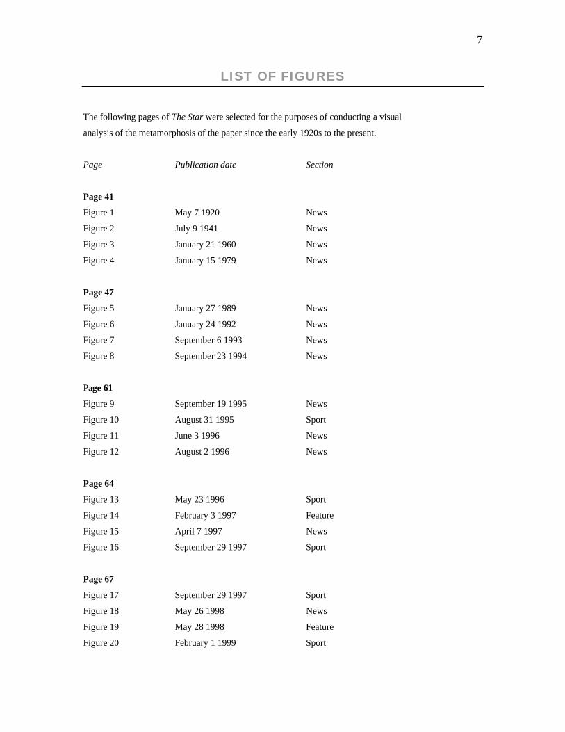
LIST OF FIGURES
The following pages of The Star were selected for the purposes of conducting a visual
analysis of the metamorphosis of the paper since the early 1920s to the present.
Page Publication date Section
Page 41
Figure 1 May 7 1920 News
Figure 2 July 9 1941 News
Figure 3 January 21 1960 News
Figure 4 January 15 1979 News
Page 47
Figure 5 January 27 1989 News
Figure 6 January 24 1992 News
Figure 7 September 6 1993 News
Figure 8 September 23 1994 News
Page 61
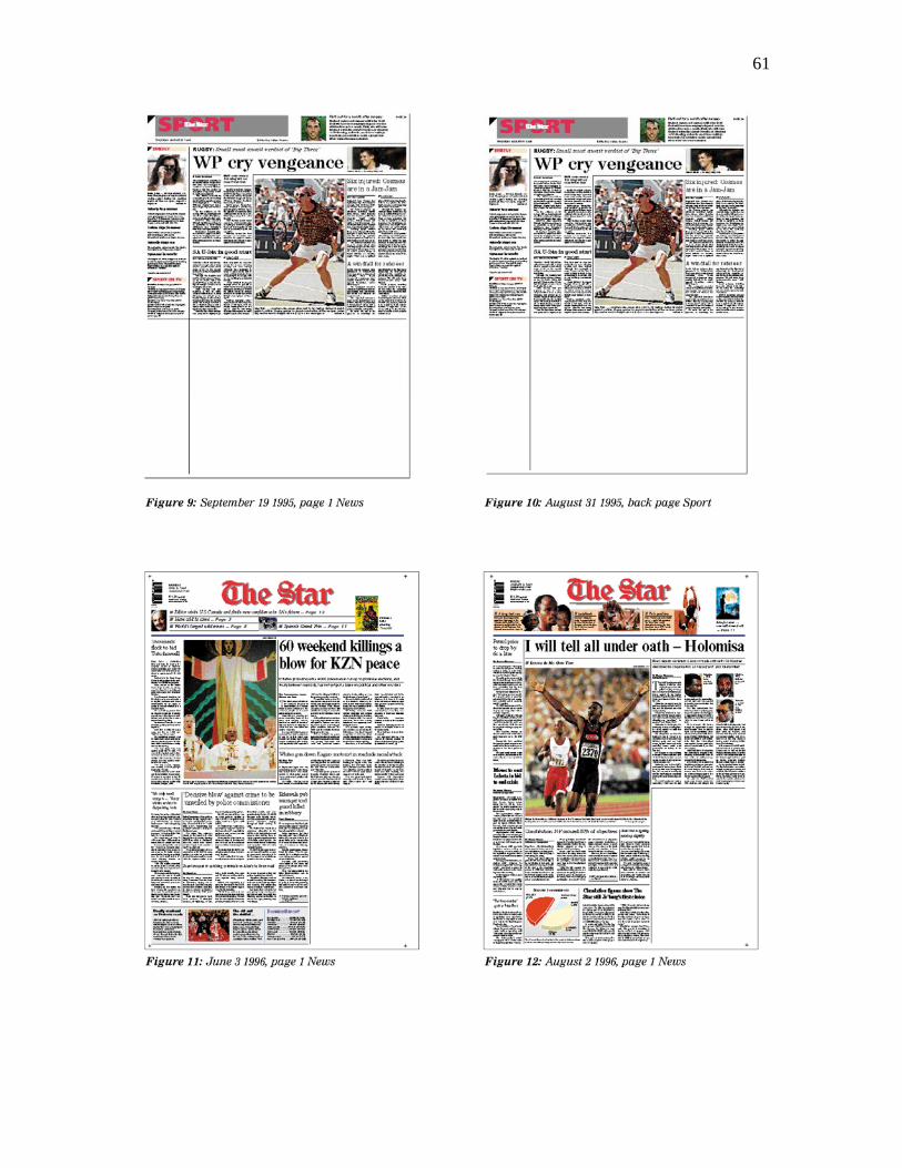
Figure 9 September 19 1995 News
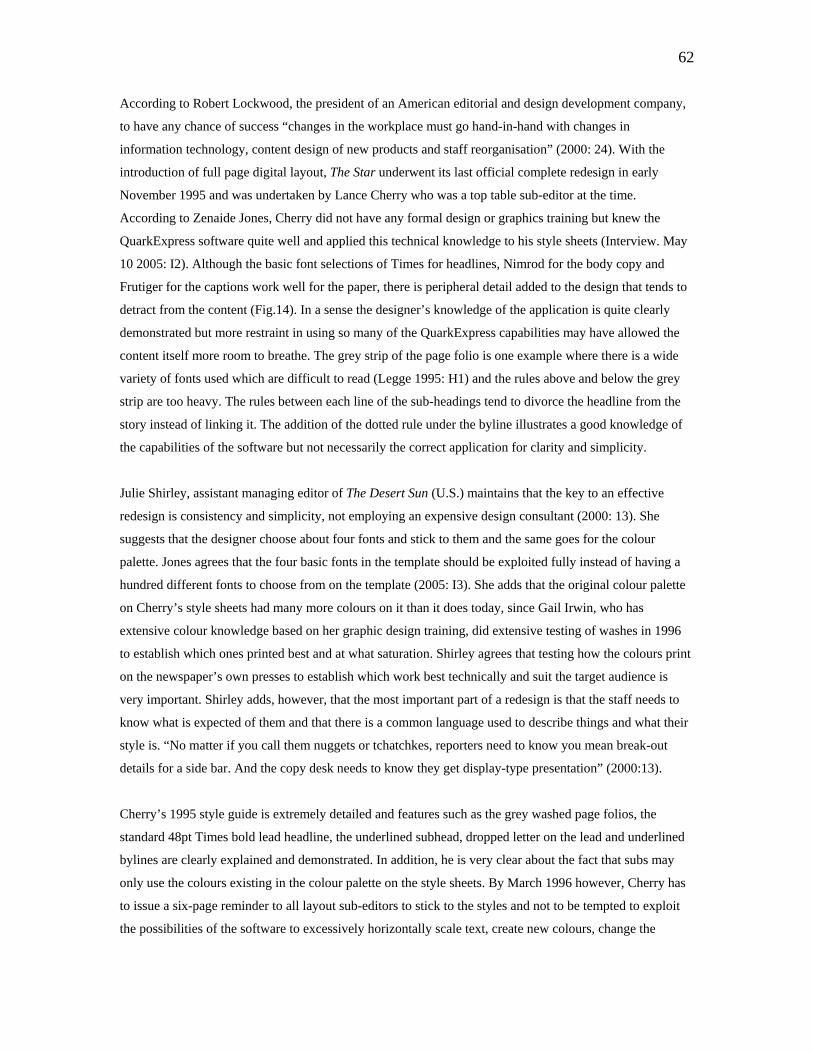
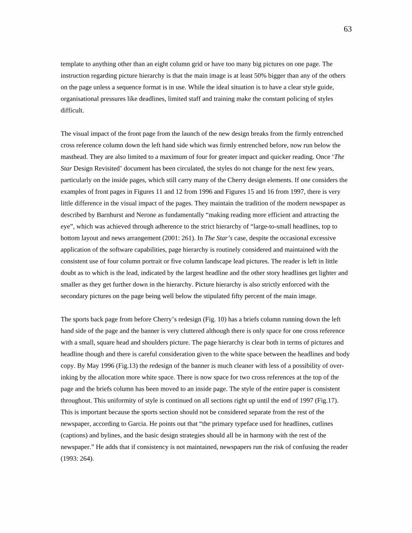
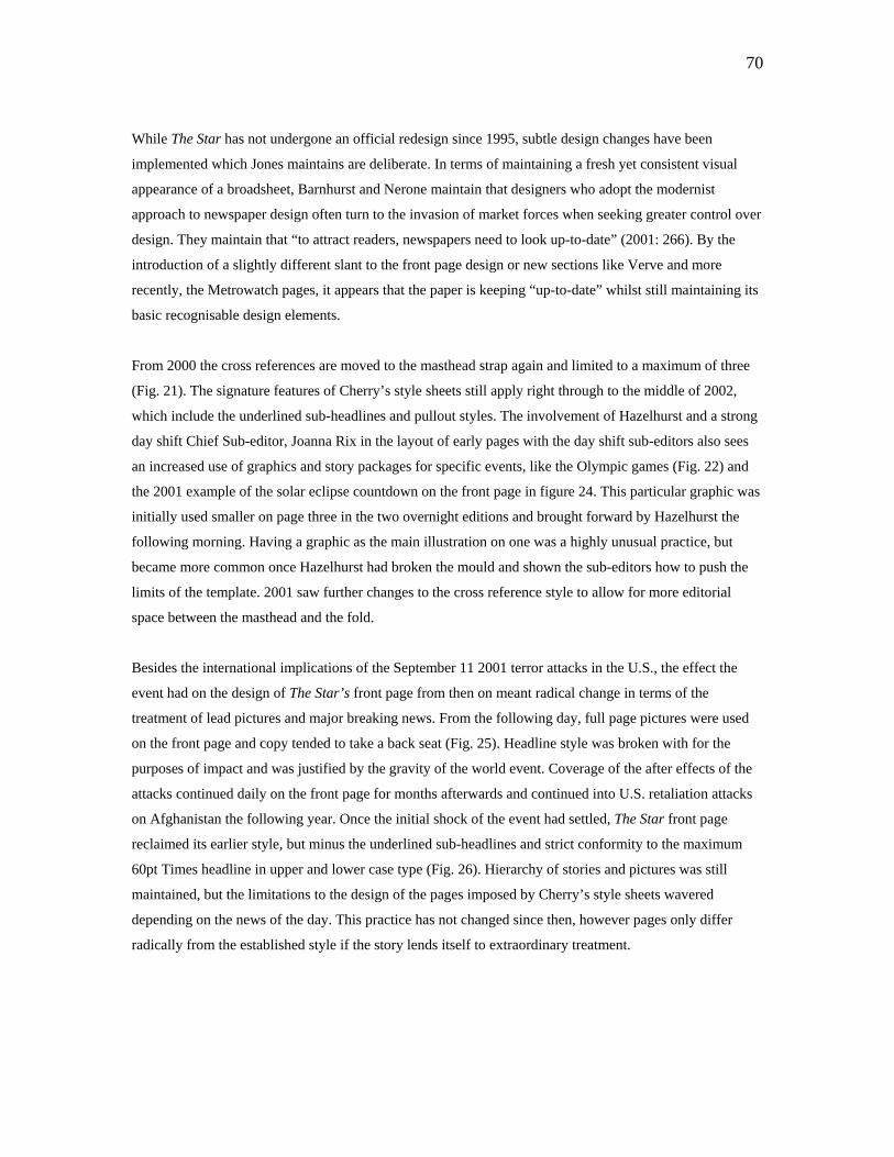
Figure 10 August 31 1995 Sport
Figure 11 June 3 1996 News
Figure 12 August 2 1996 News
Page 64
Figure 13 May 23 1996 Sport
Figure 14 February 3 1997 Feature
Figure 15 April 7 1997 News
Figure 16 September 29 1997 Sport
Page 67
Figure 17 September 29 1997 Sport
Figure 18 May 26 1998 News
Figure 19 May 28 1998 Feature
Figure 20 February 1 1999 Sport
8
Page Publication date Section
Page 69
Figure 21 September 13 2000 News
Figure 22 September 13 2000 Inside
Figure 23 October 1 2000 Sport
Figure 24 June 14 2001 News
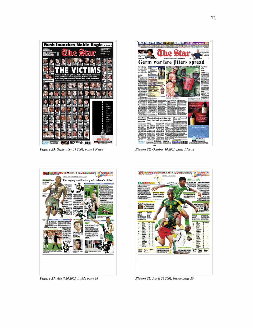
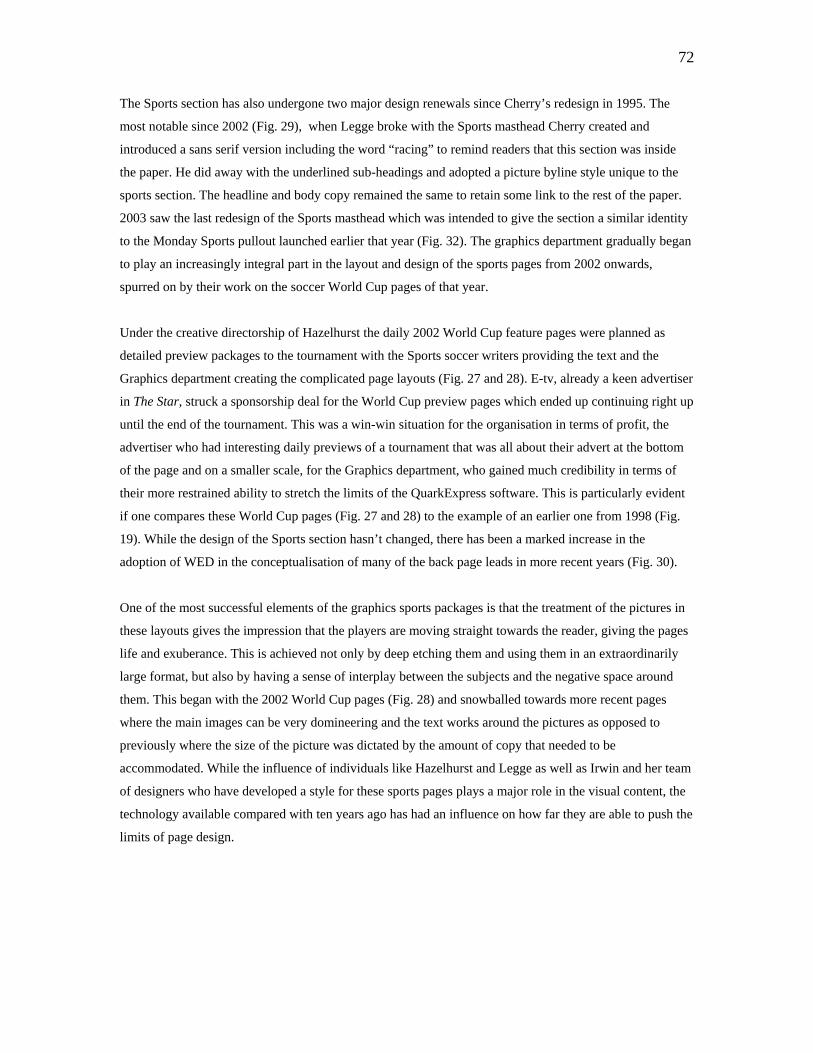
Page 71
Figure 25 September 17 2001 News
Figure 26 October 16 2001 News
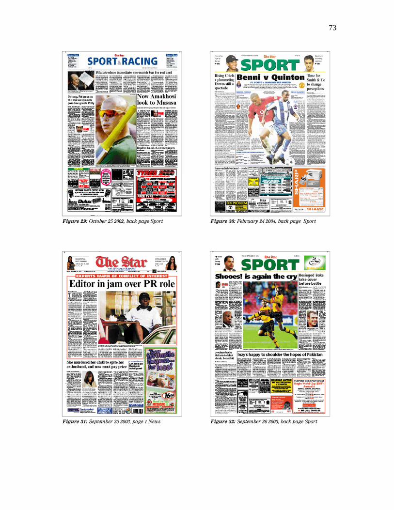
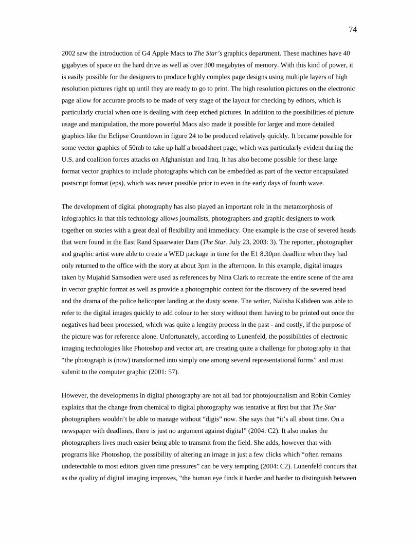
Figure 27 April 26 2002 Inside
Figure 28 April 28 2002 Inside
Page 73
Figure 29 October 25 2002 Sport
Figure 30 February 24 2004 Sport
Figure 31 September 25 2003 News
Figure 32 September 26 2003 Sport
Page 77
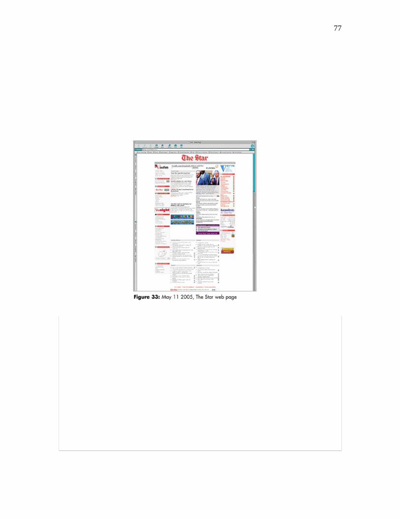
Figure 33 www.thestar.co.za Web page
May 11 2005
9
CHAPTER 1: INTRODUCTION
1.1 BACKGROUND
As a broadsheet daily since 1889, The Star has seen the editorial and production systems employed to
prepare the pages for print undergo four main stages of technological evolution. These milestones are
referred to as “waves” of technological change due to the fact that each introduction was so revolutionary
that the staff involved is forced to think outside of the comfort zones they were accustomed to working
within to get the newspaper onto the streets without jeopardising the content.
The first wave was the hot metal process using linotype technology invented by John Guttenburg over 400
years before The Star’s establishment. As Executive Editor of The Star Dr. Johan de Villiers explains, the
linotype setter worked much like an old-fashioned typewriter except that instead of text imprints being
made on paper through an ink ribbon, as one typed on the linotype machine, the little copper characters
would jump up and make an imprint in the lead mould called a galley (Interview. October 12 2004: D1).
The result was a collection of stories each set in a sheet of hot metal and placed in a tray (or form). These
were arranged according to a broadsheet-sized paper layout which had been mapped out manually by the
sub-editors with a pencil and ruler.
Hot metal was employed until the mid-1970’s when the second wave of technological development
emerged in the form of teletype setting (TTS), also known as cold metal production. Here, instead of
stacking the ‘metal stories’ into a form, the copy was input directly by teletype setters onto bromides which
were fed through a large computerised processor and emerged in long strips or galleys of text. These were
then stripped up in the Works department by compositors. Although the teletype production process was
more efficient than the hot metal process, the editorial process of editing the copy as well as designing the
layouts manually, was still as tedious as it had been with hot metal. Other less significant technological
advances made during this time are addressed in Chapter 3, but another notable development at this time
was the Argus company’s acquisition of lithographic presses in 1974, which enabled full colour to be
printed successfully for the first time on The Star.
The next major leap in technological development on The Star was Argus’ 1982 introduction of third wave
and the mainframe-based Computer Systems Incorporated (CSI). This editorial system marks the first
opportunity for electronic text editing on a computer screen. The mainframe computing format centralised
the copy editing process (Flichy 2002: 141-143). Pictures and graphics could not be seen on the screens at
this stage, but the move from manual to electronic sub-editing was a major development, according to The
Star’s Creative Director Dave Hazelhurst (Interview. October 4 2004: F1). The first three waves of
10
technological development are dealt with in more detail in the third chapter of this analysis. The fourth
chapter deals with the fourth wave of technological development which is the main focus of this analysis.
Following the feasibility investigations by editorial teams led by Liz Barratt in Gauteng and Kanthan Pillay
in Kwa-Zulu Natal in 1994, fourth wave was finally implemented the following year. Independent
Newspapers’ current IT Director Mohammed Doola, who worked for the Argus company on the
implementation of fourth wave, notes that from the early 1990s, “the company (Argus) recognised the need
to modernise the entire make up process” (Interview. November 15 2004: E1). Fourth wave was a
replacement of the entire production system and not solely limited to editorial-specific work flows. One of
the crucial factors setting fourth wave apart from the previous waves of change is that it brought the fields
of editorial and production, which had historically been kept separate, into a more integrated system where
editorial would handle much of the production process themselves. There were two main reasons for these
upgrades. The first was that CSI had already reached the end of its life span a couple of years before 1995
and the second being that Argus management saw the potential for massive financial savings with the
implementation of a system that enabled tasks previously left to a large work force in the Works, to be
carried out electronically by a much smaller editorial team which was already in place.
1.2. AIM
The aim of this paper is twofold. Firstly, it sets out to document what encompassed the upgrades to the
newspaper production technology, including the editorial and graphic computer hardware and software as
well as developments in photographic technologies over a ten year period from the inception of fourth
wave in 1995. This also involves an analysis of organisational factors such as economics, ownership and
competition which need to be considered leading up to fourth wave. In addition, it investigates what ways
and to what extent the technological developments impacted on the organisational environment in question
as these factors have the potential to affect the content of the paper. This includes an analysis of changes to
staffing structures, retrenchments, redeployments, and the establishment of new departments, training, and
the emerging need for multi-skilling as well as juniorisation becoming a characteristic feature of the
editorial work force. While The Star provides a context for this analysis, a theoretical platform is provided
by literature dealing with the organisational approach to the study of the media.
The second aim of this paper is to investigate whether it was the introduction of the new technologies or the
organisational consequences discussed in the first aim which have impacted on the design of The Star since
1995, or whether it has been a combination of the two. This is contextualised by means of a visual analysis
of The Star pages produced before 1995 in the third chapter and the developments that become evident
after the introduction of full page digital layout in the fourth chapter.
11
1.2.1. Technological developments within the organisational environment
Since the early 1980s there has been a host of new technologies which have affected media and
communications organisations, including newspapers. Technological advances which have affected the
media in more recent years include the world wide web, video telephones, electronic bulletin board
systems, video text, teletext and other forms of interactive television (McMillan 2002: 164), however most
of these are not the core focus of this research report. The new technology of relevance here is what
McMillan refers to as the “networked computer”, digital photography, the emergence of satellite
technology and the internet.
For the publishing industry, computer networks enabling individuals to collaborate on electronic news
pages became a reality with the introduction of desktop publishing (DTP) technology which, according to
industry gurus caused a complete paradigm shift in the way the industry thought the newspaper production
process worked (Doola 2004: E1). Although the 1970s saw the roll out of the personal computer (PC) with
word processing capabilities, one couldn’t lay out a newspaper using Microsoft Word, so a gap emerged in
the market. The two American companies to develop the DTP software to fulfill this gap were Aldus,
which launched PageMaker (used by Sunday Times) and Quark, which released QuarkExpress, and The
Star chose to implement. Irwin Fang explains that it was the 1984 introduction of the Apple Macintosh
computer that helped make DTP a reality. The term “desktop publishing” was coined in 1985 by
Pagemaker developer, Paul Brainerd (1997: 195-196), and publishers were now presented with hardware
and software capable of doing what a 60-strong work force in The Star’s case, had been doing for decades
with a knife and some tape, but taking much longer.
QuarkExpress allows for the pages to be made up digitally from a basic electronic template demarcated
with advertising space to a product complete with edited copy, pictures and graphics on screen before it is
sent to Pre-Press (formerly the Works department) to be played out on film, in negative form.
QuarkDispatch is a part of this software allowing for the copy to be sent electronically from the reporter to
the newsdesk where the first edit is done before it is sent to the Chief Sub-editor for placement. The Chief
Sub-editor can dispatch the same electronic version to a layout sub-editor who places the story on a
QuarkExpress layout and decide how it will be illustrated. Once the layout is basically mapped out, the
layout sub-editor electronically dispatches the copy for sub-editing and then revision. At the end of the
editing process, the copy is electronically returned to the layout sub-editor at the ideal length and fully
revised. Simultaneously, the layout sub-editor has sourced pictures and graphics, had deep etches done,
pictures retouched and prepared the page for printing. QuarkExpress also allows for the layout to be sent
electronically from one Mac to another without losing any of the page elements.
12
Desktop publishing is just one of the technological developments to revolutionise the newspaper industry.
The emergence of the internet both as a source of information and resources and a potential threat to the
future of newspapers is also an important technological development analysed in the context of The Star. In
addition to the internet, the increasing use of digital cameras, laptop computers and cellular telephones in
the generation of newspaper content becomes crucial to this study. The introduction of this equipment has a
number of implications for time-saving and assisting in making newspaper content more immediate in a
cultural environment where readers, because of the advances in television news production and content, are
becoming increasingly accustomed to being on the front lines of breaking news.
In terms of The Star’s developing production processes over the past ten years, the introduction of the
following technologies is addressed in this analysis.
1.2.1 (a) Hardware:
Apple Macintosh computers were chosen to run the Quark software because it wasn’t initially developed
to be compatible with PCs, which were considered to be more commercial machines. Macs were
specifically intended for the professional designer (Doola 2004: E1). According to Patrice Flichy, the
simplicity of the Apple Mac, which was imagined from the outset of its design, is one of its most attractive
features (2002: 137). Hazelhurst states that “194 newspapers around the world were on Mac including the
Daily Mail … and it was quite obvious that Macs could do the job” (2004: F2). While the user friendly
Macs are compatible with all the necessary software including Quark, Adobe Photoshop, Freehand and
Adobe Illustrator, the cost of importing and repairing these machines has been high relative to the cost of
PCs and their components.
Scanning allowed for pictures to become digital for the first time. This started with them moving from a
chemical etching process with hot metal, to being separated into negatives for stripping up with cold metal.
Eventually, through scanning technology, pictures became fully digitised with fourth wave where they
could be seen on computer screens. According to Mario Garcia scanners have revolutionised the way
colour photos are handled…” (1993: 114-115) and this technology became affordable for most daily
newspapers, including The Star, in the 1980s. While the introduction of the costly Hell scanners was a big
step forward for Argus in the 80s, only three or four colour pictures were scanned in daily and the process
was very technical requiring highly skilled staff. The introduction of the Horizon flatbed scanner in the late
1980s and the upgrades to the screen drum scanners of 1990s, revolutionised scanning again, making the
technology even more accessible and possible for anybody to use. The screen drum scanners were the first
to enable the complete digitisation of pictures. This was further enhanced by the introduction of the
Heidelberg flatbed scanners in about 2000 which are currently still in use (Andersen, informal interview.
May 5 2005).
13
The first filmless camera made its debut in the early 1980s and could record digital images onto a small
disk that could transmit the pictures via telephone or satellite (Fang 1997: 121). Since then, agencies have
made increasing use of digital photography allowing overseas pictures to reach The Star via integrated
services digital network lines (ISDN) or the internet within a few hours of the news happening. The Star
photographers began to work solely with ‘digis’ from about 1999 when the film processing equipment was
phased out. While time and the cost of processing film and print are saved, picture resolution is decided at
the time of the picture being taken. The higher the resolution, the longer the picture takes to be transmitted.
This can potentially create limitations for the ultimate size of the picture in printing.
Lap tops and cell phones make it possible for The Star’s photographers to remote transmit their digital
images back to the photographic department from wherever they are. The benefits of digital photography in
news cannot be fully exploited without laptop or cellular phone technology in terms of transmission and
meeting deadlines. This hardware is facilitated by satellite and internet technology.
The Star was only archived on microfilm pre-1995 since the pages were not digital before then. Full
colour archiving was impossible and the full visual effect of those pages is lost besides the brittle, yellow
hard copies of The Star housed in the Johannesburg Library archives. Optical disk technology, which was
in use at The Star from the inception of fourth wave was a vast improvement as all the electronic data could
be archived, but these disks could only hold about 350mb of data and tended to be quite fragile. Eventually
the disk drives that read the disks became obsolete around 1999 with compatibility problems arising with
advancing models of Apple Macs. The introduction of the more robust Compact Disk (CD) with 750mb of
space, is one of the ways of ensuring that digital data can be accessed in a fast and reliable manner today.
1.2.1 (b) Software:
QuarkExpress and the Quark Publishing System (QPS) make it possible for an entire page to be put
together on-screen with pictures, graphics and type being generated and edited electronically. A team of
editorial staff can work on elements of the page simultaneously to get the finished product out faster. One
of the main reasons for the selection of Quark was that it came with the work flow solution behind the
package in the form of QPS, which was only discovered when the task team came across it at The Mirror in
England. This is what enables the copy and images to be managed from start to finish electronically. The
other reason that Argus chose Quark was that for every copy of the software sold in Africa, Quark
undertook to donate a percentage of the profits to the Argus Cadet School of Journalism (Doola 2004: E2).
While the advantages of the new software technology are numerous, there are some disadvantages of full
page digital layout. According to Hazelhurst, more mistakes tend to be missed on electronic pages than
when the copy was edited on paper and probably revised by more people (2004: F3). The other drawback
14
of a fully electronic system is that network failure can result in the entire paper being late and a loss of
millions of rands to the company, although this rarely occurs.
Photo manipulation software like Photoshop now allows for deep etches to be done in fifteen minutes as
opposed to the four hours it took for a full colour etch when the pages were made up in the Works
department (Chalmers interview. November 14 2004: B2). In addition, layering pictures on top of one
another is no longer a tedious and almost impossible process since Photoshop can carry out these actions
automatically. Mac hardware and the capabilities of this software go hand in hand. The more powerful the
Macs become, the bigger and more complex the Photoshop graphics can be because the computers have the
memory to handle more data. The problem with programs that allow for pictures to be altered or modified,
according to ex-Photographic Editor Robin Comley is “the scope for unethical behaviour” (Interview.
January 6 2004). Fang explains that digital imaging, which is Photoshop’s core feature, converts pictures
into a collection of dots or pixels which can be added or removed and electronic changes, if done properly,
eliminate the evidence of tampering. He adds that the “old adage that the camera never lies can have few
remaining adherents” (1997: 121-122).
Vector-based graphics programs like Freehand and Illustrator have been in existence since the late
eighties, but as hardware has become capable of handling bigger documents, so the software developers
have given the programs more capabilities. Initially these programs were mainly used to produce what is
now known as clip art which can be lifted off a CD by anybody who owns the license, but today they have
become capable of creating huge broadsheet sized infographics with minute details. Graphics Editor Gail
Irwin recalls how infographics were drawn by hand in the 1980s with the text added on an overlay
(Interview. October 4, 2004: G1). Entire infographics can now be made up with the vector software (as
opposed to pixel-based images like photographs for which resolution is crucial in printing), making it
possible to import photographs, or even trace over them to give the impression that the face of a politician,
for example, has been created with the vector software.
The 1990 development of the Poynter Institute’s EyeTrac technology helped to give scientific weight to
what David Hazelhurst had assumed based on instinct when it came to attracting readers to a newspaper via
visual stimuli like the lead picture or headline (2004: F6). According to Mario Garcia, the 1990 Poynter
EyeTrac Research colour study was the second such study undertaken and uses specially designed
computer equipment which records the “actual eye movement of the reader and what the reader is seeing”
(1993: 121). Bearing in mind that this research was done over 10 years ago, Garcia explains that “EyeTrac
research is relatively new and allows one of the most scientific methods of recording eye movements.
Participants wear a headband holding two miniature video cameras.” One of the cameras records the retinal
eye movement of the reader while the other one shows the scene being viewed by the a participant.
Although a hierarchy of design has been evident since the 1940s, The Star has used the results of this
15
research to design its pages in such a way as to make the point of entry for the reader as clear and
interesting as possible, encouraging them to choose The Star as opposed to its competitors.
1.2.1 (c) Internet and the World Wide Web:
For The Star, as with most media organisations, the internet has become a source of information for
stories and graphics as well as a means of transmitting, selecting and downloading graphics and pictures
much more quickly and with a wider choice than the telephonic request and ISDN transmission system.
Besides providing photographers with cutting-edge technology for the transmission of their own pictures,
the internet also provides an enormous source of photographic material in the form of electronic wire
services offering pictures from around the globe at the touch of a button. Agencies increasingly allow
subscribers to view their picture archives on their internet browsers, enabling much more thought to go into
the design of a page. Since electronic selection has become the norm, if there is a failure of the company’s
internet connection, e-mail and internet access ceases and picture sourcing and transmission is brought to a
standstill which can hold pages up on deadline.
1.2.2. Visual Analysis of The Star pages
Visual analysis can be problematic since visual appreciation is very subjective, so each of the pages will be
assessed against the following criteria so that a pattern of development can be concluded.
Masthead treatment: The size and style of the masthead has undergone a number of changes both prior
to and since 1995, as has the strap in which the masthead is contained.
Page hierarchies: This deals with the concept of pages having a hierarchy of pictures and headlines
going from the biggest to smallest depending on their importance on the page. The lead picture or graphic
would be the biggest as the Poynter research concludes that this is the point of entry for 90% of readers
(Moses 2000: 62). All the other pictures on the page should be smaller. The second point of entry is the
biggest headline, with all the others being smaller or lighter so as to lead the reader through the pages
systematically. If there is no hierarchy, the reader can not decide where to look first and tends to lose
interest. Barnhurst and Nerone (2001: 22) explain that page hierarchies became a strong feature in
American newspapers from the 1920s onwards and a comparison can be made with their findings and in the
context of The Star.
16
Headline and treatment of text: Based on size and weight of type, there should be a clear main
headline, one indicating a secondary story and so on which creates a hierarchy. The font selection as well
as their treatment (size and projection) makes up this part of the visual analysis.
Picture and graphic treatment: This involves an assessment of the visual focus of the page. Scientific
results of the Poynter Institute EyeTrac research place an enormous emphasis on the main picture or
graphic element of the page as a point of entry for the reader, so the size of the image, its position on the
page in relation to the fold as well as its clarity and resolution are all taken into account. The type of
graphics used from pie charts to maps to half page illustrations is also important. Text pullout and info
boxes with colour washes are also considered graphic elements, so their treatment can not be disregarded.
Use of colour: Garcia explains that the introduction of colour to newspapers has “represented the
greatest challenge to editors and the largest capital investment to publishers” reaching revolution status in
the 1980s (1993: 112). Prior to fourth wave, adding colour to the paper was highly technical both in terms
of scanning pictures and adding colour tints to text boxes and text itself. After full page digital layout was
introduced, sub-editors could potentially use any colour they wanted, anywhere. The treatment of colour in
terms of showing restraint and discipline to a prescribed style despite the capabilities of the technology also
makes up this part of the visual analysis.
1.3. RATIONALE
Organisational theorist Brian McNair argues that “the form and content of journalism is crucially
determined by the available technology of news gathering, production and dissemination available.” He
adds that the technical circumstances of news production are often mirrored in the basic organisation of the
editorial departments (1998: 125). Based on the changing visual appearance of The Star, a documentation
of the first three waves of technological development and particularly the implementation of fourth wave in
1995 in terms of how the advances have affected the design and layout of The Star, is an interesting and
practical way of illustrating part of the organisational theory, which tends to be very broad in its
application.
Technology is just one of the factors addressed by organisational theory. Other factors considered in the
organisational approach to the study of media include economics and particularly organisations’ aggressive
drive towards making a profit or cutting costs, which was one of the main considerations behind the
decision to implement fourth wave at The Star. Besides this, the complete replacement of the production
system required a major paradigm shift in the way the staff thought of newspaper production. The need for
re-training and multi-skilling emerged, and along with retrenchments, resulted in the loss of certain skills to
the production and editorial process and eventually juniorisation.
17
Ownership is another issue dealt with in organisational theory although in the context of this analysis, it’s
relevance is purely to contextualise this document within the socio-political shifts at play in the newspaper
industry and within the organisation itself at the time of the 1995 upgrades. The Argus company completed
the implementation of fourth wave, ensuring that full page digital layout was up and running by the time
the Independent group took over towards the end of 1995. Although the upgrades were not necessarily
related to the sale of the company (Hazelhurst 2004: F2), the financial considerations of the upgrades for
the Argus company management need to be addressed since the retrenchments which resulted from the
introduction of fourth wave affected the organisational environment in which the newspaper is produced.
While still recovering from the 1995 staff cuts in the Works under Argus, the editorial department also
suffered retrenchments under the Independent group in 1997 because, according to Hazelhurst, “the owners
thought we had too many people for the size of the paper and in Ireland they have one news room to service
two papers” (2004: F4).
Although most of the literature selected to support the theoretical framework of this analysis is American,
the southern African research papers by Guy Berger (1997) and Pempelani Mufune et al (1998) cover much
of the same issues, which tend to show that the South African context is not that different from what is
happening abroad. In South Africa, according to Pempelani et al, a distinction needs to be drawn between
public, community and commercial media. While the “public media refers to the provision of radio and
television as public goods rather than private commodities”, community media places an emphasis on the
community and the commercial media “provides information, entertainment and representation as a private
commodity” (1998: 42). The Star is an example of commercial media which makes it an ideal South
African example to illustrate the organisational theory. In addition to this, information from interviews with
senior employees at The Star is supported by the theory provided by American and local academics. While
there is nothing obviously unique about The Star’s position as an African paper which has undergone a
number of organisational changes, from a historical and documentary point of view, the analysis of the
impact of new technologies on the design and layout of The Star is an interesting one.
Since The Star is due to undergo another technological upgrade, ten years on from the implementation of
fourth wave, this seems the ideal opportunity for this documentation and analysis.
1.4 THEORETICAL FRAMEWORK
Interviews with staff involved in the introduction of fourth wave at The Star have revealed that the
implementation of new technology leads to three major outcomes: faster production, cost savings and a
more ideal use of visual materials. In order to carry out this analysis, two theoretical tools are employed.
Firstly, the organisational approach to the study of the media, particularly literature dealing with how
18
organisational issues can enable and constrain editorial and production staff and the consequences of these
issues, is applied to the issues of faster production and cost. Organisational factors involve macro issues
including cost, the newspaper as a cultural commodity, the introduction of new technology and staff cuts.
The consequences of these issues can then be broken down into micro organisational pressures which affect
newsmakers such as deadlines, competition for space and fewer staff members doing more work. The
second theoretical tool pertaining to the ideal use of visual materials is better served by the application of
visual culture theory which contributes to the visual analysis of The Star pages.
1.4.1. Organisational Theory
Economics and the domination of profit as the primary goal for most media organisations are central to
organisational theory. Other issues academics address in the organisational context as having an effect on
content, include politics, sources, competition, ownership and the environmental conditions involving
deadlines, technology, the production line analogy and environmental conditioning. While the economic
issues mentioned up to this point have come in the form of savings, revenue is of even greater importance
to management when it comes to long term sustainability of the organisation. This explains James Curran’s
reference to the reader as “a consumer” (2000: 20) of the revenue-driving commodity in the form of a
newspaper. Since design and layout, which involves strategic picture, graphic and font usage is integral in
attracting the “consumer” to one paper as opposed to another at first glance, it is clear that the
organisational theory is the one that best encompasses this topic.
New communications technology brings with it major benefits for journalistic organisations,
but can also force unsettling changes on working practices and routines, challenge existing
lines of demarcation in the journalistic workplace and thus easily come to be seen as a threat
by practitioners (McNair 1998: 125).
In the context of The Star the threat McNair refers to came in the form of major retrenchments in the
Works department with the 1995 implementation of fourth wave where cost cuts were a major advantage of
the new full page digital layout system. Despite the fact that continually improving hardware and software
has generally made the lives of the editorial and remaining production staff easier, the consequences of the
introduction of new technology is seriously tackled in this analysis.
Shoemaker and Reese explain that an organisation can do one of two things when economic constraints
become too severe. They can either “sell more of their profit to the right people, and/or reduce the cost of
production” (1991b:146). It is difficult to escape the costs of newsprint, so the next best option is to trim
staff since companies generally find that the “production costs are high relative to the costs of
reproduction” (Curran 2000: 20). Granted, with the introduction of the QPS system in 1995, the department
19
to suffer the most losses was the Works where pages were previously stripped together by the compositors
and photolithographers. However, with changing technology comes the need for different skills and many
experienced sub-editors were lost due to their inability adjust to the technological developments
(Hazelhurst 2004: F2). The editorial department also suffered losses due to poaching of staff by overseas
papers and with this attrition went many years of knowledge and accuracy skills which are difficult to teach
in a short period of time to younger, less experienced staff, often straight out of college or university. The
implementation of the new technology had its definite advantages though. On the design side, editors now
had hands-on control of the layout of the paper since it was now being done under their direction by subs
and designers on the editorial floor. The potential was now there for real strides to be made in terms of
visually constructing the “cultural commodity” to stand out from its competitors and really grab the reader,
which was not consciously emphasised prior to 1995. However, there were rules of style applied to the
treatment of headlines and pictures (Chalmers 2004: B1).
Curran describes the importance of one publication standing out against another one as the concept of
“novelty”, attracting the consumer to a particular “cultural commodity” (2000:20). According to The Star’s
Circulation Director, Paul Peters, the paper relies on advertising for 70% of its revenue and on circulation
for the other 30% (Informal interview, April 15, 2003). Peters describes this necessity to keep both
circulation figures and advertising revenue up as a “virtuous circle” because you can’t have one without the
other. Without consistently good content presented in a way that appeals to the target audience of the paper,
there would be little reason for The Star’s readers to buy it. Conversely, without reasonable readership
figures, there would be little reason for advertisers to place their adverts in the publication and boost the
organisation’s profit margin.
With revenue being such a major consideration when it comes to the survival of most newspapers, visual
appeal is clearly of utmost importance. Layout staff needs to think strategically when designing the front
page of the paper, particularly what it looks like above the fold since this is what the readers are going to
see when the paper is held up by street sellers or sits on news stands next to its competitors. Often
competing papers will run the same lead, so it is crucial for design staff to make use of scientific tools
which assist them in understanding what the readers prefer and will be drawn to in order to persuade them
to buy The Star as opposed to the an opposition paper with similar content. Besides investing in more up-
to-date production technology, The Star has also made use of technological advances in reader behaviour
analysis to establish what readers want in a newspaper.
This is where the computer software technology used in the two Poynter Institute EyeTrac Research
projects become important for this analysis (Garcia 2003: 112-125). Through the October 2000
investigations of media trends analyst Jos Kuper and Marketing and Media Research (MMR), on behalf of
Independent Newspapers, it was formally introduced to staff. EyeTrac research uses colour studies to gauge
20
what visual elements of the media attract the eye of the reader first. By using the empirical results of this
technology, newspaper editors and designers attempt to produce papers with a visual hierarchy that grabs
the eye of the reader and maintains their attention leading them logically through each page.
In keeping with the Poyter Institute’s findings, studies done by Kuper and MMR showed that the first page
element to attract a reader is the main photograph or graphic, regardless of whether it is in colour or not.
Size and placement of the image also play an important role (Garcia 1993: 119). After the main illustration,
readers immediately go to the headline, and according to Garcia, “not necessarily the one accompanying
the entry point photo” (1993: 122). The Poynter Institute’s Monica Moses explains that “headlines are more
likely to be read when a photo is nearby” and adds that the bigger the photo, the more likely it is that the
reader will be attracted to reading its caption (2000: 6).
According to this research, the design or visual presentation of the lead story on a newspaper has the
potential to decide how many papers are sold and in addition, the editorial and visual content of the rest of
the paper will be a deciding factor in whether readers’ attention is held long enough to feel they need a
subscription. As Shoemaker and Reese confirm, “many (news stories) are evaluated for their audience
appeal, which translates into higher circulation and ratings, producing greater advertising appeal”
(1991b:146).
If the graphic page elements are not treated correctly by means of a methodically hierarchical layout
consisting of a clear lead picture and headline, projected on a much larger scale than subsequent pictures or
illustrations, the reader’s attention can be lost before getting to the point of reading the introduction of the
lead story. Senior designers at the paper like David Hazelhurst and Gail Irwin (who studied for a short time
at the Poynter Institute) were already aware of EyeTrac results, but the implementation gained more
momentum following the research into reader trends by Kuper and MMR. For the sake of clarity it is
relevant to include a brief overview of what the processes and findings of the EyeTrac research were.
The first study, conducted in 1985, made use of a 24-page prototype newspaper with varying colour
elements on each page but similar editorial content, consisted of an Eye Movement Test in which
participants were asked where their eye first fell when they looked at a page. Secondly, there was a
Semantic Differential Test (SDT) where content was disregarded and pages were rated on 20-word pairs
like “exciting-dull, fresh-stale, and so on” (Garcia 1993: 118). The third part was a Paired Comparison
where participants had to compare two pages using one evaluative word from the SDT to rate which
element was more important to them. “Once these results were tabulated, a Visual Magnetism Index (VMI)
was created for the elements on each page that received the most eye traffic” (Garcia 1993: 119).
21
As outlined in the aim of this analysis, the second 1990 Poynter EyeTrac Research colour study used
specially designed computer and video equipment which tracked the movement of the readers’ eye as they
read through the sample newspapers. In explaining how this study works, Garcia says:
Movement is unrestricted. The reader can sit back or place the newspaper on the table. As the
reader looks through the pages of the newspaper, the cameras recorded the journey. A cursor
tracks the readers’ eye movement, showing each item looked at. The movement is recorded
on video tape for analysis (1993: 122-123).
In addition to the technology, the content of the second study was also different in that Garcia and Dr Pegie
Stark of the Poynter Institute sent out questionnaires to editors of newspapers to find out what their
concerns about colour were before they embarked on the investigation (1993: 122).
It must be noted that production technology upgrades are extremely costly, invariably running into
millions. In Independent Newspapers’ case, regular smaller upgrades and maintenance of information
technology (I.T.) have not been undertaken over the past ten years, nor was this the case before the
introduction of QPS (Doola 2004: E1). Upgrades of production technology have historically only come at a
time when the production process is severely threatened by outdated equipment. To keep the money
coming in by getting papers out on to the streets in time, a major investment into upgrades has been
desperately needed when they have eventually been made. However, ensuring that newspapers hit the
streets on time to make enough sales is not the only reason that the sizable investment into new technology
is made. As addressed previously, more advanced technology is also often introduced to streamline
functions, allow for less staff and create a margin for savings.
With the wide selection of media available to advertisers from outdoor, to TV and radio and print, they tend
to become more selective about where they will place their ads (Herber 2005: 45). Consequently, the major
challenge for newspapers is to have a clearly defined target market and make their product stand out from
their competitors in order to maintain existing readers and attempt to boost their readership in a very
difficult climate. The idea is that circulation figures stay high enough to hold the attention of media
planners who will essentially make the decision to choose one publication over a rival for advertising
placement.
Besides the macro issues of economics and technology, micro organisational factors to which the news and
subs rooms are subjected, also affect the visual content of the publication. These involve constantly tight
deadlines, regardless of the technology being applied, briefs coming from individuals with their own
agendas and competition for limited editorial space in the paper. Along with these organisational pressures,
which have always faced journalists, comes the added element of being reliant upon technology to produce,
22
transmit and hold their copy on the network. In addition, the internet, often touted as being a major threat to
the future of newspapers (McNair 1998: 136-9), is being used increasingly as a source for news room
research and even more extensively for photographic and graphic sourcing and downloading. While for the
most part, advances in computer hardware and software over the past ten years have made the editorial
staff’s job a lot easier, according to Hazelhurst (2004: F2), sometimes being reliant on an ageing network
can have it’s disadvantages when either the editorial or internet server fails and brings the department to a
standstill. This costs time which translates into financial loss when deadlines are missed.
1.4.2. Visual Culture
Nicholas Mirzoeff explains that the concept of ‘visual culture’ has emerged out of the fact that everything
we experience in our everyday lives is visual (1999: 2). Reality television, for example, has become
commonplace and 24-hour news channels like CNN and BBC News bring global audiences up-to-the-
minute footage of events happening around the world. The September 11 2001 terrorist attack in New York
is a prime example. With the ease of access to personal video camera technology, the world was able to
watch amateur footage of the first plane hitting one of the Twin Towers and broadcast news was right there
to record the rest happening live. Another example is how recent invasions by the U.S. and British forces in
Afghanistan and Iraq have been covered live by television networks and again, transmitted via satellite to
the world in real time. Locally, we see still photographs in our newspapers of CCTV footage recorded on
the streets of our inner cities with crimes being committed and in some cases, of police making arrests
because of this technology.
Mirzoeff maintains that a gap has emerged “between the wealth of visual experience in postmodern culture
and the ability to analyse the observation” which “marks both the opportunity and the need for visual
culture as a field of study.” He explains that visual culture, gives academics the opportunity to “study the
genealogy, definition and functions of everyday life from the point of view of the consumer, rather than the
producer” (1999: 3).
The benefits for this analysis are that while the organisational theories deal with the production of news
content and the environment in which it is done from the perspective of the journalists and company
management, the theory of visual culture allows for the perspectives of the reader to be taken into account
as well. Since news media is a “cultural commodity”, according to James Curran (2000:20), it emerges that
it is crucial to analyse how the reader as the consumer relates to the commodity. By including both the
organisational approaches and some visual culture theory, this analysis becomes well rounded in the sense
that it deals with news content from the perspective of the producer and the reader.
23
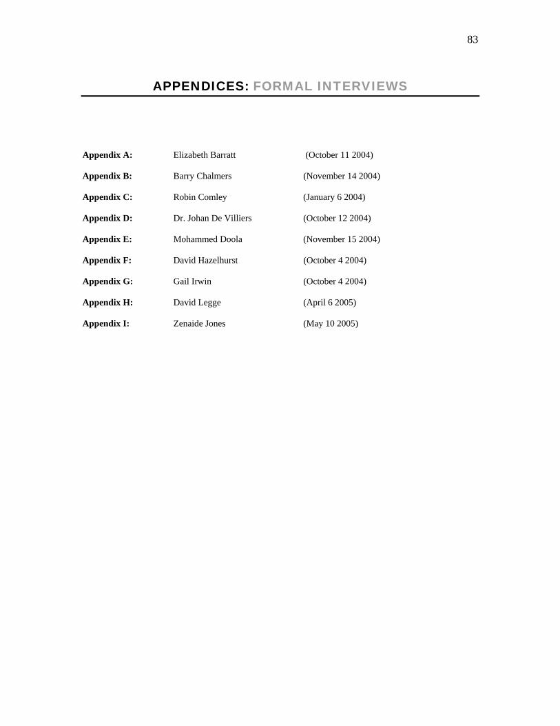
1.5. METHODOLOGY
1.5.1 Interviews:
Two kinds of interviews were conducted for this analysis. The first were formal one-on-one open-ended
question interviews with senior staff members who experienced technological developments at The Star
first hand and who specialise in the fields of design and page layout, understanding the need for
increasingly advancing technology-based skills (photography, graphics and IT). Similar questions relating
to their career histories, experiences regarding the implementation of fourth wave and how things have
changed, or not, were asked. Due to the length and in most cases, technical content of the formal
interviews, they have been transcribed for reference purposes and are included in appendices at the end of
this analysis. Secondly, informal interviews were conducted with some subjects telephonically with short
questions relating to specific information, requiring much shorter responses. For this reason, these were not
transcribed. In the case of David Hazelhurst, the formal interview was followed up with an informal
telephonic interview for reasons of clarification.
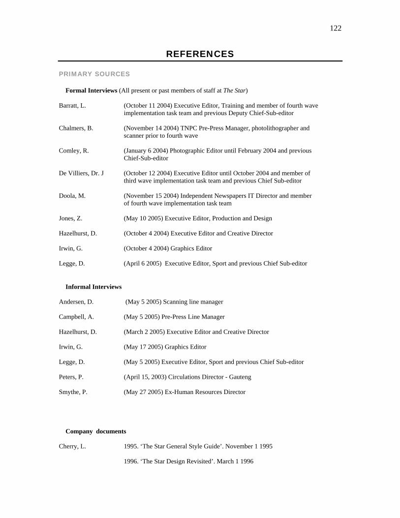
Formal interviews:
Elizabeth Barratt Executive Editor, Training
Barry Chalmers TNPC Pre-Press Manager
Robin Comley Ex-photographic Editor
Dr Johan de Villiers Executive Editor
Mohammed Doola Information Technology Director
Zenaide Jones Executive Editor, Production and Design
David Hazelhurst Executive Editor and Creative Director
Gail Irwin Graphics Editor
David Legge Executive Editor, Sport
Informal interviews:
Donald Andersen Scanning line manager
Alan Campbell Pre-Press line manager
David Hazelhurst Executive Editor and Creative Director
Gail Irwin Graphics Editor
David Legge Executive Editor, Sport
Paul Peters Circulations Director
Patrick Smythe Ex-Human Resources Director
24
Interviews are backed up and prevented from being purely anecdotal by Mario Garcia’s Contemporary
Newspaper Design (1993) and articles by staff from the Poynter Institute in the U.S. and other newspaper
experts in the field of design contained in the April 2000 issue of The American Editor. These are
supported by extensive literature dealing with organisational theory by James Curran (2000), Brian McNair
(1998), Paul Manning (2001) and Shoemaker and Reece (1991).
1.5.2. Personal observation:
As an employee of Independent Newspapers for seven years, currently holding the position of Deputy
Graphics Editor, I have experienced the benefits and challenges of hardware and software upgrades of
fourth wave first hand. The Star’s organisational environment affects all the editorial staff and some of the
observations in this analysis are based on my own experience. The interest in conducting a visual analysis
of The Star pages can be attributed to my undergraduate studies in Fine Arts where visual analysis and
dissection of design is crucial to the study of fine art works.
1.5.3. Visual analysis of The Star page portfolio:
Based on the interviews, it is possible to pinpoint specific time frames for the major technological advances
and then take pages from before and after the implementation of fourth wave and compare layouts, design,
picture/graphic usage and attention to detail to assess the extent to which things have changed. These are
measured against a set of visual analysis tools outlined in the aim of this study. Colour copies of the pages
are included where possible (there was no full colour archiving prior to 1995), with the ultimate effect
being a portfolio of a gradual progression of The Star layouts produced prior to 1995 and since. The pages
discussed in Chapter four employ new technologies in their production.
The theoretical basis for the visual content analysis of actual pages of The Star is provided by Mirzoeff’s
An Introduction to Visual Culture (1999). This aids in the visual analysis of the treatment pictures and
graphics in terms of size and colour prior to full page digital make up and particularly afterwards with the
emergence of various technologies. The theory is backed up by more practical texts by Garcia, amongst
others as well as the interviews discussed above. Barnhurst and Nerone’s The Form of News. A History
(2001), is also a particularly useful source in dealing with the issue of visual content.
25
CHAPTER 2: LITERATURE REVIEW
The literature collected serves to provide a strong theoretical framework for the paper and a sound
background for interviews. In terms of providing a framework, many of the literary sources, particularly
Curran (2000), McNair (1998), Manning (2001), Schudson (2001) and Shoemaker and Reese (1991) deal
with organisational approaches to the study of the media which encompass a number of organisational
issues which amongst other things can culminate in the acquisition of improved technology in the form of
both hardware and software. The introduction of these changes can in turn affect staff numbers and
structures and impact on the visual content of newspapers. The consequences, as discussed with key
members of The Star’s editorial team and supported by organisational theory, can either be seen as adverse
or positive. The exploration of this balance is of major importance to this study.
2.1. Background literature
Literature that providing a concise history of the technological developments in newspaper production
includes Irwin Fang’s A History of Mass Communication (1997). He clearly outlines every stage of
technological development in the mass media, from the invention of the telegraph in 1843 which
revolutionised newspapers, to chapters detailing the history of photography, the advent of multimedia and
even the impact of satellites on communication industries. The information in this book is invaluable in
preparation of interview questions.
Becoming familiar with subjects who are referred to in some of the interviews and gaining more of an
insight into the big picture of the South African newspaper industry is provided by Joel Mervis’ The Fourth
Estate: A Newspaper Story (1989). The book sets the tone for the environment in which news was
produced in South Africa over nine decades. Of particular relevance to The Star is that it deals with the
mergers, acquisitions and unbundling of certain titles and assets between South African Associated
Newspapers (SAAN), The Argus Group and Caxtons before the Independent group took over in 1995.
These socio-political changes naturally had repercussions for the staff and content of The Star under the
ownership of Independent Newspapers. It provides a sound background to the socio-political shifts prior to
fourth wave being implemented and backs up much of the background information provided by the primary
source, which are the interviews.
Guy Berger’s paper also provides a socio-political background for the introduction of new technology.
‘Harnessing new information technology for Africa’s independent media: plant crops at the start of the
rainy season’ (1997), offers a number of positive reasons why southern African media owners should
26
embrace new technology just after fourth wave had been implemented at The Star. The paper states that
“digital technologies can have at least three benefits for African journalists: make savings, add value to the
editorial product and connect you to new markets” (1997: 1). The emergence of digital camera’s, various
scanning technology and multi-media packages and the inevitable “evolution into a multiple media”, and
how these issues all affect the journalists’ working environment, their relationship with their
readers/audiences and the heightened competition that accompanies these issues are addressed. Since most
of the theoretical context is provided by American academics, including a South African perspective is
crucial.
Pempelani Mufune et al’s paper, ‘The External Environment Affecting the Development of Independent
Media in the SADC region’(1997), which was also presented to MISA explores the environment in which
radio, television and print media have evolved in the southern African context with the continuous
development of technology. Their assessment of ‘new technologies’ encompasses “the techniques of
production and distribution, the machinery, work flow and processing that accompany communication,
dissemination and production” (1997: 10). In terms of the effects of new technologies on newspapers which
have developed from linotype machines and the hand assembled pages of the 80s and early 90s to South
Africa being one of the African leaders in full page digital layout, their conclusions run parallel with The
Star’s context. In terms of production, they have observed that the introduction of new technologies has
“created new jobs and a need for new skills and thus encouraged the training and retraining of media
personnel” (1997: 10). They also deal with more streamlined means of sourcing information through the
internet, easier transmission of pages and more advanced methods of distribution.
Besides summarising the technological issues affecting the SADC region, Mufune et al’s paper provides a
concise presentation of the socio-political context for the production of the countries’ newspapers, which
helps to set the background for chapter three of this research. This includes changes in legislation which
affect media rights as well as providing a clear summary of South African ownership patterns. They explain
that South Africa has been described as “a place where there has been a massive monopolisation of the
press” (1997: 39) where the English language press was dominated by Argus and SAAN and Afrikaans
press by Die Afrikaanse Pers (Perskor) and Nasionale Pers. They also provide post-1994 socio-political
background and a sound context with regards to sources of revenue, concluding that “for South African
print media (these) are to a large extent from sales and advertising” (1997: 43). As with Berger’s paper,
research based on the local environment of news production is crucial in addition to the perspectives
provided by American and British literature which tends to dominate the theoretical framework of this
analysis.
27
2.2. Organisational Theory
In News and News Sources (2001), Paul Manning addresses general organisational issues like economics,
competition, deadlines and even how the social conditioning of the journalist can result in a news room
being compared to a sausage factory, with the same news being churned out by everybody because they
become conditioned to what their editors will approve of and accept. Deadlines also factor into the equation
of reporters and sub-editors getting things done the way they know is acceptable because the tried and
tested formula is easier than trying to break with habit and risk missing a deadline. He explains that
continuously producing stories on a daily basis, “involves the routine gathering and assembling of certain
constituent elements which are then fashioned to construct or fabricate an account of the particular news
events” (2001: 50). This suggests controversially that journalists create the news, although this does not
mean that they fabricate it, according to Manning, they merely build an event into a news story.
He also draws the reader’s attention to the fact that there is a danger in the “sausage factory” analogy
because “it tends to underestimate the extent to which particular journalists do make a difference” (2001:
53). Although organisational theory traditionally deals with news being produced on what equates to a
production line and sensitises one to issues of hierarchy, routine and organisational dynamics, it doesn’t
necessarily take into account the possibilities of the production line breaking down. Manning explains that
this involves the consideration of personal tensions, rivalry and moral disagreements. While it is
satisfactory to “describe how organisational imperatives impact upon news journalism, it is still necessary
to step back and ask questions about why news organisations are constituted in such a way that these
Reliance on computer technology can also exert organisational pressure on news production. Individuals
are reliant on complex computer networks to research and produce copy, move their stories, pictures and
graphics along the production line until it is ready for printing on deadline. One can not discount the
pressures placed on journalists by word processing, sourcing or camera equipment failing. An overloaded
network can slow down the whole news making process and risk making the entire newspaper late, which
in financial terms, can be detrimental considering how many sales can be lost because of the delay. In
addition to the other pressures involved, Manning explains that technology is a very important
consideration for organisational theorists when it comes to the environmental conditions of news
production:
Organisational pressures and technological determinants were added to the psychological
traits of the news editor in a growing list, compiled by academics, of why news media
representations of reality were imperfect distortions, rather than perfect reflections of reality
(2001:51).
28
Manning also addresses the Internet and how, rather than compete with it, many news organisations have
chosen to exploit it. The relevance of the internet as a technological determinant here is that agency and
The Star photographers, for example, are able to transmit pictures from their digital cameras through the
Internet to the office from remote locations. The immediacy of the visual effects can be stunning and
rewarding to audiences, as was the case in the 1998 Soccer World Cup where The Star first used digital
pictures on the afternoon edition (Hazelhurst, informal interview, March 2 2005). Before the end of South
Africa’s game against Uruguay, there were eight full-colour action pictures of the game ready for selection
on a computer in the photographic department. Another way in which newspapers have chosen to exploit
the Internet is to establish on-line versions of their publications to create another potential source of
revenue through web site advertising.
A more balanced argument to Manning’s is found in James Curran’s ‘Media Organisations in Society’
(2000) in which he, like Manning, deals with organisational approaches to the study of the media and
includes the emergence of new technology as part of a set of structures that affect news content. However,
the arguments presented by Curran offer both radical ideologies which suggest that organisational
determinants like the introduction of new technologies tend to constrain rather than enable development, as
well as more liberal post-Fordist approaches. These suggest that through the introduction of new
technologies, jobs “are less rigid and manual, flexibility and employee autonomy higher.” The result,
according to Curran, is that workers become more independent and that job satisfaction is improved (2000:
31).
The economically-based issues addressed, involving management’s drive to generate profit, are based on
the political economy approach to the study of the media. Under this banner he describes the media as a
“cultural commodity” and explains the three features which constitute this “cultural commodity” according
to Nicholas Garnham. These include the idea that “consumers require cultural products to be
distinguishable from each other”, making novelty a key issue. The second feature is that a cultural
commodity is not destroyed in its use, like a chocolate bar would be, for example. The third feature is that
the “audiences tend to use them in their efforts to achieve difference and distinction from other users”
(2000: 21). Curran does emphasise, however, that these features should be seen as “merely a starting-point
for understanding the industrial strategies” in the management of the media.
With regards to the organisational approach to the study of the media, Curran explains that “media
sociology can serve as the sister-discipline” to political economy and illustrate that also “examining how
regulation policy, political action, aesthetic ideologies, professional codes and histories of class, gender and
ethnic relationships can all affect the production processes and outcomes within media organisations”
29
(2000: 21-24). In so doing, one can get a more complete picture of the organisational environment in which
media is produced.
Of greatest relevance is that the optimistic post-Fordist accounts he initially raises tend to be rather
characteristic of the 1980s and that they were replaced by a “more sober assessment” in the 1990s. He
explains that for many media organisations, operations may have changed, like The Star’s adoption of
fourth wave and the production and staffing changes that resulted, but, as Curran states, issues of power
and profits have not. He emphasises that “changes in organisations have been introduced to cut costs and
spread risks, not to increase creativity and autonomy” (2000:32).
Brian McNair’s book, The Sociology of Journalism (1998) deals predominantly with the technological
environment (Chapter 7). He says that “the form and content of journalism is crucially determined by the
available technology of news gathering, production and dissemination available.” News content is amongst
other things, the outcome of the technical conditions under which journalistic production takes place
(1998:125). As an organisational theorist, he maintains that not only the journalists themselves, but the
organisational structure of the news room itself, is influenced by the technological conditions, which in turn
affect content.
He notes that while new communication technologies bring with them major advantages for the journalist,
they can also leave staff feeling threatened by the changes. This is a major theme in the interviews where
the introduction of faster, more powerful computers in 1995 created a gap for fewer staff members to get
the paper out in the same amount of time. While most of the staff losses at The Star were felt by the Works
department, once the editorial production system became more streamlined, there were editorial
retrenchments in 1997 as well. The social conditioning of this response by management to the introduction
of more streamlined systems is bound to result in staff becoming edgy and even anti-change when
presented with it.
However, the introduction of the new production system can not be blamed for diminishing head counts
alone. Processes of natural attrition without replacement and staff who simply can not keep up with the
developments of the new technology have to fall by the wayside or risk holding the whole process back.
The issue of time is an important one. McNair notes that in this new millennium, getting the news out faster
than the competitor, assuming that this is what the reader wants, has become paramount.
Immediacy, indeed, has been elevated to a production goal in itself, often superseding the
older and more traditional journalistic objective of contextualising and explaining the events
being reported (1998: 126-127).
30
The issue of globalisation also characterises the organisational approach and is addressed in here. The
internet, linked with digital cameras, provides access to pictures from the world’s wire services, making
globalisation a major determining factor when it comes to the printed publication. In the fourth chapter of
his book, McNair refers to organisational issues as “the core subject matter of the sociology of journalism.
The elements: historical, technological, political and economic” of which it is constructed (1998: 89). This
echoes the issues indicated by Curran which helps to strengthen the theoretical framework.
What makes Shoemaker and Reese’s book Mediating the Message: Theories of Influences on Mass Media
Content (1991) relevant to this study is that, like McNair, they give a broad outline of the factors within an
organisation which could affect the output of journalists and the visual content. They explain that different
organisations choose different methods of solving their production challenges, but that the real issue is how
they differ, how management reacts and how content is affected. Ultimately, according to the writers, the
difference is dictated by “ownership, goals and policy.” They add that “organisational analysis seeks to
explain variations in content that cannot be attributed to differences in routines and individuals” (1991:
139).
They conclude that journalists tend to lose their own identity in the environment of the news room because
of the organisational pressures they face and explain that when one really gets down to it, “individual
workers and their routines must be subordinated to the larger organisation and its goals” (1991: 140). Based
on Independent’s mission statement, the “goals” of the company are to produce a competitive publication
which consistently and reliably gives its readers what they want and to build up the reputation of a paper
that delivers what it promises (Fallon, Healy 1999). These goals, however, are built in to the “overarching
objective” of making a profit. According to Shoemaker and Reece, “for most organizations, the primary
goal is economic” (1991: 145).
The authors provide lengthy discussion on economics acting as constraints and dictates and explain that the
drive for profit has resulted in the news room becoming less insulated from the pressures of economics”
(1991: 146). This is where the issue of staff cuts becomes important as well as the manner in which content
is either included or excluded depending on its projected audience appeal in the context of The Star. As
Shoemaker and Reece explain, the appeal of pictorial or editorial content to the reader, “translates into
higher circulation and ratings” (1991: 146). In addition to the academic writings on the subject, we know
from decades of Audit Bureau of Circulations (ABC) research that this has the potential to translate into
higher advertising revenue. The basis of their arguments, particularly those that relate to economics,
readership and circulation provide sound theoretical backing for many of the arguments in this analysis as
to why new technology is an important determinant for visual content as it relates to the “goals” of the
organisation. The reasons for the investment in new technology and how it is used to make one product
stand out from another, is crucial to this analysis.
31
In ‘The Sociology of News Production Revisited (Again)’, Michael Schudson addresses the fact that the
traditional “opposition in media studies programmes between ‘political-economic’ and ‘cultural’
approaches has too often neglected the specific social realities that can be observed at the point of news
production” (2000: 175). What is important in the context of this analysis of The Star’s visual content is
that it brings the editorial environment to the fore. These organisational factors affect journalists,
photographers and graphic designers as well as the editors and managers. The demands placed on these
individuals by professional and market-place competition affect why certain news is selected and dictates
the way in which it is reported as well as visually presented.
Schudson addresses three theoretical approaches to the study of the media. The first being political
economy, which he explains is the outcome of news production related to the politics and the “economic
foundation of the organisation.” The second approach, and the one most relevant to this analysis, is based
primarily in sociology, and attempts to explain how journalists are “constrained by organisational and
occupational demands.” The third, though not as relevant to the scope this analysis as the first two, is the
cultural approach which places emphasis on visual culture and the constraints imposed on individuals by
broad cultural traditions, irrespective of organisational structure, economics and occupational routines
(2000: 177).
He explains that, according to a study by Jay Epstein based on a Harvard seminar on organisational theory,
members of an organisation over a period of time would modify their own specific values in accordance
with what they became conditioned to know was acceptable to the organisation for which they worked,
which echoes Manning’s sentiments. Importantly, Schudson explains that news production technologies
have changed “radically and rapidly in the past two decades” and that one can take Epstein’s assessment of
TV news production and apply it broadly to all spheres of news production. Schudson uses the example of
Ghana where, due to poor communication technology between cities and rural areas and the unreliability of
distribution channels, news content is limited to urban areas and issues (2000: 186).
Peter Lunenfeld’s Snap to Grid (2001) gives detailed technical information about the development of word
processing systems, digital page make-up, the Internet and digital photography. He explains that the
invention of photography made the discipline of academic art history a reality (2001: 57). Because of the
possibilities afforded by the slide format, a photographic timeline including the Parthenon, miniature
medieval icons, Picasso’s cubist creations and the earthwork constructions of the 1970s, was made tenable.
The relevance here is that Lunenfeld goes on to explain how photography “as both medium and object of
discourse is undergoing the most radical confrontation with electronic imaging technologies” (2001: 57).
He explains further that before the technological developments in the field of computer graphics and digital
32
photography, photography itself was the representational medium under which all others fell. Since the
technological advances though, Lunenfeld claims that this role can now be given to the computer graphic.
Essays from The New Media Handbook (2001) by Lievrouw and Livingstone give insight into the advances
in media technology and perspectives on what newspapers are up against in terms of digital news
consumption possibilities. They also explain where the current technology for newspaper production came
from and when. These served primarily as background reading, but of particular relevance for this thesis is
Patrice Flichy’s chapter entitled ‘New Media History’ which deals with the designers of new technology,
how computers, networks and the internet came into being and the rationale behind their development.
He explains that the Apple MacIntosh was successfully developed and continues as such because it wasn’t
“the naive idea of innovation spawned ready-made by the inventor’s mind” (2002: 137). Instead, it was
designed using the concept of graphic windows by a group of individuals from different sectors of the
business like software designers, marketing, finance and factory workers who collaborated and
communicated continually and amended the project “more than once” to suit their individual needs. The
end result was a machine ideal in its simplicity (the ultimate intention) that could be used in the office or by
the general public. “The MacIntosh is a computer situated on the boundary between hardware and software,
between the computer specialist and the lay person” (2002: 137). Since The Star uses Apple Macs for all its
layout and design, this background is crucial.
Richard Keeble’s The Newspaper Handbook (1997) forms part of a series of media practice handbooks
edited by James Curran and explains the editorial environment from an English perspective which to a
certain extent mirrors the inner workings of The Star’s organisational environment. This conclusively
prevents interviews from appearing purely anecdotal. The book explains what someone entering the field of
journalism could expect in the workplace. He addresses how jobs and skills have evolved, particularly with
the introduction of full page digital layout and that “since the arrival of new technology, with the decline in
advertising revenue, the job has been through many changes, not all of them positive” (1997: 4). He looks
at issues of staff cuts and the need for multi-skilling which are all elements of the organisational approach
to the study of the media and assist in making this a well rounded analysis in its conclusion.
2.3 Visual Culture and Analysis
In order to ensure that there is some theoretical framework for the visual analysis of The Star, Mirzoeff’s
An Introduction to Visual Culture (1999) is a crucial piece of literature. He explains how modern life is
increasingly taking place on screen. Surveillance cameras surround us at work and in shopping centres,
even on highways. We record our own lives with video cameras and watch other people’s lives on
television. He continues that even at work, our lives are centred on the visual from computers to digital
33
video disks (DVDs). “Human experience is now more visual and visualised than ever before from the
satellite picture to medical images of the interior of the human body” (1991:1) which are accessible at the
touch of a button.
The point is that the visual appearance of a newspaper from the pictures and fonts selected to the treatment
and content of infographics has become increasingly crucial to the lives and interest of the readers whether
they are aware of it or not. The wealth of visual experience in our everyday lives and the possibilities of
analysing that observation, according to Mirzoeff, have created the need for the emergence of ‘visual
culture’ as a field of study (1999: 3). He explains that critics from disciplines ranging as widely as art
history, media studies and sociology have begun to allude to this emerging field of study. What has
emerged from this is a clear definition that: “Visual culture is concerned with visual events in which
information, meaning or pleasure is sought by the consumer in an interface with visual technology” (1999:
3). The visual technology he refers to is any kind of equipment that is designed to be watched, looked at or
to enhance what we see, like television or the Internet.
Mirzoeff also uses the science of signs or semiotics, which is “a system devised by linguists to analyse the
spoken and written word. It divides the sign into two halves, the signifier - that which is seen - and the
signified - that which is meant” (1999: 13). He explains that the parts that make up visual culture are not
defined by the medium in which they are presented but more by the interaction between the audience or
viewer and that which is being viewed or consumed. By engaging with the visual apparatuses of media and
technology, a visual event is experienced and this is the interaction of the visual sign (the technology that
enables/sustains that sign) and the audience.
The relevance of the impact of new technologies on the design and layout of The Star with regards to visual
culture can most appropriately be applied to the ideas behind the infographics which regularly appear on
the pages of the paper. As Mirzoeff explains, “visual culture does not depend on pictures themselves but
the modern tendency to picture or visualise existence” (1999: 5). This concept is taken further in the fourth
chapter of his paper where advances in technology have allowed for infographics becoming more technical
and showing readers what they would not necessarily be able to see without the benefits of technology like
x-rays and satellite, for example.
The Form of News. A History (2001) by Barnhurst and Nerone provides a historical visual analysis of the
design of American newspapers as technology has developed since the 1900s . They include images of the
page designs and outline each new technological development so that the evolution is clearly evident.
Using the word “form”, they refer to layout, design and typography (fonts) as well as habits of illustration,
tone of reportage and the manner in which the paper is compartmentalised into sections. “Form” is what
news looks like and in their basic template, newspaper designers create an ideal. In this formal analysis
34
Barnhurst and Nerone offer a framework for considering the whole newspaper, as opposed to pure content
analysis or audience research.
Although their examples are primarily American, what is relevant to all newspapers is their contention that,
“although the content of the newspaper is often criticised for bias or sensationalism or silliness, the form of
the newspaper is almost sanctified” (2001:1). The reason for this is that the appearance of a paper is what
their readers identify them by and in order to maintain a faithful readership, the “form” of the paper needs
to essentially remain constant in a society that’s evolving all the time, helping to maintain its credibility,
sense of reliability and subsequently, a faithful readership.
Of particular pertinence to this study, are Barnhurst and Nerone’s findings that changes in design were in
fact not determined by technological development. “Sometimes a technology facilitated a particular design
feature, but every feature we identified here was in play before the so-called breakthrough technologies
were introduced.” Among the examples they site are that numerous photographs were appearing on the
pages of papers before wire services were introduced. They conclude that “technology did not lead but
followed after journalistic agency” (2001:250).
What they also found, which is interesting in terms of the organisational environment and the role of the
individual in the content of news, is that design changes did not go unopposed in the newspaper production
environment. In that period between the 1920s and 1940s, they found an existence of friction between
journalists and the designers, and that the friction took place on two levels. The first was that on a material
level of the different occupations, journalists did not want to take orders from designers and the second, in
terms of representing the days events, the strives towards clarity in the design conflicted with the jumble of
news content, as was the style at the time.
Of further relevance, is that it was around this time that journalists, in their resistance to design innovations,
relegated the designers to the domain of softer news which included the women’s sections, entertainment
and sport which were all found on the inside pages towards the back. “Even in jazzed-up newspapers, the
editorial page remained grey, and every significant design innovation became common in the inside
sections before journalists allowed it to infect the front page” (2001: 250). Literature from The American
Editor (April 2002) explains how this phenomenon has become a thing of the past at many U.S. newspapers
(Anderson 2000: 3).
Barnhurst and Nerone explain that although efforts are continually made to bridge the rift between
designers and journalists today, there were issues in the earlier part of the twentieth century that still plague
newspapers in the present day. The key offender in this case, is competition. In the 20s and 30s, the main
competition for newspapers was radio, film and magazines. Later, television and then the internet were
35
developed, not to mention other newspapers. Notably, in extreme cases of threat to its survival, they found
that newspapers turned to the designers to save them from sinking. “The complete make over of a
newspaper became common just before its demise” (2001: 251).
Towards the end of the book they address the twenty-first century, where there is broad agreement about
“making reading more efficient and attracting the eye” (2001: 261). Layouts are more logical and “the form
(is) a tool for professionals to guide readers through the day’s events”. The hierarchy of news becomes a
key issue and readers are coming to know the particular arrangement of news with leads having bigger
heads and smaller down-page stories having smaller type faces. There is an accepted consistent top to
bottom layout that runs throughout the paper.
Barnhurst and Nerone’s conclusions regarding newspaper design and the effects of Internet, which is also
addressed in the Garcia article (2000a: 4), suggest that like previous technologies, the internet’s intrusion
into newspaper operations has been both conservative and revolutionary, both progressive and
retrogressive. Although often considered the antithesis of the press, the internet in daily use has so far acted
as a surrogate print medium. Users share internet news in much the same way that they used to clip and
mail newspaper stories (2001:284).
The problem with the internet is that readers can select their topics of interest from a whole host of sources
without even glancing at other issues, as they may when paging through a newspaper. There is no longer a
hierarchy on news in online editions of newspapers. Barnhurst and Nerone refer to this as the
“narrowcasting of electronic news” (2001: 288). Analysis of the design of The Star print edition compared
to the design of www.thestar.co.za is important here since Barnhurst and Nerone found that American
newspapers and their online version have a very different appearance (2001: 288).
Literature selected to deal with the visual analysis of newspaper design includes Mario Garcia’s
Contemporary Newspaper Design (1993). Although Garcia never redesigned The Star, he did work closely
with Dave Hazelhurst on the Sunday Star (the first paper in the Argus stable to make use of Macs) when he
visited the company in 1992 and 1994. His theories on newspaper design, colour usage and the importance
of visual content have played a role in the design decisions adopted by The Star’s creative team under the
direction of Hazelhurst. Garcia explains how colour worked its way onto newspapers in the late 60’s and
70’s and how it “has managed to persuade even the most devoted skeptics that colour, like ink and paper, is
an integral part of the fabric of what readers expect in their newspapers” (1993: 112).
Based on the EyeTrac research discussed extensively in the theoretical framework, this book documents
what readers want to see in papers and what, essentially, makes them select one over another in terms of
visual appeal. He also deals with issues of scanning and retouching and the importance of these
36
technological advances for maximum picture quality. Although these issues are crucial in the analysis of
The Star’s pages, of particular interest is his analysis of the sports sections since, as Garcia says, “Sports
news and features take up more newspaper space than any other specialised topic” (1993: 260) and The
Star is no exception. Of particular relevance is that The Star Sports department under the editorship of
David Legge has made increasing use of the Graphics department to do complex layouts which include
infographics and numerous deep etched pictures over the past five years to make their pages stand out from
their competitors’. EyeTrac research and Garcia’s ideas have played some role in this decision, but
improved hardware and software has helped to make this a reality.
The chapter dealing with infographics provides a chronology for the gradually increasing popularity of
these graphic elements amongst editors and readers. This is due mainly to the fact that readers are exposed
to so much more visual stimulation in the form of TV and the Internet that they want to see information
explained in a visual, graphic way as well as be able to read about it.
In terms of the influence the Internet will have on the design and look of newspapers in the future, Mario
Garcia predicts that “newspapers will be very much linked to the electronic media.” (2000a:4) In this
context, he refers to the inclusion of references to web sites affiliated to the print version. He goes on to
describe how many newspapers will probably “revert to a minimalist style” in terms of design. He explains
that because of the way web sites are designed, with an abundance of buttons and gadgets and a wide
variety of content, print media will tend to shy away from clutter. He predicts that “we will see more white
space, bigger but fewer photos and a simple, almost skeletal look that should make newspapers very
accessible” (2000a:4).
This assessment comes from Garcia’s editorial contribution featured in the April 2000 edition of The
American Editor: Editors and Designers. The publication is a collection of editorial pieces by members of
the American Society of Newspaper Editors (ASNE) and provides a broad look at how there is no longer a
distinction drawn between the “content folks” and the “visual folks” on newspapers (Anderson 2000: 3) .
The main thrust is that all sections of the editorial team have become a cohesive unit. Designers considered
journalists as much as the writers have always been, resulting in a more well-rounded package. The Poynter
Institute’s associate in visual journalism, Monica Moses explains that readers are “significantly more likely
to recall the facts of a plane crash story when it is accompanied by an information graphic.” She adds that
accompanying pictures create a greater feeling of interest in a story and that “maximum comprehension and
interest came when text was accompanied by both a photograph and a graphic” (2000: 6-7). This is
essentially the basis of the Poynter Institute’s concept of ‘Writing, Editing and Design’ (WED), which has
recently been fully introduced to all the editorial staff at The Star and is supported by the EyeTrac research
dealt with in the theoretical framework.
37
In terms of WED and the organisational environment, what has become apparent in the context of The Star,
is the attitude of the editor and senior executives of the paper towards the role design and graphic elements
play as influential factors in attracting the reader’s attention. Garcia explains that:
There is a new generation of newspaper editors who have been “raised” professionally with
design as a major component of their work. For them, design is as much a part of newspaper
operation as writing, editing, circulation, advertising and printing. Better yet, design is one
important component (2000b: 4).
The relevance of this to The Star, is that a marked difference in the use and treatment of graphics and
design concepts like WED are evident since the paper has been under the editorship of Moegsien Williams
(September 2001). It is important to note however, that previous Star editors Peter Sullivan (1994-2001)
and Richard Steyn (1990-1994) were not against the use of graphics, but that the technology was not
available until after the implementation of fourth wave to support large numbers of complicated graphics so
the role of the design staff was slightly different. In addition to this, the perception of the importance of
graphics to the readers amongst some senior staff, particularly in sport, was not as open minded as it has
become in more recent years. Williams studied at the Poynter Institute at the same time as Irwin when they
were both formally introduced to WED. In terms of organisational determinants, it is much easier for a
graphic artist to apply the technological possibilities available if there is a willingness on the part of the
senior editorial staff to accommodate larger, more complex graphics. This is discussed in more detail in the
fourth chapter based on the writer’s own experience as well as interviews with Legge, Irwin and
Hazelhurst.
38
CHAPTER 3 THE WAY THINGS WERE
When The Star was launched as a Johannesburg daily in 1889, the first moveable type printing press which
German goldsmith John Guttenburg invented in 1445 was still in use and hot metal was the production
technology of the day. However, a number of influential technological developments had been introduced
since then, like the telegraph in the early nineteenth century. This, according to Irwin Fang, was the “first
practical use of electricity”, which jolted the national economy of the United States and completely “altered
the way news was gathered and distributed.” The 1843 invention by Samuel Morse and Alfred Vail made it
possible for news to be delivered to a mass audience over a wider distance. Its introduction to the
newspaper production industry contributed to the shift in editorial emphasis from passionate opinion to a
more dispassionate, objective report of events (Fang 1997: 77).
Motivated by the telegraph’s efficiency at transmitting news, another institution in news production was
born as six “fiercely competitive” New York based dailies formed what would become the Associated
Press (AP). It later mushroomed into the establishment of Reuters in 1849 and Agence France Press (AFP)
after World War II (Fang 1997: 82). South Africa followed in 1910 with The Argus, Rand Daily Mail and
Cape Times creating a partnership with British agency Reuters to establish a local agency and by 1938, the
South African Press Association (SAPA) had been fully established (Nel 1994: 222). These local and
international wire services are still used extensively world wide and currently provide a notable amount of
copy, picture and graphic material to The Star.
The nature of the services agencies provide has developed remarkably since their establishment. As the
technology available to newspapers for streamlining their production and editorial processes has developed,
news agencies have taken advantage of the same technology to grow. The development of satellite
technology and the internet have made distribution of their services much more efficient. As Brian McNair
explains, with each new technological development, from the telegraph and photography in the nineteenth
century to the telephone and then film and the possibilities of digital transmission in the twentieth century,
communication has become increasingly immediate and convenient. This has reduced the “time-space
barrier” for the media (1998: 126). Because of this, the element of time and meeting deadlines becomes
increasingly routine in the organisational environment of news production.
In the early 1900s, newspapers were still being produced by means of the hot metal process using a
linotype setter. According to Executive Editor Dr. Johan de Villiers (2004:D1), in South Africa “this
process didn’t really change until the 1960s” and until then, everything was done by hand. Each story was
manually set using a tray containing all the type in little lead blocks. From that point the metal was placed
39
in a frame according to the layouts, which had been drawn up with a pencil and ruler by the senior sub-
editors. All the measurements had to be exact. “In those days, three lines represented an inch and then later
we moved on to centimetres, but you still had to count” (De Villiers 2004: D1). It was the sub-editors’ job
to make sure that the line count would fit into the space specified by the Chief Sub-editor. The subs would
edit the stories which had been typed out on a typewriter or received from one of the wire services and then
type the edited version manually with the exact word count so that the whole story could be retyped again
onto the lead slugs using the linotype setter (De Villiers, 2004: D1).
In terms of the photographic and graphic elements of the layouts, according to Barnhurst and Nerone,
illustrations entered the news in about 1850 in the U.S. and photographic reproduction dominated news
illustration from about 1900 onwards (2001:18) Initially, news illustration took the form of portraiture and
story-telling, which set the scene for news stories in a visual manner to help explain the story. These
images, which served the purpose of reinforcing the notion of civic culture, remained integrated with the
text. According to Barnhurst and Nerone, their practical focus was to attract readers’ attention as well as to
inform them. Images provided a context for the words, much as they do today, as the Poynter EyeTrac
Research confirms (Garcia 1993: 120-125). In terms of design, images provided a break in the continuous
flow of text whilst acting as a compliment to the story.
As technology developed and half-tone reproduction became common from about 1900 onwards, a more
modern photojournalism emerged to replace illustrated journalism, robbing it of its story-telling power,
according to Barnhurst and Nerone. “Operating by different rules from its predecessor, the photojournalism
that dominated the twentieth century replaced any civic responsibilities for imagery with a commitment to
populism and realism” (2001:19). This transition into modernism, from a creative point of view, was
marked by a change in the practices of news gathering and styles of presentation. With the advantages of
photography, pictures became more immediate and provocative because they appeared to reflect reality
more than illustrated journalism had. Through photography, modern newspapers took on more autonomy
and objectivity and professionalism became key (Barnhurst, Nerone 2001:19).
Pictures were just one element of the emergence of modernism in terms of the form or visual content of
news. Typography, text, graphic design, systems of hierarchy and production processes all had their roles to
play. According to Barnhurst and Nerone one can not simply accredit the visual revolution in the form of
news to rapidly changing technology which. Although the developments facilitated the easier
implementation of design innovations, crediting the introduction of new technologies completely with
design changes belittles the cultural significance of news forms (2001:20).
Based on their research the period between 1920 and 1940 marks the establishment of newspaper authority.
A hierarchy of story placement told the reader what was the most important event in world news at that
40
moment. Later, newspapers developed into sections which were all marked in the page strap at the top.
‘News’ was more serious while ‘Sport’ and ‘Women’s Issues’ were considered more frivolous - and the
design of these sections signified these evaluations. They contained more illustrations and were placed
further back in the newspaper. In essence, the newspaper mapped the state of society for its readers
(Barnhurst and Nerone; 2001:22).
According to Barnhurst and Nerone, at this time, newspapers also reflected the two faces of modernism in
the fine arts which were abstraction and expressionism. They suggest that the broadsheet newspaper
adopted abstraction and the tabloid, expressionism (2001: 22-23). To take this argument further, one has to
look to the basics of fine art analysis. An abstract work of art is one that can be described as having “been
‘abstracted’ from natural appearance”, and yet vestiges of figures of objects may still be recognisable in it,
as in the Cubist paintings which include Pablo Picasso’s Guernica (1937) and Georges Braque’s The Table
(1928) (Gardner 1986: 911). According to Dutch painter Piet Mondrian, the ultimate goal of true
abstraction was “the expression of pure reality (Gardner 1986: 906).
Expressionism, on the other hand deals with expression of emotions and in order to be enjoyed, needs to
consider the artists’ understanding of current events at that particular moment. As Gardner explains, Henri
Matisse had a tendency to intellectualise his paintings and in his book, Notes of a Painter, he declares that
his art shows his love of nature, colour and joyful subject matter. She adds that he “also once observed that
he did not care for weighty themes and moods and that art should be as restful as a comfortable chair after a
hard day” (1986: 892-893). If one relates this to Barnhurst and Nerone’s notion, the “abstract” broadsheet
does traditionally pride itself on taking a serious and objective stance with the style of news writing being
almost entirely stripped of colourful description and detail. Design is ideally clean and clear-cut without
unnecessary clutter. Tabloids, on the other hand, tend to be traditionally very busy and colourful and in
terms of content, a source of entertainment rather than hard news.
Looking at selected pages of The Star between the 1920s and 1940s, the design certainly tends more
towards the abstract. If one considers the front page from May 7, 1920 (Fig. 1), and the next four pages,
they consist entirely of classified adverts running over eight vertical columns with the content being mostly
businesses for sale and wanted ads. Visually, the lines are clean but the design lacks a single focal point.
All serif headlines are of similar point size. It is only from the fifth page that adverts begin to emerge,
featuring hand drawn illustrations and these are the main graphic elements on the pages. Interestingly, the
adverts flank the editorial on either side, framing although completely overpowering it. In terms of a
hierarchy of sections, the entertainment news is found on page nine after all the more serious, business-
orientated sections, followed by an unstructured mix of Johannesburg and international news. Sport holds
the traditional position of the last three pages and all the sections have folios with the date line and page
numbers, but sections aren’t strictly categorised yet.
41
42
The emphasis placed on classified and commercial advertising (section starts on front page of the
publication) also suggests that the organisational pressure at play besides the parameters of technology was
revenue generation. An important consideration raised by Jos Kuper (2001) is that a wide percentage of The
Star readers still buy newspapers to see the adverts and promotional inserts. Although Figure 1 shows a
front page of The Star from decades before, this could explain the emphasis on commercial advertising as
opposed to editorial content in the 1920s. The advertising was as much a source of revenue for The Star as
it was giving the readers the content they wanted – even if it was commercial in nature. Barnhurst and
Nerone confirm that these type of economic factors can not be ignored in the transition to modernism
which was accompanied by newspapers becoming enterprises who sought out local monopolies as a means
of revenue (2001:22).
By the 1940s the front page of The Star begins to adopt more modernist form (Fig. 2) with a solus advert in
the bottom right position as well as two ads flanking the masthead. While the bottom advert is still the main
graphic element on the page, the layout and position of the lead story forces it into competition with the
advert in terms of attracting the attention of the reader first. The two column lead headline is the biggest
and longest on the page and the story has more sub-headings than any of the other stories. The top left
position is also ideal for logical and convenient left to right reading. Another important page element to
emerge is the illustrated map which accompanies the lead. The only other pictorial element on the page is a
single column head and shoulders photograph attached to the second lead. This story’s headline also runs
across two columns but in a smaller point size to the lead.
While the production technology had not yet developed beyond hot metal, the individuals involved in the
production process begin to explore the possibilities of the available technology by breaking the mould of
sticking rigidly to eight single columns reading up and down. This creates possibilities of using more
horizontal space, thereby aiding in the establishment of a hierarchy of stories. Commercial advertising
clients now have a choice of advert size and shape and their content becomes much more graphic. While
pictures are used sparingly due to the technical constraints involved in their reproduction, their purpose
involves to a certain extent, breaking up the long, grey slabs of copy. The page with the most graphic
elements on it is a feature page with fashion illustrations that would appeal more to women. This may mark
the beginning of a tradition at The Star of relegating graphics and illustrations to the softer news pages,
unless they are serious graphics like graphs or maps, which Barnhurst and Nerone also observed in U.S.
papers. According to Dave Hazelhurst, who joined the newspaper industry in 1956, hot metal production
meant that “all pictures had to be etched so that the negative was put onto a photo-sensitive plate and the
dark and light was separated.” He explains that it was “virtually impossible to do any colour work then. All
colour that was tried really didn’t come out.” (2004: F1).
43
Hazelhurst and de Villiers share the view that production technology which followed hot metal was an
improvement at the time, but still very tedious. This included teletype and the optical character reader. Both
of these production systems still involved a great deal of manual editing. This stage of technological
development, known as second wave saw hot metal being replaced with the cold metal process. Here,
instead of stacking the lead characters inside the form, typing was done directly onto bromide galleys
which were spewed out of a processor in long vertical strips.
Hazelhurst explains that this crucial type setting development was managed by the unions. The South
African Typographic Union (SATU) was the one to which most staff belonged and was “the most powerful
union in the country” (2004: F1). Most of the female union members became teletypists who would input
copy to teletype setters, which would be transmitted through processors onto bromide paper in an enormous
computer room. The computers would play the text out in galley form which would then be literally cut up
and pasted onto the pages by the compositors according to the layout plan mapped out manually by the sub-
editors. Once complete, the pages would be shot to negative using enormous cameras. With the text taken
care of, the photolithographers would then make up the adverts and strip in the pictures separation by
separation. According to The Newspaper Printing Company (TNPC) Pre-Press Manager, Barry Chalmers,
who worked as a Works photolithographer from 1984, explains that the work environment was very rigidly
structured at the time. Staff knew what had to be done and the time they had to do it in and there was no
margin for complacency (2004: B3).
In terms of the organisational structure, the relationship between the staff in the Works and those in
editorial was very formal with only a few communicating with one another. This rigid organisational
environment meant that rules of style were relatively strictly adhered to, measurements were exact and the
visual appeal of the paper did not change much from day to day. The stories and pictures would be
different, but the overall impression did not venture outside of what the reader expected to see each day.
The ‘abstract’ broadsheet Barnhurst and Nerone refer to existed in the form of The Star right into the late
1980s.
The subtle developments in the visual content following the introduction of cold metal type setting, do not
necessarily reflect the developments in production technology nor were they as a result thereof. As
accounts by Hazelhurst and de Villiers illustrate, the production process remained to varying degrees,
tedious and complex over a number of decades. In terms of form, however, The Star begins to evolve into a
much more visual, design orientated publication. By 1960 (Fig. 3) the paper had moved on to a nine
column grid with advertising and editorial columns still being the same width. Page hierarchy had become
more pronounced with the lead head notably larger than the others. The main image on the page is no long
the advert but a photograph, which does not necessarily go with the lead story, but is still the focal point of
44
the page. In Barnhurst and Nerone’s terms, the paper becomes truly modern, focusing almost entirely on
getting the readers’ attention.
By 1979, the front page becomes even more visually striking with the lead story being accompanied by five
single column photographs and a very domineering headline (Fig. 4). Although the lead picture
accompanies another story, it still grabs the reader’s attention. Colour printing is now possible and graphics
are also beginning to emerge on a more regular basis. In addition to the lead photograph, there are two
cartoons on the front page as well as a drawing. International briefs are contained in a text pullout box and
the adverts maintain their regular bottom right solus and eyebrow positions. The relative enormity of the
headline makes the hierarchy clear and the paper becomes much more reader friendly with the type being
broken up into more manageable chunks by illustrations. The overwhelming grey slabs of the early 1900s
begin to take a back seat to the emphasis on visual structure and order of a modernist paper.
The visual appearance of the front page of The Star from 1979 (Fig. 4) illustrates clearly how the
boundaries of the available production technology were being pushed. At that stage the goal was to achieve
a paper with a striking visual appearance that could make some attempt at satisfying a readership becoming
increasingly accustomed to being visually stimulated by the entertainment industry as well as other media
like television and magazines. By 1979 there is the emergence of a more modernised masthead with cleaner
lines, although the basic elements are still there. The finer decorative lines and curls have essentially been
shaved off. Based on current experience and the likelihood that the lithographic printing process tends lose
some of the finer details in the full colour printing process, it is possible that the masthead was modified for
optimum full colour print quality as well as to market The Star brand in a bolder manner with the masthead
taking on more body.
Although the emergence of television has been suggested as one of the reasons for the need to revolutionise
the design of newspapers, Barnhurst and Nerone explain that movies and magazines, for example, had been
in existence for longer than television, and caused ripples in the newspaper industry whose response to
these earlier threats was to streamline the newspaper. They conclude that in the U.S. the 1970’s saw an
acceleration of trends that had been on the fringes since the 1920’s. The modern newspaper now
accommodated artists, designers of bar graphs and pie charts and layout artists for each section. They also
included managing editors who supervised the layout, design, graphics and photographic selection.
Newspapers became an organised arena for professionals who worked in the business environment of the
newspaper. Although these commercial artists worked anonymously, as experts in their field, they began to
accumulate power (2001: 25).
Visual culture is defined by Nicholas Mirzoeff as being concerned with “visual events in which
information, meaning or pleasure is sought by the consumer” in their interaction and experience of visual
45
technology (1999:3). In terms of this definition of visual culture, newspapers begin to materialise into much
more visually orientated publications with the increased inclusion of “visual technology” or graphic
elements like photographs, graphics and cartoons to attract the readers’ attention. In dealing with the
emergence of the postmodern out of the modern with the increased visual stimuli available to consumers,
he adds that “while print culture is certainly not going to disappear, the fascination with the visual and its
effects that marked modernism has engendered a postmodern culture that is most postmodern when it is
visual” (1992: 3). To clarify, post modernism has often been described as the crisis of modernism because
while modernism is concerned with the visual, post-modernism is more concerned with the visual culture
related to everyday life from the point of view of the consumer or reader, rather than the producer (as is the
case in a modern context).
Although the cultural environment in which newspapers were produced during the 1970s in South Africa
was as affected by the emergence of film and television as it was in the United States newspaper production
technology at The Star was only just reaching a point where colour could be printed successfully. However,
the process of getting colour pictures onto the pages was time consuming and tedious. The acquisition of
lithographic presses in 1974 finally made accurate colour printing possible, but Hazelhurst explains that in
terms of pictures, “it was a massive job and we were limited to three pictures a day at that stage” (2004:
F1). Pictures until the late 1980s that were received from the agencies as the three primary light filter
separations of red, green and blue (RGB) had to be shot separately into the four process separations of
cyan, magenta, yellow and black (CMYK) for print to negative format and stripped up. The Star’s
photographers would produce the majority of the local pictures. Usually, a motorcyclist would wait outside
the building for the agency separations or the photographers’ prints to take them to a commercial repro
house where they were made into the three separations and returned for shooting to negative and stripping
up. This process was extremely time-consuming and there was certainly no question of changing pictures
from one edition to the next at this stage.
Mario Garcia explains that the introduction of colour to newspapers, which “represented the greatest
challenge to editors and the largest capital investment to publishers,” reached revolution status in the 1980s
(1993: 112). Research showed that “readers seemed to think that colour pictures were more realistic than
black and white” (Garcia 1993: 116) and were therefore deemed to be more trustworthy, feeding
journalists’ quest for perceived objectivity. Although the process of producing a paper with full colour
pictures was tedious, it became necessary to satisfy the desire the audience had acquired for visual
stimulation and for seeing the news as close to reality as they perceived it to be.
A crucial consideration with the introduction of colour printing for advertising and revenue, is that Ruth
Clark’s study ‘Relating to Readers in the 80s’, found that colour was more successful in attracting the
readers’ attention in adverts than it was in illustrations (Garcia 1993: 116). Garcia adds that colour versus
46
black and white advert research that was conducted by the California Press Telegram showed that “the
colour ad outpulled the black and white ad by 72 percent” (1993: 116). Consequently, the possibilities of
increased revenue streams following the introduction of the litho process would have made the Argus
company’s investment a worthwhile one.
By 1989 (Fig. 5), the lines of the masthead are even cleaner and without a dropped shadow, although the
masthead strip at the top of the paper looks cleaner, the rest of the design of the front page has become
much more cluttered than in Figure 4. Cross references run down the left hand side and hierarchically, the
lead dominates with the biggest headline. The lead picture is also strong but illustrates a different story. The
type style seems to become more adventurous at this time with the underlined subhead of the lead and a
different sans serif font used altogether for the sports story further down page. Although ruling off stories
was commonly used as a design technique before in the 1960s and 70s, the rules of the 1980s become much
thicker and tend to make the layout quite heavy. There is also inconsistency in the width of the columns
which suggests that attention was not paid to the symmetry and clarity and shows a clear break from the
rigid constraints of production processes of decades before like hot metal and teletype setting.
By this stage, however, another important milestone in The Star’s editorial production process had been
reached. By late 1982, an editorial team led by Johan de Villiers, who was the Chief Sub-editor at the time,
implemented the third wave of production technology called Computer Systems Incorporated (CSI). This
eradicated the need for text to be repeatedly input as digital editing became possible. The difficulty with
this technology was that everything the sub-editors wanted to manipulate in the text had an encoded
command before it, and they had to learn all these codes. However, according to de Villiers, it made sub-
editing much easier. He adds that “the older generation who moved from the old system to the third wave
was quite reluctant. In some cases we had very senior subs who found that it was more than they could
cope with” (2004: D2). The down side of this, as de Villiers points out, is that a great deal of experience
was lost due to the advances in technology.
Hazelhurst explains that what made the new technology difficult to come to terms with initially, was firstly
the codes, but also that you couldn’t actually see what it looked like. He adds though that by that stage,
very good proofs of pictures were possible, so the sub-editors could imagine what they were going to look
like in print. Pictures couldn’t be seen on computer screen as they can with full page digital layout, at that
stage (2004: F1). Pictures began the first phase of digitisation in the 1980s in the sense that they could be
scanned in with the drum scanners and separated into CMYK for printing, but this was the only electronic
intervention at that stage. From here they would be stripped into the layouts by the Works staff until the
introduction of fourth wave in 1995.
47
48
In terms of organisational issues, which Shoemaker and Reece point out is usually dominated by the
primary goal of making a profit (1991: 145), the Argus company was very wary of investing in new
technology that could potentially be overtaken too quickly. This had happened to many newspapers in the
U.S. (De Villiers 2004: D2). Shoemaker and Reece add that as media corporations have gotten larger, they
tend to take fewer risks than smaller organisations, and this “includes exerting their power where possible
to obtain economic and political advantage” (1991: 145). The 1994 socio-political environment in terms of
what competitor newspapers were doing in South Africa also needs consideration in terms of the timing
involved in the decision to invest in CSI. De Villiers recalls that SAAN had already moved onto Atex
(competitor software to CSI with similar capabilities) in the late 1970s, but that “The Star actually sat back
and waited” (2004: D2). This was to ensure that they did not buy into the software too early and find that
further upgrades were available almost immediately thereafter. They allowed their competitors to test the
waters first, despite the fact that the production technology their editorial and production staff were using
was tedious and outdated, illustrating clearly the over arching importance of financial considerations within
the organisation.
As outlined in the theoretical framework, the influences of competitor organisations as well as individuals
within the media organisation can have an influence on news content (Curran 2000: 26). The way in which
a manager in the position of the Chief Sub-editor deals with the introduction of new technology inevitably
has an effect on the way the subs room is run within the organisation and the visual content in the long
term. Training of editorial staff on newly introduced technological advancements since the 1980s has been
up to the Chief Sub-editor to implement and maintain. Whether this responsibility was carried out or not
affected the sub-editors’ working environment and the visual content of the paper, regardless of whether
the failure to do so for personal reasons or more likely due to organisational pressures, What emerges from
this investigation, is that the commitment of the individual is crucial to the strength of an editorial
department which is constantly under the influence of shifting organisational pressures, but also that these
pressures can constrain the efforts of the individual, no matter how crucial adequate training appears.
When Liz Barratt joined The Star as a Sub-editor in 1984 she learnt most of her layout skills from David
Legge. Implementation of strict style adherence in of the layout of the paper was key and Hazelhurst
describes Legge as “a very good style policeman.” He adds that Legge “used to make sure that everything
was used correctly and that measurements were precise and consistent” (2004: F5). Legge explains that
when he became Chief Sub-editor of The Star in about 1990, one of the contributors to a motivated and
organised subs room in his opinion, was training and clear implementation of style values.
At that stage there were just six people on the top table and I wasn’t comfortable with the fact
that if one of them got sick or went on leave that I would be a bit short, so we embarked on a
training programme, which was a bit ambitious because it had never been done before. I
49
think in the end, 23 people were trained to do page one and the likes of Robin Comley,
Zenaide Vendiero (Jones) and Colleen Ryan went through what I am told was a tough
system. But it worked well and I think in the end we had four different six-people teams who
could work on the top table (Interview, April 6 2005: H1).
Barratt explains that Legge used to make the trainee subs stay for two hours after they had put the paper to
bed to learn layout and that they “really wanted to learn” (Formal interview. October 11 2004: A3) At the
time, competition to work on the top table was rife and it was seen as prestigious to work on the front page.
If one compares the front page of The Star from 1989 (Fig. 5) and those from 1992 (Fig. 6), 1993 (Fig. 7)
and 1994 (Fig. 8), despite the fact that CSI was still being used editorially and the pages were still being
stripped up in the Works, there is a distinct difference in the visual appearance of the page from 1989 to
those produced in the early 90s, suggesting that technology did not necessarily dictate design. While there
is a consistently clear hierarchy in terms of pictures and the lead story highlighted by the size of the
headline in the example from 1989, the layout is generally very cluttered and style is inconsistent. The
gutters (white space that runs between columns of text) do not run in strictly parallel lines from the top to
bottom of the page which suggests that the columns of text are not being considered in accordance with a
grid. The result is disorganised not very easy on the eye. There is also a lack of adequate white space above
and below the headlines making the layout very tight.
In terms of organisational structure, the instructions for the layouts came from the Chief sub-editor and
were followed to the letter by the Works department. According to Allan Campbell who was a compositor
at the time, the Works just did what the layouts told them to, which included the measurements of gutters
and spaces (Informal interview, May 5 2005). Although Legge says that the team of sub-editors under his
predecessor Chris Kenny was stronger than the one he had as Chief Sub-editor, he recalls that after 1990,
his tenure was characterised by an obsessive adherence to accurate measurements and symmetry (Informal
interview, May 5 2005). He admits that he would be very quick to take it up with the Works department if
the pages did not adhere to the measurements given by the sub-editors. As a manager and trainer, Legge’s
own obsession with symmetry and clarity is evident in the visual appearance of the layout produced under
his leadership.
By 1992 (Fig. 6), the subhead of the lead is cleaner without the 1989 rule below. The gutters line up cleanly
making the page look organised and the hierarchy of stories is very clear. The lead picture struggles with
the advert for attention which could be attributed to the fact that they are so close together, although it is
important to note that at this stage, neither the pictures nor the adverts were fully digitised and could not be
seen on the CSI system layouts before printing. The other consideration is that although the sub-editors had
the benefit of seeing proofs of the pictures, they seldom, if ever, knew what the adverts were going to look
50
like so they were essentially ignored as part of the visual content of the page. Although the sub-editor
should have taken into account that the advert was going to be there daily as a graphic element, the
limitations of CSI are clear in terms of visual content.
Pages from 1993 (Fig. 7) and 1994 (Fig. 8) are very similar to one another and strict adherence to style
under Legge is quite evident. By 1993, the reverse sub-headings in the cross reference column down the
left have been replaced with cleaner black on white mini headlines and each segment is cleanly ruled off.
Italic sub-headings make an appearance, which is a style favoured by Garcia who is highly regarded by
Legge (2005: H2). Due to scanning developments, there are more pictures on the pages and an infographic
appears on page one (Fig 8). Until this point, graphics on page one had been limited to maps and smaller
illustrations to break up text more than to support a story, which this infographic does. The advert still
fights with the lead pictures for supremacy.
Robin Comley, who joined The Star’s subs desk in 1989 and would advance to the position of Deputy
Chief Sub-editor and Photographic Editor, recalls that as a junior reporter on night shift in the early 1980s
she would have to walk down the road to the post office to collect the “land line” prints of photographs
which had been transmitted from the various wire services The Star subscribed to. By the late 1980s
scanners had been introduced to The Star’s production line, but the task of having to scan in each of the
three separations was still a “laborious process” (2004: C1).
The enormous drum scanners of the 1980s have now evolved into the more space and time efficient flat bed
scanners, but the process in the past involved the selected picture being placed on the drum which would
spin at high speed and a laser would separate the colours of the picture into the four process colours
(CMYK) for stripping up and printing. Barry Chalmers, who also worked in the scanner department,
explains that the German-manufactured Hell scanner was an extremely complex piece of technology and
that it required a number of huge disks and screens in order to make the separations. He confirms
Hazelhurst’s recollection that in the early 80s they could only scan three pictures a day for The Star.
Chalmers explains that at the time, scanning was a highly specialised job (2004: B2). The next
technological development was the flatbed scanner, which did away with the necessity for the high level of
skills required to operate the Hell scanner. However, in terms of the technology available in that decade,
Garcia emphasises that one of the crucial benefits to newspaper production at the time was the speed
offered by scanners as opposed to sending the pictures out to commercial repro houses (1993: 115). He
explains that unlike before, where newspapers would out-source scanning to save money on equipment and
ensure the best quality colour separations, by the late 1980s, scanner technology had become affordable
enough for most daily newspapers to own themselves (1993:115). Although Comley describes the situation
as laborious compared to how streamlined it has become a decade later, the introduction of scanner
51
technology was clearly revolutionary at the time and was an ideal compliment to the offset litho printing
process in terms of quality colour printing.
Despite CSI’s lack of capabilities in terms of digitisation of pictures or graphics, there had been some
technological developments on the graphics side of the production process by this stage. Gail Irwin
explains that when she joined the Rand Daily Mail in 1980 where they were working on the Atex system,
there was a demand for infographics and sports graphics but at that stage it was all done manually. “So you
did your drawing by hand on one sheet that had colour and the type was done on an overlay, which was cut
down to look like an info box” (2004: G1). She adds that the shape of the graphic had to be square or
rectangular because there wasn’t really the capability on the editorial side of doing deep etches because the
layouts were made up in the Works. If the editor or artist wanted to incorporate a photograph into the
graphic, it had to be placed along side the graphic and this would have to be carefully planned with the
Works staff. Pictures couldn’t be fully integrated into graphics the way they are now. According to Irwin,
graphics would take between four to eight hours to complete, depending on their complexity, and the
graphic artist’s individual competence.
She explains that by 1992, once she had joined the Argus company, Apple Macs were used to do some of
the illustration but the proofs still had to be pasted onto an overlay. The extent of computer work possible
was extremely limited by current standards because the Macs had very little memory. She recalls that “they
might have (had) something like 8mb and often, because we couldn’t get them through the system, we
would often print out proofs of all the colour separations and send those for processing but you can
imagine, the resolution was terrible…” (2004: G1). In addition to this, if a graphic artist wanted to use
Photoshop to do a deep etch, it was only possible to have a maximum of a hundred points around the etch,
so they had to count and watch that they didn’t go over that. Irwin also recalls that the graphics department
“had very hairy deadlines…” (2004: G1). The graphics themselves didn’t take much longer than they do
now but it was the time it took for the graphics to go through processing in the Works that took much
longer so they had to make sure that they were finished early enough for a decent lead time. Johan de
Villiers recalls that if a mistake was picked up on a graphic once it had been shot to film, editorial usually
just had to live with it because the timing was impossible to make corrections (2004: D2).
CSI remained in use at The Star for another ten years before Barratt, as Deputy Chief Sub-editor in 1994
was draughted into the fourth wave feasibility investigations by Johan de Villiers as the editorial
representative. According to Mohammed Doola, who also was part of the task team to implement fourth
wave, the company management recognised the need to move on to an entirely new production system for
two reasons. The first being that the CSI mainframe-based systems were already “a few years beyond their
sell by date” and with companies like Kodak, who co-owned the editorial system having pulled out of
52
South Africa because of sanctions, the system was running without adequate support. The second reason
was that management saw the potential for huge savings in terms of staff cuts (2004: E1).
Up to this point, The Star’s editorial and production technology available had not had a direct effect on the
design and layout of the paper. Individuals within the organisation are more likely to have had a marked
effect on the evolutionary changes than the processes used to produce the paper. Visually, the litho printing
process enabled full colour pictures to appear in the layouts and this was enhanced by developments in
photographic and scanning technology, but this is just one element of the design and layout of a newspaper.
53
CHAPTER 4 FOURTH WAVE AND ITS IMPACT ON THE DESIGN
AND LAYOUT OF THE STAR
The 1995 implementation of fourth wave finally enabled pages of The Star to be fully digitised from
template to being print-ready on individual sub-editors’ Mac screens for the first time. The introduction of
full page digital layout resulted in the complete redundancy of the page layout skills in the Works
department. Following the job cuts and redeployment of these staff members, the role of the Works, which
now became known as Pre-Press, was to handle the four colour negative separations of the pages that
would emerge from the image setters once they had been sent through to the raster image processors (RIPs)
by editorial. The RIPs would receive the electronic pages from editorial in a binary format and would
automatically convert them to a postscript format so that they could be translated via laser in the image
setters into negatives of the pages. Some Works staff was retained to handle the imaging side of the
operation while others maintained the role of stripping up some pages and most of the adverts, which were
still not electronic by this stage. According to Chalmers, the replacement of the production system was
done one title at a time, department by department, so some lagged behind and mechanisms had to be in
place to accommodate these pages. “We had to phase it (manual layout) out in a parallel manner just in
case there were any hiccups along the way and a machine broke down. But we really tried not to duplicate
processes” (2005: B3).
Pictures also reached a point of full digitisation at this point. They were scanned in using the screen drum
scanner (Andersen 2005), which was more technologically advanced than the Hell scanners and old
Horizon flatbed scanners which had merely been used to scan the pictures to the four colour separations
(CMYK) for stripping up before this. The digital images were now put through a retouching and “colour
correction” which ensured that all images had the ideal balance of light and dark to print as clearly and
cleanly as possible and prevent being over-inked, taking into consideration the dot gain involved with the
litho printing process and newsprint medium. Once retouching was complete, the pictures were sent via the
network checking in system (QPS) to the layout sub-editor to be integrated into the digital layout.
By 1995 photographs were still being taken using film cameras and then scanned in. Once retouched, they
were saved in a folder on the open pre-press interface (OPI) network designated for high resolution
pictures. The work flow management system of QPS is designed to automatically create a low resolution
copy of the high resolution image on the server. The low resolution image is the one sent electronically to
the layout sub-editors. The concept behind this is that the low resolution picture doesn’t actually exist but it
is merely a visual representation of what the actual high resolution picture looks like. It takes up less
memory on the layouts so that the pages can be dealt with more efficiently in the layout and production
54
stages. Once the pages are ready for printing, the layout sub-editors print them to the RIPs the same way
one would print a proof, but with a different route, and QPS automatically replaces the low resolution
images with the high resolution ones. The potential was now there for great strides to be made in the size
and complexity of visual page elements like picture and graphics.
Digitisation of graphics and the role of graphics software became increasingly evident around the time of
the implementation of fourth wave. According to Irwin, a freshening up of The Star masthead was
commissioned in November 1994 by the Argus company (Informal interview. May 17 2005). Harry
Brindley of Intelligent Ideas, a Mac software consultant (who also did the QuarkExpress training for fourth
wave), was asked to clean up the design of the masthead. Brindley isolated the ideal CMYK colour
readings for The Star red for clearest printing on Argus’ presses using Freehand 3. This software started out
as Aldus Freehand, which was one of the first vector-based2 graphics programs developed for use on Apple
Mac. Freehand 3 was the upgrade in place by the time fourth wave was implemented.
From 1995 onwards graphics were created digitally to a greater degree as opposed to the manual methods
described by Irwin in the 1980s. Full page digital layout enables infographics to be created from start to
finish on the screen, so deep etches can be fully integrated with the text and vector graphics. It is also now
possible to edit text electronically, so word count is not as crucial as it had been in the past. The style and
tone of the editorial content still had to be succinct so that it can be read quickly and easily understood. The
main purpose of infographics, which is to clarify a complicated concept or incident, did not change with the
introduction of new technology. According to Irwin, the graphics department was given new Apple Macs
as soon as they were available, but that the memory was still quite limited in the early years of fourth wave.
The possibilities of the new technology were there, but the machines could still only handle smaller
graphics. The bigger and more complicated the graphics, the longer the Macs took to carry out commands
and save data. Although digital graphics had the potential to be quicker to do and were reliable in printing,
according to Irwin, the freedom and expression of hand-drawn artwork was lost to a certain extent with the
introduction of fourth wave (2004: G3). Again, the individual needs to be taken into consideration here as
the artist had to be exceptionally talented for their artwork to be able to compete with the digital artwork
which could be edited quickly, and countless times, while hand drawn graphics had to be perfect the first
time.
In preparation for the upgrades to the editorial system, the entire editorial floor was physically rearranged
to accommodate the new computer hardware. Extensive cabling had to be laid to enable each manager,
reporter, sub-editor and graphic artist to have a Mac which would be electronically linked to the network
through which the digital pages could be shared. Sub-editors who specialised in layout were required to
trade in their pencils and rulers, for the digital solution which allowed for text, pictures and graphics to be
imported onto the electronic pages. Sub-editors who specialised in copy editing and revising were now be
55
able to electronically edit the copy in a WYSIWYG (what you see is what you get) format which means
that they see a ghost view of how the layout sub-editor has arranged the pictures, headlines and captions, as
they are editing, and can be electronically notified if anything in the geometry of the layout changes.
The physical and cosmetic changes to the editorial environment were enormous but the consideration of the
macro organisational environment at the time of the introduction of fourth wave is crucial to this analysis as
it assists in explaining the lead up to full digitisation of the editorial production process. Shoemaker and
Reece explain that while the routines and environment of journalism provide the immediate context for the
individual worker, the organisation as a whole consists of a number of specialised parts, each with their
own set of routines. Individuals who head up parts of organisations are subject to their own routines,
however managers have to “make and enforce policy on behalf of the organisation in the service of the
organisational goals” (1991: 140). It has already been established that for most organisations, this is to
make a profit. While they explain that there are other goals built in to the primary objective, which include
producing a quality product, serving the public and achieving professional recognition (1991:145), in this
analysis, the issue of profit is to be dealt with first. For the purposes of clarity, the issue of economics is
divided into two parts. The first deals with cost cuts and savings and the second deals with the newspaper
as a “cultural commodity” (Curran 2000: 20) and the continual drive for higher circulation figures and
revenue streams.
At the time of the implementation of fourth wave, The Star was still under the ownership of The Argus
Group, and profit was a major consideration. Unlike third wave, Hazelhurst recalls that with fourth wave
the competitors’ technological position wasn’t of much consequence when it came to introducing electronic
editing and digital layout because “it was the obvious way to go to save money, which is often the driving
force of many decisions that are taken” (2004: F2). Curran explains that new technologies are often
strategic decisions which follow fundamental capitalist objectives of profit generation. He adds that “job
cuts, labour segmentation, multi-skilling and contracting out are often the results of technological
innovation being imposed at the behest of accountants rather than employees” and that many job cuts in the
news industry are justified by the introduction of new technology (2000: 37).
While it may appear that the implementation of fourth wave was based purely on profit, the reality is that
the previous system was no longer adequate to handle the company’s editorial needs reliably. In addition to
this, many of the staff who were due to be retrenched with the implementation of fourth wave were
redeployed (Barratt 2004: A3; Doola 2004: E2). Doola explains that with the introduction of updated
technology and redundancies, new requirements often develop in other areas. In this case, the necessity for
the Advertising Creative Studio emerged, giving advertising clients the opportunity to have their adverts
made up, placed and printed in one place. At the time, Creative Studio was also tasked with making up
hundreds of property pages electronically which was an enormous undertaking. He adds that in many cases
56
the redeployments were not necessarily at the company’s expense and that “it was more like growing the
business” (2004: E2).
Besides the potential for cutting costs through retrenchments, new technology allows the organisation to
become more efficient. In newspaper production, the implication of cutting time affects both the business
and the editorial sides of the organisation. This in turn affects the content and consequently the readers. If
one assumes that “time is money”, Doola explains that advertising deadlines have been greatly affected by
the new technology. Before the digitisation of pages, “advertising (deadlines) would have to close two days
before publication” (2004: E2), which limited the time sales executives had available to close deals. With
more time made available by fourth wave, the opportunity arose for more advertising to be sold closer to
the editorial deadline than before. It is not uncommon for the layout subs to have to change their layouts on
the digital pages they have already received complete with advertising layout because a new advert has
been placed on the page a few hours before they have to be sent to the RIPs, which led to high levels of
stress. Barnhurst and Nerone raise another pertinent issue regarding advertising and the effects its
importance to the survival of the organisation have on the editorial environment. They explain that space in
the paper is at a premium and that in their experience, after space has been sold to advertisers, “newspapers
never have enough left over to accommodate editorial content” (2001: 263). The result in terms of the form
of the paper is that layouts “are done on the fly” and the little space remaining does not leave much
opportunity for maximum picture projection or the consideration of white space between headlines and
body copy, for example.
From an editorial point of view, fourth wave eliminated the need for the extra lead time required for the
Works to make up pages, so more time could be spent on layouts. Doola explains that “once we had QPS,
we could shift deadlines to literally minutes before it got onto the press” (2004: E2), whereas before it took
about six hours from when editorial was finished with the pages to when the negatives were ready to be
sent down to the pressroom. The implications of this are great, particularly when editors want to update the
up-front pages for the afternoon editions in a short space of time and ensure that the news the readers see in
the evening is not from the night before. This allows for news to become more immediate and for real-time
news to become an integral part of the service The Star offers its readers. As discussed in the previous
chapter, the emergence of electronic media like television, film and digital means of sending information
has placed enormous pressure on newspapers to keep up with the speed at which consumers are updated
with current affairs.
Johan de Villiers explains that under Argus, the company had a “two pillar system” of management where
the General Manager (GM) and the Editor were on the same level but reported to different people. The GM
reported to the Managing Director on the sixth floor and the Editor reported to the Chairman of the Board,
enabling him to be a decision-maker in his own right. Initially, under Independent, the Managing Director
57
came down to the second floor and the Editor then reported to him (2004: D3). This is not only the case at
Independent newspapers though. Roy Greenslade, former Editor of The Mirror explains that with profit
being of such a major concern to media organisations, pressure is constantly applied on Managing
Directors and directors to cut costs and make savings. What this means for the organisation is
redundancies, retrenchments and the demand for greater productivity from the staff who stay. The bottom
line is that “the most important person on a newspaper is no longer the editor. It is the managing directors.
They rule the roost” (Keeble 1997: 5). Since the early days of Independent, the structure has changed a
number of times with the current situation being that the Editor of The Star, Moegsien Williams is part of
the head office structure as Group Editorial Director of Independent Newspapers South Africa.
The Independent News and Media (South Africa) mission statement issued by the Chief Executive at the
time, Ivan Fallon and Chairman Liam Healy states that part of the company’s mission “is to be South
Africa’s premier provider of information and knowledge, enabling its citizens to govern themselves more
effectively and enhance their lives” (October 1999). The document also outlines the six goals by which the
company measures its success with the second goal being “To run an outstanding business, measured by
consistent growth in profits and a fair return on investments.” This statement supports the criteria Garnham
sets out as features of a “cultural commodity” (Curran 2000: 20) as explained in Chapter two. The
company’s commitment to enabling South Africans “to govern themselves more effectively and enhance
their lives” through the information their media provide (Fallon, Healy 1999) runs parallel with Garham’s
idea that the intention is for the audience to use their media “to achieve difference and distinction from
other users” (Curran 2000: 20). Besides this factor, The Star is not destroyed in its use and one newspaper
can be read by several readers. Thirdly, the novelty-value of a cultural commodity which involves that
“consumers require cultural products to be distinguishable from each other” (Curran 2000: 20) is relevant
to this analysis because sales of the paper can be affected by how the paper is visually perceived next to its
competitors on the streets or a news stand.
Shoemaker and Reece confirm that certain news content can be evaluated for its audience appeal and
whether the readers are attracted to the editorial or visual content of a paper can translate into higher
circulation figures, helping to attract advertisers wanting to reach the maximum number of their target
market. Shoemaker and Reece confirm that “the commercial mass media make their money by delivering
audiences to advertisers” and that the more desirable the newspaper (in this case) to their target audience,
the more attractive the publication will be to the advertisers (1991: 149). This is the “virtuous circle”
between circulation figures and advertising revenue Peters refers to in the theoretical framework of this
analysis. According to Monica Moses, 90% of readers are attracted to the visual elements of the page first
when it comes to choosing which paper to buy and that the “text is literally the last thing people see in the
paper” (2000: 6). This explains why profit can be directly affected by the treatment of the visual content of
a newspaper and why design of pages has become such a focus at The Star.
58
As discussed in the aim and theoretical framework, management of The Star invested in the services of Jos
Kuper and MMR in 2000. According to Hazelhurst, when designing news pages with the reader in mind,
he’d always relied on gut instinct but that the research Kuper did for the company gave him what he needed
in terms of “the cement for how page design should work” (2004: F6). It is important to note that as
Creative Director, Hazelhurst oversees the design of most of the third and fourth edition up-front pages and
mentors the day shift top table subs in layout and design. In addition to this, on the Editor’s request, he has
run a number of workshops on the importance of pre-planning pages in keeping with Mario Garcia and Roy
Peter Clark’s WED concept. The idea behind WED is that suitable editorial packages are planned in
advance in great detail to make it interesting in every sense to the reader. In essence, it is “the marriage of
words and visuals” (Stark Adam 2000: 8).
While WED is dealt with briefly in the literature review, it is necessary to explain exactly how it works.
The practice of WED involves the entire editorial team who’ll be working on a package discussing the
story before it is written. For the process to achieve some success, the team should consist of a leader, who
co-ordinates all the players, an individual or team of journalists, a photographer, a graphic artist and the
page designer. The story idea is discussed within the group giving each individual with their own
perspectives and areas of expertise the opportunity to contribute to a cohesive package where the intention
is understood by everyone involved. Pegie Stark Adam explains that the WED concept was conceived in
the 1980s to “promote collaboration” and to get journalists to begin to consider things like story angle,
tone, length, picture and graphic possibilities as well as the treatment of text and placement of the elements
on a page (2000: 8). The purpose behind this is to give the reader the most comprehensive, clear
understanding of the complicated world we live in. While not all stories are suitable for WED and not all
WEDs work out, the importance of including this aspect of The Star’s editorial practice is to illustrate the
lengths to which the editorial management have gone to ensure that the readers are given the content they
want presented in such a way that they are drawn to buy The Star over competitor papers.
Globally, newspaper circulations are struggling and Monica Moses explains that to maintain readerships
and attract new consumers, it is crucial “to see papers through readers’ eyes and focus on meeting readers’
needs” (2000: 6). She adds that this was not the case when consumers didn’t have much other choice
besides newspapers. However since the media has been flooded with competition from television,
magazines, other newspapers and more recently, the internet, a greater effort has to be made to maintain
readership for newspapers, as cultural commodities, to survive. It is important to note however, that while
the intention of presenting well planned packages is there, the editorial space on the pages is often limited
due to advertising. Hazelhurst explains that some days there just isn’t space to do a decent package. He
emphasises however, that a full page isn’t always necessary to do a well planned story with a single
59
illustration and that reporters and designers need to learn to balance the WED concept in order for it to
work (2004: F5).
In a descriptive rather than critical paradigm, economic success is theoretically accepted as being the
primary goal of media companies. Another issue addressed is the micro organisational environment in
which news is produced, and how this affects content. The implementation of the new production system
and the accompanying staff cuts combined with a change in ownership in 1995 was a difficult period of
change for the staff at The Star. Their reaction to the technological upgrades and the redefining of skills and
job descriptions was not entirely positive as “journalists, like many people in most occupations, can find
the arrival of new technology in the work place a threatening and dismaying experience” (Manning
2001:60). Liz Barratt recalls that the training on the new equipment had to start with the basics because
many of the editorial staff had never used a mouse before. She adds that eventually staff was purely trained
on how to make up a Star page using QuarkExpress and that to prevent indiscriminate experimentation and
breaks in style, they were given limited knowledge of colour creation. The “most glaring thing” about the
introduction of the new system in editorial was that the younger staff members picked up the system quite
quickly but that the older staff members really battled and eventually ended up learning the very basics and
carried out their jobs by rote after that (2004: A2).
When Legge was seconded to work on the fourth wave implementation, where he was involved in ironing
out the finer details of the electronic templates, he asked the incoming Chief Sub-editor to ensure that the
training momentum he’s established in the early 90s be maintained. However, the implementation of the
new system required that all editorial staff be completely retrained using the new software and the company
brought in consultant, Harry Brindley to do so. The emphasis had shifted from designing layouts and
maintaining style to the technical side of the sub-editing software. Many of the finer points of layout were
now taken care of electronically like the digital lock to baseline grid, which ensured that all copy at the
bottom of text boxes lined up perfectly - something that was almost impossible to achieve when the pages
were stripped up by hand (Doola: 2004: E4). All the measurements of the pages were electronic and Liz
Barratt recalls that in her experience as a sub-editor, there was a very clear shift in job description and skills
“because you suddenly had to change from doing quite a mathematical job to a literary job. Before, we
used to measure lines, now the computers do it for you and it’s more about the words” (2004: A2).
Despite efforts to make the transition to full page digital layout as smooth as possible, the changes in the
skills required for sub-editing came with some unexpected consequences for management. Doola recalls
that the editorial staff was initially keen to get the new system but once it was in place, resented the fact
that they now had to draw the text and picture boxes on the pages for the same salaries. Some demanded
higher pay based of the Paterson grading system3, which is skills based. Many staff members managed to
secure themselves regrades through the new introductions (Doola 2004: E3).
60
Another problem that arose within the editorial department with each member of staff having access to the
Internet, was that they began to download pictures directly from the Internet and wanted to use them on the
pages as they were, not understanding the science of colour and picture resolution. Besides the copyright
factor, technical problems emerge with Internet pictures being RGB, which print black and white despite
the fact that they appear in vibrant colour on the screen. The second obstacle was that the resolution of
internet pictures is so low that they can often hardly be recognised in print. So I.T. and the editorial trainers
were faced with having to teach the editorial staff the basic concepts of what had been a highly skilled trade
previously in the Works era. This included the logic behind colour separations and the importance of
picture resolution and colour correction, which they had not envisaged initially (Doola 2004: E3). Besides
the technical considerations of colour, the possibilities of QuarkExpress gave the layout sub-editors the
freedom to use any colour they wanted to, despite the fact that their training in the carrying this out was
limited. Hazelhurst equates the discovery of the limitless colour palette to “giving a kid a full box of
crayons” (2004: F5) which shows in the colour usage from September 1995 (Fig. 9) where the design has
not changed from previous years. However, the fact that pages are now fully digital allows for them to be
backed up electronically to disk in full colour (as opposed to microfilm archiving), now offering the
opportunity for visual colour analysis. While the use of colour on the infographic is quite restrained in this
example, the varied palette of the cross reference column, which runs down the left-hand-side, completely
clashes with the masthead and over-powers the main picture on the page. The designer who created he
infographic clearly has training in the restrained application of colour while the layout sub-editor’s
treatment of colour is much more amateurish.
While deadlines have been addressed in terms of the technical possibilities of producing real-time news and
how this can translate into profit there is still the issue of tighter deadlines in conjunction with other
pressures within the immediate editorial environment. Editorial staff is required to beat the rival
newspapers in terms of content and getting the story onto the streets first. In addition, they have to
complete copy as quickly as possible to meet the deadlines, editorial Simultaneously, they are aware of the
dangers of producing inaccurate copy which at worst could result in an expensive case of libel. The way
journalists have had to adapt to these pressures, as Manning explains, is the point “where human agency
meets social structure” (2001: 54-69). The problem with the technological possibility of real-time news is
that journalists, graphic artists and sub-editors have less time available for editorial decision-making and
ensuring accuracy. McNair explains that there is a common assumption amongst media management and
those who analyse the media that the rise of real-time news has benefited the consumer by giving them
information about the world around them much sooner. The problem though, is that it “accentuates the
tendency towards event-orientated coverage, threatening the depth and thus, one could argue, the quality of
the information provided” (1998: 126-127).
61
62
According to Robert Lockwood, the president of an American editorial and design development company,
to have any chance of success “changes in the workplace must go hand-in-hand with changes in
information technology, content design of new products and staff reorganisation” (2000: 24). With the
introduction of full page digital layout, The Star underwent its last official complete redesign in early
November 1995 and was undertaken by Lance Cherry who was a top table sub-editor at the time.
According to Zenaide Jones, Cherry did not have any formal design or graphics training but knew the
QuarkExpress software quite well and applied this technical knowledge to his style sheets (Interview. May
10 2005: I2). Although the basic font selections of Times for headlines, Nimrod for the body copy and
Frutiger for the captions work well for the paper, there is peripheral detail added to the design that tends to
detract from the content (Fig.14). In a sense the designer’s knowledge of the application is quite clearly
demonstrated but more restraint in using so many of the QuarkExpress capabilities may have allowed the
content itself more room to breathe. The grey strip of the page folio is one example where there is a wide
variety of fonts used which are difficult to read (Legge 1995: H1) and the rules above and below the grey
strip are too heavy. The rules between each line of the sub-headings tend to divorce the headline from the
story instead of linking it. The addition of the dotted rule under the byline illustrates a good knowledge of
the capabilities of the software but not necessarily the correct application for clarity and simplicity.
Julie Shirley, assistant managing editor of The Desert Sun (U.S.) maintains that the key to an effective
redesign is consistency and simplicity, not employing an expensive design consultant (2000: 13). She
suggests that the designer choose about four fonts and stick to them and the same goes for the colour
palette. Jones agrees that the four basic fonts in the template should be exploited fully instead of having a
hundred different fonts to choose from on the template (2005: I3). She adds that the original colour palette
on Cherry’s style sheets had many more colours on it than it does today, since Gail Irwin, who has
extensive colour knowledge based on her graphic design training, did extensive testing of washes in 1996
to establish which ones printed best and at what saturation. Shirley agrees that testing how the colours print
on the newspaper’s own presses to establish which work best technically and suit the target audience is
very important. Shirley adds, however, that the most important part of a redesign is that the staff needs to
know what is expected of them and that there is a common language used to describe things and what their
style is. “No matter if you call them nuggets or tchatchkes, reporters need to know you mean break-out
details for a side bar. And the copy desk needs to know they get display-type presentation” (2000:13).
Cherry’s 1995 style guide is extremely detailed and features such as the grey washed page folios, the
standard 48pt Times bold lead headline, the underlined subhead, dropped letter on the lead and underlined
bylines are clearly explained and demonstrated. In addition, he is very clear about the fact that subs may
only use the colours existing in the colour palette on the style sheets. By March 1996 however, Cherry has
to issue a six-page reminder to all layout sub-editors to stick to the styles and not to be tempted to exploit
the possibilities of the software to excessively horizontally scale text, create new colours, change the
63
template to anything other than an eight column grid or have too many big pictures on one page. The
instruction regarding picture hierarchy is that the main image is at least 50% bigger than any of the others
on the page unless a sequence format is in use. While the ideal situation is to have a clear style guide,
organisational pressures like deadlines, limited staff and training make the constant policing of styles
difficult.
The visual impact of the front page from the launch of the new design breaks from the firmly entrenched
cross reference column down the left hand side which was firmly entrenched before, now run below the
masthead. They are also limited to a maximum of four for greater impact and quicker reading. Once ‘The
Star Design Revisited’ document has been circulated, the styles do not change for the next few years,
particularly on the inside pages, which still carry many of the Cherry design elements. If one considers the
examples of front pages in Figures 11 and 12 from 1996 and Figures 15 and 16 from 1997, there is very
little difference in the visual impact of the pages. They maintain the tradition of the modern newspaper as
described by Barnhurst and Nerone as fundamentally “making reading more efficient and attracting the
eye”, which was achieved through adherence to the strict hierarchy of “large-to-small headlines, top to
bottom layout and news arrangement (2001: 261). In The Star’s case, despite the occasional excessive
application of the software capabilities, page hierarchy is routinely considered and maintained with the
consistent use of four column portrait or five column landscape lead pictures. The reader is left in little
doubt as to which is the lead, indicated by the largest headline and the other story headlines get lighter and
smaller as they get further down in the hierarchy. Picture hierarchy is also strictly enforced with the
secondary pictures on the page being well below the stipulated fifty percent of the main image.
The sports back page from before Cherry’s redesign (Fig. 10) has a briefs column running down the left
hand side of the page and the banner is very cluttered although there is only space for one cross reference
with a small, square head and shoulders picture. The page hierarchy is clear both in terms of pictures and
headline though and there is careful consideration given to the white space between the headlines and body
copy. By May 1996 (Fig.13) the redesign of the banner is much cleaner with less of a possibility of over-
inking by the allocation more white space. There is now space for two cross references at the top of the
page and the briefs column has been moved to an inside page. The style of the entire paper is consistent
throughout. This uniformity of style is continued on all sections right up until the end of 1997 (Fig.17).
This is important because the sports section should not be considered separate from the rest of the
newspaper, according to Garcia. He points out that “the primary typeface used for headlines, cutlines
(captions) and bylines, and the basic design strategies should all be in harmony with the rest of the
newspaper.” He adds that if consistency is not maintained, newspapers run the risk of confusing the reader
(1993: 264).
64
65
Towards the end of 1997 the editorial department underwent a series of organisational changes on the news
and sub-editing sides that had a lingering effect, particularly in terms of the emergence of juniorisation as a
feature of The Star’s organisational environment. This involved the introduction of younger, less
experienced staff to the editorial production team required to work on the fully digitised system. Their
introduction inevitably had an effect on the editorial and visual content of the paper, as the visual analysis
of the pages shows.
There were four main issues that led to the employment of inexperienced staff. The first of these, as
Hazelhurst explains (2004: F4), is that the Irish owners called for retrenchments based on their perception
that The Star had too many people for a paper of its size and that Independent in Ireland had a centralised
news room producing copy for two titles. Staff members who were nearing retirement age, or who had
already reached that point were the first to be targeted, taking with them years of knowledge and
experience. The second, according to Jones was the broad-based poaching of experienced sub-editing staff
with QuarkExpress knowledge by an Australian and a New Zealand-based paper on two separate occasions,
for salaries that Independent couldn’t match (2005: I4). These included the loss of two Chief Sub-editors in
a row.
The third issue, according to Jones, was the continued application of the Paterson grading system which
was fully implemented at The Star by 1984 (Smythe. Informal interview, May 27 2005) and placed quite a
low ceiling on the salaries that could be offered to copy sub-editors. This made the positions less attractive
to those with a number of years’ experience behind them and demanded higher pay. The fourth issue Jones
maintains resulted in the juniorisation of the editorial staff was the closing of the Cadet School, which she
says was an enormous cost to the company and being a non-core function, was one of the first casualties of
the new owners in order to cut costs. There was also no point in training staff for a newspaper which had
just undergone retrenchments and couldn’t place the candidates in jobs (2005: I5). It is important to note
that the termination of the Cadet School system was not limited to Independent Newspapers and that
Johnnic did away with its programmes at around the same time.
Although the issue of juniorisation is not directly linked to the introduction of fourth wave and other new
technologies, the organisational environment in which the newspaper is produced has as much bearing on
content as technology might, as organisational theory included in the analysis has suggested. So while the
core focus of this analysis is to analyse the effects of technology on the design of The Star, the
organisational environment can not be completely disregarded as it may render this analysis unbalanced.
The relevance of juniorisation here serves to illustrate that there were other organisational factors at play
during the ten year period in question besides the introduction of more up-to-date technology, which may
have resulted in the design and layout of The Star.
66
Despite the changes in staffing structure, the basic design of The Star retains the styles set up by Cherry
and although the front page underwent some cosmetic freshening up, the styles on the inside pages remains
mostly unchanged. In 1998 (Fig. 18) The cross reference column moves back to the left-hand-side and use
of colour is still quite restrained. Picture and story hierarchy is as clearly defined as Cherry’s style guides
dictate with main images maintain the maximum of four columns’ width. A technological milestone for
The Star is however marked in 1998 with the soccer World Cup and the paper’s first use of digital images
taken during games in the morning and run in the afternoon editions of the paper. With the encouragement
of David Hazelhurst, the World Cup also presents the first opportunity for a graphic artist to produce
specially designed pages for the soccer leading up to and during the tournament. The only specifications for
the page was the non-negotiable placement of the sponsor’s logo in the banner and the size of the advert.
Figure 19 from that year shows a bright and very busy page design. Full advantage is taken of the
possibilities of QuarkExpress with the numerous deep etches placed over vibrantly coloured boxes, the use
of coloured body type and the wide variety of fonts. Very little attention is paid to any kind of page
hierarchy in this example. While the application of design elements tends to be excessive, the pages in this
series do allow advertisers and senior editorial staff to see what can be achieved with the software and
opens the door for other graphic artists to be given a similar opportunity in the future.
With advertisers beginning to dictate visual content within the editorial space, Shoemaker and Reece
explain that traditionally, editorial departments were deliberately kept separately from other parts of the
company, like the advertising and circulations departments, in order to maintain a sense of editorial
autonomy, allowing the journalists to concentrate on the editorial rather than how this translates into profit
(1991: 142-156). This model of departmental separation applies to The Star with the editorial, advertising
and circulations departments being housed on three separate floors but the reality of the situation is not as
clear. While editorial staff are not required to deal with advertisers, they are reminded continually to what
extent the content they produce and the visual appeal of the paper on any given day has contributed towards
boosting or bringing down circulation figures. Shoemaker and Reece confirm that on a global scale, as the
motive to generate higher profit has become more important, economic constraints have evolved into
dictates and the insulation of the editorial departments from the concerns of other sectors of the
organisation is steadily eroding (1991:146-156). In most cases, without the support of the sponsor for
sporting features, the likelihood of those pages happening on a regular basis would be close to zero.
Consequently, page designers become accustomed to accepting the terms of the sponsor in return for a
relatively wide open page to express their creativity.
67
68
The basic design of the Sports section itself remains unchanged under the editorship of Julian Kearns, as
seen in pages from 1999 (Fig. 20) compared to 2000 (Fig. 23). Infographics begin to emerge more regularly
on the sports pages, but space allocated to them remains limited and pages tend to be quite text-heavy. The
influence of the individual on the content of a paper is clearly illustrated in the organisational relationship
between the Sports and Graphics departments during this period. According to David Legge, there was a
great resistance to graphics within the sports department in the past where graphics were believed to be
troublesome when it came to printing and a waste of good editorial space. “They were the last resort and
the most junior person was assigned to do the graphic and very little information was given to the graphic
artist to work with.” (2005: H3). This made life very difficult for the artists who were trying to act on the
instructions of senior editors. It is crucial to consider that from the perspective of the Sports Chief Sub-
editor, the introduction of fourth wave initially meant that the Graphics department were given much more
powerful Macs in terms of memory and speed than the Sports department. Consequently, the size and
complexity of the graphics that could be managed within the Graphics department was broader than the
capabilities in Sport. While this was often the excuse given why graphics had to be pulled from pages and
replaced with a picture on deadline, the reluctance of the sub-editor to wait five minutes as opposed to two,
for the page to go through to the RIPs also played a role in the negligible number of graphics on the Sports
pages until 2002.
Towards the middle of 1999, Zenaide Jones was appointed Design Editor of The Star at which time she
designed the Verve section of the paper. Executive Editor heading up Oped and Features, Lizeka Mda had
spent time at The Daily Mail researching their success at attracting a higher female readership and the
Verve idea grew out of her investigations. Jones’ brief to whoever worked on the Verve section, from the
writer to the layout sub-editor, photographers or graphic artist was that the pages had to be sexy and
interesting without being trashy. She notes that the development of this new section played a dual role for
the paper. Firstly, it added some freshness to the paper organisationally without completely redesigning the
whole thing and secondly, it gave enthusiastic, younger layout sub-editors with the potential to be great
designers the opportunity to challenge themselves when it came to page design. Among these sub-editors
was Nelandri Narianan who joined The Star subs room as a junior from the Tonight section in 2000 and
proved herself to be comfortable with the technology and relished a challenge. Jones maintains that the
experience Narianan gained working on the Verve pages helped to prepare her for her current position of
day Chief Sub-editor (2005: I5).
Under Jones, the middle management structure of the Subs room also changed. Previously, there was only
one Chief Sub-editor who worked at night which meant that his day shift staff never saw him. Because of
the importance of the afternoon editions, Jones appointed a day Chief and Deputy Sub-editor as well so that
there was strong hands-on leadership for all editions. The afternoon edition of The Star sets it apart from its
competitors in that it is possible to carry the most up-to-date news possible in the afternoons as opposed to
69
some competitor papers that only publish in the morning and tend to miss breaking on-day news. This
change in organisational structure may also account for some evolution in the visual content - particularly
the afternoon editions.
70
While The Star has not undergone an official redesign since 1995, subtle design changes have been
implemented which Jones maintains are deliberate. In terms of maintaining a fresh yet consistent visual
appearance of a broadsheet, Barnhurst and Nerone maintain that designers who adopt the modernist
approach to newspaper design often turn to the invasion of market forces when seeking greater control over
design. They maintain that “to attract readers, newspapers need to look up-to-date” (2001: 266). By the
introduction of a slightly different slant to the front page design or new sections like Verve and more
recently, the Metrowatch pages, it appears that the paper is keeping “up-to-date” whilst still maintaining its
basic recognisable design elements.
From 2000 the cross references are moved to the masthead strap again and limited to a maximum of three
(Fig. 21). The signature features of Cherry’s style sheets still apply right through to the middle of 2002,
which include the underlined sub-headlines and pullout styles. The involvement of Hazelhurst and a strong
day shift Chief Sub-editor, Joanna Rix in the layout of early pages with the day shift sub-editors also sees
an increased use of graphics and story packages for specific events, like the Olympic games (Fig. 22) and
the 2001 example of the solar eclipse countdown on the front page in figure 24. This particular graphic was
initially used smaller on page three in the two overnight editions and brought forward by Hazelhurst the
following morning. Having a graphic as the main illustration on one was a highly unusual practice, but
became more common once Hazelhurst had broken the mould and shown the sub-editors how to push the
limits of the template. 2001 saw further changes to the cross reference style to allow for more editorial
space between the masthead and the fold.
Besides the international implications of the September 11 2001 terror attacks in the U.S., the effect the
event had on the design of The Star’s front page from then on meant radical change in terms of the
treatment of lead pictures and major breaking news. From the following day, full page pictures were used
on the front page and copy tended to take a back seat (Fig. 25). Headline style was broken with for the
purposes of impact and was justified by the gravity of the world event. Coverage of the after effects of the
attacks continued daily on the front page for months afterwards and continued into U.S. retaliation attacks
on Afghanistan the following year. Once the initial shock of the event had settled, The Star front page
reclaimed its earlier style, but minus the underlined sub-headlines and strict conformity to the maximum
60pt Times headline in upper and lower case type (Fig. 26). Hierarchy of stories and pictures was still
maintained, but the limitations to the design of the pages imposed by Cherry’s style sheets wavered
depending on the news of the day. This practice has not changed since then, however pages only differ
radically from the established style if the story lends itself to extraordinary treatment.
71
72
The Sports section has also undergone two major design renewals since Cherry’s redesign in 1995. The
most notable since 2002 (Fig. 29), when Legge broke with the Sports masthead Cherry created and
introduced a sans serif version including the word “racing” to remind readers that this section was inside
the paper. He did away with the underlined sub-headings and adopted a picture byline style unique to the
sports section. The headline and body copy remained the same to retain some link to the rest of the paper.
2003 saw the last redesign of the Sports masthead which was intended to give the section a similar identity
to the Monday Sports pullout launched earlier that year (Fig. 32). The graphics department gradually began
to play an increasingly integral part in the layout and design of the sports pages from 2002 onwards,
spurred on by their work on the soccer World Cup pages of that year.
Under the creative directorship of Hazelhurst the daily 2002 World Cup feature pages were planned as
detailed preview packages to the tournament with the Sports soccer writers providing the text and the
Graphics department creating the complicated page layouts (Fig. 27 and 28). E-tv, already a keen advertiser
in The Star, struck a sponsorship deal for the World Cup preview pages which ended up continuing right up
until the end of the tournament. This was a win-win situation for the organisation in terms of profit, the
advertiser who had interesting daily previews of a tournament that was all about their advert at the bottom
of the page and on a smaller scale, for the Graphics department, who gained much credibility in terms of
their more restrained ability to stretch the limits of the QuarkExpress software. This is particularly evident
if one compares these World Cup pages (Fig. 27 and 28) to the example of an earlier one from 1998 (Fig.
19). While the design of the Sports section hasn’t changed, there has been a marked increase in the
adoption of WED in the conceptualisation of many of the back page leads in more recent years (Fig. 30).
One of the most successful elements of the graphics sports packages is that the treatment of the pictures in
these layouts gives the impression that the players are moving straight towards the reader, giving the pages
life and exuberance. This is achieved not only by deep etching them and using them in an extraordinarily
large format, but also by having a sense of interplay between the subjects and the negative space around
them. This began with the 2002 World Cup pages (Fig. 28) and snowballed towards more recent pages
where the main images can be very domineering and the text works around the pictures as opposed to
previously where the size of the picture was dictated by the amount of copy that needed to be
accommodated. While the influence of individuals like Hazelhurst and Legge as well as Irwin and her team
of designers who have developed a style for these sports pages plays a major role in the visual content, the
technology available compared with ten years ago has had an influence on how far they are able to push the
limits of page design.
73
74
2002 saw the introduction of G4 Apple Macs to The Star’s graphics department. These machines have 40
gigabytes of space on the hard drive as well as over 300 megabytes of memory. With this kind of power, it
is easily possible for the designers to produce highly complex page designs using multiple layers of high
resolution pictures right up until they are ready to go to print. The high resolution pictures on the electronic
page allow for accurate proofs to be made of very stage of the layout for checking by editors, which is
particularly crucial when one is dealing with deep etched pictures. In addition to the possibilities of picture
usage and manipulation, the more powerful Macs also made it possible for larger and more detailed
graphics like the Eclipse Countdown in figure 24 to be produced relatively quickly. It became possible for
some vector graphics of 50mb to take up half a broadsheet page, which was particularly evident during the
U.S. and coalition forces attacks on Afghanistan and Iraq. It has also become possible for these large
format vector graphics to include photographs which can be embedded as part of the vector encapsulated
postscript format (eps), which was never possible prior to even in the early days of fourth wave.
The development of digital photography has also played an important role in the metamorphosis of
infographics in that this technology allows journalists, photographers and graphic designers to work
together on stories with a great deal of flexibility and immediacy. One example is the case of severed heads
that were found in the East Rand Spaarwater Dam (The Star. July 23, 2003: 3). The reporter, photographer
and graphic artist were able to create a WED package in time for the E1 8.30pm deadline when they had
only returned to the office with the story at about 3pm in the afternoon. In this example, digital images
taken by Mujahid Samsodien were used as references by Nina Clark to recreate the entire scene of the area
in vector graphic format as well as provide a photographic context for the discovery of the severed head
and the drama of the police helicopter landing at the dusty scene. The writer, Nalisha Kalideen was able to
refer to the digital images quickly to add colour to her story without them having to be printed out once the
negatives had been processed, which was quite a lengthy process in the past - and costly, if the purpose of
the picture was for reference alone. Unfortunately, according to Lunenfeld, the possibilities of electronic
imaging technologies like Photoshop and vector art, are creating quite a challenge for photography in that
“the photograph is (now) transformed into simply one among several representational forms” and must
submit to the computer graphic (2001: 57).
However, the developments in digital photography are not all bad for photojournalism and Robin Comley
explains that the change from chemical to digital photography was tentative at first but that The Star
photographers wouldn’t be able to manage without “digis” now. She says that “it’s all about time. On a
newspaper with deadlines, there is just no argument against digital” (2004: C2). It also makes the
photographers lives much easier being able to transmit from the field. She adds, however that with
programs like Photoshop, the possibility of altering an image in just a few clicks which “often remains
undetectable to most editors given time pressures” can be very tempting (2004: C2). Lunenfeld concurs that
as the quality of digital imaging improves, “the human eye finds it harder and harder to distinguish between
75
the fine details and the flowing curves we associate with chemical processes and the pixilated images of
digital systems” (2001: 59).
He identifies the key physical differences between chemical and digital photography explaining that while
with every copy made of the chemical or analogue photograph, some of its detail is lost, while presumably,
nothing is lost with digital reproduction. However, when one considers the digital image within the context
of a commercial system like the media, image compression is a vital part of digital imaging in order to keep
image sizes and consequently transfer rates manageable and competitive. He adds that this situation is
exacerbated by the networked environment, such as The Star’s where digital images are compressed for
transmission and have to be ‘unstuffed’ and essentially rewritten on the other side (2001: 59). Digital
archiving and picture library systems The Star employs have the same negative effect on the quality of
digital pictures. So while speed of picture processing has improved in leaps and bounds, Lunenfeld
maintains that great shift in transformation for photography has not grown out of the development from
chemical to digital production, but lies rather in “the composition of the output, which has shifted from the
discrete photograph to the essentially unbounded graphic” (2001: 59).
Despite these challenges, the advantages of digital photography have been embraced by the news media
and speed of transmission of these pictures is facilitated by satellite and internet technology. McNair
maintains that the Internet will be among the most important technological developments to “drive the
evolution of journalism” (1998: 136). Agency internet browsers have allowed for convenient picture
selection, making the conception and production of sports graphics much easier and faster for designers,
but the issue of website design itself has not yet been fully explored. Whether the internet should be seen as
a threat to the future of newspapers in terms of a source of news and information is a common debate
nowadays. From the readers and journalists point of view, Lunenfeld suggests that the “proliferation of
word-processing systems and screen-based reading environments like the internet has engendered a radical
reorientation in the way that people write and read, and hence think” (2001: 44). This suggests, as heard
regularly throughout the twentieth century, that the internet could mean the eventual death of newspapers,
but McNair believes otherwise (1998: 136-139). Manning agrees that the emergence of the internet has not
really affected newspapers negatively, with many news organisations choosing to use the Internet rather
than compete with it (2001: 77). Besides using the internet to access pictures, journalists can just as easily
access press releases and other information relatively quickly.
Manning also points out that some news organisations, including The Star, have chosen to “harness the
power of the net to supplement services and information for news audiences” (2001: 77). The internet can
provide another platform for advertising and opens up the possibility of another source of revenue. At the
same time, internet technology allows newspaper organisations to count how many readers actually click
on a particular story so news content “gains its prominence in the on-line environment from the frequency
76
of user activity, not from the priorities of public affairs reporting (Barnhurst and Nerone 2001: 287). The
Star’s web page is hosted by Independent Online (IOL) and as McNair describes, most online newspapers
look like “stripped-down” versions of their printed parents from which content is lifted, often merely
copied and pasted. The Star’s web site is no exception, as illustrated in Figure 33 compared to Figure 31.
The web page changes very little visually from day to day. Barnhurst and Nerone observe that web design
tends to level out the hierarchy of the modern front page and that top stories no longer have that clear visual
designation (2001: 286). It is important to note though that in most cases, this is due to bad web design and
content management rather than a constraint of the internet as media.
From a South African audience’s point of view, McNair makes the pertinent point that access to “the
internet requires expensive hardware and software, telephone usage and subscriptions to Internet service
providers, all adding up to a considerable investment of time and money.” (1998: 138) This is the main
reason stated by Hazelhurst why South African readers have still not been converted to the online versions
of the paper, although he says the internet will become much greater competition for the South African
newspaper industry once the internet becomes cheaper to surf. Besides these practical factors, McNair
suggests that the internet does not remove the rationale or even habitual pleasure of buying a newspaper
and sitting down with a cup of coffee or a beer to read it. He adds that the unique selling proposition of the
newspaper which supports its survival is precisely that they “are ‘lo-tech’ and do not require an expensive
infrastructure to be accessed” (1998: 139).
Despite the vast strides in newspaper production technology over the decades, changes to design have been
relatively gradual and not reactive in any sense. This leads one to conclude that changes in technology can
not be singled out as the sole cause for the changes which have evolved in the visual content of The Star to
present.
77
78
CHAPTER 5: CONCLUSION
Although each stage of technological upgrade within the context of The Star was revolutionary at the time,
the introduction of fourth wave was the most drastic in terms of the way newspapers were put together and
the skills that were required to do so. The overhaul of the entire production system which transferred job
responsibilities from the Works onto editorial staff, leaving the gap for staff cuts on the production side,
illustrates the enormity of the changes. The effects the introduction of the new technology had on the
organisational environment were strained initially, with staff forced to move with the wave of change or
risk being pushed aside. Having witnessed major job cuts in a previously crucial segment of the production
work force, this threat was fresh in the minds of both editorial and redeployed production staff within the
organisation when Independent took over shortly thereafter. The negative association staff have with new
introductions which alter the status quo within an organisation, may explain why change is traditionally
met with such resistance.
Despite the changes to the production system and the organisational environment however, the process of
the newspaper being published was not hindered, nor was there a radical change in the visual content of the
paper at specific moments of newer technologies being introduced. Based on the visual content of The Star
pages selected for this analysis, one can’t accurately pin-point the moment a technological development
took place. The paper continued to appear daily despite the fact that the production team consisted of a
smaller and eventually less experienced group.
The change in ownership around the same time as the introduction of fourth wave was coincidental, but it
has been suggested that the timing left Independent with a negative reputation for not caring for anything
besides the bottom line (De Villiers 2004: D3), which includes cutting jobs, despite the fact that it was
Argus which instituted the fourth wave cuts. The mission statement of the Independent group states,
however, that one of their primary goals is to make a profit and provide the owner with a positive return on
his investment. Based on the evidence in this analysis, it is clear that this is a crucial factor in the strategic
vision of the organisation on both the business and editorial fronts.
While Tony O’Reilly has not interfered in the editorial or visual content of the paper directly (Hazelhurst
2004: F3), staff at all levels are aware of the importance of the bottom line and what needs to be achieved
in terms of readership and revenue streams to maintain that goal of profit and hold on to their jobs. It
emerges that the editorial environment is not as shielded from advertising as it used to be and that the
business side of the organisation has begun to permeate the content of the paper to a certain extent.
Manning explains that “… we should not lose sight of the connection between these recent changes in the
practice of journalism and the emerging structures of ownership in the news media.” He adds that as news
79
organisations become increasingly part of media conglomerates, such as Independent News and Media, the
senior executives become increasingly sensitised to the pressures of delivering profits at the end of each
financial year. He goes on to say that the “challenge for journalists is to find ways in which an informed
news journalism can still be delivered within the constraints set by this process of intensified
commodification” (2001: 80).
While organisational theory provides a sound framework for this investigation, particularly in terms of the
influences of these economic factors, ownership, technological developments and the immediate
environment in which news is produced, Manning also maintains that the organisational approach to the
study of the media is flawed in its ‘production line’ analogy. He raises the issue that style books are often
issued to journalists in order to ensure that there is a consistent, distinctive style to the copy and layouts
(2001: 60), which applies to The Star’s situation, but that this does not address the fact that breaks in style
do occur when the occasion presents itself. This has been most evident on The Star since the September 11
2001 attack on the U.S. and Hazelhurst’s display of how breaking news can be treated since then (Fig. 25).
A more recent example was his approached to the death of Pope John Paul II and the conclave which
followed (The Star, April 18 2005: 1) where the front page of the paper was dominated by a crucifix
bearing the headline, with copy flowing around it.
Based on this example, it must also be noted that the influence of the individual on editorial content is often
disregarded by organisational theory and can not be ignored within the context of The Star and this
analysis. Before the introduction of fourth wave, Chief Sub-editors like Chris Kenny and David Legge ran
a tight operation, with Legge placing a strong emphasis on training, giving many of The Star’s current
Executive a strong foundation. Although it is not always prudent to single out individuals, one who has
made a remarkable impact on the editorial and visual content of The Star since his appointment as Creative
Director in 1994 is David Hazelhurst. His passion for what he refers to as instinctive design applications,
backed up by the scientific and theoretical concepts of Mario Garcia and the Poynter Institute (2004: F6),
have helped The Star to maintain its modernist form and emphasis on attracting the attention of the reader.
Hazelhurst’s individual influence is felt particularly in his treatment of breaking news packages which he
mentors the day shift editorial staff through.
The result of many of these packages such as “The Victims” of the September 11 2001 attack in the U.S.
(Fig 25) display maximum impact whilst maintaining the restraint that is characteristic broadsheet
newspaper design. This strength on the day shift top table creative team helps to compensate for much of
the juniorisation within the subs room during this shift when top up pages are done for the third and fourth
editions as well as early pages for the next day’s paper. These pages tend to have more space available for
news and feature packages, as well as the application of WED. The night shift sub-editors have the benefit
of depth of experience amongst the staff, when accuracy in content is emphasised on the first two editions.
80
The night shift creative team is led by Zenaide Jones who says that Hazelhurst’s informed yet creative
ability to push the boundaries of broadsheet newspaper design have inspired her to produce some very
striking page one packages for the first and second editions (2005: I2). One of the examples she sites is the
“Winnie Mandela - Wanted” package (The Star. March 13 2003: 1).
Jones explains that it takes great courage to break with the accepted style of the paper, particularly because
packages often need space to be fully explored and this is where the modernist form to which The Star’s
creative team aspires, is often compromised by the organisational pressures under which the paper is
produced. There are two issues of pertinence here. The first is that with staff numbers cut to the bone, Chief
Sub-editors are so busy putting pages out themselves that adequate training is not always given to new
members of staff who often allow their creativity to run away with them, due to the lack of strict style
control. The second is that the amount of advertising there is on any given day dictates the pagination of the
paper and very often, editorial space is further compromised by the addition of late adverts which makes
the maintenance of a modernist form very difficult. The result of the pressures for editorial space as well as
limited time in terms of deadlines tends to manifest itself in what Barnhurst and Nerone describe as a
vernacular form which was commonly seen before the modernist form emerged in the U.S. In the
vernacular form, the modernist ideal of creating a paper for the visual benefit of the reader is prejudiced by
“crowded space, irregular layout, mixed typography and inconsistent decoration…” (2001: 263). This is
often evident on The Star when page layouts have to be changed at the last minute to accommodate late
adverts, pointing directly to the defining factor of revenue generation and the way visual content can be
compromised in the drive for profit, as addressed by organisational theory.
This analysis shows that maintaining readership goes hand-in-hand with revenue generation, and
preservation of reader interest is of utmost importance. The need for occasional freshening up of certain
sections of the paper and the role this plays in conveying to readers that the paper is keeping abreast of the
changing environment in which we live is crucial. However, it must be noted that the basic appearance of
The Star’s design has not undergone any radical changes that would make it unrecognisable to its audience
over the past ten years, or even prior to full page digital layout, for that matter. While academics like
Curran address the issue of the newspaper of requiring a certain degree of novelty value in order for it to be
distinguishable from competitor publications, this has to be carefully balanced with the basic appearance of
the newspaper being maintained as a cultural commodity to enable readers to consistently identify The Star,
for example, as a brand. Associate Managing Editor of The New York Times, Tom Bodkin explains that
“good design can augment and reinforce a distinct character. It can help define and convey identity, but
should not be relied on to originate it” (2000: 22). The identity of a newspaper like The Star grows out of
the standards and traditions nurtured and developed over many decades, and are not something that can
simply be stuck on to the front page and hope will be accepted and recognised.
81
The fact that The Star has undergone just one major redesign in the past twenty years speaks volumes for
the deep roots of its visual appearance. The underlying mission of the paper has remained the same as the
visual analysis illustrates. The modernist notion of making the paper visually accessible and logical to the
reader is present in The Star layouts since the 1940s when a hierarchy of pictures and headlines made their
first appearance. This is not to say that the look of the paper has remained static, since the visual content of
The Star has changed significantly since that time. The technological processes involved in enabling the
changes to the design have resulted in them being evolutionary rather than sudden. In addition, the
organisational environment has been responsible for the constant fine tuning, refining and exploitation of
new developments in technology as they emerged over the decades to alter the visual content. Design
elements like coloured information boxes, retouched pictures accompanying breaking news stories, and
layered deep etches made possible by improved software technology like Photoshop, all existed prior to the
introduction of the new technology and were not as a result of them. Interviews with Hazelhurst, Chalmers
and Irwin show how it must be emphasised that the new technology was developed to facilitate easier and
faster inclusion of graphic design elements on a more regular basis. These findings are consistent with
Barnhurst and Nerone’s assessment of the changing form of papers in the U.S. and the indistinct influence
the introduction of new technologies had on the design of those papers (2001: 250).
To conclude this analysis, it is clear that the introduction of the new technology, and particularly fourth
wave, has dramatically affected the organisational environment in which the paper is produced as well as
the way in which it is designed and put together. However, the visual content has not been dramatically
affected by these changes at all. Instead of technology as an organisational determinant being the driving
force behind the evolution of page design, it emerges from this analysis that the creative and technical
elements of page design existed prior to the introduction of the new technology and were merely made
simpler and quicker to carry out by the technological developments. In addition to this, it appears that the
individual needs to be given more consideration in the evolution of visual content than the organisational
theory allows, since it is likely that the changes in the visual appearance of The Star are more likely due to
the influence of the individual rather than technological development. Organisational theory can not be
completely disregarded on this point though, since the bench mark by which many of the individuals
mentioned in this analysis measure their success, is the number of newspapers sold on a particular day, how
this boosts circulation figures and ultimately, how this affects revenue and keeps the organisation in a
position of strength.
82
END NOTES
1. The Works was the name given to the side of the newspaper production process in place from the first
through to fourth wave at The Star where the pages were transformed from paper layouts into film format
negatives so that the could be transferred to lithographic plates for printing. Until the implementation of
fourth wave, all The Star’s pages were made up in this section by compositors and photolithographers.
After 1995, the department became known as Pre-Press.
2. The advantage of vector art over pixel-based graphics (produced with Photoshop), is that resolution is
not a limiting factor. If the vector graphic needs to be printed bigger than it was originally created at, the
individual pixels and rough edges one sees in the printing of a “pixilated” image where the resolution has
been blown, is not evident. They have a very flat, smooth appearance.
3. According to the Human Resources Director at the time, Patrick Smythe, the Paterson grading system
was rolled out through an evolutionary process by Argus starting at the distribution company, Allied in
1979 and reached The Star, which was just another title at that stage, by late 1983. The reason for the
implementation can be attributed to the fact that Anglo American was a major shareholder in Argus and
were also experts in the implementation of Paterson and insisted upon its application, which is still in place
over 20 years later (2005).
83
APPENDICES: FORMAL INTERVIEWS
Appendix A: Elizabeth Barratt (October 11 2004) Appendix B: Barry Chalmers (November 14 2004) Appendix C: Robin Comley (January 6 2004) Appendix D: Dr. Johan De Villiers (October 12 2004) Appendix E: Mohammed Doola (November 15 2004) Appendix F: David Hazelhurst (October 4 2004) Appendix G: Gail Irwin (October 4 2004) Appendix H: David Legge (April 6 2005) Appendix I: Zenaide Jones (May 10 2005)
84
APPENDIX A: ELIZABETH BARRATT
Can you take me through the different phases of newspaper production technology from when you started in 1981 from third through to fourth wave, and explain what your involvement was in its implementation, if any? Johan de Villiers will be able to tell you better about third wave, but what happened was that I was on the cadet course, then I was put on the regionals. Now although I was trained on a typewriter, it would have been pretty soon after that, in early ‘82, that we were put onto the CSI system which was the third wave. Johan will be able to tell you about all the bloops in the beginning. After about 8-9 months, I went to Kimberly, where we went back to hot metal and paper and stuff. I spent just over a year there and came back here in about ‘84. We were still working on the CSI system and at that stage I went on to subbing, I learnt my layout skills at that point from David Legge. We did our layouts on big sheets of paper.
Was there as any kind of electronic subbing? Yes there was, CSI was electronic, but it was done on a sort of a main frame computer. You know where photographic is now? Where the back part is, there was sort of a rabbit warren and there were these enormous computers in there which made up the CSI system. So you didn’t have intelligent computers. They were all part of the main frame. So the layout person would draw it all up on a sheet of paper and you knew that it was three lines per centimeter so you had to tell people how many lines you needed and you could set the headline sizes and the font sizes, and that would be just about all you could do. As the layout person, you would get your instructions and then you would have to put in these codes. So you would put ‘body 9 across 108’ which was the standard column width and into the body 9 coding was built the font and the font size. Then you would have ‘htn 36 across 108’ which would be Head Times New Roman at 36pt over a single column. We were actually putting all the coding in which is now behind the scenes.
Then what happened after CSI? In 1994, I was Deputy Chief Sub and Johan (de Villiers) got me involved as the editorial person who would work with IT on firstly, finding a system and secondly, implementing it. We traveled all over the world looking at different systems. Now what happened in SA was that, because of the sanctions, whereas our computer system was dying years before and we should have changed our system at the same time as the American and British media did, we didn’t. We kept the damn thing going and carried on with crashes… and it was very difficult. But the result of it was that we didn’t move onto a half-baked system. A lot of the British and American papers were using combinations of things whereas we could move onto a system that was WYSIWYG and where the reporters’ terminals and the down table subs terminals and the Express pages talked to each other exactly. Of course one of the big difficulties was getting the H&Js the same so they (US and UK) were under constant pressure of having the copy coming back and it didn’t fit the page. So we were actually lucky because we jumped that stage. Because they’d invested in those systems, they had to keep going for ten years or so, but we could actually go onto a slightly more advanced system all at once. And in fact when we made the change, we were actually one of the more advanced in the world. We weren’t the only ones at all, but we were up there. So we were looking for systems in ‘94 and in‘95 we started implementing.
What was the socio-economic climate at the time in terms of ownership and what the competitors were doing? One of the things that I remember quiet clearly was that around the world, one of the most difficult conversions was with the sports departments, partly because of the tables. Nobody had computer systems that could handle tables and they were handled manually. So we decided to convert Sports first. Now at that stage, they were also starting Business Report, so they went straight onto the new system but as you know, Business Report has zoned adverts so some of the pages have to be remade three or four times for Cape Town and Durban etc. so it’s quite a complicated operation. So after we got Sports up, the whole of my team, which we called the E-team, made up of me, Berry Sandland, Robyn Leary and one other person… had to stop implementation at The Star and move on to Business Report. The Irish were up and going at that stage already and I know that Business Report came about quite quickly but there must have been some planning before that. Johnnic were still here next door in the diamond building and everyone was converting. One of the big things was that they looked at our system and we looked at theirs. They had this funny Italian system that was quite limited in terms of layout. But remember that the important thing at that stage was Business Day which had a very structured layout anyway so it was fine. Mohamed Doola would be able to tell you more about this, but the system they had was a
85
structured system and the subs that we spoke to said that they also had layouts that they had to stick to… but I don’t know how true that is. But it would have been difficult to do any of the fancy stuff. From Gauteng’s point of view, the system we liked was Media Systemen and it had been implemented at Pretoria as a pilot project and I worked on that as well. Media Systemen was at that stage faster than using Express and they would customise it for you. However it was difficult to do things like deep etches and run arounds and that kind of thing, which is of course much easier to do on systems like Quark.
How much of a role did the fact that Macs were emerging as the international standard play in the final choice of a system? Well that didn’t really have anything to do with it… well what happened finally was that it turned out to be a big thing in the company because they’d never spent so much money. Finally there were two sides and we were going for Media Systemen and the guys from KZN were going for QPS. Kanthan Pillay and I had to present to all the big bosses up on the sixth floor. I can’t remember where Cape Town stood on the issue, I presume they also presented but they were kind of sitting on the fence and I think they wanted to look further… Anyway, I had this major presentation and they told me afterwards that Kanthan Pillay had walked in there, opened his brief case, took out a whole lot of pamphlets and said “Here it is, off the shelf, you just buy it, put it in and it works…” and he turned out to be right. But I think that the reason that they went for it was that it was a fully developed system by the time they put it in. We didn’t have to have the customising, it was backed by a big American company and it was being used extensively for book publishing. It wasn’t being used that much for newspaper publishing yet because everyone still had these previous systems they still had to use. I have no doubt that in terms of layout and graphics people and from the perspectives of the people on the Sunday Star, there would have been a huge push to go onto Macs and Express, but there had been no influence on me as the Gauteng person heading up the change by editorial, to go fully onto a Mac system. And when I think about that now I’m quite surprised actually. I mean The Sunday Star had some real nightmares… sometimes it would take up to seven hours to send a page.
The Sunday Star seems to have been quite a landmark publication… Well remember that The Mail and Guardian was also on Mac from early on, so we weren’t the only ones but in terms of this place, they (Sunday Star) were quite removed from us. They weren’t on this floor and none of those people got involved in the change over. None of them were on my team. Barry Sandland had Mac experience and that’s why we chose him but none of the rest of us did.
Who was the editor at the time of the change over? Richard Steyn… you know the biggest problem we encountered was that nobody had ever used a mouse before. So we had to take people through that mouse exercise where you don’t put the mouse on the screen etc… Hazy later said we hadn’t trained people well enough, but we literally had to start with showing people how to use the mouse and go from there with very basic stuff. There was a guy called Harry Brindley who was an external person who was very clued up on Mac and who did the training. What he did was to just teach people how to make up a Star page. So he didn’t say “This is how Express works”. He gave them a limited knowledge of colour usage and creation so that people wouldn’t experiment all over the place, which would have been highly dangerous and would still be! So we only taught them about 20% of Express.
What was the staffs’ reaction to the change over, considering that people are generally adverse to change? Well we did a lot of PR work and informing of people about it and everyone went through these courses. There was a lot of co-operation actually. Laftiefa was the other person doing training and we found that she was very good because she’d also gone from knowing nothing so she really understood the questions that were being asked. I mean she invented the phrase “spider dance” because she couldn’t remember the names and combination of all the keys, and as you know, everyone who comes to work here knows exactly what that means. I also think by that stage that a lot of people had had some experience of personal computers, so it wasn’t that much of a shock. But somewhere there is an invisible line where people of a certain age really battled with it and we really just taught them the basics. To me, that was the most glaring thing… that the younger people could pick it up quite quickly and learn quite a lot on their own but the older people learnt the things and then did it by rote after that. There was, to me, a very clear change because you suddenly had to change from doing a mathematical job to quite a literary job. Before, we used to measure lines, now the computers do it for you and its more about the words.
Based on the years of experience you’ve had here, in what ways and to what extent do you think technology has impacted on the design of The Star?
86
Well if we leave the Sunday Star out of the equation completely… I can’t remember, could we have deep etches at all before?
They were very time consuming, but they had the odd few which were done in The Works OK so before, we really stuck to the rules, I mean they were so clear that I could actually list them for you, and a lot of the changes that have come about - and not just here, they’ve been worldwide changes - have happened as we’ve had more flexible tools made available to us, and so design changes have developed. For example, you always had to have the whole of the story under the headline or a bucketed kind of design with a picture. Now you can have the head running down the side of the picture or even the story. So as far as I’m concerned those are the kind of things that have happened because of technological developments. But it’s also due to changes in fashion which are also caused by technological developments. I mean all the other typographical elements like drop letters and stuff, we had. I often wonder how much of the design changes are actually due to technology and how many are actually due to changes in world trends. I mean you have Mario Garcia in the US redesigning papers all over the world. He was even the one who introduced the classy palette of washes like salmon onto our templates. We did a redesign of The Star quite soon after the change over. Lance Cherry did the redesign, and certainly brought in more complicated elements like the byline with the dots underneath it and the underlined subheads. The other thing that became more available to us were the fonts. Mohamed worked on the CSI system so he would be able to tell you how many fonts there were before and how many we have available to us now because that certainly would be a big change. I mean you could kern and space the fonts slightly like you can now but they had to be either 24pt, 32pt, 72pt, etc. the standard font sizes. And they still design computer packages with the standard font sizes so as to ensure a hierarchy of type of headlines. That’s why they have them. In those days you could see quite clearly because of the codes, I mean they would say htn32pt and if you deviated from the standards you would be caught out. And you wouldn’t want that to happen.
Would you say that anything has been lost in terms of visual content through the introduction of newer technologies? I think that one of the things that has happened is that we’re not training people properly. And I don’t know why that is, it might just be that there are different people. But we train people to use Quark Express and we don’t teach them how to do layout and they are two different things and should be dealt with as such. So we get people who produce really bad layouts or really boring ones. I think we were really taught well on paper before and it was quite a creative thing to do, so I don’t know why those same people don’t apply the same creativity. David Legge used to make us stay for two hours after we’d put the paper to bed to learn layouts - and we really wanted to learn. But now people demand to be trained during their working hours. And I don’t know why the Chief Subs aren’t holding layout classes but it may just be that they don’t have the time because there are fewer people to share the workload.
Besides having fewer people, do you think time is a big issue now? Well I think it is very true that when pagination moved from The Works into the subs room, with it came some of the people who had been strippers and they haven’t changed. They don’t know how to do layouts, they can only strip up a page which used to be planned for them. But there are very few of those. The fact that we now do the layouts ourselves and not somebody else means that we are now spending more time on our jobs which does slow down the production process.
87
APPENDIX B: BARRY CHALMERS
From your perspective as a photolithographer in the 1980s, can you tell me how layout and design was done and what the visual effect of those processes were, prior to full page digital layout? You had the compositors, and the photolithographers as the two main groups of newspaper production tradesmen. Photolithography encompasses working in layers as you do today in Photoshop, but then it was done physically by hand. What would happen, was that somebody from editorial would come with a layout drawn up on paper and say they would like a picture there and a headline there and text here. So they would conceptualise the layouts for us. They would have the copy typeset on a computer and that would go through to a computer room which was the stage between the compositors and the photolithographers. In that computer room, they would pump out galleys and galleys of type using basic computers skills on machines with big disk drives and there wasn’t very much skill involved. When I first got there in 1984, they tried to get me into compositing which was very labour intensive. Galley would pump out the text and roll it up and put it into a little drawer and the compositors would come along, get the copy for mainbody, say, and create that page. They would follow the basic layout which essentially came from the designers in editorial. On the odd occasion, compositors would make suggestions if editorial’s idea didn’t work and often they would go with it. But essentially, the compositors were puppet designers. They would follow a design and just put that galley down. Once the galley was in position, the photolithographers would put that page through a camera and shoot it to a positive. That positive would become what is essentially known as a layer in today’s electronic terms. That layer would be superimposed with multi-layers of picture separations, four for every picture on the page. Without the positioning of the type, we (photolithographers) couldn’t really do anything. Sometimes we could, but it would be our own design and not what editorial necessarily wanted. So the compositors would stick orange or golden rod paper where the photolithographers had to do their part of the work. Wherever there was orange paper, we knew the colour work had to be done. So Robin Comley, who was one of the first to come through and work with us from editorial, would want some type in magenta and a box wash that needed to be colour matched to a picture, or a cameo (white or black border around type) which was very popular in those days, and very complicated for the photolithographers. The design was very much structured around the picture and I’m not sure how it is now, but a great effort then was made to match colours of type to the colour of the sky in a picture, for example. Specific requests for colour matching would come from the subs and we would take specific readings in the negatives that came from the scanning department and physically created layered tints. It was very technical and we sometimes had to turn the positives with the tints in different directions to stop a moray pattern from forming. If we didn’t get this correct in the stripping, you would get what was called a rosette pattern which looked like flower effects all over the picture. Of course this is all pre-programmed into your computer software today. So just creating tints in those days was an art form. Now when scanning was born, it was a very complex trade and the best photolithographers were taken across. It was highly specialised and you had to know and understand the science of colour. The difference with graphic designers now is that anyone can do a few courses, spend a year on the job and call themselves a professional. Then, working with colour really was a special skill. The photolithographers would sit at a light table with their text layout and the strip of pictures in the four separations with crop marks and they would cut them up. As I’ve said, each picture had four sheets in cyan, magenta, yellow and black. So the more pictures, the more preparations there were to get the registration spot on. So if we were working on a poster with the faces of government on it, for example, that would take us maybe four days to do. On the scanners, we would have to scan each picture and sometimes we would try and batch scan them to save film and we’d get a whole sheet of faces to cut up into the four colours. Now remember that the baseline grid that you have on your electronic templates today, in the 1980s was a set of pins. When the pictures came, we would have to register each picture on the clear base colour by colour with a magnifying glass and each separation went on its own sheet of clear base on the exact spot where the orange paper was positioned on the text layout. Where it got really difficult was when you had a lot of pictures next to each other and you would have to cut off your register marks and register by eye. That’s where we also had specialists who eventually did this so often that they could register without register marks. It also became an art and in the 1980’s there were four guys who could do it; Greg Wickstrom, Jimmy Balsaras, Alan Campbell and myself and I was the youngest. If they wanted colour type, we would make a negative of the type. So it was white type on black negative film. And then we would put layers of screens, which we would lay at different angles. We would have maybe three different screens to create one colour type. So you would have four layers of film for each picture, four layers for the coloured type and sometimes we would have to double in. This meant that you would have different layers, like you do in Photoshop today where you have various merged layers, so where the computer remembers what goes with what today, before fourth wave, we would have to remember what went with what and it was all set out on huge tables. Sometimes
88
it would get so complicated that we had to write it all down and if you forgot which master was doubled in with which layers, when the film finally came out of the processor, you would see that it was all wrong and have to start again. You could waste three or four hours because you’d doubled in something twice. This was about the level of a third year apprentice. First years would do basic things like cleaning the processors and basic bromide shots. Now in the scanning department, all we would do was to scan all day. This involved setting angles in the scanners, we would set densities, calibrations etc. We had about 86 different scripts for different types of transparencies. There was one for magazine, one for newspaper, one for Sunday Times, one for The Star, so it was very complicated but very challenging. The work in those days was very much along the lines of master tradesmen. The scanners were the elite team and when I left school I was very creative and artistic. I went into the trade of photolithography and scanning and I thought I’d never look back.
What was the time frame for all of this? From 1984 onwards until full page digital layout ten years later. Now prior to all of this you had process engraving which was also an art form where they used to etch everything. Compositing encompassed two things. Just before I joined the company it was all about the bromide computer that would spit out these sheets of bromide. Now they would put these sheets through a waxer, which had two little rollers that would put hot wax onto the back of the sheets of paper which enabled the compositors to move the sheets around. Otherwise it would have been impossible for the compositors to handle these long galleys of type accurately. The compositors would create each of the eight or ten editorial columns with these waxed sheets of bromide paper physically. The wax enabled them to grab their knives and pull off the bromide strip easily and move it to somewhere else. So if there was a change to the pages between editions, the bromides could easily be moved around and re-shot to negative for printing.
Going back to scanning quickly, can you go through the developments of scanning technology? Well you had one machine from Germany called the Hell scanner, which was so complex that it could take a transparency and separate it into the four colours, which sounds simple enough. But to do this, you had huge disks and huge screens. Now this was in the early 80s when we weren’t doing much colour work. We would do maybe three to four colour pictures a day. And then the desktop scanner was introduced and that really revolutionised things because it was no longer a centralised expertise-based job. Anybody could use one and there was one in advertising, graphics, marketing… all it depended on was the level of quality you expected in terms of colour. And today, there is less and less need for scanner operators because the majority of the pictures we use are electronic already. Our photographers use digital cameras and the wire services all send the pictures electronically, so we are currently on the brink of another scanning revolution. But once again, it’s the mind set of people who have gotten used to the way things have been for the past ten years, which need to change. We have to be realistic about what the bench marks truly are in terms of what picture quality we need. And I’ll be honest with you, it doesn’t even hurt me to say that. I have come to terms with the fact that the trade I was so expert in is gone. We have to move with the times.
So based on what you’ve been telling me, do you think there have been any changes in what the visual content of the paper was like then compared to now with what seems to be a much lazier, computer generated way of doing things? The end result in those days was very similar to what we see now. The only problem then was that were limitations. The key then was colour not so much the technical stuff like etches and layers like there are now. You would have colour pictures, vignettes in the boxes and in the type. Now, new opportunities have arisen where you can do much more, much quicker. So speed, in terms of getting your printed product out is much better and we needed to evolve to this point because revenue streams are more difficult to achieve these days because people aren’t buying newspapers like they used to. Each technological era had its advantages and disadvantages and revenue was made during each one. You may wonder today how money was made when it took three days to make up a single page, but it was and it was built into the cost factor. I think that today, you don’t have that many people and the stuff still get churned out, but I think that newspaper management have realised that computers can do things quicker but not necessarily better. That’s my personal opinion. We could make up the pages the way they are done now, by hand, it would just take much longer. Deep etches were done by placing a mask on another mask and it would take about three hours for an expert to do. These days it takes an experienced graphic artist no longer than 15-20 minutes to do. So deep etches never used to be common practice. We really only did them for the inside weekend pages. The photolithographers who were quickest with the knife would get to do those.
89
How have picture and graphic usage and treatment changed over the past ten years in terms of size and frequency? Well the most obvious thing is that we have many more deep etches than we ever used to, purely because its a lot quicker and easier to do. The use of very large pictures is more common now as well as lots of little pictures. Also pictures intersecting and special backgrounds and that type of thing has become possible now. We used to have basic colours and type and that was it.
Having weathered the retrenchments that took place, do you think that anything has been lost through the introduction of more advanced technology? No, I think we’ve definitely gained. But it was the mind set of the people in those days who didn’t really know any better. The demand wasn’t really there from editorial, most of the staff just plodded along and if we said we couldn’t do something in the amount of time available, they would just accept it. But it was the supplements and weekend papers that pushed us to really get creative. They weren’t afraid to come up with ideas and push us to really be design conscious and I think they were the catalyst that got us to where we are now.
Did you ever try to make your page designs compete with the opposition papers? No I don’t think we did. Maybe editorial did but again, anything exciting took so long to do that by the time we got them finished, the competition would be out on the street, or vice versa and you didn’t get a chance to compete.
In terms of organisational structure, can you describe what it was like working under the Argus as a holding company compared to Independent? Well under Argus we never saw the men from head office much, we never saw the general managers much. It was much more military styled management in terms of not being able to leave five minutes before the end of your shift, for example. You couldn’t just walk into the Works manager’s office whenever you wanted to. It was very labour intensive and overtime-based. We didn’t have much outside communication with editorial. We just did our pages and communicated with the print works and that was it. Now, under Independent you have more interacting with editors, marketing, and the business as a whole. Before under Argus, we were funded by Anglo American and they used the paper as their mouthpiece, but now the paper is a much more commercial venture and like any other business, it’s here to make a profit.
The change in ownership and the huge impact of fourth wave took place coincidentally at around the same time. Which do you think is responsible for the changes to the organisational structure? It was a bit of both, I’d say.
When I joined The Star towards the end of 1997, I saw some pages still being stripped up the way you’ve described it. Did some sections lag behind, or was this just the stripping up of adverts by that stage? It could have been that Johnnic wasn’t ready when Independent went full page digital layout. We did pages for both Independent and Johnnic at that stage. It could have been the ads, because those came a bit later. It could have been that one department at a time was going through the restructuring. Not everything was done in one go. So until everything was streamlined, we had to hold back in the Works, but with a smaller staff. We had to phase it out in a parallel manner just in case there were any hiccups along the way and a machine broke down or something. But we really tried not to duplicate processes.
What was the chronology of the staff cuts based on the implementation of full page digital layout? The first phase was where you had the Works department who did all the stripping up. Then you had the TTS (teletype setters) department who would set all the type. These women just sat there and typed all day, providing copy for the compositors and lithographers to work with. Now when fourth wave became a reality, Peter Vary selected certain people based on their aptitude, which he had tested, to be carried forward and trained to move on to the next level. Those who didn’t want to go with fourth wave technology took the package and those who had to meet certain criteria. So there was a certain time period where we interfaced with Macs and learnt how they worked and in the scanning department we were the first to get the Macs and the software to try out. They redeployed a lot of us rather than younger people straight out of college being employed to do it.
90
But once that was done and we all learned to operate Macs and all the software, the next phase was when Peter Vary, on behalf of Management, got Greg Wickstrom to head up the DTP department. So Greg, Fernando and Celia set up Desktop Publishing and they decided what machines to buy, what software they needed and how many people they needed. They did a whole business plan for its successful implementation. And they chose the best people. Of course, everybody wanted to go there because it was seen as being new, lucrative and insurance of longevity in your job. You see, now that everything was splitting up, everybody from Advertising to Editorial wanted the cream of the Works crop. So the second section went to Jimmy because editorial wanted a scanning department, and he took the best people for that job. Now at that stage, I was the boss, my boss Greg had been moved, and Jimmy fell under me. Now they were taking him away I couldn’t go with him because I was managing what was left of the Works department. I had to then fight for the team I have now because Jimmy wanted to take my key personnel with him.
91
APPENDIX C: ROBYN COMLEY
When did you join the Star and how did you work your way up to becoming photographic editor? I joined The Star in 1989 as a sub-editor, becoming Deputy Chief Sub the next year. I had studied photography during my journalism course and always had a keen interest in it. I spent much time talking to the photographers about images and their use in the paper. I think I was fairly bossy and the editor called me in one morning and asked if I’d like to take over the Photographic Department which had been in disarray for some years. Daunting and difficult, but hugely satisfying and it was where I really wanted to be at the time. I had some difficulty gaining the confidence of all photographers to start with and it was also difficult finding a balance with the chief photographer who had been running the show for the past few years. Although he was very supportive, he understandably had his own difficulties with someone moving onto his turf. It helped that I had a deep understanding of pictures and a passion for photography, but dealing with staff and personal issues were a major part of getting things in order.
Based on your experience, what were the major milestones in technological development in photography and picture usage in South African Newspapers prior to the 1995 development of full page digital layout? When I first began as a reporter in the early eighties, one of my jobs on the night shift was to walk down the road to the post office to pick up “land line” prints which had been transmitted from various sources around the world. I would deliver these to the scanners and the laborious process of scanning in each colour separation would begin. When I joined the photographic department at The Star in 1989, technology seemed to have taken a huge leap with our very own Leafax machine which delivered these separations far quicker, right onto our desk and enabled our guys to transmit from the field. Hand processing under awkward conditions in the field and transmitting over dodgy lines were still a big drawback. Full page digital layout was a revolution for us particularly in the ability it gave us to see an image on the page - which would sometimes lead to a totally different picture decision being taken.
The relationship between the photographers and the subs/news room. Has this changed over the years? Is a close relationship between these groups important? During my time as a sub at least, there seemed to be more communication between the photographers and subs than in the past. When we were working with prints and trannies, subs seemed to be a little more in awe of pictures. There was more discussion. The process now is so much faster, subs get a black and white printout of the image and very few consult the photo desk on cropping and usage. Subs are also tending now to select their own images from digital archives which I find worrying. Whereas some superb subs are capable of making the best choice, others should make these decisions in consultation with the people who understand pictures best. It’s controversial to suggest but I’ll do it anyway: I often had the feeling that the youth and arrogance of some subs nowadays - people who have not earned their stripes as in the “old days” - contributed to this “don’t tell me how to lay out my page” attitude. I found this problem largely on the Saturday and Sunday publications as we were very fortunate to have a confident and approachable team on the daily. The down-sizing of the subs room has led to extra pressure, less time - and these all create a problem. Of course The Star is extraordinarily lucky to have Dave Hazelhurst who in his creative brilliance understands better than anyone the power of picture usage. Others fail to recognise this and are simply not prepared to make bold decisions. Without fail, the newspapers that have drawn the most positive comment in my 14 years at The Star have been those that have used pictures magnificently. At times I despair of the relationship between photographers and reporters. Apart from a few twosomes who work well together I still find in inconceivable that a team can drive together to a job without discussing it fully, work at the scene separately, drive back to the office without discussing the job, then put their work through separately - with the frequent consequence that the two don’t gel. Whether it’s animosity, rivalry or laziness, both sides need to address this problem if the system is to work. Although I am skeptical of these things, perhaps a team building/adventure weekend is needed to cement this relationship because God knows the orders, pleas and anger that I’ve expended on this subject have not worked.
What are your feelings on WED’s? Brilliant if conceived and executed correctly. I think The Star is on the right track, but needs to streamline the process and throw more resources at them - particularly when we are pressed for time. This means making the brave decision to leave other stories to be picked up from the wires and putting all your top people onto the big story. From photographic’s point of view WEDs illustrate the need for a top-rate picture researcher who has hours to spare sitting in meetings and then sourcing often pretty mundane but plentiful images. I found I was always frustrated with trying to do this while run the desk at the same time.
92
Have new advances in technology, like digital cameras created more challenges for photographers and would you say that it has made their lives easier? When they first appeared we couldn’t imagine life without darkrooms and chemicals and prints appearing before our eyes. Now we wouldn’t do without digis. And it’s all about time. On a newspaper with deadlines there is just no argument against digital. Transmitting from the field has become a dream since the days when photographers shot on film, hand-processed in the nearest bathroom and then began the slow process of analogue transmission. Life is far easier from that point of view. The area that concerns me with the new technology is the scope for unethical behaviour. With Photoshop and a myriad other techniques available, the ability to alter an image is a few clicks away and often remains undetectable to most editors given time pressures. We have seen a couple of senior photographers around the world succumb to this temptation of producing the “perfect image” - and those are only the ones who’ve been caught. So in short, digital technology has placed more onus on photographers to uphold ethical standards.
How does the convenience of having wire picture services available to us at the touch of a button via internet affect The Star photographers? Do they feel threatened? Should they? Star photographers do at times feel threatened. Wire services are comprehensive and fast and their staff are invariably equipped with better and faster technology than our guys (like satellite phones). Although we have the luxury of being able to spend more time at the scene of a news event because our deadlines are usually less hectic than the agencies, they are a low key threat. This becomes more apparent to photographers when the bean counters start murmuring about the number of wire pictures in the paper against the number of local jobs done. What they don’t realise is that a photographers productivity cannot be judged by what appears in the paper. On any given day our best photographer could work on a feature, a Motoring job and a three-hour Angela Day stint - none of which will appear for a week. This said, having a dedicated and top-rate team is what will always make The Star better and different. Not only do we have an alternative picture to our competitors who use the wires, but we do it so much better and with a deep understanding of local interest - where the wires often approach a story with a view to “international appeal”. Our policy has always been to use The Star staffer’s image unless on the rare occasion the wire image is infinitely superior. This has sometimes caused tension but most photographers accept this policy at the end of the day.
Has anything been lost from news photography as an art since the start of digi use? Obviously the darkroom process where images appeared magically in the half-gloom has been lost. The discussions and techniques of printing and burning in or holding back were almost an art form in themselves and this has been lost. Now one sees photographers sitting separately at screens, not saying a word to each other as they fiddle with the Photoshop tool bar. We are seeing less exhibitions nowadays and more web sites.
How has new technology like digi’s, internet, scanning and retouching affected the quality of picture reproduction in our papers? I think the main loss of quality has been in the size of images. The images produced by most digis we are using cannot provide images of sufficient quality to blow up right across the page - as has been particularly apparent on some of our Monday sports supplement front pages. Scanning is almost phased out now and photographers download their images directly into the system. Many of them are tempted to apply their own Photoshop skills on the images and, depending on their experience, can be a positive aspect as the photographer feels he or she has retained ownership of the image for just that much longer. There is often disagreement between retouchers and photographers as to what the image requires for newspaper production and I think this will always be the case. Communication is important here. A positive side to new technology is the selection of techniques and tools available to retouchers to salvage a difficult image (and here I mean if lighting for instance was poor). Once again no fundamental change can be made to the image if we are to retain our integrity.
If at all, how has the introduction of digital cameras affected the staffing structure of the photographic department? It has enabled us to retrain our darkroom staff into being photographers (Boxer Ngwenya being a notable and fine example).
93
How does The Star rate amongst other South African newspapers in terms of being up-to-date with photographic technology and how does this affect the look of The Star in terms of picture usage and treatment compared to other SA papers? We are lagging behind some papers in the equipment allocated to photographers. For instance, Sunday Times photographers have two top-of-the-range 1D Canon cameras each and a laptop each which makes them fully self-sufficient. Our guys have one digital camera each (most of them middle-of-the range but quite sufficient for news work), and they have four laptops to share among thirteen photographers. This is not ideal as photographers need a second digi as back-up since these cameras are more prone to problems than the film cameras were. And secondly, sharing laptops is not ideal. My experience is that pool equipment is badly treated and it is often not possible to pinpoint who is responsible for carelessness. In terms of understanding digital technology The Star is right up there with the best and people like Thys Dullaart are leading the field in their understanding of this era. As far as picture usage is concerned we are way ahead of the other papers. Having digital cameras for the morning top-up edition and being able to turn those images around in minutes has meant we have time and again blown a story out of the sky in our afternoon edition - usually to the enormous frustration of our competitors.
With new production and printing technology, more colour pictures are able to be used. Is this necessarily an advantage? Does black and white photography still enjoy the same appreciation these days? Readers tend to like colour so from that important point of view it’s a great advantage. Photographers however would often prefer black and white, particularly for features and documentary work. For me, b/w distills an image and presents it in a purer form. Colour can sometimes distract from its essence and when illustrating subjects like famine or tragedy can sometimes - in my view - appear obscene. Many top international and local photographers still shoot b/w out of choice, so yes, it certainly still has a place with photographers - but they will be faced with demands from editors to present what the public thinks it wants. I believe we should educate our readers more to our way of thinking.
In your opinion, who are the individuals at The Star who have contributed most to shaping the identity and design of the paper as it stands today and how? Obviously, Hazy for his boldness, imagination and obsession with quality is one who stands out. This is despite the fact that has sometimes driven us all to the brink of sanity. The fabulous and visionary Gail Irwin who can make any page look like a million dollars, no matter how late and close to deadline. And she never loses that cool control and ability to show us she’s the best in the country. And going back to when he was my boss in the subs room, David Legge. Very difficult to admit, but he is a nit-picker and a believer in style which - certainly in my subbing time - led to exceptionally high standards of quality. And he taught me to never stop trying to improve a page.
Newspaper photography in the next 10 years - what direction do you think The Star will take and is there anything the paper could learn from the past 10 years? If Dave Hazelhurst remains on it can only get better and better. If we lose him, I fear that there will not be someone who can match his vision and drive. Having said this I also worry somewhat at the “sleaze” factor which is creeping into the paper and this may present a problem. At present we tend to use international copy for this spicy element but if The Star tries to get its photographers to produce this type of image, they will lose interest. The Star must remain competitive and this means investing necessary resources into equipping photographers with the best available technology.
94
APPENDIX D: DR JOHAN DE VILLIERS
I believe that you were instrumental in the implementation of Third wave at The Star. Please can you take me through the fundamentals of newspaper production as you experienced it throughout your career. Newspapers started with Guttenburg around 1436, and they didn’t really change until the 1960s. Newspapers as we understand them have been around for a very long time but for anyone who has any memory of how things were on this paper, they started out as a hot metal process. Now hot metal is simply using the linotype matching that’s standing in the foyer of the building. And what happened there is that you had a pot of hot lead and all the characters were sitting in a character case and if you typed (as like with a typewriter but without the paper and ink) the little copper letter would jump up and make an imprint in the lead mould. So you ended up with each story being set in hot metal which resulted in trays of stories. Each story would have been manually set and you would have had a tray containing all the type in metal. That metal was then placed within a frame according to the layouts. Now in those days all the layouts were done manually. We had a pad that was actual size and you drew on it where you wanted each story to go. So it was everything that we do now except that then we used a pencil and a ruler and you would decide that you wanted the main story there and your head line there and you would know for instance that a 72pt headline was and inch deep so you would leave an inch on your layout pad and if it was a one deck head then you would leave one deck by one inch and your story would fit in below that. Now in getting to that point, remember that the story had to be subbed manually and what were quite crucial in those days was word counts. I was one of the obsessive ones who used to count the each word but mostly we worked it on line counts. In those days, three lines represented an inch and then later on we moved on to centimetres but you still had the count. So when the story arrived, typed out by the journalist or on the wire service, which was a telex copy, the people at the top made the decision whether it was newsworthy or not. Let’s say they decided it was the lead, they would write on the top of it 8x1 because most stories in those days were set in 8pt and the one represented the column width and then they would say “equals 30cm”. So you as the sub would get this information, take a pen and sub the story to the perfect size to fit those specifications. You would leave out the words you didn’t want and you would rewrite it all manually. When that was finished, you had hopefully done your job quite competently so that you had the exact line count you needed. That was then sent down to the works where they sat on a machine downstairs and somebody retyped the whole thing into these little lead slugs and then they compiled these galley proofs and these were then packed on the form according to the layouts. And often, you hadn’t calculated correctly so if you look at some newspapers from that time, you’ll see that quite a lot of use was made of fillers which were short little stories. Now we used to regularly sub up fillers largely on the grounds that it was likely that a story wouldn’t fit because somebody had calculated wrong. This was standard practice. As the technology started to develop, and there were a couple of phases, they got to a point where they tried to reproduce black type in another way other than by simply retyping it onto the little lead galleys. One of the things they tried was teletype setting which was where people like Celia Parr sat at a keyboard and they typed the copy onto a tape with something like punch holes in it but the punch holes were whatever you’d typed and that was then played through the equivalent of that little lead machine. So you were no longer typing it on a little brass letter case. You were typing it directly onto a teletype and that was simply run through a machine and it spewed out that type for you at the other end. There were other variations like the optical character reader which we had and it was an absolute nightmare in my youth. You would have to type your story out on a piece of paper absolutely perfectly, so it was a nightmare for those who didn’t type well and then you sent it for subbing. You actually subbed with felt tip pens and if you used a black pen and you crossed something out, the machine would not read it. So now as you are beginning to move into the second wave, you would type this thing out, go though it, take the words you didn’t want and put a black line through it and if you did it properly, when the character reader read the page, it would read it without that. So it would then regurgitate the story. Now by this stage we were beginning to moving into cold metal. Now that sounds like a contradiction in terms but all it means is that you were typing directly onto a bromide. The bromide was also in long strips but the page would no longer be made up on a metal form. Just to recap, the metal form used to lie on a table and before that on a stone, that’s where you get the phrase “off stone” from. So the form was a rectangular shape and you would pack the type into it and then tighten the form with screws. If you didn’t tighten it properly, all the lead would fall out and you would have to start again. So in the next phase, you were no, longer using the form and stacking the lead inside it. You are now taking this cold setting (bromide) and stripping it up. So what the strippers did was to take the page, which was to size, put it on a light table and strip in the pieces to the specification the layout which the subs had measured out, by cutting up the bromides.
95
Now up to this point, in one way or another, you had to reproduce the type. You either had to retype it, or get the character reader to recognise it. Moving into the third wave, the idea was that you could produce text without having to retype it. So what happened in the process was that we began to wipe out a lot of the back end of our production line, as Barry (Chalmers) would be able to tell you. At our height, I think we had about 36 of those machines in our works department and I think at full ball we would be using about 30 of them. But now that we no longer had to get anybody to retype the thing, we wiped out that whole area of expertise and those people disappeared. Now some of them were reabsorbed into further variants of the cold metal setting and some of them graduated to the teletype setting department but basically we wiped out a whole generation of linotype operators. The effects for us were that we no longer had to go on reproducing type over and over. We didn’t have a reporter who would type it onto a piece of paper, then have it heavily processed by a sub and then have it reset in the Works. The reporter can now set it on a computer and the process now allows you to send that same product on to the subs without having to redo it in any sense. Now we are getting into the third wave and that was what CSI (Computer Systems Incorporated) was all about. For us (The Star) it was the first of the computers that allowed us to do text manipulation. CSI was a company that produced this technology, SAAN, now Johnnic Communications used Atex, we decided to go the CSI route. There was a big debate but they were similar types of systems which did roughly the same thing. So what you did was you had codes, so you’d have a thing that said “style: bdy9.” . And I think the full stop there represented the default width which I think was 8.5ems wide. Columns as you know are always in ems. If you had anything else, you would have to put “bdy9/109” which was 10.9ems”, for example. But everything that we did had to have that code in front of it. So the subs had to learn a whole series of codes because they had to programme it in. But if you put that in front of your type on the screen and you subbed it on the screen, it becomes a lot easier to sub, because you would be working on the same base product. Now that end product was sent to a output device in the Works and the bromide would come out. So it’s beginning to be simplified. We’d eliminated the retypers and things had started to evolve but in a real sense, all the changes would have had more of an effect on the Works department than on us. In editorial’s case, people had to learn new skills and they were actually much easier skills once you had learnt to apply them. I think SAAN started to move onto Atex in the mid 70s already. I left there in 1975 and they may have moved over to their first Atex system in 77 or 78. The Star (Argus) actually sat back and waited. Like with all technologies, we were waiting to make sure that we wouldn’t buy into the first or second phase of the software and then find that we’d been overtaken after the huge investment. Now another thing to bear in mind with this technology is that it was a direct spin-off of the space race. When the U.S. went bonkers after the first Russian went up and started pursuing the space thing and then of course took the world to the moon in 1969, one of the things that happened was that they had developed a huge computer industry that had been essential. Without those computers, they wouldn’t have been able to do any of what they managed to share with the world. But coming out of the space race, they now had all this technology at their fingertips. So part of the spin off was that somebody decided to apply it to newspaper production - and it was totally revolutionised. From 1436 up until say 1966 for mainstream purposes, nothing actually changed. Then suddenly there’s this computer technology development and somebody realises that space can only absorb so much of it and that it needs to be applied elsewhere for maximum benefit. So you get people in Silicon Valley who go into the branches of this technology and they come up with publishing solutions. So we’ve moved on from third wave which is the CSI which allows you to edit you text on the screen, the body copy as well as the headline and output it to the Works. The bromides still had to be cut up in the Works and stuck onto the layout. So the logical thing for those working on the technology was to move on to full page digitisation where the entire full page layout could be done on screen. And that really is what fourth wave is about. So in addition to being able to input text and edit and manipulate the same body of work electronically, we can now pull it all onto an electronic page and we can also bring other elements like the pictures and graphics and integrate them. So now we are getting to fourth wave which is basically what Liz Barratt put together when we decided to go that route at the back end of ‘94. Now obviously it factored hugely on the working environment because previous to fourth wave, what the graphic artists would have done for example, was to sit with the sub that would have requisitioned a graphic of a shoot out at Library Gardens, for example. He or she would have told the artist the exact size because once the layout was decided that was it. There was no room for manipulation. That graphic would have been shot in a linotype block in the works and that would have been dropped on the page in much the same way as the type was.
96
Today, as you know, if the Chief Sub wants to suddenly increase or decrease the size of the graphic, we can do that quite quickly because of the parameters of full page digital layout. So really, it’s the difference between day and night. So for people like Dave (Hazelhurst) and I who started our careers as long ago as 1958, for him and 1961 for me, who grew up with hot metal, in subsequent eras, the face of newspapers changed before our eyes. It’s incredible that today at the last minute if you decide that you want to change the page one lead, you can do it. The integration element is so much easier. I mean even if we see that a name in the graphic is spelt incorrectly, we can change it quite simply in the minimum amount of time. Whereas in the old days we would have probably just had to live with it because it had gone so far down the line that it was impossible. So there is huge flexibility and huge colour manipulation possibilities now. Now I think one of the downsides of the advances of technology is that in our heyday, the best subs were great subeditors. Today you have some people who are described derisively as Mac jockeys who are very good at operating the Mac but are not necessarily great subs. So the skills are by no means the same. The older generation who moved from the old system to the third wave were quiet reluctant. In some cases we had very senior subs who found that it was more than they could cope with. I was the Chief Sub at the time and I can remember at least two men who couldn’t manage. One we actually ended up moving to Kimberley because he felt that he couldn’t see his way clear to coping with third wave. And I think the other went on to third wave but I don’t think he ever became fully comfortable with it. So in the end, the result is a generation gap. The same thing to a certain extent happened with fourth wave. You get people like Hazelhurst who basically on a much bastardised fourth wave system produced the Sunday Star which was half of this technology and half of that, and he mastered it. So Dave is probably the complete product today because he went through right from hot metal to full page digital layout. And he kept himself totally on top of things the whole way through. I must be honest with you, I deliberately stayed off QuarkExpress and the reason I did it was because I did not want to end up laying out pages. I made a conscious decision at the time and some may criticise that decision. I mean there are some like Zenaide Jones and Joanna Rix who love getting involved in everything but I’m far more interested in the words than I am in what they do with them.
I know that there were a lot of financial considerations that had to be taken into account when the technology was upgraded and that this resulted in a lot of staff being cut. What have the effects on The Star’s been from this? There were not so many cuts on the editorial floor, they were mainly cut in the Works, and so it didn’t really affect us so seriously here. Our numbers have changed though and I’m not so sure that it’s due to developing technology so much as being due to the owners looking at their wage bill and saying that we need to reduce it. I don’t think that the technology itself has changed the staffing numbers in editorial that much.
What differences, if any, do you see in the management styles of Argus and Independent News and Media? Fortunately I can’t be fired anymore for saying this but I think that Argus was a more human orientated organisation. I think it actually cared for its staff. I would go so far as to say that Dublin’s real and possibly only interest is the bottom line. If the bottom line requires less staff, then the proprietors are happy do it. And if the overall standard of the journalism has perhaps declined a bit, then we’d have to live with it. I mean I am not nostalgic about the past at all and I think that one of the big mistakes that people make is when they talk about the “great subs room”, but I will tell you that in 1981 when I became Chief Sub, there were some fairly formidable subs on this newspaper. They were the kind of people who could have easily worked on any newspaper in the world. They were really good. But it’s a bit like saying that we had the best farriers in the world working for us but we no longer used horse drawn transport, so no matter how good they were, it no longer applies. One has to accept that there is a change with the environment but I’m not sure that our current owners are necessarily the best people managers around.
I read an article by Cyril Ramaphosa in which he discusses the fact that media owners who live abroad, by simply watching the bottom line, are in fact allowing editorial independence. What do you think? I don’t think that’s necessarily the truth. You see the other thing that changed fundamentally is that under the Argus regime we had what was called the two pillar system. With this we had the General Manager and on the other side, an Editor and they were generally on the same level but the reporting line was different. The General Manager reported to the MD on the sixth floor and the Editor reported to the Chairman of the Board. So the Editor was actually a decision maker in his own right. Now with the Dublin era, they brought the Managing Director to the second floor and they made the Editor report to him. That changed the complexity of the relationship because it’s actually telling you finally that the Manager is the most senior person in running the newspaper, whereas under Argus, the Editor was the most senior person. There may have been clashes and Head Office had to sort them out but there was a very clear division between the Manager and the Editor and what they did. That happened to coincide with the change of ownership and it was coincidental that the change in technology came at around the same time, but I don’t think there was a relationship between the two things.
97
APPENDIX E: MOHAMMED DOOLA
When I discussed fourth wave with Liz Barratt, she said you were heavily involved in the implementation of full page digital layout. Could you take me through the logistics of the project. Yes there were many sleepless nights… but I think a good place to start is why, why ‘the fourth wave’? I think from the beginning in the early nineties, the company recognised the need to modernise the entire make up process. I don’t like to think of it as an editorial system, I would rather refer to it as a production system because and editorial system is specific to work flow within editorial, whereas fourth wave in essence was a production system replacement. Before the new systems came into play, everything was done on a manual basis. There was an electronic contribution in the sense that editorial people still sat and wrote their stories electronically. We used systems like CSI and Atex mainframe-based systems. But like I say, in the early ‘90s the company recognised the need to move on to new system for two reasons. The one was the existing mainframe systems were end of life, in fact they were a few years beyond their sell-by date. You had companies like Kodak who co-owned the editorial system but who’d pulled out of the country because of sanctions and for a few years we ran without any support. So the systems were just left there to die a natural death. It was obvious from this that we needed to replace the systems - they were old, they didn’t work any longer. The second reason was that management realised the potential of huge savings. Why it was called the fourth wave was because it was indeed a wave of change. It was a total change in the way we thought about making up newspapers. I think it’s human nature to box yourself into a corner and say that’s the way it works and that’s the way it’s going to stay forever but when you think out the box and you realise that editorial can in fact lay out their own pages it opens up a whole lot of new possibilities. Previously, we had the guys in the works typically stripping up the paper. We call those the lick and stick days and the new system took us into full page make up. So the two driving factors were old technology and the huge cost savings in terms of staff. In the U.K. for example, the unions really went ballistic when electronic pagination systems hit the market there and it took a few years to be implemented there. If you look at the history of desk top publishing, before the ‘80s it was typically the lick and stick stripping model where you had a hefty Works department and all editorial concentrated on were words and spaces. They didn’t really focus on the make up of the page. You had your production people in editorial that literally drew up a page dummy using a pencil and ruler and they would say this is how the paper should look, but there was no control from their side. It was the works department who actually made up those pages. Then we had companies like Quark and Aldus, who launched PageMaker, and Quark had QuarkExpress. In their words and in fact the words of the industry gurus, they completely revolutionised the way pages were made up because we now went from this manual lick and stick method to an electronic page make up model. Before the DTP products emerged, there were word processing applications out there. So the 70s saw the personal computer role out with word processing capabilities, but you can’t lay out a newspaper with Microsoft Word so people like Quark and Aldus saw a gap in the market for professional publishers. They tried to emulate what people did from the hot metal days through to the lick and stick in electronic applications. So when QuarkExpress and PageMaker hit the streets, people then saw a paradigm shift in the way they thought of things. You can almost compare it to the Industrial Revolution, where all of a sudden you had machines doing manual labour. In newspapers, you had a computer which had the capabilities to do what people had been doing before with a knife and some tape. So from a newspaper perspective, from the early 90s, we were quite excited. From a technical perspective we got a system replacement because we couldn’t maintain the old stuff anymore and from a management point of view, there were just dollar signs flashing everywhere because of the potential savings on staff. There was a pilot project kicked off at the Pretoria News at the time and it was before people really knew what QuarkExpress and Pagemaker were about. It was a crazy period, before we went into proper desktop publishing. So at that time, we turned to a system from Holland called Media Systemen and a lot of people in the company though that was the future of publishing. It was based on all these buzz words like open standards and open systems and Unix and it was a good exercise because we soon learned that that was not what people meant when they spoke about desktop publishing. The words “desktop publishing” (DTP) mean that you are publishing from the confines of your desk. You are not relying on magnitudes of workflow mechanisms and processes to achieve the required results. So the Pretoria News thing we ended up writing off to experience because two or three years later in 1993 or 1994 when we decided to go with Quark, who at the time was the industry leader in DTP. Tim Gill, the founder of Quark actually wrote the very first word processing application for the Apple Mac so he had a wealth of knowledge on the Apple platform and then for the first few years Quark was for Apple Mac only. The applications weren’t developed to work on PCs; they were considered more your commercial type computer whereas
98
Apple Mac was for the professional designer. In fact a lot of people argue whether Apple Mac made Quark or whether Quark made Apple computers a success. So as I say, we went through a whole series of systems investigations, the Media Systemen thing was shelved and a lot of people scored trips overseas investigating and studying systems and the industry, and everything in fact, just pointed to a Quark-type solution. I remember at the time that people were saying QuarkExpress is the DTP package solution and Quark at the time also had a workflow solution. Now it was true to say that the QuarkExpress application was used in the organisation before even the Pretoria News Media Systemen phase. We had tested it on the Sunday Star that was Apple Mac with QuarkExpress. It didn’t go too well at the time because of sanctions and Apple weren't’ represented in the country and everything we bought was four times the price and it was grey market. Nobody here even realised that Quark had a workflow solution behind the package and when we found the QPS solution at The Mirror, I think, where they were rolling out daily publications using QPS (Quark Publishing System), we decided to go with that one. Another reason for choosing QPS was that the company (Quark) was quite committed to the upliftment of journalism and they took social responsibility seriously. In fact they took it to the point where they said that for every copy of QuarkExpress that was sold in South Africa and the rest of Africa, they would donate a percentage to the Argus School of Journalism. So all the equipment, systems and software in the Cadet School were sponsored by Quark, so that made them all the more attractive. So that is the history of how we got to QPS. But more relevant to your question of how it changed things for us, I think we saw the ugly side of technology development where you see large numbers of people not being required any longer. At the time I was quite young and sensitive to that and I must admit, I had quite a few sleepless nights thinking of the people that I had worked with for quite a while now faced the reality of not having a job any longer. But I think you’ve got to become cold to those factors because as a technologist you are delivering technical solutions. You can’t hold back just because you want people to have the jobs they’ve always had. The company had stated its vision and I think everything was handled in a pretty transparent manner.
Liz Barratt mentioned that quite a few of those people were in fact redeployed… Correct. A large number of the people were redeployed. We often find that with technology, sometimes you save people in one area where there is the need and a new requirement develops in other areas. So if you look at the fourth wave project in its entirety, we may have seen the Works department out the door because there wasn’t a requirement for them anymore, but then there was the requirement for the Creative Studio, as an example, which was something that didn’t exist before. We didn’t offer client the option of having a one-stop shop where they could have their ads designed and made up, placed and printed all in one place. So the technology did save the company huge amounts of money but fortunately what happened was that some of the people were placed in positions that were born out of the new system, and not necessarily at the company’s expense. It was more like growing the business. So extra services which we didn’t, and couldn’t offer before, now emerged. A lot of people were placed in the property make up section and people in the Creative Studio created literally hundreds of pages of property, which doesn’t happen any longer but at the time there was a big requirement for the property publications.
Is time money when it comes to newspaper publishing software and hardware? Absolutely. Let’s just say time is money, that’s a given, so if you had to apply time to a newspaper it is directly linked to deadlines. A deadline and time are synonymous, so the new technology allowed the Argus at the time to rethink deadlines. All the way from production deadlines where in the lick and stick environment, as far as editorial were concerned, late breaking news couldn’t make the paper because your deadline was so far ahead of the printing time. Editorial had to make all their corrections and cut off at a point so that they could leave enough time so that the Works department could make up the pages. And it didn’t end there, because the pictures also still had to be colour separated and all those weird and wonderful things people did before scanners were introduced. There was this huge time difference from the way things are now. Then the Works needed that lead time to make up the pages, but once we had QPS we could shift deadlines to literally minutes before it got onto the press. If you look at deadlines today, it only takes a couple of minutes to get some editorial through the RIPs and OPIs to the Image Setters to Plate-making and onto the press. Whereas years ago, it took about six hours from when editorial were finished with the pages to when they were printed. If you look deeper at deadlines, there are so many, there’s editorial deadlines, advertising deadlines. Years ago, advertising would have to close two days before publication, so if you wanted to place and ad, it had to be done days ahead to make the publication. So if we look at the new technology, it allowed editorial to have full control on page make up. So there was no longer this translation problem on what the production editor wanted. In the past the production editor could
99
pencil up what he thought they needed, but once full page digital layout became a reality, they had full control over what the paper looked like because they were making it up themselves. From a picture side of things, fourth wave gave Photographic the chance to digitise their pictures. In the past on the main frame system, there was a whole picture process that was completely different from now. At the time we had those expensive, at the time, R4-million scanners and scanning was really an art. I mean people would go to college to learn the art of picture scanning and colour separations etc. So what the QuarkExpress and Adobe Photoshop type companies brought to people was the ability to scan in those pictures themselves with very little knowledge of colour separations. But generally it gave people the ability to do it in real time. There wasn’t a queuing process where it look two hours to do a picture. With the new developments, the scanning department could scan it in and literally two minutes later, the picture was on your page. Print ready, high resolution, and ready to go through the image setters. So in terms of time, I can’t quote an exact percentage of time saving but it was literally from days to minutes.
You mentioned that some developments were to our detriment. What kinds of skills have been lost with the emergence of new technologies? When I say to our detriment, I mean that initially, editorial people for example, didn’t understand colour. Now colour is the issue, when you’re talking in terms of print. Editorial people are words and spaces people, especially initially. They have changed, but one of the big obstacles we faced at the time was trying to explain to people that you can’t just download a picture off the internet and put it on a page. I think still now we battle with that issue. So we were faced with telling people that working in QuarkExpress and programs like Photoshop trying to teach people about things like colour separations. People in the past went to college to learn about colour angles and how you separate dots on plates with different angles, for example, and the whole concept of dot gain. I know of people who wrote whole white papers on dot gains. But now you have an editorial person, and no disrespect to editorial people, I mean they’re brilliant at writing, but for them to go through that learning curve, it’s been difficult for them to understand that to create a new colour in Quark Express, they need to understand the whole CMYK/RGB thing. Those two models are so different! And in some cases that’s why I say it was to our detriment because we were letting these people loose on equipment and technology that needed a bit of skill and knowledge. I can think of so many little examples of where it bit us. If I recall, one of the other difficulties we were faced with was that editorial people were all keen to get this new system, and when they finally get it, there was a resentment in a sense, where people were saying, “Hey actually, we’re not paid to draw lines on pages.” So now they are now in full control of their layouts. Everything from a mark there to the folios and page numbering, they are now responsible for that. So there was a bit of an issue with the editorial staff. They didn’t have a problem putting words on a page but when it came to the page furniture, they felt that they were not the Works department and that they shouldn’t have to do it. And I think some people may have even scored a grade bump through the process which is good for them I suppose, but from a company perspective, I don’t think they envisaged that happening. In the KZN region, for example, the editorial people refused to place electronic ads on the pages. It was a union issue where they said “we’re editorial people and we won’t put ads on the pages,” So there was a work-around implemented where a gatekeeping function was introduced. And then the ex-Works people would call up the complete page, slot the ads in and then print it, which was silly in a sense because a couple of weeks after this whole saga, we developed a little extension to Quark Express which automatically placed the ads for you. I think today, nobody would remember ever not wanting to place ads on the page, but it was a bone of contention at the time. But with all the benefits that came with the new system we tend to overlook the little things. It was a give in a sense. We decided that we would either create the technology to do it for you or we would get somebody else in to the organisation to do it. In terms of savings, I don’t think anyone has actually done a costs analysis on savings but I recall the CEO at the time, Ivan Fallon telling me R60-million in six years, R70-million in seven years and that was probably an exaggeration a bit, but the company did save a lot of money - definitely into the millions, by introducing newer technology. There were a few little developments which we were quite proud of at the time that were invented right here in the building - in this county! One little example is as we were implementing the system, the company was on this drive to launch a business product, Business Report, and Ivan Fallon was Editorial Director at the time and he saw a need in the market for another business publication. The Star used to do its own little business section and other titles in the group in KZN and Cape Town used to do about two business pages, nothing serious. Ivan Fallon then came to us looking for technical solutions. He described his vision to us and said he wanted a national business product created in one region and distributed to the others with contributors working around the country. We gave it thought and at the time Business Day and Sunday Times were doing something similar but at huge cost. They made use of the Telkom page fax facility, which was a service offered by Telkom which allowed them literally to scan in pages and then transmit it to the coastal regions. But that was slow and took forever and a day to scan and transmit those pages. It also cost an absolute fortune at the time. So we (IT) went away and looked that the new system and leveraged on the new technology. Business Report was born because the technology allowed it to be. We ended up with a situation where you could make up a page in Johannesburg and still accept articles from Cape Town and Durban, hit the print button here and literally 15-20
100
minutes later the negative would come out at the coastal region. I know that nowadays we do it all the time so it sounds like child’s play but at the time it was a real revolution in remote printing. So like I was saying earlier, we thought out the box and used the technology we had and said we could do it because of the technology. A lot of people believe that technology saved our titles in the regions. The Cape Times at the time was battling with dwindling readership and they needed something new and fresh but they couldn’t do it there. So by putting Business Report into the Cape Times and The Mercury, it a strange way it actually saved those titles. It’s often difficult to measure savings or pay back when you are looking at it in terms of saving a title. I think there is a huge monetary value attached to that which we don’t measure.
What kinds of differences do you see in the kind of page designs The Works used to put out compared to what we have seen since full page digital layout? If you are referring to the visual enhancement to the product itself, in terms of good practice, The Works guys walked around with these em rulers and religiously measured. I don’t know the details, I’m no layout person but people would say 5mm between the headline and body copy and I think where the DTP products made their mark is that they gave you the same taking the descenders into account in your measurements, so I think technically you’d be better off on a DTP application. Where people don’t give credit to DTP products is when you come to things like the baseline grid. We are currently using a baseline grid which is absolutely accurate. In Quark Express, you can still use ems and picas if you want to, but from a typographical perspective you are probably more accurate with a DTP product. And I recall at the time people arguing and saying when it was done by the works guys, that to the naked eye, you may not be able to see the discrepancy, but if you look at it critically, that baseline grid makes such a difference. It doesn’t matter if you’ve got a single column article on the left and a double column on the far right hand side of the page, all the paragraphs will line up accurately without fail. In the lick and stick environment, they would really try to line everything up but the consistency just wasn’t there. If you look deeper into applications, using DTP products, stuff like a 1mm border on a pictures was so difficult to achieve consistently in the old days. There’s one school of thought which believes that you shouldn’t be laying out a fresh page everyday. I went to a newspaper in Newcastle (U.K.), quite a large paper, about a sixty-odd page tabloid daily. Anyway, they would put the entire thing together in two hours because they had a couple of standard templates or libraries in QuarkExpress. So they would have like twenty variations of a typical page where all the boxes were ready to be filled, picture positions were predetermined, the folios and masthead were all there. So the production editor would just decide that they were going with layout number four, for example, and they would literally get that page out in minutes with a bit of massaging. Whereas here, we tend to start from scratch with a new page every day and while there are some library items, I still see the subs painfully drawing new boxes each day, so the actual structure of the page is still drawn up manually here.
Well the technology is there, so don’t you think the readers deserve to have something fresh each day? Well yes, I suppose that’s one way of looking at it.
In terms of financial issues, Argus were at the helm when fourth wave was introduced and now you’re embarking on a whole lot of upgrades development again under the Independent group. What challenges have faced you in dealing with the two different owners in terms of investment for technological development? That is such a relevant question because we are busy, again, ten years down the track, with the replacement of our editorial system. And I think that since Independent Newspapers have owned the company, you’ve got to really justify why and how and what. When I still worked for Argus it was a lot easier to get the money or CAPEX for whatever one needed. But we’ve seen that dry up. Independent Newspapers are far more demanding of proper business cases. Having said that though, if people can pull together a decent business case, then there is no lack of money. We saw that with our new (Classified) advertising system about three years ago when we experienced end of life for advertising equipment. And the right people motivated, justified and put together proper business cases that were sound and made sense, and the money was made available. I think what is relevant to the understanding of this is when we put in QPS 10 years ago we said that we were going into DTP with new technology that could be upgraded at regular intervals. So when newer versions of QuarkExpress came, we were meant to adopt them and when new Apple Macs were developed, they were supposed to be upgraded. But people here forgot that that was the undertaking so as the years went by, they were just left, and that was the same mistake we made with CSI. We walked into the very same trap and neglected our system for ten years. Now 10 years later we face another dilemma. I always think of it as a delayed cost. So whether you upgrade it regularly or whether you upgrade it every 10 years and spend the big numbers, it all comes down to pretty much the same thing. But this time around when we do the new
101
editorial system I would like it to be a living system put in place. So instead of spending R30-million after ten years, we should rather spread the R30-million over the ten years so that the balance sheets look a whole lot better and it will certainly keep the staff happier. At the moment there is great software in the building but it can’t be used because of the operating system that can’t keep up, so hopefully after this new upgrade, productivity will be increased as well. Another relevant point that I often think about is 10 years ago when we did fourth wave, it was literally a wave. It was like I said earlier, a paradigm shift in the way we did things. It was a total change from lick and stick to electronic page make up. But we sit here today, 10 years on, and not enough has changed. It’s not like a new dimension in publishing has emerged. We are doing pretty much the same thing. And about two years ago we were talking to Tim Gill, the founder of Quark and we were saying the same thing. He was saying that in the 80s, Quark changed the way people did magazines and newspapers but how much more can we milk out of the technology to get it better. We compared it to the aviation industry… if you look at the jet engine. Since the jet engine was built 20 or 30 years ago, nothing new has come out. There hasn’t been this wow new modern machine which can go ten time faster or forty times higher. You just can’t milk the technology any more. Space ships are still based of the jet engine technology. So in terms of commercial viability, there is nothing new there. It’s actually scary in a sense because you have to ask where else can we go to, how much more can we squeeze out of the systems than we already have?
Going back to our editorial systems not being upgraded for ten years and then needing a major overhaul. Do you think this is because people who’ve been in middle management for a long time just get caught in the rut of how things have always been, they think the bosses are just going to say “no” and that they’re reluctant to buck the system and make waves? You know where all of this nonsense actually started was with all the Y2K stuff. And it’s not an Independent Newspapers thing, it’s a worldwide phenomenon, a fact actually, that the IT industry lost credibility because of the Y2K story. With all the hype, IT used it as a scare tactic to get companies to upgrade their systems and they went to management to get money approved for all sorts of things. The Y2K thing was then a non-event and management felt hard done by and deceived. So IT credibility hit an all time low where IT people were just not trusted. And coupled with what I spoke about earlier where IT just wouldn’t motivate appropriately and didn’t have the ability to get together a good business plan. I must just say that during the Argus days, the Argus was kind of a social upliftment company and The Star was a paper for the people and before that the paper for a political party, but nevertheless, it wasn’t treated like a proper business. When the Irish took over things changed radically in that regard. You couldn’t just say I want it because I want it or because the old one is broken. You need to say why the old one is broken and what you plan to do with the new one and how the new one would work better for you. But people lost that ability, so coupled with the lack of credibility and ability, it probably worked in management’s favour because management could sit back and say this bunch of turkeys don’t know what they’re doing and we won’t spend the money based on that. The IT guys would then say management won’t give us the money so we’ll sit and sulk which is completely counter productive. So I think a major part of IT management is being able to build a sound business case, in fact for all sections of this newspaper need to be able to motivate with good business cases. The same goes for training. In a natural environment where technology is upgraded regularly and training is maintained regularly there are huge benefits to the company. But in our situation where IT has been guilty of letting the technology slide and management has said fine, let’s leave it at that, the result has been that training and skills levels have been left to tarnish and we’re going to end up with a mess at the end of the day.
How do you think head counts will be affected with technological changes in the future? As I said, head counts ten years ago were affected dramatically because it was a shift in the way we did things. But my guess is that if we did it again, if we did fifth wave, it wouldn’t really be a wave but rather a little ripple. It’s more like catching the second set of waves after the fourth, so there wouldn’t be too many savings from more staff cuts. Apple would disagree with me and we often get into huge debates with them saying that they will make us more efficient if we adopt OS10 because you can do this and that. But at the end of the day, people are safe. The computers are nothing without the brains that are driving them. So like Tim Gill said, we can only squeeze the technology to a point. The newer versions of Quark will give us new features that will allow you to tabulate racing results faster than you could before but it’s not going to save you people in that sense. It won’t even bring your deadlines any closer to you. If there is a time saving, it will be in a small way but not enough to change the way we do things. A lot of people got so excited when the internet started showing profit. People saw it as a new delivery mechanism. There was the potential for newspapers to deliver their content at no charge. I remember people saying “no more trucks, no more presses” because they didn’t think you’d need a press to print the paper and you didn’t need a distribution system to get it out there. This is what people were thinking. But in reality today it’s still the press media that funds all the online ventures, so print is still where it’s at. Unfortunately it’s like the aviation story. We are not going to produce a computer system that can eliminate the human behind it. That’s not going to happen. New systems will help us to work more efficiently and more
102
value will be added to the business, like Business Report becomes run of the mill in the new system, but new products can be brought to the market sooner. You would be able to do new products quicker but not necessarily shrink your staff for savings. And I think I can speak openly and say that the company needs to change its focus from shrinking people in the business to taking more of an aggressive stance of saying let’s grow the business. It’s like the Workplace model that happened some time back. Advertising were complaining that the deadlines were so tight and we were receiving ads till the last minute. Ad Creative Studio couldn’t make up those ads to get into the paper quick enough. And we sat back and thought here’s a chance to put in more people and grow the revenue base. So savings shouldn’t be looked for in shrinking people. You shouldn’t think that by shrinking people you’re going to save money and look better on the bottom line. We need to think progressively - put in more people, grow the business and make more money. This is sort of reverse psychology to many accountants in the business, but this is the way they should think of it. It’s proven, models like that do work. Take a look at the Business Report model. We didn’t sit back and say let’s cut staff and do away with the business section because we can’t afford four more heads. We said let’s take it on and grow it. And things do change, I know Business Report may not be as profitable today as it was a few years ago but you have to adapt and that’s where the technology comes in. Technology allows you to be fleet footed and to change things quickly and easily without impacting too much on the operation.
On that issue, The Star hasn’t actually had a major redesign since 1995. Do you think that the fact that we can make changes on a whim and do minor redesigns on the fly is the reason for this? Quite possibly, I’ve never actually thought of it in that way. I’ll be honest, I’ve always though of The Star’s design as giving people what they want. I don’t know if that’s a true statement, because it’s difficult to always know what people want. I’ve seen The Star change subtly many times over and that’s why if you compare The Star of ten years ago to today, it’s miles apart but nobody’s really noticed it changing. And this is quite possibly because you can tweak it.
I read a book recently entitled the Form of News in which two academics researched how newspaper design had changed over the past ten years in America and they found that a complete redesign of a paper usually signified its demise. Do you think this is the same case in SA? That’s fair enough and I can certainly buy into that. It’s like branding for me. I can’t think of The Star looking any different from that red masthead that we currently have and that’s just the masthead. But I couldn’t possibly think of anything else up there. I think in terms of redesigning, I think that design actually also reaches a point where you begin to wonder how much more creative you can actually get. From a Quark perspective, I’ve done quite a lot.
103
APPENDIX F: DAVE HAZELHURST
Can you briefly take me through your career? I started as a reporter on Rand Daily Mail in 1956, as a general reporter, crime reporter and did quite a lot of politics on riots etc… I then went to the old World, which was then a weekly newspaper, in ‘59. Then in 1960, I went Sunday Express and then I went to Drum and The City Post for the next decade. I was editor of Drum in 1963/4 then went back to be deputy editor of The City Post until it closed down. Then I went to the Rand Daily Mail as Chief Sub Editor and then later as Chief Assistant Editor. I then went to the Sunday Express, where I’d been before as Deputy Editor, back to The Mail as Managing Editor until it closed down in 1985. Then I came to The Sunday Star as Assistant Editor, then Deputy Editor and then revamped it into a tabloid in 1992 and that closed down in 94. Then I came to The Star as Creative Director in ‘94. There were bits and pieces along the way… but I probably hold the record for working at the most number of newspapers that have closed down… and that are probably my biggest claim to fame.
Please briefly explain the first, second and third waves of new technology with a broad timeline. When I first got involved in the production of newspapers, it was all hot metal. That mean that linotype was used, monotype was used and every single word that was in the newspaper, whether it was headlines or text, had to be hand set by the linotype operators. They were set in slugs which were then put together on a page or a chase upside down, obviously, and from right to left so that the imprint would be the right way around. That was then put into what was called a cardboard flong and that in turn had hot metal poured into it. Once the metal plate was made, it was shaped to go onto the rollers on the press. As far as pictures go, all pictures had to be etched. The negative was put onto a photo-sensitive plate and the dark and light was separated. Acid was then poured over that … Then that had to be nailed onto a piece of wood and put on the chase. It was virtually impossible to do any colour work then. All colour that was tried really didn’t come out. The next most important step was in the setting and all this was done through the unions. All the staff belonged to the union which was the most powerful union in the country, the South African Typographic Union. The next step was to use union members, and mostly women, who would type onto a teletype which would make an imprint and those would then be sent to machines to set the type. This was called metal type. The next step was probably the first real switch to what we have now and that was where the type would be input and emerge as phototype. So you would get these long strips of type coming out and then those would be pasted up onto pages and then pictures would be proofs stuck on. It was quite a laborious process, particularly when it came to making up pages. I suppose the real jump, well at least for me, came towards the end of 1978 when we got our first PC’s when we would code type ourselves we would sub it ourselves on screen and it would be played out in a similar way to the long strips of phototype, which then had to be stripped up. Then you would have quality proofs of your pictures which would be cut up and stripped together.
Was there any successful colour at this stage? Yes, we brought our first litho newspaper presses into the country in 1974, but we didn’t do anything electronically, nothing at all (in editorial).Pages went via The Works in the old way. We would send out pictures, it was a massive job and we were limited to three pictures a day at that stage. A motorcyclist would wait outside the building… when we’d chosen our picture we would rush it down and they would then come back with the separations. The lithographic printing made it possible to print colour accurately. But there was no electronic editing yet, but I think that was part of the process that drove electronic editing. Then by ‘78 we couldn’t do any layout or page make up on the screen but you could sub and play out proofs. But it was all done in code and you couldn’t see what it was like. They were long codes of about eight letters each. It was very painstaking but obviously a lot faster. Now we (South Africa) were way behind compared to the rest of the world. Some newspapers had already gone on to doing page make up on the Macs, but at that stage I don’t think any papers could have pictures on the screens. Now, as far as South African newspapers were concerned, that’s how things went on for the next twelve years. In fact it was more than that because it was in the early nineties that things really started to change. I might be incorrect, I’m just giving you my experience here, but in 1978 The Star bought lithographic presses and they also brought in a similar system to ours called CSI with which you could sub the copy on screen but have no pictures at all. I would guess by the late 80s we were starting to get thumbnail pictures that you could use. Until then it had been quite a tedious thing where the agencies would send you three separations, the RGB, and then those had to be photographed separately and then we’d go through the old system. Then in the late 80s we started to get pictures coming directly to us and we could send them directly to the scanners for the first time.
104
There were lots of other issues but I’m sure they were minor in comparison… There was one other dreadful system called ACR Optical Character Recognition where the reporter would type their story out on special white paper and we would mark for a deletion in a black pen or an addition in a red pen. Then you would have to put it back into the typewriter and start typing the corrections. But that system was very tedious and not really worth mentioning but it was another way… then you would send down that retyped story and that would be read by a camera and translated into text. Then by 1992 agencies were using Macs quite extensively and as far as I am aware the first newspaper, or certainly national daily to use them as the Sunday Star. So by early in ‘92, you could make up pages on the Mac but there was no subbing system on the Macs and it was a very tedious thing. You still had to sub in the old way and then send the copy back to the Mac via a whole lot of processes. At that stage the pictures were processed downstairs and then cut up and stuck down on negatives and that was a very tedious process. I think it was about a year later that we got our first pictures onto the screens. So finally we were able to do pages as you see them now. But again it was a tedious thing. The scanners had to scan them in and send them over the network to us. This wasn’t for colour correcting but it was the only technical way of doing it. We didn’t have high and low resolution pictures then, everything was high resolution and it was hell! We had four Macs and we had days when the centre spread, particularly if it was a graphic would take up to seven hours to send because it was all high res. And sometimes you would try it, sending separate colours and you would find that as you got to the yellow right at the end, it would bomb. The one night, I remember we had a graphic done by Francois Smit… It was a wonderful cartoon of a dragon on the centre spread and it bombed out. So all we could do at that stage was to go to our proofs and join them in black and white and send that. Then I think the major thing that came was the OPI which they started with on the daily Star. This was when you could put the low resolution on the screen and the high resolution would be right next to the image setters. Finally we had the whole Quark system and the new QPS system which were all integrated and that really was a major breakthrough.
Going back to the point you made about graphics bombing. I still noticed in the late nineties that some of the older editorial staff who’d been at The Star for a long time, particularly in Sport, but news too, would freak if they saw that there was a full page graphic because they were so scared that it was going to bomb. Do you think that this attitude was perpetuated from the days of only hires pics being on screen? Yes, I think part of it was that Photoshop and all of that were very compatible, but at one stage we did have problems with graphics, but very rarely and there were departments who didn’t like graphics. But they gave no more trouble than pictures. I think at one stage the image setters had problems with Freehand as well though. Our next major step will be computer to plate. I think it’s been perfected but I don’t know when it will happen here. But that will be when pages go directly from our Macs up here down to pate making in the press room.
How were Macs introduced at The Star? The Sunday Star was used as a guinea pig to an extent to see how we could introduce full page digital layout. But it wasn’t a very good experiment because as I say, we didn’t have the OPI and we were far away from anyone (IT support), nobody knew the technology, the image setters would shut down… We had lots and lots of problems but we had worked it out by then to show that it could work. They messed around for sometime at Pretoria News who’d bought a system called Media Systemen which was used only in some deep and dark Bavarian forest somewhere. It didn’t work, it wasn’t Mac compatible and it died. We were going to go for that but we were absolutely crazy. At that stage, there were about 194 newspapers around the world on Mac including The Daily Mail. By the way, we did lead Britain because of their unions they came in much later. But the Daily Mail made use of Macs and it was quite obvious that the Macs could do the job. So finally by the time The Star switched to Macs, it was quite obvious that they worked the best.
I know you were at the Sunday Star at the time but can you describe the sociopolitical climate of the company at the time of the introduction of full page digital layout, in terms of competitors, owners, financial backing etc? I would guess that the main driving force behind going to full page digital layout was that they could shed a lot of people in the works and cut costs that way. That was the big fight in Britain as well. And there had been huge opposition from the unions here. The tragedy, as you know, is that there were a lot of people in the Works who were fine, fine, tradesmen and those who fought the change hardest were silly because a lot of jobs did open up. But the saddest thing was that a lot of the finest tradesmen disappeared from newspapers and that included the readers. These were the copy holders who checked copy, checked that it was set correctly and I think because of that, the number of mistakes that get through have increased - because you just don’t have these skills anymore. So that’s been a major downside to the introduction of new technology. I don’t think the emergence of electronic editing played much of a role when it came to worrying about what the competitors were doing. But it was obviously the way to go to save money, which is often the driving force of many decisions that are taken. It had a lot of pluses and a downside.
105
What year did O’Reilly buy The Star (and others) from Argus?
They announced it in 1995 and certainly they were in the saddle by the end of the year. By that stage we’d already moved on to full page digital layout.
I read a 1999 opinion piece by Cyril Ramaphosa (Financial Mail) in which he talks about media ownership being chief among the factors which influence content. He goes on to say that owners who manage from a distance (we can assume he is talking about O’Reilly) profess to support editorial independence and confine their input to the business side of things. How do you think this applies to Independent newspapers? Well you had a problem in that this (South Africa) is a very complex society. And a paper like The Star is treading a very difficult road. One of the most difficult things is giving your readers what they want. Now if you take a paper like the Sowetan and look at it on a race basis… and I’m not saying that they are racists, because they’re not. But they cater for blacks only. 95% of their news and almost all their sport is black. There are signs of change, but their audience is a homogeneous black audience. There may be educational and economic differences but basically it’s one society. I am not saying that all blacks think alike, there are many different levels within their society. But you’re looking at a soccer-loving readership who also likes boxing. You’re looking at a readership who has all suffered under apartheid. 91% have suffered and been for a regime change; most of their readership support the ANC and lived the struggle. You have a similar situation if you look at Beeld. Their audience is Afrikaans and rugby supporters as opposed to soccer. Business Day has to cater for all races but almost a homogeneous society of people who are interested in business. There are nuances of small business and entrepreneurship which the big business or corporates would not be interested in but by and large, they are catering to people interested in business. If you aren’t interested in business, you won’t buy Business Day. But The Star has to cater for all population groups, we have to cater for soccer, rugby, cricket, tennis, golf and a great many Star readers want that. It makes life very difficult for Sport. If look at it geographically. The mainstay of The Star, our subscribers, lives in the suburbs of Johannesburg. When you go back a few years, things have changed quite dramatically and I don’t have the figures but most of The Star’s subscribers used to live in the townships, but thousands of blacks have moved to the suburbs. Now you have to cater demographically for the people who went through the struggle as well as the whites who either acquiesced or supported apartheid but who had no experience of what the blacks were going through. The blacks were an alien people to them. Their experience was alien and we see this in everyday situations. But basically, whites are saying lets forget the past and blacks are saying we can never forget. Whites have never and still don’t understand why blacks are feeling that way. So it’s a very new society, it’s a very complex society and the readership for a general newspaper like The Star both geographically and demographically is very difficult. We (The Star readers) are coming together and we can now see a homogeneous thinking to a large extent but not to every extent and we never will get to that point. These people are all bright, they are patriotic, searching for a better life. To some extent they are compassionate, they care about other people, they’re aspirational and they want to learn more about their lives and other peoples’ lives and they are interested in international news. We still have division in Sport but that is narrowing, so it’s making it easier. We haven’t done any really good research for almost a decade, but we’re doing some major research at the moment, so I’m basing this on previous research, gut feeling and experience of what sells across the board. I may be totally wrong but I think our readers are starting to think completely differently. Not as one people, that will never happen, but I think you can have the same paper attracting people right across the spectrum. So South Africa is a very nuanced society and one of the things I really believe is that papers have to be totally independent of their owners. Maybe there’s been a feeling that they (the O’Reillys) are here by the grace of the ANC. This is unsubstantiated but I’ve heard that O’Reilly befriended Mandela and Mandela paved the way. So the O’Reilly group took the decision, and possibly a courageous one, in 1994 at a time when people didn’t know what was going to happen. Doom and gloom was forecast so they got it relatively cheaply and I think theirs’ was purely a business deal and I think that they saw the future for this company being financially good. I have no evidence that they ever have, but I would worry that pressure could be put on them that may not have a good influence on a South African media company. If we started to attack too much and as you know, we are often attacked by the ANC, on a racial basis, we may be accused of doing so because we are a “white” paper. When black reporters work on stories like that they are called “dummies of the whites”. And we have been attacked right across the board. I have no reason to believe that O’Reilly isn’t committed to press freedom, but there is a danger that he/they may not have the same notion of press freedom as South Africans, black and white, do. And that is the danger, but I put it no higher than that. They could be subject to pressures that South African owners wouldn’t. They don’t have the same passion for the country… I mean they love the country, that’s quite obvious, but they don’t live here.
106
With the computer technology we have available, in what ways and to what extent do you think we give readers what they want in terms of visual content? Obviously full page digital layout is quicker, it looks great on screen and we have a really good idea of how things are going to look in print. Often, it looks perfect on the screen and that’s the problem. I know for a fact that I pick up fewer mistakes subbing copy on screen than I used to before when subbing was done on proofs. The strange thing is that no matter how carefully you think you’ve checked something and how many people it’s been through for checking, when you see it in print on the proof, the spelling mistakes just jump out at you. Maybe this will change when we get completely electronic pages.
We’ve recently had an influx of younger less experienced journalists and subs who can arguably be paid less than more experienced people who’ve been in the industry for a long time. How much do you think budgets have affected this trend towards juniorisation and what affect do you think it has had on the design and content of The Star? We need to go back two steps here. We had quite extensive editorial retrenchments because the owners thought that we had too many people for the size of the paper and in Ireland they have one newsroom to service two papers. Their argument is that quality doesn’t suffer that way but I’m of the opinion that there is a high danger of non-loyalty to a paper. If you get the same reporter to write the same story for three different papers like the daily Star, Saturday Star and The Sunday Independent, I feel that the quality and the challenge to their creativity suffers. Their argument is that it doesn’t suffer and that it’s a world wide trend. So by retrenching they’ve saved a lot of money… but they say they’re committed to employing staff of the highest quality. Another thing that’s happened is that the world has opened up for young journalists. Before, the field was relatively confined for them to work on newspapers and magazines and maybe PR. This is particularly true of young black journalists. We had a whole lot of fantastic journalists that we trained up like Justice Malala of This Day, Mondle Makhanya of The Sunday Times, I could go on and on. And they’ve all gone to top jobs but I think what has happened now is that the gap between the senior journalists and the really top executives has widened now and they’ve had offers they can’t refuse. Government has also hired a hell of a lot of journalists. They’ve been able to lure away juniors who were very promising… in one case, there was a young journalist who didn’t have a lot of experience but she would have gone right to the top. Say she was on about R10 000 or R12 000, this was quite a few years back, she was offered the job to be the PR for one of the top people in the country on a package of about R30 000. This is happening increasingly and we’ve just had one of our most promising subs who would have been one of our big stars, for sure, hired by a government agency at slightly more than double the package she was on here. So it makes it very difficult and I don’t know what to do about it. But you aren’t going to keep the really talented staff, white or black, on the salaries they’re on now. You see, there are some people who are faithful and really love newspapers and will never leave. But it’s very difficult for a talented young person who hasn’t become attached to the paper and who is earning R15 000 a month to turn down R30 000, a really good housing allowance and a really good car allowance. So to answer your question, I think the issue is that we tend to bump people up too quickly because we have to and that can also be a great thing. I think age has very little to do with talent though. I think one of the great editors of the Daily Express was 29, and it’s one of the top newspapers in the world… brilliant. When I was on The Daily Mirror in 1968, the Night Editor was 25 and the Chief Sub was 26 and it was one of the world’s biggest papers. So I’m not arguing age, they were getting the cream of the crop. Fleet street was one of the most competitive newspaper markets in the world and although they have many provincial newspapers, Fleet street used to be the Mecca and they could have their pick of the best journalistic minds. But this is no longer the case and newspapers no longer hold the appeal they used to. I don’t really know the figures anymore but a few years ago, I heard that Rhodes University had about 400 journalism students registered and only 30 were interested in working on newspapers. So newspapers have lost their allure and I think that the reason is partly that the working conditions in other professions are far better, like in consulting. And in other jobs, the pay is far higher. So there’s no doubt that newspapers are suffering from juniorisation.
Over the past ten years, it appears that The Star has undergone a number of redesigns, particularly the front page and perhaps more recently, mastheads of some of the sections like Sport and Tonight have been redesigned. Can you take me through the rationale behind these redesigns? I must just say that I have not been responsible for the redesign of The Star at all. I’ve never designed The Star, so I’m not sure what the rationale is. I’m not sure whether it’s not just a lack of policing that’s led to sporadic changes, but The Star has not been officially redesigned since about 1995.
107
Has Mario Garcia ever had anything to do The Star’s design? No Mario’s never done The Star but he did come here and I worked with him on The Sunday Star and he’s worked on other things but never done a redesign of The Star as such. He’s given advice but that’s all. He was going to do it but there was a resistance to change. Especially in those days, people hated change. But I think they are more open to change now. I just don’t think we see a lot of creative thinking and planning for how and why we should change…
Are you saying that it’s more of a knee jerk reaction? Well it’s more like someone in authority says “We’re going to do this and this “ and the response is, “OK”. There’s no creative thought.
On the news pages from around 1995, there was a very flamboyant almost overboard use of colours by the layout sub, but after that you could see a distinct, very precise design style that emerged, what do you think led to this? Well by that stage you could use any colour you wanted - the palette was limitless and it was like giving a kid a full box of crayons, I suppose. But in terms of the basic design of the pages, I think David Legge was the Chief Sub then and he was a very good style policeman. He used to make sure that everything was used correctly and that measurements were precise and consistent. David was terrific that way. And I mean there were rules… like Sullivan at one stage insisted that no headlines were to be bigger than 60pt on a lead and David enforced that. Now people just use whatever size they want, and there should be a standard. The rules can occasionally be broken, but there must be a context. On the one hand we’re trying to clean up but on the other we’re trying to encourage people to be more creative. Now creativity is great but the danger is that you get too many different styles in the paper.
Do you think that improved and more sophisticated hardware and software over the years has had a profound effect on these boundaries being pushed? Well you see, we simply couldn’t do it before. You had very strict rules and you couldn’t do things like squeezing type. The type was set, so you couldn’t horizontally scale things. In fact the biggest type you could use was 72pt. If you wanted to do a special layout it would take hours. Everything was pretty much set which was a good thing in many respects because we kept to the style, but it didn’t enable you to do some of the wonderful work that we do today. And a lot of the very best pages The Star has done would not have been possible 10 years ago because of the lack of technology.
I know that you hold Mario Garcia in very high regard and that we are currently pushing Garcia and Clark’s Poynter Institute WED concept in the design of our paper. Why do you think it has taken so long to be implemented at The Star? I didn’t get WED from Mario… They didn’t call it WED when I worked on The London Times, but we used to do detailed page planning then. I think people don’t understand the concept of WED. I think people get too ambitious and you can’t do it on all stories. And on The Star, you’ll find that the editorial space is very tight and some days there just isn’t a decent place to do a package anywhere. I also think that there often aren’t the ideas for WEDs. I think people have come to believe that WEDs have to be done on a full page and they don’t. People say they don’t have the time and you know the old story of the wood cutter who is surrounded by piles of wood he has to cut and he’s hacking away with a blunt axe, getting nowhere and when someone asks him why he doesn’t just sharpen his axe, he says he doesn’t have the time… well I find this all over. And in the end you spend more time fixing up a story than you would have spent on a little planning before hand. Unfortunately it’s usually the subs who can’t get away from their terminals, and its generally justified, but they are the ones who are going to be behind the creation of the package, so it makes it very difficult. They’ve got to make the time - and subs can also be great contributors of ideas, and that’s why it’s so important to have a complete team, including a graphic artist to listen to the concept. It’s so common that you hear people saying “What am I doing here?”, especially writers who think they know the story and have nothing new to contribute, but they forget that they could get a good idea from another member of the team. So I think that time is an issue and a basic misunderstanding. But its not the be all and end all. It’s a very exciting concept and maybe as an overall thing, the most important concept, but it’s not critical if we don’t do them all the time. I would say that it is a great flaw in The Star. If only we could just get through to everybody that it is the single most important structural concept, we would have a great newspaper.
108
How do you think technology in the form of software like QuarkDispatch has played a role in making reporters, subeditors, graphic artists and perhaps to a lesser extent, photographers less likely to communicate? I think it’s easier not to communicate, let me put it that way. I mean you could ask a photographer to take a wide picture and it could go all the way to the layout sub without anybody seeing it and then it gets cropped on screen to what we want. Similarly, someone could come to you and say we want a graphic of traffic in Johannesburg for the weekend. They say they’ll send you the hand out they got and not talk to you again at all. But in many respects, it’s made the various departments closer to each other in the way that in the old days, the way that Graphics work with Sport would never have happened. But still, we don’t spend enough time communicating. But there again, on the odd occasion I have even seen the odd reporter sitting with a graphic artist or even a graphic artist sitting with reporters. So if you asked me overall, the Dispatch software hasn’t really affected communication negatively but what it provides the potential for is that you could have a sub sitting in Cape Town subbing a story that has been written and laid out in Johannesburg, and we wouldn’t have to speak to him/her at all. Just as it would eventually be possible to have just a television screen and we could all have a teleconference - we wouldn’t even have to come into the building. It’s never going to happen, but its possible. More and more people are working form home and that is where communication tools like cell phones and e-mail have become crucial. Anna Cox doesn’t work at the office and before it would have been unheard of to have your senior Johannesburg reporter not working in the building. But there are still drawbacks, like sometimes Anna’s stories go though everybody, the news desk, Chief Sub and sub and then finally comes to me and I see that it’s not the angle I’d requested to start with and it doesn’t go with the page I’ve planned.
In a 2000 article (The American Editor), Garcia predicts that in the future newspapers will contain cross references to electronic media like internet sites and that the more readers are exposed to buttons and gadgets on web sites, the less cluttered the print media will become. He predicts that we will see more white space and fewer photo’s, used bigger. In his opinion, this will make newspapers more accessible. What do you think the implications of web design are for The Star now and in the future? The internet has not had much of an impact on newspaper design in South Africa yet. This is partly because band widths are very narrow and surfing the internet is very tedious as well as expensive compared to the cost of buying a printed newspaper. Once the net becomes cheaper to surf, and it will, it will become much bigger competition for print media and adjustments will have to be made to compete.
He also talks about a new generation of editors who’ve “grown up” professionally with design as a major component of their work and who therefore include designers and graphic artists in major editorial decisions. a) How do you think this idea has played out at The Star over the past 10 years? b) How much effect the emergence of new technology has had on what I perceive to be a changing attitude on the part of the editors in terms of design and appearance of the paper? Firstly, I don’t think this idea had been made important enough at The Star but they have seen that to an extent, design can predict the page one lead which was unthinkable 10 years ago. I would decide the lead based on pictures. If there was an amazing picture with an OK story and an incredible story with a bland picture, I would almost always go with the one that had the better picture. This serves two purposes: first it will attract the eye of the reader on the streets, which is key and secondly, if the lead has a pic with it, the head reads better because you have a perfect trinity, which draws the reader in further, according to research. The editors are coming to realise that we need to design papers that read better, so they are not designed the way they were 10 years ago when people in the media didn’t realise the importance of visuals.
How much of a role does the Poynter Institute’s EyeTrac research play in The Star’s page design concepts? All I’ve gone on really is gut feeling and some research that Jos Kuper did which involved some EyeTrac research. But basically, Eye Trac just gave me the cement for how page design should work based on my instincts. What we do know is that people are jarred by incongruous pictures and stories which can result in a dramatic drop in readership.
109
APPENDIX G: GAIL IRWIN
Can you take me briefly through your career? I did my Arts Diploma at Wits Tech and then freelanced as a designer and illustrator for a while. Then I worked at a small publication where I did the layouts for the various property sections. Then we went to London, where I had my oldest daughter Shahn. Then we came back to South Africa and went up to Zimbabwe, to Harare and I worked for an ad agency there and I had Tracey there. I freelanced for a while. Then we came back here and in 1980 I joined the Rand Daily Mail where I did infographics, sports graphics - much the same as we do now - only then it was all done by hand. So I stayed there until The Mail closed. Then I went to Beeld and I was there for five years and then I came to The Star as Art Director.
You said when you worked at the Rand Daily Mail that the graphics were done mostly by hand, when did you first start working on computer to create illustrations and infographics? At that stage the print (type) side was done on computers with a system called Atex. So all your type was done downstairs and you had to be quite accurate with your count because you couldn’t change it. So you did your drawing by hand on one sheet that had colour and the type was done on an overlay, which was cut down to look like an info box. The shape had to be square because there was no room (chance) for us to do deep etches or anything fancy like that at that stage because of the way pages were made up in the Works. Then it would go down to be processed.
What kind of graphics did you do and how long would it take you to do a graphic by hand? It would take between four and eight hours depending on how complicated they were, so there wasn’t much difference in time to now, but because they were hand drawn, they were freer than they are now. It looked like hand drawn art, not like graphic art which can look quite stiff. But we had the same sort of procedure. For an infographic you would go out with a reporter and you would collect your own information and do your own interviews.
And in terms of getting pictures for your graphics? Well was a separate thing because they would have to go next to the graphic. It couldn’t be integrated with the graphic like we do now. We could plan for it but the picture went through separately.
So in terms of a photographer with young taking reference pictures for your graphic with a digi like they do now, was there any scope for that? No, no, it was just going out and doing a sketch and you would have to write down the colours of things, like he had a yellow shirt blue trousers, to remind you and the colours of the buildings as well…
At the time of Apple Macs first becoming fixtures in the graphics department, what was your experience of the socio-political climate of the company in terms of the competitors were doing, ownership, financial support etc. At that stage The Star was still part of the Argus group and I was still doing much the same as what I was doing before - much of the graphic work was done by hand. The Macs were used to some extent to do drawings but I was still pasting the text onto an overlay. And then in about 1992, I was working for the Sunday Star and we had Macs but they didn’t have much memory. They may have had something like 8mb and often, because we couldn’t get them (graphics) through the system, we would often print out proofs of all the colour separations and send those for processing but you can imagine, the resolution was terrible…Then in Photoshop, you could only do a hundred points for a deep etch, so you had to watch that you didn’t go over that. And we had very hairy deadlines… graphics didn’t really take longer to do themselves but the time from when the graphics were finished to when it went through the process department (Works) took much longer so we had to make sure that we were finished early enough for a decent lead time.
Under Argus, how were the budgets for computer equipment and that sort of thing? Well there wasn’t a budget, we would ask for stuff and maybe we got it and maybe we didn’t. But the graphics department were given quite a lot and we were given new Macs as they came in. But they weren’t using Macs in the newsroom or anything. They were using a system called CSI, which Dave Hazelhurst can tell you more about.
110
I read a 1999 opinion piece by Cyril Ramaphosa (Financial Mail) in which he talks about media ownership being chief among the factors which influence content. He goes on to say that owners who manage from a distance (we can assume he is talking about O’Reilly) profess to support editorial independence and confine their input to the business side of things. How do you think this applies to The Star? Well, I think that’s right… they didn’t really interfere unless there was a problem with advertising. But it was easier to work on newspapers then … in the nineties, before O’Reilly came in. As soon as he came in, even if were making a good profit, he wanted more of a profit. So say we were doing about 8 or 9%, he wanted 17% and he’s never made that.
How do you see the financial side of the organisation affecting firstly, the calibre of staff in the graphics department, and secondly the number and quality of graphics output by the department? There’s a lot of juniorisation happening in all the departments which involves quite a lot of training now, but overall, newspaper graphics is quite a young profession in South Africa, although they have been using graphics for a long time. But with computers, it became a new type of graphics, so everybody needed training and it was quite fun to learn the new processes. Now, however, there are more people taking graphic design courses, but in the 90s it was very difficult to find a suitably qualified graphic artist and I could interview over 100 people to try to find somebody… At least now… well it’s still difficult to find somebody, but at least with HR doing most of the filtering, it makes the process a bit easier because we get to see people who have, on paper at least, the qualifications we need. We insist that candidates must be able to draw and they need to be computer literate on a number of Mac applications which we test at interview level.
Mario Garcia talks about a new generation of editors who’ve “grown up” professionally with design as a major component of their work and who therefore include designers and graphic artists in major editorial decisions. How do you think this idea has played out at The Star over the past 10 years? We were working on WEDs in the early 90s on the Sunday Star where all the big pages were carefully planned and designed. They were more reluctant to do it on The Star and it’s still a battle… because people were against change and to do a WED is a major change in mindset. You are actually planning something before you even send people out - and this is still a problem.
So would you say the editor and his executives as individuals play a huge role in the way the paper is ultimately designed? Yes, it depends on the editor. Moegsien (Williams) is more inclined to involve graphics in major decisions.
And the editor before him, Sullivan? Peter (Sullivan) was keen on graphics, but not in the context of WED. He saw graphics a separate thing and graphics would be done without a whole group planning the page together. I mean we would be working with reporters to get information and that but it wasn’t a planned thing. If there was a graphic - it wasn’t planned. This has improved with Moegsien because he keeps on insisting on it. You see, what happens is that the page and idea is planned and then they (reporters) slowly drift away from the plan so you need someone top keep pulling them back.
What do you think has influenced Moegsien’s attitude towards graphics and design? Moegsien and I went to the Poynter Institute together, so he was educated about WED at the same time as me. So he’s always been keen on WEDS it’s just that he didn’t have the people to carry it out where he was before in Cape Town. He came here with that idea in mind and he was just able to implement it more at The Star because the capable people are here.
With the implementation of WED as a means of giving the readers a more well rounded package (with the hope of ultimately increasing our reader base), how do you think this has affected the way the graphics department is viewed by other editorial departments? The whole thing is very tricky and quite serious. I mean at one stage I was putting stickers on everybody’s Macs saying “Don’t forget graphics when you go out on stories.” And it’s still like that. I mean it’s always better for the artist to go out with the reporters, but at least now with digital cameras we can get a better idea of how things looked at the scene when the reporters get back (if they forgot to call graphics in the first place). So from that you can fluff a graphic, but it’s not ideal.
111
The Sports department has been completely converted. The previous sports editor (Julian Kearns) had no interest in graphics, but he did ask for a few small ones in occasionally. But as soon as the new Sports Editor (David Legge) came into the position that was very keen on graphics, it’s changed. Now we do most of our work for the Sports Department. At one stage we were doing a lot of graphics for the newsroom. Some news editors have been quite good at keeping graphics in mind and the previous News Editor (Cecilia Russell) was particularly good. But now we have to run around reminding them again…
Do you think that the emergence of new technology has had any effect on how editors perceive graphics? Some of the younger editors can see the benefits of graphics but some of the older ones… well it’s almost like they’re just paying lip service because they know that graphics are good for the paper (in terms of giving the reader what they want) but can’t be bothered to make space available. But at the moment we’ve got an editor who is very keen on graphics, but you can’t lump him with all the others, because he’s different. And his attitude has rubbed off on some of his executive, so we are seeing much more space made available for graphics than before. But it really depends on the editor as an individual, not really the technology to such an extent.
As new technology in the form of more powerful computers and more advanced software has progressed over the years, would you say that anything has been lost from newspaper graphics? Yes, you’ve lost the freedom of hand drawn graphics which had a flavour of their own. And it’s a great pity. I just wonder if we shouldn’t do more hand drawn graphics and then scan them in and work the text on top of that. It’s just that it always seems quicker to do the drawing straight onto the Mac, but it does become quite stiff then… But the down side of hand drawn graphics is that its always difficult to get flat, even colours, which is very easy to get by using a Mac. And of course the printing process also makes it difficult to predict what your colours are going to look like at the end of it - regardless of the medium you choose. Of course the text side of things has really improved. When I first started out on some of the graphics, we would have to use Letraset, which is transfer type, if we wanted to add any text. It took very long, but we actually became quite quick at it. So that compensates for a whole lot of other areas where things have been lost.
What other advantages have there been with technological developments in media software and hardware? Well the internet really has made things a whole lot easier. Any information you need, or any type of reference you may need is literally at your fingertips. So really as a reference tool, the internet has become a great starting point for a graphic because graphic artists need to be sure of what they are explaining in infographics. The other thing is that the internet has allowed us much quicker access to picture wire services. As late as 2001 we still had to call though orders for sports pictures at least a day before you were planning to start a graphic form Touchline, for example, so that they could have time to source the picture and send it via e-mail or ISDN. Now you don’t need to even call them, really. You can just get onto their subscriber website and download your selection of hires pics direct from their website. Their photographers also drop their ‘live’ digital camera images directly onto the same site, so you can really pick them up quickly. Digital cameras have also been a great help because as graphic artists we can go out on job and use the digi to photograph the scene with the colours and position of things, which helps to make things much more accurate. With faster more capable computers and software, you can really work on your graphic right up to half an hour before the off-screen deadline. With the software available to do all the copy checks electronically while you’re working on the graphic at the same time really helps with time. You can actually push the limits right up to five minutes before off-screen time which you could never do before we had full page digital layout and QuarkDispatch.
Surely these updates in hardware and software also help with making changes to graphics possible for each of the different editions? Well when I joined The Star in about 1995, they actually had 9 editions! It was a nightmare, but of course they also had a whole lot more staff at the time. But that didn’t really affect us (Graphics) so much as the News Editors and the subs. They just had to watch that they didn’t double up on stories when the editions changed. Most papers had more editions than they do now…
Do you know why they decreased the number? It was costly. They had things like the Africa edition and then they tried to have regional copies. Then they wanted to bring them back and keep The Star a local Johannesburg paper to cut costs, which was one of Shaun Johnson’s ideas.
112
What newer technology would you add to The Star’s graphics department to enhance the quality and content of the graphics - be it infographics, cartoons or illustrations? Besides our own digital camera which we’ve been asking for about the past three years, I would just say it was essential to keep up with the latest versions of software as much as we can. It would also be nice to get newer Macs every year. As IT have said many times, we really put them through their paces here and do a good job of breaking new Macs in because we use all the machine’s resources and easily pick up system errors before they get handed on to the other departments who find system errors more difficult to deal with. This goes for the software as well… of course the next big thing we need in this company is to move onto a more advanced version of QuarkExpress. I think 6.0 is out and we’re still on 3.32 because of the QPS system and the RIPs being so behind. You see once all these issues are ironed out, then we can really go forward with the latest software. But the computer technology we have at the moment is holding us back because the later (and not even latest!) versions of some software like Illustrator 10 and even sometimes 8.0 result in graphics going unpredictably awry when they go through the OPI. We can’t afford those kinds of hold ups, so we box on with the older versions. It can be very frustrating, and again, it all comes down to money. It’s going to be nice to step out of the last century of computers which we’re stuck in at the moment. We really are stuck in the 20th century.
113
APPENDIX H: DAVID LEGGE
At what stage of your career did you begin to play an influential role in the design of The Star mainbody? That began in the late 1980s when one of the subs had done in his back and I had done some layout in Zimbabwe, so they called me over. They made me do six pages in two hours while one other guy did two pages in two hours which I thought was very unfair. But it was the best training I ever got. And then when the guy with the back returned, I assumed that I would go back down table but they kept me. They seemed to like that I was quite quick. I think I became Chief Sub in 1990 and they had a good process in those days. If you showed promise you first of all went to the Saturday Star. I first of all went there as Chief Sub, so the pressure was only on one day a week. I worked very quickly under three different editors which and the result was both good and bad. Bad because I never really had the chance to settle down. Good because I had to deal with such different personalities and management styles. The one was very organised, the one was very disorganised and the other didn’t show too much interest. The training then was quite strict, adherence to style was very strict and the irony is that we didn’t have the advantages of fourth wave. Then I think after three years I became Deputy Chief Sub on the daily which was a good step forward and then eventually when Chris Kenney left, I became Chief Sub of The Star. I suppose the one good thing I hope I did was the training. At that stage there were just six people on the top table and I wasn’t comfortable with the fact that if one of them got sick or went on leave that I would be a bit short, so we embarked on a training programme, which was a bit ambitious because it had never been done before. I think in the end, 23 people were trained to do page one and the likes of Zenaide Vendiero (Jones) and Colleen Ryan went through what I am told was a tough system. But it worked well and I think we had four different six-people teams who could work on the top table.
Now technologically, how did that process work in terms of hardware and software? We were still on the CSI system and what we did was when we finished the shift at 1.30pm in the afternoon the trainees spent one hour afterwards for coaching. And it was very much a case of showing them something and then they would do it , show them and they’d do it. But they had to do it on paper. They didn’t have that advantages that we have now. What staggered me was the vast number of people that we quickly trained, and they became quite competitive about it. Everybody wanted to be involved because it meant a chance to work on the top table which was seen as being quite prestigious then. Sadly, after I left, I only asked my replacement to do one thing - to follow on and to keep the training going - but for whatever reason, he didn’t and I believe many of the current problems in the subs room can be directly traced back to that. And that’s not just my view; it’s the view of several other people as well.
When did you leave that position? I think it was in about 1993 when I was draughted into the fourth wave team. And I must admit, I wasn’t a fourth wave expert but I was of value in some areas, particularly the picky stuff. I worked with a guy named Harry who was involved in setting up all the templates and they drew on me to take care of the finer points like the spacing. Gail and Hazy were also involved… but basically I was one of the engineers. The guy who was setting up the templates was very good on the system but he didn’t know whether the space between the pictures and the captions was 3pt or 6pt, things like that. Then in 1995 when they launched The Sunday Independent, they also decided to launch fourth wave, which at the time I thought was complete madness, but in fact it turned out to be a good idea because what we did was to kill two birds with one stone. I’m still not quite sure how we did it, but it was quite a unique launch in that we were early despite the fact that Tony O’Reilly was there and he and Shaun Johnson kept interfering. But I think in the end we were 25 minutes early.
Isn’t it unusual for the owner to come and interfere with the editorial staff? I think he meant well, maybe I’m being a bit harsh saying “interfering” but I think he just wanted to get involved.
I have asked Dave Hazelhurst the same question and he confirmed that he has never had anything to do with a redesign of The Star. Over the past ten years, The Star has undergone a whole series of semi-redesigns, particularly on the front page and then on the mastheads of some of the sections, like Sport. Do you know what the rationale behind these redesigns was? I don’t. And I don’t really like them actually. The main one was done in 1995 by Lance Cherry who now lives and works in Hong Kong and I think some of the elements leave The Star looking like something out of the mid 1980s. I
114
am particularly turned off by the top of page flags. We know that our printing is inconsistent so we should know to avoid these sorts of grey strips. I also had nothing to do with any of these designs but I am very grateful to have worked with the graphics staff on the redesign of the sports pullout where the design is much cleaner and the pages are very clear. The Star page straps are very difficult to read and I think we grossly underestimate the importance of being able to read the page numbers quickly. I am also surprised that The Star hasn’t been redesigned properly more recently. I am not into redesign just for the sake of it but I think that now that it has been ten years, it’s time. The look has aged. There are some very good features though. Nimrod remains a very readable type and I wouldn’t touch it for any of the titles or sections. There is almost a general kind of lack of discipline in design happening at the moment where it is occasionally difficult to recognise the paper form one edition to the next.
How important do you think it is to keep some consistency in the design? It’s very important. Some people may argue that it’s boring but I always look to the London papers for ideas and I see the wide range there from The Sun at the very bottom of the market to papers like The Guardian and The Times at the top and there is almost a boring consistency but you know each paper. If you look at a whole news stand you know immediately which product is which. There seems to be almost an obsessive adherence to style whereas I see cases of design anarchy in many of South Africa’s papers. I think the best designed paper technically is Die Beeld, who continually cleans up when it comes to the design awards. I think one of the major problems at The Star is the printing. Quite often I’ll do a wash on the page and then I’ll drop it for the simple reason that I know that it could come out at anything from a 10% wash to 90%. So you have to bear these issues in mind. I must stress though that when The Star is good it can be very good, even brilliant sometimes but when it’s bad it can look awful - but that really goes for most South African papers.
To what do you attribute the inconsistencies in the design? Well I suppose it’s the fault of people like me, it’s the people at the top. The people in charge actually have to be completely ruthless. It annoys me, speaking from the point of view that you now tell people the way to do something twenty times with no effect. We seem to have developed a breed of “experts” who all know how to do things best. But I am ruthless in pursuing them and I do make them change a lot of things and if there was more time I would make them change a lot more. I believe the crack down in terms of design discipline has to come from the top.
In the past to become Chief Sub, you had to really have paid your dues. How much do you think lack of experience plays in the process? That’s a very good point. Any subs room is made up of three layers being the good, the middle and the weak. But things have changed dramatically. When I was Chief Sub, I would say that the top layer was about 60%, the middle about 30% and the weak about 10%, which was inconsequential if you had 20 subs and one or two were weak, with good management and planning, it wasn’t that much of an issue. Now since I no longer work in the subs room, I may not be completely accurate here, but just off the top of my head, my guess is that the split is no longer anywhere near that. There are some things I see that really horrify me, not just in design but in other areas too and that’s not just in the case of The Star alone. It’s a much bigger issue and that worst thing about it is that 50% of the staff have the potential to be really great subs, but if the training isn’t there, there isn’t much they can do about it besides go along happily in ignorant bliss.
Do you think staff cuts have had anything to do with this slipping up of training and loss of experience? Definitely, and Sport is a classic example in terms of suffering from over-juniorisation. Obviously you have to accept that a certain percentage of your staff will be juniors. If there were no juniors, you and I would not have got a chance, but that junior percentage should not be more than 20%. In Sport I estimate that it is probably now over 60%. That said, we have brought in a couple of really promising guys in the past year, one worked for Teljoy as a store manager and the other came straight out of RAU with a three year degree which I think was mostly a total waste of time because not much of it was practical. Anyway, these guys can now do pages to the extent that they can handle an edition. They can be left on their own to do what I call “command and control” and run the show. One of them last week did what most D1 sub-editors would not be able to do: he had six pages with which he did a really good job and met the deadline. So there is hope.
115
Mario Garcia talks about a new generation of editors who’ve “grown up” professionally with design as a major component of their work and who therefore include designers and graphic artists in major editorial decisions which was quite rare before, although you were included in the inception of fourth wave. In terms of graphic and photographic popularity, how do you see that having changed over the past ten years? That has changed dramatically. When Garcia came to consult at the company, I was one of the few people who sadly, I have to say, showed any respect for the man. I remember that he spoke to us about italic type faces and one genius responded that it was very suitable for wine bottles. It’s very sad that we only had the benefit of this man for a very limited amount of time and very sadly, it was wasted. A lot of people who desperately needed to learn things shunned him and if I’m sounding like an obsessively pro-Garcia man, I certainly am. Anyway, there has been a lot of change. If I look back to 1990 and we used a four column main picture on page one it was quite bold and brave, and most times we’d use just three columns. Now, unless it was an extremely deep picture, you wouldn’t dream of having your main image over just four columns. And I know myself from having just drawn shapes on pages that we have come a long way. I think one of the good things about The Star is that we are not a million miles apart from the rest of the world, far from it. Actually it’s not the difficult things that we slip up on but the easy things like a two column story with a picture in the middle of it with the width of the column on either side is border line with very few words fitting on a single line. I think this is often where the London papers leave us for dead. They do the basics so much better which suggests to me that it all comes back to the training because that’s where the basics are taken care of. To answer your question, with graphics, sometime ago there was a great resistance to graphics; I have to say, especially from Sports. They were a last resort and the most junior person was assigned to do the graphic and very little information was given to the graphic artist to work with. It was tantamount to sabotage. I am very pleased to say that I think those bad days are over and even our most senior people are now involved in graphics. There still is some resistance from one or two senior people, and I must confess, I have no idea why, but they get a scowl on their faces when the word graphics is mentioned, but we should celebrate our success, rather than bemoan the dinosaurs who are still with us. We’ve come a long way.
Do you think that their reticence could have anything to do with ignorance and a simple case of not having moved on from the days of CSI and early fourth wave where a graphic was known to occasionally bomb the page and make them late on deadline? I think the major factor is very simple and it comes down to sheer laziness. They still find it easier to write 500 words into one electronic box than to write the same amount into five smaller boxes - which is often what the graphic artist will ask for. One of the main purposes of a graphic is to get away from these grey slabs of copy. I find it all very odd though, because to write 100 by five is as easy as it is to write 500 straight. Also, our own survival is a stake here. South Africa is not a natural newspaper reading country and certainly nothing as naturally newspaper reading as England and if we’re going to insist on producing grey, boring newspaper, sales will dwindle and jobs will be lost. It’s as simple as that.
116
APPENDIX I: ZENAIDE JONES
Can you briefly take me through your career? When I first joined The Star we were still using typewriters on roneoed sheets - you would do one for the news editor and one for your records… and the galleys would be stripped up by the Works. So in those days we still had what were called stone subs where you would have a trusted member of staff who could actually cut copy on stone because we just didn’t have the ability to measure so accurately or know how long a story would be. Anyway, I started as a reporter, joining the Argus Cadet School and then after Cadet School, I spent 18 months court reporting. Then I was seconded to the London Bureau for about eight months where I did general things like Princess Di’s wedding, what gifts she had received to movie reviews… I was the most junior person in the bureau, so I was expected to do just about anything. And then when I came back, I started off as a general reporter and I think the beats I covered were education, transport… I also did a stint of about two years on our women’s pages - in those days we had women’s pages. And there I worked with Sue Grant-Marshall as my senior and Barry Ronge as my colleague. And then I got a bit burnt out as a reporter. Especially towards the end when I was working on education. You know it was in the heart of the apartheid era and it could get a bit rough, so when I showed some interest in becoming a sub, Dave Legge started me on some training and I joined his department. He trained me from scratch, and I would lay out a single column for like two weeks and then they would let me have a double column page. Obviously I had a period where I was just line subbing as well but I quickly got onto the layout side of it. I kind of progressed through the subs room to the top table. The when Dave Hazelhurst became involved in the Sunday Star, I went over as the Chief Sub. In those days we were pioneering the use of Apple Macs in South Africa, so professionally I was stretched in two ways. First of all working with Hazy with his design savvy and the way he projects content, but secondly, we had severe problems with the technology because we didn’t have OPI in those days so you would print high resolution. And on the Sunday Star, which was a tabloid, we would do page spreads - Hazy was very into treating pages as spreads and designing right across the gutter. So I mean, you could be printing a page for like three hours and then it could fail on the last page (separation). And then the company started doing an investigation into what editorial system to get and I know that initially the people at The Star didn’t want Macs and they were going to go for another PC-based system. But fortunately in those days, Durban was a very strong branch and I think it was John Waters who pushed for the use of Macs, so Hazy and I, and all the people who worked on the Sunday Star had kind of a jump-start on everybody else when the whole company went onto Apples. And then when the Sunday Star closed, I was suddenly left without a job and I started in Special Projects and when I first worked there, the editorial side of it was a complete nightmare. Advertising were running the editorial side and it was embarrassing in the extreme. So it was a tough working environment because it had such a bad reputation in the company. But one of the up-sides of it was that we got to launch a whole lot of new products like the soccer magazines, and we started working on magazines with that Jo’burg entertainment magazine, which was a big learning curve with the printing and how you pair the pages and used the correct screens… and also you got to be a bit adventurous in terms of what you did with pictures and we never got that opportunity in the main body. Then I think I got a bit tired of doing that and I needed to get back in to editorial, so in 1999 I came up with ‘my dream design job’ specifications and took it to Peter Sullivan. I told him that I wanted to be the Design Editor of The Star and this is what that person would do etc… and that I would like the position, and he approved it! So with this job, I didn’t have anyone that I managed or any kind of line function. I was sort of going around and advising everybody in terms of design. But that only got us so far, so I actually got stuck in and started designing pages and doing projects. I still continued to do a lot of the special supplements that we’d done before in Special Projects. You know, not a lot of people had the skills to be able to design and layout a publication, doing the templates and everything that we used to do in Special Projects, and again, now that I look back, it could have been seen as such a negative experience, but these days most Chief Subs don’t know how to put together templates or style sheets because everything gets bubble packed and presented to them… Anyway, soon Peter Sullivan put me in charge of the Subs room, so the whole Subs room and Chief Sub reported to me then. Now in those days we had only one Chief Sub and he worked at night. The Subs room had been mismanaged for some time, so when I started cracking down on quality, standards and behaviour, the older subs started to leave. So at the beginning, practically the entire top table left.
What led to the mismanagement? Under David Legge, it appears that it was a very tight ship? Absolutely, but what I think happened is that we put somebody who was not a production person in charge of what had essentially become a production department and then really, the staff can snow you with all types of jargon and “this is how it works…”, we it emerged that when you run a department, you actually have to know something about how it
117
actually works in a real situation. So at the time it was Bruce Bennett who was Chief Sub and there was no Executive Editor to manage him. He reported directly to the Editor. But you know what the Editor of The Star is like… they just have so much on their hands at one time that there was a kind of management vacuum. People had been getting away with not working their proper hours and not keeping to any particular style or design rules. There was just like a free for all. And really, the Chief Sub was then quite a powerful position, because they were in the position to snow the Editor. So with all this, I lost quite a lot of senior staff. But what I decided to do was to appoint two Chief Subs so that each shift had an actual manager - because you just can’t manage people you never see. The soon after that they got their own deputies as well. Anyway, soon after that I was appointed to The Star’s Executive.
How and in what ways do you see the design of The Star having changed over this period of time with the implementation of full page digital layout? (Looking at examples of pages selected for this research) I must tell you that I have never particularly liked the design of The Star. It’s not particularly visible on these examples of front pages but on the inside pages, especially now, the folios with the dark grey and light gray and about five different fonts just for that one section are just too fussy. There’s just too much of everything. It has too many fonts, too many different kinds of rules - the thin ones and thick ones and dotted ones. And it was around about this time too that people were putting every kind of colour border around pictures. You see, what happened was that Lance Cherry was on top table at the time and he’d had no formal training in design but he knew the software really well. Now what Hazy and I have tried to do over the years is to pull back on some of the peripheral fussy details so that we can pump up the volume on the essentials.
I see towards the end of 2001 you did away with the underlined sub-heads and it almost seemed as if after 9/11 and the two weeks that followed of intense breaking news coverage, that the design of The Star took quite a big turn. What are your comments on this? Well, I think what Hazy has done is that when he wants to project something strongly; he does it with a bang. But to make sure that it works, the rest of the paper needs to be quite clean so that the splash on the page stands out. So the peripheral things on the style sheets and colour palette, which Gail Irwin cut down to a strict, tried and tested palette, had to be weeded out. People were wasting time trying to jazz up the paper by putting colour on and emphasising the decoration instead of concentrating on projecting the content and this has been a big thing with Hazy. Projecting what the copy actually says is crucial… content is king and that’s why when we have something good, he likes to splash it properly - not that every page is an award-winning design, but they do try and make some packages really sing. You can tell on the special days when something really big has happened that Hazy has had a hand in the design. Obviously you can have a special page every day… like if it’s Shaik trial day 53 or something. You can only work with what you have in terms of content. So the Pope dying is a big news event so it gets treated in a big way but like the umpteenth day of the fight between Mandela and his lawyer just doesn’t have such heat attached to it anymore, so you don’t, blow your trumpet where it’s not warranted. That would cause the readers to think that we are sorting on the front page again but that they can’t trust what we say because we shout about every story. We want to be able to communicate to readers the moment there is something special going on by really treating it specially. It does stun me, I have to say, that one of the premier newspaper designers in this country, Dave Hazelhurst, wasn’t consulted at all on the 1995 redesign of The Star. It is absolutely shocking! It stuns me that people who have no design background are employed to do redesigns. You know, sometimes you do get people who have no formal design training who have a feel for basic design like Hazy and myself and a few other people who come from more of a reporting background. But then you get other people who start subbing and the moment they get their hands on packages like Quark, they suddenly want to use everything… every palette, every colour, at every strength, just because its there. I think the mark of a true designer is somebody who can demonstrate restraint when its needed and when its warranted, actually be able to go with it and produce a fantastic, powerful projection of a story. In recent years Hazy has gathered these types of people around him. It is also crucial to have design people like Gail (Irwin) around who know what they are talking about when it comes to colours and fonts. I mean for a very long time, whenever I did page one, I would actually ask Gail to come and have a look to advise me on colours and I learned a lot for her. I also learned a lot from you in terms of what works best… especially when we launched the Verve section, I think you were practically attached to my hip because I wouldn’t do any colour on anything without consulting you first. So you have to really use the experts if you have them available.
In your opinion why hasn’t The Star been redesigned in ten years? Well because it’s a massive undertaking to do a redesign on a paper like The Star with all the templates and style sheets. And I gather also that no one has had the energy to actually go the Editor and say that it is actually time for a change. I know that Hazy has done it with the Tonight section to an extent… But there have been other things that have kept the Editors’ minds focused in that it looks like there has been a redesign of The Star because, since Hazy has been
118
blowing our minds with his brilliant page ones, he really has made subtle changes. He’s also he helped to push my game and I have done some pages on The Star that I have been really proud of and I think that if it hadn’t been for Hazy showing the way, I would never have had the guts to do them. One that comes to mind is the Winnie Mandela page one I did. Now when I think about it, I am amazed that I had the courage to put her picture on a “WANTED” poster, put it on page one and say “Gone AWOL”. Another font page I did that I was really proud of was that story of that little girl who had been so badly raped that she had no insides left and the picture I used was no picture. We just had an empty white box saying that the picture of this little girl was just too horrifying to publish and the shock value of that worked so well. It was the topic of conversation on all the local radio stations. Whenever I start to feel a bit stale, I have kept a library of some of the best page that we have done, mostly Hazy’s, of course but at least I can call them up and have a look at them. I mean they’ll stand the test of time… I mean just this one of the 9/11 “Victims” is just a page of head shots and yet it has so much power. So because these front pages have been so incredibly powerful and have proved to work so well in our market, it has appeared to everybody, except for those who really know, that there has in fact been a design change. So we have been gradually making changes but we haven’t done a big overhaul. For example, in the last couple of years, I have redesigned the leader page. But we didn’t call it a redesign, we just cleaned it up and changed fonts. The same goes for Oped and then of course we launched Verve and that came with completely different styles, so Hazy and I have been slowly making changes. What have remained though are all those pesky, irritating things like the underlined bylines and folios. We’ve dropped the subheads with rules above and below, which was really strange because it cut the headline off from the story… but besides that it’s just those two things that need changing now. I don’t see a major need to change, for example, fonts. Nimrod is a good body type and Times is fine for headline copy and then when we want to shout, we make use of Frutiger Ultra Black, which works really well. With those three fonts, you can create miracles. Often people think that when they embark on a redesign that they have to introduce 5000 new fonts and colours, but its what you can do with three fonts and three colours that leads to a really successful design. Metro page was another section where we continually tried to keep refreshing it with looks until we found the one that worked and stuck with it. The paper really has just been evolving and I am wondering whether this isn’t perhaps the best way because its kind of an organic process driven by content changes or what it is that you want to project well in the paper. I mean Dave Legge, in his own way has done a redesign of the Sports sections, but you wouldn’t be able to put an exact date to when that redesign actually started because it was a very gradual organic process, concentrating a lot on the content. This is again what sets The Star people apart from other papers, is that the true designers who work here know that everything begins and ends with the content.
Mario Garcia said the a that often preceding a newspaper closing down, readers may notice a major redesign, calling in the designers, who in many cases have not been taken very seriously up to that point, but are relied upon to salvage it. Well if the changes to a newspaper are purely cosmetic and not content-driven, they are almost programmed to fail. One of the really sad things too is that even if you improve a paper, it is really hard to get back the readers that you’ve lost. The Sowetan is a case in point: it has improved dramatically over the last year. Not only the look of their front page but their intro’s and headlines are clever and it’s a huge improvement. A lot of thought is going into that paper. But unfortunately, the circulation is nor growing. It’s just hit the split toe and is stuck there - completely static - because… how do you persuade certain readers to come back. For some reason they decided to go down market and they lost a lot of faithful readers that way. So it’s very difficult. So to answer you question, constant redesigns do carry with them an air of desperation and unfortunately, no redesign will work if the content is not improved upon as well.
Going back to The Star, with the introduction of new technology and the way the whole process was speeded up organisationally, bearing in mind that research has shown that reality TV etc. has led to readers expecting to see more immediacy in their paper, how do you think that has affected the content of the paper? Obviously Macs and Quark have made it possible for us to do the papers that we have been doing like having type on pictures… there were a lot of technological restraints on design with the old CSI system. The most important thing with the introduction of fourth wave was WYSIWYG. What you saw was what you got - literally. And obviously that had not been possible in the CSI days. Then we pressed a button here (in editorial) and somewhere on the other side a galley came out of a machine and someone else in the Works would put the pages together to some stipulated layout. So we didn’t actually see the page we were creating until it appeared in print. I actually can’t even imagine how we worked in those days… Obviously Quark was made for putting together pages. Besides being able to work in colour, we could now see all the page elements together - the text, the pictures and the graphics. It really gave us a lot of possibilities. The down side of it of course was that with all these new tools suddenly people felt that they had to use them all at the same time on the same page. So at the beginning, what we saw was that restraint in terms of design just went out the window. And there was a real lack of discipline when it came to the layouts.
119
Do you think it’s better now? I think so because as I say, we’ve tried to pull back on all the bells and whistles - the inessential things - and the new technology has made it possible to project stories that warrant it, to be projected very loudly in our market. And everything is expected to be immediate. As you rightly point out, the lead times have become much shorter now so something could happen two hours before and it could appear on the streets in the afternoon.
Moving on to more organisational issues, I know that there were retrenchments under Argus in 1995 and then once Independent took over there were some editorial retrenchments. Do you remember when those were? I can’t remember exactly when the cuts were but I do remember that at the same time as the retrenchments, maybe as a result of that decision, they decided that for example, one subs room could put together different papers and competing papers sometimes. That’s what they did in the Cape. So you have one subs room there where they put together the Cape Times and The Argus. They may have a few people on their top table like the Chief sub and Deputies who may work only for their particular title, but all the copy subs sub copy for both publications. The introduced a similar system in Durban and I’m not convinced that that was the way to go. I know that in Cape Town it worked a bit better but generally it can be disastrous, especially if there is not a strong top table structure. The problem is that you don’t have people who are loyal and invest in a product, who are completely familiar with the design parameters of the product and who know the style rules. Also it prevents a bit of variety in the job descriptions like having a copy sub being able to do a bit of layout occasionally. Multi-skilling has advantages in that it makes jobs interesting and varied. I can only imagine that for the vast majority of these copy subs who work in these unified subs rooms that life becomes very tedious and that they don’t really challenge themselves. They just push the work out, fly under the radar, try not offending people and don’t take chances on headlines… and this doesn’t spark creativity. If you invest in a page that you have lain out and thought up the best headlines for it and worked with the subs, maybe got a chance to do a bit of layout yourself, you are inspired. People who are multi-skilled tend to spark ideas off each other. But where you have a subs room where the roles are very strictly delineated, and you have your top table people who put together the pages, then you have copy subs everywhere, it’s a problem. They did try to persuade me to introduce a “super subs room” here in Gauteng a few years back. They wanted me to take the Business Report subs, sports and entertainment copy and layout subs and put them all together in one giant subs room. And I just fought and fought against the idea until they abandoned it because I just thought that it was a recipe for disaster. And as it turns out, I think The Star is the most creative paper because we didn’t go with the super subs idea. One of the other dangers besides jeopardising creativity is that a sub who knows nothing about the subject they are editing can’t come up with creative ideas for headlines. You can’t have a Business Report sub working on a Motoring edition - it just doesn’t work. It can be very dangerous for content. In order to excite and interest the reader, the sub really needs to be excited themselves and then communicate this to the audience. They just can’t do that if the type is just a grey block to them.
After the cuts, there were fewer people doing more work. Do you think this had a detrimental effect or was it just the natural progression of things? Although the subs room used to be almost double the size it is now, that is not to say that there wasn’t some fat. The size that we’ve got now has one person putting together Motoring and Workplace and you can imagine that that would have taken a team of about twelve people with the CSI system. So certainly less people have to do more work but I think if it is managed properly it does not have to infringe on the quality of the paper. It sometimes does get bad though… when you are working with just the right amount of staff, the moment you have a couple of people going on leave or getting sick, things become quite critical. So often the result is that subs to have the time to give splash pages the time they deserve. The other issue is that a lot of the time, subs waste waiting for things to appear, like for pictures to be scanned in, even for stories sometimes.
What about training and juniorisation with the introduction of fourth wave? When I joined the subs room about nine years ago, most of the subs were very senior. They had immense stores of knowledge and experience. But it wasn’t so much the cuts that led to juniorisation… we had two raids by Australian and New Zealand papers which practically wiped out our subs room. I can’t remember which papers they were but with the first one, we lost our Chief Sub and they took the next Chief Sub as well on their second raid. A lot of our top table was lost. These were papers who were looking for experienced subs who had Mac savvy and had experience with Mac. They came twice, not two years in a row but I think one year and then a couple of years later again. So we had to build up from there again and the result has been juniorisation. The Paterson grading system has also been to blame for some of the loss and to the detriment of the quality because we have strictly graded jobs and copy subs are graded at a certain relatively low level in the C band. Occasionally we have
120
people who stick their necks out and really show promise and they do get promoted, but they never get beyond the D2 level. Unfortunately you can be the best copy sub in the world by unless you can do layout, you just are not going to progress further in the grades. And this is where the problem lies with the grading system. We seem to reward layout people more than we reward copy subs and that does become evident in the paper. Design has improved so much but the quality of the subbing has decreased because of the grading system, the cuts and raids. So all these factors came together to result in juniorisation. If you look at our day shift subs, the average age is in the mid-20s. The night shift is a different story as they are more mature where the average age is maybe in their mid-50s but those people are going to be lost. When they retire there is going to be no-one to replace them. Training has been a problem and the newspaper industry as a whole is just not getting the quality of copy and layout subs that we need. There is a huge shortage of people with these skills and increasingly, a huge shortage of people who actually know the English language well enough to sub. I guess that they have tried to address that by introducing year-long internships but these have only been met with marginal success. Now what makes a good copy sub is not necessarily a good education… and with the first set of interns we decided to select were those with an education background. So these were people who were training to be teachers. Our thinking was that people who were going to teach English would know something about the language and would turn out to be good copy subs. Now this turned out to be a disaster because these degreed people actually knew very little - you can get a degree without actually knowing much about the language. The second internship was again, very patchy in terms of quality - especially if you compare the candidates with those that came from the old Cadet School that Argus and SAAN used to run. The reason for this was that thousands people from a round the country with a passion for the English language would apply for twelve positions which were made available every year and it was extremely competitive. I remember when I applied the first time, I was turned down and I had achieved a distinction in English at school, I read widely and I really loved the language, but then that wasn’t enough. Only on my second attempt did I actually get in and in that year, the quality of the cadets was very high at Argus and even higher at SAAN Cadet School. People like Tony Weaver were cadets that year and most of those are now on executives of newspapers now. The standard was just much higher. I guess our equity demands also play a role in conjunction with the results of Bantu education; we really are having a struggle. We are also dealing with a generation of youngsters who don’t read for pleasure and who are not in love with the language. They come here not knowing grammar and I’m not sure if this is not just a general problem with modern education. I mean last year we had some visiting students here from an American university and I found exactly the same failings in those students as we find in our graduates, so maybe it’s just that they are too young. You know in the old days, you only became a sub after ten years of building up a store of knowledge, knew the language backwards and you were learn this as a journalist who had experienced first had how your own stories had been cut by experts in the field. Now we are taking on people who have never reported for a single day in their lives, or for six months at the most. They come straight out of varsity and we are trying to turn them into copy subs and I just don’t think it really works. You see, we also get what we pay for… if you are going to pay junior salaries; you are going to get juniorisation.
Do you think the problem with training is a time issue, that we are trying to get things done faster? Well the problem with training is that we are starting off in a weakened position by trying to turn university graduates into copy subs. And then have you noticed that we actually don’t have any trainers here… you see there is no fat on the newspaper now. Every Exec and every Assistant Editor already has their hands full with a very full-time, demanding job. When are they supposed to find the time to train people? Actually expect people to pick up the job by osmosis… by being in the environment and by picking it up from their colleagues and asking questions, certainly. I mean when I was Design Editor, I still had time to coach people in design, copy subbing and layout - whoever’s turn it was to layout Verve would get a really well rounded training. Like I would coach Nelandri to do Verve and she’s gone on to be a very good layout person and is now Chief Sub. So you need to take the time… now these days, everybody’s individual jobs are so demanding that they just don’t get a chance to do on-the-job training. I mean I have done the best I can by giving guides to people about how to write a good intro, how to write a caption. So when a new sub starts, they know more or less what is expected of them but even now I’ll go into the subs room and I’ll see someone doing something on the Mac that just scares the living daylights out of me. I mean some of them don’t even know some of the functions of Quark, they don’t know how to get around the programme… they don’t know how to align objects automatically or measure. So clearly, training on an ad hoc basis, barely by osmosis and they can only learn as much as their colleagues know at the most, so it’s like the blind leading the blind. I think every newspaper should have at least one full time trainer. When we went to the U.K. in January to visit other papers, we found that the general trend was to have a full-time trainer at most papers. They had their training room, with the proper equipment and that’s their full-time job. I mean we used to with the Cadet School which was brilliant. We were trained by really experienced journalists, we had a very good shorthand instructor and they would even bring in people from outside who were experts in their field to teach us about their experiences in media law etc. Then they would give us exercises and homework and teach us particular types of interviews styles, for example, which we would have to play out.
121
Why did they do away with the Cadet School?
I actually don’t know. I suppose it happened at about the same time as they did those retrenchments and it didn’t make sense to be training people when they weren’t going to need them. But it was a very short sighted decision. Obviously Independent closed ours but it wasn’t only us, our competition had an excellent Cadet School and they closed theirs too. But it is a very expensive exercise and I mean our current internship programme is costing a fortune because you are paying up to twelve people for a year in which they are not really producing - but you have to provide some sort of training for them around the clock, depending on their shifts, and they have to be paid. And unfortunately, when companies look to make cuts, the first things to go are those non-core functions, so it’s not really surprising that management though that they could just buy in any talent they would need in the future and shut the school.
122
REFERENCES
PRIMARY SOURCES
Formal Interviews (All present or past members of staff at The Star) Barratt, L. (October 11 2004) Executive Editor, Training and member of fourth wave implementation task team and previous Deputy Chief-Sub-editor Chalmers, B. (November 14 2004) TNPC Pre-Press Manager, photolithographer and scanner prior to fourth wave Comley, R. (January 6 2004) Photographic Editor until February 2004 and previous Chief-Sub-editor De Villiers, Dr. J (October 12 2004) Executive Editor until October 2004 and member of third wave implementation task team and previous Chief Sub-editor Doola, M. (November 15 2004) Independent Newspapers IT Director and member of fourth wave implementation task team Jones, Z. (May 10 2005) Executive Editor, Production and Design Hazelhurst, D. (October 4 2004) Executive Editor and Creative Director Irwin, G. (October 4 2004) Graphics Editor Legge, D. (April 6 2005) Executive Editor, Sport and previous Chief Sub-editor
Informal Interviews Andersen, D. (May 5 2005) Scanning line manager Campbell, A. (May 5 2005) Pre-Press Line Manager Hazelhurst, D. (March 2 2005) Executive Editor and Creative Director Irwin, G. (May 17 2005) Graphics Editor Legge, D. (May 5 2005) Executive Editor, Sport and previous Chief Sub-editor Peters, P. (April 15, 2003) Circulations Director - Gauteng Smythe, P. (May 27 2005) Ex-Human Resources Director
Company documents Cherry, L. 1995. ‘The Star General Style Guide’. November 1 1995 1996. ‘The Star Design Revisited’. March 1 1996
123
Fallon, I and 1999. ‘Independent News and Media (South Africa) (Pty) Limited Healy, L. Mission Statement’. October 19 1999 Kuper, J. 2000. ‘Editorial Conference Strategy’. Prepared by MMR for Independent Newspapers - Gauteng. October 2000 SECONDARY SOURCES
Articles from Journals Anderson, N.C. 2000. ‘Design is content: Our Journalism is a product of our whole staff’ The American Editor. April 2000, Issue 808: Editors and Designers. Bodkin, T. 2000. ‘Making a mark in the branding game’. The American Editor. April 2000, Issue 808: Editors and Designers. Garcia, M. 2000 (a). ‘The future’ The American Editor. April 2000, Issue 808: Editors and Designers. 2000 (b). ‘We’ve come a long way: Newspapers are grasping the future without losing touch with their past.’ The American Editor. April 2000, Issue 808: Editors and Designers. Herber, H. 2005. ‘Backing Outdoor’ The Media, January 2005 Lockwood, R. 2000. ‘Change isn’t easy’ The American Editor. April 2000, Issue 808: Editors and Designers. Moses, M. 2000. ‘Consumer mentality’. The American Editor. April 2000, Issue 808: Editors and Designers. Reason, R. 2000. ‘The evils of page design’. The American Editor. April 2000, Issue 808: Editors and Designers. Shirley, J. 2000. ‘Design on a shoestring’. The American Editor. April 2000, Issue 808: Editors and Designers. Stark Adam, P. 2000. ‘WED days ahead’. The American Editor. April 2000, Issue 808: Editors and Designers. Viesselman, C. 2000. ‘Visual toolbox’. The American Editor. April 2000, Issue 808: Editors and Designers.
124
Books Barnhurst, K.G. 2001. The Form of News. A History and Nerone, J. New York: Guilford Fang, I. 1997. A History of Mass Communication Massachusetts. Focal Press Garcia, M. 1993. Contemporary Newspaper Design (Third Edition) New Jersey: Prentice-Hall, Inc. Gardner, H. 1986. Art Through the Ages (Eighth Edition) Florida: Harcourt Brace Jovanovich, Inc. Keeble, R. 1997. The Newspapers Handbook (Second Edition) Edited by Curran, J. London: Routledge Lunenfeld, P. 2001. Snap to Grid Massachusetts. MIT Mervis, J. 1989. The Fourth Estate: A Newspaper Story Johannesburg: Jonathan Ball McNair, B. 1998. The Sociology of Journalism London: Arnold Nel, F. 1994. Writing for the Media Johannesburg: International Thompson Publishing Mirzoeff, N. 1999. An Introduction to Visual Culture London: Routledge Schoemaker, P.J. 1991. Mediating the Message: Theories of Influences on Mass Media and Reese, S. Content. New York. Longman Smith, M. 1995. Style Guide for the Writing of Theses and Dissertations. Johannesburg: University of the Witwatersrand
Essays in Books Curran J. et al 2000. ‘Media Organisation in Society’ in Media Organisation in Society (2000) London: Routledge Flichy, P. 2002. ‘New Media History’ in The Handbook of New Media by Lievrouw, L. and Livingstone, S. (eds). (2002) London: Sage Manning, P. 2001. ‘Journalists and News Production’ in News and News Sources (2001) London: Sage McMillan, S. 2002. ‘Exploring Models of Interactivity from Multiple Research Traditions: Users, Documents and Systems’ in The Handbook of New Media by Lievrouw, L. and Livingstone, S. (eds). (2002) London: Sage
125
Schudson, M. 2000. ‘The Sociology of News Production Revisited (Again)’ in Media and Society by Curran, J. and Guravitch, M. (2001) London: Sage
Essays from the Internet Berger, G. 1997. ‘Harnessing new information technology for Africa’s independent media: plant crops at the start of the rainy season’ Paper presented to MISA. 1997 http://nml/ru.ac.za/publications
Pages from Newspapers (Excludes those used as visual examples) Clark, N. 2003. The Star. July 23, 2003: 3 Hazelhurst, D. 2005. The Star. April 18 2005: 1 Jones, Z. 2003. The Star. March 13 2003: 1
Research paper Mufune, P. et al 1997. ‘The External Environment Affecting the Development of Independent Media in the SADC Region’ a paper presented to MISA