55
Lecture 2 Describing data with graphs and numbers. Normal Distribution. Data relationships.
| Date post: | 19-Dec-2015 |
| Category: |
Documents |
| View: | 227 times |
| Download: | 1 times |
Lecture 2
Describing data with graphs and numbers. Normal Distribution. Data relationships.
Describing distributions with numbers
• Mean• Median• Quartiles• Boxplots• Standard deviation
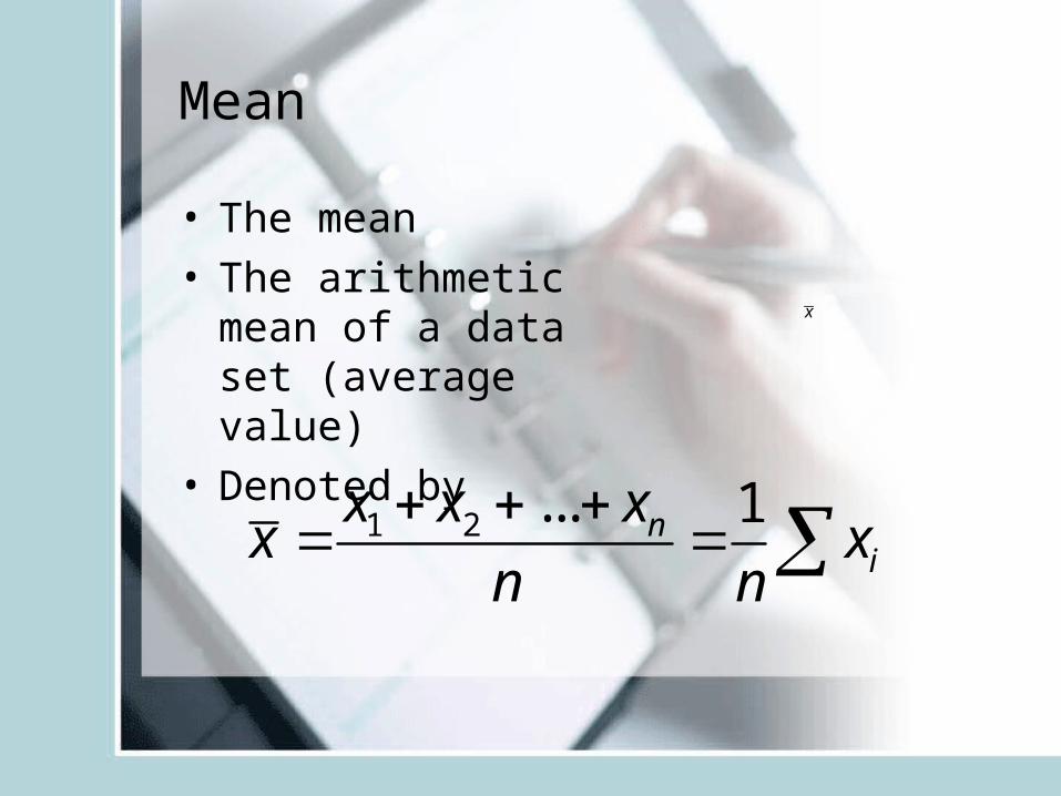
Mean
• The mean• The arithmetic
mean of a data set (average value)
• Denoted by
x
1 2 ... 1ni
x x xx x
n n
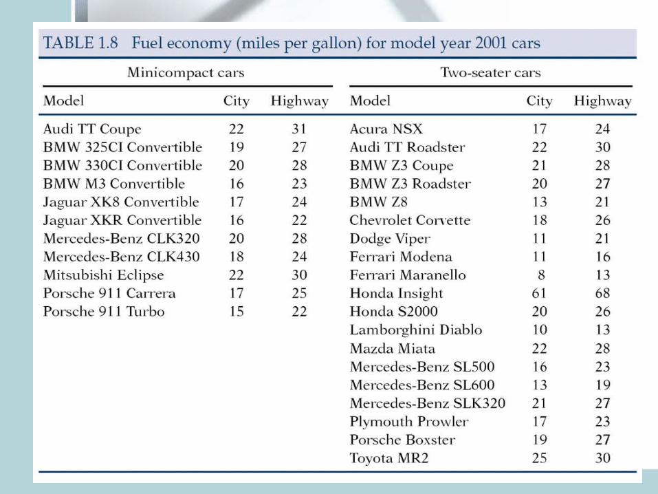
• Mean highway mileage for 19 2-seaters:Sum: 24+30+….+30=490Divide by n=19 Average: 25.8 miles/gallon
Problem: Honda Insight 68miles/gallon!If we exclude it, mean mileage: 23.4 miles/gallon
• Mean can be easily influenced by outliers. It is not a robust measure of center.
Median
• Median is the midpoint of a distribution.• Median is a resistant or robust measure of center.• Not sensitive to extreme observations• In a symmetric distribution mean=median• In a skewed distribution the mean is further out in
the long tail than is the median.
• Example: house prices: usually right skewed– The mean price of existing houses sold in 2000 in
Indiana was 176,200. (Mean chases the right tail)– The median price of these houses was 139,000.
Measures of spread: Quartiles
• Quartiles: Divides data into four parts• p-th percentile – p percent of the
observations fall at or below it.• Median – 50-th percentile• Q1-first quartile – 25-th percentile (median
of the lower half of data)• Q3-third quartile – 75-th percentile
(median of the upper half of data)
Using R:
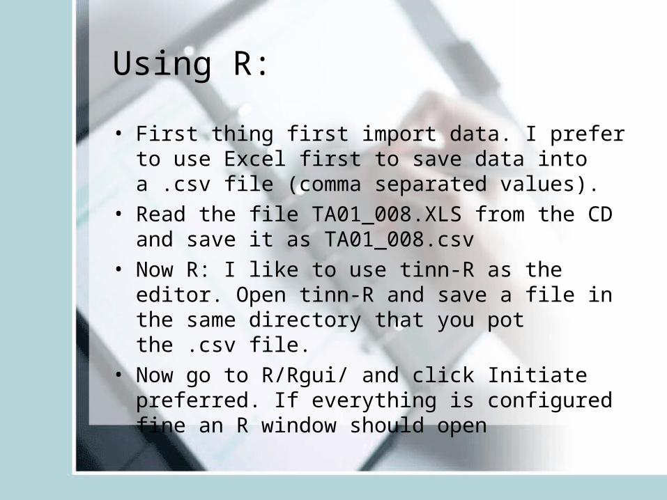
• First thing first import data. I prefer to use Excel first to save data into a .csv file (comma separated values).
• Read the file TA01_008.XLS from the CD and save it as TA01_008.csv
• Now R: I like to use tinn-R as the editor. Open tinn-R and save a file in the same directory that you pot the .csv file.
• Now go to R/Rgui/ and click Initiate preferred. If everything is configured fine an R window should open
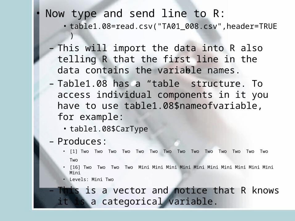
• Now type and send line to R:• table1.08=read.csv("TA01_008.csv",header=TRUE)
– This will import the data into R also telling R that the first line in the data contains the variable names.
– Table1.08 has a “table” structure. To access individual components in it you have to use table1.08$nameofvariable, for example:
• table1.08$CarType
– Produces:• [1] Two Two Two Two Two Two Two Two Two Two Two Two Two Two Two • [16] Two Two Two Two Mini Mini Mini Mini Mini Mini Mini Mini Mini Mini Mini• Levels: Mini Two
– This is a vector and notice that R knows it is a categorical variable.
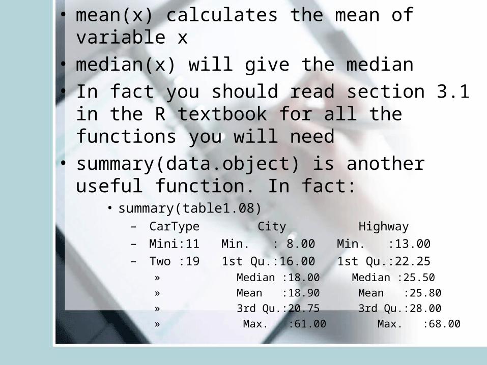
• mean(x) calculates the mean of variable x• median(x) will give the median• In fact you should read section 3.1 in the R
textbook for all the functions you will need• summary(data.object) is another useful function.
In fact:• summary(table1.08)
– CarType City Highway
– Mini:11 Min. : 8.00 Min. :13.00
– Two :19 1st Qu.:16.00 1st Qu.:22.25 » Median :18.00 Median :25.50 » Mean :18.90 Mean :25.80 » 3rd Qu.:20.75 3rd Qu.:28.00 » Max. :61.00 Max. :68.00
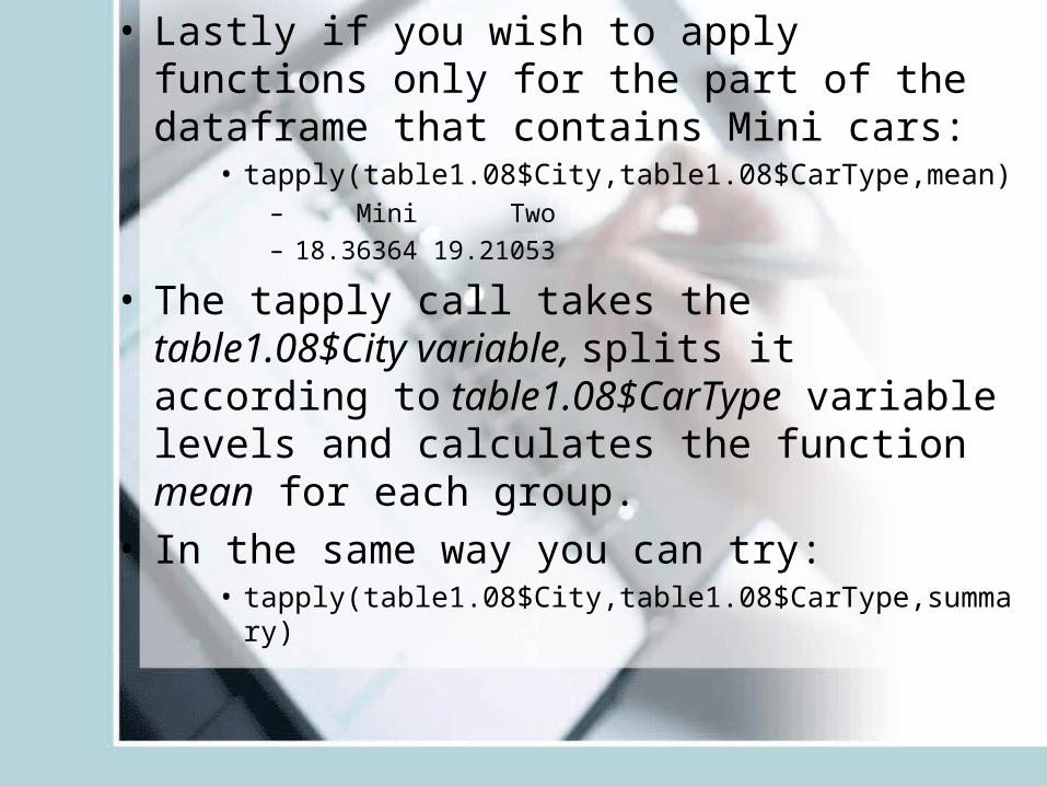
• Lastly if you wish to apply functions only for the part of the dataframe that contains Mini cars:
• tapply(table1.08$City,table1.08$CarType,mean)– Mini Two
– 18.36364 19.21053
• The tapply call takes the table1.08$City variable, splits it according to table1.08$CarType variable levels and calculates the function mean for each group.
• In the same way you can try:• tapply(table1.08$City,table1.08$CarType,summary)
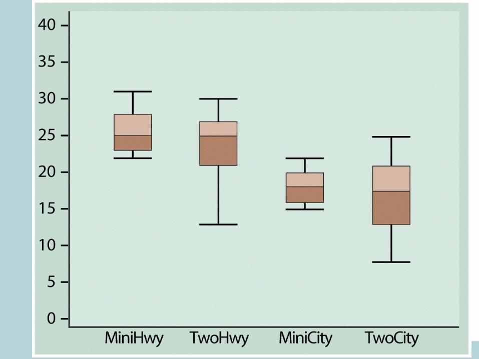
Five-Number Summary
• Minimum Q1 Median Q3 Maximum• Boxplot – visual representation of the five-
number summary.– Central box: Q1 to Q3.– Line inside box: Median– Extended straight lines: lowest to highest
observation, except outliers– Outliers marked as circles or stars.
• To make Boxplots in R use function• boxplot(x)
R code:
• boxplot(table1.08$City)• boxplot(table1.08$Highway)
• boxplot(table1.08$City~table1.08$CarType)• boxplot(table1.08$Highway~table1.08$CarType)• par(mfrow=c(1,2))• boxplot(table1.08$City~table1.08$CarType)• boxplot(table1.08$Highway~table1.08$CarType)• par(mfrow=c(1,1))
The criterion for suspected outliers
• The interquartile range – IQR=Q3-Q1• An observation is a suspected outlier if it
falls more then 1.5*IQR above the third quartile or below the first quartile.
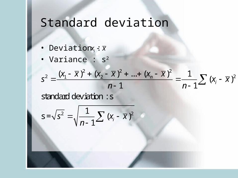
Standard deviation
• Deviation : • Variance : s2
2 2 22 21 2
2 2
( ) ( ) ... ( ) 1( )
1 1standard deviation : s
1s = ( )
1
ni
i
x x x x x xs x x
n n
s x xn
ix x
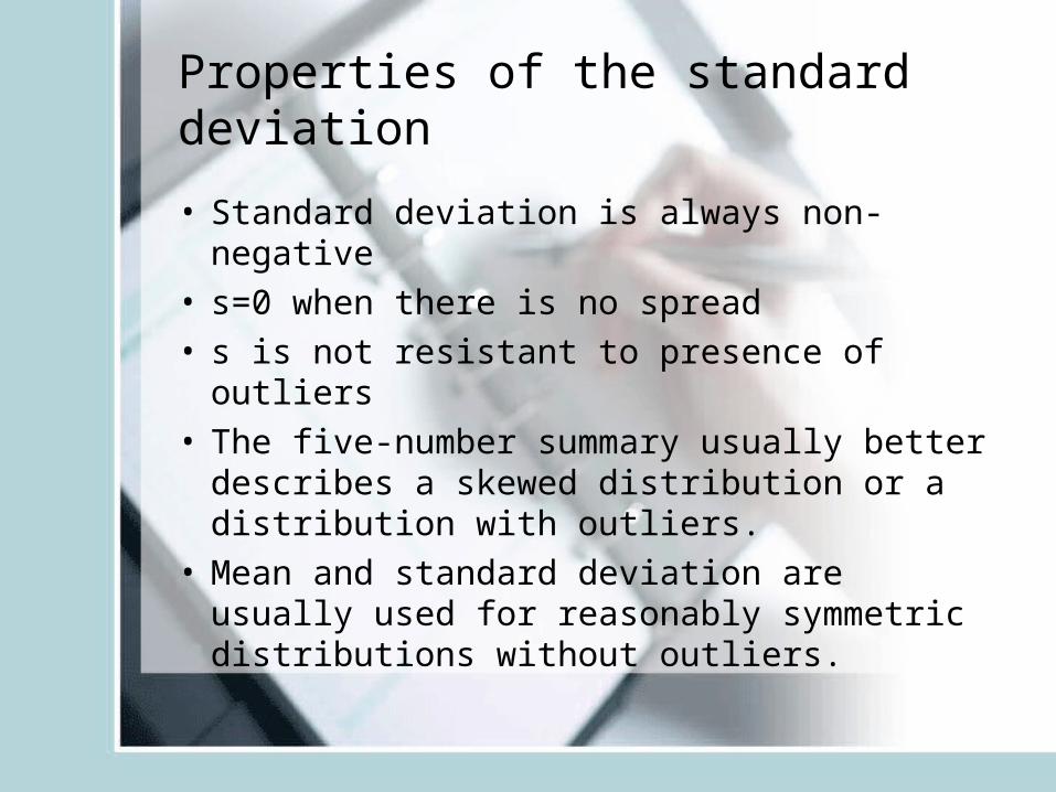
Properties of the standard deviation
• Standard deviation is always non-negative• s=0 when there is no spread• s is not resistant to presence of outliers• The five-number summary usually better
describes a skewed distribution or a distribution with outliers.
• Mean and standard deviation are usually used for reasonably symmetric distributions without outliers.
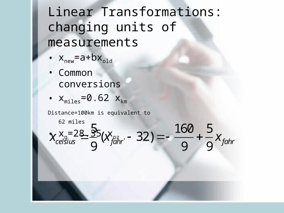
Linear Transformations: changing units of measurements
• xnew=a+bxold
• Common conversions
• xmiles=0.62 xkm
Distance=100km is equivalent to 62 miles
• xg=28.35 xoz ,
5 160 5( 32)
9 9 9celsius fahr fahrx x x
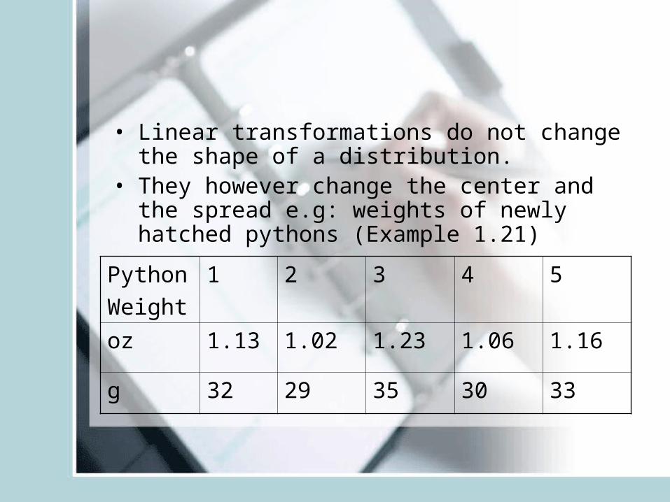
• Linear transformations do not change the shape of a distribution.
• They however change the center and the spread e.g: weights of newly hatched pythons (Example 1.21)
Python
Weight
1 2 3 4 5
oz 1.13 1.02 1.23 1.06 1.16
g 32 29 35 30 33
• python.oz=c(1.13, 1.02,1.23,1.06,1.16)
• python.g=28.35*python.oz
• mean(python.oz)
• mean(python.g)
• sd(python.oz)
• sd(python.g)
• You could of course calculate the mean in g by multipying the mean in oz with 28.35
Effect of a linear transformation
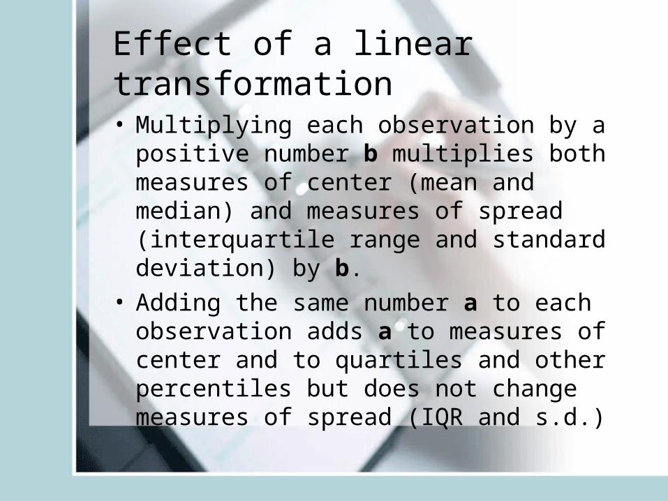
• Multiplying each observation by a positive number b multiplies both measures of center (mean and median) and measures of spread (interquartile range and standard deviation) by b.
• Adding the same number a to each observation adds a to measures of center and to quartiles and other percentiles but does not change measures of spread (IQR and s.d.)
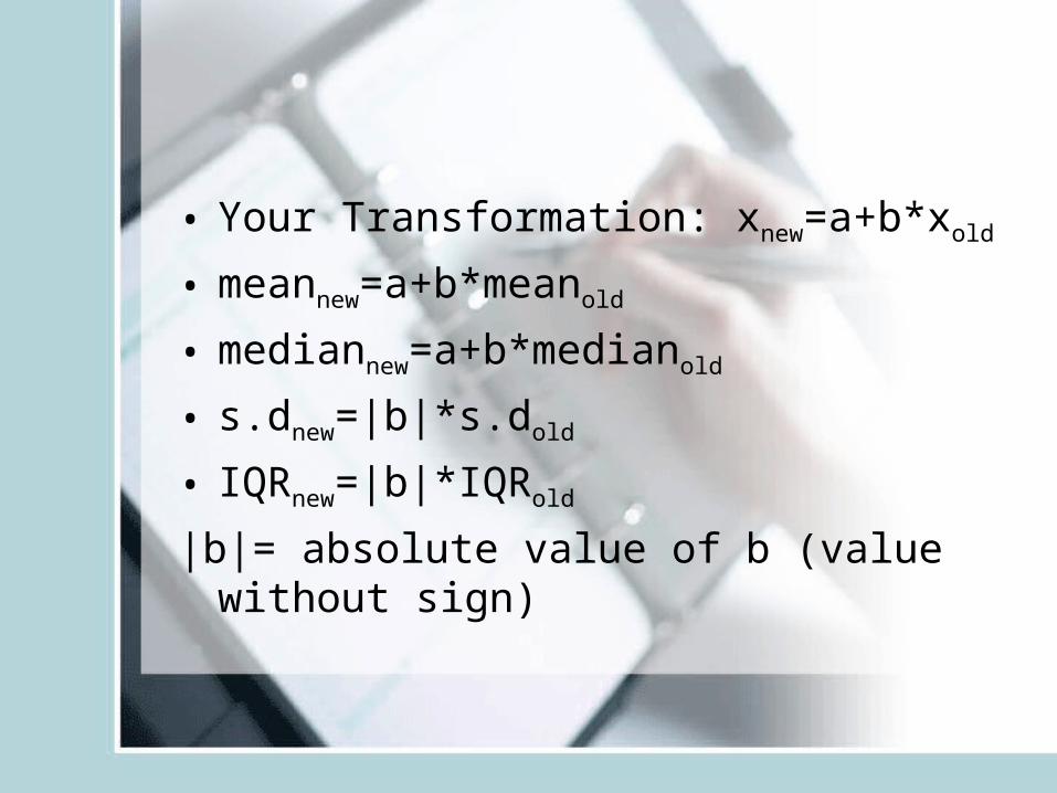
• Your Transformation: xnew=a+b*xold
• meannew=a+b*meanold
• mediannew=a+b*medianold
• s.dnew=|b|*s.dold
• IQRnew=|b|*IQRold
|b|= absolute value of b (value without sign)
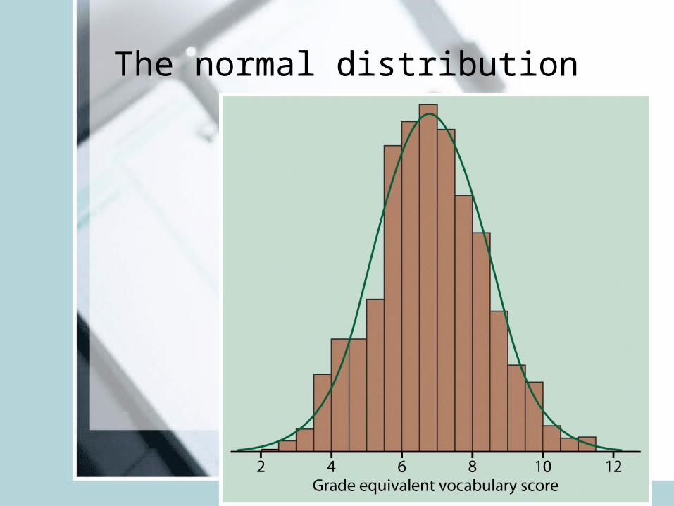
The normal distribution
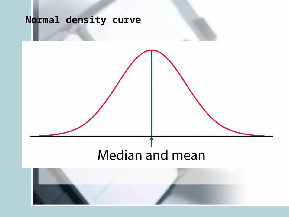
Normal density curve

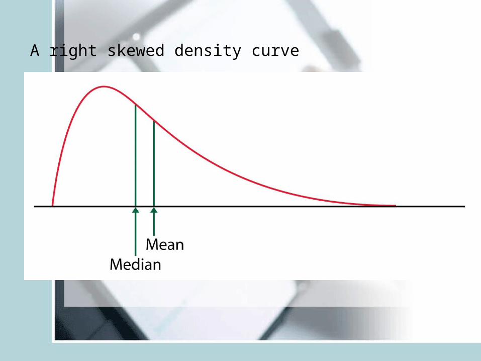
A right skewed density curve
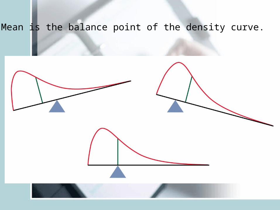
Mean is the balance point of the density curve.
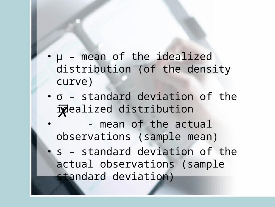
• μ – mean of the idealized distribution (of the density curve)
• σ – standard deviation of the idealized distribution
• - mean of the actual observations (sample mean)
• s – standard deviation of the actual observations (sample standard deviation)
x
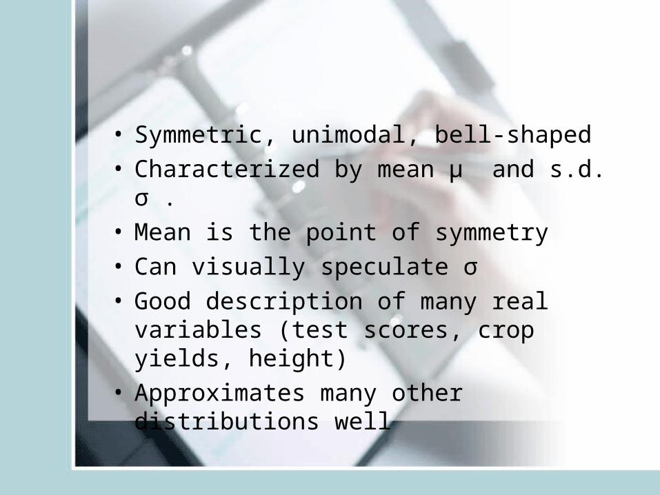
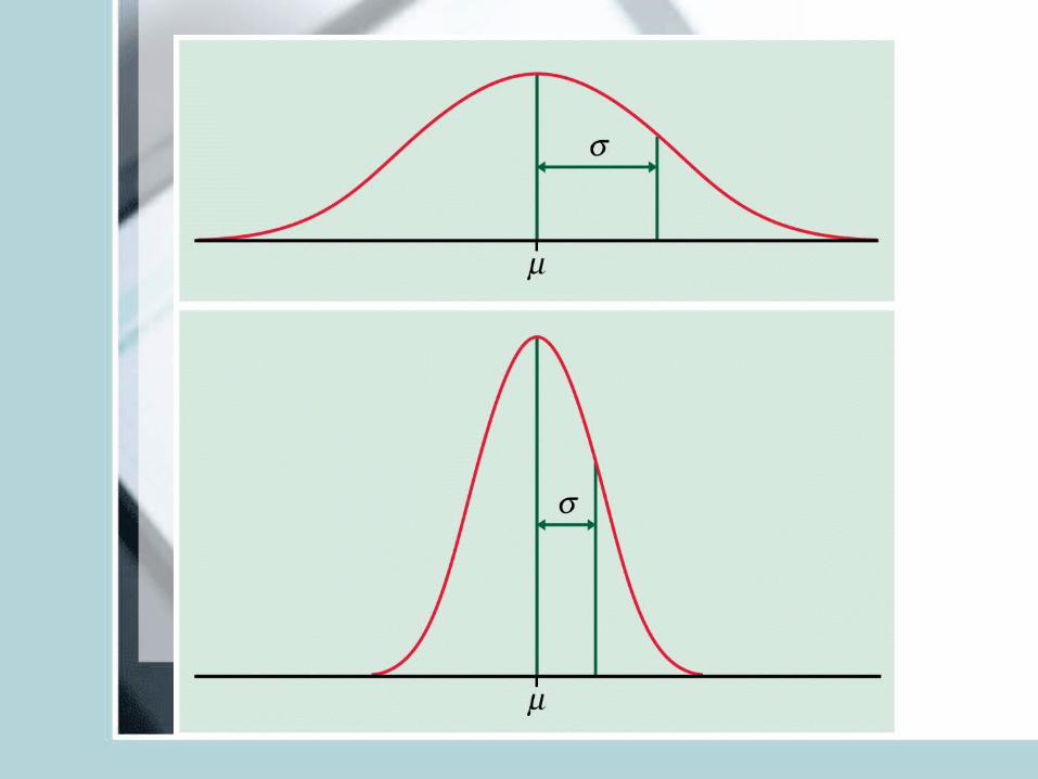
• Symmetric, unimodal, bell-shaped• Characterized by mean μ and s.d. σ .• Mean is the point of symmetry• Can visually speculate σ • Good description of many real variables
(test scores, crop yields, height)• Approximates many other distributions well
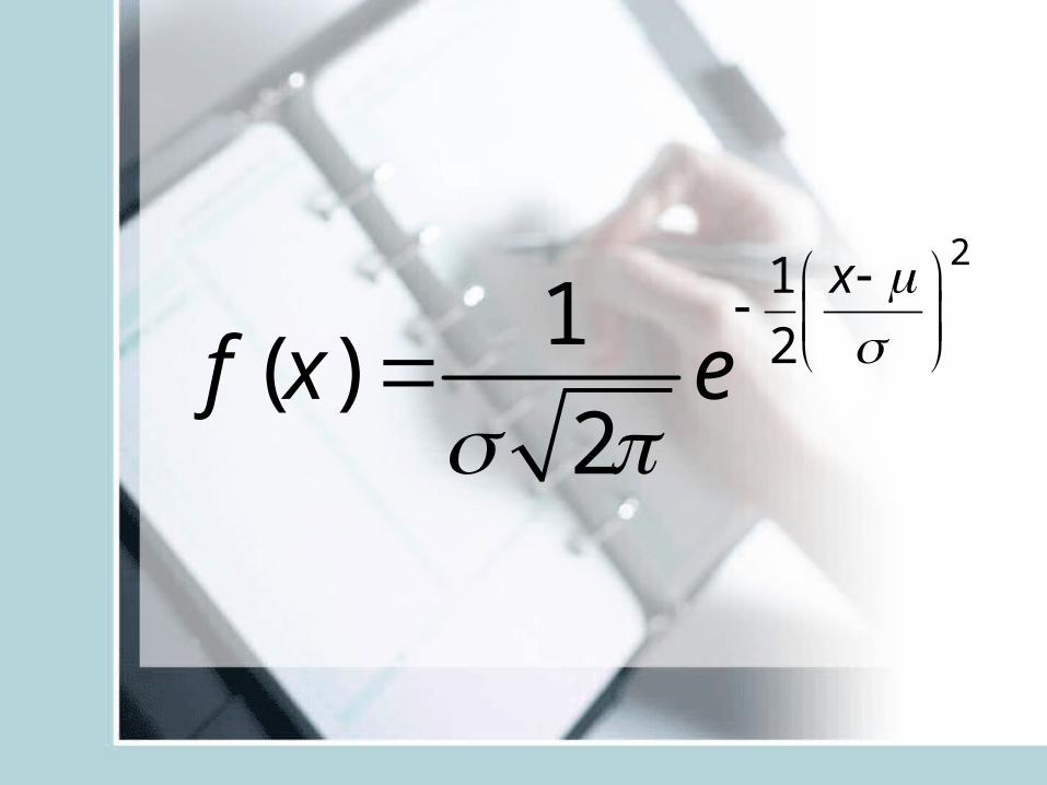
21
21( )
2
x
f x e
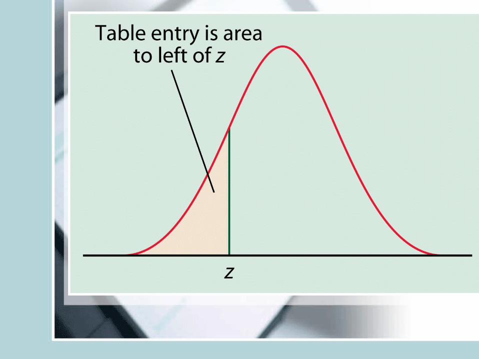
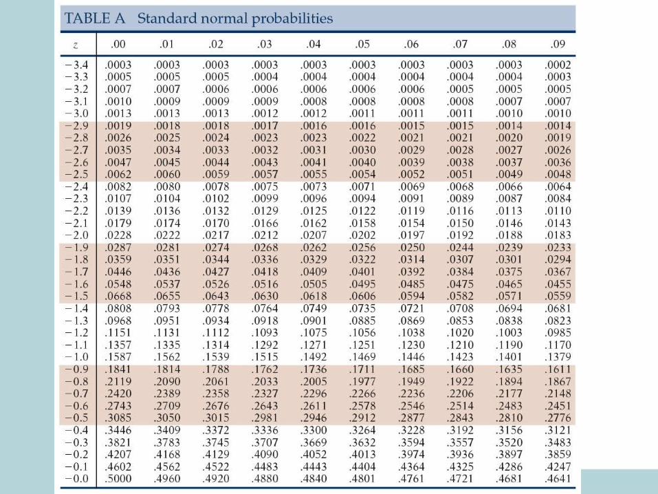
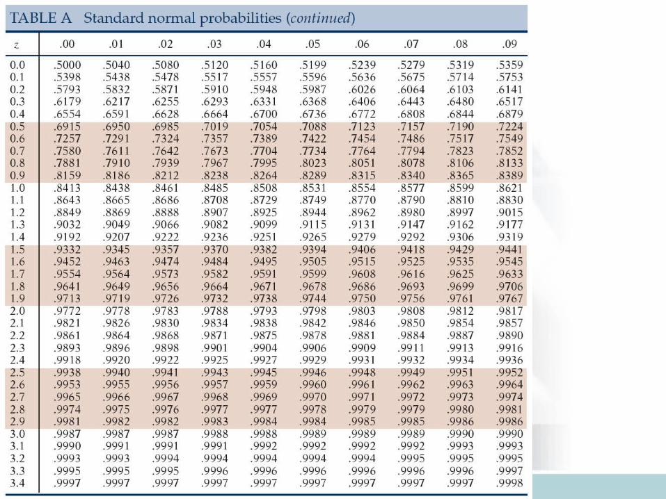
Finding probabilities for normal data
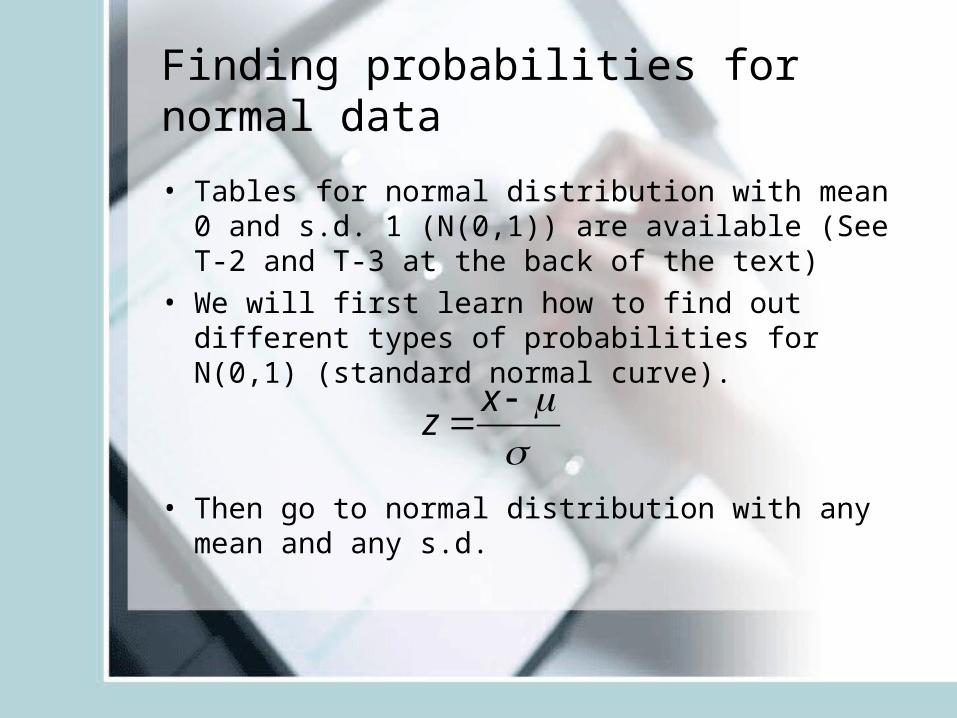
• Tables for normal distribution with mean 0 and s.d. 1 (N(0,1)) are available (See T-2 and T-3 at the back of the text)
• We will first learn how to find out different types of probabilities for N(0,1) (standard normal curve).
• Then go to normal distribution with any mean and any s.d.
xz
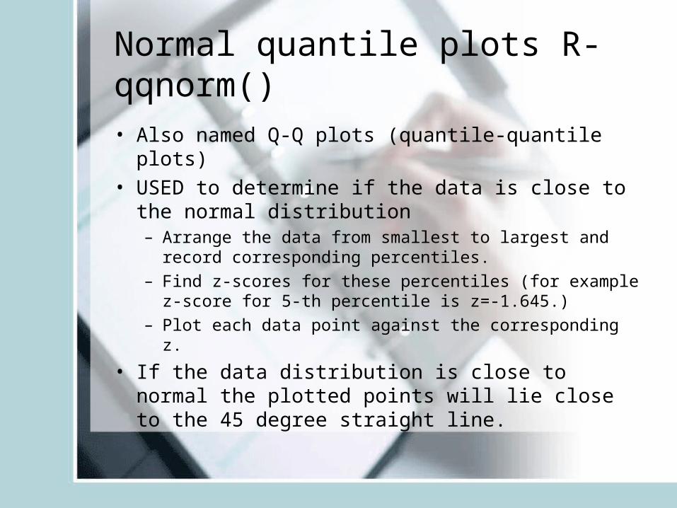
Normal quantile plots R- qqnorm()
• Also named Q-Q plots (quantile-quantile plots)• USED to determine if the data is close to the
normal distribution– Arrange the data from smallest to largest and record
corresponding percentiles.– Find z-scores for these percentiles (for example z-score
for 5-th percentile is z=-1.645.)– Plot each data point against the corresponding z.
• If the data distribution is close to normal the plotted points will lie close to the 45 degree straight line.
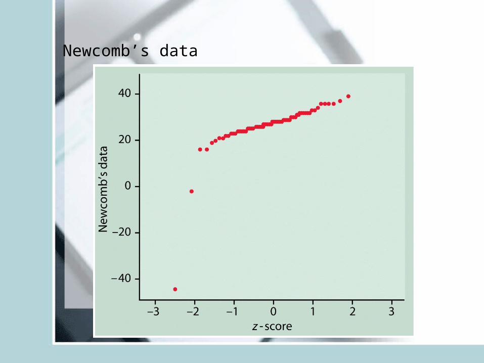
Newcomb’s data
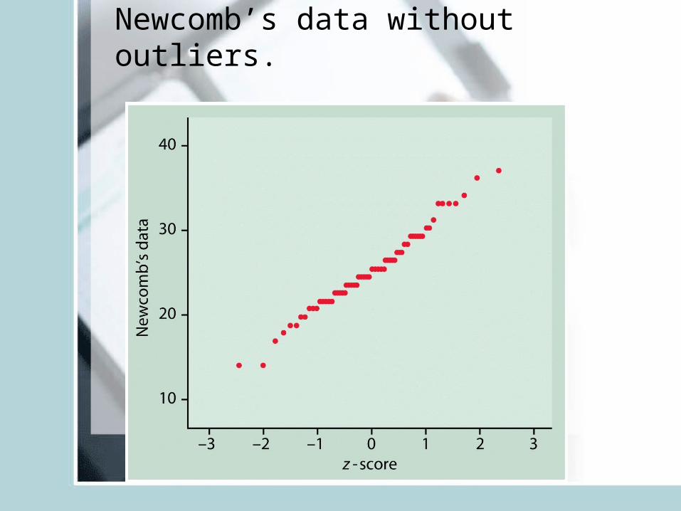
Newcomb’s data without outliers.
Looking at Data-Relationships
This is on data with two or more variables:
• Response vs Explanatory variables• Scatterplots• Correlation
– Height and weight of same individual– Smoking habits and life expectancy– Age and bone-density of individuals– Gender and political affiliation– Gender and Smoking
• Association: Some values of one variable tend to occur more often with certain values of the other variable– Both the variables measured on same set of individuals
• Caution: Often spurious, other variables lurking in the background – Shorter women have lower risk of heart attack– Countries with more TV sets have better life expectancy
rates– Just explore association or investigate a causal
relationship?
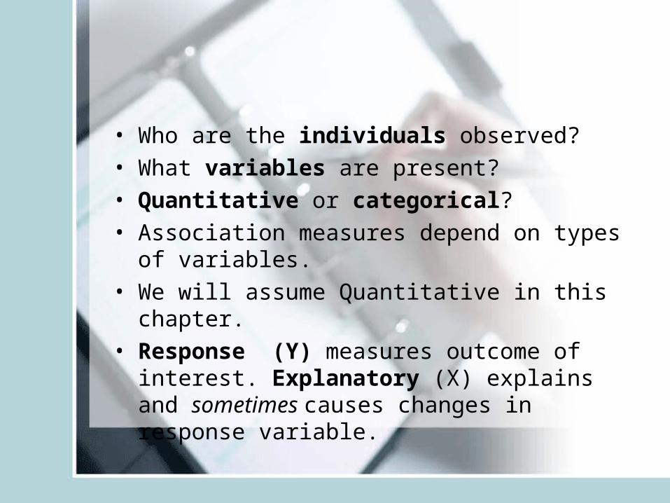
• Who are the individuals observed?• What variables are present?• Quantitative or categorical?• Association measures depend on types of
variables.• We will assume Quantitative in this chapter.• Response (Y) measures outcome of interest.
Explanatory (X) explains and sometimes causes changes in response variable.
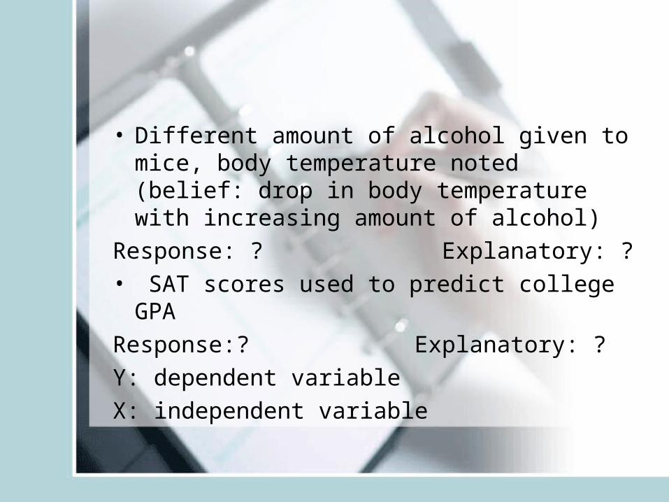
• Different amount of alcohol given to mice, body temperature noted (belief: drop in body temperature with increasing amount of alcohol)
Response: ? Explanatory: ?• SAT scores used to predict college GPA
Response:? Explanatory: ?
Y: dependent variable
X: independent variable
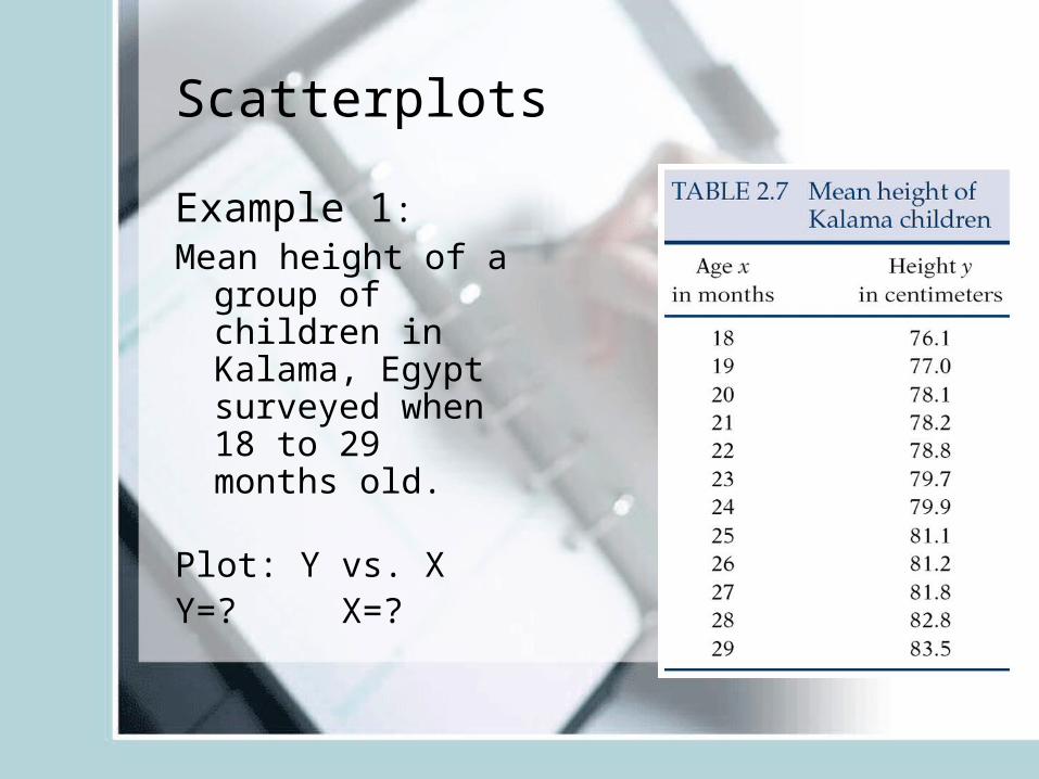
Scatterplots
Example 1: Mean height of a
group of children in Kalama, Egypt surveyed when 18 to 29 months old.
Plot: Y vs. XY=? X=?
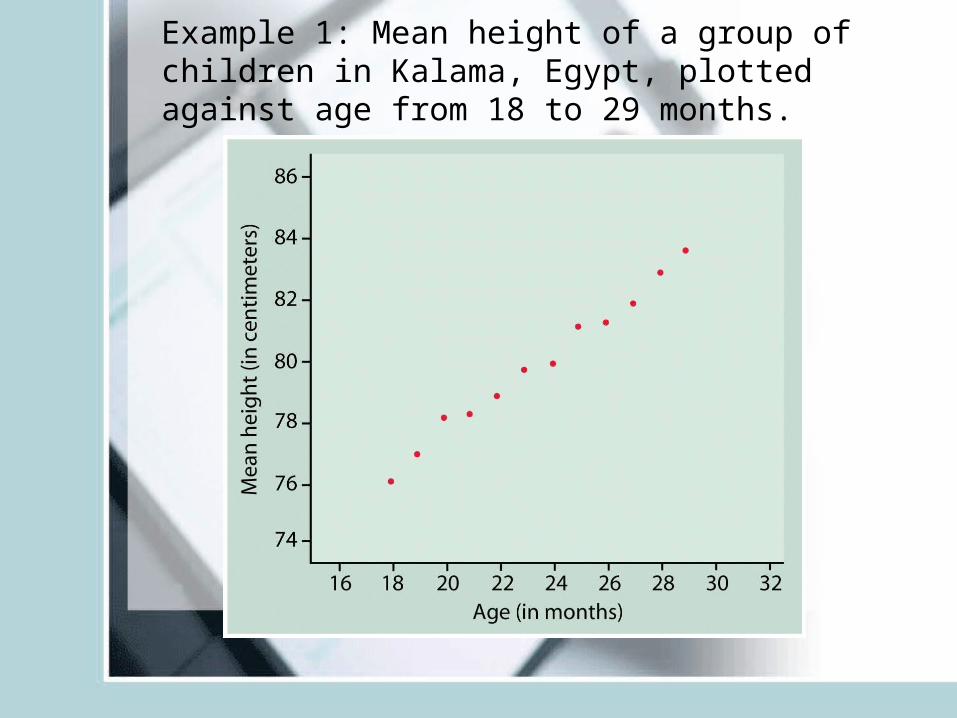
Example 1: Mean height of a group of children in Kalama, Egypt, plotted against age from 18 to 29 months.
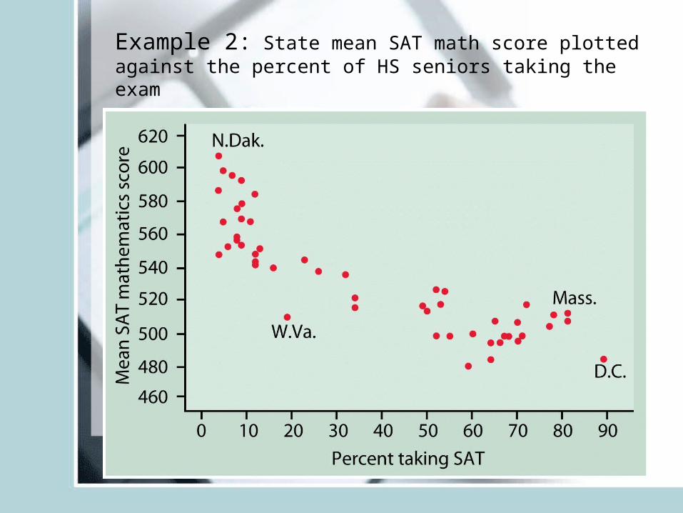
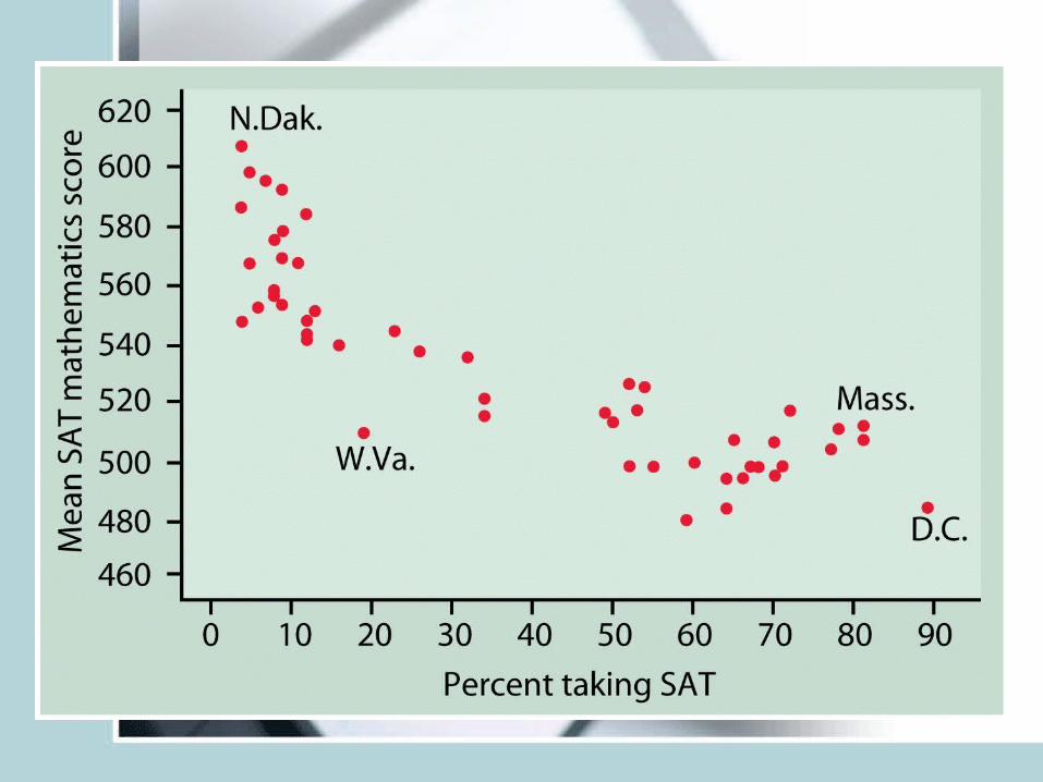
Example 2: State mean SAT math score plotted against the percent of HS seniors taking the exam
• Look for: Form (linear, curve, exponential, parabola)
• Direction: does Y increase with increase in X (positive association), Y decrease with increase in Age (negative association)
• Strength: Do the points follow the form quite closely or scattered?
• Outliers: deviations from overall relationship

R Graphical system• R is one of the most powerful programs when it
comes to drawing and customizing plots. Learning the tricks is not immediate like it is the case with some MS programs, but the rewards are much more significant.
• To make (scatter)plots in R use the function plot(x,y) where x is the vector of explanatory values and y is the vector of responses
• Section 1.3 in the R manual details the basics of making plots
• In addition read about the lines() command that adds lines to an existing plot
• One can also make 3D plots using commands:• persp, scatterplot3d, and wireframe
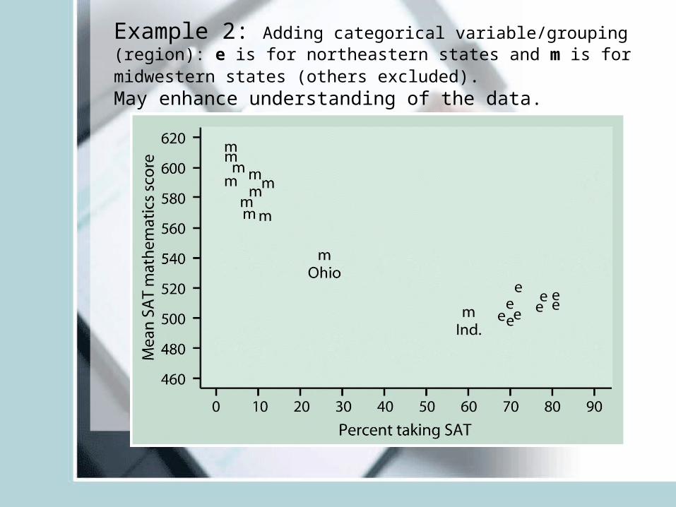
Example 2: Adding categorical variable/grouping (region): e is for northeastern states and m is for midwestern states (others excluded).May enhance understanding of the data.
• Plotting different categories via different symbols may throw light on data
• Read example 2.4, 2.5 for more examples of scatter plots.
• Existence of a relationship does not imply causation. (SAT math and SAT verbal scores)
• The relationship does not have to hold true for every subject, it is random.
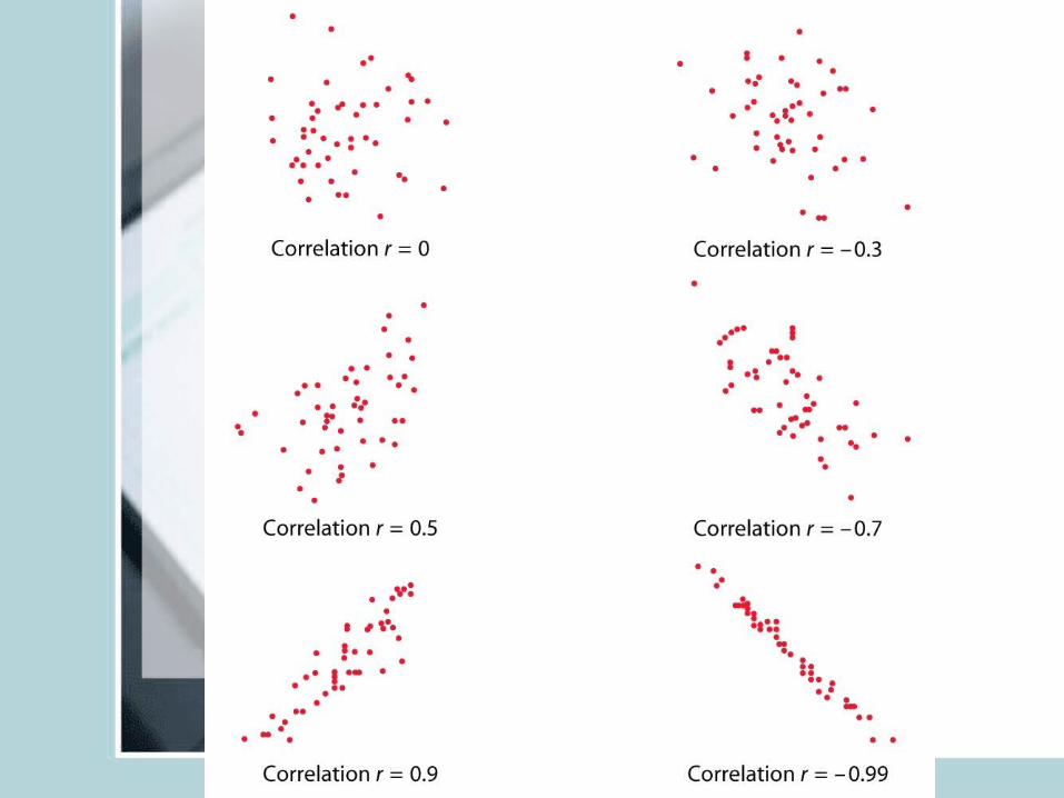
Correlation Coefficient
• Linear relationships are quite common.• Correlation coefficient r measures strength
and direction of a linear relationship between two quantitative variables X and Y.
• Data structure: (X,Y) pairs measured on n individuals
• (weight, blood pressure) or (age, bone-density) measured on a set of subjects
Correlation
• Lies between -1 and 1.• You can switch roles of X and Y, r will remain the
same.• Unit free, unaffected by linear transformation.• r positive means positive association, negative
means negative association.• X and Y should both be quantitative• r near 0 implies weak linear relationship, closer to
+1 or -1 suggests very strong linear pattern
• r is affected by outliers• Captures only the strength of “linear”
relationship, it could be true that Y and X have a very strong quadratic relationship but r is close to zero.
• r=+1 or -1 only when points lie perfectly on a straight line. (Y=2X+3)
• In R use cor()• Read Section 5.4 in your R manual (called
there Pearson Correlation).
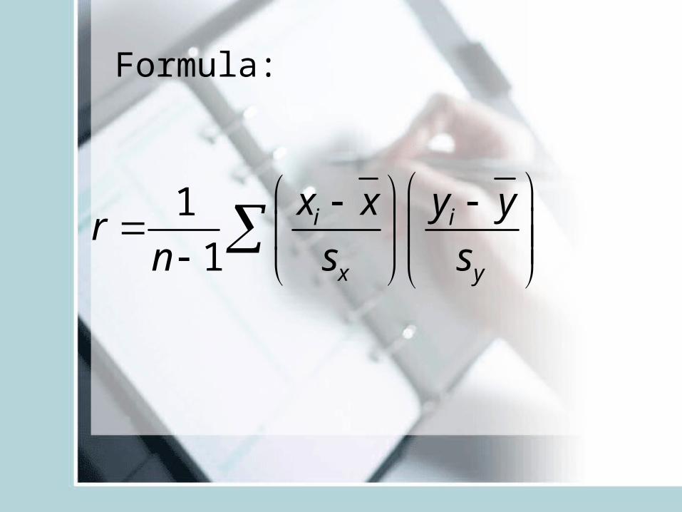
Formula:
1
1i i
x y
x x y yrn s s