24
LESSONS FROM REDESIGNING THE LINKEDIN PUBLIC PROFILE Or how to collaborate among PMs, engineers, and designers Wesley Leung Product Manager
| Date post: | 13-Feb-2017 |
| Category: |
Technology |
| Upload: | wesley-leung |
| View: | 201 times |
| Download: | 3 times |
LESSONS FROM REDESIGNING THE LINKEDIN PUBLIC PROFILEOr how to collaborate among PMs, engineers, and designers
Wesley Leung Product Manager

REALIZE All THREE PARTIES FORM A PARTNERSHIP Everyone owns the product.
1.
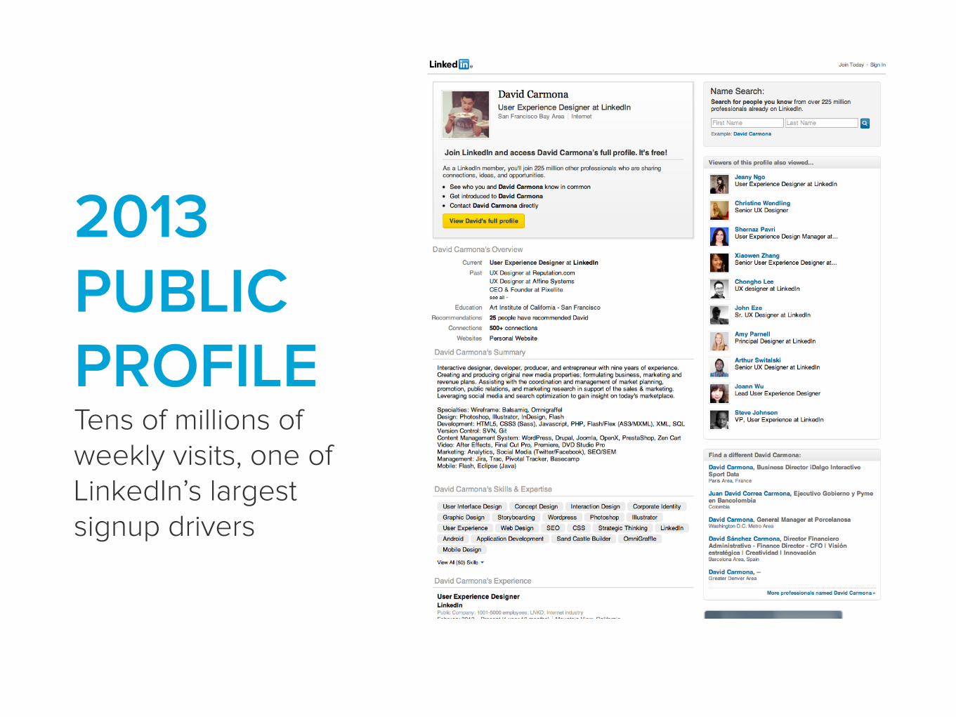
2013 PUBLIC PROFILE Tens of millions of weekly visits, one of LinkedIn’s largest signup drivers

…like an online resume
…very plain and not for me
…spammy
“”
Redesign for what?People said it looked


Product and engineering naturally brought their questions (and a dose of skepticism) to design
PM Speak: Can we boost signup conversion rates? 😏

PM Speak: We can’t tank SEO with this update! 😱
Product and engineering naturally brought their questions (and a dose of skepticism) to design

PM Speak: How can we increase the button’s CTR? 😏
Product and engineering naturally brought their questions (and a dose of skepticism) to design

Dev speak: Rendering those extra images may slow sitespeed 😑
Product and engineering naturally brought their questions (and a dose of skepticism) to design

Dev speak: That’s on a legacy stack. We’ll need to migrate 😩
Product and engineering naturally brought their questions (and a dose of skepticism) to design
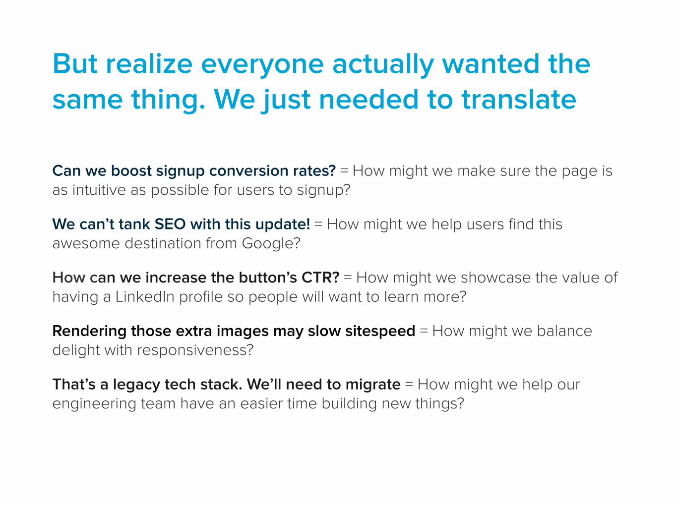
Can we boost signup conversion rates? = How might we make sure the page is as intuitive as possible for users to signup?
We can’t tank SEO with this update! = How might we help users find this awesome destination from Google?
How can we increase the button’s CTR? = How might we showcase the value of having a LinkedIn profile so people will want to learn more?
Rendering those extra images may slow sitespeed = How might we balance delight with responsiveness?
That’s a legacy tech stack. We’ll need to migrate = How might we help our engineering team have an easier time building new things?
But realize everyone actually wanted the same thing. We just needed to translate
WATCH ENGINEERS CODE Actually, everyone should observe how others do their craft
2.
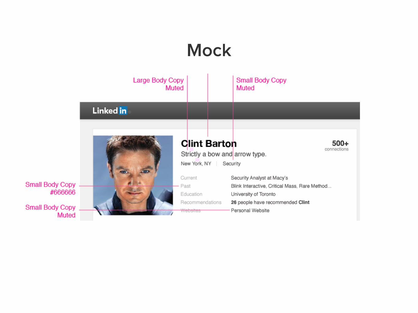
Mock

Actual
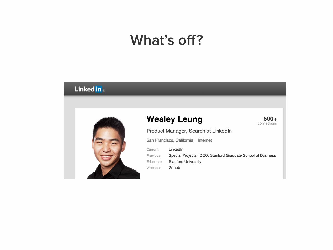
What’s off?

Those margins
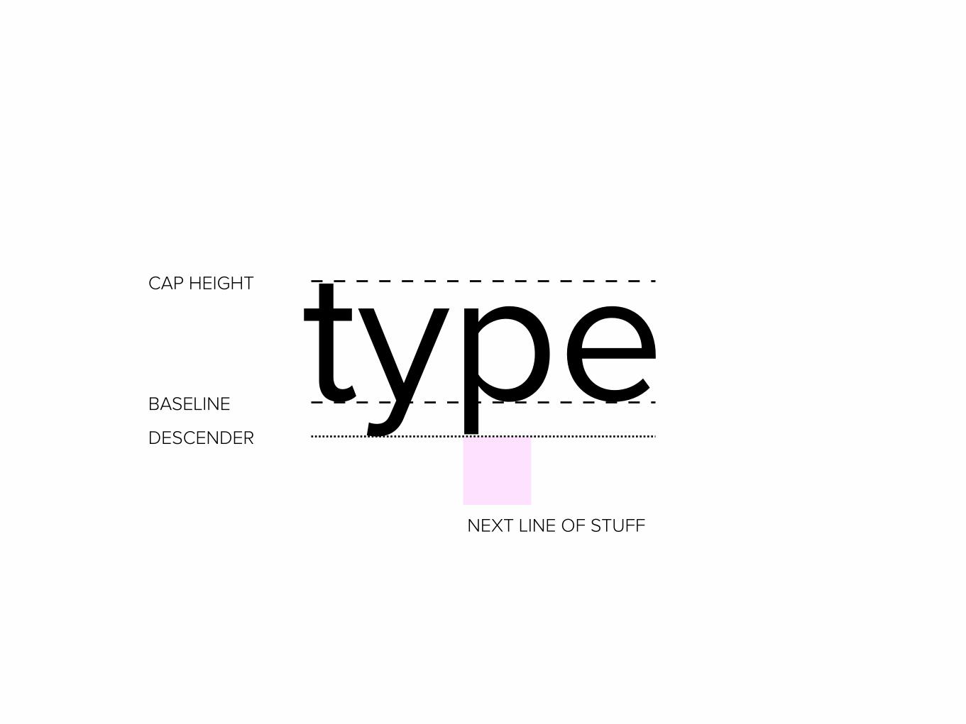
typeCAP HEIGHT
BASELINE
DESCENDER
NEXT LINE OF STUFF
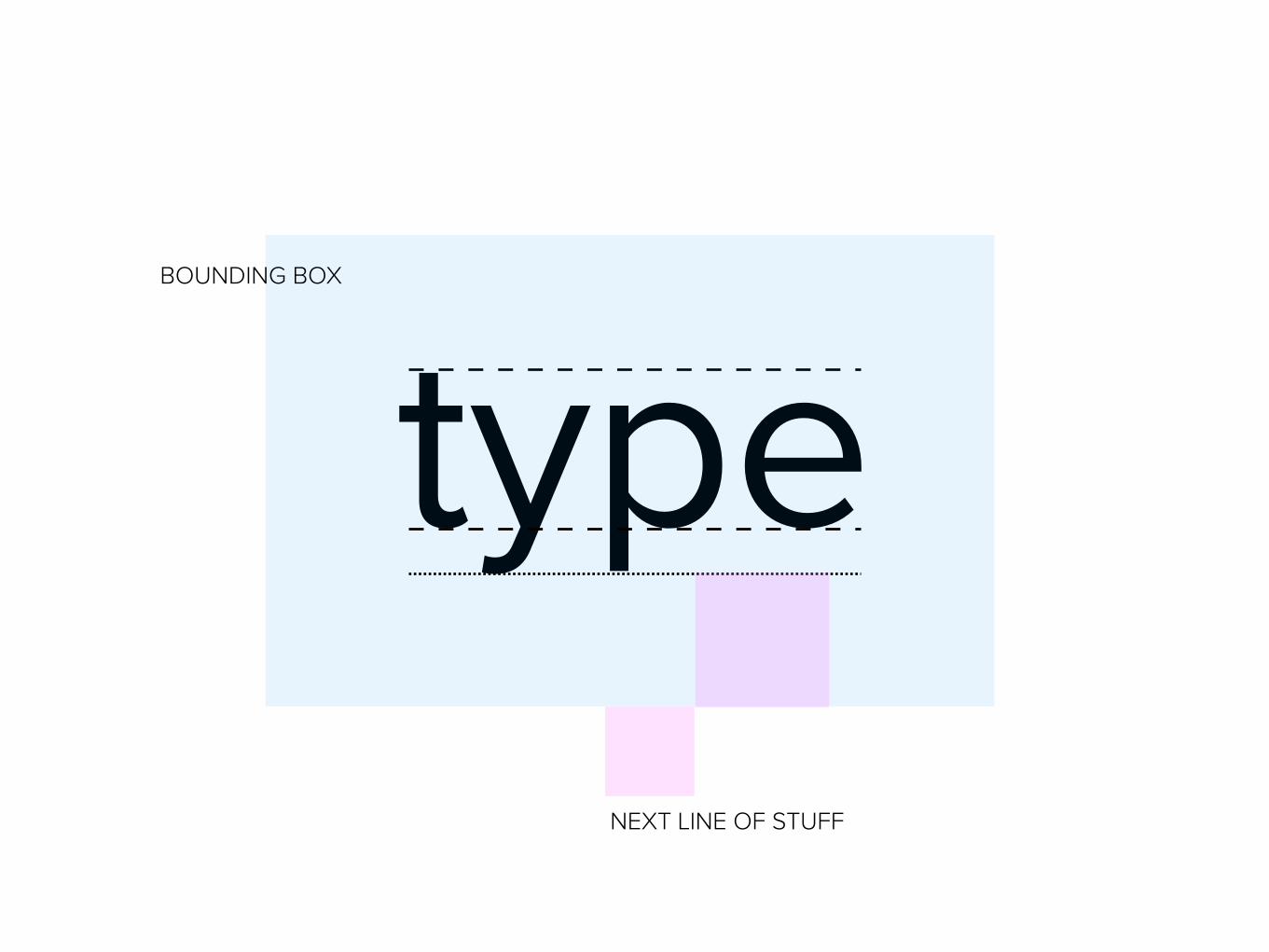
typeBOUNDING BOX
NEXT LINE OF STUFF

Nuances with how a web developer or iOS engineer may define margins can be different than a designer’s definition.
Observe each other work to catch the small details.
DESIGN FOR COMPLETENESS Yes, ads too
3.
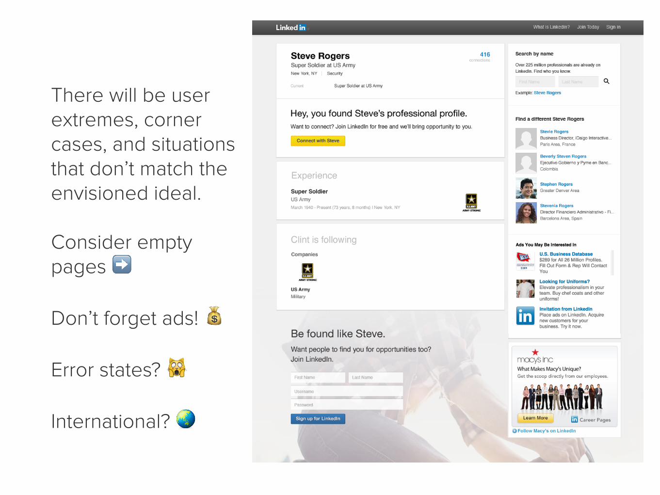
There will be user extremes, corner cases, and situations that don’t match the envisioned ideal.
Consider empty pages ➡
Don’t forget ads! 💰
Error states? 🙀
International? 🌏

Another example: Check out this neat LinkedIn concept.
Image courtesy of zeroagency: http://zeroagency.com/linkedinredesign/index.html

It looks pretty different without stock images, though. Set the right expectations with real photos and scenarios.
THANKS! Questions/comments? @wesleyleung


