Let It Flow: a Static Method for Exploring Dynamic Graphs Weiwei Cui, Xiting Wang, Shixia Liu, Nathalie H. Riche, Tara M. Madhyastha, Kwan-Liu Ma, Baining Guo Dorsal attentional network Fronto-parietal task control network Salience network Default mode network Fig. 1. Functional brain connectivity summaries of three different subjects from younger to older (from top to bottom). The x-axis represents time; the y-axis represents the connectedness of four different functional regions, which are encoded by different colors. The patterns show that the blue and yellow regions become less connected than the purple region with the increase of age. That is, as aging occurs, these two regions become less connected, indicating the deterioration of functional activity due to brain aging. Abstract— Research into social network analysis has shown that graph metrics, such as degree and closeness, are often used to summarize structural changes in a dynamic graph. However there have been few visual analytics approaches that have been proposed to help analysts study graph evolutions in the context of graph metrics. In this paper, we present a novel approach, called GraphFlow, to visualize dynamic graphs. In contrast to previous approaches that provide users with an animated visualization, GraphFlow offers a static flow visualization that summarizes the graph metrics of the entire graph and its evolution over time. Our solution supports the discovery of high-level patterns that are difficult to identify in an animation or in individual static representations. In addition, GraphFlow provides users with a set of interactions to create filtered views. These views allow users to investigate why a particular pattern has occurred. We showcase the versatility of GraphFlow using two different datasets and describe how it can help users gain insights into complex dynamic graphs. Index Terms—Dynamic Graphs, Flow Visualization, Interaction Techniques. 1 I NTRODUCTION Many graphs, such as the online social network Twitter, are constantly evolving as nodes join, leave, connect to other nodes, and/or disconnect from some of their adjacent nodes. We refer to such graphs as dynamic graphs. They are featured in a wide range of applications from examin- ing how proteins interact to understanding how information flows in large social networks over time. For this reason, there is a great need to analyze an evolving graph. One major challenge for analyzing dynamic graphs is capturing all the structural changes for a group of nodes while maintaining an overview of the entire evolving graph so that users can easily extract and integrate information across the changing states of the graph [11, 25]. • W. Cui, S. Liu, N. H. Riche, and B. Guo are with Microsoft Research, E-mail: {weiwei.cui|shixia.liu|nathalie.henry|bainguo}@microsoft.com. • X. Wang is with Tsinghua University. E-mail: [email protected]. • K.-L. Ma is with the Department of Computer Science, University of California, Davis. E-mail: [email protected]. • T. M. Madhyastha is with the Department of Psychiatry & Behavioral Sciences, University of Washington. E-mail: [email protected]. Manuscript received 31 March 2011; accepted 1 August 2011; posted online 23 October 2011; mailed on 14 October 2011. For information on obtaining reprints of this article, please send email to: [email protected]. However, existing popular approaches may be inadequate for this task. For example, it is difficult for users to perceive high-level patterns in an animated representation, since research has indicated that it is difficult for people to follow more than six or seven animated elements at the same time [8, 23]. However, stepping through each key frame in an animation makes it difficult to recall the previously visited state, which happens to be a key task in many analysis scenarios. Research into social network analysis has shown that graph met- rics are very useful for summarizing structural changes in a dynamic graph [34]. Different metrics emphasize different aspects of a social net- work. For example, the node degree is usually used to indicate people’s engagement with a social network. Illustrating the changes in node degree can reveal high-level patterns, such as the increased/decreased engagement of one community. Similarly, the clustering coefficient can provide an overall indication of the clustering in a network. Further- more, it is often desirable to understand the relative metric changes of a set of nodes/edges within the context of the whole graph. For exam- ple, analysts are concerned with the question of whether the decreased engagement of one community is caused by the overall engagement decline of the social network or by an increased engagement in another related community. Therefore, it is important to take rank factor into account when using graph metrics to summarize a dynamic graph. In this paper, we introduce GraphFlow, a new toolkit for examining and analyzing dynamic graphs from a summary of metric changes to detailed structural changes. We model the metric changes of the
Transcript
Let It Flow: a Static Method for Exploring Dynamic Graphs
Weiwei Cui, Xiting Wang, Shixia Liu, Nathalie H. Riche, Tara M. Madhyastha, Kwan-Liu Ma, Baining Guo
Dorsal attentionalnetwork
Fronto-parietal taskcontrol network
Salience network
Default modenetwork
Fig. 1. Functional brain connectivity summaries of three different subjects from younger to older (from top to bottom). The x-axisrepresents time; the y-axis represents the connectedness of four different functional regions, which are encoded by different colors.The patterns show that the blue and yellow regions become less connected than the purple region with the increase of age. That is, asaging occurs, these two regions become less connected, indicating the deterioration of functional activity due to brain aging.
Abstract— Research into social network analysis has shown that graph metrics, such as degree and closeness, are often used tosummarize structural changes in a dynamic graph. However there have been few visual analytics approaches that have been proposedto help analysts study graph evolutions in the context of graph metrics. In this paper, we present a novel approach, called GraphFlow,to visualize dynamic graphs. In contrast to previous approaches that provide users with an animated visualization, GraphFlow offers astatic flow visualization that summarizes the graph metrics of the entire graph and its evolution over time. Our solution supports thediscovery of high-level patterns that are difficult to identify in an animation or in individual static representations. In addition, GraphFlowprovides users with a set of interactions to create filtered views. These views allow users to investigate why a particular pattern hasoccurred. We showcase the versatility of GraphFlow using two different datasets and describe how it can help users gain insights intocomplex dynamic graphs.
Index Terms—Dynamic Graphs, Flow Visualization, Interaction Techniques.
1 INTRODUCTION
Many graphs, such as the online social network Twitter, are constantlyevolving as nodes join, leave, connect to other nodes, and/or disconnectfrom some of their adjacent nodes. We refer to such graphs as dynamicgraphs. They are featured in a wide range of applications from examin-ing how proteins interact to understanding how information flows inlarge social networks over time. For this reason, there is a great need toanalyze an evolving graph.
One major challenge for analyzing dynamic graphs is capturingall the structural changes for a group of nodes while maintaining anoverview of the entire evolving graph so that users can easily extract andintegrate information across the changing states of the graph [11, 25].
• W. Cui, S. Liu, N. H. Riche, and B. Guo are with Microsoft Research,E-mail: {weiwei.cui|shixia.liu|nathalie.henry|bainguo}@microsoft.com.
• X. Wang is with Tsinghua University. E-mail: [email protected].• K.-L. Ma is with the Department of Computer Science, University of
California, Davis. E-mail: [email protected].• T. M. Madhyastha is with the Department of Psychiatry & Behavioral
Manuscript received 31 March 2011; accepted 1 August 2011; posted online23 October 2011; mailed on 14 October 2011.For information on obtaining reprints of this article, please sendemail to: [email protected].
However, existing popular approaches may be inadequate for this task.For example, it is difficult for users to perceive high-level patterns in ananimated representation, since research has indicated that it is difficultfor people to follow more than six or seven animated elements at thesame time [8, 23]. However, stepping through each key frame in ananimation makes it difficult to recall the previously visited state, whichhappens to be a key task in many analysis scenarios.
Research into social network analysis has shown that graph met-rics are very useful for summarizing structural changes in a dynamicgraph [34]. Different metrics emphasize different aspects of a social net-work. For example, the node degree is usually used to indicate people’sengagement with a social network. Illustrating the changes in nodedegree can reveal high-level patterns, such as the increased/decreasedengagement of one community. Similarly, the clustering coefficient canprovide an overall indication of the clustering in a network. Further-more, it is often desirable to understand the relative metric changes ofa set of nodes/edges within the context of the whole graph. For exam-ple, analysts are concerned with the question of whether the decreasedengagement of one community is caused by the overall engagementdecline of the social network or by an increased engagement in anotherrelated community. Therefore, it is important to take rank factor intoaccount when using graph metrics to summarize a dynamic graph.
In this paper, we introduce GraphFlow, a new toolkit for examiningand analyzing dynamic graphs from a summary of metric changesto detailed structural changes. We model the metric changes of the
nodes/edges in a dynamic graph into a vector field.Visualizing this vector field provides an overview of the graph, with
which users can observe at a glance how a graph changes over time aswell as compare the relative metric changes of two or multiple nodes. Inaddition, we propose an energy-based method to quantitatively measurethe changes, so that users can easily identify critical sections of theevolving graph. Furthermore, using a set of well-aligned node-link dia-grams, GraphFlow enables users to compare detailed graph structuresat different time points.
To summarize, GraphFlow represents a dynamic graph in a staticmanner with both high-level insights into the structural changes acrossseveral time points and low-level details to investigate and understandthese changes. Specifically, it makes the following contributions:
• A flow-based visual metaphor that provides an overview ofproperty changes in a dynamic graph. This visualization supportsthe discovery of salient features of the dynamic graph, as well aspatterns of interest.
• An energy-based trend analysis that helps users identify criticaltime points in the flow visualization. Inspired by the seam carvingtechnique [2], GraphFlow uses an energy function to define theimportance of time points. In addition to finding critical timepoints, it can also be used to remove time points with smoothchanges. In this way, screen space can be better allocated to themore important information.
• An interactive, multiple coordinated view system that allowsusers to analyze a dynamic graph from the perective of globalevolving patterns to detailed structural changes over time.
2 RELATED WORK
Much research has explored static graphs [3, 17, 18, 32] over the pasttwo decades. However, the visualization of dynamic graphs is muchmore challenging and relatively few studies have been conducted in thisarea. The most well-known approach is the use of an animated node-link diagram to convey the evolution of the graph. Early work on thetopic labeled the technique as dynamic graph drawing [9, 16, 15, 21].The technique consists of generating a sequence of graphs for eachtime point and animating the layout from one step to the next to helpthe viewer easily follow changes such as fading in and out of nodes andedges as they appear in or disappear from the diagram.
Although these animation techniques are enjoyable and exciting [28],it is challenging to discover certain patterns due to the temporal natureof the animation. For example, it is difficult to remember previouslyvisited states of the graph or compare them if they do not appear consec-utively in the animation [6]. In addition, high-level patterns often occurover a longer period of time and the maintenance of a mental map mayprove cognitively demanding [1]. A solution to tackling this problemis to display all the static graphs per time point. Since this approachrequires a large amount of display space, it often uses a set of stackedlayers in 2.5D or 3D [6]. Unfortunately, stacking the static graphstogether often introduces additional visual clutter and does not scalewell for graphs with a large number of time points, nodes, and edges.
To address this problem, recent research has investigated alternativestatic representations. One technique is EdgeSplatting [11]. It hierar-chically organizes vertices of the graphs on vertical, parallel lines thatare placed perpendicular to the horizontal time line. Intuitively, thenode-link structures of individual graphs are encoded into the texturebetween neighboring vertex lines. Due to the extra space requiredto display the texture, EdgeSplattng does not scale well with a largenumber of time points. Thus, the authors subsequently proposed a“sliding window” approach to solve the scalability issue [4]. A similarpixel-based approach [10] removed the texture between vertex linesto support better scalability in terms of graph size and time. In bothapproaches, the order of vertices in the vertex lines does not changeover time, which helps users to easily track individual vertices. Morerecently, Sallaberry et al. [30] combined a new evolving clustering al-gorithm with two visualization techniques for exploring large dynamicgraphs. The first visualization is a line-chart-based overview to depictthe evolution of clusters, and the second is a node link diagram ofthe selected time step. Although these methods have achieved some
success in helping users understand the evolution patterns in dynamicgraphs, they may fail to discover some patterns related to the graphmetric, such as a slow increase in the degree of a subgraph over time.
A few researchers have also investigated the use of matrix represen-tations [7], placing a bar chart or glyph in the cells of the matrix toindicate the evolution of the relationships. These techniques appearvery promising as they do not require users to remember graph states atdifferent time points (i.e., all the information is available in the staticrepresentation) and can scale the amount of information representedin a single view. However, it remains difficult to extract high-levelpatterns, such as an overall evolution in the degree of a group of nodes,from the evolving graph.
More recently, a number of novel approaches have been introducedto extract high-level patterns from graphs. PivotGraph [38] and Honey-Comb [36] aggregate a graph based on its data attributes, supporting thediscovery of relationships between attributes carried by nodes. Graph-Prism [20] uses graph-theoretic properties such as the diameter tocharacterize the structure of large networks. However, none of theseapproaches has been applied to the analysis of dynamic graphs.
Unlike the above methods, GraphFlow aims to characterize theoverall structural changes of a dynamic graph by offering a staticrepresentation of a number of high-level graph properties. It provides aflow-based visualization for summarizing the overall evolution patterns,a trend analysis for identifying the critical time points in the flow vi-sualization, and a detailed view of the structural changes across severalcorrelated states for investigating the major causes of such patterns.
Another category of related research is ThemeRiver-based visualiza-tions [12, 29, 31], which use colored stripes to represent time-varyingthemes (e.g., topics in a document collection). In the representation,each colored stripe represents a theme, and the width at a time pointencodes the “strength” (e.g., number of documents) of the theme at thattime. Rosvall and Bergstrom [29] extended ThemeRiver to visualizecluster changes in networks. They split/merged color stripes to repre-sent the splitting/merging patterns between clusters in a network. Incontrast, GraphFlow does not require pre-computed cluster information.It focuses on the order of individual nodes and uses the order changesto represent the changes in activeness of graph nodes over time.
3 GRAPHFLOW
A dynamic graph can be represented by a sequence of timeslices: Γ ={G1,G2, . . . ,Gn}. Gi = (Vi,Ei) ( 1≤ i≤ n) is a timeslice that encodesthe structure of the graph at time i.
To visually convey the evolution patterns in Γ in a static way andwithin the context of the structure. A straightforward method is to showeach of the timeslices in the form of node-link diagrams, from G1 to Gn,side by side. However, this is not practical when n becomes very large.To solve this problem, we present a visualization framework, Graph-Flow that allows users to examine a dynamic graph at different levels ofdetail. In GraphFlow, various graph metrics can be used to summarizethe structural evolution of a dynamic graph. Once high-level insights arederived using the metrics, detailed graph structures can then be retrievedon demand to help users investigate and understand those insights.
Accordingly, GraphFlow consists of two views: 1) a flow view aimedat providing a visual summary of Γ to help users understand the overallevolution patterns and identify critical timeslices for further exploration;2) a graph view to reveal detailed content, such as the structure of Gi,to help users figure out why those particular patterns occur.
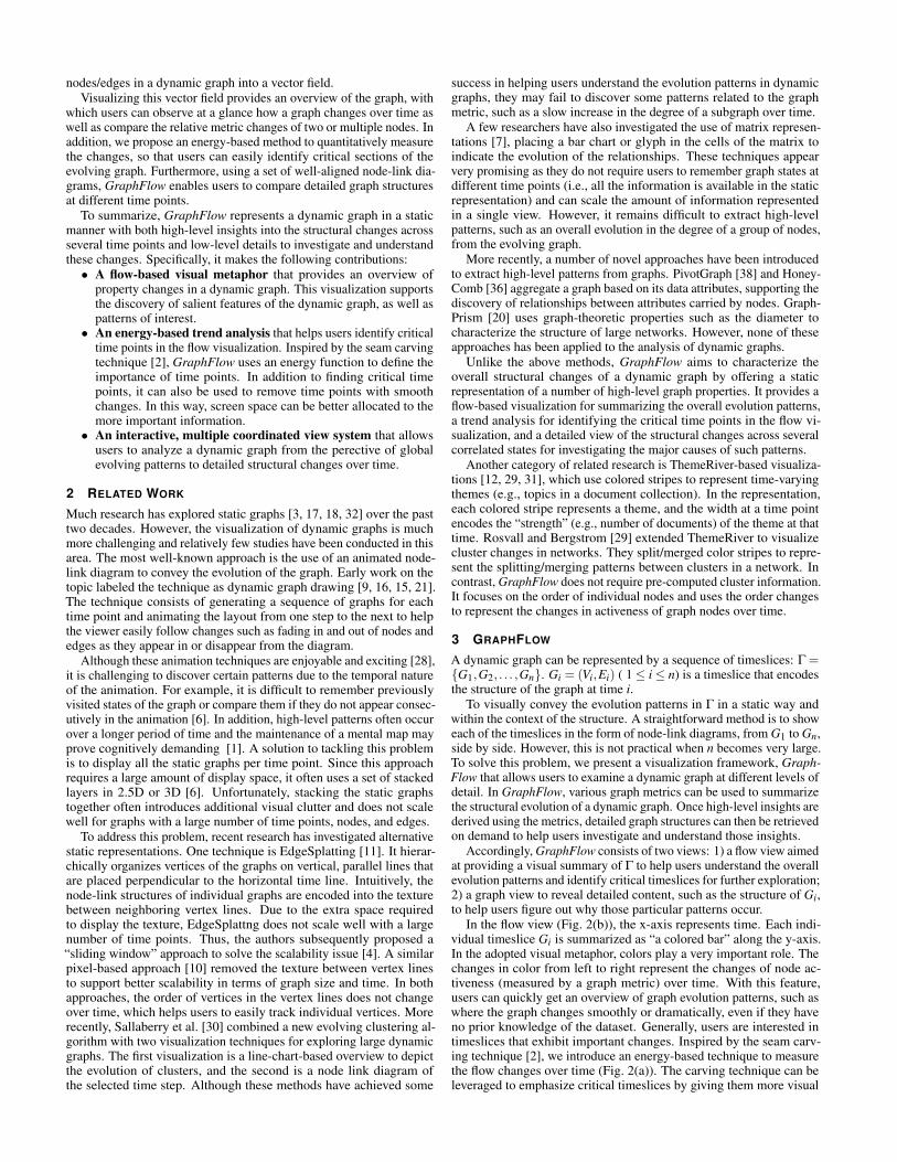
In the flow view (Fig. 2(b)), the x-axis represents time. Each indi-vidual timeslice Gi is summarized as “a colored bar” along the y-axis.In the adopted visual metaphor, colors play a very important role. Thechanges in color from left to right represent the changes of node ac-tiveness (measured by a graph metric) over time. With this feature,users can quickly get an overview of graph evolution patterns, such aswhere the graph changes smoothly or dramatically, even if they haveno prior knowledge of the dataset. Generally, users are interested intimeslices that exhibit important changes. Inspired by the seam carv-ing technique [2], we introduce an energy-based technique to measurethe flow changes over time (Fig. 2(a)). The carving technique can beleveraged to emphasize critical timeslices by giving them more visual
1
2
3
4
5
6
7
8
9
10
11
12
13
14
15
16
1718
19
20
21
2223
1
2
3
4
5
6
7
8
9
10
11
12
13
14
1516
17
18
19
20
21
2223
1
2
3
4
5
6
7
89
10 11
12
13
14
1516
17
18 19
20
21
2223
(b)
(a)
(c)
Fig. 2. Overview: (a) three curves measuring the energy at each timeslicein the flow: ev (red), ec (blue), and er (green) (Sec. 4.4.1); (b) the flowview of a dynamic graph with two enhanced paths (Sec. 4.4.2); (c) thegraph view showing three timeslices selected from the flow view with fournodes selected to show the splitting pattern (Sec. 5).
space. In addition, it can also be used to scale the flow visualizationwith a large number of time points by shrinking the flow in locationsthat exhibit fewer changes.
Once a user identifies several important time points, he can selectthem from the flow view, and the related node-link diagrams are thendisplayed side by side for comparison. In particular, we enhance themby visually linking the same nodes across different graphs (Fig. 2(c)).
4 FLOW VISUALIZATION
In this section, we first introduce our flow design and considerations.Then we present the technical details, including vector field generation,vector field rendering, and interactions.
4.1 Design ConsiderationsResearch on social network analysis has shown that graph metrics suchas degree, betweenness, closeness, and cluster coefficient, are oftenused to summarize the structural features in a dynamic graph [24, 34].For example, node degree is an important metric for measuring nodeactiveness. Showing the changes in node degree at different levels canhelp users analyze the temporal behaviors of a single node (e.g., witha dramatic increase of activeness during a time period) or a group ofnodes (e.g., becoming more inter-connected over time).
Furthermore, structural changes in a dynamic graph are measurednot only by the value changes of graph metrics, but also by their rankchanges over time. For example, in a social network, when a user’sdegree decreases, it may seem to indicate that s/he has become periph-eral and dispensable. However, the user may have actually becomemore central since other users have lost their degrees even more. Itis therefore important to involve the rank factor into the visualizationdesign to better illustrate the structural changes in an evolving graph.
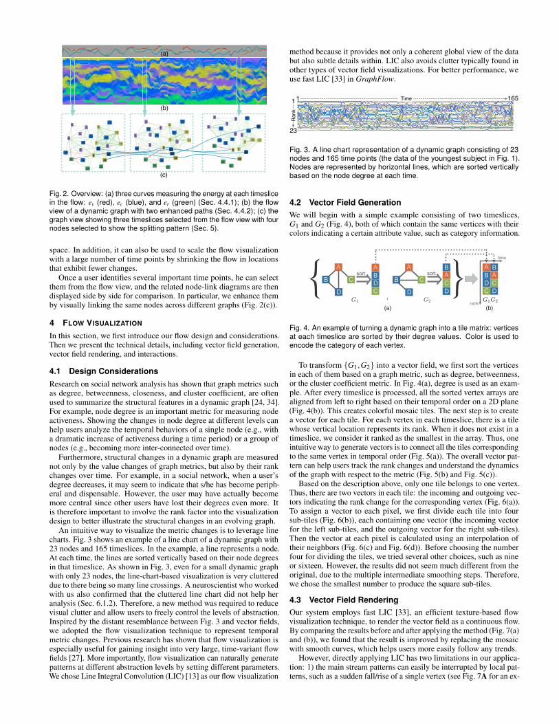
An intuitive way to visualize the metric changes is to leverage linecharts. Fig. 3 shows an example of a line chart of a dynamic graph with23 nodes and 165 timeslices. In the example, a line represents a node.At each time, the lines are sorted vertically based on their node degreesin that timeslice. As shown in Fig. 3, even for a small dynamic graphwith only 23 nodes, the line-chart-based visualization is very cluttereddue to there being so many line crossings. A neuroscientist who workedwith us also confirmed that the cluttered line chart did not help heranalysis (Sec. 6.1.2). Therefore, a new method was required to reducevisual clutter and allow users to freely control the levels of abstraction.Inspired by the distant resemblance between Fig. 3 and vector fields,we adopted the flow visualization technique to represent temporalmetric changes. Previous research has shown that flow visualization isespecially useful for gaining insight into very large, time-variant flowfields [27]. More importantly, flow visualization can naturally generatepatterns at different abstraction levels by setting different parameters.We chose Line Integral Convolution (LIC) [13] as our flow visualization
method because it provides not only a coherent global view of the databut also subtle details within. LIC also avoids clutter typically found inother types of vector field visualizations. For better performance, weuse fast LIC [33] in GraphFlow.
1 165 Time 1
23
Ran
k
Fig. 3. A line chart representation of a dynamic graph consisting of 23nodes and 165 time points (the data of the youngest subject in Fig. 1).Nodes are represented by horizontal lines, which are sorted verticallybased on the node degree at each time.
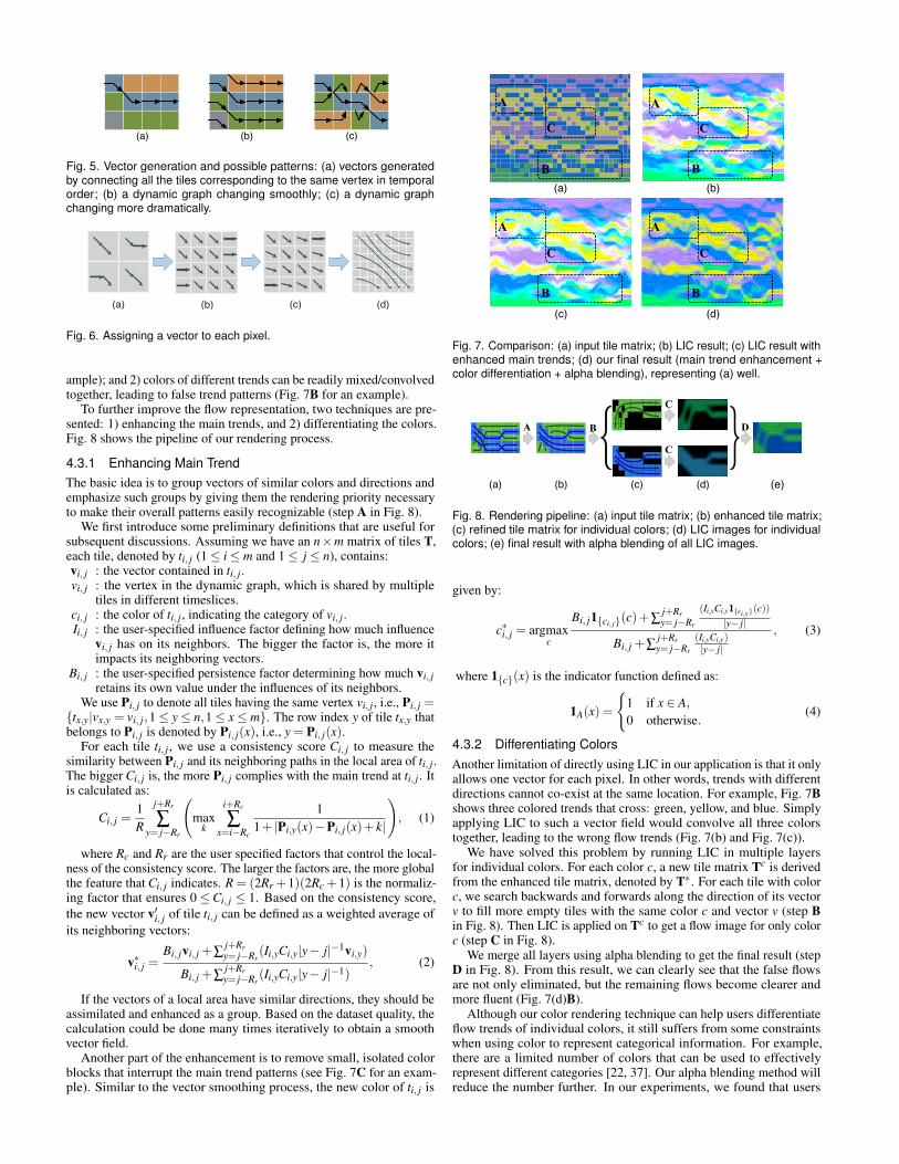
4.2 Vector Field GenerationWe will begin with a simple example consisting of two timeslices,G1 and G2 (Fig. 4), both of which contain the same vertices with theircolors indicating a certain attribute value, such as category information.
A
CB
D
A
CB
D
A
C
BD
AC
B
D
A
C
BD
AC
B
D
sort sort
,
time
rank(a) (b)
Fig. 4. An example of turning a dynamic graph into a tile matrix: verticesat each timeslice are sorted by their degree values. Color is used toencode the category of each vertex.
To transform {G1,G2} into a vector field, we first sort the verticesin each of them based on a graph metric, such as degree, betweenness,or the cluster coefficient metric. In Fig. 4(a), degree is used as an exam-ple. After every timeslice is processed, all the sorted vertex arrays arealigned from left to right based on their temporal order on a 2D plane(Fig. 4(b)). This creates colorful mosaic tiles. The next step is to createa vector for each tile. For each vertex in each timeslice, there is a tilewhose vertical location represents its rank. When it does not exist in atimeslice, we consider it ranked as the smallest in the array. Thus, oneintuitive way to generate vectors is to connect all the tiles correspondingto the same vertex in temporal order (Fig. 5(a)). The overall vector pat-tern can help users track the rank changes and understand the dynamicsof the graph with respect to the metric (Fig. 5(b) and Fig. 5(c)).
Based on the description above, only one tile belongs to one vertex.Thus, there are two vectors in each tile: the incoming and outgoing vec-tors indicating the rank change for the corresponding vertex (Fig. 6(a)).To assign a vector to each pixel, we first divide each tile into foursub-tiles (Fig. 6(b)), each containing one vector (the incoming vectorfor the left sub-tiles, and the outgoing vector for the right sub-tiles).Then the vector at each pixel is calculated using an interpolation oftheir neighbors (Fig. 6(c) and Fig. 6(d)). Before choosing the numberfour for dividing the tiles, we tried several other choices, such as nineor sixteen. However, the results did not seem much different from theoriginal, due to the multiple intermediate smoothing steps. Therefore,we chose the smallest number to produce the square sub-tiles.
4.3 Vector Field RenderingOur system employs fast LIC [33], an efficient texture-based flowvisualization technique, to render the vector field as a continuous flow.By comparing the results before and after applying the method (Fig. 7(a)and (b)), we found that the result is improved by replacing the mosaicwith smooth curves, which helps users more easily follow any trends.
However, directly applying LIC has two limitations in our applica-tion: 1) the main stream patterns can easily be interrupted by local pat-terns, such as a sudden fall/rise of a single vertex (see Fig. 7A for an ex-
(a) (b) (c)
Fig. 5. Vector generation and possible patterns: (a) vectors generatedby connecting all the tiles corresponding to the same vertex in temporalorder; (b) a dynamic graph changing smoothly; (c) a dynamic graphchanging more dramatically.
(a) (b) (c) (d)
Fig. 6. Assigning a vector to each pixel.
ample); and 2) colors of different trends can be readily mixed/convolvedtogether, leading to false trend patterns (Fig. 7B for an example).
To further improve the flow representation, two techniques are pre-sented: 1) enhancing the main trends, and 2) differentiating the colors.Fig. 8 shows the pipeline of our rendering process.
4.3.1 Enhancing Main TrendThe basic idea is to group vectors of similar colors and directions andemphasize such groups by giving them the rendering priority necessaryto make their overall patterns easily recognizable (step A in Fig. 8).
We first introduce some preliminary definitions that are useful forsubsequent discussions. Assuming we have an n×m matrix of tiles T,each tile, denoted by ti, j (1≤ i≤ m and 1≤ j ≤ n), contains:vi, j : the vector contained in ti, j.vi, j : the vertex in the dynamic graph, which is shared by multiple
tiles in different timeslices.ci, j : the color of ti, j , indicating the category of vi, j.Ii, j : the user-specified influence factor defining how much influence
vi, j has on its neighbors. The bigger the factor is, the more itimpacts its neighboring vectors.
Bi, j : the user-specified persistence factor determining how much vi, jretains its own value under the influences of its neighbors.
We use Pi, j to denote all tiles having the same vertex vi, j , i.e., Pi, j ={tx,y|vx,y = vi, j,1≤ y≤ n,1≤ x≤ m}. The row index y of tile tx,y thatbelongs to Pi, j is denoted by Pi, j(x), i.e., y = Pi, j(x).
For each tile ti, j, we use a consistency score Ci, j to measure thesimilarity between Pi, j and its neighboring paths in the local area of ti, j .The bigger Ci, j is, the more Pi, j complies with the main trend at ti, j . Itis calculated as:
Ci, j =1R
j+Rr
∑y= j−Rr
(max
k
i+Rc
∑x=i−Rc
11+ |Pi,y(x)−Pi, j(x)+ k|
), (1)
where Rc and Rr are the user specified factors that control the local-ness of the consistency score. The larger the factors are, the more globalthe feature that Ci, j indicates. R = (2Rr +1)(2Rc +1) is the normaliz-ing factor that ensures 0 ≤Ci, j ≤ 1. Based on the consistency score,the new vector v′i, j of tile ti, j can be defined as a weighted average ofits neighboring vectors:
v∗i, j =Bi, jvi, j +∑
j+Rry= j−Rr
(Ii,yCi,y|y− j|−1vi,y)
Bi, j +∑j+Rry= j−Rr
(Ii,yCi,y|y− j|−1), (2)
If the vectors of a local area have similar directions, they should beassimilated and enhanced as a group. Based on the dataset quality, thecalculation could be done many times iteratively to obtain a smoothvector field.
Another part of the enhancement is to remove small, isolated colorblocks that interrupt the main trend patterns (see Fig. 7C for an exam-ple). Similar to the vector smoothing process, the new color of ti, j is
Fig. 7. Comparison: (a) input tile matrix; (b) LIC result; (c) LIC result withenhanced main trends; (d) our final result (main trend enhancement +color differentiation + alpha blending), representing (a) well.
(a) (b) (c) (d) (e)
A B
C
C
D
Fig. 8. Rendering pipeline: (a) input tile matrix; (b) enhanced tile matrix;(c) refined tile matrix for individual colors; (d) LIC images for individualcolors; (e) final result with alpha blending of all LIC images.
given by:
c∗i, j = argmaxc
Bi, j1{ci, j}(c)+∑j+Rry= j−Rr
(Ii,yCi,y1{ci,y}(c))|y− j|
Bi, j +∑j+Rry= j−Rr
(Ii,yCi,y)|y− j|
, (3)
where 1{c}(x) is the indicator function defined as:
1A(x) =
{1 if x ∈ A,0 otherwise.
(4)
4.3.2 Differentiating ColorsAnother limitation of directly using LIC in our application is that it onlyallows one vector for each pixel. In other words, trends with differentdirections cannot co-exist at the same location. For example, Fig. 7Bshows three colored trends that cross: green, yellow, and blue. Simplyapplying LIC to such a vector field would convolve all three colorstogether, leading to the wrong flow trends (Fig. 7(b) and Fig. 7(c)).
We have solved this problem by running LIC in multiple layersfor individual colors. For each color c, a new tile matrix Tc is derivedfrom the enhanced tile matrix, denoted by T∗. For each tile with colorc, we search backwards and forwards along the direction of its vectorv to fill more empty tiles with the same color c and vector v (step Bin Fig. 8). Then LIC is applied on Tc to get a flow image for only colorc (step C in Fig. 8).
We merge all layers using alpha blending to get the final result (stepD in Fig. 8). From this result, we can clearly see that the false flowsare not only eliminated, but the remaining flows become clearer andmore fluent (Fig. 7(d)B).
Although our color rendering technique can help users differentiateflow trends of individual colors, it still suffers from some constraintswhen using color to represent categorical information. For example,there are a limited number of colors that can be used to effectivelyrepresent different categories [22, 37]. Our alpha blending method willreduce the number further. In our experiments, we found that users
generally do well using five or six colors in our system. On the otherhand, different colors may create different visual impacts, which maycause misleading information, such as false emphasis. To alleviate thisproblem, besides providing two standard color encoding schemes, wealso allow users to manually assign different colors to the categoriesthey are interested in.
4.4 InteractionGraphFlow allows users to interact with the flow view and to examinerelevant data from multiple perspectives. Specifically, we have designedtwo interactions: flow carving and path enhancing.
4.4.1 Flow CarvingWe designed flow carving, inspired by seam carving [2], to quanti-tatively measure the change degree of each timeslice. It serves twopurposes. First, it helps users easily find critical timeslices, such asthose with a dramatic change. Second, it can be used to remove verticalslices with smooth changes, so that screen space can be better allocatedto more important information.
Mathematically, we define the energy for a timeslice e(Gi) as∑
nj=1 e(ti, j), where e(ti, j) is the energy function that measures the en-
ergy of the local change at tile ti, j . We have examined several possiblerank change measures, including the gradient, saliency measure [2],entropy [14], and the inversion number [26].
The gradient, saliency measure tries to capture the vector change ata local area of ti, j [2]:
ev(ti, j) =i+k
∑x=i−k
j+k
∑y= j−k
||vi, j−vx,y||, (5)
Entropy can measure the color consistency around ti, j [14]:
ec(ti, j) =−∑c
pki, j(c) log pk
i, j(c), (6)
where pki, j(c) = k−2
∑i+kx=i−k ∑
j+ky= j−k 1{c}(cx,y).
The inversion number is used to measure the sortedness of a se-quence [26]. Formally, the inversion number for tile ti, j is defined as:
er(ti, j) =n
∑y=1
1{−1}
(sgn((
Pi,y(i−1)−Pi, j(i−1))× (y− j)
)), (7)
where 1{−1}(x) is an indicator function defined in Eq. 4. Fig. 2(a)compares the results of these three energy functions (ev as red, ecas green, and er as blue) on the same flow. As expected, no singlemeasure works well across all times, but they have similar temporalbehaviors. According to the experiments, we found the gradient,saliency measure works better in most cases. Thus, we have adoptedthis measure in GraphFlow.
4.4.2 Path EnhancingAlthough the flow representation provides a nice overview of the metricchanges, it is ineffective at identifying individual paths. To tackle thisissue, a path enhancing technique was designed.
The basic idea is to enhance the persistence and influence factorsof each tile of the path of interest. As described in Sec. 4.3.1, Bx,yand Ix,y represent the persistence and influence factors for tile tx,y. Byincreasing them, tx,y is more likely to retain its original color and vectorand to have more influence on its neighbors.
For example, when a user finds an interesting region in the flowrepresentation, and wants to know where this path comes from or goesto, s/he can simply click it. Our system then retrieves the related tilesti, j and path Pi, j . For each tile tx,y that belongs to Pi, j , we increase Bx,yand Ix,y, and re-generate the flow image. Fig. 2(b) shows two examplesof path enhancement (marked as dotted lines).
4.4.3 Details-on-DemandOnce users identify an interesting pattern in the flow view, they canclick on the point of interest. Our system will locate the correspondingtile and reveal more information to users, such as the graph structure atthat time point or related details that may be different from applicationto application.
5 GRAPH LAYOUT
When a user selects several timeslices from the flow visualization, thecorresponding graphs are presented side by side. Then the user canexamine and find the particular reasons why those timeslices are sointeresting. To achieve this, two techniques have been developed to helpusers easily track the nodes of interest across multiple graphs [11, 25].
One widely adopted approach is to lay out each graph by keepingthe relative positions of unchanged vertices/edges as stable as possible.In our system, we use the energy minimizing method introduced in [5]to generate the dynamic layouts. For a timeslice Gt = (Vt ,Et), theenergy function is formulated as:
where ωi, j and ω are the user-specified weight factors. di j,t , and xi,tare the ideal distance for edge (vi,v j) and the position of vertex vi attimeslice Gt , respectively.
In addition, we draw curves to visually connect the same verticesacross different graphs (Fig. 9) and bundle the links together to providevisual aids and help users discover patterns within a group of vertices.In our system, the bundling result is achieved by turning the straightlinks into curves based on a force model introduced in [19]. Fig. 9shows an example in which two links connect two graphs: Gi and Gi+1.For each link connecting the same vertex in Gi and Gi+1, we put twosubdivision points on the link in the middle. These points are alignedvertically based on which graph they are close to. A linear, attractingspring force Fs is used between the shifted subdivision point and itsoriginal position. On the other hand, an attracting force Fe is usedbetween each pair of subdivision points that are on the same verticalline. Therefore, the total force exerted on pi is calculated as:
Fpi = k(poi −pi)+ ∑
q∈P/{pi}
(q−pi)
||q−pi||2, (9)
where pi and poi are the actual and original locations of pi, respec-
tively. P contains the locations of all the subdivision points on the samevertical line as pi.
PP
QQ
Fig. 9. An example of force settings for two links.
6 CASE STUDY
Two different datasets were adopted to demonstrate the versatility ofGraphFlow. Despite their differences in structure and content, Graph-Flow can easily be applied to both, unveiling interesting patterns thatwe describe in our two case studies.
The first case study, conducted on the functional brain connectivitydataset from an MRI scanner, demonstrated how domain experts canquickly discover patterns in their data using GraphFlow. The secondcase study, covering two breaking events in Twitter, describes how theflow view uses different metrics to help users understand the overallevolving patterns in each event and locate critical time points duringthese events.
All the flow images in this paper took up to 0.6 seconds to generateon a desktop computer with an Intel Quad-Core 2.80 GHz CPU and 8GRAM memory, based on image quality and data size.
6.1 Functional Brain Connectivity DatasetThis case study was conducted with a team of neuroscientists at theUniversity of Washington. We performed the case study over a coupleof months, meeting with the team about twice a month and improvingthe prototype after each visit. Our main contact was Mary, who is aneuroscientist investigating brain aging and attempting to characterizethe effect of aging on cognitive abilities.
6.1.1 Data and Tasks
Higher cognitive abilities (memory, reasoning ability, etc.) are neitherthe result of activity strictly localized in specific neural structures,nor of the brain as a whole. They emerge from the coordination ofdistributed networks (groups of neurons) of cortical regions. When asubject is resting in a scanner, their blood-oxygenated level-dependentsignal measured by functional magnetic resonance imaging (fMRI)shows regional patterns of correlations. These patterns recreate maps ofknown, large-scale brain networks that are activated when the subjectperforms tasks in the scanner. Because of the similarity, the correlationstrength between regions is thought to be related to the efficiency ofcommunication between corresponding regions.
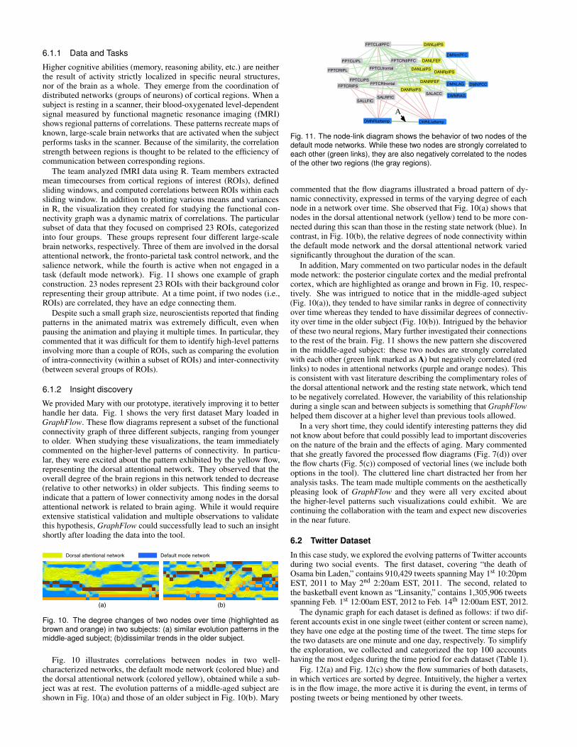
The team analyzed fMRI data using R. Team members extractedmean timecourses from cortical regions of interest (ROIs), definedsliding windows, and computed correlations between ROIs within eachsliding window. In addition to plotting various means and variancesin R, the visualization they created for studying the functional con-nectivity graph was a dynamic matrix of correlations. The particularsubset of data that they focused on comprised 23 ROIs, categorizedinto four groups. These groups represent four different large-scalebrain networks, respectively. Three of them are involved in the dorsalattentional network, the fronto-parietal task control network, and thesalience network, while the fourth is active when not engaged in atask (default mode network). Fig. 11 shows one example of graphconstruction. 23 nodes represent 23 ROIs with their background colorrepresenting their group attribute. At a time point, if two nodes (i.e.,ROIs) are correlated, they have an edge connecting them.
Despite such a small graph size, neuroscientists reported that findingpatterns in the animated matrix was extremely difficult, even whenpausing the animation and playing it multiple times. In particular, theycommented that it was difficult for them to identify high-level patternsinvolving more than a couple of ROIs, such as comparing the evolutionof intra-connectivity (within a subset of ROIs) and inter-connectivity(between several groups of ROIs).
6.1.2 Insight discovery
We provided Mary with our prototype, iteratively improving it to betterhandle her data. Fig. 1 shows the very first dataset Mary loaded inGraphFlow. These flow diagrams represent a subset of the functionalconnectivity graph of three different subjects, ranging from youngerto older. When studying these visualizations, the team immediatelycommented on the higher-level patterns of connectivity. In particu-lar, they were excited about the pattern exhibited by the yellow flow,representing the dorsal attentional network. They observed that theoverall degree of the brain regions in this network tended to decrease(relative to other networks) in older subjects. This finding seems toindicate that a pattern of lower connectivity among nodes in the dorsalattentional network is related to brain aging. While it would requireextensive statistical validation and multiple observations to validatethis hypothesis, GraphFlow could successfully lead to such an insightshortly after loading the data into the tool.
(a) (b)
Dorsal attentional network Default mode network
Fig. 10. The degree changes of two nodes over time (highlighted asbrown and orange) in two subjects: (a) similar evolution patterns in themiddle-aged subject; (b)dissimilar trends in the older subject.
Fig. 10 illustrates correlations between nodes in two well-characterized networks, the default mode network (colored blue) andthe dorsal attentional network (colored yellow), obtained while a sub-ject was at rest. The evolution patterns of a middle-aged subject areshown in Fig. 10(a) and those of an older subject in Fig. 10(b). Mary
DANLaIPS
DANLFEF
DANLpIPS
DANRaIPS
DANRFEF
DANRpIPS
DMNLAG
DMNLlattemp
DMNmPFC
DMNPCC
DMNRAG
DMNRlattemp
FPTCLdlPFC
FPTCLfrontal
FPTCLIPL
FPTCLIPS
FPTCRdlPFC
FPTCRfrontal
FPTCRIPL
FPTCRIPS
SALACC
SALLFICSALRFIC
A
Fig. 11. The node-link diagram shows the behavior of two nodes of thedefault mode networks. While these two nodes are strongly correlated toeach other (green links), they are also negatively correlated to the nodesof the other two regions (the gray regions).
commented that the flow diagrams illustrated a broad pattern of dy-namic connectivity, expressed in terms of the varying degree of eachnode in a network over time. She observed that Fig. 10(a) shows thatnodes in the dorsal attentional network (yellow) tend to be more con-nected during this scan than those in the resting state network (blue). Incontrast, in Fig. 10(b), the relative degrees of node connectivity withinthe default mode network and the dorsal attentional network variedsignificantly throughout the duration of the scan.
In addition, Mary commented on two particular nodes in the defaultmode network: the posterior cingulate cortex and the medial prefrontalcortex, which are highlighted as orange and brown in Fig. 10, respec-tively. She was intrigued to notice that in the middle-aged subject(Fig. 10(a)), they tended to have similar ranks in degree of connectivityover time whereas they tended to have dissimilar degrees of connectiv-ity over time in the older subject (Fig. 10(b)). Intrigued by the behaviorof these two neural regions, Mary further investigated their connectionsto the rest of the brain. Fig. 11 shows the new pattern she discoveredin the middle-aged subject: these two nodes are strongly correlatedwith each other (green link marked as A) but negatively correlated (redlinks) to nodes in attentional networks (purple and orange nodes). Thisis consistent with vast literature describing the complimentary roles ofthe dorsal attentional network and the resting state network, which tendto be negatively correlated. However, the variability of this relationshipduring a single scan and between subjects is something that GraphFlowhelped them discover at a higher level than previous tools allowed.
In a very short time, they could identify interesting patterns they didnot know about before that could possibly lead to important discoverieson the nature of the brain and the effects of aging. Mary commentedthat she greatly favored the processed flow diagrams (Fig. 7(d)) overthe flow charts (Fig. 5(c)) composed of vectorial lines (we include bothoptions in the tool). The cluttered line chart distracted her from heranalysis tasks. The team made multiple comments on the aestheticallypleasing look of GraphFlow and they were all very excited aboutthe higher-level patterns such visualizations could exhibit. We arecontinuing the collaboration with the team and expect new discoveriesin the near future.
6.2 Twitter Dataset
In this case study, we explored the evolving patterns of Twitter accountsduring two social events. The first dataset, covering “the death ofOsama bin Laden,” contains 910,429 tweets spanning May 1st 10:20pmEST, 2011 to May 2nd 2:20am EST, 2011. The second, related tothe basketball event known as “Linsanity,” contains 1,305,906 tweetsspanning Feb. 1st 12:00am EST, 2012 to Feb. 14th 12:00am EST, 2012.
The dynamic graph for each dataset is defined as follows: if two dif-ferent accounts exist in one single tweet (either content or screen name),they have one edge at the posting time of the tweet. The time steps forthe two datasets are one minute and one day, respectively. To simplifythe exploration, we collected and categorized the top 100 accountshaving the most edges during the time period for each dataset (Table 1).
Fig. 12(a) and Fig. 12(c) show the flow summaries of both datasets,in which vertices are sorted by degree. Intuitively, the higher a vertexis in the flow image, the more active it is during the event, in terms ofposting tweets or being mentioned by other tweets.
bin Laden Data Linsanity DataNews media (green) 31 31Journalist (blue) 17 16Celebrity (orange) 39 38Imposter (purple) 3 0Others (yellow) 10 15
Table 1. Number of Twitter accounts in the top 100 under each categoryfor the bin Laden dataset and Linsanity dataset.
(a)
(c)
10:40 11:37 00:43 00:5610:20
(b)E F
D1
D2
CB
A
News media JournalistCelebrity Imposter Others
Fig. 12. Flow summaries of the twitter datasets: (a) summary of binLaden data (sorted by degree); (b) summary of bin Laden data (sortedby closeness); (c) summary of Linsanity data (sorted by degree).
As shown in Fig. 12(a), the overall pattern becomes more and morecomplex as time goes on. In the first few minutes (from 10:20pmto 10:40pm), journalist accounts (blue), such as @keithurbahn, @bri-anstelter, and @jacksonjk, were dominant. This is because they postedrumors of Osama Bin Laden’s death, such as “I’m told by a rep-utable person they have killed Osama Bin Laden,” which were widelyretweeted as people were wondering about their reliability. But verysoon (around 10:40pm), media accounts (green), such as @cnnbrk,@nytimes, and @cbsnews, confirmed the rumors, with tweets such as
“NYT NEWS ALERT: Osama bin Laden Is Dead, White House Says” by@nytimes. They immediately took over the leading positions, becausepeople stopped retweeting the rumors and started retweeting informa-tion from the reliable sources. Thus, the journalist accounts (blue)declined in the flow representation (marked as A in Fig. 12(a)).
Once the rumors had been confirmed and spread throughout theInternet, people began to change their focus. One interesting pattern isrelated to three imposters (purple), @real bin laden, @osamabinladen,and @osamabinladen96, which we found among the top 100 accounts.They were very active for a short period (from 11:37pm to 00:43am)after the rumors were confirmed (marked as B in Fig. 12(a)). By extract-ing their posting history, we found that they actually posted messagesas early as 10:38pm such as “Relax, everyone, I’m just faking my owndeath...” But they only became popular after the rumors were con-
firmed. This may be partially due to people being more curious aboutthe reliability of the rumors at the beginning, and paying no attention tothose imposters. Once the rumors were confirmed, people were diggingeverywhere and found those imposters funny and worth mentioning;however, their jokes quickly wore out and fell out of the spotlight.
The third wave (marked as C in Fig. 12(a)) of leading accountscomes from celebrities (orange). We extracted some tweets there andfound that they are mostly joking about bin Laden, such as “R.I.P tothe king of hide-n-seek Osama Bin Laden.” In particular, we found avery clear splitting pattern around 00:56am for the celebrity accounts(marked as D1 and D2 in Fig. 12(a)). After examining the tweetsfrom both branches, we found D1 to be very focused, involving similartweets, such as “BREAKING NEWS: Donald Trump demands OsamaBin Laden’s death certificate.” On the other hand, D2 is from miscella-neous tweets. So we were curious why D1 is split from the rest. Afterchecking the content in D1 and searching the Web, we found that D1 isrelated to a political joke caused by Obama’s official TV announcementinterrupting the TV show “Celebrity Apprentice” hosted by DonaldTrump, who had challenged Obama about his birth certificate at thattime. People found such a coincidence funny, so they made severaljokes about Trump, Obama, and the death certificate.
In addition to showing the degree metric, we also generated a flowimage using the closeness centrality metric (Fig. 12(b)). It is clearthat Fig. 12(a) and Fig. 12(b) have a certain similarity at the top. Inaddition to the similarity, we also found some interesting outlier pathsin Fig. 12(b). For example, we found an outlier (Fig. 12(b)E) patternburied in a group of celebrity accounts. It includes three highly corre-lated accounts, i.e., @darrenrovell, @jtalarico328, and @dvnjr, fromthree different categories (blue, orange, and yellow). This attracted ourattention because the three accounts co-occurred with each other for aperiod of time. So we enhanced all three accounts and it turns out theyco-occurred almost everywhere in the flow (Fig. 12(b)F).
By retrieving the related content, we found that all three accountsstayed connected because they all appeared in a single tweet “RT@darrenrovell: May 1, 1945: Hitler confirmed dead. May 1, 2011: BinLaden confirmed dead. (via @JTalarico328, @DVNJr).” To furtherinvestigate the underlying pattern in this tweet, we extracted the orderof retweeting, and found the tweet was first created by @JTalarico328,retweeted by @dvnjr 12 minuteslater, and finally by @darrenrovellafter another 3 minutes. This example clearly shows how interestinginformation is propagated: from an ordinary person to a journalist to avery visible celebrity and finally to the general public.
Compared with the bin Laden data, the Linsanity data shows adifferent pattern (Fig. 12(c)). In this event, the news media (green) wasnot dominant. Instead, celebrity accounts (orange) were a relativelystable dominant group. We then calculated the flow carving curvebased on the inversion number. Several peaks occurred at the beginning.After examining the time points, we found high correlations betweenthose peaks and Jeremy Lin’s game schedule. In particular, we noticedthat the whole flow was generally triggered by the first game (Feb.4th 07:30pm), and after several peaks in activity, “Linsanity” becamea normal topic, the curve became smoother, and the game schedulecontributed less to the curve fluctuations.
7 DISCUSSION AND FUTURE WORK
In this paper, we addressed the problem of exploring a dynamic graphwith a static method. Accordingly, we introduced a novel flow-basedvisualization design for summarizing high-level evolution patterns in adynamic graph. The key idea is to convey changes in the structure of agraph through the evolution of a number of graph metrics computed onits nodes/edges. Although we used degree and closeness as examplesthroughout this paper, GraphFlow does not depend on any particulargraph metrics. Other metrics, such as cluster coefficient and trianglenumber, can also be directly applied in our system. To further aid usersin information seeking, a trend analysis was designed to identify thecritical time points in the flow visualization. Furthermore, detailedstructural changes across several correlated time points were providedto examine the major causes that lead to such interesting patterns.Two case studies were conducted to demonstrate the usefulness and
effectiveness of our system.Our flow design does have some limitations. First of all, the patterns
highly depend on the metric adopted. In our case studies, we usedcommon metrics. However, in some special scenarios, common metricsmay not be meaningful or adequate. Choosing the most appropriatemetrics will highly depend on a user’s domain knowledge. Second,in certain applications where the absolute values are critical, our flowrepresentation, which mainly focuses on rank changes, may not be veryhelpful. To address this issue, a standard line chart can be combinedwith our flow representation to show absolute values for selected nodes.Third, our graph view can only work well for small graphs, whichlimites the scalability of the whole system. To support large graphs,LOD-based [39] or DOI-based approaches [35] can be leveraged.
In the future, we plan to combine some of the graph metrics for morecomplex graphs, such as weighted graphs. In addition to flow carvingtechniques that address the scalability issue on the time dimension,we may also investigate techniques for the scalability issue on graphsize, such as aggregating nodes based on the clustering or hierarchicalstructure of the nodes. On the other hand, it is not conventional touse the flow visualization to visualize a dynamic graph. In the future,we plan to design a series of controlled experiments to systematicallyevaluate how people accept, consume, and interpret such unfamiliarvisual representations.
ACKNOWLEDGMENTS
We would like to thank Stephen Lin for proofreading this paper and theanonymous reviewers for their valuable comments.
REFERENCES
[1] D. Archambault, H. C. Purchase, and B. Pinaud. Animation, small multi-ples, and the effect of mental map preservation in dynamic graphs. IEEETransaction on Visualization and Computer Graphics, 17(4):539–552,2011.
[2] S. Avidan and A. Shamir. Seam carving for content-aware image resizing.ACM Transaction on Graphics, 26(3):1–9, 2007.
[3] G. D. Battista, P. Eades, R. Tamassia, and I. G. Tollis. Graph drawing:Algorithms for the visualization of graphs. Prentice-Hall, 1999.
[4] F. Beck, M. Burch, C. Vehlow, S. Diehl, and D. Weiskopf. Rapid serialvisual presentation in dynamic graph visualization. In IEEE Symposiumon Visual Languages and Human-Centric Computing (VLHCC), pages185–192, 2012.
[5] K. Boitmanis, U. Brandes, and C. Pich. Visualizing internet evolution onthe autonomous systems level. In Graph Drawing, pages 365–376, 2007.
[6] U. Brandes and S. R. Corman. Visual unrolling of network evolution andthe analysis of dynamic discourse. In IEEE Symposium on InformationVisualization, 2002, pages 145–151, 2002.
[7] U. Brandes and B. Nick. Asymmetric relations in longitudinal socialnetworks. IEEE Transaction on Visualization and Computer Graphics,17(12):2283–2290, 2011.
[8] U. Brandes and D. Wagner. Tracking multiple independent targets: Ev-idence for a parallel tracking mechanism. Spatial Vision, 3(3):179–197,1988.
[9] J. Branke. Dynamic graph drawing. In Drawing Graphs, pages 228–246,1999.
[10] M. Burch, C. Muller, G. Reina, H. Schmauder, M. Greis, and D. Weiskopf.Visualizing dynamic call graphs. In Proceedings of Workshop on Vision,Modeling, and Visualization, pages 207–214. The Eurographics Associa-tion, 2012.
[11] M. Burch, C. Vehlow, F. Beck, S. Diehl, and D. Weiskopf. Parallel edgesplatting for scalable dynamic graph visualization. IEEE Transaction onVisualization and Computer Graphics, 17(12):2344–2353, 2011.
[12] L. Byron and M. Wattenberg. Stacked graphs - geometry & aesthetics.IEEE Transaction on Visualization and Computer Graphics, 14(6):1245–1252, 2008.
[13] B. Cabral and L. C. Leedom. Imaging vector fields using line integralconvolution. In Proceedings of the 20th annual conference on Computergraphics and interactive techniques, SIGGRAPH ’93, pages 263–270,New York, NY, USA, 1993. ACM.
[14] T. M. Cover and J. A. Thomas. Elements of information theory. Wiley-interscience, 2006.
[15] C. Erten, P. J. Harding, S. G. Kobourov, K. Wampler, and G. V. Yee.Graphael: Graph animations with evolving layouts. In Graph Drawing,pages 98–110, 2003.
[16] C. Friedrich and M. E. Houle. Graph drawing in motion ii. In GraphDrawing, pages 220–231, 2001.
[17] N. Henry and J.-D. Fekete. Matrixexplorer: A dual-representation sys-tem to explore social networks. IEEE Transaction on Visualization andComputer Graphics, 12(5):677–684, 2006.
[18] N. Henry, J.-D. Fekete, and M. J. McGuffin. Nodetrix: A hybrid visualiza-tion of social networks. IEEE Transaction on Visualization and ComputerGraphics, 13(6):1302–1309, 2007.
[19] D. Holten and J. J. van Wijk. Force-directed edge bundling for graphvisualization. Computer Graphics Forum, 28(3):983–990, 2009.
[20] S. Kairam, D. MacLean, M. Savva, and J. Heer. Graphprism: Compactvisualization of network structure. In Advanced Visual Interfaces, pages498–506, 2012.
[21] G. Kumar and M. Garland. Visual exploration of complex time-varyinggraphs. IEEE Transaction on Visualization and Computer Graphics,12(5):805–812, 2006.
[22] A. Light and P. J.Bartlein. The end of the rainbow? color schemes forimproved data graphics. EOS Transactions of the American GeophysicalUnion, 85(40):385–391, 2004.
[23] G. Liu, E. Austen, K. Booth, B. Fisher, M. Rempel, and J. T. Enns.Multiple object tracking is based on scene, not retinal, coordinates. Jour-nal of Experimental Psychology: Human Perception and Performance,31(2):235–247, Apr. 2005.
[24] G. Melanon and A. Sallaberry. Edge metrics for visual graph analytics:A comparative study. In Information Visualisation, 2008. IV’08. 12thInternational Conference, pages 610–615. IEEE, 2008.
[25] K. Misue, P. Eades, W. Lai, and K. Sugiyama. Layout adjustment and themental map. Journal of visual languages and Computing, 6(2):183–210,1995.
[26] P. Mutzel and J. Michael. Simple and Efficient Bilayer Cross Counting.Journal of Graph Algorithms and Applications, 8(2):179–194, 2004.
[27] F. H. Post, B. Vrolijk, H. Hauser, R. S. Laramee, and H. Doleisch. The stateof the art in flow visualisation: Feature extraction and tracking. ComputerGraphics Forum, 22(4):775–792, 2003.
[28] G. G. Robertson, R. Fernandez, D. Fisher, B. Lee, and J. T. Stasko. Ef-fectiveness of animation in trend visualization. IEEE Transaction onVisualization and Computer Graphics, 14(6):1325–1332, 2008.
[29] M. Rosvall and C. T. Bergstrom. Mapping change in large networks. PloSone, 5(1):e8694, 2010.
[30] A. Sallaberry, C. Muelder, and K.-L. Ma. Clustering, visualizing, andnavigating for large dynamic graphs. In Graph Drawing, pages 487–498,2012.
[31] C. Shi, W. Cui, S. Liu, P. Xu, W. Chen, and H. Qu. Rankexplorer: Visu-alization of ranking changes in large time series data. IEEE Trans. Vis.Comput. Graph., 18(12):2669–2678, 2012.
[32] L. Shi, N. Cao, S. Liu, W. Qian, L. Tan, G. Wang, J. Sun, and C.-Y. Lin.Himap: Adaptive visualization of large-scale online social networks. InPacificVis, pages 41–48, 2009.
[33] D. Stalling and H.-C. Hege. Fast and resolution independent line integralconvolution. In Proceedings of the 22nd annual conference on Computergraphics and interactive techniques, pages 249–256. ACM, 1995.
[34] R. Toivonen, L. Kovanen, M. Kivela, J.-P. Onnela, J. Saramaki, andK. Kaski. A comparative study of social network models: Networkevolution models and nodal attribute models. Social Networks, 31(4):240–254, 2009.
[35] F. Van Ham and A. Perer. Search, show context, expand on demand: Sup-porting large graph exploration with degree-of-interest. IEEE Transactionon Visualization and Computer Graphics, 15(6):953–960, 2009.
[36] F. van Ham, H.-J. Schulz, and J. M. DiMicco. Honeycomb: Visualanalysis of large scale social networks. In Human-Computer InteractionINTERACT 2009, pages 429–442, 2009.
[37] C. Ware. Information visualization: perception for design. MorganKaufmann, 2012.
[38] M. Wattenberg. Visual exploration of multivariate graphs. In Proceedingsof the SIGCHI Conference on Human Factors in Computing Systems,pages 811–819, 2006.
[39] M. Zinsmaier, U. Brandes, O. Deussen, and H. Strobelt. Interactive level-of-detail rendering of large graphs. IEEE Transaction on Visualizationand Computer Graphics, 18(12):2486–2495, 2012.