22
Life Time Fitness Findings and Recommendations Report Prepared by Austin Balken

Life Time Fitness
Findings and Recommendations Report
Prepared by Austin Balken

Table of Contents
Reading This Report . . . . . . . . . . . . . . . . . . . . . . . . . . . . . . . . . 3 Executive Summary . . . . . . . . . . . . . . . . . . . . . . . . . . . . . . . . . . 4 Project Review and Goals . . . . . . . . . . . . . . . . . . . . . . . . . . . . . . 5
Usability Results and Recommendations . . . . . . . . . . . . . . . . . . . . 6 Usability Insights . . . . . . . . . . . . . . . . . . . . . . . . . . . . . . . . . . 7 Quality Assurance Observations . . . . . . . . . . . . . . . . . . . . . . . . . 15 Website Revision Recommendations . . . . . . . . . . . . . . . . . . . . . . 17
Research and Synthesis Methodology . . . . . . . . . . . . . . . . . . . . . . 18 Research Methodology . . . . . . . . . . . . . . . . . . . . . . . . . . . . . . . 19 Participant Information . . . . . . . . . . . . . . . . . . . . . . . . . . . . . . . 20 Synthesis Methodology . . . . . . . . . . . . . . . . . . . . . . . . . . . . . . . 21
Conclusion . . . . . . . . . . . . . . . . . . . . . . . . . . . . . . . . . . . . . . . 22
Life Time Fitness • Findings and Recommendations Report 2
1
2
3
5
6
4

Reading This Report
Life Time Fitness • Findings and Recommendations Report 3
1
Understanding the Usability Results and Recommendations Report The usability test findings are reported in the Usability Results and Recommendations section of this report. Each page will have the following layout:
Severity Rating Scale High Priority: These insights have a direct impact on the customer journey and should be addressed first. Medium Priority: These insights come from participant confusion while using the site and should be addressed. Low Priority: These insights have little affect on the customer journey, but address QA and excellence in presentation.
There will be a severity rating scale on each page denoting the urgency with which the insight should be addressed due to its impact on the customer journey through the OMS process.
Each insight will include an annotated screenshot(s) of the concern or problem area for further clarity.
When available, participant quotes will be included for the insight.
When available, quantitative data will be included displayed in a graphic or chart to visualize the findings.
These recommendations will be accompanied by data we gathered during the remote and in-lab tests.
Each insight is the result of the data accumulated from the usability tests.
Recommendations are the team’s recommended resolution for the insight.
There will be an insight label to summarize the insight in a few words.

Executive Summary
Life Time Fitness • Findings and Recommendations Report 4
2
Method Overview Our team worked to understand the strengths and weaknesses of the site by evaluating it against a variety of heuristics. We followed that evaluation with usability tests, and then compiled the data into this findings and recommendations report.
Participants The team tested 18 participants total, 5 in-lab tests and 13 remote tests.
Areas of Strength Participants responded positively to the website layout and the OSM process.
Areas of Concern Testing Results High Priority: Filters, verbiage, locating amenities. Medium Priority: Pricing and membership benefits, site flow, and page consistency. Low Priority: Formatting and browser consistency.
High Priority Recommendations • Move the “Filters” button on the Prospect page. • Update the verbiage from “Build Membership” to “Sign Up” or “Join”. • Use consistent verbiage on the navigation bar and in the Club details pages for the activities which are offered at each Club location.

Project Review and Goals
Life Time Fitness • Findings and Recommendations Report 5
3
Summary In order to better understand their customer’s satisfaction and mindset while using the OMS process, Life Time Fitness would like to gather research about how users are engaging with their website. Special attention is to be given to how the website could be improved for clarity, speed, and usability during the online joining experience.
Website The team tested the OMS process from the Life Time Fitness landing page to the Payment page. Participants explored various club location pages, the Classes, Sports, and Events pages as well. https://www.lifetime.life
Client Goals: • Gain an understanding about how the site navigation impact the flow once the user enters the OMS steps? • Get insight into the clarity of the OMS steps? • Find out whether the price table on the Build Membership step should remain or be deferred to the Membership Info step? • Get clarity about the overall aesthetic of the site, whether it appears plain and/or if elements bleed together. • Understand if sufficient information information about the membership selection is provided at the point of purchase.
User Goals: • Find a health and fitness program that works for them (including locality, offerings, cost, access, etc).
Research Goals: • Learn more about what kind of information users value when making a decision to buy a membership. • Gain insights into the pain points and opportunity areas within the navigation and user flow of the OMS process. • Learn more about users’ confidence and understanding about what they are purchasing at the Payment screen.
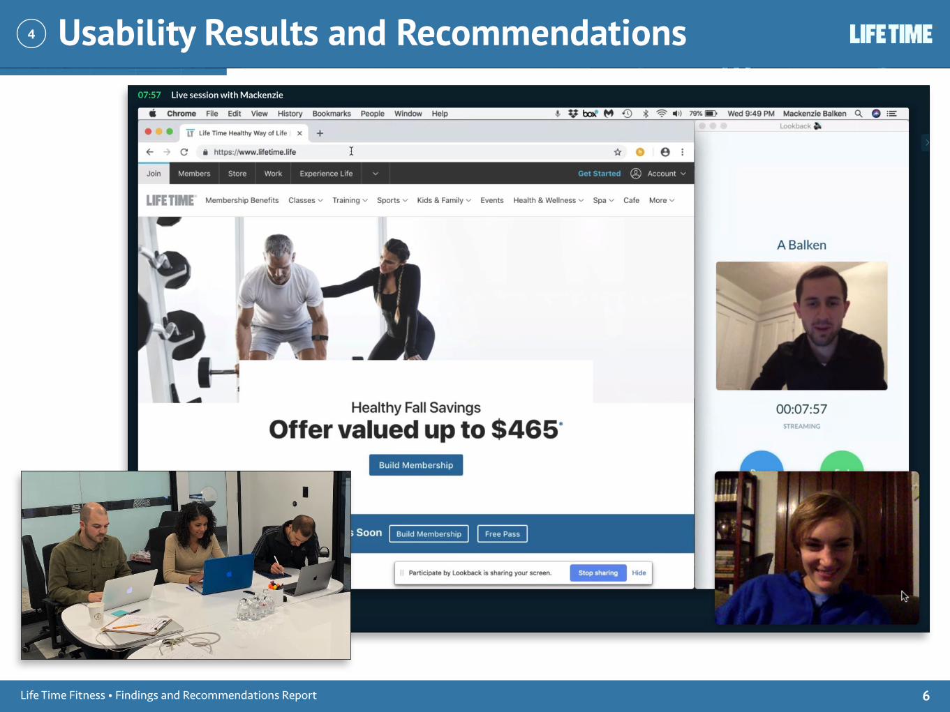
Usability Results and Recommendations
Life Time Fitness • Findings and Recommendations Report 6
4

Layout
Insight The layout of the landing page and pages in the OMS process are clean and open. Participants commented positively on the aesthetics of these pages. There is a good amount of white space around elements to keep the pages from looking cluttered.
Recommendations It would be helpful to apply this layout strategy to all the Club location pages. The pages are different in layout from one another, which causes the user to need to hunt for information. Applying a similar template to each page will aide users in finding information and keep the pages from getting cluttered.
Usability Insights
Life Time Fitness • Findings and Recommendations Report 7
4
This page looks clean and open, and users appreciated it. Applying this layout to the rest of the site will help users find information
more quickly rather than feeling lost with every new page change.
Strengths

Usability Insights
Life Time Fitness • Findings and Recommendations Report 8
4
OMS Process
Insight Once in the OMS process, participants found navigating through the screens simple execute. Including the checkout progress indicator (see photo) at the top and bottom of the pages caught a number of participant’s eyes and was followed by a positive comment.
Recommendations To make this progress indicator even more helpful for the user, consider adding more information to each step completed. User’s were able to recall what membership they had signed up for when reaching the payment page, but a few users requested being able to quickly and easily access details about their selection while in the OMS process.
Participant Quotes “It was very intuitive, easy to follow the process.” - P18
“At least this process seems easy.” - P14
This checkout progress indicator is helpful for users to keep track of where they have come from and where they will be going.
Strengths

Usability Insights
Life Time Fitness • Findings and Recommendations Report 9
4
Filters
Insight The filters button blends in with the join buttons and the magnifying glass around it and users tend to overlook it. Users respond with frustration as they enter and exit location pages to find out what Services & Programs and what Spaces each location offers.
Recommendations Moving the filters button to the right side of the screen to create some separation from similar looking buttons would help users see it more easily. Participants consistently overlooked the filters button when on the Prospect screen. Showing the filter search fields by default rather than auto hiding them would allow the users to spot the filters more easily. (See pg. 17)
Participant Quotes “[It] would have been nice to filter rather than hunt for locations that had specific activities.” - P3
“[The] filter is handy, if I’d have seen that.” - P9
High Priority
7 participants commented on needing filters11 participants did not comment on needing filters
Too many dark blue elements close together cause users to overlook them. Moving the filters button to the other side of the
page will apply the isolation needed to make it stand out.

Verbiage
Insight Terms like “Build Membership” and “On-Boarding” are confusing for customers and aren’t often consistent with other website terms. This causes customers to be confused about what they are doing and where they need to go next.
Recommendations Consider updating verbiage across the site to reflect more common terms. Change “Build Membership” to “Join” or “Sign Up.” (See pg. 17)
Participant Quotes "I'm going to ‘build membership’ here, which I think is a waste of time, I just needed the word ‘join', and somewhere to begin” - P13
"Build membership. That's confusing to me. Not used to seeing that.” - P4
Club LocationsJoin OfferFree Pass
On-BoardingLocation Access
Add MembersOffer Ends Today
Build Membership
0 2 4 6 8
Usability Insights
Life Time Fitness • Findings and Recommendations Report 10
4
High Priority
Using uncommon verbiage like “Build
Membership” to indicate a checkout process is confusing for customers. More
common call to action button names like “Join” or “Sign Up”
streamline the process for customers and reduce confusion.
Number of participants who commented on confusing verbiage

Locating Amenities
Insight The amenities each Club offers differs by location. Participants were confused about where to find what Club offered what amenities. The inconsistency of verbiage and the numerous paths to the same information caused the participants confusion while using the site.
Recommendations Rather than categorizing activities by Sport in the navigation bar and by Space or Program on the Club details page, use consistent naming. Offer a search bar from the home page that would filter activities by locations to help users find their preferred location and activities more quickly.
Participant Quotes "Is there a search button? Maybe it'll tell me where I can swim.” - P1
"I would start calling gyms to locate services I am interested in because I can't locate them here.” - P1
Usability Insights
Life Time Fitness • Findings and Recommendations Report 11
4
High Priority
Verbiage like “Spaces” and “Programs” does not mean much to users who want find out if a certain activity is supported at the
Club nearest to them. Users are likely to search using the categories shown to them in the navigation bar, the pages should
reflect these same categories to avoid user frustration.

Pricing and Membership Benefits
Insight Breaking the pricing (monthly membership fee and one time Join Offer) into two pages and using the term “Join Offer” was confusing for a number of participants. The flow of the checkout process was hindered as participants stopped to decipher the difference between the two pages and why they needed to select another pricing option.
Recommendations In order to keep users from confusion and frustration when they encounter the pricing, consider disclosing all the pricing on one page. More than half of the participants we tested were confused about membership pricing and nearly half were surprised at being charged for a Join Offer.
Participant Quotes “[This is] reminding me that not everything is included in what I selected.” - P4
“[This process] gives the illusion of choice.” - P8
Usability Insights
Life Time Fitness • Findings and Recommendations Report 12
4
Medium Priority
Help customers feel confident as they
move through the OMS process by disclosing all the
pricing information up front, possibly even before they begin to sign up.
Using verbiage like Join Offer can be
perplexing because it is uncommon. Use terms which make
sense to customers so they feel more
confident in what
Number of participants who were confused when they encountered pricing in the OMS process
Cound not find pricing detailsSurprised by Join Offer
Confused about pricing
0 2 5 7 9

Site Flow
Insight The Prospect page is an important page, the place where a visitor can become a member. Throughout the website, numerous links and buttons with a variety of names lead to this page. This makes the website feel more like a maze and clouds the user’s mental map of the website. Users also feel corralled toward this page when various links and buttons lead them back here.
Recommendations Use the same verbiage site-wide to help users know what page a link will bring them to. Also, using similar formatting makes the button or link easily recognizable.
Usability Insights
Life Time Fitness • Findings and Recommendations Report 13
Medium Priority
4
The “Build Membership” button, “Get Started” link, “Join Now” button, “View Map” link, and “All Locations” link in the navigation bar all lead to the same page. Using consistent verbiage helps
users learn the website and avoid becoming confused.

Page Consistency
Insight Using a variety of page layouts when the same content is being displayed (e.g. Club Details pages) requires users to need to look harder for the information. This is frustrating and inconsistent for the user. Consistency between pages helps users navigate the website quickly and efficiently.
Recommendations While the Club Details pages generally all have the same content, updating their layout will help users not feel unacquainted with the page and will help them navigate the site faster. Having a variety of images helps the pages from becoming mundane, but numerous participants commented on the fact that they could not find what they were looking for while on the Club Details pages.
Participant Quotes “[I’m] confused about where to go to find what's available at this location.” - P9
Usability Insights
Life Time Fitness • Findings and Recommendations Report 14
Medium Priority
4
Placing relevant information in different locations between similar functioning pages is
confusing for users.

Formatting
Insight While this insight did not come from usability testing, but from the heuristic analysis of the website, it is relevant as a quality assurance observation. There are a few places throughout the website where terms are inconsistently formatted.
Recommendations Ensure that the formatting of in-house terms, such as Onboarding, are consistent. When referencing plans in the fine print, ensure that those plans are still options for users to sign up for. In order to strive for excellence, make sure to comb the site for formatting inconsistency.
Quality Assurance Observations
Life Time Fitness • Findings and Recommendations Report 15
4
The in-field text “*Email” and “* Club”
Location” are formatted
inconsistently with an extra space between
the “*” and “Club Location”
Low Priority
There is nothing about annual plans on the Member Benefits page.
The verbiage “personal training” and “Personal Trainer are formatted
inconsistently.
The verbiage “Onboarding Personal Training Session” and “On-
Boarding PT session” are formatted inconsistently.

Browser Consistency
Insight While this insight did not come from usability testing, but from the heuristic analysis of the website, it is relevant as a quality assurance observation. Not all elements show consistently across browsers.
Recommendations Update the elements to show appropriately in Safari as well as Chrome. This makes the website look professional and well built.
Quality Assurance Observations
Life Time Fitness • Findings and Recommendations Report 16
4
While displaying perfectly on Chrome, this info button shows up as a gray box in Safari.
Low Priority

Website Revision Recommendations
Life Time Fitness • Findings and Recommendations Report 17
4
Filters Moving the “Filters” button away from other blue elements makes it stand out. Because many participants in the usability testing failed to notice the filters button and voiced their frustration with not being able to search for amenities, moving the button over or keeping the filters dropdown open by default may be a helpful solution.
Verbiage Update the verbiage site wide using a call to action word that is more common to users. Many participants were perplexed by the verbiage “Build Membership”. Changing the call to action on the buttons that lead customers to the Prospects page will increase user clarity and traffic.

Research and Synthesis Methodology
Life Time Fitness • Findings and Recommendations Report 18
5

Research Methodology
Life Time Fitness • Findings and Recommendations Report 19
5
Heuristic Analysis We started by performing a heuristic analysis on the website, observing the strengths and weaknesses according to a predefined set of criteria.
Usability Review We then compiled the data we collected from the heuristic analysis into a usability review to document and rate the findings and help guide the formulation of our research goals.
Testing Script The team used the goals provided by Lift Time and the goals derived from the heuristic analysis to write a testing script containing a series of scenarios and tasks for the participant.
Testing After collaborating together to define our testing script, the team conducted 18 usability tests, 5 in-lab and 13 remote tests.
In-lab Each in-lab test was 20 minutes long and led by a moderator and directly observed by a note taker. Three other members of the team observed the test to take notes from an observation room.
Remote Remote tests, conducted by each member of the team, ranged from 20 minutes to 1 hour. These tests were recorded via Lookback, Quicktime, or similar software. The team member conducting the test took notes during and after the test.

Participant Information
Life Time Fitness • Findings and Recommendations Report 20
5
Our participant selection was both male and female, and a variety of ages.
Participant Signed up for a membership anywhere online before
Information desired before signing up for a membership Used a gym before / Where
P1 Yes Cost Life Time / Anytime FitnessP2 Yes Paid Parking YWCAP3 Yes - Local in Las VegasP4 Yes Cost Yoga StudioP5 Yes Options, pricing CorepowerP6 Yes Synopsis, duration -
P7 Yes Cost, options LA FitnessP8 Yes - Life Time / Crossfit / UMP9 Yes Cost, membership fee Local in Minnetonka P10 Yes Commitment, app LA FitnessP11 Yes Cost LA FitnessP12 Yes - Life TimeP13 Yes - Life TimeP14 Yes - - P15 Yes Cost, equipment Yes (unnamed)P16 - - -P17 Yes Cost Life Time / LA Fitness / YMCAP18 Yes Commitment, information about products and benefits Life Time / Gold’s

Synthesis Methodology
Life Time Fitness • Findings and Recommendations Report 21
5
Raw Data The team took the raw data collected from the usability testing and sorted it Trello. We tagged the each entry with relevant tags to help sort the information while we synthesized it.
Synthesis The team used the tags to find relevant test information and compiled it into categories which informed each insight.

Conclusion
Life Time Fitness • Findings and Recommendations Report 22
6
Thank you!
Report prepared by Austin Balken • [email protected]
* Cover/header/footer photo by Daniel Apodaca on Unsplash


