67
©2015 Domtar LOGO AND COLOR GUIDE QUESTIONS? [email protected]
TABLE OF CONTENTS
A consistent presentation is the key to building strong brand recognition. Please use these guidelines to ensure that our brand looks its best whenever it is displayed.
LOGOTYPEOfficial Logotype 2. Color Version 3. Black and White Version 4. Protection Space 5. Minimum Size 6. Treatment Dont’sHorizontal Logotype 7. Horizontal Logotype 8. Protection Space 9. Minimum Size
COLORSOfficial Palette 11.Corporate and Complimentary ColorsSpecialized Palette 12. Official Health and Safety Color
TYPOGRAPHYCommunications 14. Advertising, Publications and PromotionsCorrespondence 15. Microsoft Word and PowerPoint Documents
SIGNAGEBasic Elements 17. Logotype 18. Protection Space
19. Rendering the Domtar Logotype in 3D 20. Color Palette 21. Font 22. Arrows 23. Letters and NumbersExterior SignageOperating Sites 24. Six Basic Designs 25. Large Building Sign 26. Unilingual Main Entrance Sign 27. Bilingual Main Entrance Signs (Quebec) 28. Main Entrance Signs with Information 29. Domtar Basic Signage Grid 34. Unilingual Secondary Entrance Signs 35. Unilingual Identification Sign 36. Multi-directional Unilingual Identification Sign 37. Basic Grid for Warning Signs 39. Color 40. Unilingual Notice Signs 41. Unilingual Warning Signs 42. Unilingual “No Entry” SignsOutside Operating Sites 43. Road SignsPlaces of Business 44. Corporate OfficesAdditional Elements 45. Flags 46. “No Smoking” Signs

©2015 Domtar LOGO AND COLOR GUIDE QUESTIONS? [email protected]
TABLE OF CONTENTS
PROMOTIONAL ITEMS 48. Basic Concepts and Elements 49. Mistakes to AvoidCorporate 50. Application of the Logotype on Light Backgrounds 51. Application of the Logotype on Dark Backgrounds Including Black 52. Use of Text Under the Logotype 53. Special Uses
VEHICLES 55. Basic Concepts and ElementsTrucks and Pick-Up Trucks 56. Truck Doors 57. Truck Body 58. Tandem TruckRail Cars 59. Locomotive
HEALTHY AND SAFETYCommunications 61. Official Color (Orange) 62. ExamplesAccessories 63. Safety HatsSignage 64. “No Smoking” Sign

©2015 Domtar LOGO AND COLOR GUIDE QUESTIONS? [email protected]
LOGOTYPE
Official Logotype 2. Color Version 3. Black and White Version 4. Protection Space 5. Minimum Size 6. Treatment Dont’sHorizontal Logotype 7. Horizontal Logotype 8. Protection Space 9. Minimum Size
1

©2015 Domtar LOGO AND COLOR GUIDE QUESTIONS? [email protected]
COLOR VERSIONLOGOTYPE
Official Logotype
Logotypes may be downloaded at:www.domtar.com/elements
Official LogotypeThe vertical logotype version is
preferable, and every effortmust be made to use it.
The Domtar name and “D” symbol are centered on a vertical axis. The name and two top segments of the symbol
are in Domtar blue, while the lower curve of the symbol is in Domtar green.
Incorrect UseThe white/green logotype can only be
used on a Domtar blue background. No other background color is permitted.
2
Acceptable UseThe first two examples illustrate the
correct use of the official color logotype color on a light background.
The third example shows the Domtar name and symbol reversed on a
Domtar blue background, except for the lower curve of the stylized ”D,”
which remains Domtar green.

©2015 Domtar LOGO AND COLOR GUIDE QUESTIONS? [email protected]
BLACK & WHITE VERSIONLOGOTYPE
Official Logotype
Logotypes may be downloaded at:www.domtar.com/elements
In certain situations, it is preferable to use a black and white version of the
logotype. Positive and reverse versions of the logotype have been designed
for this purpose.
In the positive version of the black and white logotype, the Domtar name and
“D” symbol are in black on a whiteor clear background.
In the reverse version, the Domtar name and “D” symbol are in white
(transparent) on a blackor dark background.
Acceptable UseThe first example illustrates an
acceptable use of the official black and white logotype on a light background.
The last two examples illustratean acceptable use of the official
black logotype on a dark andblack background.
Incorrect UseNever reproduce the color logotype in
black and white because the green part of the stylized “D” appears gray, making
it an unacceptable representation.
3

©2015 Domtar LOGO AND COLOR GUIDE QUESTIONS? [email protected]
Aximusan dandunt ex evel ipsum in fuga a rernatius, audipicimus erfernam adisti doluptae aut que in con conse aut aut qui volumquassum restem arcienihita qui tem fuga. Nam rectat la consequis et as dolorror minvelendit auteni culparum ut pres maio vellict aerovitatae neceria volorer namenis illorep udaepreHarum dolorita volupta est tiuritius dolupta a estruptam que renis delendis doluptiatis iderferum ipsa am aci dolendanda.
PROTECTION SPACELOGOTYPE
Official Logotype
Logotypes may be downloaded at:www.domtar.com/elements
Acceptable UseThe logotype should always be
surrounded by an amount of clear space, free of any text or imagery
(protection space).
The size of the square in which the “D” of the Domtar name is placed
determines the size of the clear space surrounding the Domtar logotype.
Acceptable UseThese two examples illustrate
formatting that respects the protection space around the official logotype.
Incorrect Use
Never place text, imagery, photography or lines within the official logotype’s
protection space.
Aximusan dandunt ex evel ipsum in fuga a rernatius, audipicimus erfernam adisti doluptae aut que in con conse aut aut qui volumquassum restem arcienihita qui tem fuga. Nam rectat la consequis et as dolorror minvelendit auteni culparum ut pres maio vellict aerovitatae neceria volorer namenis illorep udaepreHarum dolorita volupta est tiuritius dolupta a estruptam que renis delendis doluptiatis iderferum ipsa am aci dolendanda. que exctst asped etur. Et utatio. Et omnim alicae verum.
4

©2015 Domtar LOGO AND COLOR GUIDE QUESTIONS? [email protected]
MINIMUM SIZELOGOTYPE
Official Logotype
Logotypes may be downloaded at:www.domtar.com/elements
Regardless of the unit of measurement or medium, the official Domtar
logotype must never be reproduced smaller than 1/2 inch, 12.7 mm.
12.7 mm0.5 inch1/2 inch
36 pixels36 points
5
©2015 Domtar LOGO AND COLOR GUIDE QUESTIONS? [email protected]
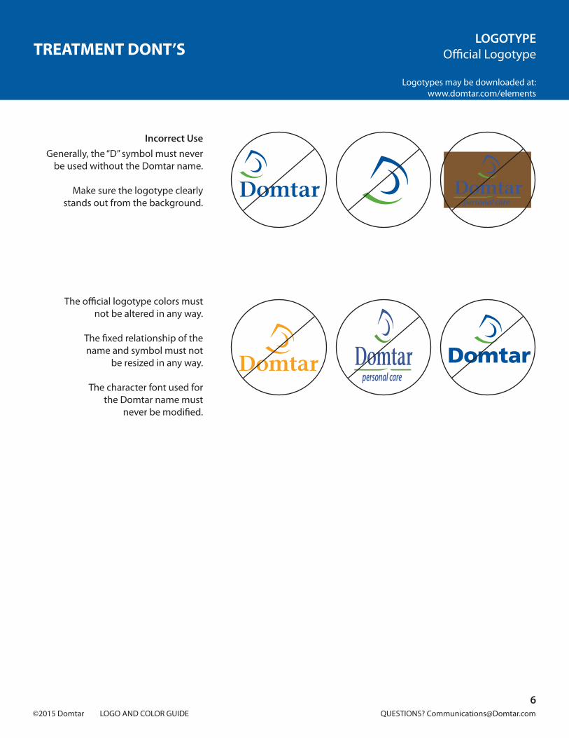
TREATMENT DONT’SLOGOTYPE
Official Logotype
Logotypes may be downloaded at:www.domtar.com/elements
Incorrect Use
Generally, the “D” symbol must never be used without the Domtar name.
Make sure the logotype clearlystands out from the background.
The official logotype colors mustnot be altered in any way.
The fixed relationship of thename and symbol must not
be resized in any way.
The character font used forthe Domtar name must
never be modified.
6

©2015 Domtar LOGO AND COLOR GUIDE QUESTIONS? [email protected]
HORIZONTAL LOGOTYPELOGOTYPE
Horizontal Logotype
Logotypes may be downloaded at:www.domtar.com/elements
Special Uses Only
Requires prior consultation with theCorporate Communications department.
7

©2015 Domtar LOGO AND COLOR GUIDE QUESTIONS? [email protected]
5
4
3WORLDWIDE INC.
5
4
3WORLDWIDE INC.
5
4
3WORLDWIDE INC.
5
4
3WORLDWIDE INC.
PROTECTION SPACELOGOTYPE
Horizontal Logotype
Logotypes may be downloaded at:www.domtar.com/elements
Special Uses Only
Requires prior consultation with theCorporate Communications department.
The logotype should always be surrounded by a clear space, which must be free of any text of imagery
(protection space).
The size of the square in which the “D” of the Domtar name is placed determines the size of the clear space surrounding
the Domtar logotype.
This space applies to all usesof the Domtar logotype.
Acceptable Use
These two examples illustrate formatting that respects the clear space
surrounding the horizontal logotype.
Incorrect Use
Never place text, imagery, photography or lines inside the official logotype
protection space.
5
4
3WORLDWIDE INC.
5
4
3WORLDWIDE INC.
5
4
3WORLDWIDE INC.
5
4
3WORLDWIDE INC.
8

©2015 Domtar LOGO AND COLOR GUIDE QUESTIONS? [email protected]
LOGOTYPEHorizontal Logotype
Logotypes may be downloaded at:www.domtar.com/elements
MINIMUM SIZE
12.7 mm0.5 inch1/2 inch
36 pixels36 points
Special Uses Only
Requires prior consultation with theCorporate Communications department.
9

©2015 Domtar LOGO AND COLOR GUIDE QUESTIONS? [email protected]
COLORS
Official Palette 11. Corporate and Complimentary ColorsSpecialized Palette 12. Official Health and Safety Color
10

©2015 Domtar LOGO AND COLOR GUIDE QUESTIONS? [email protected]
COLORSOfficial PaletteCORPORATE & COMPLIMENTARY COLORS
Our colors are unique to us. They help create our look, tone and feel.
We’ve staked our claim on a section of the palette to create our colors to make
them synonymous with the brand.
A brand helps to unify us, makes our communications memorable, and
separates us from the competition.
PMS 287C 100 M 60 Y 0 K 11.5
R 0 G 91 B 161HTML #005BA1
PMS 369C 65 M 0 Y 100 K 8.5
R 89 G 173 B 64 HTML #59AD40
Corporate Colors
Complementary Colors
The complementary colors allow great flexibility of visual presentation. These
colors harmonize with the company colors and are easily adaptable to
a consistent Domtar image.
C 90M 41Y 0K 0
C 86M 0Y 23K 0
C 61M 0Y 11K 0
C 41M 0Y 18K 0
C 92M 12Y 100K 0
C 58M 0Y 100K 0
C 38M 0Y 91K 0
C 20M 10Y 0K 65
C 5M 0Y 0K 20
11
Four-color process matching code for the Domtar color palette:C = CyanM = MagentaY = YellowK = Black
RGB matching code for the Domtar color palette:R = RedG = GreenB = Blue
R 0 G 127 B 197HTML #007FC5
R 0 G 179 B 201HTML #00B3C9
R 75 G 198 B 223HTML #4BC6DF
R 146 G 213 B 213HTML #92D5D5
R 0 G 156 B 76HTML #009C4C
R 119 G 192 B 67HTML #78C043
R 170 G 208 B 73HTML #AAD049
R 94 G 102 B 115HTML #5E6673
R 196 G 206 B 212HTML #C4CED4

©2015 Domtar LOGO AND COLOR GUIDE QUESTIONS? [email protected]
COLORSSpecialized PaletteOFFICIAL HEALTH & SAFETY COLOR
Safety Orange
Official Domtar orange has been designated to meet health and safety
needs and to alert people to dangerand warning signs.
The equivalent color in self-stickingfilm is 3M™ Tangerine.
PMS 158C 0 M 61 Y 97 K 0R 245 G 128 B 37
HTML #F58025
No EntryPrivateProperty
WARNING
12

©2015 Domtar LOGO AND COLOR GUIDE QUESTIONS? [email protected]
TYPOGRAPHY
Communications 14. Advertising, Publications and PromotionsCorrespondence 15. Microsoft Word and PowerPoint Documents
13

©2015 Domtar LOGO AND COLOR GUIDE QUESTIONS? [email protected]
TYPOGRAPHYCommunicationsADVERTISING, PUBLICATIONS & PROMOTIONS
Domtar’s communication platform effectively conveys the corporate image.
This platform and its image are defined by its stylistic elements. Myriad Pro and
Sabon are the fonts used for advertising, publications and promotions.
Uses:Product and corporate advertising,
stationary, brochures, pamphlets, internal communications, newsletters,
programs, schedules, booklets, posters, folders, etc.
Myriad ProABCDEFGHIJKLMNOPQRSTUVWXYZabcdefghijklmnopqrstuvwxyz1234567890
Light Light Italic Regular Italic Semibold Semibold ItalicBold Bold Italic Black Black Italic
SabonABCDEFGHIJKLMNOPQRSTUVWXYZabcdefghijklmnopqrstuvwxyz1234567890
Roman Italic Bold Bold Italic
Primary Fontfriendly, contemporary, resourceful
Secondary Fontclassic, credible, inviting
14

©2015 Domtar LOGO AND COLOR GUIDE QUESTIONS? [email protected]
TYPOGRAPHYCorrespondenceMICROSOFT WORD & POWERPOINT DOCUMENTS
For applications where Myriad Pro and Sabon are unavailable, system fonts
(fonts that come pre-loaded on all PCs) may be substituted.
The fonts include Arial, Verdana and Times New Roman.
Arial
ABCDEFGHIJKLMNOPQRSTUVWXYZabcdefghijklmnopqrstuvwxyz1234567890
Regular Black
Verdana
ABCDEFGHIJKLMNOPQRSTUVWXYZabcdefghijklmnopqrstuvwxyz1234567890
Regular Italic Bold Bold Italic
15
Times New Roman
ABCDEFGHIJKLMNOPQRSTUVWXYZabcdefghijklmnopqrstuvwxyz1234567890
Regular Italic Bold Bold Italic

©2015 Domtar LOGO AND COLOR GUIDE QUESTIONS? [email protected]
SIGNAGE
Basic Elements 17. Logotype 18. Protection Space 19. Rendering the Domtar Logotype in 3D 20. Color Palette 21. Font 22. Arrows 23. Letters and NumbersExterior SignageOperating Sites 24. Six Basic Designs 25. Large Building Sign 26. Unilingual Main Entrance Sign 27. Bilingual Main Entrance Signs (Quebec) 28. Main Entrance Signs with Information 29. Domtar Basic Signage Grid 34. Unilingual Secondary Entrance Signs 35. Unilingual Identification Sign 36. Multi-directional Unilingual Identification Sign 37. Basic Grid for Warning Signs 39. Color 40. Unilingual Notice Signs 41. Unilingual Warning Signs 42. Unilingual “No Entry” SignsOutside Operating Sites 43. Road SignsPlaces of Business 44. Corporate OfficesAdditional Elements 45. Flags 46. “No Smoking” Signs
Signs have many practical functions: they designate locations, guide people to their destination and serve to brand the interior and exterior workspace. This section establishes the ground rules of the Domtar signage system. It provides the guidelines for its design, staging, color and reproduction, including approved colors and grids. By producing signage in conformity with the graphics standards set out here, we ensure the unified look of all Domtar facilities and build brand recognition both in the marketplace and in the communities where Domtar is present.
16

©2015 Domtar LOGO AND COLOR GUIDE QUESTIONS? [email protected]
LOGOTYPESIGNAGE
Basic Elements
Logotypes may be downloaded at:www.domtar.com/elements
Official Logotype
Horizontal Logotype
Official Reverse Color Logotype
Horizontal Reverse Color Logotype Horizontal Color Logotype
Official Color Logotype
Note:The official and horizontal white/green reverse logotypes can only be usedon a blue Domtar Background.
On Domtar signage, the two Domtar logotypes are used in very specific ways. The official Logotype must appear on all
main building signs and main entrance signs. The horizontal logotype may
appear on secondary entrance signs, directional signs, identifying signs and
notice signs in Domtar’s operations.
17

©2015 Domtar LOGO AND COLOR GUIDE QUESTIONS? [email protected]
PROTECTION SPACESIGNAGE
Basic Elements
Logotypes may be downloaded at:www.domtar.com/elements
Protection Space for Signage
The logotype must always be surrounded by a clear space.
Do not proportionally resize the area in any way. The method of calculation
is illustrated below.
First, draw two horizontal lines: one on the baseline of the Domtar name and
the other at the tip of thelogotype symbol.
Second, select the letter “D” in Domtar, copy it and reduce it to 75%.
Position this letter as illustrated: on and under the Domtar baseline and above
the symbol.
Third, draw a rectangle at the outer edges of the “D”s. The area of the protection space measures .75 of
the height of the Domtar “D”.
Protections space for official logotype (for signage)
Protection space for horizontal logotype (for signage)
protection space
protection space
A
A
A= 75% of the height of the “D”
A= 75% of the height of the “D”
A
A
18

©2015 Domtar LOGO AND COLOR GUIDE QUESTIONS? [email protected]
RENDERING THE DOMTAR LOGOTYPE IN 3DSIGNAGE
Basic Elementsfor Exterior Signage
Logotypes may be downloaded at:www.domtar.com/elements
Metallic Materials
Use silver rather than gold or bronze when producing the logotype using
metallic materials.
Brushed stainless steel should be used.
The letters and “D” symbol should match the surface color.
Never alter or proportionally resize the letters or symbol in any way.
Letter Channel
The logotype may be reproduced in individual light boxes.
The letters and “D” symbol should match the surface color.
Never alter or proportionally resize the letters or symbol in any way.
Every effort must be made to matchthe corporate colors.
The official logotype (vertical)should be used at all times.
19

©2015 Domtar LOGO AND COLOR GUIDE QUESTIONS? [email protected]
COLOR PALETTESIGNAGE
Basic Elements
The elements of exterior signage were inspired by the company’s colors.
Domtar’s logotype harmonizes with the graphic elements.
White lettering on an official Domtar blue background is preferred for all
signage. The graphic elements, such as the arrow, are displayed on a Domtar
green square background.
Domtar orange has been added for use on warning and healthy and safety signs.
Domtarofficial Blue
Domtarofficial Green
Domtarofficial Orange
Flat printing
Pantone 287(acceptable substitutes)
Flat printing
Pantone 369(acceptable substitutes)
Flat printing
Pantone 158(acceptable substitutes)
Four-color printing
C 100 M 69 Y 0 K 11.5
Four-color printing
C 65 M 0 Y 100 K 8.5
Four-color printing
C 0 M 61 Y 97 K 0
Self-sticking film
3M™ Sultan Blue
Self-sticking film
3M™ Lime Green
Self-sticking film
3M™ Tangerine
20

©2015 Domtar LOGO AND COLOR GUIDE QUESTIONS? [email protected]
FONTSIGNAGE
Basic Elements
For all Domtar signage, we have selected the following fonts: Myriad Pro Regular, Myriad Pro Semibold and Myriad Pro Italic Semibold. This sans serif typeface is contemporary and easy-to-read.
Professional design software, such as Adobe Illustrator, Adobe Photoshop, etc. have default typographic settings. These default settings include kerning settings that are ideal for publication design but are not recommended for signage. Default kerning settings (or track kerning) place the letter too tightly and can become unreadable at certain distances. It is therefore important to rely on your signage vendor to use accurate kerning to make signs easier to read.
Myriad Pro Regular
ABCDEFGHIJKLMNOPQRSTUVWXYZabcdefghijklmnopqrstuvwxyz1234567890
Myriad Pro Regular is used for notice sign headings and warnings.
Myriad Pro Semibold is used for entrances to operations, messages and
the names of the operations.
Myriad Pro Italic Semibold is used for additional information.
Myriad Pro Semibold
ABCDEFGHIJKLMNOPQRSTUVWXYZabcdefghijklmnopqrstuvwxyz1234567890
Myriad Pro Italic Semibold
ABCDEFGHIJKLMNOPQRSTUVWXYZabcdefghijklmnopqrstuvwxyz1234567890
21

©2015 Domtar LOGO AND COLOR GUIDE QUESTIONS? [email protected]
ARROWSSIGNAGE
Basic Elements
Arrow designs may be downloaded at:www.domtar.com/elements
The design of the arrow must be consistent for Domtar signage and must
at all times be displayed on a square background. Never create a new
arrow design.
On the signs, the arrow must be presented in white on a square of
Domtar Green. When the arrow is used on a glass surface, the square is white
and the arrow is perforated.
The arrow can be pointed in any direction, as long as it occupies the same
surface area.
Do not proportionally resize or alter the arrow design in any way.
This grid illustrates the proportions of the arrow and square.
22
1/6
Packages and Messaging

©2015 Domtar LOGO AND COLOR GUIDE QUESTIONS? [email protected]
LETTERS AND NUMBERSSIGNAGE
Basic Signage
Identification letters and numbers must be displayed in white on a Domtar green
square. As illustrated below, the arrow, letters and numbers all occupy the same
grid and are the same height. However, as the letters and numbers are narrower,
they must be horizontally centered on the green square.
Letters and numbers must not be reconstructed, altered, or proportionally
resized in any way.
Letters and Numbers
Myriad Pro Semiboldcapital letters
Address
Myriad Pro Semibold
23
1/6
395

©2015 Domtar LOGO AND COLOR GUIDE QUESTIONS? [email protected]
Nekoosa Mill
Nekoosa Mill
WaterReclamationCenter
Independent ConstructionContractors and their Suppliers
Nekoosa Mill
Nekoosa Mill
Exit 70
Nekoosa Mill
Receiving
Shipping office
Driver Check-inStation
Loaded Trailer Lot
Empty Trailer Lot
Nekoosa Mill
EmployeeEntry Only
NOTICENo entryPrivateProperty
WARNING
SIX BASIC DESIGNSSIGNAGE
Exterior SignageOperating Sites
The following is an overview of approved signage at Domtar operating sites.There are six categories of exterior signs, each one bearing a different message.
1. Large Building SignsUsually mounted at the highest position on a wall, these signs can
be seen from a great distance, and have significant visual impact.
These signs bear only the logotype on a blue rectangle. A three-dimensional perspective can be added to the letters and shapes
painted in white and green.
The vertical logotype should be prominent.
2. Main Entrance SignsThese signs, which identify operations, are installed near entrances.
The vertical model should be used unless the existing support was designed for a horizontal model.
3. Secondary Entrance and Directional SignsThese signs direct visitors within the limits of an operation site.
4. Identification Signs (building/department/location)These signs identify the building and indicate the services available
at a specific location.
5. Warning and Notice SignsThese signs are designed to draw attention to a notice, warning,
restriction, danger or prohibition. An orange background it used to alert people of its importance.
6. Road Signs(To direct visitors to the site.)
24

©2015 Domtar LOGO AND COLOR GUIDE QUESTIONS? [email protected]
LARGE BUILDING SIGNSIGNAGE
Exterior SignageOperating Sites
Of all the categories, these large building signs have the greatest visual
impact. They are recognizable at a great distance due to their imposing size
and prominent position. The sign must be strategically positioned. Outdoor
corporate signs may use colored lights.
Protection area for signs
Slightly narrower than the imprint space, this space surrounds the logotype and
must be free of any graphic or text elements. It is proportionate to the
logotype and should not be altered or resized in any way.
Protection space for the official logotype (reserved for signage)
Protection space for the horizontal logotype (reserved for signage)
These examples are for illustration purposes only.
protection spaceA
A= 75% of the height of the “D”
A protection spaceA
A= 75% of the height of the “D”
A
25
Example of use of protection space usage on large signs

©2015 Domtar LOGO AND COLOR GUIDE QUESTIONS? [email protected]
A = 75% of the height of the “D”B = 50% of the height of the “D”
A
A A
A
A
A
B
A = 75% of the height of the “D”E = 40% of the height of the “D”
Name of operation
A
A
A
A
E
A A
Name of the operation
Nekoosa Mill
Nekoosa Mill
protectionspace of thelogotype
protectionspace of thelogotype
A = 75% of the height of the “D”B = 50% of the height of the “D”
A
A A
A
A
A
B
A = 75% of the height of the “D”E = 40% of the height of the “D”
Name of operation
A
A
A
A
E
A A
Name of the operation
Nekoosa Mill
Nekoosa Mill
protectionspace of thelogotype
protectionspace of thelogotype
UNILINGUAL MAIN ENTRANCE SIGNSSIGNAGE
Exterior SignageOperating Sites
The main entrance sign welcomes employees and visitors. It should be carefully constructed and maintained.
To determine the identification area, you must first establish the protection space. Then you can define the size and position of the operation name.
Once you have determined the protection space, select the “D” of the Domtar name, make a copy reduced according to the percentage required for the logotype used (40% for vertical logotype or 50% for the horizontal logotype). Position this letter under the protection space, as illustrated below. Then draw a line at the bottom of the letter “D”.The capital letter of the operation name will be the same height as this “D”.
Now, select the “D” in Domtar and make a copy at 75%. Position this letter at the bottom of the baseline of the operation name, as illustrated below. Finally, draw a rectangle at the outer edges of the “D’s”. This rectangle is the identification area. Like the protection space, it is proportional to the logotype and operation name and cannotbe altered.
If the sign is too high or too long, reduce the logotype and operation name so that the sign accommodates the entire protection space. Then center the logotype and operation name so that the surrounding space is equal on both sides.
Identification Area
Name of Operation
Myriad Pro SemiboldUpper and lower case
Measurements Measurements
Final product
Final Product
Note:The vertical model should be used
unless the existing support is designed for a horizontal model.
26These examples are for illustration purposes only.

©2015 Domtar LOGO AND COLOR GUIDE QUESTIONS? [email protected]
A
A
A
A
B
B
H
A
A
A
E
EG
G
A A AA
Name of operation
Nom de l’exploitationNom de l’exploitationName of operation
A = 75% of the height of the “D”B = 50% of the height of the “D”H = 25% of the height of the “D”
A = 75% of the height of the “D”E = 40% of the height of the “D”G = 20% of the height of the “D”
Ottawa-Hull Mill
Usine d’Ottawa-Hull
Usine d’Ottawa-HullOttawa-Hull Mill
protectionspace of the logotype
protectionspace of the logotype
BILINGUAL MAIN ENTRANCE SIGNS (QUEBEC)SIGNAGE
Exterior SignageOperating Sites
Identification Area
Name of Operation
Myriad Pro SemiboldUpper and lower case
Measurements Measurements
Final product
Final Product
Note:The vertical model should be used
unless the existing support is designed for a horizontal model.
27These examples are for illustration purposes only.
Usine de WindsorWindsor Mill
Usine de WindsorWindsor Mill

©2015 Domtar LOGO AND COLOR GUIDE QUESTIONS? [email protected]
MAIN ENTRANCE SIGNS WITH INFORMATIONSIGNAGE
Exterior SignageOperating Sites
Identification Area
Name of Operation
Myriad Pro SemiboldUpper and lower case
Information
Myriad Pro SemiboldUpper and lower case
Measurements
Final product Final ProductNote:
The vertical model should be usedunless the existing support is designed
for a horizontal model.
Note:Grid to add information.
28These examples are for illustration purposes only.
= 75% of D= 45% of D
Name of Operation
Directional
Directional 000
The Name of The Operation
Raleigh Two LineOperationParking
Parking
Entrance
Entrance
510

©2015 Domtar LOGO AND COLOR GUIDE QUESTIONS? [email protected]
DOMTAR BASIC SIGNAGE GRIDSIGNAGE
Exterior SignageOperating Sites
The information that appears on signs is structured in four zones.
The first zone is the header. This zone is used for main and secondary entry signs and is usually accompanied bya letter or a number in a Domtar Green Square.
The second zone is the message area, or the body of the sign. It can contain one or more messages, in oneor more directions.
The message can be accompanied by additional information, which is found in the third zone.
The fourth zone is the identification area. This is the zone where the Domtar logotype and operation nameare displayed.
Myriad Pro fonts are used for each zone.
1. HeaderTitle
Myriad Pro SemiboldUpper and lower case
Letters or NumbersMyriad Pro Semibold
Upper and lower case
2. MessagesText
Myriad Pro SemiboldUpper and lower case
3. Additional InformationMyriad Pro Italic
Upper and lower case
4. Identification AreaName of Operation
Myriad Pro SemiboldUpper and lower case
29These examples are for illustration purposes only.
Nekoosa Mill
Independent ConstructionContractors and their Suppliers
Employees & AuthorizedSuppliers Only
AHeader
Messages
Additional Information
Identification Area

©2015 Domtar LOGO AND COLOR GUIDE QUESTIONS? [email protected]
A = 75% of the height of the “D”B = 50% of the height of the “D”
A
A
A
B
A
A A
A
1 C
Name of operation
1/4
1/4
1/4
1/4
1/4
1/4
1/4
1/4Name of operation
1 C
Name of operation
1 C
DOMTAR BASIC SIGNAGE GRID STEP 1SIGNAGE
Exterior SignageOperating Sites
Secondary entrance signs, directional signs and identifying signs can be produced using this grid. In order to create them, you must know the exact dimensions of your sign, and more specifically, the dimensions of the visible surface area (inside the frame).
These signs are always located inside the operations site.
Step 1How to establish the identification area
If the sign is vertical, proceed as follows: First, draw a square of equal sides at the
bottom line. Then, divide this square into four equal horizontal sections. The bottom section will be the identification area: only
the logotype and name of the operation can be displayed here. The top section is the
header and message area.
If the sign is horizontal, proceed as follows: First, divide this rectangle into four equal
horizontal sections. Again, the bottom section is the identification area reserved for
the logotype and operation name.The top section is the header
and message area.
The horizontal logotype and operation name are always positioned at the lower right-
hand corner. Use the horizontal logotype in the identification area.
Use the horizontal logotype in the identification area to define the protection
space for the logotype and the size of the operation name, follow the
instructions opposite.
Position the logotype, name of the operation and protection space so that the protection
space is equal in area to theidentification area.
Then, move the logotype and operation name so that the logotype is aligned with
the lower right corner at, 1/3 (two A) of the height of the identification area.
Vertical Sign
Horizontal Sign Identification
Identification
Identification
Note:The horizontal logotype is used on
these signs in order to maximize the space for messages and information.
This is an exception.
30

©2015 Domtar LOGO AND COLOR GUIDE QUESTIONS? [email protected]
1/3 C
1/3 C
1/3 C
C
C
1/3 C
Name of operation
1/6 C
variable height
Name of operation
Messagesection
DOMTAR BASIC SIGNAGE GRID STEP 2 & 3SIGNAGE
Exterior SignageOperating Sites
After defining the identification area, you can set the margins outside the message area.
The height of the identification area acts as a standard measurement: C height. This measurement is divided intothirds and sixths.
The outside margins equal one-third of the height of the identification area and must be free of all graphic elements.
Step 2How to set the margins
In the message area, set the top, bottom, left and right margins at a distance equal to one
third the identification area. These margins help you define the baseline grid where you
place the graphic elements.
Step 3How to set the baseline grid
From the top margin, draw horizontal guides equally spaced at 1/6 the height of the identification area until you reach the
bottom margin.
If the space between the top guide and the bottom guide cannot be divided evenly,
leave the extra space above the bottom margin.
Set the margins
Set the baseline grid
31

©2015 Domtar LOGO AND COLOR GUIDE QUESTIONS? [email protected]
DOMTAR BASIC SIGNAGE GRID STEP 4SIGNAGE
Exterior SignageOperating Sites
Each sign is unique and conveys a distinct message. The message may be simple, as in the sign below, or complex,as the multi-directional sign on the following page.
Signs must be easy to read and understand, and installed in the correct place. This system is designed to simplifythe production of signs, while preserving a consistent and original style.
Step 4How to position the title and message
The grid is composed of spaces equal to 1/6 of the height of the identification area. Elements are arranged in a fixed
relationship within this grid.
Align the upper or lower case letters with the space.
Create a hierarchy between the different text elements according to their importance.
For optimal visibility, it is important to pay attention to the kerning (the spacing between the letters) of a word and a line.
The title and message should always be aligned to the left.
Spaces equal to 1/3 C separate the header and message areas.
For a secondary entrance sign (illustrated opposite), the height of the Domtar green square is always equal to the height of
the identification area.
C equals the height of the identification area.
Position the title and the message
TitleMyriad Pro Semibold
Upper and lower case
Letters or NumbersMyriad Pro Semibold
Upper and lower case
TextMyriad Pro Semibold
Upper and lower case
Name of OperationMyriad Pro Semibold
Upper and lower case
32These examples are for illustration purposes only.
C
1/3 C
1/3 C
1/6 C
1/6 C
1/6 C
1/6 C
1/6 C
1/6 C
1/6 C
1/3 C
C
1/3 C1/3 C1/3 C
1/3 CC
A = 75% of the height of the “D”B = 50% of the height of the “D”
AA
A
A
ABA
2A
Independent ConstructionContractors and their Suppliers
Entrance
Name of operation
A

©2015 Domtar LOGO AND COLOR GUIDE QUESTIONS? [email protected]
DOMTAR BASIC SIGNAGE GRID STEP 4 (SUITE)SIGNAGE
Exterior SignageOperating Sites
On the previous pages, we explained how to determine the identification and message areas. Here, we show how the guidelines apply to a multi-directional sign.
How to position the title and messageSpaces equal to 1/6 of the height of the identification area
serve as a grid to position the text elements.
Align the upper and lower case letters with the space.
For optimal visibility, it is important to pay attention to the kerning (the spacing between the letters) of words and lines.
For multi-directional signs, the height of the Domtar green square is always equal to the height of the identification
area or to half of this height.
The Domtar green squares are always positioned on the left.
Between each direction, insert a minimum space of 1/6 height of the identification area.
A space equal to 1/3 C separates squares that measure 1 C and the beginning of directional messages.
A space equal to 1/6 C separates squares that measure 1/2 C and the beginning of directional messages.
When the same direction is common to all the messages, one green square with an arrow is used.
C equals the height of the identification area.
Multi-directional sign
Letters or NumbersMyriad Pro Semibold
Upper and lower case
TextMyriad Pro Semibold
Upper and lower case
Name of OperationMyriad Pro Semibold
Upper and lower case
33These examples are for illustration purposes only.
Receiving
Shipping Office
Driver Check-inStation
Loaded Trailer Lot
Empty Trailer Lot
1/3 C
1/6 C
1/6 C
1/6 C
1/6 C
1/6 C
1/6 C
1/6 C
1/6 C
1/6 C
1/6 C
1/6 C
1/6 C
1/6 C
1/6 C
1/6 C
1/6 C
1/6 C
1/6 C
1/6 C
1/6 C
variable height
1/3 C
1/3 C1/3 C 1/6
C
C
Name of operation
A = 75% of the height of the “D”B = 50% of the height of the “D”
AA
A
A
A
A
B
C
1/2 C

©2015 Domtar LOGO AND COLOR GUIDE QUESTIONS? [email protected]
Nekoosa Mill
Plant EntranceNo.Employees & Authorized Suppliers Only
21/3 C1/3 C
C
1/6 C1/6 C
1/6 C
1/6 C
1/3 C
1/6 C1/6 C1/6 C1/6 C1/6 C
C
1/3 C
variable width
A = 75% of the height of the “D”B = 50% of the height of the “D”
A
A
A
AB
A
A
Employees & Authorized Suppliers Only
Nekoosa Mill
Plant EntranceNo.
2
Nekoosa Mill
Plant EntranceNo.Employees & Authorized Suppliers Only
21/3 C1/3 C
C
1/6 C1/6 C
1/6 C
1/6 C
1/3 C
1/6 C1/6 C1/6 C1/6 C1/6 C
C
1/3 C
variable width
A = 75% of the height of the “D”B = 50% of the height of the “D”
A
A
A
AB
A
A
Employees & Authorized Suppliers Only
Nekoosa Mill
Plant EntranceNo.
2
UNILINGUAL SECONDARY ENTRANCE SIGNSSIGNAGE
Exterior SignageOperating Sites
Unilingual Identification Sign
TitleMyriad Pro Semibold
Upper and lower case
Letters or NumbersMyriad Pro Semibold
Upper case
Additional InformationMyriad Pro Italic
Upper and lower case
Name of OperationMyriad Pro Semibold
Upper and lower case
Measurements
Final Product
34These examples are for illustration purposes only.

©2015 Domtar LOGO AND COLOR GUIDE QUESTIONS? [email protected]
Nekoosa Mill
Ash-Bark SiteAuthorized Personnel Only
1/3 C 1/3 C
1/6 C
CNekoosa Mill
Ash-Bark SiteAuthorized Personnel Only
1/3 C
DriverCheck-inStation
Nekoosa Mill
1/3 C 1/3 C
1/6 C1/3 C
C
DriverCheck-inStation
Nekoosa Mill
UNILINGUAL IDENTIFICATION SIGNSIGNAGE
Exterior SignageOperating Sites
Unilingual Identification Sign
TextMyriad Pro Semibold
Upper and lower case
Additional InformationMyriad Pro Italic
Upper and lower case
Name of OperationMyriad Pro Semibold
Upper and lower case
Measurements Final Product
Measurements Final Product
35These examples are for illustration purposes only.

©2015 Domtar LOGO AND COLOR GUIDE QUESTIONS? [email protected]
MULTI-DIRECTIONAL UNILINGUALIDENTIFICATION SIGN
SIGNAGEExterior Signage
Operating Sites
Multi-directionalUnilingual Sign
TextMyriad Pro Semibold
Upper and lower case
Name of OperationMyriad Pro Semibold
Upper and lower case
Measurements Final Product
36These examples are for illustration purposes only.
C1/3 C 1/3 C 1/3 C
1/6 C1/6 C1/6 C1/6 C1/6 C1/6 C1/6 C1/6 C1/6 C1/6 C1/6 C1/6 C1/6 C1/6 C1/3 C
Nekoosa Mill
C
1/3 C
Empty TrailerLot No. 2
Empty TrailerLot No.3
Nekoosa Mill
Empty TrailerLot No. 2
Empty TrailerLot No. 3
A = 75% of the height of the “D”B = 50% of the height of the “D”
AA
AAB
A
A

©2015 Domtar LOGO AND COLOR GUIDE QUESTIONS? [email protected]
BASIC GRID FOR WARNING SIGNSSIGNAGE
Exterior SignageOperating Sites
The procedure for creating a grid for warning and notice signs is illustrated below.
On main warning signs, terms such as WARNING or NOTICE are displayed in blue capital letters on a white rectangle positioned at the top of the sign.
Other terms may also be displayed in the header area on this type of sign, for example, DANGER and NO ENTRY.
To determine the proportions of the header area, first draw a square at the
top line. Then divide this square into four equal horizontal sections. The top
section is reserved for the warning and the bottom area is for the messaging.
The height of the top section is the guide, and equals 1 C. The left and right
margins equal 1/3 C and the height of the baselines equals 1/6 C. The
horizontal white logotype is positioned at the lower right, with margins of 1/3 C. The height of the clear area for the
logotype equals 2/3 C.
Depending on the dimensions of the sign and the space available in the
headers area, the height of the term used can be 1/2 C or 1/3 C.
Exceptionally, the term used in the header area may also be written in
upper and lower case.
Warning TermMyriad Pro Regular
Upper and lower case
TextMyriad Pro Semibold
Upper and lower case
Additional InformationMyriad Pro Italic
Upper and lower case
37These examples are for illustration purposes only.
1/4
1/4
1/4
1/4
1/4
1/4
1/4
1/4
1 C
1 C
A
A A
A
A
2/3 C
A = 75% of the height of the D
WARNING
WARNING1/3 C
NOTICE1/3 C
1/2 C
NOTICE1/2 C
1/6 C
2/3 C
1/6 C
1/3 C
C
1/3 C
1/2 C NOTICE
1/3 C
AuthorizedEntry OnlyFor Loading and Unloading Only
variableheight A
A A
A
A

©2015 Domtar LOGO AND COLOR GUIDE QUESTIONS? [email protected]
BASIC GRID FOR WARNING SIGNSSIGNAGE
Exterior SignageOperating Sites
In order to alert people, we have designed a special grid for warning signs. Specific fonts have also been used.
Myriad Pro fonts are used for each area.
Create a hierarchy among the different text elements according to
their importance.
For optimal readability, it is important to pay attention to the kerning (the
spacing between the letters)of words and lines.
1. Header
Warning TermMyriad Pro Regular
Upper case
2. Message
TextMyriad Pro Semibold
Upper and lower case
3. Additional Information
Myriad Pro ItalicUpper and lower case
4. Identification Area
Only the Domtar logotype appears in this area. The name of the operation
must not appear.
38These examples are for illustration purposes only.
NOTICEAuthorizedEntry OnlyFor Loading and Unloading Only
Header
Messages
Additional Information
Identification Area

©2015 Domtar LOGO AND COLOR GUIDE QUESTIONS? [email protected]
COLORSIGNAGE
Exterior SignageOperating Sites
Two background colors can be used for warning signs.
Domtar’s official blue backgroundThis color should be used for information concerning
rules, regulations, utilization, hours, etc. where there is no danger or serious consequence involved.
The Domtar blue background on signs usually bearsthe heading “NOTICE”.
Warning TermMyriad Pro Regular
Upper case
TextMyriad Pro Semibold
Upper and lower case
Domtar’s official orange backgroundThis color should be used for information concerning
rules, regulations and utilization with regard to the health and safety of Domtar employees and visitors at
the operations site.
The Domtar orange background on signs usually bears the headings “WARNING”, “DANGER”
or “NO TRESPASSING”.
Warning TermMyriad Pro Regular
Upper case
TextMyriad Pro Semibold
Upper and lower case
Additional InformationMyriad Pro Italic
Upper and lower case
39These examples are for illustration purposes only.
No EntryPrivateProperty
No EntryPrivateProperty
DANGEREmployeeEntry Only
NOTICE WARNING
No EntryPrivateProperty
No EntryPrivateProperty
DANGEREmployeeEntry Only
NOTICE WARNING

©2015 Domtar LOGO AND COLOR GUIDE QUESTIONS? [email protected]
UNILINGUAL NOTICE SIGNSSIGNAGE
Exterior SignageOperating Sites
Warning Signs
Create a hierarchy among the different text elements according
to their importance.
HeaderMyriad Pro Regular
Upper case
MessageMyriad Pro Semibold
Upper and lower case
Additional InformationMyriad Pro Italic
Upper and lower case
Measurements Final Product
40These examples are for illustration purposes only.
Private PropertyNo Unauthorized Vehicles Allowed
NOTICE
Open to Public Pedestrian Tra�c
A = 75% of the height of the “D”
C1/2 C
Réservé aux véhicules autorisésAccès piétonnier
1/3 C 1/3 C
1/6 C
1/6 C
1/3 C
A
A A
A
A
Propriété privée
AVISPrivate PropertyNo Unauthorized Vehicles Allowed
NOTICE
Open to Public Pedestrian Tra�c

©2015 Domtar LOGO AND COLOR GUIDE QUESTIONS? [email protected]
UNILINGUAL WARNING SIGNSSIGNAGE
Exterior SignageOperating Sites
Warning Signs
HeaderMyriad Pro Regular
Upper and lower case
MessageMyriad Pro Semibold
Upper and lower case
Measurements Final Product
41These examples are for illustration purposes only.
No EntryPrivateProperty
1/6 C
1/2 C
1/3 C1/3 C
C
variableheight
A = 75% of the height of the “D”
AA A
AA
2/3 C1/6 C
Entrée interditePropriété privée
AVERTISSEMENT
No EntryPrivateProperty
WARNINGWARNING
©2015 Domtar LOGO AND COLOR GUIDE QUESTIONS? [email protected]
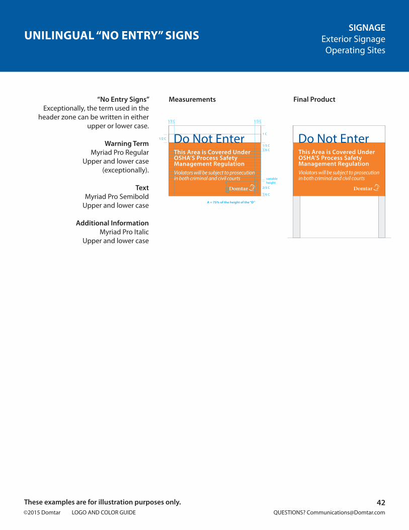
UNILINGUAL “NO ENTRY” SIGNSSIGNAGE
Exterior SignageOperating Sites
“No Entry Signs”Exceptionally, the term used in the
header zone can be written in either upper or lower case.
Warning TermMyriad Pro Regular
Upper and lower case(exceptionally).
TextMyriad Pro Semibold
Upper and lower case
Additional InformationMyriad Pro Italic
Upper and lower case
Measurements Final Product
42These examples are for illustration purposes only.
A = 75% of the height of the “D”
Do Not EnterThis Area is Covered UnderOSHA’S Process Safety Management RegulationViolators will be subject to prosecution in both criminal and civil courts
1/6 C
2/3 C
1/6 C
1/3 C
1 C
1/3 C
1/2 C Do Not Enter
1/3 C
This Area is Covered UnderOSHA’S Process Safety Management RegulationViolators will be subject to prosecution in both criminal and civil courts variable
heightA
A A
A
A

©2015 Domtar LOGO AND COLOR GUIDE QUESTIONS? [email protected]
Main EntranceJean Jacques Cossette Blvd.
Nekoosa Mill
Exit 70
Nekoosa Mill
Green line is 15% of the height of the “D”.
1u
1u
1/6u1/6u
1/6u1/6u
1/6u1/6u
Nekoosa Mill
Exit 70
1/3u
Nekoosa Mill
1/3u 1/3u1/3u
Main EntranceJean Jacques Cossette Blvd.
ROAD SIGNSSIGNAGE
Exterior SignageOutside of Operating Sites
A specific grid has been diagnosed for the production of signs placed along roads outside the limits of theoperating site. These signs must be used prudently and must conform to local regulations.
Using the horizontal logotypeon these signs is prohibited.
Step 1
Determine the Identification AreaDivide the sign horizontally into three
equal parts. The top two sections are reserved for identification: only the
official logotype and name of the operation are displayed here. The lower
section is reserved for the message.
Name of OperationMyriad Pro Semibold
Upper and lower case
Step 2
How to Position the MessageA space equal to 1/6 of the “u” determines the grid where the
message should appear.
Make sure the upper and lower case letters fit within the space.
For optimum readability, it is imperative that attention be given to the kerning
(space between the letters) of words and lines and letter sizes.
MessageMyriad Pro Semibold
Upper and lower case
Horizontal Grid Identification
Measurements
Final Product
43These examples are for illustration purposes only.
1/3
1/3
1/3 A = 75% of the height of the “D”E = 40% of the height of the “D”
u = 1/3 of the height of the sign
A
A
A
E
A
A A
Nekoosa Mill
©2015 Domtar LOGO AND COLOR GUIDE QUESTIONS? [email protected]
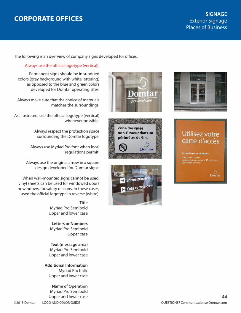
CORPORATE OFFICESSIGNAGE
Exterior SignagePlaces of Business
The following is an overview of company signs developed for offices.
Always use the official logotype (vertical).
Permanent signs should be in subdued colors (gray background with white lettering)
as opposed to the blue and green colors developed for Domtar operating sites.
Always make sure that the choice of materials
matches the surroundings.
As illustrated, use the official logotype (vertical) whenever possible.
Always respect the protection space surrounding the Domtar logotype.
Always use Myriad Pro font when local regulations permit.
Always use the original arrow in a square design developed for Domtar signs.
When wall-mounted signs cannot be used, vinyl sheets can be used for windowed doors or windows, for safety reasons. In these cases,
used the official logotype in reverse (white).
TitleMyriad Pro Semibold
Upper and lower case
Letters or NumbersMyriad Pro Semibold
Upper case
Text (message area)Myriad Pro Semibold
Upper and lower case
Additional InformationMyriad Pro Italic
Upper and lower case
Name of OperationMyriad Pro Semibold
Upper and lower case 44
Permanent signs should be in subdued colors (gray background with whitelettering) as opposed to the btue andgreen colors developed for Oomtaroperating sites.
Always make sure that the choice ofmaterials matches the surroundings.
Always use Myriad MM font when localregulations permit
When wall.mounted signs cannot beused, vinyl sheets can be used torwindowed doors or windows. forsafe ty reasons. In these cases. use theoffi cial logotype in reverse (white).
Title:Myriad MM SSSSB 600N;upper and lower case.
Letters or Numbers:Myriad MM SSSSB 600N;upper case.
Text (message area)Myriad MM SSSSB SOON;upper and lower case ..
Additional Information:Myriad MM SSSSB SOON;upper and lower case.
Name of Operation:Myriad MM SSSSB 600N;upper and lower case
SIGNAGEExterior SignagePlaces of Business
©2015 Domtar LOGO AND COLOR GUIDE QUESTIONS? [email protected]
FLAGSSIGNAGE
Exterior SignageAdditional Elements
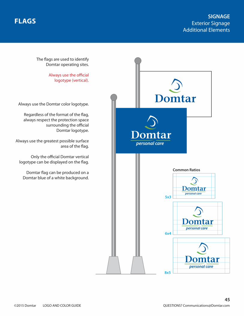
The flags are used to identifyDomtar operating sites.
Always use the official logotype (vertical).
Always use the Domtar color logotype.
Regardless of the format of the flag, always respect the protection space
surrounding the officialDomtar logotype.
Always use the greatest possible surface area of the flag.
Only the official Domtar vertical logotype can be displayed on the flag.
Domtar flag can be produced on a Domtar blue of a white background.
45
Common Ratios
5x3
6x4
8x5

©2015 Domtar LOGO AND COLOR GUIDE QUESTIONS? [email protected]
Name of operation
1/3c
1/3c
1/6c
1c
1/3c 1/3c1/3c 1/3c
1/3c
1/2c
1c
1c
1c
1c
1c
1c 1c 1c 1c
Nekoosa Mill
WARNINGNo Smoking Site
No Smoking Site
No Smoking Site
WARNINGNo Smoking Site
1/6c
1/6c1c
“NO SMOKING” SIGNSSIGNAGE
Exterior SignageAdditional Elements
“Non-smoking” symbols may be downloaded at:www.domtar.com/elements
“No Smoking” Signs
WARNINGMyriad Pro Regular
Upper case
MessageMyriad Pro Semibold
Upper and lower case
Measurements Measurements
Final Product Final Product
At Domtar operations, signs that designate non-smoking area are
associated with workplace health and safety communications. Backgrounds
on these signs must therefore be in official Domtar orange (PMS 158) “Bright
Orange.” Signs may only be created according to the two following grids.
46
Name of operation
1/3c
1/3c
1/6c
1c
1/3c 1/3c1/3c 1/3c
1/3c
1/2c
1c
1c
1c
1c
1c
1c 1c 1c 1c
Nekoosa Mill
WARNINGNo Smoking Site
No Smoking Site
No Smoking Site
WARNINGNo Smoking Site
1/6c
1/6c1c

©2015 Domtar LOGO AND COLOR GUIDE QUESTIONS? [email protected]
PROMOTIONAL ITEMS
48. Basic Concepts and Elements 49. Mistakes to AvoidCorporate 50. Application of the Logotype on Light Backgrounds 51. Application of the Logotype on Dark Backgrounds Including Black 52. Use of Text Under the Logotype 53. Special Uses
47

©2015 Domtar LOGO AND COLOR GUIDE QUESTIONS? [email protected]
BASIC CONCEPTS AND ELEMENTSPROMOTIONAL ITEMS
Corporate
Official LogotypesThe following versions of the logotype should be used for Domtar promotional items.
Protection Space(reserved for promotional items)
This space must be free of all graphic or typographical elements. It is measured by 75% of the height
of the “D” in the Domtar name and applies to the entire space
surrounding the logotype(clear space).
Company ColorsOfficial Domtar Blue
Company ColorsOfficial Domtar Green
Official TypographyThe character font for Domtar
promotional items is Myriad Pro.
More specifically, when the Domtar logotype includes text
(name of operation, certification, etc.), Myriad Pro Semibold is the
character font to be used.
Official Color Logotype Official BlackMonochrome Logotype
Official ReverseLogotype
Minimum FormatRegardless of the unit of
measurement of medium used, the official Domtar logotype must never be
reproduced smaller thanthe example illustrated.
Myriad Pro Semibold
ABCDEFGHIJKLMNOPQRSTUVWXYZabcdefghijklmnopqrstuvwxyz1234567890
12.7 mm0.5 inch1/2 inch
36 pixels36 points
Flat Printing
Pantone 287(acceptable substitute)
Flat Printing
Pantone 369(acceptable substitute)
Four-color printing
C 100 M 60 Y 0 K 11.5 (U)C 100 M 60 Y 0 K 11.5 (C)
Four-color printing
C 65 M 0 Y 100 K 8.5 (U)C 65 M 0 Y 100 K 8.5 (C)
protection spaceA
A= 75% of the height of the “D”
A
48

©2015 Domtar LOGO AND COLOR GUIDE QUESTIONS? [email protected]
MISTAKES TO AVOIDPROMOTIONAL ITEMS
Corporate
Ottawa-Hull
The fixed relationship of the Domtar name and the stylized “D” must never be altered.
As a general rule, never use the “D” symbol without the Domtar name.
Additional information must never be centered under the logotype (it must be aligned to the left).
The logotype’s official colors must never be altered.
The name and symbol must never be resized.
The character font used forthe Domtar name must never be altered.
Avoid placing the logotype inside a geometric shape. If forced to do so for technical reasons, make sure to respect the logotype’s clear space.
The logotype must never be printed on a background that could obscure it.
Reserved for signage. Never use the horizontal version of the logotype for promotional items.
No other colors to match the logotype with the colors of a promotional item are allowed.
The special version of the logotype in reverse white/green must only be used on the Domtar blue background. Never use this special white/green reverse version for promotional items.
Care must be taken to ensure that the logotype clearly stands out from the background.
49
©2015 Domtar LOGO AND COLOR GUIDE QUESTIONS? [email protected]
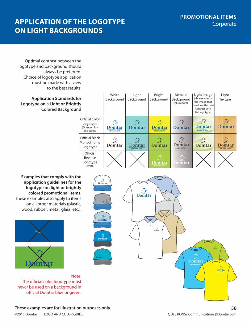
APPLICATION OF THE LOGOTYPEON LIGHT BACKGROUNDS
PROMOTIONAL ITEMSCorporate
Application Standards for Logotype on a Light or Brightly
Colored Background
Examples that comply with the application guidelines for the
logotype on light or brightly colored promotional items.
These examples also apply to items on all other materials (plastic,
wood, rubber, metal, glass, etc.).
Note:The official color logotype must
never be used on a background in official Domtar blue or green.
Optimal contrast between the logotype and background should
always be preferred.Choice of logotype application
must be made with a viewto the best results.
50These examples are for illustration purposes only.
White Background
LightBackground
MetallicBackground
(aluminum)
BrightBackground
Light Image(choose area of the image that
provides the best contrast withthe logotype)
LightTexture
Official Color Logotype (Domtar blue
and green)
Official Black Monochrome
Logotype
Official Reverse
Logotype(white)

©2015 Domtar LOGO AND COLOR GUIDE QUESTIONS? [email protected]
APPLICATION OF THE LOGOTYPE ON DARKBACKGROUNDS INCLUDING BLACK
PROMOTIONAL ITEMSCorporate
Application Guidelines for the Logotype on Dark Backgrounds,
Including Black
Examples that comply with the application guidelines for the
logotype on dark promotional items, including black.
These examples also apply to items on all other materials (plastic,
wood, rubber, metal, glass, etc.).
Note:The official blue and green Domtar
logotype must never be used on dark colors that significantly
reduce the readabilityof the logotype.
Only the official reverse logotype is acceptable on dark-colored
items including black. This version provides the best contrast between
logotype and the background.The official color logotype on a
black background is acceptable in the care of embroidered items.
51These examples are for illustration purposes only.
BlackBackground
DarkBackground
Dark TexturedBackground
Dark Image(choose area of the
image that offers the best contrast with
the logotype)
Official Color Logotype
(Domtar blue and green, embroidery
only)
Official Black Monochrome
Logotype
Official Reverse Logotype
(white)

©2015 Domtar LOGO AND COLOR GUIDE QUESTIONS? [email protected]
USE OF TEXT UNDER THE LOGOTYPEPROMOTIONAL ITEMS
Corporate
The character font to be used for text and additional information is
Myriad Pro Semibold.
Application of theLogotype with Text
The following are the guidelines for adding text under the Domtar
logotype (name of operation, certification, etc.).
Use the following grid to define the position, alignment and size.
When the description and other information are laid out
independently of the logotype, they must be in Myriad Pro
Semibold and aligned to the left.
The color of the text and other information must match the color
of the Domtar namein the logotype.
52These examples are for illustration purposes only.
Nekoosa Mill
A = 75% of the height of the “D” E = 40% of the height of the “D” F = 30% of the height of the “D”
Name of operation
A
A
A
E
Other information as requiredFF
A A
Name of operation
A
A
A
E
A A
Nekoosa Mill
Nekoosa Mill
Nekoosa MillKaizen
Kaizen
Nekoosa MillKaizen
Name of MillOther information if necessary
FF

©2015 Domtar LOGO AND COLOR GUIDE QUESTIONS? [email protected]
SPECIAL USESPROMOTIONAL ITEMS
Corporate
EmbossingIn order to meet certain
promotional needs, the embossed logotype may be reproduced
tone-on-tone, and no color is to be applied to the embossed area.
Metallic MaterialFor logotypes reproduced on
metallic materials, silver coloration must be used instead of gold
or bronze.
EmbroideryThe minimum size of embroidered
characters in 1/4 in. for lower case letters and 3/8 in. for upper
case letters in order to ensure readability. As a general rule,
operation names included under the Domtar logotype must be
written out in their entirety (e.g., Windsor Mill). In tight spaces,
however, the location alone may be displayed (e.g., Windsor).
Minimum Logotype FormatTo reproduce the Domtar logotype
much smaller than the minimum format indicated in this guide
(Basic Concepts and Elements), prior authorization
must be obtained fromCorporate Communications.
Note:In these examples, the logotype is reproduced much smaller than the standard for the minimum format of the Domtar logotype. Prior authorization must be obtained for the production of these watches.
53These examples are for illustration purposes only.
Windsor 3/8 in.
12.7 mm0.5 in.
1/2 inch36 pixels
36 points

©2015 Domtar LOGO AND COLOR GUIDE QUESTIONS? [email protected]
VEHICLES
55. Basic Concepts and ElementsTrucks and Pick-Up Trucks 56. Truck Doors 57. Truck Body 58. Tandem TruckRail Cars 59. Locomotive
54

©2015 Domtar LOGO AND COLOR GUIDE QUESTIONS? [email protected]
BASIC CONCEPTS AND ELEMENTSVEHICLES
Official LogotypesThese versions of the logotype
must be used on Domtar vehicles.
Protection Space (clear space)This space must be free of all
graphic or typographical elements. It is measured by 100% of the letter “D” in the Domtar name and applies to the entire area
surrounding the logotype.
Company ColorsOfficial Domtar Blue
Company ColorsOfficial Domtar Green
Official TypographyThe character font for Domtar
promotional items is Myriad Pro.
More specifically, when the Domtar logotype includes text
(name of operation, certification, etc.), Myriad Pro Semibold is the
character font to be used.
Myriad Pro Semibold
ABCDEFGHIJKLMNOPQRSTUVWXYZabcdefghijklmnopqrstuvwxyz1234567890
Flat Printing
Pantone 287(acceptable substitute)
Flat Printing
Pantone 369(acceptable substitute)
Four-color printing
C1 00 M 60 Y 0 K 11.5
Four-color printing
C 65 M 0 Y 100 K 8.5
Official Color Logotype Official Reverse Logotype
55

©2015 Domtar LOGO AND COLOR GUIDE QUESTIONS? [email protected]
TRUCK DOORSVEHICLES
Trucks and Pick-Up Trucks
White Cabin and DoorThe official version of the
Domtar color logotype must be reproduced on truck doors.
Color Cabin and DoorThe official reverse version of
the Domtar logotype must be reproduced on truck doors.
Note:Do not use the official color or reverse version (white/green) of the Domtar logotype on vehicles. Only reverse version (white) is allowed on colored vehicles.
56

©2015 Domtar LOGO AND COLOR GUIDE QUESTIONS? [email protected]
TRUCK BODYVEHICLES
Trucks and Pick-Up Trucks
TruckThe official color version of the
Domtar color logotype must be reproduced on the sides and back
of the truck body.
Website:Myriad Pro Semibold
Lower case
Measurements
www.domtar.com
A
A
A
B
A A
www.domtar.com
www.domtar.com
A
A
A
A A
Final Product
57

©2015 Domtar LOGO AND COLOR GUIDE QUESTIONS? [email protected]
TANDEM TRUCKSVEHICLES
Trucks and Pick-Up Trucks
Tandem TrucksThe official reverse logotype
(white) must be used oncolored vehicles
TextMyriad Pro Semibold
Upper case and lower case
LicenseMyriad Pro Regular
Upper case and lower case
Lime and SoilConditioner
By MOE License noA710144 Ext. 4463(613) 932-6620
Ext. 4463(613) 932-6620
By MOE License noA710144
Lime and SoilConditioner
58

©2015 Domtar LOGO AND COLOR GUIDE QUESTIONS? [email protected]
LOCOMOTIVEVEHICLES
Rail Cars
LocomotiveThis locomotive is shown painted
Domtar orange (Pantone 158), a color associated with Domtar’s
“Health/Safety” policy.
The official reverse logotype is used on the train engine.
59

©2015 Domtar LOGO AND COLOR GUIDE QUESTIONS? [email protected]
HEALTH AND SAFETY
Communications 61. Official Color (Orange) 62. ExamplesAccessories 63. Safety HatsSignage 64. “No Smoking” Sign
60
©2015 Domtar LOGO AND COLOR GUIDE QUESTIONS? [email protected]
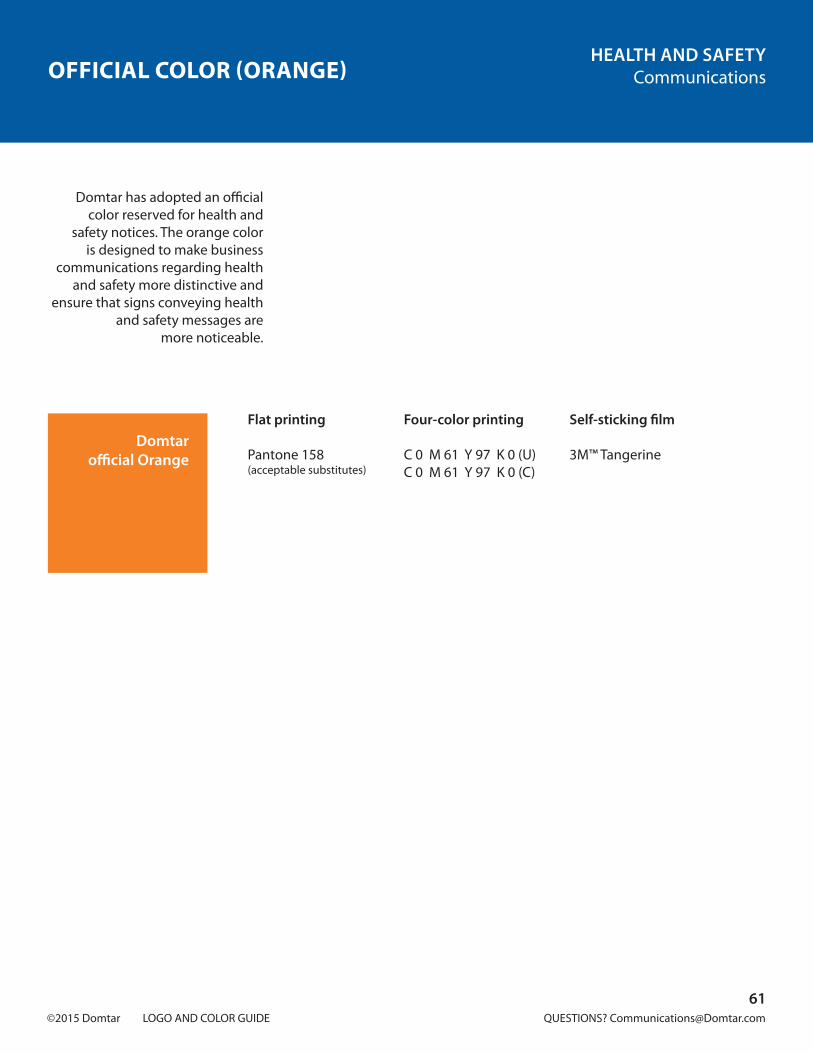
OFFICIAL COLOR (ORANGE)HEALTH AND SAFETY
Communications
Domtarofficial Orange
Flat printing
Pantone 158(acceptable substitutes)
Four-color printing
C 0 M 61 Y 97 K 0 (U)C 0 M 61 Y 97 K 0 (C)
Self-sticking film
3M™ Tangerine
Domtar has adopted an official color reserved for health and
safety notices. The orange color is designed to make business
communications regarding health and safety more distinctive and
ensure that signs conveying health and safety messages are
more noticeable.
61

©2015 Domtar LOGO AND COLOR GUIDE QUESTIONS? [email protected]
EXAMPLESHEALTH AND SAFETY
Communications
Locomotive
Warning and Caution Signs
Sticker
Note:Wording must be printed in white on an official orange background.
62
1/6 C
1/3 C
1/3 C1/3 C
C
variable height
A = 75% of the height of the “D“
A = 75% of the height of the “D“
AA A
AA
Do Not EnterPrivate Property
1/6 C
2/3 C
1/6 C
2/3 C1/6 C
1/3 C
1 C
1/3 C
1/2 C Do Not Enter
1/3 C
Area protected by OSHA work safety management regulations
All violators will be subject tocriminal and civil prosecution.
variable heightA
A A
A
A
Do Not EnterArea protected by OSHA work safety management regulations
All violators will be subject tocriminal and civil prosecution.
WARNING
Do Not EnterPrivate Property
WARNING
1/6 C
1/3 C
1/3 C1/3 C
C
variable height
A = 75% of the height of the “D“
A = 75% of the height of the “D“
AA A
AA
Do Not EnterPrivate Property
1/6 C
2/3 C
1/6 C
2/3 C1/6 C
1/3 C
1 C
1/3 C
1/2 C Do Not Enter
1/3 C
Area protected by OSHA work safety management regulations
All violators will be subject tocriminal and civil prosecution.
variable heightA
A A
A
A
Do Not EnterArea protected by OSHA work safety management regulations
All violators will be subject tocriminal and civil prosecution.
WARNING
Do Not EnterPrivate Property
WARNING
The door will unlock 15 secondsafter the bar is released.

©2015 Domtar LOGO AND COLOR GUIDE QUESTIONS? [email protected]
SAFETY HATSHEALTH AND SAFETY
Accessories
Safety hats are used throughout Domtar’s operating sites. They are
one of the basic components of our safety program in work facilities
and worksites. These distinctively-colored hats differentiate visitors
from employees.
EmployeesThe hat worn by employees is
white and bears the color logotype above the visor. The health and
safety operation slogan is printed on the back.
VisitorsThe visitor’s hat is yellow and bears
the black logotype on the front and the word “Visitor” on the back.
The Logotype2.5 inches wide
Healthy/Safety Theme PhraseMyriad Pro Bold; body 29
Upper and lower case
VisitorMyriad Pro Bold; corps 29
Upper and lower case
White Safety Hats for Employees
Yellow Safety Hats for Visitors
63

©2015 Domtar LOGO AND COLOR GUIDE QUESTIONS? [email protected]
Name of operation
1/3c
1/3c
1/6c
1c
1/3c 1/3c1/3c 1/3c
1/3c
1/2c
1c
1c
1c
1c
1c
1c 1c 1c 1c
Nekoosa Mill
WARNINGNo Smoking Site
No Smoking Site
No Smoking Site
WARNINGNo Smoking Site
1/6c
1/6c1c
“NO SMOKING” SIGNHEALTH AND SAFETY
Signage
“No Smoking” pictograms may be downloaded at: www.domtar.com/elements
In Domtar operations, signs indicating no-smoking sites are
associated with workplace health and safety messages. Therefore, the
background on these signs must be in official Domtar orange (PMS
158 “Bright Orange”). Signs may be produced using the following
two grids.
“No Smoking” Sign
WARNINGMyriad Pro Regular
upper case
MessageMyriad Pro Semibold
upper and lower case
Measurements Measurements
Final Product Final Product
64


