30 November 2017 Page 1 of 50 Lyngen/Kohli BMO US Rates 2018 Outlook Ian Lyngen, CFA, MD, Head of US Rates Strategy, Aaron Kohli, CFA, Director, Rates Strategy » As we contemplate our Treasury market call for 2018, 10-year yields are at 2.35% -- not dissimilar to the end of 2016 (2.44%), 2015 (2.27%), and 2014 (2.17%). While the yearly figures suggest that there has been a gentle upward grind in yields, in fact the path has been more volatile and along the way 10s managed to reach 2.63% during 2017 on the back of Trump-o-nomics euphoria, only to retrace to as low as 2.016% as geopolitical risks combined with the realities of lowflation. Our primary focus for 2018 will be on the shape of the yield curve and we expect that as the Fed’s hiking campaign soldiers on, the most material risk is that monetary policy inverts the 2s/10s curve more quickly than anticipated. We have 10-year yields penciled in as closing 2018 at 2.40%, but not before a test of the bottom of the recent range (2.00%) and the risk of an inverted 2s/10s curve as early as the March meeting – if not, then by June. While we’ve been focused on this risk since September ‘17 when the Fed signaled its intension to push forward despite realized inflation, it has become increasingly consensus – a dynamic that always gets us nervous, but we’re nonetheless convinced of the fundamentals behind the call. If anything, the newfound popularity of the forecast leaves us open to an inversion earlier in 2018, which will subsequently be followed by a resteepening. » » The more challenging call will be correctly timing the inversion of 5s/30s. We’re comfortable assuming that it happens sometime during the next 12- to 18-months – with an acknowledgment that the prior three occurrences came near the end of the Fed’s previous hiking cycles. » » The most important questions for the market in 2018 will be centered on inflation and inflation expectations. We can envision three scenarios for realized inflation: 1) more of the same with core- PCE gaining +0.10% to +0.14% on a monthly basis, 2) an acceleration of inflation to average +0.14% to +0.20%, or 3) a material leg higher in inflation to consistently print at +0.20% or above. In the first two outcomes, we suspect that the 2s/10s curve pushes flatter – bullishly in the first case and bearishly in the second. The second scenario is our base-case and we suspect that rather than ushering in the triumphant return of term-premium to the Treasury market, the seasonal spike of inflation so typical of the first quarter will embolden Fed tightening expectations and further weigh on the front-end of the curve while leaving 10s and 30s under only modest pressure. » » Should inflation return to more normal levels (0.14% to 0.20% monthly gains), the FOMC will emerge from lowflation as monetary policy gurus who were ahead of the inflation curve – a nice place for Yellen to end her term as Chair. While that might keep the Fed’s quarterly hike schedule in place, it won’t lead the market to assume any acceleration of the ‘planned’ rate-hikes, if for no other reason than the SEP forecasts are based on core-PCE reaching +1.9% by year-end and already have three hikes slated. The most relevant risk to our flattening bias and rates outlook comes from a spike of inflation beyond the norms that the FOMC is unwilling or unable to adequately address. Over the last three decades, the Fed has proven to be a very credible inflation fighter, while disinflation has been far
Transcript
30 November 2017 Page 1 of 50
Lyngen/Kohli BMO US Rates 2018 Outlook Ian Lyngen, CFA, MD, Head of US Rates Strategy, Aaron Kohli, CFA, Director, Rates Strategy
» As we contemplate our Treasury market call for 2018, 10-year yields are at 2.35% -- not dissimilar to the end of 2016 (2.44%), 2015 (2.27%), and 2014 (2.17%). While the yearly figures suggest that there has been a gentle upward grind in yields, in fact the path has been more volatile and along the way 10s managed to reach 2.63% during 2017 on the back of Trump-o-nomics euphoria, only to retrace to as low as 2.016% as geopolitical risks combined with the realities of lowflation. Our primary focus for 2018 will be on the shape of the yield curve and we expect that as the Fed’s hiking campaign soldiers on, the most material risk is that monetary policy inverts the 2s/10s curve more quickly than anticipated. We have 10-year yields penciled in as closing 2018 at 2.40%, but not before a test of the bottom of the recent range (2.00%) and the risk of an inverted 2s/10s curve as early as the March meeting – if not, then by June. While we’ve been focused on this risk since September ‘17 when the Fed signaled its intension to push forward despite realized inflation, it has become increasingly consensus – a dynamic that always gets us nervous, but we’re nonetheless convinced of the fundamentals behind the call. If anything, the newfound popularity of the forecast leaves us open to an inversion earlier in 2018, which will subsequently be followed by a resteepening.
»
» The more challenging call will be correctly timing the inversion of 5s/30s. We’re comfortable assuming that it happens sometime during the next 12- to 18-months – with an acknowledgment that the prior three occurrences came near the end of the Fed’s previous hiking cycles.
» » The most important questions for the market in 2018 will be centered on inflation and inflation
expectations. We can envision three scenarios for realized inflation: 1) more of the same with core-PCE gaining +0.10% to +0.14% on a monthly basis, 2) an acceleration of inflation to average +0.14% to +0.20%, or 3) a material leg higher in inflation to consistently print at +0.20% or above. In the first two outcomes, we suspect that the 2s/10s curve pushes flatter – bullishly in the first case and bearishly in the second. The second scenario is our base-case and we suspect that rather than ushering in the triumphant return of term-premium to the Treasury market, the seasonal spike of inflation so typical of the first quarter will embolden Fed tightening expectations and further weigh on the front-end of the curve while leaving 10s and 30s under only modest pressure.
» » Should inflation return to more normal levels (0.14% to 0.20% monthly gains), the FOMC will emerge
from lowflation as monetary policy gurus who were ahead of the inflation curve – a nice place for Yellen to end her term as Chair. While that might keep the Fed’s quarterly hike schedule in place, it won’t lead the market to assume any acceleration of the ‘planned’ rate-hikes, if for no other reason than the SEP forecasts are based on core-PCE reaching +1.9% by year-end and already have three hikes slated. The most relevant risk to our flattening bias and rates outlook comes from a spike of inflation beyond the norms that the FOMC is unwilling or unable to adequately address. Over the last three decades, the Fed has proven to be a very credible inflation fighter, while disinflation has been far
January 11, 2017January 11, 2017
more challenging. The implication of this fact is that if realized inflation picks up, that will only further the flattening bias unless the Fed signals a material change to its response function.
»
» Said differently, the curve will steepen out and term-premium will return if the Powell-Fed sees unexpectedly high inflation and doesn’t step-up the hawkish rhetoric – implicitly or explicitly signaling a willingness to let the economy ‘run hot’ for a time. An alternative method for getting term-premium back would be to alter the Fed’s communication strategy so drastically as to leave the market uncertain as to how the Fed will address the developments in the real economy – said more directly: dropping the dot-plot and forward rates guidance. We seriously doubt this is in the cards and only offer it as an example of the degree of change in the Fed’s behavior that it would take to reintroduce volatility in the longer end of the Treasury curve (10s and 30s).
» » We are certainly cognizant that forecasting 10-year yields will end next year at 2.40% after spiking in
the first quarter only to rally throughout the summer months is consistent with the seasonal patterns and doesn’t represent an exciting break from the norm. As we watch the market trade a version of effectively the same tax reform deal for the fourth time and 10-year yields unable to even touch the 2.64% peak achieved immediately in the wake of Trump’s election, we find ourselves content to continue playing the range for the time being.
»
» »
» Above we have outlined our quarterly projections for yields and the shape of the curve and what is implied in our forecast is an important inflection point that we have occurring some time over the next 12-18 months. The inflection point will be a result of either the real economy falling far short of the Committee’s expectations or a moment when the Fed effectively blinks via a pause in the tightening campaign. The outcome of either event will be a flattening out of the OIS curve and the resteepening
of 5s/30s. If 5s/30s is the coalmine canary of monetary policy expectations in the current environment, then the bullish steepening that followed a dovish read on the November FOMC meeting Minutes is a useful roadmap for the return of term premium.
» » We highlight this particular price action because it offers an alternative explanation for the ‘mysterious
flattening’ seen in 2017. A flatter 5s/30s curve has been characterized as the ‘new conundrum’ and the attempts to dismiss it as simply flow-driven either by pension funds or by risk parity purchases have fallen flat. From our perspective, the efforts to explain-away the flattening have been too little and too late. The observation that the lower 30-year yields are the biggest paintrade in the market is by no means a revelation and it points toward the difficulty in repricing the Treasury market toward sustainably higher rates – regardless of the persistent bid for risk assets.
» » We offer the below chart of the CFTC positions data related to the Ultra-Long futures contract just to
emphasize the magnitude and stubbornness of this particular net spec short. The fact is not lost on us that when 30-year yields dipped in late-November and the 5s/30s curve reached its flattest levels in over a decade this was the point at which the net spec short pressed back toward record levels. Call it doubling-down or pressing the trade, regardless we could see a major short-squeeze push the curve even flatter.
»
»
Ultra Short the Ultra-Long Contract
No of C
ontracts
-125000
-100000
-75000
-50000
-25000
0
25000
50000
Perc
ent
2.0
2.5
3.0
3.5
4.0
4.5
5.0
2010 2011 2012 2013 2014 2015 2016 2017
30 reversed, lhs Cot Ultra-Long Net Spec Positions, rhsSource: BMO CM & Macrobond
»
January 11, 2017January 11, 2017
» The return of inflation in 2018 presents the most important unknown variable and our sense is that most market participants assume that upside surprises on inflation can only steepen the curve, but as we’ve argued above, there is a middle-ground of higher (but not too high) inflation that will ultimately do the opposite. To be fair, the first order trade will be a knee-jerk toward higher long-end yields and a steeper curve as investors focus on the most recent history of the correlation between realized inflation and curve shape.
» » A longer-term view of the market offers a different skew however and we’ve included a chart that
compares 5s/30s with Fed Funds and core-CPI (the 6-month moving-average of the year-over-year change) to help illustrate the point. We’ve shaded the periods in which the Fed was in a rate-hiking cycle and core-CPI was increasing – very similar to the outlook widely held for 2018.
» » This demonstrates that while a pick-up of inflation during an easing or on-hold policy period might be
associated with 5s/30s steepening, whenever the Fed is actively engaged in raising rates the curve simply continues to flatten even with an acceleration of inflation. The Fed credibility argument resonates well in this context and reflects the potential for the curve to continue its relentless flattening.
» With our interpretation of the curve dynamics covered, we’ll move on to our other most pressing concerns for the year ahead. To summarize the risks in a phrase, there is a high degree of concentration risk for growth and inflation. There are two primary ways in which this is evident – first, concentration of economic growth potential on the consumer side and second, the concentration of positive inflation within the shelter component. We’re by no means forecasting a reversal in either the pace of spending or the contribution of shelter/OER to core-inflation, but rather we’re highlighting the reliance of the positive momentum within the economy on these two factors. Complete reversal, no – but a more modest pace perhaps.
» » The most often cited counterpoint to our outlook is that the long-awaited tax reforms are going to be
inflationary and spur a round of business investment that will more than offset any potential softness on the consumer side. Our faith in the ability of anything Washington can deliver to have a significant positive impact on the real economy is limited and, at best, the contribution from the corporate side will be a short-term boost to investment.
» » Returning to the core of our concern, the proportion of real GDP represented by consumption is
effectively at record levels – tied with March 2011. We offer two charts below that illustrate the origin of our apprehension. First is the history of consumption within the real economy and here it quickly becomes evident that this wasn’t always the case – in the 1960s and 1970s consumption represented as little as 58% of the US economy. Industry, government expenditures, net exports, etc. have played a more significant role in the past and while one of the often-stated goals of the Trump administration has been to revitalize the US manufacturing and production sectors, progress on this front has stalled. Moreover, even if a pro-manufacturing set of policies were enacted in 2018, a retooling of US businesses certainly wouldn’t happen immediately – think years rather than quarters. All of this leaves the burden of driving growth squarely on the shoulders of the US consumer.
» » The second chart on this topic is a history of the quarterly contribution of personal consumption to real
GDP. On average over the last ten years, the consumer has added +1.2% to real GDP growth every quarter. That compares to +0.2% from private investment, 0.0% from government spending, and +0.1% from international trade. While there have been points at which the other components have contributed or detracted more, the net impact over the last ten years has effectively been a wash. More to the point, even the average contribution from the consumer has fallen over the years. In the ten years prior to the 2001 recession, the normal quarterly contribution from personal spending was +2.6% -- notably far above the current level.
10-year Moving-Average (40-quarter) Personal Consumption Contribution to GDP
Source: BMO CM & Macrobond
January 11, 2017January 11, 2017
» We are seeing evidence of a pattern that has preceded many, although certainly not all, of the recent recessions. Specifically, whenever consumption is routinely adding an above-average amount to overall growth, the pace ultimately proves unsustainable. As presented in the chart above, whenever a given quarter’s contribution (blue bar) is larger than the norm (red line) the economy is relying more heavily on personal spending than in prior periods. We’ve now seen this dynamic during each of the last seventeen quarters – which is the longest run in post-WWII history and speaks to our overarching concern that if the consumer stumbles, the overall economy is at risk of disappointing.
»
» It is not taxing to demonstrate that the consumer is the primary driver of growth in the US and most market participants will surely say ‘yeah, but tell me something I don’t already know.’ That is a fair point and we’ll now present some evidence that the consumer might not be on such solid footing as to safely assume the current pace of spending is a given in today’s environment. Throughout most of this cycle the emphasis has been on the health of household balance sheets and the aggregate figures continue to demonstrate that debt-service ratios are well below the pre-crisis levels – currently at 9.9% versus 13% ahead of the great recession.
» » We’re sympathetic to the idea that there remains plenty of room for the consumer to add leverage to
fund the current spending patterns, but there is an important difference between the present structure of household debt and what we saw prior to the 2008 recession; namely, real estate linked borrowing is nowhere near the pre-crisis levels.
» » On the other hand, non-mortgage consumer debt has steadily rebounded and with debt-to-income (ex-
mortgages) at roughly 29%, we’re back into the range seen prior to the recession. Moreover, breaking down debt-to-disposable-income into the major categories, as we’ve done below, it quickly becomes evident that student loan and auto-related borrowing are driving this trend – that brings up the obvious worries about a stressed consumer. Outside of homeownership, education and car purchases are the most significant outlays for US spenders.
» Increased household leverage isn’t a negative unto itself, however when combined with subpar wage growth and an increase in delinquency rates as we’ve seen through 2017 (represented in the below chart), the case for a consumer stumble gains credence. After all, this is now the third longest expansion in US history. Again, we’re not making the case that there is a risk of a consumer led recession, but rather simply that a period in which the consumer isn’t adding +1.6% to quarterly real GDP (post-crisis average) could be the type of slowdown that brings into question forward growth assumptions and the pace of Fed hikes.
» In yet another sign that the forward pace of spending won’t mirror that of the recent past, we’ve been watching the savings rate continue to decline and while a more optimistic read would be that this is the beginning of the leverage-led stage of the consumer expansion, we find ourselves far more concerned that it might be a harbinger of less ambitious spending patterns. The below chart shows the historical relationship between the personal savings rate and retail sales.
» » We’ve taken the 6-month moving-average of the year-over-year change in retail sales and compared it
to the 6-month moving-average of the personal savings rate. We’ve offset the savings rate by 18-months to make the relationship more apparent and what becomes evident is that whenever there is a drop in the savings rate comparable to what we’ve seen in 2017, retail sales follows suit within four to six quarters. Further to the point, the most recent personal savings rate print was just 3.1% -- the
January 11, 2017January 11, 2017
lowest since 2007. It follows intuitively that if the current rate of spending is being funded out of saving, by foregoing savings, or through leverage there will ultimately come a point of retracement.
»
Retail Sales YoY vs. Personal Savings (18-month lead)
» » The combination of declining savings with higher non-mortgage debt and delinquencies wouldn’t be
as much of a concern had the post-crisis labor market participation dynamic developed differently. During the crisis, the 25 to 40 year old workers were hardest hit, this isn’t news, but they have also struggled to reenter the labor market as older employees have held onto their jobs longer. Inadequate retirement saving and longer/healthier working lives explains the latter. The 25 to 40 year old age group has been historically associated with driving consumption in the US as they represent key contributors in the process of household formation (purchasing homes, starting families). Sure, we’ve all heard the anecdotes of college graduates living at home much longer than in prior generations and what that means for housing, but it also has ramifications for overall consumption as younger workers spend a larger portion of their disposable income than older workers.
»
January 11, 2017January 11, 2017
Labor Force Participation Rate by Age6-month Moving-Averages
» The above two charts demonstrate two important points. In the first, the labor force participation rate is broken down by age group and speaks to the fact that the 55+ and older segment of the employment market is the only group to have higher post-recession participation – now at 40% with baby boomers known to be skewing the numbers. Meanwhile, the 35-44 year olds are down -1.5% at 82.6% and the 25-34 year olds went from 83.5% to 82.0% and have similarly struggled to be reintegrated into the workforce. The second chart shows the fallout from this in the ‘head of household’ numbers that show the 25-29 year old group at the lowest since 1964 and the 30-34 year old subset at the lowest since 1971. It’s with this context that the elevated student and auto loan numbers appear to be more of a potential headwind for spending.
» » As something of an aside, the state and local tax deductibility aspect of tax reforms (as currently
proposed) remains on our mind as it relates to consumers and higher effective taxes for the Northeast and West Coast. The counter-argument to our apprehension will surely be that an increased standard deduction will offset the loss of deductibility of state/local taxes and net spending will be steady as lower-cost states benefit from a windfall at the expense of higher cost areas.
» » That argument might be more convincing if the realities of consumption patterns in the US were not so
decidedly tilted in favor of the coasts. The coasts will see the largest impact from the change and that will lead to an immediate reduction in consumption long before companies are able to expand and contribute to growth via business investment and hiring.
» » The chart below provides a graphic to support our observation that spending is coast-heavy.
According to the BEA (which is where we got the below PCE heat-map), the average per capita personal consumption expenditures during 2016 in the US was $39.6k, whereas the states with the highest state/local taxes came in at MA $52k, NY $47k, CT $48.5k, NJ $48.9k, DC $56.8k, and CA $41.8k. The per capita data doesn’t do justice to the potential fallout for consumption because the regions most strained are also the most populous. In addition, the average SALT deduction in NY is $22.2k, CT $19.7k, and NJ $16.4k. This certainly gives a different meaning to the label ‘blue state’.
»
January 11, 2017January 11, 2017
» » »
» The other primary ‘concentration risk’ on our minds for 2018 is in the inflation space and reflects the importance of the shelter component in the outlook for inflation. This is by no means a new story and by definition housing costs are at the center of every inflation measure, but what made the ‘mystery’ of inflation in 2017 such an anomaly was that pricing pressures slowed despite a persistent grind higher in Owners’ Equivalent Rent (OER). In fact, the only times in which core-CPI didn’t disappoint versus forecasts occurred when OER was at or near decade high levels. Relaying on outpaced gains in OER during a period in which vacancies are on the rise to prop up inflation expectations offers a unique set of risks.
» » We’re certainly cognizant that by grinding sideways, the categories of inflation that worked as a drag
in 2017 will no longer be a weight on the overall core-CPI and core-PCE measures. That said, as one of the pillars of the broader inflation figures, OER and rents always play an important role. Taking a step back, below we offer a chart of the pace of core-PCE gains on both a monthly and yearly basis to demonstrate the base effects that will remain relevant during the first half of 2018. The seasonality of CPI in the first quarter of the year is widely known and so we’re content to factor this into our bearish bias for the rates market early in 2018. As we look beyond that however, we would need to see a material pickup in the pace of core-PCE gains to put the 2.00% target into range.
»
January 11, 2017January 11, 2017
»
Core-PCE Prices MoM and YoYwith +0.11% Projections
Percent
0.75
1.00
1.25
1.50
1.75
2.00
2.25
Percent
-0.20
-0.15
-0.10
-0.05
0.00
0.05
0.10
0.15
0.20
0.25
0.30
2010 2011 2012 2013 2014 2015 2016 2017 2018 2019
Core PCE, YoY Core PCE, MoM
Source: BMO CM & Macrobond » » In the chart above, we’ve outlined two separate scenarios, although we’ll be the first to admit that our
analysis risks oversimplifying the case. That said, it’s more about offering context for the extent of the change we’d need to see in inflation to get us back toward a zone where the Fed’s 2% inflation target might become relevant. In the first chart we’ve represented core-PCE in yearly terms in green and monthly in black with placeholders rather than forecasts to stress the significance of the base effects. Using the last 12 months as our guide, we’ve taken an average of the monthly gains which comes in at +0.11% and assumed that as the pace for 2018. Not surprisingly, that results in core-PCE dipping to +1.1% before ending the year at +1.3%. Hold the back page.
» » This exercise becomes more interesting when we assume an acceleration of the monthly gains from
the twelve month average of +0.11% to something that wouldn’t be such a mystery, or was that a puzzle? We looked at prior averages to get a sense for how a ‘normal’ period might look. By way of a quick recap: the month-over-month core-PCE gain for a 1-year average is +0.11%, 5-year average +0.127%, 10-years +0.128%, and 20-years +0.138%. We took the upper-end of the range and added a bit just to make the point. The below time series shows core-PCE on a yearly basis in blue and monthly in red assuming a +0.15% MoM gain. What quickly becomes clear is that even assuming a decidedly above average pace of monthly core-PCE gains, the YoY figures are below that from 2016 and that seen in early 2012 – topping out at +1.80%. Using the short, medium, and longer-term
January 11, 2017January 11, 2017
averages as our reference, we can say with a straight face that even with a more ‘optimistic’ outlook for inflation, any concerns that the Fed may have about inflation accelerating beyond the influence of monetary policy would be misplaced.
» »
»
Core-PCE Prices MoM and YoYwith +0.15% MoM Projections
Percent
0.75
1.00
1.25
1.50
1.75
2.00
2.25
Percent
-0.20
-0.10
0.00
0.10
0.20
0.30
2010 2011 2012 2013 2014 2015 2016 2017 2018
Core PCE, YoY Core PCE, MoM
Source: BMO CM & Macrobond »
» We’ve made the claim that inflation has been driven to a large degree by the shelter component within the CPI series and the next chart offers a glimpse at how that has been especially true during 2017, while as recently as 2012 and 2013 the contribution of shelter/housing was far less of a driver of inflation. This is an important comparison because we’re not worried about the slowing pace of increases in rents/OER in isolation, but only as it has become such an important cornerstone of reasonably well anchored inflation expectations.
»
January 11, 2017January 11, 2017
»
CPI Contributions to Headline
Percent
-0.15
-0.10
-0.05
0.00
0.05
0.10
0.15
0.20
May Sep Jan May Sep Jan May Sep Jan May Sep Jan May Sep Jan May Sep2012 2013 2014 2015 2016 2017
Housing, ShelterNew & Used Motor Vehicles
Public Airline FareWireless Telephone Services
Apparel, TotalMedical Care, Physicians' Services
»
» This is the part of the argument where we shift from pointing out how concentrated all of the risks appear to be to offering a ‘what if’ – not to be confused with an actual forecast for the data as that certainly isn’t our forte. There are three charts in the following series that illustrate why we’re nervous about rents/OER. The first chart compares rental vacancies with rent costs – there is an intuitive relationship that holds with more supply available (vacancies), prices (rents) tend to fall. We’ve offset the two series with vacancies leading by 9-months and in doing so the correlation becomes very apparent – the 12-month annual rental leases account for this lagged response. We’ve inverted the axis for the vacancy rate (in red) and what stands out is that the increase in dwellings available for rent is the sharpest we’ve seen since immediately in the wake of the crisis. The second chart is effectively a repeat of the first, only rents have been replaced with OER to reinforce that the relationship still holds.
» » For our final chart in this trio, we’ve taken the last 15-years of monthly OER gains, which come in at
an average of +0.22%, and considered what would happen to the yearly pace if we see a period of mean reversion. YoY OER has arguably already peaked in 2016 and if vacancies prove to be a leading indicator (as they have in the past), we might be in for an episode of smaller gains for one of the key components of core inflation. Assuming the +0.22% MoM pace would bring the year-over-year pace from the current +3.2% to a far more benign +2.67% by the end of 2018. This would be the slowest OER has risen since January 2015.
»
January 11, 2017January 11, 2017
»
Rental Vacancy Rate (9-month lead) vs. Rent on Primary ResidencesYoY 6-month moving-average
Rent US Owners Equivalent Rent YoY US Owners Equivalent Rent MoM Rent
Source: BMO CM & Macrobond »
Features and Risks Facing Treasuries in 2018: » » We’d be remiss not to flip through some of our prior yearly outlooks to see just what we got right
and, more importantly, what we missed. We’ll spare you the detailed recap, but we’ll make the observation that several of the risks that have been with us for years remain just as relevant as when we first identified them. That’s the long way of saying that a few, although certainly not the majority, on the below list may look familiar. We’ve endeavored to put them in order of importance, but as some are shorter-term in nature than others we’re open to a variety of relative weightings and would love to hear your thoughts.
1) Reflation takes hold as the current tax-plan ultimately does more good than it damages important
parts of the consumer base. The scenario in which business investment spikes in the first half and demand combines with the seasonality of inflation could put even more upward pressure on 10-year yields than we’ve already incorporated into our forecast. That said, we suspect that a period of higher inflation prints that fits well with the seasonals patterns would be unlikely to materially reshape broader inflation expectations.
January 11, 2017January 11, 2017
2) Issuance and the Debt-Ceiling Debate – We see a few potential risks in the coming year relating to Treasury issuance and the impending debt-ceiling. Although the Treasury Department has temporarily put a pause on the prospect of ultra-long issuance the potential remains for an increase in long-term government borrowing, most likely through increased issuance in the 10- and 30-year sectors. This would create a first order steepening risk to our curve-flattening call. In addition to issuance changes the Treasury’s near term cash management offers a risk to the Fed’s control of front-end cash as the Fed’s policy can be either amplified or neutralized by the Treasury’s attempt to keep a buffer of cash on-hand. Finally, as the deficit rises throughout the year the Treasury will be forced to refocus their issuance from the front-end/belly of the curve to longer-dated debt. This deficit effect could be expedited by the drop-dead date moving closer to Mnuchin’s estimate of January due to a drop in tax-receipts following the passage of tax reform.
3) QE rollover and the impact in the second half when the balance sheet runoff accelerates –In terms of QE rollover and balance sheet runoff we see five key risks that the markets face in the year ahead. First this is the first instance of a central bank attempting to unwind such a large balance sheet, consequently there is little to none in way of a “roadmap”. Second, there is a risk that Fed members are underestimating the impact of a balance sheet unwind and markets are experiencing a false sense of security. Third, the assumption is that since other central banks are currently easing there will be ample liquidity in the market. This is a false assumption since yen or euro denominated assets are not limitlessly interchangeable for dollar assets. Fourth, although tapering has not had a dramatic effect on markets so far, we are early into the tapering cycle and a risk remains that the effect will amplify with time. Finally, each dollar of liquidity drained from the market will have a marginally larger effect than the previous dollar.
4) Deregulation – there is a great deal of potential for the new composition of the FOMC to materially impact the financial sector through deregulation. At the end of the day however, we anticipate that once capital requirements are eased, the first response will be for financial institutions to return capital to shareholders via one-time dividends, buybacks, or a combination. The positive implications from an effort at sustainable deregulation will be a longer-term consideration which, while beneficial to equity prices in the sector, won’t be immediately constructive for the broader economy. In addition, the upside of deregulation is occurring at a time when the Fed is actively taking away stimulus on the other side of the fiscal v. monetary policy divide.
5) Geopolitical risks are high and with the tensions between North Korea and the rest of the world
remaining elevated, we cannot ignore the potential ramifications from a worsening of the outlook. – The geopolitical risks ahead in 2018 are even more volatile and prevalent than usual due to the concentration of authority we have seen in Saudi Arabia, North Korea and other parts of the world. On the side of North Korea the market has become well-adjusted to the US-Korea tensions and it would take a material event to spook the markets much more. We see a peaceful settlement with
January 11, 2017January 11, 2017
Korea as the largest risk to our outlook as it would result in a bear-steepening. Following Korea we focus on Saudi Arabia and Venezuela where political tensions and possible default respectively could lead to a sell-off in Treasuries or a spike in energy prices. Finally, turning to Europe, although economic conditions have been improving across the Atlantic we see potential for risk to arise through possible political movements in the “core” European countries which could put upward pressure on Treasuries.
6) Composition of the FOMC – To simply conclude that 2018 will be more hawkish than 2017 would
be oversimplifying the issue and in fact, we’ll argue that the most meaningful change in the composition of the FOMC will be a higher degree of uncertainty. Between Powell taking over the Chair and the four empty seats on the Board, the ultimate net bias of the Fed may not become evident until later in the year. All of that being said, the net disposition of the FOMC will be shifting from very dovish toward a hawkish bias in terms of currently known voting members.
7) The continued push toward global tightening – call it coordinated or coincident – is well underway. Early in 2017, when we made the rounds and spoke with clients, one of the most often cited counter-arguments toward a bullish outlook for 10- and 30-year Treasuries was the effect of a coordinated global tightening. However, if the progress toward higher front-end rates (Fed, BoE, BoC) hasn’t translated to higher yields further out the curve at this point, we struggle to imagine that it will gain traction as the impact of tighter monetary policy flows through to the real economy in the coming quarters/years. This could accelerate the pace of tightening and create an earlier inversion for our 5s/30s view.
8) Mid-term elections – Our base case for the mid-term elections is that the Democrats pick up enough seats to improve their position in the House and the Senate, but fall short of capturing a majority in either. To this case we see two possible alternatives. First, and the most likely alternative in our opinion, the Democrats successfully take majority control of the House or the Senate, putting the Administration under further scrutiny and limiting the pursuit of the Republican agenda. We would see this alternative as a mild curve flattener. The second alternative is a rally behind President Trump which helps the Republican Party capture additional seats in the House and Senate races, and boosts expectations of further legislation to help stimulate the economy. We would expect this to result in a steeper curve.
9) Potential energy shock – We have been on about the potential risk of an energy price shock for the
last year and although it did not materialize it remains a key risk for 2018. A jump in energy prices has the very real potential of pushing up near-term inflation and possibly even longer-term expectations. We are aware that energy-led inflation is not seen as “healthy” inflation; however the pass-through of energy prices to other goods, as well as to inflation expectations (5y5y breakevens), leaves us of the mindset that a jump in energy prices could have a material impact on the 2018 path of inflation.
January 11, 2017January 11, 2017
10) Credit risk – Our final risk, which allows for an earlier realization of the inversion point, relates back to many of our previous mentioned risks and focuses on the reality that the financial position is somewhat weak of many corporates, except the very top corporations. To further this point we look at US non-financial corporate debt as a percent of US GDP which is at an all-time high. With credit spreads very tight it appears that corporates are faring quite well, however, when looking at these two facts against the back-drop of an extended period of low borrowing costs and easy financial conditions one can see the potential for a large delivering and an earlier stop for the Fed. We leave the strongest entities out of the risk due to the high concentration of cash with 1% of US corporations holding over 50% of total corporate cash. However, this caveat only amplifies the risk for corporations lower on the hierarchy.
» Timing Matters:
» Once upon a time, many years ago when we started in the business of attempting to guess the direction of US interest rates, we were presented with the seasonal patterns (as we outline below) as an important guide for the direction, if not magnitude, of yield movements. Fresh-faced with a very traditional finance education focused on the fundamentals, to say we were circumspect of the importance of the seasonals would be an understatement. After all, the seasonals are constructed by averaging the moves within a particular series of data (10-year yields in the case of our go-to chart) and what possible insight might that have on the future direction of the market. We offer this anecdote not only to acknowledge our own folly, but also as we anticipate that the seasonals will once again prove an important input into the myriad of factors we’re pondering that will drive the Treasury market in the year ahead.
» » We’ve presented a traditional seasonal chart on 10-year yields in which we’ve broken down the
moves into three distinct timeframes. We’re presenting 1990-1999, 2000-2009, and 2010-2016. By layering on 2017, it becomes clear that, at least recently, the post-crisis (2010-2016) patterns have provided the best guidance. In 2018 we are similarly looking for an optimism led selloff early in the year that will ultimately be challenged by the realities of the data cycle as we get closer to the summer months. Mid-year is often a bullish period for the Treasury market and we see no reason to fade that pattern and we suspect that will be the time at which the 2s/10s yield curve is more vulnerable to inversion unless we see the FOMC scale back its tightening ambitions.
»
January 11, 2017January 11, 2017
10-year Yields SeasonalsAverage 10-year Yields, 1990-1999 vs. 2000-2009 vs. 2010-2016
» We’ve also presented the 5s/30s seasonals, if for no other reason than the relevance of this sector of the curve in 2018, as the large positional skew indicates a collective bias for higher long-end yields. Again, we offer this as an important departure point for considering the path of the curve, but also by way of acknowledging the usefulness of breaking down the seasonals into pre-crisis and post-crisis. As with the 10-year sector, the post-crisis pattern ultimately provided better guidance on the performance of 5s/30s in 2017. Squarely in the for-what-its-worth category, we’ll note that seasonally there is no bias for a steepening move in 5s/30s during any of the three distinct timeframes.
January 11, 2017January 11, 2017
»
5s/30s Curve Seasonals1990-1999 vs. 2000-2009 vs. 2010-2016
» We’re offering a relatively uninspired forecast in terms of net 10-year yield changes YoY in 2018, but we’ll argue that masks more substantive moves that should provide additional trading opportunities as the year unfolds. Below we present our quarterly outlines with bullet points highlighting our key concerns and touchpoints as we attempt to navigate the year ahead. We’ve added select end of quarter estimates for further context.
Continue to see muddling growth, but now real GDP improves optically to the upper-end of the range. Still too early to price in any impact of fiscal/tax-cut stimulus – assuming that something watered down ultimately passes.
Other fiscal initiatives from Washington will remain on the radar – uncertain at best. Mid-term elections increase in significance.
Debt-Ceiling could once again become an issue in late-March.
Optimism and seasonality of inflation contribute to a bearish undertone in the Treasury market.
January 11, 2017January 11, 2017
Realities and full extent of prior tightenings crystalize and the March meeting offers more subdued projections for 2018-2019.
Watch for the impact of higher policy rates as core-inflation remains low.
Second Quarter 2018: 2s: 2.20%, 10s 2.35%, 30s 2.60%
Concerns about the longevity of the current economic expansion further adds to expectations for a recession – even if only a ‘technical’ one with two consecutive quarters of economic contraction. What does the dollar do to trade?
Global growth profile is a key backdrop as the New Year develops and leaves Treasuries vulnerable to external shocks.
Other central banks (ECB/BOJ) moving away from stimulative monetary policy.
Risk assets become a focal point as the ramifications of rollover-tapering raise questions about the persistent search for yield.
Wary of 2s/10s curve inversion around the June 13th FOMC meeting.
Third Quarter 2018: 2s: 2.15%, 10s 2.10%, 30s 2.40%
Monetary policy uncertainty will be particularly high during the third-quarter assuming that the Fed’s desire to hike in March and June are fulfilled. A September tightening becomes a focal point and the bar for the data to justify such a move will be higher – particularly if any material correction in risk assets has occurred.
The balance sheet rollover will finally be reaching a point of having a more material impact on the front-end of the curve. This is a period at which we’d expect more upward pressure on bill and CP rates as issuance begins to rationalize the long-distorted front-end.
Traditional economic theory holds that the 12- to 18-month lagged impact of monetary policy will begin to flow through to the real economy in H2 2018.
We’ll be on the lookout for further evidence that the 2s/10s curve may invert during the second half of the year.
We’re split on our outlook for the fourth quarter because we expect that one of two things will have occurred by this point:
1) Fed will have signaled a willingness to pause in the normalization of Fed funds on the path toward 2.90%. This would trigger a belly-led steepening of the curve and cause the market to price out further rate hikes during this cycle.
2) Alternatively, the data will have been ‘good enough’ to keep another hike on the table for 2018 and as a result the curve will have pressed even flatter and in doing so sharply increase the probability we see an inverted 2s/10s or 3-mo/10s curve.
January 11, 2017January 11, 2017
Seasonals once again become relevant as a pause in Fed tightening would signal a willingness to be more stimulative – good for risk assets and consistent with the tendency for 10-year yields to rise into the end of the year.
As forecasts for 2019 are formed, we would expect that the all-too-familiar pattern of bringing renewed economic hope into the New Year will emerge. This further supports the narrative for a net bearish period for 10s – even if there is a hint from the Fed that this cycle’s terminal funds rate may be at hand.
Top 10 Risks Facing Treasuries in 2017:
1. Reflation Finally Takes Hold in the US »
» The Fed has admitted its surprise at the absence of inflation during 2017 and we’re certainly cognizant that the acceleration of inflation beyond a normal pace represents the biggest risk to our outlook for Treasury yields in 2018. That said, we suspect that a period of higher inflation prints would not only fit well with the seasonal patterns we have historically seen for inflation, but also would unlikely be enough to materially reshape broader inflation expectations. We maintain that at the end of the day, inflation is little more than mass psychology and despite the fact that we often equate core-CPI levels (or PCE) with the metric of failure or success for the Fed, the reality is that the more salient risk for the Fed is what happens with forward expectations.
» » To the extent that such expectations become incorporated into the economy in various ways, they
can be somewhat self-fulfilling. To get a sense for the current departure point of inflation expectations, we offer the Philadelphia Fed’s inflation measure and the University of Michigan. The inability of the Fed to raise inflation expectations has been one of the essential reasons that the market has hesitated to reintroduce inflation risk premium. As a result, it’s not just core-CPI, but forward expectations that we’ll be watching to serve as the backdrop for any potential future shift in our steepening or flattening view.
» » The following chart compares the University of Michigan and the Survey of Professional
Forecasters to chart the longer-term decline in expectations. Whatever small faith the markets have offered the Fed thus far in assuming that easier policy will achieve higher inflation may be in short supply if the next recession hits before core-CPI, and more importantly, expectations have recovered a bit more.
» »
January 11, 2017January 11, 2017
» »
» In the latter part of 2017 we saw CPI improve modestly on the back of slightly better housing costs and moves in energy; however inflation expectations show few such signs of resilience. The risk presented to the Fed is that such expectations can be more sticky if they persist and more difficult to reverse than weakness in actual CPI releases.
» » As a result, we find ourselves far more wary of declining expectations and are concerned that
forward inflation assumptions will prove difficult to control in the future – particularly the longer they stay at such low levels. The longer-term history of such expectations also offers little cause for optimism as it appears to reflect the secular decline in CPI over many decades. Therefore, even when the Fed does suggest that inflation expectations have “rebounded”, they are often referring to still historically low levels. Again, all these factors spell a structurally flatter curve with the long-bond an area we believe will do well in the long-run aside from some position driven washouts and what we expect will be seasonal strength in CPI in the coming months.
»
January 11, 2017January 11, 2017
»
2. Issuance and the Debt-Ceiling Debate »
» For now, the Treasury Department has more or less squelched the debate on the ultra-long by implying that it doesn’t see a great deal of demand for a 50- or 100-year bond, but we don’t expect that the issue has entirely been shelved. Treasury is likely to keep studying the prospects of further ultra-long issuance and to keep adding to the long-end in 10s and 30s once the drop-dead date for the debt ceiling is better known. President Trump has stated his preference for very long end issues and we could still see some move in that direction if the President more strongly mandates it. That would present a temporary steepening risk to our flattening view for the Treasury yield curve as a first order effect. To be clear, our research has shown that persistent steepenings are the result of a change in the Fed cycle and not the variation in issuance mix despite the “supply channel” effects that economists have historically expected would steepen the curve as more issuance materializes at the long-end of the curve.
» » Away from the question of issuance mix, we do note two facts that are of relevance in the coming
year. First, the Treasury Department endeavors to keep sufficient cash on hand to cover its operating expenses in the event of a prolonged market shutdown like the one that occurred after the September 11th attacks. Treasury’s bogey on this is to keep five days of cash on hand so that it can deal with a market closure while continuing to pay the bills. Unfortunately, this also means that
January 11, 2017January 11, 2017
Treasury’s running cash balance will rise over time as the deficits grow. This then implies that the Treasury Department will have to keep running up a larger cash balance after the debt ceiling is suspended or a bump in the ceiling is passed.
» Conversely, and in the lead-up to a drop-dead date, the Treasury Department will run down its cash balance close to the Congressionally proscribed levels (usually the cash on hand the day the debt ceiling suspension was hit and extraordinary measures were initiated). That means that for the Fed, which is trying to control the supply of cash at the front-end of the curve, the large fluctuations in Treasury bill issuance and paydowns will prove a more material difficulty in keeping the reverse repo floor effective and in controlling front-end liquidity. Though that might seem a minor point, the pace of Treasury paydowns and the size of the moves have the ability to impart a tightening to financial markets or an easing, that’s much more abrupt than anything the Fed may intend. When these effects work against the Fed (large cash paydowns), they can neutralize Fed moves and when they work in concert with the Fed, they can make the tightening more severe.
» » At the current time, the Treasury Department has estimated that the drop-dead date for the debt
ceiling would fall at some point in January. Our own estimates as well as those of street economists had the date later in the year (March) with a possibility that stronger growth and larger tax receipts would push this to August. Should the tax cut become law before then, we’re likely to see the drop-dead date fall in an earlier period. We expect that this is at least part of the thinking
January 11, 2017January 11, 2017
behind Secretary Mnuchin’s estimate of a January drop-dead date. Still, there is considerable risk around this date and even if it is in January and an extension deal materializes, we’re not confident that passage is certain until the eleventh hour in light of the particularly acrimonious political environment.
» » On the subject of issuance of front-end and intermediate notes, the Treasury Department has been
clear in signaling that it will initially focus on increases at the front-end of the curve. We see this partly as a move resulting from convenience as the considerable uncertainty over the timing of debt ceiling creates an unwillingness to raise issue sizes sooner and risks delaying auctions as we approach the drop-dead date.
»
3. Balance Sheet Unwind Accelerates and Removal of Excess Liquidity a Shock » » QE rollover impacts are difficult to quantify for a few reasons. For one, this is the first instance of
an unwind of such large balance sheet and there’s little history to use as an easy map. It’s difficult to know how institutions that have grown accustomed to ample liquidity will react when it’s removed. Second, there are reasons to believe that Fed speakers may be underestimating the impact of the unwind on markets. Third, the adage that other central banks are easing certainly means that there will be more liquidity than if they were all tightening together, but the presumption that Euros and Yen are easily fungible for Dollars works in an academic sense and with frictionless markets, but not necessarily in practice. Dollar denominated liabilities cannot be infinitely substituted by Euro denominated ones. Fourth, the fact that markets have reacted well to tapering so far doesn’t mean that they will continue to do so ad infinitum. Finally, we have reason to suspect that even if the impact of the Fed’s tightening isn’t similar in scope to what it was when they were conducting QE, it’s fair to say that every marginal dollar of drained liquidity will have a greater impact than the one that preceded it.
» » The first point of lacking a historic map has some resonance as the Fed has no precedence to
follow when it comes to the unwind of its balance sheet. Though the BOJ’s QE preceded the Fed’s, the BOJ is still buying and is likely to do so for some time to come. This means that the lack of a historic analogy leaves open the risk that there will be some market reaction that the Fed (and we) didn’t necessarily anticipate. This isn’t to say that one is likely, just that the risk of an unexpected reaction is present. For markets that have structured themselves to adapt to low volatility and ample liquidity, an abrupt change could end up offering a technical shock to markets and could either flatten or steepen the curve depending on positioning at the time.
January 11, 2017January 11, 2017
Fed Excess Reserves vs. 12m T-Bil Yields
USD
, trillion
0.50
0.75
1.00
1.25
1.50
1.75
2.00
2.25
2.50
2.75
Per
cent
0.00
0.25
0.50
0.75
1.00
1.25
1.50
1.75
2009 2010 2011 2012 2013 2014 2015 2016 2017
12m T-bill Yield, lhs Fed Excess Reserves, rhs
Source: BMO CM & Macrobond
» Our second point, that the impact could be larger than many Fed speakers anticipate has to do with what we’ve seen as the recent market reaction to other events which have pushed a lot of cash into the hands of bill investors or withdrawn it from them. In this context, the large paydown by Treasury of cash in late 2016 and into 2017 helped the Fed kick off a hike without the accompanying stress of actual liquidity withdrawal and the front-end of the Treasury curve reacted with 2s trading through OIS for a period.
» » Though some of that excess cash was drained away, the Treasury’s operating cash balance never
got as high again, which offers us two additional unknowns as the Fed tapers. The first is that large injections or withdrawals of cash by Treasury could make the job of hiking and draining liquidity harder by the Fed, especially if the Treasury’s cash balance once again approaches the heights we’ve seen in the past (once the debt ceiling is extended or suspended for some time). Second, the events do tend to demonstrate that the impact on markets of the large paydowns by Treasury is larger than the Fed’s current estimates or that the effect of tapering may have suggested (at least at the front-end of the curve).
» » Our own calculation suggests a 6 bp move in yields per $100 bn in tapering, which is slightly
higher than the Fed’s estimates of 4 bp but less than the more extreme estimates we’ve seen on the
January 11, 2017January 11, 2017
street. We’re dubious of the Fed’s ability to control the long-end of the curve, but we’ve seen ample evidence that the Fed can jawbone front-end yields up to the 5-year point higher. As such, part of the reason that the Fed hasn’t disturbed markets (yet) with its tapering is that we are only a few billion into tapering and that would amount to an impact of only a few basis points thus far. This is a fairly muted reaction but that is because even by the Fed’s own metrics, it has been a fairly small tightening so far. We’re of the view that as the Fed heads into a more material tightening in the coming year, that we will see significant pressures showing up in rates markets or in FX as a corollary.
US Treasury Cash Balance vs. 2-year OIS Spread
US
D, billionB
asis
Poi
nts
0
50
100
150
200
250
300
350
400
450
-15
-10
-5
0
5
10
15
20
25
Jan Apr Jul Oct Jan Apr Jul Oct Jan Apr Jul Oct Jan Apr Jul Oct2014 2015 2016 2017
Source: BMO CM & Macrobond » We’ve often heard bandied about the notion that while the Fed is tapering and tightening, the
cumulative effects of ECB and BOJ easing will keep liquidity ample. While there’s certainly some truth to the fact that the continued easing by other central banks for the time being will keep the markets from tightening as sharply as if they were coordinating actions, we’ve seen enough sharp moves in basis markets before to remember that while a dollar should be always exchangeable for a Euro or a Yen, participants may find the price of doing so to be extreme. The strongest support for this case comes from the credit markets where European credit has been a sector that has led US credit and where the ECB’s buying has more directly impacted spreads. That’s a long way of saying that the Fed’s tightening will leave a mark on some corners of the financial markets and
January 11, 2017January 11, 2017
will result in a tightening even if the ECB and BOJ are continuing to ease. This will be especially true if the markets encounter an unexpected shock in the coming year that increases the preferential demand for dollar liquidity.
US/European Credit OAS
Percent
0.50
0.75
1.00
1.25
1.50
1.75
2.00
Jan Apr Jul Oct Jan Apr Jul Oct Jan Apr Jul Oct Jan Apr Jul Oct Jan Apr Jul Oct Jan2012 2013 2014 2015 2016 2017
US Credit OAS European Credit OAS
Source: BMO CM & Macrobond
» It’s widely known that the effects of QE diminished with each additional dollar of buying and the Fed has taken some pains to emphasize its view that shrinkage of the balance sheet now won’t have the same impact (in terms of bp) that QE once did. Among the main arguments for this are the notions that the Treasury market is larger (and the duration of the Fed’s portfolio has decreased) and so a dollar now is a smaller percentage of the universe than it was before and the Fed’s portfolio is less supportive anyway. Another notion is that markets were panicked before and this provided some solace to them whereas they are in more efficient operations at the moment. We’re sympathetic to these arguments in that they pass the sniff test, but we’re less sure that 2018 will play out this way.
» » Our thinking is that while it’s true the Treasury market has grown, the Fed’s liquidity has
encouraged leveraging in other corners of the world and the withdrawal of that liquidity may not be as smooth a process as it currently appears (partly because each dollar of Fed supplied liquidity is supporting more global leverage now than in years past). One example is US non-financial
January 11, 2017January 11, 2017
corporate borrowing, which has increased over time and through the past few years as the Fed enacted QE. Another point is that even if the Fed is correct and the overall impact ends up being smaller in terms of basis points (not a point we’re willing to concede, but one we allow for argument’s sake), we’re likely to see the impact of tapering increase with each marginal dollar in the same way that QE had less impact with each additional dollar. In a way, we are simply reversing QE and we imagine the impact as an asymptotic curve with the greatest impact from the first few dollars, we’d argue that tapering is simply forcing us to retrace back up the curve. Additionally, the Fed’s arguments that the overall impact might be less still doesn’t obviate the notion that the impact of successive bouts of dollar liquidity withdrawal will be larger.
4. Positive Impact from Financial Sector Deregulation » We have been skeptical of the potential positive impact on the real economy from anything that is
ultimately delivered from Washington DC with perhaps the lone exception of the ways in which the Fed chooses to relax regulations in the years ahead. A Powell Fed is largely expected to be more-of-the-same as it relates to monetary policy, however with the appointment of Randal Quarles as the Fed’s Vice Chair of Supervision and the number of open board seats yet to be filled,
January 11, 2017January 11, 2017
the administration’s more meaningful way to leave an impact on the economy could come down to financial sector deregulation.
» » Outside of any attempt to repeal Dodd-Frank, the most practical way that we’ll be watching for
Trump’s deregulation efforts to play out will be in the Fed’s work with the OCC and FDIC. The Treasury Department has suggested a series of changes including rolling back some of the enforcement of Dodd-Frank and Powell has expressed a willingness to ease some aspects of the Volker-rule. That said, there have been no formal proposals made in this space and the outlines currently being circulated around Washington are more akin to a wish-list than actionable changes.
» » That said, with Chair Powell in place in 2018, there is an expectation that more tangible progress
will be made on this front by the second half of the year and we’d be remiss not to acknowledge that risks this presents to a bond bullish scenario. The primary reforms emphasize improving bank leverage ratios, allowing balance sheets to expand, and limiting the universe of banks that need to comply with the liquidity coverage ratio (LCR). Recommendations have also been made to weaken the effectiveness of the Volker-rule.
» » We’ll spare you the details of how this may more may not come to fruition, however we struggle
to envision a world in which something concrete is in place before 2019. Moreover, the process of in effect scaling back reserve requirements alone won’t be enough to return a culture of risk-taking to financial institutions that have long been burdened with a more restrictive regulatory environment for nearly a decade. At best, we suspect that once capital is freed up the first response will be for banks to return capital to shareholders via one-time dividends, buybacks, or a combination. Any positive impact from an effort at sustainable deregulation will be a longer-term consideration which, while beneficial to equity prices in the sector, won’t be immediately beneficial for the broader economy. In addition, the upside of deregulation is occurring at a time when the Fed is actively taking anyway stimulus on the other side of the fiscal v. monetary policy divide.
» » Our only hesitation with more whole-heartedly embracing the broader impact of deregulation lies
with the fact that we suspect banks and other financial institutions will take time to adapt to the new rules and changes enacted. We also suspect that many will be cautious that without the participation of Congress, regulatory changes made within the current framework of the law could be more easily rolled back if the political pendulum swings the other way, as it might at the election.
5. Geopolitical Risks Remain an Omnipresent Bullish Underpinning for Treasuries »
» Geopolitical risks are perhaps the most difficult to quantify as they are by definition unknown and difficult to predict. The concentration of authority in several spots around the world from Saudi
January 11, 2017January 11, 2017
Arabia to North Korea (and even the increasing authority vested in the US presidency) makes the decisions, outcomes and the errant tweet even more difficult to predict as they are not necessarily the result of a long or deliberative process but rather snap decisions made by one or a few individuals.
» » On the Korean side, it goes without saying that the only real risk to our rates view is that a peaceful
resolution is found quickly and we’re less confident that such an outcome can be achieved in a reasonable timeframe given what has transpired over the last year. The market has more or less acclimated to the notion of continued and progressively more aggressive provocations from North Korea. At this point, the only real market response would originate from serious escalations rather than marginal ones. Though it has thus far been the assessment of intelligence agencies that North Korea could not successfully control re-entry for an ICMB (a requirement for such longer range weapons), such assessments have often been off the mark before and we see it as only a matter of time before the DPRK’s weapons are seen as capable of hitting all parts of the US, as the recent mmissile launch seems to suggest.
» » The most peaceful outcome is likely to take the form of a de-facto stalemate or through some form
of negotiation involving the US and China. We’re not likely to see this as the culmination of a single announcement but rather a protracted period of silence from both sides once an agreement is reached or once further escalation ceases to serve its purpose. We can’t rule out a headline that a settlement has been negotiated, but even should such a headline emerge, we believe the market is less likely to put immediate weight behind it given the DPRK’s record of failing to adhere to such agreements. Any peaceful settlement would be a bear-steepener for Treasuries with 5s and 10s likely to get hit the hardest since they are the sectors that often benefit most in a flight-to-quality move. On the flip-side, further escalation of the crisis to either a full-blown war or via the channel of escalating US military engagement will only serve to quicken our timeline for the flattening of the curve and would see Treasuries gain with 5s and 10s leading the move.
» » Three other geopolitical risks that we see, two of which will have a greater impact on our energy
risk view and the third of which concerns Europe, focus on events that could help our curve view be realized even sooner. A large part of why yields have rebounded at all in the last few months has to do with the strong improvement in Europe. That’s encapsulated within the fact that the economic improvement there and the successful attempts by the ECB so far at reducing the rate of additional stimulus (European tapering) has not precipitated a large risk off move just yet. That doesn’t mean that the proverbial coast is clear and as the repeated European crises of the last decade (Greek default, hard Brexit, rise of far right parties) have shown, the cohesion of Europe might be somewhat over-estimated by the markets.
»
January 11, 2017January 11, 2017
» The latest instance of that was the inability of Merkel’s Christian Democratic Union of Germany party to form a coalition government and the potential for snap elections in one of the two core countries in Europe.
» » We’re less certain of the European cohesion pronouncement when looking ahead at the calendar
with Italian elections up this year (along with UK local elections later in the year) and the continued dragging on of Brexit talks in the EU (though the most recent breakthrough with the ECB accepting 50 bn euro in breakup payments appears positive in this regard). The more immediate risk to Europe could also be a further straining of political tensions in one of the “core” European countries (France, Germany, Italy, and Spain) which could lead the Treasury curve to rally further. Because European growth has served as a prerequisite for the meager yield increase that we have seen, sizable pressure on any of the core European nations could well spread contagion to the US markets and drag Treasuries higher.
» » Our other two political risks revolve around Venezuela and Saudi Arabia, both of which have been
in significant turmoil over the past year. With the Saudi’s more aggressively asserting their political influence in the middle-east and with Venezuela on the brink of default and a more significant political deterioration, we’re concerned that one or either of these regions could devolve
January 11, 2017January 11, 2017
into a full-blown crisis. Unlike the Korean or European situation, where we expect a broader rally in yields with a focus on 10s and 5s, a large selloff in Treasuries and materially spikes in oil prices could accompany a deterioration of the situation in either Saudi Arabia or Venezuela especially if it reaches the energy sector.
6. Composition of the FOMC
»
» In keeping with our tradition of presenting our take on the composition of the Fed via a hawk-o-meter, we’ve done so yet again and have included a comparison between 2017 and 2018 to further highlight the differences. To simply conclude that 2018 will be more hawkish than 2017 would be oversimplifying the issue and in fact, we’ll argue that the most meaningful change in the composition of the FOMC will be the degree of uncertainty. Between Powell taking over the Chair and the four empty seats on the Board, the ultimate net bias of the Fed may not become evident until later in the year.
Composition of the FOMC in 2017 (Voters in bold):
» »
Lael B
rain
ard
(v-e
)
Cha
rles
Eva
ns, C
hica
go (v
-e)
Dan
iel T
arul
lo (v
-e)
Will
iam
Dud
ley,
New
Yor
k (v
-p)
Jane
t Yel
len
(v-e
)
Nee
l Kas
hkar
i, M
inne
apol
is (v
-p)
Rapha
el Bos
tic, A
tlant
a (n
v)
Jero
me P
owell
(v-p
)
Jam
es B
ullar
d, S
t. Lo
uis (
nv-e
)
Rob
ert K
apla
n, D
alla
s (v
- e)
John
Will
iam
s, Sa
n Fr
ansic
o (n
v-e)
Inte
rim V
ice C
hair
TBD
(v-e
)
Patr
ick
Har
ker,
Phila
delp
hia
(v-e
)
Mar
k M
ullin
ix (i
nter
im),
Richm
ond
(nv-
e)
Eric
Ros
engr
en, B
osto
n (n
v-e)
Lore
tta M
este
r, Cl
evela
nd (n
v-e)
Esth
er G
eorg
e, K
ansa
s City
(nv-
p)
DOVE
NEUTRALHAWK
January 11, 2017January 11, 2017
Composition of the FOMC in 2018 (Voters in bold):
»
» In term of methodology, we attempted to sort our FOMC members on the range from those who believe hiking and tightening are already close to a mistake (Bullard and Kashkari) and those who acknowledge low inflation but are eager to hike anyway either to get more ammunition for the next cycle or because they are worried about financial risks. We don’t often include empty board seats on our hawk-o-meter, but given the number of openings, we saw it as a way to emphasize the fact that the Fed is likely to be shaped significantly in either a dovish or (more likely) a hawkish direction in the coming year.
» » With no filibusters and a compliant Senate and House, Trump is likely to fill those seats in the
coming year. In addition, the fairly powerful seat at the head of the New York Fed will become vacant in the middle of next year when Dudley departs, leaving that as another key opening in the year ahead. The composition of the Fed has already given us enough reason to believe in a longer-term flattening view and a more aggressively hawkish lean next year will only add further fuel to our view of a curve flattening.
» » Our logic for the distribution of the Fed members focused on not just how they appear today and
what they’ve said more recently, but on the trajectory of their policy shifts and what we see as the volatility of their view. Part of the analysis was hampered by the notion that a few names on the list had very little if any public speaking exposure whatsoever, with Quarles the most difficult as his last public discourse was several years old and offered little in the way of monetary policy insight though what he did say had a very hawkish lean.
»
James Bulla
rd, St. L
ouis (nv-e)
Neel Kashka
ri, Minneapolis
(nv-p)
Charles E
vans, C
hicago (n
v-e)
Lael Brainard
(v-e)
Willi
am Dudley,
New Y
ork (v
-p-r)
Raphael Bosti
c, Atla
nta (v-p)
Jerome P
owell (v
-p)
Empty Board Seat
Empty Board Seat
Empty Board Seat
Interim
Vice
Chair
TBD (v-e)
Robert K
aplan,
Dallas
(nv - e)
John W
illiams, S
an Fransico (v
-e)
Mar
k Mullin
ix (inter
im), R
ichmond (v
-e)
Patrick
Harker,
Philadelph
ia (nv
-e)
Eric Rosen
gren, B
oston (n
v-e)
Randal Quarle
s (v-p)
Loretta M
ester, C
leveland (v
-e)
Esther
George,
Kansas
City (n
v-p)
DOVE
NEUTRAL
HAWK
January 11, 2017January 11, 2017
» It’s even more hawkish when you consider that he made these statements in a period where the rest of the Fed was considerably more dovish. That said, it’s unclear how he will respond to actually being in the driver’s seat and we may well see the hawkish rhetoric of a Fed spectator turn to more moderate speech now that he’s on the board.
» » Broadly, we categorized Fed speakers into four groups. The first group, including Bullard and
Kashkari (and more recently Evans), is worried about downside risks to inflation and are essentially what we dubbed the uber-doves of the FOMC. This group is concerned that we may see a more significant crack in inflation that would lead to either persistently lower expectations or that the FOMC could simply be unable to achieve its inflation target. We put Bullard at the extreme end of this group partly because he has often been somewhat fickle in his opinion and because his dot contribution to the FOMC has been close to unchanged for some time. He has also been vocal in questioning hikes. Kashkari was next partly because he is the only FOMC member to have voted against hikes in 2017 and his vote represents the most concrete dissent in the past year that makes him markedly more dovish than Evans or Brainard, both of whom voiced doubts but largely toed the Fed’s line.
» » The second group, which includes Brainard to some extent and is focused on Dudley, Bostic, and
Powell, is a set of Fed speakers who are optimistic that inflation is turning but are watching it closely to see if it is consistent with their view. Though some might take issue with our presentation of Bostic as slightly more hawkish than Dudley, we’d argue that the trajectory of his speeches (he started only in June at the Atlanta Fed) suggests that he is more heavily buying into the narrative that inflation pressures are just around the corner. His latest speech though did contain the notion that he is closely watching CPI to confirm signs of a turn. Still, given the October CPI print and what we expect will be seasonal strength, we see him becoming more certain of a turn in inflation in the year ahead.
» » We essentially have Powell in the center of our spectrum and suspect that despite the fact that he is
considered more hawkish than Yellen, that he will hew closely to those policies and will, as his predecessor often did, end up erring on the dovish side. Powell’s notable speeches on monetary policy have recently focused on the limits of the Fed as it relates to pushing the economy towards further growth and his last such speech in June (before his name was in serious contention for the Fed spot) discussed how close to the Fed’s assigned goals the current economy was. Nonetheless, the fact that he was willing to hike as inflation moved towards the Fed’s 2% target rather than waiting for it to get there broadly put him in line with the centrists/doves like Yellen and Dudley.
» » On the slightly hawkish of center group, we saw several members who we’ll label the qualified
optimists, who suggest that they have seen enough signs of inflation moving that they are fairly certain that inflation will rise over time. Williams summed it up well in a recent speech when he said that the strength of the economy would push inflation “up to our 2 percent goal over the next
January 11, 2017January 11, 2017
couple of years.” The fact that these speakers are less sensitive to nearby misses on CPI means that they are innately more hawkish than those who are watching inflation more closely for any short term drop and might be more convinced by one or two inflation prints.
» » Mark Mullinix was named the interim chief and replaced Jeff Lacker at the Richmond Fed after the
latter resigned last year. While we were tempted to put Mullinix close to the center (given the near total lack of publicly expressed views), we were more persuaded by the argument that the views of the Richmond Fed are likely to be the culmination of staff analysis rather than simply Lacker’s personal take on the economy. As such, we’d expect Mullinix to hew closely to Lacker’s positions and we gave him that spot as a result. His recent vote to raise the discount rate, one of only 3 officials to do so, serves to emphasize his hawkish stance.
» » On the hawkish extreme of the FOMC, in a group we saw as uber-hawks (where we suspect many
of the new board additions may end up on our scale) we saw George and Mester as the biggest hawks. Aside from their longer history of supporting hikes well ahead of the rest of the FOMC, they are consistent in not simply arguing that inflation might be lower than we otherwise expect or that wages might not accelerate, but in the notion that the Fed should hike anyway as monetary policy has reached its useful limit or on the basis of the notion that the financial risks that are now building in the system outweigh the benefits of keeping rates so low. That aspect of their views put them at an even more hawkish level than some of the optimistic hawks who saw the inflation misses as temporary rather than persistent.
» » Broadly, we maintain our flattening thesis for the months ahead and acknowledge that while the
Fed has plenty of scope to push the front-end of the yield curve higher, our trades around the announcements of additional Fed seats would be to sell the rumor and buy the fact. While we expect the initial Fed speakers to sound very hawkish before they take their seats, it’s likely that reality will moderate whoever does end up in those positions.
» » On the political side, the nomination process for the remaining seats is likely to garner some
attention in the coming months as historically the Fed board members have been selected as part of a compromise. Powell himself was nominated by the Obama administration as a compromise to allow the confirmation of Jeremy Stein who Republicans had filibustered before that time. With the possibility of a filibuster no longer alive in the Senate, it’ll be interesting to see whether Trump moves forward with compromise candidates or whether he puts forward more extreme choices.
»
7. Continued Push toward Global Tightening »
» Early in 2017 we were making the rounds and speaking with clients one of the most often cited counter-arguments toward a bullish outlook for 10- and 30-year Treasuries was the effect of a coordinated global tightening. We won’t focus too much on the difference between coordinated
January 11, 2017January 11, 2017
and coincidental at this point, because frankly the outcome wouldn’t have differed. Suffice it to say however, we’re less convinced that there is a coordinated tightening campaign underway that reduces any central banks ability to act independently. With that context, we are nonetheless in an environment in which three major central banks have hiked rates (Fed, BoE, BoC) and the ECB has scaled back bond purchases.
»
»
Global Policy Rates
Percent
-1
0
1
2
3
4
5
6
7
2000 2002 2004 2006 2008 2010 2012 2014 2016 2018
Japan Fed Funds Canada UK ECB Source: BMO CM & Macrobond
» What we find to be the most striking about the outcome from this coordinated effort is that the long
assumed return of term premium hasn’t materialized. We viewed this as an important risk in 2017, however if the progress toward higher front-end rates hasn’t translated to higher yields further out the curve at this point, we struggle to imagine that it will gain traction as the impact of tighter monetary policy flows through to the real economy in the coming quarters/years.
8. Mid-term Elections Undermine the GOP or Embolden the Republican Party
» Within the scope of mid-term elections, we see two possible risks to our views. Our base case scenario is that the Democratic party picks up enough seats to improve its position in the House and the Senate but not enough to take back either house of Congress. There are two risks to this that we see, first that Democrats actually lose seats to the Republican party, allowing the Republicans to consolidate their control over the branches of Congress and the White House and push through their agenda more strongly in the second half of President Trump’s term. Our other
January 11, 2017January 11, 2017
risk is that Democrats take control of either or both houses of Congress. Between the two possible risks, we consider this one the more likely and would see the implications as a curve flattener with the potential for a Trump impeachment rising (although still unlikely) in the second half of his term.
» » Our base-case implies that Democrats will improve their positions in the House and the Senate but
keep their current relative position as a minority party in the House and the Senate. The Senate specifically features 23 Democrats defending seats while only 8 Republicans are up for re-election. The outcome of the Alabama special election on December 12th could certainly move the Democrats to within striking distance of a victory in the Senate, but we consider Democratic Senate control particularly unlikely especially with Jeff Flake bowing out early to allow Republicans to hold the seat in his state of Arizona and to avoid fragmenting the vote in a race he would have likely lost. With the Senate currently looking out of reach, the risk that Democrats improve their showing or gain seats in the House means that policies will be even tougher for a more thinly controlled Republican Congress to push through in the second half of Trump’s term.
» » Should the president’s polling remain as low as it has been thus far, it’s likely that Democrats will
pick up enough seats in the House to make the margin there very thin or even flip control. They’d need to outperform Clinton’s showing by roughly 10% across the board for a wave election and in our base case, they don’t quite get there. While recent elections like those in Virginia have suggested that such an outcome is possible, so far we have only seen evidence of this in already solidly blue areas of the electoral map.
» » Certainly the Democratic base is energized, but the lack of a cohesive economic message means
we’re less sure that a broader resonance will emerge. If the current Republican tax plan passes, it’s likely we’ll get some impact on the election, but we’re not yet certain of whether the negative impact will be for Republicans or Democrats. While the plan could give Republicans momentum, it’s equally likely to further solidify the support for Democrats in already blue parts of the nation (California, New York, and New Jersey for example) especially if it is seen as raising taxes on households to pay for large corporate cuts. California sends 14 Republicans to the House and while some of these seats are safe, there are significant risks for Republicans to this plan as well.
» » A Republican strengthening leaves the President with a much stronger mandate for everything
ranging from welfare reform to infrastructure spending. We consider this the least likely of our risks with the exception of some unforeseen event like a terrorist attack or war that solidifies support behind President Trump or unless the tax plan leads to much larger than expected economic gains that are immediately felt. In this case, we’d expect the curve to steepen as the expectations that Republicans will enact further measures to cut spending or to further boost the economy are likely to push yields at the long-end higher over the year.
»
January 11, 2017January 11, 2017
» An alternative scenario, and one that we view as the more likely of the two risks, is that Democrats take control of either the House or the Senate. While the electoral map looks daunting, Democrats would need a cohesive electoral strategy and in this case, we’d argue that the resulting change may force Trump to moderate, but will likely also open the floodgates to more significant investigations of the Trump businesses and family than if Republicans retain control of both chambers. A House victory is unlikely since gerrymandering and a concentration of Democratic votes in the urban centers of the US means that there is little room for error. Still, should the House flip to Democrats, it would likely be emblematic of the type of wave needed to convert local seats in legislatures across the country as well. In fact, the recent Virginia elections were significant because the increase in partisan voting means that Democrats nearly took control of the state legislature from Republicans in an outcome that was largely uunexpected.
» » Such a shift in more places could well reshape voting districts for a decade and beyond as the
Democrats take control of the redistricting process ahead of the census. In the near-term, it would mean that a more aggressive investigative posture from the House and/or the Senate would put the President’s affairs under greater scrutiny and bring much of his agenda to a halt. The power of subpoena would also elevate the Trump investigations to political theater as witnesses could be forced to testify under oath in public hearings (or take the 5th). Ironically, we don’t see a stalemate in Congress as an economic evil necessarily, but don’t believe that spending cuts or a more aggressive infrastructure agenda will materialize as a result of it. We consider this a moderate flattening outcome for the curve with long-end yields likely headed lower.
»
9. Potential Energy Shock and the Risks to US Economy Remain »
» The potential risk of energy shocks is one we’ve been on about for the last year and one that did not materialize is the risk of a large upward move in prices in 2017. As a risk to our flattening and lower rates views, a large jump in energy prices remains the most salient of the concerns partly because it has the potential to push near-term inflation much higher and to even put some of the longer-term inflation expectations at risk.
January 11, 2017January 11, 2017
»
DOE US Crude Oil Total Inventory Data (excluding Strategic Petroleum Reserve)
» Our concerns around the risk of rates rising significantly really center on either a technical market correction (a positions squeeze which may occur in the future) or a prolonged period of higher than expected energy prices. While we are not alone in acknowledging that cost-push inflation is not a “good” type of inflation, its also true that energy prices have often correlated with future inflation expectations not just in survey based measures, but also in the TIPS market (5y5y breakevens have often been correlated with energy prices).
» » It’s easy to dismiss the link between these metrics as indicating weaknesses in the measures
themselves, but as far as inflation is concerned, perception can often become reality. The high visibility of energy prices as well as the prevalence of energy inputs into finished goods suggest that there could be some curve steepening should our risk materialize. Prior research from the San Francisco Fed suggests that a serious spike can push up measures of expectations like the Survey of Professional forecasters and we would posit that any sustained upward move in energy prices could bleed into inflation expectations further up the curve as well.
January 11, 2017January 11, 2017
»
DOE US Crude Oil Total Inventory Data (excluding Strategic Petroleum Reserve)
» » The pathway through which our risk could materialize isn’t just the running down of crude
inventories and the lack of investment in longer-term supply, but through a political channel which sees a miscalculation in either Saudi Arabia or Venezuela. Though neither of these is a given, the notion that nothing in either country will affect oil production over the next year appears a bit optimistic to us. With Saudi Prince Mohammed Bin-Salman looking to consolidate power in the Kingdom and looking to exert influence more overtly from Iran to Lebanon, the risk of a miscalculation or even headlines that lead to price spikes are more likely than not. On the other side of Atlantic, Venezuela is facing its own issues and the recent default on PDVSA debt suggests that there is more turmoil to come. We’re not certain that we can predict the trajectory of Venezuela’s political problems, though the trajectory of its oil exports appears a bit clearer.
January 11, 2017January 11, 2017
10. Credit Risks
» Our final risk could accelerate our flattening & re-steepening timeline and is one that is intertwined with our other risks to some extent, in that the financial position of corporates beyond the strongest entities in the US is still somewhat weak. We’ve seen this metric show up in other locations, but it leaves open the risk that a rise in corporate yields as a result of front-end hikes will put some pressure on corporate borrowers in the last leg of the credit cycle and create a broader deleveraging. We’re sympathetic to the notion that we’ve heard in other venues that European corporate credit will remain well bid partly due to the ECB’s continued QE (tapering in the European context just means reducing the pace of additional QE).
» » Still, part of the rigidity in finance markets comes from the lack of fungibility in times of crises
between assets at acceptable prices and we’d suspect that the same stresses may show up if the Fed tightens and the ECB and BOJ maintain their current stances. One of the charts looking at this thesis examines the amount of dollar lending to non-dollar banks outside of the US. While this isn’t at all a comprehensive look at corporate credit globally, it does suggest that the amount of credit extended on the back the Fed’s expansion of reserves has been fairly high and that reducing dollar liquidity will not necessarily be compensated for by a permissive ECB and BOJ.
» Another chart looks at corporate credit in the US in terms of debt to GDP from the Fed’s quarterly flow of funds report. This borrowing, arising from the non-financial corporate sector is at least partly a result of easy credit markets and the fact that while consumers lost access to the markets during the 2008 crisis and for some time after, corporations were able to borrow as the Fed eased rates. Aside from that, other activity like leveraged buyouts increased over the last few years resulting in a higher debt total as well.
» » Corporate yields and spreads have also not risen to the same levels they were at even in the latest
bout of credit market crisis, suggesting that while corporate credit has performed well, the stress on corporate borrowers has remained quite mild by comparison to past episodes where spreads and yields moved higher in concert or during episodes where spread tightening did not offset Treasury yield increases.
» » One such example was the sizable increase in yields late in 2015 as the Fed’s hawkish speak
moved Treasury yields higher as cracks in EM pushed spreads wider. The combination raised borrowing costs more drastically though we’re still about two hikes away from such peaks. While this is just the US credit index and certainly not globally representative, we’d argue that the ability to absorb higher yields (on an outright basis) is somewhat mitigated by the fact that nonfinancial corporates have higher levels of debt now than they did in the past episodes.
» » A spike in inflation or a tightening of spreads could allow the Fed to hike a few more times, but
we’d expect that any such ability would be more a result of fortuitous circumstances than deliberate action. In any case, it’s relatively easy to make the case that with a higher debt load, corporates would struggle to maintain the same outright yield levels without a jump in inflation on a more sustainable basis.
» » Finally, the fact that there is a large concentration of cash in the holdings of corporations with an
S&P report earlier this year showing that the top 1% of US corporations held over 50% of corporate cash adding to the notion that while the top end of the credit spectrum will likely fare well in any sort of large widening in spreads, there’s less scope for a widening that won’t have a large impact at the lower end of the credit spectrum.
»
January 11, 2017January 11, 2017
Conclusion: » » 2018 holds the potential to be a pivotal year for both the direction of the front-end of the Treasury
market as well as the outlook for monetary policy. We’re anticipating that the most dramatic moves will occur in the shape of the yield curve with a strong flattening bias ultimately giving way to a resteepening of the curve as a policy pause approaches on the horizon. The building consensus favoring flatteners leaves us biased to see a curve inversion sooner rather than later in a classic ‘hurry up and wait’ moment for the market.
» »
January 11, 2017January 11, 2017
ANALYST’S CERTIFICATION: The authors of this report hereby certify that the views expressed in this report accurately reflect their personal views about the subject securities or issuers. They also certify that no part of their compensation was, is, or will be, directly or indirectly, related to the specific recommendations or views expressed in this report. Analysts who prepared this report are compensated based upon (among other factors) the overall profitability of BMO Capital Markets Corp. and its affiliates. Compensation for research is based on effectiveness in generating new ideas and in communication of ideas to clients, performance of recommendations, accuracy of earnings estimates and service to clients. DISCLAIMER: This material is prepared by the BMO Capital Markets Corp. (“BMOCMC”) Sales & Trading Desk, for distribution to BMOCMC clients and customers. It is not a product of the Research Department of BMOCM. The views of the BMOCMC Sales & Trading Desk may differ from those of the Research Department. This material is intended for the private use of the institutional investor to whom it was sent and is confidential and proprietary to, and may not be reproduced, disseminated or referred to, in whole or in part without the prior consent of, BMOCMC. This material has been prepared with the assistance of employees of Bank of Montreal (together with BMOCMC, “BMO”) who are involved in derivatives sales and marketing efforts. Accordingly, this material should be considered to be a solicitation of derivatives business generally and not a research report that reflects the views of disinterested research analysts. BMO is not providing advice regarding the value or advisability of trading in commodity interests, including futures contracts and commodity options, or any other activity which would cause BMO or any of its affiliates to be considered a commodity trading advisor under the U.S. Commodity Exchange Act. BMO is not undertaking to act as a swap advisor to you or in your best interests and you are urged to rely solely on advice from your qualified independent representative in making a hedging or trading decision. Notwithstanding the foregoing, this material should not be construed as an offer or the solicitation of an offer to sell or to buy or subscribe for any particular product or services (including, without limitation, any commodities, securities or other financial instruments). We are not soliciting any specific action based on this material. This material does not constitute a recommendation or a suggestion that any investment or strategy referenced herein may be suitable or appropriate for you. The information provided herein is not a complete analysis of all material facts respecting any issuer, industry or security and does not take into account the particular investment objectives, financial conditions, or needs of individual clients. Nothing in this material constitutes investment, legal, accounting or tax advice, or a representation that any investment or strategy is suitable or appropriate to your unique circumstances, or otherwise constitutes an opinion or a recommendation to you. This material is not to be relied upon in substitution for the exercise of independent judgment. You should conduct your own independent analysis of the matters referred to herein. You should seek advice based on your particular circumstances from your own independent financial, tax, legal, accounting and other professional advisors (including, without limitation, your qualified independent representative, if applicable). BMO endeavors to ensure that the information contained herein has been compiled or derived from sources that it believes are reliable and contain information and opinions which we believe are accurate and complete. However, BMO makes no representation or warranty, express or implied, in respect thereof, takes no responsibility for any errors and omissions which may be contained herein and accepts no liability whatsoever for any loss (whether direct or consequential) arising from any use of or reliance on these materials, including any information available to BMO that was not reflected herein. BMO and its affiliates may have positions (long or short), and effect transactions or make markets, in securities mentioned herein, or provide advice or loans to, or participate in the underwriting or restructuring of the obligations of, issuers and companies mentioned herein. Moreover, the BMOCMC trading desk may have acted on the basis of the information in this material. The information contained herein is as of the date and time referenced above, remains subject to change without notice although BMO does not undertake any obligation or duty to update such information. BMOCMC is a subsidiary of BMO Financial Corp., which is a subsidiary of Bank of Montreal. BMOCMC is affiliated with BMO Harris Bank NA. BMO Capital Markets is a trade name used by BMO Financial Group for the wholesale banking businesses of Bank of Montreal, BMO Harris Bank N.A. (member FDIC), Bank of Montreal Ireland p.l.c, and Bank of Montreal (China) Co. Ltd and the institutional broker dealer businesses of BMO Capital Markets Corp. (Member SIPC) in the U.S., BMO Nesbitt Burns Inc. (Member Canadian Investor Protection Fund) in Canada and Asia and BMO Capital Markets Limited (authorised and regulated by the Financial Conduct Authority) in Europe and Australia. “Nesbitt Burns” is a registered trademark of BMO Nesbitt Burns Inc., used under license. “BMO Capital Markets” is a trademark of Bank of Montreal, used under license. "BMO (M-Bar roundel symbol)" is a registered trademark of Bank of Montreal, used under license. ® Registered trademark of Bank of Montreal in the United States, Canada and elsewhere. TM Trademark of Bank of Montreal in the United States and Canada.
CONTACTS Margaret Kerins, CFA, MD, Head of FI Strategy [email protected], 312-845-2687
Michael Gregory, CFA, MD, Dep. Chief Economist [email protected], 416-359-4747
Ian Lyngen, CFA, MD, Head of US Rates Strategy [email protected], 212-702-1703
Sal Guatieri, Director, Sr. Economist [email protected], 416-359-5295
Aaron Kohli, CFA, Director, FI Strategy [email protected], 212-702-1252
Jennifer Lee, Director, Sr. Economist [email protected], 416-359-4092
Dan Krieter, CFA, Vice President, FI Strategy [email protected], 312-845-4015
Benjamin Reitzes, Director, Sr. Economist [email protected], 416-359-5628
Dan Belton, PhD, Associate, FI Strategy [email protected], 312-845-5068


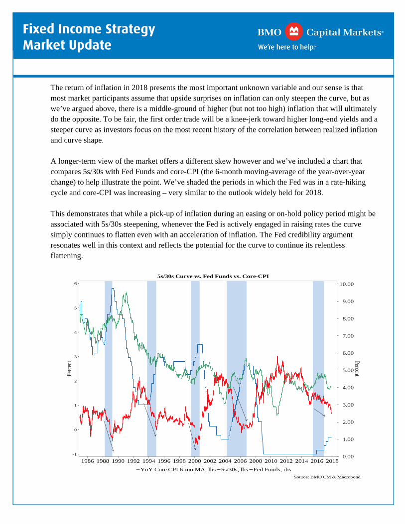

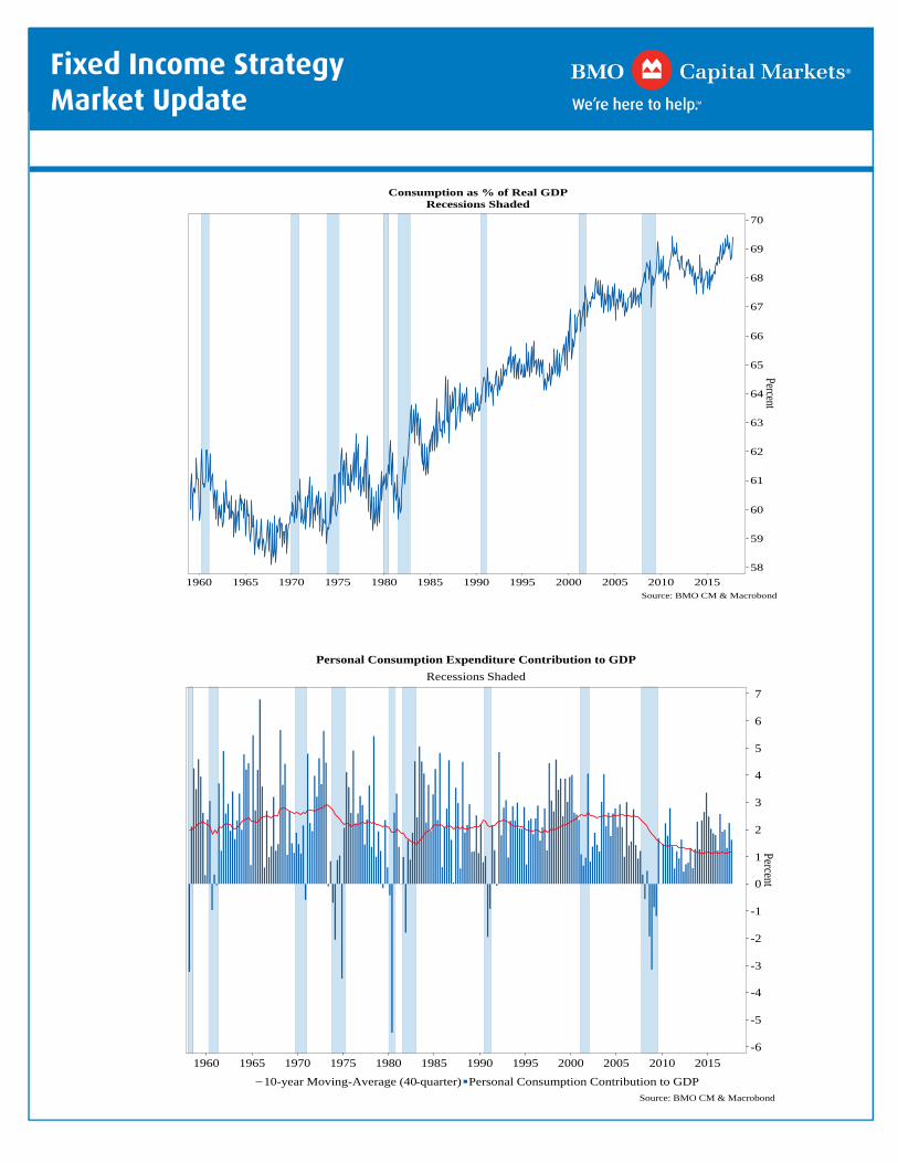

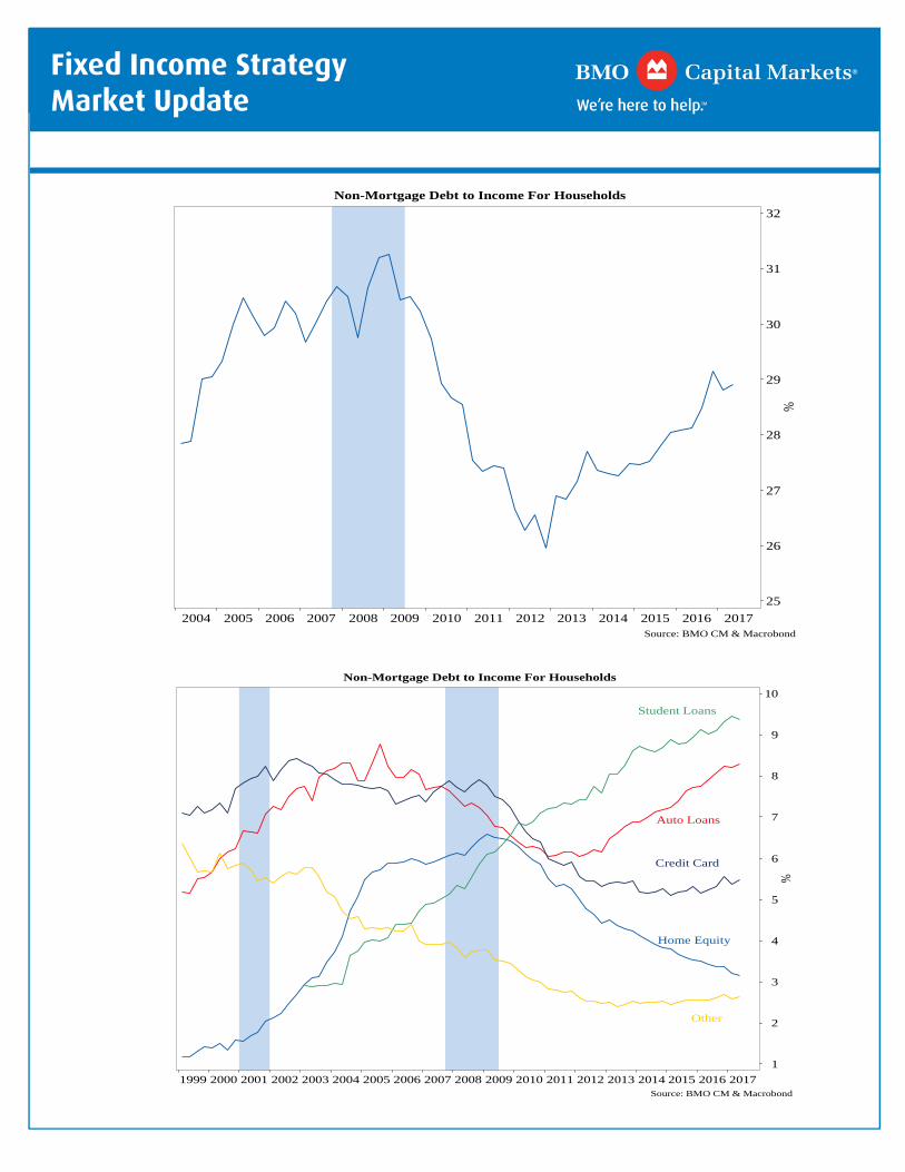
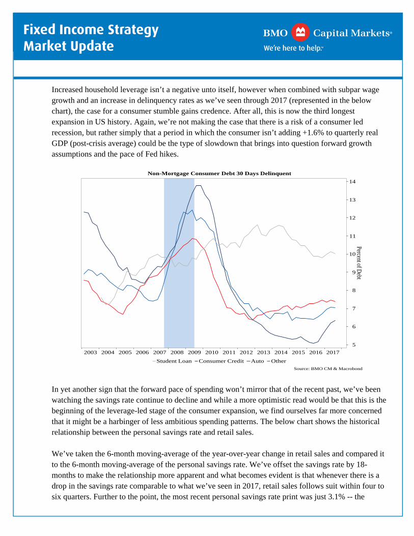


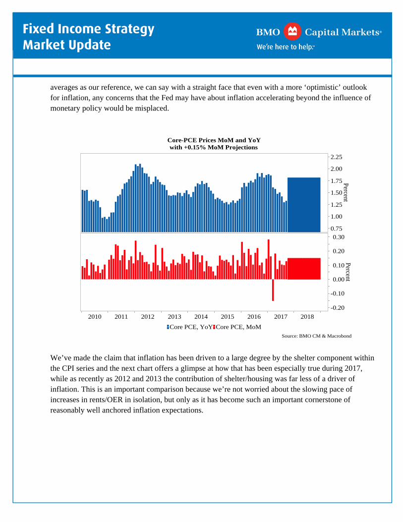


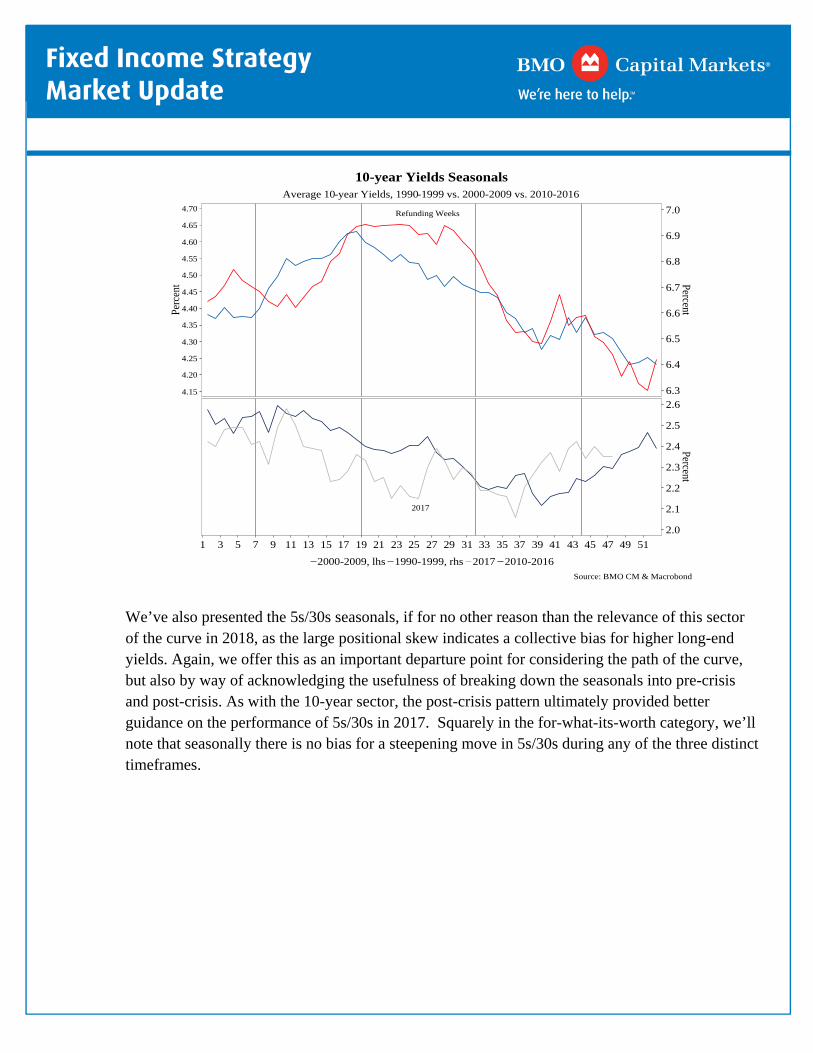
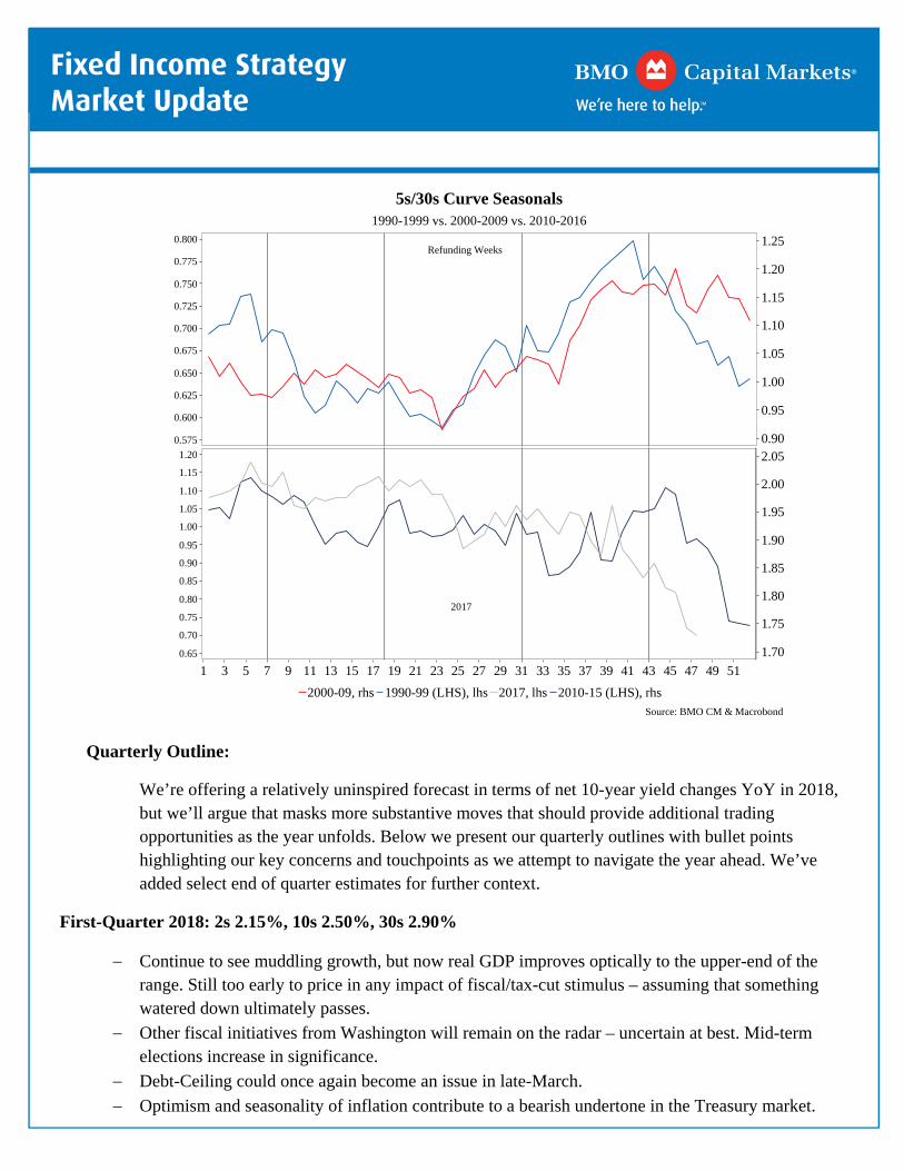

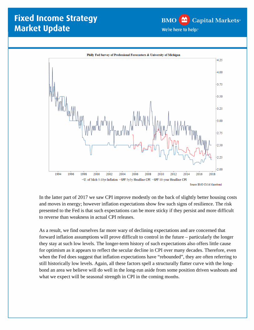
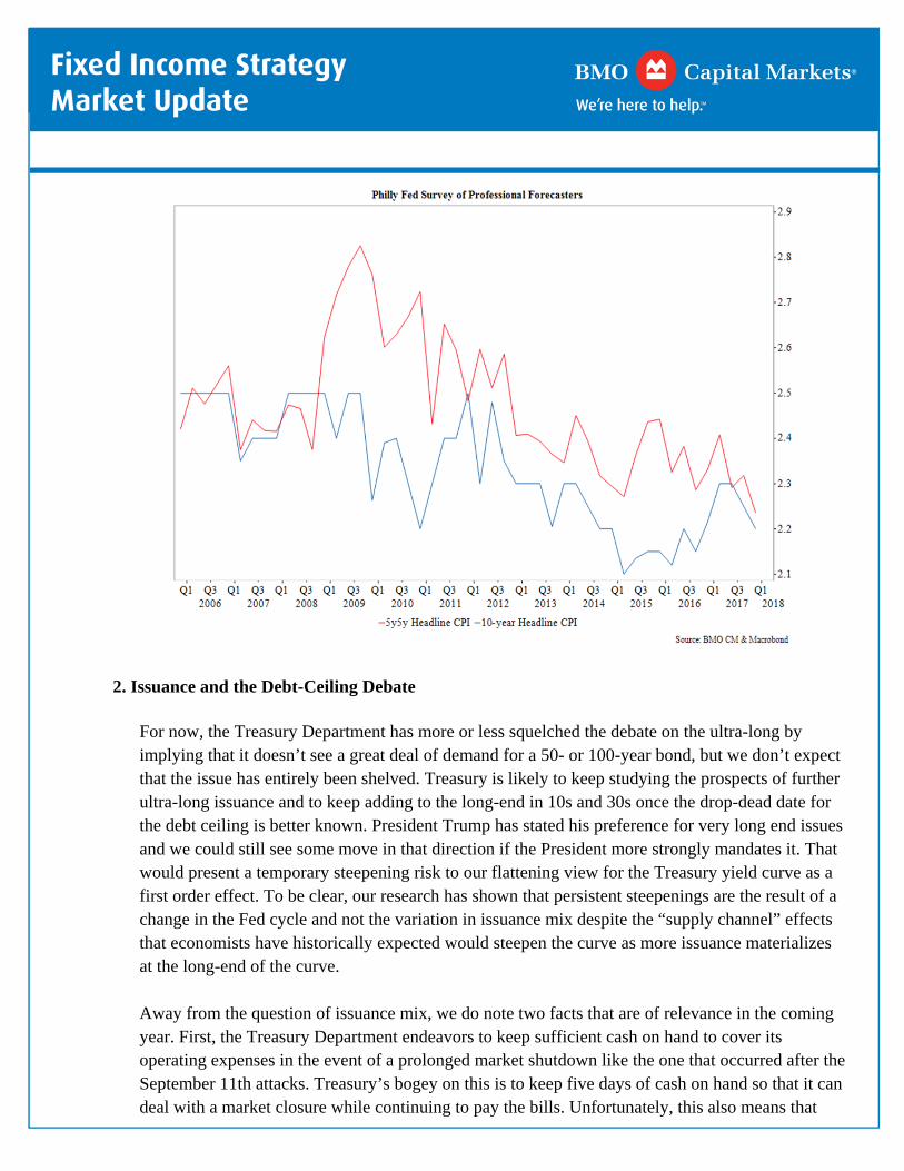
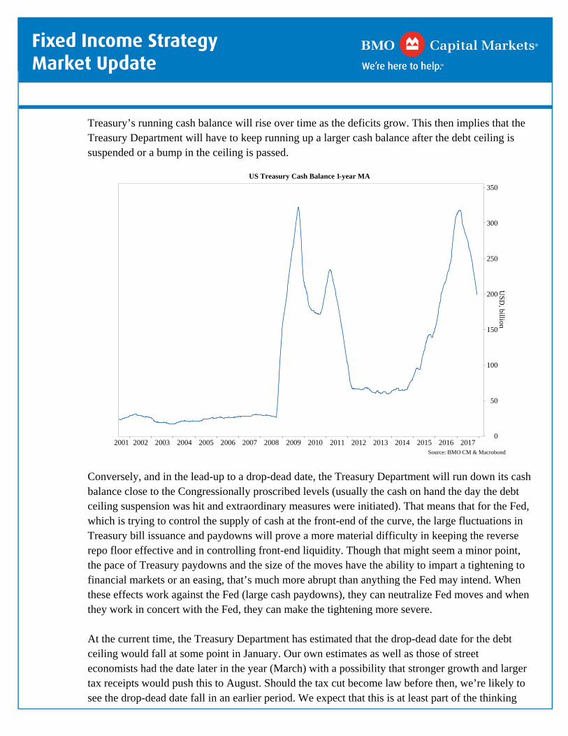

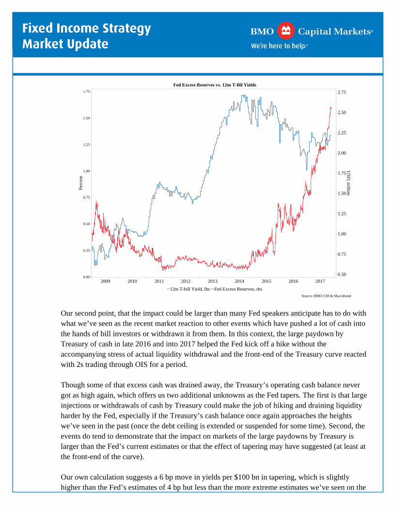
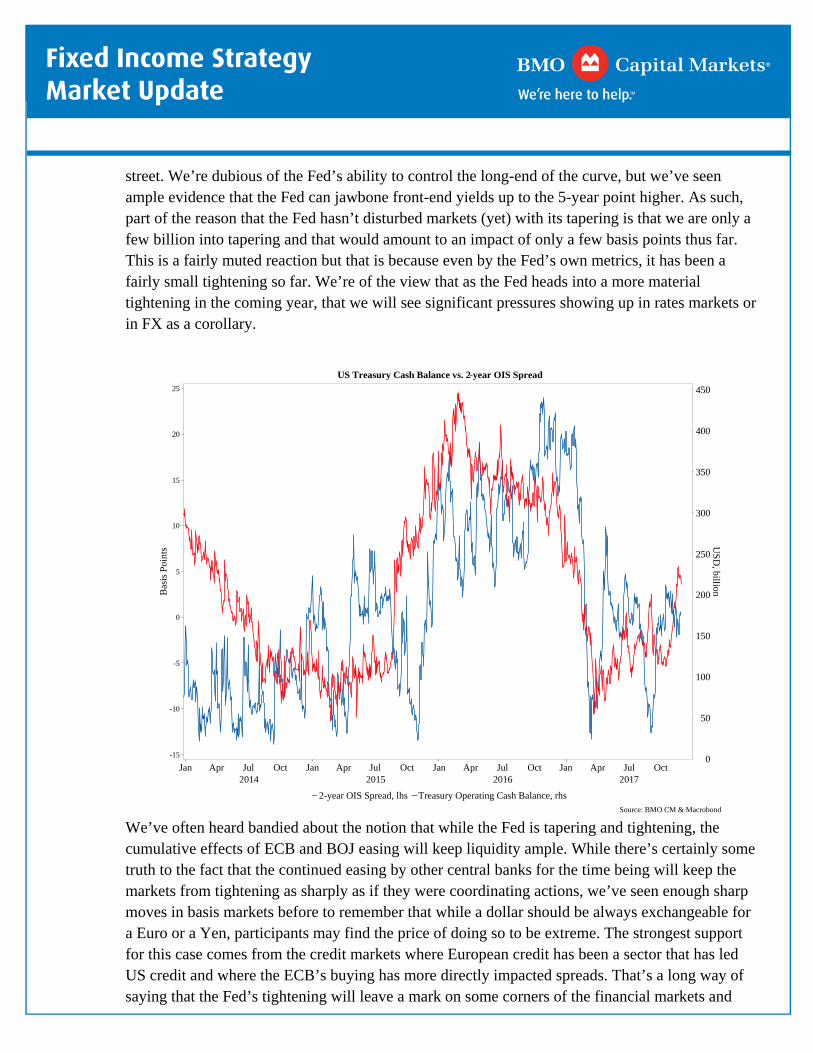


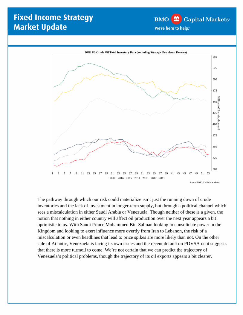
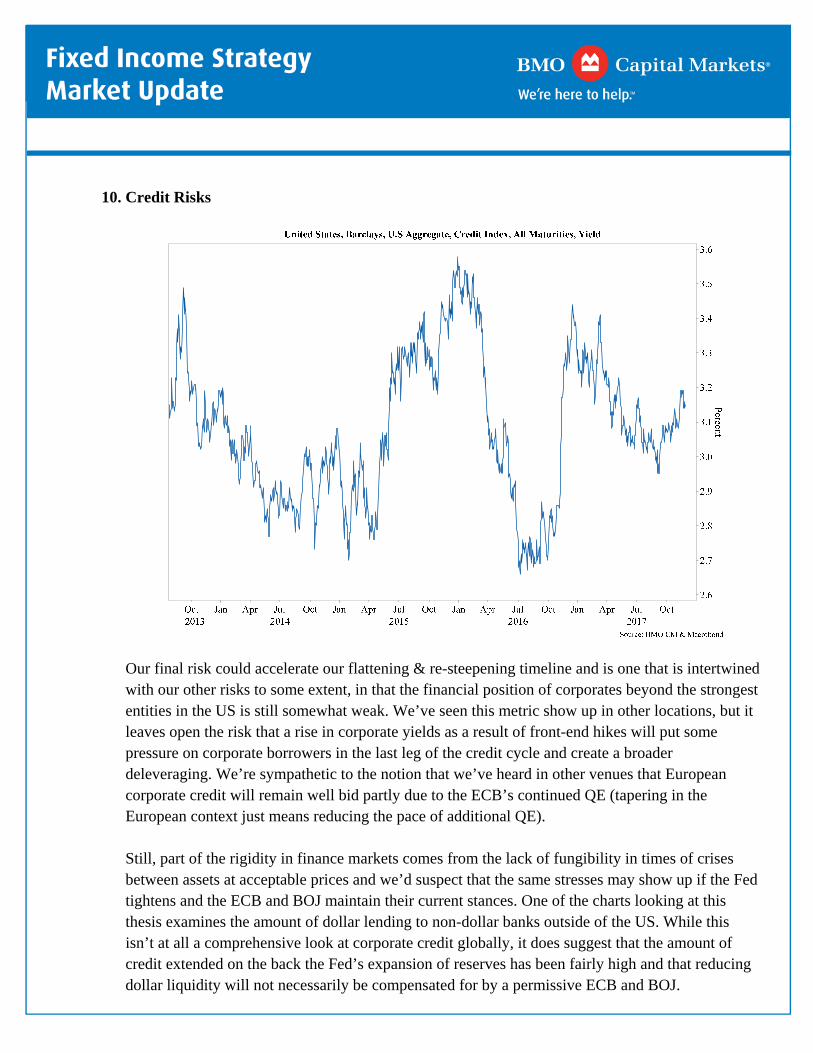


![[Lyngen Visit Lyngenfjord] Travel Guide West](https://static.documents.pub/doc/80x56/577cc3e81a28aba711978783/lyngen-visit-lyngenfjord-travel-guide-west.jpg)
