Design Planning Creating Infographics DESIGN PLANNING Chapter Objectives Differentiate between principle and design. Have a good knowledge of Colour Theory. Plan designs with good colour harmony. COMAT Training Services Pte Ltd Page 1
Transcript
Design Planning Creating Infographics
DESIGN PLANNING
Chapter Objectives Differentiate between principle and design. Have a good knowledge of Colour Theory. Plan designs with good colour harmony.
COMAT Training Services Pte Ltd Page 1
Creating Infographics Design Planning
Planning the Infographic
Plan carefully and well!Even the best infographic designs will be undermined without good planning, good team dynamics and a firm understanding of your message, audience, goals and data.
Pretty useful? Or pretty useless?
Do’s and Don’t’s of infographic designAmazing design is always a plus and it is of paramount importance for infographics. Keep these tips in mind in the design process:
1. Show, don’t tell You don’t want your infographic to feel like a novel; after all, infographics are all about presenting information visually. Keep your use of text to a minimum and use illustrations as much as possible.
Page 2 COMAT Training Services Pte Ltd
MESSSAGEHere's a great
idea for an infographic.
These are the points we want
to make.
DATALet's examine the data and
see if the data supports it.
AUDIENCEThese are the people and/or
the target demographic we want to
reach.
GOALSThis is what we
want to happen after the graphic is
viewed.
Design Planning Creating Infographics
For example, the above Twitter infographic (taken from a much bigger piece - http://www.bitrebels.com/wp-content/uploads/2011/08/Happy-Fifth-Birthday-Twitter-Infographic-1.png) writes out the numbers instead of using a more visual presentation.
2. Focus on the story Stories usually have a protagonist. They also have a beginning, a middle, and an end. While the medium is different, infographics also need to have these elements. Frame your infographic so it’s clear what issue or challenge it addresses and what the audience needs to do after viewing it.
3. Think beyond the traditional Bar and pie charts will always have their place, but the most successful infographics tell the story differently. Besides, If the client wanted an bunch of charts that could just as easily be created in Excel, they not need to the services of great designers. Sad and harsh, but true.
The best infographics minimize the use of traditional charts, opting to use photos, illustrations, and other visually compelling elements instead. In the above example, which do you think is better for the client?Of course not all data is suitable to be creatively depicted. Nevertheless, always consider ways to dress up a traditional graph:
4. Use a colour palette that complements each other The last thing you want is an infographic with clashing colours, with people scratching their
Page 4 COMAT Training Services Pte Ltd
Design Planning Creating Infographics
eyes out or scurrying for the door! Try to stay with three to four colours at most, and try to use harmonious colours.
You don’t have to reinvent the wheel when it comes to picking colours.5. Avoid a white background Most websites have white backgrounds, so
using that same colour as your background will make it difficult for people to decipher where your infographics begin and where it ends.
6. Keep it clean and simple People will find it easier to digest and retain information if you’re not cramming too much information and too many design details in one infographic. The Chinese have a saying – 一目了然 (yī mù liăo rán, “at a glance”) – which is very applicable in this context. If your infographic cannot convey its message within the first few minutes of viewing, you have lost the plot.
7. Edit and edit and edit some more Use very minimal copy; it’s not called an infographic for nothing!
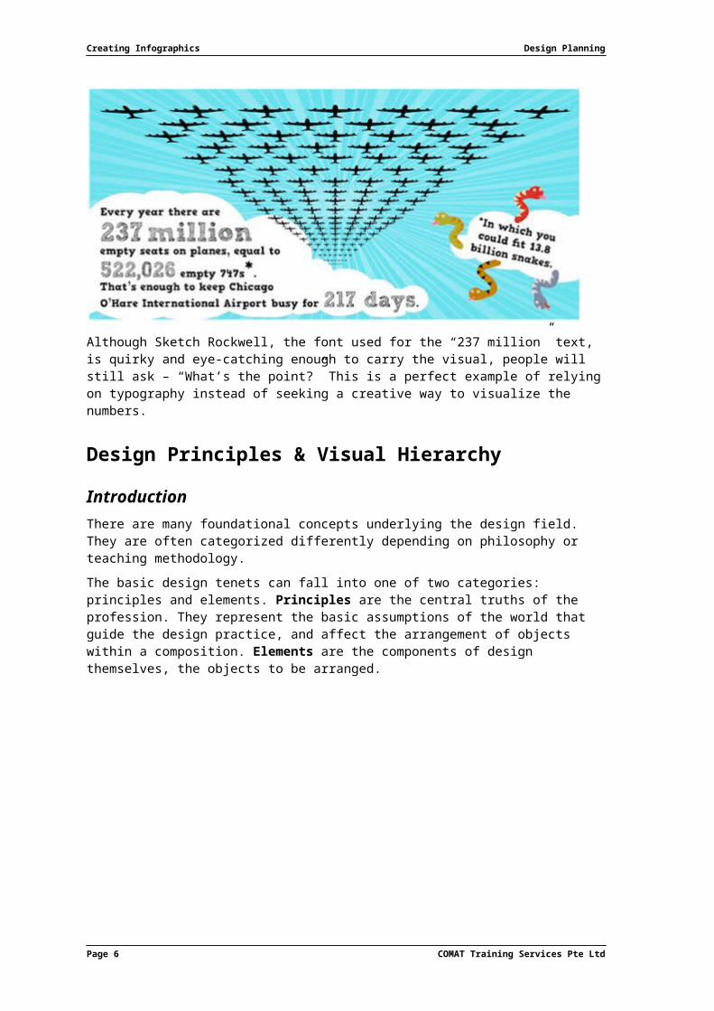
The typography curseUse of type can make or break a design.More often than not, designers begin an infographic with a great deal of energy and excitement. This rapidly fizzles out as the infographic progresses, leading to quick decisions and poor solutions. A good example of that is using typography to show off a big number instead of visualizing it in some way:
COMAT Training Services Pte Ltd Page 5
Creating Infographics Design Planning
Although Sketch Rockwell, the font used for the “237 million” text, is quirky and eye-catching enough to carry the visual, people will still ask – “What’s the point?” This is a perfect example of relying on typography instead of seeking a creative way to visualize the numbers.
Design Principles & Visual Hierarchy
IntroductionThere are many foundational concepts underlying the design field. They are often categorized differently depending on philosophy or teaching methodology.The basic design tenets can fall into one of two categories: principles and elements. Principles are the central truths of the profession. They represent the basic assumptions of the world that guide the design practice, and affect the arrangement of objects within a composition. Elements are the components of design themselves, the objects to be arranged.
Page 6 COMAT Training Services Pte Ltd
Design Planning Creating Infographics
The Principles
Major PrinciplesLet’s begin by focusing on the principles of design, the guidelines of the design profession. Specifically, we will be looking at the following principles:
Principle Meaning
Balance Balance is an equilibrium that results from looking at images and judging them against our ideas of physical structure (such as mass or gravity). It is the arrangement of the objects in a given design as it relates to their visual weight within a composition. Balance usually comes in two forms: symmetrical and asymmetrical. Symmetrical Also known as formal balance, symmetrical
balance is when the weight of a composition is evenly distributed around a central vertical or horizontal axis, or around a central point. Usually, objects on both sides of the axis are identical. When they are similar but un-identical, it is called approximate symmetry.
Asymmetrical Asymmetrical, or informal, balance is when the weight of a composition is not evenly distributed around a central axis. This involves the different-sized objects arranged so they balance one another with their respective visual weights. Often there is one dominant form offset by many smaller ones. In general, asymmetrical compositions have a greater sense of visual tension.
Horizontal Approximate Horizontal
Radial Asymmetrical
For example,
COMAT Training Services Pte Ltd Page 7
Balance Rhythm Proportion Dominance Unity
Creating Infographics Design Planning
Principle Meaning
A large shape close to the centre can be balanced by a
small shape close to the edge.
A large light-toned shape will be balanced by a small dark toned shape – the darker the shape the heavier it appears
to be.
Proportion Proportion is the comparison of dimensions or distribution between various forms. Differing proportions within a design can relate to different kinds of balance or symmetry, and help establish visual weight and depth. In the examples shown, notice how the smaller elements seem to recede while the larger elements come to the fore.
Unity Unity describes the relationship between the individual parts to the whole of a design. It refers to the visual linking of the various aspects in a given design that will tie it together.
In this sketch, the eye has to make an uncomfortable jump to link both houses together.
Connecting the houses with a road gives the design a
better unity.
An equally effective link can be made with a grove of trees.
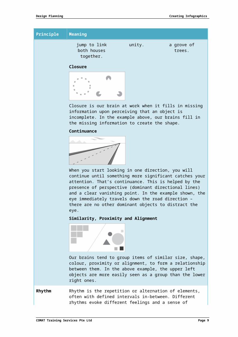
Closure
Closure is our brain at work when it fills in missing information
Page 8 COMAT Training Services Pte Ltd
Design Planning Creating Infographics
Principle Meaning
upon perceiving that an object is incomplete. In the example above, our brains fill in the missing information to create the shape.Continuance
When you start looking in one direction, you will continue until something more significant catches your attention. That’s continuance. This is helped by the presence of perspective (dominant directional lines) and a clear vanishing point. In the example shown, the eye immediately travels down the road direction – there are no other dominant objects to distract the eye.Similarity, Proximity and Alignment
Our brains tend to group items of similar size, shape, colour, proximity or alignment, to form a relationship between them. In the above example, the upper left objects are more easily seen as a group than the lower right ones.
Rhythm Rhythm is the repetition or alternation of elements, often with defined intervals in-between. Different rhythms evoke different feelings and a sense of movement, as well as establishing pattern and texture.
RegularOccurs when the elements, or their
intervals are similar in size or
length.
FlowingGives a sense of
movement, and is often more organic
in nature.
ProgressiveShows a sequence of forms through a sequence of steps.
It is interesting to note that repetition with variation is interesting. Remove that variation and it becomes monotonous.For example,
COMAT Training Services Pte Ltd Page 9
Creating Infographics Design Planning
Principle Meaning
These five squares are all the same and can be understood
in a single glance.
When variation is introduced, the same five squares are
more interesting to look at. They can no longer be
absorbed properly with a single glance. The individual
character of each square needs to be considered.
Dominance Dominance gives a design interest, establishes space and perspective, and counteracts confusion and monotony. Dominance can be applied to one or more design elements to give emphasis, often resolving where the eye goes first when looking at a design.There are three levels of dominance, each relating to the weight of a particular object within a composition.
Dominant The object given the most visual weight, the element of primary emphasis that advances to the foreground in the composition.
Sub-dominant The element of secondary emphasis, usually the elements in the middle ground of the composition.
Subordinate The object given the least visual weight, the element of tertiary emphasis that recedes to the background of the composition.
In this illustration, the trees are the dominant element, the house and hills the secondary element, and the mountains the tertiary element.
Without a dominant direction, the overall design (left side) is confusing:
When one object dominates, there is visual interest (right side):
Page 10 COMAT Training Services Pte Ltd
Design Planning Creating Infographics
Principle Meaning
When one shape does not dominate, the overall effect is monotonous (left side):
Minor PrinciplesThere are many additional concepts that are related to the principles of design. These can include specific terms and/or techniques that are in some way based on one or more of the above tenets. In the end, they add to the collection of compositional tools available for use by the designer.Some of these are briefly discussed below.
Contrast or OppositionContrast addresses the notion of dynamic tension, or the degree of conflict, that exists within a given design between the visual elements in the composition.
Rule of ThirdsThe Rule of Thirds is a compositional tool stating that the most interesting compositions are those in which the primary element is off-centre. Simply put, take any frame of reference and divide it into both horizontal and vertical thirds, making a grid of 9. You then place the important compositional elements on the dividing lines.
COMAT Training Services Pte Ltd Page 11
Creating Infographics Design Planning
Visual HierarchyVisual hierarchy refers to an arrangement, or presentation, of elements in a way that implies importance – it influences the order in which the human eye perceives what it sees. This order is created by the visual contrast between forms in a field of perception. Objects with highest contrast to their surroundings are recognized first by the human mind.Visual hierarchy is an important concept in the field of graphic design – designers often attempt to control visual hierarchy to guide the eye to information in a specific order for a specific purpose.
Visual Hierarchy Principles for Designers
SizeBigger things get noticed or read first.Case in point – in the poster below by Rebecca Foster (www.rebeccafosterdesign.co.uk/105026/843773/work/young-vic-3), the word “CRACKING” should draw all attention, everything else being secondary. If you notice anything else before the word “CRACKING”, something is very wrong!
Space & TextureWhite space is always a designer’s best friend. Anything that has ample space around it has space to breathe – that element or text block then becomes more visible.
The screen capture above is part of DrawtoClick‘s original website (www.drawtoclick.com), and makes full use of negative space. Note the line “Notre agence vous accompagne …” is set in a very small font, but it is surrounded by an excess of white space drawing attention to it. The phrases below – “Le Comprendre,” “Le Réaliser” and “Le Partager” – receive extra emphasis not only by space, but also by being boxed off from the surrounding.
Typeface weight and pairingOne of the critical considerations to establishing visual hierarchy is choice of typeface.Attributes like weight – the width of the strokes that compose its letters, style – like serif and sans serif, and modifications like italicization all contribute.
The example above is from The Tea Factory’s website (http://www.theteafactory.ca/).The first thing you notice is the focal point: “the perfect teas to keep you warm”, with especial emphasis on the word “Teas”. The differences in type weight, size, italicization, and also word placement make the visual experience more dynamic and less linear. Even the phrase “See our selection”, despite its size, is more strongly emphasized than the text above it owing to its sizing and spacing.
ColourIt goes without saying that bright colours stand out from muted colors or grays. Lighter tones appear more “distant” and are lower on the hierarchy than richer, darker ones.
Where They At’s website (http://wheretheyatnola.com) is a striking example – contrasting highlighter yellow and colour illumination against a black-and-white grid produces a striking effect.Colour is of paramount importance in mobile design – the limited screen size of phones and tablets don’t give you much leeway for strategies like size differentiation and broad spacing.
DirectionTraditional/conventional layouts are designed upon a grid of vertical and horizontal lines, also because it is the most legible format.To buck the trend in such a methodology - break out of the grid; e.g. set curved text, or arrange your page elements on a diagonal. Doing so will make it stand out against more traditional, grid-locked text, letting it take center stage.See below for two examples of unconventional layout.
Colour MattersColour is such a pervasive part of everything we visually encounter in the world, for many designers it becomes an intuitive choice.
Colour in design is very subjective – what evokes one reaction in one person may produce a very different reaction in another. Colour theory is the art and science of studying how colours affect different people, either individually or as a group.
The Colour WheelIn order to make it easier to see the relationship between different colours, the concept of the modern colour wheel was developed around the 18th century.
COMAT Training Services Pte Ltd Page 17
Creating Infographics Design Planning
There are also definitions (or categories) of colours based on the colour wheel:
Primary ColoursRed, yellow and blue
In traditional colour theory (used in paint and pigments), primary colours are the 3 pigment colours that cannot be mixed or formed by any combination of other colours. All other colours are derived from these 3 hues.
Secondary ColoursGreen, orange and purple
These are the colours formed by mixing the primary colours in any proportion.
These are the colours formed by mixing a primary and a secondary colour. That’s why the hue is a two-word name, such as blue-green, red-violet, and yellow-orange.
Colour HarmoniesColour Harmony is the art of combining a set of colours which look good together.Certain colour combinations always look good together, while other combinations are so visually painful, you have to avert your look before they burn your eyes! While you might recognize these combinations when you see them, there is a theory based on the colour wheel as to which colours look nicest together.
Analogous
Analogous colour schemes use colours adjacent on the colour wheel. As these schemes are frequently found in nature, they naturally match well, creating serene and comfortable designs that are harmonious and pleasing to the eye.
Page 18 COMAT Training Services Pte Ltd
Design Planning Creating Infographics
Make sure you have enough contrast when choosing an analogous colour scheme. Designers usually choose a 3-colour scheme: one of the 3 colours predominates; a second to support; and a third as an accent.
Complementary
Colours opposite each other on the colour wheel are considered to be complementary colours, e.g. red and green.The high contrast of complementary colours creates a vibrant look especially when used at full saturation, and must be managed well not to be jarring. These opposing colours create maximum contrast and maximum stability. It works especially well when you want a particular element to stand out.
Triad/Triadic
A triadic colour scheme uses colours that are evenly spaced around the colour wheel, usually resulting in harmonies that are quite vibrant, even if you use pale or unsaturated colours.To use a triadic harmony successfully, the colours should be carefully balanced – let one colour dominate and use the other two as accents.
Split-Complementary
The split-complementary colour scheme is a variation of the complementary colour scheme. In addition to the base colour, it uses the two colours adjacent to its complement.This colour scheme has the same strong visual contrast as the complementary colour scheme, but has less tension. It is a good choice for beginners, because it is difficult to mess up.
COMAT Training Services Pte Ltd Page 19
Creating Infographics Design Planning
Rectangle (Tetradic)
The rectangle or tetradic colour scheme uses four colours arranged into two complementary pairs.The tetradic colour scheme is very rich, and works best if you let one colour dominate. You should also pay attention to the balance between warm and cool colours in your design, and this offers plenty of possibilities for variation.
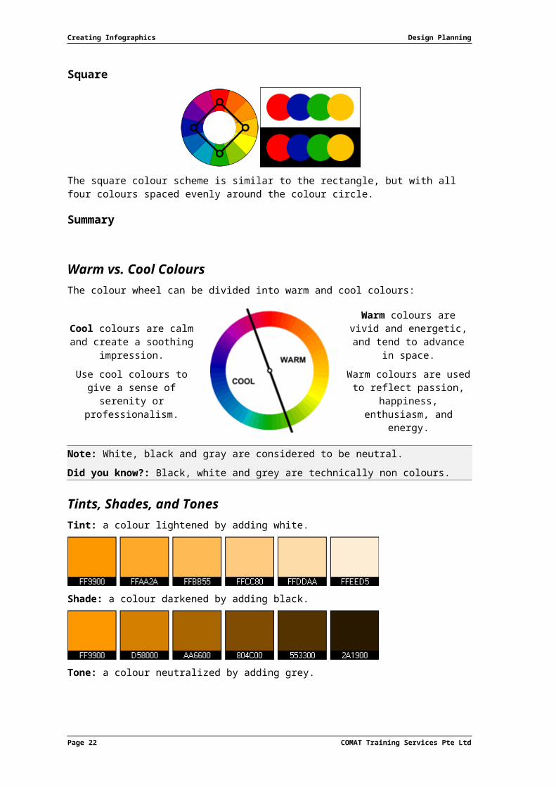
Square
The square colour scheme is similar to the rectangle, but with all four colours spaced evenly around the colour circle.
Summary
Warm vs. Cool ColoursThe colour wheel can be divided into warm and cool colours:
Cool colours are calm and create a soothing
impression.Use cool colours to give a
sense of serenity or professionalism.
Warm colours are vivid and energetic, and tend
to advance in space.Warm colours are used to
reflect passion, happiness, enthusiasm,
and energy.
Note: White, black and gray are considered to be neutral.Did you know?: Black, white and grey are technically non colours.
Tints, Shades, and TonesTint: a colour lightened by adding white.
Page 20 COMAT Training Services Pte Ltd
Design Planning Creating Infographics
Shade: a colour darkened by adding black.
Tone: a colour neutralized by adding grey.
Note: The pure colour, with no additions, is termed a hue.
Colour PerceptionDifferent colours can affect the way we perceive other colours. A typical illustration of this features the same colour placed over a light grey and a dark grey background. The apparent brightness of the colour is altered according to the context in which you see it - a trick of the eye, working to make sense of its surroundings. This can create different effects using the same palette of colours.
COMAT Training Services Pte Ltd Page 21
Creating Infographics Design Planning
Colour MeaningsColour Association
Red Red is a very hot colour. It’s associated with fire, violence, anger, warfare, importance (think celebrity events) and danger (the reason stop lights, signs and most warning labels are red). It’s also the colour of love and passion. In history, it’s been associated with both the Devil and Cupid. Red can actually have a physical effect on people, raising blood pressure and respiration rates. It’s been shown to enhance human metabolism, too.
Orange Orange is a very vibrant and energetic colour. In muted forms, it can be associated with the earth and with autumn. Orange can also represent change and movement from its association with the changings seasons.Because orange is associated with the fruit of the same name, it can be associated with health and vitality. In designs, orange commands attention without being as overpowering as red. It’s often considered more friendly and inviting, and less in-your-face.
Yellow Yellow is often considered the brightest and most energizing of the warm colours. It is associated with happiness and sunshine; but also with deceit and cowardice.In designs, bright yellow can lend a sense of happiness and cheerfulness. Light yellows also give a more calm feeling of happiness than bright yellows. Dark yellows and gold-hued yellows can sometimes look antique and are used in designs where a sense of permanence is desired.
Green Green is a very down-to-earth colour; representing new beginnings, growth, renewal and abundance but also envy or jealousy, and a lack of experience.Green has many of the same calming attributes that blue has, but it also incorporates some of the energy of yellow. In design, green can have a balancing and harmonizing effect, and is very stable. It is appropriate for designs related to wealth, stability, renewal, and nature. Brighter greens are more energizing and vibrant, while olive greens are more representative of the natural world. Dark greens are the most stable and representative of affluence.
Blue Blue is often associated with sadness in the English language; but is also used extensively to represent calmness , responsibility and peace.In design, the exact shade of blue you select will have a huge impact on how your designs are perceived. Light blues are often relaxed and calming. Bright blues can be energizing and refreshing. Dark blues are excellent for corporate sites or designs where strength and reliability are important.
Purple Long considered the colour of royalty; it’s associated with creativity and imagination, too.Since purple is a combination of red and blue, it takes on some attributes of both. In design, dark purples give a sense wealth and
Page 22 COMAT Training Services Pte Ltd
Design Planning Creating Infographics
Colour Association
luxury. Light purples are softer and are associated with spring and romance.
Black Black is the strongest of all the colours. On the positive side, it’s commonly associated with power, elegance, and formality. On the negative side, evil, death, and mystery.Black is commonly used in edgier designs, as well as in very elegant designs. It can be either conservative or modern, traditional or unconventional, sophisticated or mysterious, depending on the colours it’s teamed with.
White White is black’s diametric opposite. But like black, it can work well with just about any other colour. It is almost always associated with purity, cleanliness, goodness and virtue – angels are often depicted in white.In design, white is generally considered a neutral backdrop for other colours in the design to have a larger voice. It can help to convey cleanliness and simplicity, though, and is popular in minimalist designs.
Grey Gray is a true neutral colour, but is occasionally considered moody or depressing. Gray is usually conservative and formal, but can also be modern.In design, light grays can be used in place of white and dark grays in place of black. In corporate designs, where formality and professionalism are key, gray can be a very sophisticated colour.
Brown The traditional earth/wood/stone colour, it’s one of the completely natural colours. Brown can be associated with dependability and reliability, with steadfastness, and with earthiness. It is also considered a dull and lethargic colour.In design, brown is used to bring a feeling of warmth and wholesomeness to designs. It’s sometimes used in its darkest forms as a replacement for black, either in backgrounds or typography.