72
Unit 1 Exploring and interpreting data
| Date post: | 05-Dec-2018 |
| Category: |
Documents |
| Upload: | nguyenkhue |
| View: | 215 times |
| Download: | 0 times |

Unit 1
Exploring and interpreting data

Introduction
Introduction
We live in an age of data! In recent years an information explosion hasrevolutionised our whole environment. With the development of high-speedand high-capacity computers and related technological advances, vastamounts of data are being generated every minute. Information pours infrom the media, government agencies, researchers, commercial companiesand a host of other sources, and we must learn to make rational choicesbased on some kind of summary and analysis of this information. The aimof this module is to give you some tools for making sense of data.
If you have already studied an introductory module on statistics, you willhave learned about some techniques for performing relevant tasks. Theaim of this module is to build on this prior study. This will be achieved byinvestigating a greater range of techniques as well as by providing a deeperunderstanding of the techniques that you might have already come across.
We begin here, in Unit 1, by revising techniques for ‘getting a feel’ fordata. Data exhibit variation – so the characteristics whose values changefrom one individual to another are called variables – and we are initiallyinterested in exploring informally how values of the data vary as well aspossible relations between variables. This is done by drawing pictures ofthe data and by summarising the data numerically. Although getting a feelfor the data is likely to involve techniques you have already met, itscontinued importance is not to be underestimated. Insights gained at thisstage guide the rest of the analysis by, for example, highlighting whichtechniques are appropriate (or, more importantly, which are notappropriate) and providing a guide as to whether whatever conclusions arereached appear to be reasonable.
To get started, in Section 1, we introduce some data, and a few of theimportant words used to describe them. Then, in Section 2, we explore thequestion of whether a dataset can be thought of as representing an entirepopulation or as just a sample from it. We describe some plots that can beused to depict data in Section 3. Interest is in the distribution of the data,that is, in the pattern by which data values vary: a distribution hasattributes such as shape, location and spread. Numerical quantities thatcan be used to summarise aspects of a distribution of data are thendescribed in Section 4. Finally, Section 5 returns to the graphical theme,this time using plots to compare variables and to explore relationshipsbetween them.
An important tool in modern statistics is a statistical software packagewhich is used to get your computer to deal with the number-crunchingdrudgery underlying most statistical analysis. This tool allows statisticiansto focus on selecting the right techniques for the right situation – and oninterpreting the results. The specific statistics package that will be used inthis module is Minitab. The basic use of Minitab, and its implementationof the techniques revised in this unit, will be covered in stages as you work
3
Unit 1 Exploring and interpreting data
through the unit. However, it is not necessary to complete the computerwork associated with one section before moving on to the next section. Sostudy of the sections involving Minitab can, if you wish, be deferred to theend of your study of this unit.
1 Data
For data analysis we need data. So here we introduce some datasets toexplore. As you will see, the datasets described here are mostly small.This is deliberate, so that you can more easily see what is going on andhave the opportunity to consider individual data points. However, it isworth bearing in mind that many datasets are large enough thatinspecting all the values individually becomes tedious. Yet other datasetsare so large that inspecting more than a tiny minority of data pointsbecomes completely impractical.
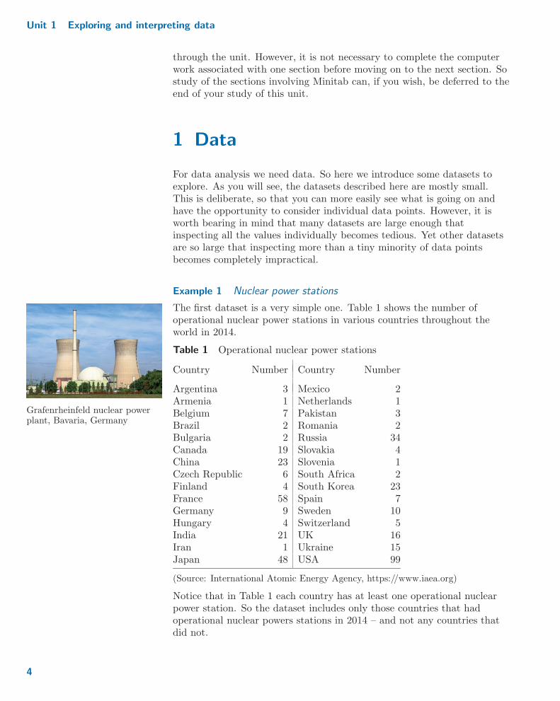
Example 1 Nuclear power stations
The first dataset is a very simple one. Table 1 shows the number ofoperational nuclear power stations in various countries throughout theworld in 2014.
Grafenrheinfeld nuclear powerplant, Bavaria, Germany
Table 1 Operational nuclear power stations
Country Number Country Number
Argentina 3 Mexico 2Armenia 1 Netherlands 1Belgium 7 Pakistan 3Brazil 2 Romania 2Bulgaria 2 Russia 34Canada 19 Slovakia 4China 23 Slovenia 1Czech Republic 6 South Africa 2Finland 4 South Korea 23France 58 Spain 7Germany 9 Sweden 10Hungary 4 Switzerland 5India 21 UK 16Iran 1 Ukraine 15Japan 48 USA 99
(Source: International Atomic Energy Agency, https://www.iaea.org)
Notice that in Table 1 each country has at least one operational nuclearpower station. So the dataset includes only those countries that hadoperational nuclear powers stations in 2014 – and not any countries thatdid not.
4

1 Data
Questions to which these data are relevant include: if a country hasoperational nuclear power stations, how many does it typically tend tohave? and, how many countries have lots of operational nuclear powerstations?
Example 2 UK workforce
Our second dataset, which we give in Table 2, gives the total workforcesize in the UK during the last quarter of 2015, categorised into differentoccupation types. Also given for each occupation type are the numbersemployed, broken down by gender.
Which occupation type is thisfemale working in?
Table 2 Composition of the UK workforce (in millions) in the lastquarter of 2015
Occupation type Male Female Total
Managers, directors & senior officials (Managers) 2.118 1.153 3.271Professional occupations (Professional) 3.172 3.014 6.186Associate professional & technical (Technical) 2.466 1.901 4.367Administrative & secretarial (Administrative) 0.860 2.480 3.340Skilled trades 3.107 0.334 3.441Caring, leisure & other services (Caring & leisure) 0.520 2.390 2.910Sales & customer services (Sales) 0.918 1.568 2.486Process, plant & machine operatives (Operatives) 1.743 0.230 1.973Elementary occupations (Elementary) 1.852 1.565 3.417
(Source: Office for National Statistics, https://www.ons.gov.uk)
Questions which these data might be used to answer include: is theworkforce evenly spread across the occupation types? and, in whichoccupation types (if any) is there a gender imbalance?
Example 3 Number of children
Many of the datasets considered in M248, like those in Examples 1 and 2,are of direct contemporary interest. Other datasets are older but retaintheir interest for historical reasons. One such can be found in Table 3.These data were sampled from the 1941 Canadian census and comprise thenumbers of children born to Protestant mothers in Ontario who were thenaged 45–54 and had been married aged 15–19. In addition, the data inTable 3 are confined to mothers who had been educated for seven years ormore. The number of entries in the dataset is 35.
Table 3 Number of children
0 4 0 2 3 3 0 4 7 1 9 4 3 2 3 2 16 6 0 13 6 6 5 9 10 5 4 3 3 5 2 3 5 15 5
Here, we might ask: what is the distribution of family size for mothers inthe category described? and, do they typically have small or large families?
5
Unit 1 Exploring and interpreting data
Example 4 Membership of sports clubs
Table 4 gives the percentages of adults (aged 16+) who were members ofsports clubs in 2014–15 in the 49 ‘sport partnership areas’ of England.(These 49 areas covered the whole of England.)
Table 4 Percentages of adults in sport partnership areas who weremembers of sports clubs
16.8 20.7 22.3 20.3 19.3 24.0 27.721.9 19.7 21.2 20.9 22.2 20.4 22.924.0 19.9 22.6 19.1 19.9 23.8 20.416.7 22.3 22.3 19.1 23.7 18.6 21.924.9 24.0 25.0 25.4 21.8 18.9 23.521.3 17.9 17.4 21.8 22.3 24.3 21.222.5 22.8 22.3 27.6 20.4 23.1 19.9
(Source: Sport England, http://www.sportengland.org)
Questions to which these data are relevant include: typically whatpercentage of adults in an area were members of a sports club? and, werethere are any areas where sports club membership was particularly low orparticularly high?
Example 5 Response inhibition training
Table 5 contains data about 10 of the 83 participants in a clinical trialinvestigating a treatment to help with weight loss: response inhibitiontraining. It was hoped that response inhibition training would help reducethe consumption of high-energy foods by training people to react lessfavourably to pictures of such foods. In the trial, the participants wereeither in the treatment group (labelled ‘T’) receiving response inhibitiontraining, or in a control group (labelled ‘C’) doing similar activities to theresponse inhibition training, but not linked to food. The number oftraining sessions the participant took part in, and the weight change (inkg) over the first two weeks is also given. (A negative weight change is aweight loss, a positive weight change is a weight gain.)
Cartoon used by authors toillustrate their study
Table 5 A selection of data from a weight loss trial
Treatment group T T T C T T C C C TNumber of sessions 4 4 4 4 3 4 4 4 4 4Gender F F F F F F M M F FWeight change −0: 6 1: 0 0 : 2 0: 8 −1: 9 −1: 3 0 : 2 1: 4 0: 2 −1: 5
(Source: Lawrence, N.S. et al. (2015) ‘Training response inhibition to food isassociated with weight loss and reduced energy intake’, Appetite, vol. 95,pp. 17–28)
With such data, the key question is whether weight loss is greater in thetreatment group compared with the control group.
6
1 Data
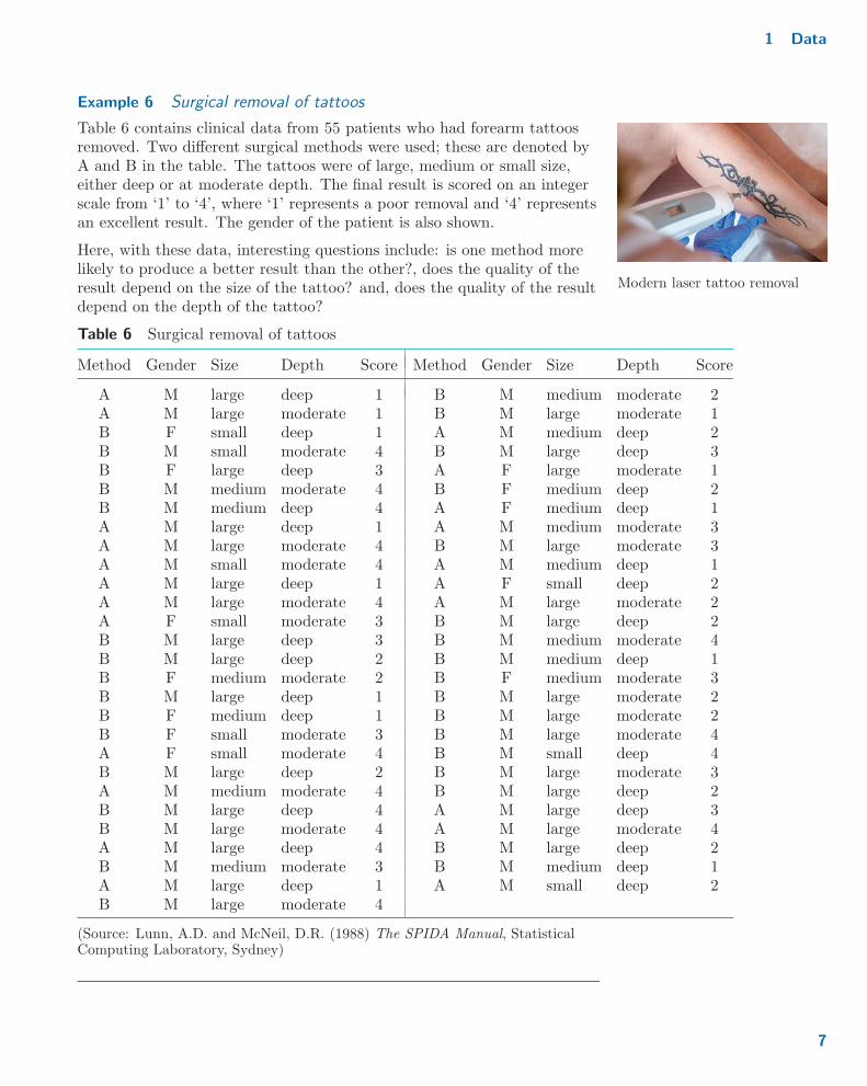
Example 6 Surgical removal of tattoos
Table 6 contains clinical data from 55 patients who had forearm tattoosremoved. Two different surgical methods were used; these are denoted byA and B in the table. The tattoos were of large, medium or small size,either deep or at moderate depth. The final result is scored on an integerscale from ‘1’ to ‘4’, where ‘1’ represents a poor removal and ‘4’ representsan excellent result. The gender of the patient is also shown.
Modern laser tattoo removal
Here, with these data, interesting questions include: is one method morelikely to produce a better result than the other?, does the quality of theresult depend on the size of the tattoo? and, does the quality of the resultdepend on the depth of the tattoo?
Table 6 Surgical removal of tattoos
Method Gender Size Depth Score Method Gender Size Depth Score
A M large deep 1 B M medium moderate 2A M large moderate 1 B M large moderate 1B F small deep 1 A M medium deep 2B M small moderate 4 B M large deep 3B F large deep 3 A F large moderate 1B M medium moderate 4 B F medium deep 2B M medium deep 4 A F medium deep 1A M large deep 1 A M medium moderate 3A M large moderate 4 B M large moderate 3A M small moderate 4 A M medium deep 1A M large deep 1 A F small deep 2A M large moderate 4 A M large moderate 2A F small moderate 3 B M large deep 2B M large deep 3 B M medium moderate 4B M large deep 2 B M medium deep 1B F medium moderate 2 B F medium moderate 3B M large deep 1 B M large moderate 2B F medium deep 1 B M large moderate 2B F small moderate 3 B M large moderate 4A F small moderate 4 B M small deep 4B M large deep 2 B M large moderate 3A M medium moderate 4 B M large deep 2B M large deep 4 A M large deep 3B M large moderate 4 A M large moderate 4A M large deep 4 B M large deep 2B M medium moderate 3 B M medium deep 1A M large deep 1 A M small deep 2B M large moderate 4
(Source: Lunn, A.D. and McNeil, D.R. (1988) The SPIDA Manual, StatisticalComputing Laboratory, Sydney)
7

Unit 1 Exploring and interpreting data
Activity 1 Comparing the structure of data
In the preceding examples, six different datasets have been provided. Howare the structures of these datasets similar, and how are the structuresdifferent?
As you have seen in Activity 1, the different datasets have differentstructures. In statistics, the objects or individuals in a dataset are knownas observations, cases or sampling units. The characteristics arereferred to as variables. And the pattern of variation in the values of avariable is called their distribution.
Variables can be categorised into different types; a variable’s type isdetermined by what characteristic it is representing.
Continuous variables correspond to numerical characteristics where anyvalue within an interval of values is possible. For example, they oftenThe ‘interval’ might be of
infinite length. correspond to measurements such as weight, length or temperature.
Discrete variables correspond to numerical characteristics where onlyparticular values are possible. For example, they often correspond tocounts, such as of the number of children in a family or of the number ofFor counts, only zero and
positive integer values arepossible.
bus routes in a city.
For both continuous and discrete variables, all the possible values arenumbers. However, for categorical variables, values are just labels –In M248, we will think of
categorical variables as beingdistinct from continuous anddiscrete variables, which arenumerical variables. Categoricalvariables are, however, quiteoften considered to be a specialtype of discrete variable.
they indicate which one of a number of groups an observation belongs to.An example is a variable that indicates whether someone never smoked, isan ex-smoker or is a current smoker. Note that the labels attached to eachgroup might be numerical, such as ‘1’, ‘2’ and ‘3’, or might not benumerical, such as ‘A’, ‘B’ and ‘C’.
Categorical data can be further split into two types: nominal and ordinal.For ordinal (categorical) data, the categories have a natural ordering.For example, a response to a question on a five-point scale whichrepresents ‘strongly disagree’, ‘disagree’, ‘neither agree nor disagree’,‘agree’ and ‘strongly agree’ is ordinal. If there is no natural ordering, thecategorical data are said to be nominal, for example, when the possiblecategories are types of woodland habitat, perhaps ‘native pinewoods’,‘native lowland woodland’, ‘plantations’, ‘ancient woodland’ and others.
Activity 2 Categorising variables
For each of the following variables, state whether it is continuous, discrete,nominal or ordinal.
(a) In Table 1, the number of operational power stations.
(b) In Table 4, the percentage of adults who were members of sports clubs.
(c) In Table 6, the surgical method used.
8
1 Data
(d) In Table 6, the size of the tattoo.
(e) In Table 6, the final result of the tattoo removal.
(f) In Table 2, the total number of people employed.
We will return to the aspects of the above categorisation of variables thatare of most importance in this module in Subsection 2.1 of Unit 2. These include the point made in
the solution to Activity 2(f).Recall that in Tables 2, 5 and 6, the data consisted of two or morevariables measured on the same objects. In each case, the groups ofvariables are known as linked variables. For example, in Table 5, thevariables corresponding to the treatment group, the number of trainingsessions attended, gender and weight change are linked. This is becausethe values of all four variables are recorded for each object (in this case, foreach participant in the study).
Activity 3 Runners
The dataset given in Table 7 relates to 22 competitors in the Great NorthRun. Blood samples were taken from 11 runners before and after the run,and from another 11 runners who collapsed near the end of the race. Themeasurements are plasma β endorphin concentrations in picomoles per β is the Greek lower-case letter
beta, pronounced ‘beeta’.litre (pmol/l). Unless you have had medical training, you are unlikely toknow precisely what constitutes a plasma β endorphin concentration, orwhat the units of measurement mean. This is a common experience amongstatisticians when working with data from specialist experiments. Whatmatters most here is that some physical attribute can be measured, andthat the measured value is important to the experimenter. The statisticianis prepared to accept that running may have an effect on the blood, andwill ask for clarification of medical questions as and when the need arises.
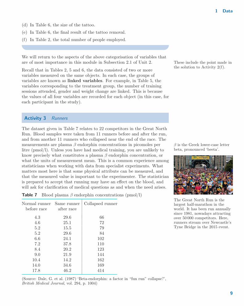
The Great North Run is thelargest half-marathon in theworld. It has been run annuallysince 1981, nowadays attractingover 50 000 competitors. Here,runners stream over Newcastle’sTyne Bridge in the 2015 event.
Table 7 Blood plasma β endorphin concentrations (pmol/l)
Normal runner Same runner Collapsed runnerbefore race after race
4.3 29.6 664.6 25.1 725.2 15.5 795.2 29.6 846.6 24.1 1027.2 37.8 1108.4 20.2 1239.0 21.9 144
10.4 14.2 16214.0 34.6 16917.8 46.2 414
(Source: Dale, G. et al. (1987) ‘Beta-endorphin: a factor in “fun run” collapse?’,British Medical Journal, vol. 294, p. 1004)
9

Unit 1 Exploring and interpreting data
In this dataset, there are three variables which correspond to the threecolumns of the table.
(a) For each variable, state whether it appears to be continuous ordiscrete.
(b) Are any of the variables linked? If so, which?
This section has focused on thinking about tables of data, and the contextsin which the data arose. A summary of the terminology is as follows.
When describing a dataset, the following terminology is used.
� Observations (or cases, or sampling units) refer to objects(people, countries, . . . ) on which characteristics are recorded.
� Variables are the characteristics recorded, and the pattern ofvariation of a variable is its distribution.
� Variables are linked if they are each recorded for the sameobservations.
� A variable is continuous if its values are numerical and allvalues in an interval are possible.
� A variable is discrete if its values are numerical but onlyparticular values (typically, integers) are possible.
� A variable is categorical if its values indicate to which group anobservation belongs.
� A categorical variable is ordinal if its values correspond to labelswhich have a natural ordering.
� A categorical variable is nominal if its values correspond tolabels but the labels do not have a natural ordering.
Even though you have not yet drawn your first graph of any data, orcalculated your first numerical summary, by thinking about the datastructure you are taking your first important steps in analysing the data.As you will see as you study the module, knowing what types of variablesyou have, and whether or not they are linked, will dictate which statisticaltechniques can reasonably be applied.
10
2 Populations and samples
Exercises on Section 1
Exercise 1 Types of variables in the Crime Survey for England andWalesThe Crime Survey for England and Wales (CSEW) aims to capturepeople’s experience of crime. It is a large survey run by the Office forNational Statistics to help the UK government understand the true level ofcrime in the country. In the survey, many variables are recorded, some ofwhich are given below. For each of these variables, state whether itappears to be a nominal, ordinal, discrete or continuous variable.
(a) The respondent’s age, given in years.
(b) The length of time the respondent has been living in their current area Respondents with lengths oftime of exactly 2, 3, 5, 10 or 20years were put in the relevantgroup along with longer times;e.g. a respondent who has livedin the area for 3 years wasassigned to the ‘3–5’ group.
(in years), grouped as ‘< 1’, ‘1–2’, ‘2–3’, ‘3–5’, ‘5–10’, ‘10–20’ or ‘20+’.
(c) The marital status of the respondent, coded as ‘single’, ‘married’,‘separated’, ‘divorced’, ‘widowed’ or ‘civil partnership’. (This is aslight simplification of the categories used.)
(d) How safe the respondent feels walking alone in their local area afterdark, coded as ‘Very safe’, ‘Fairly safe’, ‘A bit unsafe’ or ‘Very unsafe’.
Exercise 2 Linking of variables in the CSEW
(a) In the CSEW for 2014–15, would the two variables ‘how safe therespondent feels’ and ‘age in years’ be linked or not linked?
(b) The CSEW for 2015–16 surveyed different people to those surveyed in2014–15. Are the variables ‘how safe the respondent feels’ in the2014–15 survey and ‘how safe the respondent feels’ in the 2015–16survey linked or not linked?
2 Populations and samples
In Section 1, various datasets were introduced, for example, about nuclearpower stations and about the removal of tattoos. Further, in that sectionyou learned that the datasets could be thought of as consisting of a set ofobjects (observations) about which characteristics (variables) are known.The structures of the first six datasets introduced in Section 1 are given inTable 8 (overleaf).
In Section 1, we stressed one particular important feature thatdistinguishes between datasets. This is that variables come in differenttypes – continuous, discrete, ordinal categorical, nominal categorical – anddatasets will be made up of one or more variables of one or more types.Another feature that distinguishes between datasets is whether theobservations in a dataset represent a population or are a sample from apopulation.
11

Unit 1 Exploring and interpreting data
Table 8 Structure of datasets from Section 1
Example Objects Variables
Example 1 countries number of operational power stations
Example 2 occupation types number of males employednumber of females employedtotal number of people employed
Example 3 Canadian mothers number of children
Example 4 areas in England percentage of sports club membership
Example 5 participants treatment groupnumber of training sessionsgenderweight change
Example 6 patients method of tattoo removalgendersize of tattoodepth of tattooquality of removal score
The objects that form a dataset constitute a population if, collectively,they represent all the objects that it is possible to have. For example, theobjects in Example 1 form a population – the population of countrieswhich had at least one operational nuclear power station in 2014. This isbecause all such countries are listed in Table 1 (given in Example 1).Similarly, the population of a country, that is, all the people that live in acountry, is indeed a population in this sense, but it is very far from beingthe only type of population of interest in statistics.
Populations are not only human On the other hand, if only some objects that it is possible to have areincluded in the dataset, then the given objects that form a dataset are saidto be a sample from a population. For example, the data in Example 6can be thought of as a sample. This is because we can think of the patientsincluded in that dataset as just some of the patients who had tattoosremoved using either method ‘A’ or method ‘B’.
Note that, with samples, it is important to think about the underlyingpopulation. That is, what set of objects is the set of objects we have inour dataset a subset of? For example, for the data in Example 6, theunderlying population can be thought of as all patients who have tattoosremoved using either method ‘A’ or method ‘B’. Indeed, specifying theunderlying population of interest can be thought of as being driven by whoyou wish to apply your findings to. In the tattoo removal example, thispopulation could then even include future patients who will have theirtattoos removed using method ‘A’ or method ‘B’. Specifying anappropriate underlying population is not always easy.
12
2 Populations and samples
Activity 4 Sample or population?
For each of the following datasets which you have already met in this unit,state whether you think it forms a population or a sample. Further, forthose datasets which you think are samples, suggest what the underlyingpopulation is.
(a) The total number of people employed in all occupation types in theUK in the last quarter of 2015 (Example 2).
(b) The clinical trial assessing response inhibition training as a method toencourage weight loss (Example 5).
(c) The percentage of people who were members of sports clubs indifferent English areas (Example 4).
(d) Measurements of blood plasma β endorphin concentrations in runnerswho did not collapse in the Great North Run (Activity 3).
(e) The data from the Crime Survey for England and Wales 2015–16(Exercise 2(b)).
Activity 5 Earthquakes
In one 24-hour period in March 2016, 21 earthquakes around the world ofmagnitude at least 2.5 were recorded by the US Geological Survey. Forthis dataset, discuss whether it forms a population or a sample and, if asample, what the underlying population is.
As you have seen in Activities 4 and 5, for any particular dataset thedefinition of the underlying population is often not clear-cut. However,despite this ambiguity, in many analyses it does matter. Frequently, thegoal in statistical analysis is to move beyond describing and summarisingthe data that have been observed to making statements about theunderlying population, which has not been observed in its entirety. Sothen it is important to know what the underlying population actually is!Crucially, in moving from making statements about a sample to makingstatements about the underlying population, there is an assumption thatthe sample is representative of the underlying population. That is,properties of the underlying population are well reflected in the sample.
The USA, like the UK, has atwo-house parliamentary system(called Congress in the USA).The lower house in the USA isthe House of Representatives,comprising 435 elected votingmembers. The question is: is theUS House of Representativesrepresentative of the USpopulation?
For some samples, the assumption of representativeness is easy to justify,for example, when a sample is taken from a population using simplerandom sampling . That is, the sample is taken by using a process by whichevery object in the population is given the same probability of ending upin the sample as every other object. For other samples, the assumption ismore open to debate. For example, consider the question of whether theearthquakes that occur in one 24-hour period are representative of allearthquakes that occur over a year. If the 24-hour period is chosen becauseit was known that a particularly strong earthquake occurred during that
13
Unit 1 Exploring and interpreting data
period, then the sample may not be representative of all the earthquakesthat year. However, it is easier to argue that the sample is representative ifthe 24-hour period is chosen for reasons unconnected with the earthquakesthat actually occurred.
Activity 6 Representative or not?
In Activity 4(c), it was noted that the data given in Example 4 can beregarded as information about the population of different areas in Englandin 2014–15. Suppose now that the following samples are taken from thispopulation. For each sample, state whether you think the assumption ofrepresentativeness is reasonable, justifying your opinion.
(a) The areas in South East England.
(b) Six areas chosen at random from all the areas.
(c) Every sixth area when the areas are placed in alphabetical order of thenames of the areas.
As you have seen, deciding whether or not a sample is representative isoften a judgement call. Even selecting a sample using simple randomsampling is not a guarantee that a sample will definitely be representative.It just means there is no reason to think it won’t be. Ultimately, the onlyway to be sure that a sample is fully representative would be to gatherinformation about the whole population. However, in most situations, thisis impractical, if not impossible. So it is a judgement call that has to bemade. In M248, you should assume that all samples are representativeunless you are told otherwise.
Exercise on Section 2
Exercise 3 Chondrites
Meteorites are chunks of rock that originate from objects in space and landon the Earth’s surface. Chondrites are meteorites that have not undergoneparticular physical processes (e.g. melting). In Section 4, data from22 chondrites will be given. The chondrites studied were a subset of theknown chondrite meteorites from around the world that were available to aparticular chemical analyst in the 1950s and early 1960s. This dataset willhave just one variable, the percentage of silica the chondrite contains.
(a) Why is it reasonable to regard this dataset as a sample?
(b) What is the underlying population?
(c) Is it reasonable to regard this sample as being representative?
14
3 Graphics
3 Graphics
In Section 1, you began the process of getting a feel for data. Youconsidered what type(s) of variable a dataset contains and which, if any,variables are linked. In this section, we continue this process by plottingindividual variables. Such plots will be used to provide initial answers toquestions such as:
� What range of values occur in the data?
� Which values are common and which are not?
� Do any data points appear particularly unusual? If so, in what way?
These questions could be answered by looking at a table of the data.However, even for small datasets such as those given in Section 1, a goodplot displays the data in such a way that initial answers to these questionsbecome available in a much more immediate way. In Subsection 3.1, youwill see how bar charts can be used to display categorical and discretedata. Then, in Subsection 3.2, a plot useful for displaying continuous datawill be discussed: the histogram. A third type of plot, the boxplot, will beintroduced in Subsection 3.3; it is also primarily useful for displayingcontinuous data. You will get your first opportunity to use Minitab inSubsection 3.4.
3.1 Bar charts
A bar chart is a type of plot that is used to display the values ofcategorical and discrete variables.
In a bar chart, each possible category or discrete value is represented by abar, the height of which corresponds to the number of times that categoryor discrete value occurs in the dataset. These numbers are often called thefrequency of occurrence of the category or discrete value.
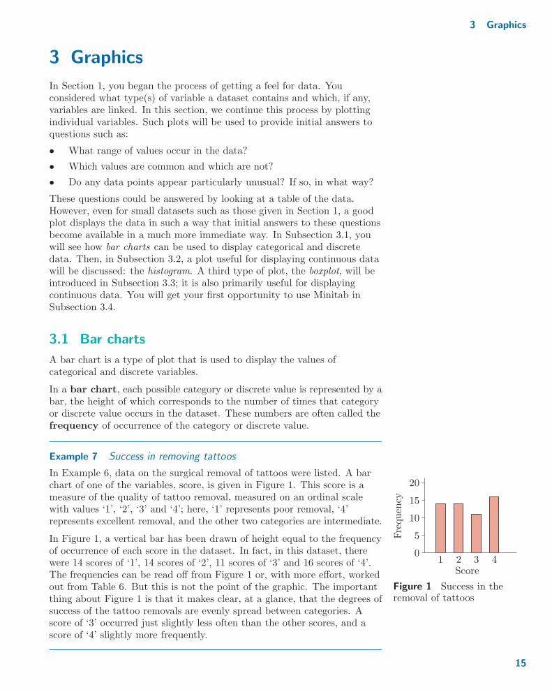
Example 7 Success in removing tattoos
In Example 6, data on the surgical removal of tattoos were listed. A barchart of one of the variables, score, is given in Figure 1. This score is ameasure of the quality of tattoo removal, measured on an ordinal scalewith values ‘1’, ‘2’, ‘3’ and ‘4’; here, ‘1’ represents poor removal, ‘4’represents excellent removal, and the other two categories are intermediate.
4Score
Frequen
cy
20
15
10
5
01 2 3
Figure 1 Success in theremoval of tattoos
In Figure 1, a vertical bar has been drawn of height equal to the frequencyof occurrence of each score in the dataset. In fact, in this dataset, therewere 14 scores of ‘1’, 14 scores of ‘2’, 11 scores of ‘3’ and 16 scores of ‘4’.The frequencies can be read off from Figure 1 or, with more effort, workedout from Table 6. But this is not the point of the graphic. The importantthing about Figure 1 is that it makes clear, at a glance, that the degrees ofsuccess of the tattoo removals are evenly spread between categories. Ascore of ‘3’ occurred just slightly less often than the other scores, and ascore of ‘4’ slightly more frequently.
15

Unit 1 Exploring and interpreting data
Example 8 Distribution of number of children
In Table 3 of Example 3, the number of children born to each of 35Canadian mothers in the first half of the twentieth century were given. Abar chart of the data is given in Figure 2.
16
Frequen
cy
Number of children76543210
7
6
5
4
3
2
1
08 9 10 11 12 13 14 15
Figure 2 Numbers of children born to particular Canadian mothers
Figure 2 makes it clear that most mothers had six or fewer children butsome had more (the largest number being 16). Among the smaller familysizes, most frequencies were broadly similar, with the largest frequencycorresponding to 3 children. However, just one mother had a single child.
Example 7 concerned a bar chart of categorical data while Example 8concerned a bar chart of discrete data. Notice that, in both Figures 1and 2, there are gaps separating each of the bars. This is an importantfeature of bar charts. The gaps emphasise the fact that categories aredistinct, as are discrete data values, and that there is no meaningful‘continuous’ link between them.
When the categorical variable is ordinal, as was the case in Example 7, itis usual to order the bars with respect to the natural ordering. Fornominal variables, there is no such natural ordering to dictate the orderingof the bars. Instead, the bars are often ordered with respect to the heightsof the bars, to assist in the comparison of heights.
Activity 7 Distribution of the UK workforce
In Example 2, data on the number of people in employment in the UK inthe last quarter of 2015 were given. A bar chart of the total numbersemployed, categorised by occupation type, is shown in Figure 3.‘Occupation type’ is a nominal variable, so its categories have been orderedfrom highest frequency on the left to lowest frequency on the right.
16

3 Graphics
Operatives
Frequen
cy(m
illions)
Occupation type
Professional
Technical
Skilledtrades
Elementary
Administrative
Managers
Caring&
leisure
Sales
7
6
5
4
3
2
1
0
Figure 3 Employment in the UK
Using this bar chart, briefly comment on the distribution of the UKworkforce at the end of 2015 across occupation types.
In each of the above bar charts, the bars are drawn vertically. This willremain the standard convention throughout the main text of this module.However, bar charts can also be displayed horizontally; the choice betweenvertical and horizontal bar charts is not very important and can in generalbe made according to convention, preference or convenience.
An issue for clothing: verticalstripes or horizontal stripes?
3.2 Frequency histograms
As you have seen in Subsection 3.1, bar charts give a visual display of thedistribution of categorical and discrete variables. However, not allvariables are categorical or discrete. What is to be done for continuousvariables? One approach is to split the range of possible values for acontinuous variable into intervals and then produce a display that issimilar to a bar chart – the histogram. The positions at which the rangeis split are known as cutpoints ; the intervals defined by the cutpoints areknown as bins (because we’re sorting the data into different ‘bins’according to the data values).
Construction of frequency histograms
Let us start by considering an example.
17

Unit 1 Exploring and interpreting data
Example 9 Binning percentages
In Table 4 of Example 4, the percentages of adults who were members ofsports clubs in 49 English areas were given. In order to understand how ahistogram is constructed, it is useful to identify an interval within whichall the data lie. By scanning through Table 4, it can be seen that thepercentages observed were between 16.7 (the smallest percentage observed)and 27.7 (the largest percentage observed). So one interval within whichall the data lie is the interval from 16.0 to 28.0. One way of splitting upthis interval is into the subintervals, or bins, 16.0–17.0, 17.0–18.0, . . . ,27.0–28.0. That is, take the cutpoints to be 16.0, 17.0, 18.0, . . . , 28.0. NoteYou might argue that, strictly
speaking, the end values 16.0and 28.0 are not really cutpoints,but it proves convenient toinclude them as such.
that the bins do not overlap, neither do they leave any gaps between them.
Having decided on some cutpoints, it is clear which bin a percentagebelongs to as long as it is not equal to a cutpoint – which some of themare! This leaves the issue of what to do when a percentage is exactly equalto a cutpoint. For example, into which bin should the percentage 24.0 thatoccurs in row 3, column 1 of Table 4 be put? It turns out that it does notmatter very much if such cases are put in the bin to the left of the value(for 24.0, this is bin 8, 23.0–24.0) or in the bin to the right of the value (for24.0, this is bin 9, 24.0–25.0); what matters is that whatever is done isdone consistently for all cases which are equal to cutpoints. For example, ifthe percentage 24.0 is put in bin 9 (to its right), then 25.0 (row 5,column 3 of Table 4) should be put into bin 10 (to its right), and the twofurther cases of 24.0 (row 5, column 2 and row 1, column 6 of Table 4)should also be put in bin 9.
This is the convention that we have chosen to use throughout this module:if a data point has a value equal to a cutpoint, put it in the bin alsocontaining higher values, to the right of the cutpoint.
Following the convention and then counting the number of observedpercentages that fall into each of the bins, we get Table 9.
Table 9 Frequencies ofobserved percentages in thesports club membership data
Bin Values Frequency
1 16.0–17.0 22 17.0–18.0 23 18.0–19.0 24 19.0–20.0 75 20.0–21.0 66 21.0–22.0 77 22.0–23.0 108 23.0–24.0 49 24.0–25.0 5
10 25.0–26.0 211 26.0–27.0 012 27.0–28.0 2
18

3 Graphics
The histogram corresponding to the bins and their frequencies given inTable 9 is shown in Figure 4. As in a bar chart, each possible bin – thecontinuous data analogue of a categorical group – is represented by a bar,the height of which corresponds to the frequency with which values in thatbin occur in the dataset. It shows that most areas have sports clubmemberships of between about 19% and 25% of adults, with some havingsmaller percentages and a few higher. The bin associated with the greatestnumber of areas has between 22% and 23% membership.
Frequen
cy
0
2
4
6
8
10
28Percentage
16 18 20 22 24 26
Figure 4 A histogram of the sports club membership data
As you have seen in Example 9, having grouped a set of continuous datainto bins, a plot known as a histogram can be drawn where the number ofcases in each bin is represented by a bar. Thus bar charts and histogramsare similar. However, there are two key differences between bar charts andhistograms.
1. On bar charts, gaps are left between bars. On histograms, there are nosuch gaps. This is because, with continuous data, all values in therange of interest are possible.
2. On bar charts, the heights of the bars correspond to the numbers ofcases in the groups. On histograms it is the areas of the bars thatcorrespond to the numbers of cases in the bins.
That said, often the cutpoints are defined so that the widths of all the binsare the same. This is another convention that we will follow throughoutthis module. For example, all the bins given in Table 9 are of the samewidth, namely, one percentage point. When bins are all the same width,the heights of the bars are also proportional to the numbers of cases in the Area = height � widthbins. And so we can, for now, forget about areas of bars and simply makethe height of each bar equal to the frequency associated with the bin(which is just like a bar chart, after all!). Such histograms are known asfrequency histograms. You will meet another sort of
histogram, a unit-areahistogram, in Subsection 5.2.
19
Unit 1 Exploring and interpreting data
Before considering the interpretation of frequency histograms, we will haveto consider further complications that arise in their construction. You willprobably have realised that there is more than one way of splitting therange of possible values of continuous data into a set of bins using a seriesof cutpoints. There is choice about the position of the starting point (solong as it is not greater than the smallest observed value) and of thedistance between cutpoints (the widths of the bins). These choices canmake quite a lot of difference to the resulting frequency histogram.
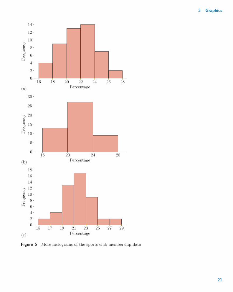
Activity 8 Other binnings of percentages
For each of the following sets of cutpoints, give the corresponding table ofYou could use the frequenciesgiven in Table 9 rather thangoing back to the data inTable 4.
frequencies for the sports clubs membership data. (Where an observedpercentage is the same as a cutpoint, place the percentage in the groupcontaining higher values, to its right.)
(a) Cutpoints: 16.0, 18.0, 20.0, 22.0, 24.0, 26.0, 28.0.
(b) Cutpoints: 16.0, 20.0, 24.0, 28.0.
(c) Cutpoints: 15.0, 17.0, 19.0, 21.0, 23.0, 25.0, 27.0, 29.0.
(Histograms using these cutpoints will be considered in Activity 9.)
Example 10 Frequency histograms of the sports club membership data
Figure 4 in Example 9 is a frequency histogram of the sports clubmembership data given in Table 4, using the binning scheme given inTable 9. Figure 5 shows three more frequency histograms of the sports clubmembership data. Each of these is based on a different binning scheme:Figure 5(a) on the bins given in Activity 8(a); Figure 5(b) on the binsgiven in Activity 8(b); and Figure 5(c) on the bins given in Activity 8(c).
20
3 Graphics
Frequen
cyFrequen
cyFrequen
cy
(a)
0
2
4
6
8
10
12
14
(b)
0
5
10
15
20
25
30
(c)
0
2
4
6
8
10
12
14
16
18
Percentage16 18 20 22 24 26 28
Percentage16 20 24 28
29Percentage
15 17 19 21 23 25 27
Figure 5 More histograms of the sports club membership data
21
Unit 1 Exploring and interpreting data
Activity 9 Which frequency histogram?
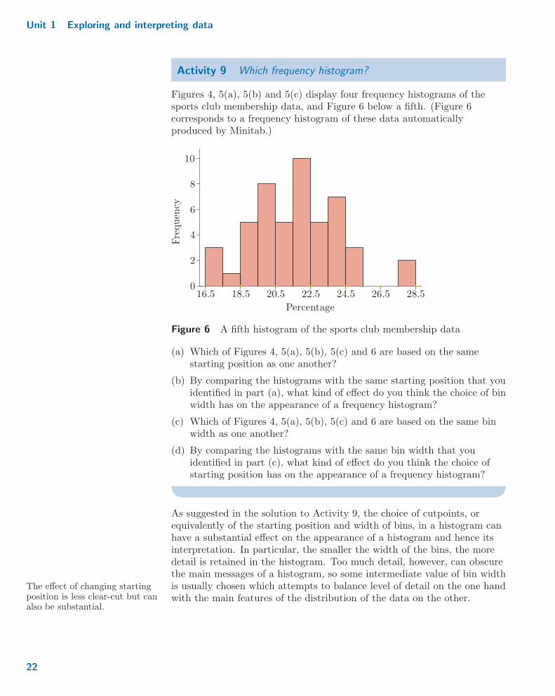
Figures 4, 5(a), 5(b) and 5(c) display four frequency histograms of thesports club membership data, and Figure 6 below a fifth. (Figure 6corresponds to a frequency histogram of these data automaticallyproduced by Minitab.)
28 : 5
Frequen
cy
Percentage
0
2
4
6
8
10
16 : 5 18 : 5 20 : 5 22 : 5 24 : 5 26 : 5
Figure 6 A fifth histogram of the sports club membership data
(a) Which of Figures 4, 5(a), 5(b), 5(c) and 6 are based on the samestarting position as one another?
(b) By comparing the histograms with the same starting position that youidentified in part (a), what kind of effect do you think the choice of binwidth has on the appearance of a frequency histogram?
(c) Which of Figures 4, 5(a), 5(b), 5(c) and 6 are based on the same binwidth as one another?
(d) By comparing the histograms with the same bin width that youidentified in part (c), what kind of effect do you think the choice ofstarting position has on the appearance of a frequency histogram?
As suggested in the solution to Activity 9, the choice of cutpoints, orequivalently of the starting position and width of bins, in a histogram canhave a substantial effect on the appearance of a histogram and hence itsinterpretation. In particular, the smaller the width of the bins, the moredetail is retained in the histogram. Too much detail, however, can obscurethe main messages of a histogram, so some intermediate value of bin widthis usually chosen which attempts to balance level of detail on the one handThe effect of changing starting
position is less clear-cut but canalso be substantial.
with the main features of the distribution of the data on the other.
22
3 Graphics
We will pursue this issue no further in this module except to emphasisethat when you are provided with a histogram of some data, particularchoices have been made – hopefully in a sensible way, either automatically
Guidance on what goes in whatbin?
by a computer program such as Minitab or by reasonable choices made bya person. Other choices (of starting position and/or bin width) may wellhave given rise to a histogram with a different appearance. It thereforereally makes sense only to talk of ‘a histogram’ of some data rather than‘the histogram’ of the data. It also means that one should notover-interpret every little bump and dip in a histogram, a point taken upagain in the next passage.
Interpretation of frequency histograms
Looking at a frequency histogram gives an insight into the shape of thedistribution of the data. When interpreting a histogram, it is usual toconsider the following two points, in particular:
1. the number of modes
2. whether the distribution of the data is symmetric and, if not, whether Statisticians often just say ‘thedata are’ rather than ‘thedistribution of the data is’.
the data are left-skew or right-skew.
These two aspects of histogram shape are explained next.
A mode in a histogram corresponds to a peak in the heights of the bars.Note that a mode does not just refer to the tallest bar or bars. It is possiblefor a bar to correspond to a mode without it being the tallest bar overall:a bar corresponding to a mode just needs to be taller than the bars either If you are familiar with the
terminology of mathematicaloptimisation, you will see thatmodes include both local andglobal maxima in a histogram.
side of it. The data are unimodal if there is just one mode, bimodal ifthere are two modes, and multimodal if there are more than two modes.
A histogram is symmetric if the pattern in the heights of the barsappears to be symmetric around some central point. Asymmetry(non-symmetry) is often called skew in statistics. Left-skew and ‘Skew’ is often written in other
texts as ‘skewed’.right-skew refer to the manner in which the data decline away from thecentral point: if the heights of the bars decline away to zero more slowlyon the left-hand side compared with the right-hand side, the data are saidto be left-skew. Conversely, if the heights of the bars decline away to zeromore slowly on the right-hand side compared with the left-hand side, thedata are said to be right-skew. The direction of skew is of interest mainlywhen the data are both unimodal and asymmetric.
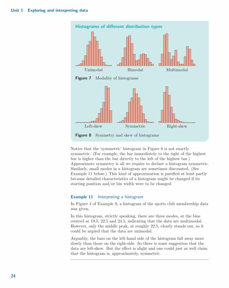
A pictorial summary of these two features is given in the following figures.
23
Unit 1 Exploring and interpreting data
Histograms of different distribution types
MultimodalUnimodal Bimodal
Figure 7 Modality of histograms
Right-skewLeft-skew Symmetric
Figure 8 Symmetry and skew of histograms
Notice that the ‘symmetric’ histogram in Figure 8 is not exactlysymmetric. (For example, the bar immediately to the right of the highestbar is higher than the bar directly to the left of the highest bar.)Approximate symmetry is all we require to declare a histogram symmetric.Similarly, small modes in a histogram are sometimes discounted. (SeeExample 11 below.) This kind of approximation is justified at least partlybecause detailed characteristics of a histogram might be changed if itsstarting position and/or bin width were to be changed.
Example 11 Interpreting a histogram
In Figure 4 of Example 9, a histogram of the sports club membership datawas given.
In this histogram, strictly speaking, there are three modes, at the binscentred at 19.5, 22.5 and 24.5, indicating that the data are multimodal.However, only the middle peak, at roughly 22.5, clearly stands out, so itcould be argued that the data are unimodal.
Arguably, the bars on the left-hand side of the histogram fall away moreslowly than those on the right-side. So there is some suggestion that thedata are left-skew. But the effect is slight and one could just as well claimthat the histogram is, approximately, symmetric.
24
3 Graphics
Example 12 Interpreting another histogram
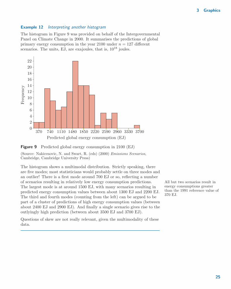
The histogram in Figure 9 was provided on behalf of the IntergovernmentalPanel on Climate Change in 2000. It summarises the predictions of globalprimary energy consumption in the year 2100 under n = 127 differentscenarios. The units, EJ, are exajoules, that is, 1018 joules.
3700
Frequen
cy
Predicted global energy consumption (EJ)
0
2
4
6
8
10
12
14
16
18
20
22
370 740 1110 1480 1850 2220 2590 2960 3330
Figure 9 Predicted global energy consumption in 2100 (EJ)
(Source: Nakicenovic, N. and Swart, R. (eds) (2000) Emissions Scenarios,Cambridge, Cambridge University Press)
The histogram shows a multimodal distribution. Strictly speaking, thereare five modes; most statisticians would probably settle on three modes andan outlier! There is a first mode around 700 EJ or so, reflecting a numberof scenarios resulting in relatively low energy consumption predictions. All but two scenarios result in
energy consumptions greaterthan the 1991 reference value of370 EJ.
The largest mode is at around 1500 EJ, with many scenarios resulting inpredicted energy consumption values between about 1300 EJ and 2200 EJ.The third and fourth modes (counting from the left) can be argued to bepart of a cluster of predictions of high energy consumption values (betweenabout 2400 EJ and 2900 EJ). And finally a single scenario gives rise to theoutlyingly high prediction (between about 3500 EJ and 3700 EJ).
Questions of skew are not really relevant, given the multimodality of thesedata.
25

Unit 1 Exploring and interpreting data
Activity 10 Describing histograms
Briefly describe the shapes of the following two histograms.
(a) A histogram of the life expectancy at birth for girls born in 2013 invarious countries across the world is shown in Figure 10.
The highest life expectancies, of87 years, are in Hong Kong andJapan
90
Frequen
cy
Life expectancy at birth (years)
40 50 600
10
20
30
40
50
60
70 80
Figure 10 Life expectancy at birth (years)
(Source: World Bank, http://data.worldbank.org/indicator/SP.DYN.LE00.FE.IN)
(b) The waiting times between almost 300 eruptions of the Old Faithfulgeyser in Yellowstone National Park, USA, were recorded inAugust 1978. A histogram of these data is given in Figure 11.
Old Faithful: little to seebetween eruptions!
Frequen
cy
Time (minutes)
60
60
5040
50
40
30
20
10
070 80 90 100 110
Figure 11 Waiting times between eruptions (minutes)
(Source: Azzalini, A. and Bowman, A.W. (1990) ‘A look at some data on the OldFaithful geyser’, Applied Statistics, vol. 39, no. 3, pp. 357–65)
3.3 Boxplots
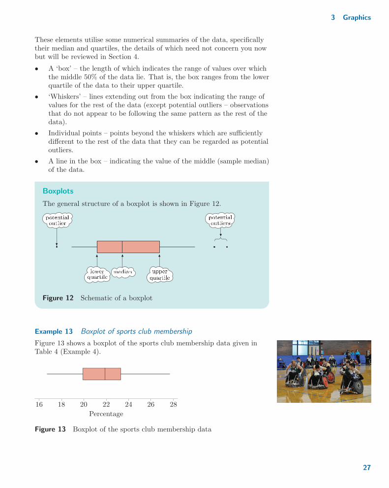
Histograms are not the only way of displaying a continuous variable.Another type of plot that is frequently used is the boxplot (also knownas a box-and-whisker plot). Boxplots consist of a number of elements.
26
3 Graphics
These elements utilise some numerical summaries of the data, specificallytheir median and quartiles, the details of which need not concern you nowbut will be reviewed in Section 4.
� A ‘box’ – the length of which indicates the range of values over whichthe middle 50% of the data lie. That is, the box ranges from the lowerquartile of the data to their upper quartile.
� ‘Whiskers’ – lines extending out from the box indicating the range ofvalues for the rest of the data (except potential outliers – observationsthat do not appear to be following the same pattern as the rest of thedata).
� Individual points – points beyond the whiskers which are sufficientlydifferent to the rest of the data that they can be regarded as potentialoutliers.
� A line in the box – indicating the value of the middle (sample median)of the data.
Boxplots
The general structure of a boxplot is shown in Figure 12.
Figure 12 Schematic of a boxplot
Example 13 Boxplot of sports club membership
Figure 13 shows a boxplot of the sports club membership data given inTable 4 (Example 4).
16 18 20 22 24 26 28
Percentage
Figure 13 Boxplot of the sports club membership data
27
Unit 1 Exploring and interpreting data
On this boxplot, no individual points are shown. So there are no areasthat are to be regarded as potential outliers. The middle 50% ofmembership percentages lie between about 20 and 23; those values areapproximately the limits of the central box. Beyond that, all themembership percentages lie between about 17 and 27.5; those values areapproximately the limits of the whiskers.
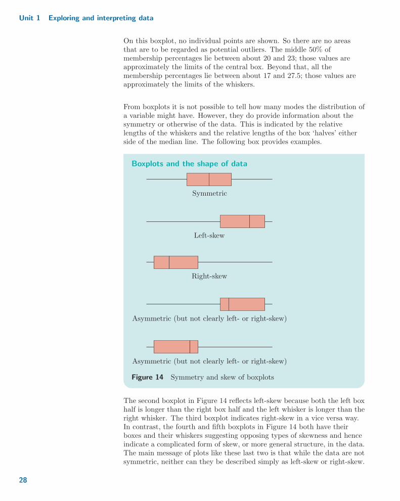
From boxplots it is not possible to tell how many modes the distribution ofa variable might have. However, they do provide information about thesymmetry or otherwise of the data. This is indicated by the relativelengths of the whiskers and the relative lengths of the box ‘halves’ eitherside of the median line. The following box provides examples.
Boxplots and the shape of data
Symmetric
Left-skew
Right-skew
Asymmetric (but not clearly left- or right-skew)
Asymmetric (but not clearly left- or right-skew)
Figure 14 Symmetry and skew of boxplots
The second boxplot in Figure 14 reflects left-skew because both the left boxhalf is longer than the right box half and the left whisker is longer than theright whisker. The third boxplot indicates right-skew in a vice versa way.In contrast, the fourth and fifth boxplots in Figure 14 both have theirboxes and their whiskers suggesting opposing types of skewness and henceindicate a complicated form of skew, or more general structure, in the data.The main message of plots like these last two is that while the data are notsymmetric, neither can they be described simply as left-skew or right-skew.
28

3 Graphics
Example 14 Shape of the sports clubs membership data
You might argue that in Figure 13, the right whisker is longer than the leftwhisker and the left box half is longer than the right box half. So from theboxplot the distribution of percentages of adults who were members ofsports clubs appears to be asymmetric, but not clearly left- or right-skew.This is slightly different to the conclusion reached in Example 11.However, such ambiguity is quite reasonable given that any lack ofsymmetry displayed by these data is not at all pronounced.
Activity 11 Beta endorphin levels in collapsed runners
In Activity 3, some data on the β endorphin levels of runners in the GreatNorth Run was described. A boxplot of the data for the collapsed runnersis given in Figure 15.
In the 1954 Empire Gamesmarathon in Vancouver, Britishrunner Jim Peters led the fieldby 17 minutes but collapsedrepeatedly within about200 metres of the finish andcould not complete the race
Endorphin concentration (pmol/l)
0 100 200 300 400 500
Figure 15 β endorphin levels in collapsed runners
Use this boxplot to describe the shape of the distribution of these data.
3.4 Introducing Minitab
It is now time to transfer your attention to Computer Book A and workthrough Chapters 1 and 2 of it. In Chapter 1, you will be introduced tothe data analysis software Minitab. Among other things, you will learnhow to produce bar charts using Minitab. Then, in Chapter 2, you will useMinitab to produce frequency histograms and boxplots of datasets.
Refer to Chapters 1 and 2 of Computer Book A for the rest ofthe work in this section.
29

Unit 1 Exploring and interpreting data
Exercises on Section 3
Exercise 4 Interpreting a bar chart
Exercise 1 described some variables collected in the Crime Survey forEngland and Wales (CSEW). One of these was the length of time therespondent has been living in their current area (in years), grouped as‘< 1’, ‘1–2’, ‘2–3’, ‘3–5’, ‘5–10’, ‘10–20’ or ‘20+’. A bar chart of the dataon this variable that were collected in 2007–08 (when the CSEW wascalled the British Crime Survey) is displayed in Figure 16.
Frequen
cy
0
1000
2000
3000
4000
5000
< 1 1–2 2–3 3–5 5–10 10–20 20+
Length of time (years)
Figure 16 Lengths of time lived at current address
Using this bar chart, comment on the distribution of the lengths of timerespondents had been living in their current area.
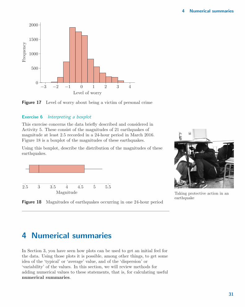
Exercise 5 Interpreting a histogram
From the variables collected in the British Crime Survey 2007–08,researchers derived a new variable, the ‘level of worry about being a victimof personal crime’. The way this variable was constructed means that it iseffectively continuous. The scale was set so that a value of 0 was a‘middling’ value, and the higher the value, the more worry the respondenthad. A histogram of the values of this variable is given in Figure 17.
Using this histogram, comment on the distribution of the levels of worryreported.
30
4 Numerical summaries
0
500
1000500
Frequen
cy
1000
2000
3−3 −2 −1 0 1 2 −4
Level of worry
Figure 17 Level of worry about being a victim of personal crime
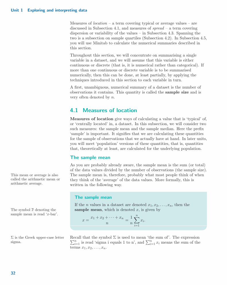
Exercise 6 Interpreting a boxplot
This exercise concerns the data briefly described and considered inActivity 5. These consist of the magnitudes of 21 earthquakes ofmagnitude at least 2.5 recorded in a 24-hour period in March 2016.Figure 18 is a boxplot of the magnitudes of these earthquakes.
Using this boxplot, describe the distribution of the magnitudes of theseearthquakes.
Taking protective action in anearthquake
2 : 5 3 3 : 5 4 4 : 5 5 5 : 5Magnitude
Figure 18 Magnitudes of earthquakes occurring in one 24-hour period
4 Numerical summaries
In Section 3, you have seen how plots can be used to get an initial feel forthe data. Using those plots it is possible, among other things, to get someidea of the ‘typical’ or ‘average’ value, and of the ‘dispersion’ or‘variability’ of the values. In this section, we will review methods foradding numerical values to these statements, that is, for calculating usefulnumerical summaries.
31
Unit 1 Exploring and interpreting data
Measures of location – a term covering typical or average values – arediscussed in Subsection 4.1, and measures of spread – a term coveringdispersion or variability of the values – in Subsection 4.3. Spanning thetwo is a subsection on sample quartiles (Subsection 4.2). In Subsection 4.5,you will use Minitab to calculate the numerical summaries described inthis section.
Throughout this section, we will concentrate on summarising a singlevariable in a dataset, and we will assume that this variable is eithercontinuous or discrete (that is, it is numerical rather than categorical). Ifmore than one continuous or discrete variable is to be summarisednumerically, then this can be done, at least partially, by applying thetechniques introduced in this section to each variable in turn.
A first, unambiguous, numerical summary of a dataset is the number ofobservations it contains. This quantity is called the sample size and isvery often denoted by n.
4.1 Measures of location
Measures of location give ways of calculating a value that is ‘typical’ of,or ‘centrally located’ in, a dataset. In this subsection, we will consider twosuch measures: the sample mean and the sample median. Here the prefix‘sample’ is important. It signifies that we are calculating these quantitiesfor the sample of observations that we actually have at hand. In later units,you will meet ‘population’ versions of these quantities, that is, quantitiesthat, theoretically at least, are calculated for the underlying population.
The sample mean
As you are probably already aware, the sample mean is the sum (or total)of the data values divided by the number of observations (the sample size).The sample mean is, therefore, probably what most people think of whenThis mean or average is also
called the arithmetic mean orarithmetic average.
they think of the ‘average’ of the data values. More formally, this iswritten in the following way.
The sample mean
If the n values in a dataset are denoted x1, x2, : : : , xn, then thesample mean, which is denoted x, is given byThe symbol x denoting the
sample mean is read ‘x-bar’.
x =x1 + x2 + � � � + xn
n=
1
n
n∑i=1
xi :
Recall that the symbol Σ is used to mean ‘the sum of’. The expressionΣ is the Greek upper-case lettersigma.
∑ni=1 is read ‘sigma i equals 1 to n’, and
∑ni=1 xi means the sum of the
terms x1, x2, : : : , xn.
32

4 Numerical summaries
Example 15 Calculating a sample mean
In Table 4, the percentages of adults who were members of sports clubs in49 areas covering the whole of England were given. From this population,a random sample of six areas has now been selected. The percentage ofadults who were members of sports clubs for the selected areas is as follows.
19: 1 17: 4 23: 7 22: 3 16: 7 22: 6
If x1, x2, : : : , x6 represents all the cases in this sample, then just working It doesn’t actually matter whichvalue corresponds to which x.along the list, x1 = 19: 1, x2 = 17: 4, x3 = 23: 7, x4 = 22: 3, x5 = 16: 7 and
x6 = 22: 6.
The mean of these percentages is therefore
x =1
6
6∑i=1
xi =1
6(x1 + x2 + x3 + x4 + x5 + x6)
=1
6(19: 1 + 17: 4 + 23: 7 + 22: 3 + 16: 7 + 22: 6) =
121: 8
6= 20: 3:
Thus the sample mean percentage is 20.3%.
Activity 12 Calculating another sample mean
In Activity 3, the β endorphin concentrations of 11 runners who collapsedduring the Great North Run were given. For convenience, the data aregiven again below.
66 72 79 84 102 110 123 144 162 169 414
Calculate the sample mean.
The sample median
Calculation of the sample median starts out by placing all the observationsin order. In M248, we will assume that whenever a variable is ordered, thevalues will be placed in increasing order. The sample median is definedas ‘the middle value’ in the dataset, a simple definition that, as youprobably already know, is not always quite as simple as it seems. The ideais that the sample median is a value for which approximately the samenumber of the data values are smaller than it as are larger than it.
Before writing the definition of the sample median, it is first necessary todistinguish between the order that the observations arrived, or were given,in and their order after they are placed in ascending order. Suppose that,for a sample of n cases, the values of a variable are x1, x2, : : : , xn. We thendenote by x(1), x(2), : : : , x(n) the same values when placed in ascending In some texts, you will see
ordered data represented asx1;n, x2;n, : : : , xn;n.
order. So x(1) is the smallest value in the dataset, x(2) is the secondsmallest value and so on; in particular, x(n) – the nth smallest value – isthe largest value in the dataset.
33

Unit 1 Exploring and interpreting data
Activity 13 Ordering observations
In Example 15, the percentages of adults who were members of sportsclubs in a sample of six areas were given as follows:
x1 = 19: 1, x2 = 17: 4, x3 = 23: 7,
x4 = 22: 3, x5 = 16: 7, x6 = 22: 6:
(a) Reorder these values so that they are in ascending order.
(b) Which observations, out of x1, x2, : : : , x6, correspond to each of thefollowing?
(i) x(1)
(ii) x(6)
(iii) x(4)
The sample median is defined as follows.
The sample median
Let a dataset x1, x2, : : : , xn be reordered as x(1), x(2), : : : , x(n). Thenthe sample median, m, is given by
m = x( 12(n+1)) :
If the sample size n is odd, then n+ 1 is even and the number 12(n+ 1) is
an integer. For instance, if n = 5, then 12(n+ 1) = 6
2 = 3, while if n = 27,
then 12(n+ 1) = 28
2 = 14.
The central reservation splits adivided highway into two equalhalves and is called the medianin the USA and Australia
If the sample size n is even, then n+ 1 is odd and the number 12(n+ 1) is
not an integer but has a fractional part equal to 12 . For instance, if n = 28,
then 12(n+ 1) = 29
2 = 1412 . The sample median is defined to be
x( 12(n+1)) = x(14 1
2), but no member of the ordered dataset has label
‘(141
2
)’, since all are labelled by integers.
The way round this problem is to interpret x(14 12)
as ‘the number halfway
between x(14) and x(15)’, which is in fact the average of x(14) and x(15);that is,
x(14 12)
= x(14) +1
2
(x(15) − x(14)
)=
1
2
(x(14) + x(15)
):
In general, since 12(n+ 1) = n
2 + 12 , for n even the median is halfway
between x(n2 )
and x(n2+1), that is, the median is
m =1
2
(x(n
2 )+ x(n
2+1)
): (1)
34
4 Numerical summaries
This is all much simpler when dealing with numbers than the aboveexplanation in symbols might suggest!
Example 16 Calculating a sample median
In Example 15, the mean percentage sports club membership for a sampleof areas was calculated. Here, we will calculate the sample median of thesame dataset.
For this sample, n = 6. So 12(n+ 1) = 7
2 = 312 , and the median is
m = x(3 12), the value halfway between x(3) and x(4). So, using the ordered
data values given in the solution to Activity 13,
m =1
2
(x(3) + x(4)
)=
1
2(19: 1 + 22: 3) =
41: 4
2= 20: 7:
Thus the sample median percentage is 20.7%.
Activity 14 Calculating more sample medians
(a) Calculate the median β endorphin concentration for 11 runners whocollapsed during the Great North Run. (These data were recentlyrepeated in Activity 12.)
(b) Table 10 gives the percentages of silica found in each of 22 chondrites.(Chondrites are a type of meteorite, as explained in Exercise 3.)
Table 10 Silica content of chondrites
20.77 22.56 22.71 22.99 26.39 27.08 27.32 27.3327.57 27.81 28.69 29.36 30.25 31.89 32.88 33.2333.28 33.40 33.52 33.83 33.95 34.82
(Source: Ahrens, L.H. (1965) ‘Observations on the Fe-Si-Mg relationship inchondrites’, Geochimica et Cosmochimica Acta, vol. 29, no. 7, pp. 801–6)
Calculate the median percentage of silica in these chondrites.
Mean or median?
In this subsection, we have reviewed two measures of location: the(sample) mean and the (sample) median. This then raises the question ofwhich one to use.
In many situations, it does not make much difference which is chosen.However, if the observed data include some extreme values, or even arejust very skew, then the value of the median is likely to be more ‘typical’of the majority of the data than is the value of the mean. This is becausethe median is a resistant measure of location, whereas the mean is not. This property is also known as
robustness.That is, the value of the mean can be heavily influenced by one or twoextreme values, whereas the value of the median is not.
35

Unit 1 Exploring and interpreting data
Activity 15 Typical β endorphin concentration for collapsed runners
In Activities 12 and 14(a), you calculated the mean and median β
endorphin concentrations for 11 runners who collapsed during the GreatNorth Run. In Activity 11, it was observed that the highest observationcould be regarded as an outlier. So in this activity you will investigatewhat difference it makes to measures of location if this observation isdropped. (The data are in both Activities 3 and 12.)
(a) Calculate the mean β endorphin concentration for the 10 observationsthat are not regarded as outliers.
(b) Calculate the median β endorphin concentration for the 10observations that are not regarded as outliers.
(c) Compare your answers to parts (a) and (b) to the mean and medianbased on all the observations (which are 138.6 pmol/l and 110 pmol/l,respectively). Does this support the claim that the median is aresistant measure of location, but the mean is not?
Sample size also plays a role when considering the robustness or otherwiseof sample measures of location (or other summary measures obtained fromdata): generally speaking, the smaller the sample size, the more influencean outlier will have on a sample measure.
Resistance to outliers is not the only consideration when comparing thesample mean with the sample median; some other considerations (whichwe will not go into here) favour the mean over the median. It should alsobe said that it does no harm, especially when using a computer, tocalculate both measures of location; if the sample mean and samplemedian are similar, then you have an especially good idea of the ‘typical’value in the data; if the sample mean and sample median are considerablydifferent, then you have an indication that there is something in the data –perhaps outlier(s), perhaps skewness – that is leading to such a difference.
4.2 Sample quartiles
As you have seen, the sample median is essentially the middle value afterhaving placed the data values in order. Other positions in this ordered listare also useful to consider. In particular, two such positions are the valuesone-quarter of the way along the list and three-quarters of the way along;these are the sample lower (first) quartile and the sample upper(third) quartile. The idea here is that the sample lower quartile hasapproximately three times as many data values larger than it than aresmaller than it. Conversely, the sample upper quartile is the value whichhas approximately three times as many data values smaller than it thanare larger than it.
36
4 Numerical summaries
When there are n observations, n = 3, 4, : : : , these sample quartiles are Sample quartiles are not definedif n = 1 or 2.defined to correspond to the values at positions 1
4(n+ 1) and 34(n+ 1)
along the ordered list.
The sample quartiles
Let a dataset x1, x2, : : : , xn, n = 3, 4, : : : , be reordered asx(1), x(2), : : : , x(n). Then the sample lower quartile, qL, is given by
qL = x( 14(n+1)),
and the sample upper quartile, qU , is given by
qU = x( 34(n+1)) :
The numbers 14(n+ 1) and 3
4(n+ 1) are both integers only when n+ 1is divisible by 4. In some cases, these numbers are, again, of the form‘something and a half’, which we already know how to define in themanner of the sample median when n is even. Denoting the ‘something’by k, we set
x(k+ 12)
= x(k) +1
2
(x(k+1) − x(k)
)=
1
2
(x(k) + x(k+1)
):
In all other cases, the definitions lead to the problem of how to define thevalue that is ‘something and a quarter’ and ‘something and three-quarters’of the way along the ordered list. There are different definitions that canbe (and are) used. The definitions that will be used in M248 are thefollowing: These are also the definitions
used by Minitab.x(k+ 1
4)= x(k) +
1
4
(x(k+1) − x(k)
),
x(k+ 34)
= x(k) +3
4
(x(k+1) − x(k)
):
In words, x(k+ 14)
is taken to be the value that is one-quarter of the way
between x(k) and x(k+1). Similarly, x(k+ 34)
is taken to be the value that is
three-quarters of the way between x(k) and x(k+1).
Example 17 Calculating sample quartiles
In Example 16, the median percentage of people who were members ofsports clubs was calculated for a sample of six areas in England, using datagiven in Example 15; it turned out to be 20.7%. As has already beennoted, for these data n = 6. So
qL = x( 14(n+1)) = x( 7
4)= x(1 3
4)
and
qU = x( 34(n+1)) = x( 21
4 )= x(5 1
4):
37
Unit 1 Exploring and interpreting data
This means that
qL = x(1+ 34)
= x(1) +3
4
(x(2) − x(1)
)= 16: 7 +
3
4(17: 4− 16: 7) = 16: 7 + 0: 525 = 17: 225
and
qU = x(5+ 14)
= x(5) +1
4
(x(6) − x(5)
)= 22: 6 +
1
4(23: 7− 22: 6) = 22: 6 + 0: 275 = 22: 875:
So the lower quartile is approximately 17.2%, and the upper quartile isapproximately 22.9%.
Activity 16 Sample quartiles of the β endorphin concentrations forcollapsed runners
In Activity 15, you compared the mean and median β endorphinconcentrations for collapsed runners, including and excluding the outlier.In this activity, you will calculate the quartiles for the same data, againincluding and excluding the outlier. For convenience, the data are givenonce again, in ordered form, below.
66 72 79 84 102 110 123 144 162 169 414
(a) Calculate the quartiles based on all 11 observations.
(b) Calculate the quartiles if the outlier, 414 pmol/l, is excluded from thecalculation.
(c) Compare your answers to parts (a) and (b). Does it matter if theoutlier is included in the calculations?
You should bear in mind that, by definition, it must always be the casethat
qL ≤ m ≤ qU :
If your calculations do not satisfy these relationships, something is wrongwith your calculations.
If the central reservation is themedian, are the lane dividers ina dual carriageway the quartiles?
Activity 17 Sample quartiles and the boxplot
In a boxplot, the limits of the central box correspond to the samplequartiles. Using the basic idea of the sample quartiles, justify thestatement that ‘the length of the box indicates where the middle 50%(approximately) of the data lie’.
38

4 Numerical summaries
4.3 Measures of spread
Subsection 4.1 was concerned with measures of location. This subsection is
Measuring spread?
concerned not with summarising what value an observation might typicallytake, but instead with how spread out the observations are. That is, wewish to obtain measures that take larger values whenever the data aremore spread out and smaller values whenever they are less spread out. Weconsider two of the prime ways of measuring what we need to measure,along with a variation on the second. These are the sample interquartilerange, the sample standard deviation and its close relation, the samplevariance.
The sample interquartile range
The sample interquartile range is defined to be the difference between thetwo sample quartiles, that is, the sample upper quartile minus the samplelower quartile. As such, and as you have just seen in Activity 17, thesample interquartile range is the length of the box in a boxplot. Thisinterpretation makes it clear that the interquartile range is measuring theamount of spread in the data, at least over its central portion, defined tobe approximately its middle 50%.
The sample interquartile range
The sample interquartile range is defined as
qU − qL,
where qU is the sample upper quartile and qL is the sample lowerquartile.
Example 18 Calculating a sample interquartile range
In Example 17, the quartiles for the percentages of adults who weremembers of sports clubs in six areas in England were calculated to beqL = 17: 225 and qU = 22: 875. So for these data,
qU − qL = 22: 875− 17: 225 = 5: 65:
That is, the sample interquartile range is approximately 5.7%.
Activity 18 Calculating another sample interquartile range
For the data on β endorphin levels of collapsed runners, calculate thesample interquartile range. Include the potential outlier in yourcalculations. (Remember that you obtained the sample quartiles for thesedata in Activity 16.)
39

Unit 1 Exploring and interpreting data
The sample standard deviation
The sample standard deviation, like the sample mean, is a summarymeasure whose calculation involves all of the data values. At the heart ofthe calculation are ‘deviations’, the differences between the data pointsand their mean; these are (xi − x) for x = 1, 2, : : : , n. It is these deviationsthat give the standard deviation its name. As the aim is to measure howspread out the data values are, regardless of whether they are above orbelow their mean, the deviations are first squared. These squaredThe same could be achieved by
just ignoring the signs of thedeviations. However, squaringdeviations leads to a measure ofspread that is easier to deal withmathematically.
deviations are then averaged (although not quite in the usual way, as youwill soon see). The final step, taking the square root of the averagedsquared deviations, ensures that the standard deviation has the same unitsas the data values (for example, if the data are given in kilograms, thenthe sample mean and the sample standard deviation are given in kilogramsalso). Mathematically, this process is expressed as follows.
The sample standard deviation
If the n values in a dataset are denoted x1, x2, : : : , xn and theirsample mean is
x =1
n
n∑i=1
xi,
then the sample standard deviation, s, is defined byIn M248, the square root sign isalways taken to mean thepositive square root. Forexample,
√9 = 3 even though
−3 is also a square root of 9.s =
√√√√ 1
n− 1
n∑i=1
(xi − x)2 :
As you will see later in M248, the division by (n− 1) rather than by n
gives the sample standard deviation better statistical properties.
Note that the square of the standard deviation, s2, is useful in its ownright. So this quantity has its own name, the sample variance.Explicitly, the sample variance is given by
s2 =1
n− 1
n∑i=1
(xi − x)2 :
Example 19 Calculating a sample standard deviation
For the sample of areas in England introduced in Example 15, n = 6 andthe mean percentage of adults who were members of sports clubs isx = 20: 3%. So the sample variance is
40

4 Numerical summaries
s2 =1
n− 1
n∑i=1
(xi − x)2 =1
5
6∑i=1
(xi − 20: 3)2
=1
5
((19: 1− 20: 3)2 + (17: 4− 20: 3)2 + � � � + (22: 6− 20: 3)2
)=
1
5(1: 44 + 8: 41 + � � � + 5: 29) =
43: 66
5= 8: 732:
This means that the sample standard deviation is s =√8: 732 % 2: 95%:
Activity 19 Calculating another sample standard deviation
For the data on β endorphin levels of collapsed runners most recently givenin Activity 16, calculate the sample standard deviation. Include thepotential outlier in your calculations. To make the calculation a little lesstedious, it is sufficient here to use the value of the sample mean that wascalculated correct to one decimal place in Activity 12, namely,138.6 pmol/l.
Interquartile range or standard deviation?
As with the measures of location, two (main) measures of spread have beendescribed in this section: the sample interquartile range and the samplestandard deviation. Before focusing on a comparison of the two, we’llinclude the sample variance in the considerations of the next activity.
Activity 20 A negative spread?
(a) Is it ever possible for the sample interquartile range to be negative?
(b) Is it ever possible for the sample variance to be negative?
(c) Is it ever possible for the sample standard deviation to be negative?
So, as you argued in Activity 20, neither the sample interquartile range northe sample standard deviation can ever be negative. In particular, this Both measures can take the
value zero but these instancescorrespond to situations withlittle or no variability in thedata, which are uninterestingstatistically.
means that any claim that a sample interquartile range or a samplestandard deviation (or a sample variance) is negative indicates that therehas been an error in the calculation somewhere!
Furthermore, the more spread out the data are, the larger both quantitiestend to be. In the case of the sample interquartile range, this is becausespreading out the data results in the sample lower quartile and the sampleupper quartile becoming further apart. In the case of the sample standarddeviation, this is because spreading out the data results in the squareddeviations from the mean becoming larger.
41
Unit 1 Exploring and interpreting data
Although the sample interquartile range and the sample standarddeviation share the above similarities, the values of the measuresthemselves are not directly comparable. That is, it is not possible to saythat one dataset (say dataset ‘A’) is more spread out than another dataset(dataset ‘B’) just because the interquartile range for ‘A’ is more than thestandard deviation for ‘B’.
So, which one to choose?
The interquartile range is a resistant measure. For example, had we askedyou to recalculate the sample interquartile range for the β endorphin levelsof collapsed runners without the outlying value of 414, you would havefound (using quartile values from the solution to Activity 16(b)), thatqU − qL = 148: 5− 77: 25 = 71: 25 pmol/l. This is not very different fromthe value of 83 pmol/l that you found for the case with the outlier includedin Activity 18. Further, the sample quartiles on which it is based sharesimilarities with the sample median: the sample quartiles and the samplemedian are each based on picking out values from the dataset that arecertain amounts of the way along the list of ordered data values. So thesample interquartile range is usually quoted when the sample median is agood choice of measure of location.
The standard deviation is based on deviations about the mean. It is not aresistant measure. For example, had we made you do a parallel tediouscalculation to that of Activity 19 but without the outlying value414 pmol/l, you would have found that the sample standard deviationreduces drastically from the 98.0 pmol/l you found there to 37.4 pmol/l.Again, however, as with the mean, other considerations can favour thestandard deviation. So the sample standard deviation is usually quotedwhen the sample mean is a good choice of measure of location.
You may or may not havewritten so much out!
4.4 A note on accuracy
To what accuracy should you give the results of calculations? If you lookthrough the examples in this section, you will find that, in general, resultshave been given either exactly or, when approximated, to the sameaccuracy as the data or rounded to one decimal place or one significantfigure more than is given in the data. There is no hard-and-fast rule aboutwhat you should do: appropriate accuracy depends on a number of factors,including the reliability of the data and the size of the dataset. However,you should avoid rounding the data either too much, so that valuableinformation is lost, or too little, thus suggesting that your results are moreaccurate than can be justified from the available data.
As a rough guide, it is usually satisfactory to round a result to onesignificant figure more than is given in the data. But note that this roughguide applies only to results quoted at the ends of calculations:intermediate results should not be rounded. If you round a result and thenuse the rounded value in subsequent calculations – for instance, if you usea rounded value for the mean when calculating the standard deviation of adataset – then this sometimes leads to quite serious inaccuracies (known asrounding errors).
42

4 Numerical summaries
Statisticians are not obsessed with degrees of rounding. This is becauseany rounding errors are usually insignificant relative to other inaccuraciesdue to assumptions and approximations involved in the statisticalmodelling process.
4.5 Numerical summaries using Minitab
The work in this subsection consists of a chapter in Computer Book A, inwhich you will see how to use Minitab to calculate the numericalsummaries that have been described in this section.
Refer to Chapter 3 of Computer Book A for the rest of the workin this section.
Exercises on Section 4
Exercise 7 Quartiles of the chondrite data
In Activity 14(b), you calculated the sample median for the dataset on thepercentages of silica found in each of n = 22 chondrites given (in orderedform) in Table 10.
(a) Calculate the sample lower quartile and sample upper quartile of thepercentages of silica in these chondrites.
(b) Hence calculate the sample interquartile range of the percentages ofsilica in these chondrites.
Exercise 8 Location and spread of a sample of numbers of nuclearpower stations
In Table 1, the numbers of operational power stations in 2014 were givenfor all countries which had at least one such power station. From thispopulation, a random sample of seven countries was then selected. Thenumbers of operational power stations for the selected areas are as follows.
99 23 1 3 15 4 9
(a) Calculate the sample median, quartiles and interquartile range of thesedata.
(b) Calculate the sample mean and standard deviation of these data.
(c) Give a brief summary of what parts (a) and (b) tell you about thelocation and spread of the numbers of operational power stations inthe countries selected in this sample.
43

Unit 1 Exploring and interpreting data
5 Comparing variables graphically
So far in this unit, you have been exploring techniques for getting a feel fordata one variable at a time. In this section, the focus is on looking at twoor more variables at the same time, with a view to comparing theirdistributions (in Subsections 5.1–5.3) or understanding the relationshipbetween them (Subsection 5.4).
The graphical methods considered will be: side-by-side bar charts inSubsection 5.1; unit-area histograms in Subsection 5.2; comparativeboxplots in Subsection 5.3; and scatterplots in Subsection 5.4. (Unit-areahistograms can also be used for single datasets in place of frequencyhistograms.) Finally, in Subsection 5.5, you will use Minitab to obtain andinvestigate the graphs described in this section.
5.1 Side-by-side bar chartsWhen comparing different categorical or discrete variables, it isalways possible to place bar charts next to one another; this way, by glancingbetween them, differences and similarities can be picked up. However, whenthe variables are actually measurements using the same categories but on adifferent group of objects, we can do better than that: the two bar chartscan be merged so that the bars relating to the same categories are adjacent.Such a combined bar chart is known as a side-by-side bar chart.
Example 20 Participants in a weight loss trial
In Example 5, data from a weight loss clinical trial were introduced. Aside-by-side bar chart giving the number of male and female participants inthe trial is shown in Figure 19. (Here, the data from all 83 participants areincluded, not just the 10 listed in Table 5.)
Control Treatment0
5
10
15
20
25
30
35 male
female
Frequen
cy
Figure 19 Numbers of females and males in each of the two treatmentgroups of a weight loss trial
44

5 Comparing variables graphically
In this side-by-side bar chart, there are two pairs of bars displayed: theleft-hand pair represents the data for the control group, and the right-handpair the data for the treatment group. Within each pair, there is a bar forthe number of females and a bar for the number of males.
The heights of the bars representing the numbers of females are similar inheight, indicating that the numbers of females in the control and treatmentgroups were similar. The same can be said for the numbers of males in thetwo groups. However, in both pairs of bars, it is clear that the barsrepresenting females are much taller than the bars representing males. Soin this weight loss clinical trial, there were many more female participantsthan male participants. The ratio of female to male participants in the twogroups was broadly similar (as reflected in the heights of the bars withintreatment groups), with a slightly lower ratio of females to males beingapparent in the treatment group compared with the control group.
Activity 21 Gender distribution of the UK workforce
In Activity 7, you considered a bar chart of the distribution of the totalUK workforce at the end of 2015. The data in Table 2, given inExample 2, break down the workforce numbers for males and femalesseparately. A side-by-side bar chart of these data is given in Figure 20.
On the right, a male in a‘Caring & leisure’ occupation
Frequen
cy(m
illions)
Occupation type
Professional
Technical
Skilledtrades
Elementary
Administrative
Managers
Caring&
leisure
Sales
Operatives
male
female
0
0 : 5
1
1 : 5
2
2 : 5
3
3 : 5
Figure 20 UK workforce, October to December 2015, by gender
Using this side-by-side bar chart, comment on how the numbers employedin each occupation type compare for males and females.
45

Unit 1 Exploring and interpreting data
5.2 Unit-area histograms
As with bar charts, the most straightforward way of comparing histogramsis to place histograms for two different variables next to one another.However, one consequence of doing this – if the histograms are plotted onthe same vertical scale – is that the most obvious feature that might showThis applies to bar charts too,
as you saw in Example 20. up is simply that one sample size is larger than the other. When thesample sizes are very different, this could obscure comparisons of otheraspects of the shapes of the distributions of the variables.
Example 21 Comparing weight changes with frequency histograms
In Figure 21, two frequency histograms are given. Both depict data fromthe weight loss clinical trial described in Example 5 relating to the changein weight of participants after two weeks. The histogram in Figure 21(a)displays the data for females in the control group, while the histogram inFigure 21(b) displays the data for males in the control group.
Frequen
cy
Weight change (kg)Weight change (kg)(a)
0
2
4
6
Frequen
cy
0
2
4
6
8
10
12
8
10
12
−4 −2 0 2 4 −4 −2 0 2 4
(b)
Figure 21 Frequency histograms of weight change for (a) females and (b) males in the control group
The bars on the histogram for females are generally much longer than thebars on the histogram for males, reflecting the fact that the control groupconsisted of many more females than males.
This feature can be removed by plotting unit-area histograms. Instead ofplotting frequencies for each group, scaled frequencies are plotted.
Unit-area histograms
A unit-area histogram is a frequency histogram in which thefrequencies are scaled so that the total area of the bars in thehistogram is 1.
Before applying this notion to Figure 21, let us look at the effect of makinga single frequency histogram into a unit-area histogram.
46

5 Comparing variables graphically
Example 22 A unit-area histogram of sports club membership
In Figure 4 of Example 9, a frequency histogram of the sports clubmembership data was given. It is repeated here for convenience.
Frequen
cy
Percentage
0
2
4
6
8
10
16 18 20 22 24 26 28
Figure 22 A frequency histogram of the sports club membership data
A unit-area histogram of the same data, using the same cutpoints, isshown in Figure 23.
Den
sity
Percentage
0
0 : 05
0 : 1
0 : 15
0 : 2
16 18 20 22 24 26 28
Figure 23 A unit-area histogram of the sports club membership data
If you are thinking that the only difference between Figures 22 and 23 isthat the vertical scale has changed, you’d be right. The shape of thehistogram has remained unaltered. This small change is all that is neededto ensure that the total area of the bars takes the value 1. You will seehow this works in the following activity.
Note that the label ‘Density’, replacing ‘Frequency’, on the vertical axisindicates that a unit-area histogram is being plotted.
47

Unit 1 Exploring and interpreting data
Activity 22 Total area of bars
Consider the frequency version of the histogram of sports club membershipgiven in Figure 22. Numbering the bars from left to right, the frequenciesrepresented by each bar are given in the following table. (You will fill inthe blank row in the table shortly.) There’s a zero frequency between whatwe’ve called bars 10 and 11.
Table 11 Frequencies in Figure 22
Bar number 1 2 3 4 5 6 7 8 9 10 11Frequency 2 2 2 7 6 7 10 4 5 2 2Scaled area
(a) The area of a single bar is its height times its width, which inFigure 22 is the frequency associated with the bar times 1 (since thewidth of each bar in this case happens to be 1; usually, it isn’t).Calculate the total area of the bars in Figure 22.
(b) In order to scale the frequencies so that the total area of the bars is 1,divide the frequency of each bar by the total area of the bars to obtainthe scaled frequencies. Again, these scaled frequencies are scaled areassince the width of each bar is 1. Round these values correct to twodecimal places and put them in the blank row in Table 11. Check thattheir sum is 1.
(c) Check visually that the areas that you calculated in part (b)approximately match the heights of the unit-area histogram inThe approximation here derives
from the rounding. Figure 23. (Again, in this case, areas equal heights because bar widthsare 1.)
It might seem a trivial change to change the vertical scale so that the totalarea is equal to 1. However, by doing so, it allows us to focus oncomparing the shapes of the histograms.
Example 23 Comparing weight changes with unit-area histograms
In Example 21, frequency histograms of weight changes over two weeks forparticipants in the control group of a weight loss clinical trial were given;Figure 21(a) is a frequency histogram for females, Figure 21(b) for males.Unit-area histograms for these data are given in Figure 24.
The unit-area histograms in Figure 24 are fairly similar. The bars are alittle higher and more closely packed for males compared with females.This indicates that the weight changes were less spread out for malescompared with females. Otherwise, both histograms indicate just onemode and look approximately symmetric.
48

5 Comparing variables graphically
(a)
Den
sity
Weight change (kg)
0
0 : 1
0 : 2
0 : 3
0 : 4
Den
sity
0
0 : 1
0 : 2
0 : 3
0 : 4
−4 −2 0 2 4
Weight change (kg)
−4 −2 0 2 4
(b)
Figure 24 Unit-area histograms of weight change for (a) females and (b) males in the control group
Activity 23 Recall of memories
In a study of memory recall times, a series of stimulus words was shown toa subject on a computer screen. For each word, the subject was instructedto recall either a pleasant or an unpleasant memory associated with thatword. Successful recall of a memory was indicated by the subject pressinga bar on a computer keyboard. Of key interest in this study was whetherpleasant memories could be recalled more easily and quickly thanunpleasant ones. Unit-area histograms for the two samples are shown inFigure 25.
Use the unit-area histograms to compare the distributions of recall timesfor the two types of memory.
11
(a) (b)
Den
sity
Recall time (seconds)
0
0 : 1
0 : 2
0 : 3
Den
sity
0
0 : 1
0 : 2
0 : 3
1 3 5 7 9 111 3 5 7 9
Recall time (seconds)
Figure 25 Recall times for (a) pleasant and (b) unpleasant memories
(Source: Dunn, G. and Master, D. (1982) ‘Latency models: the statistical analysisof response times’, Psychological Medicine, vol. 12, pp. 659–65)
49
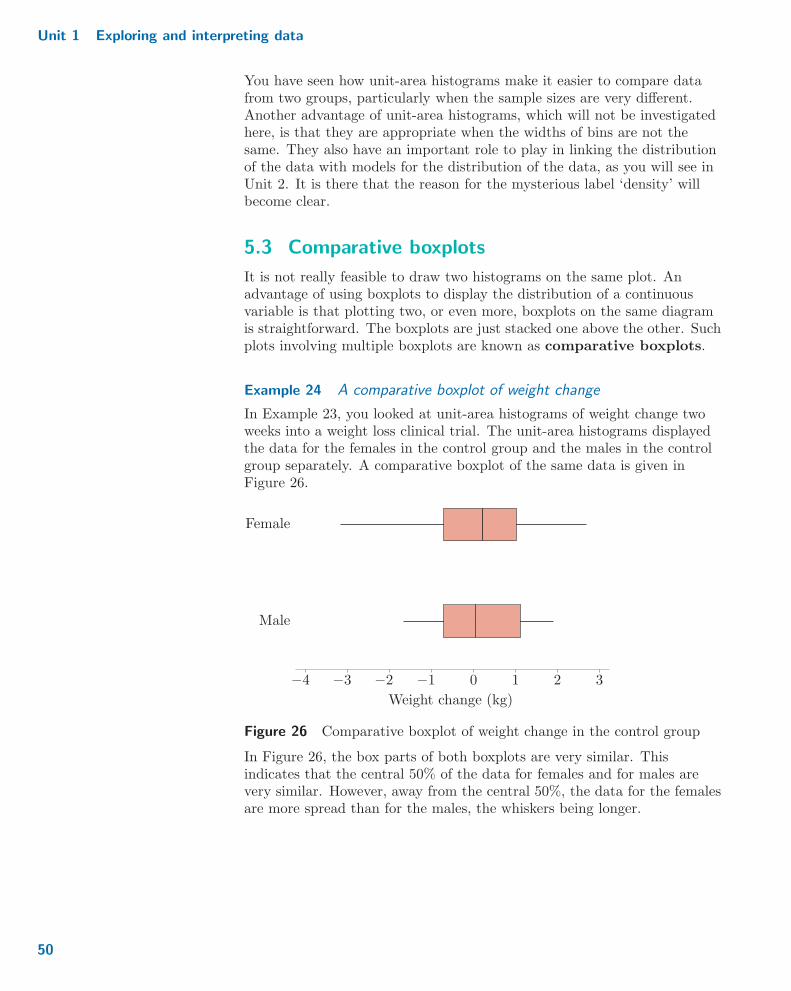
Unit 1 Exploring and interpreting data
You have seen how unit-area histograms make it easier to compare datafrom two groups, particularly when the sample sizes are very different.Another advantage of unit-area histograms, which will not be investigatedhere, is that they are appropriate when the widths of bins are not thesame. They also have an important role to play in linking the distributionof the data with models for the distribution of the data, as you will see inUnit 2. It is there that the reason for the mysterious label ‘density’ willbecome clear.
5.3 Comparative boxplots
It is not really feasible to draw two histograms on the same plot. Anadvantage of using boxplots to display the distribution of a continuousvariable is that plotting two, or even more, boxplots on the same diagramis straightforward. The boxplots are just stacked one above the other. Suchplots involving multiple boxplots are known as comparative boxplots.
Example 24 A comparative boxplot of weight change
In Example 23, you looked at unit-area histograms of weight change twoweeks into a weight loss clinical trial. The unit-area histograms displayedthe data for the females in the control group and the males in the controlgroup separately. A comparative boxplot of the same data is given inFigure 26.
Female
Male
−3 −2 −1 1 2 3
Weight change (kg)
−4 0
Figure 26 Comparative boxplot of weight change in the control group
In Figure 26, the box parts of both boxplots are very similar. Thisindicates that the central 50% of the data for females and for males arevery similar. However, away from the central 50%, the data for the femalesare more spread than for the males, the whiskers being longer.
50

5 Comparing variables graphically
Activity 24 A comparative boxplot of memory recall data
In Activity 23, you used unit-area histograms to compare the distributionsof recall times for pleasant and unpleasant memories. The comparativeboxplot shown in Figure 27 represents the same data.
Recall time (seconds)
Pleasantmemories
12
Unpleasantmemories
0 2 4 6 8 10
Figure 27 Comparative boxplot of memory recall times
(a) In the solution to Activity 23, it was noted that the distribution ofrecall times of unpleasant memories was more spread out than thedistribution of pleasant memories. Is this backed up by Figure 27?Why or why not?
(b) Also in the solution to Activity 23, it was noted that bothdistributions appear to be right-skew. Is this also backed up byFigure 27? Why or why not?
(c) Identify one other difference between the two distributions that isapparent in Figure 27.
Comparative boxplots have an arguably even more important role incomparing the distributions of more than two variables. You will exploresuch a situation in your computer work in Subsection 5.5.
5.4 Scatterplots
So far, all the comparative diagrams have assumed that the variables arenot linked, that is, that the measurements were made on different cases.When two variables are linked, a scatterplot is used instead. The variables are often
continuous but may be discrete.On a scatterplot, each case is represented by a point. The position of thispoint along the horizontal (x) axis indicates the value of one variable forthis case, while the position of the point along the vertical (y) axisindicates the value of the other variable for the same case.
51
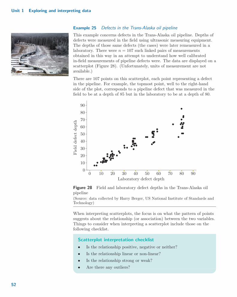
Unit 1 Exploring and interpreting data
Example 25 Defects in the Trans-Alaska oil pipeline
This example concerns defects in the Trans-Alaska oil pipeline. Depths ofdefects were measured in the field using ultrasonic measuring equipment.The depths of those same defects (the cases) were later remeasured in alaboratory. There were n = 107 such linked pairs of measurementsobtained in this way in an attempt to understand how well calibratedin-field measurements of pipeline defects were. The data are displayed on ascatterplot (Figure 28). (Unfortunately, units of measurement are notavailable.)
There are 107 points on this scatterplot, each point representing a defectin the pipeline. For example, the topmost point, well to the right-handside of the plot, corresponds to a pipeline defect that was measured in thefield to be at a depth of 85 but in the laboratory to be at a depth of 80.
Field
defectdep
th
Laboratory defect depth0 10 20 30 40 50 60 70 80 90
0
10
20
30
40
50
60
70
80
90
Figure 28 Field and laboratory defect depths in the Trans-Alaska oilpipeline
(Source: data collected by Harry Berger, US National Institute of Standards andTechnology)
When interpreting scatterplots, the focus is on what the pattern of pointssuggests about the relationship (or association) between the two variables.Things to consider when interpreting a scatterplot include those on thefollowing checklist.
Scatterplot interpretation checklist
� Is the relationship positive, negative or neither?
� Is the relationship linear or non-linear?
� Is the relationship strong or weak?
� Are there any outliers?
52
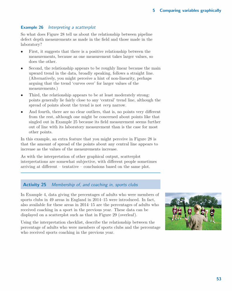
5 Comparing variables graphically
Example 26 Interpreting a scatterplot
So what does Figure 28 tell us about the relationship between pipelinedefect depth measurements as made in the field and those made in thelaboratory?
� First, it suggests that there is a positive relationship between themeasurements, because as one measurement takes larger values, sodoes the other.
� Second, the relationship appears to be roughly linear because the mainupward trend in the data, broadly speaking, follows a straight line.(Alternatively, you might perceive a hint of non-linearity, perhapsarguing that the trend ‘curves over’ for larger values of themeasurements.)
� Third, the relationship appears to be at least moderately strong:points generally lie fairly close to any ‘central’ trend line, although thespread of points about the trend is not very narrow.
� And fourth, there are no clear outliers, that is, no points very differentfrom the rest, although one might be concerned about points like thatsingled out in Example 25 because its field measurement seems furtherout of line with its laboratory measurement than is the case for mostother points.
In this example, an extra feature that you might perceive in Figure 28 isthat the amount of spread of the points about any central line appears toincrease as the values of the measurements increase.
As with the interpretation of other graphical output, scatterplotinterpretations are somewhat subjective, with different people sometimesarriving at different – tentative – conclusions based on the same plot.
Activity 25 Membership of, and coaching in, sports clubs
In Example 4, data giving the percentages of adults who were members ofsports clubs in 49 areas in England in 2014–15 were introduced. In fact,also available for these areas in 2014–15 are the percentages of adults whoreceived coaching in a sport in the previous year. These data can bedisplayed on a scatterplot such as that in Figure 29 (overleaf).
Using the interpretation checklist, describe the relationship between thepercentage of adults who were members of sports clubs and the percentagewho received sports coaching in the previous year.
53
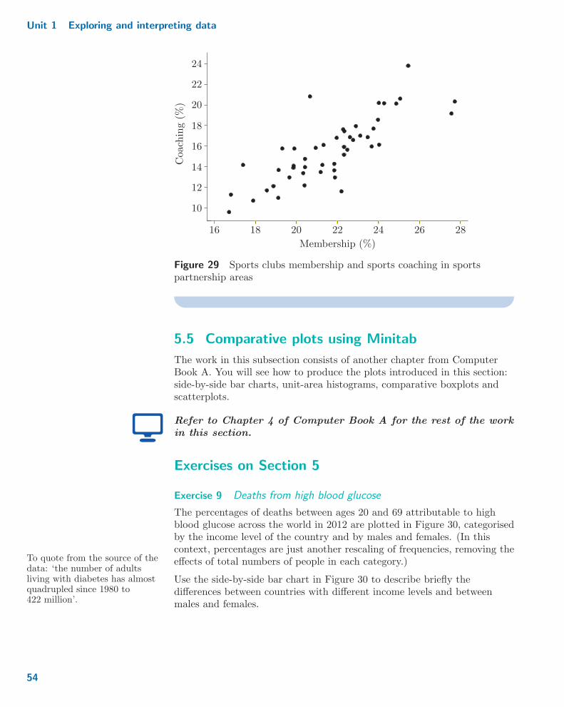
Unit 1 Exploring and interpreting data
28
Coaching(%
)
Membership (%)
10
12
14
16
16
18
18
20
20
22
22
24
24
26
Figure 29 Sports clubs membership and sports coaching in sportspartnership areas
5.5 Comparative plots using Minitab
The work in this subsection consists of another chapter from ComputerBook A. You will see how to produce the plots introduced in this section:side-by-side bar charts, unit-area histograms, comparative boxplots andscatterplots.
Refer to Chapter 4 of Computer Book A for the rest of the workin this section.
Exercises on Section 5
Exercise 9 Deaths from high blood glucose
The percentages of deaths between ages 20 and 69 attributable to highblood glucose across the world in 2012 are plotted in Figure 30, categorisedby the income level of the country and by males and females. (In thiscontext, percentages are just another rescaling of frequencies, removing theeffects of total numbers of people in each category.)
Use the side-by-side bar chart in Figure 30 to describe briefly the
To quote from the source of thedata: ‘the number of adultsliving with diabetes has almostquadrupled since 1980 to422 million’.
differences between countries with different income levels and betweenmales and females.
54
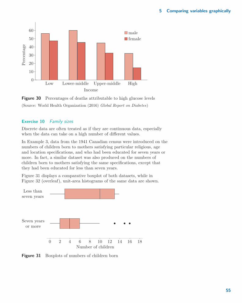
5 Comparing variables graphically
Percentage
Income
Low Lower-middle Upper-middle High0
10
20
30
40
50
60male
female
Figure 30 Percentages of deaths attributable to high glucose levels
(Source: World Health Organization (2016) Global Report on Diabetes)
Exercise 10 Family sizes
Discrete data are often treated as if they are continuous data, especiallywhen the data can take on a high number of different values.
In Example 3, data from the 1941 Canadian census were introduced on thenumbers of children born to mothers satisfying particular religious, ageand location specifications, and who had been educated for seven years ormore. In fact, a similar dataset was also produced on the numbers ofchildren born to mothers satisfying the same specifications, except thatthey had been educated for less than seven years.
Figure 31 displays a comparative boxplot of both datasets, while inFigure 32 (overleaf), unit-area histograms of the same data are shown.
0 2 4 6 8 10 12 14 16 18Number of children
Less thanseven years
Seven yearsor more
Figure 31 Boxplots of numbers of children born
55
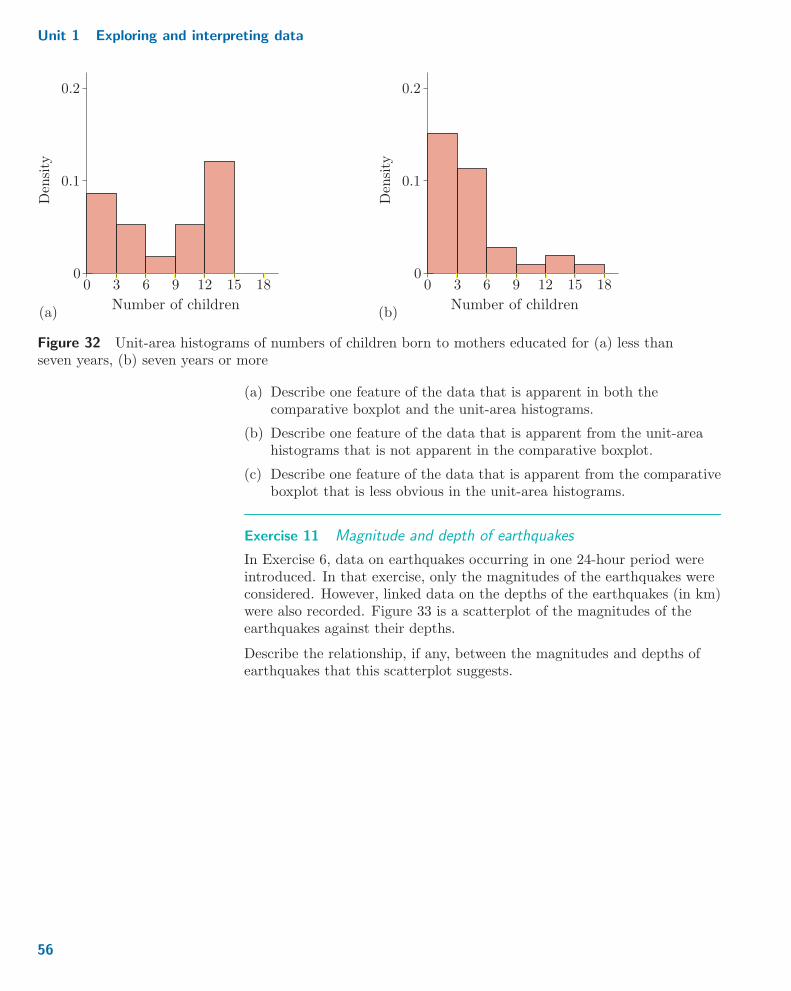
Unit 1 Exploring and interpreting data
18
(a) (b)Number of childrenNumber of children
0
0 : 1
0 : 2
0
Den
sity
Den
sity
0 : 1
0 : 2
03 6 9 12 15 180 3 6 9 12 15
Figure 32 Unit-area histograms of numbers of children born to mothers educated for (a) less thanseven years, (b) seven years or more
(a) Describe one feature of the data that is apparent in both thecomparative boxplot and the unit-area histograms.
(b) Describe one feature of the data that is apparent from the unit-areahistograms that is not apparent in the comparative boxplot.
(c) Describe one feature of the data that is apparent from the comparativeboxplot that is less obvious in the unit-area histograms.
Exercise 11 Magnitude and depth of earthquakes
In Exercise 6, data on earthquakes occurring in one 24-hour period wereintroduced. In that exercise, only the magnitudes of the earthquakes wereconsidered. However, linked data on the depths of the earthquakes (in km)were also recorded. Figure 33 is a scatterplot of the magnitudes of theearthquakes against their depths.
Describe the relationship, if any, between the magnitudes and depths ofearthquakes that this scatterplot suggests.
56

6 Unit 1 and the rest of the module
Magnitude
Depth (km)
2 : 5
3
3 : 5
4
4 : 5
5
5 : 5
0 50 100 150 200
Figure 33 Magnitudes and depths of earthquakes
6 Unit 1 and the rest of the module
Unit 1 has a different ‘feel’ to what much of the rest of this module willhave, for two main reasons.
The first of these is that its purpose has largely been revision of ideas andtechniques, most of which you should have come across before embarkingon M248. At other points in the module, other notions and methods willarise that you might also have met before, and which will be revised as andwhen necessary. However, most of the rest of the module will, of course, beexpected to be new to you (including deeper consideration of some ideaswhose basics you might have met before).
The second reason is that Unit 1 has concentrated on looking at data in adescriptive fashion, in order to get some idea of its features and foiblesthrough graphical exploration and some simple numerical summaries. Theremainder of M248, and indeed of much of statistics, is concerned withproceeding on to developing appropriate models for data, and with usingthose models to help us answer real, practical, questions to which the datahave something relevant to contribute. The latter process is known asstatistical inference. Graphs, and especially numerical summaries, but ofmodels as well as of data, will continue to play an enormous role in themodule.
57
Unit 1 Exploring and interpreting data
Summary
In this unit, you have been (re)introduced to a number of ways ofrepresenting data graphically and of summarising data numerically. Webegan by looking at some datasets and considering informally the kinds ofquestions they might be used to answer. The distinction betweenpopulations and samples has also been stressed.
An important first stage in any assessment of a collection of data is torepresent the data, if possible, in some informative diagrammatic way.Useful graphical representations that you have met in this unit include barcharts, histograms, boxplots and scatterplots. Bar charts are generally usedwith categorical data, or with numerical data that are discrete (countedrather than measured); side-by-side bar charts can be used to display morethan one such variable. Histograms and boxplots are generally used withcontinuous (measured) data. Histograms come in frequency and unit-areaversions which differ only in their ‘vertical’ scaling; a comparative boxplotallows more than one continuous variable to be displayed at the same time.Histograms need a reasonably large dataset and are sensitive to the choiceof cutpoints; boxplots cannot show how many modes a distribution has.Scatterplots are used to investigate the relationship between two numericalvariables (which are often continuous but may be discrete).
Features of the distribution of a dataset have been described. Modes andmodality (unimodal, bimodal or multimodal?) are one important aspect;skew, which might be right-skew or left-skew, is another.
Numerical summaries of data are also very important. Two main pairs ofsummaries for assessing location and spread have been described. Themeasures of location that have been discussed are the sample mean andthe sample median, and the measures of spread are the sample standarddeviation (together with a closely related measure, the sample variance)and the sample interquartile range. Sample lower and upper quartiles arerequired for the interquartile range and for boxplots. The median andinterquartile range are more resistant to unusual values in the data thanare the mean and standard deviation, although the mean and standarddeviation also have properties which make them good to work with.
The data analysis software Minitab has been introduced. As well aslearning the basics of using the software, you have seen how to use it toproduce all of the graphical displays mentioned above and to calculate thenumerical summaries.
58

Learning outcomes
Learning outcomes
After you have worked through this unit, you should be able to:
� appreciate that many datasets can be thought of as being arepresentative sample from an underlying population
� gain an overall ‘feel’ for data and the way they are distributed byconstructing appropriate graphical displays and calculating numericalsummaries
� recognise that producing an appropriate graphical representation orappropriate numerical summaries can help greatly in comparing sets ofdata
� understand that categorical and discrete data can be represented inbar charts, and that when interest lies in comparing two or more suchdatasets, a side-by-side bar chart can be useful
� appreciate that in order to examine a continuous variable, bothhistograms and boxplots are appropriate graphics
� understand the difference between a frequency histogram and aunit-area histogram
� recognise that a boxplot shows less detail about a distribution than ahistogram or bar chart, but that boxplots are particularly useful forcomparing two or more datasets
� use scatterplots when the values of two linked numerical variables areavailable and the aim is to investigate the relationship between thetwo variables
� calculate the sample mean and sample median as measures of locationof a dataset
� calculate the sample standard deviation, sample variance and sampleinterquartile range as measures of spread of a dataset, the last namedrequiring the calculation of sample lower and upper quartiles
� appreciate that the sample median and interquartile range are moreresistant measures than are the sample mean and standard deviation
� use some of the basic facilities of Minitab, especially to obtain thegraphical representations and numerical summaries listed above.
59
Unit 1 Exploring and interpreting data
Solutions to activities
Solution to Activity 1
The structures of the datasets are similar in that they each containinformation about a set of entities, objects or individuals: countries in thecase of Table 1, occupation types in the case of Table 2, mothers satisfyingparticular criteria in Table 3, areas in England in the case of Table 4,participants in a clinical trial in the case of Table 5, and patients in thecase of Table 6. Furthermore, for each dataset, one or more characteristicsare known about each object. For example, in Table 5, there are fourcharacteristics associated with each person: the treatment group they’rein, the number of training sessions attended, their gender and their weightchange over two weeks.
However, the numbers of objects and the numbers of characteristics givenin each dataset are not the same. Table 1 provides information about30 objects, and information is provided on just one characteristic for each.Table 2 provides information about 9 objects and 3 characteristics.In Table 2, one characteristic
happens to be the sum of theother two.
Table 3 provides information about 35 objects and 1 characteristic.Table 4 provides information about 49 objects and again just1 characteristic. Table 5 provides information about 10 objects and4 characteristics, the complete dataset having included information about83 objects altogether. (And in the complete clinical trial, very many morecharacteristics were recorded about the participants, too.) Table 6provides information about 55 objects and 5 characteristics.
Also, for many of the characteristics the entries are numerical, but forother characteristics the entries are not numerical. For example, for thedata given in Table 5, the number of training sessions attended and weightchange are numerical, but the groups into which patients are put and theirgender are not numerical.
Solution to Activity 2
(a) Discrete. The number of operational power stations is a count, so onlyparticular (integer) numbers make sense. For example, while a countrymight have, say, 3 operational power stations, it does not make senseto say that a country has 3.1755 operational power stations.
(b) Continuous. The percentage of adults can be thought of as ameasurement which can take any value (to any number of decimalplaces) between 0 and 100.
(c) Nominal. The values ‘A’ and ‘B’ are just labels associated with thetwo methods under consideration.
(d) Ordinal. The possible values ‘small’, ‘medium’ and ‘large’ are labels,but with the categories having a natural ordering with respect to howbig the tattoo was.
60
Solutions to activities
(e) Ordinal. Although numbers have been used to indicate the degree ofsuccess of the tattoo removal, the values 1, 2, 3 and 4 are really justlabels. There is, however, a natural ordering to the categories withrespect to how successful the removal was.
(f) Strictly speaking, as a count, this variable is a discrete variable.However, in practice, this variable would usually be treated as acontinuous variable. This is because the numbers concerned are solarge that if we were to plot out all the possible numbers we could get,any gaps between numbers would be so small as to be unnoticeable.
Solution to Activity 3
(a) It is reasonable to treat all three variables as continuous; β endorphinconcentrations appear to be capable of taking any of a wide range ofpositive values.
(b) The variables in the first two columns of Table 7, the blood plasma β
endorphin concentrations in each ‘normal runner before race’ and‘same runner after race’, are linked as they relate to measurements onthe same individuals in a group of 11 runners. However, the variablerepresenting the blood plasma β endorphin concentrations in each‘collapsed runner’ is not linked to the other two variables as thecollapsed runners were different individuals to the ‘normal’ runners.
Solution to Activity 4
(a) Population. All people in employment in the UK in the last quarter of2015 are included in the dataset. (At least, that is the aim of theOffice for National Statistics, who compiled the data.)
(b) Sample. It might be hoped that the results for participants in theclinical trial would generalise to perhaps the entire population ofpeople interested in achieving loss of weight.
(c) Population. The 49 areas cover the whole of England. So there are noareas left out of the dataset.
(d) Sample. Reasonable suggestions for the underlying population include:all runners in that particular Great North Run; all runners in theGreat North Run, regardless of year; all runners competing in races ofsimilar distance to the Great North Run.
(e) Sample. It is reasonable to regard all the adults in England and Walesin 2015–16 as the underlying population. The Crime Survey forEngland and Wales involves tens of thousands of participants, yet itsoutput remains a very large sample rather than a population (which inthis case is of the order of a thousand times bigger).
61

Unit 1 Exploring and interpreting data
Solution to Activity 5
This dataset could represent either a population or a sample, dependingon how the underlying population is defined. If the underlying populationis taken to be earthquakes of magnitude at least 2.5 that occurred duringa 24-hour period that was, for some reason, of particular interest, then thedata would constitute a population. However, there are many other24-hour periods that could have been chosen. So, regarding the underlyingpopulation as being all earthquakes of magnitude at least 2.5, these dataform a sample.
Solution to Activity 6
(a) No, this is not likely to be representative. The areas in South EastEngland are likely to be more similar to each other than to areas inthe rest of England. So by just concentrating on these areas, the fullrange of variation in sports club membership across England is likelyto be missed.
(b) Yes, this is likely to be representative as it would be a simple randomsample.
(c) Yes, this is likely to be representative. Even though the sample wouldbe chosen in a systematic way, it is with respect to something that isnot likely to be related to sports club membership.
Solution to Activity 7
The occupation types with the most workers are ‘Professional’ followed by‘Technical’. The occupation types with the fewest workers are ‘Operatives’followed by ‘Sales’. All the other categories have similar, intermediatenumbers of workers.
Solution to Activity 8
(a) Table 12
Bin Values Frequency
1 16.0–18.0 42 18.0–20.0 93 20.0–22.0 134 22.0–24.0 145 24.0–26.0 76 26.0–28.0 2
(b) Table 13
Bin Values Frequency
1 16.0–20.0 132 20.0–24.0 273 24.0–28.0 9
62
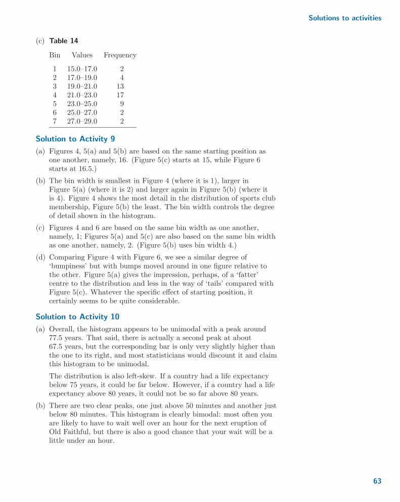
Solutions to activities
(c) Table 14
Bin Values Frequency
1 15.0–17.0 22 17.0–19.0 43 19.0–21.0 134 21.0–23.0 175 23.0–25.0 96 25.0–27.0 27 27.0–29.0 2
Solution to Activity 9
(a) Figures 4, 5(a) and 5(b) are based on the same starting position asone another, namely, 16. (Figure 5(c) starts at 15, while Figure 6starts at 16.5.)
(b) The bin width is smallest in Figure 4 (where it is 1), larger inFigure 5(a) (where it is 2) and larger again in Figure 5(b) (where itis 4). Figure 4 shows the most detail in the distribution of sports clubmembership, Figure 5(b) the least. The bin width controls the degreeof detail shown in the histogram.
(c) Figures 4 and 6 are based on the same bin width as one another,namely, 1; Figures 5(a) and 5(c) are also based on the same bin widthas one another, namely, 2. (Figure 5(b) uses bin width 4.)
(d) Comparing Figure 4 with Figure 6, we see a similar degree of‘bumpiness’ but with bumps moved around in one figure relative tothe other. Figure 5(a) gives the impression, perhaps, of a ‘fatter’centre to the distribution and less in the way of ‘tails’ compared withFigure 5(c). Whatever the specific effect of starting position, itcertainly seems to be quite considerable.
Solution to Activity 10
(a) Overall, the histogram appears to be unimodal with a peak around77.5 years. That said, there is actually a second peak at about67.5 years, but the corresponding bar is only very slightly higher thanthe one to its right, and most statisticians would discount it and claimthis histogram to be unimodal.
The distribution is also left-skew. If a country had a life expectancybelow 75 years, it could be far below. However, if a country had a lifeexpectancy above 80 years, it could not be so far above 80 years.
(b) There are two clear peaks, one just above 50 minutes and another justbelow 80 minutes. This histogram is clearly bimodal: most often youare likely to have to wait well over an hour for the next eruption ofOld Faithful, but there is also a good chance that your wait will be alittle under an hour.
63
Unit 1 Exploring and interpreting data
Solution to Activity 11
About 50% of the values lie between approximately 80 and 160 pmol/l,with most of the rest of the data between approximately 60 and170 pmol/l. There is one outlier with a β endorphin concentration of over400 pmol/l. In one way, this individual is of particular interest: whatcaused such a high β endorphin concentration? is it real or perhaps anerror in measurement?
On the other hand, we might be more interested in the distribution of βendorphin concentrations for the more typical collapsed runners. Then,ignoring the outlier, the distribution of the β endorphin concentrationsstill does not seem to be symmetric. While the left whisker is longer thanthat on the right, the difference between the lengths of the whiskers issmall. However, the right half of the box is longer than the left half, sothere is some indication of right-skew in the data.
This is a small dataset, comprising just 11 measurements, so we shouldnot over-interpret the data.
Solution to Activity 12
The sample mean of these concentrations is
x =66 + 72 + 79 + 84 + 102 + 110 + 123 + 144 + 162 + 169 + 414
11
=1525
11% 138 : 6 :
Thus the sample mean β endorphin concentration is approximatelyThe issue of how many decimalplaces to retain in calculationswill be discussed later, inSubsection 4.4.
138.6 pmol/l.
Solution to Activity 13
(a) In ascending order, the percentages are as follows:
x(1) = x5 = 16 : 7, x(2) = x2 = 17 : 4, x(3) = x1 = 19 : 1,
x(4) = x4 = 22 : 3, x(5) = x6 = 22 : 6, x(6) = x3 = 23 : 7 :
(b) (i) x(1) is the smallest observation, that is, x(1) = x5 = 16 : 7.
(ii) As there are 6 observations, x(6) is the largest observation, thatis, x(6) = x3 = 23 : 7.
(iii) x(4) = x4 = 22 : 3.
Solution to Activity 14
(a) There are n = 11 observations, so 12(n+ 1) = 12
2 = 6 and hencem = x( 1
2 (n+1)) = x(6). Notice that the concentrations given in
Activity 12 are already in ascending order. So x(6) = x6 andm = x(6) = 110. Thus the sample median β endorphin concentrationis 110 pmol/l.
(b) For this sample, n = 22 so 12(n+ 1) = 23
2 = 1112 and hence
m = x( 12 (n+1)) = x(11 1
2). This means that m is the value halfway
between x(11) and x(12). Again, the dataset is already in ordered form,
64
Solutions to activities
so
m =1
2
(x(11) + x(12)
)=
1
2(28 : 69 + 29 : 36) =
58 : 05
2= 29 : 025 :
Thus the sample median percentage of silica is 29.025%.
Solution to Activity 15
(a) The mean for the 10 observations that are not outliers is
x =66 + 72 + 79 + 84 + 102 + 110 + 123 + 144 + 162 + 169
10
=1111
10= 111 : 1 :
So the mean β endorphin concentration is now 111.1 pmol/l.
(b) Without the outlier there are 10 observations, so n = 10 and hencem = x( 1
2 (n+1)) = x(5 12). This means the median is halfway between
x(5) and x(6). That is, m = 12(102 + 110) = 106 pmol/l.
(c) Removing the outlier has changed the mean from 138.6 pmol/l to111.1 pmol/l, whereas the median has only changed from 110 pmol/lto 106 pmol/l. This shows that the median is a resistant measure: itsvalue does not depend very much on whether the outlier is included inthe calculation or not. In contrast, whether or not the outlier isincluded makes a big difference to the value of the mean, showing thatit is not a resistant measure.
Solution to Activity 16
(a) When all the observations are included, n = 11. So
qL = x( 14 (n+1)) = x( 12
4 )= x(3) = 79
and
qU = x( 34 (n+1)) = x( 36
4 )= x(9) = 162 :
So when the outlier is included, the sample lower and upper quartilesare 79 pmol/l and 162 pmol/l, respectively.
(b) When the outlier is excluded, n = 10. So
qL = x( 14 (n+1)) = x( 11
4 )= x(2 3
4)
= x(2) +3
4
(x(3) − x(2)
)= 72 +
3
4(79− 72) = 77 : 25
and
qU = x( 34 (n+1)) = x( 33
4 )= x(8 1
4)
= x(8) +1
4
(x(9) − x(8)
)= 144 +
1
4(162− 144) = 148 : 5 :
This means that when the outlier is excluded, the sample lower andupper quartiles are 77.25 pmol/l and 148.5 pmol/l, respectively.
65

Unit 1 Exploring and interpreting data
(c) When the outlier is dropped from the calculation, the lower quartiledoes not change very much, while the upper quartile changes morethan the lower quartile.
Solution to Activity 17
The lower limit of the box is the sample lower quartile. So approximately25% of the data lie to the left of this point (either along the whisker ormarked as potential outliers). Similarly, the upper limit of the box is theupper quartile, so approximately 25% of the data lie to the right of thispoint. This leaves approximately 50% of the data to be covered by the box.
Solution to Activity 18
From Activity 16(a), qL = 79 and qU = 162. So for these data,
qU − qL = 162− 79 = 83 :
That is, the sample interquartile range is 83 pmol/l. (It is good practice togive the units of measures of spread, just as it is for measures of location.)
Solution to Activity 19
The sample variance s2 is
s2 =1
10
11∑i=1
(xi − 138 : 6)2
=1
10
{(66− 138 : 6)2 + (72− 138 : 6)2 + � � � + (414− 138 : 6)2
}=
1
10(5270 : 76 + 4435 : 56 + � � � + 75845 : 16) = 9598 : 656 :
So the sample standard deviation is s =√9598 : 656 % 98 : 0 pmol/l.
Solution to Activity 20
(a) The sample lower quartile can never be greater than the sample upperquartile, that is, qL ≤ qU , as mentioned towards the end ofSubsection 4.2. But the sample interquartile range is qU − qL, so theinterquartile range can never be negative.
(b) From its definition, the sample variance is an average of a set ofsquared deviations. So as the squared deviations can never benegative, neither can their average. Happily, this means that thereshould never be the problem of trying to take the square root of anegative number when calculating the sample standard deviation fromthe sample variance!
(c) The sample standard deviation is just the square root of the samplevariance, where the square root is taken to be the positive square root.Hence the sample standard deviation cannot be negative.
66

Solutions to activities
Solution to Activity 21
It is striking that in many pairs, the bars for males and females areconsiderably different in height. This indicates that some occupation typesare dominated by females (administrative, caring & leisure and sales) andothers are dominated by males (especially skilled trades and operatives,and to a lesser extent managers). Only in the professional, technical andelementary occupation types are the numbers roughly equal.
Solution to Activity 22
(a) Since in this case the area of each bar equals its frequency, the totalarea is the total frequency, which is 2 + 2 + � � � + 2 = 49.
(b) Dividing the frequencies by 49 gives the scaled areas given in thebottom row of Table 15.
Table 15 Completed version of Table 11
Bar number 1 2 3 4 5 6 7 8 9 10 11Frequency 2 2 2 7 6 7 10 4 5 2 2Scaled area 0.04 0.04 0.04 0.14 0.12 0.14 0.20 0.08 0.10 0.04 0.04
The sum of the values in the ‘Scaled area’ row is0 : 04 + 0 : 04 + � � � + 0 : 04 = 0 : 98. So, after allowing for rounding error,this confirms that the total area of the bars in a histogram using thesevalues is equal to 1.
(c) The scaled areas in Table 15 visually match the heights of the bars inFigure 23 well.
Solution to Activity 23
Both distributions appear to be right-skew and to have prominent modesaround 2 seconds. However, the recall times for the unpleasant memoriesappear to be more spread out than those for the pleasant memories.
Solution to Activity 24
(a) The claim is backed up by Figure 27. The box and the whiskers forthe unpleasant memories are longer than the box and the whiskers forthe pleasant memories.
(b) The boxplot of the unpleasant memories suggests that the underlyingdistribution is right-skew. However, the boxplot of the pleasantmemories only suggests that the distribution is not symmetric. So theassertion that both distributions are right-skew is only partiallybacked up by the comparative boxplot.
(c) In Figure 27, it is clear that the unpleasant memories generally tooklonger to recall. This is because elements of the box for the unpleasantmemories are to the right of the equivalent elements of the box for thepleasant memories. There is also a potential outlier in theobservations of the pleasant memory recall times but no potentialoutliers in the observations of the unpleasant memory recall times.
67
Unit 1 Exploring and interpreting data
Solution to Activity 25
On this plot, the points generally lie near to a straight line running frombottom left to top right. So there seems to be a positive, linear,relationship between the percentage of adults who were members of asports club and the percentage of adults who had received coaching. Thisrelationship appears to be fairly strong. There are some potential outliers.For example, the two areas which had the greatest percentages of adultsports club membership had relatively low percentages of adults who hadreceived coaching. Also, one area with adult sports club membership alittle over 20% seems to have a noticeably higher percentage of adults whohad received coaching than other similar areas.
68

Solutions to exercises
Solutions to exercises
Solution to Exercise 1
(a) Age in years is a discrete variable, as the numbers will just be wholenumbers.
(b) As coded, the length of time the respondent has been living in theircurrent area is an ordinal variable. There are categories, and thesecategories have a clear ordering.
(c) Marital status is a nominal variable. There are categories, but there isno well-defined ordering of the categories.
(d) How safe the respondent feels is an ordinal variable. There are fourcategories, and a clear ordering to those categories given by ‘degree ofsafety’.
Solution to Exercise 2
(a) The variables ‘how safe the respondent feels’ and ‘age in years’ arelinked as they are given as responses by the same set of people.
(b) The variables ‘how safe the respondent feels’ in the 2014–15 surveyand ‘how safe the respondent feels’ in the 2015–16 survey are notlinked as they concern responses by different groups of people.
Solution to Exercise 3
(a) For the dataset not to be a sample, the 22 chondrites would have torepresent all the chondrites it is possible to have. This was not so,even at the time of analysis.
(b) A reasonable assumption is that the underlying population is allchondrite meteorites.
(c) While these particular chondrites were certainly not a simple randomsample of all possible chondrites, perhaps the best that can be said isthat there is no reason to think that the sample is not representativeof the population.
Solution to Exercise 4
Much the most common response was for people to say they had beenliving in their current area for ‘20+ years’. The least common responsewas ‘2–3 years’. The frequency of responses increases from ‘2–3 years’ to‘20+ years’ and, a little, from ‘2–3 years’ to ‘less than 1 year’.
Solution to Exercise 5
The histogram has just a single peak so the distribution appears to beunimodal. This peak is situated a little below zero. Positive values (on theright) appear to be more spread out than negative values (on the left). Sothe distribution appears to be right-skew: more respondents had a highlevel of worry about becoming a victim of personal crime than had a lowlevel of worry. Finally, none of the values were less than −2 : 5 or greaterthan 3.5.
69
Unit 1 Exploring and interpreting data
Solution to Exercise 6
The magnitudes ranged between 2.5 and approximately 5.3, with 50% ofthem between about 2.6 and 4.6. Overall, the distribution of themagnitudes is right-skew.
Solution to Exercise 7
(a) Since n = 22,
qL = x( 14 (n+1)) = x( 23
4 )= x(5 3
4)
= x(5) +3
4
(x(6) − x(5)
)= 26 : 39 +
3
4(27 : 08− 26 : 39) = 26 : 9075
and
qU = x( 34 (n+1)) = x( 69
4 )= x(17 1
4)
= x(17) +1
4
(x(18) − x(17)
)= 33 : 28 +
1
4(33 : 40− 33 : 28) = 33 : 31 :
So the sample lower and upper quartiles are approximately 26.91%and exactly 33.31%, respectively.
(b) The sample interquartile range is therefore
qU − qL = 33 : 31− 26 : 9075 = 6 : 4025 :
That is, the sample interquartile range is approximately 6.40%.
Solution to Exercise 8
(a) The ordered data are
x(1) = 1, x(2) = 3, x(3) = 4, x(4) = 9, x(5) = 15,
x(6) = 23, x(7) = 99 :
Since n = 7,
m = x( 12 (n+1)) = x( 8
2)= x(4) = 9,
qL = x( 14 (n+1)) = x( 8
4)= x(2) = 3,
qU = x( 34 (n+1)) = x( 24
4 )= x(6) = 23
and
qU − qL = 23− 3 = 20 :
x̄ =1
n
n∑i=1
xi =99 + 23 + 1 + 3 + 15 + 4 + 9
7=
154
7= 22,(b)
s2 =1
n− 1
n∑i=1
(xi − x)2 =1
6
7∑i=1
(xi − 22)2
=1
6
{(99− 22)2 + (23− 22)2 + � � � + (9− 22)2
}=
1
6(5929 + 1 + � � � + 169) =
7274
6% 1212 : 3
70

Solutions to exercises
and
s =
√7274
6% 34 : 8 :
(You should have obtained precisely the same results in this part hadyou worked with the ordered rather than the unordered data. Samplemeans and standard deviations are not changed by reordering.)
(c) The median number of operational nuclear power stations and themean number of operational nuclear power stations are ratherdifferent, at 9 and 22, respectively. This difference makes it hard tostate a ‘typical’ number of operational nuclear power stations, aneffect caused by the unusually large data value, 99, included in thesample. The median is usually preferred in such a situation, so havingnine operational power stations might be considered typical. Thesame extreme value is responsible for the sample standard deviation(34.8) being very large. The resistant sample interquartile range alsotakes a rather large value, namely 20. There seems to be a high degreeof spread across these data values; the number of operational nuclearpower stations varies widely from country to country.
Solution to Exercise 9
The percentages of deaths attributable to high blood glucose were higherin low-income and lower-middle-income countries than in the richercountries – and this was the same for men and women. However, forcountries with the same general income levels, there were lowerpercentages of deaths attributable to high blood glucose in femalescompared with males.
Solution to Exercise 10
(a) In both of the figures, it is clear that the number of children istypically lower for the mothers that spent longer in education.
(b) In the unit-area histograms, it is clear that the distribution of thenumber of children in the group corresponding to the mothers withthe shorter education is bimodal, whereas the distribution appears tobe unimodal for mothers who had a longer education. This cannot beseen from the comparative boxplot.
(c) The comparative boxplot suggests that in the group of mothers whohad a longer education, a few had unusually large numbers of children.This feature is less obvious (though present) in the unit-areahistograms.
Solution to Exercise 11
The scatterplot suggests that there is no clear-cut relationship between themagnitude and depth of an earthquake, though the deeper earthquakes doseem to have bigger magnitudes than most of the shallower ones.
71

Acknowledgements
Acknowledgements
Grateful acknowledgement is made to the following sources:
Page 3: c© Kran Kanthawong / 123RF.com
Page 4: Avda / https://commons.wikimedia.org/wiki/File:Kernkraftwerk_Grafenrheinfeld_-_2013.jpgThis file is licensed under the Creative Commons Attribution-ShareAlike Licencehttp://creativecommons.org/licenses/by-sa/3.0/
Page 5 top: c© iStockphoto.com / Highwaystarz-Photography
Page 5 bottom: Taken from: Canada. Dept. of Interior / Library and Archives Canada / C-036149
Page 6 top: c© Patrick Callaghan
Page 6 bottom: Taken from: http://www.wikihow.com/Avoid-the-Temptation-to-Eat-Unhealthy-Foods
Page 7: c© damiangretka / www.istockphoto.com
Page 8: c© Dustin M. Ramsey
Page 9: c© Copyright NewcastleGateshead
Page 12: Vladimir Seliverstov / www.123rf.com
Page 14: H. Raab This file is licensed under the Creative Commons Attribution-ShareAlike Licencehttp://creativecommons.org/licenses/by-sa/3.0/
Page 17: c© Yauheniya Hauss / 123RF.com
Page 19: c© Gregg from GriDD / www.whatthegregg.com
Page 23: Taken from: https://twitter.com/hashtag/foodpackaging?src=hash
Page 26 top: c© KGalione / www.istock.com
Page 26 bottom: c© Richard Wong / Alamy Stock Photo
Page 27: c© Melissa Nemeth This file is licensed under the Creative Commons Attribution-ShareAlikeLicence https://creativecommons.org/licenses/by-sa/2.0/
Page 29: c© Hulton Archive / Stringer / Getty Images
Page 31: c© Ben Chun / https://flic.kr/p/baSfHP This file is licensed under the Creative CommonsAttribution-ShareAlike Licence https://creativecommons.org/licenses/by-sa/2.0/
Page 34: c© Jakec /https://en.wikipedia.org/wiki/File:Interstate_80_in_Hemlock_Township,_Columbia_County,_Pennsylvania.JPGThis file is licensed under the Creative Commons Attribution-ShareAlike 3.0 Unported License
Page 38: c© Ian Britton / http://www.freefoto.com/preview/41-14-12/Dual-Carriageway This file islicensed under the Creative Commons Attribution-NonCommercial-NoDerivative 3.0 License
Page 39: Steve Karg / https://commons.wikimedia.org/wiki/File:Western-pack-butter.jpg This file islicensed under the Creative Commons Attribution Licence http://creativecommons.org/licenses/by/3.0/
Page 40: c© Philip Bird / 123RF.com
Page 42: c© Meme Center
Page 45: c© kzenon / 123RF.com
Page 49: c© David Mzareulyan / www.istockphoto.com
Page 53: c© flairmicro / www.123rf.com
Every effort has been made to contact copyright holders. If any have been inadvertently overlooked,the publishers will be pleased to make the necessary arrangements at the first opportunity.
72


