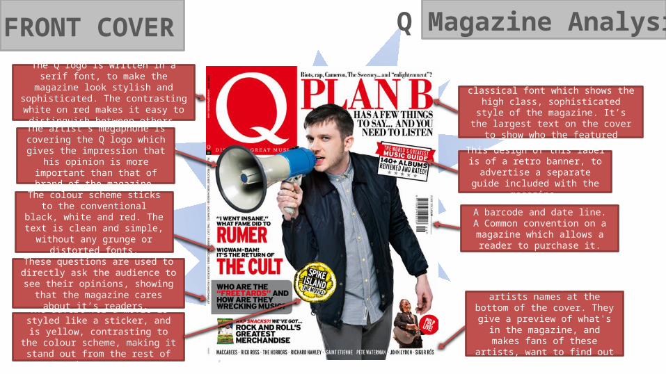
Q Magazine Analysi FRONT COVER The artist’s megaphone is covering the Q logo which gives the impression that his opinion is more important than that of brand of the magazine. The colour scheme sticks to the conventional black, white and red. The text is clean and simple, without any grunge or distorted fonts. It's menu strip is the artists names at the bottom of the cover. They give a preview of what's in the magazine, and makes fans of these artists, want to find out what's inside. The masthead is written in a classical font which shows the high class, sophisticated style of the magazine. It’s the largest text on the cover to show who the featured artist is. The advert for a movie is styled like a sticker, and is yellow, contrasting to the colour scheme, making it stand out from the rest of the cover. This design of this label is of a retro banner, to advertise a separate guide included with the magazine. The Q logo is written in a serif font, to make the magazine look stylish and sophisticated. The contrasting white on red makes it easy to distinguish between others. A barcode and date line. A Common convention on a magazine which allows a reader to purchase it. These questions are used to directly ask the audience to see their opinions, showing that the magazine cares about it’s readers.
Transcript
Q Magazine AnalysisFRONT COVER
The artist’s megaphone is covering the Q logo which gives the impression that his opinion is more important
than that of brand of the magazine.
The colour scheme sticks to the conventional black, white and red.
The text is clean and simple, without any grunge or distorted fonts.
It's menu strip is the artists names at the bottom of the cover. They give a preview of what's in the magazine,
and makes fans of these artists, want to find out what's inside.
The masthead is written in a classical font which shows the high class, sophisticated
style of the magazine. It’s the largest text on the cover to show who the featured artist is.
The advert for a movie is styled like a sticker, and is yellow, contrasting to the
colour scheme, making it stand out from the rest of the cover.
This design of this label is of a retro banner, to advertise a separate guide
included with the magazine.
The Q logo is written in a serif font, to make the magazine look stylish and sophisticated. The contrasting white on red makes it easy
to distinguish between others.
A barcode and date line. A Common convention on a magazine which
allows a reader to purchase it.
These questions are used to directly ask the audience to see their opinions,
showing that the magazine cares about it’s readers.
Q Magazine AnalysisCONTENTS PGThe serif font used for the
word review gives off a stylish and classic look. This can hint at the hish
register writing style depicted within the
‘review’ article in the magazine. With Q’s current audience
popularity, this writing style is expected from
regular readers.
The contents title is kept very simplistic and plain.
This can be due to the readers already having prior
knowledge on what the contents page is. The
magazine can focus on the content of the page rather than making the title look
unnecessarily fancy.
Similar to the artists at the top of the page, this
artist is cut out of the image and overlap other images on the contents.
This also shows his higher prestige, but gives the impression that his
status is lower due to his low location on the page.
An advert to subscribe show’s the magazine’s
multi-modality and gives the audience an extra
feature to stay in touch with the magazine, even after they have read this
issue.
This text box is circular, in contrast to the other
square boxes, drawing the readers attention to
the text within it.
These artists are cut out of the image and overlap the ‘Contents’ title. This shows they’re
a featured band and seem to be of a higher importance than those embedded within a box.
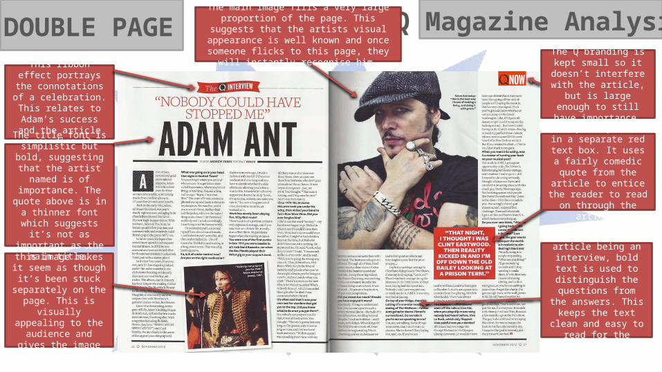
Q Magazine AnalysisDOUBLE PAGEThe Q branding is kept
small so it doesn’t interfere with the article, but is large enough to still
have importance.
This ribbon effect portrays the
connotations of a celebration. This relates to Adam’s success and
the article succeeding it.
The effect on this image makes it seem as though it’s been stuck separately
on the page. This is visually appealing to the audience and gives the image some character.
This pull quote is in a separate red text box. It
uses a fairly comedic quote from the article to entice the reader to read
on through the article.
Due to this article being an interview, bold text is used to distinguish the
questions from the answers. This keeps the text clean and easy to read for the audience.
The title font is simplistic but bold, suggesting that
the artist named is of importance. The quote
above is in a thinner font which suggests it’s not as
important as the main title.
The main image fills a very large proportion of the page. This suggests that the artists visual
appearance is well known and once someone flicks to this page, they will instantly recognise him.
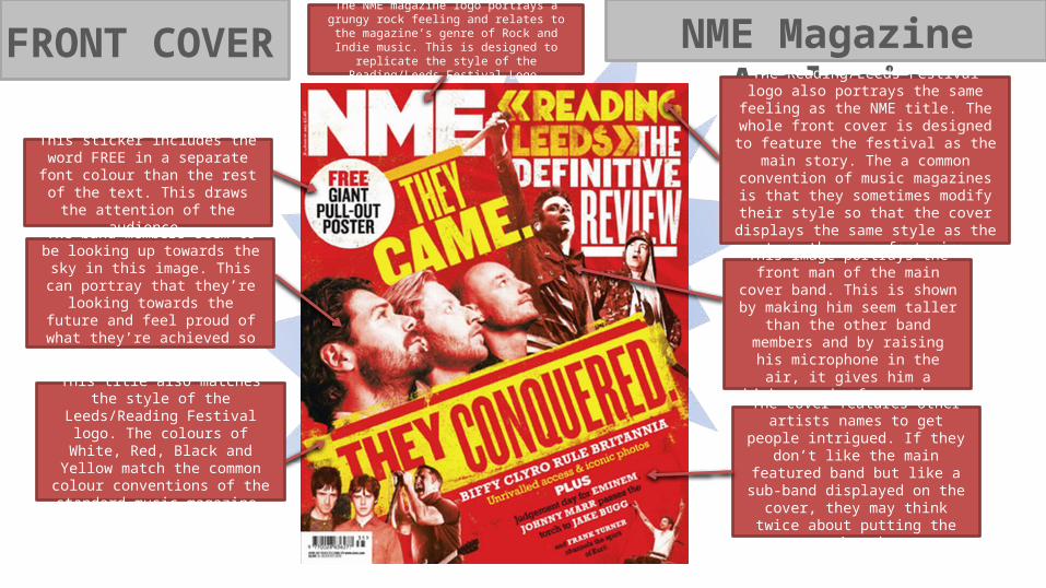
NME Magazine AnalysisFRONT COVER
The band members seem to be looking up towards the sky in this
image. This can portray that they’re looking towards the future and feel
proud of what they’re achieved so far.
The Reading/Leeds Festival logo also portrays the same feeling as the NME title. The whole front cover is designed to feature the festival as the main story. The a common convention of music magazines is that they sometimes modify their style so that the cover displays
the same style as the story they are featuring.
The NME magazine logo portrays a grungy rock feeling and relates to the magazine’s genre of Rock
and Indie music. This is designed to replicate the style of the Reading/Leeds Festival Logo.
This sticker includes the word FREE in a separate font colour than the rest of
the text. This draws the attention of the audience.
The cover features other artists names to get people intrigued. If they don’t like the main featured band but like a sub-band displayed on the cover, they
may think twice about putting the magazine down.
This title also matches the style of the Leeds/Reading Festival logo. The colours of White, Red, Black and Yellow match the common colour conventions of the standard music
magazine.
This image portrays the front man of the main cover band. This is shown by making him seem taller than the other
band members and by raising his microphone in the air, it gives him a
higher rank of prestige.
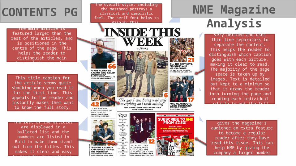
NME Magazine AnalysisCONTENTS PG
This title caption for the article seems quite shocking when you read it for
the first time. This appeals to the reader and instantly makes them want
to know the full story.
An advert to subscribe gives the magazine’s audience an extra feature to become a regular reader after they
have read this issue. This can help NME by giving the company a larger
number of re-buyers.
The rest of the articles are displayed in a bulleted list and the numbers are listed in Bold to make them stand out from the titles. This makes it clear and
easy to read for the audience.
The overall style, including the masthead portrays a classical and simplistic feel. The
serif font helps to display this.
The main article is featured larger than the rest of the articles, and is
positioned in the centre of the page. This helps the reader to distinguish
the main focus of the magazine.
The layout of the page is very defined and uses thin line separators to
separate the content. This helps the reader to distinguish which caption
goes with each picture, making it clear to read. The majority of the page
space is taken up by images. Text is detailed but kept to a minimum so
that it draws the reader into turning the page and reading each individual
article to get the full story.
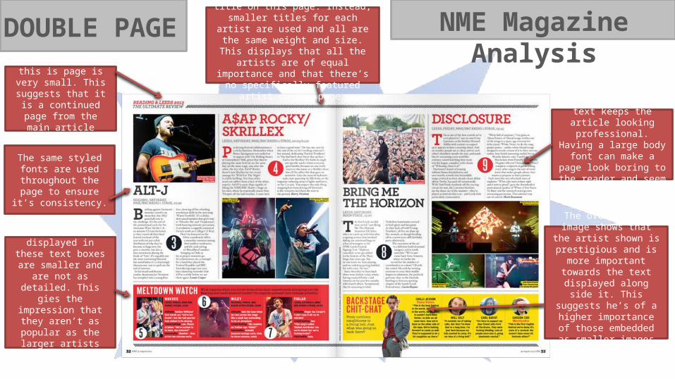
NME Magazine AnalysisDOUBLE PAGE
Smaller sized body text keeps the article looking
professional. Having a large body font can make a page look boring to the reader
and seem childlike.
The main title on this is page is very small. This
suggests that it is a continued page from the
main article page.
The same styled fonts are used throughout the
page to ensure it’s consistency.
The artists displayed in these text boxes are
smaller and are not as detailed. This gies the impression that they
aren’t as popular as the larger artists displayed
above.
The overlapping image shows that the artist shown
is prestigious and is more important towards the text displayed along side it. This
suggests he’s of a higher importance of those embedded as smaller
images within the text.
There is no central, large title on this page. Instead, smaller titles for each artist are used and all are the same weight and size. This displays that all the artists are of
equal importance and that there’s no specifically featured artist on the page.
SPIN Magazine AnalysisFRONT COVER
The main feature image was taken at a location in contrast to the common
convention of a studio. The background of the countryside makes the artists
seem natural and friendly. The instruments they’re holding show that
they’re a folk/alternative band.
The subtitle is written in a serif font, with italics. It’s smaller size suggests it’s not as
important as the main masthead but it serves to give a more in depth preview of
what’s to come inside the magazine.
The Buzz-Word ‘Featuring’ shows that there’s a variety of different artists rather
than just the cover artists.
The distribution company for the magazine is an American label called
RED. Due to the magazine being American, conventions displayed are slightly different, including there's no quotes from inside the magazine. The American stereotype of the British is
portrayed by putting them in the countryside, creating their profile as
being ‘Posh English Folk’.
This cover doesn’t feature any inside magazine quotes, and instead relies on
prior knowledge of the featured artists. If the audience didn’t know any of the artists names on the cover, due to there being no
headlines, inside stories are left to the readers intrigue.
A puff is placed above the logo to make the magazine seem important in the industry. ‘Special Edition’ also makes the magazine seem as if it’s rare and needs to be read.
The magazine logo ‘SPIN’ is being covered by the artists which makes them
seem more important than the magazine’s branding. The red and white
theme fits with the British conventions of a magazine, although it’s an American
magazine.
The masthead is written in a simplistic font consisting of all capitals. This gives the
impression that the magazine and band have a minimalistic feel to them.
SPIN Magazine AnalysisCONTENTS PG
Black, white and sepia colours used in the image give it a retro,
but modern look.
A blue colour is used in this box to make the readers eyes pick it out from the grey
background, although the box is kept small as it’s not as important to the page as the
contents of the magazine.
The ‘Features’ section of this page is in a simplistic white font. This keeps with the modern, retro conventions
portrayed by the image.
The red and white SPIN logo contrast with the dark toned background.
The page doesn’t look crowded with content, and is kept
minimalistic to draw attention to the features text and the image.
The page doesn’t have unnecessary pieces of text,
everything relates to the contents of the magazine. This quote shows that the image is part of an article
located on another page.
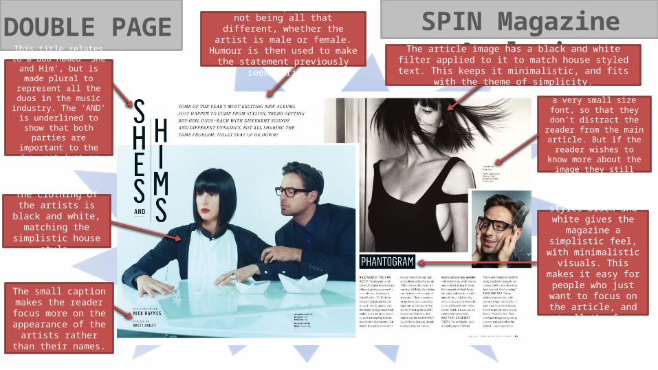
SPIN Magazine AnalysisDOUBLE PAGEThe article image has a black and white filter applied to it to
match house styled text. This keeps it minimalistic, and fits with the theme of simplicity.
The captions are in a very small size font, so that they
don’t distract the reader from the main article. But if the
reader wishes to know more about the image they still
can.
Keeping text styles black and white gives the
magazine a simplistic feel, with minimalistic visuals.
This makes it easy for people who just want to focus on the article, and
not all the fancy features.
Gender is represented as not being all that different, whether the artist is male or female. Humour is then used to make the statement previously seem serious.
The small caption makes the reader focus more on
the appearance of the artists rather than their
names.
The clothing of the artists is black and white, matching the simplistic
house style.
This title relates to a duo named ‘She and Him’, but is made plural to represent all
the duos in the music industry. The ‘AND’ is
underlined to show that both parties are important