7
AS Media Ellen Coyle MAGAZINE FRONT COVERS
| Date post: | 31-Dec-2015 |
| Category: |
Documents |
| Upload: | aristotle-graves |
| View: | 42 times |
| Download: | 0 times |

AS Media
Ellen Coyle
MAGAZINE FRONT COVERS

FRONT COVER VERSION 1My masthead is basic , however I have used the drop shadow effect on photoshop to give it a more professional look. Over all , my first front cover is very basic. I changed the hair colour and eye colour using the brush tool and editing the colours. However, I think it looks too obvious and the front cover looks altogether more fashionmagazine like than music magazine like. I don't think it looks very professional and doesn't have enough coverlines as well as the coverline font not looking very professional which again makes it look basic. I tried to match colours that my model is wearing with the coverlines, for example the article headline with the ring on her finger. I have tried to improve all these in my next front cover.

FRONT COVER VERSION 2 I think my second version of my magazine is alot better than the first. I used the brush tool on photoshop to change the hair colour and eye colour of my model. Although the coloursaren't exactly the way I wanted them, the colourchange of her eyes, hair and skin tone look a lot less obvious. Also I have a lot more coverlines and have used different fonts, whilst matching the coverlines to something my model is wearing again. I think that the different coloursand different ways of making them stand out, as well as referring to bands and artists highlight the fact that the magazine is a musicmagazine. I also gave the coverlines an outline using stroke on photoshop I think the background still needsimproving, as well as making the generalmagazine look a bit more professional.
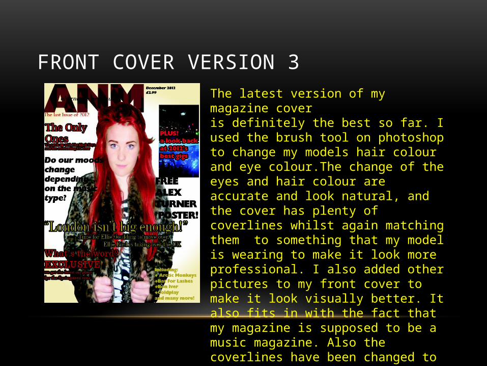
FRONT COVER VERSION 3The latest version of my magazine coveris definitely the best so far. I used the brush tool on photoshop to change my models hair colour and eye colour.The change of the eyes and hair colour are accurate and look natural, and the cover has plenty of coverlines whilst again matching them to something that my model is wearing to make it look more professional. I also added other pictures to my front cover to make it look visually better. It also fits in with the fact that my magazine is supposed to be a music magazine. Also the coverlines have been changed to make the more obvious using the stroke tool on photoshop to give it an outline.

FRONT COVER VERSION 4This is the fourth draft of my front cover. I have made slight changes such as the colour of the masthead because I think the maroon colour I had used previously clashed with my colour scheme and didn’t look right. I also added a shadow to my model using the drop shadow tool on photoshop to make it look as if she is standing up against a wall. I took a few strokes off my coverlines because I think there were too many. I am really pleased with my fourth draft, I think it looks professional and fits my audience type. However I still think it could be improved.

FRONT COVER VERSION 5This is the next copy of my magazine front cover. I changed the centre image to make it a better and clearer image. I also got rid of the gold lettering and replaced it with white because it fit with some of her outfit (the stripes) and because it keeps to a basic colour scheme. I also changed the places of the text and I think they fit better now. Over all, I think this draft of my front cover looks a lot more professional and I am really impressed with it. However, I still think I could make a few more minor improvements.

FINAL FRONT COVERThis is the final version of my front cover. I changed the central image once more, to again a clearer image, but one that I think fits the magazine genre. I kept the same colour scheme and most everything the same, except I put the “best gigs of 2012” into a black circle to make it stand out more. I made the date and price smaller because I think that professional magazines have a smaller dates and prices so that it does not distract from the front cover. I also swapped the barcode and list of artists around because I think they fit in better there. This is the final version of my magazine and I am really happy with the final outcome.


