4
MAGAZINE RESEARCH
| Date post: | 26-Jul-2015 |
| Category: |
Economy & Finance |
| Upload: | freyabruce |
| View: | 100 times |
| Download: | 0 times |

MAGAZINE RESEARCH

We have decided to use EMPIRE magazine for our ancillary product-
Magazine cover. We felt this would best fit with our target audience and the
overall genre and feel to our film. Although our film is an indie production our film is in association with FILM4. We
decided to have this as FILM4 support British Indie films, but being a
conglomerate of channel 4 it has good connections and reputation, therefore
we are able to collaborate with EMPIRE magazine for our poster.
Another reason For choosing EMPIRE magazine is because I love the way that the whole magazine takes on
the theme on the film. I feel that this is really important in effectively
marketing a film, and will work well for Synthacaine as the mise-en-scene of our film is a key aspect to creating the genre of our post modern British
crime.
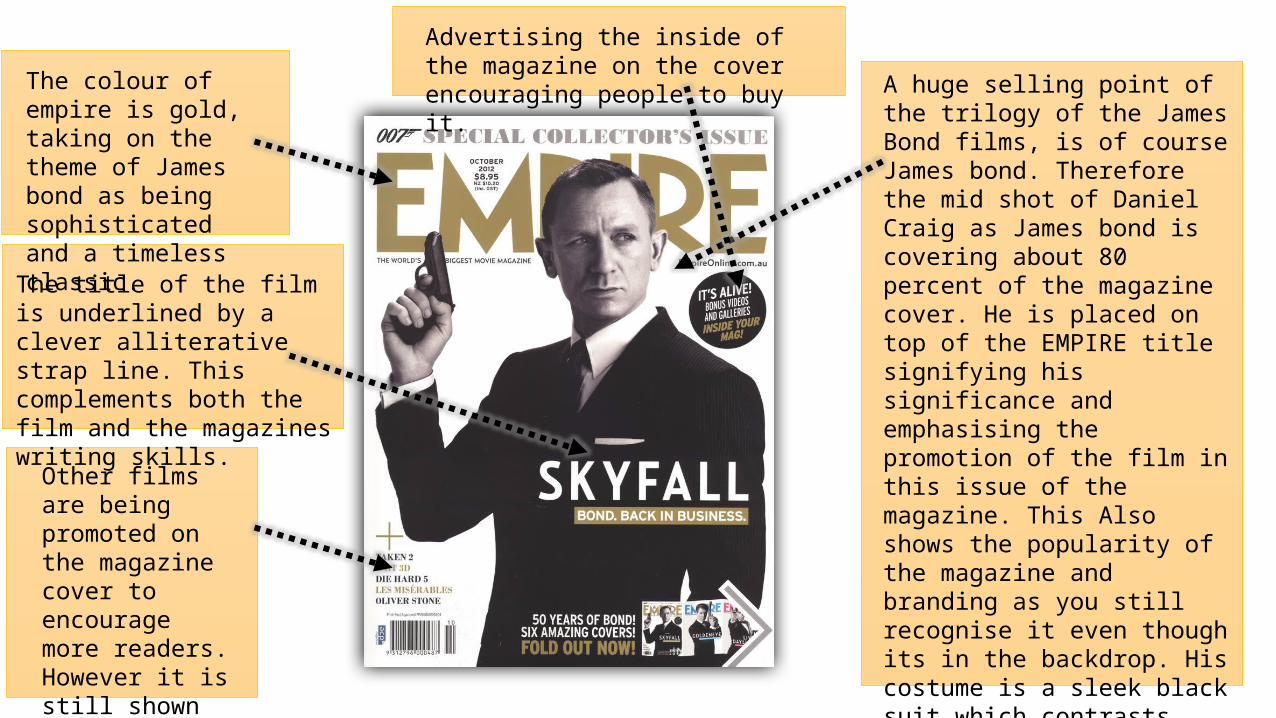
The colour of empire is gold, taking on the theme of James bond as being sophisticated and a timeless classic.
A huge selling point of the trilogy of the James Bond films, is of course James bond. Therefore the mid shot of Daniel Craig as James bond is covering about 80 percent of the magazine cover. He is placed on top of the EMPIRE title signifying his significance and emphasising the promotion of the film in this issue of the magazine. This Also shows the popularity of the magazine and branding as you still recognise it even though its in the backdrop. His costume is a sleek black suit which contrasts nicely to the plain white background. Additionally he is holding a gun as a prop. This sets the genre of the film, and gets the pre-existing fan base excited for the action and class they know will be presented in the film.
Other films are being promoted on the magazine cover to encourage more readers. However it is still shown in the black&white&gold theme.
The title of the film is underlined by a clever alliterative strap line. This complements both the film and the magazines writing skills.
Advertising the inside of the magazine on the cover encouraging people to buy it.

Full length shot of ‘the joker’ sitting down. His head layered on top of the masthead. Representing the dominance of the character but also the importance of the new film.
The EMPIRE title is in unusually in its traditional format. I think this is because the cover is very busy – representing the lifestyle and character of the joker. The red actually compliments the colour scheme for the dark knight cover.
The price is presented in a small font so it will be the last thing the viewer notices.
The theme of the magazine colour is lots of bright colours, contrasting greens and purples. All matching the colour of his socks. This is an attractive design and is eye catching. It gives a feel that the magazine and the film will be exciting.
The world exclusive in white capital writing gives the magazine an extra selling point as this is the only place to get the inside info on the dark knight.
The main feature of the magazine cover is ‘meet the joker’. This is in a almost splattered printed child-like type font. Giving the audience a chance to get more information on the film and meet the ‘bad guy.’ encouraging film fans to buy it and gain exclusive character traits before they watch the film. ‘The cover line underneath is written in white jagged handwriting style. Giving the impression that the joker himself wrote it, portraying to the audience the genre of the film
The Batman symbol is placed on top of the jokers head almost like a play on a halo. The jokers body is shadowed and dark showing a mysterious facial expression. And a confident body position. This juxtaposes the depressing setting of what seems like a prison/capture due to bars. However his hands are displayed much brighter making them symbolic?
A big green X is shown as a sort of bullet point- showing the reader what else is in the magazine. The wording ‘PLUS!’ in capitals almost fools the reader into thinking they are getting more than they’re paying for.


