5
Magazine Research
| Date post: | 08-Aug-2015 |
| Category: |
Social Media |
| Upload: | ambermaygardner |
| View: | 67 times |
| Download: | 0 times |
Magazine Research
Magazine Information
• First published in the 1st of February 1983• Target audience is 16-30 year olds approximately 72% male and
28% female• The genre of Mixmag is dance music/DJ/ Clubbing• Worlds best selling dance/clubbing magazine• The editor of the magazine is Nick Decosemo• Total circulation is 21,250• The publishing company is Disco Mix Club • The magazine is released monthly• The brand identity of Mixmag includes: same skyline, cover
mount, small FAP in top corner and loud colour schemes.• Distributed in shops and online• Leading competitors include: DJ and VIP• The price is £4.95

Front CoverMasthead- the masthead is bold and pale pink which stands out in contrast against the darker turquoise background. The model is positioned over the masthead suggesting it’s well known.
Main Image- the main image is a studio shot of a DJ looking artist therefor is a motivating image. He gives a direct mode of address by making eye contact which catches the attention of the reader.
Coverline- the coverline is in a bold font linking to the house style and is typed in white to stand out from the background. The size of the font is larger than the sublines therefor making it appear more important.
Pull Quote- the pull quote uses colloquial language to grab the readers attention as it is said by an important artist.
Sublines- the sublines are very small which suggests that the target audience is older as it is not as attention seeking. This creates lots of gutter space
Barcode/ Price- the magazine is £4.99 which is very expensive for a magazine suggesting that it’s aimed at an older target audience.
House Style- the house style for Mixmag is contemporary, bold and colorful. The bold fonts with a pale colour create a larger contrast.

Contents
Mixmag Logo- the logo of Mixmag is featured on most pages of the magazine in order to establish brand identity.
Page Numbers- the page numbers are written in a small simple font suggesting that the target audience is older.
Secondary images- the contents page features many large secondary images in order to keep the reader occupied in the magazine. These images are also motivated to the genre of DJ.
Masthead- the masthead is in a bold stencil font again following the house style by using light colours and bold fonts.
Sections- the contents page is divided into three main sections: page numbers, pictures and a small article on the Free CD included. This organizes the page so readers find it easier to find what their looking for.
Sub-headings- the sub-headings follow the same colour and similar font to the page number captions. However have an Italic affect to create a difference in appearance.
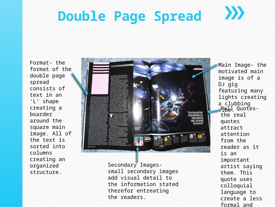
Double Page Spread
Format- the format of the double page spread consists of text in an ‘L’ shape creating a boarder around the square main image. All of the text is sorted into columns creating an organized structure.
Main Image- the motivated main image is of a DJ gig featuring many lights creating a clubbing vibe.
Pull Quotes- the real quotes attract attention from the reader as it is an important artist saying them. This quote uses colloquial language to create a less formal and more friendly tone.
Secondary Images- small secondary images add visual detail to the information stated therefor entreating the readers.


