28
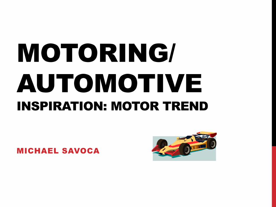
MOTORING/ AUTOMOTIVE INSPIRATION: MOTOR TREND MICHAEL SAVOCA
| Date post: | 20-Jul-2015 |
| Category: |
Automotive |
| Upload: | michaels1665 |
| View: | 40 times |
| Download: | 0 times |
MOTORING/
AUTOMOTIVE
INSPIRATION: MOTOR TREND
MICHAEL SAVOCA

NEWSSTAND
Motor Trend, Automobile, and Road & Track caught my eye
the most. Their covers looked more appealing than the
others. Also, Motor Trend was on the floor.
Road & Track caught my eye the most in this genre because
their cover looked different from what I remember it being.
The design and masthead were different.
Road & Track had the best photography because the central
image was taken at a high angle and it looked as if it were
moving fast.
Road & Track had the best design because I liked their new
masthead and I liked the use of grays the incorporated in the
cover.

NEWSSTAND
Motor Trend had the articles that grabbed my attention
because when I looked at the title and subject of them, I
could imagine myself using those subjects on my spread.
Motor Trend had the best Table of Contents because it was
designed it an appealing way and the contents matched my
interests.
Motor Trend had the best articles because I could see myself
using them as inspiration for my spread. I also like the
subject of them

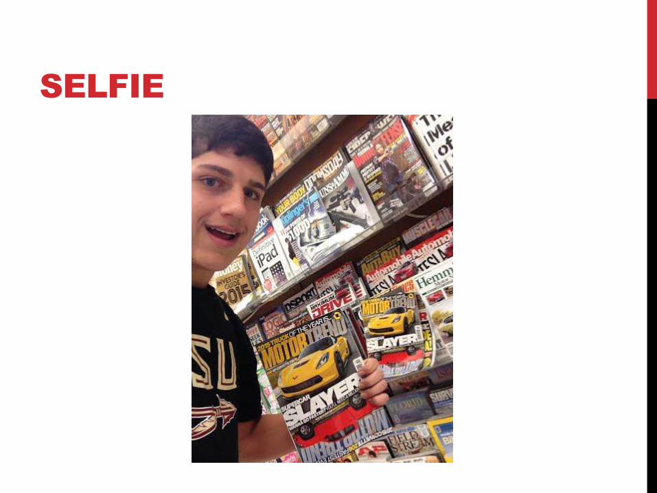
SELFIE
REFLECTION
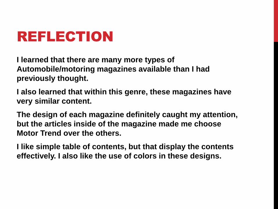
I learned that there are many more types of
Automobile/motoring magazines available than I had
previously thought.
I also learned that within this genre, these magazines have
very similar content.
The design of each magazine definitely caught my attention,
but the articles inside of the magazine made me choose
Motor Trend over the others.
I like simple table of contents, but that display the contents
effectively. I also like the use of colors in these designs.
INSPIRATION
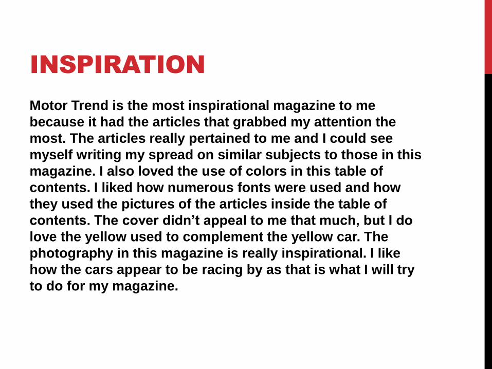
Motor Trend is the most inspirational magazine to me
because it had the articles that grabbed my attention the
most. The articles really pertained to me and I could see
myself writing my spread on similar subjects to those in this
magazine. I also loved the use of colors in this table of
contents. I liked how numerous fonts were used and how
they used the pictures of the articles inside the table of
contents. The cover didn’t appeal to me that much, but I do
love the yellow used to complement the yellow car. The
photography in this magazine is really inspirational. I like
how the cars appear to be racing by as that is what I will try
to do for my magazine.
SELFIE

1

2

3
4

5
6
7

8

9
10
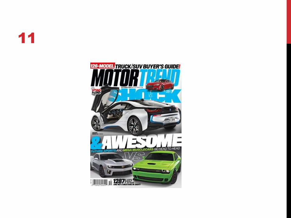
11
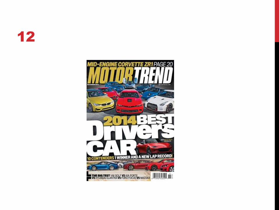
12

INSPIRATIONAL
MAGAZINE
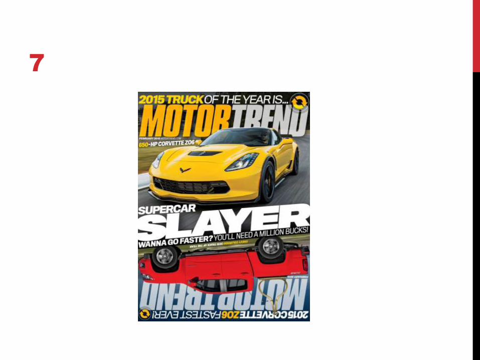
The magazine is mainly about the 2015 Corvette Z06 and the
2015 Motor Trend Truck of the Year. The article about the new
Corvette is about the first tests and impressions of this fairly
new car. The article about the Motor Trend Truck of the Year
compares several heavy-duty and full-size trucks.
The target audience are Males ages 18-54. They are in the
middle class and have an interest in cars.
There are comparison articles, tests and drives of new cars,
future cars, the specs of a $30 million race car, analysis on
compact cars, and a look back at the ultimate driving
machine.

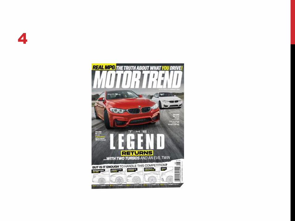
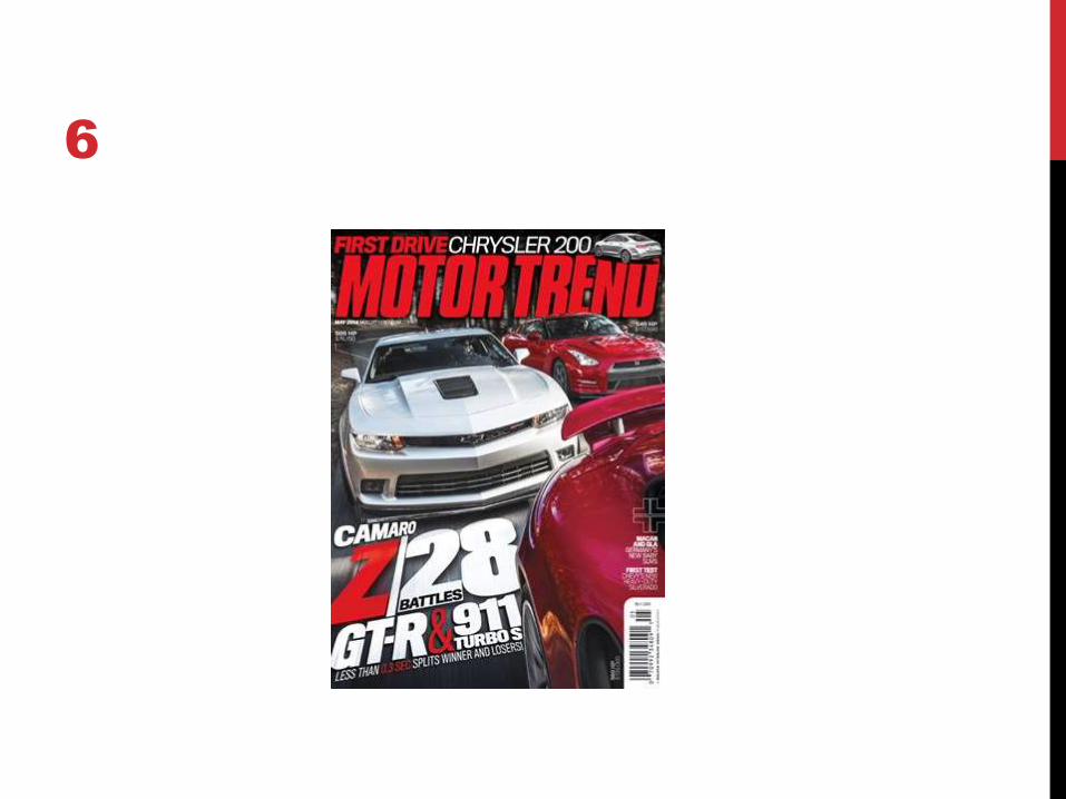
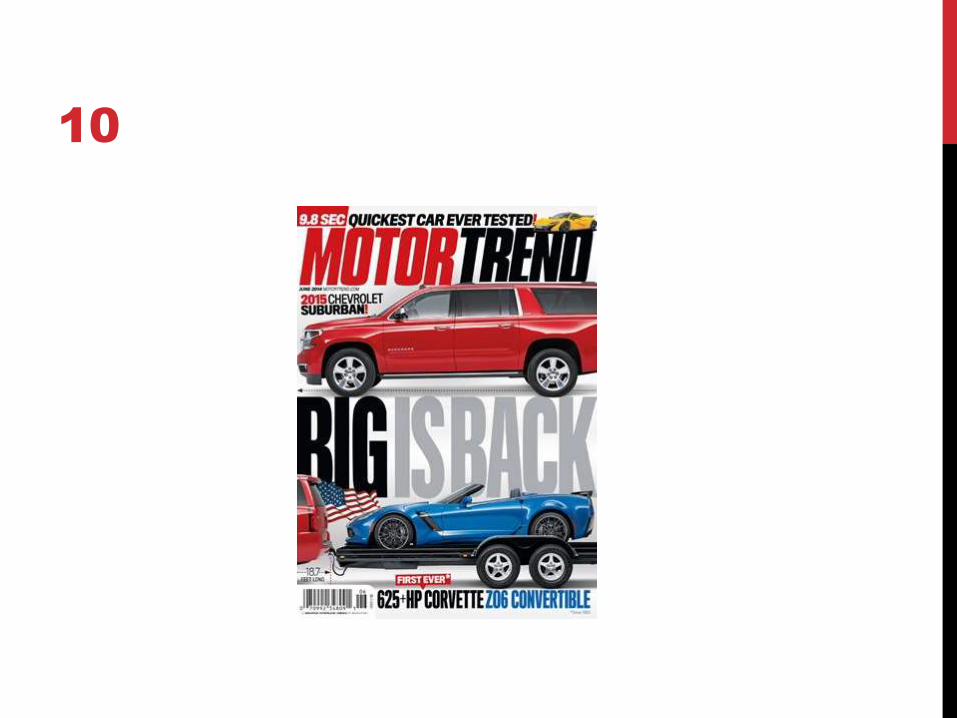
COVERS
A photo of cars are generally the central image on these
covers. Some are action shots of the car racing by, while
others are shots of the cars at a stand still.
The photos are generally taken at a race track or closed road.
In some covers the photo may be taken at a studio.
A common element on all covers is that the colors used
changes for every cover. Also, the main cover lines and
anchorage text are huge and says something witty. The
layouts are the same, but the cover lines on the magazine are
scattered in each magazine. They are not consistent. Some
magazines have puffs and pugs, while some don’t.

FAVORITE COVER
This is my favorite and most inspirational
cover image to me because it is bold and
strong. I like how the anchorage text is
bigger than the masthead. This should
grab the reader’s attention like it did to me.
I am also a fan of the central image. I like
how the wheels are turned to the side. I
plan on taking a picture of the car with its
wheels to the side. I like how the color of
the car is the same color as the masthead.
I also like how each of the cover lines has
a little picture of a car to match with it.
Lastly, I like the simplicity of the cover
since it had very few cover lines and text
surrounding the central image.

TABLE OF CONTENTS
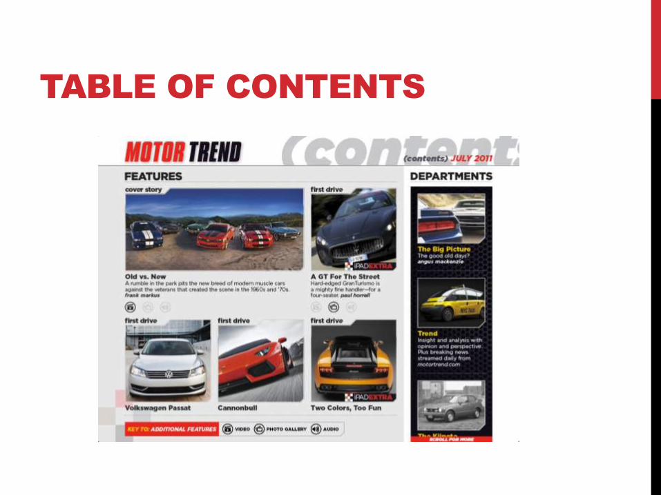
TABLE OF CONTENTS

TABLE OF CONTENTS
From the Table of Contents that I could find, I found that
Motor Trend likes to make the design busy. In two of the
Table of Contents, the color black was used as a background.
Although, it was hard to find Table of Contents from the same
year, it appears that the font stays the same for each but
changes color or transparency. It seems that as each year
progressed, the font was more eye grabbing and bold. Also,
in the newest Table of Contents, there are more colors and
shapes used in this design. Also, there are more pictures
than the earlier Table of Contents. On average, each Table of
Contents displays 9.6 stories in the magazine.

TWO-PAGE SPREAD

TWO-PAGE SPREAD
TWO-PAGE SPREADS
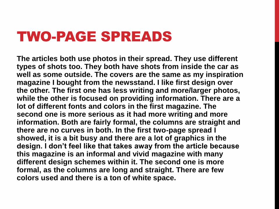
The articles both use photos in their spread. They use different types of shots too. They both have shots from inside the car as well as some outside. The covers are the same as my inspiration magazine I bought from the newsstand. I like first design over the other. The first one has less writing and more/larger photos, while the other is focused on providing information. There are a lot of different fonts and colors in the first magazine. The second one is more serious as it had more writing and more information. Both are fairly formal, the columns are straight and there are no curves in both. In the first two-page spread I showed, it is a bit busy and there are a lot of graphics in the design. I don’t feel like that takes away from the article because this magazine is an informal and vivid magazine with many different design schemes within it. The second one is more formal, as the columns are long and straight. There are few colors used and there is a ton of white space.


