6
Magazine Research
| Date post: | 08-Aug-2015 |
| Category: |
Social Media |
| Upload: | ambermaygardner |
| View: | 100 times |
| Download: | 0 times |
Magazine Research
Magazine Information
• Launched in September 2011supported by many large companies such as Universal Music, Asda, Boohoo, Tesco’s and So Fragrances
• Genre of the magazine is clearly pop music in the charts
• The target audience is focused on 100% female audience 13-15 year old
• Circulation of the magazine is 115,000
• Issued weekly
• Costs £2.99 per issue
• The content of the magazine includes: fashion, makeup, gossip, quizzes, posters, games, boy tips and shopping.
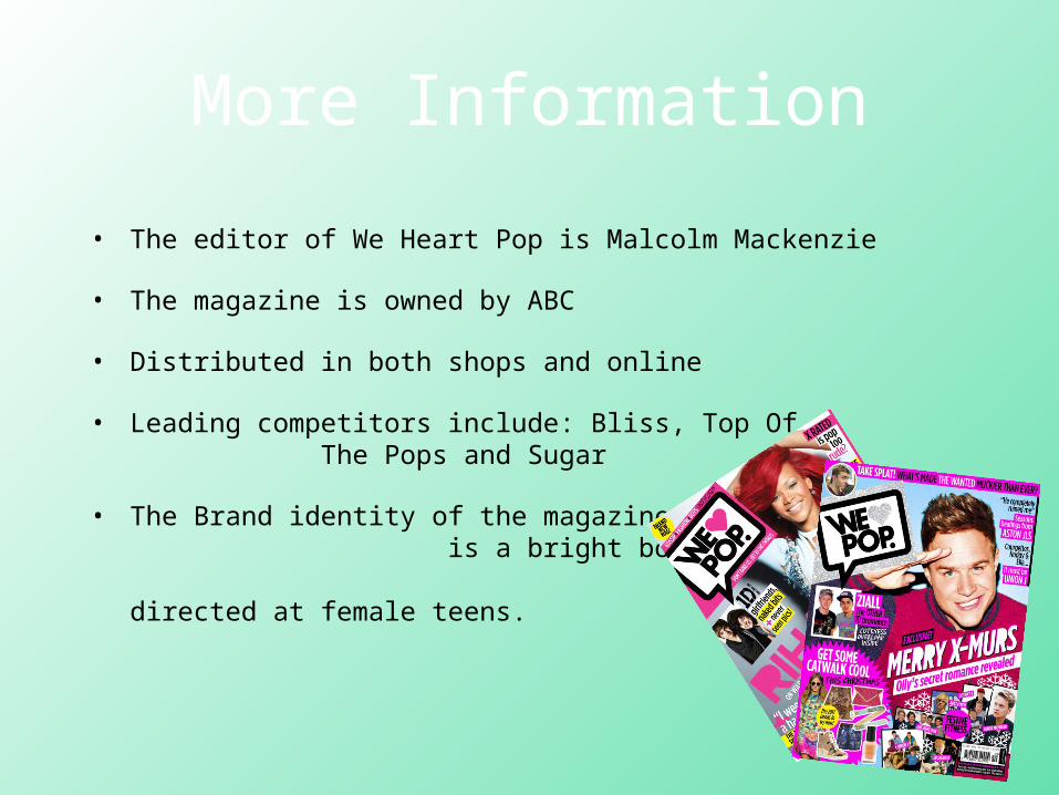
More Information
• The editor of We Heart Pop is Malcolm Mackenzie
• The magazine is owned by ABC
• Distributed in both shops and online
• Leading competitors include: Bliss, Top Of The Pops and Sugar
• The Brand identity of the magazine is a bright bold colours with a happy vibe directed at female teens.
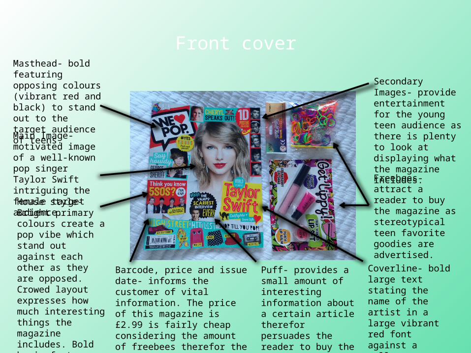
Front cover
Freebees- attract a reader to buy the magazine as stereotypical teen favorite goodies are advertised.
Masthead- bold featuring opposing colours (vibrant red and black) to stand out to the target audience of teens.
Coverline- bold large text stating the name of the artist in a large vibrant red font against a yellow background therefor highlighting it.
Main Image- motivated image of a well-known pop singer Taylor Swift intriguing the female target audience.
Secondary Images- provide entertainment for the young teen audience as there is plenty to look at displaying what the magazine includes.
House style- Bright primary colours create a pop vibe which stand out against each other as they are opposed. Crowed layout expresses how much interesting things the magazine includes. Bold basic fonts are easy to read and eye-catching.
Puff- provides a small amount of interesting information about a certain article therefor persuades the reader to buy the magazine and read it.
Barcode, price and issue date- informs the customer of vital information. The price of this magazine is £2.99 is fairly cheap considering the amount of freebees therefor the young target audience can afford to purchase it.
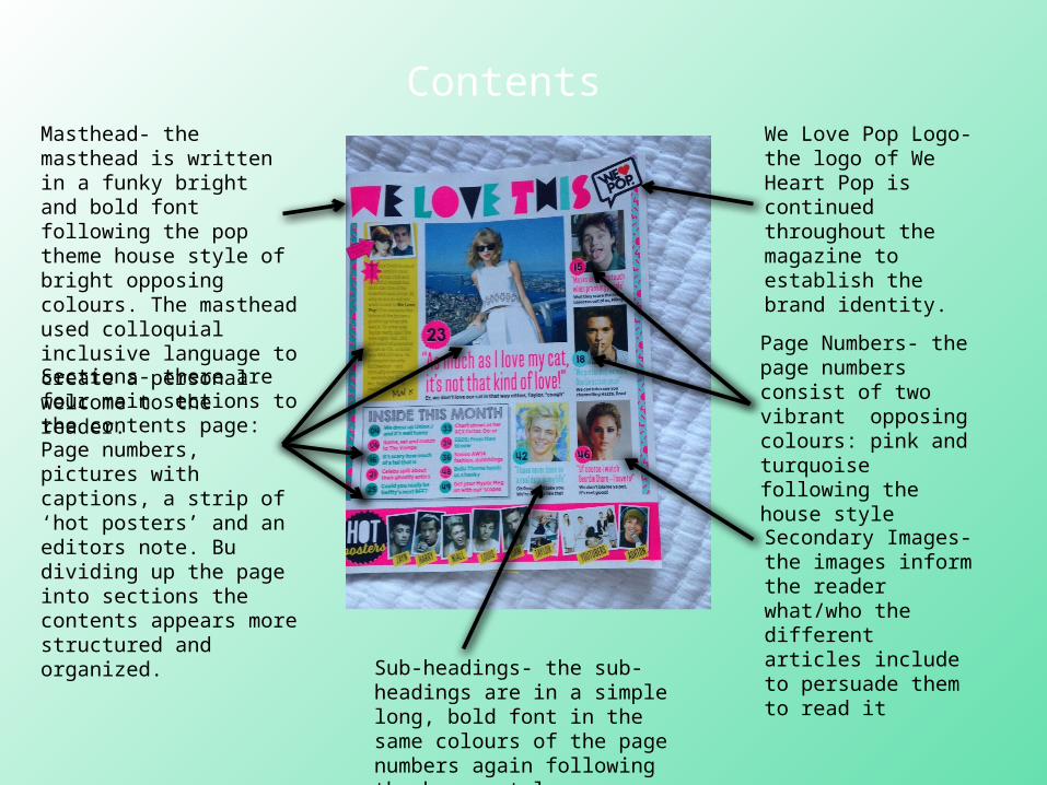
Contents Masthead- the masthead is written in a funky bright and bold font following the pop theme house style of bright opposing colours. The masthead used colloquial inclusive language to create a personal welcome to the reader.Sections- there are four main sections to the contents page: Page numbers, pictures with captions, a strip of ‘hot posters’ and an editors note. Bu dividing up the page into sections the contents appears more structured and organized.
Page Numbers- the page numbers consist of two vibrant opposing colours: pink and turquoise following the house style
We Love Pop Logo- the logo of We Heart Pop is continued throughout the magazine to establish the brand identity.
Secondary Images- the images inform the reader what/who the different articles include to persuade them to read itSub-headings- the sub-
headings are in a simple long, bold font in the same colours of the page numbers again following the house style
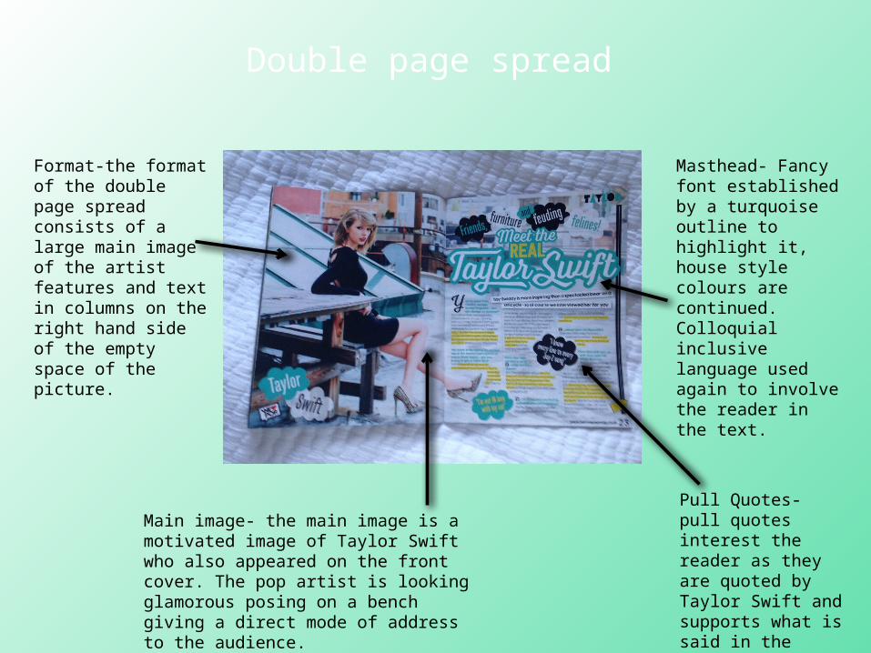
Double page spread
Masthead- Fancy font established by a turquoise outline to highlight it, house style colours are continued. Colloquial inclusive language used again to involve the reader in the text.
Format-the format of the double page spread consists of a large main image of the artist features and text in columns on the right hand side of the empty space of the picture.
Pull Quotes- pull quotes interest the reader as they are quoted by Taylor Swift and supports what is said in the article.
Main image- the main image is a motivated image of Taylor Swift who also appeared on the front cover. The pop artist is looking glamorous posing on a bench giving a direct mode of address to the audience.


