50
Making Accessibility Sexy <head> Conference 26 October 2008 Ann McMeekin
| Date post: | 14-Jul-2015 |
| Category: |
Design |
| Upload: | ann-mcmeekin-carrier |
| View: | 2,165 times |
| Download: | 0 times |
Making Accessibility Sexy<head> Conference
26 October 2008
Ann McMeekin

I know Jeremy had his tongue firmly in his cheek when he showed this slide, but I saw more than a few heads nod in agreement when it went up on the screen.
Why not?
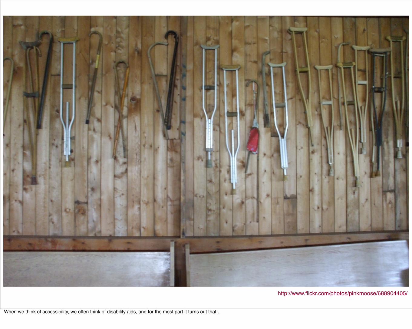
http://www.flickr.com/photos/pinkmoose/688904405/
When we think of accessibility, we often think of disability aids, and for the most part it turns out that...
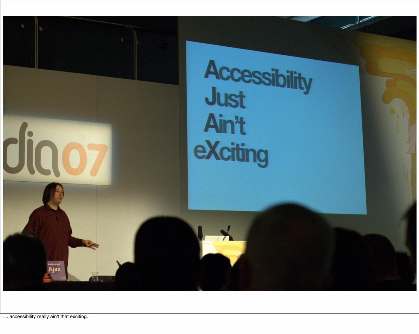
... accessibility really ain't that exciting.
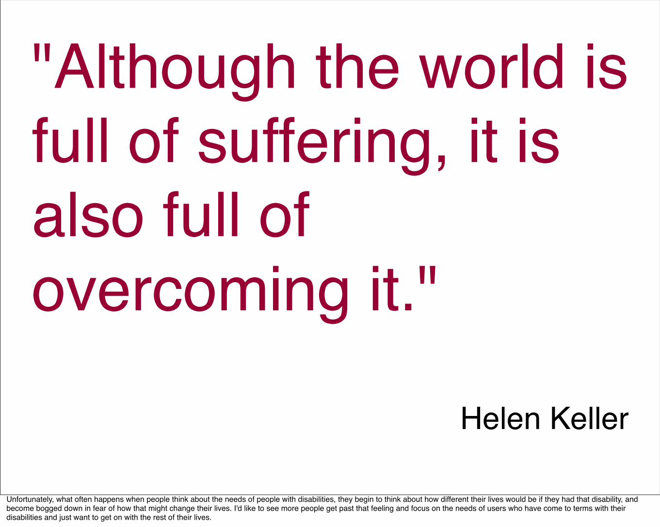
"Although the world is full of suffering, it is also full of overcoming it."
Helen Keller
Unfortunately, what often happens when people think about the needs of people with disabilities, they begin to think about how different their lives would be if they had that disability, and become bogged down in fear of how that might change their lives. I'd like to see more people get past that feeling and focus on the needs of users who have come to terms with their disabilities and just want to get on with the rest of their lives.
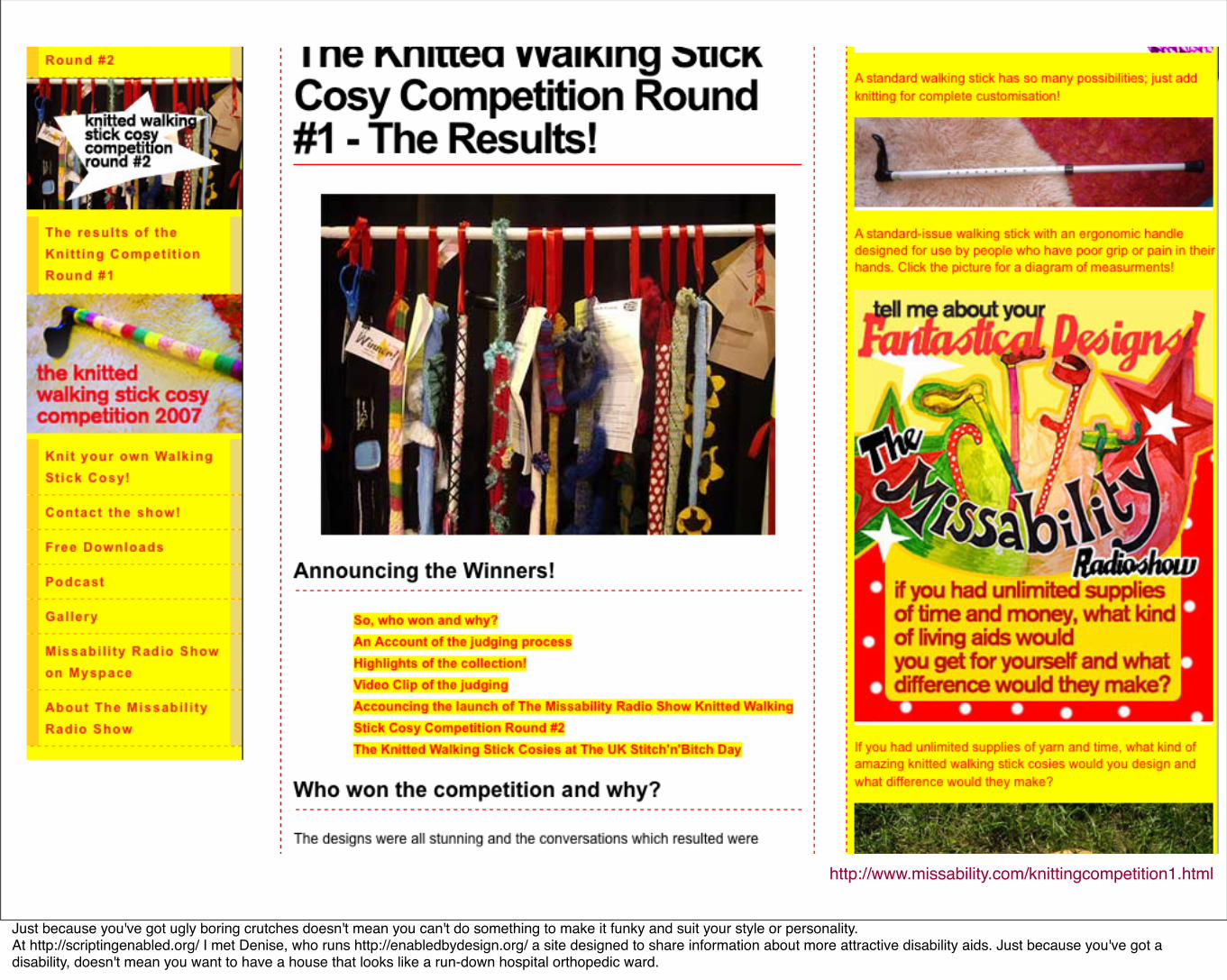
http://www.missability.com/knittingcompetition1.html
Just because you've got ugly boring crutches doesn't mean you can't do something to make it funky and suit your style or personality.At http://scriptingenabled.org/ I met Denise, who runs http://enabledbydesign.org/ a site designed to share information about more attractive disability aids. Just because you've got a disability, doesn't mean you want to have a house that looks like a run-down hospital orthopedic ward.
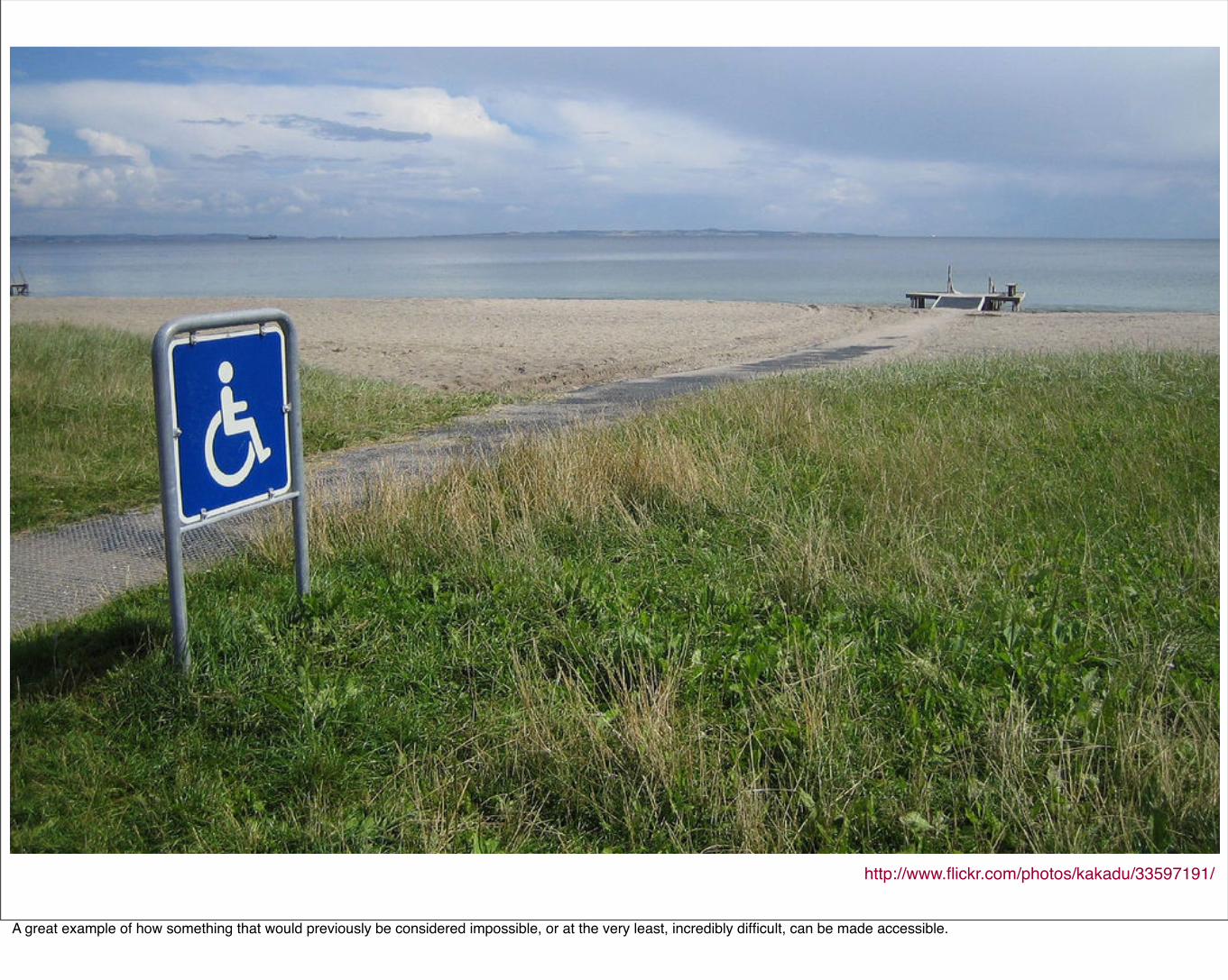
http://www.flickr.com/photos/kakadu/33597191/
A great example of how something that would previously be considered impossible, or at the very least, incredibly difficult, can be made accessible.
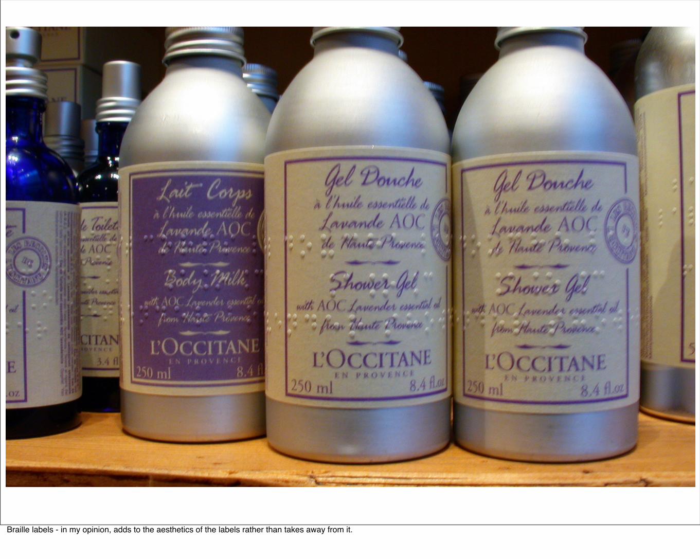
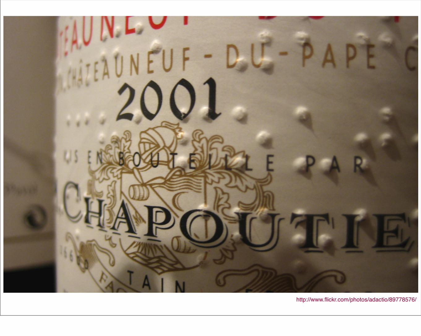
Braille labels - in my opinion, adds to the aesthetics of the labels rather than takes away from it.
http://www.flickr.com/photos/adactio/89778576/
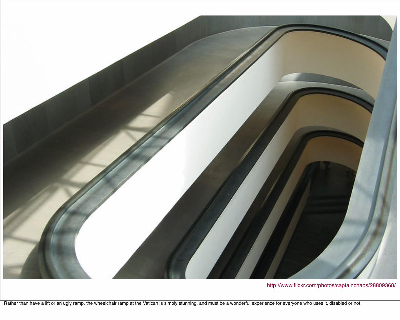
http://www.flickr.com/photos/captainchaos/28809368/
Rather than have a lift or an ugly ramp, the wheelchair ramp at the Vatican is simply stunning, and must be a wonderful experience for everyone who uses it, disabled or not.
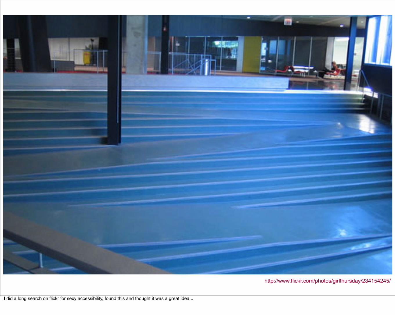
http://www.flickr.com/photos/girlthursday/234154245/
I did a long search on flickr for sexy accessibility, found this and thought it was a great idea...
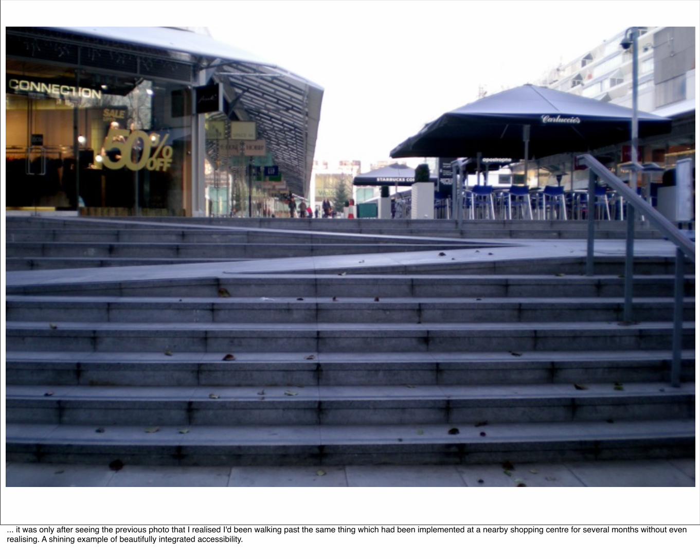
... it was only after seeing the previous photo that I realised I'd been walking past the same thing which had been implemented at a nearby shopping centre for several months without even realising. A shining example of beautifully integrated accessibility.
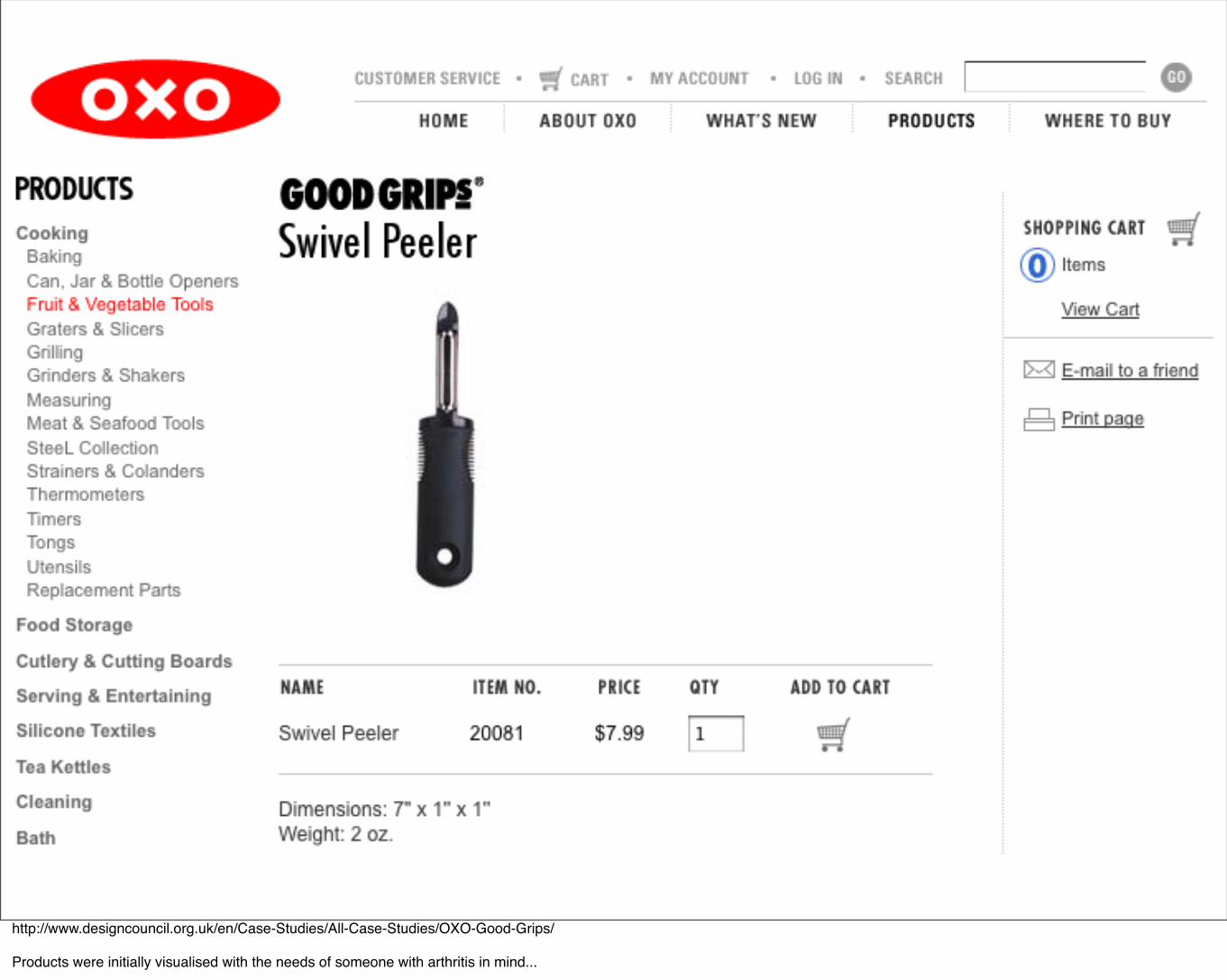
http://www.designcouncil.org.uk/en/Case-Studies/All-Case-Studies/OXO-Good-Grips/
Products were initially visualised with the needs of someone with arthritis in mind...
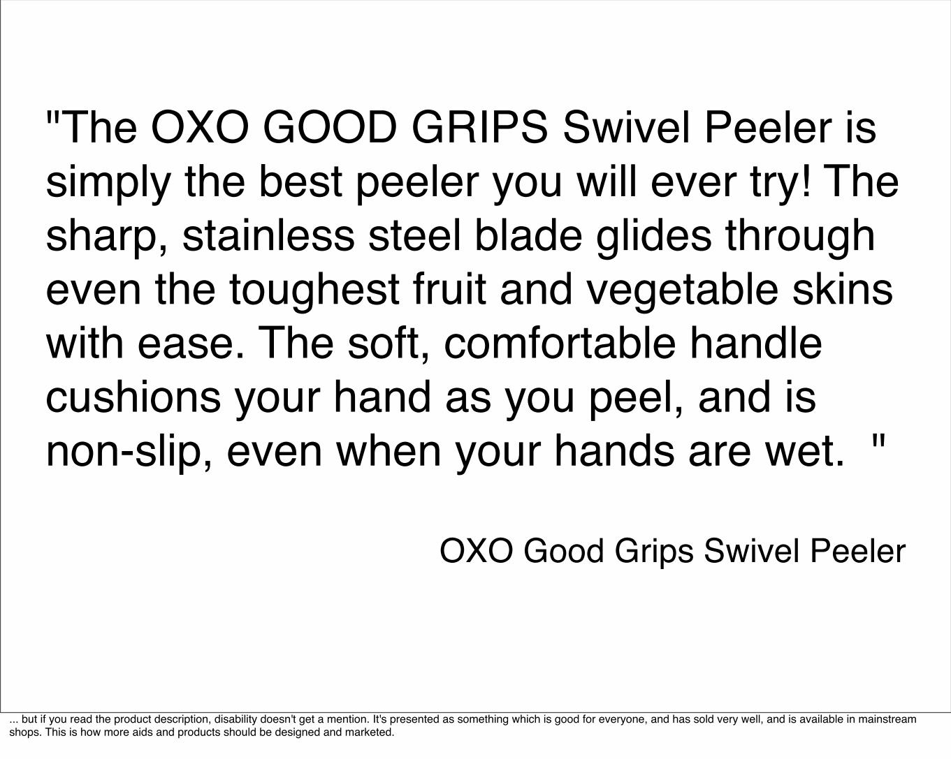
"The OXO GOOD GRIPS Swivel Peeler is simply the best peeler you will ever try! The sharp, stainless steel blade glides through even the toughest fruit and vegetable skins with ease. The soft, comfortable handle cushions your hand as you peel, and is non-slip, even when your hands are wet. "
OXO Good Grips Swivel Peeler
... but if you read the product description, disability doesn't get a mention. It's presented as something which is good for everyone, and has sold very well, and is available in mainstream shops. This is how more aids and products should be designed and marketed.
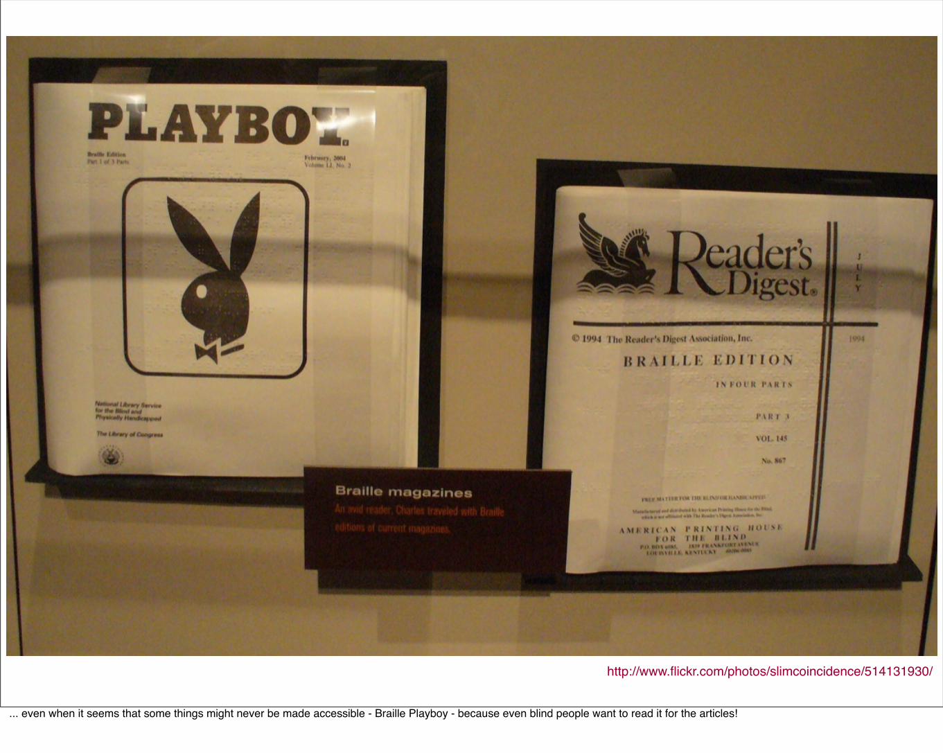
http://www.flickr.com/photos/slimcoincidence/514131930/
... even when it seems that some things might never be made accessible - Braille Playboy - because even blind people want to read it for the articles!
"Limitations are the soil from which creativity grows."Jeffrey Zeldman, A List Apart, May 12 2000
http://www.alistapart.com/articles/5k
Many designers feel that accessibility puts too much of a constraint on their ability to create beautiful websites - I believe that this quote holds true, even though it was made eight years ago.
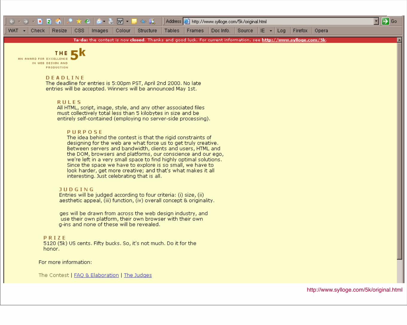
http://www.sylloge.com/5k/original.html
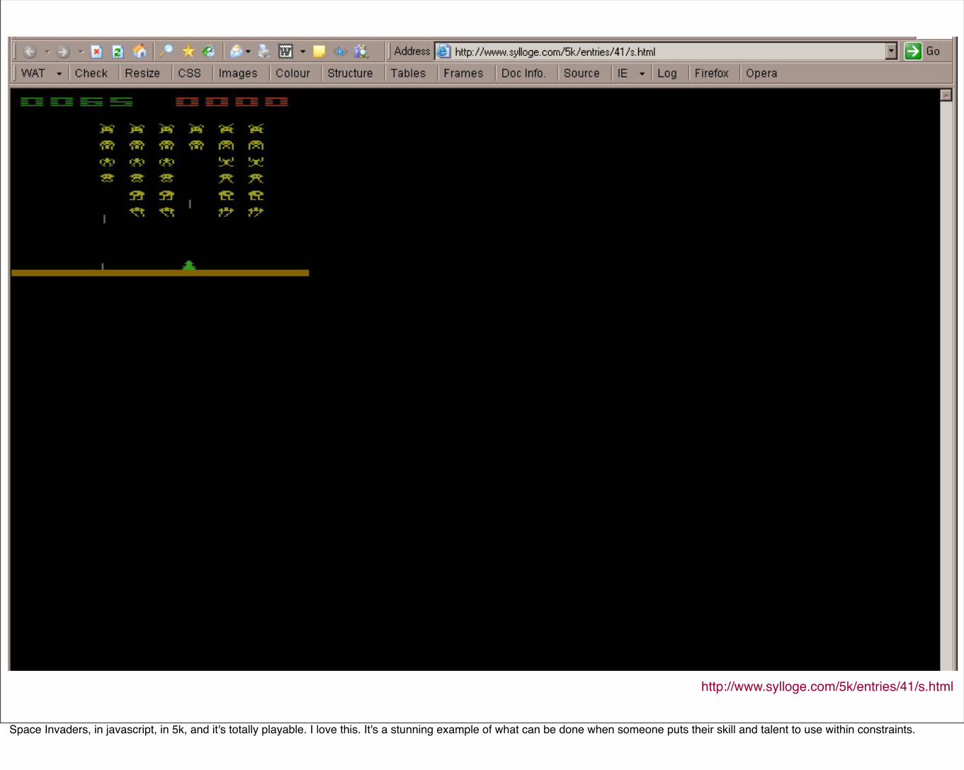
http://www.sylloge.com/5k/entries/41/s.html
Space Invaders, in javascript, in 5k, and it's totally playable. I love this. It's a stunning example of what can be done when someone puts their skill and talent to use within constraints.
How can I make accessibility sexy?
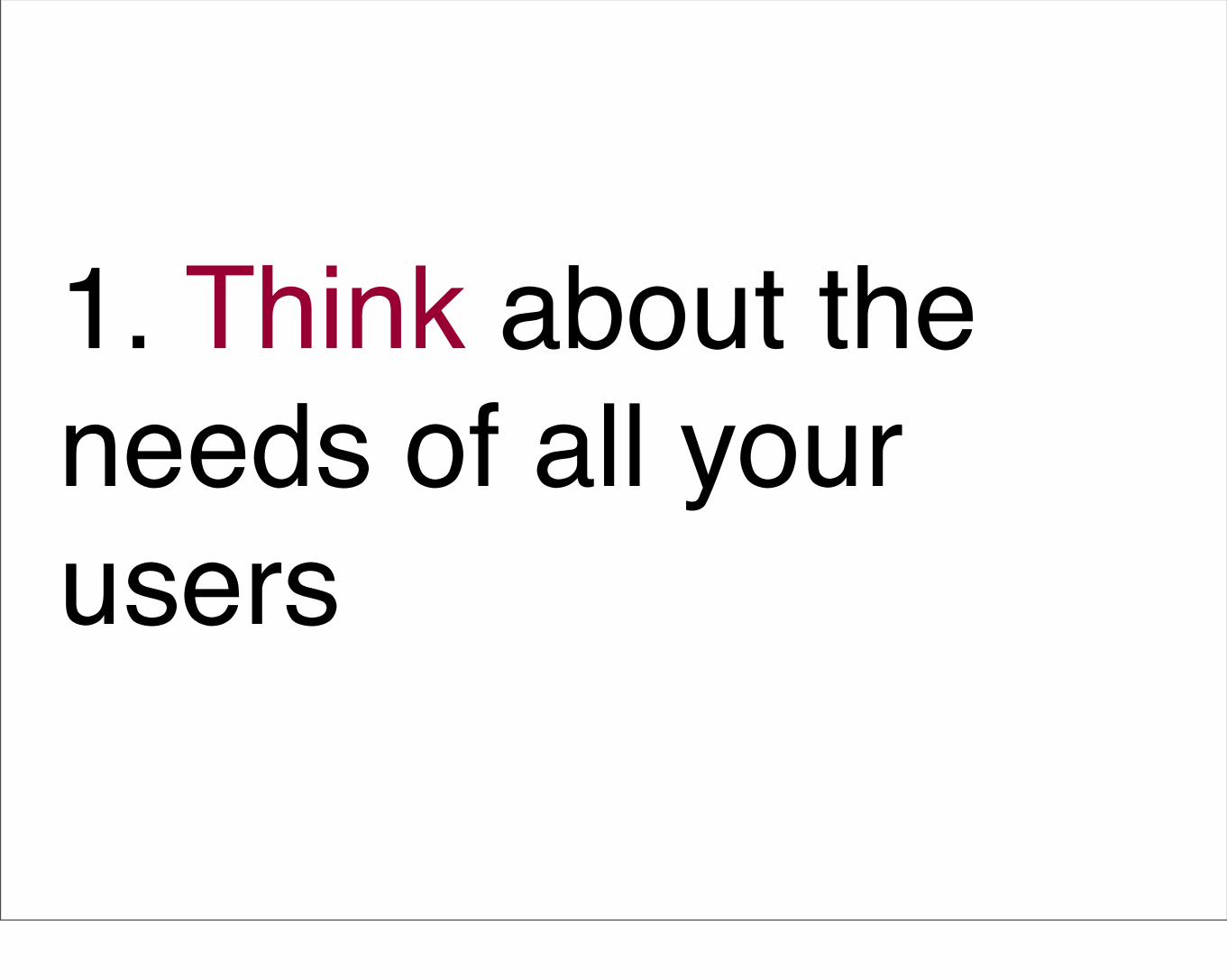
1. Think about the needs of all your users
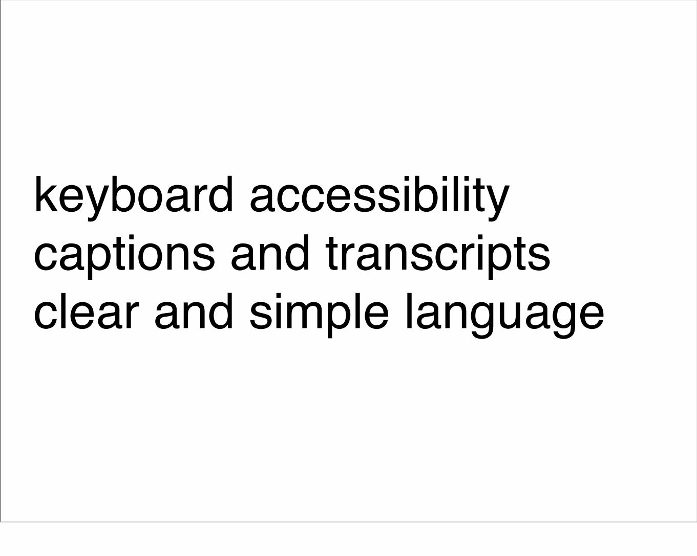
keyboard accessibilitycaptions and transcriptsclear and simple language
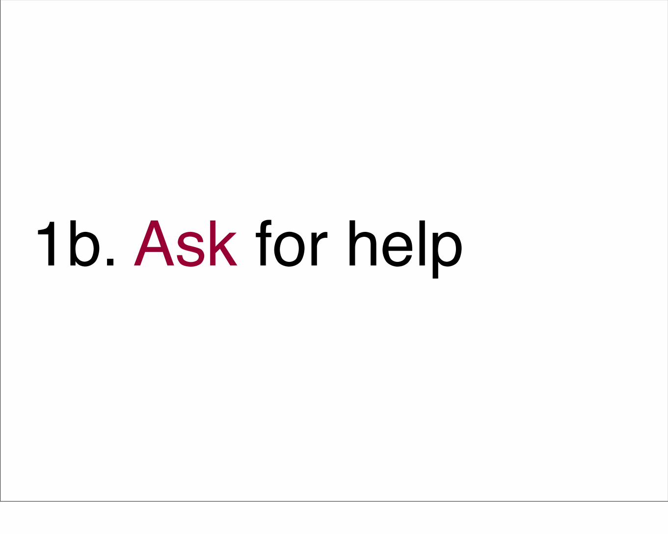
1b. Ask for help
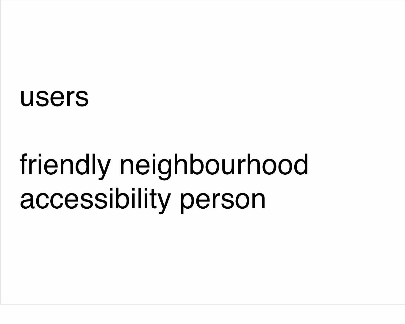
users
friendly neighbourhood accessibility person
2. Focus on standard interaction before adding complex interaction
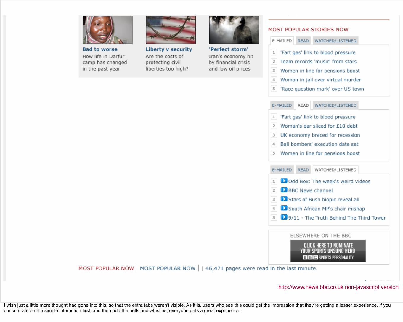
http://www.news.bbc.co.uk non-javascript version
I wish just a little more thought had gone into this, so that the extra tabs weren't visible. As it is, users who see this could get the impression that they're getting a lesser experience. If you concentrate on the simple interaction first, and then add the bells and whistles, everyone gets a great experience.
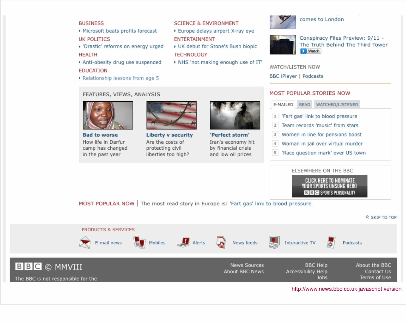
http://www.news.bbc.co.uk javascript version
3. Big is beautiful
http://icant.co.uk/easy-youtube/
Lots of feedback that the bigger buttons and clearer icons are easier to use for those who are older, or those who have cognitive impairments.
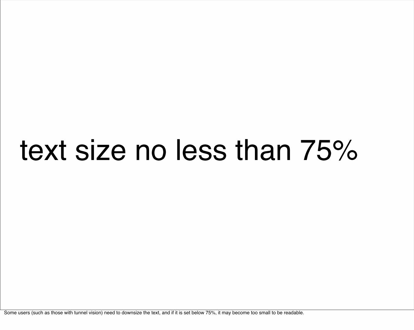
text size no less than 75%
Some users (such as those with tunnel vision) need to downsize the text, and if it is set below 75%, it may become too small to be readable.
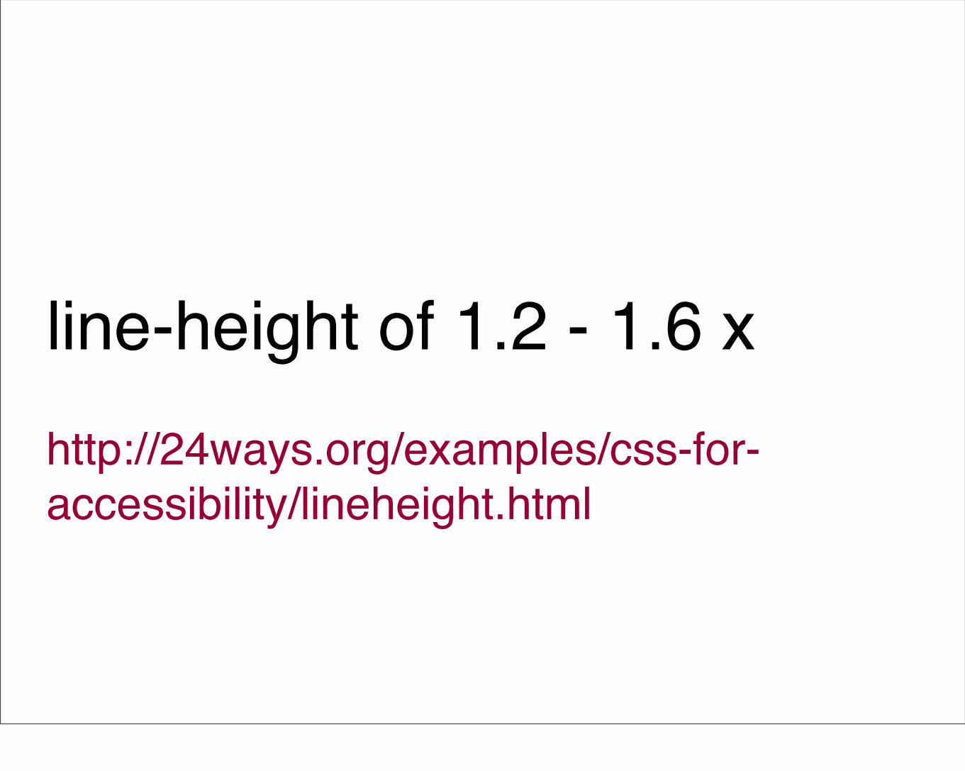
line-height of 1.2 - 1.6 xhttp://24ways.org/examples/css-for-accessibility/lineheight.html
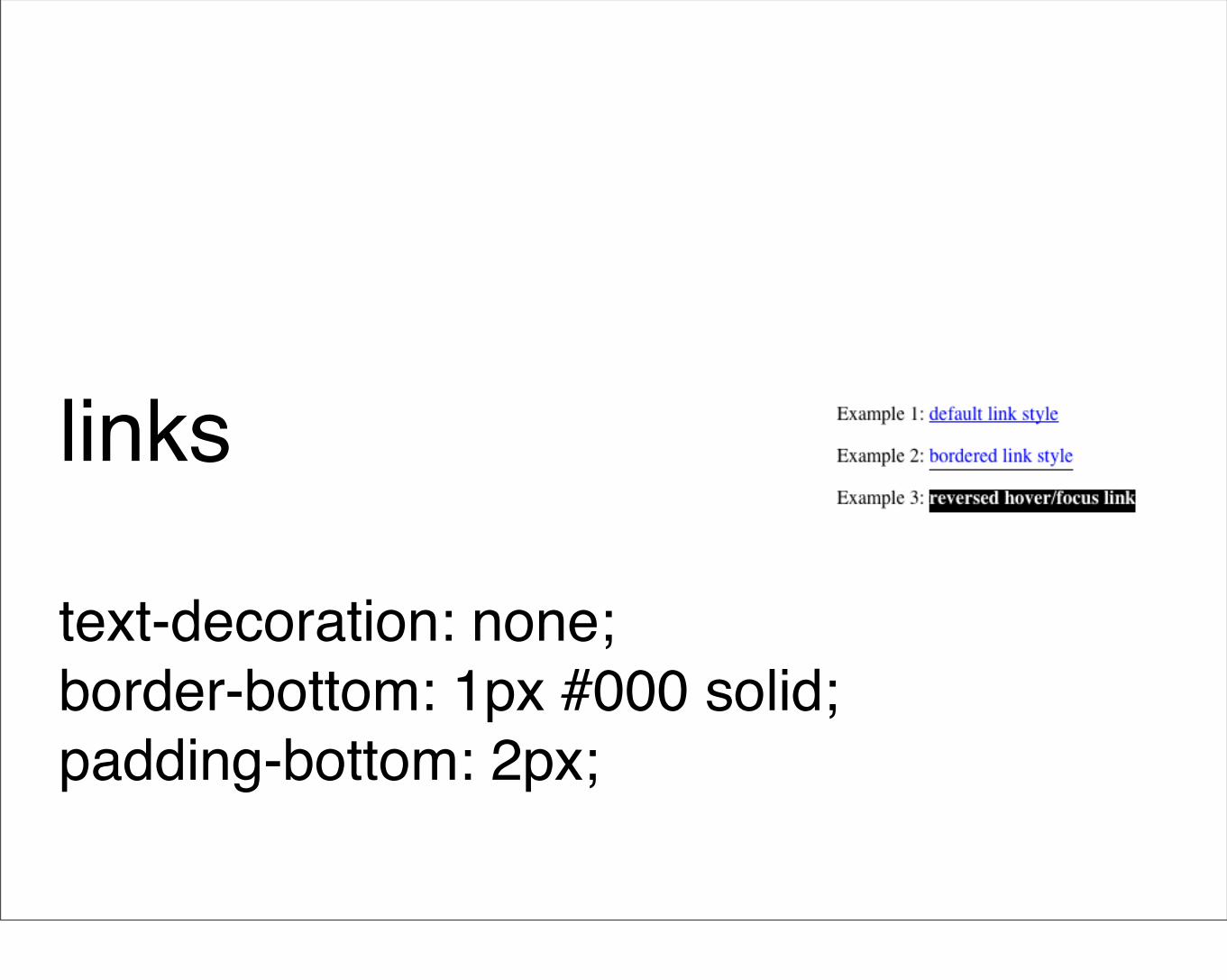
links
text-decoration: none;border-bottom: 1px #000 solid;padding-bottom: 2px;
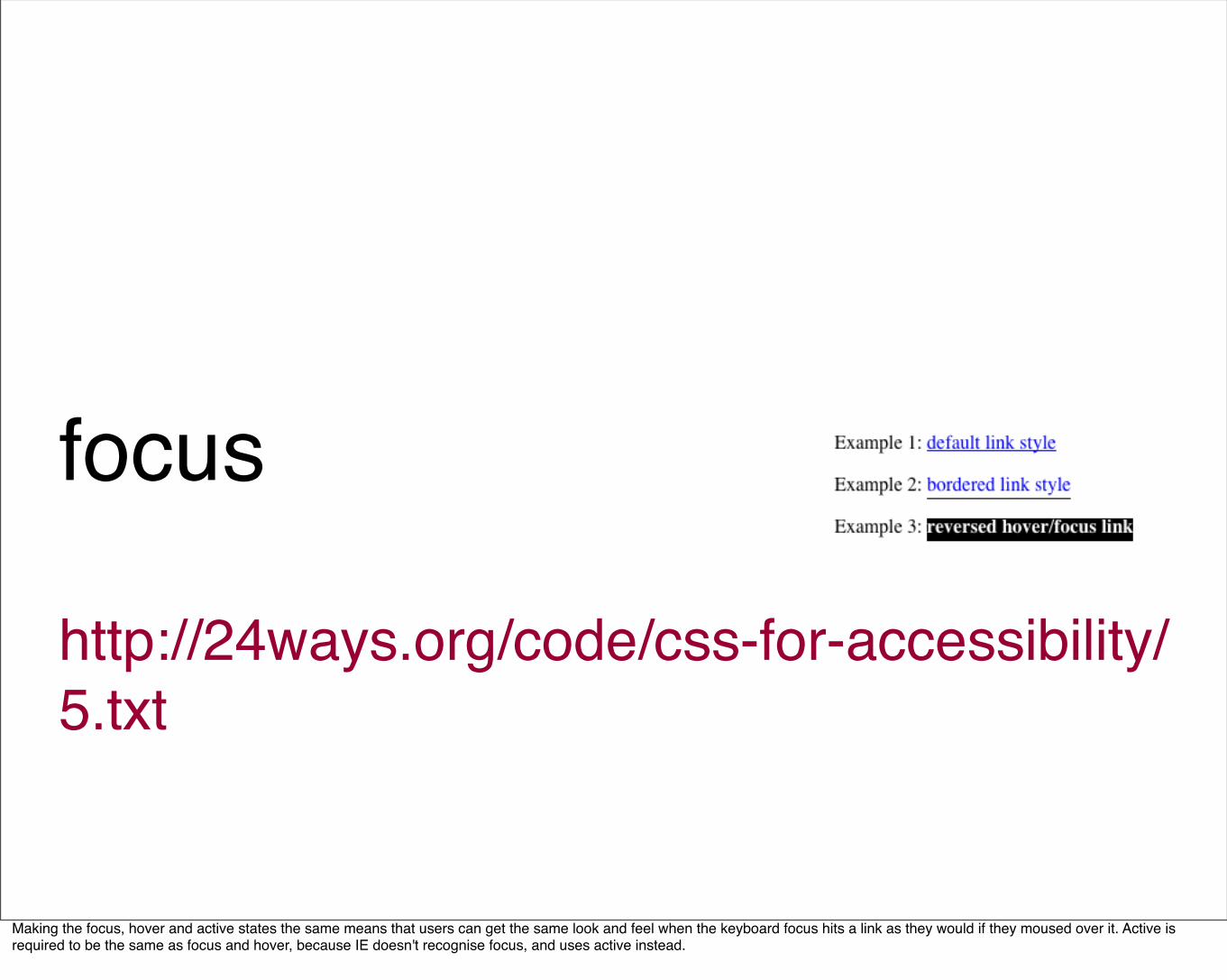
focus
http://24ways.org/code/css-for-accessibility/5.txt
Making the focus, hover and active states the same means that users can get the same look and feel when the keyboard focus hits a link as they would if they moused over it. Active is required to be the same as focus and hover, because IE doesn't recognise focus, and uses active instead.
icons and buttons
It's not just about disability - I got an iPhone recently and have found that if the icons and buttons are too small, it can be very difficult to click on them.
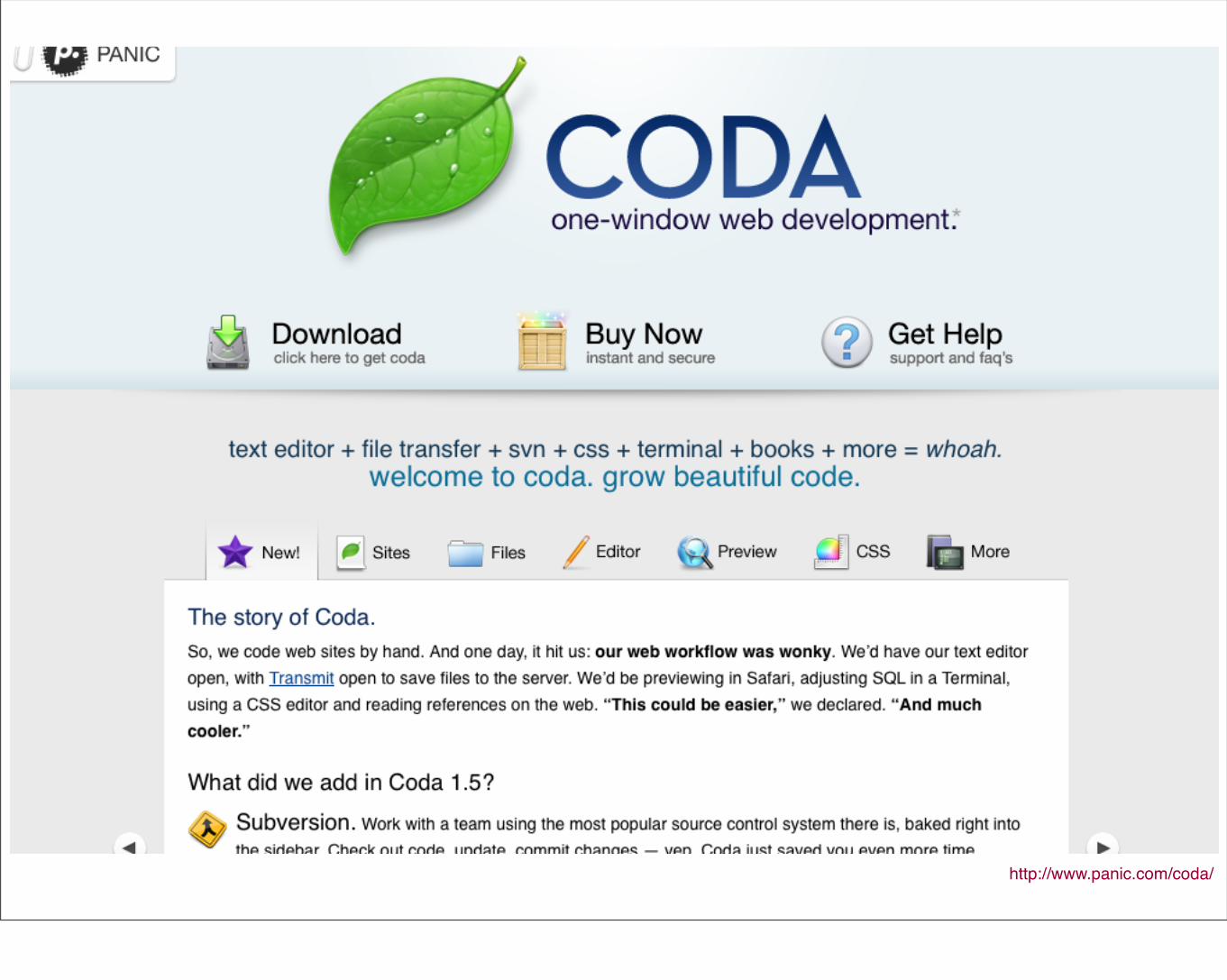
http://www.panic.com/coda/
white space
(but not too much)
Too much whitespace makes it difficult for those using screen magnification to track where they're going in the page. The same is also true on the iPhone.
4. Include accessibility content in your design
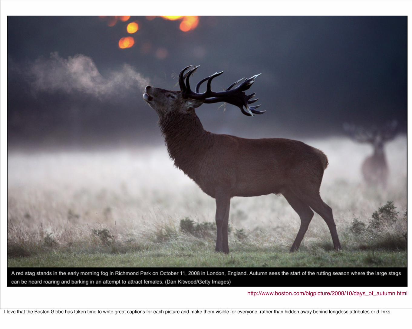
http://www.boston.com/bigpicture/2008/10/days_of_autumn.html
I love that the Boston Globe has taken time to write great captions for each picture and make them visible for everyone, rather than hidden away behind longdesc attributes or d links.
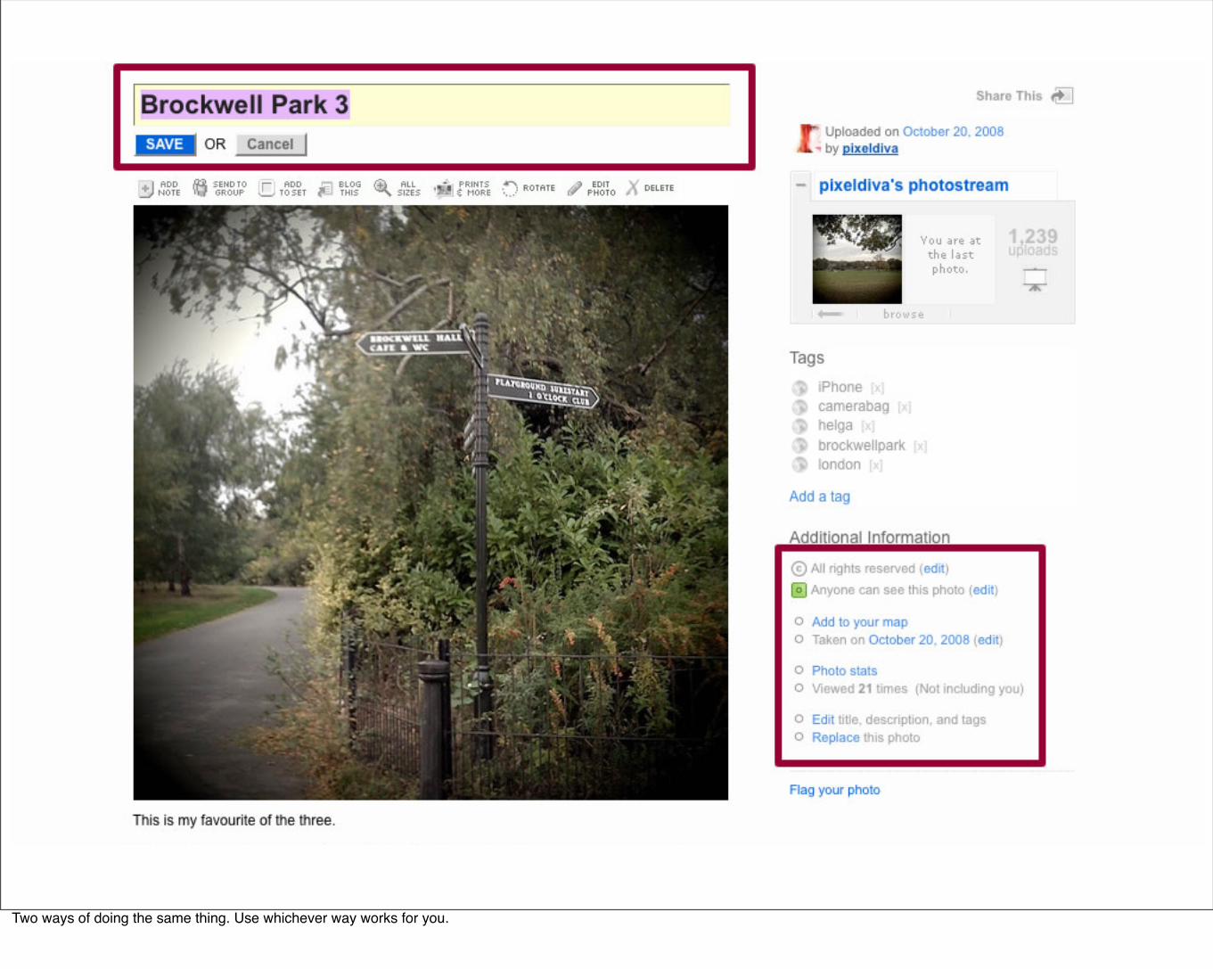
Two ways of doing the same thing. Use whichever way works for you.
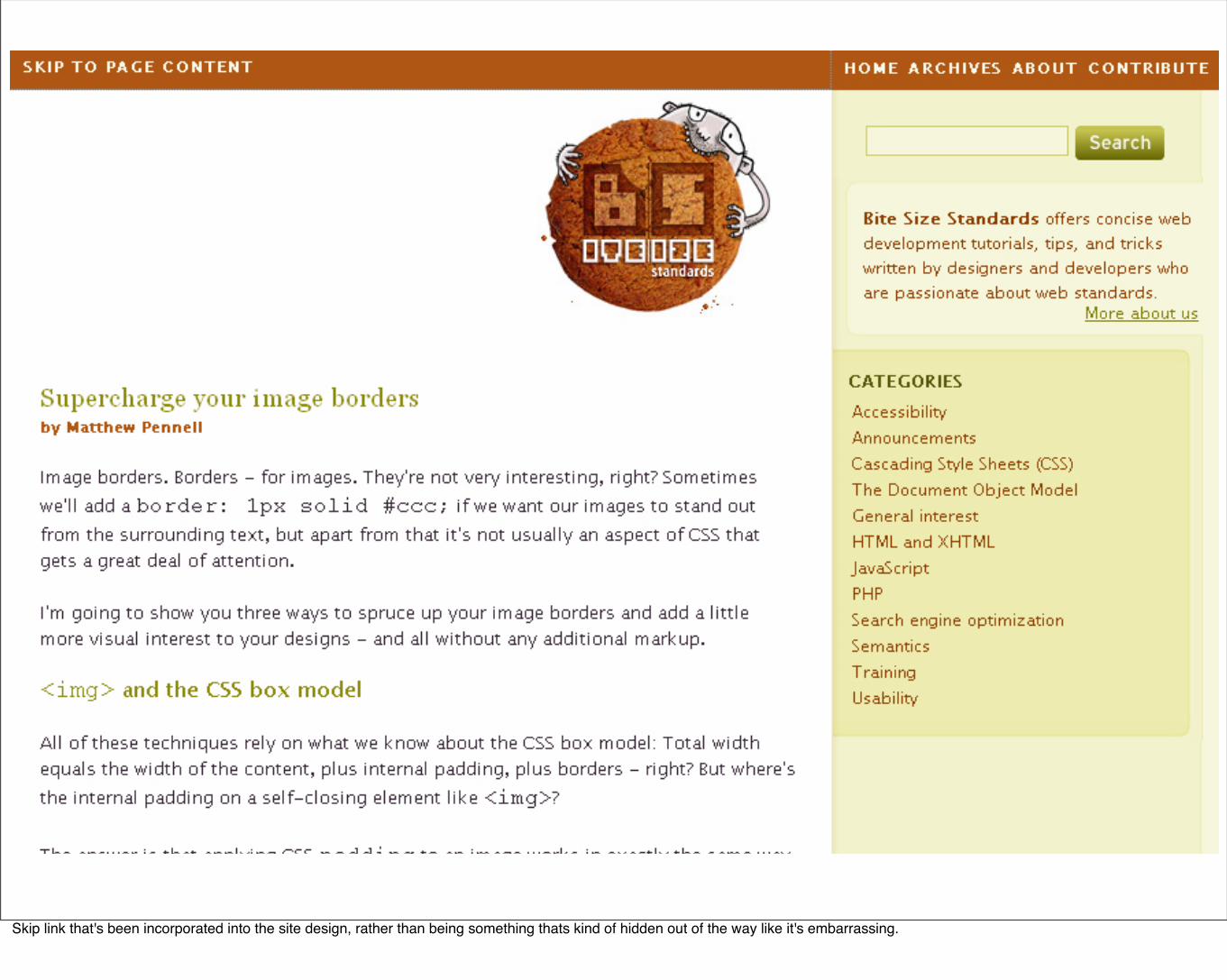
Skip link that's been incorporated into the site design, rather than being something thats kind of hidden out of the way like it's embarrassing.
5. Create beautiful websites
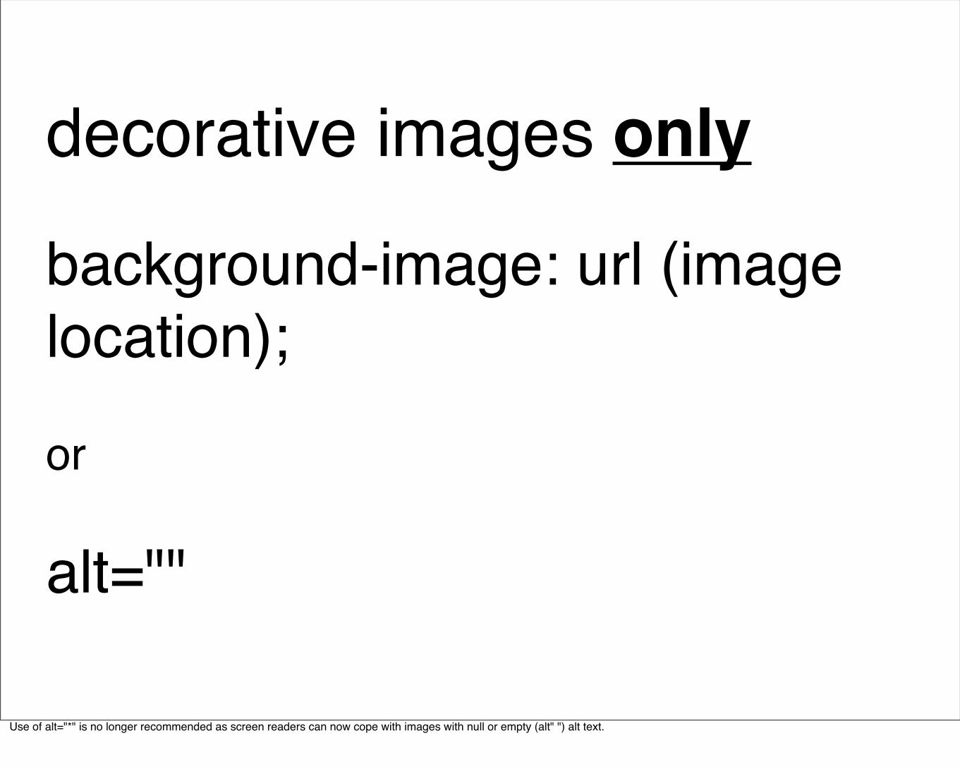
decorative images only
background-image: url (image location);
or
alt=""
Use of alt="*" is no longer recommended as screen readers can now cope with images with null or empty (alt" ") alt text.
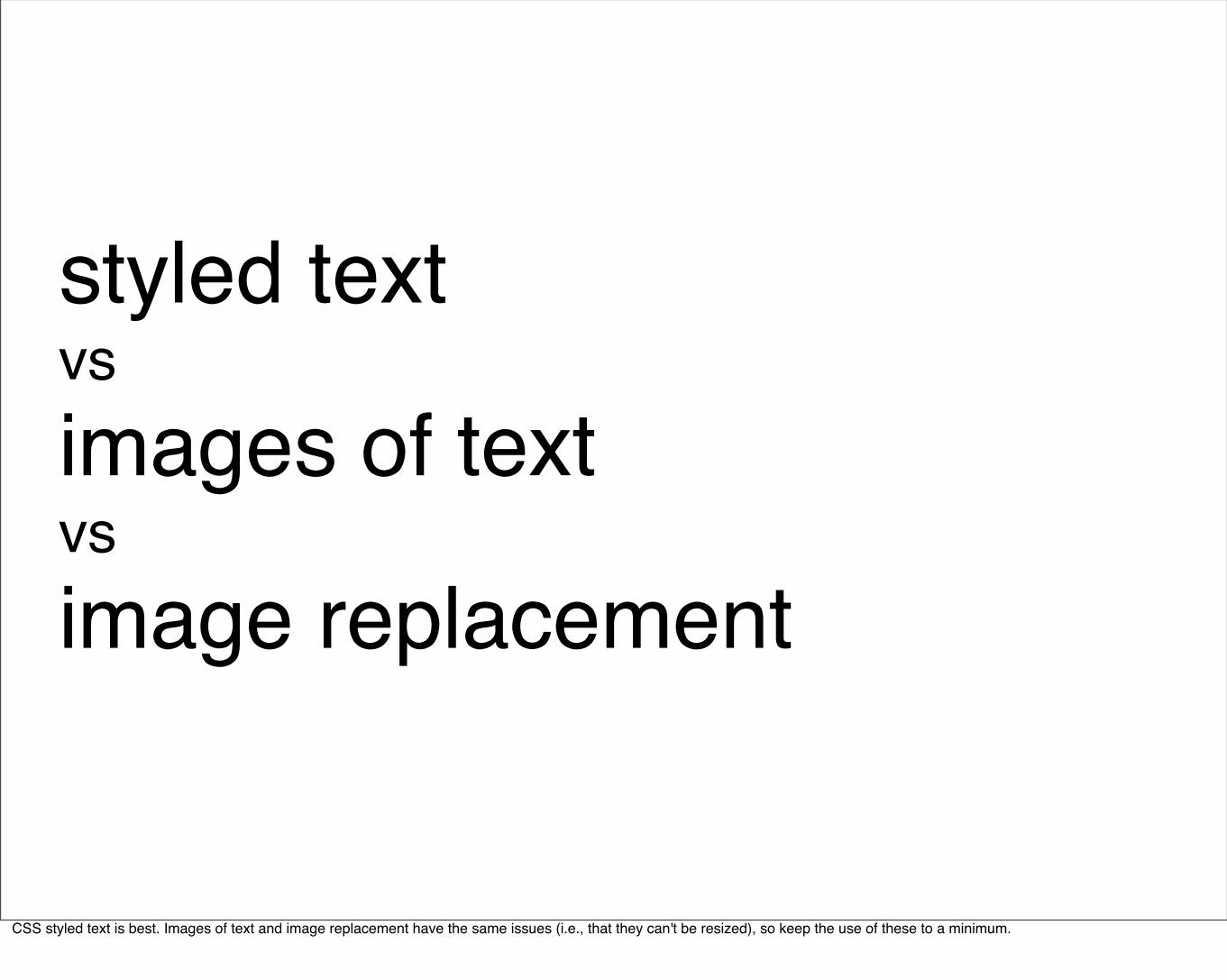
styled textvsimages of textvsimage replacement
CSS styled text is best. Images of text and image replacement have the same issues (i.e., that they can't be resized), so keep the use of these to a minimum.
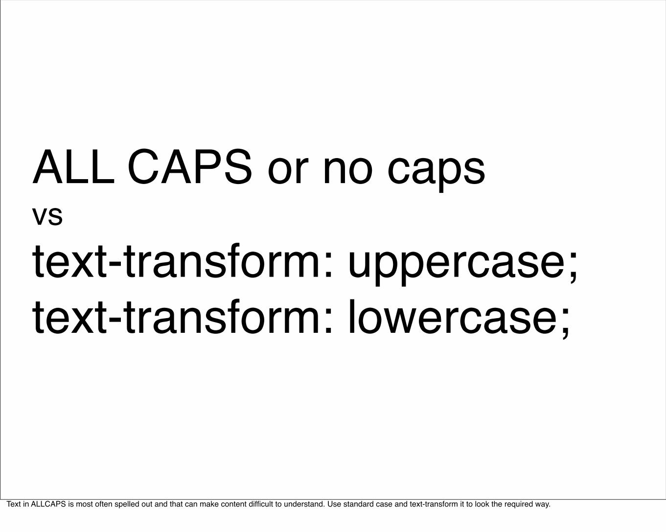
ALL CAPS or no capsvstext-transform: uppercase;text-transform: lowercase;
Text in ALLCAPS is most often spelled out and that can make content difficult to understand. Use standard case and text-transform it to look the required way.
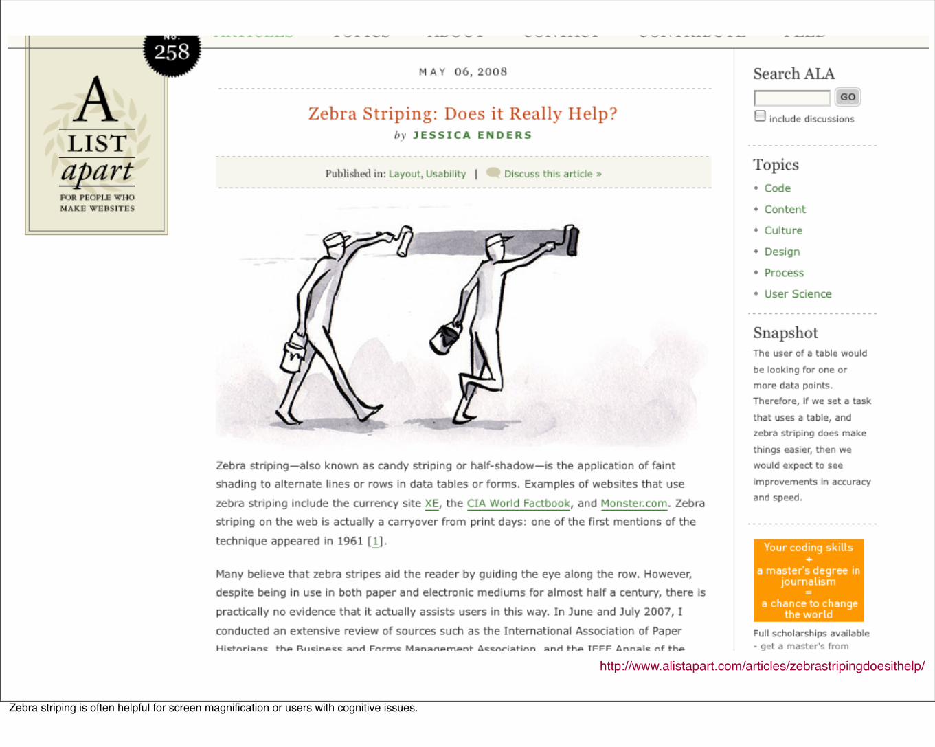
http://www.alistapart.com/articles/zebrastripingdoesithelp/
Zebra striping is often helpful for screen magnification or users with cognitive issues.
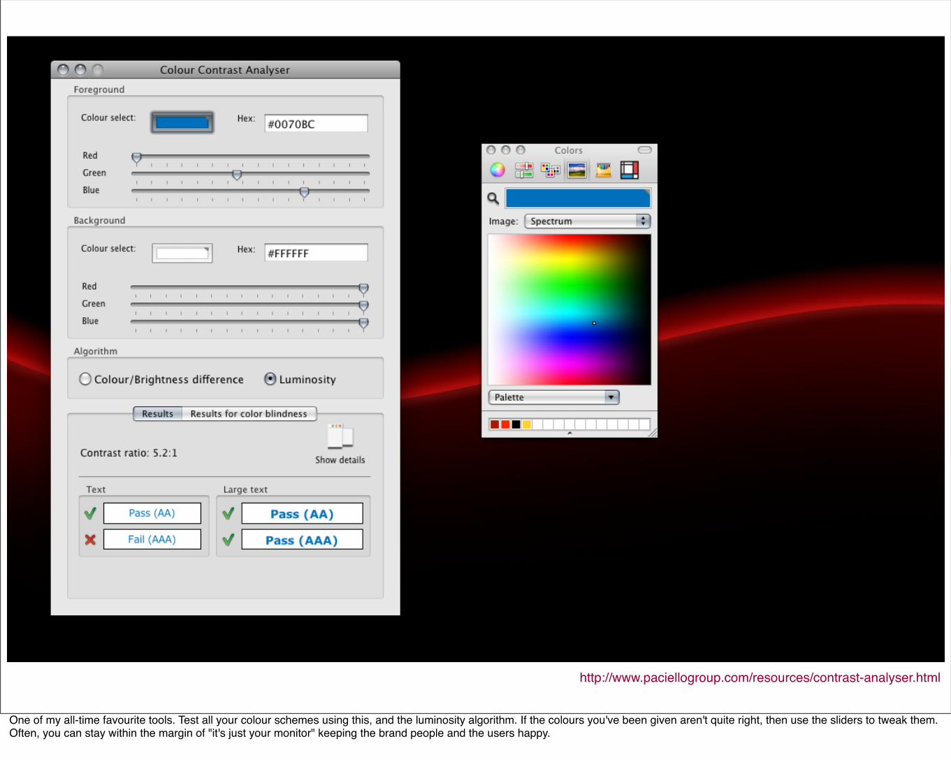
http://www.paciellogroup.com/resources/contrast-analyser.html
One of my all-time favourite tools. Test all your colour schemes using this, and the luminosity algorithm. If the colours you've been given aren't quite right, then use the sliders to tweak them. Often, you can stay within the margin of "it's just your monitor" keeping the brand people and the users happy.
Design without Accessibility
Accessibilitywithout
Creativity
The ultimate goal
Happy Users!http://www.flickr.com/photos/purrr/126597849/