UNHCR 2017, IM/Reporting Unit 1 Welcome to the wonderful world of Geographical Information Systems (GIS). In this module, we introduce the QGIS itself, as well as explaining the user interface, how to import data, and create simple maps. After completing this section, you will be able to correctly identify the main elements of the screen in QGIS and know what each of them does, and load a shapefile into QGIS. WHAT IS QGIS? QGIS is an open source geographic information system software. It runs on Windows, Mac OS X, and Linux. QGIS is a user-friendly GIS, providing common functions and features; also a free, collaborative, cross-platform software that is constantly developing by QGIS community. WHAT ARE THE STEPS OF THIS GUIDE? Steps of the tutorial are designed to create a simple and clean map. • Brief introduction on user interface, functions of the software • Open geographical data. • Change projection • Import a spreadsheet • Join a spreadsheet to a geographical data • Styling the map • Creating a legend, titles and other graphical adjustments • Export in different formats FIRST THINGS FIRST 1. INSTALLING QGIS You can download setup for file for QGIS using following link: https://www.qgis.org/en/site/index.html After downloading the setup file, execute the file and install the software simply clicking “Next” for all dialog options. 2. DOWNLOAD COMMON OPERATIONAL DATASET CODs are core sets of data to be used in GIS software. Set includes administrative boundaries, populated places, road and river infrastructure of the country. You can download Turkey COD using following link. https://www.dropbox.com/sh/kii88grrwzu3cth/AADaGI0jDy5YtoUDNq9J13bSa?dl=0 3. DOWNLOAD PROVINCIAL BREAKDOWN DATA OF SYRIAN INDIVIDUALS Data, created by DGMM, downloadable also from our IM Toolkit (link provided below). Includes province names, related p-codes and population of Syrian Individuals. Link 4. REMEMBER GIS DATA MODELS Vector data model: A representation of the world using vertices or points, connected vertices or lines, and closed connected vertices or polygons. We will use the data of administrative boundaries and province centers. Raster data model: A representation of the world as a surface divided into a regular grid of cells such as a satellite image or an elevation surface. We will use a basemap from OpenStreet Maps to visualize our map in a good way. MAPPING WITH QGIS FOR HUMANITARIAN USE
Transcript
UNHCR 2017, IM/Reporting Unit 1
Welcome to the wonderful world of Geographical Information Systems (GIS). In this module, we introduce the QGIS itself, as well as explaining the user interface, how to import data, and create simple maps. After completing this section, you will be able to correctly identify the main elements of the screen in QGIS and know what each of them does, and load a shapefile into QGIS.
WHAT IS QGIS? QGIS is an open source geographic information system software. It runs on Windows, Mac OS X, and Linux. QGIS is a user-friendly GIS, providing common functions and features; also a free, collaborative, cross-platform software that is constantly developing by QGIS community.
WHAT ARE THE STEPS OF THIS GUIDE? Steps of the tutorial are designed to create a simple and clean map.
• Brief introduction on user interface, functions of the software• Open geographical data.• Change projection• Import a spreadsheet• Join a spreadsheet to a geographical data• Styling the map• Creating a legend, titles and other graphical adjustments• Export in different formats
FIRST THINGS FIRST
1. INSTALLING QGIS
You can download setup for file for QGIS using following link: https://www.qgis.org/en/site/index.html
After downloading the setup file, execute the file and install the software simply clicking “Next” for all dialog options.
2. DOWNLOAD COMMON OPERATIONAL DATASET
CODs are core sets of data to be used in GIS software. Set includes administrative boundaries, populated places, road and
3. DOWNLOAD PROVINCIAL BREAKDOWN DATA OF SYRIAN INDIVIDUALS
Data, created by DGMM, downloadable also from our IM Toolkit (link provided below).
Includes province names, related p-codes and population of Syrian Individuals. Link
4. REMEMBER GIS DATA MODELS
Vector data model: A representation of the world using vertices or points, connected vertices or lines, and closed connected vertices or polygons. We will use the data of administrative boundaries and province centers. Raster data model: A representation of the world as a surface divided into a regular grid of cells such as a satellite image or an elevation surface. We will use a basemap from OpenStreet Maps to visualize our map in a good way.
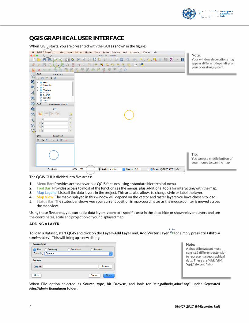
QGIS GRAPHICAL USER INTERFACE When QGIS starts, you are presented with the GUI as shown in the figure:
The QGIS GUI is divided into five areas:
1. Menu Bar: Provides access to various QGIS features using a standard hierarchical menu. 2. Tool Bar: Provides access to most of the functions as the menus, plus additional tools for interacting with the map. 3. Map Legend: Lists all the data layers in the project. This area also allows to change style or label the layer.4. Map View: The map displayed in this window will depend on the vector and raster layers you have chosen to load.5. Status Bar: The status bar shows you your current position in map coordinates as the mouse pointer is moved across
the map view.
Using these five areas, you can add a data layers, zoom to a specific area in the data, hide or show relevant layers and see the coordinates, scale and projection of your displayed map.
ADDING A LAYER
To load a dataset, start QGIS and click on the Layer>Add Layer and, Add Vector Layer or simply press ctrl+shift+v (cmd+shift+v). This will bring up a new dialog:
When File option selected as Source type, hit Browse, and look for “tur_polbnda_adm1.shp” under Separated Files/Admin_Boundaries folder.
Note: Your window decorations may appear different depending on your operating system.
Tip: You can use middle button of your mouse to pan the map.
Note: A shapefile dataset must consist 5 different extension to represent a geographical data. These are *dbf, *dbf, *qpj, *sbx and *shp.
UNHCR 2017, IM/Reporting Unit 3
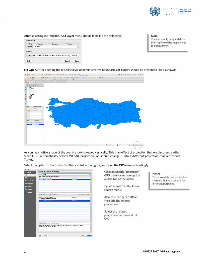
After selecting the *shp file, Add Layer menu should look line the following:
Hit Open. After opening the file, first level of administrative boundaries of Turkey should be presented like as shown:
As you may notice, shape of the country looks skewed vertically. This is an effect of projection that we discussed earlier. Since QGIS automatically selects WGS84 projection, we should change it into a different projection that represents Turkey.
Select the option in the Status Bar that circled in the figure, and open the CRS menu accordingly.
Note: You can simply drag and drop the *shp file to the map canvas to open a layer.
Note: There are different projection systems that you can use for different purposes.
Click on Enable “on the fly” CRS transformation option on the top of the menu. Type “Pseudo” in the Filter search menu. Also, you can type “3857”, the code the related projection. Select the related projection system and hit OK.
UNHCR 2017, IM/Reporting Unit 4
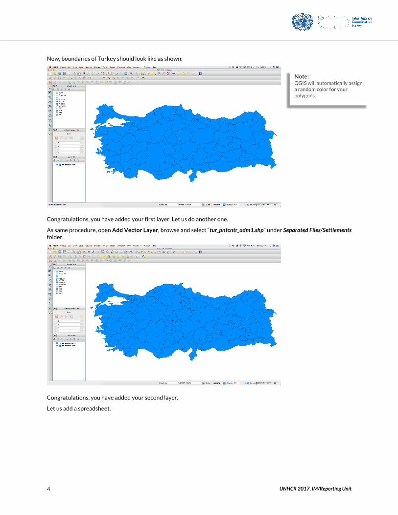
Now, boundaries of Turkey should look like as shown:
Congratulations, you have added your first layer. Let us do another one.
As same procedure, open Add Vector Layer, browse and select “tur_pntcntr_adm1.shp” under Separated Files/Settlements folder.
Congratulations, you have added your second layer.
Let us add a spreadsheet.
Note: QGIS will automatically assign a random color for your polygons.
UNHCR 2017, IM/Reporting Unit 5
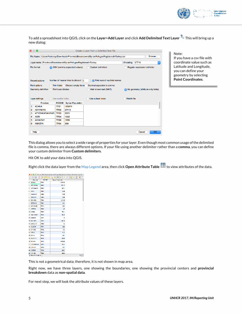
To add a spreadsheet into QGIS, click on the Layer>Add Layer and click Add Delimited Text Layer This will bring up a new dialog:
This dialog allows you to select a wide range of properties for your layer. Even though most common usage of the delimited file is comma, there are always different options. If your file using another delimiter rather than a comma, you can define your custom delimiter from Custom delimiters.
Hit OK to add your data into QGIS.
Right click the data layer from the Map Legend area, then click Open Attribute Table to view attributes of the data.
This is not a geometrical data; therefore, it is not shown in map area.
Right now, we have three layers, one showing the boundaries, one showing the provincial centers and provincial breakdown data as non-spatial data.
For next step, we will look the attribute values of these layers.
Note: If you have a csv file with coordinate value such as Latitude and Longitude, you can define your geometry by selecting Point Coordinates.
UNHCR 2017, IM/Reporting Unit 6
ATTRIBUTE DATA
As we discussed earlier, attributes of the data refer to the properties of spatial entities such as identity, province name or another specific information. They are often referred as non-spatial data since they do not in themselves represent location information.
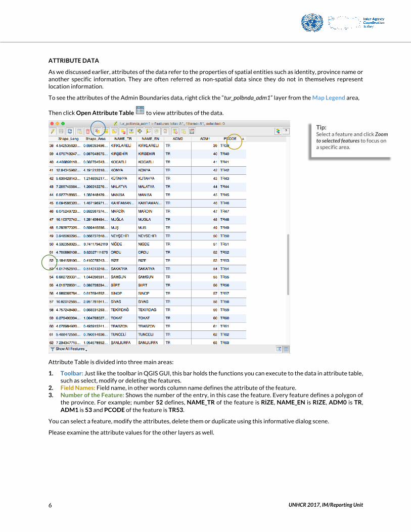
To see the attributes of the Admin Boundaries data, right click the “tur_polbnda_adm1” layer from the Map Legend area,
Then click Open Attribute Table to view attributes of the data.
Attribute Table is divided into three main areas:
1. Toolbar: Just like the toolbar in QGIS GUI, this bar holds the functions you can execute to the data in attribute table, such as select, modify or deleting the features.
2. Field Names: Field name, in other words column name defines the attribute of the feature. 3. Number of the Feature: Shows the number of the entry, in this case the feature. Every feature defines a polygon of
the province. For example; number 52 defines, NAME_TR of the feature is RİZE, NAME_EN is RIZE, ADM0 is TR, ADM1 is 53 and PCODE of the feature is TR53.
You can select a feature, modify the attributes, delete them or duplicate using this informative dialog scene.
Please examine the attribute values for the other layers as well.
Tip: Select a feature and click Zoom to selected features to focus on a specific area.
UNHCR 2017, IM/Reporting Unit 7
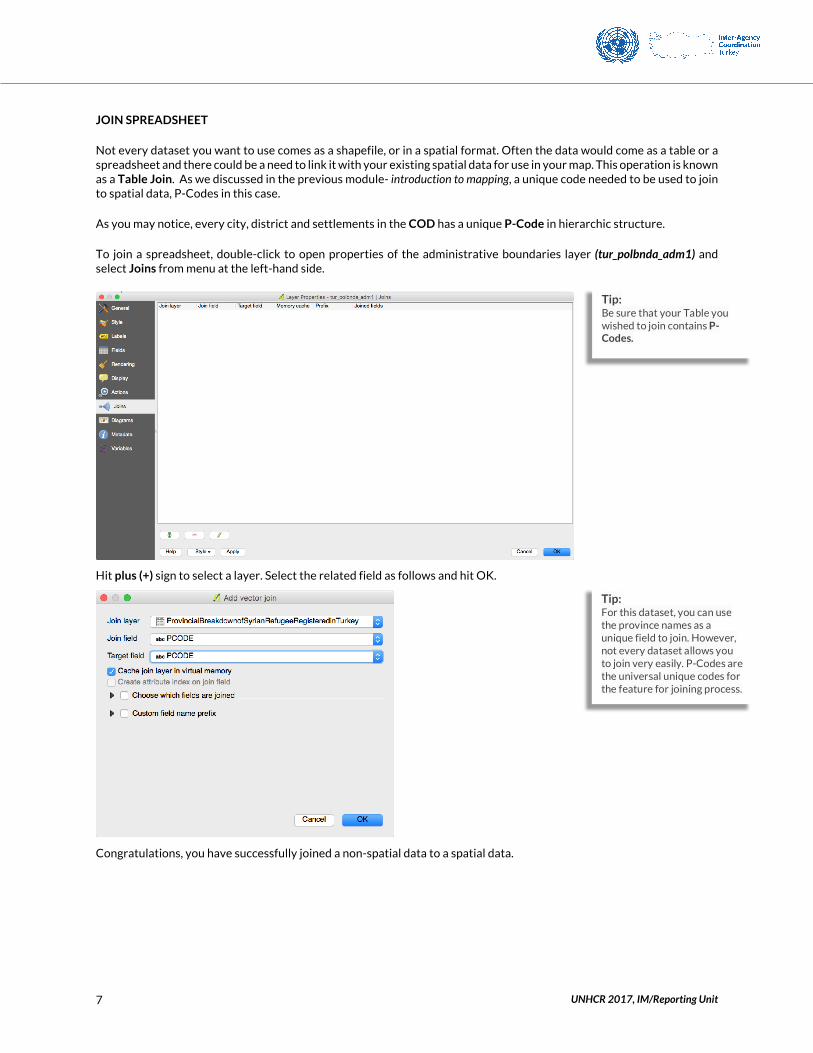
JOIN SPREADSHEET
Not every dataset you want to use comes as a shapefile, or in a spatial format. Often the data would come as a table or a spreadsheet and there could be a need to link it with your existing spatial data for use in your map. This operation is known as a Table Join. As we discussed in the previous module- introduction to mapping, a unique code needed to be used to join to spatial data, P-Codes in this case.
As you may notice, every city, district and settlements in the COD has a unique P-Code in hierarchic structure.
To join a spreadsheet, double-click to open properties of the administrative boundaries layer (tur_polbnda_adm1) and select Joins from menu at the left-hand side.
Hit plus (+) sign to select a layer. Select the related field as follows and hit OK.
Congratulations, you have successfully joined a non-spatial data to a spatial data.
Tip: For this dataset, you can use the province names as a unique field to join. However, not every dataset allows you to join very easily. P-Codes are the universal unique codes for the feature for joining process.
Tip: Be sure that your Table you wished to join contains P-Codes.
UNHCR 2017, IM/Reporting Unit 8
STYLING
Now let us work on styling to reflect the population data to the map. Double-click to the administrative boundaries layer to open the properties.
• Select Style from left-hand menu • Select Graduated from the top dropdown menu • Select ProvincialBreakdownofSyrianRegistered in column menu • Select a color ramp you like from color ramp menu • Select Quantile (Equal Count) from Mode and select classes (we choose 8) in classes menu • Hit classify • Change the values to how you think meaningful (we set the range 1,000 – 5,000 – 10,000 – 20,000 – 50,000 –
100,000 – 250,000) • Hit okay to see your map!
This is a choropleth map, showing highly dense provinces according to the Syrian population.
Note: If Column option does not allow you to select the related field, try Add Delimited Layer from the Menu Bar.
Tip: Choropleth maps works well with ranged set of data.
UNHCR 2017, IM/Reporting Unit 9
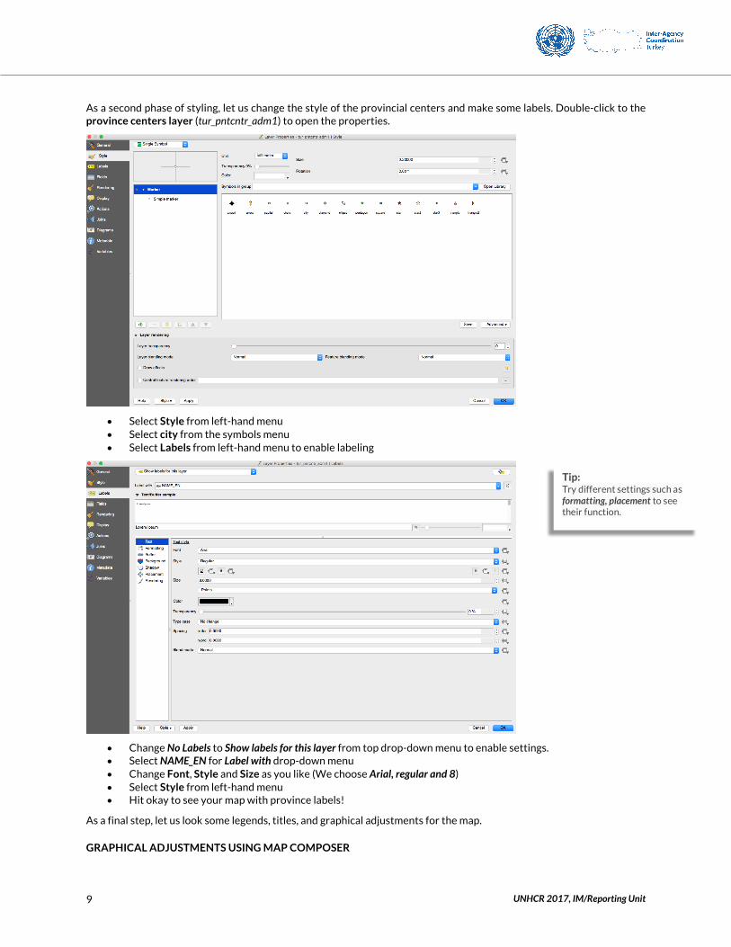
As a second phase of styling, let us change the style of the provincial centers and make some labels. Double-click to the province centers layer (tur_pntcntr_adm1) to open the properties.
• Select Style from left-hand menu • Select city from the symbols menu • Select Labels from left-hand menu to enable labeling
• Change No Labels to Show labels for this layer from top drop-down menu to enable settings. • Select NAME_EN for Label with drop-down menu • Change Font, Style and Size as you like (We choose Arial, regular and 8) • Select Style from left-hand menu • Hit okay to see your map with province labels!
As a final step, let us look some legends, titles, and graphical adjustments for the map.
GRAPHICAL ADJUSTMENTS USING MAP COMPOSER
Tip: Try different settings such as formatting, placement to see their function.
UNHCR 2017, IM/Reporting Unit 10
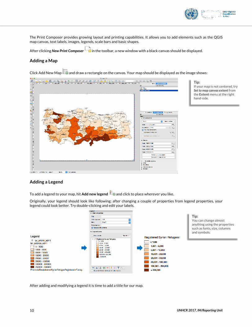
The Print Composer provides growing layout and printing capabilities. It allows you to add elements such as the QGIS map canvas, text labels, images, legends, scale bars and basic shapes.
After clicking New Print Composer in the toolbar, a new window with a black canvas should be displayed.
Adding a Map
Click Add New Map and draw a rectangle on the canvas. Your map should be displayed as the image shows:
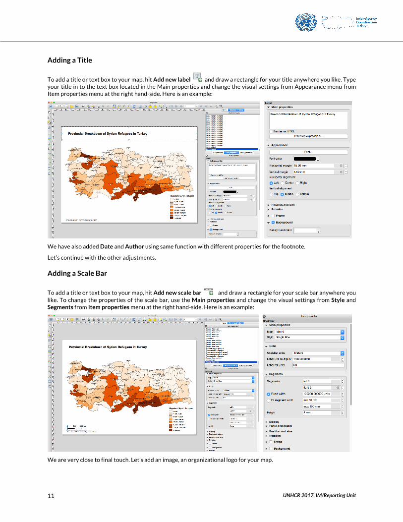
Adding a Legend
To add a legend to your map, hit Add new legend and click to place wherever you like.
Originally, your legend should look like following; after changing a couple of properties from legend properties, your legend could look better. Try double-clicking and edit your labels.
After adding and modifying a legend it is time to add a title for our map.
Tip: If your map is not centered, try Set to map canvas extent from the Extent menu at the right hand-side.
Tip: You can change almost anything using the properties such as fonts, size, columns and symbols.
UNHCR 2017, IM/Reporting Unit 11
Adding a Title
To add a title or text box to your map, hit Add new label and draw a rectangle for your title anywhere you like. Type your title in to the text box located in the Main properties and change the visual settings from Appearance menu from Item properties menu at the right hand-side. Here is an example:
We have also added Date and Author using same function with different properties for the footnote.
Let’s continue with the other adjustments.
Adding a Scale Bar
To add a title or text box to your map, hit Add new scale bar and draw a rectangle for your scale bar anywhere you like. To change the properties of the scale bar, use the Main properties and change the visual settings from Style and Segments from Item properties menu at the right hand-side. Here is an example:
We are very close to final touch. Let’s add an image, an organizational logo for your map.
UNHCR 2017, IM/Reporting Unit 12
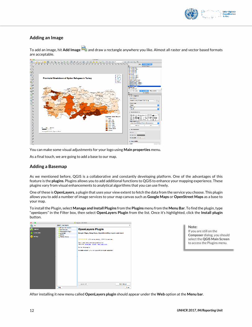
Adding an Image
To add an image, hit Add Image and draw a rectangle anywhere you like. Almost all raster and vector based formats are acceptable.
You can make some visual adjustments for your logo using Main properties menu. As a final touch, we are going to add a base to our map.
Adding a Basemap
As we mentioned before, QGIS is a collaborative and constantly developing platform. One of the advantages of this feature is the plugins. Plugins allows you to add additional functions to QGIS to enhance your mapping experience. These plugins vary from visual enhancements to analytical algorithms that you can use freely.
One of these is OpenLayers, a plugin that uses your view extent to fetch the data from the service you choose. This plugin allows you to add a number of image services to your map canvas such as Google Maps or OpenStreet Maps as a base to your map.
To install the Plugin, select Manage and Install Plugins from the Plugins menu from the Menu Bar. To find the plugin, type “openlayers” in the Filter box, then select OpenLayers Plugin from the list. Once it’s highlighted, click the Install plugin button.
After installing it new menu called OpenLayers plugin should appear under the Web option at the Menu bar.
Note: If you are still on the Composer dialog, you should select the QGIS Main Screen to access the Plugins menu.
UNHCR 2017, IM/Reporting Unit 13
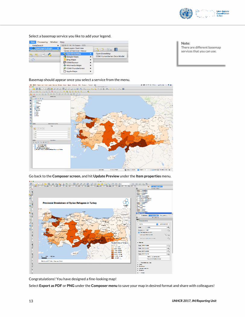
Select a basemap service you like to add your legend.
Basemap should appear once you select a service from the menu.
Go back to the Composer screen, and hit Update Preview under the Item properties menu.
Congratulations! You have designed a fine-looking map!
Select Export as PDF or PNG under the Composer menu to save your map in desired format and share with colleagues!
Note: There are different basemap services that you can use.
UNHCR 2017, IM/Reporting Unit 14
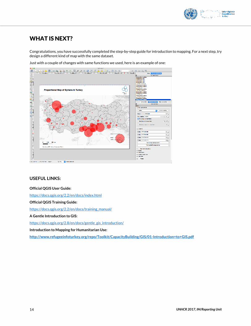
WHAT IS NEXT?
Congratulations, you have successfully completed the step-by-step guide for introduction to mapping. For a next step, try design a different kind of map with the same dataset.
Just with a couple of changes with same functions we used, here is an example of one: