12
Market Research
| Date post: | 05-Aug-2015 |
| Category: |
Education |
| Upload: | tordcarlin |
| View: | 32 times |
| Download: | 0 times |

Market Research
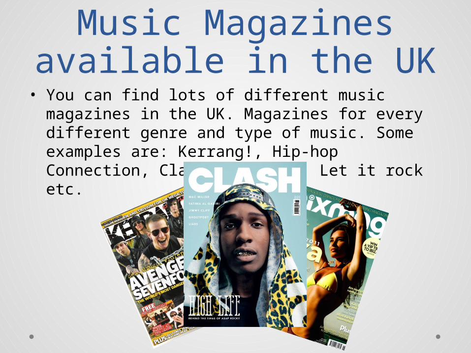
Music Magazines available in the UK
• You can find lots of different music magazines in the UK. Magazines for every different genre and type of music. Some examples are: Kerrang!, Hip-hop Connection, Clash, The Wire, Let it rock etc.
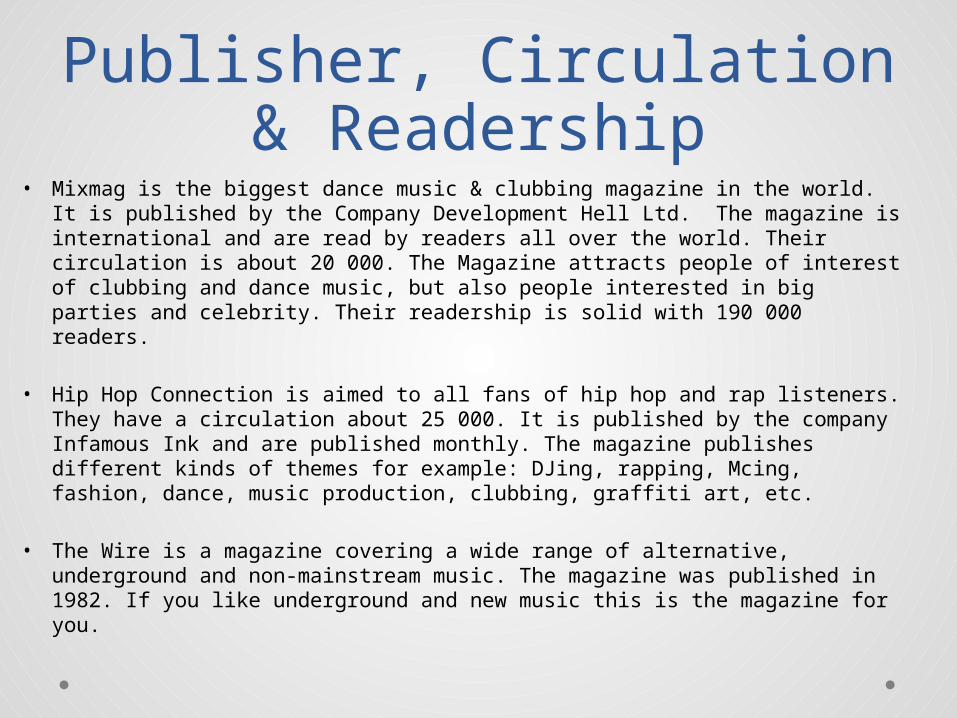
Publisher, Circulation & Readership
• Mixmag is the biggest dance music & clubbing magazine in the world. It is published by the Company Development Hell Ltd. The magazine is international and are read by readers all over the world. Their circulation is about 20 000. The Magazine attracts people of interest of clubbing and dance music, but also people interested in big parties and celebrity. Their readership is solid with 190 000 readers.
• Hip Hop Connection is aimed to all fans of hip hop and rap listeners. They have a circulation about 25 000. It is published by the company Infamous Ink and are published monthly. The magazine publishes different kinds of themes for example: DJing, rapping, Mcing, fashion, dance, music production, clubbing, graffiti art, etc.
• The Wire is a magazine covering a wide range of alternative, underground and non-mainstream music. The magazine was published in 1982. If you like underground and new music this is the magazine for you.
MixmagTextual Analysis
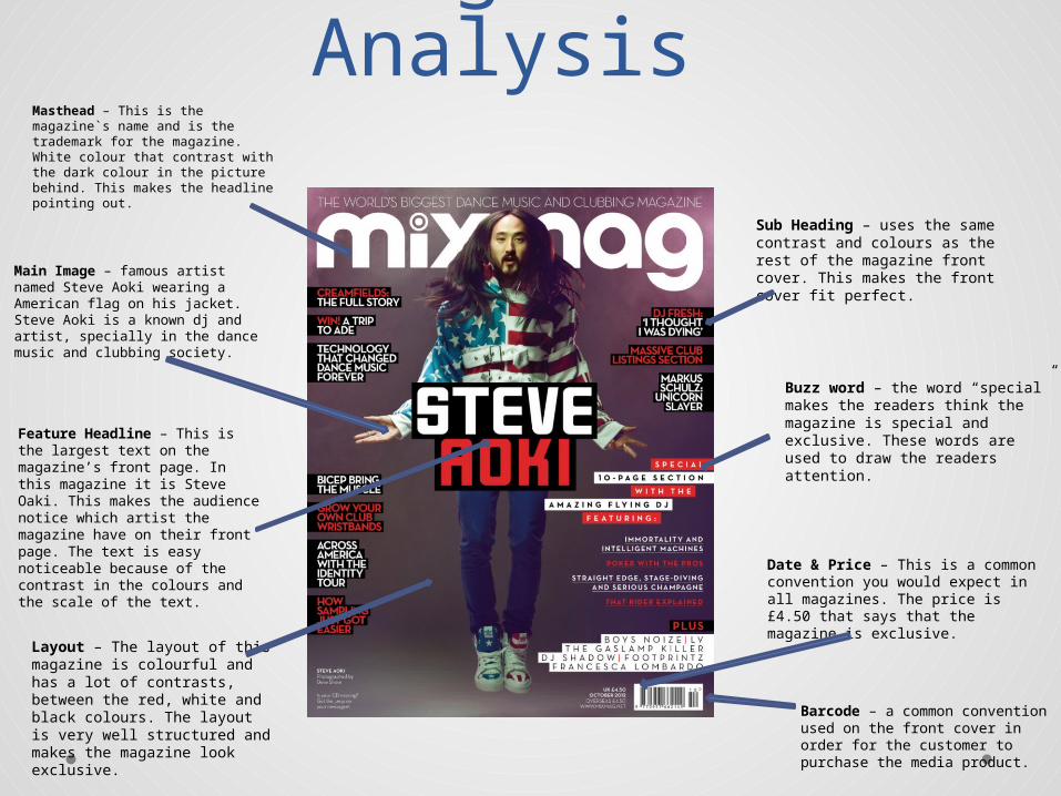
Main Image – famous artist named Steve Aoki wearing a American flag on his jacket. Steve Aoki is a known dj and artist, specially in the dance music and clubbing society.
Masthead – This is the magazine`s name and is the trademark for the magazine. White colour that contrast with the dark colour in the picture behind. This makes the headline pointing out.
Date & Price – This is a commonconvention you would expect in all magazines. The price is £4.50 that says that the magazine is exclusive.
Barcode – a common convention used on the front cover in order for the customer to purchase the media product.
Layout – The layout of this magazine is colourful and has a lot of contrasts, between the red, white and black colours. The layout is very well structured and makes the magazine look exclusive.
Buzz word – the word “special” makes the readers think the magazine is special and exclusive. These words are used to draw the readers attention.
Feature Headline – This is the largest text on the magazine’s front page. In this magazine it is Steve Oaki. This makes the audience notice which artist the magazine have on their front page. The text is easy noticeable because of the contrast in the colours and the scale of the text.
Sub Heading – uses the same contrast and colours as the rest of the magazine front cover. This makes the front cover fit perfect.
Mixmag Double
Page Spread
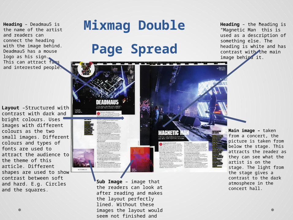
Layout –Structured with contrast with dark and bright colours. Uses images with different colours as the two small images. Different colours and types of fonts are used to attract the audience to the theme of this article. Different shapes are used to show contrast between soft and hard. E.g. Circles and the squares.
Heading – the heading is “Magnetic Man” this is used as a description of something else. The heading is white and has contrast with the main image behind it.
Heading – Deadmau5 is the name of the artist and readers can connect the heading with the image behind. Deadmau5 has a mouse logo as his sign. This can attract fans and interested people.
Sub Image – image that the readers can look at after reading and makes the layout perfectly lined. Without these images the layout would seem not finished and empty.
Main image – taken from a concert, the picture is taken from below the stage. This attracts the reader as they can see what the artist is on the stage. The light from the stage gives a contrast to the dark atmosphere in the concert hall.
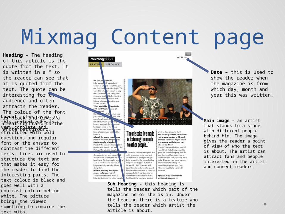
Mixmag Content page
Layout – The layout of this content page is very complete and structured with bold questions and regular font on the answer to contrast the different texts. Lines are used to structure the text and that makes it easy for the reader to find the interesting parts. The text colour is black and goes well with a contrast colour behind white. The picture brings the viewer something to combine the text with.
Heading – The heading of this article is the quote from the text. It is written in a “ so the reader can see that it is quoted from the text. The quote can be interesting for the audience and often attracts the reader. The colour of the font is black and gives a great contrast to the white background.
Main image – an artist that stands to a stage with different people behind him. The image gives the reader a point of view of who the text is about. The artist can attract fans and people interested in the artist and connect readers.
Date – this is used to show the reader when the magazine is from which day, month and year this was written.
Sub Heading – this heading is tells the reader which part of the magazine he or she is in. Under the heading there is a feature who tells the reader which artist the article is about.
Hip Hop Connection Textual
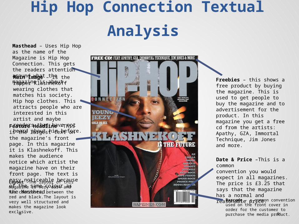
Analysis Masthead – Uses Hip Hop as the name of the Magazine is Hip Hop Connection. This gets the readers attention around what the magazine is about. Main Image – is the rapper Klashnekoff wearing clothes that matches his society. Hip hop clothes. This attracts people who are interested in this artist and maybe readers that have not heard about him before.
Date & Price –This is a commonconvention you would expect in all magazines. The price is £3.25 that says that the magazine has a normal and reasonable price.
Layout –The layout of this magazine is very dark and has contrasts, between the red and black.The layout is very well structured and makes the magazine look exclusive.
Barcode – a common convention used on the front cover in order for the customer to purchase the media product.
Feature Headline –This is the largest text on the magazine’s front page. In this magazine it is Klashnekoff. This makes the audience notice which artist the magazine have on their front page. The text is easy noticeable because of the same colour as the Masthead.
Freebies – this shows a free product by buying the magazine. This is used to get people to buy the magazine and to advertisement for the product. In this magazine you get a free cd from the artists: Apathy, GZA, Immortal Technique, Jim Jones and more.

Hip hop Connection Double Page
Spread
Main image – The main image is the famous rapper Baby J and this is taken as a close up of the artist. This attracts fans, people interested and readers to what the content of this article. The whole page is an image of the artist and this structures the layout of the pages.
Heading – Baby J is the heading on this page, he is a famous rapper artist and the heading attracts both fans and people interested in hip-hop/rap. The heading goes with a contrast of the background.
Layout – The layout is simple and very structured. One page is a whole picture of the artist which the other page is about. This gives the viewer one page to read on and one page to look at to see who they are reading about. The text is written in red and black and gives the reader a good contrast between what is what. The more important content like a quote from the text is written in red and the regular text is in black.
Drop caps – draws the attention of the reader to the start of the article on this page.
Date – this is used to show the reader when the magazine is from which day, month and year this was written.
Fact box – this is used to inform the reader about different stuff that may be important for the article.

Hip hop connection content page
Layout – The layout of this content page from Hip hop connection is has a lot of images and texts. It is structured in different lines and columns. You have contrasts between the white and red text. And you have as well a contrast between the box-text and the text written without a box.
Heading –this heading is the largest and the main heading on this page. This attracts the readers attention and tells them what the text is about. In this article the heading tells the reader that they are going to read about the book of the month.
Main image – The main image on this content page is the image of the girl laying on the ground with coloured trousers. The image tells the reader what the text in the box is about and in this text it is about the book of the month. Sub image – the sub images is the images that follows with the text in this article. They are there to attract the readers attention. They show what the text can be about and in this article its images of the artist and different other images.
Buzz word – words used to attract the readers attention, here you have “well read” and this attracts the readers to see what the article is about.
Drop caps – draws the attention of the reader to the start of the article on this page.
Fact box – this is used to inform the reader about different stuff that may be important for the article.

Wire Textual Analysis Masthead – Uses Wire as the name of magazine is Wire. This gets the readers attention around what the magazine is about. The masthead has a colour that contrasts with the background and main image.Main Image – is a unknown artist, this is what the magazine is about, music and rare artist and unknown people. The non-mainstream artist is known to be seen in this music magazine.
Layout –The layout of this magazine is very dark and has contrasts, between the light and dark. The layout is very well structured and makes the magazine look exclusive.
Date & Price –This is a commonconvention you would expect in all magazines. The price is £3.50 that says that the magazine has a normal and reasonable price.
Barcode – a common convention used on the front cover in order for the customer to purchase the media product.
Buzz word – the word “Sensational” makes the readers think the magazine is special and exclusive. These words are used to draw the readers attention.
Wire Double Page Spread
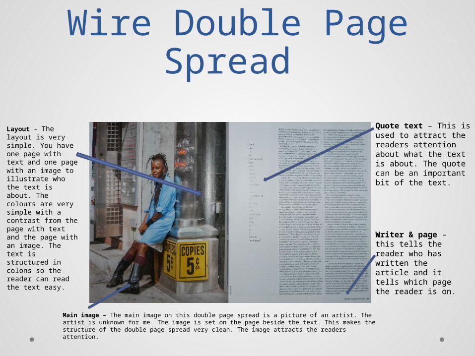
Main image – The main image on this double page spread is a picture of an artist. The artist is unknown for me. The image is set on the page beside the text. This makes the structure of the double page spread very clean. The image attracts the readers attention.
Layout – The layout is very simple. You have one page with text and one page with an image to illustrate who the text is about. The colours are very simple with a contrast from the page with text and the page with an image. The text is structured in colons so the reader can read the text easy.
Quote text – This is used to attract the readers attention about what the text is about. The quote can be an important bit of the text.
Writer & page – this tells the reader who has written the article and it tells which page the reader is on.
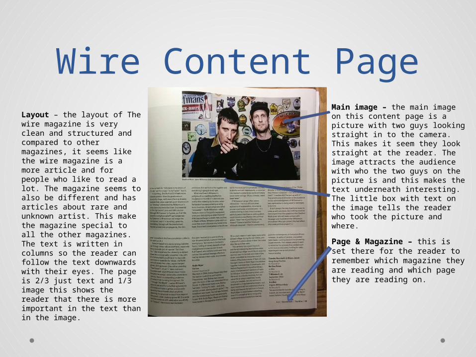
Wire Content PageLayout – the layout of The wire magazine is very clean and structured and compared to other magazines, it seems like the wire magazine is a more article and for people who like to read a lot. The magazine seems to also be different and has articles about rare and unknown artist. This make the magazine special to all the other magazines. The text is written in columns so the reader can follow the text downwards with their eyes. The page is 2/3 just text and 1/3 image this shows the reader that there is more important in the text than in the image.
Main image – the main image on this content page is a picture with two guys looking straight in to the camera. This makes it seem they look straight at the reader. The image attracts the audience with who the two guys on the picture is and this makes the text underneath interesting. The little box with text on the image tells the reader who took the picture and where.
Page & Magazine – this is set there for the reader to remember which magazine they are reading and which page they are reading on.


