12
Mastering the Art of Colours Knowing the terms which matter Part:2
| Date post: | 02-Jul-2015 |
| Category: |
Documents |
| Upload: | ecole-intuitlab-mumbai |
| View: | 174 times |
| Download: | 1 times |

Mastering the Art of ColoursKnowing the terms which matter
Part:2

IntroductionGetting your colours right means getting your head around some tricky terms. Checking the colours you see on screen are the same ones that are reproduced in your printed designs is fairly straightforward.
We bring you important terms which you must know as a designer.
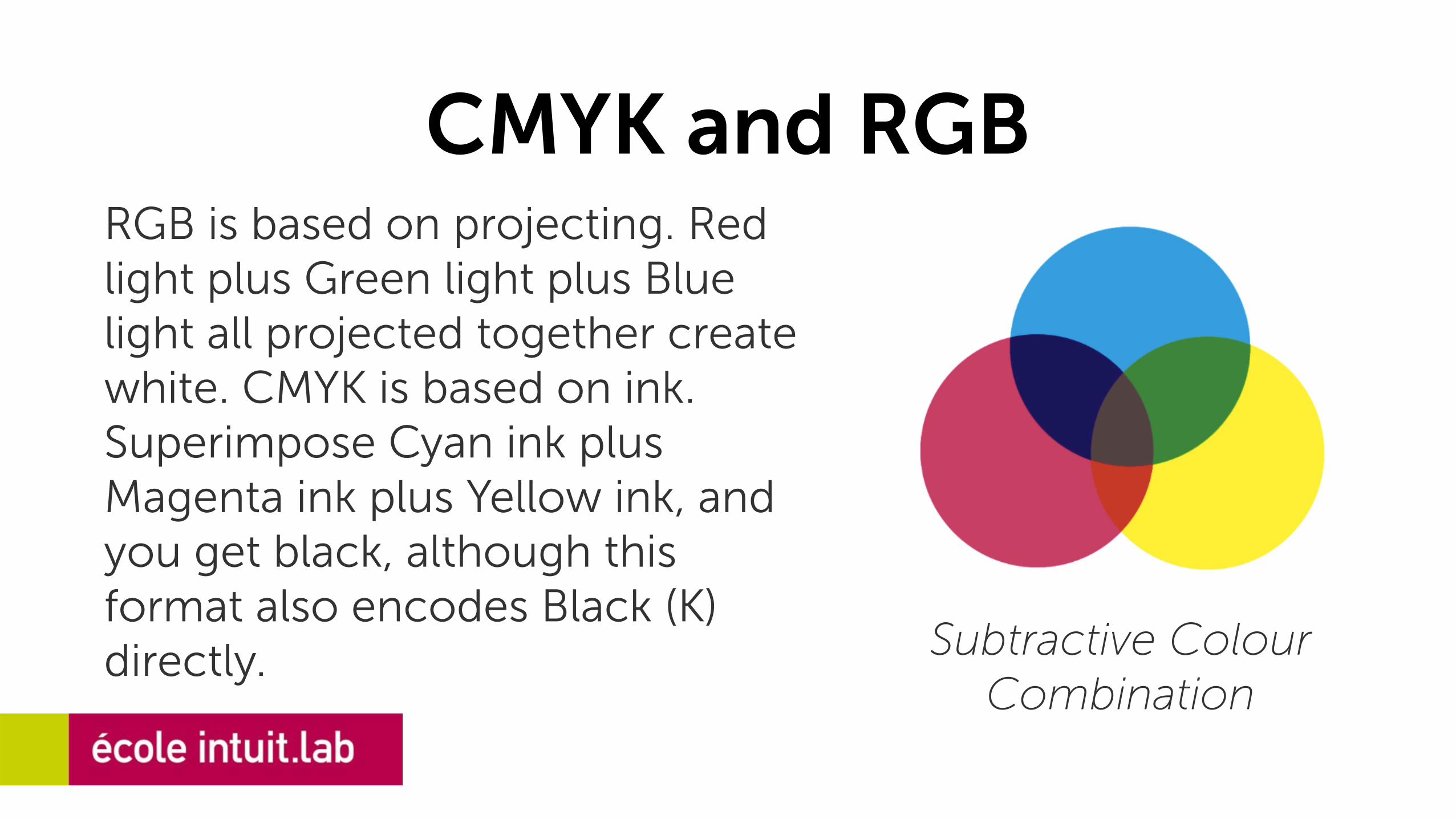
CMYK and RGBRGB is based on projecting. Red light plus Green light plus Blue light all projected together create white. CMYK is based on ink. Superimpose Cyan ink plus Magenta ink plus Yellow ink, and you get black, although this format also encodes Black (K) directly. Subtractive Colour
Combination

DPI and PPIDPI stands for 'Dots Per Inch' and refers to the number of dots per inch on a printed page. PPI refers to 'Pixels Per Inch' and is the number of pixels per inch in your image.
DPI PPI
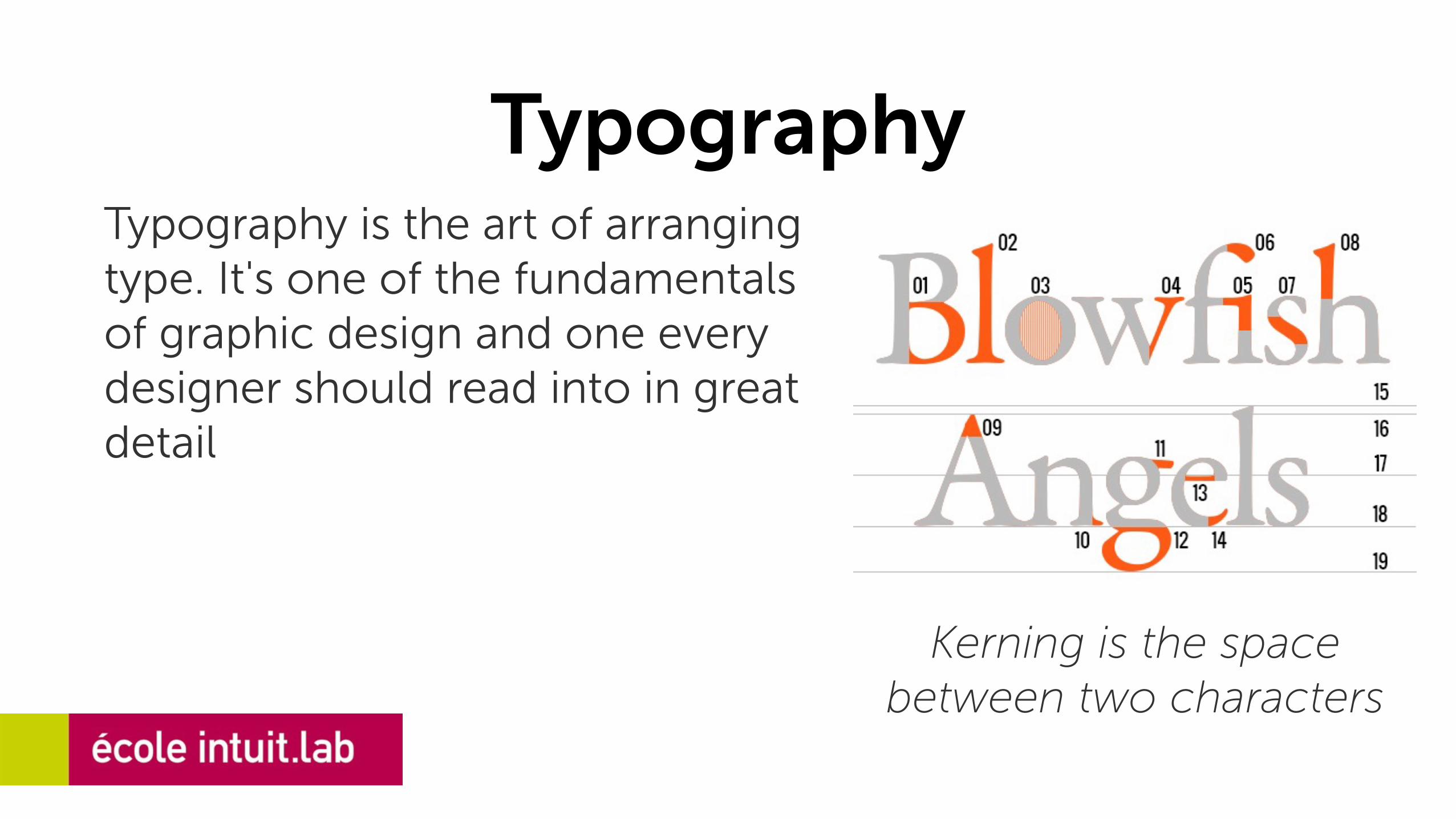
TypographyTypography is the art of arranging type. It's one of the fundamentals of graphic design and one every designer should read into in great detail
Kerning is the space between two characters
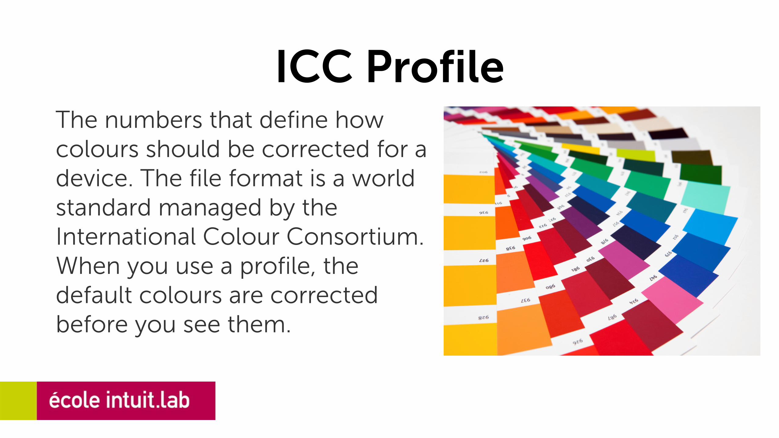
ICC ProfileThe numbers that define how colours should be corrected for a device. The file format is a world standard managed by the International Colour Consortium. When you use a profile, the default colours are corrected before you see them.
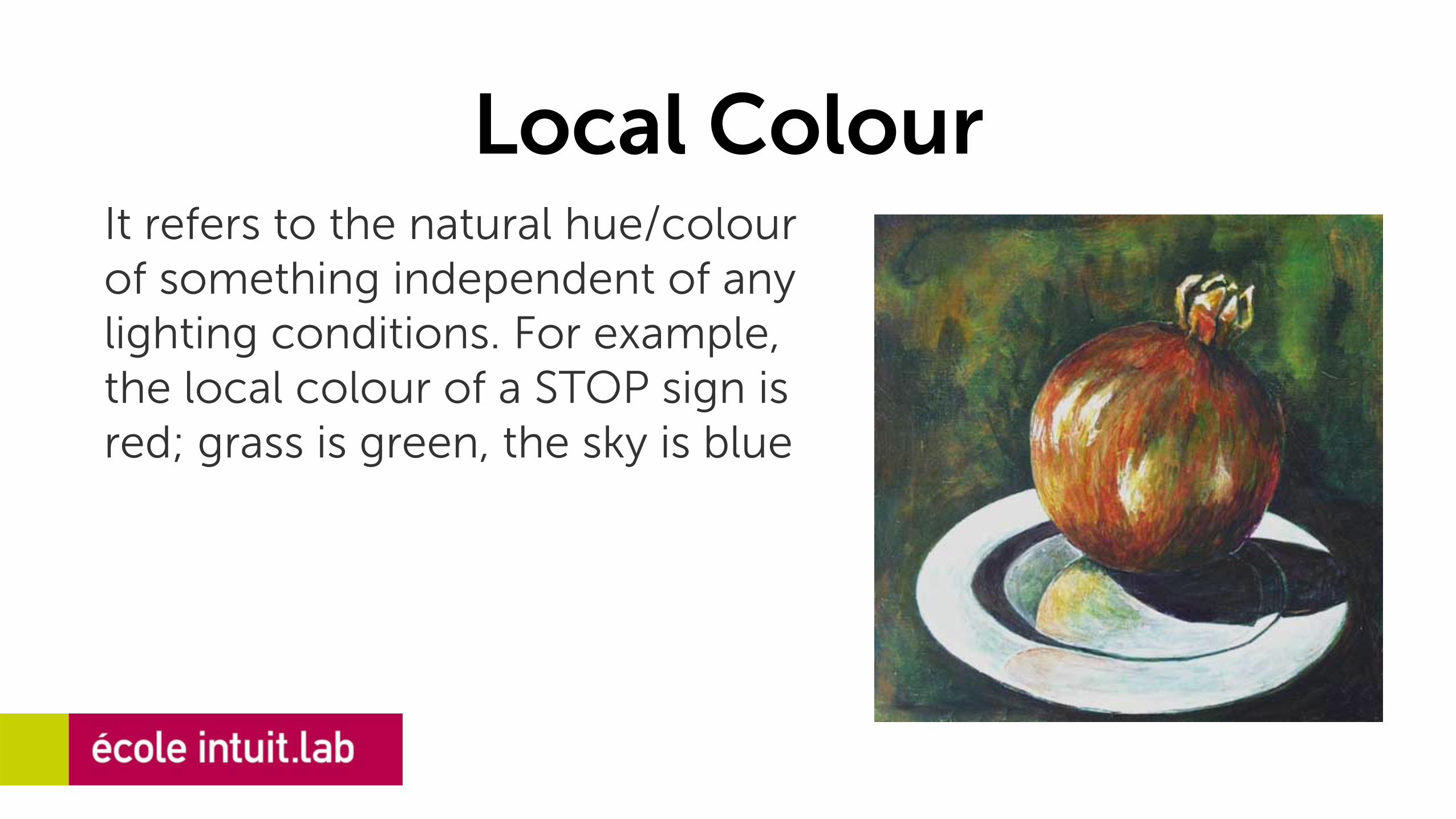
Local ColourIt refers to the natural hue/colour of something independent of any lighting conditions. For example, the local colour of a STOP sign is red; grass is green, the sky is blue
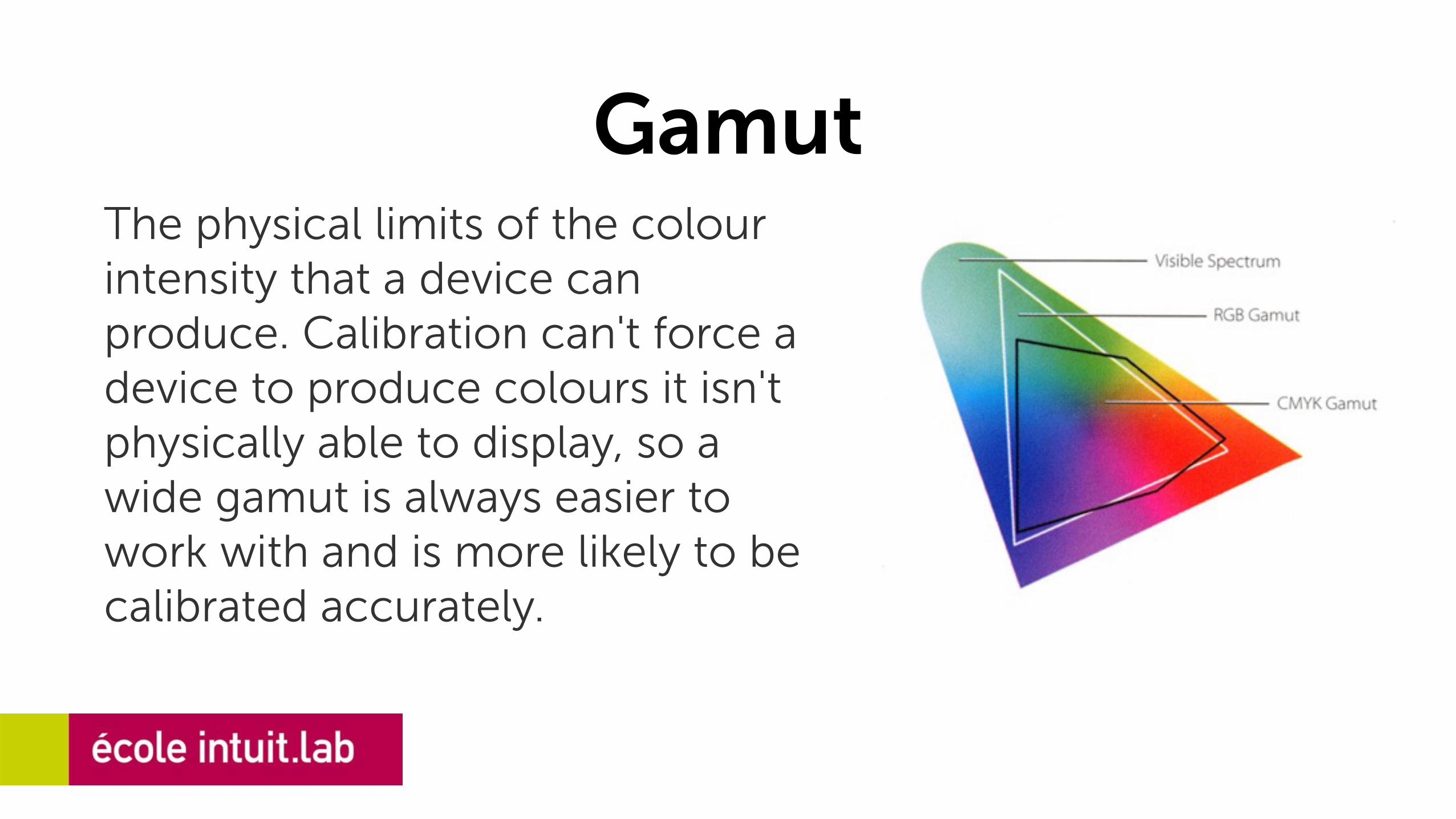
GamutThe physical limits of the colour intensity that a device can produce. Calibration can't force a device to produce colours it isn't physically able to display, so a wide gamut is always easier to work with and is more likely to be calibrated accurately.

Colour ContextRed appears more brilliant against a black background and somewhat duller against the white background. In contrast with orange, the red appears lifeless; in contrast with blue-green, it exhibits brilliance.
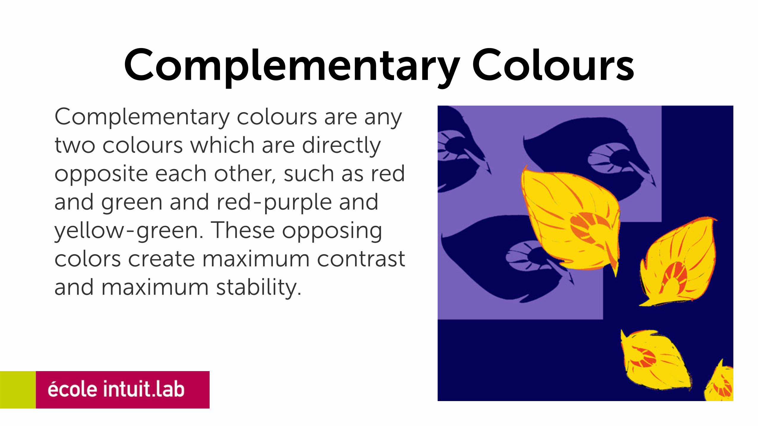
Complementary ColoursComplementary colours are any two colours which are directly opposite each other, such as red and green and red-purple and yellow-green. These opposing colors create maximum contrast and maximum stability.
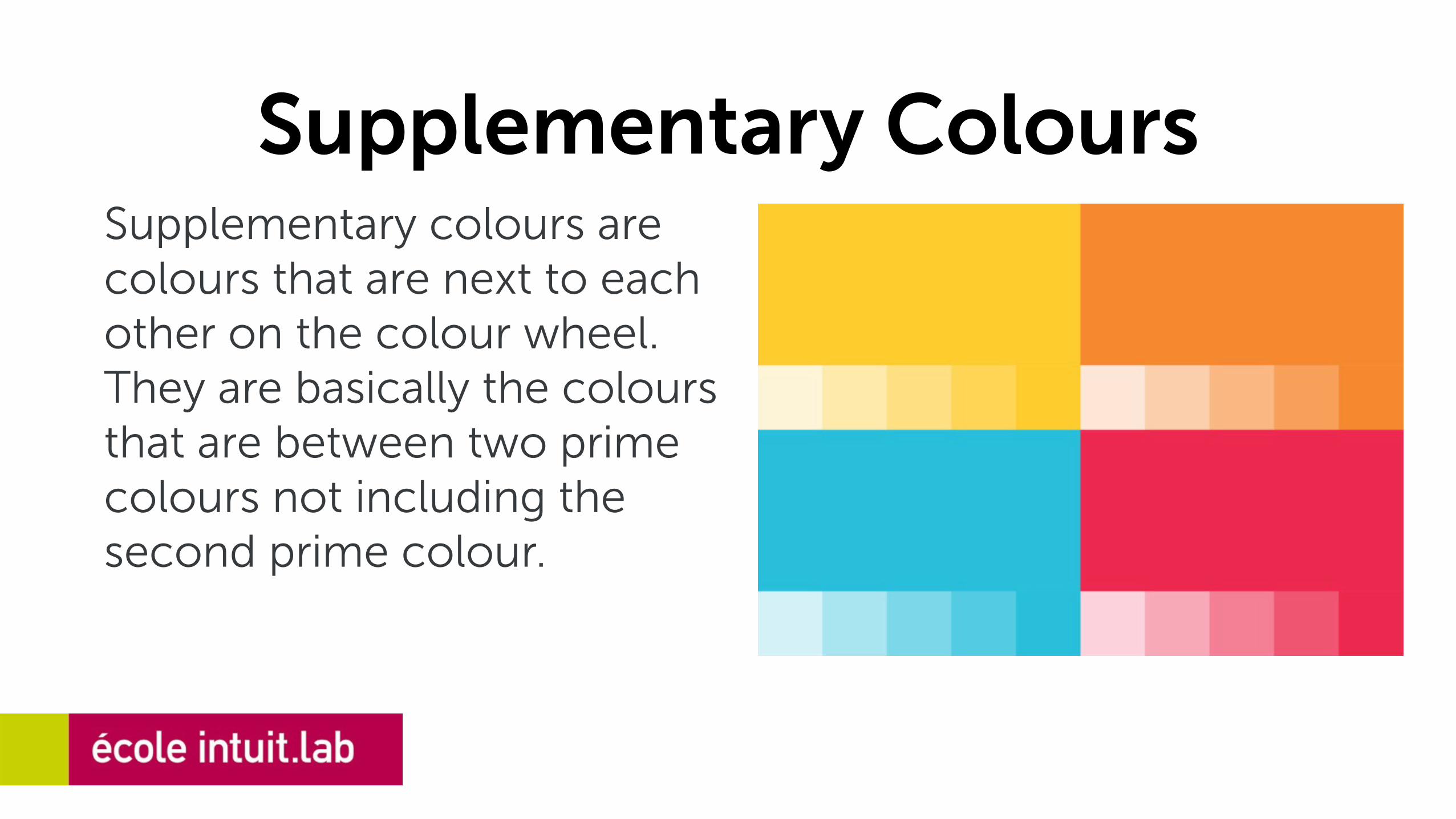
Supplementary ColoursSupplementary colours are colours that are next to each other on the colour wheel. They are basically the colours that are between two prime colours not including the second prime colour.

ecole intuit.labAddress : DGP House, 4th Floor, 88C, Old Prabhadevi Rd,
Prabhadevi, Mumbai - 400025 Email : [email protected]


