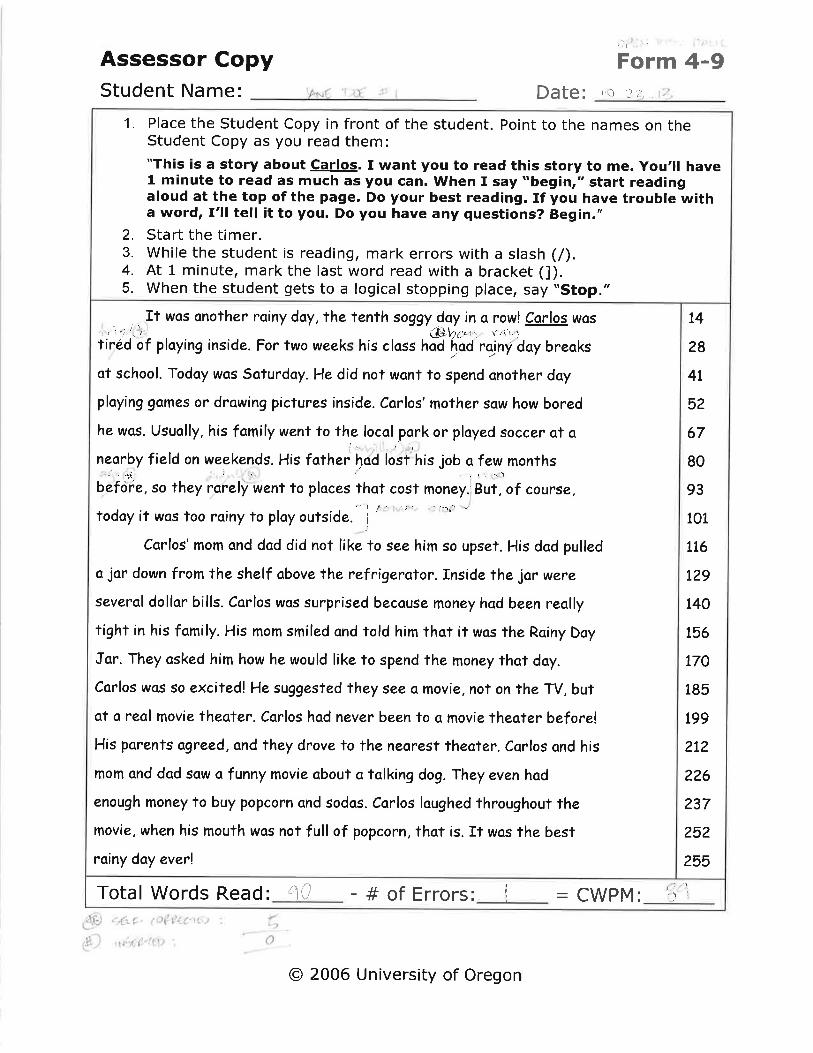
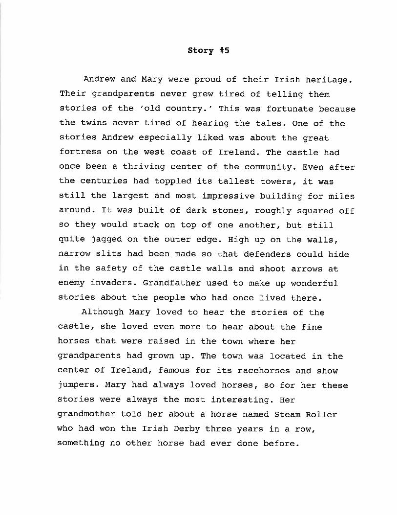
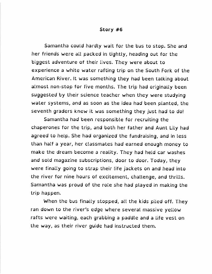
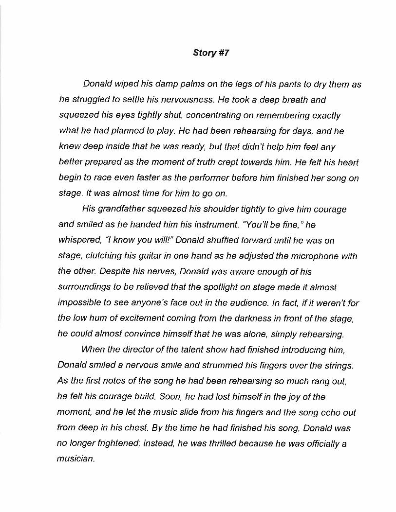
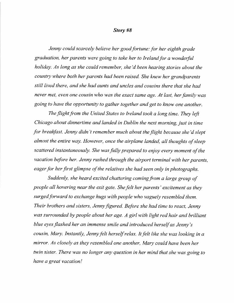
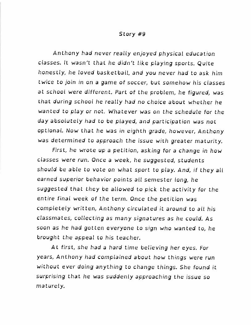
1 Maya Grigorovich-Barsky Research Seminar – EDU-607 (Fall 2013) Dean Sarah Belson December 4, 2013 The Effects of Fonts on Reading Performance for Those with Dyslexia: A Quasi-Experimental Study Abstract A few studies have been conducted that show evidence that document design, the presentation of text, and font type all have a significant effect on a text's accessibility, however none of these studies have specifically addressed the impact of the font type on reading performance for those with reading disabilities such as dyslexia. With the introduction of fonts that are specifically designed to increase text accessibility and readability for individuals with dyslexia, interest surrounding the idea of improving readability through improved document design has come under consideration. This study is one of the first to measure the effect of font type on reading speed in people with reading disabilities. The effect was measured by asking 4 subjects officially diagnosed with dyslexia to read 9 distinct passages of text presented in 9 different fonts. According to the data collected, sans serif, non-italicized, and proportioned font styles only slightly improved overall reading fluency over serif, monospaced and italic fonts. However, when asked for personal preferences, the results differed dramatically. Keywords Dyslexia, font types, typography, readability, legibility, text presentation, document design, accessibility Introduction As many as 15-20% of the world’s population have some symptoms of dyslexia, a neurological disability which impairs a person's ability to read and write fluently (International Dyslexia Association, Fact Sheets). These symptoms can include slow or inaccurate reading, poor spelling, poor writing, or mixing up similar words. Not everyone who exhibits these symptoms qualify for special education and the related accommodations, however they still may struggle with many aspects of academic learning. To help prevent much of this struggle, it is a widely accepted believe and practice of teachers that systematic, explicit instruction in reading and writing benefits individuals with dyslexia, however very little research has been done to show that text presentation can be an important factor regarding reading performance as well [Rello, Kanvinde & Baeza-Yates, 2012).
Transcript
1
Maya Grigorovich-Barsky Research Seminar – EDU-607 (Fall 2013) Dean Sarah Belson December 4, 2013
The Effects of Fonts on Reading Performance for Those with Dyslexia: A Quasi-Experimental Study
Abstract
A few studies have been conducted that show evidence that document design, the presentation of
text, and font type all have a significant effect on a text's accessibility, however none of these studies
have specifically addressed the impact of the font type on reading performance for those with reading
disabilities such as dyslexia. With the introduction of fonts that are specifically designed to increase
text accessibility and readability for individuals with dyslexia, interest surrounding the idea of improving
readability through improved document design has come under consideration. This study is one of the
first to measure the effect of font type on reading speed in people with reading disabilities. The effect
was measured by asking 4 subjects officially diagnosed with dyslexia to read 9 distinct passages of text
presented in 9 different fonts. According to the data collected, sans serif, non-italicized, and
proportioned font styles only slightly improved overall reading fluency over serif, monospaced and
italic fonts. However, when asked for personal preferences, the results differed dramatically.
Keywords
Dyslexia, font types, typography, readability, legibility, text presentation, document design, accessibility
Introduction
As many as 15-20% of the world’s population have some symptoms of dyslexia, a neurological disability
which impairs a person's ability to read and write fluently (International Dyslexia Association, Fact
Sheets). These symptoms can include slow or inaccurate reading, poor spelling, poor writing, or mixing
up similar words. Not everyone who exhibits these symptoms qualify for special education and the
related accommodations, however they still may struggle with many aspects of academic learning. To
help prevent much of this struggle, it is a widely accepted believe and practice of teachers that
systematic, explicit instruction in reading and writing benefits individuals with dyslexia, however very
little research has been done to show that text presentation can be an important factor regarding
reading performance as well [Rello, Kanvinde & Baeza-Yates, 2012).
2
While little research has been dedicated to the effects of typeface on legibility and readability of text in
adult populations, even fewer studies have been applied to these topics and how they affect children’s
reading abilities (Hughes & Wilkins, 2000). Furthermore, most research on document design has focused
on readers of average reading ability, mainly for purposes such as marketing and advertising (Schriver,
1996). But despite best intentions and quality design, the needs of those with reading disabilities such as
dyslexia have not necessarily been addressed in previous studies. Publishing companies have stylistic
guidelines, but these are often based on font types and sizes deemed most aesthetically pleasing rather
than on empirical data investigating legibility and readability (Lannon, 2000). But font type and size are
only two of many typographic parameters that affect reading performance. Others include inter-
character spacing, word spacing, line spacing, justification and line length to name a few (Tinker, 1968).
Because a large majority of teaching material (i.e., textbooks, standardized tests, literature) is still found
in printed form, it is particularly important to examine readability of printed text for children, and
specifically, children with dyslexia. Furthermore, although more material may be readily available via
electronic platforms such as tablets or e-readers, text remains the primary mode of content delivery.
Many students who struggle to learn to read are able, with appropriate instruction, to compensate for
initial reading problems by becoming accurate decoders, however many fail to reach a level of sufficient
fluency to become fast and efficient readers. Thus, the development of techniques for improving
automaticity and fluency is critical. Although current research has given us some direction about
effective methods for increasing fluency (National Institute of Child Health and Human Development,
2000), further systematic research is needed to give us more comprehensive answers to questions
concerning the best methodologies, types of materials, and length/intensity of interventions necessary
for optimal gains to increase reading fluency.
Even as knowledge about dyslexia has evolved over the past few decades, as little as 10 years ago, many
teachers did not have methods to help those with dyslexia to read effectively. This has gradually changed
and now more attention is being given to provide accommodations to these students. As a result, a few
graphic designers have architected new fonts to help with the ease of reading (Gonzalez, OpenDyslexic;
Boer, Dyslexie). One of these new typefaces is called OpenDyslexic. Introduced in 2003, OpenDyslexic is
offered as a free and open source typeface for anyone to download and use at www.OpenDyslexic.org.
However, as word spreads about this new tool, a debate is also emerging about whether a typeface such
as OpenDyslexic can really help those with dyslexia read more fluently.
3
Abelardo Gonzalez, designer of OpenDyslexic, claims that the font increases readability for people with
dyslexia by emphasizing certain characteristics in letters such as creating heavy weighted bottoms to
indicate direction. Gonzalez argues that it is because of this emphasis of top and bottom that the reader
is more easily able to identify the directionality of the letter. Perceiving the top and bottom of the letter
aids in recognizing the correct letter, and may sometimes help prevent the brain from rotating the
character, which may be a process that individuals with dyslexia experience while reading. Gonzalez
goes on to argue that consistently weighted bottoms can also help reinforce the line of text. The unique
shapes of each letter can help prevent confusion through flipping and swapping (Gonzalez,
www.OpenDyslexic.com).
Despite the fact that there have been no known formal studies counter-arguing Gonzalez’s claims about
the benefits of using OpenDyslexic, there are those who remain skeptical of its effectiveness. A few
informal polls conducted by journalists on individuals who have experienced reading with the typeface
first hand reveal a different sentiment. In her article for the online publication of The Examiner,
(www.Examiner.com) reporter Tina Burgess interviews a teacher and a number of students with
dyslexia who have had a chance to interact with the new font, and the conclusions of her interviews
contradict what Gonzalez is asserting. When asked the question, “Does the new dyslexia font help?”
the majority of the answers indicated that in general, it didn’t help their reading abilities. Journalist
Rebecca Williams, for KnoxNews (www.KnoxNews.com), experienced similar responses. “"I thought it
was more difficult to read because I had to think about the letters more, and try to see them in the
proper order," said 14 year-old Stockton Dempster, a homeschool student with dyslexia. Another
interviewee, Emily Dempster, President of the Tennessee branch of the International Dyslexia
Association, would rather err on the side of caution over attempting another gimmick or “quick-fix.”
NBC News’ Rita Rubin also reported further skepticism from dyslexia researcher Sally Shaywitz, who
has published more than 200 scientific articles, chapters, and books about dyslexia, including the
bestselling book "Overcoming Dyslexia." Shaywitz is also a physician who co-directs the Yale Center for
Dyslexia & Creativity. In the interview, she stated that “As a scientist, I go by evidence and data, and I’m
not aware of any” to support the notion that any of the special fonts improve reading ability in dyslexics.
She points out that dyslexia is not necessarily a visual problem; some individuals affected by dyslexia
have trouble matching the letters they see on the page with the sounds those letters and combinations
of letters make. “Reversing letters is not a sure sign of dyslexia; a child can be highly dyslexic and NOT
reverse letters.”
4
The author of this study aimed to test the claims of Gonzalez and hoped to gain a better understanding
of what those with dyslexia really need to read more fluently and with more accuracy and prosody.
Additionally, the author hoped to find conclusive data supporting the notion that readability preferences
of people with dyslexia can vary greatly, however general principles of reading preference may be
formulated. The author expected to see similar results to the study conducted by Rello and Baeza-Yates
in 2013: fonts such as Arial, Verdana, and OpenDyslexic would have higher measures of legibility over
Times New Roman, Courier, and Garamond due to their greater length of letter strokes and cleaner lines.
Additionally, the author expected that there would be a difference in results between the commonly
used sans serif fonts (Arial and Verdana) and the specially designed font, OpenDyslexic, for two reasons:
(1) the subjects would feel more comfortable reading texts presented in the widely used Arial and
Verdana due to familiarity, and (2) the monospaced characteristic of OpenDyslexic would cause greater
spacing confusion to the dyslexic reader.
Participants
Four individuals (3 female, and 1 male) participated in the study, whose ages were 11, 12, 13, and 47
years. All had a confirmed diagnosis of dyslexia. Each participant was asked to present official clinical
results proving that dyslexia had been diagnosed. Additionally, three of the four participants required
prescription eyeglasses for corrected vision, but assured the examiner that their vision was corrected-
to-normal when glasses or contacts were used. It should also be noted that the socio-economic and
family backgrounds of all of the participants were very similar, each coming from a middle-to-upper class
family, with no history of serious medical conditions, therefore it is assumed that participants had similar
exposure to all of the commonly used fonts used in the study. The one subject who may have had more
exposure to the various fonts is the one adult. Lastly, the three younger participants are currently in
school, while the adult works full time. In order to participate, all participants must have submitted a
signed consent, with parents or guardians providing assent when the participant was under 18 years of
age.
Methodology and Materials
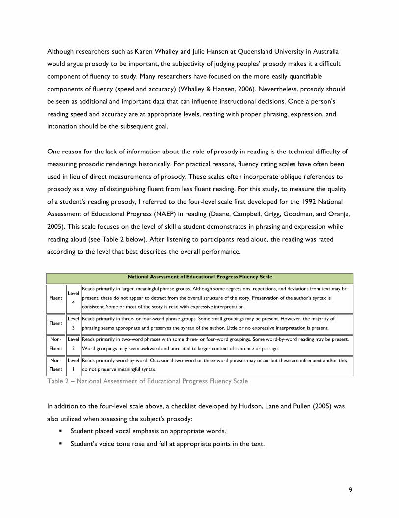
A font is derived from combinations of several font characteristics, including serifs, stroke width and
length, and letter height and width (Lannon, 2000). A font’s legibility or readability can be studied by
either analyzing these individual characteristics or by studying differences among entire fonts (Woods,
David & Scharff, 2005). Both approaches to studying a font’s legibility have limitations and can lead to
very different conclusions. Systematically studying individual characteristics (such as stroke width or the
use of serifs) of a particular font requires manipulation of individual characteristics while holding others
5
constant. While this approach allows direct assessment of the influences specific font characteristics
have on legibility, it often proves impractical because it may require construction of artificial fonts
(Lockhead & Crist, 1980). Fonts such as OpenDyslexic were derived from this type of study. Conversely,
studying whole fonts that have already been established, such as Times New Roman or Arial, though easily
used in practical application, limits the ability to draw generalized conclusions with respect to the
specific characteristics of that font; only fonts closely resembling the studied font may be included in the
generation of conclusions and new theories.
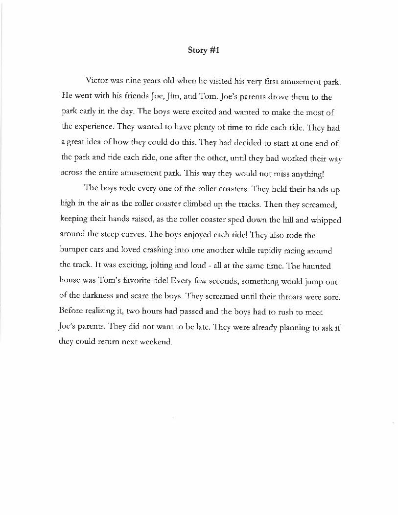
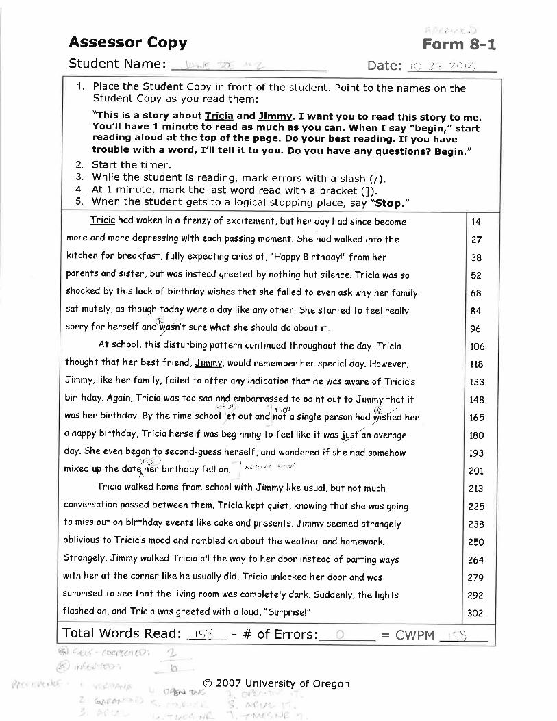
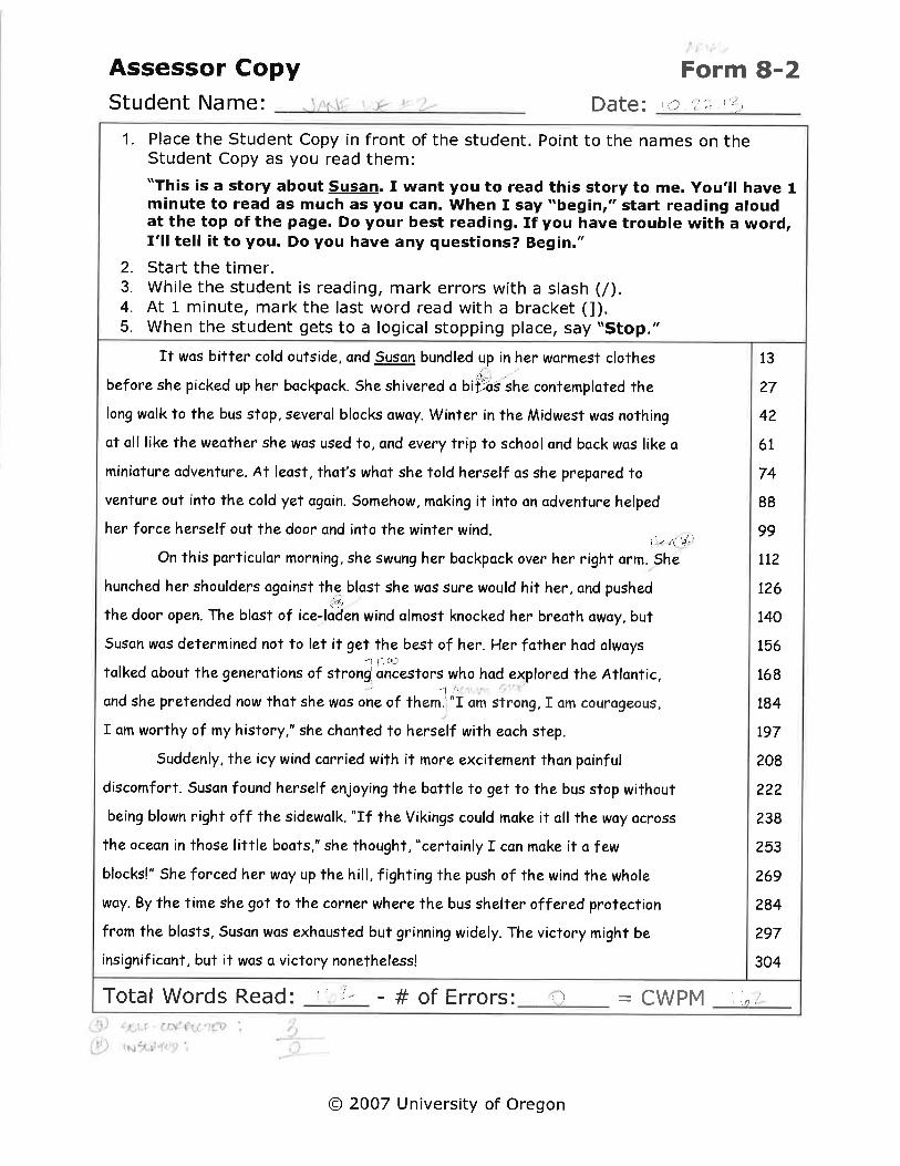
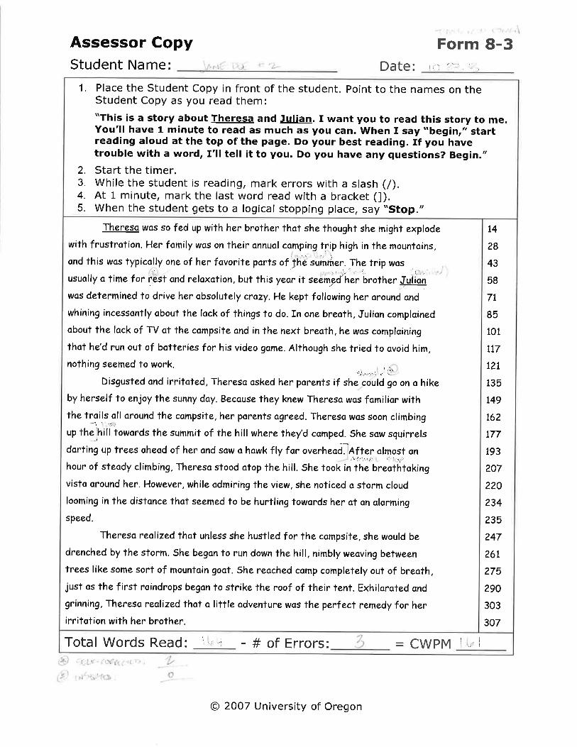
This study followed the whole font analysis approach described above by asking the four participants to
read nine comparable passages in varying font types. Readability was measured through fluency,
accuracy, and prosody only. At this stage of the study, comprehension was not assessed. Lastly, the
participants’ preferences were gathered with the simple closing question of “Please rate the nine font
types you read by placing them in order from easiest-to-read to hardest-to-read.” In this study, font
types served as the independent variables: Garamond, Arial, Times New Roman, Verdana, Courier,
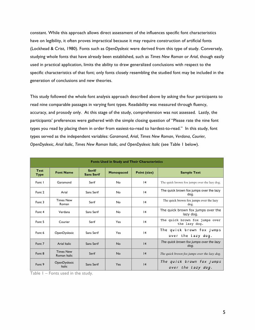
OpenDyslexic, Arial Italic, Times New Roman Italic, and OpenDyslexic Italic (see Table 1 below).
Fonts Used in Study and Their Characteristics
Test Type Font Name Serif/
Sans Serif Monospaced Point (size) Sample Text
Font 1 Garamond Serif No 14 The quick brown fox jumps over the lazy dog.
Font 2 Arial Sans Serif No 14 The quick brown fox jumps over the lazy dog.
Font 3 Times New
Roman Serif No 14 The quick brown fox jumps over the lazy dog.
Font 4 Verdana Sans Serif No 14 The quick brown fox jumps over the lazy dog.
Font 5 Courier Serif Yes 14 The quick brown fox jumps over the lazy dog.
Font 6 OpenDyslexic Sans Serif Yes 14 The quick brown fox jumps
over the lazy dog.
Font 7 Arial Italic Sans Serif No 14 The quick brown fox jumps over the lazy dog.
Font 8 Times New Roman Italic
Serif No 14 The quick brown fox jumps over the lazy dog.
Font 9 OpenDyslexic Italic
Sans Serif Yes 14 The quick brown fox jumps
over the lazy dog.
Table 1 – Fonts used in the study.
6
The fonts Arial, Verdana, Courier, and Times New Roman were selected due to their popularity, as they
tend to be the most common fonts people encounter (Chapman, 2011). They also are common
representatives of both serif and sans serif fonts. Additionally, after correspondence with the
Educational Testing Service (ETS), the largest private nonprofit educational testing and assessment
organization, it has been confirmed that the majority of their tests are printed in either Arial or Times
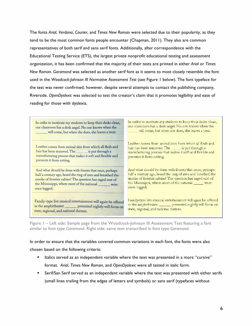
New Roman. Garamond was selected as another serif font as it seems to most closely resemble the font
used in the Woodcock-Johnson III Normative Assessment Test (see Figure 1 below). The font typeface for
the test was never confirmed, however, despite several attempts to contact the publishing company,
Riverside. OpenDyslexic was selected to test the creator’s claim that it promotes legibility and ease of
reading for those with dyslexia.
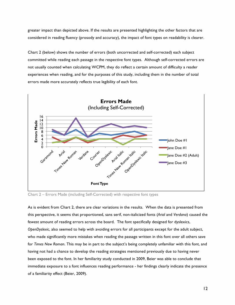
Figure 1 – Left side: Sample page from the Woodcock-Johnson III Assessment Test featuring a font similar to font type Garamond. Right side: same text transcribed in font type Garamond.
In order to ensure that the variables covered common variations in each font, the fonts were also
chosen based on the following criteria:
§ Italics served as an independent variable where the text was presented in a more “cursive”
format. Arial, Times New Roman, and OpenDyslexic were all tested in italic form.
§ Serif/San Serif served as an independent variable where the text was presented with either serifs
(small lines trailing from the edges of letters and symbols) or sans serif (typefaces without
7
serifs). Arial, Arial Italic, Verdana, OpenDyslexic, and OpenDyslexic Italic are the three sans serif
fonts, and Times New Roman, Times New Roman Italic, Garamond, and Courier are serif font types.
§ Monospace/Proportional served as an independent variable where the text was presented using
a monospaced type, that is, a font whose letters and characters each occupy the same amount
of horizontal space, and proportional, where the text was presented using proportional fonts.
OpenDyslexic, OpenDyslexic Italic, and Courier are considered monospaced type fonts. The others
used are considered proportional fonts.
Since the overall presentation of the text may have an effect on reading speed for people with dyslexia
as well, precautions were taken to use the same layout for all of the passages. All characteristics of each
page remained constant, save for the font difference. All passages were left-justified, and all text was
printed in 14-point font size. The color that was used reflects the most frequently used in printed text:
black text on white background. All passages were presented on a single sheet of paper for reading,
with nothing else nearby to cause any distractions. Lastly, the fonts were all presented in the same
order. This order is reflected in Table 1.
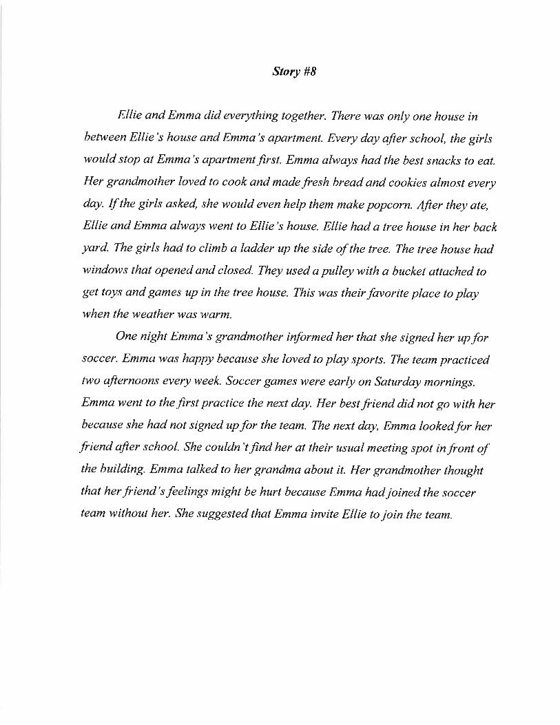
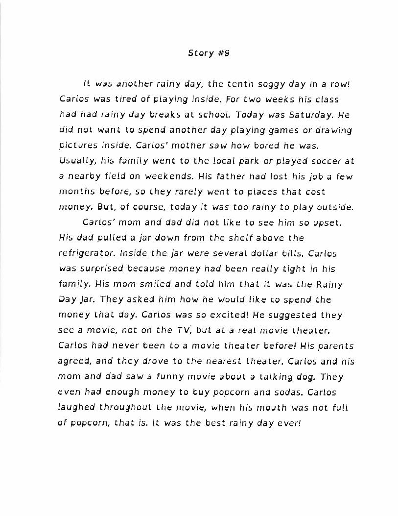
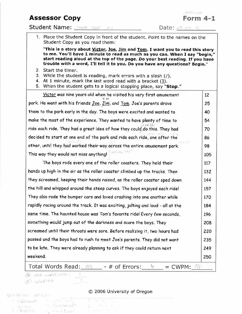
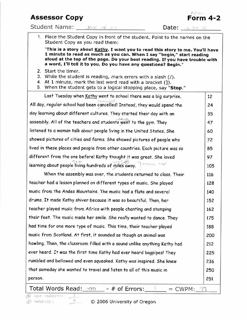
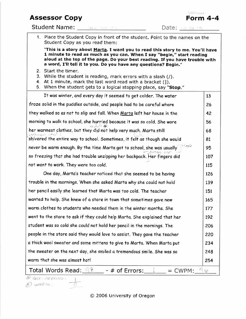
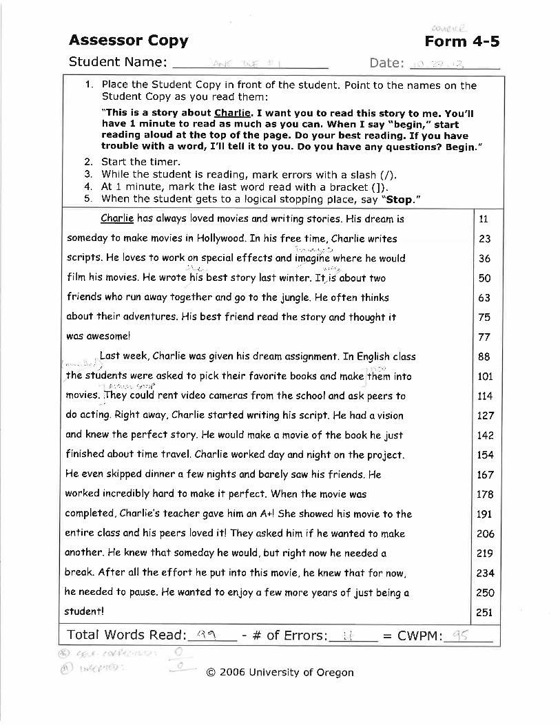
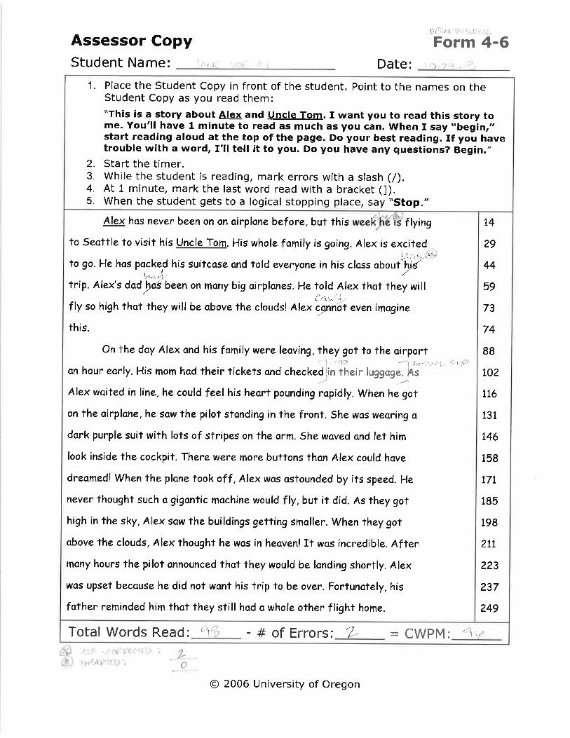
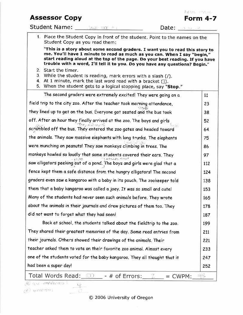
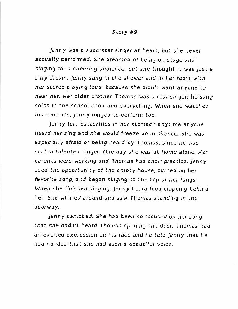
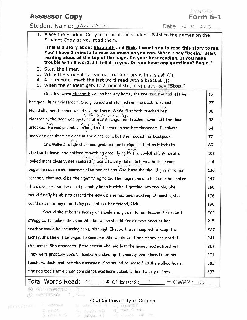
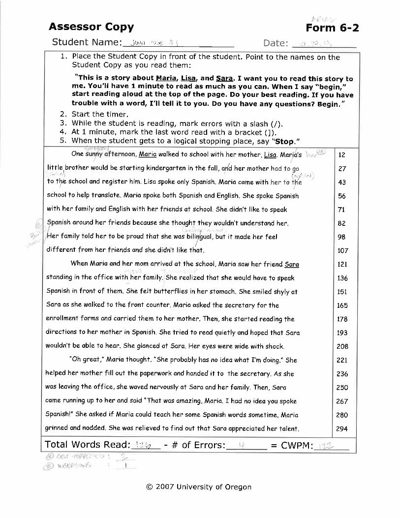
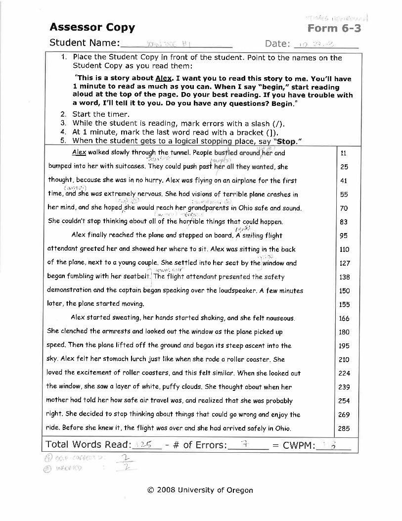
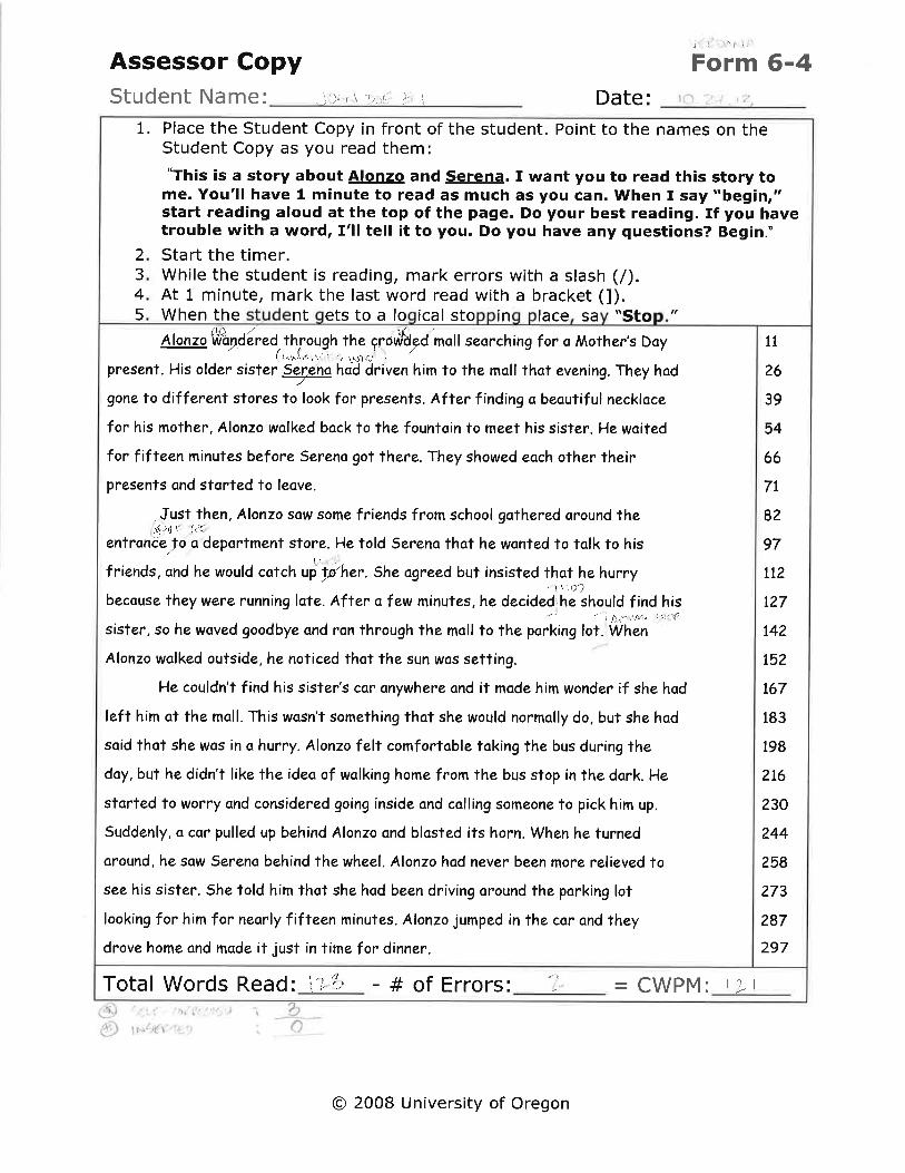
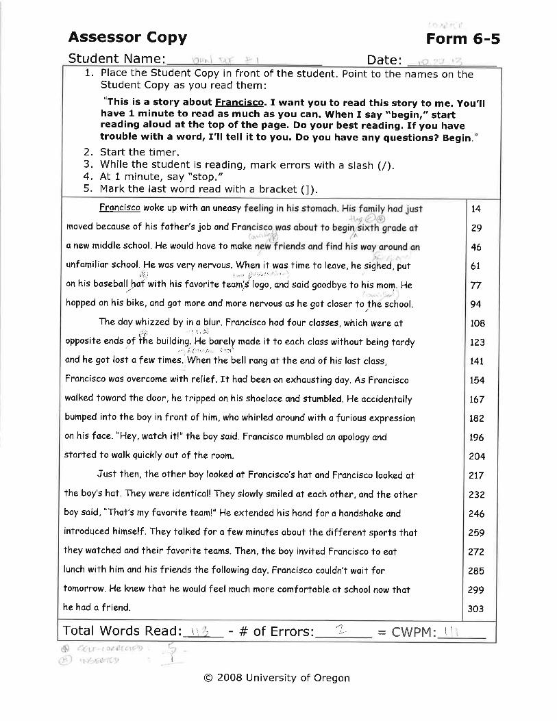
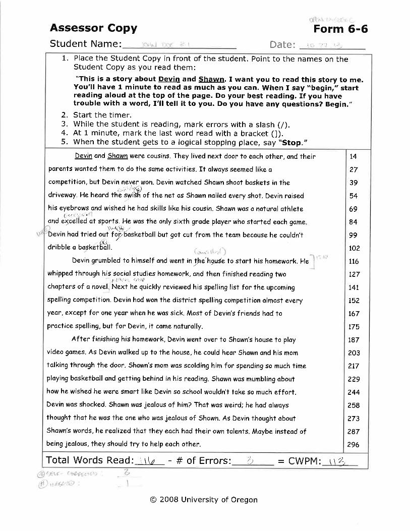
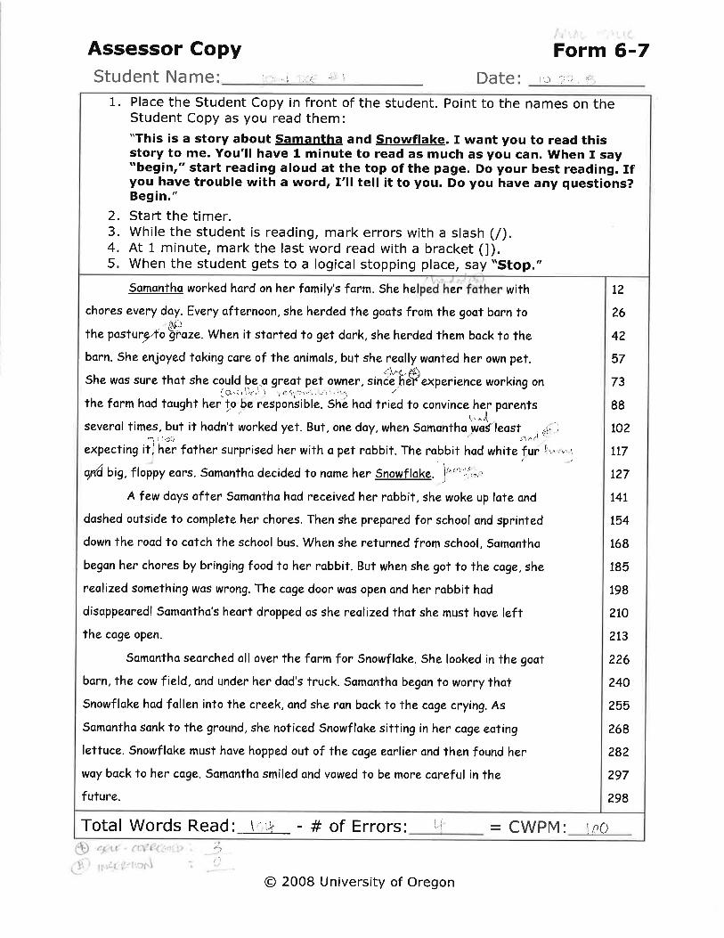
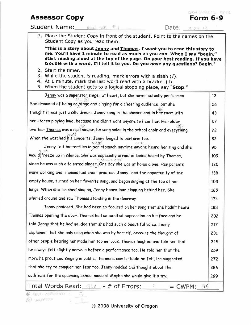
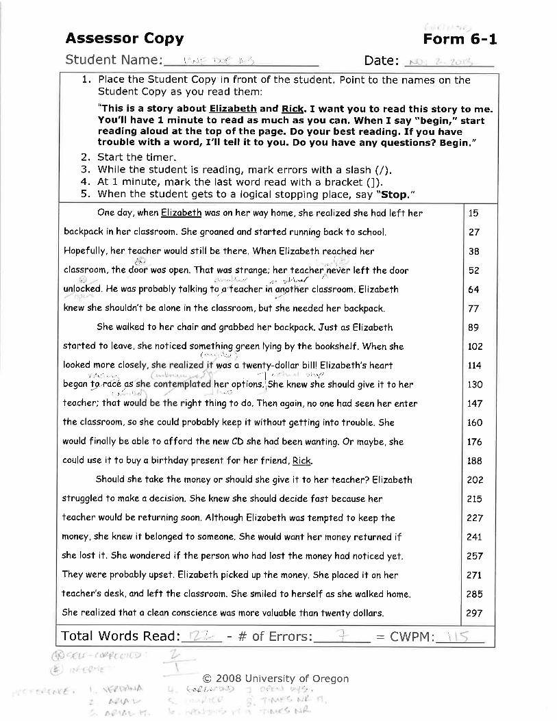
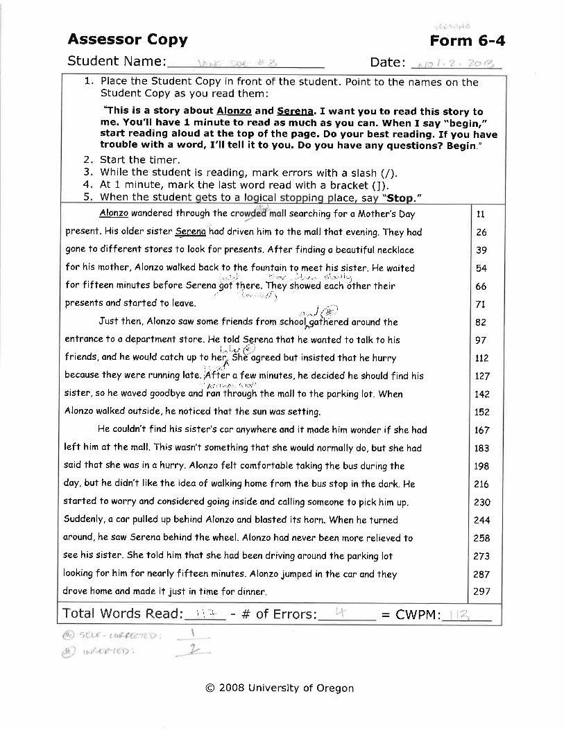
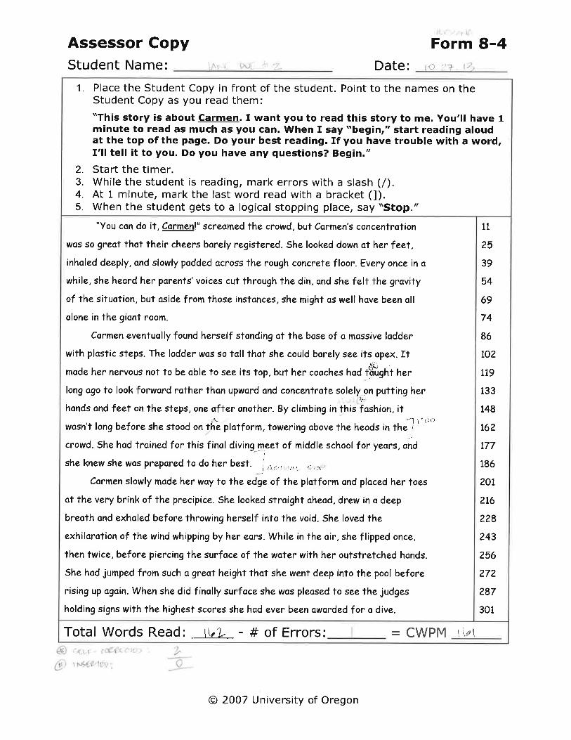
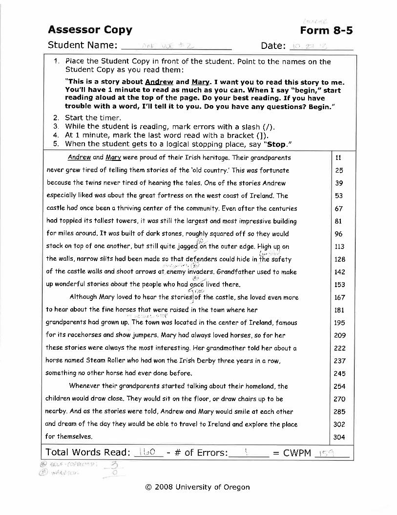
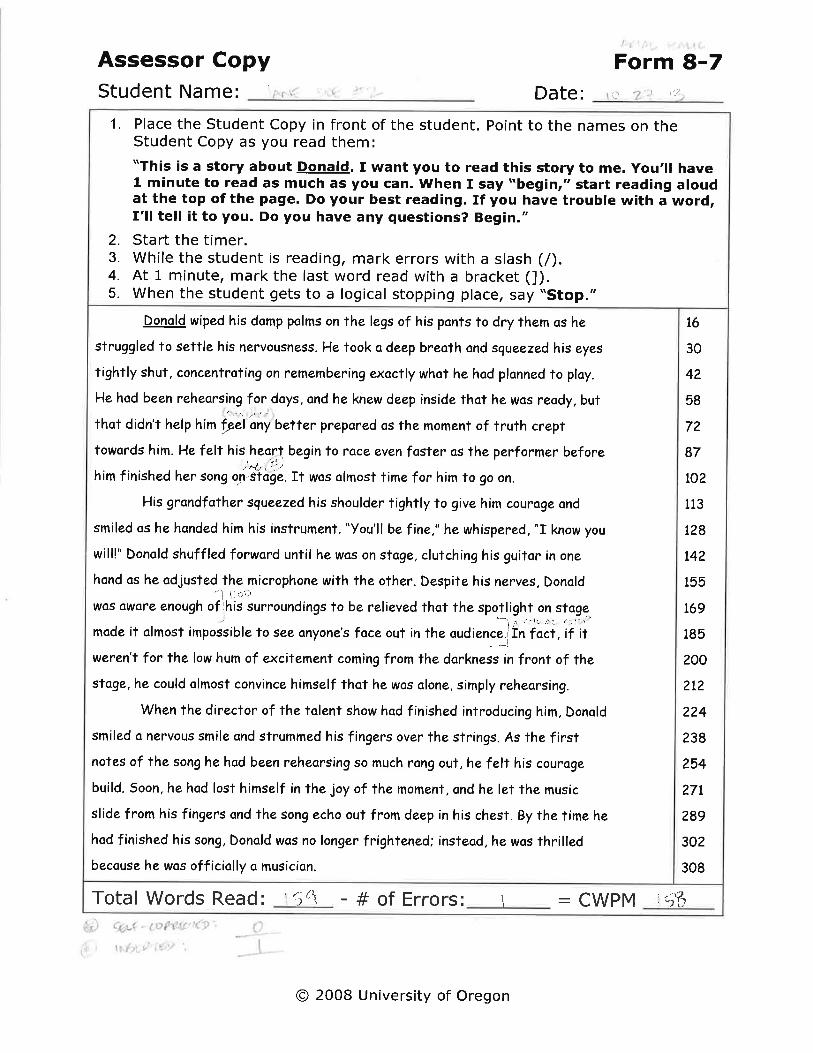
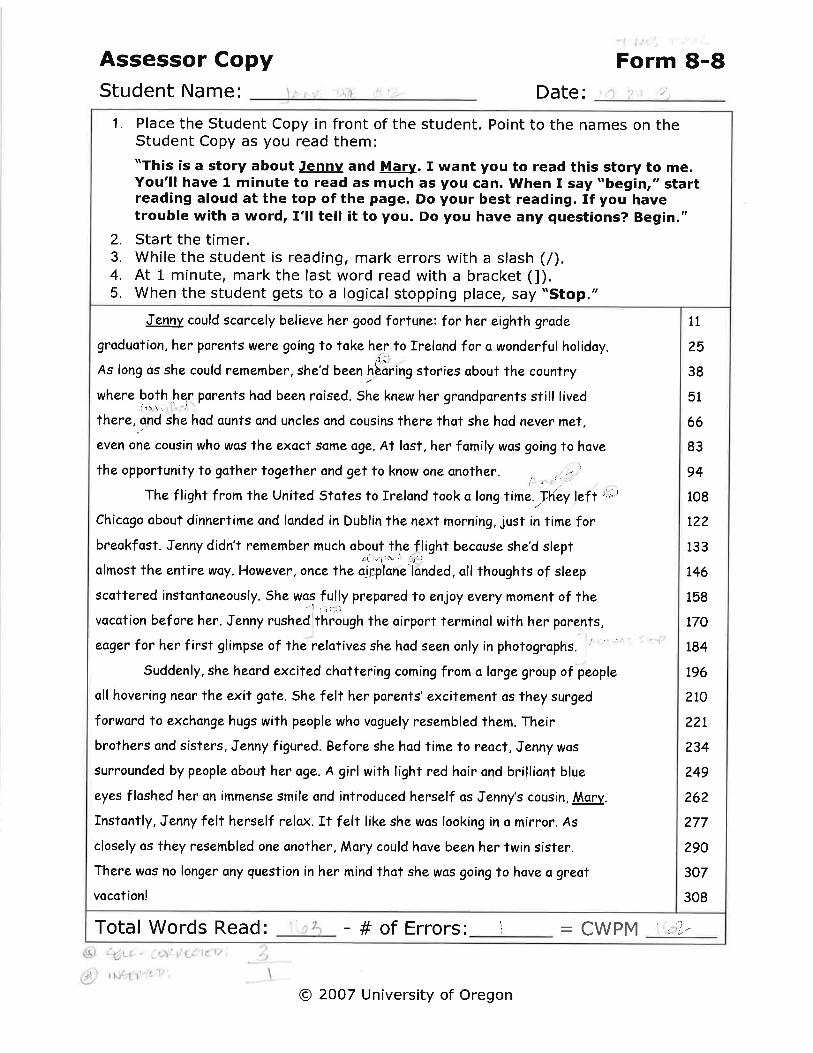
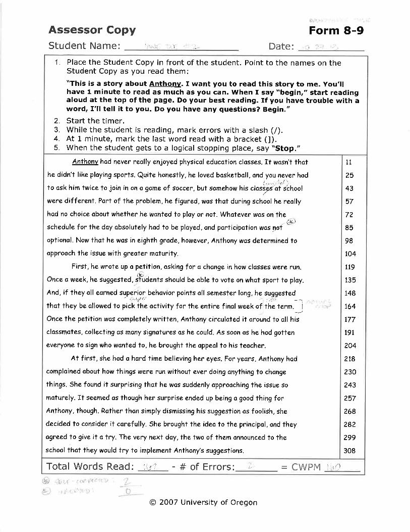
Each reading was timed for 60 seconds and all passages were read in one sitting. To ensure that all texts
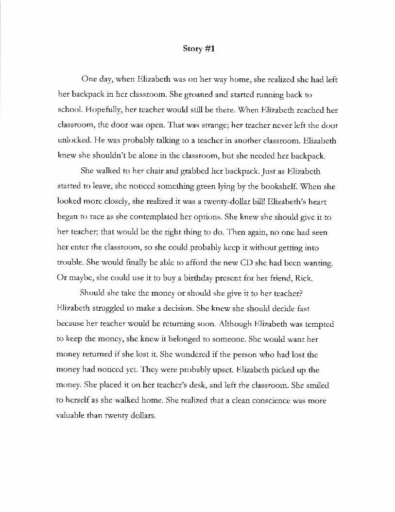
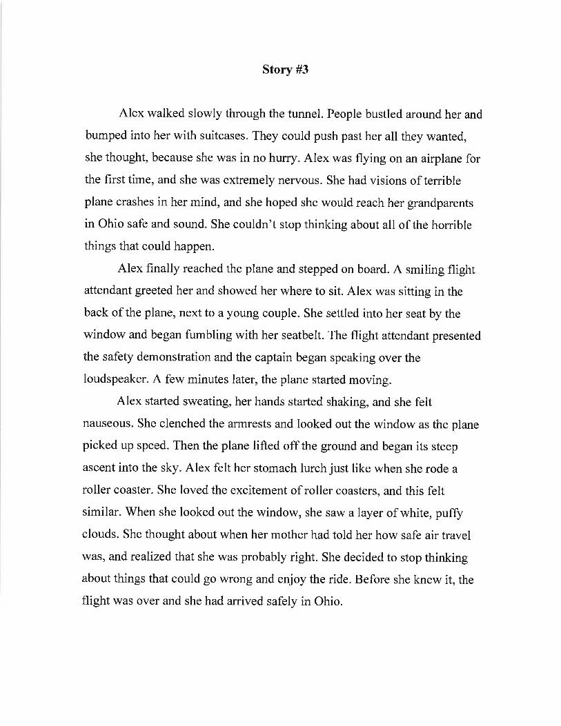
used in the study met the comparability requirements, the passages themselves were pulled directly
from a program called EasyCBM® (www.EasyCBM.com). EasyCBM® was designed by researchers at the
University of Oregon as an integral part of a Response to Intervention (RTI) model (Tindal & Alonzo,
2006). The assessments on the system are what is known as curriculum-based measures (CBMs). CBMs
are standardized measures that sample from a year’s worth of curriculum to assess the degree to which
students have mastered the skills and knowledge deemed critical at each grade level.
According to the authors Tindal and Alonzo, the reading tests in this system include measures of