The masthead is the top of the pops logo, the pink font shows that the magazine is aimed at teenage girls. The font is rounded which gives The main image is a studio taken image of Lady Gaga, it has direct address with the audience which makes the reader seem like there is a The main coverline appeals a lot to young girls as the magazine is targeted at an age range that are still developing and majority may not be confident with their body. This The barcode and price is shown which is needed when you purchase the magazine, the price stands out to adults as it would usually be the parents buying this magazine for their children. The plug is aimed at the target audience as it is a kind of issue that a teenager of this age may relate to, it may be a way to get The cover line ‘true life terror’ is advertising the fact that there are real life situations and articles in the magazine, then going onto say “I was The image insert of one direction links with the other plug, which says “1Ds cutest interview ever!” this shows that the magazine is about music as they’re a band, as The bbc logo has been placed on the top of the magazine. The bbc is a trusted institution therefore the reader/parent will know that the magazine will meet requirements for their children to read. The magazine uses buzz words such as ‘wow’ and ‘inside!’ these are all in bold and stand out which will grab the readers attention. The magazine follows the rule of thirds design, all main coverlines are on either side of the page and the image is central to the middle. The colour scheme is constant throughout the cover, the main colour is pink, some coverlines are in purple and the smaller coverlines are in blue – this continues throughout the magazine to follow a theme. The use of a tag line across the top of the page attracts the reader and gives a brief summary of the rest of the contents of the magazine which would attract the reader into wanting to buy the magazine more.
Transcript
The masthead is the top of the pops logo, the pink font shows that the magazine is aimed at teenage girls. The font is rounded which gives the reader an impression that the magazine will be fun and informal. The main image is a studio
taken image of Lady Gaga, it has direct address with the audience which makes the reader seem like there is a connection with the star.
The main coverline appeals a lot to young girls as the magazine is targeted at an age range that are still developing and majority may not be confident with their body. This would appeal to the reader as they might be able to relate to the article.
The barcode and price is shown which is needed when you purchase the magazine, the price stands out to adults as it would usually be the parents buying this magazine for their children.
The plug is aimed at the target audience as it is a kind of issue that a teenager of this age may relate to, it may be a way to get the reader involved in the magazine as they have to fill it in themselves.
The cover line ‘true life terror’ is advertising the fact that there are real life situations and articles in the magazine, then going onto say “I was attacked by cows” makes it seem much more humours than scary.
The image insert of one direction links with the other plug, which says “1Ds cutest interview ever!” this shows that the magazine is about music as they’re a band, as well as this it relates to the teenage girl audience as one directions main fanbase is teenage girls.
The bbc logo has been placed on the top of the magazine. The bbc is a trusted institution therefore the reader/parent will know that the magazine will meet requirements for their children to read.
The magazine uses buzz words such as ‘wow’ and ‘inside!’ these are all in bold and stand out which will grab the readers attention.
The magazine follows the rule of thirds design, all main coverlines are on either side of the page and the image is central to the middle.
The colour scheme is constant throughout the cover, the main colour is pink, some coverlines are in purple and the smaller coverlines are in blue – this continues throughout the magazine to follow a theme.
The use of a tag line across the top of the page attracts the reader and gives a brief summary of the rest of the contents of the magazine which would attract the reader into wanting to buy the magazine more.
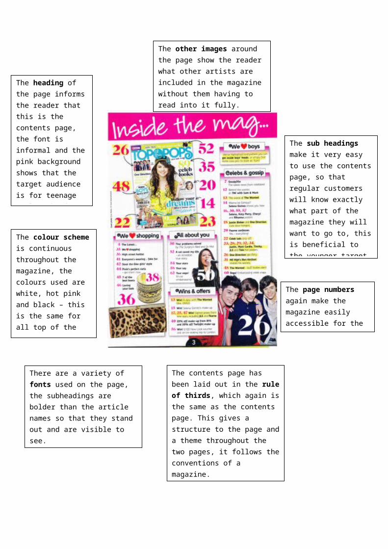
The heading of the page informs the reader that this is the contents page, the font is informal and the pink background shows that the target audience is for teenage girls. The font being informal makes the magazine more welcoming to the reader.
The colour scheme is continuous throughout the magazine, the colours used are white, hot pink and black – this is the same for all top of the pops issues. The colour yellow has been used to highlight important articles.
The sub headings make it very easy to use the contents page, so that regular customers will know exactly what part of the magazine they will want to go to, this is beneficial to the younger target audience as they will be able to find the pages they want quicker.
The page numbers again make the magazine easily accessible for the readers.
The contents page has been laid out in the rule of thirds, which again is the same as the contents page. This gives a structure to the page and a theme throughout the two pages, it follows the conventions of a magazine.
The other images around the page show the reader what other artists are included in the magazine without them having to read into it fully.
There are a variety of fonts used on the page, the subheadings are bolder than the article names so that they stand out and are visible to see.
There is a supplement image on the page, this shows selena with her friend under the title ‘fantastic friendships’. This fits with the subheading and links the two together.
The layout of this article does not really follow conventions of a magazine, the article is full of angular shapes that are filling up empty spaces and also the article is not that big. The double page spread was not of the cover girl it was of another celebrity which also does not follow conventions. However, the article still seems to use the rule of thirds rule as you can clearly see that the page has been divided into 3.
The title is large and in capital letters to grab the reader’s attention, the font is black and has pink quotation marks around it to fit in with the theme of the article, the title is a grab quote taken from the article itself which will attract the audience to want to read more into the article.
The font is very bold and in the readers face, this gets the reader’s attention as it stands out. As well as this, the headings are all in capital letters; this enables the font to stand out even more as it seems like a statement and almost as if its ‘loud’. The same font is used throughout the double spread however some parts are made bold.
The colour scheme is yet again pink black and white – this colour scheme is continuous throughout this magazine as it keeps it all together and it keeps it all as a theme.
The main image takes up most of the double page spread. It shows us who the article is about, the way Selena is sitting shows that the article will be fun and jokey.