10
Q1) IN WHAT WAYS DOES YOUR MEDIA PRODUCT USE, DEVELOP OR CHALLENGE FORMS AND CONVENTIONS OF REAL MEDIA PRODUCT?
| Date post: | 18-Aug-2015 |
| Category: |
Marketing |
| Upload: | jeremysamuel98 |
| View: | 73 times |
| Download: | 1 times |
Q1) IN WHAT WAYS DOES YOUR MEDIA PRODUCT USE, DEVELOP OR CHALLENGE FORMS AND CONVENTIONS OF REAL MEDIA PRODUCT?
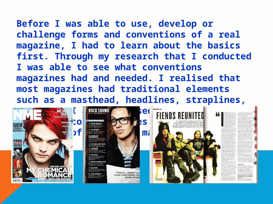
Before I was able to use, develop or challenge forms and conventions of a real magazine, I had to learn about the basics first. Through my research that I conducted I was able to see what conventions magazines had and needed. I realised that most magazines had traditional elements such as a masthead, headlines, straplines, pugs etc. I also realised that the house style and colour schemes are dependent on the genre of the music magazine.
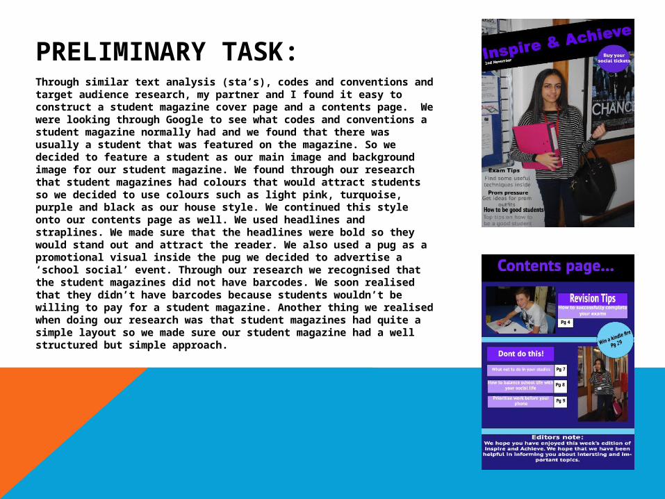
PRELIMINARY TASK:Through similar text analysis (sta’s), codes and conventions and target audience research, my partner and I found it easy to construct a student magazine cover page and a contents page. We were looking through Google to see what codes and conventions a student magazine normally had and we found that there was usually a student that was featured on the magazine. So we decided to feature a student as our main image and background image for our student magazine. We found through our research that student magazines had colours that would attract students so we decided to use colours such as light pink, turquoise, purple and black as our house style. We continued this style onto our contents page as well. We used headlines and straplines. We made sure that the headlines were bold so they would stand out and attract the reader. We also used a pug as a promotional visual inside the pug we decided to advertise a ‘school social’ event. Through our research we recognised that the student magazines did not have barcodes. We soon realised that they didn’t have barcodes because students wouldn’t be willing to pay for a student magazine. Another thing we realised when doing our research was that student magazines had quite a simple layout so we made sure our student magazine had a well structured but simple approach.
MAIN TASK:Front Cover
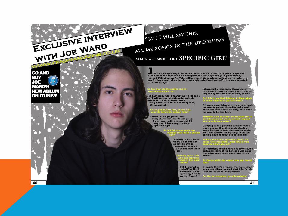
For the main task my partner and I decided to go with a rock generic themed magazine. I looked at rock magazines such as NME, Kerrang, and Classic Rock etc. By looking at these magazines I was heightening my knowledge about the codes and conventions rock magazines used. I made sure that I used the codes and conventions that a rock magazine used in my own magazine as I knew that by doing so, it would attract the right target audience. During my research I conducted out two interviews. I interviewed both genders who were both teenagers. I did this to help me acknowledge what teenagers expect when they buy a rock magazine. Furthermore my partner and I also conducted a survey aimed at teenagers and this was also to help me see what they would expect and what they would want when purchasing a rock magazine. When it came to names, we had a few in mind but we decided to name our magazine ‘Crash’ as by having a name that is associated with the genre rock appeals to an audience of people who are into rock music. I placed the masthead at the top of the magazine as then it would be easy for customers to identify the magazine when it is placed on a shelf.
For the house style we asked teenagers on the colours they best thought suited a rock magazine and 64% of people chose black, white and purple. However, instead of using purple I chose to used yellow instead as I thought it looked better.
As for main image of the front page, the majority of people (36%) who took part in the survey said they would prefer a band. However, I chose to use a tall male model to feature on my front cover. I made him make confident and optimistic poses as when I did my subject matter research I realised that most rock stars portray themselves as people who don’t care about what other people think about them. I made him wear clothes that rock artists would normally wear, such as black skinny jeans, a black hoodie, a black coat and black trainers as it has good contrast with the colour scheme. I took long shots, medium shots and close up shots of him and in the end I decided to choose a medium shot of him as my front cover picture as I thought it looked good. I wrote several headlines and straplines. I made sure that I made the headlines were bold and in capital letters as I wanted them to stand out. I also made sure that the colour of the headlines was yellow. The straplines on the other hand were in white and they were in lower case. These headlines and straplines were placed on the top right hand side of the front cover. I placed another headline, which was much bigger and I placed it right under the main image. I made the font of the headline bold and increased the size so that it would be more appealing and eye-catchy. I also used a controversial pull quote under the headline to make the reader want to know what it’s about. I decided to put the barcode, price and issue number at the bottom right of the front cover because I thought it would be well suited there. As for the date I put it under the masthead.

MAIN TASK
During my research I found that I had to maintain my house style, so I followed the codes and conventions and carried on the house style onto the contents page. I realised that most contents pages have more than one picture so I used four pictures. I kind of separated the contents page into two sides. So on one side I had the pictures and the editors note and on the other side I had all headlines and straplines. Next to the straplines I put the page numbers to make it easier for the reader locate the article quicker.
CONTENTS PAGE:

MAIN TASK
Double Page Spread:
As for my double page spread, I wasn’t sure on the kind of layout I wanted so I asked teenagers through the survey my partner I created and 55% of them said that they would prefer a 50/50 split so that it was I chose. However, I made sure that the main image overlapped onto the other page. I used a pull quote as I thought it would make the double page spread look much better. A drawback is that the model wore the same outfit as he wore for the front cover.