In what ways do your media product use, develop or challenge forms and conventions of real media products? Before I started to construct my magazine I did a vast amount of research into existing music magazines from my sub-genre (alternative music). I analysed the different codes and conventions which are used on a front cover, contents page and double page spread. I tried to incorporate the majority of the conventions used in a magazine however sometimes I did challenge this and changed some conventions to make my genre look more unique and individual. Masthead conventions: This is my final masthead which does not conform to the typical conventions of a music magazine. As most magazines have a masthead which is just a single colour to make it look very prominent on the front cover. For example this is a masthead following all the typical conventions as it has one bold colour which will entice the reader into buying the magazine. Although I have followed a typical convention as I capitalised my masthead to make it prominent and easy for the reader identify. However I did take inspiration from this magazine as it is renowned for having a white
Transcript
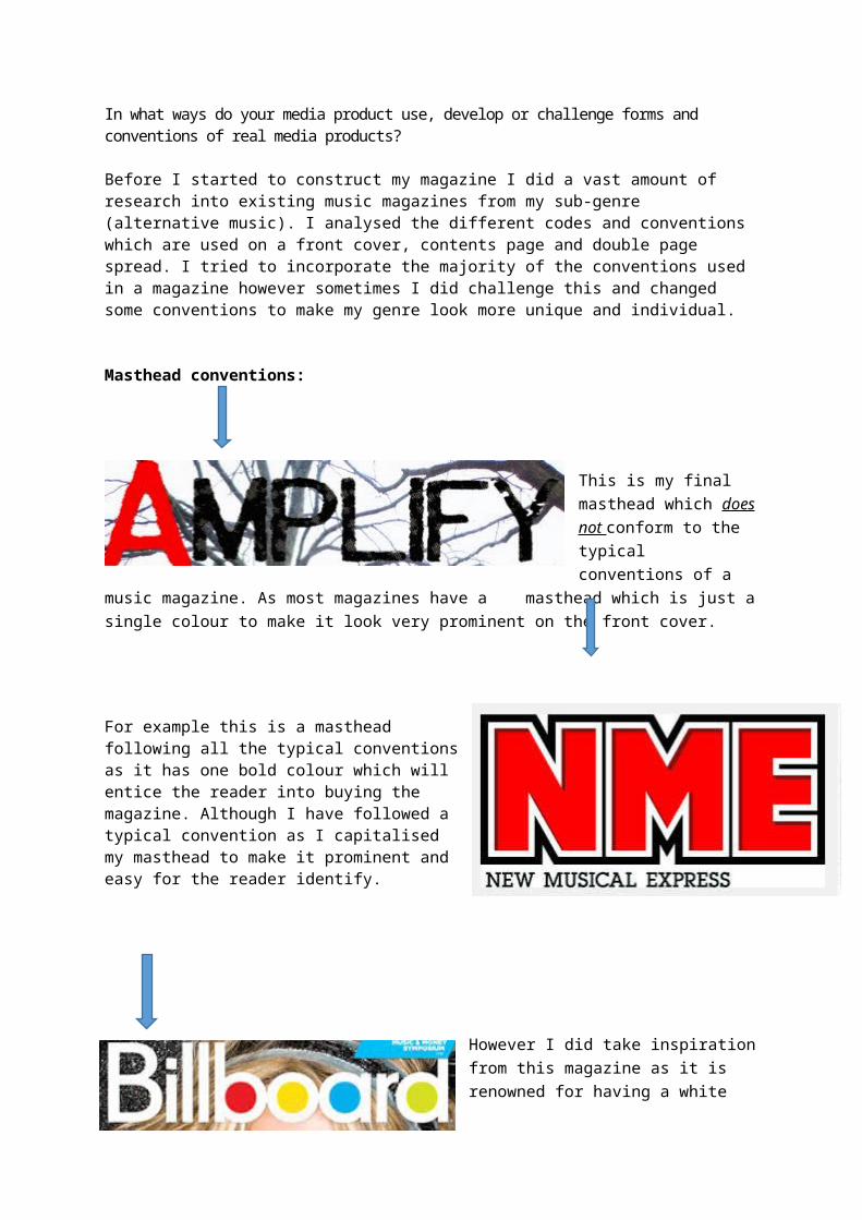
In what ways do your media product use, develop or challenge forms and conventions of real media products?
Before I started to construct my magazine I did a vast amount of research into existing music magazines from my sub-genre (alternative music). I analysed the different codes and conventions which are used on a front cover, contents page and double page spread. I tried to incorporate the majority of the conventions used in a magazine however sometimes I did challenge this and changed some conventions to make my genre look more unique and individual.
Masthead conventions:
This is my final masthead which does not conform to the typical conventions of a music magazine. As most magazines have a
masthead which is just a single colour to make it look very prominent on the front cover.
For example this is a masthead following all the typical conventions as it has one bold colour which will entice the reader into buying the magazine. Although I have followed a typical convention as I capitalised my masthead to make it prominent and easy for the reader identify.
However I did take inspiration from this magazine as it is renowned for having a white masthead with different colours filling in the letters. I used this creativity for my magazine as I liked the idea that the
masthead didn’t conform to the usual ‘rules’ when creating a masthead. This is how I came up with the idea that the ‘A’ from Amplify should be coloured in red whilst the rest of the masthead was black.
Puff Conventions:
I have followed the conventions of the puffs used in ‘NME’ magazine. I used circular shapes which contrasts to the rectangular shapes used in most magazines. I used the tag ‘WIN’ to catch the reader’s attention which is very similar to NME’s puff where they use capitalisation to entice the reader. I used a puff in my magazine as an effective ploy to try and get the reader to purchase the magazine.
For my headline I have followed the conventions of having it at the top of the page. I experimented with having the headline at the bottom of the page but the headline blended in to the picture making it hard to read. ‘Billboard’ magazine have the headline at the top of the page to display the most important article in the magazine. However ‘NME’ challenge this typical convention and place their headline in the centre of the front cover to display that it is going to be the most talked about article. Both magazines use the artist’s names as the main headline before using sub-headings to explain the article. I used this convention as it would be easy for fans to identify the main headlines just by seeing the artist’s names.
Focusing on graphology I would say that my front cover was similar to NME’s it includes conventions such as puffs, cover lines, headlines and mastheads. Although NME uses secondary images to preview other articles although I did use a picture of an album to highlight the main article in the magazine.
In terms of font style I used a similar font to NME where it looked quite informal which gave a more relaxed feeling, I liked this as it would appeal to my target audience more. Whereas I am not following the conventions of Billboard magazine as they used capitalised text to add a serious tone which I don’t think would able my target audience to connect with the magazine. Although I did incorporate Billboard’s font colour as I wanted it to contrast with my background so that it added personality.
Unlike the other two front covers my main image doesn’t use direct address which gives a sense of mystery. I used a mid-mid shot to give the readers a view on what my model is wearing so that my target audience can get a current look into what my model is wearing.
I tried to stick to my colour scheme of red, white, grey and black to appeal to both a male and female target audience. I used accent colours such as red to highlight the important articles and used in my magazine. I chose a colour scheme which was very similar to NME although they used both red and neon yellow to symbolise the important conventions in their magazine. My colour scheme fits the more ‘alternative’ genre as it has dark colours with red contrasting against the
On my contents page I have developed and used conventions by including:
-The colour scheme from the front cover, throughout the contents page which was black, red, white and grey.
- A large image of my main model was used in my contents page to develop the front cover
-Use a similar font to the masthead
I tried to stick to my colour scheme of red, white, grey and black to appeal to both a male and female target audience. I used accent colours such as red to highlight the important articles and used in my magazine. I chose a colour scheme which was very similar to NME although they used both red and neon yellow to symbolise the important conventions in their magazine. My colour scheme fits the more ‘alternative’ genre as it has dark colours with red contrasting against the
A convention I used similar from the NME magazine was that I created a header to explain to the reader what’s inside. Although the NME magazine went into a lot more depth in the contents page about the articles included. Whereas I only gave a small amount of information to the reader, I think this was useful so that there is still an element of surprise for when the readers open my magazine.
I have stuck to the typical conventions of a double page spread in the sense that I have used my main image as a focus point, although I have sued other secondary images to build up the bands profile.
Similar to NME I have used columns to display the interview so it is structured well for the readers. However one convention I have changed is instead of having the quotation in the middle of the page surrounded by the text. I included it on the page where my image was so that it received a lot more attention and didn’t look cramped.
Again I consistently used my colour scheme all the way through my magazine