302
Medical Statistics from Scratch An Introduction for Health Professionals Second Edition David Bowers Honorary Lecturer, School of Medicine, University of Leeds, UK

OTE/SPH OTE/SPH
JWBK220-FM November 28, 2007 11:13 Char Count= 0
Medical Statistics from ScratchAn Introduction for Health Professionals
Second Edition
David BowersHonorary Lecturer, School of Medicine, University of Leeds, UK
iii


OTE/SPH OTE/SPH
JWBK220-FM November 28, 2007 11:13 Char Count= 0
Medical Statistics from ScratchSecond Edition
i

OTE/SPH OTE/SPH
JWBK220-FM November 28, 2007 11:13 Char Count= 0
ii
OTE/SPH OTE/SPH
JWBK220-FM November 28, 2007 11:13 Char Count= 0
Medical Statistics from ScratchAn Introduction for Health Professionals
Second Edition
David BowersHonorary Lecturer, School of Medicine, University of Leeds, UK
iii

OTE/SPH OTE/SPH
JWBK220-FM November 28, 2007 11:13 Char Count= 0
Copyright C© 2008 John Wiley & Sons Ltd, The Atrium, Southern Gate, Chichester,West Sussex PO19 8SQ, England
Telephone (+44) 1243 779777
Email (for orders and customer service enquiries): [email protected] our Home Page on www.wileyeurope.com or www.wiley.com
All Rights Reserved. No part of this publication may be reproduced, stored in a retrieval system or transmitted inany form or by any means, electronic, mechanical, photocopying, recording, scanning or otherwise, except underthe terms of the Copyright, Designs and Patents Act 1988 or under the terms of a licence issued by the CopyrightLicensing Agency Ltd, 90 Tottenham Court Road, London W1T 4LP, UK, without the permission in writing of thePublisher. Requests to the Publisher should be addressed to the Permissions Department, John Wiley & Sons Ltd,The Atrium, Southern Gate, Chichester, West Sussex PO19 8SQ, England, or emailed to [email protected], orfaxed to (+44) 1243 770620.
Designations used by companies to distinguish their products are often claimed as trademarks. All brand names andproduct names used in this book are trade names, service marks, trademarks or registered trademarks of theirrespective owners. The Publisher is not associated with any product or vendor mentioned in this book.
This publication is designed to provide accurate and authoritative information in regard to the subject mattercovered. It is sold on the understanding that the Publisher is not engaged in rendering professional services. Ifprofessional advice or other expert assistance is required, the services of a competent professional should be sought.
Other Wiley Editorial Offices
John Wiley & Sons Inc., 111 River Street, Hoboken, NJ 07030, USA
Jossey-Bass, 989 Market Street, San Francisco, CA 94103-1741, USA
Wiley-VCH Verlag GmbH, Boschstr. 12, D-69469 Weinheim, Germany
John Wiley & Sons Australia Ltd, 33 Park Road, Milton, Queensland 4064, Australia
John Wiley & Sons (Asia) Pte Ltd, 2 Clementi Loop #02-01, Jin Xing Distripark, Singapore 129809
John Wiley & Sons Canada Ltd, 6045 Freemont Blvd, Mississauga, Ontario, L5R 4J3
Wiley also publishes its books in a variety of electronic formats. Some content that appears in print may not beavailable in electronic books.
Library of Congress Cataloging-in-Publication Data
Bowers, David, 1938–Medical statistics from scratch : an introduction for health professionals / David Bowers. — 2nd ed.
p. ; cm.Includes bibliographical references and index.ISBN 978-0-470-51301-9 (cloth : alk, paper)
1. Medical statistics. 2. Medicine—Research—Statistical methods. I. Title.[DNLM: 1. Biometry. 2. Statistics—methods. WA 950 B786m 2007]RA409.B669 2007610.72’7—dc22
2007041619
British Library Cataloguing in Publication Data
A catalogue record for this book is available from the British Library
ISBN 978-0-470-51301-9
Typeset in 10/12pt Minion by Aptara Inc., New Delhi, IndiaPrinted and bound in Great Britain by Antony Rowe Ltd., Chippenham, WiltsThis book is printed on acid-free paper responsibly manufactured from sustainable forestryin which at least two trees are planted for each one used for paper production.
iv

OTE/SPH OTE/SPH
JWBK220-FM November 28, 2007 11:13 Char Count= 0
This book is for Susanne
v

OTE/SPH OTE/SPH
JWBK220-FM November 28, 2007 11:13 Char Count= 0
vi

OTE/SPH OTE/SPH
JWBK220-FM November 28, 2007 11:13 Char Count= 0
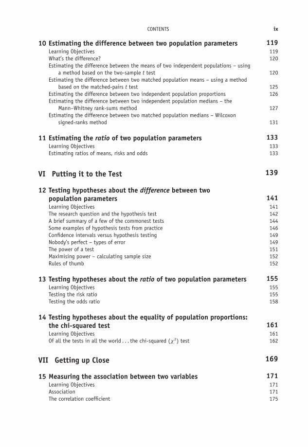
Contents
Preface to the 2nd Edition xi
Preface to the 1st Edition xiii
Introduction xv
I Some Fundamental Stuff 1
1 First things first – the nature of data 3Learning Objectives 3Variables and data 3The good, the bad, and the ugly – types of variable 4Categorical variables 4Metric variables 7How can I tell what type of variable I am dealing with? 9
II Descriptive Statistics 15
2 Describing data with tables 17Learning Objectives 17What is descriptive statistics? 17The frequency table 18
3 Describing data with charts 29Learning Objectives 29Picture it! 29Charting nominal and ordinal data 30Charting discrete metric data 34Charting continuous metric data 35Charting cumulative data 37
4 Describing data from its shape 43Learning Objectives 43The shape of things to come 43
vii

OTE/SPH OTE/SPH
JWBK220-FM November 28, 2007 11:13 Char Count= 0
viii CONTENTS
5 Describing data with numeric summary values 51Learning Objectives 51Numbers R us 52Summary measures of location 54Summary measures of spread 57Standard deviation and the Normal distribution 65
III Getting the Data 69
6 Doing it right first time – designing a study 71Learning Objectives 71Hey ho! Hey ho! It’s off to work we go 72Collecting the data – types of sample 74Types of study 75Confounding 81Matching 81Comparing cohort and case-control designs 83Getting stuck in – experimental studies 83
IV From Little to Large – Statistical Inference 91
7 From samples to populations – making inferences 93Learning Objectives 93Statistical inference 93
8 Probability, risk and odds 97Learning Objectives 97Chance would be a fine thing – the idea of probability 98Calculating probability 99Probability and the Normal distribution 100Risk 100Odds 101Why you can’t calculate risk in a case-control study 102The link between probability and odds 103The risk ratio 104The odds ratio 105Number needed to treat (NNT) 106
V The Informed Guess – Confidence Interval Estimation 109
9 Estimating the value of a single population parameter – the idea ofconfidence intervals 111Learning Objectives 111Confidence interval estimation for a population mean 112Confidence interval for a population proportion 116Estimating a confidence interval for the median of a single population 117
OTE/SPH OTE/SPH
JWBK220-FM November 28, 2007 11:13 Char Count= 0
CONTENTS ix
10 Estimating the difference between two population parameters 119Learning Objectives 119What’s the difference? 120Estimating the difference between the means of two independent populations – using
a method based on the two-sample t test 120Estimating the difference between two matched population means – using a method
based on the matched-pairs t test 125Estimating the difference between two independent population proportions 126Estimating the difference between two independent population medians – the
Mann–Whitney rank-sums method 127Estimating the difference between two matched population medians – Wilcoxon
signed-ranks method 131
11 Estimating the ratio of two population parameters 133Learning Objectives 133Estimating ratios of means, risks and odds 133
VI Putting it to the Test 139
12 Testing hypotheses about the difference between twopopulation parameters 141Learning Objectives 141The research question and the hypothesis test 142A brief summary of a few of the commonest tests 144Some examples of hypothesis tests from practice 146Confidence intervals versus hypothesis testing 149Nobody’s perfect – types of error 149The power of a test 151Maximising power – calculating sample size 152Rules of thumb 152
13 Testing hypotheses about the ratio of two population parameters 155Learning Objectives 155Testing the risk ratio 155Testing the odds ratio 158
14 Testing hypotheses about the equality of population proportions:the chi-squared test 161Learning Objectives 161Of all the tests in all the world . . . the chi-squared (χ2) test 162
VII Getting up Close 169
15 Measuring the association between two variables 171Learning Objectives 171Association 171The correlation coefficient 175

OTE/SPH OTE/SPH
JWBK220-FM November 28, 2007 11:13 Char Count= 0
x CONTENTS
16 Measuring agreement 181Learning Objectives 181To agree or not agree: that is the question 181Cohen’s kappa 182Measuring agreement with ordinal data – weighted kappa 184Measuring the agreement between two metric continuous variables 184
VIII Getting into a Relationship 187
17 Straight line models: linear regression 189Learning Objectives 189Health warning! 190Relationship and association 190The linear regression model 192Model building and variable selection 200
18 Curvy models: logistic regression 213Learning Objectives 213A second health warning! 213Binary dependent variables 214The logistic regression model 215
IX Two More Chapters 225
19 Measuring survival 227Learning Objectives 227Introduction 227Calculating survival probabilities and the proportion surviving: the Kaplan-Meier table 228The Kaplan-Meier chart 230Determining median survival time 231Comparing survival with two groups 232
20 Systematic review and meta-analysis 239Learning Objectives 239Introduction 240Systematic review 240Publication and other biases 244The funnel plot 244Combining the studies 246
Appendix: Table of random numbers 251
Solutions to Exercises 253
References 273
Index 277

OTE/SPH OTE/SPH
JWBK220-FM November 28, 2007 11:13 Char Count= 0
Preface to the 2nd Edition
This book is a ‘not-too-mathematical’ introduction to medical statistics. It should appeal toanyone training or working in the health care arena – whatever their particular discipline –who wants either a simple introduction to the subject, or a gentle reminder of stuff they mighthave forgotten. I have aimed the book at:� Students doing a first degree or diploma in clinical and health care courses.� Students doing post-graduate clinical and health care studies.� Health care professionals doing professional and membership examinations.� Health care professionals who want to brush up on some medical statistics generally, or who
want a simple reminder of a particular topic.� Anybody else who wants to know a bit of what medical statistics is about.
The most significant change in this second edition is the addition of two new chapters, one onmeasuring survival, and one on systematic review and meta-analysis. The ability to understandthe principles of survival analysis is important, not least because of its popularity in clinicalresearch, and consequently in the clinical literature. Similarly, the increasing importance ofevidence-based clinical practice means that systematic review and meta-analysis also demanda place. In addition, I have taken the opportunity to correct and freshen the text in a few places,as well as adding a small number of new examples. My thanks to Lucy Sayer, my editor at JohnWiley, for her enthusiastic support, to Liz Renwick and Robert Hambrook, and all the otherwiley people, for their invaluable help and special thanks to my copy-editor Barbara Noble, forher truly excellent work and enthusiasm (of course, any remaining errors are mine).
I am happy to get any comments and criticisms from you. You can e-mail me at:[email protected].
xi

OTE/SPH OTE/SPH
JWBK220-FM November 28, 2007 11:13 Char Count= 0
xii

OTE/SPH OTE/SPH
JWBK220-FM November 28, 2007 11:13 Char Count= 0
Preface to the 1st Edition
This book is intended to be an introduction to medical statistics but one which is not toomathematical—in fact has the absolute minimum of maths. The exceptions however are Chap-ters 17 and 18, on linear and logistic regression. It’s really impossible to provide material onthese procedures without some maths, and I hesitated about including them at all. Howeverthey are such useful and widely used techniques, particularly logistic regression and its pro-duction of odds ratios, that I felt they must go in. Of course you don’t have to read them. Itshould appeal to anyone training or working in the health care arena—whatever their particulardiscipline—who wants a simple, not-too-technical introduction to the subject. I have aimedthe book at:� students doing either a first degree or diploma in health care-related courses� students doing postgraduate health care studies� health care professionals doing professional and membership examinations� health care professionals who want to brush up on some medical statistics generally, or who
want a simple reminder of one particular topic� anybody else who wants to know a bit of what medical statistics is about.
I intended originally to make this book an amalgam of two previous books of mine, Statisticsfrom Scratch for Health Care Professionals and Statistics Further from Scratch. However, althoughit covers a lot of the same material as in those two books, this is in reality a completely newbook, with a lot of extra stuff, particularly on linear and logistic regression. I am happy to getany comments and criticisms from you. You can e-mail me at: [email protected].
xiii

OTE/SPH OTE/SPH
JWBK220-FM November 28, 2007 11:13 Char Count= 0
xiv

OTE/SPH OTE/SPH
JWBK220-FM November 28, 2007 11:13 Char Count= 0
Introduction
Before the spread of personal computers, researchers had to do most things by hand (by which Imean with a calculator), and so most statistics books were full of equations and their derivations,with many pages of the necessary statistical tables. Analysing anything other than small samplescould be time-consuming and error prone. You also needed to be reasonably good at maths. Ofcourse, for the statistics specialist there is still a need for books that deal with statistical theory,and the often complex mathematics which underlies the subject.
However, now that there are computers in most offices and homes, and many professionalshave some access to a computer statistics programme, there is room for books which focusmore on an understanding of the principal ideas which underlie the statistical procedures, onknowing which approach is the most appropriate, and under what circumstances, and on theinterpretation of the outputs from a statistics program.
I have thus tried to keep the technical stuff to a minimum. There are a few equations here andthere (most in the last few chapters), but those I have provided are mainly for the purposes ofdoing some of the exercises. I have also assumed that readers will have a nodding acquaintance ofeither SPSS or Minitab. Short courses in these programs are now widely available to most clinicalstaff. I also provide a few examples of outputs from SPSS and Minitab, for the commonestapplications, which I hope will help you make sense of any results you get. Both SPSS andMinitab have excellent Help facilities, which should answer most of the difficulties you mayhave.
Remember this is an introductory book. If you want to explore any of the methods I describein more detail, you can always turn to one of the more comprehensive medical statistics books,such as Altman (1991), or Bland (1995).
xv

OTE/SPH OTE/SPH
JWBK220-FM November 28, 2007 11:13 Char Count= 0
xvi

OTE/SPH OTE/SPH
JWBK220-01 December 21, 2007 19:2 Char Count= 0
I
Some Fundamental Stuff
1

OTE/SPH OTE/SPH
JWBK220-01 December 21, 2007 19:2 Char Count= 0
2

OTE/SPH OTE/SPH
JWBK220-01 December 21, 2007 19:2 Char Count= 0
1First things first – the natureof data
Learning objectives
When you have finished this chapter, you should be able to:� Explain the difference between nominal, ordinal, and metric discrete and metric con-tinuous variables.� Identify the type of a variable.� Explain the non-numeric nature of ordinal data.
Variables and data
A variable is something whose value can vary. For example, age, sex and blood type arevariables. Data are the values you get when you measure1 a variable. For example, 32 years(for the variable age), or female (for the variable sex). I have illustrated the idea in Table 1.1.
1 I am using ‘measure’ in the broadest sense here. We wouldn’t measure the sex or the ethnicity of someone, forexample. We would instead usually observe it or ask the person or get the value from a questionnaire. But wewould measure their height or their blood pressure. More on this shortly.
Medical Statistics from Scratch, Second Edition David BowersC© 2008 John Wiley & Sons, Ltd

OTE/SPH OTE/SPH
JWBK220-01 December 21, 2007 19:2 Char Count= 0
4 CH 1 FIRST THINGS FIRST – THE NATURE OF DATA
Table 1.1 Variables and data
Mrs Brown Mr Patel Ms Manda
Age 32 24 20
Sex Female Male Female
Blood type O O A
The variables ... ... and the data.
The good, the bad, and the ugly – types of variable
There are two major types of variable – categorical variables and metric2 variables. Each of thesecan be further divided into two sub-types, as shown in Figure 1.1, which also summarises theirmain characteristics.
Categorical variables Metric variables
Nominal Ordinal Discrete Continuous
Values in Values in Integer values Continuous values
arbitrary ordered on proper numeric on proper numericcategories
(no units) (no units) (counted units) (measured units)
line or scale line or scale
categories
Figure 1.1 Types of variable
Categorical variables
Nominal categorical variables
Consider the variable blood type. Let’s assume for simplicity that there are only four differentblood types: O, A, B, and A/B. Suppose we have a group of 100 patients. We can first determinethe blood type of each and then allocate the result to one of the four blood type categories. Wemight end up with a table like Table 1.2.
2 You will also see metric data referred to as interval/ratio data. The computer package SPSS uses the term ‘scale’data.

OTE/SPH OTE/SPH
JWBK220-01 December 21, 2007 19:2 Char Count= 0
CATEGORICAL VARIABLES 5
Table 1.2 Blood types of 100 patients (fictitious data)
Number of patientsBlood type (or frequency)
O 65A 15B 12A/B 8
By the way, a table like Table 1.2 is called a frequency table, or a contingency table. It shows howthe number, or frequency, of the different blood types is distributed across the four categories.So 65 patients have a blood type O, 15 blood type A, and so on. We’ll look at frequency tablesin more detail in the next chapter.
The variable ‘blood type’ is a nominal categorical variable. Notice two things about thisvariable, which is typical of all nominal variables:� The data do not have any units of measurement.3� The ordering of the categories is completely arbitrary. In other words, the categories cannot
be ordered in any meaningful way.4
In other words we could just as easily write the blood type categories as A/B, B, O, A or B, O, A,A/B, or B, A, A/B, O, or whatever. We can’t say that being in any particular category is better,or shorter, or quicker, or longer, than being in any other category.
Exercise 1.1 Suggest a few other nominal variables.
Ordinal categorical variables
Let’s now consider another variable some of you may be familiar with – the Glasgow Coma Scale,or GCS for short. As the name suggests, this scale measures the degree of brain injury followinghead trauma. A patient’s Glasgow Coma Scale score is judged by their responsiveness, as observedby a clinician, in three areas: eye opening response, verbal response and motor response. TheGCS score can vary from 3 (death or severe injury) to 15 (mild or no injury). In other words,there are 13 possible values or categories of brain injury.
Imagine that we determine the Glasgow Coma Scale scores of the last 90 patients admittedto an Emergency Department with head trauma, and we allocate the score of each patient toone of the 13 categories. The results might look like the frequency table shown in Table 1.3.
3 For example, cm, or seconds, or ccs, or kg, etc.4 We are excluding trivial arrangements such as alphabetic.

OTE/SPH OTE/SPH
JWBK220-01 December 21, 2007 19:2 Char Count= 0
6 CH 1 FIRST THINGS FIRST – THE NATURE OF DATA
Table 1.3 A frequency table showingthe (hypothetical) distribution of 90Glasgow Coma Scale scores
Glasgow Coma Number ofScale score patients
3 84 15 66 57 58 79 6
10 811 812 1013 1214 915 5
The Glasgow Coma Scale is an ordinal categorical variable. Notice two things about thisvariable, which is typical of all ordinal variables:� The data do not have any units of measurement (so the same as for nominal variables).� The ordering of the categories is not arbitrary as it was with nominal variables. It is now
possible to order the categories in a meaningful way.
In other words, we can say that a patient in the category ‘15’ has less brain injury than a patientin category ‘14’. Similarly, a patient in the category ‘14’ has less brain injury than a patient incategory ‘13’, and so on.
However, there is one additional and very important feature of these scores, (or any other setof ordinal scores). Namely, the difference between any pair of adjacent scores is not necessarilythe same as the difference between any other pair of adjacent scores.
For example, the difference in the degree of brain injury between Glasgow Coma Scale scoresof 5 and 6, and scores of 6 and 7, is not necessarily the same. Nor can we say that a patient witha score of say 6 has exactly twice the degree of brain injury as a patient with a score of 12. Thedirect consequence of this is that ordinal data therefore are not real numbers. They cannot beplaced on the number line.5 The reason is, of course, that the Glasgow Coma Scale data, and
5 The number line can be visualised as a horizontal line stretching from minus infinity on the left to plus infinityon the right. Any real number, whether negative or positive, decimal or integer (whole number), can be placedsomewhere on this line.
OTE/SPH OTE/SPH
JWBK220-01 December 21, 2007 19:2 Char Count= 0
METRIC VARIABLES 7
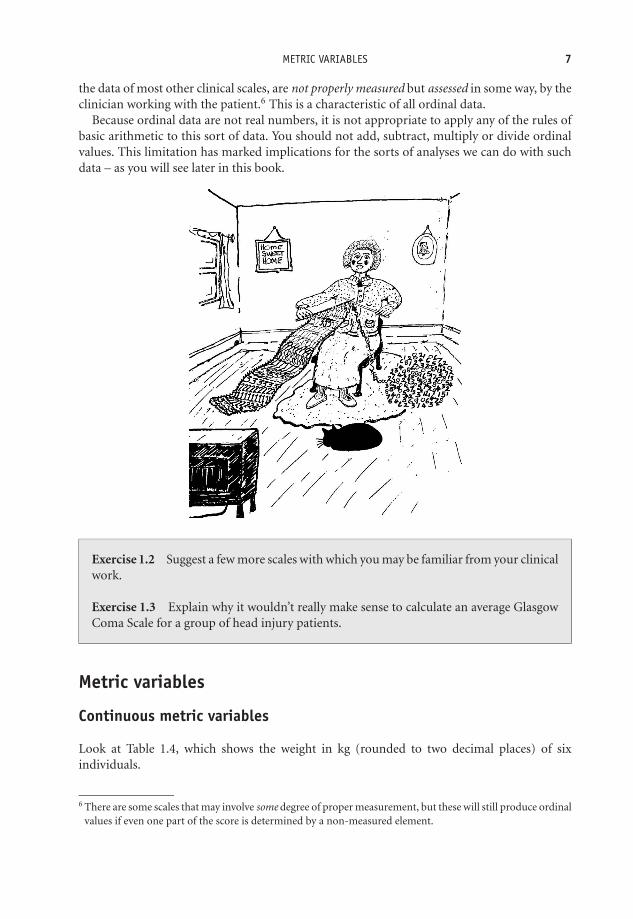
the data of most other clinical scales, are not properly measured but assessed in some way, by theclinician working with the patient.6 This is a characteristic of all ordinal data.
Because ordinal data are not real numbers, it is not appropriate to apply any of the rules ofbasic arithmetic to this sort of data. You should not add, subtract, multiply or divide ordinalvalues. This limitation has marked implications for the sorts of analyses we can do with suchdata – as you will see later in this book.
Exercise 1.2 Suggest a few more scales with which you may be familiar from your clinicalwork.
Exercise 1.3 Explain why it wouldn’t really make sense to calculate an average GlasgowComa Scale for a group of head injury patients.
Metric variables
Continuous metric variables
Look at Table 1.4, which shows the weight in kg (rounded to two decimal places) of sixindividuals.
6 There are some scales that may involve some degree of proper measurement, but these will still produce ordinalvalues if even one part of the score is determined by a non-measured element.

OTE/SPH OTE/SPH
JWBK220-01 December 21, 2007 19:2 Char Count= 0
8 CH 1 FIRST THINGS FIRST – THE NATURE OF DATA
Table 1.4 The weight of six patients
Patient Weight (kg)
Ms V. Wood 68.25Mr P. Green 80.63Ms S. Lakin 75.00Mrs B. Noble 71.21Ms G. Taylor 73.44Ms J. Taylor 76.98
The variable ‘weight’ is a metric continuous variable. With metric variables, proper measure-ment is possible. For example, if we want to know someone’s weight, we can use a weighingmachine, we don’t have to look at the patient and make a guess (which would be approximate),or ask them how heavy they are (very unreliable). Similarly, if we want to know their diastolicblood pressure we can use a sphygmometer.7 Guessing, or asking, is not necessary.
Because they can be properly measured, these variables produce data that are real numbers,and so can be placed on the number line. Some common examples of metric continuousvariables include: birthweight (g), blood pressure (mmHg), blood cholesterol (μg/ml), waitingtime (minutes), body mass index (kg/m2), peak expiry flow (l per min), and so on. Notice thatall of these variables have units of measurement attached to them. This is a characteristic of allmetric continuous variables.
In contrast to ordinal values, the difference between any pair of adjacent values is exactly thesame. The difference between birthweights of 4000 g and 4001 g is the same as the differencebetween 4001 g and 4002 g, and so on. This property of real numbers is known as the intervalproperty (and as we have seen, it’s not a property possessed by ordinal values). Moreover, a bloodcholesterol score, for example, of 8.4 μg/ml is exactly twice a blood cholesterol of 4.2 μg/ml.This property is known as the ratio property (again not shared by ordinal values).8 In summary:� Metric continuous variables can be properly measured and have units of measurement.� They produce data that are real numbers (located on the number line).
These properties are in marked contrast to the characteristics of nominal and ordinal variables.Because metric data values are real numbers, you can apply all of the usual mathematical
operations to them. This opens up a much wider range of analytical possibilities than is possiblewith either nominal or ordinal data – as you will see.
Exercise 1.4 Suggest a few continuous metric variables with which you are familiar.What is the difference between, and consequences of, assessing the value of somethingand measuring it?
7 We call the device we use to obtain the measured value, e.g. a weighing scale, or a sphygmometer, or tapemeasure, etc., a measuring instrument.
8 It is for these two reasons that metric data is also known as ‘interval/ratio’ data – but ‘metric’ data is shorter!

OTE/SPH OTE/SPH
JWBK220-01 December 21, 2007 19:2 Char Count= 0
HOW CAN I TELL WHAT TYPE OF VARIABLE I AM DEALING WITH? 9
Table 1.5 The number of times that a groupof children with asthma used their inhalers inthe past 24 hours
Number of times inhalerPatient used in past 24 hours
Tim 1Jane 2Susie 6Barbara 6Peter 7Gill 8
Discrete metric variables
Consider the data in Table 1.5. This shows the number of times in the past 24 hours that eachof six children with asthma used their inhalers.
Continuous metric data usually comes from measuring. Discrete metric data, such as that inTable 1.5, usually comes from counting. For example, number of deaths, number of pressuresores, number of angina attacks, and so on, are all discrete metric variables. The data pro-duced are real numbers, and are invariably integer (i.e. whole number). They can be placedon the number line, and have the same interval and ratio properties as continuous metricdata:� Metric discrete variables can be properly counted and have units of measurement – ‘numbers
of things’.� They produce data which are real numbers located on the number line.
Exercise 1.5 Suggest a few discrete metric variables with which you are familiar.
Exercise 1.6 What is the difference between a continuous and a discrete metric variable?Somebody shows you a six-pack egg carton. List (a) the possible number of eggs that thecarton could contain; (b) the number of possible values for the weight of the empty carton.What do you conclude?
How can I tell what type of variable I am dealing with?
The easiest way to tell whether data is metric is to check whether it has units attached to it, suchas: g, mm, ◦C, μg/cm3, number of pressure sores, number of deaths, and so on. If not, it may beordinal or nominal – the former if the values can be put in any meaningful order. Figure 1.2 isan aid to variable type recognition.

OTE/SPH OTE/SPH
JWBK220-01 December 21, 2007 19:2 Char Count= 0
10 CH 1 FIRST THINGS FIRST – THE NATURE OF DATA
Has the variable got units? (this
includes 'numbers of things')
YesNo
Do the data come from
measuring or counting?
Counting Measuring
Discrete metric
Continuous metric
Can the data be put in
meaningful order?
YesNo
Categorical ordinal
Categorical nominal
Figure 1.2 An algorithm to help identify variable type
Exercise 1.7 Four migraine patients are asked to assess the severity of their migrainepain one hour after the first symptoms of an attack, by marking a point on a horizontalline, 100 mm long. The line is marked ‘No pain’, at the left-hand end, and ‘Worst possiblepain’ at the right-hand end. The distance of each patient’s mark from the left-hand endis subsequently measured with a mm rule, and their scores are 25 mm, 44 mm, 68 mmand 85 mm. What sort of data is this? Can you calculate the average pain of these fourpatients? Note that this form of measurement (using a line and getting subjects to markit) is known as a visual analogue scale (VAS).
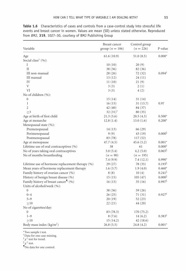
Exercise 1.8 Table 1.6 contains the characteristics of cases and controls from a case-control study9 into stressful life events and breast cancer in women (Protheroe et al.1999).Identify the type of each variable in the table.
Exercise 1.9 Table 1.7 is from a cross-section study to determine the incidence ofpregnancy-related venous thromboembolic events and their relationship to selected riskfactors, such as maternal age, parity, smoking, and so on (Lindqvist et al. 1999). Identifythe type of each variable in the table.
Exercise 1.10 Table 1.8 is from a study to compare two lotions, Malathion andd-phenothrin, in the treatment of head lice (Chosidow et al. 1994). In 193 schoolchil-dren, 95 children were given Malathion and 98 d-phenothrin. Identify the type of eachvariable in the table.
At the end of each chapter you should look again at the learning objectives and satisfy yourselfthat you have achieved them.
9Don’t worry about the different types of study, I will discuss them in detail in Chapter 6.
OTE/SPH OTE/SPH
JWBK220-01 December 21, 2007 19:2 Char Count= 0
HOW CAN I TELL WHAT TYPE OF VARIABLE I AM DEALING WITH? 11
Table 1.6 Characteristics of cases and controls from a case-control study into stressful lifeevents and breast cancer in women. Values are mean (SD) unless stated otherwise. Reproducedfrom BMJ, 319, 1027–30, courtesy of BMJ Publishing Group
Breast cancer Control groupVariable group (n = 106) (n = 226) P value
Age 61.6 (10.9) 51.0 (8.5) 0.000∗
Social class† (%):I 10 (10) 20 (9)II 38 (36) 82 (36)III non-manual 28 (26) 72 (32) 0.094‡
III manual 13 (12) 24 (11)IV 11 (10) 21 (9)V 3 (3) 2 (1)VI 3 (3) 4 (2)
No of children (%):0 15 (14) 31 (14)1 16 (15) 31 (13.7) 0.972 42 (40) 84 (37)≥3 32 (31)† 80 (35)
Age at birth of first child 21.3 (5.6) 20.5 (4.3) 0.500∗
Age at menarche 12.8 (1.4) 13.0 (1.6) 0.200∗
Menopausal state (%):Premenopausal 14 (13) 66 (29)Perimenopausal 9 (9) 43 (19) 0.000§
Postmenopausal 83 (78) 117 (52)Age at menopause 47.7 (4.5) 45.6 (5.2) 0.001∗
Lifetime use of oral contraceptives (%) 38 61 0.000‡
No of years taking oral contraceptives 3.0 (5.4) 4.2 (5.0) 0.065§
No of months breastfeeding (n = 90) (n = 195)7.4 (9.9) 7.4 (12.1) 0.990∗
Lifetime use of hormone replacement therapy (%) 29 (27) 78 (35) 0.193§
Mean years of hormone replacement therapy 1.6 (3.7) 1.9 (4.0) 0.460∗
Family history of ovarian cancer (%) 8 (8) 10 (4) 0.241§
History of benign breast disease (%) 15 (15) 105 (47) 0.000§
Family history of breast cancer¶ (%) 16 (15) 35 (16) 0.997§
Units of alcohol/week (%):0 38 (36) 59 (26)0–4 26 (25) 71 (31) 0.927‡
5–9 20 (19) 52 (23)≥10 22 (21) 44 (20)
No of cigarettes/day:0 83 (78.3) 170 (75.2)1–9 8 (7.6) 14 (6.2) 0.383‡
≥10 15 (14.2) 42 (18.6)Body mass index (kg/m2) 26.8 (5.5) 24.8 (4.2) 0.001∗
∗Two sample t test.†Data for one case missing.‡χ2 test for trend.§χ2 test.¶No data for one control.

OTE/SPH OTE/SPH
JWBK220-01 December 21, 2007 19:2 Char Count= 0
12 CH 1 FIRST THINGS FIRST – THE NATURE OF DATA
Table 1.7 Patient characteristics from a cross-section study of thrombotic risk duringpregnancy. Reproduced with permission from Elsevier (Obstetrics and Gynaecology, 1999, Vol. 94,pages 595–599.
Thrombosis cases Controls(n = 608) (n = 114,940) OR 95% CI
Maternal age (y) (classification 1)≤19 26 (4.3) 2817 (2.5) 1.9 1.3, 2.920–24 125 (20.6) 23,006 (20.0) 1.1 0.9, 1.425–29 216 (35.5) 44,763 (38.9) 1.0 Reference30–34 151 (24.8) 30,135 (26.2) 1.0 0.8, 1.3≥35 90 (14.8) 14,219 (12.4) 1.3 1.0, 1.7
Maternal age (y) (classification 2)≤19 26 (4.3) 2817 (2.5) 1.8 1.2, 2.720–34 492 (80.9) 97,904 (85.2) 1.0 Reference≥35 90 (14.8) 14,219 (12.4) 1.3 1.0, 1.6
ParityPara 0 304 (50.0) 47,425 (41.3) 1.8 1.5, 2.2Para 1 142 (23.4) 40,734 (35.4) 1.0 ReferencePara 2 93 (15.3) 18,113 (15.8) 1.5 1.1, 1.9≥Para 3 69 (11.3) 8429 (7.3) 2.4 1.8, 3.1Missing data 0 (0) 239 (0.2)
No. of cigarettes daily0 423 (69.6) 87,408 (76.0) 1.0 Reference1–9 80 (13.2) 14,295 (12.4) 1.2 0.9, 1.5≥10 57 (9.4) 8177 (7.1) 1.4 1.1, 1.9Missing data 48 (7.9) 5060 (4.4)
Multiple pregnancyNo 593 (97.5) 113,330 (98.6) 1.0 ReferenceYes 15 (2.5) 1610 (1.4) 1.8 1.1, 3.0
PreeclampsiaNo 562 (92.4) 111,788 (97.3) 1.0 ReferenceYes 46 (7.6) 3152 (2.7) 2.9 2.1,3.9
Cesarean deliveryNo 420 (69.1) 102,181 (88.9) 1.0 ReferenceYes 188 (30.9) 12,759 (11.1) 3.6 3.0,4.3
OR = odds ratio; CI = confidence interval.Data presented as n (%).

OTE/SPH OTE/SPH
JWBK220-01 December 21, 2007 19:2 Char Count= 0
HOW CAN I TELL WHAT TYPE OF VARIABLE I AM DEALING WITH? 13
Table 1.8 Basic characteristics of two groups of children in a study to compare two lotions inthe treatment of head lice. One group (95 children) were given Malathion lotion, the secondgroup (98 children), d-phenothrin. Reprinted courtesy of Elsevier (The Lancet, 1994, 344,1724–26)
Characteristic Malathion (n = 95) d-phenothrin (n = 98)
Age at randomisation (yr) 8.6 (1.6) 8.9 (1.6)Sex—no of children (%)Male 31 (33) 41 (42)Female 64 (67) 57 (58)Home no (mean)Number of rooms 3.3 (1.2) 3.3 (1.8)Length of hair—no of children (%)∗
Long 37 (39) 20 (21)Mid-long 23 (24) 33 (34)Short 35 (37) 44 (46)Colour of hair—no of children (%)Blond 15 (16) 18 (18)Brown 49 (52) 55 (56)Red 4 (4) 4 (4)Dark 27 (28) 21 (22)Texture of hair—no of children (%)Straight 67 (71) 69 (70)Curly 19 (20) 25 (26)Frizzy/kinky 9 (9) 4 (4)Pruritus—no of children (%) 54 (57) 65 (66)Excoriations—no of children (%) 25 (26) 39 (40)Evaluation of infestationLive lice-no of children (%)
0 18 (19) 24 (24)+ 45 (47) 35 (36)++ 9 (9) 15 (15)+++ 12 (13) 15 (15)++++ 11 (12) 9 (9)
Viable nits-no of children (%)∗
0 19 (20) 8 (8)+ 32 (34) 41 (45)++ 22 (23) 24 (25)+++ 18 (19) 20 (21)++++ 4 (4) 4 (4)
The 2 groups were similar at baseline except for a significant difference for the length of hair (p = 0.02; chi-square).∗One value missing in the d-phenothrin group.Baseline characteristics of the P Humanus capitis-infested schoolchildren assigned to receive malathion or d-phenothrin lotion∗

OTE/SPH OTE/SPH
JWBK220-01 December 21, 2007 19:2 Char Count= 0
14

OTE/SPH OTE/SPH
JWBK220-02 December 21, 2007 19:22 Char Count= 0
II
Descriptive Statistics
15

OTE/SPH OTE/SPH
JWBK220-02 December 21, 2007 19:22 Char Count= 0
16

OTE/SPH OTE/SPH
JWBK220-02 December 21, 2007 19:22 Char Count= 0
2Describing data with tables
Learning objectives
When you have finished this chapter you should be able to:� Explain what a frequency distribution is.� Construct a frequency table from raw data.� Construct relative frequency, cumulative frequency and relative cumulativefrequency tables.� Construct grouped frequency tables.� Construct a cross-tabulation table.� Explain what a contingency table is.� Rank data.
What is descriptive statistics?
The next four chapters of the book are about the processes of descriptive statistics. What doesthis mean? When we first collect data for some project, it will usually be in a ‘raw’ form. Thatis, not organised in any way, making it difficult to see what’s going on. Descriptive statistics isa series of procedures designed to illuminate the data, so that its principal characteristics and
Medical Statistics from Scratch, Second Edition David BowersC© 2008 John Wiley & Sons, Ltd

OTE/SPH OTE/SPH
JWBK220-02 December 21, 2007 19:22 Char Count= 0
18 CH 2 DESCRIBING DATA WITH TABLES
main features are revealed. This may mean sorting the data by size; perhaps putting it into atable, maybe presenting it in an appropriate chart, or summarising it numerically; and so on.
An important consideration in this process is the type of variable concerned. The data fromsome variables are best described with a table, some with a chart, some, perhaps, with both.With other variables, a numeric summary is more appropriate. In this chapter, I am going tofocus on putting the data into an appropriate table. In subsequent chapters, I will look at theuse of charts and of numeric summaries.
The frequency table
We’ll begin with another look the frequency table, which you first encountered in the previouschapter. Let’s start with an example using nominal data.
Nominal variables - organising the data into non-ordered categories
In Table 1.8 we had data from the nit lotion study comparing two types of treatment for nits,Malathion or d-phenothrin, using a sample of 95 children, and for each child informationwas collected on nine variables (Chosidow et al. 1994). The raw data thus consisted of 95questionnaires, each containing data on the nine variables, one being the child’s hair colourblonde, brown, red and dark.
The resulting frequency table for the four colour categories is shown in Table 2.1. As youknow, the ordering of nominal categories is arbitrary, and in this example they are shown bythe number of children in each – largest first. Notice that total frequency (n = 95), is shown atthe top of the frequency column. This is helpful to any reader and is good practice. Table 2.1 tellsus how the hair colour of each of the 95 children is distributed across the four colour categories.In other words, Table 2.1 describes the frequency distribution of the variable ‘hair colour’.

OTE/SPH OTE/SPH
JWBK220-02 December 21, 2007 19:22 Char Count= 0
THE FREQUENCY TABLE 19
Table 2.1 Frequency table showing the distribution ofhair colour of each of 95 children in a study ofMalathion versus d-phenothrin for the treatment of nits
Category Frequency (number of children)(hair colour) n = 95
Brown 49Dark 27Blonde 15Red 4
Relative frequency
Often of more use than the actual number of subjects in each category are the percentages. Tableswith this information are called relative or percentage frequency tables. The third column ofTable 2.2 shows the percentage of children in each hair-colour category.
Table 2.2 Relative frequency table, showing the percentage of children ineach hair-colour category
Category(hair colour)
Frequency(number ofchildren)
n = 95
Relative frequency(% of children in each
category)
Brown 49 51.6
Dark 27 28.4
Blonde 15 15.8
Red 4 4.2
(49/95) × 100 =
51.6
Exercise 2.1 Table 2.3 shows the frequency distribution for cause of blunt injury tolimbs in 75 patients (Rainer et al. 2000). Calculate a column of relative frequencies. Whatpercentage of patients had crush injuries?
Table 2.3 Frequency table showing causes of bluntinjury to limbs in 75 patients. Reproduced from BMJ,321, 1247–51, courtesy of BMJ Publishing Group
Frequency (number of patients)Cause of injury n = 75
Falls 46Crush 20Motor vehicle crash 6Other 3
OTE/SPH OTE/SPH
JWBK220-02 December 21, 2007 19:22 Char Count= 0
20 CH 2 DESCRIBING DATA WITH TABLES
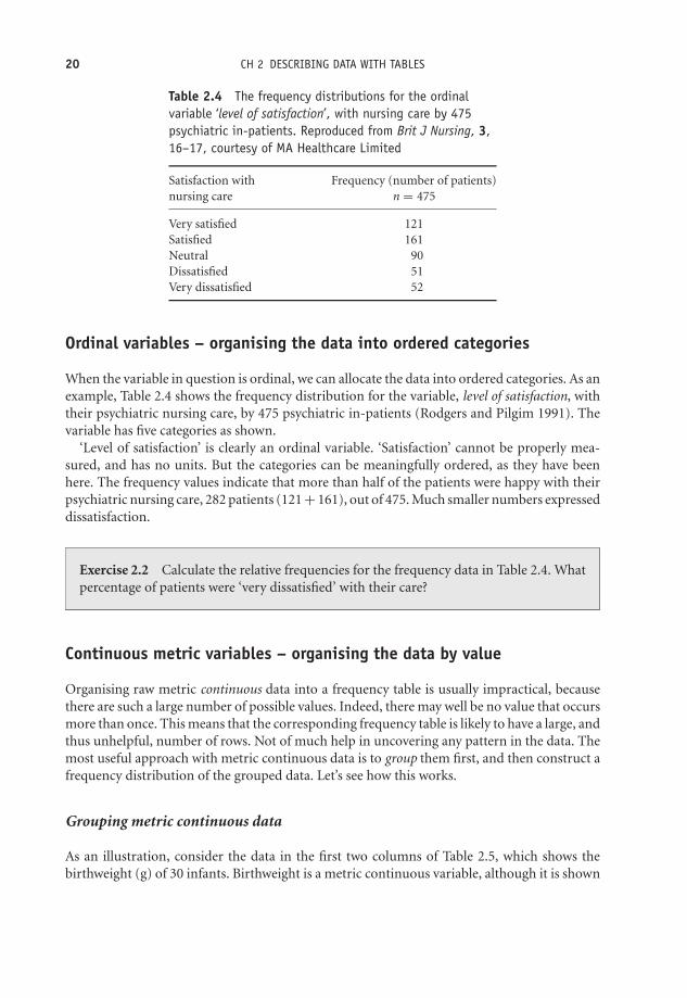
Table 2.4 The frequency distributions for the ordinalvariable ‘level of satisfaction’, with nursing care by 475psychiatric in-patients. Reproduced from Brit J Nursing, 3,16–17, courtesy of MA Healthcare Limited
Satisfaction with Frequency (number of patients)nursing care n = 475
Very satisfied 121Satisfied 161Neutral 90Dissatisfied 51Very dissatisfied 52
Ordinal variables – organising the data into ordered categories
When the variable in question is ordinal, we can allocate the data into ordered categories. As anexample, Table 2.4 shows the frequency distribution for the variable, level of satisfaction, withtheir psychiatric nursing care, by 475 psychiatric in-patients (Rodgers and Pilgim 1991). Thevariable has five categories as shown.
‘Level of satisfaction’ is clearly an ordinal variable. ‘Satisfaction’ cannot be properly mea-sured, and has no units. But the categories can be meaningfully ordered, as they have beenhere. The frequency values indicate that more than half of the patients were happy with theirpsychiatric nursing care, 282 patients (121 + 161), out of 475. Much smaller numbers expresseddissatisfaction.
Exercise 2.2 Calculate the relative frequencies for the frequency data in Table 2.4. Whatpercentage of patients were ‘very dissatisfied’ with their care?
Continuous metric variables – organising the data by value
Organising raw metric continuous data into a frequency table is usually impractical, becausethere are such a large number of possible values. Indeed, there may well be no value that occursmore than once. This means that the corresponding frequency table is likely to have a large, andthus unhelpful, number of rows. Not of much help in uncovering any pattern in the data. Themost useful approach with metric continuous data is to group them first, and then construct afrequency distribution of the grouped data. Let’s see how this works.
Grouping metric continuous data
As an illustration, consider the data in the first two columns of Table 2.5, which shows thebirthweight (g) of 30 infants. Birthweight is a metric continuous variable, although it is shown

OTE/SPH OTE/SPH
JWBK220-02 December 21, 2007 19:22 Char Count= 0
THE FREQUENCY TABLE 21
Table 2.5 Raw data showing a number of characteristics associated with 30 infants, includingbirthweight (g)
Infant I/D Birthweight Apgar Mother smoked Mother’s(n = 30) (g) scorea Sex during pregnancy parity
1 3710 8 M no 12 3650 7 F no 13 4490 8 M no 04 3421 6 F yes 15 3399 6 F no 26 4094 9 M no 37 4006 8 M no 08 3287 5 F yes 59 3594 7 F no 2
10 4206 9 M no 411 3508 7 F no 012 4010 8 M no 213 3896 8 M no 014 3800 8 F no 015 2860 4 M no 616 3798 8 F no 217 3666 7 F no 018 4200 9 M yes 219 3615 7 M no 120 3193 4 F yes 121 2994 5 F yes 122 3266 5 M yes 123 3400 6 F no 024 4090 8 M no 325 3303 6 F yes 026 3447 6 M yes 127 3388 6 F yes 128 3613 7 M no 129 3541 7 M no 130 3886 8 M yes 1
a The Apgar Scale is a measure of the well-being of new-born infants. It can vary between 0 and 10 (low scores bad).
here to the nearest integer value, greater precision not being necessary. Among the 30 infantsthere are none with the same birthweight, and a frequency table with 30 rows and a frequencyof 1 in every row would add very little to what you already know from the raw data (apart fromtelling you what the minimum and maximum birthweights are). One solution is to group thedata into (if possible) groups of equal width, to produce a grouped frequency distribution. Thisis only be worthwhile, however, if you have enough data values, the 30 here is barely enough,but in practice there will, hopefully, be more.
The resulting grouped frequency table for birthweight is shown in Table 2.6. This gives us amuch better idea of the data’s main features than did the raw data. For example, you can now
OTE/SPH OTE/SPH
JWBK220-02 December 21, 2007 19:22 Char Count= 0
22 CH 2 DESCRIBING DATA WITH TABLES
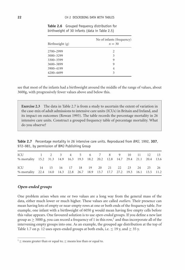
Table 2.6 Grouped frequency distribution forbirthweight of 30 infants (data in Table 2.5)
No of infants (frequency)Birthweight (g) n = 30
2700–2999 23000–3299 33300–3599 93600–3899 93900–4199 44200–4499 3
see that most of the infants had a birthweight around the middle of the range of values, about3600g, with progressively fewer values above and below this.
Exercise 2.3 The data in Table 2.7 is from a study to ascertain the extent of variation inthe case-mix of adult admissions to intensive care units (ICUs) in Britain and Ireland, andits impact on outcomes (Rowan 1993). The table records the percentage mortality in 26intensive care units. Construct a grouped frequency table of percentage mortality. Whatdo you observe?
Table 2.7 Percentage mortality in 26 intensive care units. Reproduced from BMJ, 1992, 307,972–981, by permission of BMJ Publishing Group
ICU 1 2 3 4 5 6 7 8 9 10 11 12 13% mortality 15.2 31.3 14.9 16.3 19.3 18.2 20.2 12.8 14.7 29.4 21.1 20.4 13.6
ICU 14 15 16 17 18 19 20 21 22 23 24 25 26% mortality 22.4 14.0 14.3 22.8 26.7 18.9 13.7 17.7 27.2 19.3 16.1 13.5 11.2
Open-ended groups
One problem arises when one or two values are a long way from the general mass of thedata, either much lower or much higher. These values are called outliers. Their presence canmean having lots of empty or near-empty rows at one or both ends of the frequency table. Forexample, one infant with a birthweight of 6050 g would mean having five empty cells beforethis value appears. One favoured solution is to use open-ended groups. If you define a new lastgroup as ≥ 5000 g, you can record a frequency of 1 in this row,1 and thus incorporate all of theintervening empty groups into one. As an example, the grouped age distribution at the top ofTable 1.7 on p. 12 uses open-ended groups at both ends, i.e. ≤ 19 y, and ≥ 35 y.
1 ≥ means greater than or equal to; ≤ means less than or equal to.

OTE/SPH OTE/SPH
JWBK220-02 December 21, 2007 19:22 Char Count= 0
THE FREQUENCY TABLE 23
Table 2.8 Frequency table for discrete metric datashowing number of times that inhaler used in past24 hours by 53 children with asthma
Number of times inhaler Frequency (number of children)used in past 24 hours n = 53
0 61 162 123 84 5
≥5 6
Frequency tables with discrete metric variables
Constructing frequency tables for metric discrete data is often less of a problem than withcontinuous metric data, because the number of possible values which the variable can takeis often limited (although, if necessary, the data can be grouped in just the same way). As anexample, Table 2.8 is a frequency table showing the number of times in the past 24 hours that53 asthmatic children used their inhaler. We can easily see that most used their inhaler onceor twice. Notice the open-ended row showing that six children had used their inhaler five ormore times.
Exercise 2.4 The data below are the parity (the number of previous live births) of 40women chosen at random from the 332 women in the stress and breast cancer study referredto in Table 1.6. (a) Construct frequency and relative frequency tables for this parity data.(b) Describe briefly what is revealed about the principal features of parity in these women.
4 0 2 3 2 2 3 3 0 3 1 2 8 3 4 2 1 2 2 2 2 2 3 22 3 0 3 2 4 0 1 3 5 1 1 0 3 2 1
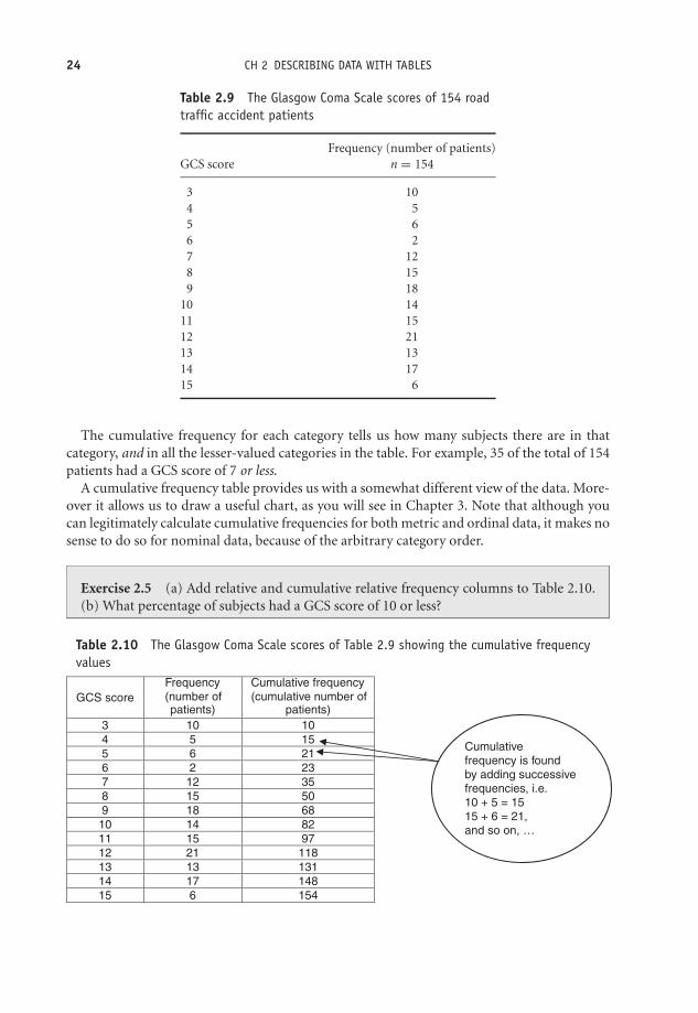
Cumulative frequency
The data in Table 2.9 shows the frequency distribution of Glasgow Coma Scale score (GCS) forthe last 154 patients admitted to an emergency department with head injury following a roadtraffic accident (RTA).
Suppose you are asked, ‘How many patients had a GCS score of 7 or less?’. You could answerthis question by looking at Table 2.9 and adding up all of the values in the first five rows. But,if questions like this are likely to come up frequently, it may pay to calculate the cumulativefrequencies. To do this we successively add, or cumulate, the frequency values one by one, startingat the top of the column. The results are shown in the third column of Table 2.10.
OTE/SPH OTE/SPH
JWBK220-02 December 21, 2007 19:22 Char Count= 0
24 CH 2 DESCRIBING DATA WITH TABLES
Table 2.9 The Glasgow Coma Scale scores of 154 roadtraffic accident patients
Frequency (number of patients)GCS score n = 154
3 104 55 66 27 128 159 18
10 1411 1512 2113 1314 1715 6
The cumulative frequency for each category tells us how many subjects there are in thatcategory, and in all the lesser-valued categories in the table. For example, 35 of the total of 154patients had a GCS score of 7 or less.
A cumulative frequency table provides us with a somewhat different view of the data. More-over it allows us to draw a useful chart, as you will see in Chapter 3. Note that although youcan legitimately calculate cumulative frequencies for both metric and ordinal data, it makes nosense to do so for nominal data, because of the arbitrary category order.
Exercise 2.5 (a) Add relative and cumulative relative frequency columns to Table 2.10.(b) What percentage of subjects had a GCS score of 10 or less?
Table 2.10 The Glasgow Coma Scale scores of Table 2.9 showing the cumulative frequencyvalues
GCS score
Frequency
(number ofpatients)
Cumulative frequency
(cumulative number of
patients)
3 10 10
4 5 15
5 6 21
6 2 23
7 12 35
8 15 50
9 18 68
10 14 82
11 15 97
12 21 118
13 13 131
14 17 148
15 6 154
Cumulative
frequency is found
by adding successive
frequencies, i.e.
10 + 5 = 15
15 + 6 = 21,
and so on, …
OTE/SPH OTE/SPH
JWBK220-02 December 21, 2007 19:22 Char Count= 0
THE FREQUENCY TABLE 25
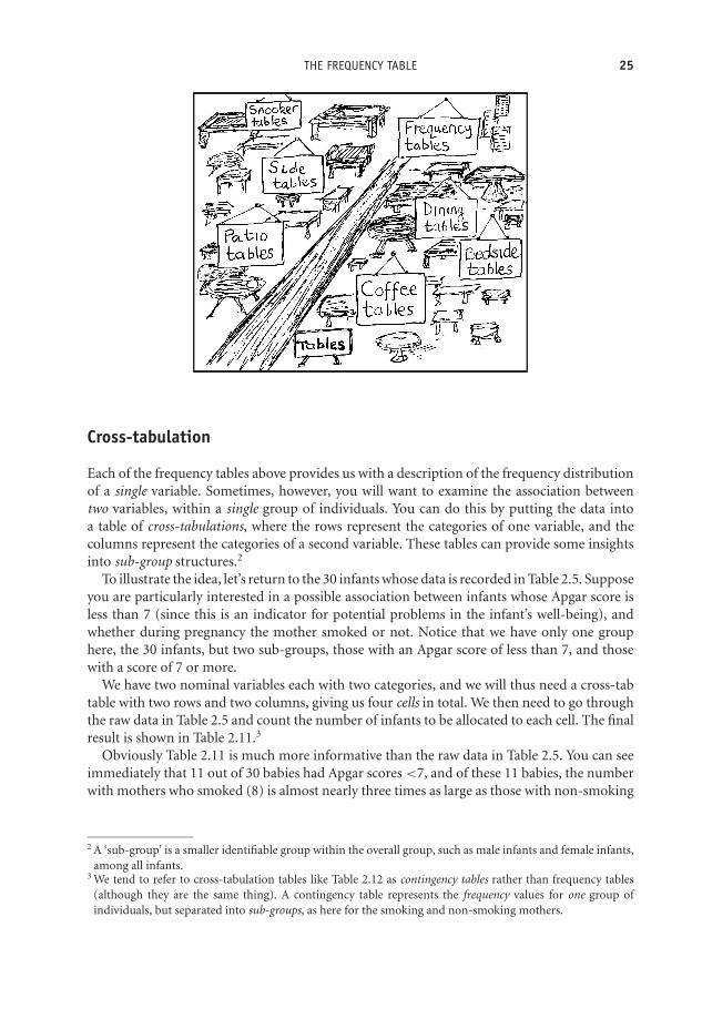
Cross-tabulation
Each of the frequency tables above provides us with a description of the frequency distributionof a single variable. Sometimes, however, you will want to examine the association betweentwo variables, within a single group of individuals. You can do this by putting the data intoa table of cross-tabulations, where the rows represent the categories of one variable, and thecolumns represent the categories of a second variable. These tables can provide some insightsinto sub-group structures.2
To illustrate the idea, let’s return to the 30 infants whose data is recorded in Table 2.5. Supposeyou are particularly interested in a possible association between infants whose Apgar score isless than 7 (since this is an indicator for potential problems in the infant’s well-being), andwhether during pregnancy the mother smoked or not. Notice that we have only one grouphere, the 30 infants, but two sub-groups, those with an Apgar score of less than 7, and thosewith a score of 7 or more.
We have two nominal variables each with two categories, and we will thus need a cross-tabtable with two rows and two columns, giving us four cells in total. We then need to go throughthe raw data in Table 2.5 and count the number of infants to be allocated to each cell. The finalresult is shown in Table 2.11.3
Obviously Table 2.11 is much more informative than the raw data in Table 2.5. You can seeimmediately that 11 out of 30 babies had Apgar scores <7, and of these 11 babies, the numberwith mothers who smoked (8) is almost nearly three times as large as those with non-smoking
2 A ‘sub-group’ is a smaller identifiable group within the overall group, such as male infants and female infants,among all infants.
3 We tend to refer to cross-tabulation tables like Table 2.12 as contingency tables rather than frequency tables(although they are the same thing). A contingency table represents the frequency values for one group ofindividuals, but separated into sub-groups, as here for the smoking and non-smoking mothers.
OTE/SPH OTE/SPH
JWBK220-02 December 21, 2007 19:22 Char Count= 0
26 CH 2 DESCRIBING DATA WITH TABLES
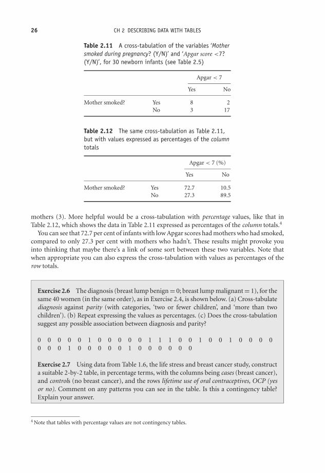
Table 2.11 A cross-tabulation of the variables ‘Mothersmoked during pregnancy? (Y/N)’ and ‘Apgar score <7?(Y/N)’, for 30 newborn infants (see Table 2.5)
Apgar < 7
Yes No
Mother smoked? Yes 8 2No 3 17
Table 2.12 The same cross-tabulation as Table 2.11,but with values expressed as percentages of the columntotals
Apgar < 7 (%)
Yes No
Mother smoked? Yes 72.7 10.5No 27.3 89.5
mothers (3). More helpful would be a cross-tabulation with percentage values, like that inTable 2.12, which shows the data in Table 2.11 expressed as percentages of the column totals.4
You can see that 72.7 per cent of infants with low Apgar scores had mothers who had smoked,compared to only 27.3 per cent with mothers who hadn’t. These results might provoke youinto thinking that maybe there’s a link of some sort between these two variables. Note thatwhen appropriate you can also express the cross-tabulation with values as percentages of therow totals.
Exercise 2.6 The diagnosis (breast lump benign = 0; breast lump malignant = 1), for thesame 40 women (in the same order), as in Exercise 2.4, is shown below. (a) Cross-tabulatediagnosis against parity (with categories, ‘two or fewer children’, and ‘more than twochildren’). (b) Repeat expressing the values as percentages. (c) Does the cross-tabulationsuggest any possible association between diagnosis and parity?
0 0 0 0 0 1 0 0 0 0 0 1 1 1 0 0 1 0 0 1 0 0 0 00 0 0 1 0 0 0 0 0 1 0 0 0 0 0 0
Exercise 2.7 Using data from Table 1.6, the life stress and breast cancer study, constructa suitable 2-by-2 table, in percentage terms, with the columns being cases (breast cancer),and controls (no breast cancer), and the rows lifetime use of oral contraceptives, OCP (yesor no). Comment on any patterns you can see in the table. Is this a contingency table?Explain your answer.
4 Note that tables with percentage values are not contingency tables.

OTE/SPH OTE/SPH
JWBK220-02 December 21, 2007 19:22 Char Count= 0
THE FREQUENCY TABLE 27
Ranking data
As you will see later in the book, some statistical techniques require the data to be ranked,before any analysis takes place. Ranking means first arranging the data by size, and then givingthe largest value a rank of 1, the second largest value a rank of 2, and so on.5 Any values whichare the same, i.e. which are tied, are given the average rank. For example, the seven values: 2,3, 5, 5, 5, 6, 8, could be ranked as: 1, 2, 4 = , 4 = , 4 = , 6, 7, because the three 5 values havethe original ranks of 3, 4, 5, the average of which is 4. SPSS and Minitab will both rank data foryou if necessary.
5 Or you could give the smallest a rank of 1, the next smallest a rank of 2, and so on.

OTE/SPH OTE/SPH
JWBK220-02 December 21, 2007 19:22 Char Count= 0
28

OTE/SPH OTE/SPH
JWBK220-03 December 21, 2007 18:56 Char Count= 0
3Describing data with charts
Learning objectives
When you have finished this chapter you should be able to:� Choose the most appropriate chart for a given data type.� Draw pie charts; and simple, clustered and stacked, bar charts.� Draw histograms.� Draw step charts and ogives.� Draw time series charts.� Interpret and explain what a chart reveals.
Picture it!
In terms of describing data, of seeing ‘what’s going on’, an appropriate chart is almost always agood idea. What ‘appropriate’ means depends primarily on the type of data, as well as on whatparticular features of it you want to explore. In addition, if you are writing a report, a chart willalways give you an ‘impact’ factor. Finally, a chart can often be used to illustrate or explain acomplex situation for which a form of words or a table might be clumsy, lengthy or otherwise
Medical Statistics from Scratch, Second Edition David BowersC© 2008 John Wiley & Sons, Ltd

OTE/SPH OTE/SPH
JWBK220-03 December 21, 2007 18:56 Char Count= 0
30 CH 3 DESCRIBING DATA WITH CHARTS
Figure 3.1 Pie chart: children receiving Malathion in nit lotion study, percentage by hair colour. Datain Table 2.1
inadequate. In this chapter I am going to examine some of the commonest charts available fordescribing data, and indicate which charts are appropriate for each type of data.
Charting nominal and ordinal data
The pie chart
You will all know what a pie chart is, so just a few comments here. Each segment (slice) of a piechart should be proportional to the frequency of the category it represents. For example, Figure3.1 is a pie chart of hair colour for the children receiving Malathion in the nit lotion studyin Table 2.1. I have chosen to display the percentage values, which are often more helpful. Adisadvantage of a pie chart is that it can only represent one variable (in Figure 3.1, hair colour).You will therefore need a separate pie chart for each variable you want to chart. Moreover a piechart can lose clarity if it is used to represent more than four or five categories.
Exercise 3.1 The two pie charts in Figure 3.2 are from a study to investigate the types ofstroke in patients with asymptotic internal-carotid-artery stenosis (Inzitari et al. 2000).They show the types (in percentages) of disabling and non-disabling ipsilateral strokes,among two categories of patients: those with < 60 per cent stenosis, and those with 60–99per cent stenosis. What is the most common type of stroke in each of the two categoriesof stenosis? What is the second most common type?
Exercise 3.2 Sketch a pie chart for the patient satisfaction data in Table 2.4.

OTE/SPH OTE/SPH
JWBK220-03 December 21, 2007 18:56 Char Count= 0
CHARTING NOMINAL AND ORDINAL DATA 31
<60% Stenosis
Disabling cardioembolic Disabling Iacunar Disabling Iarge-artery
Nondisabling cardioembolic Nondisabling Iacunar Nondisabling Iarge-artery
60–99% Stenosis
27.5%5.0%
10.0%
27.5%
25.5%
5.0%
42.4%
12.6%
3.3%19.2%
5.9%
16.6%
Figure 3.2 Pie charts showing the types (by percentages) of disabling and non-disabling ipsilateralstrokes, among two categories of patients, those with < 60 per cent stenosis, and those with 60–99 per cent stenosis. Reproduced from NEJM, 342, 1693–9, by permission of New England Journal ofMedicine
The simple bar chart
An alternative to the pie chart for nominal data is the bar chart. This is a chart with frequencyon the vertical axis and category on the horizontal axis. The simple bar chart is appropriate ifonly one variable is to be shown. Figure 3.3 is a simple bar chart of hair colour for the group ofchildren receiving Malathion in the nit lotion study. Note that the bars should all be the samewidth, and there should be (equal) spaces between bars. These spaces emphasise the categoricalnature of the data.
Figure 3.3 Simple bar chart of hair colour of children receiving Malathion in nit lotion study (data inTable 2.1)

OTE/SPH OTE/SPH
JWBK220-03 December 21, 2007 18:56 Char Count= 0
32 CH 3 DESCRIBING DATA WITH CHARTS
Exercise 3.3 Use the data in Table 1.8 to sketch a simple bar chart, showing the haircolour of the children receiving d-phenothrin.
Exercise 3.4 Draw a simple bar chart for the patient satisfaction data in Table 2.4. InExercise 3.2, you drew a pie chart for this data. Which chart do you think works best?Why?
The clustered bar chart
If you have more than one group you can use the clustered bar chart. Suppose you also knowthe sex of the children receiving Malathion in the above example. This gives us two sub-groups,boys and girls, with the data shown in Table 3.1.
There are two ways of presenting a clustered bar chart. Figure 3.4 shows one possibility,with hair colour categories on the horizontal axis. This arrangement is helpful if you wantto compare the relative sizes of the groups within each category (e.g. redheaded boys versusredheaded girls).
Table 3.1 Frequency distribution ofhair colour by sex of Malathion childrenin nit lotion study
Frequency
Hair colour Boys Girls
Blonde 4 11Brown 29 20Red 1 3Dark 14 13
Figure 3.4 Clustered bar chart of hair colour by sex for children in Table 3.1

OTE/SPH OTE/SPH
JWBK220-03 December 21, 2007 18:56 Char Count= 0
CHARTING NOMINAL AND ORDINAL DATA 33
Alternatively, the chart could have been drawn with the categories boys and girls, on thehorizontal axis. This format would be more useful if you wanted to compare category sizeswithin each group. For example, red haired girls compared to dark haired girls. Which chart ismore appropriate depends on what aspect of the data you want to examine.
Exercise 3.5 Use the data in Table 3.1 to sketch a clustered percentage bar chart showingthe hair colour of children receiving Malathion and d-phenothrin. There are two possibleformats. Explain why you chose the one you did.
An example from practice
The clustered bar chart in Figure 3.5 is from a study describing the development of the APACHEII scale, used to assess risk of death, and used mainly in ICUs (Knaus et al. 1985). APACHE IIhas a range of 0 (least risk of death) to 71 (greatest risk). Data was available on two groups ofpatients, one group admitted to ICU for medical emergencies, the second admitted directly toICU following surgery. The bar chart shows the percentage death rate (vertical axis), against
Apache II Score
Nonoperative Postoperative
APACHE II AND HOSPITAL DEATH
Noroperative and Postoperative Patients
Death
Rate
100.0%
90.0%
80.0%
70.0%
60.0%
50.0%
40.0%
30.0%
20.0%
10.0%
0.0%
0–4 5–9 10–14 15–19 20–24 25–29 30–34 35+
Figure 3.5 Clustered bar chart of APACHE II scores. Data on two groups of patients, one group admittedto ICU for medical emergencies, the second admitted directly to ICU following surgery. The vertical axisis death rate (per cent). Reproduced from Critical Care Medicine, 13, 818–29, courtesy of LippincottWilliams Wilkins
OTE/SPH OTE/SPH
JWBK220-03 December 21, 2007 18:56 Char Count= 0
34 CH 3 DESCRIBING DATA WITH CHARTS
bands of the APACHE II score. Quite clearly, for those less severely ill, percentage mortalityamong the medical emergency group is noticeably higher than among the post-operative group.For those patients classified as the most severely ill (scores of 35+), the situation is reversed.
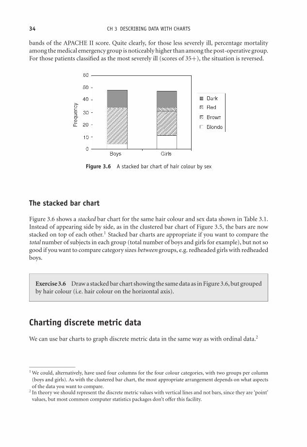
Figure 3.6 A stacked bar chart of hair colour by sex
The stacked bar chart
Figure 3.6 shows a stacked bar chart for the same hair colour and sex data shown in Table 3.1.Instead of appearing side by side, as in the clustered bar chart of Figure 3.5, the bars are nowstacked on top of each other.1 Stacked bar charts are appropriate if you want to compare thetotal number of subjects in each group (total number of boys and girls for example), but not sogood if you want to compare category sizes between groups, e.g. redheaded girls with redheadedboys.
Exercise 3.6 Draw a stacked bar chart showing the same data as in Figure 3.6, but groupedby hair colour (i.e. hair colour on the horizontal axis).
Charting discrete metric data
We can use bar charts to graph discrete metric data in the same way as with ordinal data.2
1 We could, alternatively, have used four columns for the four colour categories, with two groups per column(boys and girls). As with the clustered bar chart, the most appropriate arrangement depends on what aspectsof the data you want to compare.
2 In theory we should represent the discrete metric values with vertical lines and not bars, since they are ‘point’values, but most common computer statistics packages don’t offer this facility.

OTE/SPH OTE/SPH
JWBK220-03 December 21, 2007 18:56 Char Count= 0
CHARTING CONTINUOUS METRIC DATA 35
25
Number of schools (n=37)
Number of cases per school
1 2 3 4 5 6 7 8 9 10 11 12 13 14 15 16 17 18 19 20 21 22 23
20
15
10
5
0
Figure 3.7 Bar chart used to represent discrete metric data on numbers of measles cases in 37 schools.Reproduced from Amer. J. Epid., 146, 881–2, courtesy of OUP
An example from practice
Figure 3.7 is an example of a bar chart used to present numbers of measles cases (discrete metricdata), in 37 schools in Kentucky in a school year (Prevots et al. 1997).
Exercise 3.7 What does Figure 3.7 tell you about the distribution of measles cases inthese 37 schools?
Charting continuous metric data
The histogram
A continuous metric variable can take a very large number of values, so it is usually impracticalto plot them without first grouping the values. The grouped data is plotted using a frequencyhistogram, which has frequency plotted on the vertical axis and group size on the horizontal axis.
A histogram looks like a bar chart but without any gaps between adjacent bars. This em-phasises the continuous nature of the underlying variable. If the groups in the frequency tableare all of the same width, then the bars in the histogram will also all be of the same width.3
Figure 3.8 shows a histogram of the grouped birthweight data in Table 2.6.One limitation of the histogram is that it can represent only one variable at a time (like the
pie chart), and this can make comparisons between two histograms difficult, because, if youtry to plot more than one histogram on the same axes, invariably parts of one chart will overlapthe other.
3 But if one group is twice as wide as the others then the frequency must be halved, etc.

OTE/SPH OTE/SPH
JWBK220-03 December 21, 2007 18:56 Char Count= 0
36 CH 3 DESCRIBING DATA WITH CHARTS
0
1
2
3
4
5
6
7
8
9
10
2700-2999 3000-3299 3300-3599 3600-3899 3900-4199 4200-4499
Birthweight (g)
Num
ber
of in
fants
Figure 3.8 Histogram of the grouped birthweight data in Table 2.6
Exercise 3.8 The histogram in Figure 3.9 is from the British Regional Heart Studyand shows the serum potassium levels (mmol/l) of 7262 men aged 40–59 not receivingtreatment for hypertension (Wannamethee et al. 1997). Comment on what the histogramreveals about serum potassium levels in this sample of 7262 British men.
Exercise 3.9 The grouped age data in Table 3.2 is from a study to identify predictivefactors for suicide, and shows the age distribution by sex of 974 subjects who attemptedsuicide unsuccessfully, and those among them who were later successful (Nordentoft et al.1993). Sketch separate histograms of percentage age for the male attempters and for thelater succeeders. Comment on what the charts show.
800
600
400
200
0< 3.5 3.7 4.0 4.3
Serum potassium (mmol/l)
No
. o
f m
en
4.6 4.9 5.2 5.5 5.8
Figure 3.9 Histogram of the serum potassium levels of 7262 British men aged 40–59 years. Reproducedfrom Amer. J. Epid., 145, 598–607, courtesy of OUP

OTE/SPH OTE/SPH
JWBK220-03 December 21, 2007 18:56 Char Count= 0
CHARTING CUMULATIVE DATA 37
Table 3.2 Grouped age data from a follow-up cohort study to identify predictive factors forsuicide. Reproduced from BMJ, 1993, 306, 1637–1641, by permission of BMJ Publishing Group
No (%) attempting suicide No (%) later successful
Men (n = 412) Women (n = 562) Men (n = 48) Women (n = 55)
Age (years)15–24 57 (13.8) 80 (14.2) 3 (6.3) 3 (5.5)25–34 131 (31.8) 132 (23.5) 10 (20.8) 12 (21.8)35–44 103 (25.0) 146 (26.0) 16 (33.3) 16 (29.1)45–54 62 (15.0) 90 (16.0) 11 (22.9) 9 (16.4)55–64 38 (9.2) 58 (10.3) 4 (8.3) 4 (7.3)65–74 18 (4.4) 43 (7.7) 3 (6.3) 8 (14.5)75–84 1 (0.2) 11 (2.0) 0 2 (3.6)>85 2 (0.5) 2 (0.4) 1 (2.1) 1 (1.8)
Living alone 96 (23.3) 85 (15.1) 17 (35.4) 14 (25.5)Employed 139 (33.7) 185 (32.9) 14 (29.2) 13 (23.6)
Charting cumulative data
The step chart
You can chart cumulative ordinal data or cumulative discrete metric data (data for both typesof variables are integers) with a step chart. In a step chart the total height of each step above thehorizontal axis represents the cumulative frequency, up to and including that category or value.The height of each individual step is the frequency of the corresponding category or value.
An example from practice
Figure 3.10 is a step chart of the cumulative rate of suicide (number per 1000 of the population),in 152 Swedish municipalities, taken from a study into the use of calcium channel blockers
10
8
6
4
2
00
1 2 3 4 5 6 7
Follow up (years)
Sui
cide
rat
e pe
r 10
00 p
opul
atio
n
Figure 3.10 A step chart of the cumulative rate of suicide (number per 1000 of the population) in152 Swedish municipalities. 617 users (continuous line) and 2780 non-users (dotted line). Reproducedfrom BMJ, 316, 741–5, courtesy of BMJ Publishing Group

OTE/SPH OTE/SPH
JWBK220-03 December 21, 2007 18:56 Char Count= 0
38 CH 3 DESCRIBING DATA WITH CHARTS
(prescribed for hypertension) and the risk of suicide (Lindberg et al. 1998). So for example, inyear 4 the suicide rate per 1000 of the population was (7 − 5.2) = 1.8 (the approximate heightof the step). And over the course of the first four years, the suicide rate had risen to seven perthousand. You can produce step charts for numeric ordinal data, such as cumulative Apgarscores in exactly the same way, although not, as far as I am aware, with Word or Excel, or withSPSS or Minitab.
Table 3.3 Cumulative and relative cumulative frequency for the grouped birthweight from thedata in Table 2.6
Birthweight No of infants Cumulative % cumulative(g) (frequency) frequency frequency
2700–2999 2 2 6.673000–3299 3 5 16.673300–3599 9 14 46.673600–3899 9 23 76.673900–4199 4 27 90.004200–4499 3 30 100.00
Exercise 3.10 Draw a step chart for the percentage cumulative Apgar scores in Table 3.3.
The cumulative frequency curve or ogive
With continuous metric data, there is assumed to be a smooth continuum of values, so youcan chart cumulative frequency with a correspondingly smooth curve, known as a cumulativefrequency curve, or ogive.4 If you add columns for cumulative and relative cumulative frequencyto the grouped birthweight data in Table 2.6, you get Table 3.3.
If you want to draw an ogive by hand, you plot, for each group or class, the group cumulativefrequency value against the lower limit of the next higher group. So, for example, 16.67 is plottedagainst 3300, 46.67 against 3600, and so on. The points should be joined with a smooth curve.5
The result is shown in Figure 3.11. Notice that I have put a percentage cumulative frequency ofzero in the imaginary group 2400–2699 g. This enables me to close the ogive at the left-handend.
The ogive can be very useful if you want to estimate the cumulative frequency for any valueon the horizontal axis, which is not one of the original group values. For example, supposeyou want to know what percentage of infants had a birthweight of 3650g or less. By drawinga line vertically upwards from a value of 3750 g on the horizontal axis to the ogive, and thenhorizontally to the vertical axis, you can see that about 63 per cent of the infants weighed 3750 gor less. You can of course ask such questions in reverse, for example, what birthweight marksthe lowest 50 per cent of birthweights? This time you would start with a value of 50 per cent
4 The ‘g’ in ogive is pronounced as the j in ‘jive’.5 Unfortunately, I couldn’t find a program that would allow me to join the points with a smooth curve.

OTE/SPH OTE/SPH
JWBK220-03 December 21, 2007 18:56 Char Count= 0
CHARTING CUMULATIVE DATA 39
0
10
20
30
40
50
60
70
80
90
100
2700 3000 3300 3600 3900 4200 4500
Birthweight (g)
% c
um
ula
tive
fre
qu
en
cy
Figure 3.11 The relative cumulative frequency curve (or ogive) for the percentage cumulative birth-weight data in Table 3.3
on the vertical axis, move right to the ogive, then down to the value of about 3700 g on thehorizontal axis.
An example from practice
Figure 3.12 shows two per cent ogives for total cholesterol concentration in two groups takenfrom a study into the effectiveness of health checks conducted by nurses in primary care(Imperial Cancer Fund OXCHECK Study Group 1995)
9
Control
Total cholesterol (mmol/l)
Cum
ula
tive F
requency (%
)
Intervention
100
90
80
70
60
50
40
30
20
10
0
3 4 5 6 7 8 10 11
Figure 3.12 Percentage cumulative frequency curves for total cholesterol concentration in two groups.Reproduced from BMJ, 310, 1099–104, courtesy of BMJ

OTE/SPH OTE/SPH
JWBK220-03 December 21, 2007 18:56 Char Count= 0
40 CH 3 DESCRIBING DATA WITH CHARTS
Exercise 3.11 (a) Comment on what Figure 3.12 reveals about the cholesterol levels inthe two groups. (b) Sketch percentage cumulative frequency curves for the age of the malesuicide attempters and later succeeders, shown in Table 3.2. For each of the two groups,half of the subjects are older than what age?
Charting time-based data – the time series chart
If the data you have collected are from measurements made at regular intervals of time (minutes,weeks, years, etc.), you can present the data with a time series chart. Usually these charts areused with metric data, but may also be appropriate for ordinal data. Time is always plotted onthe horizontal axis, and data values on the vertical axis.
0
1974 1999
20
40
60
80
100
120
140
160
Year
Ra
te p
er
mill
ion
M
F
Figure 3.13 Suicide rates for males and females aged 15–29 years in England and Wales

OTE/SPH OTE/SPH
JWBK220-03 December 21, 2007 18:56 Char Count= 0
CHARTING CUMULATIVE DATA 41
Table 3.4 Choosing an appropriate chart
HistogramData type Pie chart Bar chart (if grouped) Step chart Ogive
Nominal yes yes no no noOrdinal no yes no yes (cumulative) noMetric discrete no yes yes yes (cumulative) yes (cumulative)Metric continuous no no yes no yes (cumulative)
An example from practice
Figure 3.13 shows the suicide rates (number of suicides per one million of population), for malesand females aged 15–29 years in England and Wales, between 1974 and 1999. The contrastingpatterns in the male/female rates are noticeable, more perhaps in this chart form than if shownin a table.
There is one other useful chart, the boxplot, but that will have to wait until we meet somenew ideas in the next two chapters. Meanwhile Table 3.4 may help you to decide on the mostappropriate chart for any given set of data.

OTE/SPH OTE/SPH
JWBK220-03 December 21, 2007 18:56 Char Count= 0
42

OTE/SPH OTE/SPH
JWBK220-04 December 21, 2007 18:57 Char Count= 0
4Describing data from its shape
Learning objectives
When you have finished this chapter you should be able to:� Explain what is meant by the ‘shape’ of a frequency distribution.� Sketch and explain: negatively skewed, symmetric and positively skewed distributions.� Sketch and explain a bimodal distribution.� Describe the approximate shape of a frequency distribution from a frequency table orchart.� Sketch and describe a Normal distribution.
The shape of things to come
I have said previously that the choice of the most appropriate procedures for summarisingand analysing data will depend on the type of variable involved. Variable type is the mostimportant consideration. In addition, however, the way the data are distributed – the shape ofthe distribution, can also be influential. By ‘shape’ I mean:� Are the values fairly evenly spread throughout their possible range? This is a uniform
distribution.
Medical Statistics from Scratch, Second Edition David BowersC© 2008 John Wiley & Sons, Ltd

OTE/SPH OTE/SPH
JWBK220-04 December 21, 2007 18:57 Char Count= 0
44 CH 4 DESCRIBING DATA FROM ITS SHAPE� Are most of the values concentrated towards the bottom of the range, with progressivelyfewer values towards the top of the range? This is a right or positively skewed distribution. . .� . . . or towards the top of the range, with progressively fewer values towards the bottom ofthe range? This is a left or negatively skewed distribution.� Do most of the values clump together around one particular value, with progressively fewervalues both below and above this value? This is a symmetric or mound-shaped distribution.� Do most of the values clump around two or more particular values? This is a bimodal ormultimodal distribution.
One simple way to assess the shape of a frequency distribution is to plot a bar chart, or ahistogram. Here are some examples of the shapes described above.
Negative skew1
Figure 4.1 shows age distribution of 2454 patients with acute pulmonary embolism and is drawnfrom 52 hospitals in seven countries (Goldhaber et al. 1999). You can see that most values lietowards the top end of the range, with progressively fewer lower values. This distribution isnegatively skewed.
Exercise 4.1 In Figure 4.1, which age group has: (a) the highest number of patients? (b)the lowest number?
Positive skew
The histogram in Figure 4.2 shows serum E2 levels from a study of hormone replacementtherapy for osteoporosis prevention (Rodgers and Miller 1999). This distribution has most ofits values in the lower end of the range with progressively fewer towards the upper end. Thereis a single high valued outlier. This distribution is positively skewed.
Exercise 4.2 In Figure 4.2, if the outlier was removed, would the distribution be less ormore skewed?
1 Skewness is the primary measure used to describe the asymmetry of frequency distributions, and many com-puter programs will calculate a skewness coefficient for you. This can vary between –1 (strong negative skew),and +1 (strong positive skew). Values of zero or close to it, indicate lower levels of skew, but do not necessarilymean that the distribution is symmetric.

OTE/SPH OTE/SPH
JWBK220-04 December 21, 2007 18:57 Char Count= 0
THE SHAPE OF THINGS TO COME 45
<15 15–29 30–39 40–49
Age (years)
50–59 60–69 70–79 >80
14%
25%24%
14%
11%
7%
5%
0.2%
600
550
500
450N
um
be
r o
f p
atie
nts
350
400
300
250
200
150
100
50
0
Figure 4.1 An example of negative skew. The age distribution of 2454 patients with acute pulmonaryembolism. Reproduced with permission from Elsevier (The Lancet, 1999, Vol No. 353, pp. 1386–9)
12
10
8
6
4
2
0100 150 200 250 300
Serum E2 (pmol/I)
No. of patients
350 400 450 500
Figure 4.2 An example of positive skew. Serum E2 levels in 45 patients in a study of HRT for theprevention of osteoporosis. Reproduced with permission of the British Journal of General Practice (1997,Vol. 47, pages 161–165)
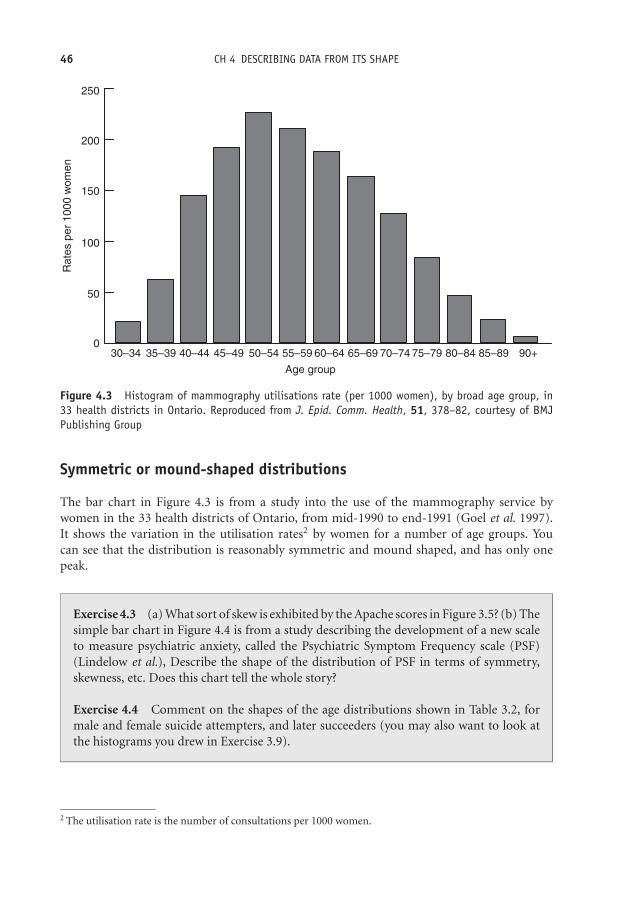
OTE/SPH OTE/SPH
JWBK220-04 December 21, 2007 18:57 Char Count= 0
46 CH 4 DESCRIBING DATA FROM ITS SHAPE
250
200
150
100
30–34 35–39 40–44 45–49 50–54 55–59 60–64
Age group
Ra
tes p
er
1000 w
om
en
65–69 70–74 75–79 80–84 85–89 90+
50
0
Figure 4.3 Histogram of mammography utilisations rate (per 1000 women), by broad age group, in33 health districts in Ontario. Reproduced from J. Epid. Comm. Health, 51, 378–82, courtesy of BMJPublishing Group
Symmetric or mound-shaped distributions
The bar chart in Figure 4.3 is from a study into the use of the mammography service bywomen in the 33 health districts of Ontario, from mid-1990 to end-1991 (Goel et al. 1997).It shows the variation in the utilisation rates2 by women for a number of age groups. Youcan see that the distribution is reasonably symmetric and mound shaped, and has only onepeak.
Exercise 4.3 (a) What sort of skew is exhibited by the Apache scores in Figure 3.5? (b) Thesimple bar chart in Figure 4.4 is from a study describing the development of a new scaleto measure psychiatric anxiety, called the Psychiatric Symptom Frequency scale (PSF)(Lindelow et al.), Describe the shape of the distribution of PSF in terms of symmetry,skewness, etc. Does this chart tell the whole story?
Exercise 4.4 Comment on the shapes of the age distributions shown in Table 3.2, formale and female suicide attempters, and later succeeders (you may also want to look atthe histograms you drew in Exercise 3.9).
2 The utilisation rate is the number of consultations per 1000 women.

OTE/SPH OTE/SPH
JWBK220-04 December 21, 2007 18:57 Char Count= 0
THE SHAPE OF THINGS TO COME 47
300
250
200
150
Fre
quency
100
50
00 5 10 15
PSF score
20 25 30 35
Figure 4.4 Simple bar chart showing the lowest 95 per cent of values of the Psychiatric SymptomFrequency scale. Reproduced from J. Epid. Comm. Health, 51, 549–57, courtesy of BMJ Publishing Group
Bimodal distributions
A bimodal distribution is one with two distinct humps. These are less common than the shapesdescribed above, and are sometimes the result of two separate distributions, which have not beendisentangled. Figure 4.5 shows a hypothetical bimodal distribution of systolic blood pressure.The upper peak could be due to a sub-group of hypertensive patients, but whose presence inthe group has not been separately identified.
110–119 120–129 130–139
Systolic blood pressure (mmHg)
10
8
6
4
2
0
Fre
qu
en
cy (
no. w
om
en
)
140–149 150–159
Figure 4.5 A bimodal frequency distribution

OTE/SPH OTE/SPH
JWBK220-04 December 21, 2007 18:57 Char Count= 0
48 CH 4 DESCRIBING DATA FROM ITS SHAPE
Normal-ness
There is one particular symmetric bell-shaped distribution, known as the Normal distribution,which has a special place in the heart of statisticians.3 Many human clinical features are dis-tributed Normally, and the Normal distribution has a very important role to play in what is tocome later in this book.
An example from practice
Figure 4.6 shows a histogram for the distribution of the cord platelet count (109/l), in 4382Finnish infants, from a study of the prevalence and causes of thrombocytopenia4 in full-terminfants (Sainio et al. 2000). You can see, even without the help of the Normal curve superimposedupon it, that the distribution has a very regular bell-shaped symmetric distribution – in fact ispretty well as Normal as it gets with real data.
Although the Normal distribution is one of the most important in a health context, you mayalso encounter the binomial and Poisson distributions. As an example of the former, supposeyou need to choose a sample of 20 patients from a very large list of patients, which contains equalnumbers of males and females. The chance of choosing a male patient is thus 1 in 2. Providedthat the probability of picking a male patient each time remains fixed at 1 in 2, the binomialequation will tell you the probability of getting any given number of males (or females), inyour 20 selected patients. For example, the probability of getting eight males in a sample of 20patients is 0.1201 – about 12 chances in a 100.
3 Note the capitalised, ‘N’, to distinguish this statistical usage from that of the word ‘normal’ meaning usual,ordinary, etc.
4 Thrombocytopenia is deemed to exist when the cord platelet count is less than 150 × 109/l. It is a risk factorfor intraventricular haemorrhage and contributes to the high neurological morbidity in infants affected.
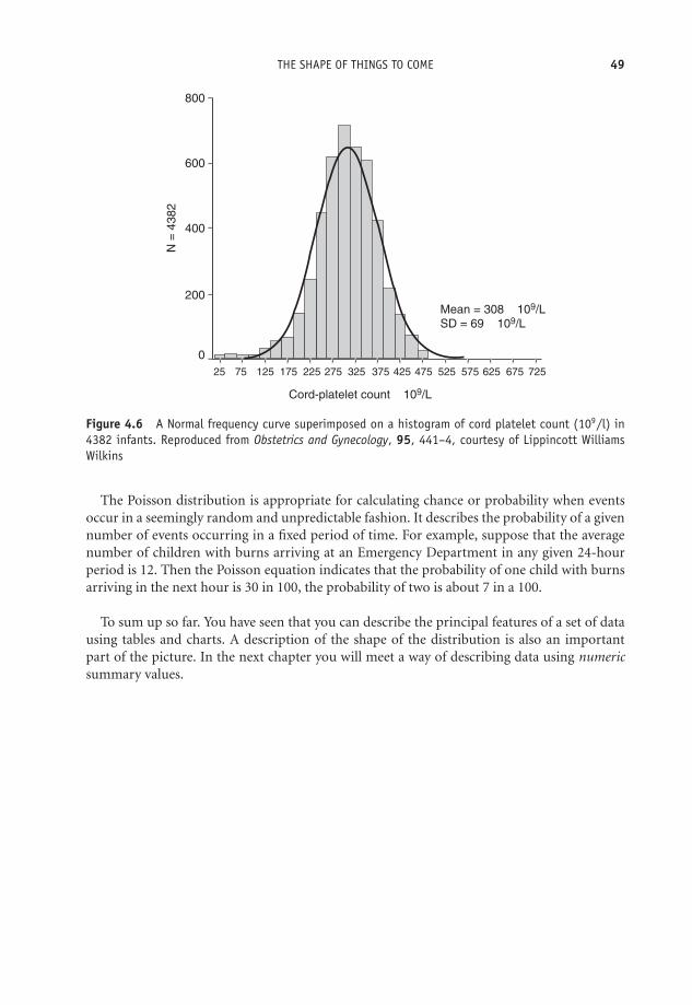
OTE/SPH OTE/SPH
JWBK220-04 December 21, 2007 18:57 Char Count= 0
THE SHAPE OF THINGS TO COME 49
Mean = 308 × 109/L
SD = 69 × 109/L
Cord-platelet count × 109/L
N =
4382
800
600
400
200
0
25 75 125 175 225 275 325 375 425 475 525 575 625 675 725
Figure 4.6 A Normal frequency curve superimposed on a histogram of cord platelet count (109/l) in4382 infants. Reproduced from Obstetrics and Gynecology, 95, 441–4, courtesy of Lippincott WilliamsWilkins
The Poisson distribution is appropriate for calculating chance or probability when eventsoccur in a seemingly random and unpredictable fashion. It describes the probability of a givennumber of events occurring in a fixed period of time. For example, suppose that the averagenumber of children with burns arriving at an Emergency Department in any given 24-hourperiod is 12. Then the Poisson equation indicates that the probability of one child with burnsarriving in the next hour is 30 in 100, the probability of two is about 7 in a 100.
To sum up so far. You have seen that you can describe the principal features of a set of datausing tables and charts. A description of the shape of the distribution is also an importantpart of the picture. In the next chapter you will meet a way of describing data using numericsummary values.

OTE/SPH OTE/SPH
JWBK220-04 December 21, 2007 18:57 Char Count= 0
50

OTE/SPH OTE/SPH
JWBK220-05 December 21, 2007 18:57 Char Count= 0
5Describing data with numericsummary values
Learning objectives
When you have finished this chapter, you should be able to:� Explain what prevalence and incidence are.� Explain what a summary measure of location is, and show that you understand themeaning of, and the difference between, the mode, the median and the mean.� Be able to calculate the mode, median and mean for a set of values.� Demonstrate that you understand the role of data type and distributional shape inchoosing the most appropriate measure of location.� Explain what a percentile is, and calculate any given percentile value.� Explain what a summary measure of spread is, and show that you understand thedifference between, and can calculate, the range, the interquartile range and thestandard deviation.� Show that you can estimate percentile values from an ogive.� Demonstrate that you understand the role of data type and distributional shape inchoosing the most appropriate measure of spread.
Medical Statistics from Scratch, Second Edition David BowersC© 2008 John Wiley & Sons, Ltd
OTE/SPH OTE/SPH
JWBK220-05 December 21, 2007 18:57 Char Count= 0
52 CH 5 DESCRIBING DATA WITH NUMERIC SUMMARY VALUES� Draw a boxplot and explain how it works.� Show that you understand the area properties of the Normal distribution, and howthese relate to standard deviation.
Numbers R us
As you saw in the previous two chapters, we can ‘describe’ a mass of raw data by charting it,or arranging it in table form. In addition, we can examine its shape. These procedures willhelp us to make some sense of what initially might be a confusing picture, and hopefully to seepatterns in the data. As you are about to see, however, it is often more useful to summarise thedata numerically. There are two principal features of a set of data that can be summarised witha single numeric value:� First, a value around which the data has a tendency to congregate or cluster. This is called a
summary measure of location.1� Second, a value which measures the degree to which the data are, or are not, spread out,called a summary measure of spread or dispersion.
With these two summary values you can then compare different sets of data quantitatively.Before I discuss these two measures, however, I want to look first at a number of simplernumeric summary measures.
Numbers, percentages and proportions
When you present the results of an investigation, you will almost certainly need to give thenumbers of the subjects involved; and perhaps also provide values for percentages. In Table 1.6,the authors give the percentage of subjects who are in each ‘social class’ category. For example,26 per cent, i.e. (28/106) × 100, and 32 per cent, i.e. (72/226) × 100, of the cases and controlsrespectively, are in the category, ‘III non-manual’. As in this example, it is usually categoricaldata that are summarised with a value for percentage or proportion.
Exercise 5.1 The data in Table 5.1 are taken from a study of duration of breast feedingand arterial distensibility leading to cardiovascular disease (Leeson et al. 2001). The tabledescribes the basic characteristics of two groups, 149 subjects who were bottle-fed asinfants, and 182 who were breast-fed. Using the values in the first row of the table in Table3.2, calculate both the proportion and the percentage of men, among those subjects whowere: (a) breastfed; (b) bottle-fed.
1 Also known as measures of central tendency.

OTE/SPH OTE/SPH
JWBK220-05 December 21, 2007 18:57 Char Count= 0
NUMBERS R US 53
Table 5.1 Basic characteristics of two groups of individuals, breast-fed and bottle fed, from astudy of duration of breast feeding and arterial distensibility leading to cardiovascular disease.Reproduced from BMJ, 322, 643–7, courtesy of BMJ Publishing Group
P value for differenceVariable Breast fed Bottle fed between groups
No of participants (men/women) 149 (67/82) 182 (93/89) —Age (years) 23 (20 to 28) 23 (20 to 27) 0.07Height (cm) 170 (10) 168 (9) 0.03Weight (kg) 70.4 (14.5) 68.7 (13.1) 0.28Body mass index (kg/m2) 24.2 (4.1) 24.3 (3.7) 0.83Length of breast feeding (months) 3.33 (0 to 18) — —Resting arterial diameter (mm) 3.32 (0.59) 3.28 (0.59) 0.45Distensibility coefficient (mm/Hg−1) 0.133 (0.07) 0.140 (0.08) 0.38Cholesterol (mmol/l) 4.43 (0.99) 4.61 (1.01) 0.11LDL cholesterol (mmol/l) 2.71 (0.88) 2.90 (0.93) 0.07HDL cholesterol (mmol/l) 1.18 (0.25) 1.18 (0.31) 0.96Systolic blood pressure (mm Hg) 128 (14) 128 (14) 0.93Diastolic blood pressure (mm Hg) 70 (9) 71 (8) 0.31Smoking history (No (%)):
Smokers 49 (33) 64 (35)Former smokers 25 (17) 22 (12) 0.78Non-smokers 75 (50) 96 (53)
No (%) in social class:I 12 (8) 13 (7)II 36 (24) 33 (18)IIINM 51 (34) 62 (34)IIIM 24 (16) 36 (20) 0.19IV 22 (15) 33 (18)V 4 (3) 5 (3)
LDL = Low density lipoprotein, HDL = High density lipoprotein.
Prevalence and the incidence rate
If appropriate we can also summarise data by providing a value for the prevalence or the in-cidence rate of some condition. The point prevalence of a disease is the number of existingcases in some population at a given time. In practice, the period prevalence is more oftenused. We might typically report it as, ‘the prevalence of genital chlamydia in single womenin England in 1996 was 3.1 per cent’. The prevalence figure will include existing cases, i.e.those who contracted the disease before 1996, and still had it, as well as those first get-ting the disease in 1996. The incidence or inception rate of a disease is the number of newcases occurring per 1000, or per 10 000, of the population,2 during some period, usually12 months.
2 Or whatever base is arithmetically appropriate.
OTE/SPH OTE/SPH
JWBK220-05 December 21, 2007 18:57 Char Count= 0
54 CH 5 DESCRIBING DATA WITH NUMERIC SUMMARY VALUES
Exercise 5.2 (a) When a group of 890 women was tested for genital chlamydia with aligase chain reaction test, 23 of the women had a positive response. Assuming the test isalways 100 per cent efficient, what is the prevalence of genital chlamydia among women inthis group? (b) Suppose in a certain city that there were 10 000 live births in 2002. Ten ofthe infants died of sudden infant death syndrome. What is the incidence rate for suddeninfant death syndrome in this city?
Summary measures of location
A summary measure of location is a value around which most of the data values tend tocongregate or centre. I am going to discuss three measures of location: the mode; the median;and the mean. As you will see, the choice of the most appropriate measure depends cruciallyon the type of data involved. I will summarise which measure(s) you can most appropriatelyuse with which type of data, later in the chapter
The mode
The mode is that category or value in the data that has the highest frequency (i.e. occurs themost often). In this sense, the mode is a measure of common-ness or typical-ness. As an example,the modal Apgar score in Table 2.5 is 8, this being the category with the highest frequency (of 9infants), i.e. is the most commonly occurring. The mode is not particularly useful with metriccontinuous data where no two values may be the same. The other shortcoming of this measureis that there may be more than one mode in a set of data.
Exercise 5.3 Determine the modal category for: (a) Social class for both cases and con-trols, in the stress and breast cancer study shown in Table 1.6. (b) The level of satisfactionwith nursing care, from the data in Table 2.4. (c) The PSF score in Figure 4.4.
Exercise 5.4 What is the modal cause of injury in Table 2.3?
The median
If we arrange the data in ascending order of size, the median is the middle value. Thus, halfof the values will be equal to or less than the median value, and half equal to or above it.The median is thus a measure of central-ness. As an example of the calculation of the median,suppose you had the following data on age (in ascending order of years), for five individuals:30 31 32 33 35. The middle value is 32, so the median age for these five people is 32 years. If youhave an even number of values, the median is the average of the two values either side of the‘middle’.
OTE/SPH OTE/SPH
JWBK220-05 December 21, 2007 18:57 Char Count= 0
SUMMARY MEASURES OF LOCATION 55
An advantage of the median is that it is not much affected by skewness in the distribution, orby the presence of outliers. However, it discards a lot of information, because it ignores mostof the values, apart from those in the centre of the distribution.
There is another, quite easy way, of determining the value of the median, which will alsocome in useful a bit later on. If you have n values arranged in ascending order, then:
the median = 1/2(n + 1)th value.
So, for example, if the ages of six people are: 30 31 32 33 35 36, then n = 6, therefore:
1/2(n + 1) = 1/2 × (6 + 1) = 1/2 × 7 = 3.5.
Therefore the median is the 3.5th value. That is, it is the value half way between the 3rd valueof 32, and the 4th value of 33, or 32.5 years, which is the same result as before.
Exercise 5.5 (a) Determine the median percentage mortality of the 26 ICUs in Table 2.7(see also Exercise 2.3). (b) From the data in Table 3.2, determine which age group containsthe median age for (i) men, and (ii) women, both for those attempting suicide, and forlater successful suicides.
The mean
The mean, or the arithmetic mean to give it its full name, is more commonly known as theaverage. One advantage of the mean over the median is that it uses all of the information in thedata set. However, it is affected by skewness in the distribution, and by the presence of outliersin the data. This may, on occasion, produce a mean that is not very representative of the generalmass of the data. Moreover, it cannot be used with ordinal data (recall from Chapter 1 thatordinal data are not real numbers, so they cannot be added or divided).
Exercise 5.6 Comment on the likely relative sizes of the mean and median in the distri-butions of (a) serum potassium and (b) serum E2, shown in the histograms in Figure 3.9and Figure 4.2.
Exercise 5.7 Determine the mean percentage mortality in the 26 ICUs in Table 2.7, andcompare with the median value you determined in Exercise 5.5(a).
Exercise 5.8 The histogram of red blood cell thioguanine nucleotide concentration(RBCTNC), in pmol/8 × 10 8 red blood cells, in 49 children, shown in Figure 5.1, is from astudy into the potential causes of high incidence of secondary brain tumours in childrenafter radiotherapy (Relling et al. 1999). (a) Using the information in the figure, calculatemedian and mean RBCTNC for the 49 children. (b) Remove the two outlier values of3300, and re-calculate the mean and median. Compare and comment on the two sets ofresults.

OTE/SPH OTE/SPH
JWBK220-05 December 21, 2007 18:57 Char Count= 0
56 CH 5 DESCRIBING DATA WITH NUMERIC SUMMARY VALUES
16
14
12
10N
um
ber
of
patients
Thioguanine nucleotide concentration
(pmol/8 × 108 red blood cells)
020
040
060
080
0
1000
1200
1400
1600
1800
2000
2200
2400
2600
2800
3000
3200
8
6
4
2
0
Figure 5.1 Histogram of red blood cell thioguanine nucleotide concentration (RBCTNC), in pmol/8 ×10 8 red blood cells, in 49 children. Reprinted courtesy of Elsevier (The Lancet 2002, 354, 34–9)
Percentiles
Percentiles are the values which divide an ordered set of data into 100 equal-sized groups. Asan illustration, suppose you have birthweights for 1200 infants, which you’ve put in ascendingorder. If you identify the birthweight that has 1 per cent (i.e. 12) of the birthweight values belowit, and 99 per cent (1188) above it, then this value is the 1st percentile. Similarly, the birthweightwhich has 2 per cent of the birthweight values below it, and 98 per cent above it is the 2ndpercentile. You could repeat this process until you reached the 99th percentile, which wouldhave 99 per cent (1188) of birthweight values below it and only 1 per cent above. Notice thatthis makes the median the 50th percentile, since it divides the data values into two equal halves,50 per cent above the median and 50 per cent below.
Calculating a percentile value
How do you determine any particular percentile value? Take the example of the 30 birthweightsin Table 2.5, which we reproduce below, but now in ascending order, along with their positionin the order:
2860 2994 3193 3266 3287 3303 3388 3399 3400 3421 3447 3508 3541 3594 36131 2 3 4 5 6 7 8 9 10 11 12 13 14 15
3615 3650 3666 3710 3798 3800 3886 3896 4006 4010 4090 4094 4200 4206 449016 17 18 19 20 21 22 23 24 25 26 27 28 29 30
The pth percentile is the value in the p/100(n+1)th position. For example, the 20th percentileis the 20/100(n + 1)th value. With the 30 birthweight values, the 20th percentile is thereforethe 20/100(30 + 1)th value = 0.2 × 31st value = 6.2th value. The 6th value is 3303 g and the
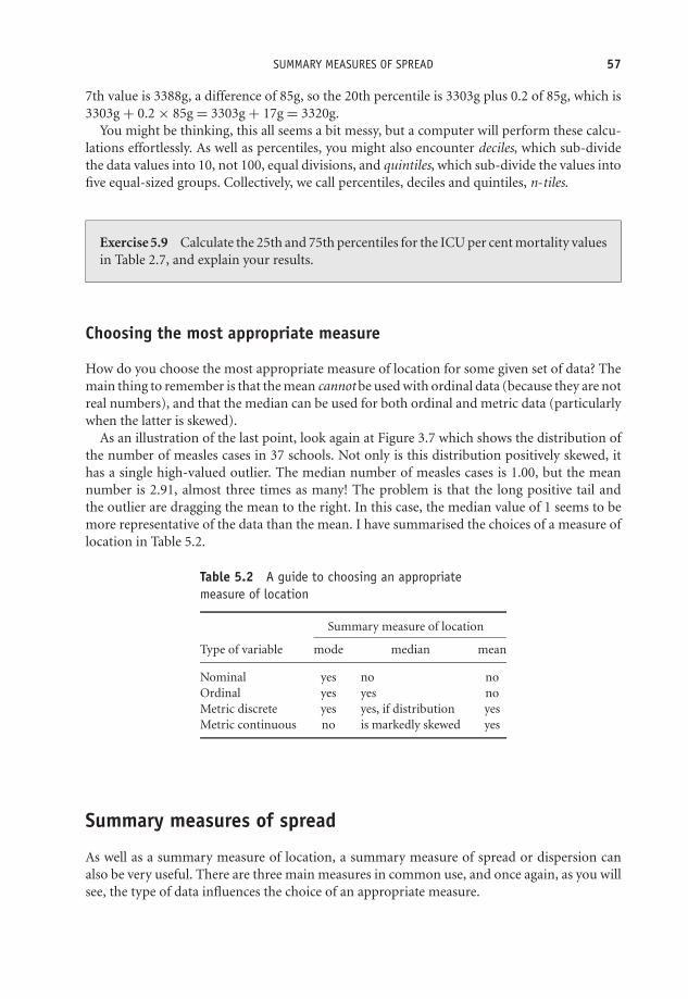
OTE/SPH OTE/SPH
JWBK220-05 December 21, 2007 18:57 Char Count= 0
SUMMARY MEASURES OF SPREAD 57
7th value is 3388g, a difference of 85g, so the 20th percentile is 3303g plus 0.2 of 85g, which is3303g + 0.2 × 85g = 3303g + 17g = 3320g.
You might be thinking, this all seems a bit messy, but a computer will perform these calcu-lations effortlessly. As well as percentiles, you might also encounter deciles, which sub-dividethe data values into 10, not 100, equal divisions, and quintiles, which sub-divide the values intofive equal-sized groups. Collectively, we call percentiles, deciles and quintiles, n-tiles.
Exercise 5.9 Calculate the 25th and 75th percentiles for the ICU per cent mortality valuesin Table 2.7, and explain your results.
Choosing the most appropriate measure
How do you choose the most appropriate measure of location for some given set of data? Themain thing to remember is that the mean cannot be used with ordinal data (because they are notreal numbers), and that the median can be used for both ordinal and metric data (particularlywhen the latter is skewed).
As an illustration of the last point, look again at Figure 3.7 which shows the distribution ofthe number of measles cases in 37 schools. Not only is this distribution positively skewed, ithas a single high-valued outlier. The median number of measles cases is 1.00, but the meannumber is 2.91, almost three times as many! The problem is that the long positive tail andthe outlier are dragging the mean to the right. In this case, the median value of 1 seems to bemore representative of the data than the mean. I have summarised the choices of a measure oflocation in Table 5.2.
Table 5.2 A guide to choosing an appropriatemeasure of location
Summary measure of location
Type of variable mode median mean
Nominal yes no noOrdinal yes yes noMetric discrete yes yes, if distribution yesMetric continuous no is markedly skewed yes
Summary measures of spread
As well as a summary measure of location, a summary measure of spread or dispersion canalso be very useful. There are three main measures in common use, and once again, as you willsee, the type of data influences the choice of an appropriate measure.

OTE/SPH OTE/SPH
JWBK220-05 December 21, 2007 18:57 Char Count= 0
58 CH 5 DESCRIBING DATA WITH NUMERIC SUMMARY VALUES
The range
The range is the distance from the smallest value to the largest. The range is not affected byskewness, but is sensitive to the addition or removal of an outlier value. As an example, therange of the 30 birthweights in Table 2.5 is (2860.0 to 4490.0) g. The range is best written likethis, rather than as the single-valued difference, i.e. as 1630 g, in this example, which is muchless informative.
Exercise 5.10 What are the ranges for age among those infants breast-fed, and thosebottle-fed in Table 3.2?
The interquartile range (iqr)
One solution to the problem of the sensitivity of the range to extreme value (outliers) is tochop a quarter (25 per cent) of the values off both ends of the distribution (which removes anytroublesome outliers), and then measure the range of the remaining values. This distance iscalled the interquartile range, or iqr. The interquartile range is not affected either by outliers orskewness, but it does not use all of the information in the data set since it ignores the bottomand top quarter of values.
Calculating interquartile range by hand (avoid if possible!)
To calculate the interquartile range by hand, you need first to determine two values:� The value which cuts off the bottom 25 per cent of values; this is known as the first quartileand denoted Q1.� The value which cuts off the top 25 per cent of values, known as the third quartile and denotedQ3.3
The interquartile range is then written as (Q1 to Q3). With the birthweight data: Q1 =3396.25 g, and Q3 = 3923.50 g. Therefore: interquartile range = (3396.25 to 3923.50) g. Thisresult tells you that the middle 50 per cent of infants (by weight) weighed between 3396.25 gand 3923.50 g.
An example from practice
Table 5.3 describes the baseline characteristics of 56 patients in an investigation into the use ofanalgesics in the prevention of stump and phantom pain in lower-limb amputation (Nikolajsen
3 The median is sometimes denoted as Q2.
OTE/SPH OTE/SPH
JWBK220-05 December 21, 2007 18:57 Char Count= 0
SUMMARY MEASURES OF SPREAD 59
et al. 1997). The ‘blockade’ group of patients were given bupivacaine and morphine, the control(comparison) group, were given an identically administered saline placebo.
As you can see, two variables, ‘pain in week before amputation’, and ‘daily opioid consumptionat admission (mg)’, were summarised with median and interquartile range values. Pain wasmeasured using a visual analogue scale (VAS4), which of course produces ordinal data, so themean is not appropriate, and the authors have used the median and interquartile range as theirsummary measures of location and spread.
The median level of pain in the blockade group is 51, with an iqr of (23.8 to 87.8).5 Thismeans that 25 per cent of this group had a pain level of less than 23.8, and 25 per cent a painlevel greater than 87.8. The middle 50 per cent had a pain level between 23.8 and 87.8. I’ll returnto the opioid consumption variable shortly.
Table 5.3 The baseline characteristics of 56 patients in an investigation into the use ofanalgesics in the prevention of stump and phantom pain in lower-limb amputation. Reproducedfrom The Lancet, 1994, 344, 1724–26, courtesy of Elsevier
Blockade group Control groupCharacteristics of patients (n = 27) (n = 29)
Men/women 15/12 18/11Mean (SD) age in years 72.8 (13.2) 70.8 (11.4)Diabetes 10 14Concurrent treatment because of cardiovascular disease 18 19Previous stroke 3 2Previous contralateral amputation 7 3Median (IQR) pain in week before amputation 51 (23.8–8–78) 44 (25.3–68)
(VAS, 0–100 mm)Median (IQR) daily opioid consumption at admission 50 (20–68.8) 30 (5–62.5)
(mg)Level of amputation
Below knee 15 16Through knee-joint 5 2Above knee 7 11
Reamputations during follow-up 3 2Died during follow-up 10 10
Exercise 5.11 Calculate the iqr for the ICU percentage mortality values in Table 2.7. (Youhave already calculated the 25th and 75th percentiles in Exercise 5.9).
Exercise 5.12 Interpret the median and interquartile range values for pain in the weekbefore amputation, for the control group in Table 5.3.
4 See Chapter 1.5 The table contains a typographical error, recording 87.8 as ‘8–78’.

OTE/SPH OTE/SPH
JWBK220-05 December 21, 2007 18:57 Char Count= 0
60 CH 5 DESCRIBING DATA WITH NUMERIC SUMMARY VALUES
Estimating the median and interquartile range from the ogive
As I indicated earlier, you can estimate the median and the interquartile range from the cumu-lative frequency curve (the ogive). Figure 5.2 shows the ogive for the cumulative birthweightdata in Table 3.3.
0
10
20
30
40
50
60
70
80
90
100
2700 3000 3300 3600 3900 4200 4500
Birthweight (g)
% c
um
ula
tive
fre
qu
ency
Figure 5.2 Using the relative cumulative frequency curve (or ogive) of birthweight to estimate themedian and interquartile range values (Note that this should be a smooth curve)
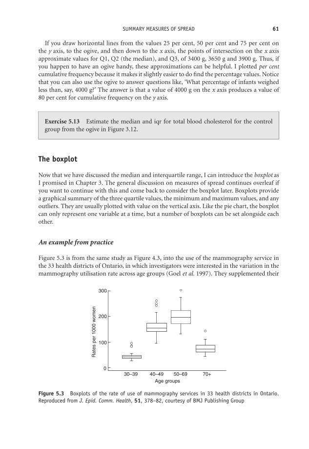
OTE/SPH OTE/SPH
JWBK220-05 December 21, 2007 18:57 Char Count= 0
SUMMARY MEASURES OF SPREAD 61
If you draw horizontal lines from the values 25 per cent, 50 per cent and 75 per cent onthe y axis, to the ogive, and then down to the x axis, the points of intersection on the x axisapproximate values for Q1, Q2 (the median), and Q3, of 3400 g, 3650 g and 3900 g. Thus, ifyou happen to have an ogive handy, these approximations can be helpful. I plotted per centcumulative frequency because it makes it slightly easier to do find the percentage values. Noticethat you can also use the ogive to answer questions like, ‘What percentage of infants weighedless than, say, 4000 g?’ The answer is that a value of 4000 g on the x axis produces a value of80 per cent for cumulative frequency on the y axis.
Exercise 5.13 Estimate the median and iqr for total blood cholesterol for the controlgroup from the ogive in Figure 3.12.
The boxplot
Now that we have discussed the median and interquartile range, I can introduce the boxplot asI promised in Chapter 3. The general discussion on measures of spread continues overleaf ifyou want to continue with this and come back to consider the boxplot later. Boxplots providea graphical summary of the three quartile values, the minimum and maximum values, and anyoutliers. They are usually plotted with value on the vertical axis. Like the pie chart, the boxplotcan only represent one variable at a time, but a number of boxplots can be set alongside eachother.
An example from practice
Figure 5.3 is from the same study as Figure 4.3, into the use of the mammography service inthe 33 health districts of Ontario, in which investigators were interested in the variation in themammography utilisation rate across age groups (Goel et al. 1997). They supplemented their
300
200
100
Rate
s p
er
1000 w
om
en
030–39 40–49 50–69
Age groups
70+
Figure 5.3 Boxplots of the rate of use of mammography services in 33 health districts in Ontario.Reproduced from J. Epid. Comm. Health, 51, 378–82, courtesy of BMJ Publishing Group

OTE/SPH OTE/SPH
JWBK220-05 December 21, 2007 18:57 Char Count= 0
62 CH 5 DESCRIBING DATA WITH NUMERIC SUMMARY VALUES
results with the boxplots shown in the figure, for the age groups: (30–39); (40–49); (50–59);and 70+ years. The vertical axis is the mammography utilisation rate (visits per 1000 women),in the 33 health districts. Outliers are denoted by the small open circles.
Let’s look at the third boxplot, that for the women aged 50–69:� The bottom end of the lower ‘whisker’ (the line sticking out of the bottom of the box),corresponds to the minimum value – about 125 visits per 1000 women.� The bottom of the box is the 1st quartile value, Q1. So about 25 per cent of women had autilisation rate of 175 or less visits per 1000 women.� The line across the inside of the box (it won’t always be half-way up), is the median, Q2.So half of the women had a utilisation rate of less than about 200 consultations per 1000women, and half a rate of more than 200. The more asymmetric (skewed) the distributionalshape, the further away from the middle of the box will be the median line, closer to the topof the box is indicative of negative skew, closer to the bottom of the box – positive skew.� The top of the box is the third quartile Q3. That is, about a quarter of women had a consultationrate of 225 or more per 1000.� The top end of the upper whisker is the ‘maximum’ mammography utilisation rate – about275 consultations per 1000 women. This is the maximum value that can be considered stillto be part of the general mass of the data. Because. . .� . . .there is one outlier. One of the health districts reported a utilisation rate of about 300 per1000 women.6 This is, of course, the actual maximum value in the data.
Exercise 5.14 Sketch the box plot for the percentage mortality in ICUs shown in Table2.7. (Note that you have already calculated the median and iqr values in Exercises 5.6 and5.10). What can you glean from the boxplot about the shape of the distribution of the ICUpercentage mortality rate?
Exercise 5.15 The boxplots in Figure 5.4 are from a study of sperm integrity in adultsurvivors of childhood cancer compared to a control group of non-cancer individuals(Thomson et al. 2002). What do the two boxplots tell you?
Standard deviation
The limitation of the interquartile range as a summary measure of spread is that (like themedian) it doesn’t use all of the information in the data, since it omits the top and bottom
6 Outliers are defined in various ways by different computer programs. Outliers are here defined as any valuemore than thee halves of the interquartile range greater than the third quartile, or less than the first quartile.

OTE/SPH OTE/SPH
JWBK220-05 December 21, 2007 18:57 Char Count= 0
SUMMARY MEASURES OF SPREAD 63
25
20
p=0.06
DN
A d
am
age (
%)
Controls
(n=64)
Non-azoospermic
long-term survivors of
childhood cancer (n=23)
15
10
5
0
Figure 5.4 Boxplots from a study of sperm integrity in adult survivors of childhood cancer, comparedto a control group of non-cancer individuals. Reprinted from The Lancet 2002, 360, 361–6, Fig. 2,p. 364, courtesy of Elsevier
quarter of values. An alternative approach uses the idea of summarising spread by measuringthe mean (average) distance of all the data values from the overall mean of all of the values.The smaller this mean distance is, the narrower the spread of values must be, and vice versa.This idea is the basis for what is known as the standard deviation, or s.d. The following way ofcalculating the sample standard deviation by hand illustrates this idea:7� Subtract the mean of the sample from each of the n sample values in the sample, to give the
difference values.� Square each of these differences.� Add these squared values together (called the sum of squares).� Divide the sum of squares by (n – 1); i.e. divide by 1 less than the sample size.8� Take the square root. This is the standard deviation.
One advantage of the standard deviation is that, unlike the interquartile range, it uses all of theinformation in the data.
7 This is a very tedious procedure. If you have an s.d. key on your calculator use that. Better still, use a computer!8 If we divide by n, as we normally would do to find a mean, we get a result which is slightly too small. Dividing
by (n – 1) adjusts for this. Technically, the sample s.d. is said to be a biased estimator of population s.d. SeeChapter 7 for the meaning of sample and population.

OTE/SPH OTE/SPH
JWBK220-05 December 21, 2007 18:57 Char Count= 0
64 CH 5 DESCRIBING DATA WITH NUMERIC SUMMARY VALUES
Exercise 5.16 In Figure 4.6 the authors tell us that the mean cord platelet count is308×109/l, and the standard deviation is 69×109/l (notice the two measures have thesame units).1 Explain what this value means.
An example from practice
In Table 5.3, the analgesic/amputation pain study, the authors summarise the age of the patientsin the study with the mean and standard deviation. As you can see, the spread of ages in theblockade group is wider than in the control group, 13.2 years around a blockade group’s meanof 72.8 years, compared to 11.4 years around a control group’s mean of 70.8 years.
The authors could also have used the mean and standard deviation for daily opioid consump-tion (mg), since this is a metric variable, but instead used the median and interquartile range;there are a number of possible reasons for this. First, the data may be noticeably skewed and/orcontained outliers, perhaps making the mean a little too unrepresentative of the general massof data. Or the investigators may have specifically wanted a summary measure of central-ness,which the median provides. Third, they may have felt that asking people to recall their opioidconsumption last week was likely to lead to fuzzy, imprecise, values, and so have preferred totreat them as if they were ordinal.
Exercise 5.17 Calculate and interpret the standard deviation for the ICU percentagemortality values in Table 2.7. (You have already calculated the mean percentage mortalityin Exercise 5.7). I would hesitate to do this without a calculator with a standard deviationfunction.
To sum up summary measures of spread: with ordinal data use either the range or theinterquartile range. The standard deviation is not appropriate because of the non-numericnature of ordinal data. With metric data use either the standard deviation, which uses all ofthe information in the data, or the interquartile range. The latter if the distribution is skewed,and/or you have already selected the median as your preferred measure of location. Don’t mix-and-match measures – standard deviation goes with the mean, and iqr with the median. Thesepoints are summarised in Table 5.4.
Table 5.4 Choosing an appropriate measure of spread
Summary measure of spread
Type of variable Range Interquartile range Standard deviation
Nominal No No NoOrdinal Yes Yes NoMetric Yes Yes, if skewed Yes
1109 means 1000 000 000.
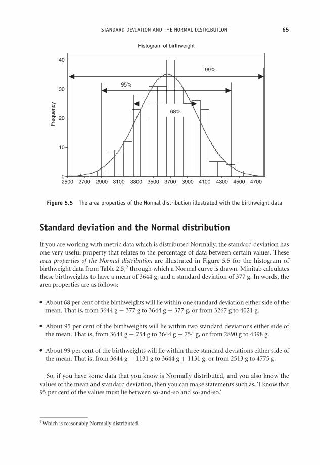
OTE/SPH OTE/SPH
JWBK220-05 December 21, 2007 18:57 Char Count= 0
STANDARD DEVIATION AND THE NORMAL DISTRIBUTION 65
Fre
quency
470045004300410039003700350033003100290027002500
40
30
20
10
0
Histogram of birthweight
68%
95%
99%
Figure 5.5 The area properties of the Normal distribution illustrated with the birthweight data
Standard deviation and the Normal distribution
If you are working with metric data which is distributed Normally, the standard deviation hasone very useful property that relates to the percentage of data between certain values. Thesearea properties of the Normal distribution are illustrated in Figure 5.5 for the histogram ofbirthweight data from Table 2.5,9 through which a Normal curve is drawn. Minitab calculatesthese birthweights to have a mean of 3644 g, and a standard deviation of 377 g. In words, thearea properties are as follows:� About 68 per cent of the birthweights will lie within one standard deviation either side of the
mean. That is, from 3644 g − 377 g to 3644 g + 377 g, or from 3267 g to 4021 g.� About 95 per cent of the birthweights will lie within two standard deviations either side ofthe mean. That is, from 3644 g − 754 g to 3644 g + 754 g, or from 2890 g to 4398 g.� About 99 per cent of the birthweights will lie within three standard deviations either side ofthe mean. That is, from 3644 g − 1131 g to 3644 g + 1131 g, or from 2513 g to 4775 g.
So, if you have some data that you know is Normally distributed, and you also know thevalues of the mean and standard deviation, then you can make statements such as, ‘I know that95 per cent of the values must lie between so-and-so and so-and-so.’
9 Which is reasonably Normally distributed.
OTE/SPH OTE/SPH
JWBK220-05 December 21, 2007 18:57 Char Count= 0
66 CH 5 DESCRIBING DATA WITH NUMERIC SUMMARY VALUES
An example from practice
To illustrate the usefulness of the Normal area properties, look again at the histogram of thecord platelet count for 4382 infants in Figure 4.6, which appears to be reasonably Normal, andhas a mean of 308 × 109/l, and a standard deviation of 69 × 109/l. You can therefore say thatabout two-thirds (67 per cent) of the 4382 infants, i.e. 2936 infants, had a cord platelet countbetween 308 – 69 and 308 + 69, which is between 239 and 377 109/l.
Table 5.5 Output measures from a study of the effectiveness of lisinopril as aprophylactic for acute migraine. Figures are means (SD). Reproduced from BMJ, 322,19–22, courtesy of BMJ Publishing Group
Mass % reductionLisinopril Placebo (95% Cl)
Primary efficacy parameterHours with headache 129 (125) 162 (142) 20 (5 to 36)Days with headache 19.7 (14) 23.7 (11) 17 (5 to 30)Days with migraine 14.5 (11) 18.5 (10) 21 (9 to 34)
Secondary efficacy parameterHeadache severity index 297 (325) 370 (310) 20 (3 to 37)Triptan doses 15.7 (15) 20.2 (17) 22 (7 to 38)Doses of analgesics 14.5 (23) 16.2 (20) 11 (−16 to 37)Days with sick leave 2.30 (4.32) 2.09 (2.50) −10 (−64 to 37)Bodily pain* 63.7 (29) 53.8 (23) −18 (−35 to −1)General health* 73.6 (20) 74.1 (21) 1 (−6 to 7)Vitality* 61.1 (24) 58.2 (21) −5 (−18 to 8)Social functioning* 81.4 (25) 79.5 (23) −2 (−11 to 6)
* From SF-36.
Exercise 5.18 Table 5.5 is from a study of the effectiveness of lisinopril as a prophylacticfor acute migraine, in which one group of patients was given lisinopril, and a second groupa placebo (Schrader et al. 2001). Outcome measures included, ‘hours with headache’, ‘dayswith headache’ and ‘days with migraine’, all metric continuous variables. The mean andstandard deviation for each of these variables for both groups is shown in the figure. Doyou think they can be Normally or symmetrically distributed? Explain your answer.
Transforming data
Later in the book you will meet some procedures which require the data to be Normallydistributed. But what if it isn’t? Happily some non-Normal data can be transformed to make thedistribution more Normal (or at least more Normal than it was to start with). The most popularapproach is to take the log of the data (to base 10); first because it works more often than otherprocedures, and second because the back-transformation (i.e. anti-logging the results at theend of the analysis) can be meaningfully interpreted.

OTE/SPH OTE/SPH
JWBK220-05 December 21, 2007 18:57 Char Count= 0
STANDARD DEVIATION AND THE NORMAL DISTRIBUTION 67
Weight_Now
Fre
qu
ency
12010590756045
140
120
100
80
60
40
20
0
Histogram of Weight_Now
(a)
log Wt
Fre
qu
ency
2.1002.0251.9501.8751.8001.7251.6501.575
140
120
100
80
60
40
20
0
Histogram of log Wt
(b)
Figure 5.6 The effect of applying a log10 transformation on the shape of the distribution of the weightof 658 women

OTE/SPH OTE/SPH
JWBK220-05 December 21, 2007 18:57 Char Count= 0
68 CH 5 DESCRIBING DATA WITH NUMERIC SUMMARY VALUES
An example from practice
Figure 5.6 shows histograms for the original and transformed data on the weight (kg) of 685women in a diet and health cohort study.10 The original data is positively skewed, Figure 5.6a.If we transform the data by taking logs10, you can see that the transformed data has a moreNormal-ish shape, Figure 5.6b.
In Part II, I have discussed ways of looking at sample data – with tables, with charts, from itsshape, and with numeric summary measures. Collectively these various procedures are labelleddescriptive statistics. However, in all of the above, I assumed that you already had the data thatyou were describing, and I’ve said nothing so far about how you might collect the data in thefirst place. This is the question I will address in the following chapter.
10This data was kindly supplied by Professor Janet Cade of Leeds University Medical School.

OTE/SPH OTE/SPH
JWBK220-06 November 28, 2007 10:47 Char Count= 0
III
Getting the Data
69

OTE/SPH OTE/SPH
JWBK220-06 November 28, 2007 10:47 Char Count= 0
70

OTE/SPH OTE/SPH
JWBK220-06 November 28, 2007 10:47 Char Count= 0
6Doing it right first time –designing a study
Learning objectives
When you have finished this chapter you should be able to:� Explain what a sample is, and what the difference between study and target popula-tions is.� Explain why it is important for a sample to be as representative of the populationfrom which it is taken as possible.� Define a random sample, and explain what a sampling frame is.� Briefly outline what is meant by a contact sample, and by stratified and systematicsamples.� Explain the difference between observational and experimental studies.� Explain the difference between matched and independent groups.� Briefly describe case-series, cross-section, cohort and case-control studies, and theirlimitations and advantages.� Explain the problem of confounding.
Medical Statistics from Scratch, Second Edition David BowersC© 2008 John Wiley & Sons, Ltd

OTE/SPH OTE/SPH
JWBK220-06 November 28, 2007 10:47 Char Count= 0
72 CH 6 DOING IT RIGHT FIRST TIME – DESIGNING A STUDY� Outline the general idea of the clinical trial.� Explain the concept of randomisation, and why it is important, and demonstrate thatyou can use a random number table to perform a simple block randomisation.� Describe the concept of blinding, and what it is intended to achieve.� Outline and compare the design of the parallel and cross-over randomised controlledtrials, and summarise their respective advantages and shortcomings.� Explain what intention-to-treat means.� Be able to choose an appropriate study design to answer some given research question.
Hey ho! Hey ho! It’s off to work we go
There are two main threads here. First, the study design question, and second, the data collectionquestion. Study design embraces issues like:� What is the research question? What are we hypothesising?� Which variables do we need to measure?� Which is our main outcome variable (the variable we are most interested in)?� How many subjects need to be included in the study?� Who exactly are the subjects? How should we select them?� How many groups do we need?� Are we going to make some form of clinical intervention or simply observe?� Do we need a comparison group?� At what stage are we going to take measurements? Before, during, after, etc.?� How long will the study take? And so on.
Study design is a systematic way of dealing with these issues, and offers a good-practice blueprintthat is applicable in almost all research situations.
Second, the data collection question. Having decided an appropriate study design, we thenhave to consider the following:� How are we going collect the data from the subjects?� How do we ensure that the sample is as representative as possible?
I want to start with the data collection question. First, though, a brief mention of what we meanby a population.
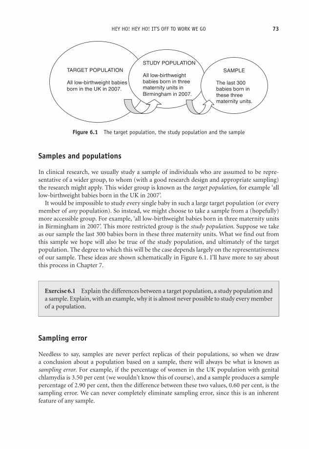
OTE/SPH OTE/SPH
JWBK220-06 November 28, 2007 10:47 Char Count= 0
HEY HO! HEY HO! IT’S OFF TO WORK WE GO 73
TARGET POPULATION
All low-birthweight babies
born in the UK in 2007.
STUDY POPULATION
All low-birthweight
babies born in threematernity units in
Birmingham in 2007.
SAMPLE
The last 300
babies born in
these three maternity units.
Figure 6.1 The target population, the study population and the sample
Samples and populations
In clinical research, we usually study a sample of individuals who are assumed to be repre-sentative of a wider group, to whom (with a good research design and appropriate sampling)the research might apply. This wider group is known as the target population, for example ‘alllow-birthweight babies born in the UK in 2007’.
It would be impossible to study every single baby in such a large target population (or everymember of any population). So instead, we might choose to take a sample from a (hopefully)more accessible group. For example, ‘all low-birthweight babies born in three maternity unitsin Birmingham in 2007’. This more restricted group is the study population. Suppose we takeas our sample the last 300 babies born in these three maternity units. What we find out fromthis sample we hope will also be true of the study population, and ultimately of the targetpopulation. The degree to which this will be the case depends largely on the representativenessof our sample. These ideas are shown schematically in Figure 6.1. I’ll have more to say aboutthis process in Chapter 7.
Exercise 6.1 Explain the differences between a target population, a study population anda sample. Explain, with an example, why it is almost never possible to study every memberof a population.
Sampling error
Needless to say, samples are never perfect replicas of their populations, so when we drawa conclusion about a population based on a sample, there will always be what is known assampling error. For example, if the percentage of women in the UK population with genitalchlamydia is 3.50 per cent (we wouldn’t know this of course), and a sample produces a samplepercentage of 2.90 per cent, then the difference between these two values, 0.60 per cent, is thesampling error. We can never completely eliminate sampling error, since this is an inherentfeature of any sample.
OTE/SPH OTE/SPH
JWBK220-06 November 28, 2007 10:47 Char Count= 0
74 CH 6 DOING IT RIGHT FIRST TIME – DESIGNING A STUDY
Collecting the data – types of sample
Now the data collection question. There are many books wholly dedicated to the variousmethods of collecting sample data. I am going to do little more than mention a couple of thesemethods by name. Those interested in more details of the methods referred to should consultother readily available sources.
The simple random sample and its offspring
The most important consideration is that any sample should be representative of the populationfrom which it is taken. For example, if your population has equal numbers of male and femalebabies, but your sample consists of twice as many male babies as female, then any conclusionsyou draw are likely to be, at least, misleading. Generally, the most representative sample is asimple random sample. The only way that a simple random sample will differ from the populationwill be due to chance alone.
For a sample to be truly random, every member of the population must have an equal chanceof being included in the sample. Unfortunately, this is rarely possible in practice, since this wouldrequire a complete and up-to-date list (name and contact details) of, for example, every low-birthweight baby born in the UK in 2007. Such a list is called a sampling frame. In practice,compiling an accurate sampling frame for any population is hardly ever going to be feasible!
This same problem applies also to two close relatives of simple random sampling – systematicrandom sampling, and stratified random sampling. In the former, some fixed fraction of thesampling frame is selected, say every 10th or every 50th member, until a sample of the requiredsize is obtained. Provided there are no hidden patterns in the sampling frame, this method willproduce samples as representative as a random sample. In stratified sampling, the samplingframe is first broken down into strata relevant to the study, for example men and women; or non-smokers, ex-smokers and smokers. Then each separate stratum is sampled using a systematicsampling approach, and finally these strata samples are combined. But both methods requirea sampling frame.
Contact or consecutive samples
The need for an accurate sampling frame makes random sampling impractical in any realisticclinical setting. One common alternative is to take as a sample, individuals in current or recentcontact with the clinical services, such as consecutive attendees at a clinic. For example, in thestudy of stress as a risk factor for breast cancer (Table 1.6), the researchers took as their sample332 women attending a clinic at Leeds General Infirmary for a breast lump biopsy.
Alternatively, researchers may study a group of subjects in situ, for example on a ward, orin some other setting. In the nit lotion study (Table 2.1), researchers took as their sampleall infested children from a number of Parisian primary schools, based on the high rates ofinfestation in those same schools the previous year.
If your sample is not a random sample, then the obvious question is, ‘How representativeis it of the population?’ And, moreover, which population are we talking about here? In thebreast cancer study, if the researchers were confident that their sample of 332 women was
OTE/SPH OTE/SPH
JWBK220-06 November 28, 2007 10:47 Char Count= 0
TYPES OF STUDY 75
reasonably representative of all such women in the Leeds area (their study population), thenthey would perhaps have felt justified in generalising their findings to this population, andmaybe to all women in the UK (a possible target population). But if they knew that the womenin their sample were all from a particularly deprived (or particularly affluent) part of the city,or if some ethnic minority formed a noticeably large proportion of the women, then such ageneralisation would be more risky.
Exercise 6.2 What is the principal advantage of random sampling? What is the principaldrawback of this approach? Describe another method of getting samples that is used inclinical research.
Types of study
With this brief look at the data collection problem, I want to return now to the study design ques-tion. Study design divides into two main types. Some alternative ways of classifying these are:� Observational versus experimental studies.� Prospective versus retrospective studies.� Longitudinal versus cross-sectional studies.
I am going to use the first classification, although I will explain the other terms along theway. Broadly speaking, an observational study is one in which researchers actively observe thesubjects involved, perhaps asking questions, or taking some measurements, or looking at clinicalrecords, but they don’t control, change or effect in any way, their selection, treatment or care.An experimental study, on the other hand, does involve some sort of active intervention withthe subjects. I will first discuss a number of types of observational study designs.
Exercise 6.3 What is the fundamental difference between an observational study and anexperimental study?
Observational studies
There are four principal types of observational study:� Case-series.� Cross-section studies.� Cohort studies.� Case-control studies.
OTE/SPH OTE/SPH
JWBK220-06 November 28, 2007 10:47 Char Count= 0
76 CH 6 DOING IT RIGHT FIRST TIME – DESIGNING A STUDY
Case-series studies
A health carer may see a series of patients (cases) with similar but unusual symptoms oroutcomes, find something interesting and write it up as a study. This is a case-series.
An example from practice
In 1981 a drug technician at the Centre for Disease Control in the USA, noticed an unusually highnumber of requests for the drug pentamidine, used to treat Pneumocystis carinii pneumonia(PCP). This led to a scientific report, in effect a case-series study, of PCP occurring unusually infive gay men in Los Angeles. At the same time a similar outbreak of Kaposi’s Sarcoma (previouslyrare except in elderly men) in a small number of young gay men in New York, also began toraise questions. These events signalled the arrival of HIV in the USA.
In the same way, new variant CJD was also first suspected from an unusual series of deaths ofyoung people in the UK, from an apparent dementia-like illness, a disease normally associatedwith the elderly. Case-series studies often point to a need for further investigations, as was thecase in each one of these quoted examples.
Cross-section studies
A cross-section study aims to take a ‘snapshot’ of some situation at some particular point intime,1 but notably data on one or more variables from each subject in the study is collectedonly once.
An example from practice
The following extract is from a cross-section study carried out in 1993 on 2542 rural Chinesesubjects, into the relationship between body mass index2 and cardiovascular disease, in a ruralChinese population (1st paragraph in text below) (Hu et al. 2000). The population of thisregion of China was about 6 million, and the 2542 individuals included in the sample wereselected using a two-stage sampling process, as the 2nd paragraph explains. Each subject wasthen interviewed and the necessary measurements were taken (3rd paragraph).
A total of 2 542 subjects aged 20–70 years from a rural area of Anqing, China,participated in a cross-sectional survey, and 1 610 provided blood samples in 1993.Mean BMI (kg/m2) was 20.7 for men and 20.9 for women. . .
1 In practice this ‘point’ in time may in fact be a short-ish period of time.2 Body mass index, used to measure obesity, is equal to a person’s weight (kg) divided by their height squared
(m)2. A bmi of between 20 to 25 is considered ‘normal’, 25 to 30 indicates a degree of obesity. Higher scoresindicate greater levels of obesity.
OTE/SPH OTE/SPH
JWBK220-06 November 28, 2007 10:47 Char Count= 0
TYPES OF STUDY 77
. . .These participants were selected from 20 townships in four counties based on atwo-stage sampling approach. The sampling unit is a village in the first stage and anuclear family in the second stage, based on the following criteria: 1) both parentsare alive; and 2) there are at least two children in the family. We limited the analysisto 2 542 participants aged 20 years or older from 776 families. . .
. . .Trained interviewers administered questionnaires to gather information on eachparticipant’s date of birth, occupation, education level, current cigarette smoking, andalcohol use. . .measurements, including height and weight, were taken using standardprotocols, with subjects not wearing shoes or outer-wear. BMI was calculated asweight (kg)/height (m2). Blood pressure measurements were obtained by trainednurses after subjects had been seated for 10 minutes by using a mercury manometerand appropriately sized cuffs, according to standard protocols.
Note that there is no intervention by the researchers into any aspect of the subjects’ care ortreatment – the observers only take measurements, ask some questions or study records. Theresults from the above study showed that subjects in the sample with higher body mass indexvalues were also likely to have higher blood pressures. The researchers might reasonably claimthat this link would also exist in the province’s population of 6 million – that’s their inference –but the truth of this would depend on how representative the sample was of the whole Anqingpopulation. Whether or not the finding could be extended to the rest of the diverse Chinesepopulation is more questionable. To sum up, cross-section studies:� Take only one measurement from each subject at one moment in, or during one period of,
time. Data from one or more than one variable may be collected.� Can be used to investigate a link between two or more variables, but not the direction of anycausal relationship. The Anqing study does not reveal whether a higher body mass index leadsto higher blood pressures (more strain on the heart, for example), or whether higher bloodpressures lead to higher body mass index (maybe higher blood pressures increase appetite),it simply establishes some sort of association.� Are not particularly helpful if the condition being investigated is rare. If, for example, only0.1 per cent of a population has some particular disease, then a very large sample would beneeded to provide any reliable results. Too small a sample might lead you to conclude thatnobody in the population had the disease!� Can be more limited in scope and aim only to describe some existing state of affairs, such asthe prevalence of some condition – for example, the percentage of 16+ UK individuals whohave taken ecstasy. Only one variable is measured – use of ecstasy, yes or no. Since this is theonly variable measured, no link with any other variable can be explored.� That aim to uncover attitudes, opinions or behaviours, are often referred to as surveys. For ex-ample, the views of clinical staff towards having patients’ relatives in Emergency Departmenttrauma rooms.
OTE/SPH OTE/SPH
JWBK220-06 November 28, 2007 10:47 Char Count= 0
78 CH 6 DOING IT RIGHT FIRST TIME – DESIGNING A STUDY
Exercise 6.4 Give two examples of the application of the cross-section design in a clinicalsetting.
From here to eternity – cohort studies
The main objective of a cohort study is to identify risk factors causing a particular outcome, forexample death, or lung cancer, or stroke, or low-birthweight babies and so on. The principlestructure of a cohort study (also known as a follow-up, prospective, or longitudinal study) is asfollows:� A group of individuals is selected at random from the general population, for example all
women living in Manchester. . .� . . .or from a particular population, for example all call-centre workers. . .� . . .or via a clinical setting, for example women diagnosed with breast cancer.� The group is followed forward over a period of time,3 and the subjects monitored on theirexposure to suspected risk factors, or to different clinical interventions.� At the end of the study, a comparison is made between groups with and without the outcomeof interest (say cardio-vascular disease), in terms of their exposure over the course of thestudy to a suspected risk factor (e.g. smoking, lack of exercise, diet, etc.).� A reasoned conclusion is drawn about the relationship between the outcome of interest andthe suspected risk factor or intervention.
A well-known prospective cohort study was that conducted by Doll and Hill into a possibleconnection between mortality and cigarette smoking. They recruited about 60 per cent of thedoctors in the UK, determined their age and smoking status (among other things), and thenfollowed them up over the ensuing years, recording deaths as they arose. Very quickly the databegan to show significantly higher mortality among doctors who smoked.
In some cohort studies, the data may be collected from existing historical records, andsubjects followed from some time starting in the past, as the following example demonstrates.
An example from practice
An investigation of the relationship between weight in infancy and the prevalence of coronaryheart disease (CHD) in adult life used a sample of 290 men born between 1911 and 1930, andliving in Hertfordshire, whose birthweights and weights at one year were on record. In 1994
3 Note that ‘forward’ doesn’t necessarily mean from today, although prospective cohort studies do follow subjectsforward from the time the study is initiated.
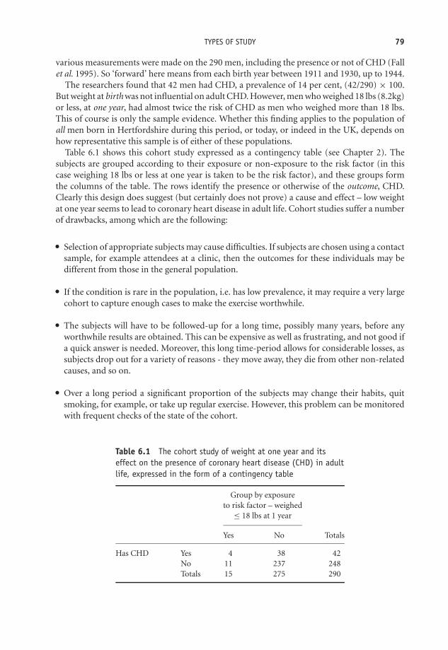
OTE/SPH OTE/SPH
JWBK220-06 November 28, 2007 10:47 Char Count= 0
TYPES OF STUDY 79
various measurements were made on the 290 men, including the presence or not of CHD (Fallet al. 1995). So ‘forward’ here means from each birth year between 1911 and 1930, up to 1944.
The researchers found that 42 men had CHD, a prevalence of 14 per cent, (42/290) × 100.But weight at birth was not influential on adult CHD. However, men who weighed 18 lbs (8.2kg)or less, at one year, had almost twice the risk of CHD as men who weighed more than 18 lbs.This of course is only the sample evidence. Whether this finding applies to the population ofall men born in Hertfordshire during this period, or today, or indeed in the UK, depends onhow representative this sample is of either of these populations.
Table 6.1 shows this cohort study expressed as a contingency table (see Chapter 2). Thesubjects are grouped according to their exposure or non-exposure to the risk factor (in thiscase weighing 18 lbs or less at one year is taken to be the risk factor), and these groups formthe columns of the table. The rows identify the presence or otherwise of the outcome, CHD.Clearly this design does suggest (but certainly does not prove) a cause and effect – low weightat one year seems to lead to coronary heart disease in adult life. Cohort studies suffer a numberof drawbacks, among which are the following:� Selection of appropriate subjects may cause difficulties. If subjects are chosen using a contact
sample, for example attendees at a clinic, then the outcomes for these individuals may bedifferent from those in the general population.� If the condition is rare in the population, i.e. has low prevalence, it may require a very largecohort to capture enough cases to make the exercise worthwhile.� The subjects will have to be followed-up for a long time, possibly many years, before anyworthwhile results are obtained. This can be expensive as well as frustrating, and not good ifa quick answer is needed. Moreover, this long time-period allows for considerable losses, assubjects drop out for a variety of reasons - they move away, they die from other non-relatedcauses, and so on.� Over a long period a significant proportion of the subjects may change their habits, quitsmoking, for example, or take up regular exercise. However, this problem can be monitoredwith frequent checks of the state of the cohort.
Table 6.1 The cohort study of weight at one year and itseffect on the presence of coronary heart disease (CHD) in adultlife, expressed in the form of a contingency table
Group by exposureto risk factor – weighed
≤ 18 lbs at 1 year
Yes No Totals
Has CHD Yes 4 38 42No 11 237 248Totals 15 275 290

OTE/SPH OTE/SPH
JWBK220-06 November 28, 2007 10:47 Char Count= 0
80 CH 6 DOING IT RIGHT FIRST TIME – DESIGNING A STUDY
Finally, note again that the selection of the groups in the cohort contingency table is based onwhether individuals have or have not been exposed to the risk factor, for example weighing 18 lbsor less at one year (or smoking, or exposure to asbestos, or whatever).
Back to the future – case-control studies
A number of the limitations of the cohort design are addressed by the case-control design,although it is itself far from perfect, as you will see. In a cohort study, a group of subjectsis followed up to see if they develop an outcome (a condition) of interest. In contrast, in acase-control study the groups are selected on the basis of having or not having the outcomeor condition. The objective is the same in both types of study – can the outcome of interestbe related to the candidate risk factor? The structure of a case-control study (also known as alongitudinal or retrospective study) is as follows:� Two groups of subjects are selected on the basis of whether they have or do not have some
condition of interest (for example, sudden infant death, or stroke, or depression, etc.).� One group, the cases, will have the condition of interest.� The other group, the controls, will not have the condition, but will be as similar to the casesas possible in all other ways.� Individuals in both groups are then questioned about past exposure to possible risk factors.� A reasoned conclusion is then drawn about the relationship between the condition in questionand exposure to the suspected risk factor.
OTE/SPH OTE/SPH
JWBK220-06 November 28, 2007 10:47 Char Count= 0
CONFOUNDING 81
It was the outcome from such a case-control study by Doll and Hill that led them to conductthe later cohort study referred to above. Before I discuss the case-control design in more detail,there are a couple of important ideas to be dealt with first.
Confounding
Why do we want to ensure that the cases and controls are broadly similar (on age and sex, ifnothing else). The reason is that it would be very difficult to identify smoking, say, as a riskfactor for lung cancer in the cases, if these were on average twice as old as the controls. Who isto say that it is not increased age that causes a corresponding increased risk of lung cancer andnot smoking. Consider the following situation.
Researchers noticed that mothers who smoke more have fewer Down syndrome babies thanmothers who smoke less (or don’t smoke at all) (Chi-Ling et al.1999). So at first glance smokingless seems to be a risk factor for Down syndrome. It would appear that if a mother wants toreduce the risk of having a baby with Down syndrome she should smoke a lot! However, thefact is that younger mothers have fewer Down syndrome babies but smoke more, while oldermothers have more Down syndrome babies but smoke less. Thus the apparent connectionbetween smoking and Down syndrome babies is a mirage. It disappears when we take ageinto account. We say that age is confounding the relationship between smoking and Downsyndrome, i.e. age is a confounder.
To be a confounder, a variable must be associated with both the risk factor (smoking) and theoutcome of interest (Down syndrome). Age satisfies this condition since smoking is connectedwith age, and having a Down syndrome baby is also connected with age. Age is commonlyfound to be a confounder, as is sex. When we allow for the effects of possible confounders, weare said to be controlling or adjusting for confounders. Results which are based on unadjusteddata are said to be ‘crude’ results. I’ll have more to say about confounding later in the book.
Matching
One way to make cases and controls more similar is to match them. How we match casesand controls divides case-control studies into two types – the matched and the unmatcheddesigns. To qualify as a matched case-control each control must be individually matched (orpaired), person-to-person, with a case. If cases and controls are independently selected, or areonly broadly matched (for example, the same broad mix of ages, same proportions of males andfemales – known as frequency matching), then this is an unmatched case-control design. Finally,bear in mind that variables on which the subjects are matched cannot be used to shed any lighton the relationship between outcome and risk. For example, if we are interested in coffee asone possible risk factor for people with pancreatic cancer (the cases), we should certainly notmatch cases and controls so that both groups drink lots of coffee.
Unmatched case-control design – an example from practice
In the following extract, from a frequency-matched case-control study into the possible con-nection between lifelong exercise and stroke (Shinton and Sagar 1993), the authors describethe selection of the cases and the controls.
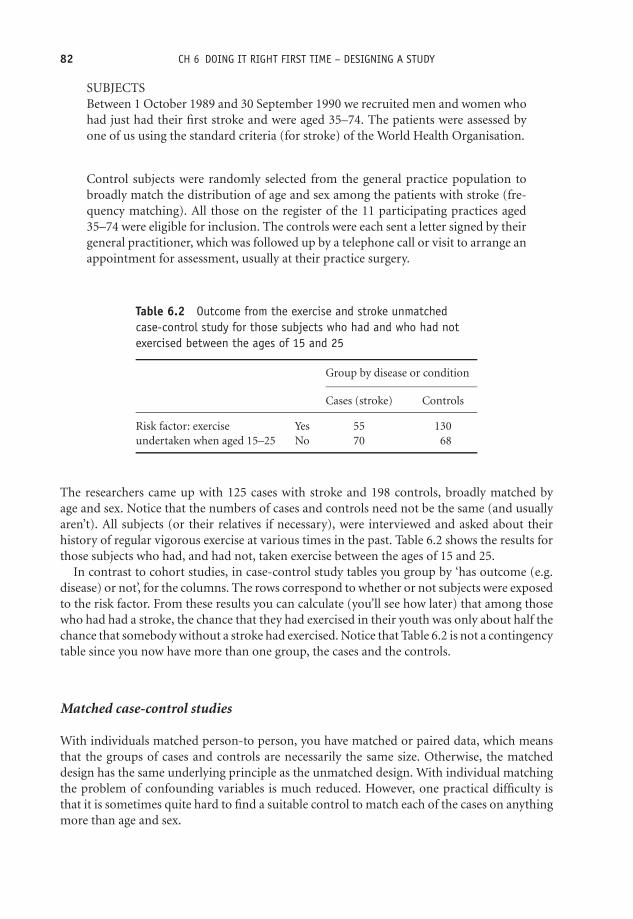
OTE/SPH OTE/SPH
JWBK220-06 November 28, 2007 10:47 Char Count= 0
82 CH 6 DOING IT RIGHT FIRST TIME – DESIGNING A STUDY
SUBJECTSBetween 1 October 1989 and 30 September 1990 we recruited men and women whohad just had their first stroke and were aged 35–74. The patients were assessed byone of us using the standard criteria (for stroke) of the World Health Organisation.
Control subjects were randomly selected from the general practice population tobroadly match the distribution of age and sex among the patients with stroke (fre-quency matching). All those on the register of the 11 participating practices aged35–74 were eligible for inclusion. The controls were each sent a letter signed by theirgeneral practitioner, which was followed up by a telephone call or visit to arrange anappointment for assessment, usually at their practice surgery.
Table 6.2 Outcome from the exercise and stroke unmatchedcase-control study for those subjects who had and who had notexercised between the ages of 15 and 25
Group by disease or condition
Cases (stroke) Controls
Risk factor: exerciseundertaken when aged 15–25
Yes 55 130No 70 68
The researchers came up with 125 cases with stroke and 198 controls, broadly matched byage and sex. Notice that the numbers of cases and controls need not be the same (and usuallyaren’t). All subjects (or their relatives if necessary), were interviewed and asked about theirhistory of regular vigorous exercise at various times in the past. Table 6.2 shows the results forthose subjects who had, and had not, taken exercise between the ages of 15 and 25.
In contrast to cohort studies, in case-control study tables you group by ‘has outcome (e.g.disease) or not’, for the columns. The rows correspond to whether or not subjects were exposedto the risk factor. From these results you can calculate (you’ll see how later) that among thosewho had had a stroke, the chance that they had exercised in their youth was only about half thechance that somebody without a stroke had exercised. Notice that Table 6.2 is not a contingencytable since you now have more than one group, the cases and the controls.
Matched case-control studies
With individuals matched person-to person, you have matched or paired data, which meansthat the groups of cases and controls are necessarily the same size. Otherwise, the matcheddesign has the same underlying principle as the unmatched design. With individual matchingthe problem of confounding variables is much reduced. However, one practical difficulty isthat it is sometimes quite hard to find a suitable control to match each of the cases on anythingmore than age and sex.

OTE/SPH OTE/SPH
JWBK220-06 November 28, 2007 10:47 Char Count= 0
COMPARING COHORT AND CASE-CONTROL DESIGNS 83
Comparing cohort and case-control designs
The case-control design has a number of advantages over the cohort study:
� With a cohort study, as you saw above, rare conditions require large samples, but with acase-control study, the availability of potential cases is much greater and sample size can besmaller. Cases will often be contact samples, i.e. selected from patients attending particularclinics.� Case-control studies are cheaper and easier to conduct.� Case-control studies give results much more quickly.
But they do have a number of limitations:
� Problems with the selection of suitable control subjects. You want subjects who, apart fromnot having the condition in question, are otherwise similar to the cases. But such individualsare often not easily found.� Problems with the selection of cases. One problem is that many conditions vary in their typeand nature and it is thus difficult to decide which cases should be included.� The problem of recall bias. In case-control studies you are asking people to recall eventsin their past. Memories are not always reliable. Moreover cases may have a better recall ofrelevant past events than controls – over the years their illness may provide more easilyremembered signposts, and they have a better motive for remembering – to get better!
Because of these various difficulties, case-control studies often provide results which seem toconflict with findings of other apparently similar case-control studies. For reliable conclusions,cohort studies are generally preferred – but are not always a practical alternative.
Exercise 6.5 (a) What advantages does a case-control study have over a cohort study?(b) What are the principal shortcomings of a case-control study?
Getting stuck in – experimental studies
We can now turn to designs, where, in contrast to observational studies, the investigatorsactively participate in some aspect of the recruitment, treatment or care of the subjects in thestudy.

OTE/SPH OTE/SPH
JWBK220-06 November 28, 2007 10:47 Char Count= 0
84 CH 6 DOING IT RIGHT FIRST TIME – DESIGNING A STUDY
Clinical trials
Clinical trials are experiments to compare two or more clinical treatments. I use the word‘treatment’ here, to mean any sort of clinical intervention, from kind words to new drugs.Many books have been written wholly on clinical trials, and I can only touch briefly upon someof the more important aspects of this design. Consider the following imaginary scenario. Anew drug, Arabarb, has been developed for treating hypertension. You want to investigate itsefficacy compared to the existing drug of choice. Here’s what you need to do:
� Decide on an outcome measure – diastolic blood pressure seems a good candidate.� Select a sample of individuals with hypertension. Divide into two groups (we’ll see howbelow)� Ensure that the two groups are as similar as possible. Similar, not only for the obviousvariables, such as sex and age, but similar also for other variables whose existence you’reaware of but can’t easily measure. For example, emotional state of mind, lifestyles, geneticdifferences and so on. But also similar in terms of other variables whose existence you arenot even aware of.� Give one group the new drug, Arabarb. This is the treatment group.� Give the other group the existing drug. This is the comparison or control group. A controlgroup is imperative. If you have only one group of people, and you measure their diastolicblood pressure before and after they get the Arabarb, you cannot conclude that any decreasein diastolic blood pressure is caused necessarily by the drug. Being in a calm, quiet clinicalsetting, or having someone fussing over them, might reduce diastolic blood pressure.� Group similarity is a possible answer to the confounding problem. If the groups were identicalin every respect, the only difference being that one group got Arabarb, while the other got theexisting drug, then any greater reduction in diastolic blood pressure in the treatment groupis likely to be due to the new drug. We know it can’t be due to the fact that the subjects inone group were slightly older, or contained more people who lived alone, or had a greaterproportion of males, etc. because we have set out to make the groups identical with respectto these variables. So how do we do this?
Randomisation
The solution is to allocate subjects to one group or the other, using some random procedure.We could toss a coin – heads they go to the treatment group, tails to the control group. Thismethod has the added virtue, not only of making the groups similar, but also of taking theallocation process out of the hands of the researcher. He or she might unconsciously introduceselection bias in the allocation, for example by choosing the least well patients for the treatmentgroup. If the randomisation is successful, and the original sample is large enough, then the two

OTE/SPH OTE/SPH
JWBK220-06 November 28, 2007 10:47 Char Count= 0
GETTING STUCK IN – EXPERIMENTAL STUDIES 85
groups should be more or less identical, differing only by chance. This design is thus called therandomised controlled trial (RCT).
Coin tossing is a little impractical of course, and instead a table of random numbers (there’sone in the Appendix) can be used for the allocation process. Let’s see how we might use thismethod to randomly allocate 12 patients.
You decide to allocate a patient to the treatment group (T), if the random number is even,say, and to the control group (C), if odd. You then need to determine a starting point in therandom number table, maybe by sticking a pin in the table and identifying a start number.Suppose, to keep things simple, you start at the top of column 1 and go down the column; thefirst six rows contain the values: 23157, 05545, 14871, 38976, 97312, 11742. Combining thesethree rows gives:
The numbers: 2 3 1 5 7 0 5 5 4 5 1 4
The allocations: T C C C C T C C T C C T
This gives you four treatment group subjects and eight control group subjects. This is a problembecause if possible you want your groups to be the same size. You can fix this with blockrandomisation.
Block randomisation
Here’s how it works. You decide on a block size, let’s say blocks of four, and write downall combinations that contain equal numbers of Cs and Ts. Since there are six such possiblecombinations, you will have six blocks:
Block1 : CCTT
Block2 : CTCT
Block3 : CTTC
Block4 : TCTC
Block5 : TCCT
Block6 : TTCC
With the same random numbers as before, the first number was 2, so the first four subjects areallocated according to Block 2, i.e. CTCT. The next number was 3, so the next four subjects areallocated as Block 3, i.e. CTTC. The next number was 1, giving the allocation CCTT, and so on.Obviously random numbers greater than 6 are ignored. You will end up with the allocation:
CTCT CTTC CCTT
which gives equal numbers, six, in both groups.
OTE/SPH OTE/SPH
JWBK220-06 November 28, 2007 10:47 Char Count= 0
86 CH 6 DOING IT RIGHT FIRST TIME – DESIGNING A STUDY
Blinding
If at all possible, you don’t want the patients to know whether they are in the treatment group orthe control groups. This is to avoid the possibility of response or placebo bias. If a patient knows,or thinks they know, that they are getting the active drug, their psychological response to thisknowledge may cause a physical, i.e. a biochemical, response, which conceivably might in turnaffect their diastolic blood pressure. In the Arabarb trial, you could achieve this ‘blinding’ ofthe patients to their treatment, for example, by giving them all identical tablets, one containingthe Arabarb, the other a placebo. This blinding is not always possible. For example, you mightbe testing out a new walking frame for elderly infirm patients. It will be difficult to disguise thisfrom the older existing frame with which they are all familiar.
A further desirable precaution is also to blind the investigator to the allocation process. Ifthe investigator doesn’t know which subject is receiving the drug and which the placebo, theirtreatment of the subjects will remain impartial and even-handed. Human nature being whatit is, there may be an unconscious inclination to treat a patient who is known to be in thetreatment group differently to one in the control group. This effect is known as treatment bias,and can be avoided by blinding the investigator. We can do this by entrusting a disinterestedthird party to obtain the random numbers and decide on the allocation rules. Only this personwill know which group any given subject is in, and will not reveal this until after the treatmentis complete and the results collected and analysed.
Assessment bias can also be overcome by blinding the investigator. This applies to where anassessment of some condition after treatment, is required. For example, in trials of a drug tocontrol agitation or anxiety, where proper measurement is not possible, then an investigator,knowing that a patient got the active drug, might then judge a patient’s condition to be more‘improved’, than would an uninvolved outsider, who should thus be involved in the process.
When both subject and investigator are blinded, we refer to the design as a double-blindrandomised controlled trial – the gold standard among experimental designs. Without blindingthe trial is referred to as being open. Compared to other designs, the RCT gives the most robustand dependable results.
The design described above, in which two groups receive identical treatment (except for thedifference in drugs) throughout the period of the trial, is known as a parallel design.
The cross-over randomised controlled trial
A variation on the parallel design is the cross-over design, shown schematically in Figure 6.2.In this design one group gets drug A, say, for some fixed period of time and the second groupget drug B (or placebo). Then, after a wash-out period to prevent drug effect carry-over, thegroups are reversed. The group which got drug A now gets drug B, and vice versa, and for thesame period of time. Which group gets which treatment first is decided randomly.
The advantage of this method is that each subject gets both treatments, and thus acts as hisor her own control. ‘Same-subject’ matching, if you like. As a consequence of the matched-pair feature, this design requires smaller samples to achieve the same degree of efficiency.Unfortunately, there are a number of problems with this approach.� A subject may undergo changes between the first treatment period and the second.

OTE/SPH OTE/SPH
JWBK220-06 November 28, 2007 10:47 Char Count= 0
GETTING STUCK IN – EXPERIMENTAL STUDIES 87
Group 1 Group 2
Treatment B
Treatment A
Group 2 Group 1
time
Figure 6.2 Schematic of a cross-over randomised controlled trial
� The method doesn’t work well if the drug or treatment to be investigated requires a long timeto become effective - for practical reasons cross-over trials are generally of relatively shortduration (one reason is to avoid excessive drop out).� Despite a wash-out interval, there may still be a drug carry-over effect. If carry-over is detectedthe second half of the trial has to be abandoned.� The cross-over design is also inappropriate for conditions which can be cured – most of thesubjects in the active drug half of the study might be cured by the end of the first period!
An example from practice
The following extract describes the design of a randomised cross-over trial of regular versusas-needed salbutamol in asthma control (Chapman et al. 1994).
If inclusion criteria were met at the first clinic visit, patients were enrolled in afour-week randomised crossover assessment of regular vs. as-needed salbutamol.Patients took either 2 puffs (200 mg) metered dose salbutamol from a coded inhaleror matching placebo four times daily for two weeks. On return to the clinic, diarycards were reviewed and patients assigned to receive the crossover treatment for twoweeks. During both treatment arms patients carried a salbutamol inhaler for relief ofepisodic asthma symptoms. Thus, the placebo treatment arm constituted as-neededsalbutamol.
Patients were instructed to record their peak expiratory flow rate (PEFR) twice daily:in the early morning and late at night, before inhaler use. Patients also recorded ina diary the number of daytime and night-time asthma episodes suffered and thenumber of as-needed salbutamol puffs used for symptom relief.
Data from the last eight days of each treatment period were analysed; the first six acted asan active run-in or washout period. Two investigators, blinded to the treatment assignment,examined these comparisons for each patient, and categorised each patient as: showing no dif-ference in asthma control between treatment periods; greater control during the first treatment

OTE/SPH OTE/SPH
JWBK220-06 November 28, 2007 10:47 Char Count= 0
88 CH 6 DOING IT RIGHT FIRST TIME – DESIGNING A STUDY
period; greater control during the second treatment period; or differences between treatmentperiods that did not indicate control to be clearly better during either.
Selection of subjects
Just a brief word about selecting subjects for the RCT. Essentially you want a sample of subjects(and they will usually be patients of some sort), who represent a cohesive and clearly definedpopulation. Thus you might want to exclude subjects who, although they have the conditionof interest, have a complicated or more advanced form of it, or simultaneously have othersignificant illnesses or conditions, or are taking drugs for another condition – indeed anythingwhich you feel makes them untypical of the population you have in mind. If your sample is nottruly representative of the population you are investigating (a problem known as selection bias),then any conclusions you arrive at about your target population are unlikely to be at all reliable.
An example from practice
The following extract is from a RCT to compare the efficacy of having midwives solely managethe care of pregnant Glasgow women, with the more usual arrangements of care being sharedbetween midwife, hospital doctors, and GPs (Turnbull et al. 1996). Outcomes were the numberof interventions and complications, maternal and fetal outcomes, and maternal satisfactionwith the care received. The first paragraph details the selection criteria, the second and thirdparagraphs describe the random allocation and the blinding processes.
MethodsDesign and participantsThe study was carried out at Glasgow Royal Maternity Hospital, a major urbanteaching hospital with around 5000 deliveries per year, serving a largely disadvantagedcommunity. Between Jan 11, 1993, and Feb 25, 1994, all women booking for routinecare at hospital-based consultant clinics were screened for eligibility; the criteria wereresidence within the hospital’s catchment area, booking for antenatal care within 16completed weeks of pregnancy, and absence of medical or obstetric complications(based on criteria developed by members of the clinical midwifery management teamin consultation with obstetricians; available from the MDU).
The women were randomly assigned equally between the two types of care withoutstratification. A restricted randomisation scheme (random permutated blocks of ten)by random number tables was prepared for each clinic by a clerical officer who wasnot involved in determining eligibility, administering care, or assessing outcome. Theresearch team telephoned a clerical officer in a separate office for care allocation foreach woman.
Women in the control group had no identifying mark on their records, and clinicalstaff were unaware whether a particular woman was in the control group or was not

OTE/SPH OTE/SPH
JWBK220-06 November 28, 2007 10:47 Char Count= 0
GETTING STUCK IN – EXPERIMENTAL STUDIES 89
in the study. We decided not to identify control women. . .because of concern that theidentification of the control group would prompt clinical staff to treat these womendifferently (i.e., the Hawthorne effect).
Intention-to-treat
One problem that often arises in an RCT, after the randomisation process has taken place, isthe loss of subjects, principally through drop-out (moving away, refusing further treatment,dying from non-related causes, etc.), and withdrawal for clinical reasons (perhaps they cannottolerate the treatment). Unfortunately, such losses may adversely affect the balance of the twogroups achieved through randomisation. In these circumstances it is good practice to analysethe data as if the lost subjects were still in the study, as you originally intended – even ifall of their measurements are not complete. This is known as intention-to-treat analysis. Itdoes, however, require that you have information on the outcome variable for all participantswho were originally randomised, even if they didn’t complete the course of treatment in thetrial. Unfortunately this information is not always available, and in many studies thereforeintention–to-treat may be more an aspiration than a reality.
Exercise 6.6 Explain how the possibility of treatment and assessment bias, and responsebias, is overcome in the design of a RCT.
Exercise 6.7 (a) What is the principle purpose of randomisation in clinical trials? (b)Using block randomisation, with blocks of four, and a random number table, allocate 40subjects into two groups, each with 20 individuals.
Exercise 6.8 The following paragraphs contain the stated objective or hypothesis (thewording might have been changed slightly in some cases), in each of a number of recentlypublished clinical research papers. In each case: (a) suggest a suitable outcome variable;(b) suggest an appropriate study design or designs (there’s usually more than one way toskin a cat), which would enable the investigators to achieve their stated objective(s); (c)identify possible confounders (if appropriate); (d) comment on the appropriateness ofthe designs and methods actually chosen by the researchers.
(a) To determine whether a child’s tendency to atopic diseases (asthma, hay fever, eczema,etc.), is affected by the number of siblings that child has.
(b) To compare two drugs, ciprofoloxacin (CF) and pivmecillinam (PM), for the treatment ofchildhood shigellosis (dysentery).
(c) To study the effect of maternal chronic hypertension on the risk of small-for-gestationalage birthweight.
(d) To evaluate a possible association between maternal smoking and the birth of a Downsyndrome child.

OTE/SPH OTE/SPH
JWBK220-06 November 28, 2007 10:47 Char Count= 0
90 CH 6 DOING IT RIGHT FIRST TIME – DESIGNING A STUDY
(e) To compare a community-based service (patients living and treated at home), with ahospital-based service (patients admitted to and treated in hospital), for patients withacute, severe psychiatric illness, with reference to psychiatric outcomes, the burden onrelatives and relatives’ satisfaction with the service.
(f) To compare regular with as-needed inhaled salbutamol in asthma control.
(g) To evaluate the impact of counselling on: client symptomatology, self-esteem and qualityof life; drug prescribing; referrals to other mental health professionals; and client and GPsatisfaction.

OTE/SPH OTE/SPH
JWBK220-07 November 28, 2007 10:47 Char Count= 0
IV
From Little to Large –Statistical Inference
91

OTE/SPH OTE/SPH
JWBK220-07 November 28, 2007 10:47 Char Count= 0
92

OTE/SPH OTE/SPH
JWBK220-07 November 28, 2007 10:47 Char Count= 0
7From samples to populations –making inferences
Learning objectives
When you have finished this chapter you should be able to:� Show that you understand the difference, and the connection, between a populationparameter and a sample statistic.� Explain what statistical inference is.� Explain what an estimate is and why this is unlikely to be exactly the same as thepopulation parameter being estimated.
Statistical inference
You saw in the previous chapter, that when we want to discover things that interest us about apopulation, we take a sample. We then hope to generalise our sample findings, first to the studypopulation and ultimately to the target population. Statisticians call this process, of generalisingfrom a sample to a population, statistical inference or inferential statistics.
To take an example (Grun et al. 1997): researchers were interested in comparing two methodsof screening for genital chlamydia in women attending general practice. Their target populationwas, ‘all asymptomatic women attending general practice’.1 Their study population was four
1 They don’t say whether this is all such women in London, or England, or Wales, or the UK!
Medical Statistics from Scratch, Second Edition David BowersC© 2008 John Wiley & Sons, Ltd

OTE/SPH OTE/SPH
JWBK220-07 November 28, 2007 10:47 Char Count= 0
94 CH 7 FROM SAMPLES TO POPULATIONS – MAKING INFERENCES
TARGET POPULATION
All asymptotic women
aged 18-35 attending
general practice; about 2.6 % with
genital chlamydia??
STUDY POPULATION
3960 women aged
18-35 in four general practices in Camden
and Islington;
about 2.6 % with
genital chlamydia?
SAMPLE
n = 765;
2.6 % with
genital
chlamydia
Figure 7.1 The process of statistical inference – from sample to population
general practices in the London Boroughs of Camden and Islington, with a total of 37 000patients. All women aged between 18 and 35 were invited to take part in the study. A total studypopulation of 3960 women were eligible for inclusion. After exclusions for various reasons, atotal sample of 765 women were finally included. As well as the results of their cervical smear forgenital chlamydia, data from a brief questionnaire on demographic details, history of urogenitalproblems and information on sexual history, was also included in the sample data.
The prevalence of genital chlamydia in the sample was found to be 2.6 per cent. The authorsmight then have inferred from this sample result that the prevalence of genital chlamydia inthe study population of 3960 women in the four practices, was also about 2.6 per cent. And byextension, was also true of the target population of all asymptotic women attending generalpractice.
The accuracy of this estimate would depend on how typical the 765 women in the samplewere of all the 3960 women in the study population, and in turn how typical these women wereof all the women in the target population – all women 18–35 in the UK attending GP practice.This particular statistical inference process is illustrated in Figure 7.1.
I have used the word ‘estimate’ 2 here deliberately, because the value you get from yoursample (from any sample) is never going to be exactly the same as the population value. Youhave to accept that the percentage with genital chlamydia in the population is probably around2.6 per cent, give or take a bit. The size of the ‘bit’ depends on how similar your sample is to itspopulation – and on sampling error. I’ll have a lot more to say on this later in the book.
For the moment, the meaning of a few terms. The feature or characteristic of a populationwhose value you want to determine is known as a population parameter. For example, themean or the median of some variable in a population are both population parameters. In thegenital chlamydia example, the population parameter you want to estimate is the percentagewith genital chlamydia.
The value that you get from your sample, in this case the sample percentage with genitalchlamydia (on which you are going to base your estimate of the population value) is called thesample statistic. This is why we are so interested in the summary descriptive measures, suchas the sample mean and the sample median, described in Chapter 6. In other words, you canuse the sample mean, for example, to estimate the population mean, the sample median toestimate the population median and so on.
2 An estimate is just a fancy word for an informed guess.

OTE/SPH OTE/SPH
JWBK220-07 November 28, 2007 10:47 Char Count= 0
STATISTICAL INFERENCE 95
Actually, estimation is not the only way of making inferences about population parametervalues. An alternative approach is to hypothesise that a population parameter has a particularvalue, and then see if the value of the corresponding sample statistic is compatible with yourhypothesis. This approach is called hypothesis testing. In Chapters 9 to 11, I am going to discusssome common estimation procedures and in Chapters 12 to 14, I will discuss the alternativehypothesis test approach. First, however, I need to say a few words on probability, and someother related stuff; this I will do in the next chapter.
Exercise 7.1 (a) Explain the meaning of and the difference between a population pa-rameter and a sample statistic. (b) Why is a sample, however well chosen, never going tobe exactly representative of the sampled population? (c) Give a couple of examples thatillustrate the difference between a target and a study population?
Exercise 7.2 Give a few reasons why women aged 18–35 in the London boroughs ofCamden and Islington may not be typical of all women in London, or of all women in theUK.

OTE/SPH OTE/SPH
JWBK220-07 November 28, 2007 10:47 Char Count= 0
96

OTE/SPH OTE/SPH
JWBK220-08 December 21, 2007 19:7 Char Count= 0
8Probability, risk and odds
Learning objectives
When you have finished this chapter you should be able to:� Define probability, explain what an event is and calculate simple probabilities.� Explain the proportional frequency approach to calculating probability.� Explain how probability can be used with the area properties of the Normal distribu-tion.� Define and explain the idea of risk and its relationship with probability.� Calculate the risk of some outcome from a contingency table and interpret the result.� Define and explain the idea of odds.� Calculate odds from a case-control 2 × 2 table and interpret the result.� State the equation linking probability and odds and be able to calculate one giventhe other.� Explain what the risk ratio of some outcome is, calculate a risk ratio and interpret theresult.� Explain what the odds ratio for some outcome is, calculate an odds ratio and interpretthe result.
Medical Statistics from Scratch, Second Edition David BowersC© 2008 John Wiley & Sons, Ltd

OTE/SPH OTE/SPH
JWBK220-08 December 21, 2007 19:7 Char Count= 0
98 CH 8 PROBABILITY, RISK AND ODDS� Explain why it’s not possible to calculate a risk ratio in a case-control study.� Define number needed to treat, explain its use and calculate NNT in a simple example.
Chance would be a fine thing – the idea of probability
Probability is a measure of the chance of getting some outcome of interest from some event.The event might be rolling a dice and the outcome of interest might be getting a six; or theevent might be performing a biopsy with the outcome of interest being evidence of malignancyand so on. Some basic ideas about probability:
� The probability of a particular outcome from an event will lie between zero and one.� The probability of an event that is certain to happen is equal to one. For example, theprobability that everybody dies eventually.� The probability of an event that is impossible is zero. For example, throwing a seven with anormal dice.� If an event has as much chance of happening as of not happening (like tossing a coin andgetting a head), then it has a probability of 1/2 or 0.5.� If the probability of an event happening is p, then the probability of the event not happeningis 1 – p.

OTE/SPH OTE/SPH
JWBK220-08 December 21, 2007 19:7 Char Count= 0
CALCULATING PROBABILITY 99
Table 8.1 Frequency table showing causes of blunt injury tolimbs in 75 patients
Frequency (number of ProportionalCause of injury patients) n = 75 frequency
46/75 =
0.613Falls 46 0.613Crush 20 0.267Motor vehicle crash 6 0.080Other 3 0.040
Calculating probability
You can calculate the probability of a particular outcome from an event with the followingexpression:
The probability of a particular outcome from an event is equal to the number of outcomesthat favour that event, divided by the total number of possible outcomes.
To take a simple example: What is the probability of getting an even number when you roll adice?
Total number of possible outcomes = 6 (1 or 2 or 3 or 4 or 5 or 6)
Total number of outcomes favouring the event ‘an even number’ = 3 (i.e. 2 or 4 or 6)
So probability of getting an even number = 3/6 = 1/2= 0.5
The above method for determining probability works well with experiments where all of theoutcomes have the same probability, e.g. rolling dice, tossing a coin, etc. In the real world youwill often have to use what is called the proportional frequency approach, which uses existingfrequency data as the basis for probability calculations.
As an example, look at Table 8.1 (which is Table 2.3 reproduced for convenience) whichshows the causes of blunt injury to limbs. I have added an extra column showing the propor-tional frequency (category frequency divided by total frequency). Notice that the proportionalfrequencies sum to one.
Exercise 8.1 Table 1.6 shows the basic characteristics of the two groups of women receiv-ing a breast lump diagnosis in the stress and breast cancer study. What is the probabilitythat a woman chosen at random: (a) will have had her breast lump diagnosed as (i) benign?(ii) malignant?; (b) will be post-menopausal?; (c) will have had three or more children?
Exercise 8.2 Table 1.7 is from a study of thrombotic risk during pregnancy. What is theprobability (under classification 1) that a subject chosen at random will be aged: (a) lessthan 30?; (b) more than 29?

OTE/SPH OTE/SPH
JWBK220-08 December 21, 2007 19:7 Char Count= 0
100 CH 8 PROBABILITY, RISK AND ODDS
Now ask the question, ‘What is the probability that if you chose one of these 75 patients atrandom their injury will have been caused by a fall?’. The answer is the proportional frequencyfor the ‘fall’ category, i.e. 0.613. In other words, we can interpret proportions as equivalentto probabilities. Probability is a huge subject with many textbooks devoted to it, but for ourpurposes in this book we don’t really need to know any more.
Probability and the Normal distribution
We know that if data is Normally distributed then about 95 per cent of the values will lie nofurther than two standard deviations from the mean (see Figure 5.5). In probability terms,we can say that there is a probability of 0.95 that a single value chosen at random will lie nofurther than two standard deviations from the mean. In the case of the Normally distributedbirthweight data, this means that there is a probability of 0.95 that the birthweight of one ofthese infants chosen at random will be between 2890 g and 4398 g.
Exercise 8.3 Using the information on cord platelet count in Figure 4.6, determine theprobability that one infant chosen at random from this sample will have a cord plateletcount: (a) between 101 × 109/l and 515 × 109/l; (b) less than 239 × 109/l.
Risk
As I mentioned earlier a risk is the same as a probability, but the former word tends to befavoured in the clinical arena. So the definition of probability given earlier applies equally hereto risk. In other words, the risk of any particular outcome from an event is equal to the numberof favourable outcomes divided by the total number of outcomes. Risk accordingly can varybetween zero and one.
As an example, and also to re-visit the contingency table, look again at the table in Table 6.1from the cohort study of coronary heart disease (CHD) in adult life and the risk factor ‘weighing18 lbs or less at one year’. The risk (or probability) that those adults who as infants weighed18 lbs or less at one year will have CHD, is equal to the number who weighed 18 lbs or less atone year and had CHD, divided by the total number who weighed 18 lbs or less. This is equalto 4/15 = 0.2667.
Similarly, the risk (or probability) for those who weighed more than 18 lbs at one year willhave CHD equals the number who weighed more than 18 lbs at one year and had CHD, dividedby the total number who weighed more than 18 lbs. This is equal to 38/275 = 0.1382 and thusis only half the risk of those weighing 18 lbs or less.
The risk for a single group, as it is described it above, is also known as the absolute risk,mainly to distinguish it from relative risk, which is the risk for one group compared to the riskfor some other group (which we’ll come to shortly).

OTE/SPH OTE/SPH
JWBK220-08 December 21, 2007 19:7 Char Count= 0
ODDS 101
Table 8.2 The distribution of alcohol intake and deaths by sex and level of alcohol intake.Reproduced from BMJ, 308, 302–6, courtesy of BMJ Publishing Group
Men Women
Alcohol intake No of No (%) No of No (%)(beverages a week)* subjects of deaths subjects of deaths
<1 625 195 (31.2) 2472 394 (15.9)1–6 1183 252 (21.3) 3079 283 (9.2)7–13 1825 383 (21.0) 1019 96 (9.4)14–27 1234 285 (23.1) 543 46 (8.5)28–41 585 118 (20.2) 72 6 (8.3)42–69 388 99 (25.5) 29 5 (17.2)> 69 211 66 (31.3) 20 1 (5.0)
Total 6051 1398 (23.1) 7234 831 (11.5)
*One beverage contains 9–13 g alcohol.
Exercise 8.4 Table 8.2 is from a cohort study into the influence of sex, age, body massindex and smoking on alcohol intake and mortality in Danish men and women agedbetween 30 and 79 years (Gronbaek et al. 1994). The table shows the distribution ofalcohol intake and deaths by sex and level of alcohol intake. Use the information in thetable to construct an appropriate contingency table for: (a) men; (b) women. Calculatethe absolute risk of death among those subjects who consume: (i) less than one beveragea week; (ii) more than 69 beverages a week. Interpret your results.
Odds
The odds for a particular outcome from an event is closely related to probability, is perhaps amore difficult concept, but important in medical statistics, and we will meet it again later inthe book. As you saw above, the probability (or risk) of a particular outcome from an eventis the number of outcomes favourable to the event divided by the total number of outcomes.But:
The odds for an event is equal to the number of outcomes favourable to the event dividedby the number of outcomes not favourable to the event.
Notice that:� The value of the odds for an outcome can vary from zero to infinity.� When the odds for an outcome are less than one, the odds are unfavourable to the outcome;the outcome is less likely to happen than it is to happen.� When the odds are equal to one, the outcome is as likely to happen as not.

OTE/SPH OTE/SPH
JWBK220-08 December 21, 2007 19:7 Char Count= 0
102 CH 8 PROBABILITY, RISK AND ODDS� When the odds are greater than one, the odds are favourable to the outcome; the outcome ismore likely to happen than not.
Let’s go back to the dice rolling game. The odds in favour of the outcome ‘an even number’,is the number of outcomes favourable to the event (the number of even numbers, i.e. 2, 4,6), divided by the number of outcomes not favourable to the event (the number of not evennumbers, i.e. 1, 3, 5), which is 3/3 = 1/1 or one to one.
So the odds of getting an even number are the same as the odds of getting an odd number.Nearly all the odds in health statistics are expressed as ‘something’ to one. We call this value ofone the reference value.
As a further more relevant example, we can also calculate odds from a table such as that forthe exercise and stroke case-control study in Table 6.2. For instance:� Among those patients who’d had a stroke, 55 had exercised (been exposed to the ‘risk’ of
exercising) and 70 had not, so the odds that those with a stroke had exercised is 55/70 =0.7857.� Among those patients who hadn’t had a stroke, 130 had exercised and 68 had not, so theodds that they had exercised is 130/68 = 1.9118.
In other words, among those who’d had a stroke, the odds that they had exercised was lessthan half the odds (0.7857/1.9118) of those who hadn’t had a stroke. We can conclude on thebasis of this sample that exercise when young seems to confer protection against a stroke.
Exercise 8.5 Table 8.3 is from a matched case-control study into maternal smokingduring pregnancy and Down syndrome (Chi-Ling et al. 1999). It shows the basic char-acteristics of mothers giving birth to babies with Down syndrome (cases), and withoutDown syndrome (controls). Use the information in the table to construct appropriateseparate 2 × 2 contingency tables for women: (a) aged under 35; (b) aged 35 and over.Hence calculate the odds that they had smoked during pregnancy among mothers givingbirth to: (i) a Down syndrome baby; (ii) a healthy baby. What do you conclude?
Why you can’t calculate risk in a case-control study
For most people the risk of an event, being akin to probability, makes more sense and is easierto interpret than the odds for that same event. That being so, maybe it would be more helpfulto express the stroke/exercise result as a risk rather than as odds. Unfortunately we can’t, andhere’s why.
To calculate the risk that those with a stroke had exercised, you need to know two things: thetotal number who’d had a stroke, and the number of these who had been exposed to the risk(of exercise). You then divide the latter by the former. In a cohort study you would select thegroups on this basis – whether they had been exposed to the risk (of exercising) or not. So onegroup would contain individuals exposed to the risk and the other those not exposed.
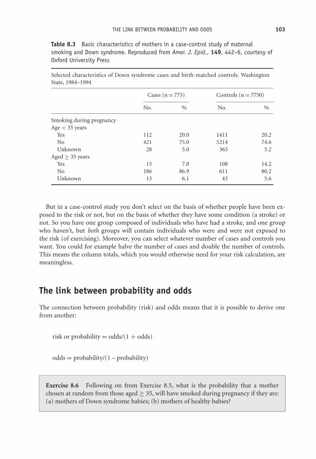
OTE/SPH OTE/SPH
JWBK220-08 December 21, 2007 19:7 Char Count= 0
THE LINK BETWEEN PROBABILITY AND ODDS 103
Table 8.3 Basic characteristics of mothers in a case-control study of maternalsmoking and Down syndrome. Reproduced from Amer. J. Epid., 149, 442–6, courtesy ofOxford University Press
Selected characteristics of Down syndrome cases and birth-matched controls. WashingtonState, 1984–1994
Cases (n = 775) Controls (n = 7750)
No. % No. %
Smoking during pregnancyAge < 35 years
Yes 112 20.0 1411 20.2No 421 75.0 5214 74.6Unknown 28 5.0 363 5.2
Aged ≥ 35 yearsYes 15 7.0 108 14.2No 186 86.9 611 80.2Unknown 13 6.1 43 5.6
But in a case-control study you don’t select on the basis of whether people have been ex-posed to the risk or not, but on the basis of whether they have some condition (a stroke) ornot. So you have one group composed of individuals who have had a stroke, and one groupwho haven’t, but both groups will contain individuals who were and were not exposed tothe risk (of exercising). Moreover, you can select whatever number of cases and controls youwant. You could for example halve the number of cases and double the number of controls.This means the column totals, which you would otherwise need for your risk calculation, aremeaningless.
The link between probability and odds
The connection between probability (risk) and odds means that it is possible to derive onefrom another:
risk or probability = odds/(1 + odds)
odds = probability/(1 – probability)
Exercise 8.6 Following on from Exercise 8.5, what is the probability that a motherchosen at random from those aged ≥ 35, will have smoked during pregnancy if they are:(a) mothers of Down syndrome babies; (b) mothers of healthy babies?

OTE/SPH OTE/SPH
JWBK220-08 December 21, 2007 19:7 Char Count= 0
104 CH 8 PROBABILITY, RISK AND ODDS
Table 8.4 Generalised contingency table for risk ratio calculations in a cohort study
Group by exposed to risk factor
Yes No Totals
Outcome: has disease Yes a b (a + b)No c d (c + d)
Totals (a + c) (b + d)
The risk ratio
In practice, risks and odds for a single group are not nearly as interesting as a comparison ofrisks and odds between two groups. For risk you can make these comparisons by dividing therisk for one group (usually the group exposed to the risk factor) by the risk for the second,non-exposed, group. This gives us the risk ratio.1 Let’s calculate the risk ratio for the data inTable 6.1, from the cohort study of coronary heart disease (CHD) in adult life and weighing 18lbs or less at one year, using the results obtained on page 100:
Among those weighing 18 lbs or less at one year, the risk of CHD = 0.2667
Among those weighing more than 18 lbs at one year, the risk of CHD = 0.1382
So the risk ratio for CHD among those weighing 18 lbs or less at one year compared to thoseweighing more than 18 lbs = 0.2667/0.1382 = 1.9298. We interpret this result as follows: adultswho weighed 18 lbs or less at one year old have nearly twice the risk of CHD as those whoweighed more than 18 lbs.
We can generalise the risk ratio calculation with the help of the contingency table as in Table8.4, where the cell values are represented as a, b, c and d.� Among those exposed to the risk factor, the risk of disease = a/(a + c).� Among those not exposed, the risk of disease = b/(b + d).� Therefore : risk ratio = a
(a+c)/b
(b+d) = a(b+d)b(a+c)
Exercise 8.7 Use the results you obtained in Exercise 8.4 to calculate the risk ratio ofdeath for those who consumed more than 69 beverages a week, compared to those whoconsumed less than one beverage per week (which we’ll define as the reference group),for: (a) men; (b) women. Interpret your results.
1 Risk ratio is also commonly known as relative risk.

OTE/SPH OTE/SPH
JWBK220-08 December 21, 2007 19:7 Char Count= 0
THE ODDS RATIO 105
Table 8.5 Generalised 2 × 2 table for odds ratio calculations in acase-control study
Group by outcome (e.g. disease)
Cases Controls
Exposed to risk factor? Yes a bNo c d
The odds ratio
With a case-control study you can compare the odds that those with a disease will have beenexposed to the risk factor, with the odds that those who don’t have the disease will have beenexposed. If you divide the former by the latter you get the odds ratio.
On p. 102 you calculated the following odds for the stroke and exercise study (where we aretreating exercise as the risk factor): the odds that those with a stroke had exercised = 55/70= 0.7857; and the odds that those without a stroke had exercised = 130/68 = 1.9118. Divingthe former by the latter, you get the odds ratio = 0.7857/1.9118 = 0.4110. This result suggeststhat those with a stroke are less than half as likely to have exercised when young as the healthycontrols. It would seem that exercise is a beneficial ‘risk’ factor. We can generalise the odds ratiocalculation with the help of the 2 × 2 table in Table 8.5.
� The odds of exposure to the risk factor among those with the disease = a/c,� The odds of exposure to the risk factor among the healthy controls = b/d.� Therefore: odds ratio = a/cb/d = ad/bc .
Exercise 8.8 Use the results from Exercise 8.5 to calculate the odds ratio for smokingamong the mothers of Down syndrome babies compared to mothers of healthy babies,for: (a) mothers aged under 35; (b) mothers aged 35 and over. Interpret your results.
Remember that the risk ratios and odds ratios in the coronary heart disease and in the strokeexamples above are sample risk and odds ratios. For instance, from the sample risk ratio of1.928 in the CHD/weight at one year study, you can infer that the population risk ratio is alsoabout 1.93 ± a ‘bit’. But how big is this ‘bit’, how precise is your estimate? This is a question I’lladdress in Chapter 11.
Finally, I mentioned earlier that most people are happier with the concept of ‘risk’ thanwith ‘odds’, but that you can’t calculate risk in a case-control study. However, there is ahappy ending. The odds ratio in a case-control study is a reasonably good estimator of the

OTE/SPH OTE/SPH
JWBK220-08 December 21, 2007 19:7 Char Count= 0
106 CH 8 PROBABILITY, RISK AND ODDS
equivalent risk ratio, so you can at least approximate its value with the corresponding oddsratio.
Number needed to treat (NNT)
This seems as good a time as any to discuss a measure of the effectiveness of a clinical procedurewhich is related to risk; more precisely, to absolute risk. This is the number needed to treat, orNNT. NNT is the number of patients who would need to be treated with the active procedure,rather than a placebo (or alternative procedure), in order to reduce by one the number ofpatients experiencing the condition.
To explain NNT let’s go back to the example for weighing 18 lbs or less at one year as a riskfactor for coronary heart disease (CHD). The absolute risk of CHD among those weighing18 lbs or less was 0.2667. The absolute risk of CHD for those weighing more than 18 lbs was0.1382.
We need now to define the absolute risk reduction or ARR as the difference between twoabsolute risks. So in this example, the absolute risk reduction is the difference in these twoabsolute risks – the reduction in risk gained by weighing more than 18 lbs at one year ratherthan weighing 18 lbs or less. In this case:
ARR = 0.2667 − 0.1382 = 0.1285
Now the number needed to treat is defined as follows: NNT = 1/ARRThus in this case: NNT = 1/0.1285 = 7.78In other words, if you had some treatment (infant-care advice for vulnerable parents, for
example), which would cause infants who would otherwise have weighed less than 18 lbs atone year to weigh 18 lbs or more, then you would need to ‘treat’ eight infants (or their parents)to ensure that one of these infants did not develop coronary heart disease when an adult.2
NNT is often used to give a familiar and practical meaning to outcomes from clinical trials andsystematic reviews,3 where measures of risk, and risk ratios, may be difficult to translate intothe potential benefit to patients.
An example from practice
Table 8.6 is from the follow-up (cohort) study into the effectiveness of carotid endarterectomyin ipsilateral stroke prevention first referred to in Figure 3.2 (Inzitari et al. 2000). The tableshows that for any stroke, the (absolute) risk if treated medically is 0.110 (11.0 per cent), and iftreated surgically is 0.051 (5.1 per cent). The reduction in absolute risk, ARR = 0.110 - 0.051 =0.059 (5.9 per cent). So NNT = 1/0.059 = 16.95 or 17, at five years. In other words, 17 patientswould have to be treated with carotid endarterectomy to prevent one patient from having astroke within five years who, without the treatment, would otherwise have done so.
2 The number must always be rounded up.3 Systematic review is the systematic collection of all the results from as many similarly-designed studies as
possible dealing with the same clinical problem. I discuss this procedure in Chapter 20.
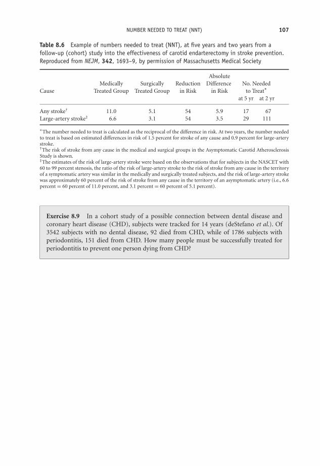
OTE/SPH OTE/SPH
JWBK220-08 December 21, 2007 19:7 Char Count= 0
NUMBER NEEDED TO TREAT (NNT) 107
Table 8.6 Example of numbers needed to treat (NNT), at five years and two years from afollow-up (cohort) study into the effectiveness of carotid endarterectomy in stroke prevention.Reproduced from NEJM, 342, 1693–9, by permission of Massachusetts Medical Society
AbsoluteMedically Surgically Reduction Difference No. Needed
Cause Treated Group Treated Group in Risk in Risk to Treat*
at 5 yr at 2 yr
Any stroke† 11.0 5.1 54 5.9 17 67Large-artery stroke‡ 6.6 3.1 54 3.5 29 111
*The number needed to treat is calculated as the reciprocal of the difference in risk. At two years, the number neededto treat is based on estimated differences in risk of 1.5 percent for stroke of any cause and 0.9 percent for large-arterystroke.†The risk of stroke from any cause in the medical and surgical groups in the Asymptomatic Carotid AtherosclerosisStudy is shown.‡The estimates of the risk of large-artery stroke were based on the observations that for subjects in the NASCET with60 to 99 percent stenosis, the ratio of the risk of large-artery stroke to the risk of stroke from any cause in the territoryof a symptomatic artery was similar in the medically and surgically treated subjects, and the risk of large-artery strokewas approximately 60 percent of the risk of stroke from any cause in the territory of an asymptomatic artery (i.e., 6.6percent = 60 percent of 11.0 percent, and 3.1 percent = 60 percent of 5.1 percent).
Exercise 8.9 In a cohort study of a possible connection between dental disease andcoronary heart disease (CHD), subjects were tracked for 14 years (deStefano et al.). Of3542 subjects with no dental disease, 92 died from CHD, while of 1786 subjects withperiodontitis, 151 died from CHD. How many people must be successfully treated forperiodontitis to prevent one person dying from CHD?

OTE/SPH OTE/SPH
JWBK220-08 December 21, 2007 19:7 Char Count= 0
108

OTE/SPH OTE/SPH
JWBK220-09 December 21, 2007 19:8 Char Count= 0
V
The Informed Guess –Confidence Interval Estimation
109

OTE/SPH OTE/SPH
JWBK220-09 December 21, 2007 19:8 Char Count= 0
110

OTE/SPH OTE/SPH
JWBK220-09 December 21, 2007 19:8 Char Count= 0
9Estimating the value of a singlepopulation parameter – the ideaof confidence intervals
Learning objectives
When you have finished this chapter you should be able to:� Describe the sampling distribution of the sample mean and the characteristics of itsdistribution.� Explain what the standard error of the sample mean is and calculate its value.� Explain how you can use the probability properties of the Normal distribution tomeasure the preciseness of the sample mean as an estimator of the population mean.� Derive an expression for the confidence interval of the population mean.� Calculate and interpret a 95 per cent confidence interval for a population mean.� Calculate and interpret a 95 per cent confidence interval for a population proportion.� Explain and interpret a 95 per cent confidence interval for a population median.
Medical Statistics from Scratch, Second Edition David BowersC© 2008 John Wiley & Sons, Ltd
OTE/SPH OTE/SPH
JWBK220-09 December 21, 2007 19:8 Char Count= 0
112 CH 9 ESTIMATING THE VALUE OF A SINGLE POPULATION PARAMETER
Confidence interval estimation for a population mean
You saw at the beginning of Chapter 6 that we can use a sample statistic to make an informedguess, or estimate, of the value of the corresponding population parameter. For example, thesample mean birthweight for the 30 infants in Table 2.5 was 3644.4 g, so you can estimate thepopulation mean birthweight of all infants of whom this sample is representative, also to beabout 3644 g,1 plus or minus some (hopefully) small random or sampling error. The obviousquestions are:� How small is this ‘plus or minus’ bit?� Can it be quantified?� Can we establish how precise our sample mean birthweight is as an estimate of population
mean birthweight?� How close to a population mean can you expect any given sample mean to be?
As you can see these are all essentially the same question, ‘How big an error might we bemaking when we use the sample mean as an estimate of the population mean?’. This questioncan be answered with what is known as a confidence interval estimator, which is a numericexpression that quantifies the likely size of the sampling error. But to get a confidence intervalwe need first to introduce an important concept in statistical inference – the standard error.
The standard error of the mean
Our sample of 30 infants produced a sample mean birthweight of 3644.4 g. You could takea second, different, sample of 30 infants from the same population, and this sample wouldproduce a different value for the sample mean. And a third sample, and a fourth and so on.In fact from any realistic population you could (in theory), take a huge number of differentsame-size samples, each of which would produce a different sample mean. You would end upwith a large number of sample means, and if you were to arrange all of these sample meansinto a frequency curve, you would find:� That it was Normal. This Normal-ness of the distribution of sample means is a very useful
quality (to say the least); we will depend on it a lot in what is to come.� That it was centred around the true population mean. In other words, the mean of all possiblesample means is the same as the population mean.
This is very re-assuring. It means that, on average, the sample mean estimates the populationmean exactly. But note the ‘on average’. A particular single sample mean may still be somedistance from the true mean.
1 The value of the sample mean of 3644.4g is known as the point estimate of the population mean. It’s the singlebest guess you could make as to the value of the population mean.
OTE/SPH OTE/SPH
JWBK220-09 December 21, 2007 19:8 Char Count= 0
CONFIDENCE INTERVAL ESTIMATION FOR A POPULATION MEAN 113
We can measure the spread of all of these different sample means in the usual way - with thestandard deviation. However, to distinguish it from the spread of values in a single sample, wecall it the standard error.2 It is usually abbreviated as s.e.(x), where the symbol x stands for thesample mean. Remember that the standard deviation is a measure of the spread of the data ina single sample. The standard error is a measure of the spread in all (same-size) sample meansfrom a population.
We can very easily estimate the standard error with the equation: s.e.(x) = s/√
n. Here s is thesample standard deviation and n is the sample size. Notice that as the sample size n increases,the standard error decreases. In other words, the bigger the sample, the smaller the error in ourestimate of population mean. Intuitively this feels right.
For example, if we took a sample of size n = 100 from a population, and measured systolicblood pressure, and obtained a sample mean of 135 mmHg and a sample standard deviationof 3 mmHg, then the estimated standard error would be:
s.e.(X ) = 3/√
100 = 3/10 = 0.33 mmHg
Since the distribution of sample means is Normal, we can make use of the area properties of theNormal distribution (see Figure 5.5). If the sample standard deviation is 3 mmHg and samplesize n = 100, then the standard error = 0.33 mmHg. Because the distribution of sample meansis Normal, this means that about 95 per cent of sample means will lie within plus or minustwo standard errors of the population mean. That is within plus or minus 0.66 mmHg of thepopulation mean. In other words there’s a pretty good chance (a probability of 0.95 in fact) thatany single sample mean will be no further than 0.66 mmHg from the (unknown) populationmean.
The above discussion about taking lots of different samples from a population is entirelytheoretical. In practice, you will usually only get to take one sample from a population, thevalue of whose mean you will never know. To sum up, the standard error is a measure of thepreciseness of the sample mean as an estimator of the population mean. Smaller is better. Ifyou are comparing the precision of two different sample means as estimates of a populationmean, the sample mean with the smallest standard error is likely to be the more precise.
Exercise 9.1 A team of researchers used a cohort study to investigate the intake ofvitamins E and C and the risk of lung cancer, 19 years into the study (Yong et al. 1997). Theycalculated the mean (and the standard error) intake of vitamins E and C, of individualswith and without lung cancer (cases and non-cases respectively). These were:
Vitamin E. Cases: 6.03 mg (0.35 mg); non-cases: 6.30 mg (0.05 mg).Vitamin C. Cases: 64.18 mg (5.06 mg); non-cases: 82.21 mg (0.80 mg).
How would you interpret these results in terms of the likely precision of each of the samplemeans as estimators of their respective population means?
2 To give it its full name, the standard error of the sampling distribution of the sample mean (quite a mouthful),but thankfully, it is usually just called the standard error.
OTE/SPH OTE/SPH
JWBK220-09 December 21, 2007 19:8 Char Count= 0
114 CH 9 ESTIMATING THE VALUE OF A SINGLE POPULATION PARAMETER
How we use the standard error of the mean to calculate a confidenceinterval for a population mean
With the standard error under our belt we can now get to grips with the confidence interval.You have seen that we can be 95 per cent confident that any sample mean is going to bewithin plus or minus two standard errors of the population mean.3 From this we can showthat:
Population mean = sample mean ± 2 × standard error
That is:� We can be 95 per cent confident that the interval, from the sample mean – 2 × standarderror, to the sample mean + 2 × standard error, will include the population mean.� Or in probability terms, there is a probability of 0.95 that the interval from the sample mean– 2 × standard error, to the sample mean + 2 × standard error, will contain the populationmean.
In other words, if you pick one out of all the possible sample means at random, there is aprobability of 0.95 that it will lie within two standard errors of the population mean. We callthe distance from the sample mean – 2 × s.e.(x), to the sample mean + 2 × s.e.(x), theconfidence interval.
The above result means that you now quantify just how close a sample mean is likely to beto the population mean. For obvious reasons the value you get when you put some figures intothis expression is known as the 95 per cent confidence interval estimate of the population mean.A 95 per cent confidence level is most common, but 99 per cent confidence intervals are alsoused on occasion. Note that the confidence interval is sometimes said to represent a plausiblerange of values for the population parameter.
A worked example from practice
In the cord-platelet count histogram in Figure 4.6, the mean cord platelet count in a sample of4382 infants is 306×109/l, and the standard deviation is 69×109/l, so the standard error of themean is:
s.e.(X) = 69 × 109/√
4382 = 1.042 × 10⁹/ l
3 I have used the value two in all of these expressions as a convenient approximation to the exact value (whichin any case will be very close to two, when the probability is 0.95). The exact value comes from what is knownas the t distribution. The t distribution is similar to the Normal distribution, but for small sample sizes isslightly wider and flatter. It is used instead of the Normal distribution for reasons connected to inferencesabout the population standard deviation, which we don’t need to go into here. Anyway, in practice you willuse a computer to obtain your confidence interval result. This will use the proper value.

OTE/SPH OTE/SPH
JWBK220-09 December 21, 2007 19:8 Char Count= 0
CONFIDENCE INTERVAL ESTIMATION FOR A POPULATION MEAN 115
Therefore the 95 per cent confidence interval for the population mean cord platelet count is:
(306 − 2 × 1.042 to 306 + 2 × 1.042) g or (303.916 to 308.084) × 109/ l
Which we can interpret as follows: we can be 95 per cent confident that the population meancord platelet count is between 303.916×10⁹/l and 308.084×10⁹/l, or alternatively that there’s aprobability of 0.95 that the interval from 303.916 to 308.084 will contain the population meanvalue. Of course there’s also a 5 per cent chance (or a 0.05 probability), that it will not!
Alternatively we can say that the interval (303.916 to 308.084) × 109/l represents a plausiblerange of values for the population mean cord platelet count. The narrower the confidenceinterval the more precise is the estimator. In the cord platelet example, the small width, andtherefore high precision of the confidence interval, is due to the large sample. By the way, it’sgood practice to put the confidence interval in brackets and use the ‘to’ in the middle and nota ‘–’ sign, since this may be confusing if the confidence interval has a negative value(s).
Exercise 9.2 Use the summary age measures given in Table 1.6 for the life events andbreast cancer study, to calculate the standard error and the 95 per cent confidence intervalsfor population mean age of: (a) the cases; (b) the controls. Interpret your confidenceintervals. What do you make of the fact that the two confidence intervals don’t overlap?
An example from practice
The results in Table 9.1 are from a randomised trial to evaluate the use of an integrated carescheme for asthma patients, in which care is shared between the GP and a specialist chestphysician (Grampian Asthma Study 1994). The treatment group patients each received thisintegrated care, the control group received conventional care from their GP only. The researcherswere interested in the differences between the groups, if any, in a number of outcomes, shownin the figure (ignore the last column for now). The target population they have in mind is,perhaps, all asthma patients in the UK.
Table 9.1 Means and 95 per cent confidence intervals for a number of clinical outcomes over12 months, for asthma patients. The treatment group patients received integrated care, thecontrol group conventional GP care. Reproduced from BMJ, 308, 559–64, courtesy of BMJPublishing Group
Integrated care Conventional careClinical outcome (n ≥ 296) (n ≥ 277) Ratio of means
No of bronchodilators prescribed 10.1 (9.2 to 11.1) 10.6 (9.7 to 11.7) 0.95 (0.83 to 1.09)No of inhaled steroids prescribed 6.4 (5.9 to 6.9) 6.5 (6.1 to 7.1) 0.98 (0.88 to 1.09)No of courses of oral steroids used 1.6 (1.4 to 1.8) 1.6 (1.4 to 1.9) 0.97 (0.79 to 1.20)No of general practice asthma consultations 2.7 (2.4 to 3.1) 2.5 (2.2 to 2.8) 1.11 (0.95 to 1.31)No of hospital admissions for asthma 0.15 (0.11 to 0.19) 0.11 (0.08 to 0.15) 1.31 (0.87 to 1.96)
Means and 95% confidence interval are estimated from Poisson regression models after controlling for initial peakflow, forced expiratory volume (as % of predicted), and duration af asthma.

OTE/SPH OTE/SPH
JWBK220-09 December 21, 2007 19:8 Char Count= 0
116 CH 9 ESTIMATING THE VALUE OF A SINGLE POPULATION PARAMETER
You can see that in the integrated care group of 296 subjects, the sample mean number ofbronchodilators prescribed over 12 months was 10.1, with a 95 per cent confidence interval forthe population mean of (9.2 to 11.1). So you can be 95 per cent confident that the populationmean number of bronchodilators prescribed for this group is somewhere between 9.2 and 11.1.In the control group, the sample mean is 10.6 with a 95 per cent confidence interval for thepopulation mean (9.7 to 11.7), which can be similarly interpreted.
Exercise 9.3 Interpret and compare the sample mean number of hospital admissions,and their corresponding confidence intervals, for the two groups in Table 9.1.
Confidence intervals as described above can also be applied to a population percentage,provided that the values are percentages of a metric variable, for example percentage mor-tality across a number of hospitals following some procedure (see, for example, Table 2.7).However, if the data is a proportion or percentage of a nominal or ordinal variable, say theproportion of patients with a pressure sore, or the proportion of mothers with an EdinburghMaternal Depression Scale score of more than 8, then a different approach, described next, isneeded.
Confidence interval for a population proportion
We start with an expression for the standard error of the sample proportion:
s.e. = (p)
√p(1 − p)
n
where p is the sample proportion, and n is sample size. Incidentally, the sampling distributionof sample proportions has a binomial distribution, which is quite different from the Normaldistribution if the sample is small, but becomes more Normal as sample size increases. The 95per cent confidence interval for the population proportion is equal to the sample proportionplus or minus 1.96 4 standard errors:
{[p − 1.96 × s.e.(p)] to [p + 1.96 × s.e.( p)]}
For example, from Table 1.6, 14 of the 106 women with a malignant diagnosis are pre-menopausal giving a sample proportion p of 14/106 or 0.13. The standard error of p is thus:
s.e.(p) =√
0.13(1 − 0.13)
106= 0.033
Therefore the 95 per cent confidence interval for the population proportion who are
4 When we are dealing with proportions, we use, not the t distribution, but the z, or Standard Normal, distribution.The 95 per cent value for z is 1.96.

OTE/SPH OTE/SPH
JWBK220-09 December 21, 2007 19:8 Char Count= 0
ESTIMATING A CONFIDENCE INTERVAL FOR THE MEDIAN OF A SINGLE POPULATION 117
pre-menopausal is:
(0.13 − 1.96 × 0.033 to 0.13 + 1.96 × 0.033) = (0.065 to 0.195)
In other words you can be 95 per cent confident that the proportion of cases in this popu-lation who are pre-menopausal lies somewhere between 0.065 to 0.195. Or alternatively, thatthis interval represents a plausible range of values for the population proportion who aremenopausal.
Exercise 9.4 Calculate the standard error for the sample proportion of controls in Table1.6 who are pre-menopausal, and hence calculate the 95 per cent confidence interval forthe corresponding population proportion. Interpret your result.
Estimating a confidence interval for themedian of a single population
If your data is ordinal then the median rather than the mean is the appropriate measure oflocation (review Chapter 5 if you’re not sure why). Alternatively, if your data is metric butskewed (or your sample is too small to check the distributional shape), you might also preferthe median as a more representative measure. Either way a confidence interval will enable youto assess the likely range of values for the population median. As far as I know, SPSS does notcalculate a confidence interval for a single median, but Minitab does, and bases its calculationon the Wilcoxon signed-rank test5 (I’ll discuss this in Chapter 12).
Table 9.2 Sample median pain levels, and 95 per cent confidence intervals for the differencebetween the two groups, at three time periods, in the analgesics/stump pain study. Reproducedcourtesy of Elsevier (The Lancet, 1994, Vol No. 344, page 1724–6)
Median (IQR) pain
Blockade Control 95% CI forgroup (n = 27) group (n = 29) difference (p)
After epidural bolus 0 (0–0) 38 (17–67) 24 to 43 (p < 0.0001)After continuous epidural infusion 0 (0–0) 31 (20–51) 24 to 43 (p < 0.0001)After epidural bolus in operating theatre 0 (0–0) 35 (16–64) 19 to 42 (p < 0.0001)
Pain assessed by visual analogue scale (0–100 mm).
5 We won’t deal with tests (i.e. hypothesis tests) until we get to Chapter 12, but the confidence intervals that Idiscuss in this and in the next chapter are based on a number of different hypothesis tests. The alternativewould have been for me to introduce hypothesis tests before I dealt with confidence intervals. However, forvarious pedagogic reasons I didn’t think this was appropriate.

OTE/SPH OTE/SPH
JWBK220-09 December 21, 2007 19:8 Char Count= 0
118 CH 9 ESTIMATING THE VALUE OF A SINGLE POPULATION PARAMETER
An example from practice
Table 9.2 is from the analgesics and stump pain study referred to in Table 5.3, and shows thesample median pain levels and their 95 per cent confidence intervals (assessed using a visualanalogue scale), for the treatment and control groups, at three time periods.
Exercise 9.5 In Table 9.2, interpret and compare the differences in median pain levelsand their 95 per cent confidence intervals for each of the three time periods.

OTE/SPH OTE/SPH
JWBK220-10 December 21, 2007 19:9 Char Count= 0
10Estimating the differencebetween two populationparameters
Learning objectives
When you have finished this chapter you should be able to:� Give some examples of situations where there is a need to estimate the differencebetween two population parameters.� Very briefly outline the basis of estimation of the difference between two populationmeans using methods based on the two-sample t test1 (for independent populations)and the matched-pairs t test (for matched populations).� Very briefly outline the basis of estimation of the difference between two populationmedians using methods based on the Mann-Whitney test (for independent popula-tions) and the Wilcoxon test (for matched populations).� Interpret results from studies that estimate the difference between two populationmeans, two percentages or two medians.� Demonstrate an awareness of any assumptions that must be satisfied when estimatingthe difference between two population parameters.
1 Throughout this chapter we will be looking at methods of estimation based on various hypothesis tests. I willbegin to discuss hypothesis tests properly in Chapter 12.
Medical Statistics from Scratch, Second Edition David BowersC© 2008 John Wiley & Sons, Ltd

OTE/SPH OTE/SPH
JWBK220-10 December 21, 2007 19:9 Char Count= 0
120 CH 10 ESTIMATING THE DIFFERENCE BETWEEN TWO POPULATION PARAMETERS
What’s the difference?
As you have just seen, it’s possible to determine a confidence interval for any single populationparameter – a population mean, a median, a percentage and so on. However, by far the mostcommon application of confidence intervals is the comparison of two population parameters,for example between the means of two populations, such as the mean age of a population ofwomen and the mean age of a population of men; I’ll start with this.
Estimating the difference between the means of twoindependent populations – using a method based on thetwo-sample t test
The procedure here, like that for the single mean (see Chapter 9), is based on the t distribution(see the footnote on p. 114). However, with two populations, you need to know if they areindependent or matched (see p. 81 to review matching). I’ll start with estimating the differencein the means of two independent populations, since this is by far the most common in practice.For this we use a method based on the two-sample t test. First, there are a number of pre-requisites that need to be met:� Data for both groups must be metric. As you know from Chapter 5 the mean is only appro-
priate with metric data anyway.� The distribution of the relevant variable in each population must be reasonably Normal. Youcan check this assumption from the sample data using a histogram, although with smallsample sizes this can be difficult.� The population standard deviations of the two variables concerned should be approximatelythe same, but this requirement becomes less important as sample sizes get larger. You cancheck this by examining the two sample standard deviations.2
An example using birthweights
Suppose you want to compare (by estimating the difference between them), the populationmean birthweights of infants born in a maternity unit with that of infants born at home (sampledata in Table 10.1). The two samples were selected independently with no attempt at matching.
Both SPSS and Minitab compute the sample mean birthweight of the home-born infantsto be 3726.5 g, with a standard deviation of 385.7 g. Recall that for the infants born in thematernity units, sample mean birthweight was 3644.4 g with a standard deviation of 376.8g (see p. 112). So there is a difference in the sample mean birthweights of 82.1 g, (3726.5 g– 3644.4 g), but this does not mean that there is a difference in the population mean birthweights.
2 This condition is usually stated in terms of the two variances being approximately the same. Variance is standarddeviation squared.

OTE/SPH OTE/SPH
JWBK220-10 December 21, 2007 19:9 Char Count= 0
ESTIMATING THE DIFFERENCE BETWEEN THE MEANS OF TWO INDEPENDENT POPULATIONS 121
Table 10.1 Sample data for birthweight (g), Apgar scores and whether mother smoked duringpregnancy for 30 infants born in a maternity unit and 30 born at home
Birthweight (g) Mother smoked Apgar score
Infant Hospital birtha Home birth Hospital birth Home birth Hospital birth Home birth
1 3710 3810 0 0 8 102 3650 3865 0 0 7 83 4490 4578 0 0 8 94 3421 3522 1 0 6 65 3399 3400 0 1 6 76 4094 4156 0 0 9 107 4006 4200 0 0 8 98 3287 3265 1 0 5 69 3594 3599 0 1 7 8
10 4206 4215 0 0 9 1011 3508 3697 0 0 7 812 4010 4209 0 0 8 913 3896 3911 0 0 8 814 3800 3943 0 0 8 915 2860 3000 0 1 4 316 3798 3802 0 0 8 917 3666 3654 0 0 7 818 4200 4295 1 0 9 1019 3615 3732 0 0 7 820 3193 3098 1 1 4 521 2994 3105 1 1 5 522 3266 3455 1 0 5 623 3400 3507 0 0 6 724 4090 4103 0 0 8 925 3303 3456 1 0 6 726 3447 3538 1 0 6 727 3388 3400 1 1 6 728 3613 3715 0 0 7 729 3541 3566 0 0 7 830 3886 4000 1 0 8 6
a This is the data from Table 2.5.
It is important to remember that a difference between two sample values does not necessarilymean that there is a difference in the two population values. Any difference in these samplebirthweight means might simply be due to chance. Now we come to an important point:
If the 95 per cent confidence interval for the difference between two population parametersincludes zero, then you can be 95 per cent confident that there is no difference in the twoparameter values. If the interval doesn’t contain zero, then you can be 95 per cent confidentthat there is a statistically significant difference in the means.
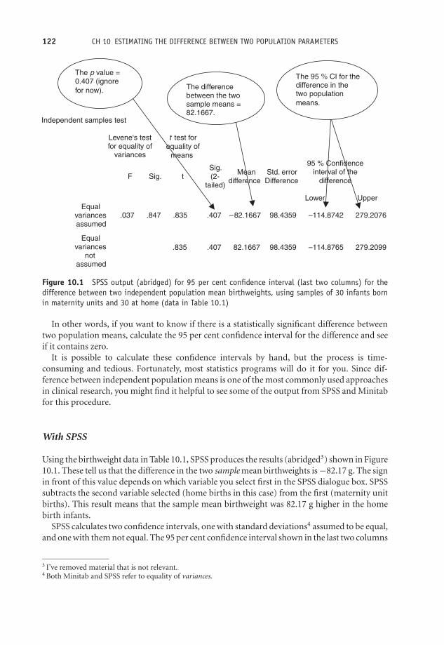
OTE/SPH OTE/SPH
JWBK220-10 December 21, 2007 19:9 Char Count= 0
122 CH 10 ESTIMATING THE DIFFERENCE BETWEEN TWO POPULATION PARAMETERS
Independent samples test
Levene's test
for equality of variances
t test for
equality of
means
F Sig. t
Sig.
(2-
tailed)
Mean
difference Difference
Std. error
95 % Confidence
interval of the
difference
Lower Upper
Equal
variances
assumed
.037 .847 .835 .407 –82.1667 98.4359 –114.8742 279.2076
.835 .407 82.1667 98.4359 –114.8765 279.2099
Equal
variances
not
assumed
The p value =
0.407 (ignore
for now).The difference
between the two
sample means = 82.1667.
The 95 % CI for the
difference in the two population
means.
Figure 10.1 SPSS output (abridged) for 95 per cent confidence interval (last two columns) for thedifference between two independent population mean birthweights, using samples of 30 infants bornin maternity units and 30 at home (data in Table 10.1)
In other words, if you want to know if there is a statistically significant difference betweentwo population means, calculate the 95 per cent confidence interval for the difference and seeif it contains zero.
It is possible to calculate these confidence intervals by hand, but the process is time-consuming and tedious. Fortunately, most statistics programs will do it for you. Since dif-ference between independent population means is one of the most commonly used approachesin clinical research, you might find it helpful to see some of the output from SPSS and Minitabfor this procedure.
With SPSS
Using the birthweight data in Table 10.1, SPSS produces the results (abridged3) shown in Figure10.1. These tell us that the difference in the two sample mean birthweights is −82.17 g. The signin front of this value depends on which variable you select first in the SPSS dialogue box. SPSSsubtracts the second variable selected (home births in this case) from the first (maternity unitbirths). This result means that the sample mean birthweight was 82.17 g higher in the homebirth infants.
SPSS calculates two confidence intervals, one with standard deviations4 assumed to be equal,and one with them not equal. The 95 per cent confidence interval shown in the last two columns
3 I’ve removed material that is not relevant.4 Both Minitab and SPSS refer to equality of variances.

OTE/SPH OTE/SPH
JWBK220-10 December 21, 2007 19:9 Char Count= 0
ESTIMATING THE DIFFERENCE BETWEEN THE MEANS OF TWO INDEPENDENT POPULATIONS 123
is (−114.9 to 279.2)g, the same in both cases. SPSS tests for equality of the standard deviations(or variances), using Levene’s test. The assumption is that they are the same. We will discusstests in Chapter 12.
Since this confidence interval includes zero, you can conclude that there is no statisticallysignificant difference in population mean birthweights of infants born in a maternity unit andinfants born at home.
With Minitab The Minitab output, which confirms that from SPSS, is shown in Figure10.2. The 95 per cent confidence interval is in the second row up.
An example from practice
Table 10.2 is from a cohort study of maternal smoking during pregnancy and infant growthafter birth (Conter et al 1995). The subjects were 12 987 babies who were followed up forthree years after birth. Of these, 10 238 had non-smoking mothers, 2276 had mothers who had
Two-Sample T-Test and CI: Weight hosp (g), Weight home
Two-sample T for Weight hosp (g) vs Weight home
N Mean StDev SE MeanWeight hosp 30 3644 377 69Weight home 30 3727 386 70
Difference = mu Weight hosp (g) – mu Weight home Estimate for difference: –82.2 95% CI for difference: (–279.3, 114.9)T-Test of difference = 0 (vs not =): T-Value = –0.83 P-Value = 0.407 DF = 57
The p-value =
0.407 (ignore
for now).
The difference
between the
two sample
means = 82.2. The 95% CI for the
difference in the two
population means.
Figure 10.2 Minitab output for 95 per cent confidence interval for the difference between two in-dependent population mean birthweights, using samples of 30 infants born in maternity units and 30at home. Note that Minitab uses the word ‘mu’ to denote the population mean, normally designated asGreek μ

OTE/SPH OTE/SPH
JWBK220-10 December 21, 2007 19:9 Char Count= 0
Tabl
e10
.295
per
cent
confi
denc
ein
terv
als
for
diff
eren
cein
wei
ghts
acco
rdin
gto
sex
and
smok
ing
habi
tsof
mot
hers
betw
een
inde
pend
ent
grou
psof
babi
es.Re
prod
uced
from
BMJ,
310,
768–
71,co
urte
syof
BMJ
Publ
ishi
ngGr
oup
At
birt
hA
t3
mon
ths
At
6m
onts
Mot
her
’sN
o.95
%C
Ifo
rN
o.95
%C
Ifo
rN
o.95
%C
Ifo
rsm
okin
gh
abit
child
ren
Wei
ght
(g)
diff
eren
cech
ildre
nW
eigh
t(g
)di
ffer
ence
child
ren
Wei
ght
(g)
diff
eren
ce
Gir
lsN
on-s
mok
ers
4904
3220
4904
5584
4895
7462
1–9
cigs
per
day
1072
3132
(−12
1to
−55)
1071
5550
(−77
to9)
1072
7471
(−47
to65
)≥1
0p
erd
ay22
830
52(−
234
to–1
02)
228
5519
(−15
2to
22)
227
7434
(−14
1to
85)
Boy
sN
on-s
mok
ers
5334
3373
5332
6026
5330
8038
1–9
cigs
per
day
1204
3266
(−13
9to
−75)
1204
5958
(−11
3to
−23)
1204
7974
(−11
8to
−10)
≥10
cigs
per
day
245
3126
(−31
2to
−181
)24
559
07(−
212
to−2
6)24
580
14(−
136
to88
)
124

OTE/SPH OTE/SPH
JWBK220-10 December 21, 2007 19:9 Char Count= 0
ESTIMATING THE DIFFERENCE BETWEEN TWO MATCHED POPULATION MEANS 125
smoked one to nine cigarettes a day, and 473 had mothers who had smoked 10 or morecigarettes a day. The figure shows the 95 per cent confidence intervals for differences in meanweight according to sex of baby and smoking habits of mothers: at birth, and at three and sixmonths.
The results show, for example, that at birth, the difference between the sample mean weightof female babies born to non-smoking mothers and those born to mothers smoking 10 ormore cigarettes a day, was (3220 − 3052) = 168 g. That is, the infants of smoking mothersare on average lighter by 168 g. Is this difference statistically significant in the population,or due simply to chance? The 95 per cent confidence interval of (−234 to −102) g, does notinclude zero, so you can be 95 per cent confident that the difference is real, i.e. is statisticallysignificant.
Exercise 10.1 Interpret the sample mean and confidence intervals shown in Table 10.2for all four differences in weights at six months.
Estimating the difference between two matched populationmeans – using a method based on the matched-pairs t test
If the data within each of the two groups whose means you are comparing is widely spreadcompared to the difference in the spreads between the groups,5 this can make it more difficultto detect any difference in their means. When data is matched (see Chapter 7 for an explanationof matching), this reduces much of the within-group variation, and, for a given sample size,makes it easier to detect any differences between groups. As a consequence, you can achievebetter precision (narrower confidence intervals), without having to increase sample size. Thedisadvantage of matching is that it is sometimes difficult to find a sufficiently large number ofmatches (as you saw in the case-control discussion earlier).
In the independent groups case, the mean of each group is computed separately, and then aconfidence interval for the difference in these means is calculated. In the matched groups case,we use a method based on the matched-pairs t test, in which the difference between each pairof values is computed first and then a confidence interval for the mean of these differences iscalculated.
An example from practice
Table 10.3 shows the 95 per cent confidence intervals for the difference in bone mineral density intwo matched groups of women, one group depressed and one ‘normal’ (Michelson et al. 1995).(Ignore the ‘SD from expected peak’ rows.) Only one of the confidence intervals contains zero,indicating that there is no difference in population mean bone mineral density at the radius,but there is at all of the other five sites.
5 Called ‘between-group’ variation.

OTE/SPH OTE/SPH
JWBK220-10 December 21, 2007 19:9 Char Count= 0
126 CH 10 ESTIMATING THE DIFFERENCE BETWEEN TWO POPULATION PARAMETERS
Table 10.3 Confidence intervals for the differences between the population mean bone mineraldensities in two individually matched groups of women, one group depressed, the other ‘normal’,using a method based on the matched-pairs t test. Reproduced from NEJM, 335, 1176–81, bypermission of Massachusetts Medical Society
Depressed Normal Mean Difference PBone Measured† Women Women (95% CI) Value
Lumbar spine (anteroposterior)Density (g/cm2) 1.00 ± 0.15 1.07 ± 0.09 0.08 (0.02 to 0.14) 0.02SD from expected peak −0.42 ± 1.28 0.26 ± 0.82 0.68 (0.13 to 1.33)
Lumbar spine (lateral)‡
Density (g/cm2) 0.74 ± 0.09 0.79 ± 0.07 0.05 (0.00 to 0.09) 0.03SD from expected peak −0.88 ± 1.07 −0.36 ± 0.80 0.50 (0.04 to 1.03)
Femoral neckDensity (g/cm2) 0.76 ± 0.11 0.88 ± 0.11 0.11 (0.06 to 0.17) <0.00SD from expected peak −1.30 ± 1.07 −0.22 ± 0.99 1.08 (0.55 to 1.61)
Ward’s triangleDensity (g/cm2) 0.70 ± 0.14 0.81 ± 0.13 0.11 (0.06 to 0.17) <0.00SD from expected peak −0.93 ± 1.24 0.18 ± 1.22 1.11 (0.60 to 1.62)
TrochanterDensity (g/cm2) 0.66 ± 0.11 0.74 ± 0.08 0.08 (0.04 to 0.13) <0.001SD from expected peak −0.70 ± 1.22 0.26 ± 0.91 0.97 (0.46 to 1.47)
RadiusDensity (g/cm2) 0.68 ± 0.04 0.70 ± 0.04 0.01 (–0.01 to 0.04) 0.25SD from expected peak −0.19 ± 0.67 0.03 ± 0.67 0.21 (–0.21 to 0.64)
*Plus-minus values are means ± SD. CI denotes confidence interval.†Values for “SD from expected peak” are the numbers of standard deviations from the expected peak density derivedfrom a population-based study of normal white women.3‡This measurement was made in 23 depressed women and 23 normal women.
Exercise 10.2 In Table 10.3, which population difference in bone mineral density isestimated with the greatest precision?
You can also calculate a confidence interval for the difference in two population percentagesprovided they derive from two metric variables. For the difference between two population pro-portions, however, a different approach is needed. This is an extension of the single proportioncase discussed in Chapter 9, as you will now see.
Estimating the difference between two independentpopulation proportions
Suppose you want to calculate a 95 per cent confidence interval for the difference between thepopulation proportion of women having maternity unit births who smoked during pregnancyand the proportion having home births who smoked. The sample data on smoking status forthe sample of 60 mothers is shown in Table 10.1.

OTE/SPH OTE/SPH
JWBK220-10 December 21, 2007 19:9 Char Count= 0
ESTIMATING THE DIFFERENCE BETWEEN TWO INDEPENDENT POPULATION MEDIANS 127
There are 10 mothers who smoked among the 30 giving birth in the maternity unit andsix among the 30 giving birth at home. This gives sample proportions of 10/30 = 0.3333, and6/30 = 0.2000, respectively. You can check whether this difference is statistically significant orlikely to be due to chance alone, by calculating a 95 per cent confidence interval for the differencein the corresponding population proportions.6 To do this by hand is a bit long-winded andyou would want to use a computer program to do the calculation for you.
An example from practice
If you look back at Table 9.1, the randomised trial of integrated versus conventional care forasthma patients, the last column shows the 95 per cent confidence intervals for the differencein population percentages between the two groups, for a number of patient perceptions of thescheme. As you can see, none of the confidence intervals include zero, so you can be 95 percent confident that the difference in population percentages between the groups of patients isstatistically significant in each case.
Estimating the difference between two independentpopulation medians – the Mann–Whitney rank-sums method
As you know from Chapter 5, the mean may not be the most representative measure of locationif the data is skewed, and is not appropriate anyway if the data is ordinal. In these circumstances,you can compare the population medians rather than the means, and in place of the 2-sample ttest (a parametric procedure), use a method based on the Mann–Whitney test (a non-parametricprocedure).
Parametric versus non-parametric methods
A parametric procedure can be applied to data which is metric, and also has some partic-ular distribution, most commonly the Normal distribution. A non-parametric proceduredoes not make these distributional requirements. So if you are analysing data that is eithermetric but not Normal, or is ordinal, then you need to use a non-parametric approach.The Mann–Whitney procedure only requires that the two population distributions havethe same approximate shape, but does not require either to be Normal. It is the non-parametric equivalent of the two-sample t test.
Briefly, the Mann–Whitney method starts by combining the data from both groups, which arethen ranked. The rank values for each group are then separated and summed. If the mediansof the two groups are the same, then the sums of the ranks of the two groups should be
6 The 95 per cent confidence interval is (−0.088 to 0.355). Since this interval includes 0, we conclude that thereis no difference in the proportion of mothers who smoked at home and in the maternity unit.
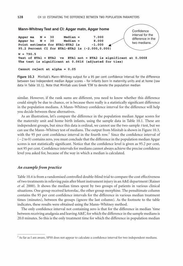
OTE/SPH OTE/SPH
JWBK220-10 December 21, 2007 19:9 Char Count= 0
128 CH 10 ESTIMATING THE DIFFERENCE BETWEEN TWO POPULATION PARAMETERS
Mann-Whitney Test and CI: Apgar matn, Apgar home
Apgar ma N = 30 Median = 7.000 Apgar ho N = 30 Median = 8.000 Point estimate for ETA1-ETA2 is -1.000 95.2 Percent CI for ETA1-ETA2 is (-2.000,0.000)
W = 790.5 Test of ETA1 = ETA2 vs ETA1 not = ETA2 is significant at 0.0668 The test is significant at 0.0616 (adjusted for ties)
Cannot reject at alpha = 0.05
Confidence
interval for the
difference in the
two medians.
Figure 10.3 Minitab’s Mann–Whitney output for a 95 per cent confidence interval for the differencebetween two independent median Apgar scores – for infants born in maternity units and at home (rawdata in Table 10.1). Note that Minitab uses Greek ‘ETA’ to denote the population median
similar. However, if the rank sums are different, you need to know whether this differencecould simply be due to chance, or is because there really is a statistically significant differencein the population medians. A Mann–Whitney confidence interval for the difference will helpyou decide between these alternatives.
As an illustration, let’s compare the difference in the population median Apgar scores forthe maternity unit and home birth infants, using the sample data in Table 10.1. These areindependent groups, but since this data is ordinal, we cannot use the two-sample t test, but wecan use the Mann–Whitney test of medians. The output from Minitab is shown in Figure 10.3,with the 95 per cent confidence interval in the fourth row.7 Since the confidence interval of(−2 to 0) contains zero, you must conclude that the difference in the population median Apgarscores is not statistically significant. Notice that the confidence level is given as 95.2 per cent,not 95 per cent. Confidence intervals for medians cannot always achieve the precise confidencelevel you asked for, because of the way in which a median is calculated.
An example from practice
Table 10.4 is from a randomised controlled double-blind trial to compare the cost effectivenessof two treatments in relieving pain after blunt instrument injury in an A&E department (Raineret al. 2000). It shows the median times spent by two groups of patients in various clinicalsituations. One group received ketorolac, the other group morphine. The penultimate columncontains the 95 per cent confidence intervals for the difference in various median treatmenttimes (minutes), between the groups (ignore the last column). As the footnote to the tableindicates, these results were obtained using the Mann–Whitney method.
The only confidence interval not containing zero is that for the difference in median ‘timebetween receiving analgesia and leaving A&E’, for which the difference in the sample medians is20.0 minutes. So this is the only treatment time for which the difference in population median
7 As far as I am aware, SPSS does not appear to calculate a confidence interval for two independent medians.
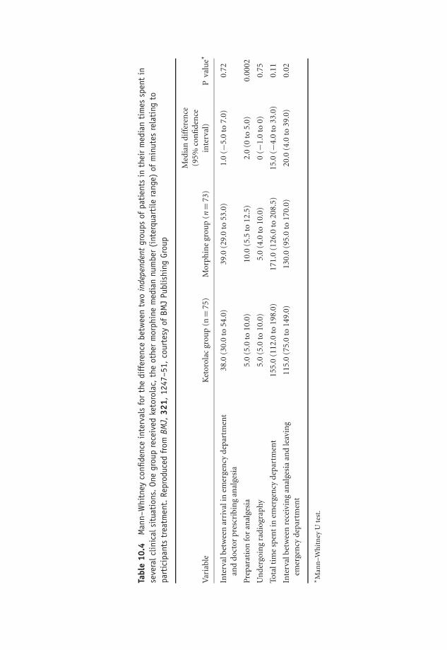
OTE/SPH OTE/SPH
JWBK220-10 December 21, 2007 19:9 Char Count= 0
Tabl
e10
.4M
ann–
Whi
tney
confi
denc
ein
terv
als
for
the
diff
eren
cebe
twee
ntw
oin
depe
nden
tgr
oups
ofpa
tien
tsin
thei
rm
edia
nti
mes
spen
tin
seve
ralc
linic
alsi
tuat
ions
.On
egr
oup
rece
ived
keto
rola
c,th
eot
her
mor
phin
em
edia
nnu
mbe
r(i
nter
quar
tile
rang
e)of
min
utes
rela
ting
topa
rtic
ipan
tstr
eatm
ent.
Repr
oduc
edfr
omBM
J,32
1,12
47–5
1,co
urte
syof
BMJ
Publ
ishi
ngGr
oup
Med
ian
diff
eren
ce(9
5%co
nfi
den
ceV
aria
ble
Ket
orol
acgr
oup
(n=
75)
Mor
phin
egr
oup
(n=
73)
inte
rval
)P
valu
e*
Inte
rval
betw
een
arri
vali
nem
erge
ncy
depa
rtm
ent
and
doct
orpr
escr
ibin
gan
alge
sia
38.0
(30.
0to
54.0
)39
.0(2
9.0
to53
.0)
1.0
(−5.
0to
7.0)
0.72
Pre
para
tion
for
anal
gesi
a5.
0(5
.0to
10.0
)10
.0(5
.5to
12.5
)2.
0(0
to5.
0)0.
0002
Un
derg
oin
gra
diog
raph
y5.
0(5
.0to
10.0
)5.
0(4
.0to
10.0
)0
(−1.
0to
0)0.
75
Tota
ltim
esp
ent
inem
erge
ncy
depa
rtm
ent
155.
0(1
12.0
to19
8.0)
171.
0(1
26.0
to20
8.5)
15.0
(−4.
0to
33.0
)0.
11
Inte
rval
betw
een
rece
ivin
gan
alge
sia
and
leav
ing
emer
gen
cyde
part
men
t11
5.0
(75.
0to
149.
0)13
0.0
(95.
0to
170.
0)20
.0(4
.0to
39.0
)0.
02
* Man
n–W
hit
ney
Ute
st.
129

OTE/SPH OTE/SPH
JWBK220-10 December 21, 2007 19:9 Char Count= 0
Tabl
e10
.5Co
nfide
nce
inte
rval
esti
mat
esfr
omth
eW
ilcox
onsi
gned
-ran
ksm
etho
dfo
rth
edi
ffer
ence
inpo
pula
tion
food
inta
kes
per
day,
for
anu
mbe
rof
subs
tanc
es,fr
oma
stud
yof
the
diet
ary
habi
tsof
schi
zoph
reni
cs.Va
lues
are
med
ian
(ran
ge).
Repr
oduc
edfr
omBM
J,31
7,78
4–5,
cour
tesy
ofBM
JPu
blis
hing
Grou
p
Men
Wom
enA
llW
ilcox
onsi
gned
ran
kste
st
Pati
ents
Con
trol
sPa
tien
tsC
ontr
ols
Pati
ents
Con
trol
sM
edia
ndi
ffer
ence
Inta
ke/d
ay(n
=17
)(n
=17
)(n
=13
)(n
=13
)(n
=30
)(n
=30
)(9
5%C
l)P
En
ergy
(MJ)
11.8
414
.19
8.87
(5.0
7–13
.02)
9.99
(5.2
5–16
.25)
9.71
11.9
82.
06(0
.26–
4.23
)0.
04(7
.67–
17.9
3)(6
.94–
23.2
2)(5
.07–
17.9
4)(5
.25–
23.2
2)P
rote
in(g
)92
.511
4.2
68.7
(38.
4–10
4.2)
82.5
(40.
5–14
2.7)
84.5
96.0
15.9
(−1.
1to
32.8
)0.
07(6
5.1–
157.
4)(7
4–63
3)(3
8.4–
157.
4)(4
0.5
to63
3.0)
Tota
lfibr
e(g
)13
.022
.010
.7(7
.3–1
8.0)
15.5
(10.
7–22
.9)
12.6
(7.3
–20.
8)18
.9(8
.7–8
6.2)
7.0
(3.6
to10
.6)
0.00
01(8
.5–2
0.8)
(8.7
–86.
2)R
etin
ol(μ
g)64
781
753
3(2
88–7
556)
817
(201
–115
85)
590
817
310
(93
to12
69)
0.02
(294
–149
8)(1
34–1
2341
)(2
88–7
556)
(134
–123
41)
Car
oten
e(μ
g)78
325
1020
48(5
50–4
657)
3079
(956
–618
8)14
4327
9813
76(5
49to
2452
)0.
004
(219
–363
8)(5
23–1
1313
)(2
19–4
657)
(523
–113
13)
Vit
amin
C(m
g)41
.081
.040
.0(3
–165
)61
.0(2
7.0–
291.
0)40
.5(3
.0–2
04)
80.5
(14.
0–21
9)33
.5(2
.0to
64.0
)0.
03(4
.0–2
04)
(14.
0–26
2)V
itam
inE
(mg)
4.8
10.2
64.
5(2
.3–6
.0)
5.38
(3.6
–14.
7)4.
7(2
.3–1
8.0)
7.8
(2.2
–32.
0)2.
9(1
.45
to5.
35)
0.00
02(3
.4–1
8.0)
(2.2
3–32
.0)
Alc
ohol
(g)
3.8
(0–1
9.4)
11.7
(0–8
0)0
(0–5
.6)
1.8
(0–1
2)0
(0–1
9.4)
5.7
(0–8
0)5.
4(1
.2to
9.9)
0.00
9
130

OTE/SPH OTE/SPH
JWBK220-10 December 21, 2007 19:9 Char Count= 0
ESTIMATING THE DIFFERENCE BETWEEN TWO MATCHED POPULATION MEDIANS 131
times is statistically significant, and you can be 95 per cent confident that this difference isbetween 4 and 39 minutes.
Exercise 10.3 Table 10.4 includes the sample median times and their 95 per cent con-fidence intervals for each time interval, for both groups separately. Only one pair ofconfidence intervals don’t overlap, those for the only time difference which is statisticallysignificant. Why aren’t you surprised by this?
Estimating the difference between two matched populationmedians – Wilcoxon signed-ranks method
When two groups are matched, but either the data is ordinal, or if metric is noticeably skewed,you can obtain confidence intervals for differences in population medians, based on the non-parametric Wilcoxon test. The two population distributions, regardless of shape, should besymmetric. This is the non-parametric equivalent of the parametric matched-pairs t test, de-scribed above. The matching will again reduce the variation within groups, so narrower, andtherefore more precise, confidence intervals are available for a given sample size.
Briefly the Wilcoxon method starts by calculating the difference between each pair of values,and these differences are then ranked (ignoring any minus signs). Any negative signs are thenrestored to the rank values, and the negative and positive ranks are separately summed. Ifthe medians in the two groups are the same, then these two rank sums should be similar. Ifdifferent, the Wilcoxon method provides a way of determining whether this is due to chance,or represents a statistically significant difference in the population medians.
An example from practice
Table 10.5 contains the results of a case-control study into the dietary intake of schizophrenicpatients living in the community in Scotland (McCreadie et al. (1998). It shows the dailyenergy intake of eight dietary substances for the cases (17 men and 13 women diagnosed withschizophrenia), and the controls, each individually matched on sex, age, smoking status andemployment status.
If you focus on the penultimate column, in which data for men and women is combined,you can see that only the confidence interval for daily protein intake, (−1.1 to 32.8) g, containszero, which implies that there is no difference in population median protein intake betweenschizophrenics and normal individuals. For all other substances, the difference is statisticallysignificant.
Exercise 10.4 Explain the meaning of the 95 per cent confidence interval for differencein median alcohol intake of the two groups in Table 10.5.

OTE/SPH OTE/SPH
JWBK220-10 December 21, 2007 19:9 Char Count= 0
132
OTE/SPH OTE/SPH
JWBK220-11 December 21, 2007 19:52 Char Count= 0
11Estimating the ratio of twopopulation parameters
Learning objectives
When you have finished this chapter you should be able to:� Explain what is meant by the ratio of two population parameters and give someexamples of situations where there is a need to estimate such a ratio.� Explain and interpret a confidence interval for a risk ratio.� Explain and interpret a confidence interval for an odds ratio.� Explain the difference between crude and adjusted risk and odds ratios.
Estimating ratios
Estimating the ratio of two independent population means
When you compare two population means you usually want to know if they’re the same ornot, and if not, how big the difference between them is. Sometimes though, you might want toknow how many times bigger one population mean is than another. The ratio of the two meanswill tell us that.
Medical Statistics from Scratch, Second Edition David BowersC© 2008 John Wiley & Sons, Ltd

OTE/SPH OTE/SPH
JWBK220-11 December 21, 2007 19:52 Char Count= 0
134 CH 11 ESTIMATING THE RATIO OF TWO POPULATION PARAMETERS
If two sample means have a ratio of 1, this tells us only that the means are the same size inthe sample. If the sample ratio is different from 1, you need to check whether this is simply dueto chance, or if the difference is statistically significant – one mean is bigger than the other. Youcan do this with a 95 per cent confidence interval for the ratio of population means. And here’sthe rule:
If the confidence interval for the ratio of two population parameters does not contain thevalue 1, then you can be 95 per cent confident that any difference in the size of the twomeasures is statistically significant.
Compare this with the rule for the difference between two population parameters, wherethat rule is that if the confidence interval does not contain zero, then any difference betweenthe two parameters is statistically significant.
An example from practice
Look again at the last column in Table 9.1, which shows a number of outcomes from a ran-domised trial to compare integrated versus conventional care for asthma patients. The lastcolumn contains the 95 per cent confidence intervals for the ratio of population means forthe treatment and control groups. You will see that all of the confidence intervals contain 1,indicating that the population mean number of bronchodilators used, the number of inhaledsteroids prescribed and so on, was no larger (or smaller) in one population than in the other.
The sample ratio furthest away from 1 is 1.31, for the ratio of mean number of hospitaladmissions, i.e. the sample of integrated care group patients had 31 per cent more admissionsthan the conventionally treated control group patients. However, the 95 per cent confidenceinterval of (0.87 to 1.96) includes 1, which implies that this is generally not the case in thepopulations.
Confidence interval for a population risk ratio
Table 6.1 showed the contingency table for a cohort study into the risk of coronary heart disease(CHD) as an adult, among men who weighed 18 lbs or less at 12 months old (the risk factor).On p. 104 we derived a risk ratio of 1.93 from this sample cohort. In other words, men whoweighed 18 lbs or less at one year, appear to have nearly twice the risk of CHD when an adult,as men who weighed more than 18 lbs at one year. But is this true in the population of suchmen, or no more than a chance departure from a population ratio of 1? You now know that youcan answer this question by examining the 95 per cent confidence interval for this risk ratio.
The 95 per cent confidence interval for the CHD risk ratio turns out to be (0.793 to 4.697).1
Since this interval contains 1, you can conclude, that despite a sample risk ratio of nearly 2, that
1 The calculation of confidence intervals for risk ratios and odds ratios is a step too far for this book. Thoseinterested in doing the calculation by hand can consult Altman (1991) who gives the necessary formulae.

OTE/SPH OTE/SPH
JWBK220-11 December 21, 2007 19:52 Char Count= 0
ESTIMATING RATIOS 135
weighing 18 lbs or less at one year is not a significant risk factor for coronary heart disease inadult life in the sampled population. Notice that, in general, the value of a sample risk or oddsratio, as in this example, does not lie in the centre of its confidence interval, but is usually closerto the lower value.
An example from practice
Table 11.1 is from a cohort study of 552 men surviving acute myocardial infarction, in whicheach subject was assessed for depression at the beginning of the study (Ladwig et al. 1994).14.5 per cent were identified as severely depressed, 2.3 per cent as moderately depressed, and63.2 per cent had low levels of depression. The subjects were followed up at 6 months, anda number of outcomes measured, including: suffering angina, returning to work, emotionalstability and smoking. The researchers were interested in examining the role of moderate andof severe depression (compared to low depression), as risk factors for each of these outcomes.
The results show the crude and adjusted risk ratios (labelled ‘relative risks’ by the authors) foreach outcome. The crude risk ratios are not adjusted for any confounding factors, whereas theadjusted risk ratios are adjusted for the factors listed in the table footnote (review the materialon confounding and adjustment in Chapter 7 if necessary).
Let’s interpret the 95 per cent risk ratios for ‘return to work’. The crude risk ratios for areturn to work indicate lower rates of return to work for men both moderately depressed (risk
Table 11.1 The crude and adjusted risk ratios (labelled relative risk by the authors), for anumber of outcomes related to the risk factor of experiencing moderate and severe levels ofdepression compared to low depression. Reprinted courtesy of Elsevier (The Lancet, 1994,Vol No. 343, page 20–3)
Relative risk (95% CI)
Depression level Crude Adjusted*
Angina pectorisModerate 1.36 (0.83 to 2.23) 0.97 (0.55 to 1.70)Severe 3.12 (1.58 to 6.16) 2.31 (1.11 to 4.80)
Return to workModerate 0.41 (0.22 to 0.77) 0.58 (0.28 to 1.17)Severe 0.39 (0.18 to 0.88) 0.54 (0.22 to 1.31)
Emotional InstabilityModerate 2.21 (1.33 to 3.69) 1.87 (1.07 to 3.27)Severe 5.55 (2.87 to 10.71) 4.61 (2.32 to 9.18)
SmokingModerate 1.39 (0.71 to 2.73) 1.19 (0.56 to 2.51)Severe 2.63 (1.23 to 5.60) 2.84 (1.22 to 6.63)
Late potentialsModerate 1.30 (0.76 to 2.22) 1.54 (0.86 to 2.74)Severe 0.70 (0.33 to 1.47) 0.75 (0.35 to 2.17)
*Adjusted for age, social class, recurrent infarction, rehabilitation, cardiac events and helplessness

OTE/SPH OTE/SPH
JWBK220-11 December 21, 2007 19:52 Char Count= 0
136 CH 11 ESTIMATING THE RATIO OF TWO POPULATION PARAMETERS
ratio = 0.41), and severely depressed (risk ratio = 0.39), compared to men with low levels ofdepression. Neither of the confidence intervals, (0.22 to 0.77) and (0.18 to 0.88), includes 1,indicating statistical significance. However, after adjusting for possible confounding variables,the adjusted risk ratios are 0.58 and 0.54, and are no longer statistically significant, because theconfidence intervals for both risk ratios, for moderate depression (0.28 to 1.17), and severedepression (0.22 to 1.31), now include 1.
Exercise 11.1 Table 11.2 is from the same cohort study referred to in Exercise 8.9,to investigate dental disease, and risk of coronary heart disease (CHD) and mortality,involving over 20 000 men and women aged 25–74, who were followed up between 1971–4 and 1986–7 (DeStefano et al. 1993).
The results give the risk ratios (called relative risks here) for CHD and mortality inthose with a number of dental diseases compared to those without (the referent group),adjusted for a number of possible confounding variables (see table footnote for a list ofthe variables adjusted for).
Briefly summarise what the results show about dental disease as a risk factor for CHDand mortality. Note: the periodontal index (range from 0-8, higher is worse) measuresthe average degree of periodontal disease in all teeth present, and the oral hygiene index(range 0-6, higher is worse) measures the average degree of debris and calculus on thesurfaces of six selected teeth.
Confidence intervals for a population odds ratio
Table 6.2 showed the data for the case-control study into exercise between the ages of 15 and25, and stroke later in life. The risk factor was ‘not exercising’, and you calculated the samplecrude odds ratio of 0.411 for a stroke, in those who hadn’t exercised compared to those who
Table 11.2 Adjusted risk ratios for CHD and mortality among those with dental diseasecompared to those without dental disease∗. Reproduced by permission of BMJ Publishing Group.(BMJ, 1993, Vol. 306, pages 688–691)
Indicator No of subjects† Coronary heart disease Total mortality
Periodontal class:No disease 673 1.00 1.00Gingivitis 529 0.98 (0.63 to 1.54) 1.42 (0.84 to 2.42)Periodontitis 300 1.72 (1.10 to 2.68) 2.12 (1.24 to 3.62)No teeth 92 1.71 (0.93 to 3.15) 2.60 (1.33 to 5.07)
Periodontal index (per unit) 1502 1.09 (1.00 to 1.19) 1.11 (1.01 to 1.22)Oral hygiene index (per unit) 1436 1.11 (0.96 to 1.27) 1.23 (1.06 to 1.43)
*Adjusted for age, sex, race, education, poverty index, marital state, systolic blood pressure, total cholesterol concen-tration, diabetes, body mass index, physical activity, alcohol consumption, and cigarette smoking.†Excluding those with missing data for any variable and, for periodontal index and hygiene index, those who had noteeth.

OTE/SPH OTE/SPH
JWBK220-11 December 21, 2007 19:52 Char Count= 0
ESTIMATING RATIOS 137
had (see p. 105). So the exercising group appear to have under half the odds for a stroke asthe non-exercising group. However, you need to examine the confidence interval for this oddsratio to see if it contains 1 or not, before you can come to a conclusion about the statisticalsignificance of the population odds ratio.
SPSS produces an odds ratio of 0.411, with a 95 per cent confidence interval of (0.260to 0.650). This does not contain 1, so you can be 95 per cent confident that the odds ra-tio for a stroke in the population of those who did exercise compared to the population ofthose who didn’t exercise is somewhere between 0.260 and 0.650. So early-life exercise doesseem to reduce the odds for a stroke later on. Of course this is a crude, unadjusted odds ra-tio, which takes no account of the contribution, positive or negative, of any other relevantvariables.
An example from practice
Table 11.3 shows the results from this same exercise/stroke study, where the authors provideboth crude odds ratios and ratios adjusted for a number of different variables (Shinton andSagar 1993).
We have been looking at exercise between the ages of 15 and 25, the first row of the table.Compared to the crude odds ratio calculated above of 0.411, the authors report an odds ratiofor stroke, adjusted for age and sex, among those who exercised compared to those who didn’texercise, as 0.33, with a 95 per cent confidence interval of (0.20 to 0.60). So even after the effects ofany differences in age and sex between the two groups has been adjusted for, exercising remainsa statistically significant ‘risk’ factor for stroke (although beneficial in this case). Adjustmentfor possible confounders is crucial if your results are to be of any use, and I will return toadjustment and how it can be achieved in Chapter 18.

OTE/SPH OTE/SPH
JWBK220-11 December 21, 2007 19:52 Char Count= 0
138 CH 11 ESTIMATING THE RATIO OF TWO POPULATION PARAMETERS
Table 11.3 Odds ratios for stroke*, according to whether, and at what age, exercise wasundertaken by patients, compared to controls without stroke. Reproduced by permission of BMJPublishing Group. (BMJ, 1993, Vol. 307, pages 231–234)
Exercise not undertaken Exercise undertaken
No of cases: Odds ratio No of cases:Odds ratio no of controls (95% confidence interval) no of controls
Age when exercise undertaken (years):
15–25 1.0 70:68 0.33 (0.2 to 0.6) 55:13025–40 1.0 103:136 0.43 (0.2 to 0.8) 21:5740–55 1.0 101:139 0.63 (0.3 to 1.5) 10:22
*Adjusted for age and sex
Exercise 11.2. (a) Explain briefly why, in Table 11.3, age and sex differences between thegroups have to be adjusted for. (b) What do the results indicate about exercise as a riskfactor for stroke among the 25–40 years and 40–55 years groups?
Exercise 11.3. Refer back to Table 1.7, the results from a cross-section study into throm-botic risk during pregnancy. Identify and interpret any statistically significant odds ratios.

OTE/SPH OTE/SPH
JWBK220-12 December 21, 2007 19:10 Char Count= 0
VI
Putting it to the Test
139

OTE/SPH OTE/SPH
JWBK220-12 December 21, 2007 19:10 Char Count= 0
140

OTE/SPH OTE/SPH
JWBK220-12 December 21, 2007 19:10 Char Count= 0
12Testing hypotheses about thedifference between twopopulation parameters
Learning objectives
When you have finished this chapter you should be able to:� Explain how a research question can be expressed in the form of a testable hypothesis.� Explain what a null hypothesis is.� Summarise the hypothesis test procedure.� Explain what a p-value is.� Use the p-value to appropriately reject or not reject a null hypothesis.� Summarise the principal tests described in this chapter, along with their most appro-priate application, and any distributional and other requirements.� Interpret SPSS and Minitab results from a hypothesis test.� Interpret published results of hypothesis tests.� Point out the advantages of confidence intervals over hypothesis tests.� Describe type I and type II errors, and their probabilities.
Medical Statistics from Scratch, Second Edition David BowersC© 2008 John Wiley & Sons, Ltd

OTE/SPH OTE/SPH
JWBK220-12 December 21, 2007 19:10 Char Count= 0
142 CH 12 TESTING HYPOTHESES ABOUT THE DIFFERENCE BETWEEN TWO POPULATION PARAMETERS� Explain the power of a test and how it is calculated.� Explain the connection between power and sample size.� Calculate sample size required in some common situations.
The research question and the hypothesis test
The procedures discussed in the preceding three chapters have one primary aim: to use con-fidence intervals to estimate population parameter values, and their differences and ratios.We were able to make statements like, ‘We are 95 per cent confident that the range of valuesdefined by the confidence interval will include the value of the population parameter,’ or, ‘Theconfidence interval represents a plausible range of values for the population parameter.’
There is, however, an alternative approach called hypothesis testing, which uses exactly thesame sample data as the confidence interval approach, but focuses not on estimating a parametervalue, but on testing whether its value is the same as a previously specified or hypothesised value.In recent years, the estimation approach has become more generally favoured, primarily becausethe results from a confidence interval provides more information than the results of a hypothesistest (as you will see a bit later). However, hypothesis testing is still very common in researchpublications, and so I will describe a few of the more common tests.1 Let’s first establish somebasic concepts.
The null hypothesis
As we have seen, almost all clinical research begins with a question. For example, is Malathiona more effective drug for treating head lice than d-phenothrin? Is stress a risk factor for breastcancer? To answer questions like this you have to transform the research question into a testablehypothesis called the null hypothesis, conventionally labelled H0. This usually takes the followingform:
H0: Malathion is NOT a more effective drug for treating head lice than d-phenothrin.
H0: Stress is NOT a risk factor for breast cancer.
Notice that both of these null hypotheses reflect the conservative position of no difference, norisk, no effect, etc., hence the name, ‘null’ hypothesis. To test this null hypothesis, researcherswill take samples and measure outcomes, and decide whether the data from the sample providesstrong enough evidence to be able to refute or reject the null hypothesis or not. If evidenceagainst the null hypothesis is strong enough for us to be able to reject it, then we are implicitlyaccepting that some specified alternative hypothesis, usually labelled H1, is probably true.
1 And there are some situations where there is no reasonable alternative to a hypothesis test.

OTE/SPH OTE/SPH
JWBK220-12 December 21, 2007 19:10 Char Count= 0
THE RESEARCH QUESTION AND THE HYPOTHESIS TEST 143
The hypothesis testing process
The hypothesis testing process can be summarised thus:� Select a suitable outcome variable.� Use your research question to define an appropriate and testable null hypothesis involvingthis outcome variable.� Collect the appropriate sample data and determine the relevant sample statistic, e.g. samplemean, sample proportion, sample median, (or their difference or ratio), etc.� Use a decision rule that will enable you to judge whether the sample evidence supports ordoes not support your null hypothesis.� Thus, on the strength of this evidence, either reject or do not reject your null hypothesis.
Let’s take a simple example. Suppose you want to test whether a coin is fair, i.e. not weightedto produce more heads or more tails than it should. Your null hypothesis is that the coin is fair,i.e. will produce as many heads as tails, so that the population proportion π , equals 0.5. Youroutcome variable is the sample proportion of heads, p. You toss the coin 100 times, and get42 heads, so p = 0.42. Is this outcome compatible with your hypothesised value of 0.5? Is thedifference between 0.5 and 0.42 statistically significant or could it be due to chance?
You can probably see the problem. How do we decide what proportion of heads we mightexpect to get if the coin is fair? As it happens, there is a generally accepted rule, which involvessomething known as the p-value.
The p-value and the decision rule
The hypothesis test decision rule is: If the probability of getting the number of heads you get (oreven fewer) is less than 0.05,2 when the null hypothesis is true, then this is strong enough evidenceagainst the null hypothesis and it can be rejected. The beauty of this rule is that you can apply itto any situation where the probability of an outcome can be calculated, not just to coin tossing.
As a matter of interest, the probability of getting say 42 or fewer heads if the coin is fairis 0.0666, which is not less than 0.05. This is not strong enough evidence against the nullhypothesis. However, if you had got 41 heads or fewer, the probability of which is 0.0443, thisis less than 0.05, now the evidence against H0 is strong enough and it can be rejected. The coinis not fair. This crucial threshold outcome probability (0.0443 in this example), is called thep-value, and defined thus:
A p-value is the probability of getting the outcome observed (or one more extreme),assuming the null hypothesis to be true.
2 Or 0.01. There is nothing magical about these values, they are quite arbitrary.
OTE/SPH OTE/SPH
JWBK220-12 December 21, 2007 19:10 Char Count= 0
144 CH 12 TESTING HYPOTHESES ABOUT THE DIFFERENCE BETWEEN TWO POPULATION PARAMETERS
So, in the end, the decision rule is simple:� Determine the p-value for the output you have obtained (using a computer).� Compare it with the critical value, usually 0.05.� If the p-value is less than the critical value, reject the null hypothesis; otherwise do notreject it.
When you reject a null hypothesis, it’s worth remembering that although there is a probabilityof 0.95 that you are making the correct decision, there is a corresponding probability of 0.05that your decision is incorrect. In fact, you never know whether your decision is correct or not,3
but there are 95 chances in 100 that it is. Compare this with the conclusion from a confidenceinterval where you can be 95 per cent confident that a confidence interval will include thepopulation parameter, but there’s still a 5 per cent chance that it will not.
It’s important to stress that the p-value is not the probability that the null hypothesis is true(or not true). It’s a measure of the strength of the evidence against the null hypothesis. Thesmaller the p-value, the stronger the evidence (the less likely it is that the outcome you gotoccurred by chance). Note that the critical value, usually 0.05 or 0.01, is called the significancelevel of the hypothesis test and denoted α (alpha). We’ll return to alpha again shortly.
Exercise 12.1 Suppose you want to check your belief that as many males as females useyour genito-urinary clinic. (a) Frame your belief as a research question. (b) Write down anappropriate null hypothesis. (c) You take a sample of 100 patients on Monday and find that40 are male. The p-value for 40 or fewer males from a sample of 100 individuals is 0.028.Do you reject the null hypothesis? (d) Your colleague takes a sample of 100 patients on thefollowing Friday and gets 43 males, the p-value for which is 0.097. Does your colleaguecome to the same decision as you did? Explain your answer.
A brief summary of a few of the commonest tests
Some hypothesis tests are suitable only for metric data, some for metric and ordinal data, andsome for ordinal and nominal data. Some require data to have a particular distribution (oftenNormal); these are parametric tests. Some have no or less strict distributional requirements;the non-parametric tests. Before I discuss a few tests in any detail, I have listed in Table 12.1a brief summary of the more commonly used tests, along with their data and distributionalrequirements, if any. I am ignoring tests of single population parameters since these are notrequired often enough to justify any discussion.
3 Because you’ll never know what the value of any population parameter is.

OTE/SPH OTE/SPH
JWBK220-12 December 21, 2007 19:10 Char Count= 0
A BRIEF SUMMARY OF A FEW OF THE COMMONEST TESTS 145
Table 12.1 Some of the more common hypothesis tests
Two-sample t test. Used to test whether or not the difference between two independent population meansis zero (i.e. the two means are equal). The null assumption is that it is. Both variables must be metricand Normally distributed (this is a parametric test). In addition the two population standard deviationsshould be similar (but for larger sample sizes this becomes less important).
Matched-pairs t test. Used to test whether or not the difference between two paired population meansis zero. The null assumption is that it is, i.e. the two means are equal. Both variables must be metric, andthe differences between the two must be Normally distributed (this is a parametric test).
Mann-Whitney test. Used to test whether or not the difference between two independent populationmedians is zero. The null assumption is that it is, i.e. the two medians are equal. Variables can be eithermetric or ordinal. No requirement as to shape of the distributions, but they need to be similar. This is thenon-parametric equivalent of the two-sample t test.
Kruskal-Wallis test. Used to test whether the medians of three of more independent groups are thesame. Variables can be either ordinal or metric. Distributions any shape, but all need to be similar. Thisnon-parametric test is an extension of the Mann-Whitney test.
Wilcoxon test. Used to test whether or not the difference between two paired population medians iszero. The null assumption is that it is, i.e. the two medians are equal. Variables can be either metricor ordinal. Distributions any shape, but the differences should be distributed symmetrically. This is thenon-parametric equivalent of the matched-pairs t test.
Chi-squared test. (χ 2). Used to test whether the proportions across a number of categories of two ormore independent groups is the same. The null hypothesis is that they are. Variables must be categorical.a
The chi-squared test is also a test of the independence of the two variables (and has a number of otherapplications). We will deal with the chi-squared test in Chapter 14.
Fisher’s Exact test. Used to test whether the proportions in two categories of two independent groups isthe same. The null hypothesis is that they are. Variables must be categorical. This test is an alternative tothe 2 × 2 chi-squared test, when cell sizes are too small (I’ll explain this later).
McNemar’s test. Used to test whether the proportions in two categories of two matched groups is thesame. The null hypothesis is that they are. Variables must be categorical.
a Categorical will normally be nominal or ordinal, but metric discrete or grouped metric continuous might be usedprovided the number of values or groups is small.
Interpreting computer hypothesis test results for the difference in twoindependent population means – the two-sample t test
Since the two-sample t test is one of the more commonly used hypothesis tests, it will be helpfulto have a look at the computer output. For example, let’s apply the two-sample t test to test thenull hypothesis of no difference in the population mean birthweight of maternity-unit-borninfants and the mean birthweight of home-born infants (data in Table 10.1). The nullhypothesis is:
H0: μM = μH
OTE/SPH OTE/SPH
JWBK220-12 December 21, 2007 19:10 Char Count= 0
146 CH 12 TESTING HYPOTHESES ABOUT THE DIFFERENCE BETWEEN TWO POPULATION PARAMETERS
Where, μM = population mean birthweight of maternity-unit-born infants, and μH = thepopulation mean birthweight of home-born infants.4
With SPSS
Look back at Figure 10.1, which shows the output from SPSS, which, in addition to the95 per cent confidence interval, gives the result of the two-sample t test of the equality ofthe two population mean birthweights. The test results are given in columns five, six and seven.The column headed ‘Sig. (2-tailed)’ gives the p-value of 0.407. Since this is not less than 0.05,you cannot reject the null hypothesis. You thus conclude that there is no difference in the twopopulation mean birthweights.
With Minitab
The Minitab output in Figure 10.2 gives the same p-value value as SPSS (0.407), confirmingthat the two population means are not significantly different.
Some examples of hypothesis tests from practice
Two independent means – the two-sample t test
Table 12.2 shows the baseline characteristics of two independent groups in a randomised contro-lled trial to compare conventional blood pressure measurement (CBP) and ambulatory bloodpressure measurement (ABP) in the treatment of hypertension (Staessen et al. 1997). p-valuesfor the differences in the basic characteristics of the two groups are shown in the last column.
The authors used a variety of tests to assess the difference between several parameters forthese independent groups (although these are referred to in the text, this information shouldhave been available somewhere in the table itself). To assess the difference in population meanage, and mean body mass index, they used a two-sample t test. For age, the p-value is 0.03,so you can reject the null hypothesis of equal mean ages and conclude that the difference isstatistically significant. The p-value for the difference in mean body mass index is 0.39, so youcan conclude that the mean body mass index in the two populations is the same.
Exercise 12.2 Comment on what the results in Table 12.2 indicate about the differencebetween the two populations in terms of their mean serum creatinine and serum totalcholesterol levels.
Exercise 12.3 Refer back to Table 1.6, showing the basic characteristics of women in thebreast cancer and stressful life events case-control study. Comment on what the p-valuestell you about the equality or otherwise, between cases and controls, of the means of theseven metric variables (shown with an * – see table footnote).
4 Note that differences in independent percentages can also be tested with the two-sample t test.
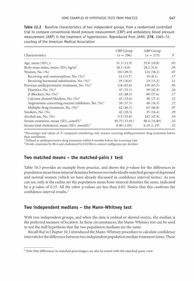
OTE/SPH OTE/SPH
JWBK220-12 December 21, 2007 19:10 Char Count= 0
SOME EXAMPLES OF HYPOTHESIS TESTS FROM PRACTICE 147
Table 12.2 Baseline characteristics of two independent groups, from a randomised controlledtrial to compare conventional blood pressure measurement (CBP) and ambulatory blood pressuremeasurement (ABP) in the treatment of hypertension. Reproduced from JAMA, 278, 1065–72,courtesy of the American Medical Association
CBP Group ABP GroupCharacteristics (n = 206) (n = 213) P
Age, mean (SD), y 51.3 (11.9) 53.8 (10.8) .03Body mass index, mean (SD), kg/m2 28.5 (4.8) 28.2 (4.4) .39Women, No. (%) 102 (49.5) 124 (58.2) .07
Receiving oral contraceptives, No. (%)∗ 14 (13.7) 10 (8.1) .17Receiving hormonal substitution, No. (%)∗ 19 (18.6) 19 (15.3) .51
Previous antihypertensive treatment, No. (%)† 134 (65.0) 139 (65.3) .95Diuretics, No. (%)∗ 47 (35.1) 59 (42.4) .26β-Blockers, No. (%)∗ 65 (48.5) 80 (57.6) .17Calcium channel blockers, No. (%)∗ 45 (33.6) 38 (27.3) .32Angiotensin-converting enzyme inhibitors, No. (%)∗ 50 (37.3) 48 (34.5) .72Multiple-drug treatment, No. (%)∗ 62 (46.3) 65 (46.8) .97
Smokers, No. (%) 42 (20.5) 35 (16.4) .29Alcohol use, No. (%) 115 (55.8) 102 (47.9) .10Serum creatinine, mean (SD), μmol/L‡ 85.75 (15.91) 88.4 (16.80) .25Serum total cholesterol, mean (SD), mmol/L‡ 6.00 (1.03) 6.10 (1.19) .32
∗Percentages and values of P computed considering only women receiving antihypertensive drug treatment beforetheir enrollment.†Defined as antihypertensive drug treatment within 6 months before the screening visit.‡Divide creatinine by 88.4 and cholesterol by 0.02586 to convert milligrams per deciliter.
Two matched means – the matched-pairs t test
Table 10.3 provides an example from practice, and shows the p-values for the differences inpopulation mean bone mineral densities between two individually matched groups of depressedand normal women (which we have already discussed in confidence interval terms). As youcan see, only at the radius are the population mean bone mineral densities the same, indicatedby a p-value of 0.25. All the other p-values are less than 0.05. Notice that this confirms theconfidence interval results.5
Two independent medians – the Mann-Whitney test
With two independent groups, and when the data is ordinal or skewed metric, the median isthe preferred measure of location. In these circumstances, the Mann-Whitney test can be usedto test the null hypothesis that the two population medians are the same.
Recall that in Chapter 10, I introduced the Mann-Whitney procedure to calculate confidenceintervals for the difference between two independent population median treatment times. These
5 Note that differences in matched percentages can also be tested with the matched-pairs t test.

OTE/SPH OTE/SPH
JWBK220-12 December 21, 2007 19:10 Char Count= 0
148 CH 12 TESTING HYPOTHESES ABOUT THE DIFFERENCE BETWEEN TWO POPULATION PARAMETERS
were from a study of the use of ketorolac versus morphine to treat limb injury pain. Table 10.4contains both 95 per cent confidence intervals and p-values from this study. Only one confidenceinterval does not include zero, that for the time between receiving analgesia and leaving A&E(4.0 to 39.0). This outcome has a p-value of 0.02, less than 0.05, which confirms the fact that thedifference in treatment time between the two population median times is statistically significant.
However there is a problem with the time for preparation of the analgesia. Table 10.4 showsthis has a 95 per cent confidence interval of (0 to 5.0), which includes zero, implying nosignificant difference in treatment times. But the p-value is given as 0.0002, which suggestsa highly significant difference in population medians. In the accompanying text the authorsindicate that this difference is significant and quote the low p-value, so I can only assume atypographical error in the confidence interval.
Interpreting computer output for the Mann-Whitney test
In view of the widespread use of the Mann-Whitney test you might find it helpful to see theoutput for this procedure from both SPSS and Minitab.
With SPSS
With the Apgar scores in Table 10.1, you can use the Mann-Whitney test to check if thepopulation median Apgar scores for infants born in a maternity unit and those born at homeare the same and differ in the sample only by chance. The null hypothesis is that these mediansare equal. The output from SPSS is shown in Figure 12.1. The p-value of 0.061 is labelled‘Asymp. Sig. (2-tailed)’. Since this is not less than 0.05 you cannot reject the null hypothesis ofno difference in population median Apgar scores between the two groups.
Test Statistics APGARALL
Mann-Whitney U 325.500Wilcoxon W 790.500
Z –1.876Asymp. Sig. (2-
tailed).061
The pvalue.
Figure 12.1 Output from SPSS for the Mann-Whitney test of the difference between population me-dians of the two independent Apgar scores (raw data in Table 10.1)
With Minitab
If you refer back to Figure 10.3, you will see the results of Minitab’s Mann-Whitney test threerows from the bottom.6 The p-value is given in the second row up as 0.0616 and since this is
6 ‘ETA’ is Minitab’s word for the population median.

OTE/SPH OTE/SPH
JWBK220-12 December 21, 2007 19:10 Char Count= 0
CONFIDENCE INTERVALS VERSUS HYPOTHESIS TESTING 149
not less than 0.05 you cannot reject the null hypothesis. This is confirmed in the bottom row ofthe table, and enables you to conclude that the population median Apgar scores are the samein both groups of infants.
Two matched medians – the Wilcoxon test
In the same circumstances as for the Mann-Whitney test described above, but with matchedpopulations, the Wilcoxon test is appropriate. Look back at Table 10.5, which was from amatched case-control study into the dietary intake of schizophrenic patients living in thecommunity in Scotland. Here the authors have used the Wilcoxon matched-pairs test to testfor differences in the population median daily intakes of a number of substances between ‘AllPatients’ and ‘All Controls’. The p-values are in the column headed ‘P’. As you can see, the onlyp value not less than 0.05 is that for protein (p-value = 0.07), so this is the only substance whosemedian daily intake does not differ between the two populations. Once again this confirms theconfidence interval results.
Confidence intervals versus hypothesis testing
I said at the beginning of this chapter that where possible, confidence intervals are preferred tohypothesis tests because the confidence intervals are more informative. How so? Have anotherlook at Table 10.4, from the study comparing ketorolac and morphine for limb injury pain.The authors give both 95 per cent confidence intervals and p-values for differences in a numberof different treatment times, between two groups of limb injury patients. Let’s take the lastof these. For the ‘interval between receiving analgesia and leaving A&E’, the p-value of 0.02enables us to reject the null hypothesis, and you would conclude that the difference betweenthe two population median treatment times is statistically significant.
The 95 per cent confidence interval of (4.0 to 39.0) minutes, tells us, not only that thedifference between the population medians is statistically significant – because the confidenceinterval does not contain zero – but in addition, that the value of this difference in populationmedians is likely to be somewhere between 4.0 minutes and 39 minutes. So the confidenceinterval does everything that the hypothesis test does – it tells us if the medians are equal ornot, but it also gives us extra information – on the likely range of values for this difference.Moreover, unlike a p-value, the confidence interval is in clinically meaningful units, which helpswith the interpretation. So whenever possible, it is good practice to use confidence intervals inpreference to p-values.
Nobody’s perfect – types of error
Suppose you are investigating a new drug for the treatment of hypertension. Your null hypothesisis that the drug has no effect. Let’s suppose that the drug does actually reduce mean systolicblood pressure, but, on average, by only 5 mmHg. However, the hypothesis test you use canonly detect a change of 10 mmHg or more. As a consequence, you will not find strong enough

OTE/SPH OTE/SPH
JWBK220-12 December 21, 2007 19:10 Char Count= 0
150 CH 12 TESTING HYPOTHESES ABOUT THE DIFFERENCE BETWEEN TWO POPULATION PARAMETERS
evidence to reject the null hypothesis, and you’ll conclude, mistakenly, that the new drug is noteffective. But the effect is there, it’s just that your test does not have enough power to detect it.
There are three questions here. First, what exactly is the power of a test and how can wemeasure it? Second, how can we increase the power of the test we are using? Third, is there amore powerful test that we can use instead? Before I address these questions, a few words ontypes of error.
Whenever you decide either to reject or not reject a null hypothesis, you could be makinga mistake. After all, you are basing your decision on sample evidence. Even if you have doneeverything right, your sample could still, by chance, not be very representative of the population.Moreover, your test might not be powerful enough to detect an effect if there is one. There aretwo possible errors:
Type I error: Rejecting a null hypothesis when it is true. Also known as a false positive. Inother words, concluding there is an effect when there isn’t. The probability of committinga type I error is denoted α (alpha), and is the same alpha as the significance level of a test.
Type II error: Not rejecting a null hypothesis when it is false. Also known as a false negative.That is, concluding there is no effect when there is. The probability of committing a typeII error is denoted β (beta).
Ideally, you would like a test procedure which minimised the probability of a type I error, becausein many clinical situations such an error is potentially serious – judging some procedure to beeffective when it is not. When you set the significance level of a test to α = 0.05, it’s becauseyou want the probability of a type I error to be no more than 0.05. Nonetheless, if there is a realeffect you would certainly like to detect it, so you also want to minimise the probability of β, atype II error, or put another way, you want to make (1 − β) as large as possible.
Exercise 12.4 Explain, with examples, what is meant in hypothesis testing by: (a) a falsepositive; (b) a false negative.

OTE/SPH OTE/SPH
JWBK220-12 December 21, 2007 19:10 Char Count= 0
THE POWER OF A TEST 151
The power of a test
We can now come back to the three questions above. To answer the first question – the powerof a test is defined to be (1 − β); it is a measure of its capacity to reject the null hypothesiswhen it is false. In other words, to detect an effect if one is present. In practice, β is typicallyset at 0.2 or 0.1. This provides power values of 0.80 (or 80 per cent), and 0.90 (or 90 per cent)respectively. So if there is an effect, then the probability of the test detecting it is 0.80 or 0.90.
The power of a test is a measure of its capacity to reject the null hypothesis when it is false.In other words, its capacity to detect an effect if one is present.
Although you would like to minimise both α and β, unfortunately they are, for a given samplesize, linked. You can’t make β smaller without making α larger, and vice versa. Thus when youdecide a value for α, you are also inevitably fixing the value of β. To answer the second question– the only way to reduce both simultaneously (and increase the power of a test) is to increasethe sample size.
To answer the third question, is there a more powerful test? Briefly, parametric tests are morepowerful than non-parametric tests (see p. 127 on the meaning of these terms). For example,a Mann-Whitney test has 95 percent of the power of the two-sample t test.7 The Wilcoxonmatched-pairs test similarly has 95 per cent of the power of the matched-pairs t test. As forthe chi-squared test, there is usually no obvious alternative when used for categorical data, socomparisons of power are less relevant, but it is known to be a powerful test. Generally youshould of course use the most powerful test that the type of data, and its distributional shape,will allow.
An example from practice
The following is an extract from the RCT of epidural analgesic in the prevention of stump andphantom pain after amputation, referred to in Table 5.3. The authors of the study outline theirthinking on power thus:
The natural history of phantom pain after amputation shows rates of about 70%,and in most patients the pain is not severe. Since epidural treatment is an invasiveprocedure, we decided that a clinically relevant treatment should reduce the inci-dence of phantom pain to less than 30% at week 1 and then at 3, 6, and 12 monthsafter amputation. Before the start of the study, we estimated that a sample size of27 patients per group would be required to detect a between-group difference of 40%in the rate of phantom pain (type I error rate 0.05; type II error rate 0.2; power =0.8).
7 In view of the restrictions associated with the two-sample t test, the Mann-Whitney test seems an excellentalternative!

OTE/SPH OTE/SPH
JWBK220-12 December 21, 2007 19:10 Char Count= 0
152 CH 12 TESTING HYPOTHESES ABOUT THE DIFFERENCE BETWEEN TWO POPULATION PARAMETERS
Exercise12.5 a) Explain, with the help of a few clinical examples, why you would normallywant to minimise α, when testing a hypothesis. (b) α is conventionally set to 0.05, or 0.01.Why, if you want to minimise it, don’t you set it at 0.001 or 0.000001, or even 0?
Maximising power – calculating sample size
Generally, the bigger the sample, the more powerful the test.8 The minimum size of a samplefor a given power is determined both by the chosen level of alpha, as well as the power required.The sample size calculation can be summarised thus:� Decide on the minimum size of the effect that would be clinically useful (or otherwise of
interest).� Decide the significance level α, usually 0.05.� Decide the power required, usually 80 per cent.� Do the sample size calculation, using some appropriate software, or the rule of thumbdescribed below.
Minitab has an easy to use sample size calculator for the most commonly used tests. Machin,et al. (1987) is a comprehensive collection of sample size calculations for a large number ofdifferent test situations.
Rules of thumb9
Comparing the means of two independent populations (metric data)
The required sample size n is given by the following expression:
n = 2 × s.d.2
E 2× k
Where s.d. is the population standard deviation (assumed equal in both populations). Thiscan be estimated using the sample standard deviations, if they are available from a pilot study,say. Otherwise the s.d. will have to be guessed using whatever information is available. E is theminimum change in the mean that would be clinically useful or otherwise interesting. k is amagic number which depends on the power and significance levels required, and is obtainedfrom Table 12.3.
8 These sample size calculations also apply if you are calculating confidence intervals. Samples that are too smallproduce wide confidence intervals, sometimes too wide to enable a real effect to be identified.
9 I am indebted to Andy Vail for this material.
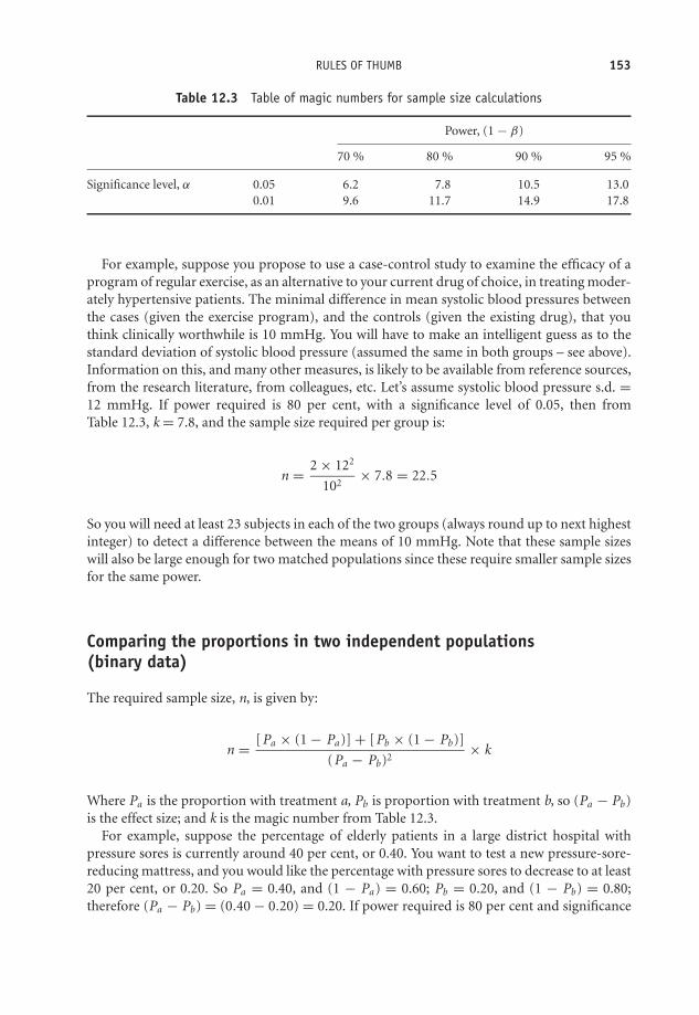
OTE/SPH OTE/SPH
JWBK220-12 December 21, 2007 19:10 Char Count= 0
RULES OF THUMB 153
Table 12.3 Table of magic numbers for sample size calculations
Power, (1 − β)
70 % 80 % 90 % 95 %
Significance level, α 0.05 6.2 7.8 10.5 13.00.01 9.6 11.7 14.9 17.8
For example, suppose you propose to use a case-control study to examine the efficacy of aprogram of regular exercise, as an alternative to your current drug of choice, in treating moder-ately hypertensive patients. The minimal difference in mean systolic blood pressures betweenthe cases (given the exercise program), and the controls (given the existing drug), that youthink clinically worthwhile is 10 mmHg. You will have to make an intelligent guess as to thestandard deviation of systolic blood pressure (assumed the same in both groups – see above).Information on this, and many other measures, is likely to be available from reference sources,from the research literature, from colleagues, etc. Let’s assume systolic blood pressure s.d. =12 mmHg. If power required is 80 per cent, with a significance level of 0.05, then fromTable 12.3, k = 7.8, and the sample size required per group is:
n = 2 × 122
102× 7.8 = 22.5
So you will need at least 23 subjects in each of the two groups (always round up to next highestinteger) to detect a difference between the means of 10 mmHg. Note that these sample sizeswill also be large enough for two matched populations since these require smaller sample sizesfor the same power.
Comparing the proportions in two independent populations(binary data)
The required sample size, n, is given by:
n = [Pa × (1 − Pa )] + [Pb × (1 − Pb)]
(Pa − Pb)2× k
Where Pa is the proportion with treatment a, Pb is proportion with treatment b, so (Pa − Pb)is the effect size; and k is the magic number from Table 12.3.
For example, suppose the percentage of elderly patients in a large district hospital withpressure sores is currently around 40 per cent, or 0.40. You want to test a new pressure-sore-reducing mattress, and you would like the percentage with pressure sores to decrease to at least20 per cent, or 0.20. So Pa = 0.40, and (1 − Pa ) = 0.60; Pb = 0.20, and (1 − Pb) = 0.80;therefore (Pa − Pb) = (0.40 − 0.20) = 0.20. If power required is 80 per cent and significance

OTE/SPH OTE/SPH
JWBK220-12 December 21, 2007 19:10 Char Count= 0
154 CH 12 TESTING HYPOTHESES ABOUT THE DIFFERENCE BETWEEN TWO POPULATION PARAMETERS
level α = 0.05, then required sample size per group is:
n = (0.40 × 0.60) + (0.20 × 0.80)
0.202× 7.8 = 78.0
Thus you would need at least 78 subjects in each group, which would also be big enough formatched proportions.
Exercise 12.6 In the above examples for: (a) hypertension and (b) the pressure sore exam-ple; what sample sizes would be required if power and significance levels were respectively:(i) 90 per cent and 0.05; (ii) 90 per cent and 0.01; (iii) 80 per cent and 0.01?
Exercise 12.7 Suppose you are proposing to use a randomised controlled trial to studythe effectiveness of St John’s Wort, as an alternative to an existing drug for the treatmentof mild to moderate depression. The percentage of patients reporting an improvement inmood three months after existing drug treatment is 70 per cent. You would be satisfiedif the percentage reporting mood improvement after three months of St John’s Wort was80 per cent. How big a sample would you require to detect this improvement if you wantedyour test to have, (a) 80 per cent power and an α of 0.05; (b) 90 per cent power and an α
of 0.01?

OTE/SPH OTE/SPH
JWBK220-13 December 21, 2007 19:10 Char Count= 0
13Testing hypotheses aboutthe ratio of two populationparameters
Learning objectives
When you have finished this chapter you should be able to:� Describe the usual form of the null hypothesis in the context of testing the ratio oftwo population parameters� Outline the differences between tests of ratios and tests of differences.� Interpret published results on tests of risk and odds ratios.
Testing the risk ratio
In Chapter 11 you saw that if the confidence interval for a sample risk ratio contains 1, then thepopulation risk ratio is most probably not statistically significant, i.e. not significantly differentfrom 1. This in turn means that the risk factor in question is not a statistically significant risk.You can also use the hypothesis test approach to find out whether any departure in the samplerisk ratio from 1 is statistically significant, or is more likely due to chance. The null hypothesis
Medical Statistics from Scratch, Second Edition David BowersC© 2008 John Wiley & Sons, Ltd

OTE/SPH OTE/SPH
JWBK220-13 December 21, 2007 19:10 Char Count= 0
156 CH 13 TESTING HYPOTHESES ABOUT THE RATIO OF TWO POPULATION PARAMETERS
is that the population risk ratio equals 1, the alternate hypothesis is that it isn’t equal to 1. Thatis:
H0: population risk ratio = 1
H1: population risk ratio �= 1
In other words, if H0 is true, the risk factor in question does not significantly increase or decreasethe risk for the condition or disease. If the associated p value is less than 0.05 (or 0.01), youcan reject the null hypothesis H0, and conclude that the population risk ratio in question isstatistically significant, and the risk factor in question is a statistically significant risk.
An example from practice
Table 13.1 is from a randomised trial into the efficacy of long-term treatment with subcutaneousheparin in unstable coronary-artery disease (FRISC II Investigators 1999), and shows the riskratios, 95 per cent confidence intervals and p values for a number of clinical outcomes, in twoindependent groups, one group given heparin, the other a placebo.
As you can see from the p values in the last column, three out of the six risk ratios werestatistically significant: death, myocardial infarction or both, at one month (p value = 0.048);death, myocardial infarction or revascularisation, at one month (p value = 0.001); and death,myocardial infarction or revascularisation, at three months (p value = 0.031). All three of thesep values are less than 0.05, the remaining three are all greater than 0.05. Notice that these resultsare confirmed by the corresponding 95 per cent confidence intervals.
Table 13.1 Risk ratios, 95 per cent confidence intervals, and p-values, for a number of clinicaloutcomes, at 1 month, 3 months and 6 months, in two independent groups, one group givenheparin and the other group a placebo. Reprinted courtesy of Elsevier (The Lancet, 1999, Vol No.354, page 701–7)
Dalteparin Placebo Risk ratioVariable (n = 1129) (n = 1121) (95% CI) p
1 monthDeath, MI, or both 70 (6.2%) 95 (8.4%) 0.73 (0.54–0.99) 0.048Death, MI, or revascularisation 220 (19.5%) 288 (25.7%) 0.76 (0.65–0.89) 0.001
3 monthsDeath, MI, or both 113 (10.0%) 126 (11.2%) 0.89 (0.70–1.13) 0.34Death, MI, or revascularisation 328 (29.1%) 374 (33.4%) 0.87 (0.77–0.99) 0.031
6 months∗
Death, MI, or both 148 (13.3%) 145 (13.1%) 1.01 (0.82–1.25) 0.93Death, MI, or revascularisation 428 (38.4%) 440 (39.9%) 0.96 (0.87–1.07) 0.50
MI = myocardial infarction.∗Dalteparin (n = 1115), placebo (n = 1103).

OTE/SPH OTE/SPH
JWBK220-13 December 21, 2007 19:10 Char Count= 0
TESTING THE RISK RATIO 157
Table 13.2 Relative risk for a number of non-cerebral bleeding complications in patientsreceiving tenecteplase compared to those receiving alteplase, in the treatment of acutemyocardial infarction. Reprinted courtesy of Elsevier (The Lancet, 1999, Vol No. 354,page 716–21)
Frequency (%)
Tenecteplase Alteplase Relative riskComplication (n = 8461) (n = 8488) (95% CI) p
Reinfarction 4.1 3.8 1.078 (0.929–1.250) 0.325Recurrent angina 19.4 19.5 0.995 (0.935–1.058) 0.877Sustained hypotension 15.9 16.1 0.988 (0.921–1.058) 0.737Cardiogenic shock 3.9 4.0 0.965 (0.832–1.119) 0.664Major arrhythmias 20.5 21.2 0.968 (0.913–1.027) 0.281Pericarditis 3.0 2.6 1.124 (0.941–1.343) 0.209Invasive cardiac procedures
PTCA 24.0 23.9 1.006 (0.953–1.061) 0.843Stent placement 19.0 19.7 0.968 (0.910–1.029) 0.302CABG 5.5 6.2 0.884 (0.783–0.999) 0.049IABP 2.6 2.7 0.968 (0.805–1.163) 0.736
Killip class >I 6.1 7.0 0.991 (0.982–0.999) 0.026Tamponade or cardiac rupture 0.6 0.7 0.816 (0.558–1.193) 0.332Acute mitral regurgitation 0.6 0.7 0.886 (0.613–1.281) 0.571Ventricular septum defect 0.3 0.3 0.817 (0.466–1.434) 0.568Anaphylaxis 0.1 0.2 0.376 (0.147–0.961) 0.052Pulmonary embolism 0.09 0.04 2.675 (0.710–10.080) 0.145
PTCA = Percutaneous transluminal coronary angioplasty; CABG = coronary-artery bypass graft; IABP = Intra-aorticballoon pump.
Exercise 13.1 Table 13.2 is from a double blind RCT to assess the efficacy of tenecteplaseas a possible alternative to alteplase in the treatment of acute myocardial infarction(ASSENT-2 Investigators 1999). The table contains the risk ratios (relative risks) for anumber of in-hospital cardiac events and procedures, for patients receiving tenecteplase,compared to those receiving alteplase.1
Identify and comment on those cardiac events and procedures for which patients onalteplase had a significant higher risk of experiencing than those on tenecteplase. Note:the key to the cardiac procedures is given in the table footnote. The Killip scale is aclassification system for heart failure in patients with acute myocardial infarction, andvaries from I (least serious, no heart failure, 5 per cent expected mortality), to IV (mostserious, cardiogenic shock, 90 per cent expected mortality).
1 As a background note: rapid infusion of alteplase, with aspirin and heparin, is the current gold standard forpharmacological reperfusion in acute myocardial infarction. Tenecteplase is a mutant of alteplase with fewerof the limitations of alteplase.

OTE/SPH OTE/SPH
JWBK220-13 December 21, 2007 19:10 Char Count= 0
158 CH 13 TESTING HYPOTHESES ABOUT THE RATIO OF TWO POPULATION PARAMETERS
Testing the odds ratio
Here the null hypothesis is that the population odds ratio is not significantly different from 1.That is:
H0: population odds ratio = 1
H1: population odds ratio �= 1
In other words, in the population, if H0 is true the risk factor in question does not significantlyincrease or decrease the odds for the condition or disease. Only if the p value for the sampleodds ratio is less than 0.05, can you reject the null hypothesis, and conclude that the risk factoris statistically significant.
An example from practice
Table 13.3 is from an unmatched case-control study into the effect of passive smoking asa risk factor for coronary heart disease (CHD), in Chinese women who had never smoked(He et al. 1994). The cases were patients with CHD, the controls women without CHD. Thestudy looked at both passive smoking at home from husbands who smoked, and at work fromsmoking co-workers. The null hypotheses were that the population odds ratio was equal to1, both at home and at work, i.e. passive smoking has no effect on the odds for CHD. The
Table 13.3 Odds ratios, 95 per cent confidence intervals and p values, from an unmatchedcase-control study into the effect of passive smoking as a risk factor for coronary heart disease.The cases were patients with coronary heart disease, the controls individuals without coronaryheart disease. Reproduced from BMJ, 308, 380–4, courtesy of BMJ Publishing Group
Adjusted odds ratio(95% confidence interval)∗ P value
Final model (factors 1 to 7):1 Age (years) 1.13 (1.04 to 1.22) 0.0032 History of hypertension 2.47 (1.14 to 5.36) 0.0223 Type A personality 2.83 (1.31 to 6.37) 0.0084 Total cholesterol (mg/dl) 1.02 (1.01 to 1.03) 0.00065 High density lipoprotein cholesterol (mg/dl) 0.94 (0.90 to 0.98) 0.0036 Passive smoking from husband 1.24 (0.56 to 2.72) 0.607 Passive smoking at work 1.85 (0.86 to 4.00) 0.12
Other model (factors 1 to 5 and passive smoking at work) 1.95 (0.90 to 4.10)† 0.087
Other model (factors 1 to 5 and passive smoking fromhusband or at work, or both)
2.36 (1.01 to 5.55)† 0.049
∗Adjusted for the other variables in the final model.†Adjusted for the first five varibles above; odds ratios for these variables in the other models were essentially the sameas those shown above and are not shown.

OTE/SPH OTE/SPH
JWBK220-13 December 21, 2007 19:10 Char Count= 0
TESTING THE ODDS RATIO 159
table contains the adjusted odds ratios for CHD for a number of risk factors, with 95 per centconfidence intervals and p values.
As you can see, the adjusted odds ratio for CHD because of passive smoking from the husbandwas 1.24, with a p value of 0.60, so you cannot reject the null hypothesis. You conclude thatpassive smoking from husbands is not a statistically significant risk factor for CHD in wives.The same conclusions can be drawn for the odds ratio of 1.85 for passive smoking at work,p value equals 0.12.
Exercise 13.2 In Table 13.3, identify those risk factors which are statistically significantfor CHD in the population from whom this sample of women was drawn.

OTE/SPH OTE/SPH
JWBK220-13 December 21, 2007 19:10 Char Count= 0
160

OTE/SPH OTE/SPH
JWBK220-14 December 21, 2007 19:11 Char Count= 0
14Testing hypotheses aboutthe equality of populationproportions: the chi-squared test
Learning objectives
When you have finished this chapter you should be able to:� Describe the rationale underlying the chi-squared hypothesis test.� Explain the difference between observed and expected values.� Calculate expected values and the test statistic.� Outline the procedure for the chi-squared test for the independence of two variablesin a population.� Outline the procedure for the chi-squared test for the equality of two population pro-portions, and show this is equivalent to the test of the independence of two variables.� Perform a chi-squared test in 2 × 2, 2 × 3, 2 × 4 and 3 × 4 cases.� Interpret SPSS and Minitab chi-squared test results.� Interpret published results of chi-squared tests.� Outline the procedure for the chi-squared test for trend.
Medical Statistics from Scratch, Second Edition David BowersC© 2008 John Wiley & Sons, Ltd

OTE/SPH OTE/SPH
JWBK220-14 December 21, 2007 19:11 Char Count= 0
162 CH 14 TESTING HYPOTHESES ABOUT THE EQUALITY OF POPULATION PROPORTIONS
Table 14.1 Observed values in the sample of mothers giving birth in maternity units and athome, and whether they smoked during their pregnancy (raw data in Table 10.1)
Smoked?
Yes No Totals
Maternity unit
10 20 30
Birthing place Home 6 24 30
Totals 16 44 60
If the two variables, smoking and birthing place, are unrelated in the population, then there is no reason why this proportion of smokers should be any different ...
... to this proportion. (see text below and footnote).
Of all the tests in all the world . . . thechi-squared (χ2) test
Two hypothesis tests are prominent in general clinical research. One is the two-sample t test,(see Chapter 12), which, as you have seen, is used with metric data to test the equality of twoindependent population means. The second is the chi-squared test1 (denoted χ2).2 This hastwo common applications: first as a test of whether two categorical variables are independentor not; second, as a test of whether two proportions are equal or not. As you will see, these testsare in fact equivalent.
The chi-squared test is applied to frequency data3 in the form of a contingency table (i.e.a table of cross-tabulations), with the rows representing categories of one variable and thecolumns categories of a second variable. The null hypothesis is that the two variables areunrelated.
To explain the idea of the chi-squared test, let’s refer back to the birthweight data inTable 10.1, and ask the question, ‘Is there a relationship between the variables “birthing place”and “whether the mother smoked during pregnancy”?’ The relevant data is summarised in the2 × 2 table, Table 14.1. The columns of this table represent the two groups ‘smokers’ and ‘non-smokers’. These two groups are independent - this is an essential requirement of the chi-squaredtest.4 The rows of the table represent the variable birthing place (either maternity unit, or homebirth), again independent.
1 The test is called the chi-squared test because it uses the chi-squared, or χ2, distribution. If a variable X isNormally distributed, then the variable X2 has a χ2 distribution. The χ2 distribution is very skewed in smallsamples but becomes more similar in shape to the Normal distribution when samples are large.
2 And pronounced as in Kylie Minogue3 The method does not work for tables of percentages, proportions, or measurements.4 If the two groups are matched, then McNemar’s test is appropriate (see Table 12.1).

OTE/SPH OTE/SPH
JWBK220-14 December 21, 2007 19:11 Char Count= 0
OF ALL THE TESTS IN ALL THE WORLD . . . THE CHI-SQUARED (χ2) TEST 163
If we want to know whether the variables ‘birthing place’ and ‘smoking’ are related, thecompeting hypotheses will be:
H0 : Birthing place and smoking status are not related in the population,
i.e. the two variables are independent.
H1 : Birthing place and smoking status are related in the population.
The two variables are dependent.
Now, if the two variables are unrelated, then there is no reason why the proportion of smokersamong mothers giving birth in a maternity unit, should be any different to the proportion ofsmokers among home-birth mothers.5 In other words, these two proportions should be thesame. But we have already discussed a method for deciding whether two proportions are thesame – by calculating a confidence interval for the difference in two population proportions –see p. 126 in Chapter 10. In fact, the two methods – asking if two variables are independentor if two proportions are the same - are equivalent whenever one of the variables has only twocategories. However, although we can calculate a confidence interval in the two proportionsapproach as we saw in Chapter 10, we can’t with the chi-squared approach.
You can see that 10 out of the sample of 30 maternity-unit mothers smoked (a proportion of0.333), and six out of 30 home-birth mothers smoked (a proportion of 0.2000). These sampleproportions are definitely not the same, but this could be due to chance.
The crucial question is this, ‘What proportions would we expect to find if the null hypoth-esis of unrelated variables was true?’ The answer is, since we’ve got 16 smokers in a total of60 women, a proportion of 16/60 = 0.2667, we would expect to find 0.2667 or 26.67 per centof the 30 in each category, which is 0.2667 × 30 = 8. So you’d expect about eight smokers ineach group, rather than the observed values of 10 and six. An easier way to calculate expectedfrequencies is to use the expression:
Expected cell frequency = Total of row cell is in × total of column cell is in
overall total frequency
For example, for the top left-hand cell, the row total is 30, the column total is 16 and the overalltotal is 60, so the expected value is (30×16)/60 = 8. Since in this example the row totals are both30, this means that the other two cells must each have an expected value of 22. In other words,the two-by-two table you would expect to see if the null hypothesis was true is that shown inTable 14.2.
Exercise 14.1 Calculate the expected values for the contingency table of ‘mother smoked’and ‘Apgar score < 7’, shown in Table 2.11.
5 If there was a relationship, for example, maternity unit mothers tended to smoke more on average thanhome-birth mothers, then we would expect to find that the proportion of smokers among these mothers wasconsistently larger than among home-birth mothers. If there is no relationship, i.e. if the two variables areindependent, then there is no reason to expect one proportion generally to be any larger or any smaller thanthe other.

OTE/SPH OTE/SPH
JWBK220-14 December 21, 2007 19:11 Char Count= 0
164 CH 14 TESTING HYPOTHESES ABOUT THE EQUALITY OF POPULATION PROPORTIONS
Table 14.2 Expected cell values if the null hypothesis of unrelatedvariables (or equal proportions) is true
Smoked?
Group 1: Yes Group 2: No Totals
Place of birth Maternity unit 8 22 30Home 8 22 30
Totals 16 44 60
Are the observed and expected values close enough?
As you’ve seen, even if the null hypothesis is true, you wouldn’t expect the difference between theobserved and expected values to be exactly zero. But how far away from zero does this differencehave to be, before you accept that the sample results are indicative of a true difference in theproportions in the population, rather than chance?
You can use the chi-squared test to answer this question: if the p-value associated with thechi-squared test is less than 0.05 (or 0.01), you can reject the null hypothesis and conclude thatthe two variables are not independent or, put another way, there is a statistically significantdifference in the proportions.
The chi-squared test can be used with more than two categories in each variable, but withsmall sample sizes the maximum number of either is limited by the proviso that none of theexpected values should be less than 1, and that 80 per cent of expected values should be greaterthan 5.6 There are two ways round the problem of low expected values. First, increase thesample size – usually impractical. Second, amalgamate two or more rows or columns, if thiscan be done and still make sense.
Calculation of a chi-squared test is not difficult to do by hand if the number of categories issmall, but you would have to have available, and know how to use, a table of chi-squared values(I’m assuming here that calculation of the p-value is too difficult by hand, so this is a practicalalternative). The procedure is as follows:� Calculate the expected value E, for each cell in the table.� For each cell calculate the value of (O − E), where O is the observed value.� Square each (O − E) value.� Divide each (O − E)2 value by the E value for that cell.� Sum all of the values in the previous step.� Take the square root of the result from the previous step. This result is called the test statistic.7
6 There is some dispute among statisticians about the validity of this condition – some suggest that thechi-squared test still works well even with low expected frequencies.
7 For the mathematically minded, the test statistic =√∑ {
(O − E )2
E
}.
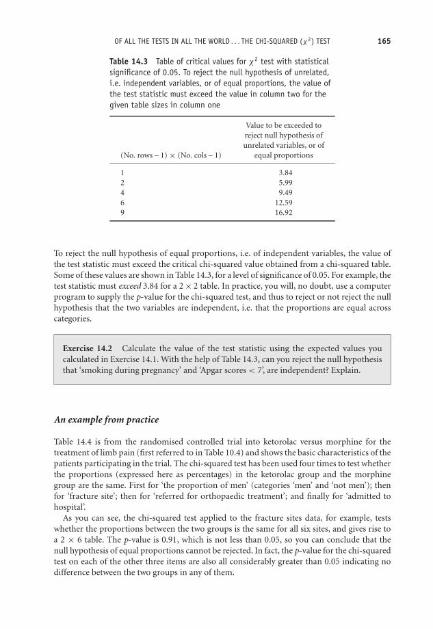
OTE/SPH OTE/SPH
JWBK220-14 December 21, 2007 19:11 Char Count= 0
OF ALL THE TESTS IN ALL THE WORLD . . . THE CHI-SQUARED (χ2) TEST 165
Table 14.3 Table of critical values for χ2 test with statisticalsignificance of 0.05. To reject the null hypothesis of unrelated,i.e. independent variables, or of equal proportions, the value ofthe test statistic must exceed the value in column two for thegiven table sizes in column one
Value to be exceeded toreject null hypothesis ofunrelated variables, or of
(No. rows – 1) × (No. cols – 1) equal proportions
1 3.842 5.994 9.496 12.599 16.92
To reject the null hypothesis of equal proportions, i.e. of independent variables, the value ofthe test statistic must exceed the critical chi-squared value obtained from a chi-squared table.Some of these values are shown in Table 14.3, for a level of significance of 0.05. For example, thetest statistic must exceed 3.84 for a 2 × 2 table. In practice, you will, no doubt, use a computerprogram to supply the p-value for the chi-squared test, and thus to reject or not reject the nullhypothesis that the two variables are independent, i.e. that the proportions are equal acrosscategories.
Exercise 14.2 Calculate the value of the test statistic using the expected values youcalculated in Exercise 14.1. With the help of Table 14.3, can you reject the null hypothesisthat ‘smoking during pregnancy’ and ‘Apgar scores < 7’, are independent? Explain.
An example from practice
Table 14.4 is from the randomised controlled trial into ketorolac versus morphine for thetreatment of limb pain (first referred to in Table 10.4) and shows the basic characteristics of thepatients participating in the trial. The chi-squared test has been used four times to test whetherthe proportions (expressed here as percentages) in the ketorolac group and the morphinegroup are the same. First for ‘the proportion of men’ (categories ‘men’ and ‘not men’); thenfor ‘fracture site’; then for ‘referred for orthopaedic treatment’; and finally for ‘admitted tohospital’.
As you can see, the chi-squared test applied to the fracture sites data, for example, testswhether the proportions between the two groups is the same for all six sites, and gives rise toa 2 × 6 table. The p-value is 0.91, which is not less than 0.05, so you can conclude that thenull hypothesis of equal proportions cannot be rejected. In fact, the p-value for the chi-squaredtest on each of the other three items are also all considerably greater than 0.05 indicating nodifference between the two groups in any of them.

OTE/SPH OTE/SPH
JWBK220-14 December 21, 2007 19:11 Char Count= 0
166 CH 14 TESTING HYPOTHESES ABOUT THE EQUALITY OF POPULATION PROPORTIONS
Table 14.4 Basic characteristics of the patients participating in a randomised controlled trialof ketorolac versus morphine for the treatment of blunt injury limb pain (see Table 10.5). Thechi-squared test has been used four times to test whether the proportions in the ketorolac andmorphine groups are the same for a number of items. Values are numbers (percentage*) unlessstated otherwise. Reproduced from BMJ, 321, 1247–51, by permission of BMJ
Ketorolac group Morphine groupVariable (n = 75) (n = 73) P value
Mean (SD) age (years) 53.9 (21.7) 53.2 (21.8) 0.85‡
No (%) of men 38 (51) 33 (45) 0.51§Mean (SD) body mass index (kg/m2) 22.8 (3.2) 23.0 (3.7) 0.77‡
Mean (interquartile range) time between 95 (30–630) 82 (33–921) 0.75injury and arrival at hospital (minutes)
Cause of injury:Motor vehicle crash 6 (8) 4 (5) 0.58¶Falls 46 (61) 51 (70)Crush 20 (27) 14 (19)Other 3 (4) 4 (5)
Fractures: 50 (67) 48 (66) 0.91§Clavicle, humerus, elbow 5 (7) 8 (11)Radius, ulnar 8 (11) 11 (15)Hand 15 (20) 13 (18)Femur, patella 14 (19) 12 (16)Tibia, fibula 5 (7) 3 (4)Foot 2 (3) 1 (1)
Non-fractures:Dislocation, upper limb 2 (3) 1 (1)Soft tissue injury, upper limb 10 (13) 10 (14)Soft tissue injury, lower limb 14 (19) 14 (19)
Initial mean (SD) pain score:At rest 3.8 (1.1) 3.9 (1.1) 0.65‡
With activity 8.1 (1.2) 8.1 (1.2) 0.85‡
Referred for orthopaedic assessment 41 (55) 36 (49) 0.52§Admitted to hospital† 38 (51) 29 (40) 0.18§Admitted with adverse effects 0 3 (4)
*Percentages may not sum to 100 because of rounding.†Patient’s admitted to hospital (to orthopaedic or emergency observation ward).‡t test for unpaired means comparison.§χ2 test.¶Fisher’s exact test.
Notice that the authors have used Fisher’s Exact test (see Table 12.1 for a brief description)to compare the equality of the proportions between the two groups for ‘cause of injury’. Thisis almost certainly because of low expected values in some cells.
The chi-squared test for trend
The chi-squared trend test is another useful application of the chi-squared distribution, and isappropriate if either variable has categories that can be ordered. I can best explain with a realexample.

OTE/SPH OTE/SPH
JWBK220-14 December 21, 2007 19:11 Char Count= 0
OF ALL THE TESTS IN ALL THE WORLD . . . THE CHI-SQUARED (χ2) TEST 167
Table 14.5 Numbers of subjects by social class incases and controls, in a study of stressful life events asa possible risk factor for breast cancer in women
Malignant diagnosis Benign diagnosisSocial class (cases) group (control) group
I 10 20II 38 82III non-manual 28 72III manual 13 24IV 11 21V 3 2VI 3 4
Totals 106 226
An example from practice
Table 14.5 shows the social class categories (ordinal data) of the cases and controls in theunmatched case-control study of breast cancer in women (refer to Table 1.6). Recall that thesubjects were women who attended with a breast lump. The cases were those women whoreceived a malignant diagnosis, the controls those who received a benign diagnosis. These twogroups are independent.
With two groups and seven ordered categories of ‘social class’, we have a 2 × 7 table. If youapply the chi-squared test here, you are testing whether the proportion of breast cancer cases isthe same in each social class category, and simultaneously whether the two variables, diagnosisand social class, are independent. If the proportions are not the same you conclude that thevariables are associated in some way.8
8 Note that to perform the chi-squared test for trend we have to number the categories.

OTE/SPH OTE/SPH
JWBK220-14 December 21, 2007 19:11 Char Count= 0
168 CH 14 TESTING HYPOTHESES ABOUT THE EQUALITY OF POPULATION PROPORTIONS
The problem is that if social class is associated with diagnosis, then you would expect theproportion getting a benign diagnosis to vary systematically, either increasing or decreasing,as social class increased.9 In other words, the variability in the proportions may be due largelyto this trend, rather than that the variables are associated.
In the chi-squared test for trend, the null hypothesis is that there is no trend, and the p-valueis used in the usual way. Note that the test statistic for the trend test will always be less thanthat for the overall test described earlier. However, the trend test may produce a statisticallysignificant result even when the overall test does not. This is because the test for trend is amore powerful test. The net result of all this is that if one or both of your variables has ordinalcategories, you should use the chi-squared test for trend rather than the overall chi-squaredtest.
As a matter of interest, the overall chi-squared test for the data in Table 14.5 gives a p-valueof 0.784, while the chi-squared trend test gives a p-value of 0.094. As it happens, neither ofthese is statistically significant, but is an illustration of how different the results from the twotests can be.
Exercise 14.3 Refer back to Table 1.6, the breast cancer and stress case-control study.The table footnote indicates four chi-squared trend tests. Comment on what each p-valuereveals about the existence of a trend in the categories of each of the variable concerned.
The chi-squared test has a large number of other applications, one of which we’ll meet inChapter 19.
9 The direction of change would depend on whether stressful life events were more, or less, common in highersocial class groups.

OTE/SPH OTE/SPH
JWBK220-15 December 21, 2007 19:45 Char Count= 0
VII
Getting up Close
169

OTE/SPH OTE/SPH
JWBK220-15 December 21, 2007 19:45 Char Count= 0
170

OTE/SPH OTE/SPH
JWBK220-15 December 21, 2007 19:45 Char Count= 0
15Measuring the associationbetween two variables
Learning objectives
When you have finished this chapter you should be able to:� Explain the meaning of association.� Draw and interpret a scatterplot, and from it assess the linearity, direction andstrength of an association.� Distinguish between negative and positive association.� Explain what a correlation coefficient is.� Describe Pearson’s correlation coefficient r , its distributional requirements, and in-terpret a given value of r .� Describe Spearman’s correlation coefficient rs and interpret a given value of rs .� Describe the circumstances under which Pearson’s r or Spearman’s rs is appropriate.
Association
When we say that two ordinal or metric variables are associated, we mean that they behave ina way that makes them appear ‘connected’ - changes in either variable seem to coincide with
Medical Statistics from Scratch, Second Edition David BowersC© 2008 John Wiley & Sons, Ltd

OTE/SPH OTE/SPH
JWBK220-15 December 21, 2007 19:45 Char Count= 0
172 CH 15 MEASURING THE ASSOCIATION BETWEEN TWO VARIABLES
changes in the other variable. It’s important to note (at this point anyway), that we are notsuggesting that change in either variable is causing the change in the other variable, simply thatthey exhibit this commonality. As you will see, association, if it exists, may be positive (lowvalues of one variable coincide with low values of the other variable, and high values with highvalues) or negative (low values with high values and vice versa).
In this chapter, I want to discuss two alternative methods of detecting an association. Thefirst method relies on a plot of the sample data, called a scatterplot, in which values of onevariable are plotted on the vertical axis and values of the other on the horizontal axis. Thesecond approach is numeric, making both comparison and inference possible.
The scatterplot
A scatterplot will enable you to see if there is an association between the variables, and if thereis, its strength and direction. But the scatterplot will only provide a qualitative assessment, andthus has obvious limitations. First, it’s not always easy to say which of two sample scatterplotsindicates the stronger association and second, it doesn’t allow us to make inferences aboutpossible associations in the population.
An example from practice
As part of a study of the possible association between Crohn’s disease (CD) and ulcerativecolitis (UC), researchers in Canada (Blanchard et al. 2001) produced the scatterplot shown inFigure 15.1. It doesn’t matter which variable is plotted on which axis for the scatterplot itself,but in the study of causal relationships between variables (which I will discuss in Chapter 17),the choice of axis becomes more important.
Looking at the scatterplot it’s not difficult to see that something is going on here. The scatteris not just a random cloud of points, but appears to display a pattern – low CD levels seem tobe associated with low UC levels, and higher CD levels with high UC levels. You could justlyclaim that the two variables appear to be positively associated.
As a second example, Figure 15.2 shows a scatterplot taken from a study into the possiblerelationship between percentage mortality from aortic aneurysm, and the number of aorticaneurysm episodes dealt with per year, in each of 22 hospitals (McKee and Hunter 1995). Thisscatterplot displays a negative association between the two variables, low values for number ofepisodes seem to be associated with high values for percentage mortality, and vice versa.
As a final example from practice, Figure 15.3 shows a scatterplot taken from the cross-section study into the possible contribution of channel blockers (prescribed for depression),to the suicide rate in 284 Swedish municipalities (Lindberg et al. 1998), first referred to inFigure 3.10. The scatterplot here is very much more fuzzy than the two previous plots, andit would be hard to claim, merely from eyeballing it, that there is any notable associationbetween the two variables (although admittedly there is some evidence of a rather weak positiveassociation).
When you set out to investigate a possible association between two variables, a scatterplotis almost always worthwhile, and will often produce an insight into the way the two variablesco-behave. In particular, it may reveal whether an association between them is linear. The

OTE/SPH OTE/SPH
JWBK220-15 December 21, 2007 19:45 Char Count= 0
ASSOCIATION 173
r=0.49, p<0.001
CD Incidence Rate per 100,000
UC
Inci
denc
e R
ate
per
100,
000
0 5 10 15 20 25 30 350
5
10
15
20
25
30
35
Figure 15.1 Scatterplot of the age-standardised incidence rates of Crohn’s disease (CD) and ulcerativecolitis (UC) by Manitoba postal area, Canada, 1987–1996. The scatterplot suggests a positive associationbetween the two variables. Reproduced from Americal Jnl of Epidemiology 2001, 154: 328–33, Fig. 3p. 331, by permission of OUP
100908070605040302010
7060504030Episodes/year
20100
0
% M
orta
lity
Figure 15.2 A scatterplot of percentage mortality from aortic aneurysm, and number of aorticaneurysm episodes dealt with per year, in 22 hospitals. The plot suggests a negative association betweenthe two variables. Reproduced from Quality in Health Care, 4, 5–12, courtesy of BMJ Publishing Group
property of linearity is important in some branches of statistics and we’ll meet it again ourselvesin Chapter 17. Put simply, a linear association is one in which the points in the scatterplot seemto cluster around a straight line. The two scatterplots in Figure 15.4 illustrate the differencebetween a linear and a non-linear association. The scatter in Figure 15.4a seems to be linear;but in Figure 15.4b it shows some curviness.
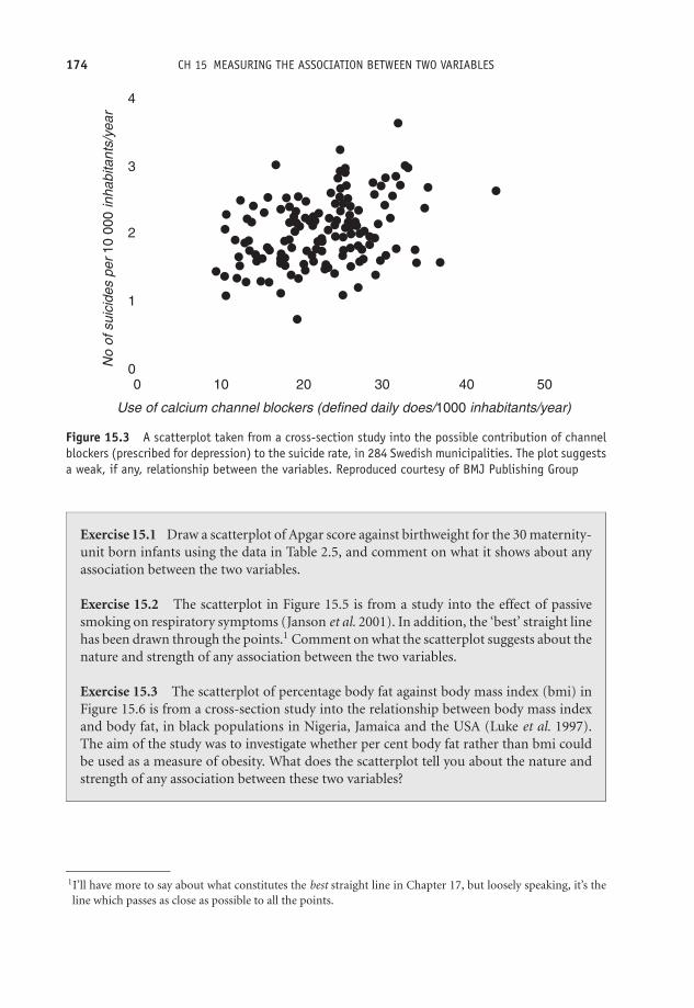
OTE/SPH OTE/SPH
JWBK220-15 December 21, 2007 19:45 Char Count= 0
174 CH 15 MEASURING THE ASSOCIATION BETWEEN TWO VARIABLES
4
3
2
1
00
Use of calcium channel blockers (defined daily does/1000 inhabitants/year)
No
of s
uici
des
per
10 0
00 in
habi
tant
s/ye
ar
10 20 30 40 50
Figure 15.3 A scatterplot taken from a cross-section study into the possible contribution of channelblockers (prescribed for depression) to the suicide rate, in 284 Swedish municipalities. The plot suggestsa weak, if any, relationship between the variables. Reproduced courtesy of BMJ Publishing Group
Exercise 15.1 Draw a scatterplot of Apgar score against birthweight for the 30 maternity-unit born infants using the data in Table 2.5, and comment on what it shows about anyassociation between the two variables.
Exercise 15.2 The scatterplot in Figure 15.5 is from a study into the effect of passivesmoking on respiratory symptoms (Janson et al. 2001). In addition, the ‘best’ straight linehas been drawn through the points.1 Comment on what the scatterplot suggests about thenature and strength of any association between the two variables.
Exercise 15.3 The scatterplot of percentage body fat against body mass index (bmi) inFigure 15.6 is from a cross-section study into the relationship between body mass indexand body fat, in black populations in Nigeria, Jamaica and the USA (Luke et al. 1997).The aim of the study was to investigate whether per cent body fat rather than bmi couldbe used as a measure of obesity. What does the scatterplot tell you about the nature andstrength of any association between these two variables?
1I’ll have more to say about what constitutes the best straight line in Chapter 17, but loosely speaking, it’s theline which passes as close as possible to all the points.

OTE/SPH OTE/SPH
JWBK220-15 December 21, 2007 19:45 Char Count= 0
THE CORRELATION COEFFICIENT 175
Figure 15.4 (a) A linear association (b) A non-linear association
r =0.80 p<0.0001
Proportion of current smokers (%)0 10 20 30 40 50 60
Pro
port
ion
expo
sed
to e
nviro
nmen
tal
toba
cco
smok
e at
wor
k (%
)
0
10
20
30
40
50
60
Figure 15.5 Scatterplot from a study into the effect of passive smoking on respiratory symptoms.Reprinted courtesy of Elsevier (The Lancet 2001, 358, 2103–9, Fig. 1, p. 2105)
The correlation coefficient
The principal limitation of the scatterplot in assessing association is that it does not provideus with a numeric measure of the strength of the association; for this we have to turn to thecorrelation coefficient. Two correlation coefficients are widely used: Pearson’s and Spearman’s.
Pearson’s correlation coefficient
Pearson’s product-moment correlation coefficient, denoted ρ (Greek rho), in the population,and r in the sample, measures the strength of the linear association between two variables.Loosely speaking, the correlation coefficient is a measure of the average distance of all of thepoints from an imaginary straight line drawn through the scatter of points (analogous to thestandard deviation measuring the average distance of each value from the mean).

OTE/SPH OTE/SPH
JWBK220-15 December 21, 2007 19:45 Char Count= 0
176 CH 15 MEASURING THE ASSOCIATION BETWEEN TWO VARIABLES
bmi
UNITED STATES
Per
cent
Bod
y Fa
t
60
50
40
30
20
10
06050403020100
Figure 15.6 Scatterplot of per cent body fat against body mass index from a cross-section study intothe relationship between bmi and body fat, in black population samples from Nigeria, Jamaica and theUSA. Reproduced from Amer. J. Epid., 145, 620–8, courtesy of Oxford University Press
For Pearson’s correlation coefficient to be appropriately used, both variables must be metriccontinuous and, if a confidence interval is to be determined, also approximately Normally dis-tributed. The value of Pearson’s correlation coefficient can vary as follows: from −1, indicatinga perfect negative association (all the points lie exactly on a straight line); through 0, indicatingno association; to +1, indicating perfect positive association (all points exactly on a line). Inpractice, with real sample data, you will never see values of –1, 0 or +1. Calculation of r byhand is very tedious and prone to error, so we will avoid it here. But it can be done in a flashwith a computer statistics program, such as SPSS or Minitab.
Is the correlation coefficient statistically significant in the population?
To assess the statistical significance of a population correlation coefficient and hence decidewhether there is a statistically significant association between the two variables, you can eitherperform a hypothesis test (is the p-value less than 0.05?), or calculate a confidence interval(does it include zero?). For the hypothesis test, the hypotheses are:
H0: ρ = 0
H1: ρ �= 0
For example, for the data shown in the scatterplot in Figure 15.1, the sample r = 0.49, with ap-value < 0.001. This indicates a statistically significant positive association in the populationbetween incidence rate of Crohn’s disease and ulcerative colitis.

OTE/SPH OTE/SPH
JWBK220-15 December 21, 2007 19:45 Char Count= 0
THE CORRELATION COEFFICIENT 177
A useful rule of thumb if you have a value for r but no confidence interval or p-value, isthat to be statistically significant, r must be greater than 2/
√n, where n is the sample size. For
example, if n = 100, then r has to be greater than 2/10 = 0.200 to be statistically significant.
An example from practice
Table 15.1 is taken from the same cross-section study as Exercise 15.3, and shows the samplePearson’s correlation coefficient for the association between bmi and per cent body fat, withblood pressure, and waist and hip measurements, along with an indication of the statisticalsignificance or otherwise of the p-value.
Unfortunately, the authors have not given the actual p-values, but only indicated whetherthey were less than 0.05 or less than 0.01. This is not good practice; the actual p-values shouldalways be provided. As you can see, the population correlation coefficient between both bmiand per cent body fat, with waist and hip circumference, is positive and statistically significantin every case. However, bmi is more closely associated (higher r values) than body fat, exceptin Jamaican men. Apart from the association with systolic blood pressure in US males, there isno statistically significant association with either of the blood pressure measurements.
Exercise 15.4 Table 15.2 is from a case-control study of medical record validation (Olsonet al. 1997), and shows the value of Pearson’s r, and the 98 per cent confidence intervals,for the correlation between gestational age, as estimated by the mother, and as determinedfrom medical records, for a number of demographic sub-groups (ignore the last column).The cases were the mothers of child leukaemia patients, the matched controls were ran-domly selected by random telephone calling. Identify: (a) any correlation coefficients notstatistically significant; (b) the strongest correlation; (c) the weakest correlation.
Spearman’s rank correlation coefficient
If either (or both) of the variables is ordinal, then Spearman’s rank correlation coefficient (usuallydenoted ρs in the population and rs in the sample) is appropriate. This is a non-parametricmeasure. As with Pearson’s correlation coefficient, Spearman’s correlation coefficient variesfrom –1, through 0, to +1, and its statistical significance can again be assessed with a p-valueor a confidence interval. The null hypothesis is that the population correlation coefficientρs = 0. Spearman’s rs is not quite as bad to calculate by hand as Pearson’s r but bad enough,and once again you would want to do it with the help of a computer program.
An example from practice
Table 15.3 is from the same cross-section study first referred to in Figure 4.3, into the use ofthe Ontario mammography services. The authors wanted to know whether the variation in
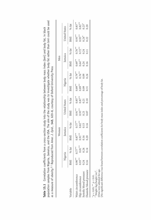
OTE/SPH OTE/SPH
JWBK220-15 December 21, 2007 19:45 Char Count= 0
Tabl
e15
.1Co
rrel
atio
nco
effic
ient
sfr
oma
cros
s-se
ctio
nst
udy
into
the
rela
tion
ship
betw
een
body
mas
sin
dex
(bm
i)an
dbo
dyfa
t,in
blac
kpo
pula
tion
sam
ples
from
Nige
ria,Ja
mai
ca,an
dth
eUS
A.Th
eai
mof
the
stud
yw
asto
inve
stig
ate
whe
ther
body
fat
rath
erth
anbm
icou
ldbe
used
asa
mea
sure
ofob
esit
y.‡,§
Repr
oduc
edfr
omAm
er.J.
Epid
.,14
5,62
0–8,
cour
tesy
ofOx
ford
Univ
ersi
tyPr
ess
Wom
enM
en
Nig
eria
Jam
aica
Un
ited
Stat
esN
iger
iaJa
mai
caU
nit
edSt
ates
Var
iabl
eB
MI
%fa
tB
MI
%fa
tB
MI
%fa
tB
MI
%fa
tB
MI
%fa
tB
MI
%fa
t
Wai
stci
rcu
mfe
ren
ce0.
90**
0.77
**0.
87**
0.77
**0.
91**
0.85
**0.
89**
0.79
**0.
69**
0.76
**0.
93**
0.83
**
Hip
circ
um
fere
nce
0.93
**0.
81**
0.91
**0.
82**
0.93
**0.
87**
0.89
**0.
76**
0.64
**0.
72**
0.93
**0.
82**
Syst
olic
bloo
dpr
essu
re0.
240.
240.
160.
150.
210.
210.
090.
090.
240.
240.
24*
0.23
*
Dia
stol
icbl
ood
pres
sure
0.16
0.14
0.20
0.16
0.07
0.10
0.31
0.24
0.16
0.11
0.22
0.20
* p<
0.05
;**
p<
0.01
.†
Wei
ght
(kg)
/hei
ght
(m)2
.‡D
ata
wer
ead
just
edfo
rag
e.§N
osi
gnifi
can
tdi
ffer
ence
was
fou
nd
betw
een
corr
elat
ion
coef
fici
ents
for
body
mas
sin
dex
and
perc
enta
geof
body
fat.
178

OTE/SPH OTE/SPH
JWBK220-15 December 21, 2007 19:45 Char Count= 0
THE CORRELATION COEFFICIENT 179
the ranked utilisation rates (number of visits per 1000 women) was similar across the agegroups. They did this by measuring the strength of the association between the ranked ratesfor each pair of different age groups. When the association was strong and significant, theyconcluded that the variation in the usage rate was similar.
The results show that the rs for the association between the ranked usage rates for 30–39year-olds, and the 40–49 year-olds, across the 33 districts was 0.6496 (first row of table), witha p-value of 0.0005. So this association is positive and statistically significant in these two agegroup populations. Indeed, the correlation coefficients between all pairs of age groups arestatistically significant, with all p-values < 0.05. The authors thus concluded that variation in
Table 15.2 Pearson’s r and 98 per cent confidence intervals for the associationbetween gestational age, as estimated by the mother and from medical records, for anumber of demographic sub-groups. Reproduced from Amer. J. Epid., 145, 58–67,courtesy of Oxford University Press
Correlation of Kappagestational age 98% CI* statistic†
All gestational ages 0.839 0.817–0.859 0.62Case/control status
Cases 0.849 0.813–0.878 0.63Controls 0.835 0.805–0.861 0.61
Education<High school 0.694 0.553–0.797 0.51High school 0.833 0.790–0.868 0.63>High school 0.835 0.804–0.861 0.62
Household income<$22,000 0.791 0.734–0.837 0.59$22,000–$ 34,999 0.882 0.849–0.908 0.62≥$35,000 0.843 0.800–0.877 0.65Unknown 0.745 0.641–0.823 0.60
Time (years) from delivery to interview<2 0.896 0.862–0.921 0.642–3.9 0.821 0.784–0.852 0.634–5.9 0.828 0.775–0.869 0.616–8 0.852 0.734–0.920 0.42
Maternal age (years)<25 0.822 0.773–0.861 0.6425–29 0.889 0.862–0.912 0.6330–34 0.760 0.694–0.813 0.57≥35 0.888 0.824–0.930 0.64
Birth orderFirst born 0.880 0.853–0.903 0.67Second born 0.815 0.778–0.846 0.57≥Third born 0.632 0.416–0.781 0.52
Maternal raceWhite 0.846 0.822–0.866 0.64Other 0.782 0.680–0.855 0.42
*CI, confidence Interval.† Three categories, <38, 38–41, ≥42 weeks.

OTE/SPH OTE/SPH
JWBK220-15 December 21, 2007 19:45 Char Count= 0
180 CH 15 MEASURING THE ASSOCIATION BETWEEN TWO VARIABLES
Table 15.3 Spearman correlation coefficients from a cross-section study of the use ofthe Ontario mammography services in relation to age. Each correlation coefficientmeasures the strength of the association in the variation between the ranked usage rateacross the 33 heath districts for each pair of age groups. Reproduced from J. Epid.Comm. Health, 51, 378–82, courtesy of BMJ Publishing Group
Age group (y) 30–39y 40–49y 50–69y 70+y
30–39 1.0000 0.6496 (p < 0.0001) 0.5949 (p = 0.0005) 0.5488 (p = 0.0014)40–49 1.0000 0.9021 (p < 0.0001) 0.8985 (p < 0.0001)50–69 1.0000 0.9513 (p < 0.0001)70+ 1.0000
usage rate was similar for the four age groups across the 33 health districts. However, whetherassociation is the correct way to measure similarity in two sets of values is a question I willreturn to in the next chapter.
Two other correlation coefficients can only be mentioned briefly. Kendal’s rank-order cor-relation coefficient, denoted τ (tau), is appropriate in the same circumstances as Spearman’srs , i.e. with ranked data (which may be ordinal or continuous). Tau is available in SPSS, butnot in Minitab. The point-biserial correlation coefficient is appropriate if one variable is metriccontinuous and the other is truly dichotomous (which means that the variable can take onlytwo values; alive or dead, male or female, etc.). Unfortunately, this latter measure of associationis not available in either SPSS or Minitab.
If you plan to use a correlation coefficient you should ensure that the assumptions referredto above are satisfied, in particular that the association is linear - which can be checked by ascatterplot. Moreover, with Pearson’s correlation coefficient you should interpret any resultswith suspicion if there are outliers present in either data set, since these can distort the results.
Finally it is worth noting again that just because two variables are significantly associated,does not mean that there is a cause–effect relationship between them.

OTE/SPH OTE/SPH
JWBK220-16 December 21, 2007 18:59 Char Count= 0
16Measuring agreement
Learning objectives
When you have finished this chapter you should be able to:� Explain the difference between association and agreement.� Describe Cohen’s kappa, calculate its value and assess the level of agreement.� Interpret published values for kappa.� Describe the idea behind ordinal kappa.� Outline the Bland–Altman approach to measuring agreement between metric variables.
To agree or not agree: that is the question
Association is a measure of the inter-connectedness of two variables; the degree to which theytend to change together, either positively or negatively. Agreement is the degree to which thevalues in two sets of data actually agree. To illustrate this idea look at the hypothetical data inTable 16.1, which shows the decision by a psychiatrist and by a psychiatric social worker (PSW)whether to section (Y), or not section (N), each of 10 individuals with mental ill-health. Wewould say that the two variables were in perfect agreement if every pair of values were the same.
Medical Statistics from Scratch, Second Edition David BowersC© 2008 John Wiley & Sons, Ltd

OTE/SPH OTE/SPH
JWBK220-16 December 21, 2007 18:59 Char Count= 0
182 CH 16 MEASURING AGREEMENT
Table 16.1 Decision by a psychiatrist and a psychiatric social workerwhether or not to section 10 individuals suffering mental ill-health
Patient 1 2 3 4 5 6 7 8 9 10
Psychiatrist Y Y N Y N N N Y Y YPSW Y N N Y N N Y Y Y N
In practical situations this won’t happen, and here you can see that only seven out of the 10decisions are the same, so the observed level of proportional agreement is 0.70 (70 per cent).
Cohen’s kappa
However, if you had asked each clinician simply to toss a coin to make the decision (heads –section, tails – don’t section), some of their decisions would probably still have been the same –by chance alone. You need to adjust the observed level of agreement for the proportion youwould have expected to occur by chance alone. This adjustment gives us the chance-correctedproportional agreement statistic, known as Cohen’s kappa, κ :
κ = (proportion of observed agreement − proportion of expected agreement)
(1 − proportion of expected agreement)
We can calculate the expected values using a contingency table in exactly the same way aswe did for chi-squared (row total × column total ÷ overall total – see Chapter 14). Table 16.2shows the data in Table 16.1 expressed in the form of a contingency table, with the psychiatrist’sscores in the rows, the PSW’s scores in the columns, and with row and column totals added.The expected values are shown in brackets in each cell.
Table 16.2 Contingency table showing observed (and expected ) decisions by a psychiatrist anda psychiatric social worker on whether to section 10 patients (data from Figure 16.1)
Psychiatric Social Worker
Yes NoTotals
Yes 4 (3) 2 (3) 6 Psychiatrist
No 1 (2) 3 (2) 4
Totals 5 5 10
Expectedvalue:
(5 × 6)/10 = 3
We have seen that the observed agreement is 0.70, and we can calculate the expected agreementto be 5 out of 10 or 0.50.1 Therefore:
κ = (0.70 − 0.50)/(1 − 0.50) = 0.20/0.50 = 0.40
1 We can expect the two clinicians to agree on ‘Yes’ three times, and ‘No’ two times, making five agreements intotal.

OTE/SPH OTE/SPH
JWBK220-16 December 21, 2007 18:59 Char Count= 0
COHEN’S KAPPA 183
Table 16.3 How good is theagreement – assessing kappa
Kappa Strength of agreement
≤0.20 Poor0.21–0.40 Fair0.41–0.60 Moderate0.61–0.80 Good0.81–1.00 Very good
So after allowing for chance agreements, agreement is reduced from 70 per cent to 40 per cent.Kappa can vary between zero (agreement no better than chance), and one (perfect agreement),and you can use Table 16.3 to asses the quality of agreement. It’s possible to calculate a confidenceinterval for kappa, but these will usually be too narrow (except for quite small samples) to addmuch insight to your result.
An example from practice
Table 16.4 is from a study into the development of a new quality of life scale for patientswith advanced cancer and their families – the Palliative Care Outcome scale (POS) (Hearnet al. 1998). It shows agreement between the patient and staff (who also completed the scalequestionnaires) for a number of items on the POS scale. The table also contains values ofSpearman’s rs , and the proportion of agreements within one point on the POS scale. The levelof agreement between staff and patient is either fair or moderate for all items, and agreementwithin one point is either good or very good.
Table 16.4 From a palliative care outcome scale (POS) study showing levels of agreementbetween the patient and staff assessment for a number of items on the POS scale. Reproducedfrom Quality in Health Care, 8, 219–27, courtesy of BMJ Publishing Group
ProportionNo of Patient score Staff score Spearman agreement
Item patients (% severe) (% severe) K correlation within 1 score
At first assessment: 145 matched assessmentsPain 140 24.3 20.0 0.56 0.67 0.87Other symptoms 140 27.2 26.4 0.43 0.60 0.86Patient anxiety 140 23.6 30.0 0.37 0.56 0.83Family anxiety 137 49.6 46.0 0.28 0.37 0.72Information 135 12.6 13.4 0.39 0.36 0.79Support 135 10.4 14.1 0.22 0.32 0.79Life worthwhile 133 13.6 16.5 0.43 0.54 0.82Self worth 132 15.9 23.5 0.37 0.53 0.82Wasted time 135 5.9 6.7 0.33 0.32 0.95Personal affairs 129 7.8 13.2 0.42 0.49 0.96

OTE/SPH OTE/SPH
JWBK220-16 December 21, 2007 18:59 Char Count= 0
184 CH 16 MEASURING AGREEMENT
Table 16.5 Injury Severity Scale (ISS) scores given from case notes by two experienced traumaclinicians to 16 patients in a major trauma unit. Reproduced from BMJ, 307, 906–9. bypermission of BMJ Publishing Group
Case no.
Observer no. 1 2 3 4 5 6 7 8 9 10 11 12 13 14 15 16
1 9 14 29 17 34 17 38 13 29 4 29 25 4 16 25 452 9 13 29 17 22 14 45 10 29 4 25 34 9 25 8 50
Exercise 16.1 Do the highest and the lowest levels of agreement in Table 16.4 coincidewith the highest and lowest levels of correlation? Will this always be the case?
Exercise 16.2 Table 16.5 is from a study in a major trauma unit into the variation betweentwo experienced trauma clinicians in assessing the degree of injury of 16 patients fromtheir case notes (Zoltie et al. 1993). The table shows the Injury Severity Scale (ISS) scoreawarded to each patient.2 Categorise the scores into two groups: ISS scores of less than 16,and of 16 or more. Express the results in a contingency table, and calculate: (a) the observedand expected proportional agreement; (b) kappa. Comment on the level of agreement.
A limitation of kappa is that it is sensitive to the proportion of subjects in each category (i.e.to prevalence), so caution is needed when comparing kappa values from different studies –these are only helpful if prevalences are similar. Moreover, Cohen’s kappa as described above isonly appropriate for nominal data, as in the sectioning example above, although most data canbe ‘nominalised’, like the ISS values above. In the next paragraph, however, I describe, briefly,a version of kappa which can handle ordinal data.
Measuring agreement with ordinal data – weighted kappa
The idea behind weighted kappa is best illustrated by referring back to the data in Table 16.5. Thetwo clinician’s ISS scores agree for only five patients. So the proportional observed agreementis only 5/16 = 0.3125 (31.25 per cent). However, in several cases the scores have a ‘near miss’;patient 2, for example, with scores of 14 and 13. Other pairs of scores are further apart, patient15 is given scores of 25 and 8! Weighted kappa gives credit for near misses, but its calculationis too complex for this book.
Measuring the agreement between two metric continuousvariables
When it comes to measuring agreement between two metric continuous variables the obviousproblem is the large number of possible values – it’s quite possible that none of them will be
2 The ISS is used for the assessment of severity of injury, with a range from 0 to 75. ISS scores of 16 or aboveindicate potentially life-threatening injury, and survival with ISS scores above 51 is considered unlikely.

OTE/SPH OTE/SPH
JWBK220-16 December 21, 2007 18:59 Char Count= 0
MEASURING THE AGREEMENT BETWEEN TWO METRIC CONTINUOUS VARIABLES 185
the same. One solution is to use a Bland-Altman chart (Bland and Altman 1986). This involvesplotting, for each pair of measurements, the differences between the two scores (on the verticalaxis) against the mean of the two scores (on the horizontal axis).
A pair of tramlines, called the 95 per cent limits of agreement, are drawn a distance of two sd
above and below the zero difference line (where sd = standard deviations of the differences). If
The 95 % limits of agreement are drawn 2 s.d.s either side of the zero difference line
(s.d. = standard deviation of the difference between the two measures). . .
... and for reasonable
agreement, most of the points should lie between them.
(HP+ABPM)/2 (DBP; mmHg)
HP
-AB
PM
(D
BP
; m
mH
g)
7060–30
–20
–10
0
10
20
30
80 90 100 110 120
Figure 16.1 A Bland-Altman chart to measure agreement between two metric continuous variables;diastolic blood pressure as measured by patients at home with a cuff-measuring device (HP), and asmeasured by the same patients using an ambulatory device (ABPM). Reproduced from Brit. J. GeneralPractice, 48, 1585–9, courtesy of the Royal College of General Practitioners

OTE/SPH OTE/SPH
JWBK220-16 December 21, 2007 18:59 Char Count= 0
186 CH 16 MEASURING AGREEMENT
all of the points on the graph fall between the tramlines, then agreement is ‘acceptable’, but themore points there are outside the tramlines, the less good the agreement. Moreover the spreadof the points should be reasonably horizontal, indicating that differences are not increasing (ordecreasing) as the values of the two variables increase.
An example from practice
The idea is illustrated in Figure 16.1, for agreement between two methods of measuring diastolicblood pressure (Brueren et al. 1998). In this example, there are only a few points outside the± 2 standard deviation tramlines and the spread of points is broadly horizontal. We wouldassess this chart as suggesting reasonably good agreement between the two methods of bloodpressure measurement.
The continuous horizontal line across the middle of the chart represents the mean of thedifferences between the two measures. Note that this is below the zero mark indicating somebias in the measures. It looks as if the ABPM values are greater on the whole than the HP values.
To sum up, two variables that are in reasonable agreement will be strongly associated, butthe opposite is not necessarily true. The two measures are not equivalent; association does notmeasure agreement.

OTE/SPH OTE/SPH
JWBK220-17 December 21, 2007 20:24 Char Count= 0
VIII
Getting into a Relationship
187

OTE/SPH OTE/SPH
JWBK220-17 December 21, 2007 20:24 Char Count= 0
188

OTE/SPH OTE/SPH
JWBK220-17 December 21, 2007 20:24 Char Count= 0
17Straight line models:linear regression
Learning objectives
When you have finished this chapter you should be able to:� Describe the difference between an association and a cause-and-effect relationship.� Estimate the equation of a straight line from a graph, and draw a straight line knowingits equation.� Describe what is meant by a linear relationship and how the linear regression equationcan be used to model it.� Identify the constant and slope parameters, and the dependent and independentvariables.� Explain the role of the residual term.� Summarise the model building process.� Provide a brief explanation of the idea behind the method of ordinary least squaresestimation.� List the basic assumptions of the simple linear regression model.
Medical Statistics from Scratch, Second Edition David BowersC© 2008 John Wiley & Sons, Ltd

OTE/SPH OTE/SPH
JWBK220-17 December 21, 2007 20:24 Char Count= 0
190 CH 17 STRAIGHT LINE MODELS: LINEAR REGRESSION� Interpret computer-generated linear regression results.� Explain what goodness-of-fit is and how it is measured in the simple linear regressionmodel.� Explain the role of R2 in the context of multiple linear regression.� Interpret published multiple linear regression results.� Explain the adjustment properties of the regression model.� Outline how the basic assumptions can be checked graphically.
Health warning!
Although the maths underlying the idea of linear regression is a little complicated, someexplanation of the idea is necessary if you are to gain any understanding of the procedure andbe able to interpret regression computer outputs sensibly. I have tried to keep the discussion asbrief and as non-technical as possible, but if you have an aversion to maths you might want toskim the material in the next few pages.
Relationship and association
In Chapter 15, I emphasised the fact that an association between two variables does not meanthat there is a cause-and-effect relationship between them. For example, body mass index andsystolic blood pressure may appear to be closely associated, but this does necessarily mean thatan increase in body mass index will cause a corresponding increase in systolic blood pressure(or indeed the other way round). In this chapter and the next, I am going to deal with the ideaof a causal relationship between variables, such that changes in the value of one variable bringabout or cause changes in the value of another variable. Or to put it another way, variationamong a group of individuals in say their blood pressure is caused, or explained, by the variationamong those same individuals in their body mass index.
In the clinical world demonstrating a cause–effect relationship is difficult, and requires anumber of conditions to be satisfied; the relationship should be plausible, repeatable, pre-dictable, with a proved mechanism, and so on. I will assume in the remainder of this chapterthat a cause-effect relationship between the variables has been satisfactorily demonstrated, andthat this relationship is linear (see pp. 172/3 for an explanation of linearity).
A causal relationship – explaining variation
Let’s begin with a simple example. Suppose that systolic blood pressure (SBP), in mmHg, iseffected by body mass index (bmi) in kg/m2, and the two variables are related by the followingexpression:
SBP equals 110 plus 3/4 of bmi

OTE/SPH OTE/SPH
JWBK220-17 December 21, 2007 20:24 Char Count= 0
RELATIONSHIP AND ASSOCIATION 191
0
20
40
60
80
100
120
140
160
0 10 20 30 40 50
BMI
SB
P
Figure 17.1 A plot of systolic blood pressure (SBP) against body mass index (bmi) produces a straightline, and shows that the relationship between the two variables is linear
So for example, when bmi = 40, SBP equals 110 plus 3/4 of 40, or 110 plus 30, which equals140. This equation is a linear equation. If you plot it with pairs of values of bmi and SBP,you will see a straight line. For instance, when bmi = 24, SBP = 128, and when bmi = 32,SBP = 134. We already know that when bmi = 40, SBP = 140, and if we plot these threepairs of values, and draw a line through them, we get Figure 17.1. This is clearly a straightline.
We can write the above expression more mathematically as an equation:
SBP = 110 + 0.75 × bmi
This equation explains the variation in systolic blood pressure from person to person, in termsof corresponding variation from person to person in body mass index. I have referred to thisrelationship as an equation, but I could also have described it as a model. We are modellingthe variation in systolic blood pressure in terms of corresponding variation in body massindex. We can write this equation in a more general form in terms of two variables Y and X,thus:1
Y = b0 + b1 X
The term b0 is known as the constant coefficient, or the coefficient of intersection – it’s wherethe line cuts the Y axis (110 in our Figure 17.1). The term b1 is known as the slope coefficient,(0.75 in our equation), and will be positive if the line slopes upwards from left to right (as inFigure 17.1), and negative if the line slopes down from left to right (as in Figure 15.2). Highervalues of b1 means more steeply sloped lines. One important point: the value of b1 (+ 0.75 inthe example) is the amount by which SBP would change if the value of bmi increased by 1 unit.I’ll come back to this later.
1 You may remember this from school as: y = mx + c, or some other variation.

OTE/SPH OTE/SPH
JWBK220-17 December 21, 2007 20:24 Char Count= 0
192 CH 17 STRAIGHT LINE MODELS: LINEAR REGRESSION
140130120110100908070
50
40
30
20
10
0
hip (cm)
bm
i
The residual or
error term, e, for
this subject (see
text on p.194)
Figure 17.2 A scatterplot of body mass index against hip circumference, for a sample of 412 womenin a diet and health cohort study. The scatter of values appears to be distributed around a straight line.That is, the relationship between these two variables appears to be broadly linear
Exercise 17.1 Plot the following values for the variables X and Y on a scatter plot anddraw the straight line through the points. What is the equation of this line?
Y 5 4 2 1X 2 4 8 10
The linear regression model
In Figure 17.1 all of the points lie exactly on the straight line. In practice this won’t happen, andthe scatterplot in Figure 17.2 is more typical of what you might see. Here we have body massindex, bmi, (in kg/m2), and hip circumference, HIP (cm), for a sample of 412 British womenfrom a study into the relationship between diet and health. Suppose we believe that there isa causal relationship between bmi and HIP – changes in hip measurement lead to changes inbmi. If we want to investigate the nature of this relationship then we need to do three things,which I’ll deal with in turn:� Make sure that the relationship is linear.2� Find a way to determine the equation linking the variables, i.e. get the values of b0 and b1.� See if the relationship is statistically significant, i.e. that it is present in the population.
2 Because we are only dealing with linear relationships in this chapter.
OTE/SPH OTE/SPH
JWBK220-17 December 21, 2007 20:24 Char Count= 0
THE LINEAR REGRESSION MODEL 193
Is the relationship linear?
One way of investigating the linearity of the relationship is to examine the scatterplot, such asthat in Figure 17.2.
The points in the scatterplot do seem to cluster along a straight line (shown dotted), whichI have drawn, ‘by eye’, through the scatter. This suggests a linear relationship between bmi andHIP. So far, so good. We can write the equation of this straight line as:
bmi = b0 + b1 × HIP
This equation is known as the sample regression equation. The variable on the left-hand side ofthe equation, bmi, is known variously as the outcome, response or dependent variable. I’m goingto refer to it as the dependent variable in this chapter. It must be metric continuous. It gives usthe mean value of bmi for any specified HIP measurement. In other words, it would tell us (ifwe knew b0 and b1) what the mean body mass index would be for all those women with someparticular hip measurement.
The variable on the right-hand side of the equation, HIP, is known variously as the predictor,explanatory or independent variable, or the covariate. I will use the term independent variablehere. The independent variable can be of any type: nominal, ordinal or metric. This is thevariable that’s doing the ‘causing’. It is changes in hip circumference that cause body mass indexto change in response, but not the other way round.
Incidentally, my ‘by eye’ line has the equation:
bmi = −8.4 + 0.33 × HIP
This means that the mean body mass index of all the women with, say, HIP = 100 cm in thissample is equal to 24.6 kg/m2.
Clearly drawing a line by eye through a scatter is not satisfactory – ten people would getten different lines. So the obvious question arises, ‘What is the ‘best’ straight line that can be“drawn” through a scatter of sample values, and how do I find out what it is?’
Exercise 17.2 (a) Draw by eye the best straight line you can through the scatterplotin Figure 15.1, and write down the regression equation. By how much would the meanincidence rate of ulcerative colitis (UC) change if the rate of Crohn’s disease (CD) changedby one unit? (b) Draw, by eye, the best straight line you can through the scatterplot inFigure 15.2, and write down the regression equation. What change in mean percentagemortality would you expect if the mean number of episodes per year increased by 1? (c)What is the equation of the regression line shown in Figure 15.5? What value of mean percent exposed at work would you expect if per cent of current smokers in a workplace was35 per cent?
Estimating b0 and b1 – the method of ordinary least squares (OLS)
The second problem is to find a method of getting the values of the sample coefficients b0 andb1, which will give us a line that fits the scatter of points better than any other line, and which

OTE/SPH OTE/SPH
JWBK220-17 December 21, 2007 20:24 Char Count= 0
194 CH 17 STRAIGHT LINE MODELS: LINEAR REGRESSION
will then enable us to write down the equation linking the variables. The most popular methodused for this calculation is called ordinary least squares, or OLS. This gives us the values of b0
and b1, and the straight line that best fits the sample data. Roughly speaking, ‘best’ means theline that is, on average, closer to all of the points than any other line. How does it do this?Look back at Figure 17.2. The distance of each point in the scatter from the regression lineis known as the residual or error, denoted e. I have shown the e for just one of the points.If all of these residuals are squared and then added together, to give the term �e2,3 then the‘best’ straight line is the one for which the sum, �e2, is smallest. Hence the name ordinary‘least squares’.
Now: the calculations involved with OLS are too tedious to do by hand, but you can usea suitable computer program to derive their values quite easily (both SPSS and Minitab willdo this). It is important to note that the sample regression coefficients b0 and b1 are estimatesof the population regression coefficients β0 and β1. In other words, we are using the sampleregression equation:
Y = b0 + b1 X
to estimate the population regression equation:
Y = β0 + β1 X
Basic assumptions of the ordinary least squares procedure
The ordinary least squares procedure is only guaranteed to produce the line that best fits thedata if the following assumptions are satisfied:� The relationship between Y and X is linear.� The dependent variable Y is metric continuous.� The residual term, e, is Normally distributed, with a mean of zero, for each value of the
independent variable, X.� The spread of the residual terms should be the same, whatever the value of X. In other words,e shouldn’t spread out more (or less) when X increases.
Let me explain the last two assumptions. Suppose you had, say, 50 women with a hip circum-ference of 100 cm. As the scatterplot in Figure 17.2 indicates, most of these women have adifferent body mass index. As you have seen, the difference between each individual woman’sbmi and the regression line is the residual e. If you arranged these 50 residual values into afrequency distribution then the third assumption stipulates that this distribution should beNormal.
The fourth assumption demands that if you repeated the above exercise for each separatevalue of hip circumference, then the spreads (the standard deviations) of each distribution of
3 Known as the sum of squares. � is the Greek ‘sigma’, which means sum all the values.
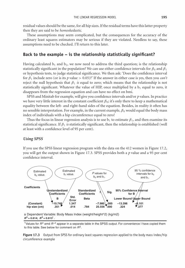
OTE/SPH OTE/SPH
JWBK220-17 December 21, 2007 20:24 Char Count= 0
THE LINEAR REGRESSION MODEL 195
residual values should be the same, for all hip sizes. If the residual terms have this latter propertythen they are said to be homoskedastic.
These assumptions may seem complicated, but the consequences for the accuracy of theordinary least squares estimators may be serious if they are violated. Needless to say, theseassumptions need to be checked. I’ll return to this later.
Back to the example – is the relationship statistically significant?
Having calculated b1 and b2, we now need to address the third question; is the relationshipstatistically significant in the population? We can use either confidence intervals for β0 and β1
or hypothesis tests, to judge statistical significance. We then ask: ‘Does the confidence intervalfor β1 include zero (or is its p value > 0.05)?’ If the answer in either case is yes, then you can’treject the null hypothesis that β1 is equal to zero; which means that the relationship is notstatistically significant. Whatever the value of HIP, once multiplied by a b1 equal to zero, itdisappears from the regression equation and can have no effect on bmi.
SPSS and Minitab for example, will give you confidence intervals and/or p values. In practicewe have very little interest in the constant coefficient β0; it’s only there to keep a mathematicalequality between the left- and right-hand sides of the equation. Besides, in reality it often hasno sensible interpretation. For example, in the current example, β0 would equal the body massindex of individuals with a hip circumference equal to zero!
Thus the focus in linear regression analysis is to use b1 to estimate β1, and then examine itsstatistical significance. If β1 is statistically significant, then the relationship is established (wellat least with a confidence level of 95 per cent).
Using SPSS
If you use the SPSS linear regression program with the data on the 412 women in Figure 17.2,you will get the output shown in Figure 17.3. SPSS provides both a p value and a 95 per centconfidence interval.
CoefficientsUnstandardized
CoefficientsStandardized Coefficients Sig.t 95% Confidence Interval
for B
B Std. Error Beta Lower Bound Upper Bound
(Constant) –10.748 1.347 –7.980 .000 –13.396 –8.101hip size (cm) .351 .014 .784 25.556 .000 .324 .377
Values for R
1
1 2 amd R
–2 appear in a separate table in the SPSS output. For convenience I have copied them
to this table. See below for comment on R 2.
Estimated
b0 value.
Estimated
b1 value. P values for
b0 and b1.
95 % confidence
intervals for b0
and b1.
Figure 17.3 Output from SPSS for ordinary least squares regression applied to the body mass index/hipcircumference example
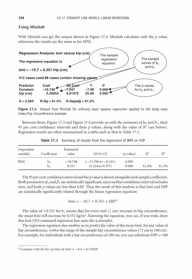
OTE/SPH OTE/SPH
JWBK220-17 December 21, 2007 20:24 Char Count= 0
196 CH 17 STRAIGHT LINE MODELS: LINEAR REGRESSION
Using Minitab
With Minitab you get the output shown in Figure 17.4. Minitab calculates only the p value,otherwise the results are the same as for SPSS.
Regression Analysis: bmi versus hip (cm)
The regression equation is
bmi = –10.7 + 0.351 hip (cm)
412 cases used 88 cases contain missing values
Predictor Coef SE Coef T PConstant –10.749 1.347 –7.98 0.000 hip (cm) 0.35053 0.01372 25.56 0.000
S = 2.284 R-Sq = 61.4% R-Sq(adj) = 61.3%
The sample
regression
equation.
The sample
values of b0
and b1.
The p values
for b0 and b1.
Figure 17.4 Output from Minitab for ordinary least squares regression applied to the body massindex/hip circumference example
Between them, Figure 17.3 and Figure 17.4 provide us with the estimates of b0 and b1, their95 per cent confidence intervals and their p values, along with the value of R2 (see below).Regression results are often summarised in a table such as that in Table 17.1.
Table 17.1 Summary of results from the regression of BMI on HIP
Dependent Estimatedvariable Coefficient value (95 % CI) (p-value) R2 R2
BMI b0 −10.748 (−13.396 to −8.101) 0.000b1 0.351 (0.324 to 0.377) 0.000 61.4% 61.3%
The 95 per cent confidence interval and the p value is shown alongside each sample coefficient.Both parameters β0 andβ1 are statistically significant, since neither confidence interval includeszero, and both p values are less than 0.05. Thus the result of this analysis is that bmi and HIPare statistically significantly related through the linear regression equation:
bmi = −10.7 + 0.351 × HIP 4
The value of +0.351 for b1 means that for every unit (1 cm) increase in hip circumference,the mean bmi will increase by 0.351 kg/m2. Knowing the equation, you can, if you wish, drawthis best OLS estimated regression line onto the scatterplot.
The regression equation also enables us to predict the value of the mean bmi, for any value ofhip circumference, within the range of the sample hip circumference values (71 cm to 140 cm).For example, for individuals with a hip circumference of 100 cm, you can substitute HIP = 100
4 Compare with the by-eye line of: bmi = −8.4 + 0.33HIP.

OTE/SPH OTE/SPH
JWBK220-17 December 21, 2007 20:24 Char Count= 0
THE LINEAR REGRESSION MODEL 197
into the sample regression equation and thus calculate a value for mean bmi of 24.4 kg/m2.Prediction of bmi for hip circumference values outside the original sample data range requiresa more complex procedure, and will not be discussed here.
Exercise 17.3 What does the model predict for mean bmi for women with a hip circum-ference of 130 cm?
Goodness-of-fit – R2
Figure 17.3, Figure 17.4, and Table 17.1, contain values for something called R2, and R2 (SPSScalls the latter ‘R-Sq(adj)’). What are these? Suppose you think that waist circumference, WST,might be used as a measure of obesity, so you repeat the above procedure, but use WST as yourindependent variable instead of HIP. Your results indicate that b1 is again statistically signifi-cant. Now you have two models, in both of which the independent variable has a statisticallysignificant linear relationship with bmi. But which model is best? The one with HIP or the onewith WST?
In fact, the best model is the one that ‘explains’ the greatest proportion of the observedvariation in bmi from subject to subject, that is, has the best goodness-of-fit. One such measureof this explanatory power is known as the coefficient of determination, and is denoted R2.
As a matter of interest, R2 =0.614, or 61.4 per cent, for the hip circumference model, and R2 =0.501, or 50.1 per cent, for the waist circumference model. So variation in hip circumferenceexplains 61 per cent of the observed variation in bmi, while variation in waist circumferenceexplains only 50 per cent of the variation. So using hip circumference as your independentvariable gives you a better fitting model.
Here’s a thought. If only 61 per cent of the variation in bmi is explained by variation in hipcircumference, what is the remaining 39 per cent explained by? One possibility is that the rest isdue to chance, to random effects. A more likely possibility is that, as well as hip circumference,there are other variables that contribute something to the variation in bmi from subject tosubject. It would be naıve to believe that variation in bmi, or any clinical variable, can be totallyexplained by only one variable. Which brings us neatly to the multiple linear regression model.
Multiple linear regression
A simple linear regression model is one with only one independent variable on the right-handside. When you have more than one independent variable the regression model is called a mul-tiple linear regression model. For example, having noticed that both hip and waist circumferenceare each significantly related to bmi, you might include them both as independent variables. Thisgives the following model, which now gives us mean bmi for the various possible combinationsof sample values of both HIP and WST:
bmi = b0 + b1 × HIP + b2 × WST

OTE/SPH OTE/SPH
JWBK220-17 December 21, 2007 20:24 Char Count= 0
198 CH 17 STRAIGHT LINE MODELS: LINEAR REGRESSION
EstimatedVariable coefficient (95 % CI) (p-value) R2 R2
Model (& constant b0= −10.748 (−13.396 to −8.101) 0.000dependentvariable)1. BMI HIP b1 = 0.351 (0.324 to 0.377) 0.000 61.4% 61.3%
2. BMI constant b0 = −9.645 (−12.250 to −7.041) 0.000HIP b1 = 0.261 (0.219 to 0.303) 0.000WST b2 = 0.105 (0.065 to 0.144) 0.000 63.7% 63.5%
Figure 17.5 Multiple linear regression output (last three rows) from SPSS for model with body massindex as the dependent variable and both hip and waist circumferences as independent variables
Note that when we move from the simple to the multiple linear regression model, we need toadd a further basic assumption to the list on p. 194. That is, that there is no perfect associationor collinearity between any of the independent variables. When this assumption is not met, werefer to the model as having multicollinearity. The consequence of this condition is wide andthus imprecise confidence intervals.
If you use SPPS to derive the OLS estimators of the above model containing both HIP andWST you get the output shown in Figure 17.5 (last three rows).
Using these results, we can write the estimated multiple linear regression model as:
bmi = −9.645 + 0.261 × HIP + 0.105 × WST
So for example, for all of those women in the sample for whom HIP = 100 and WST = 75,then the above equation estimates their mean bmi to be:
bmi = −9.645 + 0.261 × 100 + 0.105 × 75 = 24.330
The other information in Figure 17.5 tells us that parameters β1 and β2 are both statisticallysignificant as neither confidence interval includes zero. Compared to the simple regressionmodel containing only HIP as an independent variable, goodness of fit has improved marginally,with R2 increasing from 61.4 per cent to 63.7 per cent. Note that in the multiple linear regressionmodel, R2 measures the explanatory power with all of the variables currently in the model actingtogether.
Exercise 17.4 If we add ‘age’ as a third independent variable to the bmi model, thenMinitab produces the results shown in Figure 17.6. (a) Comment on the statistical sig-nificance of the three independent variables. (b) How does an increase in age effect meanbody mass index values? (c) Has goodness of fit improved compared to the model withonly HIP and WST included? (d) What is the mean body mass index of all of those womenin the sample with a hip circumference of 100 cm, and a waist circumference of 75 cm,who are aged: (i) 30; (ii) 60?

OTE/SPH OTE/SPH
JWBK220-17 December 21, 2007 20:24 Char Count= 0
THE LINEAR REGRESSION MODEL 199
Regression Analysis : BMI versus hip(cm), waist(cm), Age
The regression equation is
BMI = - 12.4 + 0.289 hip(cm) + 0.125 waist(cm) - 0.0249 Age
Predictor Coef SE Coef T P Constant -12.425 1.353 -9.18 0.000 Hip(cm) 0.28876 0.02041 14.15 0.000 Waist(cm) 0.12549 0.01762 7.12 0.000 Age -0.02492 0.01104 -2.26 0.024
S = 2.24817 R-Sq = 64.0% R-Sq(adj) = 63.8%
Figure 17.6 Output from Minitab for regression of bmi on HIP, WST and AGE
Dealing with nominal independent variables: design variablesand coding
In linear regression, most of the independent variables are likely to be metric, or at least ordinal.However any independent variable that is nominal must be coded into a so-called design (ordummy) variable, before being entered into a model. There is only space for a brief descriptionof the process here.
As an example, suppose in a study of hypertension, you have systolic blood pressure (SBP)as your dependent variable, and age (AGE) and smoking status (SMK), as your independentvariables. SMK, is a nominal variable, having the categories: non-smoker, ex-smoker, andcurrent smoker. This gives the model:
SBP = b0 + b1AGE + b2SMK (1)
To enter SMK into your computer, you would have to score the three smoking categories insome way – but how? As 1, 2, 3, or as 0, 1, 2, etc. As you can imagine, the scores you attributeto each category will effect your results. The answer is to code these three categories into twodesign variables. Note that the number of design variables is always one less than the numberof categories in the variable being coded. In this example, we set out the coding design as inTable 17.2.
So you replace smoking status (with its dodgy numbering), with two new design variables,D1 and D2, which take the values in Table 17.2, according to smoking status. The model now
Table 17.2 Coding design for a nominalvariable with three categories
Design variable values
Smoking status D1 D2
Non-smoker 0 0Ex-smoker 0 1Current smoker 1 0

OTE/SPH OTE/SPH
JWBK220-17 December 21, 2007 20:24 Char Count= 0
200 CH 17 STRAIGHT LINE MODELS: LINEAR REGRESSION
becomes: Y = b0 + b1Age + b2D1 +b3D2. For example, if the subject is a current smoker,D1 = 1 and D2 = 0; if an ex-smoker, D1 = 0 and D2 = 1; if a non-smoker, D1 = 0 and D2 =0. Notice in the last situation that the smoking status variable effectively disappears from themodel.
This coding scheme can be extended to deal with nominal variables with any reasonablenumber of categories, depending on the sample size.5 The simplest situation is a nominalvariable with only two categories, such as sex, which can be represented by one design variablewith values 0 (if male) or 1 (if female).
Exercise 17.5 The first three subjects in the study of systolic blood pressure and itsrelationship with age and smoking status are, a 50-year-old smoker, a 55-year-old non-smoker and a 35-year-old ex-smoker, respectively. Fill in the first three rows of the datasheet shown in Table 17.3, as appropriate.
Table 17.3 Data sheet for systolic bloodpressure relationship
Subject Age D1 D2
123
Model building and variable selection
At the beginning of this chapter we chose body mass index as the variable to explain or modelsystolic blood pressure. In practice, researchers may or may not have an idea about whichvariables they think are relevant in explaining the variation in their dependent variable. Whetherthey do or they don’t will influence their decision as to which variables to include in their model,i.e. their variable selection procedure.
There are two main approaches to the model-building process:� First, automated variable selection – the computer does it for you. This approach is perhapsmore appropriate if you have little idea about which variables are likely to be relevant in therelationship.� Second, manual selection – you do it! This approach is more appropriate if you have aparticular hypothesis to test, in which case you will have a pretty good idea which independent
5 As a rule of thumb, you need at the very least 15 subjects for each independent variable in your model. If you’vegot, say, five ordinal and/or metric independent variables in your model, you would need a minimum of 75subjects. If you want also to include a single nominal variable with five categories (i.e. four design variables),you would need another 60 subjects. In these circumstances, it might help to amalgamate some categories.
OTE/SPH OTE/SPH
JWBK220-17 December 21, 2007 20:24 Char Count= 0
MODEL BUILDING AND VARIABLE SELECTION 201
variable is likely to be the most relevant in explaining your dependent variable. However,you will almost certainly want to include other variables to control for confounding (seep. 81 for an account of confounding).
Both of these methods have a common starting procedure, as follows:6� Identify a list of independent variables that you think might possibly have some role inexplaining the variation in your dependent variable. Be as broad-minded as possible here.� Draw a scatterplot of each of these candidate variables (if it is not a nominal variable), againstthe dependent variable. Examine for linearity. If any of the scatterplots show a strong, butnot a linear relationship with the dependent variable, you will need to code them first beforeentering them into the computer data sheet. For example, you might find that the relationshipbetween the dependent variable and ‘age’ is strong but not linear. One approach is to groupthe age values into four groups, using its three quartile values to define the group boundaries,and then code the groups with three design variables.� Perform a series of univariate regressions, i.e. regress each candidate independent variablein turn against the dependent variable. Note the p-value in each case.� At this stage, all variables that have a p-value of at least 0.2 should be considered for inclusion inthe model. Using a p-value less than this may fail to identify variables that could subsequentlyturn out to be important in the final model.
With this common starting procedure out of the way, we can briefly describe the two variableselection approaches, starting with automated methods.
Automated variable selection methods� Forwards selection: The program starts with the variable that has the lowest p-value from theunivariate regressions. It then adds the other variables one at a time, in lowest p-value order,regressing each time, retaining all variables with p-values < 0.05 in the model.� Backwards selection: The reverse of forwards selection. The program starts with all of thecandidate variables in the model, then the variable that has highest p-value>0.05, is removed.Then the next highest p-value variable, and so on, until only those variables with a p-value< 0.05 are left in the model, and all other variables have been discarded.� Forwards or backwards stepwise selection: After each variable is added (or removed), the vari-ables which were already (or are left) in the model are re-checked for statistical significance;if no longer significant they are removed. The end result is a model where all variables havea p-value < 0.05.
6 Note that the criteria used by the different computer regression programs to select and de-select variablesdiffer.
OTE/SPH OTE/SPH
JWBK220-17 December 21, 2007 20:24 Char Count= 0
202 CH 17 STRAIGHT LINE MODELS: LINEAR REGRESSION
These automated procedures have a number of disadvantages, although they may be usefulwhen researchers have little idea about which variables are likely to be relevant. As an exampleof the automated approach, the authors of a study into the role of arginase in sickle cell disease,in which the outcome variable was log10 arginase activity (Morris et al. 2005), comment:
This modelling used a stepwise procedure to add independent variables, beginningwith the variables most strongly associated with log10arginase with P ≤ 0.15. Deletionof variables after initial inclusion in the model was allowed. The procedure continueduntil all independent variables in the final model had P ≤ 0.05, adjusted for otherindependent variables, and no additional variables had P ≤ 0.05.
Manual variable selection methods
Manual, DIY methods, are often more appropriate if the investigators know in advance whichis likely to be their principal independent variable. They will include this variable in the model,together with any other variables that they think may be potential confounders. The identity ofpotential confounders will have been established by experience, a literature search, discussionswith colleagues and patients and so on. There are two alternative manual selection procedures:� Backward elimination: The main variable plus all of the potentially confounding variables are
entered into the model at the start. The results will then reveal which variables are statisticallysignificant (p-value < 0.05). Non-significant variables can then be dropped, one at a time indecreasing p-value order, from the model, regressing each time. However, if the coefficientof any of the remaining variables changes markedly7 when a variable is dropped, the variableshould be retained, since this may indicate that it is a confounder.� Forward elimination: The main explanatory variable of interest is put in the model, and theother (confounding) variables are added one at a time in order of (lowest) p-value (fromthe univariate regressions). The regression repeated each time a variable is added. If theadded variable is statistically significant it is retained, if not it is dropped, unless any of thecoefficients of the existing variables change noticeably, suggesting that the new variable maybe a confounder.
The end result of either of these manual approaches should be a model containing the samevariables (although this model may differ from a model derived using one of the automatedprocedures). In any case, the overall objective is parsimony, i.e. having as few explanatoryvariables in the model as possible, while at the same time explaining the maximum amountof variation in the dependent variable. Parsimony is particularly important when sample sizeis on the small side. As a rule of thumb, researchers will need at least 15 observations for eachindependent variable to ensure mathematical stability, and at least 20 observations to obtainreasonable statistical reliability (e.g. narrow-ish confidence intervals).
As an example of the manual backwards selection approach, the authors of a study ofbirthweight and cord serum EPA concentration (Grandjean et al. 2000), knew that cord serum
7 There is no rule about how big a change in a coefficient should be considered noteworthy. A value of 10 percent has been suggested, but this seems on the small side.

OTE/SPH OTE/SPH
JWBK220-17 December 21, 2007 20:24 Char Count= 0
MODEL BUILDING AND VARIABLE SELECTION 203
EPA was their principal independent variable, and but wanted to include possible confoundersin their model. They commented:
Multiple regression analysis was used to determine the relevant importance of pre-dictors of the outcome (variable). Potential confounders were identified on the basisof previous studies, and included maternal height and weight, smoking during preg-nancy, diabetes, parity, gestational length, and sex of the child. Covariates8 were keptin the final regression equation if statistically significant (p < 0.01) after backwardselimination.
Incidentally, the main independent variable, cord serum concentration, was found to bestatistically significant (p-value = 0.037), as were all of the confounding variables.
Goodness-of-fit again: R 2
When you add an extra variable to an existing model, and want to compare goodness-of-fitwith the old model, you need to compare not R2, but adjusted R2, denoted R2. The reasonsdon’t need to concern us here, but R2 will increase when an extra independent variable is addedto the model, without there necessarily being any increase in explanatory power. However, if R2
increases, then you know that the explanatory power (its ability to explain more of the variationin the dependent variable) of the model has increased. From Figure 17.3 or Figure 17.4, R2 =0.613 in the simple regression model with only hip circumference as an independent variable.From Figure 17.5, with both hip and waist circumferences included, R2 increases to 0.635, sothis multiple regression model does show a small but real improvement in goodness-of-fit, andwould be preferred to either of the simple regression models. Of course, you might decide toexplore the possibility that other independent variables might also have a significant role toplay in explaining variation in body mass index; age is one obvious contender, as is sex, andshould be included in the model.
Exercise 17.6 Table 17.4 contains the results of a multiple linear regression model froma cross-section study of disability, among 1971 adults aged 65 and over in 1986 (Kavanaghand Knapp 1998). The objective of the study was to examine the utilisation rates of generalpractitioners’ time by elderly people resident in communal establishments. The dependentvariable was the natural log of weekly utilisation (minutes) per resident.9 There were 10independent variables, as shown in the figure.
(a) Identify those independent variables whose relationship with the dependent variableis statistically significant. (b) What is the effect on the natural log of utilisation time, andwhat is this in actual minutes, if there is an increase of: (i) one person in the number in a
8 i.e. independent variables.9 Probably because the researchers believed the utilisation rate to be skewed. See Figure 5.6 for an example of
transformed data.

OTE/SPH OTE/SPH
JWBK220-17 December 21, 2007 20:24 Char Count= 0
204 CH 17 STRAIGHT LINE MODELS: LINEAR REGRESSION
private residential home; (ii) one unit in the severity of disability score? (c) How much ofthe variation in general practitioners’ utilisation time is explained by the variation in theindependent variables?
Table 17.4 Sample regression coefficients from a linear regression model,where the dependent variable is the natural log of the utilisation time (minutes)of GPs, by elderly patients in residential care. The independent variables are asshown. Reproduced from BMJ, 317, 322–7, courtesy of BMJ Publishing Group
Explanatory variable β coefficient (SE) P value
Constant 0.073 (0.353) 0.837Age <0.0005 (0.004) 0.923Male sex 0.024 (0.060) 0.685Severity of disability 0.043 (0.005) <0.0001Mental disorders 0.120 (0.061) 0.047Nervous system disorders 0.116 (0.062) 0.063Circulatory system disorders 0.122 (0.066) 0.063Respiratory system disorders 0.336 (0.115) 0.003Digestive system disorders 0.057 (0.070) 0.415Type of accommodation:
Local authority — —Voluntary residential home −0.084 (0.183) 0.649Voluntary nursing home 0.562 (0.320) 0.079Private residential home −0.173 (0.157) 0.272Private nursing home 0.443 (0.228) 0.053
Size of establishment (No of residents)Local authority −0.004 (0.003) 0.170Voluntary residential home −0.004 (0.002) 0.069Voluntary nursing home −0.002 (0.002) 0.245Private residential home 0.006 (0.002) 0.017Private nursing home −0.007 (0.007) 0.362
R2 = 0.1098, F(17,415) = 9.71, P = <0.0001. Sample size = 1971 in 433 sampling units.
Adjustment and confounding
One of the most attractive features of the multiple regression model is its ability to adjust for theeffects of possible association between the independent variables. It’s quite possible that two ormore of the independent variables will be associated. For example, hip (HIP) and waist (WST)circumference are significantly positively associated with r = +0.783 and p-value = 0.000. Theconsequence of such association is that increases in HIP are likely to be accompanied by increasesin WST. The increase in HIP will cause bmi to increase both directly, but also indirectly viaWST. In these circumstances it’s difficult to tell how much of the increase in bmi is due directlyto an increase in HIP, and how much to the indirect effect of an associated increase in WST.
The beauty of the multiple regression model is that each regression coefficient measures onlythe direct effect of its independent variable on the dependent variable, and controls or adjustsfor any possible interaction from any of the other variables in the model. In terms of the results inFigure 17.5, an increase in HIP of 1 cm will cause mean bmi to increase by 0.261 kg/m2 (the value
OTE/SPH OTE/SPH
JWBK220-17 December 21, 2007 20:24 Char Count= 0
MODEL BUILDING AND VARIABLE SELECTION 205
of b1), and all of this increase is caused by the change in hip circumference (plus the inevitablerandom error). Any effect that a concomitant change in waist circumference might have isdiscounted. The same applies to the value of -0.0249 for b3 on the ‘age’ variable in Figure 17.6.
We can use the adjustment property to deal with confounders in just the same way. Youwill recall that a confounding variable has to be associated with both one of the independentvariables and the dependent variable (see the discussion in Chapter 6). Notice that the coefficientb1, which was 0.351 in the simple regression model with HIP the only independent variable,decreases to 0.261 with two independent variables. A marked change like this in the coefficientof a variable already in the model when a new variable is added, is an indication that one ofthe variables is possibly a confounder. As you have already seen in the model-building sectionabove, in these circumstances both variables should be retained in the model.
An example from practice
Table 17.5 is from a cross-section study into the relationship between bone lead and blood leadlevels, and the development of hypertension in 512 individuals selected from a cohort study(Cheng et al. 2001). The table shows the outcome from three multiple linear regression modelswith systolic blood pressure as the dependent variable. The first model includes blood leadas an independent variable, along with six possible confounding variables.10 The second andthird models were the same as the first model, except tibia and patella lead, respectively, weresubstituted for blood lead. The results include 95 per cent confidence intervals and the R2 foreach model.
As the table shows, the tibia lead model has the best goodness-of-fit (R2 = 0.1015), buteven this model only explains 10 per cent of the observed variation in systolic blood pressure.However, this is the only model that supports the relationship between hypertension and leadlevels; the 95 per cent confidence interval for tibia lead (0.02 to 2.73) does not include zero.The only confounders statistically significant in all three models are age, family history ofhypertension and calcium intake.
Exercise 17.7 From the results in Table 17.5: (a) which independent variables are statis-tically significant in all three models? (b) Explain the 95 per cent confidence interval of(0.28 to 0.64) for age in the blood lead model. (c) In which model does a unit (1 year)increase in age change systolic blood pressure the most?
Diagnostics – checking the basic assumptions of the multiple linearregression model
The ordinary least squares method of coefficient estimation will only produce the best es-timators if the basic assumptions of the model are satisfied. That is: a metric continuous
10 The inclusion of Age2 in the model is probably an attempt to establish the linearity of the relationship betweensystolic blood pressure and age. If the coefficient for Age2 is not statistically significant then the relationshipis probably linear.
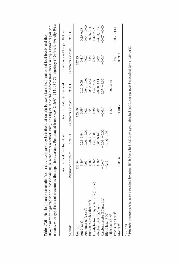
OTE/SPH OTE/SPH
JWBK220-17 December 21, 2007 20:24 Char Count= 0
Tabl
e17
.5M
ulti
ple
regr
essi
onre
sult
sfr
oma
cros
s-se
ctio
nst
udy
into
the
rela
tion
ship
betw
een
bone
lead
and
bloo
dle
adle
vels
and
the
deve
lopm
ent
ofhy
pert
ensi
onin
512
indi
vidu
als
sele
cted
from
aco
hort
stud
y.Th
efig
ure
show
the
outc
ome
from
thre
em
ulti
ple
linea
rre
gres
sion
mod
els,
wit
hsy
stol
icbl
ood
pres
sure
asth
ede
pend
ent
varia
ble.
Repr
oduc
edfr
omAm
er.J.
Epid
.,15
3,16
4–71
,co
urte
syof
Oxfo
rdUn
iver
sity
Pres
s
Bas
elin
em
odel
+bl
ood
lead
Bas
elin
em
odel
+ti
bia
lead
Bas
elin
em
odel
+p
atel
lale
ad
Var
iabl
ePa
ram
eter
esti
mat
e95
%C
IPa
ram
eter
esti
mat
e95
%C
IPa
ram
eter
esti
mat
e95
%C
I
Inte
rcep
t12
8.34
125.
9012
7.23
Age
(yea
rs)
0.46
∗0.
28,0
.64
0.39
∗0.
20,0
.58
0.44
∗0.
26,0
.63
Age
squ
ared
(yea
rs2)
−0.0
2∗−0
.04,
−0.0
0−0
.02∗
−0.0
4,−0
.00
−0.0
2∗−0
.04,
−0.0
0B
ody
mas
sin
dex
(km
/m2)
0.36
∗0.
01,0
.72
0.33
−0.0
2,0.
690.
35−0
.00,
0.71
Fam
ilyh
isto
ryof
hyp
erte
nsi
on(y
es/n
o)4.
36∗
1.42
,7.3
04.
36∗
1.47
,7.2
54.
32∗
1.42
,7.2
2A
lcoh
olin
take
(g/d
ay)
0.08
∗0.
00,0
.149
0.07
−0.0
0,0.
140.
07−0
.00,
0.14
Cal
ciu
min
take
(10
mg/
day)
−0.0
4∗−0
.08,
−0.0
0−0
.04∗
0.07
,−0.
00−0
.04∗
−0.0
7,−0
.00
Blo
odle
ad(S
D)†
−0.1
3−1
.35,
1.09
Tib
iale
ad(S
D)†
1.37
∗0.
02,2
.73
Pate
llale
ad(S
D)†
0.57
−0.7
1,1.
84M
odel
R2
0.09
560.
1015
0.09
50
∗ p<
0.05
†Pa
ram
eter
esti
mat
esar
eba
sed
on1
stan
dar
dde
viat
ion
(SD
)in
bloo
dle
adle
vel(
4.03
μg/
dl)
,tib
iale
adle
vel(
13.6
5μ
g/g)
,an
dp
atel
lale
adle
vel(
19.5
5μ
g/g)
.
206

OTE/SPH OTE/SPH
JWBK220-17 December 21, 2007 20:24 Char Count= 0
MODEL BUILDING AND VARIABLE SELECTION 207
dependent variable; a linear relationship between the dependent and each independent vari-able; error terms with constant spread and Normally distributed; and the independent vari-ables not perfectly correlated with each other. How can we check that these assumptions aresatisfied?
� A metric continuous dependent variable. Refer to Chapter 1 if you are unsure how to identifya metric continuous variable.� A linear relationship between the dependent variable and each independent variable. Easiest toinvestigate by plotting the dependent variable against each of the independent variables; thescatter should lie approximately around a straight line.11 The other possibility is to plot theresidual values against the fitted values of the independent variable (bmi in our example).These are the values the estimated regression equation would give for mean bmi, for everycombination of values of HIP and WST. The scatter should be evenly spread around zero,with no discernible pattern, such as in Figure 17.7(a).� The residuals have constant spread across the range of values of the independent variable. Checkwith a plot of the residual values against the fitted values of bmi. The spread of the residualsshould be fairly constant around the zero value, across the range of fitted values of theindependent variable. Figure 17.7(b) is an example of non-constant variance. The spreadappears to increase as the value of the independent variable increases. Figure 17.7(c) is anexample of both non-linearity and non-constant variance.� The residuals are Normally distributed for each fitted value of the independent variable. Thisassumption can be checked with a histogram of the residuals. For our bmi example, thehistogram in Figure 17.10 indicates that, apart from a rather worrying outlier, the distributionis Normal. You might want to identify which woman this outlier represents and check herdata for anomalies.� The independent variables are not perfectly correlated with each other. Unfortunately, this isnot an easy assumption to check. Some degree of correlation is almost certain to exist amongsome of the independent variables.
Exercise 17.8 (a) Explain briefly each of the basic assumptions of the multiple linearregression model. (b) With the aid of sketches where appropriate, explain how we can testthat these assumptions are satisfied.
11Notice that we only have to establish this property of linearity for the metric independent variables in themodel. Any binary variables are linear by default – they only have two points, which can be joined with astraight line. Any ordinal independent variables will have to be expressed as binary dummies – again linear bydefault for the same reason.

OTE/SPH OTE/SPH
JWBK220-17 December 21, 2007 20:24 Char Count= 0
208 CH 17 STRAIGHT LINE MODELS: LINEAR REGRESSION
20100
–2
–1
0
1
2
independent variable
resid
ual
20100
–4
–3
–2
–1
0
1
2
3
4
independent variable
resid
ual
20100
–4
–3
–2
–1
0
1
2
3
4
independent variable
resid
ual
These residuals
appear to be evenly
spread around zero,
with no discernible
pattern, suggesting
linearity.
(a)
These residuals do
not have constant
spread, (the spread
seems to get bigger
as X increases). . .(b)
… and these
residuals are
neither linear
nor uniformly
spread. (c)
Figure 17.7 Testing the basic assumptions of the linear regression model by plotting the residualsagainst the fitted values of the regression equation
An example from practice
Let’s apply the above ideas to check the basic assumptions of the ordinary least squares methodas applied to the multiple linear regression of body mass index (bmi) on hip circumference(HIP) and waist circumference (WST), which we considered earlier. Recall that the model was:
bmi = b0 + b1 × HIP + b2 × WST
and that both HIP and WST were found to be statistically significant explainers of the variationin bmi.

OTE/SPH OTE/SPH
JWBK220-17 December 21, 2007 20:24 Char Count= 0
MODEL BUILDING AND VARIABLE SELECTION 209
The first assumption is that bmi is a metric continuous dependent variable, which it is. Thesecond assumption is that the relationship between bmi and HIP and bmi and WST shouldbe linear. If we draw a scatterplot of bmi against each of these variables, we get the scatterplotsshown in Figure 17.8. These indicate a reasonable degree of linearity in each case. Notice thoughthat the spread in bmi appear to get larger as WST increases.
The third assumption is that the residuals have constant spread over the range of fittedvalues of the model. Figure 17.9 is a plot of these residuals against the fitted values of bmi. Thisthird assumption appears not to be completely satisfied. The spread of residual values appearto increase as the fitted bmi value increases. This may be an indication that an importantindependent variable is missing from the model. However, the distribution of points aboveand below the zero line seems reasonably symmetric, supporting the linearity assumptiondemonstrated in the scatterplots.
The fourth assumption of the Normality of the residuals is checked with the histogram ofthe residuals, see Figure 17.10. These do appear to be reasonably Normal, although there issome suggestion of positive skew.
Thus all of the basic assumptions appear to be reasonably well satisfied (apart from the multi-colinearity assumption which we have not tested), and the ordinary least squares regressionestimates b1 and b2 of the population parameters β1 and β2, are the ‘best’ we can get, i.e. theyfit the data at least as well as any other estimates.12
Multiple linear regression is popular in clinical research. Much more popular though, forreasons which will become clear in the next chapter, is logistic regression.
Analysis of variance
Analysis of variance (ANOVA) is a procedure that aims to deal with the same problems as linearregression analysis, and many medical statistics books contain at least one chapter describingANOVA. It has a history in the social sciences, particularly psychology. However, regressionand ANOVA are simply two sides of the same coin – the generalised linear model. As Andy Field(2000) says:
Anova is fine for simple designs, but becomes impossibly cumbersome in more com-plex situations. The regression model extends very logically to these more complexdesigns, without getting bogged down in mathematics. Finally, the method (Anova)becomes extremely unmanageable in some circumstances, such as unequal samplesizes. The regression method makes these situations considerably more simple.
In view of the fact that anything ANOVA can do, regression can also do, and, for me anyway,do it in a way that’s conceptually easier, I am not going to discuss ANOVA in this book. If youare interested in exploring ANOVA in more detail, you could do worse than read Andy Field’sbook, or that of Altman (1991).
12There are other methods of estimating the values of the regression parameters, which I don’t have the spaceto consider. However, provided the basic assumptions are satisfied, none will be better than the ordinary leastsquares estimators.

OTE/SPH OTE/SPH
JWBK220-17 December 21, 2007 20:24 Char Count= 0
210 CH 17 STRAIGHT LINE MODELS: LINEAR REGRESSION
hip(cm)
BM
I
1401301201101009080
50
45
40
35
30
25
20
15
Scatterplot of BMI vs hip(cm)
waist(cm)
BM
I
1101009080706050
45
40
35
30
25
20
15
Scatterplot of BMI vs waist(cm)
Figure 17.8 Scatterplots of the dependent variable body mass index (bmi) against hip circumference(HIP) – top plot – and waist circumference (WST) – bottom plot. As you can see, both plots indicate amore-or-less linear relationship

OTE/SPH OTE/SPH
JWBK220-17 December 21, 2007 20:24 Char Count= 0
MODEL BUILDING AND VARIABLE SELECTION 211
Fitted Value
Re
sid
ua
l
3530252015
15
10
5
0
–5
–10
Residuals Versus the Fitted Values
(response is BMI)
Figure 17.9 A plot of the residuals versus the fitted bmi values, as a check of the basic assumptionsof the linear regression model
Residual
Fre
quency
129630–3–6
120
100
80
60
40
20
0
Histogram of the Residuals
(response is BMI)
Figure 17.10 A plot of the residuals in the body mass index example, showing reasonable Normality,and thus satisfying the fourth assumption governing the use of the ordinary least squares estimationmethod

OTE/SPH OTE/SPH
JWBK220-17 December 21, 2007 20:24 Char Count= 0
212

OTE/SPH OTE/SPH
JWBK220-18 November 28, 2007 11:10 Char Count= 0
18Curvy models: logistic regression
Learning objectives
When you have finished this chapter you should be able to:� Explain why a linear regression model is not appropriate if the dependent variable isbinary.� Explain what the logit transformation is and what it achieves.� Write down the logic regression equation.� Explain the concept of linearity and outline how this can be tested for and dealt with.� Explain how estimates of the odds ratios can be derived directly from the regressionparameters.� Describe how the statistical significance of the population odds ratio is determined.� Interpret output from SPSS and Minitab logistic regression programs.
A second health warning!
Although the maths underlying the logistic regression model is perhaps more complicated thanthat in linear regression, once more a brief description of the underlying idea is necessary ifyou are to gain some understanding of the procedure and be able to interpret logistic computeroutputs sensibly.
Medical Statistics from Scratch, Second Edition David BowersC© 2008 John Wiley & Sons, Ltd

OTE/SPH OTE/SPH
JWBK220-18 November 28, 2007 11:10 Char Count= 0
214 CH 18 CURVY MODELS: LOGISTIC REGRESSION
Binary dependent variables
In linear regression the dependent or outcome variable must be metric continuous. In clinicalresearch, however, the outcome variable in a relationship will very often be dichotomous orbinary, i.e. will take only two different values: alive or dead; malignant or benign; male orfemale and so on. In addition, variables that are not naturally binary can often be made so.For example, birthweight might be coded ‘less than 2500 g’, and ‘2500 g or more’, Apgar scorescoded ‘less than 7’, ‘7 or more’, etc. In this chapter I want to show how a binary dependentvariable makes the linear regression model inappropriate.
Finding an appropriate model when the outcome variable is binary
If you are trying to find an appropriate model to describe the relationship between two variablesY and X, when Y, the dependent variable, is continuous, you can draw a scatterplot of Y againstX (Figure 17.2 is a good example) and if this has a linear shape you can model the relationshipwith the linear regression model. However, when the outcome variable is binary, this graphicalapproach is not particularly helpful.
For example, suppose you are interested in using the breast cancer/stress data from the studyreferred to in Table 1.6, to investigate the relationship between the outcome variable ‘diagnosis’,and the independent variable ‘age’. Diagnosis is, of course, a binary variable with two values:Y = 1 (malignant) or Y = 0 (benign). If we plot diagnosis against age, we get the scatterplotshown in Figure 18.1, from which it’s pretty well impossible to draw any definite conclusionsabout the nature of the relationship.
Age
Dia
gn
osis
(0=
be
nig
n)
8070605040
1.0
0.8
0.6
0.4
0.2
0.0
Scatterplot of Diagnosis (0=benign) vs Age
Figure 18.1 Scatter plot of diagnosis against age for the 332 women in the breast cancer and stressstudy referred to in Table 1.6

OTE/SPH OTE/SPH
JWBK220-18 November 28, 2007 11:10 Char Count= 0
THE LOGISTIC REGRESSION MODEL 215
Table 18.1 Proportion of women with malignant lump in each age group
Proportion with malignant lump, i.e. Y = 1.Or the probability that Y = 1, i.e. P(Y = 1) Midpoint of age group
0.140 450.226 550.635 650.727 75
The problem is that the large variability in age, in both the malignant and benign groups,obscures the difference in age (if any) between them. However, if you group the age data: 40-49,50-59, etc., and then calculate the proportion of women with a malignant diagnosis (i.e. withY = 1) in each group, this will reduce the variability, but preserve the underlying relationshipbetween the two variables. The results of doing this are shown in Table 18.1.
Notice that I’ve labelled the first column as the ‘Proportion with Y = 1, or the Probability thatY = 1, written as P(Y = 1)’. Here’s why. In linear regression, you will recall that the dependentvariable is the mean of Y for a given X. But what about a binary dependent variable? Can wefind something analogous to the mean? As it happens, the mean of a set of binary, zero or one,values is the same as the proportion of ones,1 so an appropriate equivalent version of the binarydependent variable would seem to be ‘Proportion of (Y = 1)s’.
But proportions can be interpreted as probabilities (see Chapter 8). So the dependent variablebecomes the ‘Probability that Y = 1’, or P(Y = 1), for a given value of X. For example theprobability of a malignant diagnosis (Y = 1) for all of those women aged 40, which we canwrite as, P(Y = 1) given X = 40.
You can see in Table 18.1, the proportion with malignant breast lumps (the probability thatY = 1) increases with age, but does it increase linearly? A scatterplot of the proportion withmalignant lumps, Y = 1, against group age midpoints is shown in Figure 18.2, which doessuggest some sort of relationship between the two variables. But it’s definitely not linear, so alinear regression model won’t work. In fact, the curve has more of an elongated S shape, sowhat we need is a mathematical equation that will give such an S-shaped curve.
There are several possibilities, but the logistic model is the model of choice. Not only becauseit produces an S-shaped curve, which we want, but, critically, it has a meaningful clinicalinterpretation. Moreover, the value of P(Y = 1) is restricted by the maths of the logistic modelto lie between zero and one, which is what we want, since it’s a probability.
The logistic regression model
The simple2 population logistic regression equation is:
P(Y = 1) = (eβ0+β1X)/(1 + eβ0+β1X) (1)
1 For example, the mean of the five values: 0, 1, 1, 0, 0 is 2/5 = 0.4, which is the same as the proportion of 1s,i.e. 2 in 5 or 0.4.
2 ‘Simple’ because there is only one independent variable – so far.
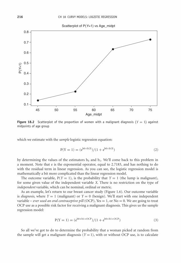
OTE/SPH OTE/SPH
JWBK220-18 November 28, 2007 11:10 Char Count= 0
216 CH 18 CURVY MODELS: LOGISTIC REGRESSION
Age_midpt
P(Y
=1
)
75706560555045
0.8
0.7
0.6
0.5
0.4
0.3
0.2
0.1
Scatterplot of P(Y=1) vs Age_midpt
Figure 18.2 Scatterplot of the proportion of women with a malignant diagnosis (Y = 1) againstmidpoints of age group
which we estimate with the sample logistic regression equation:
P(Y = 1) = (eb0+b1X)/(1 + eb0+b1X) (2)
by determining the values of the estimators b0 and b1. We’ll come back to this problem ina moment. Note that e is the exponential operator, equal to 2.7183, and has nothing to dowith the residual term in linear regression. As you can see, the logistic regression model ismathematically a bit more complicated than the linear regression model.
The outcome variable, P(Y = 1), is the probability that Y = 1 (the lump is malignant),for some given value of the independent variable X. There is no restriction on the type ofindependent variable, which can be nominal, ordinal or metric.
As an example, let’s return to our breast cancer study (Figure 1.6). Our outcome variableis diagnosis, where Y = 1 (malignant) or Y = 0 (benign). We’ll start with one independentvariable – ever used an oral contraceptive pill (OCP), Yes = 1, or No = 0. We are going to treatOCP use as a possible risk factor for receiving a malignant diagnosis. This gives us the sampleregression model:
P(Y = 1) = (eb0+b1×OCP)/(1 + eb0+b1×OCP) (3)
So all we’ve got to do to determine the probability that a woman picked at random fromthe sample will get a malignant diagnosis (Y = 1), with or without OCP use, is to calculate

OTE/SPH OTE/SPH
JWBK220-18 November 28, 2007 11:10 Char Count= 0
THE LOGISTIC REGRESSION MODEL 217
the values of b0 and b1 somehow, and then put them in the logistic regression equation, withOCP = 0, or OCP = 1.
Estimating the parameter values
Whereas the linear regression models use the method of ordinary least squares to estimatethe regression parameters β0 and β1, logistic regression models use what is called maximumlikelihood estimation. Essentially this means choosing the population which is most likely tohave generated the sample results observed. Figure 18.3 and Figure 18.4, respectively, show theoutput from SPSS’s and Minitab’s logistic regression program for the above OCP model.
SPSS’s and Minitab’s logistic regression program both give b0 = −0.2877 and b1 = −0.9507.If we substitute these values into the logistic regression model of Equation (3), we get:3
if OCP = 0 (has never used OCP), P(Y = 1) = 0.4286
if OCP = 1 (has used OCP), then P(Y = 1) = 0.2247
So a woman who has never used an oral contraceptive pill has a probability of getting amalignant diagnosis nearly twice that of a woman who has used an oral contraceptive. Ratherthan being a risk factor for a malignant diagnosis, in this sample the use of oral contraceptivesseems to confer some protection against a breast lump being malignant.
Logistic Regression
Number of cases included in the analysis: 332
Dependent Variable.. DIAGN Diagnosis
----------------- Variables in the Equation ------------------
Variable B S.E. Wald df Sig R
OCP –.9507 .2424 15.3809 1 .0001 –.1794Constant –.2877 .1628 3.1213 1 .0773
95% CI for Exp(B)Variable Exp(B) Lower Upper
OCP .3865 .2403 .6215
‘Exp (B)’ is the
odds ratio (see
text below).
The 95 %
confidence
interval for
the odds ratio.
The p-value
for b1. (OCP)
The value ofthe coefficient
b1.
Figure 18.3 Abbreviated output from SPSS for a logistic regression with diagnosis as the dependentvariable, and use of oral contraceptive pill (OCP) as the independent variable or risk factor
3 You’ll first need to work out the values of (b0 + b1 × OCP), then (1 + b0 + b1 × OCP), then raise e to eachof these powers. Then divide the former by the latter.

OTE/SPH OTE/SPH
JWBK220-18 November 28, 2007 11:10 Char Count= 0
218 CH 18 CURVY MODELS: LOGISTIC REGRESSION
Binary Logistic Regression: Diagnosis versus OCP?
Response Information
Variable Value Count Diagnosis 1 106 (Event)
0 226 Total 332
Logistic Regression Table Odds 95 % CI
Predictor Coef SE Coef Z P Ratio Lower Upper Constant – 0.2877 0.1628 –1.77 0.077 OCP? 1 – 0.9507 0.2424 –3.92 0.000 0.39 0.24 0.62
Log-Likelihood = – 200.009 Test that all slopes are zero: G = 15.860, DF = 1, P-Value = 0.000
* NOTE * No goodness of fit tests performed. * The model uses all degrees of freedom.
The p-value
for b1
(OCP).
The odds ratio
(see text
below).
The 95 %
confidence interval
for the odds ratio.
The value of the
coefficient
b .1
Figure 18.4 Output from Minitab for a logistic regression with Diagnosis as the dependent variableand Use of Oral Contraceptive Pill (OCP) as the independent variable or risk factor
The odds ratio
The great attraction of the logistic regression model is that it readily produces odds ratios.But how? There’s quite a lot of maths involved, but eventually we can get to the followingresult:
Odds ratio = eb0+b1/eb0 = eb1 4
It is this ability to produce odds ratios that has made the logistic regression model so popularin clinical studies. Thus to find the odds ratio all you need to do is raise e to the power b1, easilydone on a decent calculator.
For example, in our Diagnosis/OCP model, b0 = −0.2877 and b1 = −0.9507, so theodds ratio for a malignant diagnosis for woman using OCP compared to women not usingOCP is:
Odds ratio = e−0.9507 = 0.386
In other words, a woman who has used OCP has only about a third of the odds of gettinga malignant diagnosis as a woman who has not used OCP. This result seems to confirm ourearlier result that use of OCP provides some protection against a malignancy. Of course wedon’t know whether this result is due to chance or whether this represents a real statistically
4 Making use of the rule: Xa /Xb = Xa−b .
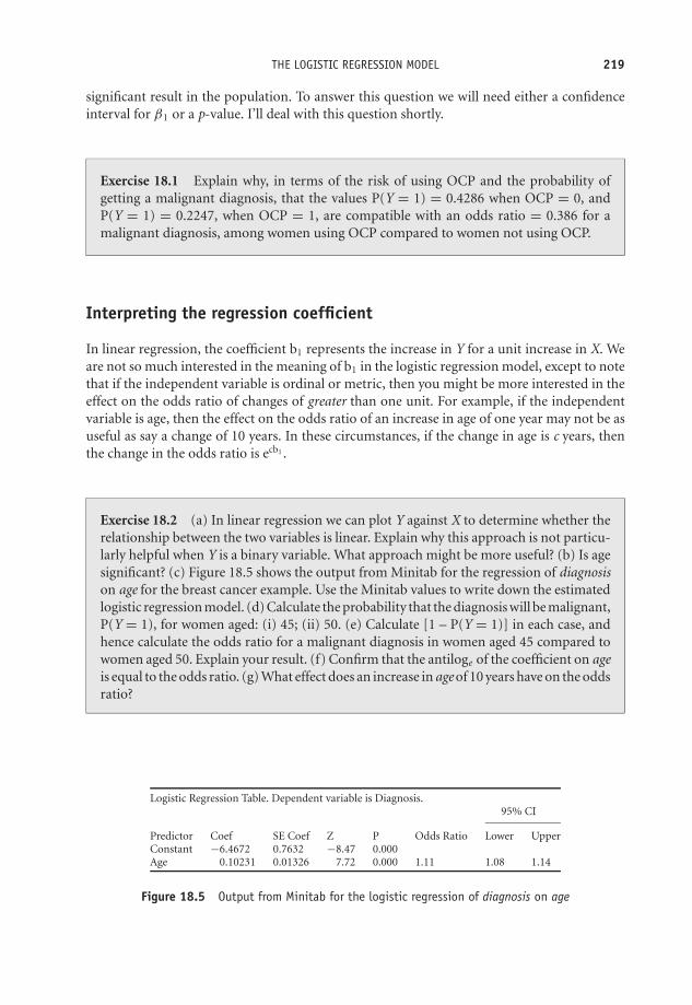
OTE/SPH OTE/SPH
JWBK220-18 November 28, 2007 11:10 Char Count= 0
THE LOGISTIC REGRESSION MODEL 219
significant result in the population. To answer this question we will need either a confidenceinterval for β1 or a p-value. I’ll deal with this question shortly.
Exercise 18.1 Explain why, in terms of the risk of using OCP and the probability ofgetting a malignant diagnosis, that the values P(Y = 1) = 0.4286 when OCP = 0, andP(Y = 1) = 0.2247, when OCP = 1, are compatible with an odds ratio = 0.386 for amalignant diagnosis, among women using OCP compared to women not using OCP.
Interpreting the regression coefficient
In linear regression, the coefficient b1 represents the increase in Y for a unit increase in X. Weare not so much interested in the meaning of b1 in the logistic regression model, except to notethat if the independent variable is ordinal or metric, then you might be more interested in theeffect on the odds ratio of changes of greater than one unit. For example, if the independentvariable is age, then the effect on the odds ratio of an increase in age of one year may not be asuseful as say a change of 10 years. In these circumstances, if the change in age is c years, thenthe change in the odds ratio is ecb1 .
Exercise 18.2 (a) In linear regression we can plot Y against X to determine whether therelationship between the two variables is linear. Explain why this approach is not particu-larly helpful when Y is a binary variable. What approach might be more useful? (b) Is agesignificant? (c) Figure 18.5 shows the output from Minitab for the regression of diagnosison age for the breast cancer example. Use the Minitab values to write down the estimatedlogistic regression model. (d) Calculate the probability that the diagnosis will be malignant,P(Y = 1), for women aged: (i) 45; (ii) 50. (e) Calculate [1 – P(Y = 1)] in each case, andhence calculate the odds ratio for a malignant diagnosis in women aged 45 compared towomen aged 50. Explain your result. (f) Confirm that the antiloge of the coefficient on ageis equal to the odds ratio. (g) What effect does an increase in age of 10 years have on the oddsratio?
Logistic Regression Table. Dependent variable is Diagnosis.95% CI
Predictor Coef SE Coef Z P Odds Ratio Lower UpperConstant −6.4672 0.7632 −8.47 0.000Age 0.10231 0.01326 7.72 0.000 1.11 1.08 1.14
Figure 18.5 Output from Minitab for the logistic regression of diagnosis on age
OTE/SPH OTE/SPH
JWBK220-18 November 28, 2007 11:10 Char Count= 0
220 CH 18 CURVY MODELS: LOGISTIC REGRESSION
Statistical inference in the logistic regression model
As you saw in Chapter 11, if the population odds ratio is equal to 1, then the risk factor inquestion has no effect on the odds for any particular outcome; that is, the variable concernedis not a statistically significant risk (or benefit). We can use either the p-value or the confidenceinterval to decide whether any departures from a value of 1 for the odds ratio is due merely tochance or is an indication of statistical significance.
In fact, in Figure 18.4, the 95 per cent confidence interval for the odds ratio for OCP useis (0.24 to 0.62), and since this does not include 1, the odds ratio is statistically significant interms of receiving a malignant diagnosis. In addition the p-value = 0.000, so a lot less than 0.05.However, we still need to be cautious about this result because it represents only a crude oddsratio, which, in reality, would need to be adjusted for other possible confounding variables,such as age. We can make this adjustment in logistic regression just as easily as in the linearregression model, simply by including the variables we want to adjust for on the right-handside of the model.
Notice that Minitab, Figure 18.4, uses the z distribution to provide a p-value, whereas SPSS,Figure 18.3, uses the Wald statistic, which can be shown to have a z distribution in the appropriatecircumstances.
Exercise 18.3 Figure 18.6 shows the output from SPSS for the regression of diagnosis onbody mass index (BMI). Comment on the statistical significance of body mass index as arisk factor for receiving a malignant diagnosis.

OTE/SPH OTE/SPH
JWBK220-18 November 28, 2007 11:10 Char Count= 0
THE LOGISTIC REGRESSION MODEL 221
95.0% CI for EXP(B)
B Wald Sig. Exp(B) Lower Upper
Step 1(a) BMI .082 10.943 .001 1.085 1.034 1.139Constant −2.859 19.313 .000 .057
Figure 18.6 The output from SPSS for the regression of diagnosis on body mass index (some columnsare missing)
The multiple logistic regression model
In my explanation of the odds ratio above I used a simple logistic regression model, i.e. onewith a single independent variable (OCP), because this offers the simplest treatment. However,the result we got, that the odds ratio is equal to eb1 , applies to each coefficient if there is morethan one independent variable, i.e. eb2 , eb3 , etc. The usual situation is to have a risk factorvariable plus a number of confounder variables (the usual suspects – age, sex, etc.). Suppose,for example, that you decided to include age and body mass index (BMI) along with OCP asindependent variables. Equation (1) would then become:
P(Y = 1) = (eβ0+β1×OCP+β2×age+β3×BMI)/(1 + eβ0+β1×OCP+β2×age+β3×BMI)
P(Y = 1) is still of course the probability that the woman will receive a malignant diagnosis,Y = 1. The odds ratio for age is eb2; the odds ratio for BMI is eb3. Moreover, as with linear regres-sion, each of these odds ratios is adjusted for any possible interaction between the independentvariables.
As an example, output from Minitab for the above multiple regression model of diagnosisagainst use of oral contraceptives (OCP), age and body mass index (BMI), is shown in Figure 18.7.
Exercise 18.4 Comment on what is revealed in the output in Figure 18.7 about therelationship between diagnosis and the three independent variables shown.
Building the model
The strategy for model building in the logistic regression model is similar to that for linearregression:� Make a list of candidate independent variables.� For any nominal or ordinal variables in the list construct a contingency table and perform a
chi-squared test.5 Make a note of the p-value.
5 Provided the number of categories isn’t too big for the size of your sample – you don’t want any empty cellsor low expected values (see Chapter 14)
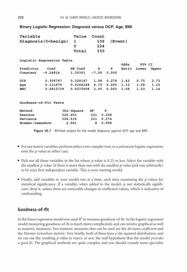
OTE/SPH OTE/SPH
JWBK220-18 November 28, 2007 11:10 Char Count= 0
222 CH 18 CURVY MODELS: LOGISTIC REGRESSION
Binary Logistic Regression: Diagnosis versus OCP, Age, BMI
Variable Value CountDiagnosis(0=benign) 1 106 (Event) 0 224 Total 330
Logistic Regression Table Odds 95% CIPredictor Coef SE Coef Z P Ratio Lower UpperConstant -9.24814 1.30391 -7.09 0.000
OCP 0.356767 0.329147 1.08 0.278 1.43 0.75 2.72Age 0.111670 0.0164348 6.79 0.000 1.12 1.08 1.15BMI 0.0812739 0.0275908 2.95 0.003 1.08 1.03 1.14
Goodness-of-Fit Tests
Method Chi-Square DF PPearson 329.603 321 0.358Deviance 328.516 321 0.374Hosmer-Lemeshow 2.581 8 0.958
Figure 18.7 Minitab output for the model diagnosis against OCP, age and BMI
� For any metric variables, perform either a two-sample t test, or a univariate logistic regression;note the p-value in either case.� Pick out all those variables in the list whose p-value is 0.25 or less. Select the variable withthe smallest p-value (if there is more than one with the smallest p-value pick one arbitrarily)to be your first independent variable. This is your starting model.� Finally, add variables to your model one at a time, each time examining the p-values forstatistical significance. If a variable, when added to the model, is not statistically signifi-cant, drop it, unless there are noticeable changes in coefficient values, which is indicative ofconfounding.
Goodness-of-fit
In the linear regression model you used R2 to measure goodness-of-fit. In the logistic regressionmodel measuring goodness-of-fit is much more complicated, and can involve graphical as wellas numeric measures. Two numeric measures that can be used are the deviance coefficient andthe Hosmer-Lemeshow statistic. Very briefly, both of these have a chi-squared distribution, andwe can use the resulting p-value to reject, or not, the null hypothesis that the model providesa good fit. The graphical methods are quite complex and you should consult more specialist

OTE/SPH OTE/SPH
JWBK220-18 November 28, 2007 11:10 Char Count= 0
THE LOGISTIC REGRESSION MODEL 223
sources for further information on this and other aspects of this complex procedure. Hosmerand Lemeshow (1989) is an excellent source.
Exercise 18.5 Use the Hosmer-Lemeshow goodness-of-fit statistic in the output of Figure18.7 to comment on the goodness-of-fit of the model shown.
Linear and logistic regression modelling are two methods from a more general class of meth-ods known collectively as multivariable statistics. Multivariate statistics on the other hand, isa set of procedures applicable where there is more than one dependent variable, and includesmethods such as principal components analysis, multidimensional scaling, cluster and discrim-inant analysis, and more. Of these, principal components analysis appears most often in theclinical literature, but even so is not very common. Unfortunately, there is no space to discussany of these methods.

OTE/SPH OTE/SPH
JWBK220-18 November 28, 2007 11:10 Char Count= 0
224

OTE/SPH OTE/SPH
JWBK220-19 December 21, 2007 19:0 Char Count= 0
IX
Two More Chapters
225

OTE/SPH OTE/SPH
JWBK220-19 December 21, 2007 19:0 Char Count= 0
226

OTE/SPH OTE/SPH
JWBK220-19 December 21, 2007 19:0 Char Count= 0
19Measuring survival
Learning objectives
When you have finished this chapter you should be able to:� Explain what censoring means.� Calculate Kaplan-Meier survival probabilities.� Draw a Kaplan-Meier survival curve.� Use the Kaplan-Meier curve to estimate median survival time (if possible).� Explain the use of the log-rank test to determine if the survival experience of two ormore groups is significantly different.� Explain the role of the hazard ratio in comparing the relative survival experience oftwo groups.� Outline the general idea behind Cox proportional hazards regression and interpret theresults from such a regression.
Introduction
Imagine that you have a patient who has overdosed on paracetamol. A spouse asks you whattheir chances of ‘coming through it’ are. Or suppose a patient with breast cancer wants to
Medical Statistics from Scratch, Second Edition David BowersC© 2008 John Wiley & Sons, Ltd

OTE/SPH OTE/SPH
JWBK220-19 December 21, 2007 19:0 Char Count= 0
228 CH 19 MEASURING SURVIVAL
know which of two possible treatments offers the best chance of survival. You can answerquestions like these with the help of a procedure known as survival analysis. The basis of thismethod is the measurement of the time from some intervention or procedure to some event ofinterest.
For example, if you were studying survival after mastectomy for breast cancer (the procedure),you would want to know how long each woman survived following surgery. Here, the eventof interest would be death. For practical reasons you usually have to limit the duration of thestudy, for example, to one year, or five years, etc. Very often you will want to compare thesurvival experiences of two groups of patients; for example women having a mastectomy, withwomen having less radical surgery.
Censored data
One particular problem, which makes this type of analysis tricky, is that you often don’t observethe event of interest in all of the subjects. For example, after five years, by no means all of thewomen will have died following the mastectomy. We don’t know how long these particularpatients will live after the end of the study period, only that they are still alive when the studyperiod ends. In addition, some patients may withdraw from the study during the study period;they may move away, or simply refuse further participation, or die from a cause unrelated tothe study. These types of incomplete data are said to be censored.
A final problem is that not all patients may enter the study at the same time. Fortunately,methods have been developed to deal with these difficulties. One of which, known as theKaplan–Meier method, gives us a table of survival probabilities which can be charted as theKaplan-Meier chart. The two questions that are often of the greatest interest are:� What’s the probability of a patient surviving for some given period of time?� What’s the comparative survival experience of two groups of patients?
A simple example of survival in a single group
Look at the data in Table 19.1, which shows survival data (in months) for a group of 12 patientsdiagnosed with a brain tumour, who were followed up for 12 months.
Table 19.1 shows that seven patients died, two left the study prematurely and three survived.This means that you have seven definite and five censored survival times. We can represent thesurvival times in the last column of Table 19.1 graphically, as in Figure 19.1, where the survivaltimes are arranged in ascending order.
Calculating survival probabilities and the proportionsurviving: the Kaplan-Meier table
The Kaplan-Meier method requires a Kaplan-Meier table like Table 19.2, with, strictly speaking,rows only for time periods when a death occurs (shown in bold in the table). However, I have

OTE/SPH OTE/SPH
JWBK220-19 December 21, 2007 19:0 Char Count= 0
CALCULATING SURVIVAL PROBABILITIES AND THE PROPORTION SURVIVING 229
Table 19.1 Survival times (months) over a 12-month study period, of 12 patients diagnosedwith brain tumour. *Indicates censored data (patient survived, S, or left study prematurely, P).The actual survival time for these patients is not known
Month of entry to study Time after study start Outcomes: Died (D),(0 indicates present at date to death or Survived (S) or left Survival
Patient beginning of study) censoring (months) study prematurely (P) times
1 0 12 S* 122 0 12 S* 123 0 11 D 114 0 8 D 85 1 6 P* 56 2 12 S* 107 2 4 D 28 2 5 D 39 2 9 D 7
10 3 9 P* 611 3 8 D 512 3 7 D 4
included all 12 rows in the table to help illustrate the method more clearly. The second columntells us how many people were still alive, n, at the beginning of each month, t. This will equalthe total initial number of patients in the study, minus both the total number of deaths and thetotal number of premature withdrawals up to the beginning of the month. Column 4 recordsthe number of deaths d in each month. Column 5 records the total number at risk during themonth, r. By dividing column 4 by column 5, we get d/r, the probability that a patient stillalive at the beginning of the month will die during it (which is equivalent to the proportion ofpatients dying in that month). The value of d/r is shown in column 6.
0 1 2 3 4 5 6 7 8 9 10 11 12
7
8
12
11
5
10
9
6
2
3
4
1
Patient
Survival time (months)
Figure 19.1 Chart of survival times (in ascending order) from Table 19.1

OTE/SPH OTE/SPH
JWBK220-19 December 21, 2007 19:0 Char Count= 0
230 CH 19 MEASURING SURVIVAL
Table 19.2 Calculation of Kaplan-Meier survival probabilities
1 2 3 4 5 6 7 8Month Number still Withdrawn Deaths in Number Probability Probability Cumulative
in study at prematurely month t at risk in of death in of surviving probabilitystart of during month t month t month t of survivingmonth t month t to month t
t n w d r d/r p = 1 −d/r S
1 12 0 0 12 0 1 12 12 0 0 12 0 1 13 12 0 0 12 0 0 14 12 0 1 11 1/11 = 0.091 0.909 0.9095 11 0 1 10 1/10 = 0.100 0.900 0.8186 10 1 0 9 0 1 17 9 0 1 8 1/8 = 0.125 0.875 0.7168 8 0 2 6 2/6 = 0.333 0.667 0.4789 6 1 1 4 1/4 = 0.250 0.750 0.358
10 4 0 0 4 0 1 111 4 0 1 3 1/3 = 0.333 0.667 0.23912 3 0 0 3 0 1 1
Since d/r is the probability of dying during a time period, then (1 – d/r) must be the probabilityof surviving to the end of the time period. This survival probability is shown in column 7. Tocalculate the probability of surviving all of the preceding time periods and the current timeperiod, you must successively multiply the probabilities in column 7 together (ignoring any0’s). The resultant cumulative probabilities, labelled S, are shown in column 8. For example,the value for S of 0.818 in row 5 is 1 × 1 × 1 × 0.909 × 0.900. These column 8 values are theKaplan-Meier survival probabilities.
Table 19.2 indicates that the probability of a patient surviving to the end of the third monthis 1, to the end of the fourth month is 0.909, and so on, and for the full 12 months after thediagnosis is 0.239.
We can also interpret these values as proportions. For example, 0.909 of the patients (or 90.9per cent, will survive to the end of the fourth month. About a quarter (23.9 per cent) will survivethe full 12 months. We can generalise these results to the population of patients of whom thissample is representative, and who have the same type of brain tumour, at the same stage ofdevelopment, and receive the same level of care. In addition, we may want to adjust for possibleconfounding variables such as age, sex, etc. We’ll deal with this question later.
The Kaplan-Meier chart
If you plot the cumulative survival probabilities in the last column of Table 19.2 against time,you get the Kaplan-Meier curve, shown in Figure 19.2. Notice that the survival ‘curve’ looks likea staircase, albeit with uneven steps. Every time there is a death, the curve steps down. Sincethere are seven deaths, there are seven steps down.1
1 Notice there is a double step down at period 8 because of the two deaths.

OTE/SPH OTE/SPH
JWBK220-19 December 21, 2007 19:0 Char Count= 0
DETERMINING MEDIAN SURVIVAL TIME 231
0
0.2
0.4
0.6
0.8
1
1 2 3 4 5 6 7 8 9 10 11 12
Time (months)
Sur
viva
l pro
babi
lity
The first death does not occur until month 4.
There are two deaths in month 8, so a double step
down.
The probability of surviving 12 months is 0.239.
Each time there is a death, the
curve steps down.
Figure 19.2 The Kaplan-Meier survival curve drawn from the data in Table 19.2 (the dotted lineindicates median proportion surviving – see text below)
Exercise 19.1 The data in Table 19.3 shows the survival times (in days) of eight patientswith acute myocardial infarction, treated with a new reperfusion drug Explase, as part of afibrinolytic regimen. Patients were followed up for 14 days. Calculate survival probabilitiesand plot Kaplan-Meier survival curves. Comment on your results.
Table 19.3 The survival times (in days) of eight patients with acutemyocardial infarction. Patients were followed up for 14 days
Day of entry to study Time after study start Outcomes: Died (D),(0 indicates present at date to death or Survived (S) or Left study
Patient beginning of study) censoring (days) prematurely (P)
1 0 3 D2 0 14 S3 0 8 D4 0 12 P5 1 14 S6 2 13 D7 2 14 S8 2 14 S
Determining median survival time
One of the consequences of not knowing the actual survival times of all of those subjectswho survive beyond the end of the study period is that we cannot calculate the mean survivaltime of the whole group. However, if you interpret the probabilities on the vertical axis of

OTE/SPH OTE/SPH
JWBK220-19 December 21, 2007 19:0 Char Count= 0
232 CH 19 MEASURING SURVIVAL
a Kaplan-Meier chart as proportions or percentages, you can often easily determine mediansurvival times. It is that value which corresponds to a probability of 0.5 (i.e. 50 per cent). InFigure 19.2, the median survival time is 8 months. At this time, half of the patients still survived.Obviously the survival time of any proportion of the sample can be determined in this sameway, including the interquartile range values, provided that the Kaplan-Meier curve goes downfar enough (unfortunately it often doesn’t).
de Gramont
Lokich
Raltitrexed
Time since randomisation (months)Patients at riskde GramontLokichRaltitrexed
303301301
133124108
424030
1114
8
454
Pro
port
ion
with
out p
rogr
essi
on
0
0
1.0
0.9
0.8
0.7
0.6
0.5
0.4
0.3
0.2
0.1
6 12 18 24
Figure 19.3 Kaplan-Meier curves for overall survival for three groups of patients in a comparison ofthree chemotherapy regimes in the treatment of colorectal cancer. Reprinted from The Lancet, 2002,359, 1559 with permission from Elsevier
Exercise 19.2 Figure 19.3 shows Kaplan-Meier curves for progression-free survival, forthree groups of patients in a comparison of three chemotherapy regimes used for thetreatment of colorectal cancer (Maughan et al. 2002). The three regimes were: the deGramont regimen; the Lokich regimen; and Raltitrexed. What were the approximatemedian survival times for progression-free survival with each of the three regimes?
Comparing survival with two groups
Although the survival curve for a single group may sometimes be of interest, much moreusual is the desire to compare the survival experience of two or more groups. For example,Figure 19.4 is taken from a study of chemotherapy for the treatment of bladder cancer (MedicalResearch Council Advanced Bladder Working Group 1999). One group of patients (n = 485)was randomly assigned to receive conventional radical surgery (cystectomy) or radiotherapy,while a second group (n = 491) received the conventional treatment plus chemotherapy. The

OTE/SPH OTE/SPH
JWBK220-19 December 21, 2007 19:0 Char Count= 0
COMPARING SURVIVAL WITH TWO GROUPS 233
ChemotherapyNo chemotherapy
Events305279
120
0
10
20
30
40
50
60
70
80
90
100
Time from randomisation (months)
Patients at risk
No chemotherapy
Chemotherapy
485
491
271
308192
222
145
163
102
11663
75
Pro
port
ion
aliv
e an
ddi
seas
e-fr
ee (
%)
24 36 48 60
Total485491
Figure 19.4 Survival curves for two groups of patients with bladder cancer, one group given conven-tional surgery or radiotherapy, the other group given the conventional treatment plus chemotherapy.Reprinted coutresy of Elsevier (The Lancet, 1999, Vol No. 354, p. 533–9)
question asked, ‘Was the survival experience of the chemotherapy group any better over thefive year follow up?’
The two Kaplan-Meier curves seem to show that the proportions surviving in the chemother-apy group was larger than those in the conventional group throughout the duration of the study,since the survival curve for the former was higher than that of the latter. In fact, the authorsof this study report median values for disease-free survival of 20 months for the chemotherapygroup and 16.5 months for the no-chemotherapy group. The 95 per cent confidence interval forthe difference in medians was (0.5 to 7.0) months, so the difference in medians was statisticallysignificant.
Notice that the authors have provided a table showing the numbers at risk at each timeinterval. This is to remind us that the smaller numbers of survivors towards the end of a trialproduce less reliable results. As a direct consequence of this effect, you should not assume thatjust because the gap between two survival curves gets progressively larger (as it is often seen todo), that this is necessarily due to an actual divergence in the survival experiences in the twogroups. It might well be caused simply by the low numbers of subjects still at risk. This canmake the ends of the curves unreliable.
The log-rank test
If you want to compare the overall survival experience of two (or more) groups of patients(rather than say comparing just the median survival times as we did above), then one possibleapproach is to use the non-parametric log-rank test. Essentially, the null hypothesis to be testedis that the two samples (the two groups) are from the same population as far as their survivalexperience is concerned. In other words there is no difference in the survival experiences.
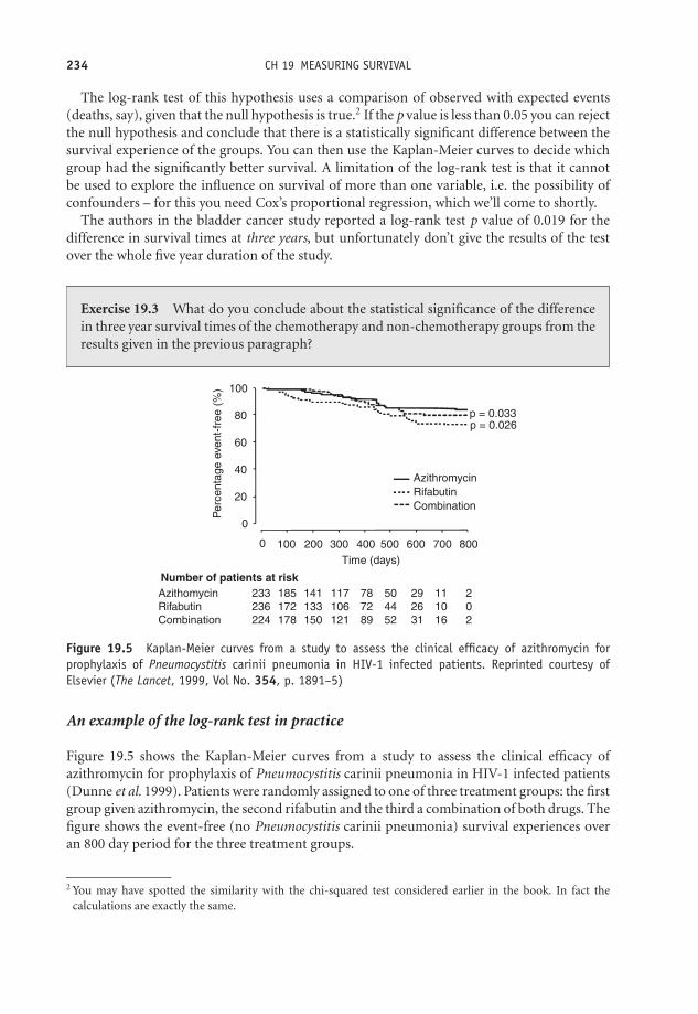
OTE/SPH OTE/SPH
JWBK220-19 December 21, 2007 19:0 Char Count= 0
234 CH 19 MEASURING SURVIVAL
The log-rank test of this hypothesis uses a comparison of observed with expected events(deaths, say), given that the null hypothesis is true.2 If the p value is less than 0.05 you can rejectthe null hypothesis and conclude that there is a statistically significant difference between thesurvival experience of the groups. You can then use the Kaplan-Meier curves to decide whichgroup had the significantly better survival. A limitation of the log-rank test is that it cannotbe used to explore the influence on survival of more than one variable, i.e. the possibility ofconfounders – for this you need Cox’s proportional regression, which we’ll come to shortly.
The authors in the bladder cancer study reported a log-rank test p value of 0.019 for thedifference in survival times at three years, but unfortunately don’t give the results of the testover the whole five year duration of the study.
Exercise 19.3 What do you conclude about the statistical significance of the differencein three year survival times of the chemotherapy and non-chemotherapy groups from theresults given in the previous paragraph?
p = 0.033p = 0.026
AzithromycinRifabutinCombination
0
0
20
40
60
80
100
100 200 300Time (days)
Number of patients at riskAzithomycinRifabutinCombination
233236224
185172178
141133150
117106121
787289
504452
292631
111016
202
400 500
Per
cent
age
even
t-fr
ee (
%)
600 700 800
Figure 19.5 Kaplan-Meier curves from a study to assess the clinical efficacy of azithromycin forprophylaxis of Pneumocystitis carinii pneumonia in HIV-1 infected patients. Reprinted courtesy ofElsevier (The Lancet, 1999, Vol No. 354, p. 1891–5)
An example of the log-rank test in practice
Figure 19.5 shows the Kaplan-Meier curves from a study to assess the clinical efficacy ofazithromycin for prophylaxis of Pneumocystitis carinii pneumonia in HIV-1 infected patients(Dunne et al. 1999). Patients were randomly assigned to one of three treatment groups: the firstgroup given azithromycin, the second rifabutin and the third a combination of both drugs. Thefigure shows the event-free (no Pneumocystitis carinii pneumonia) survival experiences overan 800 day period for the three treatment groups.
2 You may have spotted the similarity with the chi-squared test considered earlier in the book. In fact thecalculations are exactly the same.

OTE/SPH OTE/SPH
JWBK220-19 December 21, 2007 19:0 Char Count= 0
COMPARING SURVIVAL WITH TWO GROUPS 235
The log-rank test was used to test the hypothesis that there is no difference in the percentageevent-free between the azithromycin and rifabutin groups (p value = 0.033), and betweenthe azithromycin and the combination groups (p-value = 0.026). The authors concludedthat azithromycin as prophylaxis for Pneumocystitis carinii pneumonia, provides additionalprotection over and above standard Pneumocystitis carinii pneumonia prophylaxis. However,these results should be treated with caution because of the very small size of the survivor grouptowards the end of the study.
Coumadin
AspirinLogrank test: p = 0.03
Cum
ulat
ive
trea
tmen
t fai
lure
(%
)0.14
0.12
0.10
0.08
0.06
0.04
0.02
0
Patients at riskCombination 325
336332
279282293
233233243
188186197
159159161
105100102
545660
AspirinCoumadin
Combination
Figure 19.6 Kaplan-Meier curves of percentage number of subsequent ischaemic events from a ran-domised controlled trial into the relative effectiveness of aspirin and oral anticoagulants (coumadin),used for antiplatelet treatment, following myocardial infarction. Reprinted courtesy of Elsevier (TheLancet 2002, 360, 109–14, Fig. 3, p. 111)
Exercise 19.4 Figure 19.6 shows the Kaplan-Meier curves for the percentage number ofischaemic events from a randomised controlled trial into the relative effectiveness of as-pirin and oral anticoagulants (coumadin) for antiplatelet treatment following myocardialinfarction (van Es et al. 2002). The object was to investigate which of these two drugs ismore effective for the long-term reduction of subsequent ischaemic events, and whetherthe combination of the two drugs offers greater benefit than either drug alone. Is therea statistically significant difference in mortality between the three possible treatments?Which treatment seems to offer the best survival?
The hazard ratio
The log-rank test is limited by the fact that it is just that – a test. It will tell you if there is asignificant difference between the survival experience of two (or more) groups, but does notquantify that difference. For this we need what is called the hazard ratio (based on the ratio

OTE/SPH OTE/SPH
JWBK220-19 December 21, 2007 19:0 Char Count= 0
236 CH 19 MEASURING SURVIVAL
of observed and expected events for the two groups), along with which we can calculate aconfidence interval. As a matter of interest, the authors of the bladder cancer study reported,for those alive and disease free, a hazard ratio of 0.82, with a 95 per cent confidence intervalof (0.70 to 0.97). We can interpret this result to mean that the group who had chemotherapyhad a risk of dying in the study period of only 82 per cent compared to the risk for the non-chemotherapy group, and this difference was statistically significant (confidence interval doesnot include 1).
Exercise 19.5 The survival curves shown in Figure 19.4 from the bladder cancer study arefor subjects who are alive and disease free. For subjects who were alive but not necessarilydisease free, the authors report the following results. What do these results tell you?
Comparison of the survival time in the two groups gave a hazard ratio of 0.85[95 per cent CI of (0.71 to 1.02)]. The absolute difference in 3-year survival was5.5 per cent, 50.0 per cent in the chemotherapy group, 55.5 per cent in the non-chemotherapy group [95 per cent CI of (−0.5 to 11.0)]. The median survival timefor the chemotherapy group was 44 months and for the no-chemotherapy groupwas 37.5 months [95 per cent CI of (−0.5 to 15)].
The proportional hazards (or Cox’s) regression model
Although researchers can use the log-rank test to distinguish survival between two groups, thetest only provides a p value; it would be more useful to have an estimate of any difference insurvival, along with the corresponding confidence interval. The hazard ratio mentioned aboveprovides this, but neither the log-rank test nor the simple hazard ratio allow for adjustment forpossible confounding variables, which may significantly affect survival. For this we can use anapproach known as proportional hazards (or Cox’s) regression. This procedure will provide bothestimates and confidence intervals for variables that affect survival, and enable researchers toadjust for confounders. We will discuss briefly the principle underlying the method, and themeaning of some of the terms used.
The focus of proportional hazards regression is the hazard. The hazard is akin to a failure rate. Ifthe end-point is death, for example, then the hazard is the rate at which individuals die at somepoint during the course of a study. The hazard can go up or down over time, and the distributionof hazards over the length of a study is known as the hazard function. You won’t see authorsquote the hazard regression function or equation, but for those interested it looks like this:
Hazard = h0 + e (β1 X1+β2 X2+...)
h0 is the baseline hazard and is of little importance. The explanatory or independent variablescan be any mixture of nominal, ordinal or metric, and nominal variables can be ‘dummied’, asdescribed in Chapter 17 and Chapter 18. The same variable selection procedures as in linearor logistic regression models can also be used, i.e. either automated or by hand.
The most interesting property of this model is that eβ1 , eβ2 , etc. give us the hazard ratios, orHRs, for the variables X1, X2, and so on (notice the obvious similarity with the odds ratios in

OTE/SPH OTE/SPH
JWBK220-19 December 21, 2007 19:0 Char Count= 0
COMPARING SURVIVAL WITH TWO GROUPS 237
logistic regression). The hazard ratios are essentially risk ratios, but called hazard ratios in thecontext of survival studies. For example, in a study of the survival of women with breast cancer,the variable X1 might be ‘micrometastases present (Y/N)’. In which case, the hazard ratio HR1
(the risk of death for a patient when micrometastases are present compared to that for a patientwhere they are absent, is equal to eb1. All of this is only true if the relative effect (essentially theratio) of the hazard on the two groups (for example, the relative effect of micrometastases onthe survival of each group) remains constant over the whole course of the study.
An application from practice
As an example of proportional hazards regression, Table 19.4 is taken from a study into therelative survival of two groups of patients with non-metastatic colon cancer; one group havingopen colectomy (OC), the other laparoscopy-assisted colectomy (LAC) (Lacy et al. 2002). Thefigure shows hazard ratios and their confidence intervals: for the probability of being free ofrecurrence; for overall survival; and for cancer-related survival, after the patients were stratifiedaccording to tumour stage.
So, for example, patients with lymph-node metastasis do only about a third as well in termsof being recurrence-free over the course of the study compared to patients without lymph-node metastasis (hazard ratio = 0.31), and this difference is statistically significant since theconfidence interval does not include 1 (and the p value of 0.0006 is < 0.05). Patients withlymph-node metastasis also compare badly with non-metastasis patients in terms of both
Table 19.4 Results of a Cox proportional hazards regression analysis comparing the survival ofpatients with laparoscopy-assisted colectomy versus open colectomy, for the treatment ofnon-metastatic colon cancer. Reproduced courtesy of Elsevier (The Lancet, 2002, Vol No. 359,page 2224–30
Hazard ratio (95% CI) p
Probability of being free ofrecurrence
Lymph-node metastasis(presence vs absence)
0.31 (0.16–0.60) 0.0006
Surgical procedure (OC vs LAC) 0.39 (0.19–0.82) 0.012Preoperative serum CEA
concentrations(≥4 ng/mL vs <4 ng/mL)
0.43 (0.22–0.87) 0.018
Overall survivalSurgical procedure (OC vs LAC) 0.48 (0.23–1.01) 0.052Lymph-node metastasis
(presence vs absence)0.49 (0.25–0.98) 0.044
Cancer-related survivalLymph-node metastasis
(presence vs absence)0.29 (0.12–0.67) 0.004
Surgical procedure (OC vs LAC) 0.38 (0.16–0.91) 0.029
Type ofsurgical
procedure,laparoscopy-
assisted vs opencolectomy, is
significantly beneficialin terms of
recurrence-freeand cancer-relatedsurvival, but not in
terms of overallsurvival.
OC = open colectomy; LAC = laparoscopy-assisted colectomy;CEA = carcinoembryonic antigen.

OTE/SPH OTE/SPH
JWBK220-19 December 21, 2007 19:0 Char Count= 0
238 CH 19 MEASURING SURVIVAL
overall survival (only about half as well, HR = 0.49), and cancer-related survival (just over aquarter as well, HR = 0.29). Both of these results are statistically significant. Note that type ofsurgery; laparoscopy-assisted versus open colectomy, is not statistically significant in terms ofoverall survival as the confidence interval of (0.23 to 1.01) includes 1.
Table 19.5 Hazard ratios due to a number of risk factors in a univariate (unadjusted), andmultivariate (adjusted) cohort analysis of the risk to HIV+ women of vulvovaginal and perianalcondylomata acuminata and intraepithelial neoplasia. Reproduced courtesy of Elsevier (TheLancet, 2002, Vol No. 359, page 108–14
Univariate analysis* Multivariate analysis†
Number Hazard ratio Adusted hazardof women (95% CI) p ratio (95% CI) p
Risk factorHIV-1 infection 726 17.0 (4.07–70.9) 0.0007 6.96 (1.51–32.2) 0.01CD4 T lymphocyte count‡ 707 3.38 (2.24–5.10) <0.0001 1.66 (1.03–2.69) 0.04Human papillomavirus infection 699 4.86 (2.21–10.7) 0.0006 3.76 (1.67–8.43) 0.0013History of injecting two or more 726 3.09 (1.57–6.07) 0.003 2.32 (1.14–4.71) 0.02
drugs three or more times per weekLess than a highschool education 725 2.15 (1.09–4.22) 0.03 1.99 (1.00–3.98) 0.05Cigarette smoking at enrolment 726 0.84 (0.43–1.64) 0.61 0.71 (0.35–1.44) 0.34Age <35 years at enrolment 726 1.85 (0.93–3.68) 0.08Currently unmarried 726 2.48 (0.96–6.38) 0.06Annual income <US$ 10 000 711 1.15 (0.56–2.34) 0.71First sex at <16 years of age 723 1.33 (0.69–2.59) 0.40>7 lifetime sex partners 722 1.40 (0.71–2.79) 0.33History of prostitution 722 1.83 (0.90–3.74) 0.10History of ever injecting drugs 726 1.74 (0.90–3.39) 0.10History of sexually transmitted disease§ 654 1.58 (0.72–3.45) 0.25
∗In univariate analysis, vulvovaginal lesion was the outcome variable.†355 HIV-1-positive and 325 HIV-1-negative women were included in the multivariate analysis, with vulvovaginalor perianal lesion as the outcome variable and HIV-1 infection, CD4 T lymphocyte count, human papillomavirusinfection, less than a highschool education, cigarette smoking, and history of injection of two or more drugs three ormore times per week as covariates.‡ HIV-1 negative women were presumed to have a CD4 count >500 cell/, μL.§ Does not include a history of genital warts.
Exercise 19.6 Table 19.5 shows the hazard ratios (unadjusted and adjusted) due to anumber of risk factors in a cohort analysis of the risk to HIV+ women of vulvovaginaland perianal condylomata acuminata and intraepithelial neoplasia (Conley et al. 2002).Interpret the multivariate results. How do these differ from the univariate results?
Checking the proportional hazards assumption
The proportional hazards assumption can be checked graphically using what is known as thelog-log plot. Unfortunately, this procedure is beyond the scope of this book.

OTE/SPH OTE/SPH
JWBK220-20 December 21, 2007 19:1 Char Count= 0
20Systematic review andmeta-analysis
Learning objectives
When you have finished this chapter you should be able to:� Provide a broad outline of the idea of systematic review.� Outline a typical search procedure.� Describe what is meant by publication bias and its implications.� Describe how we can use the funnel plot to examine for the presence of publicationbias.� Explain the importance of heterogeneity across studies and how the L’Abbe plot canbe used in this context.� Explain the meaning of meta-analysis.� Outline the role of the Mantel-Haenszel procedure in combining studies.� Describe what a forest plot is and how it is used.
Medical Statistics from Scratch, Second Edition David BowersC© 2008 John Wiley & Sons, Ltd

OTE/SPH OTE/SPH
JWBK220-20 December 21, 2007 19:1 Char Count= 0
240 CH 20 SYSTEMATIC REVIEW AND META-ANALYSIS
Introduction
If you have a patient with a particular condition and you want to know the current consensus onthe most effective treatment, then you could perhaps ask the opinions of colleagues (althoughthey may know no more than you) or maybe look through some pharmaceutical publicitymaterial. Or read all the relevant journals lying around your clinic or office. Better still, ifyou have access to one of the clinical databases, such as Medline, then the job will be thatmuch easier; in fact, anything like an adequate search is almost impossible otherwise. If youwant your search to capture everything written on your topic then you will need a systematicapproach. This process of searching for all relevant studies (or trials) is known as a systematicreview.
However you do your systematic review, you are likely to encounter some difficulties:� Many of the studies you turn up will be based on smallish samples. As you know, smallsamples may well produce unreliable results.� Partly as a consequence of the above problem, many of the studies come to different andconflicting conclusions.� There will be some studies that you simply do not find. Perhaps because they are publishedin obscure and/or non-English-language journals, or are not published at all (for example,internal pharmaceutical company reports, or research dissertations). This shortfall may leadto what is known as publication bias.
To some extent you can address the first two of these problems by combining all of theseindividual studies into one large study, as you will see later (a process called meta-analysis),and you will also want to deal with the potential for publication bias. But let’s start with a briefdescription of systematic review.
Systematic review
The basis of a systematic review is a comprehensive search that aims to identify all similarand relevant studies that satisfy a pre-defined set of inclusion and exclusion criteria. As anexample, the following extract from a systematic review and meta-analysis of studies of dietaryintervention to lower blood cholesterol, shows the inclusion and exclusion criteria, togetherwith a brief description of the search procedure (Tang et al. 1998).
Methods
Identification of trials and extraction of data
The object of
the search...
We aimed to identify all unconfounded randomised trialsof dietary advice to lower cholesterol concentration in free-living subjects published before 1996. Trials were eligible for

OTE/SPH OTE/SPH
JWBK220-20 December 21, 2007 19:1 Char Count= 0
SYSTEMATIC REVIEW 241
inclusion if there were at least two groups, of which one couldbe considered a control group; treatment assignment was byrandom allocation; the intervention was a global dietary mod-ification (changes to various food components of the diet toachieve the desired targets); and lipid concentration were mea-sured before and after the intervention.
...the inclusion criteria...
...the exclusion criteria...
Trials of diets to reduce fat intake in women considered tobe at risk of breast cancer were included because the dietswere similar to those aimed at lowering cholesterol concen-tration. We excluded trials of specific supplementation diets(such as those with particular oils or margarine, garlic, plantsterol, or fibre supplements, etc.), multifactorial interventiontrials, trials aimed primarily at lowering body weight or bloodpressure, and trials whose interventions lasted less than fourweeks. Trials based on randomisation of workplace or generalpractice were also excluded.
To identify these trials we identified four electronic databases(Medline, Human Nutrition, EMBASE, and Allied and Alter-native Medicine). These databases included trials publishedafter 1966. We also identified trials by hand searching theAmerican Journal of Human Nutrition by scrutinising thereferences of review articles and of each relevant randomisedtrial, and by consulting experts on the subject.
...and the search
strategy.
Reports that appeared only in non-English language journals were examined withthe help of translators. Trials were categorised according to their approximate targetdiet into four groups.
The end result of a systematic review then, is a list of studies, each one of which provides avalue for the specified outcome measure. In the above example, this outcome measure wasthe percentage difference in mean total blood cholesterol between the intervention (dietaryadvice) group and the control group. Examination of this list of outcome values may providethe required insights into treatment effectiveness.
Exercise 20.1 Briefly outline the systematic review procedure and some of the problemsthat may arise.
The forest plot
The list of studies produced by the systematic review is often accompanied by what is known asa forest plot. This plot has study outcome on the vertical axis, usually arranged by size of study(i.e. by sample size), and the outcome measure on the horizontal axis. The outcome measure

OTE/SPH OTE/SPH
JWBK220-20 December 21, 2007 19:1 Char Count= 0
242 CH 20 SYSTEMATIC REVIEW AND META-ANALYSIS
might be odds or risk ratios, means or proportions, or their differences, and so on. Thereare a number of ways of displaying the data. For example, by using a box with a horizontalline through it, whose length represents the width of the 95 per cent confidence interval forwhatever outcome measure is being used. Or with a diamond, whose width represents the 95per cent confidence interval. The area of each box or diamond should be proportional to itssample size. As an example, the forest plot for the cholesterol study referred to above is shownin Figure 20.1.
Here the 22 individual studies, each represented by a black square whose size is proportionalto sample size, are divided into four groups according to their approximate target diet (we don’tneed to go into the details). The aggregated mean percentage reduction in cholesterol (witha 95 per cent confidence interval) for each of these groups is represented by a white square,whose size is proportional to the sample size of the aggregated individual studies. The largewhite square at the bottom of the plot is the aggregated value for all the studies combined. I’llcome back to this shortly.
The horizontal axis represents mean percentage change in blood cholesterol. As you cansee, 21 of the 22 studies show a reduction in percentage cholesterol (the study fourth fromthe top lies exactly on the zero, or no difference, line). However, in seven of the studies theconfidence interval crosses the zero line, indicating that the reduction in cholesterol is notstatistically significant. The remaining 15 studies show a statistically significant reduction(95 per cent confidence interval does not cross the zero line), as do all four group sum-mary values. Thus there appears to be plenty of evidence that dietary interventions of thetype included here do manage to achieve statistically significant reductions in total bloodcholesterol.
Exercise 20.2 The results in Table 20.1 show the outcomes (relative risk for proportionof subjects with side effects), from each of six randomised trials comparing antibiotic withplacebo for treating acute cough in adults (Fahey et al. 1998). Draw a forest plot of thisdata and comment briefly on what it shows. Note: relative risks greater than 1 favour theplacebo (i.e. fewer side effects).
Table 20.1 The outcomes (relative risk for proportion of subjects with side effects), from eachof six randomised trials comparing antibiotic with placebo for treating acute cough in adults.Reproduced from BMJ 1998, 316: 906–10. Figure 4, p. 909. Figures 2 and 3, p. 908, courtesy ofBMJ Publishing Group
Study Sample size Relative risk (95 % CI)
Briskfield et al. 50 0.51 (0.20 to 1.32)Dunlay et al. 57 7.59 (0.43 to 134.81)Franks and Gleiner 54 3.48 (0.39 to 31.38)King et al. 71 2.30 (0.93 to 5.70)Stott and West 207 1.49 (0.63 to 3.48)Verheij et al. 158 1.71 (0.80 to 3.67)Total 597 1.51 (0.86 to 2.64)

OTE/SPH OTE/SPH
JWBK220-20 December 21, 2007 19:1 Char Count= 0
Amer
ican
Hea
rt A
ssoc
iatio
n st
ep 1
die
ts
Bloe
mbe
rg e
t al33
Sa
rkki
nen
et a
l (A)
34
Bu
rr e
t al35
Am
eric
an d
iet-
hear
t stu
dy (2
C)37
Ba
ron
et a
l39
Any
Amer
ican
Hea
rt A
ssoc
iatio
n st
ep 1
die
t
Amer
ican
Hea
rt A
ssoc
iatio
n st
ep 2
die
ts
Wat
ts e
t al40
An
ders
on e
t al (
1)42
An
ders
on e
t al (
2)42
Am
eric
an d
iet-
hear
t stu
dy (1
A)37
Am
eric
an d
iet-
hear
t stu
dy (1
C)37
Am
eric
an d
iet-
hear
t stu
dy (2
A)37
Am
eric
an d
iet-
hear
t stu
dy (2
D)37
D
ieta
ry in
terv
entio
n st
udy
in c
hild
ren43
Any
Amer
ican
Hea
rt A
ssoc
iatio
n st
ep 2
die
t
Die
t to
Incr
ease
pol
yuns
atur
ated
toun
satu
rate
d fa
t rat
io
Lere
n44 4
5 46
W
oodh
ill e
t al47
Sa
rkki
nen
et a
l (B)
37
Am
eric
an d
iet-
hear
t stu
dy (1
B)37
Am
eric
an d
iet-
hear
t stu
dy (2
B)37
An
y di
et to
incr
ease
P/S
ratio
Low
fat d
iets
R
esea
rch
Com
mitt
ee50
Sa
rkki
nen
et a
l (C)
34
In
sull
et a
l51
Boyd
et a
l52
Any
low
fat d
iet
Any
diet
Mea
n pe
rcen
tage
cha
nge
in b
lood
cho
lest
erol
–20
–18
–16
–14
–12
–10
–8
–6
–4
–2
0 2
4 65.
8% (3
.8%
to 7
.8%
)χ2 3=
2, P
>0.5
5.3%
(4.7
% to
5.9
%)
χ2 21=
104,
P<0
.000
1
7.6%
(6.2
% to
9.0
%)
χ2 4= 24
, P<0
.001
5.6%
(4.7
% to
6.5
%)
χ2 7= 45
, P<0
.001
3.0%
(1.8
% to
4.1
%)
χ2 4 =
6, P
>0.1
Wei
ghte
d m
ean
redu
ctio
n in
cho
lest
erol
by g
roup
and
test
for d
iffer
ence
s be
twee
nef
fect
s in
diff
eren
t com
paris
ons
Eac
h bl
ack
squa
re
repr
esen
ts a
n in
divi
dual
stu
dy...
... th
e si
ze o
f whi
ch
is p
ropo
rtio
nal t
o th
e sa
mpl
e si
ze o
f th
at s
tudy
T
he w
idth
of
the
horiz
onta
l lin
e is
the
95 %
C
I for
the
stud
y.
The
four
whi
te
squa
res
show
the
com
bine
d re
sults
fo
r th
e st
udie
s in
ea
ch o
f the
four
grou
ps.
Thi
s w
hite
sq
uare
is th
e co
mbi
ned
resu
lt fo
r al
l of t
he
stud
ies
(see
the
met
a-an
alys
is
sect
ion
on
p. 2
48 b
elow
).
The
list
of
indi
vidu
al
stud
ies.
Figu
re20
.1Fo
rest
plot
for
the
diet
ary
inte
rven
tion
and
bloo
dch
oles
tero
lst
udy.
Mea
npe
rcen
tage
chan
ges
(wit
h95
per
cent
confi
denc
ein
terv
als)
inbl
ood
tota
lcho
lest
erol
conc
entr
atio
n.Re
prod
uced
from
BMJ
1998
,31
6:12
13–2
0,co
urte
syof
BMJ
Publ
ishi
ngGr
oup
243

OTE/SPH OTE/SPH
JWBK220-20 December 21, 2007 19:1 Char Count= 0
244 CH 20 SYSTEMATIC REVIEW AND META-ANALYSIS
Publication and other biases
The success of any systematic review depends critically on how thorough and wide-ranging thesearch for relevant studies is. One frequently quoted difficulty is that of publication bias, whichcan arise from a number of sources:� The tendency for journals to favour the acceptance of studies showing positive outcomes at
the expense of those with negative outcomes.� The tendency for authors to favour the submission to journals of studies showing positiveoutcomes at the expense of those with negative outcomes.� Studies with positive results are more likely to be published in English language journalsgiving them a better chance of capture in the search process.� Studies with positive results are more likely to be cited, giving them a better chance of capturein the search process.� Studies with positive results are more likely to be published in more than one journal, givingthem a better chance of capture in the search process.� Some studies are never submitted for publication. For example, those that fail to show a pos-itive result, those by pharmaceutical companies (particularly if the results are unfavourable),graduate dissertations and so on.
In the light of all this it is important that possible presence of publication bias should beaddressed. One possibility is to use what is known as a funnel plot.
The funnel plot
In a funnel plot the size of the study is shown on the vertical axis and the size of the treatment’seffect (for example, as measured by an odds or risk ratio, or a difference in means, etc.) isshown on the horizontal axis. In the absence of bias the funnel plot should have the shapeof a symmetric upturned cone or funnel. Larger studies shown at the top of the funnel willbe more precise (their results will not be so spread out), smaller studies, shown towards thebottom less precise, and therefore more spread out. These differences produce the funnel shape.However, if the funnel is asymmetrical, for example, if parts of the funnel are missing or poorlyrepresented – and this will usually be near the bottom of the funnel where the smaller studiesare located – then this is suggestive of bias of one form or another.1
1 There are a number of other possible causes of bias in systematic reviews. Those interested should look, forexample, at Egger and Davey Smith (1998), where other possible biases are discussed.

OTE/SPH OTE/SPH
JWBK220-20 December 21, 2007 19:1 Char Count= 0
THE FUNNEL PLOT 245
The larger studies towards the top of the plot (not very spread out)...
...and the smaller studies towards the bottom (morespread out).
The funnel plot should be symmetrical, indicative of no publication bias, but there appears to be a large “hole” in this area...
...possible due to small studies, showing negative ‘benefit’, being missed from the systematic review, evidence of possible publication bias.
Relative benefit
1010.10
50
100
150
200
250
Tota
l in
com
paris
on
100
Figure 20.2 Funnel plot used to check for publication bias in a systematic review of the effectivenessof topically applied non-steroidal anti-inflammatory drugs. The asymmetry of the funnel is an indica-tion of publication bias (see text). Reproduced from BMJ, Jan 1998; 316: 333–338, courtesy of BMJPublishing Group
As an example, Figure 20.2 is a funnel plot from a systematic review of the effectiveness oftopically applied non-steroidal anti-inflammatory drugs in acute and chronic pain conditions(Moore et al. 1998). Relative benefit (risk ratio) is shown on the horizontal axis. Each point inthe figure represents one of the studies. Values to the left of the value of 1 on the horizontal axisshow negative ‘benefit’, values to the right, positive benefit.
The asymmetry in the funnel is quite marked, with a noticeable absence of small studiesshowing negative ‘benefit’ (risk ratio less than 1). The authors comment:
The funnel plot might be interpreted as showing publication bias. The tendency forsmaller trials to produce a larger analgesic effect might be construed as supporting theabsence of trials showing no difference between topical non-steroidal and placebo. Wemade strenuous efforts to unearth unpublished data and contacted all pharmaceuticalcompanies in the United Kingdom that we identified as producing non-steroidalproducts. One company made unpublished data available to us, but the others didnot feel able to do so.
Exercise 20.3 a) Outline the major sources of publication bias. (b) Figure 20.3 shows afunnel plot from a systematic review of trials of beta blockers in secondary prevention aftermyocardial infarction (Egger and Davey Smith 1998). The plot has odds ratio (horizontalaxis) against sample size. Comment on the evidence for publication bias.
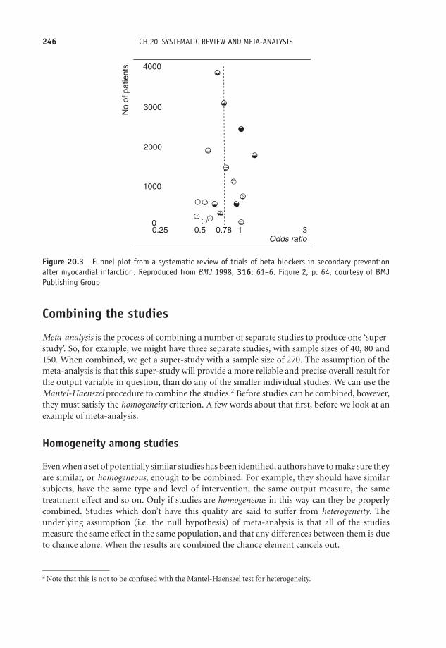
OTE/SPH OTE/SPH
JWBK220-20 December 21, 2007 19:1 Char Count= 0
246 CH 20 SYSTEMATIC REVIEW AND META-ANALYSIS
4000
No
of p
atie
nts
3000
2000
1000
00.25 0.5 0.78 1
Odds ratio3
Figure 20.3 Funnel plot from a systematic review of trials of beta blockers in secondary preventionafter myocardial infarction. Reproduced from BMJ 1998, 316: 61–6. Figure 2, p. 64, courtesy of BMJPublishing Group
Combining the studies
Meta-analysis is the process of combining a number of separate studies to produce one ‘super-study’. So, for example, we might have three separate studies, with sample sizes of 40, 80 and150. When combined, we get a super-study with a sample size of 270. The assumption of themeta-analysis is that this super-study will provide a more reliable and precise overall result forthe output variable in question, than do any of the smaller individual studies. We can use theMantel-Haenszel procedure to combine the studies.2 Before studies can be combined, however,they must satisfy the homogeneity criterion. A few words about that first, before we look at anexample of meta-analysis.
Homogeneity among studies
Even when a set of potentially similar studies has been identified, authors have to make sure theyare similar, or homogeneous, enough to be combined. For example, they should have similarsubjects, have the same type and level of intervention, the same output measure, the sametreatment effect and so on. Only if studies are homogeneous in this way can they be properlycombined. Studies which don’t have this quality are said to suffer from heterogeneity. Theunderlying assumption (i.e. the null hypothesis) of meta-analysis is that all of the studiesmeasure the same effect in the same population, and that any differences between them is dueto chance alone. When the results are combined the chance element cancels out.
2 Note that this is not to be confused with the Mantel-Haenszel test for heterogeneity.

OTE/SPH OTE/SPH
JWBK220-20 December 21, 2007 19:1 Char Count= 0
COMBINING THE STUDIES 247
You might find the comments on heterogeneity by the authors of the diet and cholesterolstudy quoted earlier illuminating (Tang, et al. 1998):
Heterogeneity between study effects
The design and results of these dietary studies differed greatly. They were conductedover 30 years and varied in their aims, in the intensity and type of intervention, andin the different baseline characteristics of the subjects included. Completeness andduration of follow up also differed. Unsurprisingly, the heterogeneity between theireffects on blood cholesterol concentration was also significant. Among the longertrials some, but not all, of the heterogeneity between the effects on blood cholesterolconcentration seemed to be due to the type of diet recommended. Deciding whichtrials should be included in which groups is open to different interpretation and,although we tried to be consistent, for some trials the target diets either were notclearly stated or did not fit neatly into recognised categories such as the step 1 and2 diets. It is important to be cautious in interpreting meta-analysis when there isevidence of significant heterogeneity; although there was no evidence that the overallresults were influenced by trials with outlying values.
The homogeneity assumption should be tested. One possibility is for the authors to providereaders with a L’Abbe plot. The L’Abbe plot displays outcomes from a number of studies, withthe percentage of successes (or reduction in risk, etc.) with the treatment group on the verticalaxis, and same measure for the control/placebo group on the horizontal axis. The 45◦ line isthus the boundary between effective and non-effective treatment. Values above the line showbeneficial results. If possible, varying sized plotting points proportional to sample size shouldbe shown. The more compact the plot, the more homogeneous the studies.
As an example, Figure 20.4 is a L’Abbe plot showing outcomes from 37 placebo-controlledtrials of topical non-steroidal anti-inflammatory drugs in acute (•), and chronic (�), pain
Beneficial results above the 45° line.
the 45° line.
Non-beneficial
results below
Percentage with successful outcome with topical placebo
Perc
enta
ge w
ith s
ucce
ssfu
l out
com
e w
ith to
pica
l non
-ste
roid
al
00
25
25
50
50
75
75
100
100
Figure 20.4 L’Abbe plot showing outcomes from 37 placebo-controlled trials of topical non-steroidalanti-inflammatory drugs in acute (•) and chronic (�) pain conditions. The compactness of the plottedpoints is a measure of homogeneity across the studies. Reproduced from BMJ, Jan 1998; 316: 333–338,courtesy of BMJ Publishing Group

OTE/SPH OTE/SPH
JWBK220-20 December 21, 2007 19:1 Char Count= 0
248 CH 20 SYSTEMATIC REVIEW AND META-ANALYSIS
conditions (Moore et al. 1998). In this plot, the authors have not plotted the points in proportionto sample size. Whether the degree of spread of the points in Figure 20.4 is indicative ofhomogeneity among the studies is a matter of judgement, which can only be made by thoseexperienced in the interpretation of these charts. Note that the overall meta-analytic result canalso be plotted on this same plot (but is not shown in Figure 20.4).
Mantel-Haenszel test for heterogeneity
A more commonly used alternative is the Mantel-Haenszel test for heterogeneity, which uses thechi-squared distribution (see Chapter 14). The null hypothesis is that the studies are homoge-neous. An example of its use is given in Table 20.2, which is taken from a study that ‘aimed toidentify and evaluate all published randomised trials of hospital versus general practice care forpeople with diabetes’ (Griffin 1998). The author’s Table 2 presents a summary of the weighted(by sample size) mean differences, for a number of different outcomes. The author’s Table 3presents similar information for different outcomes in terms of the odds ratio. The p-valuesfor the Mantel-Haenszel test (using chi-squared) are given in the last column. Only one set ofstudies (Referral to chiropody, p-value < 0.005) displays evidence of heterogeneity, but sincethis comprised only two studies, the result is somewhat meaningless.
Meta-analysis and the Mantel-Haenszel procedure
If the studies pass the homogeneity test then we can combine them using the Mantel-Haenszelprocedure, to produce the meta-analysis; this will give us an overall value for the outcome inquestion. The procedure is often accompanied by a forest plot, showing the individual studies,together with the combined result, as in the next example.
This is a report of a meta-analysis of randomised controlled trials to compare antibioticwith placebo, for acute cough in adults, referred to above (Fahey et al. 1998). The focus wason placebo-controlled trials, which reported two specific outcomes: the proportion of subjectsreporting productive cough; and the proportion of subjects reporting no improvement atfollow-up.3 Figure 20.5 shows the forest plots for these two acute cough outcomes, in terms ofthe risk ratios (called by the authors ‘relative risks’) in favour of the specific outcome.
The overall net outcome effect is shown with a diamond shape here (one for each of the twooutcomes). The area of the diamond is proportional to the total number of studies represented,and the width the 95 per cent confidence interval. Values to the left of an odds ratio of 1(bottom axis) show reductions in fatalities among cases, those to the right an increase infatality (compared to control groups).
The Mantel-Haenszel procedure was used to produce the final result shown at the bottomof the forest plot in Figure 20.5. The aggregate relative risks are 0.85 for productive cough and0.62 for no improvement at follow-up. These appear to show reductions in the risk for bothconditions and favour the antibiotic over the placebo. However, since both have 95 per centconfidence intervals which include 1, neither is in fact significant, confirmed by the fact that
3 There was a third outcome concerned with side-effects which is not considered here. See Exercise 20.2 above.
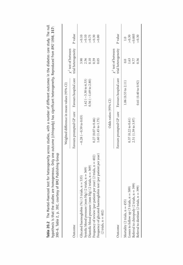
OTE/SPH OTE/SPH
JWBK220-20 December 21, 2007 19:1 Char Count= 0
Tabl
e20
.2Th
eM
ante
l-H
aens
zelt
est
for
hete
roge
neit
yac
ross
stud
ies,
wit
ha
num
ber
ofdi
ffer
ent
outc
omes
inth
edi
abet
esca
rest
udy.
The
null
hypo
thes
isis
that
the
stud
ies
are
hom
ogen
eous
.On
lyon
eou
tcom
e(c
hiro
pody
)ha
ssi
gnifi
cant
hete
roge
neit
y.Re
prod
uced
from
BMJ
1998
,31
7:39
0–6.
Tabl
e2,
p.39
2,co
urte
syof
BMJ
Publ
ishi
ngGr
oup
Wei
ghte
ddi
ffer
ence
inm
ean
valu
es(9
5%C
I)
Ou
tcom
eFa
vou
rspr
ompt
edG
Pca
reFa
vou
rsh
ospi
talc
are
χ2
test
ofbe
twee
ntr
ialh
eter
ogen
eity
Pva
lue
Gly
cate
dh
aem
oglo
bin
(%)
(3tr
ials
,n=
535)
−0.2
8(−
0.59
to0.
03)
3.90
>0.
10Sy
stol
icbl
ood
pres
sure
(mm
Hg)
(2tr
ials
,n=
369)
1.62
(−3.
30to
6.53
)2.
56>
0.10
Dia
stol
icbl
ood
pres
sure
(mm
Hg)
(2tr
ials
,n=
369)
0.56
(−1.
69to
2.80
)0.
10>
0.75
Freq
uen
cyof
revi
ew(p
erpa
tien
tpe
rye
ar)
(2tr
ials
,n=
402)
0.27
(0.0
7to
0.46
)0.
59>
0.30
Freq
uen
cyof
glyc
ated
hae
mog
lobi
nte
st(p
erpa
tien
tpe
rye
ar)
1.60
(1.4
5to
1.75
)0.
05>
0.80
(2tr
ials
,n=
402)
Od
ds
rati
os(9
5%C
I)
Ou
tcom
eFa
vou
rspr
ompt
edG
Pca
reFa
vou
rsh
ospi
talc
are
χ2
test
ofbe
twee
ntr
ialh
eter
ogen
eity
Pva
lue
Mor
talit
y(2
tria
ls,n
=45
5)1.
06(0
.53
to2.
11)
0.0
1.0
Los
ses
tofo
llow
up
(3tr
ials
,n=
589)
0.37
(0.2
2to
0.61
)1.
63>
0.30
Ref
erra
lto
chir
opod
y(2
tria
ls,n
=39
9)2.
51(1
.59
to3.
97)
9.77
<0.
005
Ref
erra
lto
diet
itia
n(2
tria
ls,n
=39
9)0.
61(0
.40
to0.
92)
0.56
>0.
30
249
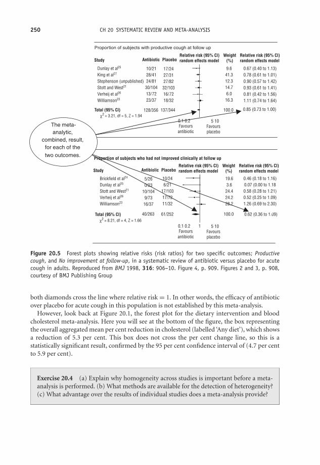
OTE/SPH OTE/SPH
JWBK220-20 December 21, 2007 19:1 Char Count= 0
250 CH 20 SYSTEMATIC REVIEW AND META-ANALYSIS
Proportion of subjects with productive cough at follow up
Proportion of subjects who had not improved clinically at follow up
Study
Total (95% Cl)
10/2128/4124/81
30/10413/7223/37
Dunlay et al25
King et al27
Stephenson (unpublished)Stott and West21
Verheij et al26
Williamson23
128/356 137/344
17/2427/3127/82
32/10316/7218/32
9.641.312.314.76.0
16.3
19.63.6
24.424.228.2
0.46 (0.18 to 1.16)0.07 (0.00 to 1.180.58 (0.28 to 1.21)0.52 (0.25 to 1.09)1.26 (0.69 to 2.30)
0.62 (0.36 to 1.09)
5/260/23
10/1049/73
16/37
Brickfield et al24
Dunlay et al25
Stott and West21
Verheij et al26
Williamson23
Total (95% Cl) 40/263 61/252
10/246/21
17/10317/7211/32
0.67 (0.40 to 1.13)0.78 (0.61 to 1.01)0.90 (0.57 to 1.42)0.93 (0.61 to 1.41)0.81 (0.42 to 1.56)1.11 (0.74 to 1.64)
100.0 0.85 (0.73 to 1.00)
0.1 0.2 5 10Favours
antibioticFavoursplacebo
0.1 0.2 1 5 10
100.0
Favoursantibiotic
Favoursplacebo
Antibiotic PlaceboRelative risk (95% Cl)random effects model
Relative risk (95% Cl)random effects model
Weight(%)
Study Antibiolic PlaceboRelative risk (95% Cl)random effects model
Relative risk (95% Cl)random effects model
Weight(%)
χ2 = 3.21, df = 5, Z = 1.94
χ2 = 8.21, df = 4, Z = 1.66
The meta-analytic,
combined, result, for each of the two outcomes.
Figure 20.5 Forest plots showing relative risks (risk ratios) for two specific outcomes; Productivecough, and No improvement at follow-up, in a systematic review of antibiotic versus placebo for acutecough in adults. Reproduced from BMJ 1998, 316: 906–10. Figure 4, p. 909. Figures 2 and 3, p. 908,courtesy of BMJ Publishing Group
both diamonds cross the line where relative risk = 1. In other words, the efficacy of antibioticover placebo for acute cough in this population is not established by this meta-analysis.
However, look back at Figure 20.1, the forest plot for the dietary intervention and bloodcholesterol meta-analysis. Here you will see at the bottom of the figure, the box representingthe overall aggregated mean per cent reduction in cholesterol (labelled ‘Any diet’), which showsa reduction of 5.3 per cent. This box does not cross the per cent change line, so this is astatistically significant result, confirmed by the 95 per cent confidence interval of (4.7 per centto 5.9 per cent).
Exercise 20.4 (a) Explain why homogeneity across studies is important before a meta-analysis is performed. (b) What methods are available for the detection of heterogeneity?(c) What advantage over the results of individual studies does a meta-analysis provide?
OTE/SPH OTE/SPH
JWBK220-21 November 28, 2007 11:11 Char Count= 0
AppendixTable of random numbers
23157 54859 01837 25993 76249 70886 95230 3674405545 55043 10537 43508 90611 83744 10962 2134314871 60350 32404 36223 50051 00322 11543 8083438976 74951 94051 75853 78805 90194 32428 7169597312 61718 99755 30870 94251 25841 54882 1051311742 69381 44339 30872 32797 33118 22647 0685043361 28859 11016 45623 93009 00499 43640 7403693806 20478 38268 04491 55751 18932 58475 5257149540 13181 08429 84187 69538 29661 77738 0952736768 72633 37948 21569 41959 68670 45274 8388007092 52392 24627 12067 06558 45344 67338 4532043310 01081 44863 80307 52555 16148 89742 9464761570 06360 06173 63775 63148 95123 35017 4699331352 83799 10779 18941 31579 76448 62584 8691957048 86526 27795 93692 90529 56546 35065 3225409243 44200 68721 07137 30729 75756 09298 2765097957 35018 40894 88329 52230 82521 22532 6158793732 59570 43781 98885 56671 66826 95996 4456972621 11225 00922 68264 35666 59434 71687 5816761020 74418 45371 20794 95917 37866 99536 1937897839 85474 33055 91718 45473 54144 22034 2300089160 97192 22232 90637 35055 45489 88438 1636125966 88220 62871 79265 02823 52862 84919 5488381443 31719 05049 54806 74690 07567 65017 1654311322 54931 42362 34386 08624 97687 46245 23245
Medical Statistics from Scratch, Second Edition David BowersC© 2008 John Wiley & Sons, Ltd

OTE/SPH OTE/SPH
JWBK220-21 November 28, 2007 11:11 Char Count= 0
252

OTE/SPH OTE/SPH
JWBK220-22 December 18, 2007 10:23 Char Count= 0
Solutions to Exercises
Note: Although I have provided complete solutions to the calculating parts of the exercises, Ihave offered only brief comments where a commentary is required. This is deliberate, firstlybecause I don’t want to write the book again in terms of the solutions and secondly tutors mightwant to tease these answers from the students themselves, perhaps as part of a wider discussion.
1.1 Ethnicity, sex, marital status, type of operation, smoking status, etc.
1.2 Apgar scale, Waterlow scale, Edinburgh Post-natal Depressions scale, Beck DepressionInventory, SF36, Apache, etc.
1.3 GCS produces ordinal data, which are not real numbers, so can’t be added or divided.
1.4 Height, temp., cholesterol, body mass index, age, time, etc.
1.5 Number of deaths, number of angina attacks, number of operations performed, numberof stillbirths, etc.
1.6 A continuous metric variable has an infinite or uncountable number of possible values. Adiscrete metric variable has a limited, countable number of possible values. (a) 7 (0, 1, 2, . . . , 6).(b) Not possible to do this, since number of possible weights is infinite.
1.7 VAS data is ordinal, because these are subjective judgements, which are not measuredbut assessed, and will probably vary from patient to patient and moment to moment. So it’snot possible to calculate average if by this is meant adding up four values and dividing by four,because ordinal data are not real numbers.
1.8 Age, MC. Social class, O. No. of children, MD. Age at 1st child, MC. Age at menarche,MC. Menopausal state, O. Age at menopause, MC. Lifetime use of oral contraceptives, N. No.years taking oral contraceptives, MC. No. months breastfeeding, MC. Lifetime use of hrt, MC.Years of hrt, MC. Family history of ovarian cancer, N. Family history of breast cancer, N. Unitsof alcohol, MD. No. cigs per day, MD. Body mass index, MC. (key: N = nominal; O = ordinal;MD = metric discrete; MC = metric cont.).
1.9 Maternal age, MC, but given here in ordinal groups. Parity, MD. No. cigs daily, MD.Multiple pregnancy, N. Pre-eclampsia, N. Cesarean, N.
Medical Statistics from Scratch, Second Edition David BowersC© 2008 John Wiley & Sons, Ltd
OTE/SPH OTE/SPH
JWBK220-22 December 18, 2007 10:23 Char Count= 0
254 SOLUTIONS TO EXERCISES
1.10 Age, MC. Sex, N. Number of rooms in home, MD. Length of hair, O. Colour of hair, N.Texture of hair, N. Pruritus, N. Excoriations, N. Live lice, O. Viable nits, O.
2.1
Frequency Relative frequencyCause of injury (number of patients) (% of patients)
Falls 46 61.33Crush 20 26.67Motor vehicle crash 6 8.00Other 3 4.00
2.2
Satisfaction with Frequency Relative frequencynursing care (number of patients) (% of patients)
Very satisfied 121 25.5Satisfied 161 33.9Neutral 90 18.9Dissatisfied 51 10.7Very dissatisfied 52 10.9
2.3
% mortality tally Frequency
10.0–14.9 —–//// //// 915.0–19.9 —–//// /// 820.0–24.9 —–//// 525.0–29.9 /// 330.0–34.9 / 1
Observation: Most ICUs have percentage mortality under 20 per cent.
2.4
Parity Frequency % frequency
0 5 12.501 6 15.002 14 35.003 10 25.004 3 7.55 1 2.56 0 07 0 08 1 2.5

OTE/SPH OTE/SPH
JWBK220-22 December 18, 2007 10:23 Char Count= 0
SOLUTIONS TO EXERCISES 255
Most women have a parity between 1 and 3, with the largest percentage of women (35 per cent)having a parity of 1.
2.5 (a)
Cumulative frequency Cumulative relativeGCS Frequency (cumulative no. Relative frequency frequency.score (no. of patients) of patients) (% of patients) (Cumulative % of patients)
3 10 10 6.49 6.494 5 15 3.25 9.745 6 21 3.90 13.646 2 23 1.30 14.947 12 35 7.79 22.738 15 50 9.74 32.479 18 68 11.69 44.16
10 14 82 9.09 53.2511 15 97 9.74 62.9912 21 118 13.64 76.6313 13 131 8.44 85.0714 17 148 11.04 96.1115 6 154 3.90 100.00
(b) 53.25 per cent
2.6
(a) Better to have parity as the columns and diagnosis as the rows.
Parity (no.)
Diagnosis ≤2 >2 totals
Benign 22 10 32Malignant 4 4 8totals 26 14 40
(b)
Diagnosis Parity (%)
≤2 >2
Benign 84.6 71.4Malignant 15.4 28.6totals 100.0 100.0
OTE/SPH OTE/SPH
JWBK220-22 December 18, 2007 10:23 Char Count= 0
256 SOLUTIONS TO EXERCISES
(c) Only 15.4 per cent of those with a parity of 2 or less had a malignant diagnosis, comparedto nearly twice as many with a parity of 3 or more. Low levels of parity seem to favour a benigndiagnosis.
2.7
OCP Cases (n = 106) Controls (n = 226)
Yes 38 61No 62 39totals 100 100
Comment: Only 38 per cent of those receiving a malignant diagnosis (the cases) had at sometime used OCP, whereas 61 per cent of the controls (receiving a benign diagnosis), had usedOCP. This suggests that a woman who had used OCP is more likely to receive a benign diagnosis.This is not a contingency table. There are two distinct groups of patients, those with a malignantdiagnosis and those with a benign diagnosis.
3.1 Most common type of stroke is non-disabling large-artery in both groups. Second mostcommon is disabling large artery in both groups.
3.2
Very satisfied
SatisfiedNeutral
DissatisfiedVery dissatisfied
Category
10.9%
10.7%18.9%
33.9%
25.5%
3.3
d-phenothrin children
0
10
20
30
40
50
60
Blonde Brown Red Dark
Hair colour
Fre
qu
ency
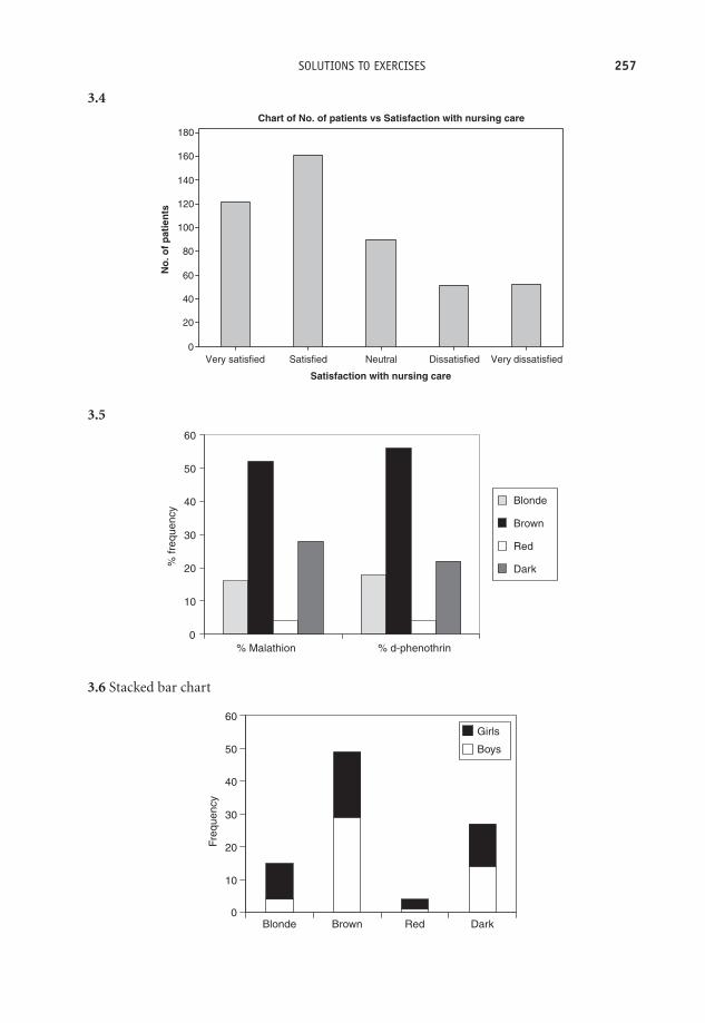
OTE/SPH OTE/SPH
JWBK220-22 December 18, 2007 10:23 Char Count= 0
SOLUTIONS TO EXERCISES 257
3.4
Satisfaction with nursing care
No
. of
pat
ien
ts
Very dissatisfiedDissatisfiedNeutralSatisfiedVery satisfied
180
160
140
120
100
80
60
40
20
0
Chart of No. of patients vs Satisfaction with nursing care
3.5
0
10
20
30
40
50
60
% Malathion % d-phenothrin
% fr
eque
ncy
Blonde
Brown
Red
Dark
3.6 Stacked bar chart
0
10
20
30
40
50
60
Blonde Brown Red Dark
Freq
uenc
y
Girls
Boys
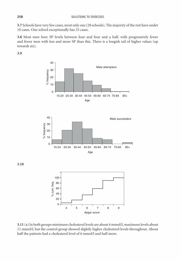
OTE/SPH OTE/SPH
JWBK220-22 December 18, 2007 10:23 Char Count= 0
258 SOLUTIONS TO EXERCISES
3.7 Schools have very few cases, most only one (20 schools). The majority of the rest have under10 cases. One school exceptionally has 23 cases.
3.8 Most men have SP levels between four and four and a half, with progressively fewerand fewer men with less and more SP than this. There is a longish tail of higher values (uptowards six).
3.9
Male succeeders
0
10
20
30
40
15-24 25-34 35-44 45-54 55-64 65-74 75-84 85+
Age
% fr
eque
ncy
Male attempters
0
10
20
30
40
15-24 25-34 35-44 45-54 55-64 65-74 75-84 85+
Age
% fr
eque
ncy
3.10
100
80
60
40
20
04 5 6 7 8 9
% c
um. f
req.
Apgar score
3.11 (a) In both groups minimum cholesterol levels are about 4 mmol/l, maximum levels about11 mmol/l, but the control group showed slightly higher cholesterol levels throughout. Abouthalf the patients had a cholesterol level of 6 mmol/l and half more.

OTE/SPH OTE/SPH
JWBK220-22 December 18, 2007 10:23 Char Count= 0
SOLUTIONS TO EXERCISES 259
(b)
120Male attempters
Age
<15 15–24 25–34 35–44 45–54 55–64 65–74 75–84 85+
100
80
60
40
20
0
% c
um fr
eque
ncy
120 Male succeeders
Age
<15 15–24 25–34 35–44 45–54 55–64 65–74 75–84 85+
100
80
60
40
20
0
% fr
eque
ncy
About 26 and 33
Comment: although this data is grouped we can see that half of the male attempters wereyounger than the youngest half of the male succeeders.
4.1 (a) highest is 70–79, (b) lowest is <15.
4.2 Less skewed.
4.3 (a) Negative. (b) The distribution is positively skewed, but only shows the lowest 95 per centof values.
4.4 For attempters, the majority of both men and women are aged between 25 and 35. Forsucceeders, the majority are between 25 and 54. In all cases the distributions are positivelyskewed.
5.1 (a) Proportion breast fed = 67/149 = 0.4497; percentage = 0.4497 × 100 = 44.97 %.(b) Proportion bottle fed = 93/182 = 0.5110; percentage = 0.5110 × 100 = 51.10 %.
5.2 (a) Prevalence of genital chlamydia = (23/890) × 100 = 2.58 %.(b) Incidence of SIDS per year = 10/10000.
Incidence rate per thousand live births per year = 10/10 = 1 SIDS death per 1000 live birthsper year.
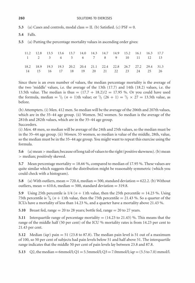
OTE/SPH OTE/SPH
JWBK220-22 December 18, 2007 10:23 Char Count= 0
260 SOLUTIONS TO EXERCISES
5.3 (a) Cases and controls, modal class = II. (b) Satisfied. (c) PSF = 0.
5.4 Falls.
5.5 (a) Putting the percentage mortality values in ascending order gives:
11.2 12.8 13.5 13.6 13.7 14.0 14.3 14.7 14.9 15.2 16.1 16.3 17.71 2 3 4 5 6 7 8 9 10 11 12 13
18.2 18.9 19.3 19.3 20.2 20.4 21.1 22.4 22.8 26.7 27.2 29.4 31.314 15 16 17 18 19 20 21 22 23 24 25 26
Since there is an even number of values, the median percentage mortality is the average ofthe two ‘middle’ values, i.e. the average of the 13th (17.7) and 14th (18.2) values, i.e. the13.5th value. The median is thus = (17.7 + 18.2)/2 = 17.95 %. Or you could have usedthe formula, median = 1/2 (n + 1)th value; or 1/2 (26 + 1) = 1/2 × 27 = 13.5th value, asbefore.
(b) Attempters. (i) Men. 412 men. So median will be the average of the 206th and 207th values,which are in the 35–44 age group. (ii) Women. 562 women. So median is the average of the281th and 282th values, which are in the 35–44 age group.Succeeders.(i) Men. 48 men, so median will be average of the 24th and 25th values, so the median must bein the 35–44 age group. (ii) Women. 55 women, so median is value of the middle, 28th, value,so the median must be in the 35–44 age group. You might want to repeat this exercise using theformula.
5.6 (a) mean>median; because of long tail of values to the right (positive skewness). (b) mean> median; positively skewed.
5.7 Mean percentage mortality = 18.66 %, compared to median of 17.95 %. These values arequite similar which suggests that the distribution might be reasonably symmetric (which youcould check with a histogram).
5.8 (a) With outliers, mean = 720.4, median = 500, standard deviation = 622.2. (b) Withoutoutliers, mean = 610.6, median = 500, standard deviation = 319.8.
5.9 Using 25th percentile is 1/4 (n + 1)th value, then the 25th percentile = 14.23 %. Using75th percentile is 3/4 (n + 1)th value, then the 75th percentile = 21.43 %. So a quarter of theICUs have a mortality of less than 14.23 %, and a quarter have a mortality above 21.43 %.
5.10 Breast fed, range = 20 to 28 years; bottle fed, range = 20 to 27 years.
5.11 Interquartile range of percentage mortality = (14.23 to 21.43) %. This means that therange of the middle half (50 per cent) of the ICU % mortality rates is from 14.23 per cent to21.43 per cent.
5.12 Median (iqr) pain = 51 (23.8 to 87.8). The median pain level is 51 out of a maximumof 100, so 50 per cent of subjects had pain levels below 51 and half above 51. The interquartilerange indicates that the middle 50 per cent of pain levels lay between 23.8 and 87.8.
5.13 Q2, the median = 6mmol/l; Q1 = 5.5mmol/l; Q3 = 7.0mmol/l; iqr = (5.5 to 7.0) mmol/l.

OTE/SPH OTE/SPH
JWBK220-22 December 18, 2007 10:23 Char Count= 0
SOLUTIONS TO EXERCISES 261
5.14
ICU
_% M
ort
alit
y
30
25
20
15
10
Boxplot of ICU_% Mortality
Seems to have a long positive tail and positively skewed (or outliers).
5.15 Median percentage DNA damage higher in the control group - about 12 compared toabout eight in survivors. Interquartile range is also slightly larger. Max value much larger incontrols (about 25 compared to 15). Minimums similar.
5.16 You can think of this, roughly speaking, as indicating that the average distance of all ofthese cord platelet count values is 69×109/l from the mean value of 306×109/l.
5.17 SD = 5.36 %. With a mean of 18.66 per cent (Exercise 5.6), this suggests that the ICU’spercentage mortality rates are, on average, 5.36 per cent away from this mean value.
5.18 For data to be Normally distributed, we need to be able to fit in three standard deviationsbelow the mean (and three above it). In all cases it is impossible (by a long way!) to fit threeSDs below the mean value without going into negative time. This would suggest that all thedistributions are positively skewed.
6.1 The target population is the population at which the research is aimed; this is too large tobe studied in any way. The study population is a more attainable but nonetheless still too largeto be studied. The sample is a sample, representative of the study population. Consider trying tostudy the population of people in the UK who are HIV+. This is large population, perhaps manyhundreds of thousands. It will be impossible to identify all, or even a reasonable proportion ofthis population. Many of these people will be transient; many will be undiagnosed. Many willrefuse to participate in any research, etc.
6.2 The principal advantage is that a random sample will be representative of the population.The principal drawback is that a sampling frame is needed to take a random sample. Practically,sample frames for any realistic population are virtually impossible to obtain.
6.3 In an observational study, the investigators do not influence in any way the recruitment,treatment or aftercare of subjects, but may simply ask questions, take measurements, observeevents and so on. In an experimental study, the investigator takes any active role in some aspectof the study, giving a drug, changing nursing care, etc.

OTE/SPH OTE/SPH
JWBK220-22 December 18, 2007 10:23 Char Count= 0
262 SOLUTIONS TO EXERCISES
6.4 A sample to determine levels of satisfaction with an endoscopy procedure. A sample todetermine the prevalence of pressure sores in elderly patients in hospitals.
6.5 (a) Case-control studies are usually quicker, cheaper and better with rare conditions,than cohort studies. They don’t suffer from subject fall-out over time. (b) Selection of suitablecontrols is often difficult. Problems with reliance on accuracy of patient recall, and medicalrecords. Not good when exposure to risk factor is rare.
6.6 By double-blinding.
6.7 (a) To produce two groups of subjects who are as alike as possible. This will balance allfactors, known and unknown, that might differentially affect the response of the two groups tothe two treatments or treatment and placebo, and includes controlling for confounders. (b) Anysolution to this problem will, of course, depend on the particular set of random numbers used.My random numbers were: 2 3 1 5 (7) 5 4 (8) 5 (9) (0) 1 (8) 3 (7) 2. Since we only have sixblocks we can’t use the random numbers in parentheses. With blocks of four:
Block 1, CCTT; Block 2, CTCT; Block 3, CTTC;Block 4, TCTC; Block 5, TCCT; Block 6, TTCC
The first number is 2, so the first four subjects are allocated as block 2: C, T, C and T. The nextnumber is 3, so the next four subjects are allocated: C, T, T and C. Continue this procedureuntil there are 20 in each group.
6.8 (a) The authors used a cross-section study of schoolchildren who were given a skin-pricktest of sensitivity to six common allergens (the outcome variable), to determine atopic status,complimented by a questionnaire completed by parents to elicit pertinent socio-economicfactors (including number of siblings). Possible confounders identified by the researchers werefamily history of atopy, sex, socio-economic status, presence of pets, smoking, and age.
(b) The researchers used a double-blind RCT, with patients (aged 2–15 years) randomisedto either CF or PM. To quote, ‘A double-dummy techniques was used: patients randomlyassigned to CF also received a placebo PM, and patients randomly assigned to PM also receiveda placebo CF. Drug allocation was determined by a computer-generated list of random numbers.’The clinical outcome variable was the presence or absence of persistent dysentery after threedays, and acceptable stool quality1 and no fever after five days. Confounding is not an issuein RCTs, since the randomisation process is supposed to produce two groups with identicalcharacteristics.
(c) The researchers used a cohort design, following a group of 2185 pregnant women becomingpregnant and having a baby between August 1991 and May 1993. The women were divided intotwo groups, normotensive and hypertensive. The outcome variable was defined as a birthweightbelow the 10th decile of expected weight (values from reference tables). Potential confounderswere parity, age, socio-economic status, ethnicity, weight and height, smoking status, and useof aspirin.
(d) The researchers used a case-control study, in which cases were women with Down syndromechildren, and controls were women selected randomly, having children with no congenital
1 Satisfying a number of criteria.

OTE/SPH OTE/SPH
JWBK220-22 December 18, 2007 10:23 Char Count= 0
SOLUTIONS TO EXERCISES 263
abnormalities. Controls were matched only on birth year. There were 10 controls for eachcase! Potential confounding factors were: maternal and paternal ages, marital status (mar-ried/unmarried), parity, alcohol consumption (yes/no), prior foetal loss, and race (white/non-white).
(e) The researchers describe their study design as a ‘follow-up’ study. They selected two groupsof patients (and their relatives), one receiving home-based care in one part of a city, the otherhospital-based care, in a different part of the city. The relatives were interviewed at 10 days, onemonth and one year, and given questionnaires to assess the burden they were experiencing,their satisfaction with the service, and the General Health Questionnaire. The patients wereassessed after four days, and then weekly and given a number of psychiatric questionnaires(Present State Examination, Morningside Rehabilitation Scale). The results from these variousquestionnaires constituted the outcome measures.
(f) The researchers used a randomised cross-over design. The subjects were randomised toeither the ‘regular’ treatment arm (two puffs of salbutamol four times daily) or the ‘as needed’treatment arm (salbutamol used as needed), each arm lasting two weeks. Patients were askedto record their peak expiratory flow rate (PEFR) morning and evening before inhaler use, thenumber of asthma episodes, and the number of as-needed salbutamol puffs used for symptomrelief.
(g) The researchers summarise their design as follows, ‘All new clients referred for counsellingby GPs were asked to complete a questionnaire before and after counselling’. This contained:three psychological scales to measure anxiety and depression, self-esteem, and quality of life;and questions on levels of satisfaction with the counselling service. GPs were also asked tocomplete a questionnaire on their level of satisfaction with the service. The prescribing ofanxiolytic/hypnotic and anti-depressant drugs, and the number of referrals to other mentalhealth services in practices with and without counsellors was compared.
7.1 (a) A population parameter is a defining characteristic of a population, for examplethe mean age of all men dying of lung cancer in England and wales. The population pa-rameter is unknown but can be estimated from a representative sample drawn from thispopulation. (b) A sample will never have exactly the same characteristics as a populationbecause there is always the possibility that those members of a population not included inthe sample may in some way be different from those included. (c) Determining the param-eters of a target population is the underlying objective, but in practice this may prove to bedifficult if not impossible. The study population is the population that, in practice, can besampled.
7.2 They may be more wealthy or poorer, or older, or ethnically more or less mixed, etc.
8.1 (a) (i) p(benign) = 226/332 = 0.681; (ii) p(malignant) = 106/332 = 0.319. Notice thesetwo probabilities sum to 1. (b) p(postmenopausal) = 200/332 = 0.602; (c) p(>3 children) =112/332 = 0.337.
8.2 (a) p(age <30) = (0.355 + 0.206 + 0.043) = 0.604. (b) p(age >29) = (0.248 + 0.148) =0.396.
8.3 (a) 0.99. (b) 0.165

OTE/SPH OTE/SPH
JWBK220-22 December 18, 2007 10:23 Char Count= 0
264 SOLUTIONS TO EXERCISES
8.4 (a) Men.
Alcohol consumption(beverages/week)
Dead <1 >69 Totals
Yes 195 66 261No 430 145 575Totals 625 211 836
(i) Absolute risk of death if consuming <1 beverage per week = 195/625 = 0.312. (ii) Absoluterisk of death if consuming >69 beverages per week = 66/211 = 0.313.
(b) Women.
Alcohol consumption(beverages/week)
Dead <1 >69 Totals
Yes 394 1 395No 2078 19 2097Totals 2472 20 2492
(i) Absolute risk of death if consuming <1 beverage per week = 394/2472 = 0.159. (ii) Absoluterisk of death if consuming >69 beverages per week = 1/20 = 0.050.
Interpretation of results. For men there is approximately the same absolute risk of death amongthose consuming <1 beverage per week and those consuming >69 beverages per week (0.312versus 0.313). For women the absolute risk of death if consuming <1 beverage per week isabout three times the absolute risk for those consuming >69 beverages per week (0.159 versus0.050). This perhaps surprising result may be due to the very small numbers consuming >69beverages per week, which makes the result very unreliable.
8.5 (a) Under 35.
Down syndrome baby
Smoked Yes No
Yes 112 1411No 421 5214Totals 533 6625
(i) The odds that a woman having a Down syndrome baby smoked = 112/421 = 0.2660. (ii)The odds that a woman having a healthy baby smoked = 1411/5214 = 0.2706.

OTE/SPH OTE/SPH
JWBK220-22 December 18, 2007 10:23 Char Count= 0
SOLUTIONS TO EXERCISES 265
(b) ≥ 35
Down syndrome baby
Smoked Yes No
Yes 15 108No 186 611
Totals 201 719
(i) The odds that a woman having a Down syndrome baby, smoked = 15/186 = 0.0806. (ii)The odds that a woman having a healthy baby, smoked = 108/611 = 0.1768.
Interpretation of results. Among the under 35 mothers there is little difference in the odds forDown syndrome between smoking and non-smoking mothers (0.2660 versus 0.2706). Amongmothers ≥35, the odds for Down syndrome among smoking mothers is about a half the oddsfor non-smoking mothers (0.0806 versus 0.1768).
8.6 (a) p = 0.0806/(1 + 0.806) = 0.0746; (b) p = 0.1768/(1 + 0.1768) = 0.1502.
8.7 (a) Men: risk ratio of death among those drinking >69 beverages per week compared tothose drinking <1 beverage per week = 0.313/0.312 = 1.003. (b) Women: risk ratio = 0.050/0.159 = 0.314.
Interpretation of results. For men a risk ratio very close to 1 implies that that there is no increasedor decreased risk of death among those drinking <1 compared to those drinking >69 beveragesper week. For women, the risk of death among the heavy drinkers appears to be only about athird the risk for light (or none) drinkers. But small numbers in the sample are not reliable.
8.8 (a) Mothers <35. Odds ratio for a woman with a Down syndrome baby having smoked,compared to a woman with a healthy baby = 0.2660/0.2706 = 0.9830. (b) Mothers ≥35. Oddsratio = 0.0806/0.1768 = 0.4558.
Interpretation of results. In younger mothers, the odds ratio close to 1 (0.9830) implies thatsmoking neither increases nor decreases the odds for Down syndrome. In older mothers, theodds ratio of 0.4558, implies that mothers who smoked during pregnancy have under half theodds of having a Down syndrome baby compared to non-smoking mothers.
8.9
Periodontitis
Death from CHD Yes No Totals
Yes 151 92 243No 1635 3450 5085Totals 1786 3542 5328
Absolute risk of dying from CHD with periodontitis = 151/1786 = 0.084. Absolute risk ofdying from CHD with no dental disease = 92/3542 = 0.026. So risk reduction = 0.084 –0.026 = 0.058. Therefore NNT = 1/0.058 = 17.2, i.e. 18 people.

OTE/SPH OTE/SPH
JWBK220-22 December 18, 2007 10:23 Char Count= 0
266 SOLUTIONS TO EXERCISES
9.1 The smaller the s.e. of the sample mean, the more precise the estimate of the populationmean. In this case the sample mean vitamin E intake of 6.30 mg (non-cases), has a s.e. of 0.05mg, so we can be 95 per cent confident that the population mean vitamin E intake (non-cases)is no further than two s.e.s from this mean, i.e. within ± 0.10 mg. The largest s.e., 5.06 mg, andtherefore the least precise estimate of the population mean, is that for vitamin C (cases).
9.2 (a) Cases. Sample mean age = 61.6 y, sample s.d. = 10.9 y, n = 106. Thus s.e.(x) =10.9/
√106 = 1.059. The 95 per cent confidence interval is therefore: (61.6 ± 2 × 1.059), or
(59.582 to 63.718) years. (b) Controls. Sample mean age = 51.0 y, sample s.d. = 8.5 y, n = 226.Thus s.e.(x) = 8.5/
√226 = 0.565. The 95 per cent confidence interval is therefore: (51.0 ± 2 ×
0.565), or (49.870 to 52.13) years. The fact that the two CIs don’t overlap means that we canbe 95 per cent confident that the two population mean ages are significantly different.
9.3 For the integrated care group, over 12 months the sample mean number of admissions is0.15. The 95 per cent confidence interval means we can be 95 per cent confident that the intervalfrom 0.11 to 0.19 will contain the population mean number of visits for the population of whichthis is a representative sample. For the conventional care group the sample mean number ofvisits is lower, 0.11, and the 95 per cent confidence interval means we can be 95 per centconfident that the interval from 0.08 to 0.15 will contain the population mean number of visits.
9.4 p = 0.290, s.e.(p) =√
0.29(1 − 0.29)
226= 0.030. 95 % CI is:
(0.290 – 2 × 0.030 to 0.290 + 2 × 0.030) = (0.230 to 0.350)
So we can be 95 per cent confident that the interval from 0.230 to 0.350 (or 23.0 to 35.0 per cent),will contain the population proportion of women who are pre-menopausal.
9.5 For all three time periods the median differences in pain levels are reasonably similar(38, 31 and 35), as are the 95 per cent confidence intervals, which all overlap, indicating nostatistically significant difference between the two groups at any time period.
10.1 Three of the confidence intervals include zero, so there is no statistically significantdifference in population mean infant weights between non-smoking and smoking mothers.The confidence interval for the difference in the mean weight of non-smoking mothers andmothers smoking 1–9 cigarettes per day, (−118 to –10) g, for boys, does not include zero, sothis difference in population mean weights is statistically significant.
10.2 That for the radius, which has the narrowest confidence interval.
10.3 Because overlapping confidence intervals imply that the difference is not statisticallysignificant.
10.4 The difference in sample median alcohol intakes is 5.4 g. The 95 per cent confidenceinterval of (1.2 to 9.9) g, does not include zero, so we can be 95 per cent confident that thepopulation difference in median alcohol intake is statistically significant and lies somewherebetween 1.2 g and 9.9 g.
11.1 For gingivitis, the confidence intervals for both CHD and mortality contain 1, so dif-ference in risk compared to no disease is not statistically significant. For periodontitis neitherconfidence interval includes 1, so the difference in risk is statistically significant. For no teeth,the confidence interval for CHD includes 1, so not statistically significant, but for mortality,
OTE/SPH OTE/SPH
JWBK220-22 December 18, 2007 10:23 Char Count= 0
SOLUTIONS TO EXERCISES 267
the confidence interval does not include 1, so the difference in risk compared to no disease isstatistically significant.
11.2 (a) Age and sex are notorious as confounders of many other variables, and adjustmentfor them is nearly always advisable. (b) With no exercise taken as the referent state, the odds ratiofor all three age groups are less than 1, suggesting perhaps that exercise at any age reduces theodds for a stroke. However, only exercise taken between 15 and 40 has a statistically significanteffect, since the confidence interval for the 40–55 year-old group, (0.3 to 1.5), includes 1. Note,by the way, that a 25-year-old and a 40-year-old individual could each be allocated to eitherone of two groups. The groups are not well defined.
11.3 The following risk factors are statistically significant for increasing the risk of throm-boembolic events: being aged ≤19; having any parity other than 1; smoking ≥ 10 cigarettesper day; having multiple pregnancy; having pre-eclampsia; having a cesarean. The latter twoappear to increase the risk the most.
12.1 (a) Is the proportion of women using the clinic same as proportion of men, i.e. 0.5?(b) H0: π = 0.5 (π is population proportion of women using clinic). (c) Yes, reject because thep-value is less than 0.05. The proportion of women is not 0.5, i.e not the same as men. (d) No,don’t reject because the p-value is not less than 0.05. The proportion of women using the clinicis the same as men.
12.2 Since both p-values (0.25 and 0.32) exceed 0.05, then there is no statistically significantdifference in the two means.
12.3 Mean age, mean age at menopause, and mean body mass index are statistically significant,since their p-values are all less than 0.05. The other four variables show no statistically significantdifference since their p-values are all greater than 0.05.
12.4 (a) A false positive is when the null hypothesis is rejected when it shouldn’t have been,because it is true, i.e. an effect is detected when there isn’t one. (b) A false negative is when thenull hypothesis is not rejected when it should have been, because it is false, i.e. a real effect isnot detected.
12.5 (a) We want to minimise the probability of a type I error, i.e. a false positive. Forexample, we might have a test, the results of which, if positive, will lead to an unnecessaryintrusive intervention. (b) Because if α is made very small, β would be become unacceptablylarge because of the trade-off between the two measures.
12.6 (a) (i) n = (2 × 122/102) × 10.5 = 31; (ii) n = (2 × 122/102) × 14.9 = 43; (iii) n =(2 × 122/102) × 11.7 = 34. (b) (i) n = [(0.4 × 0.6 + 0.20 × 0.80)/0.202] × 10.5 = 105;(ii) n = [(0.4 × 0.6 + 0.20 × 0.80)/0.202] × 14.9 = 149; (iii) n = [(0.4 × 0.6 + 0.20 ×0.80)/0.202] × 11.7 = 117.
12.7 Pa = 0.70. Pb = 0.80, so (Pb – Pa) = −0.10. Therefore, (a) n = [(0.70 × 0.30 + 0.80 ×0.20)/ −0.102] × 7.8 = 289; (b) n = [(0.70 × 0.30 + 0.80 × 0.20)/ −0.102] × 14.9 = 551.
13.1 There are only two statistically significant risk factors, both of which show higher risksfor the alteplase patients (i.e. rr < 1); CAPG, rr = 0.884, p-value = 0.049, see table footnotefor meaning of CAPG; and a Killip classification > 1; rr = 0.991, p-value = 0.026. Anaphylaxisis a complication which is almost statistically significant (rr = 0.376, p-value = 0.052, and wemight want to consider it so.
OTE/SPH OTE/SPH
JWBK220-22 December 18, 2007 10:23 Char Count= 0
268 SOLUTIONS TO EXERCISES
13.2 In the model with the seven variables shown, all are statistically significant except pas-sive smoking from husband, and at work. With only the first five variables included, pluspassive smoking from husband and/or at work, makes this last variable statistically significant(p-value = 0.049).
14.1 Expected values:
Apgar < 7
Yes No Totals
Yes 3.667 6.333 10Mother smoked No 7.333 12.667 20
Totals 11 19 30
14.2 The test statistic = √{(8 − 3.667)2/3.667 + (3 − 7.333)2/7.33 + (2 − 6.333)2/6.33 +(17 − 12.67)2/12.667} = √
12.109 = 3.480. Since we have a 2 × 2 table, then we are in thefirst row of Table 14.3, because (2 − 1) × (2 − 1) = 1 × 1 = 1, and the critical chi-squaredvalue which must be exceeded to reject the null hypothesis is 3.85. The test statistic value of3.480 does not exceed this value, so the evidence is not strong enough for us to reject the nullhypothesis of equal proportions of smokers in both Apgar groups.
The null hypothesis of equal proportions is equivalent to a null hypothesis of independentvariables. Since we have rejected the former we have also rejected the latter, so these variablesare independent.
14.3 (i) No trend across categories of social class, p-value = 0.094; (ii) statistically significanttrend across the two categories (yes/no) of oral contraceptive use, p-value = 0.000; (iii) no trendacross categories of alcohol consumption, p-value = 0.927; (iv) no trend across categories ofcigarette consumption, p-value = 0.383.
15.1
Wgt_Mat_unit
Ap
gar
_mat
_un
it
4500425040003750350032503000
9
8
7
6
5
4
Scatterplot of Apgar_mat_unit vs Wgt_Mat_unit
Association seems to be strong and positive.
OTE/SPH OTE/SPH
JWBK220-22 December 18, 2007 10:23 Char Count= 0
SOLUTIONS TO EXERCISES 269
15.2 The association seems to be strong and positive.
15.3 The association appears to be strong and positive, but does not appear to be linear.
15.4 (a) All are statistically significant. (b) 0.896 for mothers less than two years from birthdate. (c) 0.632 for mothers where the baby concerned was ≥ 3rd born.
16.1 Yes. No.
16.2 Contingency table:
Observer 1
<16 ≥16 Totals
<16 5 2 7Observer 2 ≥16 0 9 9Totals 5 11 16
(a) Observed proportional agreement = (5 + 9)/16 = 0.875.
(b) Expected values are as follows:
Observer 1
<16 ≥16
<16 2.19 4.81Observer 2 ≥16 2.81 6.19
Expected agreement = (2.19 + 6.19)/16 = 0.523. So kappa = (0.875 – 0.523)/(1 – 0.523) =0.738. From Table 16.3, chance adjusted agreement is very good.
17.1 Scatterplot.
X
Y
10987654321
5
4
3
2
1
Scatterplot of Y vs X
Equation is: Y = 6.0 – 0.5X

OTE/SPH OTE/SPH
JWBK220-22 December 18, 2007 10:23 Char Count= 0
270 SOLUTIONS TO EXERCISES
17.2 (a) best straight line by eye:
r=0.49, p<0.001
CD Incidence Rate per 100,000
UC
Inci
denc
e R
ate
per
100,
000
0 5 10 15 20 25 30 350
5
10
15
20
25
30
35
Equation is: UC = 1 + 0.85 × CD. By +0.85.
(b) %M = 46.886 − 0.620E. A decrease is % mortality of 0.620 %. (c) % exposed at work =12 + 0.92 × % current smokers. 22 %.
17.3 mean BMI = 41.902 kg/m2.
17.4 (a) All p-values < 0.05 so all statistically significant. (b) Will decrease bmi by 0.025 foreach 1 year increase. (c) Adjusted R2 was 0.635, now 0.638, so marginal improvement. (i) 18.42;(ii) 10.95.
17.5
Subject Age D1 D2
1 50 1 02 55 0 03 35 0 1
17.6 (a) Severity of disability; mental disorders; respiratory system disorders; numbers ofresidents in private residential homes (all p-values < 0.05). (b) (i) natural log of utilisationtime increases by 0.006, or 1.006 minutes (taking antilog). (ii) increase of 0.043 in natural log,or 1.044 minutes. (c) About 11 per cent (see R2 in table footnote).
17.7 (a) Age; age squared; family history of hypertension; calcium intake. (b) We can be95 per cent confident that the population regression parameter on age is between 0.28 and0.64. (c) The blood lead model (largest age coefficient value).
17.8 See text.
18.1 Using the formula, odds = probability/(1 − probability) from Chapter 8. WhenP(Y = 1) = 0.4286 when OCP = 0, then odds = 0.7501. When P(Y = 1) = 0.2247, whenOCP = 1, odds = 0.2898. The odds ratio = 0.2898/0.7501 = 0.386.
18.2 (a) Because there are only two values for the dependent variable. It would be better togroup the variables first and plot proportions in each group. (b) Yes, the confidence intervalfor odds ratio of (1.08 to 1.14) does not include 1. (c) P(Y = 1) = e(−6.4672+0.10231 × age).
OTE/SPH OTE/SPH
JWBK220-22 December 18, 2007 10:23 Char Count= 0
SOLUTIONS TO EXERCISES 271
(d)(i) 0.1343. (ii) 0.2707. (e) 0.8657, 0.7299. Odds ratio = 0.4182. A woman aged 45 has onlyabout 41 per cent the odds of a malignant diagnosis as a woman aged 50. (f) The antiloge of0.10231 equals 1.108 (rounded to 1.11 by Minitab). (g) 10 × 0.10231 = 1.0231. antiloge of1.0231 = 2.78. In other words an increase in age of 10 years increases the odds ratio by 2.78.
18.3 BMI is statistically significant since the p-value is < 0.05 and confidence interval doesnot include 1.
18.4 OCP is not statistically significant; p-value 0.278 is > 0.05; and confidence intervalincludes 1. Age and BMI both statistically significant; p-values are < 0.05 and neither confidenceinterval includes 1.
18.5 The null hypothesis is that the goodness-of-fit is good. The p-value here is 0.958, whichis not less than 0.05, so we cannot reject the null hypothesis and conclude that the fit is good.
19.1
1 2 3 4 5 6 7 8Day Number still Withdrawn Deaths in Number Probability Probability Cumulative
in study at prematurely day t at risk in of death in of surviving probabilitystart of up to day t day t day t of survivingday t day t to day t
t n w d r d/r p = 1 −d/r S
3 8 0 1 8 1/8 = 0.125 0.875 0.8758 7 0 1 6 1/6 = 0.167 0.833 0.758
13 6 1 1 4 1/4 = 0.25 0.75 0.569
0
0.2
0.4
0.6
0.8
1
1.2
0 1 2 3 4 5 6 7 8 9 10 11 12 13 14 15
Day
Su
rviv
al p
rob
abili
ty
19.2 Raltitrexed; about 5 months. Lokich; about 51/2 months. de Gramont; about 6 months.
19.3 Since the p-value is < 0.05, then a null hypothesis of no difference in survival times canbe rejected.

OTE/SPH OTE/SPH
JWBK220-22 December 18, 2007 10:23 Char Count= 0
272 SOLUTIONS TO EXERCISES
19.4 The log-rank test p-value is 0.03. Since this is < 0.05 we can assume that there is astatistically significant difference between the treatments. The combination seems to work bestsince it shows the lowest percentage treatment failure.
19.5 All confidence intervals include the value 1 so none are statistically significant.
19.6 In the multivariate (adjusted) results, the first five are all statistically significant sincenone of the confidence intervals includes 1. This is the same as for the five univariate analyses.The last, cigarette smoking at enrolment, is not statistically significant since this confidenceinterval does include 1; which is also not statistically significant in the univariate analysis. Noneof the other variables are statistically significant in the univariate analyses.
20.1 See the text.
20.2 Risk ratio (relative risk) shown by �. Size of sample not indicated in this figure.
0.0 0.5 1.0 1.5 2.0 2.5 3.0 3.5 4.0 4.5 5.0 5.5 6.0 6.5 7.0 7.5
to 31.4
to 134.8
Risk ratio (relative risk)
20.3 (a) See the list in the section headed ‘Publication and other biases’. (b) On the questionof publication bias and this funnel plot the authors comment, ‘Visual assessment shows someasymmetry, which indicates that there was selective non-publication of smaller trials with lesssizeable benefits. However, in formal statistical analysis the degree of asymmetry is found tobe small and non-significant. Bias does not therefore seem to have distorted the findings fromthis meta-analysis.’
20.4 (a) If studies are not similar in objective, in outcome measure, in design, have similarsubjects and so on then it is not sensible to combine them. (b) L’Abbe plots; Mantel-Haenszeltest; chi-squared test. (c) A larger combined sample is likely to be more reliable (precise) thana number of smaller samples.

OTE/SPH OTE/SPH
JWBK220-23 November 28, 2007 11:12 Char Count= 0
References
Altman, D.G. (1991) Practical Statistics for Medical Research. London: Chapman & Hall.ASSENT-2 (Assessment of the Safety and Efficacy of a New Thrombolytic) Investigators. (1999)
Lancet, 354, 716–21.Blanchard, J.F., Bernstein, C.N., Wajda, A. and Rawsthorne, P. (2001) Small-area variations and
sociodemographic correlates for the incidence of Crohn’s disease and ulcerative colitis. Amer. J.Epid., 154, 328–33.
Bland, J.M. and Altman, D.G. Statistical methods for assessing agreement between two clinicalmeasurements. Lancet, I, 307–10.
Bland, M. (1995) An Introduction to Medical Statistics. Oxford: Oxford University Press.Brueren, M.M., Schouten, H.J.A., de Leeuw, P.W., van Montfrans, G.A. and van Ree JW. (1998) A
series of self-measurements by the patient is a reliable alternative to ambulatory blood pressuremeasurement. Brit. J. General Practice, 48, 1585–9.
Chapman, K.R., Kesten, S. and Szalai, J.P. (1994) Regular vs as-needed inhaled salbutamol in asthmacontrol. Lancet, 343, 1379–83.
Cheng, Y., Schartz, J., Sparrow, D. et al. (2001) Bone lead and blood lead levels in relation to baselineblood pressure and the prospective development of hypertension. Amer. J. Epid., 153, 164–71.
Chi-Ling, C., Gilbert, T.J. and Daling, J.R. (1999) Maternal smoking and Down syndrome: thecon-founding effect of maternal age. Amer. J. Epid., 149, 442–6.
Chosidow, O., Chastang, C., Brue, C. et al. (1994) Controlled study of Malathion and d-phenothrinlotions for Pediculus humanus var capitas-infested schoolchildren. Lancet, 344, 1724–6.
Conley, L.J., Ellerbrock, T.V., Bush, T.J. et al. (2002) HIV-1 infection and risk of vulvovaginal andperianal condylomata acuminate and intraepithelial neoplasia: a prospective cohort study. Lancet,359, 108–14.
Conter, V., Cortinovis, I., Rogari, P. and Riva, L. (1995) Weight growth in infants born to motherswho smoked during pregnancy. BMJ, 310, 768–71.
DeStafano, F., Anda, R.F., Kahn, H.S., Williamson, D.F. and Russell, C.M. (1993) Dental disease andrisk of coronary heart disease and mortality. BMJ, 306, 688–91.
Dunne, M.W., Bozzette, S., McCutchan, J.A. et al. (1999) Kemper Class activity, Havlir D, for the Cal-ifornia Collaborative Treatment Group. Efficacy of Azithromycin in prevention of Pneumocystiscarinii pneumonia: a randomised trial. Lancet, 354, 891–5
Egger, M. and Davey Smith, G. (1998) Bias in location and selection of studies. BMJ, 316, 61–6.Fahey, T., Stocks, N. and Thomas, T. (1998) Quantitative systematic review of randomised controlled
trials comparing antibiotic with placebo for acute cough in adults. BMJ, 316, 906–10.
Medical Statistics from Scratch, Second Edition David BowersC© 2008 John Wiley & Sons, Ltd

OTE/SPH OTE/SPH
JWBK220-23 November 28, 2007 11:12 Char Count= 0
274 REFERENCES
Fall, C.H.D., Vijayakumar, M., Barker, D.J.P., Osmond, C. and Duggleby, S. (1995) Weight in infancyand prevalence of coronary heart disease in adult life. BMJ, 310, 17–9.
Field, A. (2000) Discovering Statistics Using SPSS for Windows. London: Sage.FRISC II (FRagmin and Fast Revascularisation during InStability in Coronary artery disease) In-
vestigators. (1999) Long-term low-molecular-mass heparin in unstable coronary-artery disease:FRISC II prospective randomised multicentre study. Lancet, 354, 701–7.
Goel, V., Iron, K. amd Williams, J.I. (1997) Enthusiasm or uncertainty: small area variations in theuse of the mammography services in Ontario, Canada. J. Epid. Comm. Health, 51, 378–82.
Goldhaber, S.Z., Visani, L. and De Rosa, M. (1999) Acute pulmonary embolism: clinical outcomesin the International Cooperative Pulmonary Embolism Registry (ICOPER). Lancet, 353, 1386–9.
Grampian Asthma Study of Integrated Care. (1994) Integrated care for asthma: a clinical, social,and economic evaluation. BMJ, 308, 559–64.
Grandjean, P., Bjerve, K.S., Weihe, P. and Steuerwald, U. (2000) Birthweight in a fishing community:significance of essential fattey acids and marine food contaminants. Int. J. Epid., 30, 1272–7.
Griffin, S. (1998) Diabetes care in general practice: a meta-analysis of randomised control trials.BMJ, 317, 390–6.
Gronbaek, M., Deis, A., Sorensen, T.I.A. et al. (1994) Influence of sex, age, body mass index, andsmoking on alcohol intake and mortality. BMJ, 308, 302–6.
Grun, L., Tassano-Smith, J., Carder, C. et al. (1997) Comparison of two methods of screening forgenital chlamydia infection in women attending in general practice: cross sectional survey. BMJ,315, 226–30.
He, Y., Lam, T.H., Li, L.S. et al. (1994) Passive smoking at work as a risk factor for coronary heartdisease in Chinese women who have never smoked. BMJ, 308, 380–4.
Hearn, J. and Higinson, I.J., on behalf of the Palliative Care Core Audit Project Advisory Group.(1998) Development and validation of a core outcome measure for palliative care: the palliativecare outcome scale. Quality in Health Care, 8, 219–27.
Hosmer, D.W. and Lemeshow, S. (1989) Applied Logistic Regression Analysis. Chichester: John Wiley& Sons, Ltd.
Hu, F.B., Wand, B., Chen, C., Jin, Y., Yang, J., Stampfer, M.J. and Xu X. (2000) Body mass index andcardiovascular risk factors in a rural Chinese population. Amer. J. Epid., 151, 88–97.
Imperial Cancer Fund OXCHECK Study Group. (1995) Effectiveness of health checks conductedby nurses in primary care: final results of the OXCHECK study. BMJ, 310, 1099–104.
Inzitari, D., Eliasziw, M., Gates, P. et al. (2000) The causes and risk of stroke in patients withasymptotic internal-carotid-artery stenosis. NEJM, 342, 1693–9.
Janson, C., Chinn, S., Jarvis, D et al., for the European Community Respiratory Health Survey. (2001)Effect of passive smoking on respiratory symptoms, bronchial responsiveness, lung function, andtotal serum IgE in the European Community Respiratory Health Survey: a cross-sectional study.Lancet, 358, 2103–9.
Kavanagh, S. and Knapp, M. (1998) The impact on general practitioners of the changing balance ofcare for elderly people living in an institution. BMJ, 317, 322–7.
Knaus, W.A., Draper, E.A., Wagner, D.P. and Zimmerman, J.E. (1985) APACHE II: A severity ofdisease classification system. Critical Care Medicine, 13, 818–29.
Lacy, A.M., Garcia-Valdecasas, J.C., Delgado, S. et al. (2002) Laparoscipy-assited colectomy versusopen colectomy for treatment of non-metastatic colon cancer: a randomised trial. Lancet, 359,2224–30.
Ladwig, K.H., Roll, G., Breithardt, G., Budde, T., Borggrefe, M. (1994) Post-infarction depressionand incomplete recovery 6 months after acute myocardial infarction. Lancet, 343, 20–3.
Leeson, C.P.M., Kattenhorn. J.E. and Lucas, A. (2001) Duration of breast feeding and arterial dis-ability in early adult life: a population based study. BMJ, 322, 643–7.
OTE/SPH OTE/SPH
JWBK220-23 November 28, 2007 11:12 Char Count= 0
REFERENCES 275
Lindberg, G., Bingefors, K., Ranstam,J. and Rastam, A.M. (1998) Use of calcium channel blockersand risk of suicide: ecological findings confirmed in population based cohort study. BMJ, 316,741–5.
Lindelow, M., Hardy, R. and Rodgers, B. (1997) Development of a scale to measure symptoms ofanxiety and depression in the general UK population: the psychiatric symptom frequency scale.J. Epid. Comm. Health, 51, 549–57.
Lindqvist, P., Dahlback, M.D. and Marsal, K. (1999) Thrombotic risk during pregnancy: a populationstudy. Obstetrics and Gynecology, 94, 595–9.
Luke, A., Durazo-Arvizu, R., Rotimi, C. et al. (1997) Relations between body mass index and bodyfat in black population samples from Nigeria, Jamaica, and the United States. Amer. J. Epid., 145,620–8.
Machin, D., Campbell, M.J., Fayers, P.M. and Pinol, A.P.Y. (1987) Sample Size Tables for ClinicalStudies. Oxford: Blackwell Scientific.
Maughan, T.S., James, R.D., Kerr, D.J. et al., for the British MRC Colorectal Cancer Working Party.(2002) Lancet, 359, 1555–63.
McCreadie, R., Macdonald, E., Blacklock, C. et al. (1998) Dietary intake of schizophrenic patientsin Nithsdale, Scotland: case-control study. BMJ, 317, 784–5.
McKee, M. and Hunter, D. (1995) Mortality league tables: do they inform or mislead? Quality inHealth Care, 4, 5–12.
Medical Research Council Advanced Bladder Working Party. (1999) Neoadjuvant cisplatin,methotrexate, and vinblastine chemotherapy formuscle-invasive bladder cancer: a randomisedcontrolled trial. Lancet, 354, 533–9.
Michelson, D., Stratakis, C., Hill, L. et al. (1995) Bone mineral density in women with depression.NEJM, 335, 1176–81.
Moore, R.A., Tramer, M.R., Carroll, D., Wiffen, P.J. and McQuay, H.J. (1998) Quantitative systematicreview of topically applied non-steroidal anti-inflamatory drugs. BMJ, 316, 333–8.
Morris, C.R., Kato, G.J., Poljakovic, M. et al. (2005) Dysregulated arginine metabolism, hemolysis-associated pulmonary hypertension, and mortality in sickle cell disease. JAMA, 294, 81–91.
Nikolajsen, L., Ilkjaer, S., Christensen, J.H., Kroner, K. and Jensen, T.S. (1997) Randomised trial ofepidural bupivacaine and morphine in prevention of stump and phantom pain in lower-limbamputation. Lancet, 350, 1353–7.
Nordentoft, M., Breum, L., Munck, L.K., Nordestgaard, A.H. and Bjaeldager, P.A.L. (1993) Highmortality by natural and unnatural causes: a 10 year follow up study of patients admitted to apoisoning treatment centre after suicide attempts. BMJ, 306, 1637–41.
Olson, J.E., Shu, X.O., Ross, J.A., Pendergrass, T. and Robison, L.L. (1997) Medical record validationof maternity reported birth characteristics and pregnancy-related events: A report from theChildren’s Cancer Group. Amer. J. Epid., 145, 58–67.
Prevots, D.R., Watson, J.C., Redd, S.C. and Atkinson, W.A. (1997) Outbreak in highly vaccinatedpopulations: implications for studies of vaccine performance. Amer. J. Epid., 146, 881–2.
Protheroe, D., Turvey, K., Horgan, K. et al. (1999) Stressful life events and difficulties and onset ofbreast cancer: case-control study. BMJ, 319, 1027–30.
Rainer, T.H., Jacobs, P., Ng, Y.C. et al. (2000) Cost effectiveness analysis of intravenous ketorolacand morphine for treating pain after limb injury: double blind randomised controlled trail. BMJ,321, 1247–51.
Relling, M.V., Rubnitz, J.E., Rivera, G.K. et al. (1999) High incidence of secondary brain tumoursafter radiotherapy and antimetabolites. Lancet, 354, 34–9.
Rodgers, M. and Miller, J.E. (1997) Adequacy of hormone replacement therapy for osteoporo-sis prevention assessed by serum oestradiol measurement, and the degree of association withmenopausal symptoms. Brit. J. General Practice, 47, 161–5.
OTE/SPH OTE/SPH
JWBK220-23 November 28, 2007 11:12 Char Count= 0
276 REFERENCES
Rogers, A. and Pilgrim, D. (1991) Service users views of psychiatric nurses. Brit J Nursing, 3, 16–7.Rowan, K.M., Kerr, J.H., Major, E. et al. (1993) Intensive Care Society’s APACHE II study in Britain
and Ireland – I: Variations in case mix of adult admissions to general intensive care units andimpact on outcome. BMJ, 307, 972–81.
Sainio, S., Jarvenpaa, A.-L. and Kekomaki, R. (2000) Thrombocytopenia in termi nfants: apopulation-based study. Obstetrics and Gynecology, 95, 441–4.
Schrader, H., Stovner, L.J., Helde, G., Sand, T. and Bovin, G. (2001) Prophylactic treatmentof migraine with angiotensin converting enzyme inhibitor (lisinopril): randomised, placebo-controlled, cross-over study. BMJ, 322, 19–22.
Shinton, R. and Sagar, G. Lifelong exercise and stroke. BMJ, 307, 231–4.Staessen, J.A., Byttebier, G., Buntinx, F. et al. (1997) Antihypertensive treatment based on conven-
tional or ambulatory blood pressure measurement. JAMA, 278, 1065–72.Tang, J.L., Armitage, J.M., Lancaster, T. et al. (1998) Systematic review of dietary intervention trials
to lower blood total cholesterol in free-living subjects. BMJ, 316, 1213–20.Thomson, A.B., Campbell, A.J., Irvine, D.S. et al. (2002) Semen quality and spermatozoal DNA
integrity in survivors of childhood cancer: a case-control study. Lancet, 360, 361–6.Turnbull, D., Holmes, A., Shields, N., et al. (1996) Randomised, controlled trial of efficacy of
midwife-managed care. Lancet, 348, 213–219.van Es, R., Jonker, J.J., Verheught, F.W.A., Deckers, J.W. and Grobbee, D.E., for the Antithrom-
botics in the Secondary Prevention of Events in Coronary Thrombosis-2 (ASPECT-2) ResearchGroup. (2002) Aspirin and coumadin after acute coronary syndromes (the ASPECT-2 study): arandomised controlled trial. Lancet, 360, 109–14.
Wannamethee, S.G., Lever, A.F., Shaper, A.G. and Whincup, P.H. (1997) Serum potassium, cigarettesmoking, and mortality in middle-aged men. Amer. J. Epid., 145, 598–607.
Yong, L.-C., Brown, C.C., Schatzkin, A. et al. (1997) Intake of vitamins E, C, and A and risk of lungcancer. Amer. J. Epid., 146, 231–43.
Zoltie, N. and de Dombal, F.T., on behalf of the Yorkshire Trauma Audit Group. (1993) The hit andmiss of ISS and TRISS. BMJ, 307, 906–9.

OTE/SPH OTE/SPH
JWBK220-IND December 18, 2007 13:8 Char Count= 0
Index
α see significance levelabsolute risk 100–1, 106–7absolute risk reduction (ARR) 106–7adjustment
confidence intervals 136, 137–8confounders 81goodness-of-fit 196–7, 203hypothesis tests 158
agreement 181–6association 186Bland-Altman charts 185–6Cohen’s kappa 182–4continuous data 184–6limits 185–6ordinal data 184weighted kappa 184
analysis of variance (ANOVA) 209–11APACHE II scores 33–4Apgar scores 25–6, 38, 121, 128, 148,
174arithmetic mean see meanARR see absolute risk reductionassessment bias 86association 171–80
agreement 186confidence intervals 179correlation coefficients 175–80,
183definition 171–2linear 172–3, 175linear regression 190–1, 192negative 172–3non-linear 173, 175p values 176–9positive 172–3
statistical significance 176–7strength 174, 175–80see also scatterplots
attitudes 77automated variable selection 200–2
β see type II errorsbackwards elimination 202–3backwards selection 201bar charts 31–5, 41, 44–7beneficial risk factors 105bimodal distribution 47binary data 153, 214–15binomial distribution 48, 116Bland-Altman charts 185–6blinding 86block randomisation 85boxplots 41, 61–2, 63British Regional Heart Study 36
case-control studies 11association 177confidence intervals 137hypothesis tests 146, 153, 158matched 81, 82, 102odds ratios 105–6probability 98risk 102–3study design 80–3unmatched 81–2
case-series studies 76categorical data 4–7, 10
agreement 184association 180charts 30–4, 37–8, 40–1
Medical Statistics from Scratch Second Edition David BowersC© 2008 John Wiley & Sons, Ltd
OTE/SPH OTE/SPH
JWBK220-IND December 18, 2007 13:8 Char Count= 0
278 INDEX
categorical data (Continued)confidence intervals 127, 131frequency tables 18–20, 23–6hypothesis tests 145, 151, 161–8linear regression 199–200numeric summary values 55, 57, 64ordered 166–8
causal relationships 77, 180, 190–1censored data 228chance-corrected proportional agreement statistic
179, 182–4charts 29–41
bar charts 31–5, 41boxplots 41, 61–2, 63categorical data 30–4, 37–8, 40–1continuous data 35–7, 40–1cumulative data 37–41discrete data 34–5, 37–8, 40–1distribution 44–7metric data 34–8, 40–1nominal data 30–4, 41ogives 38–40, 41, 60–1ordinal data 30–4, 37–8, 40–1pie charts 30–1, 41step charts 37–8, 41time series charts 40–1see also histograms
chi-squared testhypothesis tests 145, 151, 161–8logistic regression 221, 222survival 234
clinical databases 240, 241clinical trials 84clustered bar charts 32–4coding design 199–200coefficient of determination 197Cohen’s kappa 179, 182–4cohort studies
charts 36–7probability 100–1, 102, 104, 106–7study design 78–80, 83survival 238
colinearity 198comparative studies 13confidence intervals 111–18
agreement 183association 179difference between population parameters
119–31hypothesis tests 117, 119–31, 149, 156, 163independent populations 120–5, 127–31, 133–4
linear regression 195–6, 198logistic regression 217matched populations 125–6, 131mean 112–16, 120–6, 134median 117–18, 127–31Minitab 120, 123, 128Normal distribution 112–13, 120,
127odds ratios 134–5, 137–8proportions 116–17, 126–7ratio of two population parameters 133–8risk ratios 134–6single population parameter 111–18SPSS 120, 122–3standard error 112–16survival 237–8systematic review 242–3
confounderslinear regression 202–3, 204–5logistic regression 222risk ratios 136study design 81, 84
consecutive sampling 74–5constant coefficient 191contact sampling 74–5contingency tables 25–6
chi-squared test 162–4logistic regression 221risk 104study design 79–80, 82
continuous metric data 7–8, 10agreement 184–6association 176, 180charts 35–7, 40–1frequency tables 20–2linear regression 193, 194, 207numeric summary values 57, 64
control groups 84, 86controlling for confounders 81correlation coefficients 175–80, 183counts 9covariates see independent variablesCox’s regression model 236cross-over randomised control trials 86–8cross-section studies 12
association 177–80study design 76–8
cross-tabulations 25–6cumulative data 37–41cumulative frequencies 23–4
see also ogives
OTE/SPH OTE/SPH
JWBK220-IND December 18, 2007 13:8 Char Count= 0
INDEX 279
data, definition 3–4data collection see samplingdatabases 240, 241death see survivaldeciles 57decision rules 143–4dependent variables 72, 193, 207,
214–17descriptive statistics
charts 29–41definition 17–18distribution 43–9frequency tables 5, 6, 17–27numeric summary values 51–68
design variables 199–200deviance coefficient 222diagnostics 205–9discrete metric data 9, 10
charts 34–5, 37–8, 40–1frequency tables 23numeric summary values 57, 64
dispersion measures 52, 57–68distribution 43–9
bimodal 47binomial 116hypothesis tests 144–5numeric summary values 55, 57, 58,
65–8outliers 44skew 44–5, 55, 57, 62, 64, 131symmetric 44, 46transformed data 66–8uniform 43see also Normal distribution
double-blind randomised control trials86
drop-out 89dummy variables 199–200
Edinburgh Maternal DepressionScale 116
elimination methods 202–3errors
blinding 86drop-out 89hypothesis tests 149–50linear regression 194, 207–8,
211recall bias 83sampling 73, 83, 94, 112selection bias 83, 84–5
estimates 94–5see also confidence intervals
exclusion criteria 240–1expected values 163–6, 182experimental studies 83–90explanatory variable see independent
variablesextraction of data 240–1
false negatives/positives 150Fischer’s exact test 145follow-up see cohort studiesforest plots 241–3, 250forwards elimination 202forwards selection 201frequency matching 81–2frequency tables 5, 6, 17–27
categorical data 18–20, 23–6contingency tables 25–6continuous data 20–2cross-tabulations 25–6cumulative frequencies 23–4discrete data 23grouping data 20–2metric data 20–3nominal data 18–19open-ended groups 22ordinal data 20, 23–4ranking data 27relative frequency 19–20
funnel plots 244–6
GCS see Glasgow Coma Scalegeneralisation see statistical inferencegeneralised linear model 209Glasgow Coma Scale (GCS) 5–7, 23–4goodness-of-fit 196–7, 203–4, 222–3grouped data 20–2, 35–7grouped frequency distributions 21–2
hazard function 236hazard ratios 235–6heterogeneity 246–50histograms 35–7, 41
confidence intervals 120distribution 44–6, 56, 65, 67linear regression 211numeric summary values 56, 65,
67homogeneity 246–50homoskedasticity 195

OTE/SPH OTE/SPH
JWBK220-IND December 18, 2007 13:8 Char Count= 0
280 INDEX
Hosmer-Lemeshow statistic 222–3hypothesis tests
chi-squared test 145, 151, 161–8, 221,222, 234
confidence intervals 117, 119–31, 149,156, 163
decision rules 143–4difference between population parameters
141–54equality of population proportions 161–8errors 149–50Fischer’s exact test 145independent populations 119–25, 127–31,
145–9, 151, 152–4, 162–3Kruskal-Wallis test 145logistic regression 221, 222McNemar’s test 145, 162Mann-Whitney rank-sums test 127–31, 145,
147–9, 151matched populations 125–6, 131, 145, 147, 149,
151, 162matched-pairs t test 125–6, 145, 147, 151mean 145–7median 145, 147–9Minitab 146, 148–9Normal distribution 144–5p values 143–4, 146–9, 156–9, 164–6, 168paired populations 145power 150, 151–2, 168procedure 143proportions 161–8ratio of two population parameters 155–9research questions 142rules of thumb 152–4significance level 144, 150, 153SPSS 146, 148trend 166–8two-sample t test 120–5, 145–6, 151, 222Wilcoxon signed-rank test 117, 131, 145, 149,
151see also null hypothesis
incidence rate 53–4inclusion criteria 240–1independent populations
difference 120–5, 127–31hypothesis tests 145–9, 151, 152–4,
162–3Mann-Whitney rank-sums test 127–31ratios 133–4two-sample t test 120–5
independent variableslinear regression 193, 199–201, 204, 207–8logistic regression 216, 221–2
inferences 77, 93–5informed guesses see confidence intervalsInjury Severity Scale (ISS) 184intention-to-treat 89interquartile range (iqr) 58–61, 63–4, 232interval property 8iqr see interquartile rangeISS see Injury Severity Scale
journals 244
Kaplan-Meier curves 230–1, 233–5Kaplan-Meier tables 228–30Kappa statistic 179, 182–4Kendal’s rank-order correlation coefficient 180Killip scale 157Kruskal-Wallis test 145
L’Abbe plots 247left skew see positive skewLevene’s test 123limits of agreement 185–6linear association 172–3, 175linear regression 189–211
analysis of variance 209–11association 190–1, 192assumptions 194–5, 205–9causal relationships 190–1coding design 199–200colinearity 198confounders 202–3, 204–5design variables 199–200diagnostics 205–9goodness-of-fit 196–7, 203–4Minitab 196model-building 200–1multiple 197–9, 203, 205–9nominal independent variables 199–200ordinary least squares 193–8, 205, 209population regression equation 194sample regression equation 193SPSS 195–6statistical significance 195–6variable selection 200–3variation 190–1
location measures 52, 54–7, 59–61log-log plots 238log-rank test 233–5

OTE/SPH OTE/SPH
JWBK220-IND December 18, 2007 13:8 Char Count= 0
INDEX 281
logistic regression 213–23binary dependent variables 214–15goodness-of-fit 222–3maximum likelihood estimation 217–18Minitab 217–20model-building 221–2multiple 221odds ratios 217, 218–19, 220regression coefficient 219SPSS 217, 220–1statistical inference 220–1
longitudinal studies see case-control studies;cohort studies
McNemar’s test 145, 162Mann-Whitney rank-sums test 127–31, 145,
147–9, 151Mantel-Haenszel test 248–50manual variable selection 200, 202–3matched case-control studies 81, 82, 102matched populations 125–6, 131, 145, 147, 149,
151, 162matched-pairs t test 125–6, 145, 147, 151maximum likelihood estimation (MLE) 217–18mean
confidence intervals 112–16, 120–6, 134hypothesis tests 145–7linear regression 197–8numeric summary values 55, 57standard error 112–16statistical inference 94systematic review 242–3, 249
measurements 8, 10median
confidence intervals 117–18, 127–31hypothesis tests 145, 147–9numeric summary values 54–5, 57, 59–61statistical inference 94survival time 231–2
meta-analysis 239, 240, 246–50homogeneity/heterogeneity 246–50L’Abbe plots 247Mantel-Haenszel test 248–50
metric data 4, 7–9, 10agreement 184–6association 176, 180charts 34–8, 40–1confidence intervals 120, 126, 127, 131frequency tables 20–3hypothesis tests 145, 152–3linear regression 193, 194, 207
logistic regression 222numeric summary values 57, 64
MLE see maximum likelihood estimationmode 54, 57model-building 200–1mound-shaped see symmetric distributionmulti-colinearity 198multiple linear regression 197–9, 203, 205–9multiple logistic regression 221multivariate analysis 223, 238
n-tiles 57negative
association 172–3outcomes 244skew 44–5, 55, 62
NNT see number needed to treatnominal categorical data 4–5, 10
agreement 184charts 30–4, 41frequency tables 18–19linear regression 199–200numeric summary values 57, 64
non-linear association 173, 175see also logistic regression
non-parametric tests 127, 144–5, 151Normal distribution 48–9
association 176confidence intervals 112–13, 120, 127hypothesis tests 144–5linear regression 194, 207, 209probability 100standard deviation 65–8
null hypothesisdifference between population parameters
142–5, 148, 150ratio of two population parameters 155–6, 158,
163–4, 168survival 233–4
number lines 6number needed to treat (NNT) 98, 106–7numeric summary values 51–68
dispersion measures 52, 57–68distribution 55, 57, 58, 65–8incidence rate 53–4interquartile range 58–61, 63–4location measures 52, 54–7, 59–61numbers 52–3ogives 60–1outliers 55, 57, 58, 62percentages 52–3

OTE/SPH OTE/SPH
JWBK220-IND December 18, 2007 13:8 Char Count= 0
282 INDEX
numeric summary values (Continued)percentiles 56–7prevalence 53–4proportions 52–3quantitation 52range 58skew 55, 57, 62, 64standard deviation 62–8transformed data 66–8
observed values 163–6odds 101–2, 103odds ratios 105–6
confidence intervals 134–5, 137–8hypothesis tests 158–9logistic regression 217, 218–19, 220systematic review 245–6, 248–9
ogives 38–40, 41, 60–1OLS see ordinary least squaresopen trials 86open-ended groups 22opinions 77ordered categorical data 166–8ordering of data 5–7, 10, 18–20ordinal categorical data 5–7, 10
agreement 184association 180charts 30–4, 37–8, 40–1confidence intervals 127, 131frequency tables 19–20, 23–4hypothesis tests 145numeric summary values 55, 57, 64
ordinary least squares (OLS) 193–8, 205, 209outcome variables see dependent variablesoutliers
distribution 44frequency tables 22meta-analysis 247numeric summary values 55, 57, 58, 62
OXCHECK Study Group 39
p valuesassociation 176–9hypothesis testing 143–4, 146–9, 156–9, 164–6,
168linear regression 195–7, 198, 201–2logistic regression 217, 220, 221–2survival 234, 237–8
Palliative Care Outcome scale (POS) 183parallel design 86parametric tests 127, 144–5, 151
parsimony 202Pearson’s correlation coefficient 175–7percentages
cumulative frequency 38–40frequency 19–20numeric summary values 52–3
percentiles 56–7period prevalence 53pie charts 30–1, 41placebo bias 86point-biseral correlation coefficient 180point prevalence 53Poisson distribution 48–9population
correlation coefficients 175–7difference between parameters 119–31,
141–54logistic regression model 215–16mean 112–16, 120–6, 134, 145–7median 117–18, 127–31, 145, 147–9odds ratios 137, 158–9proportions 116–17, 126–7ratio of two parameters 133–8, 155–9regression equation 194risk ratios 155–6single parameter 111–18statistical inference 93–5study design 72–3survival 230see also confidence intervals; hypothesis
testsPOS see Palliative Care Outcome scalepositive
association 172–3outcomes 244skew 44–5, 55, 57, 62
power of a test 150, 151–2, 168predictions 196predictors see independent variablesprevalence 53–4, 77probability 97–100
calculation 99–100case-control studies 98, 102–3, 105–6cohort studies 100–1, 102, 104, 106–7definition 98logistic regression 215Normal distribution 100number needed to treat 98, 106–7odds 101–2, 103odds ratios 105–6Poisson distribution 48–9

OTE/SPH OTE/SPH
JWBK220-IND December 18, 2007 13:8 Char Count= 0
INDEX 283
risk 100–1, 102–3risk ratios 104survival 228–31
proportional frequency 99proportional hazards 236–8proportions
confidence intervals 116–17, 126–7hypothesis tests 161–8numeric summary values 52–3populations 161–8samples 116
prospective studies see cohort studiesPsychiatric Symptom Frequency (PSF) scale 46–7publication bias 244, 245
quintiles 57
random number tables 85, 251randomisation 74, 84–5, 88–9randomised controlled trials (RCT)
hypothesis tests 146, 151, 156–7, 165study design 85, 86–90systematic review 242
range 58ranked data
frequency tables 27Kendal’s rank-order correlation coefficient
180log-rank test 233–5Mann-Whitney rank-sums test 127–31, 145,
147–9, 151Spearman’s rank correlation coefficient 177–80,
183Wilcoxon signed-rank test 117, 131, 145, 149,
151ratio property 8RCT see randomised control trialsrecall bias 83reference values 102regression see linear regression; logistic regressionrelative frequency 19–20
cumulative 38–9, 60relative risk see risk ratiosresearch questions 142residuals 194, 207–8, 211response bias 86response variables see dependent variablesretrospective studies see case-control studiesreview see systematic reviewright skew see negative skewrisk 100–1, 102–3, 217
risk ratios 100, 104confidence intervals 134–6hypothesis tests 155–7survival 237systematic review 242, 245, 248, 250
rules of thumb 152–4
samplecorrelation coefficients 175–80logistic regression model 216mean 112, 116, 120–2, 134odds ratios 137percentage 94proportions 116regression equation 193statistic 94survival 230
sampling 72, 73errors 73, 83, 94, 112frames 74randomisation 74, 84–5, 88–9statistical inference 93–5types 74–5
scatterplots 172–5, 176linear regression 192, 196, 201, 208–11logistic regression 214–16
selection bias 83, 84–5, 88–9significance level (α) 144, 150, 153simple bar charts 31–2simple random sampling 74skew 44–5, 55, 57, 62, 64, 131slope coefficient 191Spearman’s rank correlation coefficient 177–80,
183spread see dispersion measuresstacked bar charts 34standard deviation 62–8
agreement 185–6confidence intervals 120, 123
standard error 112–16statistical inference 77, 93–5step charts 37–8, 41stepwise selection 201–2straight line models see linear regressionstratified random sampling 74study design 71–90
blinding 86case-control studies 80–3case-series studies 76clinical trials 84cohort studies 78–80, 83
OTE/SPH OTE/SPH
JWBK220-IND December 18, 2007 13:8 Char Count= 0
284 INDEX
study design (Continued)confounders 81, 84contingency tables 79–80, 82cross-section studies 76–8experimental studies 83–90intention-to-treat 89matching 81–2outcome variables 72populations 72–3randomisation 83, 84–5, 88–9randomised control trials 85, 86–90sampling 72–5, 83–5, 88–9types of study 75–81
study populations 73, 75, 93–4sub-groups 25sum of squares 63summary values see numeric summary valuessurveys 76–8survival 227–38
censored data 228comparison between groups 232–9Cox’s regression model 236hazard ratios 235–6Kaplan-Meier curves 230–1, 233–5Kaplan-Meier tables 228–30log-log plots 238log-rank test 233–5median 231–2null hypothesis 233–4probability 228–31proportional hazards 236–8single groups 228
symmetric distribution 44, 46systematic random sampling 74systematic review 239–45
extraction of data 240–1forest plots 241–3, 250funnel plots 244–6homogeneity/heterogeneity 246–50identification of trials 240–1inclusion criteria 240–1L’Abbe plots 247
Mantel-Haenszel test 248–50meta-analysis 239, 240, 246–50methods 240–3publication bias 244, 245search strategy 241
t distribution 114, 120–6, 145–7, 151, 222tables see frequency tablestarget populations 73, 75, 93–4test statistic 164tests see hypothesis teststime series charts 40–1transformed data 66–8treatment bias 86treatment groups 84, 86trend 166–8two-sample t test 120–5, 145–6, 151, 222type I/II errors 150
uniform distributions 43units 5, 7–9univariate analysis 238univariate logistic regression 222unmatched case-control studies 81–2
variablescharacteristics 9–13definition 3–4selection 200–3types 4–9see also categorical; continuous; discrete;
metric; nominal; ordinal datavariation 190–1visual analogue scale (VAS) 10, 59, 118
Wald statistic 220–1weighted kappa 184weighted mean 242–3, 249Wilcoxon signed-rank test 117, 131, 145, 149,
151
z distribution 220


