ISBN-13: 978-1-285-83862-5 ISBN-10: 1-285-83862-9 Cengage Learning 200 First Stamford Place, 4th Floor Stamford, CT 06902 USA Cengage Learning is a leading provider of customized learning solutions with office locations around the globe, including Singapore, the United Kingdom, Australia, Mexico, Brazil, and Japan. Locate your local office at: www.cengage.com/global. Cengage Learning products are represented in Canada by Nelson Education, Ltd. To learn more about Cengage Learning Solutions, visit www.cengage.com. Purchase any of our products at your local college store or at our preferred online store www.cengagebrain.com.
NOTE: UNDER NO CIRCUMSTANCES MAY THIS MATERIAL OR ANY PORTION THEREOF BE SOLD, LICENSED, AUCTIONED, OR OTHERWISE REDISTRIBUTED EXCEPT AS MAY BE PERMITTED BY THE LICENSE TERMS HEREIN.
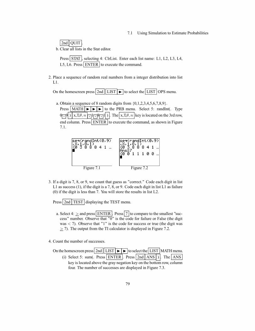
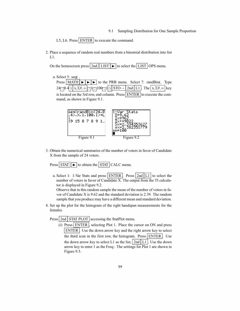
READ IMPORTANT LICENSE INFORMATION
Dear Professor or Other Supplement Recipient: Cengage Learning has provided you with this product (the “Supplement”) for your review and, to the extent that you adopt the associated textbook for use in connection with your course (the “Course”), you and your students who purchase the textbook may use the Supplement as described below. Cengage Learning has established these use limitations in response to concerns raised by authors, professors, and other users regarding the pedagogical problems stemming from unlimited distribution of Supplements. Cengage Learning hereby grants you a nontransferable license to use the Supplement in connection with the Course, subject to the following conditions. The Supplement is for your personal, noncommercial use only and may not be reproduced, or distributed, except that portions of the Supplement may be provided to your students in connection with your instruction of the Course, so long as such students are advised that they may not copy or distribute any portion of the Supplement to any third party. Test banks, and other testing materials may be made available in the classroom and collected at the end of each class session, or posted electronically as described herein. Any
material posted electronically must be through a password-protected site, with all copy and download functionality disabled, and accessible solely by your students who have purchased the associated textbook for the Course. You may not sell, license, auction, or otherwise redistribute the Supplement in any form. We ask that you take reasonable steps to protect the Supplement from unauthorized use, reproduction, or distribution. Your use of the Supplement indicates your acceptance of the conditions set forth in this Agreement. If you do not accept these conditions, you must return the Supplement unused within 30 days of receipt. All rights (including without limitation, copyrights, patents, and trade secrets) in the Supplement are and will remain the sole and exclusive property of Cengage Learning and/or its licensors. The Supplement is furnished by Cengage Learning on an “as is” basis without any warranties, express or implied. This Agreement will be governed by and construed pursuant to the laws of the State of New York, without regard to such State’s conflict of law rules. Thank you for your assistance in helping to safeguard the integrity of the content contained in this Supplement. We trust you find the Supplement a useful teaching tool.
TI™ is a trademark of Texas Instruments.
Contents Chapter 1: Introduction to the TI-83 Plus Silver Edition and the TI-84 Plus Silver Edition ......... 1 Chapter 2: Turning Data into Information ..................................................................................... 2 Chapter 3: Relationships Between Quantitative Variables .......................................................... 36 Chapter 4: Relationships Between Categorical Variables ........................................................... 56 Chapter 5: Sampling: Surveys and How to Ask Questions .......................................................... 67 Chapter 6: Gathering Useful Data For Examining Relationships ................................................ 72 Chapter 7: Probability .................................................................................................................. 77 Chapter 8: Random Variables ...................................................................................................... 82 Chapter 9: Understanding Sampling Distributions: Statistics as Random Variables ................... 97 Chapter 10: Estimating Proportions With Confidence ................................................................. 108 Chapter 11: Estimating Means With Confidence ........................................................................ 117 Chapter 12: Testing Hypotheses About Proportions .................................................................... 136 Chapter 13: Testing Hypotheses About Means ........................................................................... 150 Chapter 14: Inference About Simple Regression ......................................................................... 167 Chapter 15: More about Categorical Variables ............................................................................ 190 Chapter 16: Analysis of Variance ................................................................................................ 200 Appendix: Troubleshooting the TI-83 and TI-84........................................................................ A1
Chapter 1Introduction to the TI-83 PlusSilver Edition and the TI-84Plus Silver Edition
1.1 Getting Started
This chapter represents a brief introduction to the TI-83 Plus Silver Edition (here-after referred to the TI-83 Plus SE) and the TI-84 Plus Silver Edition (hereafterreferred to the TI-84 Plus SE). Basic commands, techniques and the use of lists arediscussed briefly in this introduction. Detailed descriptions of built in calculatorfunctions are given in the TI-83 Plus SE and TI-84 Plus SE guidebooks.
After reading this chapter you should be able to:1. Turn the calculator on and off.2. Adjust the display contrast.3. Evaluate an expression.4. Use last entry to edit an expression and evaluate and expression.5. Access menu options.6. Display the mode settings.7. Graph a function.8. Enter a list.9. Plot a statistical data set.
10. Save a list using a descriptive name.11. Clear lists.
1.2 Features
The keypad on the TI-83 Plus SE and TI-84 Plus SE are virtually identical. TheTI-84 Plus SE, TI-83 Plus SE, and the TI-83 Plus are keystroke-for Keystroke com-patible. The keyboard is divided into zones: graphing keys, editing keys, advancedfunction keys, and scientific calculator keys. The graphing keys access the inter-active graphing features and are located on the first row at the top of the keyboard.The editing keys allow you to edit expressions and values and are located on thesecond and third rows below the graphing keys. The advanced function keys dis-play menus that access the advanced functions: MATH, APPS, PRGM, VARS andare located on the fourth row below the graphing keys. The scientific calculator
1
Chapter 1 Introduction to the TI-83 Plus Silver Edition and the TI-84 Plus Silver Edition
keys access the capabilities of a standard scientific calculator and are the remain-ing keys located on rows five through ten.
The TI-83 Plus SE and TI-84 Plus SE uses Flash technology, which lets you up-grade to future software versions without buying a new graphing handheld calcu-lator. As new software becomes available, you can electronically upgrade yourTI-84 Plus from the Internet. The primary differences between the TI-83 Plus SEand the TI-84 Plus SE occur in1. The TI-83 Plus SE is preloaded with one application. The TI-84 Plus SE is
preloaded with numerous applications.2. The TI-83 Plus SE uses a TI-Graph link that is available as an accessory from
TI. The TI-84 Plus SE comes with a USB unit-to-unit cable to connect andcommunicate with another TI-84 Plus Silver Edition. With TI Connect soft-ware and a USB computer cable, you can also link the TI-84 Plus SE to apersonal computer.
1.3 The Basics
Keystrokes Introduced1. ON turns on the calculator.
2. 2nd OFF turns the calculator off.
3. 2nd N darkens the screen; 2nd H lightens the screen.
4. 2nd MEM accesss the MEMORY menu.
5. 2nd QUIT returns to the home screen.
6. ENTER may be used to evaluate an expression or execute a menu option.
7. 2nd ENTER recalls the last entry.
8. STAT displays the STAT menu.
9. ALPHA H moves the cursor down one screen at a time.
10. MODE displays the mode settings.
11. Y= displays the Y= editor.
12. WINDOW displays the current window variable values.
13. GRAPH displays the graph of a selected function.
14. ZOOM >ZStandard sets the standard window variables.
To turn on the calculator press the ON key, and the key sequence 2nd OFFturns the calculator off. There is a battery saving feature on the calculator that willautomatically turn off the TI-83 Plus SE and the TI-84 Plus SE.
2
1.3 Evaluating Expressions
The 2nd key located on the top left and the up and down cursor movement keyslocated on the top right portion of the keypad are used to adjust the screen con-trast. The keystrokes 2nd N darken the screen and 2nd H lighten the screen.This keystroke sequence, when repeated, will continuously darken or lighten thescreen.
You can adjust the display contrast to suit your viewing angle and lighting condi-tions. As you change the contrast setting, a number from 0 (lightest) to 9 (darkest)in the top-right corner indicates the current level. You may not be able to see thenumber if contrast is too light or too dark. Both the TI-83 Plus SE and the TI-84Plus SE have 40 contrast settings, so each number 0 through 9 represents four set-tings. When the batteries are low, a low-battery message is displayed when youturn on the calculator.
Variables (real or complex number, list, matrix, Y= variable, program, Apps, App-Vars, picture, graph database, or string) stored in the calculator may be selectivelydeleted. The 2nd MEM keystrokes access the MEMORY menu as shown inFigure 1.1.
Figure 1.1
Home Screen
The home screen is the primary screen of the TI-83 Plus SE and the TI-84 Plus SE.The appearance of the cursor indicates what will happen when you press the nextkey or select the next menu item to be pasted as a character on the home screen.On this screen, you may enter instructions to execute and evaluate expressions.Answers are displayed on this home screen. The blinking rectangular cursor, ¥ ,indicates the calculator is ready to accept commands. To return to the home screenfrom any other screen, use 2nd QUIT .
Evaluating Expressions
The order of operations applies to all expressions entered into the calculator. Paren-theses should be used to ensure the desired order of operations, with the grey nega-tion key - , being used for negation. The grey negation key is located on the bot-tom row, column four of the keyboard. After entering an expression, press theENTER key to evaluate the expression. Figures 1.2 and 1.3 illustrate several
3
Chapter 1 Introduction to the TI-83 Plus Silver Edition and the TI-84 Plus Silver Edition
arithmetic calculations.
Figure 1.2 Figure 1.3
Last Entry
When you press ENTER on the home screen to evaluate an expression or executean instruction, the expression or instruction is placed in a storage area called EN-TRY (last entry). When you turn off the TI-84 Plus, ENTRY is retained in memory.To recall ENTRY, press 2nd ENTER . The last entry is pasted to the current cur-sor location, where you can edit and execute it. On the home screen or in an editor,the current line is cleared and the last entry is pasted to the line.
Example 1.1 A dataset consists of handspan values in centimeters for six females;the values are 21, 19, 20, 20, 29, and 19. The mean is the numerical average, calcu-lated as the sum of the data values divided by the number of values. (Utts/Heckard,Statistical Ideas and Methods, p32)
Follow these steps to learn the process of editing an expression.1. Enter the data and determine the mean.
Enter the data as shown in Figure 1.4. Press ENTER to evaluate the expres-sion.
2. Edit the expression.
An error was found in the data recording. Examination of the data indicates thatthe 29 should actually be a 22. Press 2nd ENTRY to display the expressiononce again. Use the up arrow key, N , placing the cursor on the 9 of the value29. Change the 29 to 22. Press ENTER to evaluate the revised expression.This process is illustrated in Figures 1.4, 1.5, and 1.6.
Figure 1.4 Figure 1.6 Figure 1.6
Menus
You can access the TI-83 Plus SE and TI-84 Plus SE operations using menus. When
4
1.3 Functions
you press a key or key combination to display a menu, one or more menu namesappear on the top line of the screen. When you press a key that displays a menu, thatmenu temporarily replaces the screen where you are working. For example, whenyou press STAT , the STAT menu is displayed as a full screen, as shown in Figure1.7. The current, or active, menu will be highlighted or darkened. The left and rightarrow keys, J and I , move the cursor to the other menu options. To select amenu option, press the number of the menu option desired, or move the cursor upor down with the arrow keys, N and H to highlight the desired selection andpress ENTER . Observe that if the left-most menu option is highlighted, pressingthe left arrow, J , causes the cursor to highlight the right-most menu option. Ifmore than a screen-full of menu options press ALPHA H to move down onescreen at a time.
Figure 1.7 Figure 1.8
Display Modes
Mode settings control how the TI-83 Plus SE and TI-84 Plus SE displays and in-terprets numbers and graphs. Mode settings are retained by the Constant Memoryfeature when the TI-83 Plus SE and TI-84 Plus SE is turned off. All numbers, in-cluding elements of matrices and lists, are displayed according to the current modesettings. The MODE key, 2nd row, 2nd column, is used to view and/or changethe mode settings. To select a particular setting, move the cursor with the arrowkeys to the desired option and press ENTER to highlight that option. Once youhave selected the desired settings, press 2nd QUIT . Recommended settings areshown in Figure 1.8.
Graphing
You can store, graph, and analyze up to 10 functions, up to six parametric func-tions, up to six polar functions, and up to three sequences. You can use DRAWinstructions to annotate graphs. Mode settings must be changed appropriately.
Functions
You can store, graph, and analyze up to 10 functions, up to six parametric func-tions, up to six polar functions, and up to three sequences. You can use DRAWinstructions to annotate graphs. Mode settings must be changed appropriately.
Example 1.2 Normal random variables are the most common type of continuous
5
Chapter 1 Introduction to the TI-83 Plus Silver Edition and the TI-84 Plus Silver Edition
random variables. The bell-shaped normal curve illustrates the distribution of thesenormal random variables. (Utts/Heckard, Statistical Ideas and Methods, p268)
Follow these steps to graph a normal probability function y = 1�2�e�
12x
2 .1. Enter the function.
Press Y= , row 1, column 1, to enter the function, as shown in Figure 1.9.Press (1/
p(2�))eˆ(�1/2)(x2). The left and right parenthese are located on
row 6. Press 2nd �, � is located on the 5th row, right column above the ^key. Press 2nd e, e is located on the 8th row, left column above the LN key.Be sure to use the grey negation key when you enter (�1/2).
2. Set the Window viewing variables in order to view the graph.
Press WINDOW , row 1, column 2. Set Xmin to -3, being sure to use the greynegation key. Set Xmax to 3; Xscl to 1; Ymin to -0.2, again being sure to usethe grey negation key. Set Ymax to 0.5; Yscl to 1; Xres to 1. These settingsare illustrated in Figure 1.10
3. View the graph.
Press GRAPH , row 1, column 5. The graph of the normal curve is shown inFigure 1.11.
Figure 1.9 Figure 1.10 Figure 1.114. Set the graph window to standard viewing and clear the function .
Press ZOOM and select 6: ZStandard to restore the default graph windowsettings. Press Y= and press CLEAR to remove the function.
1.4 Statistics
Keystrokes Introduced1. STAT displays the Stat menu.
2. STAT >CALC displays the STAT >CALC menu.
3. 2nd DISTR displays the distributions menu.
4. VARS displays the VARS menu.
5. DISTR >DISTR displays menu options for calculating values of commonprobability distributions.
6
1.4 Plotting Statistical Data
6. DISTR >DRAW displays menu options for shading areas under a probabilitydistribution function.
7. 2nd STAT PLOT displays statistical plot options.
8. STO� stores values to a list or a single value to a variable.
9. ZOOM >ZoomStat redefines the viewing window so that all statistical datapoints are displayed.
10. TRACE may be used to trace a plot of statistical data.
11. ClrList clears from memory the elements of one or more listnames.
12. 2nd A-LOCK sets alpha lock on; ALPHA turns alpha lock off when alphalock is on.
13. STAT >SetUpEditor clears the list editor and restores the built in list L!-l6.
The TI-83 Plus SE and TI-84 Plus SE have several functions for analyzing data.Many of these functions are contained in the STAT >CALC and STAT >TESTSmenu options. The STAT key is located on the 3rd row, 3rd column. These menusare shown in Figure 1.12 and Figure 1.13. These functions provide summary sta-tistics, regression lines, confidence intervals, hypothesis tests, and analysis of vari-ance.
Other statistical functions are contained in the 2nd DISTR menu, located on the4th row, 4th column above VARS . . DISTR >DISTR provide menu optionsfor calculating values of common probability distribution functions, and is shownin Figure 1.14; DISTR >DRAW provide menu options for shading areas under aprobability distribution function, and is shown in Figure 1.15.
Figure 1.12 Figure 1.13
Figure 1.14 Figure 1.15
Plotting Statistical Data
You can plot statistical data by selecting 2nd STAT PLOT , located directly overY= .The 2nd STAT PLOT menu options provides access to statistical plot op-
7
Chapter 1 Introduction to the TI-83 Plus Silver Edition and the TI-84 Plus Silver Edition
tions and the capability of turning on/off all statistical plots, as shown in Figure1.16. One, two, or all three statistical plots may be displayed on the screen simul-taneously. The TI-83 Plus SE and TI-84 Plus SE can display a scatter plot, xyLine,histogram, modified box plot, regular box plot, and normal probability plot.
Figure 1.16
Lists
Lists represent a set of observations. A list may contain up to 999 numerical valuesand is the principal way to store data for analysis. Many of the built-in statisticalfunctions and programs operate on data sorted in a list or lists.The TI-83 Plus SEand TI-84 Plus SE have six list names in memory: L1, L2, L3, L4, L5, and L6.The list names L1 through L6 are on the keyboard above the numeric keys 1through 6 .̧ To paste one of these names to a valid screen, press 2nd , and thenpress the appropriate key. L1 through L6 are stored in stat list editor columns 1through 6 when you reset memory. Lists may also be created with a descriptivename. The name must be a string of up to 5 characters. The first letter must bea letter which may be folowed by letters, numbers, or �. The number of lists islimited by available memory. Lists may be created on the home screen, or in theSTAT list editor.
Example 1.3 Here are the weights (in pounds) of 18 men who were on the crewteams at Oxford and Cambridge universities (The Independent, March 31, 1992),also Hand, D. J. et al., 1994, p337.): (Utts/Heckard, Statistical Ideas and Methods,p27)
Follow these steps to create two lists.1. Create list L1 on the home screen.
On the home screen, curly braces ({}) are used to enclose lists. Numbers areseperated by commas. Enter the weights for Cambridge within curly bracesseperated by commas, as shown in Figure 1.17. Store the list by using thekeystrokes STO� ; 2nd L1 ; ENTER , storing the data in list L1. Afterpressing ENTER , the contents of the list are displayed on the home screen.Note that spaces rather than commas seperate values in a displayed list. You
8
1.4 Lists
may use the left and right arrow keys, J and I ,to scroll through the list.
2. Create list L2 using the STAT list editor.
Press STAT ENTER to select the STAT list editor. Note that the weights forCambridge are displayed in list L1. Place the cursor on list L2 row 1 to makeL2(1) the active list row, as shown in Figure 1.18. Enter the weights for Oxfordpressing ENTER after each entry. The list is partially entered in Figure 1.19.Press 2nd QUIT to quit the STAT editor.
Figure 1.17 Figure 1.18 Figure 1.193. Plot the statistical data by creating modified box plots for the weights of the
crew teams at Oxford and Cambridge universities.
Press 2nd STAT PLOT accessing the StatPlot menu, as shown in Figure 1.20.
Press ENTER , selecting Plot 1. Place the cursor on ON and press ENTER .Use the down arrow key and the right arrow key to select the first icon in thesecond row, the modified box plot. Press ENTER . Use the down arrow keyto select L1 as the list, 2nd L1 , as shown in Figure 1.21.
Use the up arrow key to place the cursor on Plot2. Place the cursor on ON andpress ENTER . Use the down arrow key and the right arrow key to select thefirst icon in the second row, the modified box plot. Press ENTER . Use thedown arrow key to select L2 as the list, 2nd L2 , as shown in Figure 1.22.
Press ZOOM , ZoomStat to view the graph, as shown in Figure 1.23.
Figure 1.20 Figure 1.21
Figure 1.22 Figure 1.23
9
Chapter 1 Introduction to the TI-83 Plus Silver Edition and the TI-84 Plus Silver Edition
4. Identify outliers.
Press the TRACE key and the left arrow key to identify an outlier (109.0) inlist L1. Use the down arrow key and the left arrow key to identify an outlier(109.5) in list L2.
5. Turn off all plots and return the graph window to standard viewing.
Press 2nd STAT PLOT , selecting PlotsOff and press ENTER . Press ZOOMand select 6: ZStandard to restore the default graph window settings.
6. Save list L1 as CAMBR and list L2 as OXFRD.
Press 2nd L1 STO� 2nd A-LOCK and type CAMBR; press ENTER .Press 2nd L2 STO� 2nd A-LOCK and type OXFRD; press ENTER .
These outliers indicate that the last weight given in each list is very differentfrom the others. In fact, those two men were the coxswains for their teams, whilethe other men were the rowers.
Clearing Lists
To clear all of the entries in a list, or lists, press STAT , selecting 4: ClrList. Pressthe appropriate key. L1 through L6, as shown in Figure 1.24. To clear all lists,press STAT , selecting 4: ClrList. Press the appropriate keys, seperating each listname by a comma, as shown in Figure 1.25.
Figure 1.24 Figure 1.25
Dispaying Lists
The menu option of STAT , SetUpEditor used without any arguments clears thelist editor and restores the built in lists L1-L6. SetUpEditor followed by a sequenceof up to 20 lists replaces the stat list editor with the new sequence of lists.
10
Chapter 2Turning Data Into Information
2.1 Introduction
In this chapter, you will learn how to create simple summaries and pictures fromvarious kinds of raw data.
After reading this chapter you should be able to:1. Change frequencies to a percentage falling into each category.2. Create a bar chart for a single categorical variable.3. Create a bar chart displaying two categorical variables.4. Obtain the five-number summary for quantitative data.5. Plot statistical data by creating a histogram for a quantitative variable.6. Create comparative boxplots for quantitative variables.7. Draw a histogram with s superimposed normal curve.8. Calculate the variance and standard deviation for a small data set.
2.2 Raw Data
Raw data is a term used for numbers and category labels that have been collectedbut have not yet been processed in any way. For example, here is a list of questionsasked in a large statistics class and the ’’raw data’’ given by one of the students:
Question Raw Data1. What is your sex (m = male,f = female)? m2. How many hours did you sleep last night? 5 hours3. Randomly pick a letter-S or Q. S4. What is your height in inches? 67 inches5. Randomly pick a number between 1and 10. 36. What’s the fastest you’ve ever driven a car (mph)? 110 mph7. What is your right handspan In centimeters? 21.5 cm8. What is your left handspan in centimeters? 21.5 cm
2.3 Types of Variables
Different types of summaries are appropriate for different types of variables. Itmakes sense, for example, to calculate the average number of hours of sleep lastnight for the members of a group, but it doesn’t make sense to calculate the averagesex (male, female) for the group. For gender data, it makes more sense to determine
11
Chapter 2 Turning Data Into Information
the proportion of the group that’s male and the proportion that’s female.We learned in a previous section that a variable is a characteristic that differs fromone individual to the next. A variable may be a categorical characteristic, like aperson’s sex, or a numerical characteristic, like hours of sleep last night.
ExampleRaw data from categorical variables consist of group orcategory names that don’t necessarily have a logical ordering. eye color
Categorical variables for which the categories have highest degreea logic ordering are called ordinal variables. earned
Raw data from quantitative variables consist of numericalvalues taken on each individual height in inches
TI calculators allow only for numerical values to be used in a statistical analysis.For example, the text ’’Male’’ or ’’Female’’ can not be used for the ’’Sex’’ variablein the PennState1 worksheet. Neither can we use the letters ’’M’’ or ’’F’’ sincethese letters are replaced by the value stored in memory for the ’’M’’ and ’’F’’ vari-ables in the calculator.The solution to the problem is to assign a unique numerical code for each value ofthe variable. In this case, you might code ’’Male = 0’’ and ’’Female = 1’’ on the TIcalculator.
Values of the other categorical categorical variables (’’SQpick’’ and ’’Form’’) in thePennState1 worksheet could also be coded. For example, you might code ’’S = 0’’and ’’Q = 1’’. Other numerical values could also be used.
The quantitative variables in the PennState1 worksheet: (Hours of sleep the pre-vious night, Choice of either S or Q, Reported height, inches , ’’Random’’ pick ofa number between 1 and 10, Fastest speed ever driven, mph, Measured stretchedright handspan, cm, Measured stretched left handspan, cm ) can be handled by theTI calculator without coding.
2.4 Summarizing One or Two Categorical Variables
Numerical Summaries
To summarize a categorical variable, the first step is to count how many individualsfall into each possible category. Percents usually are more informative than countsso the second step is to calculate the percent in each category. These two easy stepscan also be used to summarize a combination of two categorical variables.
Keystrokes Introduced1. 2nd LIST >MATH>sum( returns the sum of the elements within a list.
2. ZOOM >ZStat redefines the viewing window so that all statistical data points
12
2.4 Numerical Summaries
are displayed.
3. 2nd STAT PLOT accesses the StatPlot menu.
4. 2nd DRAW > Text( draws text on a graph screen.
5. STAT >CALC> 1: 1-VarStats analyzes data for one quantitative variable.
6. 2nd LIST I , OPS. Select 1: SortA( sorts elements of a list in ascendingorder.
Example 2.1 Seatbelt Use by 12thGraders
How often do you wear a seatbelt when driving a car? This is one of many ques-tions asked in a biennial nationwide survey of American high school students. Thesurvey, conducted as part of a federal program called the Youth Risk Behavior Sur-veillance System (YRBSS), is sponsored and organized by the U.S. Centers forDisease Control (CDC). Survey questions concern potentially risky behaviors suchas cigarette smoking, alcohol use, and so on. For the question about seatbelt usewhen driving, possible answers were Always, Most times, Sometimes, Rarely, andNever. An additional choice allowed respondents to say they don’t drive, whichoften was the case because many survey participants were under the minimumlegal driving age. Table 2.1 summarizes responses in the 2003 survey given by12thgrade students who said they drive.
Response CountAlways 1686Most times 578Sometimes 414Rarely 249Never 115
Table 2.1
Follow these steps to determine the percentage of students falling into each cate-gory.1. Clear any data from lists L1 and L2.
Press STAT ENTER to select the STAT list editor. Place the cursor at thetop of list L1. Press CLEAR followed by the down arrow key,H to clear anydata from list L1. Place the cursor at the top of list L2. Press CLEAR followedby the down arrow key,H to clear any data from list L2.
2. Enter the data.
Place the cursor on list L1 row 1 to make L1(1) the active list row, as shownin Figure 2.1. Enter the counts for the responses pressing ENTER after eachentry. The list is entered in Figure 2.2.
3. Enter an expression to determine the percentage of students falling into each
13
Chapter 2 Turning Data Into Information
category.
Move the cursor to the top of list L2. With the cursor at the top of list L2type 2nd L1 ÷ 2nd LIST J , selecting sum( , and press ENTER . Type2nd L1 and a ). These steps are reflected in Figures 2.3 and 2.4. Press ENTER
to evaluate the expression.
Figure 2.1 Figure 2.2 Figure 2.3
Figure 2.4 Figure 2.5Notice that a majority, 1686/3042= .554 or 55.4%, said they always wear a seat-belt when driving, while just 115/3042= .032 or 3.2% said they never wear aseatbelt. Because 55.4% said they always wear a seatbelt, we can calculate thepercent who don’t always wear a seatbelt as 100%-55.4% =44.6% . Alterna-tively, the percent saying they don’t always wear a seatbelt could be detenninedas 19.0% + 13.6% + 8.2% + 3.8%, the sum of the percents for all categoriesother than Always.
Frequency and Relative Frequency
Frequency is a synonym for the count of how many observations fall into a cat-egory. The proportion or percent in a category is a type of a relative frequency,the count in a category relative to the total count over all categories. A frequencydistribution for a categorical variable is a listing of all categories along with theirfrequencies (counts). A relative frequency distribution is a listing of all categoriesalong with their relative frequencies (given as proportions or percents, for exam-ple). It is commonplace to give the frequency and relative frequency distributionstogether, as was done in Table 2.1
Visual Summaries for Categorical Variables
There are two simple visual summaries used for categorical data:a. Pie charts are useful for summarizing a single categorical variable if there
are not too many categories. Unfortunately, pie charts are not built-in tothe TI-83 Plus SE nor the TI-84 Plus SE.
14
2.4 Visual Summaries for Categorical Variables
b. Bar graphs are useful for summarizing one or two categorical variablesand are particularly useful for making comparisons when there are twocategorical variables.
Both of these simple graphical displays are easy to construct and interpret, asthe examples in the text demonstrate.
Example 2.3 Random Numbers Question 5 in the class survey described in Sec-tion 2.1 asked students to ’’Randomly pick a number between 1and 10.’’ The piechart shown in Figure 2.1 of the text illustrates that the results are not even closeto being evenly distributed across the numbers. Notice that almost 30%of the stu-dents chose 7 while only just over 1% chose the number l. The data is displayedas an ungrouped frequency distribution in Table 2.2.
Follow these steps to create a bar chart for the categorical variable ’’random num-ber’’.1. Preparations:
a. Turn off all’’Y=’’ functions.
Press Y= and press CLEAR to remove all functions For each line thatis not blank, place the cursor on the function and press CLEAR Press2nd QUIT .
b. Clear all lists in the Stat editor.
Press STAT , selecting 4: ClrList. Enter each list name: L1, L2, L3, L4,L5, L6, as shown in Figure 2.6. Press ENTER to execute the command.
2. Enter data using the STAT list editor.
Press STAT ENTER to select the STAT list editor.
a. Enter the data for the categorical variable ’’random number’’ in list L1.
Place the cursor on list L1 row 1 to make L1(1) the active list row. Enterthe data: 1, 2, 3, 4, 5, 6, 7, 8, 9, 10 pressing ENTER after each entry.Place the cursor on list L12 row 1 to make L2(1) the active list row. Enterthe frequencies: 2, 9, 22, 21, 18, 23, 56, 19, 14, 6 in L2 pressing ENTER
15
Chapter 2 Turning Data Into Information
after each entry, as shown in Figure 2.7.
Figure 2.6 Figure 2.7
3. Plot the statistical data by creating a bar chart for the categorical variables ’’ran-dom number’’.
Press 2nd STAT PLOT accessing the StatPlot menu.
Press ENTER , selecting Plot 1. Place the cursor on ON and press ENTER .Use the down arrow key and the right arrow key to select the third icon in thefirst row, the histogram (bar chart). Press ENTER . Use the down arrow keyto select list L1 as the list, 2nd L1 . Use the down arrow key to enter list L2as the Freq: 2nd L2 . The settings for Plot 1 are shown in Figure 2.8.
4. View the graph.
Press ZOOM , 9: ZoomStat to view the graph, as shown in Figure 2.9.
Figure 2.8 Figure 2.9
Example 2.4 Myopia A survey of 479 children found that those who had sleptwith a nightlight or in a fully lit room before the age of 2 had a higher incidenceof nearsightness (myopia) later in childhood (Sacramento Bee, May 13, 1999,pp. A1, A18). The raw data for each child consisted of two categorical vari-ables, each with three categories. Table 2.2 gives the categories and the numberof children falling into each combination of them.
The patten in Table 2.2 is striking. As the amount of sleeptime light inceases,the incidence of myopia also increases. However this study does not prove thatsleeping with light actually caused myopia in children. There are other possibleexplanations. For example, myopia has a genetic component, so those childrenwhose parents have myopia are more likely to suffer from it themselves. Maybenearsighted parents are more likely to proviode light while their children are
Follow these steps to create a bar chart for the categorical variables. You willcreate a clustered bar chart displayed in percentages of the row totals for eachof the categorical variables.
5. Preparations:a. Turn off all’’Y=’’ functions.
Press Y= and press CLEAR to remove all functions For each line thatis not blank, place the cursor on the function and press CLEAR Press2nd QUIT .
b. Clear all lists in the Stat editor.
Press STAT , selecting 4: ClrList. Enter each list name: L1, L2, L3, L4,L5, L6, as shown in Figure 2.10. Press ENTER to execute the command.
6. Enter data using the STAT list editor.
Press STAT ENTER to select the STAT list editor.
a. Enter codes for categorical variable ’’Slept with’’ in odd.numbered lists.
Place the cursor on list L1 row 1 to make L1(1) the active list row. Enter1, 2, 3 pressing ENTER after each entry.Place the cursor on list L3 row 1 to make L3(1) the active list row. Enter5, 6, 7 pressing ENTER after each entry.Place the cursor on list L5 row 1 to make L5(1) the active list row. Enter9, 10, 11 pressing ENTER after each entry.
b. Enter the percentages, as whole numbers, for the categorical variable ’’My-opia’’ in even numbered lists.
Place the cursor on list L2 row 1 to make L2(1) the active list row. Enterthe percentages: 90, 9, 1 pressing ENTER after each entry.Place the cursor on list L4 row 1 to make L4(1) the active list row. Enterthe percentages: 66, 31, 3 pressing ENTER after each entry.Place the cursor on list L6 row 1 to make L6(1) the active list row. Enter
17
Chapter 2 Turning Data Into Information
the percentages: 45, 48, 7 pressing ENTER after each entry.The results of the data entry process are shown in Figures 2.11 and 2.12.
Figure 2.10 Figure 2.11 Figure 2.127. Plot the statistical data by creating a clusted bar chart for the categorical vari-
ables ’’Slept with’’ and ’’Myopia’’.
Press 2nd STAT PLOT accessing the StatPlot menu.(i) Press ENTER , selecting Plot 1. Place the cursor on ON and press
ENTER . Use the down arrow key and the right arrow key to selectthe third icon in the first row, the histogram. Press ENTER . Use thedown arrow key to select L1 as the Xlist, 2nd L1 . Use the downarrow key to select L2 as the Freq:, 2nd L2 . The settings for Plot1 are shown in Figure 2.13.
(ii) Use the up arrow key to place the cursor on Plot2. Place the cur-sor on ON and press ENTER . Use the down arrow key and theright arrow key to select the third icon in the first row, the histogram.Press ENTER . Use the down arrow key to select L3 as the Xlist,2nd L3 . Use the down arrow key to select L4 as the Freq:, 2nd L4 .
The settings for Plot 2 are shown in Figure 2.14.(iii) Use the up arrow key to place the cursor on Plot3. Place the cur-
sor on ON and press ENTER . Use the down arrow key and theright arrow key to select the third icon in the first row, the histogram.Press ENTER . Use the down arrow key to select L5 as the Xlist,2nd L5 . Use the down arrow key to select L6 as the Freq:, 2nd L6 .
The settings for Plot 3 are shown in Figure 2.15.
Figure 2.13 Figure 2.14 Figure 2.15
8. Set the Window viewing variables in order to view the graph.
Press WINDOW , row 1, column 2. Set Xmin to 1. Set Xmax to 12; Xscl to1; Ymin to -10, being sure to use the grey negation key. Set Ymax to 105; Yscl
18
2.5 Interesting Features of Quantitative Data
to 10; Xres to 1. These settings are illustrated in Figure 2.169. View the graph.
Press GRAPH to view the graph, as shown in Figure 2.16.
Figure 2.16 Figure 2.1710. Optional: Add text to the histogram (bar chart).
Press 2nd DRAW , selecting 0: Text from the DRAW menu, as shown in Fig-ure 2.18. Use the arrow keys to position the cursor. Press 2nd A-LOCKto type the labels. You may have to select 2nd DRAW , selecting 1: Clr-Draw from the DRAW menu and GRAPH to attempt once again to positionthe labels to your satisfaction. The finished graph is displayed in Figure 2.19.
Figure 2.18 Figure 2.19The first cluster on the left of the clustered bar chart displays the category ’’-Darkness’’ of the ’’Slept with’’ variable. The heights of the bars indicate relativefrequencies of 90%, 9%, and 1%. The middle cluster of the clustered bar chartdisplays the category ’’Nightlight’’ of the ’’Slept with’’ variable. The heights ofthe bars indicate relative frequencies of 66%, 31%, and 3%. The third clusterfrom the left of the clustered bar chart displays the category ’’Full light’’ of the’’Slept with’’ variable. The heights of the bars indicate relative frequencies of45%, 48%, and 7%.
11. Turn off all plots and return the graph window to standard viewing.
Press 2nd STAT PLOT , selecting PlotsOff and press ENTER . Press ZOOMand select 6: ZStandard to restore the default graph window settings.
These outliers indicate that the last weight given in each list is very differentfrom the others. In fact, those two men were the coxswains for their teams, whilethe other men were the rowers.
19
Chapter 2 Turning Data Into Information
2.4 - (continued) Interesting Features of Quantitative Data
Looking at a long, disorganized list of data values is about the same as looking at ascrambled set of letters. To begin finding the information in quantitative data, wehave to organize it using visual displays and numerical summaries. In this sectionwe focus on interpreting the main features of quantitative variables. More specificdetails will be given in the following sections.
Example 2.5 Right Handspans. Table 2.3 displays the raw data for the righthandspan measurements (in centimeters) made in the student survey described inSection 2.1 of the text. The measurements are listed separately for males and fe-males, but are not organized in any other way. Imagine that you know a femalewhose stretched right handspan is 20.5 em. Can you see how she compares to theother females in Table 2.3? That probably will be hard because the list of data val-ues is disorganized.We will organize the handspan data in Table 2.3 using a five-number summary,which consists of the median, the quartiles (roughly, the medians of the lower andupper halves of the data), and the extremes (high, low).
Follow these steps to obtain the five-number summaries for females and males.1. Preparations:
a. Turn off all’’Y=’’ functions.
Press Y= and press CLEAR to remove all functions For each line thatis not blank, place the cursor on the function and press CLEAR Press2nd QUIT .
b. Clear all lists in the Stat editor.
Press STAT , selecting 4: ClrList. Enter each list name: L1, L2, L3, L4,L5, L6. Press ENTER to execute the command.
2. Enter data using the STAT list editor.
Press STAT ENTER to select the STAT list editor.
a. Enter the ’’Stretched Right Handspans (cm) ’’ of the 190 College studentsin lists L1 and L2.
Enter the ’’Stretched Right Handspans (cm) ’’ for the Males (87 students)in list L1. Place the cursor on list L1 row 1 to make L1(1) the active listrow. Enter 21.5, 22.5, 23.5, etc. pressing ENTER after each entry.Enter the ’’Stretched Right Handspans (cm) ’’ for the Females (103 stu-dents) in list L2. Place the cursor on list L2 row 1 to make L2(1) the activelist row. Enter 20, 19, 20.5, etc. pressing ENTER after each entry.
The data in lists L1 and L2 are displayed in Figure 2.203. Obtain the five-number summaries for females and males.
Press STAT I to obtain the STAT CALC menu, as shown in Figure 2.21.
a. Select 1: 1-Var Stats and press ENTER . Press 2nd L1 to select the’’Stretched Right Handspans (cm) ’’ of the males. Press ENTER . Usethe down arrow key, H , five times. The output from the TI calculator isdisplayed in Figure 2.22.
b. Select 1: 1-Var Stats and press ENTER . Press 2nd L1 to select the’’Stretched Right Handspans (cm) ’’ of the males. Press ENTER . Usethe down arrow key, H , five times. The output from the TI calculator isdisplayed in Figure 2.23.
4. Save list L1 as MRSN1 and list L2 as FRSN1.
Press 2nd L1 STO� 2nd A-LOCK and type MRSN ALPHA 1; press
21
Chapter 2 Turning Data Into Information
ENTER . Press 2nd L2 STO� 2nd A-LOCK and type FRSN ALPHA 1;press ENTER .
Figure 2.20 Figure 2.21
Figure 2.22 Figure 2.23
Remember that the five-number summary approximately divides the datasetinto quarters. For example, about 25% of the female handspan measurements arebetween 12.5 and 19.0 centimeters, about 25% are between 19 and 20 em, about25% are between 20 and 21 em, and about 25 % are between 21 and 23.25 em. Thefive-number summary gives us a good idea of where our imagined female with the20.5 centimeter handspan fits into the distribution of handspans for females. She’sin the third quarter of the data, slightly above the median (the middle value).
2.6 Pictures for Quantitative Data
There are three similar types of pictures that are used to represent quantitativevariables, all of which are valuable for assessing center, spread, shape, and out-liers. Histograms are similar to bar graphs and can be used for any number ofdata values, although they are not particularly informative when the sample size issmall. Stem-and-Leaf plots and dotplots present all individual values, so for verylarge datasets they are more cumbersome than histograms. A fourth kind of pic-ture, called a boxplot or box-andwhisker plot, displays the information given in afive-number summary. It is especially useful for comparing two or more groupsand for identifying outliers. The TI-83 Plus SE and the TI-84 Plus SE are wellsuited for displaying histograms, Stem-and-Leaf plots and boxplots. The TI-83Plus SE and the TI-84 Plus SE do not have build in features for creating dotplots.We will begin by creating a histogram of women’s right handspans.
Example 2.5 Right Handspans. Table 2.3 displays the right handspan measure-ments (in centimeters) made in the student survey described in Section 2.1 of thetext. The measurements are listed separately for males and females. Recall thatthe right handspan measurements for the females are stored in the list FRSN1.
Follow these steps to obtain the histogram of right handspans for females.
22
2.6 Pictures for Quantitative Data1. Preparations:
a. Turn off all’’Y=’’ functions.
Press Y= and press CLEAR to remove all functions For each line thatis not blank, place the cursor on the function and press CLEAR Press2nd QUIT .
b. Clear all lists in the Stat editor.
Press STAT , selecting 4: ClrList. Enter each list name: L1, L2, L3, L4,L5, L6. Press ENTER to execute the command.
2. Enter data using the STAT list editor.
Press STAT ENTER to select the STAT list editor.
a. Enter the ’’Stretched Right Handspans (cm) ’’ of the females in lists L1.
Place the cursor at the top of list L1. Press 2nd LIST , selecting the listFRSN1, as shown in Figure 2.24. Press ENTER to drive the data into theworking list L1. The data from the list FRSN1 is displayed in list L1, asshown in Figure 2.25.
Figure 2.24 Figure 2.253. Plot the statistical data by creating a histogram of the right handspan measure-
ments for the females.
Press 2nd STAT PLOT accessing the StatPlot menu.(i) Press ENTER , selecting Plot 1. Place the cursor on ON and press
ENTER . Use the down arrow key and the right arrow key to selectthe third icon in the first row, the histogram. Press ENTER . Usethe down arrow key to select L1 as the list, 2nd L1 . Use the downarrow key to enter 1 as the Freq:. The settings for Plot 1 are shown inFigure 2.26.
4. View the graph.
Press ZOOM , 9: ZoomStat to view the graph, as shown in Figure 2.27.
23
Chapter 2 Turning Data Into Information
Figure 2.26 Figure 2.275. Turn off all plots and return the graph window to standard viewing.
Press 2nd STAT PLOT , selecting PlotsOff and press ENTER . Press ZOOMand select 6: ZStandard to restore the default graph window settings.
The histogram shows the distribution of the data, the pattern of how often thevarious measurements occurred. The histogram is useful for assessing the location,spread, and shape of a distribution and may be useful for detecting outliers. Noticethat the values are ’’centered’’ around 20 em, which is the median value. There aretwo possible outlier values that are low compared to the bulk of the data that areevident in the histogram. Except for those values, the handspans have a range ofabout 7 em, extending from about 16 to 23 em. They tend to be ’’clumped’’ around20 and taper off toward 16 and 23.
Example 2.5 Continued. Right Handspans. Table 2.3 displays the right handspanmeasurements (in centimeters) made in the student survey described in Section 2.1of the text. The measurements are listed separately for males and females. Recallthat the right handspan measurements for the females are stored in the list FRSN1and the right handspan measurements for the males are stored in the list MRSN1.
Follow these steps to obtain the boxplot of right handspans for females and males.1. Preparations:
a. Turn off all’’Y=’’ functions.
Press Y= and press CLEAR to remove all functions For each line thatis not blank, place the cursor on the function and press CLEAR Press2nd QUIT .
b. Clear all lists in the Stat editor.
Press STAT , selecting 4: ClrList. Enter each list name: L1, L2, L3, L4,L5, L6. Press ENTER to execute the command.
24
2.6 Pictures for Quantitative Data
2. Enter data using the STAT list editor.
Press STAT ENTER to select the STAT list editor.
a. Enter the ’’Stretched Right Handspans (cm) ’’ of the females in lists L1 andthe ’’Stretched Right Handspans (cm) ’’ of the males in lists L2.
Place the cursor at the top of list L1. Press 2nd LIST , selecting the listFRSN1, as shown in Figure 2.28. Press ENTER to drive the data into theworking list L1. Place the cursor at the top of list L2. Press 2nd LIST ,selecting the list MRSN1, as shown in Figure 2.29. Press ENTER todrive the data into the working list L1. The data from the list FRSN1 andMRSN1 is displayed in list L1 and list L2, as shown in Figure 2.30.
Figure 2.29 Figure 2.29
Figure 2.30
3. Plot the statistical data by creating comparative boxplots of the right handspanmeasurements for the females and males.
Press 2nd STAT PLOT accessing the StatPlot menu.(i) Press ENTER , selecting Plot 1. Place the cursor on ON and press
ENTER . Use the down arrow key and the right arrow key to selectthe first icon in the second row, the modified boxplot. Press ENTER .Use the down arrow key to select L1 as the list, 2nd L1 . Use thedown arrow key to enter 1 as the Freq:. The settings for Plot 1 areshown in Figure 2.31.
(ii) Use the up arrow key to place the cursor on Plot2. Place the cursoron ON and press ENTER . Use the down arrow key and the rightarrow key to select the first icon in the second row, the modified boxplot. Press ENTER . Use the down arrow key to select L2 as the
25
Chapter 2 Turning Data Into Information
list, 2nd L2 . Use the down arrow key to enter 1 as the Freq:. Thesettings for Plot 2 are shown in Figure 2.32.
Figure 2.31 Figure 2.324. View the graph.
Press ZOOM , 9: ZoomStat to view the graph, as shown in Figure 2.33.
Figure 2.335. Turn off all plots and return the graph window to standard viewing.
Press 2nd STAT PLOT , selecting PlotsOff and press ENTER . Press ZOOMand select 6: ZStandard to restore the default graph window settings.
The comparative boxplots compare the spans of the right hands of males andfemales. For each group, the box covers the middle 50% of the data, and the linewithin a box marks the median value. With the exception of possible outliers,the lines extending from a box reach to the minimum and maximum data values.Possible outliers are marked with an square.
2.7 Numerical Summaries of Quantitative Variables
We discussed the interesting features of a quantitative dataset in Section 2.4 of thetext, and in Section 2.5 of the text we learned how to look for them using use visualdisplays of the data. In this section we learn how to compute numerical summariesof these features for quantitative data.
Quartiles and Five-Number Summaries
A simple way to find the quartiles is to split the ordered values into the half thatis below the median and the half that is above the median. The lower quartile (Ql)is the median of the data values ,that are below the median. The upper quartile(Q3) is the median of the data values that are above the median. These values are
26
2.7 Quartiles and Five-Number Summaries
called quartiles because, along with the median and the extremes, they approxi-mately divide the ordered data into quarters.We will begin by creating a histogramof women’s right handspans.
Follow these steps to obtain the five-number summary for the 87 speeds.1. Preparations:
a. Turn off all’’Y=’’ functions.
Press Y= and press CLEAR to remove all functions For each line thatis not blank, place the cursor on the function and press CLEAR Press2nd QUIT .
b. Clear all lists in the Stat editor.
Press STAT , selecting 4: ClrList. Enter each list name: L1, L2, L3, L4,L5, L6. Press ENTER to execute the command.
2. Enter data using the STAT list editor.
Press STAT ENTER to select the STAT list editor.
a. Enter the ’’Fastest Speeds’’ in lists L1.
Enter the ’’Fastest Speeds’’ for the 87 students in list L1. Place the cursoron list L1 row 1 to make L1(1) the active list row. Enter 110, 109, 90, etc.pressing ENTER after each entry. After entering all of the data, select
27
Example 2.13 Fastest Speeds. In Case Study 1.1 we summarized responses tothe question ’’What’s the fastest you’ve ever driven a car?’ Table 2.4 displays theresponse of the 87 males surveyed.
Chapter 2 Turning Data Into Information
2nd QUIT .
Figure 2.34 Figure 2.35 Figure 2.36
b. Save list L1 as MFST1.
Press 2nd L1 STO� 2nd A-LOCK and type MFST ALPHA1; pressENTER , as shown in Figure 2.35.
c. Sort the data in ascending order.
Press 2nd LIST I , OPS. Select 1: SortA(, pressing ENTER . Press2nd L1 ) and press ENTER , as shown in Figure 2.36.
d. Examine the data set.
Press STAT ENTER to select the STAT list editor. The sorted data nowappears in list 1, as shown in Figure 2.37.Use the down arrow key, H , to locate the 44th value in the list, as shownin Figure 2.38.The median is the middle value in an ordered list, so for 87 values, themedian is the (87 + 1)/2 =88/2 =44th value in the list. The 44th value is110, and this value is shown in bold in the data list, as shown in Figure2.38.
Figure 2.37 Figure 2.38
Aside from the middle value of 110, there were 43 values at or below 110,and another 43 values at or above 110. Notice that there are many responsesof 110, which is why we are careful to say that 43 of the values are at orabove the median.There are 43 values on either side of the median. To find the quartiles, sim-ply find the median of each of those sets of 43 values. The lower quartileis the (43 + 1)/2 = 22nd value from the bottom of the data.Use the up arrow key, N , to locate the 22nd value in the list, as shown inFigure 2.39. The value of Q1 is 95.Use the down arrow key, H , to locate the 22nd value from the top, asshown in Figure 2.40. The upper quartile is the 22nd value from the top;
28
2.8 Features of Bell-Shaped Distributions
the value of Q3 is 120.
Figure 2.39 Figure 2.40
The median and quartiles divide the data into equal numbers of values butdo not necessarily divide the data into equally wide intervals. For example,the lowest 1/4 of the males had responses ranging over the 40-mph intervalfrom 55 mph to 95 mph, while the next 1/4 had responses ranging over onlya l5-mph interval, from 95 to 110. Similarly, the third quarter had responsesin only a 10-mph interval (110 to 120), while the top 1/4 had responses ina 30-mph interval (120 to 150). It is common to see the majority of valuesclumped in the middle and the remainder tapering off into a wider range.
e. Find the Summary Measures (mean, median, quartiles, low and high val-ues, range and interquartile range).
Press STAT > CALC, selecting 1: 1Var Stats. Press ENTER . Press2nd L1 and ENTER , as shown in Figure 2.41. The results are shown
in Figure 2.42. Use the down arrow key, H , five times to obtain the sum-mary measure shown in Figure 2.43.
Figure 2.41 Figure 2.42 Figure 2.43The calculator output indicates the mean = 107.4, miniumum =55, Q1 =95, median = 110, Q3 = 120 and maximum = 150. The range is maximum- minimum= 150-55 = 95 and the interquartile range is Q3-Q1 = 120 - 95= 25.
2.8 Features of Bell-Shaped Distributions
Nature seems to follow a predictable pattern for many kinds of measurements.Most individuals are clumped around the center, and the greater the distance avalue is from the center, the fewer individuals have that value. Except for thetwo outliers at the lower end. that pattern is evident in the females’ right handspanmeasurements, as shown in Example 2.5, Figure 2.27. If we were to draw a smoothcurve onnecting the tops of the bars on a histogram with this shape, the smoothcurve would resemble the shape of a bell.Numerical variables that follow this pattern are said to follow a bell-shaped curve,or to be ’’bell-shaped.’’ A special case of this distribution of measurements is so
29
Chapter 2 Turning Data Into Information
common it is also called a normal disbibution or normal curve.
Example 2.5 - Revisted - Women’s Right Hand Spans. Table 2.3 displays theraw data for the right handspan measurements (in centimeters) made in the studentsurvey described in Section 2.1 of the text. The measurements are listed separatelyfor males and females, but are not organized in any other way. In Example 2.5, youhave saved the data for the males in list MRSN1 and the data for the females in listFRSN1.We will draw a histogram of the women’s right handspans, with a superimposednormal curve.
Follow these steps to draw the histogram of the women’s right handspans, with asuperimposed normal curve.1. Preparations:
a. Turn off all’’Y=’’ functions.
Press Y= and press CLEAR to remove all functions For each line thatis not blank, place the cursor on the function and press CLEAR Press2nd QUIT .
b. Clear all lists in the Stat editor.
Press STAT , selecting 4: ClrList. Enter each list name: L1, L2, L3, L4,L5, L6. Press ENTER to execute the command.
2. Enter data using the STAT list editor.
Press STAT ENTER to select the STAT list editor.
a. Enter the ’’Stretched Right Handspans (cm) ’’ of the females in list L1.
Place the cursor at the top of list L1. Press 2nd LIST , selecting the listFRSN1, as shown in Figure 2.44. Press ENTER to drive the data into theworking list L1. The data from the list FRSN1 is displayed in list L1, asshown in Figure 2.45.
Figure 2.44 Figure 2.45 Figure 2.46b. Obtain the numerical summaries of the women’s right handspans.
30
2.8 Features of Bell-Shaped Distributions
Press STAT I to obtain the STAT CALC menu.
c. Select 1: 1-Var Stats and press ENTER . Press 2nd L1 to select the’’Stretched Right Handspans (cm) ’’ of the females. The output from theTI calculator is displayed in Figure 2.46.Observe that the mean of the women’s right handspans is 20.017 and thestandard deviation is 1.764.
3. Set up the plot for the histogram of the right handspan measurements for thefemales.
Press 2nd STAT PLOT accessing the StatPlot menu.(i) Press ENTER , selecting Plot 1. Place the cursor on ON and press
ENTER . Use the down arrow key and the right arrow key to selectthe third icon in the first row, the histogram. Press ENTER . Usethe down arrow key to select L1 as the list, 2nd L1 . Use the downarrow key to enter 1 as the Freq:. The settings for Plot 1 are shown inFigure 2.47.
4. Enter the function to superimpose the normal curve on the histogram.
Press Y= , row 1, column 1, to enter the function, as shown in Figure 1.9. Press(18/1.764
p(2�))eˆ((�1/2)(x � 20.017)2/1.7642). Observe that the mean
of the women’s right handspans, 20.017 and the standard deviation, 1.764, areentered into the function to determine the y-values of the graph. The 18 is ascaling factor designed to make the plot of the histogram and the normal curvecoincide. Other scaling factors can be explored. The left and right parenthesesare located on row 6. Press 2nd �, � is located on the 5th row, right columnabove the ^ key. Press 2nd e, e is located on the 8th row, left column abovethe LN key. Be sure to use the grey negation key when you enter (�1/2).The function is shown in Figure 2.48.
5. Set the Window viewing variables in order to view the graph.
Press WINDOW , row 1, column 2. Set Xmin to 11, Xmax to 27; Xscl to 1;Ymin to -5, being sure to use the grey negation key. Set Ymax to 31; Yscl to1; Xres to 1. These settings are illustrated in Figure 2.49
6. View the graph.
Press GRAPH , to view the graph, as shown in Figure 2.50.
31
Chapter 2 Turning Data Into Information
Figure 2.47 Figure 2.48
Figure 2.49 Figure 2.507. Turn off all plots and return the graph window to standard viewing.
Press 2nd STAT PLOT , selecting PlotsOff and press ENTER . Press ZOOMand select 6: ZStandard to restore the default graph window settings.
8. Clear the function.
Press Y= , and Press Y= and press CLEAR to remove all functions Foreach line that is not blank, place the cursor on the function and press CLEARPress 2nd QUIT .
The Concept of Standard Deviation
Because normal curves are so common in nature, a whole set of descriptive fea-tures has been developed that apply mostly to variables with that shape. In fact,two summary features uniquely determine a normal curve, so that if you knowthose two summary numbers, you can draw the curve precisely. The first summarynumber is the mean, and the bell shape is centered on that number. The secondsummary number is called the standard deviation, and it is a measure of the spreadof the values.You can think of the standard deviation as roughly the average distance values fallfrom the mean. Put another way, it measures variability by summarizing how farindividual data values are from the mean.The formula for calculating the standard deviation is a bit more involved than theconceptual interpretation just discussed. This is the first instance of a summarymeasure that differs based on whether the data represent a sample or an entire pop-ulation. The version given here is appropriate when the dataset is considered torepresent a sample from a larger population. The value of s2, the squared standarddeviation is called the (sample) variance. The formula for the (sample) varianceis
s2 =
P(x� x)2n� 1
In practice, statistical software like Minitab, a spreadsheet program like Excel, or
32
2.8 The Concept of Standard Deviation
a TI calculator typically is used to find the standard deviation lor a dataset. Forsituations where you have to calculate the standard deviation by hand, here is astep-bystep guide to the steps involved:
Step 1: Calculate x, the sample mean.Step 2: For each observation, calculate the difference between the data
value and the mean.Step 3: Square each difference calculated In step 2.Step 4: Sum the squared differences calculated in step 3, and then divide
this sum by n� 1.The answer for this step Is called the varIance.Step 5: Take the square root of the variance calculated in step 4.
The answer for this step is called the standard deviation.
Example 2.18 Calculatinga Standard Deviation. You will calculate the standarddeviation of the four pulse rates 62, 68, 74, 76.
Follow these steps to calculate the standard deviation.1. Preparations:
a. Turn off all’’Y=’’ functions.
Press Y= and press CLEAR to remove all functions For each line thatis not blank, place the cursor on the function and press CLEAR Press2nd QUIT .
b. Clear all lists in the Stat editor.
Press STAT , selecting 4: ClrList. Enter each list name: L1, L2, L3, L4,L5, L6. Press ENTER to execute the command.
2. Enter data using the STAT list editor.
Press STAT ENTER to select the STAT list editor.
a. Enter the four pulse rates 62, 68, 74, 76 in list L1.
Place the cursor on list L1 row 1 to make L1(1) the active list row. Enter62, 68, 74, 76 pressing ENTER after each entry. The data is displayed in
33
Chapter 2 Turning Data Into Information
list L1, as shown in Figure 2.45. Press 2nd QUIT to exit the Stat Editor.
Figure 2.51b. Obtain the mean, variance, and standard deviation of the pulse rates using
the definitions.
Press 2nd LIST I I to obtain the LIST MATH menu.
(i) Obtain the mean of the pulse rates.
Select 3: mean( and press ENTER . Press 2nd L1 to select thefour pulse rates. Press ENTER . The output from the TI calculatoris displayed in Figure 2.53, indicating the mean, 70.
(ii) Obtain the sum of the squared differences.
On the homescreen, press 2nd L1 - 2nd LIST I I , selecting3: mean(. Press 2nd L1 and ) . Press STO� 2nd L2 ENTER ,storing the differences between the data value and the mean in list L2.Press 2nd L2 , x2 . Press STO� 2nd L3 ENTER , storing thesquared differences in list L3. The output from the TI calculator is dis-played in Figure 2.52, indicating the sum of the squared difference is120.
(iii) Obtain the variance.
Press 2nd LIST I I to obtain the LIST MATH menu. Select5: sum( and press ENTER . Press 2nd L3 and ) to obtain thesum of the squared differences in list L3. To obtain the variance, di-vide this sum by n � 1. Do this by pressing 2nd LIST I I toobtain the LIST MATH menu. Select 5: sum( and press ENTER .Press 2nd L3 and ) . Press ÷ , and 2nd LIST I to obtain
the LIST OPS menu. Select 3: dim( and press ENTER . Press2nd L1 and ) . Press ENTER . The output from the TI calculator
is displayed in Figure 2.53, indicating the variance, 40.(iv) Obtain the standard deviation.
Press 2nd � 40 ) to obtain the standard deviation, 6.32, as shown
34
2.8 The Concept of Standard Deviation
in Figure 2.54.
Figure 2.52 Figure 2.53 Figure 2.54Observe that the mean of the pulse rates is 70, the variance is 40, andthe standard deviation is 6.32.
3. Obtain the mean, variance, and standard deviation of the pulse rates using theSTAT CALC menu..
Press STAT I to obtain the STAT CALC menu.
a. Select 1: 1-Var Stats and press ENTER . Press 2nd L1 to select the fourpulse rates. Press ENTER . The output from the TI calculator is displayedin Figure 2.55.
Figure 2.55Observe that the mean of the pulse rates is 70 and the standard deviationis 6.32.
35
In this chapter, we will learn how to describe the relationship between two quan-titative variables. Remember (from Chapter 2) that the terms quantitative variableand measurement variable are synonyms for data that can be recorded as numer-ical values and then ordered according to those values. The relationship betweenweight and height is an example of a relationship between two quantitative vari-ables.The questions we ask about the relationship between two variables often concernspecific numerical features of the association. For example, we may want to knowhow much weight will increase on average for each 1-inch increase in height. Or,we may want to estimate what the college grade point average will be for a studentwhose high school grade point average was 3.5.In this chapter, you will learn howto create simple summaries and pictures from various kinds of raw data.
After reading this chapter you should be able to:1. Display a scatterplot of two quantitative variables.2. Display subgroups of two quantitative variables on a scatterplot.3. Display a scatterplot with the regression equation superimposed upon the scat-
terplot.4. Make predictions using a regression equation.5. Obtain the residuals.6. Find the correlation coefficient and the coefficient of determination for two
quantitative variables.7. Obtain the regression output, identifying the slope, intercept, r2, SSTO, and
SSE for two quantitative variables.
Keystrokes Introduced1. 2nd STAT PLOT > scatterplot displays a scatterplot of two quantitative
variables.2. STAT CALC> 8: LinReg (a + bx) calculates a regression equation for two
quantitative variables.
3. 2nd CATALOG >DiagnosticOn displays r, the correlation coefficient, andr2, the coefficient of determination when a linear regression equation is ob-
tained.4. VARS> 5: Statistics I I accesses the regression equation storage registers.
5. STAT >CALC> 1: 1-VarStats analyzes data for one quantitative variable.
6. 2nd LIST >MATH>sum( returns the sum of the elements within a list.
A scatterplot is a two-dimensional graph of the measurements for two numericalvariables. A point on the graph represents the combination of measurements foran individual observation. The vertical axis, which is called the y axis, is used tolocate the value of one of the variables. The horizontal axis, called the x axis, isused to locate the value of the other variable.
Questions to AskAbout a ScatterplotWhat is the average pattern? Does it look like a straight line or is it curved?What is the direction of the pattern?How much do individual points vary from the average pattern?Are there any unusual data points?
Follow these steps to display a scatterplot of handspan and height measurementsfor all 167 students.1. Preparations:
a. Turn off all’’Y=’’ functions.
Press Y= and press CLEAR to remove all functions For each line thatis not blank, place the cursor on the function and press CLEAR Press2nd QUIT .
b. Clear all lists in the Stat editor.
Press STAT , selecting 4: ClrList. Enter each list name: L1, L2, L3, L4,
Example 3.1 Height and Handspan
Tables 3.1a and 3.1b display the observations of a dataset that includes the heights(in inches) and fully stretched hands pans (in centimeters) of 167 college students.The data values for all 167 students are the raw data for studying the connectionbetween height and handspan. Imagine how difficult it is to see the pattern in thedata from all 167 observations were shown in Table 3.1. Even when we just lookat the data for the first12 students, it takes a while to confirm that there does seemto be a tendency for taller people to have larger handspans.
a. Enter the data for the quantitative variables ’’height’’ and ’’handspan’’ inlists L1 and L2.
Place the cursor on list L1 row 1 to make L1(1) the active list row. Enterthe height data: 68, 71, 73, ... pressing ENTER after each entry.Place the cursor on list L2 row 1 to make L2(1) the active list row. Enter the
Chapter 3 Relationships Between Quantitative Variables
L5, L6, as shown in Figure 3.1. Press ENTER to execute the command.
Table 3.1a
38
hand data: 21.5, 23.5, 22.5, ... in L2 pressing ENTER after each entry,as shown in Figure 5.2.
3. Plot the statistical data by creating a scatterplot of handspan and height mea-surements for all 167 students.
Press 2nd STAT PLOT accessing the stat plot menu.Press ENTER , selecting Plot 1. Place the cursor on ON and press ENTER .Use the down arrow key and the right arrow key to select the first icon in thefirst row, the scatterplot. Press ENTER . Use the down arrow key to select list
Figure 3.1 Figure 3.2
Table 3.1b
39
3.1 Looking for Patterns With Scatterplots
L1 as the list, 2nd L1 . Use the down arrow key to enter list L2 as the Ylist:
4. View the graph.
Press 2nd L1 STO� 2nd A-LOCK and type HGHT; press ENTER .Press 2nd L2 STO� 2nd A-LOCK and type HAND; press ENTER .
Indicating Groups Within the Data on Scatterplots
Chapter 3 Relationships Between Quantitative Variables
2nd L2 . Use the down arrow key to select the second icon for the mark. Thesettings for Plot 1 are shown in Figure 3.3.
Press ZOOM , 9: ZoomStat to view the graph, as shown in Figure 3.4.
Figure 3.3 Figure 3.45. Save list L1 as HGHT and list L2 as HAND.
Figure 3.4 is a scatterplot that displays the handspan and height measurementsfor all 167 students. The hands pan measurements are plotted along the verticalaxis (y), and the height measurements are plotted along the horizontal axis (x).Each point represents the two measurements for an individual.We see that taller people tend to have greater handspan measurements thanshorter people do. When two variables tend to increase together, as they doin Figure 3.4, we say that they have a positive association. Another notewor-thy characteristic of the graph is that we can describe the general pattern ofthis relationship with a straight line. In other words, the hands pan and heightmeasurements may have a linear relationship.
When we examined the connection between height and hands pan in Example 3.1,you may have wondered whether we should be concerned about student gender.Both height and hands pan tend to be greater for men than for women, so we shouldconsider the possibility that gender differences might be completely responsible forthe observed relationship.It’s easy to indicate subgroups on a scatterplot. We just use different symbols ordifferent colors to represent the different groups.
a. Enter the data for the quantitative variables ’’height’’ and ’’handspan’’ forfemales in lists L1 and L2.
Place the cursor on list L1 row 1 to make L1(1) the active list row. Enterthe height data for females: 68, 64, 59, ... pressing ENTER after eachentry.
Chapter 3 Relationships Between Quantitative Variables
Press STAT , selecting 4: ClrList. Enter each list name: L1, L2, L3, L4,L5, L6, as shown in Figure 3.5. Press ENTER to execute the command.
Table3.3
42
Place the cursor on list L2 row 1 to make L2(1) the active list row. Enter
b. Enter the data for the quantitative variables ’’height’’ and ’’handspan’’ formales in lists L3 and L4.
Place the cursor on list L3 row 1 to make L3(1) the active list row. Enterthe height data for males: 71, 73, 68, ... pressing ENTER after each entry.Place the cursor on list L4 row 1 to make L4(1) the active list row. Enterthe hand data for males: 23.5, 22.5, 23.5, ... in L2 pressing ENTER aftereach entry, as shown in Figure 5.7.
3. Plot the statistical data by creating a scatterplot indicating groups within thedata.
Press 2nd STAT PLOT accessing the StatPlot menu.
Create a scatterplot of female heights and handspans with heights on the hori-zontal axis and handspan on the vertical axis.Press ENTER , selecting Plot 1. Place the cursor on ON and press ENTER .Use the down arrow key and the right arrow key to select the first icon in thefirst row, the scatterplot. Press ENTER . Use the down arrow key to select listL1 as the Xlist, 2nd L1 . Use the down arrow key to enter list L2 as the Ylist:
Create a scatterplot of male heights and handspans with heights on the horizon-tal axis and handspan on the vertical axis.Use the up arrow key, to select Plot 2. Place the cursor on ON and pressENTER . Use the down arrow key and the right arrow key to select the first
icon in the first row, the scatterplot. Press ENTER . Use the down arrow keyto select list L3 as the Xlist, 2nd L3 . Use the down arrow key to enter listL4 as the Ylist: 2nd L2 . Use the down arrow key to select the third icon for
53
the hand data for females: 21.5, 18.0, 20.0, ... in L2 pressing ENTERafter each entry, as shown in Figure 3.6.
Figure 3.5 Figure 3.6 Figure 3.7
2nd L2 . Use the down arrow key to select the second icon for the mark. Thesettings for Plot 1 are shown in Figure 3.8.
the mark. The settings for Plot 2 are shown in Figure 3.9.4. Set the Window viewing variables in order to view the graph.
3.1 Indicating Groups Within the Data on Scatterplots
5. View the graph.
Press 2nd L1 STO� 2nd A-LOCK and type HGHTF; press ENTER .Press 2nd L2 STO� 2nd A-LOCK and type HANDF; press ENTER .
7. Save list L3 as HGHTM and list L4 as HANDM.
Press 2nd L1 STO� 2nd A-LOCK and type HGHTM; press ENTER .Press 2nd L2 STO� 2nd A-LOCK and type HANDM; press ENTER .
Notice that the positive association between hands pan and height appears tohold within each sex. For both men and women, hands pan tends to increaseas height increases.
Scatter plots show us a lot about a relationship, but we often want more specificnumerical descriptions of how the response and explanatory variables are related.Imagine, for example, that we are examining the weights and heights of a sampleof college women. We might want to know what the increase in average weightis for each I-inch increase in height. Or, we might want to estimate the averageweight for women with a specific height, like 5’10’’.Regression analysis is the area of statistics used to examine the relationship be-tween a quantitative response variable and one or more explanatory variables. Akey element of regression analysis is the estimation of a regression equation thatdescribes how, on average, the response variable is related to the explanatory vari-
Chapter 3 Relationships Between Quantitative Variables
Press WINDOW , row 1, column 2. Set Xmin t o 5 5 . S e t X m a x t o8 0 ; X s c l to 1; Ymin to 15. Set Ymax to 26; Yscl to 10; Xres to 1. Thesesettings areillustrated in Figure 3.10
Press GRAPH to view the graph, as shown in Figure 3.11.
Figure 3.8 Figure 3.9
Figure 3.10 Figure 3.116. Save list L1 as HGHTF and list L2 as HANDF.
44
3.2 Describing Linear Patterns With a Regression Line
ables. This regression equation can be used to answer the types of questions thatwe just asked about the weights and heights of college women.A regression equation can atso-be used to predict values of a response variableusing known values of an explanatory variable. For instance, it might be usefulfor colleges to have an equation for the connection between verbal SAT score andcollege grade point average (GPA). They could use that equation to predict the po-tential GPAs of future students, based on their verbal SAT scores. Some collegesactually do this kind of prediction to decide whom to admit, but they use a collec-tion of variables to predict GPA.There are many types of relationships and many types of regression equations. Thesimplest kind of relationship between two variables is a straight line, and that’s theonly type we will discuss here. Straight-line relationships occur frequently in prac-tice, so this is a useful and important type of regression equation. Before we usea straight-line regression model, however, we should always examine a scatterplotto verify that the pattern actually is linear.
Follow these steps to display a scatterplot with the regression equation superim-posed upon the scatterplot.1. Preparations:
3.2 Describing Linear Patterns With a Regression Line
Example 3.2 Driver Age and the Maximum Legibility Distance of HighwaySigns In a study of the legibility and visibility of highway signs, a Pennsylvaniaresearch firm determined the maximum distance at which each of 30 drivers couldread a newly designed sign. The 30 participants in the study ranged in age from 18to 82 years old. The government agency that funded the research hoped to improvehighway safety for older drivers and wanted to examine the relationship betweenage and the sign legibility distance.Table 5.4 lists the data. We will use the TI calculator to display a scatterplot to showthat the relationship between ’’maximum distance’’ and ’’age’’ has a straight linepattern and to find the ’’best’’ line for this set of measurements. We will display aline that describes the average relationship between the two variables.
Table 3.4
45
’Y=’’ functions.
Press Y= and press CLEAR to remove all functions For each line thatis not blank, place the cursor on the function and press CLEAR Press2nd QUIT .
b. Clear all lists in the Stat editor.
Press STAT , selecting 4: ClrList. Enter each list name: L1, L2, L3, L4,L5, L6. Press ENTER to execute the command.
c. Turn Diagnostics On to display r, the correlation coefficient, and r2, thecoefficient of determination.
Press 2nd CATALOG , located on the bottom row, 2nd column from theleft above the 0. Press ALPHA D, and use the down arrow key to locateDiagnosticOn, as shown in Figure 5.12. Press ENTER to select the com-mand and press ENTER once again to execute the command.
2. Enter data using the STAT list editor.
Press STAT ENTER to select the STAT list editor.
a. Place the cursor on list L1 row 1 to make L1(1) the active list row. Enterthe ’’Age’’ data: 18, 20, 22, ... pressing ENTER after each entry.Place the cursor on list L2 row 1 to make L2(1) the active list row. Enterthe ’’Distance’’ data: 510, 590, 560, ... in L2 pressing ENTER after eachentry, as shown in Figure 5.13.
Press STAT I to obtain the STAT CALC menu.
Chapter 3 Relationships Between Quantitative Variablesa. Turn off all’
Figure 3.12
46
Figure 3.133. Obtain the regression equation.
in Figure 5.15. Press ENTER to execute the command. The output fromthe TI calculator is displayed in Figure 5.16.
4. Obtain data points to plot the regression equation.
Press VARS, row 4, column 4. Select 5: Statistics. Use the right arrow, I ,twice, selecting 2: a. Press +, VARS, 5: Statistics, and the right arrow, I ,twice, selecting 3: b. Press × , 2ndL1. Press STO� 2nd L3 . Your screenshould look like Figure 5.17. These data points represent the predicted valuesof ’’Distance’’ from the ’’Age’’ variable stored in list L1. These predicted valuesof ’’Distance’’ are stored in L3.
5. Display a scatterplot with the regression equation superimposed upon the scat-terplot.
Press 2nd STAT PLOT accessing the StatPlot menu.
Press ENTER , selecting Plot 1. Place the cursor on ON and press ENTER .Use the down arrow key and the right arrow key to select the first icon in thefirst row, the scatterplot. Press ENTER . Use the down arrow key to select listL1 as the Xlist, 2nd L1 . Use the down arrow key to enter list L2 as the Ylist:
Use the up arrow key to place the cursor on Plot2. Place the cursor on ON andpress ENTER . Use the down arrow key and the right arrow key to select thesecond icon in the first row, the xyLine. Press ENTER . Use the down arrowkey to select L1 as the Xli
3.2 Describing Linear Patterns With a Regression Linea. Use the down arrow key, H , seven times and press ENTER, or just press 8
to select 8: LinReg (a+bx), as shown in Figure 3.14. Press 2ndL1 to selectthe ’’Age’’ data. Press , 2ndL2 to select the ’’Distance’’ data, as shown
Figure 3.14 Figure 3.15 Figure 3.16The regression line y=577 - 3x describes how the maximum sign legibilitydistance (the y variable) is related to driver age (the x variable).
Figure 3.17
2nd L2 . Use the down arrow key to select the second icon for the mark. Thesettings for Plot 1 are shown in Figure 3.18.
s t , 2nd L1 . Use the down arrow key to selectL3as the Ylist:, 2nd L3 . The settings for Plot 2 are shown in Figure 3.19.
47
6. View the graph.
(i) How much does the distance decrease when age is increased?(ii) For drivers of any specific age, what is the average distance at which
the sign can be read?
The slope of the equation can be used to answer the first question. Rememberthat the slope is the number that multiplies the x varia,ble and the sign of the slopeindicates the direction of the association. Here, the slope tells us that, on average,the legibility distance decreases 3 feet when age increases by one year. This infor-mation can be used to estimate the average change in distance for any differencein ages, For an age increase of 30 years, the estimated decrease in legibility dis-tance is 90 feet because the slope is -3 feet per year.
The question about estimating the average legibility distances for a specific age isanswered by using the specific age as the x value in the regression equation. Toemphasize this use of the regression line, we write it as
Average distance = 577� 3 Age
1. Make predictions for specific ages, 20, 50, and 80, finding the average distanceat which the sign can be read.
Press VARS, row 4, column 4. Select 5: Statistics. Use the right arrow, I ,twice, selecting 2: a. Press + , VARS, 5: Statistics, and the right arrow, I ,twice, selecting 3: b. Press × , 20. Press ENTER.Press VARS, row 4, column 4. Select 5: Statistics. Use the right arrow, I ,twice, selecting 2: a. Press + , VARS, 5: Statistics, and the right arrow, I ,twice, selecting 3: b. Press × , 50. Press ENTER.Press VARS, row 4, column 4. Select 5: Statistics. Use the right arrow, I ,twice, selecting 2: a. Press + , VARS, 5: Statistics, and the right arrow, I ,twice, selecting 3: b. Press × , 80. Press ENTER. The results of these three
Chapter 3 Relationships Between Quantitative Variables
Figure 3.18 Figure 3.19 Figure 3.20Earlier, we asked these two questions about distance and age:
Press ZOOM , 9: ZoomStat to view the graph, as shown in Figure 3.20.
48
For any given line, we can calculate the predicted value by for each point inthe observed data. To do this for any particular point, we use the observed xvalue in the regression equation. The prediction error for an observation is thedifference between the observed y value and the predicted value by; the formulais error = (y � by). The terminology ’’error’’ is somewhat misleading, sincethe amount by which an individual differs from the line is usually due to naturalvariation rather than ’’errors’’ in the measurements. A more neutral term for thedifference (y � by) is that it is the residual for that individual.
2. Obtain the residuals.
Recall that the predicted values of ’’Distance’’, based upon the ’’Age’’ variableare stored in L3 and the observed values of ’’Distance’’ are in L2.
Press STAT ENTER to select the STAT list editor.
a. Place the cursor at the top of list L4. Press 2nd L2 , - 2nd L3 , as shown
3. Turn off all plots and return the graph window to standard viewing.
Press 2nd STAT PLOT , selecting PlotsOff and press ENTER . Press ZOOMand select 6: ZStandard to restore the default graph window settings.
3.3 Measuring Strength and Direction with Correlation
calculations are shown in Figure 3.21.
Figure 3.21
in Figure 3.22, pressing ENTER to obtain the residuals.b. Place the cursor at the top of list L5. Press 2ndLIST, selecting the list
RESID, as shown in Figure 3.23. Press ENTER to drive the residuals,that are automatically generated on the TI calculator with that list name,into L5. Observe that the residuals displayed in lists L4 and L5 are identi-cal, as shown in Figure 3.24.
Figure 3.22 Figure 3.23 Figure 3.24
49
The linear pattern is so common that a statistic was created to characterize this typeof relationship. The statistical correlation between two quantitative variables is anumber that indicates the strength and the direction of a straight-line relationship.
(i) The strength of the relationship is determined by the closeness of thepoints to a straight line.
(ii) The direction is determined by whether one variable generally in-creases or generally decreases when the other variable increases.
As used in statistics, the meaning of the word correlation is much more specificthan it is in everyday life. A statistical correlation only describes linear relation-ships. Whenever a correlation is calculated, a straight line is used as the frame ofreference for evaluating the relationship. When
’maximum distance’’ and ’’age’’.
Follow these steps to find the correlation coefficient and the coefficient of deter-mination.1. Preparations:
a. Turn off all’’Y=’’ functions.
Press Y= and press CLEAR to remove all functions For each line thatis not blank, place the cursor on the function and press CLEAR Press2nd QUIT .
b. Clear all lists in the Stat editor: Caution: If the ’’Age’’ and ’’Distance’’ dataare within L1 and L2, Do NOT execute this step .
Press STAT , selecting 4: ClrList. Enter each list name: L1, L2, L3, L4,L5, L6. Press ENTER to execute the command.
c. Turn Diagnostics On to display r, the correlation coefficient, and r2, thecoefficient of determination.
Press 2nd CATALOG , located on the bottom row, 2nd column from theleft above the 0. Press ALPHA D , and use the down arrow key to
Chapter 3 Relationships Between Quantitative Variables
3.3 Measuring Strength and Direction with Correlation
Example 3.2 Driver Age and the Maximum Legibility Distance of HighwaySigns Revisted In a study of the legibility and visibility of highway signs, aPennsylvania research firm determined the maximum distance at which each of 30drivers could read a newly designed sign. The 30 participants in the study rangedin age from 18 to 82 years old. The government agency that funded the researchhoped to improve highway safety for older drivers and wanted to examine the re-lationship between age and the sign legibility distance.Table 3.3 lists the data. We will use the TI calculator to determine the correlationcoefficient between ’
50
2. Enter data using the STAT list editor.
Press STAT ENTER to select the STAT list editor.
a. Place the cursor on list L1 row 1 to make L1(1) the active list row. Enterthe ’’Age’’ data: 18, 20, 22, ... pressing ENTER after each entry.Place the cursor on list L2 row 1 to make L2(1) the active list row. Enterthe ’
3. Obtain the regression equation, correlation coefficient and the coefficient ofdetermination.
Press STAT I to obtain the STAT CALC menu.
select the ’’Age’’ data. Press , 2nd L2 to select the ’’Distance’’ data,
strong negative association between the variables.
Calculating the Sum of Squared Errors
A least squares line has the property that the sum of squared differences betweenthe observed vaIues of y and the predicted values is smaller for that line than itis for any other line. Put more simply, the least squares line minimizes the sumof squared prediction errors for the observed data set. The notation SSE, whichstands for sum of squared errors, is used to represent the sum of squared predictionerrors. The least squares line (the regression line) has a smaller SSE than any otherregression line that might be used to predict the response variable.
3.3 Calculating the Sum of Squared Errors
locate DiagnosticOn, as shown in Figure 3.12. Press ENTER to selectthe command and press ENTER once again to execute the command.
’Distance’’ data: 510, 590, 560, ... in L2 pressing ENTER after eachentry, as shown in Figure 3.13.
a. Use the down arrow key, H , seven times and press ENTER , or just press8 to select 8: LinReg (a+bx), as shown in Figure 3.14. Press 2ndL1 to
as shown in Figure 3.15. Press ENTER to execute the command. Theoutput from the TI calculator is displayed in Figure 3.16 and Figure 3.25.
Figure 3.25For the data shown in Figure 3.20 relating driver age and sign legibilitydistance, the correlation is r = �0.80. This value indicates a somewhat
Follow these steps to obtain the regression output, identifying the slope, intercept,r2, SSTO, and SSE for this set of measurements.1. Preparations:
a. Turn off all’’Y=’’ functions.
Press Y= and press CLEAR to remove all functions For each line thatis not blank, place the cursor on the function and press CLEAR Press2nd QUIT .
b. Clear all lists in the Stat editor.
Press STAT , selecting 4: ClrList. Enter each list name: L1, L2, L3, L4,L5, L6. Press ENTER to execute the command.
c. Turn Diagnostics On to display r, the correlation coefficient, and r2, thecoefficient of determination.
Press 2nd CATALOG , located on the bottom row, 2nd column from theleft above the 0 . Press ALPHA D , and use the down arrow key tolocate DiagnosticOn, as shown in Figure 5.12. Press ENTER to selectthe command and press ENTER once again to execute the command.
2. Enter data using the STAT list editor.
Press STAT ENTER to select the STAT list editor.
a. Place the cursor on list L1 row 1 to make L1(1) the active list row. Enterthe ’’x = Exam 1 score’’ data: 70, 75, 80, ... pressing ENTER after eachentry.Place the cursor on list L2 row 1 to make L2(1) the active list row. Enterthe ’’y =Exam 2 score’’ data: 75, 82, 80, ... in L2 pressing ENTER after
Chapter 3 Relationships Between Quantitative Variables
Example - Exam Scores Suppose that x = score on exam 1 in a course and y=score on exam 2, and that the first two rows in Table 5.5 (shown below) give xvalues and y values for n = 6 students. We will use the TI calculator to obtain theregression output, identifying the slope, intercept, r
Table3.5
52
Press STAT I to obtain the STAT CALC menu.
a. Use the down arrow key, H , seven times and press ENTER , or just press
2 =0.842. The ’’x = Exam 1 score’’ explains 84.2% of the variation amongthe ’’y =Exam 2 score’’ data.
4. Obtain the sum of square errors.
Press VARS , row 4, column 4. Select 5: Statistics. Use the right arrow, I ,twice, selecting 2: a. Press +, VARS , 5: Statistics, and the right arrow, I ,twice, selecting 3: b. Press × , 2nd L1 . Press STO� 2nd L3 . Yourscreen should look like Figure 5.30. These data points represent the predictedvalues, by, from ’’x =Exam 1 score’’ variable stored in list L1. These predictedvalues, by, of ’’Exam 2 score’’ are stored in L3.
Press STAT ENTER to select the STAT list editor.
3.3 Calculating the Sum of Squared Errors
each entry, as shown in Figure 3.13.
Figure 3.263. Obtain the regression equation.
8 to select 8: LinReg (a+bx), as shown in Figure 3.27. Press 2nd L1to select the ’’x = Exam 1 score’’ data. Press , 2nd L2 to select the ’’y
=Exam 2 score’’ data, as shown in Figure 3.28. Press ENTER to executethe command. The output from the TI calculator is displayed in Figure.29.
a. Place the cursor at the top of list L4. Press 2nd L2 , - 2nd L3 , asshown in Figure 3.31, pressing ENTER to obtain the residuals. The resid-
53
Figure 3.27 Figure 3.28 Figure 3.29The regression equation is y = 20 + 0.8x; the y-intercept is 20 and theslope is 0.8. The correlation coefficient, r = .918 describes a moderatelystrong positive association. The squared correlation is r = ( .918)
ress 2nd LIST I I , selecting 5: sum(. Press
2nd L4 x2 ) . Pres
5. Obtain the total sum of squares, SSTO = sum ((y-y)2).
To obtain the mean of the predicted y values, press STAT > CALC, selecting1: 1Var Stats. Press ENTER . Pres
Press STAT ENTER to select the STAT list editor.
b. Press 2nd QUIT . Press 2nd LIST I I , selecting 5: sum(. Press
2nd L5 x2 ) . Press ENTER . Your screen should look like Figure
Chapter 3 Relationships Between Quantitative Variables
uals are shown in Figure 3.32.
Figure 3.30 Figure 3.31b. Press 2nd QUIT . P
s ENTER . Your screen should look likeFigure 3.33.
Figure 3.32 Figure 3.33The sum of squared errors is SSE = 30.
s 2nd L3 and ENTER , as shown inFigure 5.34. The results are shown in Figure 5.35.
Figure 3.34 Figure 3.35The mean of the predicted y values is 84.
54
a. Place the cursor at the top of list L5. Press 2nd L2 , - 8 4 , as shown inFigure 3.36, pressing ENTER . The results are shown in Figure 3.37.
2) is 190.
The coefficient of determination, r2 = SSTO�SSESSTO = 190�30
190 = 0. 84211.
3.3 Calculating the Sum of Squared Errors
3.38.
55
Figure 3.36 Figure 3.37 Figure 3.38The total sum of quares, SST O = sum ((y-y)
This chapter is about the analysis of the relationship between two categorical vari-ables, so let’s begin by recalling the meaning of the term categorical variable.Theraw data from categorical variables consist of group or category names that don’tnecessarily have any ordering. Eye color and hair color, for instance, are categor-ical variables.We can also use the methods of this chapter to examine ordinal variables. Ordinalvariables can be thought of as categorical variables for which the categories havea natural ordering. For example, a researcher might define categories for quanti-tative variables, like age, income, or years of education.Although there are many questions that we can and will ask about two categoricalvariables, in most cases the principal question that we ask is: Is there a relation-ship between the two variables, so that the category into which individuals fall forone variable seems to depend on the category they are in for the other variable?
After reading this chapter you should be able to:1. Construct a table of Frequency Counts from raw data including row and column
percents.2. Conduct a chi-square test, including finding observed counts, computing a chi-
square statistic and find the p-value.3. Find a p-value given the chi-square value and degrees of freedom.
Keystrokes Introduced1. 2nd LIST I OPS>3: dim(listname ) returns the dimension (number of el-
ements) of listname.
2. 2nd LIST I I MATH > 5: sum(list [,start,end ]) returns the sum of theelements of list from start to end.
3. 2nd MATRIX I I , selecting the MATRIX EDIT menu. This commandenables you to edit a matrix element value including the dimensions and theelements of the matrix.
4. 2nd MATRIX >NAMES selecting a matrix, pressing ENTER to view theelements of the matrix.
5. STAT I I , selecting the STAT TEST menu. You will select C: �2 Test,performing a �2 test, where the observations have been entered into matrix A.
6. 2nd DISTR , using the down arrow key, H , several times to select 7: �2cdf(.The arguments in �2cdf are(lowerbound,upperbound,df ). The command com-
putes the distribution probability between lowerbound and upperbound for thespecified degrees of freedom df.
In an experiment done in a statistics class, 92 college students were given a formread ’’Randomly choose one of the letters S or Q.’’ Another 98 students were givena form with the order ofthe letters reversed, to read ’
S S S S S S S S S S S S S S S S S S SS S S S S S S S S S S S S S S S S S SS S S S S S S S S S S S S S S S S S SS S S S Q Q Q Q Q Q Q Q Q Q Q Q Q Q QQ Q Q Q Q Q Q Q Q Q Q Q Q Q Q Q
S S S S S S S S S S S S S S S S S S SS S S S S S S S S S S S S S S S S S SS S S S S S S Q Q Q Q Q Q Q Q Q Q Q QQ Q Q Q Q Q Q Q Q Q Q Q Q Q Q Q Q Q QQ Q Q Q Q Q Q Q Q Q Q Q Q Q Q Q Q Q QQ Q Q
TI calculators allow only for numerical values to be used in a statistical analysis.We can not use the letters ’’S’’ or ’’Q’’ since these letters are replaced by the valuestored in memory for the ’’S’’ and ’’Q’’ variables in the calculator.The solution to the problem is to assign a unique numerical code for each valueof the variable. In this case, you might code ’’S = 0’’ and ’’Q = 1’’ on the TIcalculator.
Follow these steps to construct a table of frequency counts from the raw data,including row and column percents.
4.1 Displaying Relationships
4.1 Displaying Relationships
Table 4.1 ’’Randomly pick a letter-S or Q’’
Table 4.2 ’’Randomly pick a letter-Q or S’’
’Randomly choose one of theletters Q or S.’’ The purpose was to determine if the order of listing the letters mightinfluence the choice of letters. The possible influence of the order of listing items isa concern in elections. Many election analysts feel a candidate gains an advantageif he or she is the first candidate listed on the ballot. The data is contained in thePennState1 worksheet and is displayed in Table 4.1 and Table 4.2.
We have already encountered several examples of the type of problem we will studyin this chapter. In Chapter 2, for instance, we described a study of 479 childrenthat found that children who slept either with a nightlight or in a fullylit roombefore the age of two had a higher incidence of myopia (nearsightedness) laterin childhood. Data from the PennState1 worksheet will be used toillustratehow relationships betweencategorical variables may be presented.
Example
57
a. Turn off all’’Y=’’ functions.
Press Y= and press CLEAR to remove all functions For each line thatis not blank, place the cursor on the function and press CLEAR Press2nd QUIT .
b. Clear all lists in the Stat editor.
Press STAT , selecting 4: ClrList. Enter each list name: L1, L2, L3, L4,L5, L6. Press ENTER to execute the command.
2. Enter data using the STAT list editor.
Press STAT ENTER to select the STAT list editor.
’Randomly pick a letter-S or Q’’.
Place the cursor on list L1 row 1 to make L1(1) the active list row. Code’’S = 0’’ and ’’Q = 1’’ entering 0 for ’’S’’ and 1 for ’’Q’’ pressing ENTERafter each entry.
’Randomly pick a letter-Q or S’’.
Place the cursor on list L2 row 1 to make L2(1) the active list row. Code’’S = 0’’ and ’’Q = 1’’ entering 0 for ’’S’’ and 1 for ’’Q’
3. Count the number of observations entered into list L1 and list L2.
Chapter 4 Relationships Between Categorical Variables1. Preparations:
a. Enter the data found in Table 4.1 ’
b. Enter the data found in Table 4.2 ’
’ p r e s s i n gENTERafter each entry, as shown in Figure 4.1.
Figure 4.1
On the homescreen press 2nd LIST I to select the LIST OPS menu.Select 3: dim(. Press ENTER . Press 2nd L1 ) . Press ENTER to executethe command.We know that there are 92 entries in list L1, corresponding to the92 students, as shown in Figure 4.2.On the homescreen press 2nd LIST I to select the LIST OPS menu.Select 3: dim(. Press ENTER . Press 2nd L2 ) . Press ENTER to executethe command.We know that there are 98 entries in list L2, corresponding to the
58
’Q’’.
On the homescreen press 2nd LIST I I to select the LIST MATH menu.Select 5: sum(. Press ENTER . Press 2nd L1 ) . Press ENTER to exe-
ess 2nd L2 ) . Press ENTER to exe-
As a result of counting the number of occurrences of the letter ’’Q’’, you arenow able to construct a frequency table of the number of occurrences of theletter ’’Q’’ and the letter ’
Letters pickedForm S Q Total
S first 61 31 92
Q first 45 53 98
Press STAT ENTER to select the STAT list editor.
4.1 Displaying Relationships
98 students, as shown in Figure 4.2.
Figure 4.24. Count the number of 0’s or the number of occurrences of the letter’
cute the command. Since the letter ’’Q’’ was coded as a ’’1’’, we know that ’’Q’’occurred 31 times out of the 92 responses, as shown in Figure 4.3.On the homescreen press 2nd LIST I I to select the LIST MATH menu.Select 5: sum(. Press ENTER . Prcute the command. Since the letter ’’Q’’ was coded as a ’’1’’, we know that ’’Q’’occurred 53 times out of the 98 responses, as shown in Figure 4.3.
Figure 4.3
’S’’. This information is shown in Table 4.3.
Total 106 84 190Table 4.3 Occurrences of the letters ’’S’’ and ’’Q’’
Follow these steps to construct a table of row percents based upon Table 4.3.1. Enter the data found in Table 4.3 using the STAT list editor.
59
on the row labeled ’’S first.’’ Enter the count for ’’S’’,61 and the count for’’Q’’, 31, pressing ENTER after each entry.
b. Place the cursor on list L5 row 1 to make L5(1) the active list row. Focuson the row labeled ’’Q first.’’ Enter the count for ’’S’’,45 and the count for’’Q’’, 53, pressing ENTER after each entry.
2. Calculate the row percents for ’’S first’’.
On the homescreen, press 2nd L3 ÷ 2nd LIST I I selecting the LISTMATH menu. Select 5: sum( and press 2nd L3 ) × 100 STO� 2nd L4 ,
On the homescreen, press 2nd L5 ÷ 2nd LIST I I selecting the LISTMATH menu. Select 5: sum( and press 2nd L5 ) × 100 STO� 2nd L6 ,
As a result of the calculation of the row percents, you are now able to addthe row percent to the table of the number of occurrences of the letter ’’Q’
Chapter 4 Relationships Between Categorical Variablesa. Place the cursor on list L3 row 1 to make L3(1) the active list row. Focus
as shown in Figure 4.4.3. Calculate the row percents for ’’Q first.’’
as shown in Figure 4.5.
Figure 4.4 Figure 4.5
4. Select STAT ENTER to select the STAT list editor.
a. Place the cursor on list L4 row 1 to make L4(1) the active list row. Viewthe row percents for S first displayed in list L4, as shown in Figure 4.6.
b. Place the cursor on list L6 row 1 to make L6(1) the active list row. Viewthe row percents for Q first displayed in list L6, as shown in Figure 4.6.
Figure 4.6 Figure 4.7
’and the letter ’’S’’. This information is shown in Table 4.4. The % of Row
60
for Total were calculated seperately.Letters picked
Form S Q TotalS first 61 31 92
% of Row 66.3 33.7 100.0
Q first 45 53 98% of Row 45.9 54.1% 100.0
Total 106 84 19055.8 44.2 100.0
We can use row percents to compare the rates of the letters picked by thosewho received the form ’’S first’’ and ’’Q first.’’ The first row of the tablegives the data for those who received the form ’’S first.’’ Among the 92individuals who received the form ’’S first’’, 66.3% picked the letter S, and33.7% picked the letter Q. The second row of the table gives the data forthose who received the form ’’Q first.’’ Among the 98 individuals whoreceived the form ’’Q first’’, 45.9% picked the letter S, and 54.1% pickedthe letter Q. The difference between the two sets of row percents appearsto indicate a relationship. There is a relationship between two categori-cal variables forming a two-way table if two or more rows have differentdistributions of row percents.
Press STAT ENTER to select the STAT list editor.
a. Place the cursor on list L3 row 1 to make L3(1) the active list row. Focuson the column labeled ’’S.’’ Enter the count for ’’S first’’,61 and the countfor ’’Q first’’, 45, pressing ENTER after each entry.
b. Place the cursor on list L5 row 1 to make L5(1) the active list row. Focuson the column labeled ’’Q.’’ Enter the count for ’’S first’’,31 and the countfor ’’Q first’’, 53, pressing ENTER after each entry.
2. Calculate the column percents for ’’S’’.
On the homescreen, press 2nd L3 ÷ 2nd LIST I I selecting the LISTMATH menu. Select 5: sum( and press 2nd L3 ) × 100 STO� 2nd L4 ,
4.1 Displaying Relationships
Table 4.4 Occurrences of the letters ’’S’’ and ’’Q’’
Follow these steps to construct a table of column percents based upon Table4.3.1. Enter the data found in Table 4.3 using the STAT list editor.
as shown in Figure 4.4.3. Calculate the column percents for ’’Q.’’
61
On the homescreen, press 2nd L5 ÷ 2nd LIST I I selecting the LISTMATH menu. Select 5: sum( and press 2nd L5 ) × 100 STO� 2nd L6 ,
a. Place the cursor on list L4 row 1 to make L4(1) the active list row. Viewthe column percents for ’
As a result of the calculation of the column percents, you are now able toadd the column percents to the table of the number of occurrences of theletter ’’Q’
Letters pickedForm S Q Total
S first 61 31 92% of Column 57.5 36.9 48.4
Q first 45 53 98% of Column 42.5 63.1 51.6
Total 106 84 190100.0 100 100.0
We can use column percents to compare the rates of the form received bythose who picked the letter ’’S’’ and those who picked the letter’’Q.’’ Thefirst column of the table gives the data for those who picked the letter ’’S.’’Among the 106 individuals who picked the letter ’’S’’, 57.5% received theform ’’S first’’, and 42.5% received the form ’’Q first.’’ The second columnof the table gives the data for those who picked the letter ’’Q.’’ Among
Chapter 4 Relationships Between Categorical Variables
as shown in Figure 4.5.
Figure 4.8 Figure 4.9
4. Select STAT ENTER to select the STAT list editor.
’S’’ displayed in list L4, as shown in Figure 4.10.b. Place the cursor on list L6 row 1 to make L6(1) the active list row. View
the column percents for ’’Q’’ displayed in list L6, as shown in Figure 4.11.
Figure 4.10 Figure 4.11
’ and the letter ’’S’’. This information is shown in Table 4.5. The% of Column for Total were calculated seperately.
Table 4.5 Occurrences of the letters ’’S’’ and ’’Q’’
62
the 84 individuals who picked the letter ’’Q’’, 36.9% received the form ’’Sfirst’’, and 63.1% received the form ’’Q first.’’ The difference between thetwo sets of column percents appears to indicate a relationship. There is arelationship between two categorical variables forming a two-way table iftwo or more columns have different distributions of column percents.
’.
The steps involved in computing a chi-square-test on the TI-83 S.E. and TI-84 S.E.require:entering the observed counts in a matrix. Enter that matrix variable name at theObserved: prompt in the �2.Test editor with the default being matrix A: [A]. Atthe Expected: prompt, enter the matrix variable name to which you want the com-puted expected counts to be stored with the default being matrix B: [B].Calculating the �2 test statistic.Examining the matrix of Expected counts obtained by calculating the �2 test sta-tistic.
Follow these steps to conduct a chi-square test, including observed counts, com-puting a chi-square statistic and finding the p-value.1. Enter the observed counts in matrix A.
a. Press 2nd MATRIX , located on row 4, left hand column. and press
4.4 Assessing the Statistical Significance of a 2×2 Ta b l e
4.4 Assessing the Statistical Significance of a 2×2 T a b l e
Example - Continued
’Q’’ and the letter ’’S’
Question 3 in the class survey described in Section 2.1 asked 92 college studentsto ’’Randomly pick a letter-S or Q.’’ Another 98 college students were asked to’’Randomly pick a letter-Q or S.’’ The data is contained in the PennState1 work-sheet and is displayed in Table 4.1 and Table 4.2. Table 4.3 contains the frequencytable of the number of occurrences of the letter ’
I I selecting the MATRIX EDIT menu, as shown in Figure 4.12.Select matrix [A]. Press ENTER .
b. Enter the dimensions of matrix A. Press 2 (rows), ENTER , press 2 (columns)ENTER . Refer to Table 4.3 to obtain the observed counts. Enter the ele-ment in the first row, first column: 61; press ENTER . Enter the elementin the first row, second column: 31; press ENTER . Enter the element inthe second row, first column: 45; press ENTER . Enter the element in the
second row, second column: 53; press ENTER . The resulting matrix is
63
2. Compute the chi-square statistic.
Press STAT I I selecting the STAT TEST menu. Select C: �2 Test, as
15 then followthese instructions:
a. Place matrix A in Observed: by selecting 2nd MATRIX >NAMES 1:
’ or ’’Q first’’) and the letter picked in thepopulation.
d. View the expected counts for the two-way table..
Chapter 4 Relationships Between Categorical Variables
shown in Figure 4.13.
Figure 4.12 Figure 4.13Press 2nd QUIT .
shown in Figure 4.14. Press ENTER . If matrix A is not listed in Observed:and matrix B is not listed in Expected,as shown in Figure4.
[A] and pressing ENTER , as shown in Figure 4.16.b. Place matrix B in Expected: by selecting 2nd MATRIX >NAMES 2:
[B] and pressing ENTER , as shown in Figure 4.16.
Figure 4.14 Figure 4.15 Figure 4.16c. Calculate the chi-squared statistic by highlighting Calculate and press ENTER ,
as shown in Figure 4.17. The results are shown in Figure 4.18.
Figure 4.17 Figure 4.18Using the TI calculator, the p-value is found to be 0.005. The p-value tellsus that the chance is only 0.005 (which is really 5 in 1000) that we wouldget a chi-square statistic as large as 7.995 (or larger) if there really is norelationship between the order of the letters on the form and the letter thatwould be picked by people in this population. In the context of this prob-lem, this means that there is a statistically significant relationship betweenthe form of the question (’’S first’
64
result of viewing the expected values, you are now able to add the expectedvalues to the table of the number of occurrences of the letter ’
Letters pickedForm S Q Total
S first 61 31 92Expected Value 51.33 40.67
Q first 45 53 98Expected Value 54.67 43.33
A �2-distribution is used to find the p-value for an �2-test of the null hypoth-esis that there is no association between the two variables. The family of �2-distributions is a family of skewed distributions, each with a minimum value of 0.A specific �2 distribution is indicated by the parameter called degreesof freedomIn �2-test,the degrees of freedom is df = k � 1 (number of groups - 1).
Finding a p-value given the �2
2cdf(lowerbound, upperbound, df ) computes the �2 distribution probabilitybetween the lowerbound and upperbound for the specified df.
4.4 Finding a P-value
Press 2nd MATRIX >NAMES 2: [B] and pressing ENTER to viewthe expect counts shown in Figure 4.19.
Figure 4.19Use the right arrow key, I , to scroll through the expected values. As a
’Q’’ and theletter ’’S’’. This information is shown in Table 4.6. The % of Column forTotal were calculated seperately.
Total 106 84 190Table 4.6 Occurrences of the letters ’’S’’ and ’’Q’’
The Family of �2-Distributions
Finding a P-value
value and degrees of freedom. In Example 4.10,Figure 4.18, the p-value is reported as part of the output. The TI distribution func-tion �
65
2-distribution:
Press 2nd DISTR , using the down arrow key, H , several times to select7: �2 ype the lowerbound,7.995 , upperbound,1E99, df,1 ) . The upperbound,1E99, is translated as 1×1099
he right of �2 = 7.995 under the �2- distribution is the same asthe p-value, 0.005.
Chapter 4 Relationships Between Categorical Variables
Follow these steps to obtain the p-value obtained in Example 4.10, Figure 4.18.1. Find a p-value for an �
cdf(, as shown in Figure 4.20 and press ENTER. T
. Press ENTER to execute the command. The results are shown in Figure 4.21.
Figure 4.20 Figure 4.21The area to t
66
The Fundamental Rule for Using Data for Inference is that available data canbe used to make inferences about a much larger group if the data can be consid-ered ,to be representative with regard to the question(s) of interest.
After reading this chapter you should be able to:1. Select a simple random sample.
Keystrokes Introduced1. 2nd LIST I , selecting 5: seq( from the OPS menu. The arguments in seq(
are seq(expression,variable,begin,end [,increment ]). You will useseq(expression,variable,begin,end [,increment ]) to create a column of ID lables.
2. MATH I I I selecting 5: randInt( from the PRB menu. The argumentsin randInt( are randInt(lower,upper [,numtrials ]). You will use randInt( arerandInt(lower,upper [,numtrials ]) to randomly select students.
Chapter 5Sampling: Surveys and Howto Ask QuestionsThere are two major categories of statistical techniques that can be applied to data.The first is descriptive statistics, in which we use numerical and graphical sum-maries to characterize a dataset. We partially covered descriptive statistics in Chap-ter 2, and we introduced additional descriptive techniques in Chapters 3 and 4.Thesecond important category of statistical techniques is inferential statistics, i nwhich we use sample data to make conclusions about a broader range of individu-als than just those who are observed. For example, in Case Study 1.6 about aspirinuse and the risk of heart disease, the data from a sample of 22,071 physicians wasused to infer that taking aspirin helps prevent heart attacks for all men similar tothe participants.In Chapters 5 and 6, you will learn how to collect representative data. In thesechapters you willleam that the data collection method used affects the extent towhich you can use sample data to make inferences about a larger population. De-scriptive summaries such as the mean and standard deviation, as well as graphicaltechniques, can be used whether the data are from a sample or from an entire pop-ulation, but inferential methods can be used only when the data in hand are froma representative sample for the question being asked a about a larger population.When you use inferential methods, a key concept is that you have to think aboutboth the source of the data and the question(s) of interest. A dataset may containrepresentative infonnation for some questions but not for others.
67
In most statistical studies, the objective is to use a small group of units to makean inference about a larger group. The larger group of units about which infer-ences are to be made is called the population. The smaller group of units actuallymeasured is called the sample. Sometimes measurements are taken on the wholegroup of interest, in which case these measurements comprise a census of the wholepopulation. Occasionally you will see someone make the mistake of trying to usecensus data to make inferences to some hypothetical ’’larger group’’ when thereisn’t one.
Simple Random Samples
Rememberthe fundamental rule for making valid inferences about the group rep-resented by the sample for which the data were measured: The data must be repre-sentative of the larger group with respect to the question of interest.The principalway to guarantee that sample data represents a larger population is to use a simplerandom sample from the population.
With a simple random sample, every conceivable group of units of the requiredsize from the population has the same chance to be the selected sample.
5.1 Simple Random Samples
5.1 Populations, Samples, and Simple Random Samples
An ideal data collection method is to obtain a simple random sample of the popu-lation of interest, or to collect sample data using one of the more complex randomsampling methods described later in this chapter. In some research studies, how-ever, random sampling is not possible for both practical and ethical reasons. Forinstance, suppose researchers want to study the effect of using marijuana to reducepain in cancer patients. It would be neither practical nor ethical to select a randomsample of all cancer patients to participate. Instead, the researchers would usevolunteers who want to take part, and hope these volunteers represent the largerpopulation of all cancer patients. The use of volunteers will be discussed morefully in Chapter 6, when we cover randomized experiments.Simple random samples and related sampling methods are typically used for onetype of statistical study: sample surveys or polls. Remember from Chapter 1 that ina sample survey the investigators gather opinions or other information from eachindividual included in the sample. Because this gathering of information is usuallynot time consuming or invasive, it is often both practical and ethical to contact alarge random sample from the population of interest. Throughout this chapter wewill learn more about how to select simple random samples and how to conductsample surveys.
68
Example: Finding a Simple Random Sample Using UCDavis1.
Follow these steps to find a simple random sample of 10 students weekly televi-sion watching amounts (variable is TV).1. Preparations:
a. Turn off all’’Y=’’ functions.
Press Y= and press CLEAR to remove all functions For each line thatis not blank, place the cursor on the function and press CLEAR Press2nd QUIT .
b. Clear all lists in the Stat editor.
Press STAT , selecting 4: ClrList. Enter each list name: L1, L2, L3, L4,L5, L6. Press ENTER to execute the command.
2. Enter data using the STAT list editor.
Press STAT ENTER to select the STAT list editor.
a. Enter the weekly television watching amounts (variable is TV) in list L3.
Chapter 5 Sampling: Surveys and How to Ask Questions
Students in a liberal arts course in statistical literacy were given a survey thatinc1uded questions on how many hours per week they watched television. Theresponses are shown in Table 5.1 and are contained in the UCDavis1 data file.
Table 5.1
69
Place the cursor on list L3 row 1 to make L3(1) the active list row. Enter theweekly television watching amounts from Table 5.1 row by row. type 13,2, 20, ...9, 1, 5 pressing ENTER after each entry to enter all 173 weeklytelevision watching amounts, as shown in Figure 5.1.
b. Create a column of ID lables in list L1.Press 2nd QUIT . On the homescreen, we will create a list of ID labels
2. Press ENTER , placing seq( on thehomescreen.The arguments in seq( are seq(expression,variable,begin,end [,increment ]).Enter the expression by pressing X,T ,�,n found on row three, columntwo; press , .Enter the variable by pressing X,T ,�,n , , .Enter the values for begin, end, and increment. Type 1 , 173 , 1 followedby ) .
3. Randomly select 10 students weekly television watching amounts, storing theresults in list L2.
4. View the randomly selected 10 students weekly television watching amounts.
5.1 Simple Random Samples
from 1 to 173 in list L1. Press 2nd LIST I , selecting 5: seq(from theOPS menu, as shown in Figure 3..
Figure 5.1 Figure 5.2 Figure 5.3
Store the results in list L1 by pressing STO 2nd L1 . Press ENTER toexecute the comand. The homescreen is shown in Figure 5.3.
On the homescreen, press MATH I I I selecting 5: randInt( from thePRB menu, as shown in Figure 5.4. Press ENTER placing randInt( on thehomescreen.The arguments in randInt( are randInt(lower,upper [,numtrials ]).Enter the lower, upper and numtrials by typing 1 , 173 , 10 followed by STO 2nd L2 ..Press ENTER to execute the comand. The results are shown in Figure 5.5.
Press STAT ENTER to select the STAT list editor.The ID lables are displayed in list L1, the 10 randomly selected 1D labels aredisplayed in list L2, and the weekly television watching amounts are displayedin list L3, as shown in Figure 5.6.
Figure 5.4 Figure 5.5 Figure 5.6
70
.., 15� 10.Your results most certainly would be different since these are randomly selectedlabels.
Chapter 5 Sampling: Surveys and How to Ask Questions
The TI output, as shown in Figure 5.6, indicates the follwing 10 randomlyselected ID lables act as pointers to 10 students weekly television watchingamounts: 25→ 30, 173→ 5, 98→ 14, 114→ 4, .
71
In this chapter, we learn about ways to collect data in order to examine relationshipsbetween variables. We have already seen several examples that involved possiblelinks between variables. In Chapter 2, Example 2.1 was about the connection be-tween gender and seat belt use for 12th grade students. Example 2.2 was about apossible connection between the use of nightlights in infancy and nearsightedness.Case Study 1.6 described a study that demonstrated a link between taking an as-pirin a day and a decreased risk of heart attacks for men.In studies like these, we want to know if a cause-and-effect relationship exists.That is, we want to know if changing the value of one variable cause ehanges inanother variable. We will learn in this chapter that the way a study is conductedaffects our ability to infer that a cause-and-effect relationship exists.
Although there are a number of different strategies for collecting meaningful data,there is common terminology used in most of them. Statisticians tend to borrowwords from common usage and apply a slightly different meaning, so be sure youare familiar with the special usage of a word in a statistical context.
Types of ResearchStudies
There are two basic types of statistical research studies conducted to detect rela-tionships between variables:
observational studiesexperiments
In an observational study, the researchers simply observe or question the partic-ipants about opinions, behaviors, or outcomes. Participants are not asked to doanything differently. For example, Case Study 1.5 described an observational studyin which blood pressure and frequency of certain types of religious activity (likeprayer and church attendance) were measured. The goal was to see if people withhigher frequency of religious activity had lower blood pressure. Researchers sim-ply measured blood pressure and frequency of religious activity. They did notask participants to change how often they prayed or went to religious services, orchange any other aspect of their lives.
In an experiment, researchers manipulate something and measure the effect of the
manipulation on some outcome of interest. Randomized experiments are experi-ments in which the participants are randomly assigned to participate in one condi-tion or another. The different ’’conditions’’ are called treatments.
A major theme of this chapter will be that a randomized experiment providesstronger evidence of a cause-and-effect relationship than an observational study.
An experiment measures the effect of manipulating the environment of the par-ticipants in some way. With human participants, the manipulation may includereceiving a drug or medical treatment, going through a training program, agreeingto a special diet, and so on. Most experiments on humans use volunteers becauseyou can’t very well force someone to accept a manipulation. Experiments are alsodone on other kinds of experimental units, such as when different growing condi-tions are compared for their effect on plant yield, or different paints are applied onhighways to see which ones last longer. The idea is to measure the effect of thefeature being manipulated, the explanatory variable, on the response variable.
In a randomized experiment, participants usually are randomly assigned to eitherreceive a specific treatment or to take part in a control group. The purpose of therandom assignment is to make the groups approximately equal in all respects ex-cept for the explanatory variable, which is purposely manipulated. Differences inthe response variable between the groups, if large enough to rule out natural chancevariability, can then be attributed to the manipulation of the explanatory variable.
After reading this chapter you should be able to:1. Use simulation to obtain a random sample.
Keystrokes Introduced1. MATH I I I the PRB (probability) menu, select 5: randInt(lower,upper
[,numtrials ]). The command generates and displays a random integer within arange specified by lower and upper integer bounds for a specified number oftrials numtrials.
2. 2nd LIST I OPS>1: SortA(listname ) sorts elements of listname in as-cending order.
3. DEL used to delete an entry.
Chapter 6 Gathering Useful Data For Examining Relationships
6.2 Designing a Good Experiment
73
We have already encountered several examples of the type of problem we will studyin this chapter. In Chapter 2, for instance, we described a study of 479 childrenthat found that children who slept either with a nightlight or in a fullylit roombefore the age of two had a higher incidence of myopia (nearsightedness) laterin childhood. Example 6.10 - Finding Gifted ESP Participants will be used toillustrate how relationships between categorical variables may be presented.
Follow these steps to choose 15 children to assign to Group 1 and the 12 childrento assign to the Control Group.1. Preparations:
a. Turn off all’’Y=’’ functions.
Press Y= and press CLEAR to remove all functions For each line thatis not blank, place the cursor on the function and press CLEAR Press2nd QUIT .
b. Clear all lists in the Stat editor.
Press STAT , selecting 4: ClrList. Enter each list name: L1, L2, L3, L4,L5, L6. Press ENTER to execute the command.
2. Use the random integer function to select 15 children to assign to Group 1.a. On the homescreen, press MATH , located on the fourth row, left column.
Press I I I to select the PRB (probability) menu. Select 5: randInt(to generate and store a random integer.Type 1,43,15 to select 15 integers
74
6.3 Simple Random Sampling and Randomization
6.3 Simple Random Sampling and Randomization
Example 6.3 - Assigning Children to Lift Weights
In Case Study 6.2, 43 children were randomly assigned to one of three treatmentgroups. Children in group 1 performed weight-lifting repetitions with a heavy load,group 2 performedmore repetitions but with a moderate load, and group 3 was acontrol group that did not lift weights. There were 15 children assign to group 1,16 to group 2, and 12 to group 3.Suppose we are asked to randomly assign children to treatment goups. How couldwe carry out this randomization?One way would be to use a random integer generator , like the one on theT I - 8 3 P l u s S.E. or TI-84S.E. First , we think of the children as being labeledwith integers from 01 to 43. Then you will choose a simple random sample of size15.
from 1 to 43. Press ) STO� 2nd L1 to store the random integers inlist L1, as shown in Figure 6.1.
b. Check for duplicates.
On the homescreen, press 2nd LIST , located on the third row, column3. Press 2: SortA( and 2nd L1 ) ENTER to place the list in ascending
2nd ENTER 2nd ENTER to execute the commands once again.
3. Use the random integer function to select 12 children to assign to the ControlGroup.
a. On the homescreen, press MATH , located on the fourth row, left column.Press I I I to select the PRB (probability) menu. Select 5: randInt(to generate and store a random integer.Type 1,43,30 to select 30 integersfrom 1 to 43. Press ) STO� 2nd L2 to store the random integers in
b. Check for duplicates.
On the homescreen, press 2nd LIST , located on the third row, column 3.Press 2: SortA( and 2nd L2 ) ENTER to place the list in ascending or-
der, as shown in Figure 4.4. Choose STAT >EDIT to view the lists in theSTAT list editor. View list L1 and list L2 side by side. If duplicates exist
in L2, press DEL to delete a duplicate entry in L2. If an entry appear inlist L1 and also in list L2, press DEL to delete the entry in list L2. Do thisuntil only 12 entries appear in list L2. You may wish to repeat all of Step3, until no duplicates are present in list L2 by pressing 2nd QUIT , exit-
75
Chapter 6 Gathering Useful Data For Examining Relationships
Figure 6.1 Figure 6.2
order, as shown in Figure 6.2. Choose STAT >EDIT to view the list in theSTAT list editor. If duplicates exist, repeat all of Step 2, until no dupli-cates are present by pressing 2nd QUIT , exiting the STAT editor.Press
list L2, as shown in Figure 6.3.
ing the STAT editor.Press 2nd ENTER 2nd ENTER to execute thecommands once again. The results are shown in Figure 6.5. Your resultsare most likely to be different since these are random numbers.
beled 3, 8, 9, ... are in Group 1, while 12 students labeled 5, 6, 7 are in theControl Group. The remaining 16 children will constitute Group 2.Other methods of making random assignments would also work. For in-stance, Minitab or Excell could also be used to create random assignments.
6.3 Simple Random Sampling and Randomization
76
Figure 6.3 Figure 6.4 Figure 6.5 The TI calculator output, as shown in Figure 6.5, indicates 15 students la-
Chapter 7ProbabilityStatistical methods are used to evaluate information in uncertain situations andprobability plays a key role in that process. Remember our definition of statisticsfrom Chapter 1: Statistics is a collection of procedures and principles for gatheringdata and analyzing information in order to help people make decisions when facedwith uncertainty. Decisions like whether to buy a lottery ticket, whether to buy anextended warranty on a computer,or which of two courses to take are examples ofdecisions that you may have to make that involve uncertainty and the evaluationof probabilities.Probability calculations also are a key element of statistical inference. In Chapter6 we introduced p-values, which are probabilities used to determine if the resultsof a study are statistically significant. As a reminder of how p-values are used,consider Case Study 1.6 in which 22,071 physicians were randomly assigned totake either aspirin or a placebo. There were 189 heart attacks in the placebo groupbut only 104 in the aspirin group. Could this have happened just by the luck ofhow the physicians were randomized to the treatment groups?Suppose that regardless of which group they were in, 104 + 189 = 293 of the menwould have had heart attacks anyway. What is the probability that, just by the luckof random assignment, the numbers of heart attacks in the two groups would havebeen so different? In other words, if aspirin and placebo are equally effective (orineffective), what is the probability that we would see such a large discrepancy inthe proportion of heart attacks in the two groups? The answer is the p-value, whichis less than .00001. This is strong evidence that these results did not just occur bychance. From this, we conclude that aspirin really did reduce the number of heartattacks in the group that took it.
After reading this chapter you should be able to:1. Use simulation to estimate probabilities.
Keystrokes Introduced1. 2nd LIST I OPS>5: seq(expression, variable, begin, end[,increment] )
returns a list.2. MATH I I -PRB>7: randBin(numtrials,prob,[,numsimulations] ) gener-
ates and displays a random real number from a specified Binomial distribution.
3. MATH I I -PRB>6: randInt(lower,upper,numtrials ) generates and dis-plays a random integer within a range specified by lower and upper for a spec-ified number of trials.
77
Chapter 7 Probability
7.1 Using Simulation to Estimate Probabilities
Some probabilities are so difficult or time-consuming to calculate that it is easierto simulate the situtation repeatedly using a computer or calculator and observe therelative frequency of the event of interest. If you simulate the random circumstancen times and the outcome of interest occurs in x out of those n times, then theestimated probability for the outcome of interest is x
n . This is an estimate of thelong-run relative frequency with which the outcome would occur in real life.
An ESP test is conducted by randomly selecting one of five video clips and play-ing it in one building, while a participant in another building tries to describe whatis playing. Later, the participant is shown the five video clips and is asked to deter-mine which one best matches the description he or she had given. By chance, theparticipant would get this correct with probability 1/5. Individual participants areeach tested eight times, with five new video clips each time. They are identified as’’gifted’’ If they guess correctly at least five times out of the eight tries. Supposepeople actually do have some ESPand can guess correctly with probability .30 (in-stead of the .20 expected by chance). What is the probability that a participant willbe identified as ’’gifted’’?In Chapter 8 you will learn how to solve this kind of problem, but we can simu-late the answer using a TI calculator to produce the digits 0, 1,2, .. .,9 with equallikelihood. A random number table is available in the text. Many calculators andcomputers will simulate these digits. Here are the steps needed for one ’’repeti-tion’’:Each ’’guess’’ is simulated with a digit, equally likely to be 0 to 9.For each participant, we simulate eight ’’guesses’’ resulting in a string of eight dig-its.If a digit is 7, 8, or 9, we count that guess as ’’correct’’ so P(correct) =3/10 = .3, as required in the problem. If the digit is 0 to 6, the guess Is ’’incorrect.’’(There is nothing special about 7, 8,9; we could have used anythree digits.)If there are five or more ’’correct’’ guesses (digits 7, 8, 9), we count that as’’gifted.’’
The entire process is repeated many times, and the proportion of times the resultis a ’’gifted’’ participant is an estimate of the desired probability.
Follow these steps to simulate this experiment for one participant, exploring thestep-by-step process.1. Preparations:
a. Turn off all’’Y=’’ functions.
Press Y= and press CLEAR to remove all functions For each line thatis not blank, place the cursor on the function and press CLEAR Press
78
Example 7.30 - Finding Gifted ESP Participants
7.1 Using Simulation to Estimate Probabilities
2nd QUIT .b. Clear all lists in the Stat editor.
Press STAT , selecting 4: ClrList. Enter each list name: L1, L2, L3, L4,L5, L6. Press ENTER to execute the command.
2. Place a sequence of random real numbers from a integer distribution into listL1.
On the homescreen press 2nd LIST I to select the LIST OPS menu.
a. Obtain a sequence of 8 random digits from {0,1,2,3,4,5,6,7,8,9}.Press MATH I I I to the PRB menu. Select 5: randInt(. Type0 , 9 ) x,T,�, n , 1 , 8 , 1 ) . The x,T,�, n key is located on the 3rd row,end column. Press ENTER to execute the command, as shown in Figure7.1.
Figure 7.1 Figure 7.2
3. If a digit is 7, 8, or 9, we count that guess as ’’correct.’’ Code each digit in listL1 as success (1), if the digit is a 7, 8, or 9. Code each digit in list L1 as failure(0) if the digit is less than 7. You will store the results in list L2.
Press 2nd TEST displaying the TEST menu.
a. Select 4: > and press ENTER . Press 7 to compare to the smallest ’’suc-cess’’ number. Observe that ’’0’’ is the code for failure or False (the digitwas < 7). Observe that ’’1’’ is the code for success or true (the digit was> 7). The output from the TI calculator is displayed in Figure 7.2.
4. Count the number of successes.
On the homescreen press 2nd LIST I I to select the LIST MATH menu.(i) Select 5: sum(. Press ENTER . Press 2nd ANS ) . The ANS
key is located above the gray negation key on the bottom row, columnfour. The number of successes are displayed in Figure 7.3.
79
Chapter 7 Probability
Figure 7.3
Notice that this participant got 3 ’’guesses’’ of digits that were a 7, 8,or 9.
Follow these steps to simulate this experiment for a 100 participants.1. Place a sequence of random real numbers from a integer distribution into list
L1.
On the homescreen press 2nd LIST I to select the LIST OPS menu.
a. Obtain a sequence of 100 random digits {0,1,2,3,4,5,6,7,8,9}storing thesequence in list L1.Press MATH I I I to the PRB menu. Select 7: randBin(. Type8 , 0.3 ) x,T,�, n , 1 , 100 , 1 ) STO� 2nd L1 . The x,T,�, n keyis located on the 3rd row, end column. Press ENTER to execute the com-mand, as shown in Figure 7.4.
Figure 7.4 Figure 7.5
2. If there are five or more ’’correct’’ guesses (digits 7, 8, 9), we count that as’’gifted.’’ Code each ’’participant’’ in list L1 who had five or more ’’correct’’guesses as success (1). Code each ’’participant’’ in list L1 who had fewer thanfive ’’correct’’ guesses as as failure (0). You will store the results in list L2.
Press 2nd TEST displaying the TEST menu.
a. Select 4: > and press ENTER . Press 5 to compare to the smallest ’’-success’’ number. Press STO� 2nd L2 , storing the 1’s and 0’s in listL2. Observe that ’’0’’ is the code for failure or False (the digit was < 7).Observe that ’’1’’ is the code for success or true (the digit was > 7). The
80
7.1 Using Simulation to Estimate Probabilities
output from the TI calculator is displayed in Figure 7.5.
3. Count the number of successes.
On the homescreen press 2nd LIST I I to select the LIST MATH menu.(i) Select 5: sum(. Press ENTER . Press 2nd L2 ) , selecting list L2.
The number of successes are displayed in Figure 7.3.
Figure 7.6
Notice that there were 2 participants who got five or more correct, sothe probability of finding a ’’gifted’’ participant in this simulation isabout 2
100 = 0.02. In other words, if everyone is equally talented, andeach guess is correct with probability 0.3, there there will be five ormore correct guesses out of eight tries with probability 0.02, or about2% of the time.
81
Chapter 8Random VariablesThe numerical outcome of a random circumstance is called a random variable. Inthis chapter, we’ll learn how to characterize the pattern of the distribution of thevalues that a random variable may have, and we’ll learn how to use the pattern tofind probabilities. Patterns make life easier to understand and decisions easier tomake. For instance, dogs come in a variety of breeds, sizes, and temperaments, butall dogs fit certain patterns that veterinarians can rely upon when treating nearlyany type of dog. If a veterinarian had to learn a different pattern for treating everydifferent breed, it might be nearly impossible for any individual to learn enough tobe able to treat dogs in general.
After reading this chapter you should be able to:1. List the probabilities for a binomial experiment.2. Find exact and cumulative probabilities for a specific value of x, given n and
p.3. Find probabilities for a uniform distribution.4. Find standard normal probabilities.5. Find probabilities for any normal distribution.6. Find percentiles for a normal distribution.
Keystrokes Introduced1. 2nd DISTR , selecting 0: binomialpdf(. The arguments are
binomialpdf(numtrials,p[,x]). The function computes a probability at x for thediscrete binomial distribution wiht the specified numtrials and probability p ofsuccess on each trial.
2. 2nd DISTR , selecting A: binomialcdf( . The arguments arebinomialpdf(numtrials,p[,x]). The function computes a cumulative probabil-ity at x for the discrete binomial distribution wiht the specified numtrials andprobability p of success on each trial.
3. 2nd DISTR , selecting 2: normalcdf( . The arguments arenormalcdf(lowerbound,upperbound [,μ,�]). The function computes the nor-mal distribution probability between lowerbound and upperbound for the spec-ified μ and �.
4. 2nd DISTR , selecting 3: invNorm( .The arguments are invNorm(area [,μ,�]).The function computes the inverse cumulative normal distribution function fora given area under the normal distribution specified by μ and �.
82
8.1 Binomial Random Variables
8.1 Binomial Random Variables
In this section, we consider an important family of discrete random variables calledbinomial random variables. Certain conditions must be met for a variable to fallinto this family, but the basic idea is that a binomial random variable is a count ofhow many times an event occurs (or does not occur) in a particular number inde-pendent observations or trials that make up a random circumstance.
Binomial Experiments and Binomial Random Variables
The number of heads in three tosses of a fair coin, the number of girls in six inde-pendent births, and the number of men who are six feet tall or taller in a randomsample of ten adult men from a large population are all examples of binomial ran-dom variables. A binomial random variable is defined asX = number of successesin the n trials of a binomial experiment.
A binomial experiment is defined by the following conditions:
1. There are n ’’trials’’where n is specified in advance and is not a random value.2. There are two possible outcomes on each trial, called ’’success’’ and ’’failure’’
and denoted Sand F.3. The outcomes are independent from one trial to the next.4. The probability of a ’’success’’ remains the same from one trial to the next, and
this probability is denoted by p. The probability of a ’’failure’’ is 1�p for everytrial.
Example List the Probabilities for a Binomial Experiment
As an example of listing the probabilites for a binomial experiment, let us usen = 10 and p = 0.25 as an example.
Follow these steps to find the probabilities for a binomial experiment where n =10 and p = 0.25.1. Preparations:
a. Turn off all’’Y=’’ functions.
Press Y= and press CLEAR to remove all functions For each line thatis not blank, place the cursor on the function and press CLEAR Press2nd QUIT .
b. Clear all lists in the Stat editor.
Press STAT , selecting 4: ClrList. Enter each list name: L1, L2, L3, L4,L5, L6. Press ENTER to execute the command.
2. Enter data using the STAT list editor.
83
Chapter 8 Random Variables
Press STAT ENTER to select the STAT list editor.
a. Method 1: List the probability distribution in the STAT editor..
Enter the data for the binomial random variable in list L1.
Place the cursor on list L1 row 1 to make L1(1) the active list row. Entervalues from 0 to 10: 0, 1, 2, ...,10 pressing ENTER after each entry.Place the cursor at the top of list L2, on the label L2. Press 2nd DISTR ,selecting 0: binomialpdf( , and Press ENTER . Type the number of trials,10, a , , the probability of success, 0.25, and ) as shown in Figure 8.2.Press ENTER to execute the command. The results are shown in Figure8.3
Figure 8.1 Figure 8.2 Figure 8.3
The TI output, as shown in Figure 8.3, indicates the P (x = 0) = 0.05631,P (x = 1) = 0.18771, P (x = 2) = 0.28157, etc.
3. Method 2: Listing the probability distribution on the homescreen..
Press 2nd QUIT returning to the homescreen.
Press 2nd DISTR , selecting 0: binomialpdf( , type the number of trials, 10,a , , the probability of success, 0.25, and ) as shown in Figure 8.4. PressENTER to execute the command. The results are shown in Figure 8.5. Use
the right arrow key, I , to view the individual probabilities.
Figure 8.4 Figure 8.5
The TI output, as shown in Figure 8.5, indicates the P (x = 0) = 0.05631,P (x = 1) = 0.18771, P (x = 2) = 0.28157, etc.
4. Method 3: Producing individual probabilities..
84
8.1 Binomial Random Variables
Press 2nd DISTR , selecting 0: binomialpdf( , type the number of trials, 10,a , , the probability of success, 0.25, the number of successes, 0, and ) asshown in Figure 8.6. Press ENTER to execute the command. The results areshown in Figure 8.7.
Figure 8.6 Figure 8.7
The TI output, as shown in Figure 8.7, indicates the P (x = 0) = 0.05631.
Repeat the above process for another value of x.Press 2nd DISTR , selecting 0: binomialpdf( , type the number of trials, 10,a , , the probability of success, 0.25, the number of successes, 1, and ) asshown in Figure 8.8. Press ENTER to execute the command. The results areshown in Figure 8.9.
Figure 8.8 Figure 8.9
The TI output, as shown in Figure 8.9, indicates the P (x = 1) = 0.18771.
Example 8.16 Calculations for Number of Girls in Ten Births
Let X = number of girls in ten births, and assume that p = 0.488 is the probabilitythat any birth is a girl. This value of p is based on birth records in the United States.
Follow these steps to find the probability of exactly 7 girls in ten births.1. Preparations:
a. Turn off all’’Y=’’ functions.
Press Y= and press CLEAR to remove all functions For each line thatis not blank, place the cursor on the function and press CLEAR Press2nd QUIT .
b. Clear all lists in the Stat editor.
85
Chapter 8 Random Variables
Press STAT , selecting 4: ClrList. Enter each list name: L1, L2, L3, L4,L5, L6. Press ENTER to execute the command.
c. Press 2nd DISTR , selecting 0: binomialpdf( , type the number of trials,10, a , , the probability of success, 0.488, the number of successes, 7, and) as shown in Figure 8.10. Press ENTER to execute the command. The
results are shown in Figure 8.11.
Figure 8.10 Figure 8.11
The TI output, as shown in Figure 8.11, indicates the P (x = 7) = 0.106.2. Find cumulative probabilities.
a. Find the probability of having at most 7 girls out of 10 births. An equilaventstatement is to find the probability of having 7 or fewer girls out of 10births.
Press 2nd DISTR , selecting A: binomialcdf( , type the number of trials,10, a , , the probability of success, 0.488, the number of successes, 7, and) as shown in Figure 8.12. Press ENTER to execute the command. The
results are shown in Figure 8.13.
Figure 8.12 Figure 8.13
The TI output, as shown in Figure 8.13, indicates the P (x � 7) = 0.9533.b. Find the probability of having at least 7 girls out of 10 births. An equilavent
statement is to find the probability of having 7 or more girls out of 10 births.What we will do is to subtract the probability of having at most 6 girls outof 10 births from the sum of the probabilities, 1.
Press 1 - 2nd DISTR , selecting A: binomialcdf( , type the number oftrials, 10, a , , the probability of success, 0.488, the number of successes,6, and ) as shown in Figure 8.14. Press ENTER to execute the com-
86
8.2 Continuous Random Variables
mand. The results are shown in Figure 8.15.
Figure 8.14 Figure 8.15
The TI output, as shown in Figure 8.13, indicates the P (x � 7) = 0.1529.
8.2 Continuous Random Variables
We learned in Section 8.1 that a .continuous random variable is one for whichthe outcome can be any value in .an interval of collection of intervals. In prac-tice, all measurements are rounded to a specified number of decimal places, so wemay not be able to accurately observe all possible outcomes of a continuous vari-able. Forexample, the limitations of weighing scales keep us from observing thata weight may actually be 128.3671345993pounds. Generally, however, we call arandom variable a continuous random variable ifthere are a large number of ob-servable outcomes covering an interval or set of intervals.For a discrete random variable,we can find the probability that the variableX ex-actly equals a specified value. We can’t do this for a continuous random variable.For a continuous random variable, we are only able to find the probability that Xfalls between two values. In other words, unlike discrete random variables, con-tinuous random variables do not have probability distribution functions specifyingthe exact probabilities of specified values. Instead, they have probability densityfunctions, which are used to find probabilities that the random variable falls into aspecified interval of values.
A bus arrives at a bus stop every 10 minutes. If a person arrives at the bus stop ata random time, how long will he or she have to wait for the next bus? Define therandom variable X = waiting time until the next bus arrives. The value of X couldbe any value between 0 and 10 minutes, and X is a continuous random variable.(In practice, the limitations of watches would force us to round off the exact time.)Figure 8.16 shows the probability density function for the waiting time. Possiblewaiting times are along the horizontal axis, and the vertical axis is a density scale.The height of the ’’curve’’ is .1 for all X between 0 and 1, so the total area between0 and 10 minutes is (10)(.1) =1.
The density function shown in Figure 8.16 is a flat line that covers the interval ofpossible values for X. There is a ’’uniformity’’ to this density curve in that every
87
Example 8.19 Time Spent Waiting for a Bus I
Chapter 8 Random Variables
interval with the same width has the same probability. A random variable withthis property is called a uniform random variable and is the simplest example of acontinuous random variable.
Waiting Time (min)
De
nsi
ty
109876543210
0.10
0.05
0.00
Figure 8.16
Suppose we want to find the probability that the waiting timeX was in the intervalfrom 5 to 7 minutes. The general principle for any continuous random variable isthat the probability P (a � x � b) is the ’’area under the curve’’ over the intervalfrom a to b. In this example, the ’’area under the curve’’ is the area of a rectanglethat has width = 7 - 5 = 2 minutes and height = .1. This area is (2)(.1) = .2, whichis the probability that the waiting time is between 5 and 7 minutes. In Figure 8.17,the shaded area represents the desired probability.
Follow these steps to find probabilities for a uniform distribution.
1. On the homescreen, multiply the base times the height by typing 2 × 0.1.Press ENTER to obtain the area (probability) under the uniform distributionof 0.2, as shown in Figure 8.18.
Figure 8.17 Figure 8.18
88
8.3 Finding Probabilities for z-Scores
8.3 Normal Random Variables
The most commonly encountered type of continuous random variable is the nor-mal random variable which has a specific form of a bell-shaped probability den-sity curve called a normal curve. A normal random variable is also said to havea normal distribution. Any’normal random variable is completely characterizedby specifying values for its mean, μ, and standard deviation �.Nature provides numerous examples of measurements that follow a normal curve.The fact that so many different kinds of measurements follow a normal curve isnot surprising. On many attributes, the majority of people are somewhat close toaverage, and as you move further from the average, either above or below, thereare fewer people with such values.
Features of Normal Curves and Normal Random Variables
As with any continuous random variable, the probability that a normal randomvariable falls into a specified interval is equivalent to an area under its densitycurve. Also, P (X = k) = 0, meaning that the probability is 0 that a normal ran-dom variableX exactly equals any specified value.Some features shared by all normal curves and normal random variables (X) are:1. The normal curve is symmetric and bell-shaped (but not all symmetric bell-
shaped density curves are normal curves).2. P (X � μ) = P (X � μ) = 0.5, meaning that there are equal probabilities for
a measurement being less than the mean and greater than the mean.3. P (X � μ�d)�P (X � μ�d) for any positive number d. This means that the
probability that X is more than d units below the mean equals the probabilitythat X is more than d units above the mean.
4. The Empirical Rule holds:a.P (μ� � � X � μ+ �) � 0.68
b.P (μ� 2� � X � μ+ 2�) � 0.95
c.P (μ� 3� � X � μ+ 3�) � 0.997
Standardized Scores
We’ learned in Chapter 2 that a standardized score, also called a z-score, is thedistance between a specified value and the mean, measured in number of standarddeviations. We repeat the definition here using notation for random variables.
The formula for converting any value x to a z-score isz = Value - Mean
Standard deviation = x�μ�
Finding Probabilities for z-Scores
A normal random variable with mean μ = 0 and standard deviation � = 1 is said
89
Chapter 8 Random Variables
to be a standard normal random variable and to have a standard normal distribu-tion. When we convert values for any normal random variable to z-scores, it isequivalent to converting the random variable of interest to a standard normal ran-dom variable. We use the letter Z to represent a standard normal random variable.
Find a probability under the normal curve.
Follow these steps to find the probability under the normal curve that z is:1. greater than 1.31.2. les than 1.31
3. On the homescreen, press 2nd DISTR , selecting 2: normalcdf( , type thelowerbound of 1.31, a , , and the upperbound 1 2nd EE 99, as shownin Figures 8.19 and 8.20. The key EE is located above the , on the sixthrow, second column. Press ENTER to execute the command. The results areshown in Figure 8.20.
Figure 8.19 Figure 8.20The P (z > 1.31) = 0.0951.
4. Find the probability under the normal curve that z is less than 1.31.
On the homescreen, press 2nd DISTR , selecting 2: normalcdf( , type thelowerbound of �1 2nd EE 99, a , , and the upperbound 1.31 as shownin Figures 8.21 and 8.22. Be sure to use the grey negation key found on thebottom row, column four. The key EE is located above the , on the sixthrow, second column. Press ENTER to execute the command. The results areshown in Figure 8.22.
Figure 8.21 Figure 8.22The P (z < 1.31) = 0.9049.
90
8.3 How to Solve General Normal Curve Problems
How to Solve General Normal Curve Problems
The TI-83 SE and TI-84 SE calculators can be used to find probabilities for anygeneral normal random variable. An important fact about nonnal random variablesis that any probability problem about a normal random variable can be convertedto a problem about a standard normal variable.
Follow these steps to find the probability that a randomly selected college womanis 62 inches or shorter.1. Method 1: Transform the observation to a z � score.
P (x � 62) = P¡Z � 62�65
2.7
¢= P (Z � �1.11)
Find the probability under the normal curve that z is less than �1.11.
On the homescreen, press 2nd DISTR , selecting 2: normalcdf( , type thelowerbound of �1 2nd EE 99, a , , the upperbound �1.11, and ) asshown in Figures 8.21 and 8.22. Be sure to use the grey negation key found onthe bottom row, column four. The key EE is located above the , on the sixthrow, second column. Press ENTER to execute the command. The results areshown in Figure 8.22.
Figure 8.23 Figure 8.24The P (x � 62) = P
¡Z � 62�65
2.7
¢= P (Z � �1.11) = 0.1335. In other
words, about 13% of college women are 62 inches or shorter.2. Method 2: Enter the lowerbound, upperbound, μ, and � in terms of the x vari-
able.
On the homescreen, press 2nd DISTR , selecting 2: normalcdf( , type thelowerbound of �1 2nd EE 99, a , , the upperbound 62, the value for μ,65, the value for �, 2.7, and ) as shown in Figures 8.25 and 8.26. Be sure
91
Example 8.24 - Probability That Height Is Less Than 62 Inches Assume that theheights of college women follow a normal curve with μ = 6 5 inches and � =2 .7 inches, we can find probabilities associated with any possible range ofheights.For example, what is the probability that a randomly selected collegewoman is 62inches or shorter? Equivalently, what proportion of college womenare 62 inchesor shorter?
Chapter 8 Random Variables
to use the grey negation key found on the bottom row, column four. The keyEE is located above the , on the sixth row, second column. Press ENTER
to execute the command. The results are shown in Figure 8.26.
Figure 8.25 Figure 8.26The P (x � 62) = 0.1333. In other words, about 13% of college women are62 inches or shorter. Observe that Method 2 is good only for the z = x�μ
�formula and is not valid for any other z formula.
Follow these steps to find the proportion of college women who are taller than 68inches.1. Method 1: Transform the observation to a z � score.
P (x > 68) = P¡Z > 68�65
2.7
¢= P (Z > 1.11)
Find the probability under the normal curve that z is more than 1.11.
On the homescreen, press 2nd DISTR , selecting 2: normalcdf( , type thelowerbound of 1.11 a , , the upperbound of 1 2nd EE 99, and ) as shownin Figures 8.27 and 8.28. The key EE is located above the , on the sixthrow, second column. Press ENTER to execute the command. The results areshown in Figure 8.28.
Figure 8.27 Figure 8.28The P (x > 68) = P
¡Z > 68�65
2.7
¢= P (Z > 1.11) = 0.1335. In other
words, about 13% of college women are 68 inches or taller.
92
Example 8.2 - Proportion of Women Who Are Taller Than 68 Inches If weassume that college women’s heights follow a normal curve with μ = 6 5inchesand � = 2 .7 inches, we can find probabilities associated with any possiblerange ofheights. Suppose we want to find the proportion of college women whoare taller than 68 inches.
8.3 How to Solve General Normal Curve Problems
2. Method 2: Enter the lowerbound, upperbound, μ, and � in terms of the x vari-able.
On the homescreen, press 2nd DISTR , selecting 2: normalcdf( , type thelowerbound of 68, a , , the upperbound 1 2nd EE 99, the value for μ, 65,the value for �, 2.7, and ) as shown in Figures 8.29 and 8.30. The key EEis located above the , on the sixth row, second column. Press ENTER toexecute the command. The results are shown in Figure 8.30.
Figure 8.29 Figure 8.30TheP (x > 68) = 0.1333. In other words, about 13% of college women are 68inches or taller. Observe that Method 2 is good only for the z = x�μ
� formulaand is not valid for any other z formula.
Follow these steps to find the proportion of college women who are taller than 68inches.1. Method 1: Transform the observations to z � scores.
P (x � 62) = P¡Z � 62�65
2.7
¢= P (Z � �1.11)
P (x � 68) = P¡Z � 68�65
2.7
¢= P (Z � 1.11)
Find the probability under the normal curve that z is between z = �1.11 andz = 1.11.
On the homescreen, press 2nd DISTR , selecting 2: normalcdf( , type thelowerbound of �1.11 a , , the upperbound of 1.11, and ) as shown in Fig-ures 8.31 and 8.32. The key EE is located above the , on the sixth row, sec-ond column. Press ENTER to execute the command. The results are shown
93
Example 8.24 - Continued Proportion of Women Between 62 and 68 InchesTallIf we assume that college women’s heights follow a normal curve with μ = 6 5inches and � = 2 .7 inches, we can find probabilities associated with any possiblerange of heights. Suppose we want to find the proportion of college women whobetween 62 and 68 inches tall.
Chapter 8 Random Variables
in Figure 8.32.
Figure 8.31 Figure 8.32TheP (62 � x � 68) = P
¡62�652.7 � Z � 68�65
2.7
¢= P (�1.11 � Z � 1.11) =
0.7330. In other words, about 73% of college women are between 62 and 68inches tall.
2. Method 2: Enter the lowerbound, upperbound, μ, and � in terms of the x vari-able.
On the homescreen, press 2nd DISTR , selecting 2: normalcdf( , type thelowerbound of 62, a , , the upperbound 68, the value for μ, 65, the valuefor �, 2.7, and ) as shown in Figures 8.33 and 8.34. The key EE is locatedabove the , on the sixth row, second column. Press ENTER to execute thecommand. The results are shown in Figure 8.34.
Figure 8.33 Figure 8.34The P (62 � x � 68) = 0.7335. In other words, about 73% of college womenare between 62 and 68 inches tall. Observe that Method 2 is good only for thez = x�μ
� formula and is not valid for any other z formula.
8.4 Finding Percentiles
In some problems, we want to know what value of a variable has a given percentileranking. For example, we may want to know what pulse rate is the 25th percentileof pulse rates for men. Notice that the word percentile refers to the value of a vari-able. The percentile rank corresponds to the cumulative probability (area to theleft under the density curve) for that value.Suppose that the 25th percentile of pulse rates for adult males is 64 beats perminute. This means that 25% of men have a pulse rate below 64. The percentile is64 beats per minute (a value of the variable) and the percentile rank is 25% or .25(a cumulative probability).
94
Example 8.26 - The 75th Percentile of Systolic Blood Pressures Suppose thatthe blood pressures of men aged 18 to 29 years old can be described with a nor-mal curve having mean μ = 1 2 0 and standard deviation � = 1 0 . What is the75th
8.4 Finding Percentiles
percentile? In other words, what is the blood pressure value x such that P (Bloodpressure � x) = 0.75?
Follow these steps to find the 75th percentile of systolic blood pressures..1. Method 1: Find the value of z� for which P (Z � z�) = p.
In order to find the value of z� for which P (Z � z�) = p, we use the invNormfunction requiring the area to the left of z�. Therefore for the 75th percentile,the area to the left of the 75th percentile is 0.75, as shown in Figure 8.35.. Takethe following steps:On the homescreen, press 2nd DISTR , located on the fourth row, columnfour, above VARS . Select 3: invNorm( .Type 0.75 ) ENTER , as shown inFigure 8.36. The results are shown in Figure 8.37, indicating the appropriatez� for the 75th percentile is 0.67, rounded to 2 decimal places.
Figure 8.35
Figure 8.36 Figure 8.37
On the homescreen, compute x = z�� + μ. Type 0.67 × 10 + 120, pressingENTER to execute the command. The results are shown in Figure 8.38.
Figure 8.38The 75th percentile is 126.7 or about 127. P (Blood pressure � 126.7) =0.75. In other words, about 75% of the blood pressures of men aged 18 to 29years old are below 127.
2. Method 2: Enter the area, μ, and � in terms of the x variable.
On the homescreen, press 2nd DISTR , selecting 3: invNorm( .Type the area,0.75, the value for μ, 120, the value for �, 10, and ) as shown in Figures 8.38and 8.39. Press ENTER to execute the command. The results are shown in
95
Chapter 8 Random Variables
Figure 8.39.
Figure 8.39The 75th percentile is 126.7 or about 127. P (Blood pressure � 126.7) =0.75. In other words, about 75% of the blood pressures of men aged 18 to 29years old are below 127.
96
Chapter 9Understanding SamplingDistributions: Statistics asRandom VariablesThis chapter introduces the reasoning that allows researchers to make conclusionsabout entire populations using relatively small samples of individuals. The secretto understanding how things work is to understand what kind of dissimilarity weshould expect to see among different samples from the same population.This chapter serves as an introduction to the reasoning that allows researchers tomake conclusions about entire populations on the basis of a relatively small sampleof individuals. The basic idea is that we must work backwards, from a sample to apopulation. We start with a question about a population like: How many teenagersare infected with HIV? At what average age do left-handed people die? Whatis the average income of all students at a large university? We collect a samplefrom the population about which we have the question and measure the variable ofinterest. We can then answer the question of interest for the sample. Finally, basedon statistical theory, we will be able to determine how close our sample answer isto what we really want to know, the true answer for the population.
After reading this chapter you should be able to:1. Simulate the sampling distribution for a sample proportion.2. Simulate the sampling distribution for a sample mean.3. Determine areas and probabilities for a Student’s t-distribution.
Keystrokes Introduced1. 2nd LIST I OPS>5: seq(expression, variable, begin, end[,increment] )
returns a list.2. MATH I I -PRB>7: randBin(numtrials,prob,[,numsimulations] ) gener-
ates and displays a random real number from a specified Binomial distribution.
3. MATH I I -PRB>6: randNorm(μ,�,numtrials ) generates and displays arandom real number from a Normal distribution specified by μ and � for aspecified number of trials.
4. 2nd DISTR 5: tcdf(lowerbound,uppebound,df ) computes the Student’s t-distribution probability between lowerbound and upperbound for.the specifieddf (degrees of freedom).
97
Chapter 9 Understanding Sampling Distributions: Statistics as Random Variables
9.1 Sampling Distribution for One Sample Proportion
In this Section we cover sampling distributions for one sample proportion. How-ever, the module includes substantial discussion and explanation that should helpyou understand sampling distributions in general.Suppose we conduct a binomial experiment with n trials and get successes on x ofthe trials. Or, suppose we measure a categorical variable for a representative sam-ple of 11individuals, and x of them have responses in a certain category. In eachcase, we can compute the statistic bp= the sample proportion = x
n , the proportionof trials resulting in success, or the proportion in the sample with responses in thespecified category. If we repeated the binomial experiment or collected a new sam-ple, we would probably get a different value for the sample proportion.A result given in Section 8.7 of the text is that with sufficiently large n, a bino-mial random variable is also approximately a normal random variable. A binomialrandom variableX counts the number of times an event happens in n trials, butthe approximate normality also applies to the proportion, bp = x
n . Dividing eachpossible value of X by the sample size n does not change the shape of the n dis-tribution of possible values. In other words, the sampling distributionfor a sampleproportion is approximately a normal distribution.
This sample size in this example has been changed from 2400 in the text to a sam-ple size of 24 in order to make this practical for a TI calculator.
Suppose that of all voters in the United States, 40% are in favor of Candidate Xfor president. Pollsters take a sample of 24 voters. What proportion of the samplewould be expected to favor Candidate X? The rule tells that that the proportion ofthe sample who favor Candidate X is a random variable that has a normal distrib-ution. The mean and standard deviation for the distribution are:
Mean = p = 0.40 (40%)
s.d.(bp) =q
p(1�p)n =
q0.4(1�0.4)
24 = 0.1
Follow these steps to simulate the sampling distribution for this sample proportion.
1. Preparations:a. Turn off all’’Y=’’ functions.
Press Y= and press CLEAR to remove all functions For each line thatis not blank, place the cursor on the function and press CLEAR Press2nd QUIT .
b. Clear all lists in the Stat editor.
Press STAT , selecting 4: ClrList. Enter each list name: L1, L2, L3, L4,
98
Example 9.4 - Possible Sample Proportions Favoring a Candidate
9.1 Sampling Distribution for One Sample Proportion
L5, L6. Press ENTER to execute the command.
2. Place a sequence of random real numbers from a binomial distribution into listL1.
On the homescreen press 2nd LIST I to select the LIST OPS menu.
a. Select 5: seq( .Press MATH I I I to the PRB menu. Select 7: randBin(. Type24 , 0.4 ) x,T,�, n , 1 , 100 , 1 ) STO� 2nd L1 . The x,T,�, n keyis located on the 3rd row, end column. Press ENTER to execute the com-mand, as shown in Figure 9.1.
Figure 9.1 Figure 9.2
3. Obtain the numerical summaries of the number of voters in favor of CandidateX from the sample of 24 voters.
Press STAT I to obtain the STAT CALC menu.
a. Select 1: 1-Var Stats and press ENTER . Press 2nd L1 to select thenumber of voters in favor of Candidate X. The output from the TI calcula-tor is displayed in Figure 9.2.Observe that in this random sample the mean of the number of voters in fa-vor of Candidate X is 9.62 and the standard deviation is 2.39. The randomsample that you produce may have a different mean and standard deviation.
4. Set up the plot for the histogram of the right handspan measurements for thefemales.
Press 2nd STAT PLOT accessing the StatPlot menu.(i) Press ENTER , selecting Plot 1. Place the cursor on ON and press
ENTER . Use the down arrow key and the right arrow key to selectthe third icon in the first row, the histogram. Press ENTER . Usethe down arrow key to select L1 as the list, 2nd L1 . Use the downarrow key to enter 1 as the Freq:. The settings for Plot 1 are shown inFigure 9.3.
99
Chapter 9 Understanding Sampling Distributions: Statistics as Random Variables
5. Enter the function to superimpose the normal curve on the histogram.
Press Y= , row 1, column 1, to enter the function, as shown in Figure 9.4. Press(30/2.39
p(2�))eˆ((�1/2)(x � 9.62)2/2.392). Observe that in this random
sample the mean of the number of voters in favor of Candidate X is 9.62 witha standard deviation is 2.39, are entered into the function to determine the y-values of the graph. The 30 is a scaling factor designed to make the plot ofthe histogram and the normal curve coincide. Other scaling factors can be ex-plored. You may choose to replace the mean of 9.62 and the standard deviationof 2.39 with the mean and standard deviation from your random sample. Theleft and right parentheses are located on row 6. Press 2nd �, � is located onthe 5th row, right column above the ^ key. Press 2nd e, e is located on the8th row, left column above the LN key. Be sure to use the grey negation keywhen you enter (�1/2). The function is shown in Figure 9.4.
6. Set the Window viewing variables in order to view the graph.
Press WINDOW , row 1, column 2. Set Xmin to 11, Xmax to 27; Xscl to 1;Ymin to -5, being sure to use the grey negation key. Set Ymax to 31; Yscl to1; Xres to 1. These settings are illustrated in Figure 9.5
7. View the graph.
Press GRAPH , to view the graph, as shown in Figure 9.6.
Figure 9.3 Figure 9.4
Figure 9.5 Figure 9.68. Turn off all plots and return the graph window to standard viewing.
Press 2nd STAT PLOT , selecting PlotsOff and press ENTER . Press ZOOMand select 6: ZStandard to restore the default graph window settings.
9. Clear the function.
Press Y= , and Press Y= and press CLEAR to remove all functions For
100
9.2 Sampling Distribution for One Sample Mean
each line that is not blank, place the cursor on the function and press CLEARPress 2nd QUIT .Figure 9.6 indirectly shows how a sampling distribution provides informationabout the accuracy of a sample statistic. In that example, we learned that witha sample size of n =24 voters it is nearly certain that the proportion of votersfavoring Candidate X in the sample will be within±3(0.1) = ±0.3 of the truepopulation proportion.
9.2 Sampling Distribution for One Sample Mean
In this Section we cover sampling distributions for one sample mean. However, themodule for one mean includes substantial discussion and explanation that shouldhelp you understand sampling distributions in general.Suppose a population consists of thousands or millions of individuals, and we areinterested in estimating the mean of a quantitative variable. It we sample 25 peo-pleandcompute the mean of the variable for that sample,how close will that samplemean be to the population mean we are trying to estimate? Each time we take asample we will get a different sample mean. Can we say anything about what weexpect those means to be?For example, suppose we are interested in estimating the average weight loss foreveryone who attends a national weight-loss clinic for ten weeks. Suppose, un-known to us, the distribution of weight losses for everyone in this population is ap-proximately normal with a mean of 8 pounds and a standard deviation of 5 pounds.
Conditions for the Sampling Distribution of the Mean to Be ApproximatelyNormalAs with sample proportions, statisticians understand what to expect for the possi-ble distribution of sample means in repeated sampling from the same population.Technically called the sampling distribution of the sample mean, we call this rulethe Normal Curve Approximation Rule for Sample Means, or simply the Rule forSample Means to convey what it says. Unlike the equivalent rule for proportions,it is not always necessary to have a large sample for this rule to work.If the popu-lationof measurementsis bell-shaped,then the result holds for all sample sizes.TheRule for Sample Means applies in both of the following types of situations:Situation 1 The population of the measurements of interest is bell-shaped
and-a-random sample of any size is measured.Situation 2 The population of measurements of interest is not bell-shaped,
but a large random sample is measured.
101
Chapter 9 Understanding Sampling Distributions: Statistics as Random Variables
definition The Normal Curve Approximation Rule for Sample Means canbe defined as follows:
Let μ = mean for the population of interest.Let � =standard deviation for the population of interest.Let x = mean for the sample = sample mean.
If numerous random samples of the same size n are taken, the distributionof possible values of X is approximately normal, with
Mean=μStandarddeviation= s.d.(x) =
��n
This approximate normal distribution is called the sampling distribution ofx or the sampling distribution of the mean.Technical Note: The n observations in each sample must all be independent,which they will be if random samples are used.
For our hypothetical weight-loss example, the population mean and standard devi-ation wereμ= 8 pounds and � = 5 pounds, respectively, and we were taking randomsamples of size 25. The mean and standard deviation for the distribution are:
Mean = μ = 8 poundss.d.(bx) = ��
n= 5�
25= 1.0
Follow these steps to simulate the sampling distribution for this mean.1. Preparations:
a. Turn off all’’Y=’’ functions.
Press Y= and press CLEAR to remove all functions For each line thatis not blank, place the cursor on the function and press CLEAR Press2nd QUIT .
b. Clear all lists in the Stat editor.
Press STAT , selecting 4: ClrList. Enter each list name: L1, L2, L3, L4,L5, L6. Press ENTER to execute the command.
2. Place a sequence of random real numbers from a normal distribution with mean= μ = 8 pounds and s.d.(bx) = 1.0 into list L1.
On the homescreen press MATH I I I to the PRB menu.
102
Example 9.7 - Hypothetical Mean Weight Loss
9.2 Sampling Distribution for One Sample Meana. Select 6: randNorm( . Enter the mean = μ = 8, s.d.(bx) = 1.0, and the
number of samples, n = 500: 8 , 1 , 500 ) STO� 2nd L1 . PressENTER to execute the command, as shown in Figure 9.7.
Figure 9.7 Figure 9.8
3. Obtain the numerical summaries of the sampling distribution of these samplemeans.
Press STAT I to obtain the STAT CALC menu.
a. Select 1: 1-Var Stats and press ENTER . Press 2nd L1 to select themeans stored in list L1. The output from the TI calculator is displayed inFigure 9.8.Observe that in this random sample the mean of the means is 8.06 and thestandard deviation is 0.969, reasonably close to the theoretical values. Therandom sample that you produce may have a different mean and standarddeviation.
4. Set up the plot for the histogram of the sampling distribution of the samplemeans.
Press 2nd STAT PLOT accessing the StatPlot menu.(i) Press ENTER , selecting Plot 1. Place the cursor on ON and press
ENTER . Use the down arrow key and the right arrow key to selectthe third icon in the first row, the histogram. Press ENTER . Usethe down arrow key to select L1 as the list, 2nd L1 . Use the downarrow key to enter 1 as the Freq:. The settings for Plot 1 are shown inFigure 9.9.
5. Enter the function to superimpose the normal curve on the histogram.
Press Y= , row 1, column 1, to enter the function, as shown in Figure 9.10.Press (80/0.97
p(2�))eˆ((�1/2)(x�8.06)2/0.972). Observe that in this ex-
ample, the mean of the sample means is 8.06 with a standard deviation is 0.97,and are entered into the function to determine the y-values of the graph. The80 is a scaling factor designed to make the plot of the histogram and the nor-mal curve coincide. Other scaling factors can be explored. You may choose toreplace the mean of 8.06 and the standard deviation of 0.97 with the mean andstandard deviation from your random sample. The left and right parentheses
103
Chapter 9 Understanding Sampling Distributions: Statistics as Random Variables
are located on row 6. Press 2nd �, � is located on the 5th row, right columnabove the ^ key. Press 2nd e, e is located on the 8th row, left column abovethe LN key. Be sure to use the grey negation key when you enter (�1/2).The function is shown in Figure 9.10.
6. Set the Window viewing variables in order to view the graph.
Press WINDOW , row 1, column 2. Set Xmin to 4.5, Xmax to 12.5; Xscl to1; Ymin to -2, being sure to use the grey negation key. Set Ymax to 300; Ysclto 1; Xres to 1. These settings are illustrated in Figure 9.11
7. View the graph.
Press GRAPH , to view the graph, as shown in Figure 9.12.
Figure 9.9 Figure 9.10
Figure 9.11 Figure 9.128. Turn off all plots and return the graph window to standard viewing.
Press 2nd STAT PLOT , selecting PlotsOff and press ENTER . Press ZOOMand select 6: ZStandard to restore the default graph window settings.
9. Clear the function.
Press Y= , and Press Y= and press CLEAR to remove all functions Foreach line that is not blank, place the cursor on the function and press CLEARPress 2nd QUIT .Figure 9.12 indirectly shows how a sampling distribution provides informationabout the accuracy of a sample statistic. In this example, we learned that witha sample size of n =25 the weight losses are approximately normal. From theEmpirical Rule, we know the following facts about possible sample means inthis situtation, based on intervals extending 1, 2. and 3 standard deviationsfrom the mean of 8:
a. There is a 68%chance that the sample mean will be between 7and 9.b. There is a 95%chance that the sample mean will be between 6 and 10.
104
9.3 Areas and Probabilities for Student’s t-Distribution
c. It is almost certain that the sample mean will be between 5 and 11.
9.3 Areas and Probabilities for Student’s t-Distribution
Because Student’s t-distribution differs for each possible df value, we can’t sum-marize the probability areas in one table like we could for the standard normaldistribution. We would need a separate table for each possible df value. Instead,tables for the t-distribution are tailored to specific uses.Many calculators and computer software programs provide probabilities (areas)for specified (t-values and t-values for specified areas. For example, the TI-83 andTI-84 calculate the Student’s t-distribution probability between a lowerbound andan upperbound for a specified degrees of freedom, df. In other words, it providesP(t> k).
t = x�μs�n
= x�8s�25
has a t-distribution with df = 25 � 1 = 24. If we were to generate thousands ofrandom samples of size 25 and draw a histogram of the resulting standardized t-statistics, they would adhere to this t-distribution.In practice, we do not draw thousands of samples and we do not know μ. Supposewe speculated that μ= 8 pounds and drew one random sample, the first one givenin Table 9.1 of the text, for which x = 8.32 pounds and s = 4.74 pounds. Are thesample results consistent with the speculation that μ = 8 pounds? In other words.is a sample mean of 8.32 pounds reasonable to expect if μ = 8 pounds?The standardized statistic is
t = x�μs�n
= x�8s�25
= 8.32�84.74�25
= 0.34
Follow these steps to find the probability of observing a test statistic of t = 0.34,or greater.1. Calculate the probability of t = 0.34 or greater.
Press 2nd DISTR , located on row 4, column 4, above VARS ,to obtain thedistribution function menu.
a. Use the down arrow key, H , selecting 5: tcdf( , the Student’s-t cumu-lative distribution probability function, as shown in Figure 9.13. PressENTER. Enter the lowerbound, upperbound, and degrees of freedom, df .Type 0.34 , 100 , 24 ) , as shown in Figure 9.14. Press ENTER to executethe command. The output from the TI calculator is displayed in Figure
105
Example 9.7 Standardized Mean Weights In Section 9.3, we considered fourhypothetical samples of n = 25 people who were trying to lose weight at a clinic.Weplayed the role of the all-knowing sage and assumed we knew that μ = 8and� = 5. If the value for μ is correct, then the standardized statistic
Chapter 9 Understanding Sampling Distributions: Statistics as Random Variables
9.15.
Figure 9.13 Figure 9.14 Figure 9.15
This statistic,t = 0.34, tells us that the sample mean of 8.32 is only about0.3684 of a standard error above 8, which is certainly consistent with apopulation mean weight loss of 8 pounds.
Variations in Finding Areas for a Student’s t-distribution
Variation 1: Follow these steps to find the probability of observing a test statisticof t = 0.34, or less, given that the degrees of freedom is 24.1. Calculate the probability of t = 0.34 or less.
Press 2nd DISTR , located on row 4, column 4, above VARS ,to obtain thedistribution function menu.
a. Use the down arrow key, H , selecting 5: tcdf( , the Student’s-t cumu-lative distribution probability function, as shown in Figure 9.16. PressENTER. Enter the lowerbound, upperbound, and degrees of freedom, df .Type 0.34 , 100 , 24 ) , as shown in Figure 9.14. Press ENTER to executethe command. The output from the TI calculator is displayed in Figure9.15.
Figure 9.16 Figure 9.17 Figure 9.18
This TI calculator output tells us that the probability of finding a value oft = 0.34 or less, given that the degrees of freedom is 24, is about 0.6316or 63.16% of the time.
Variation 2: Follow these steps to find the probability of observing a test sta-tistic between t = �1.17 and t = +2.27, given that the degrees of freedom is9.1. Calculate the probability of observing a value of t between t = �1.17 andt = +2.27.
106
9.3 Areas and Probabilities for Student’s t-Distribution
Press 2nd DISTR , located on row 4, column 4, above VARS ,to obtain thedistribution function menu.
a. Use the down arrow key, H , selecting 5: tcdf( , the Student’s-t cumulativedistribution probability function, as shown in Figure 9.19. Press ENTER.Enter the lowerbound, upperbound, and degrees of freedom, df . Type -1.17 , 2.27 , 9 ) , as shown in Figure 9.20. Press ENTER to execute thecommand. The output from the TI calculator is displayed in Figure 9.21.
Figure 9.19 Figure 9.20 Figure 9.21
This TI calculator output tells us that the probability of finding a value oft between t = �1.17 and t = +2.27, given that the degrees of freedom is9 is about 0.8393 or 83.93% of the time.