49
Mobile Email Marketing Strategy and Design Approaches for Small Screen Email Success Karen Talavera President Synchronicity Marketing
| Date post: | 14-Jul-2015 |
| Category: |
Documents |
| Upload: | online-marketing-institute |
| View: | 359 times |
| Download: | 5 times |
Mobile Email MarketingStrategy and Design Approaches for
Small Screen Email Success
Karen Talavera
President
Synchronicity Marketing
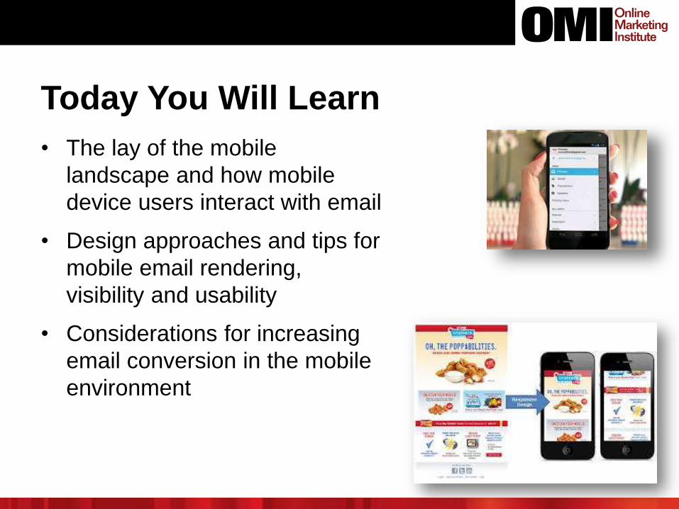
Today You Will Learn
• The lay of the mobile
landscape and how mobile
device users interact with email
• Design approaches and tips for
mobile email rendering,
visibility and usability
• Considerations for increasing
email conversion in the mobile
environment
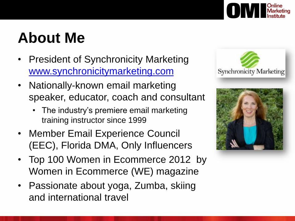
• President of Synchronicity Marketing
www.synchronicitymarketing.com
• Nationally-known email marketing
speaker, educator, coach and consultant
• The industry’s premiere email marketing
training instructor since 1999
• Member Email Experience Council
(EEC), Florida DMA, Only Influencers
• Top 100 Women in Ecommerce 2012 by
Women in Ecommerce (WE) magazine
• Passionate about yoga, Zumba, skiing
and international travel
About Me
Agenda• The Mobile Email Landscape
• User Experience with Mobile Email
• Mobile Email Design Mindset
• Mobile Email Design Best Practices
• The Path to Mobile Email Conversion
Point to Ponder
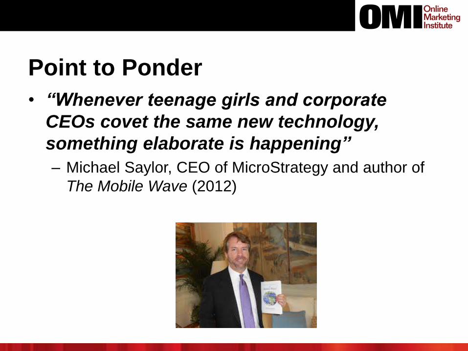
• “Whenever teenage girls and corporate
CEOs covet the same new technology,
something elaborate is happening”
– Michael Saylor, CEO of MicroStrategy and author of
The Mobile Wave (2012)
THE MOBILE EMAIL LANDSCAPE
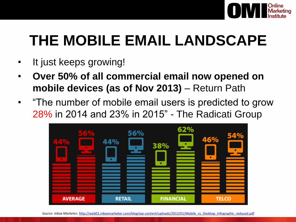
• It just keeps growing!
• Over 50% of all commercial email now opened on
mobile devices (as of Nov 2013) – Return Path
• “The number of mobile email users is predicted to grow
28% in 2014 and 23% in 2015” - The Radicati Group
Source: Inbox Marketer, http://web01.inboxmarketer.com/blog/wp-content/uploads/2013/01/Mobile_vs_Desktop_Infographic_reduced.pdf
Worldwide Smartphone Penetration
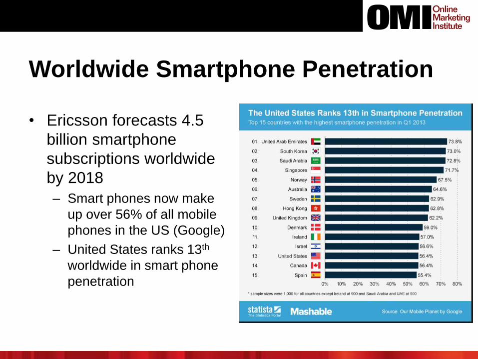
• Ericsson forecasts 4.5
billion smartphone
subscriptions worldwide
by 2018
– Smart phones now make
up over 56% of all mobile
phones in the US (Google)
– United States ranks 13th
worldwide in smart phone
penetration
Mobile Internet Subscriptions Rise
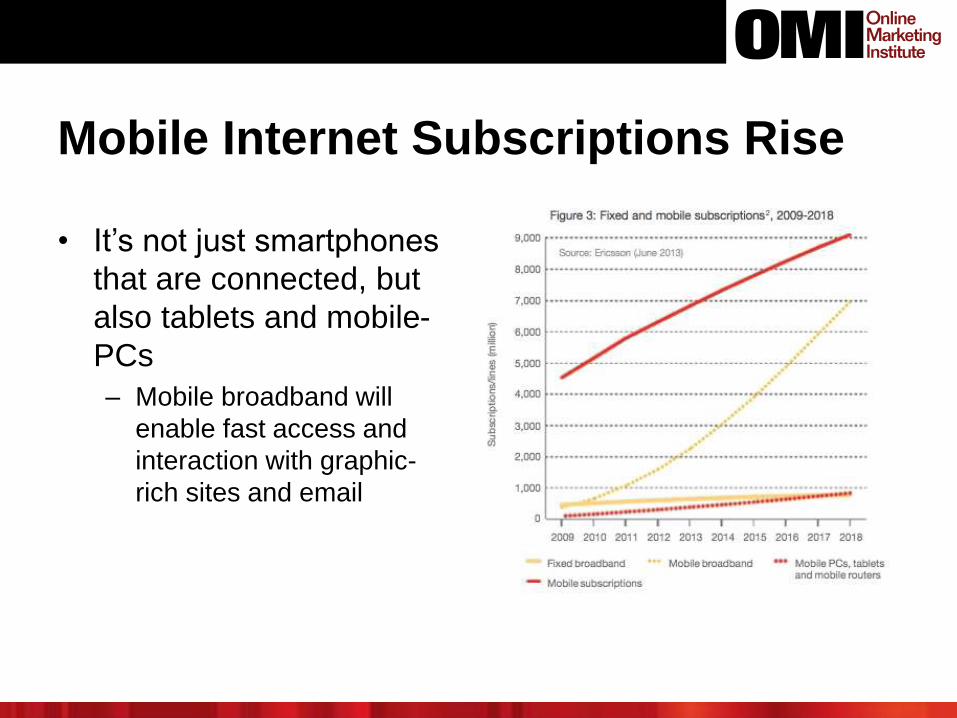
• It’s not just smartphones
that are connected, but
also tablets and mobile-
PCs
– Mobile broadband will
enable fast access and
interaction with graphic-
rich sites and email
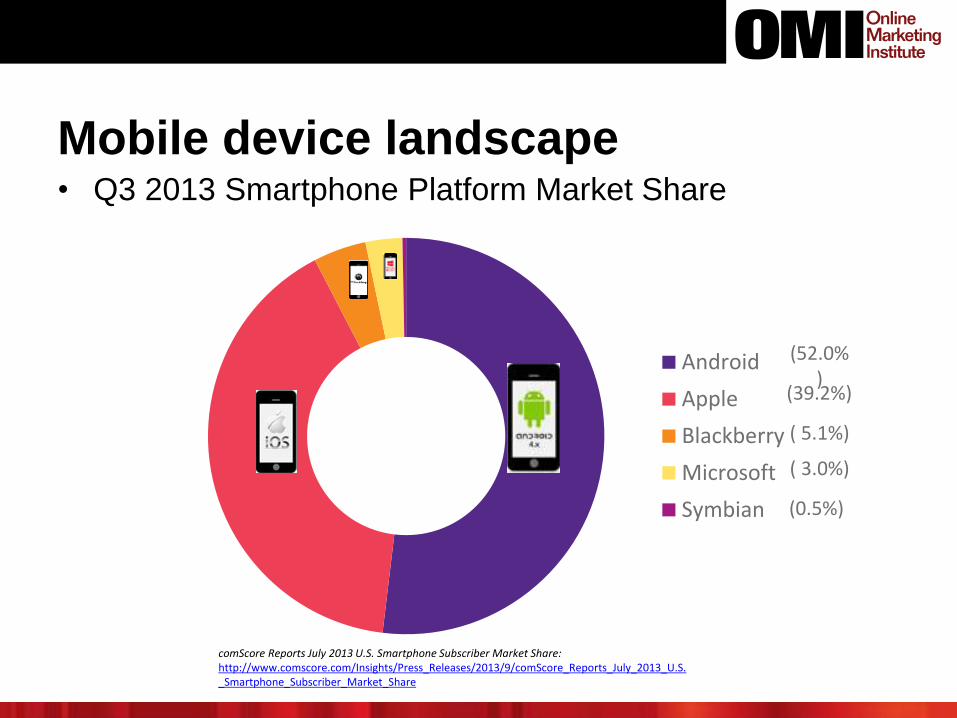
Mobile device landscape• Q3 2013 Smartphone Platform Market Share
comScore Reports July 2013 U.S. Smartphone Subscriber Market Share: http://www.comscore.com/Insights/Press_Releases/2013/9/comScore_Reports_July_2013_U.S._Smartphone_Subscriber_Market_Share
Android
Apple
Blackberry
Microsoft
Symbian
(52.0%)
(39.2%)
( 5.1%)
( 3.0%)
(0.5%)
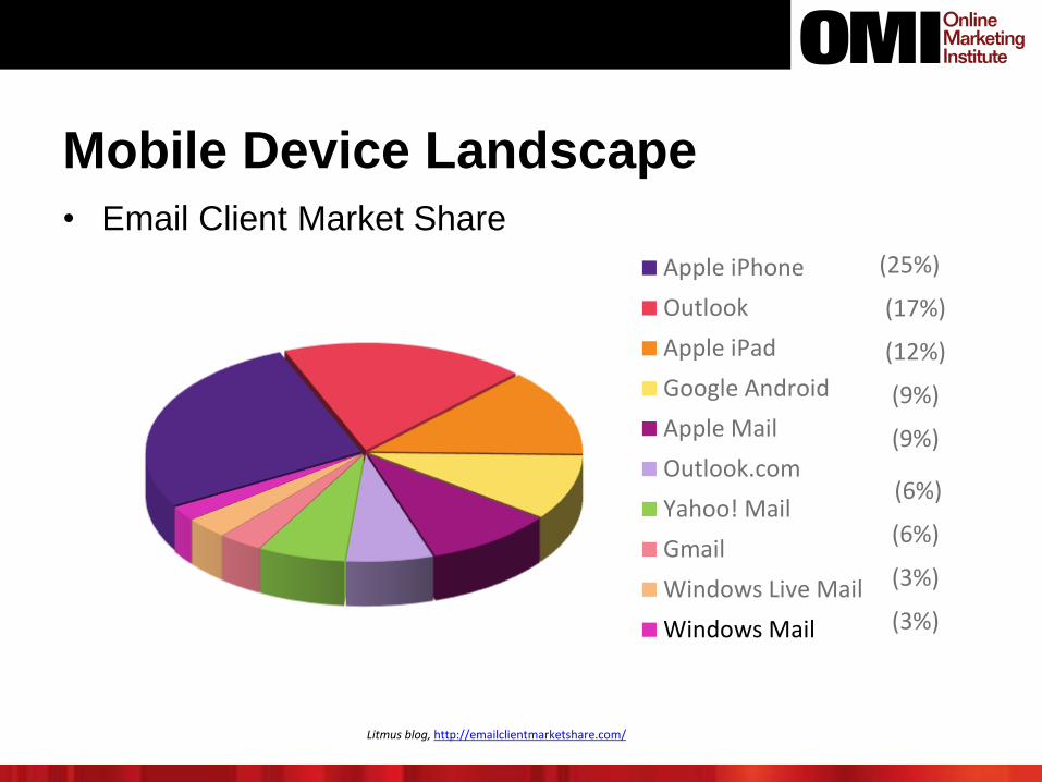
Mobile Device Landscape
• Email Client Market Share
Litmus blog, http://emailclientmarketshare.com/
Apple iPhone
Outlook
Apple iPad
Google Android
Apple Mail
Outlook.com
Yahoo! Mail
Gmail
Windows Live Mail
Windows Mail
(25%)
(17%)
(12%)
(9%)
(9%)
(6%)
(6%)
(3%)
(3%)
Implications
• In the next few years, at least 75% of the world
population will have mobile Internet access
• The mobile device will be (in many places in the world it
already is) the sole computer connected to the Internet
• Most activities possible on a laptop or desktop will be
possible from a mobile device if they aren’t already
• Multiple marketing and messaging channels exist in the
mobile context, and some (like SMS) are unique to
mobile devices
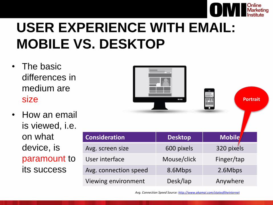
USER EXPERIENCE WITH EMAIL:
MOBILE VS. DESKTOP
Consideration Desktop Mobile
Avg. screen size 600 pixels 320 pixels
User interface Mouse/click Finger/tap
Avg. connection speed 8.6Mbps 2.6Mbps
Viewing environment Desk/lap Anywhere
Avg. Connection Speed Source: http://www.akamai.com/stateoftheinternet
• The basic
differences in
medium are
size
• How an email
is viewed, i.e.
on what
device, is
paramount to
its success
Portrait
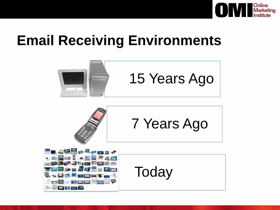
Email Receiving Environments
15 Years Ago
7 Years Ago
Today
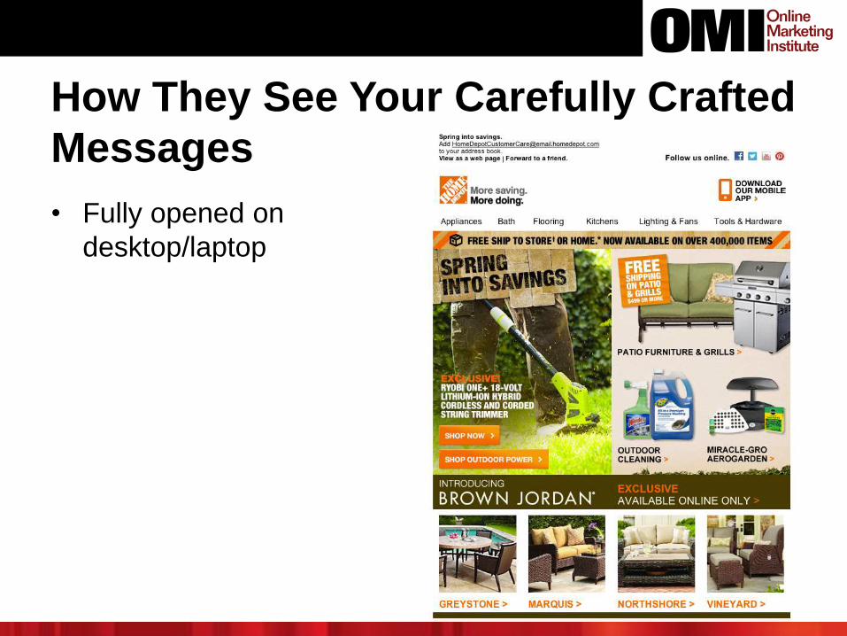
How They See Your Carefully Crafted
Messages
• Fully opened on
desktop/laptop
14
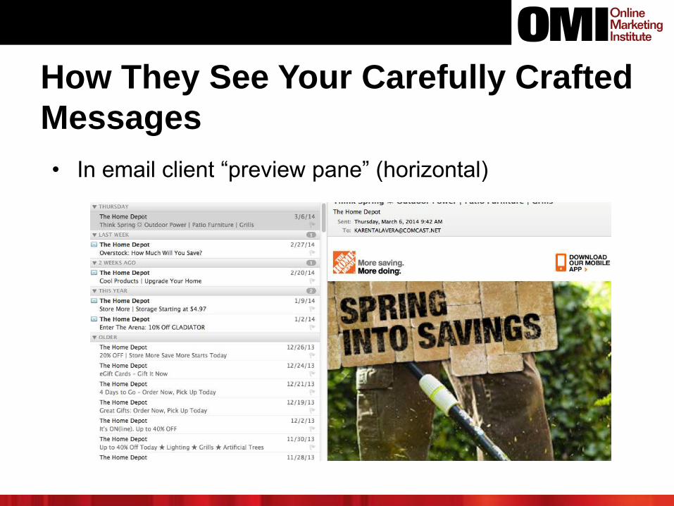
How They See Your Carefully Crafted
Messages
• In email client “preview pane” (horizontal)
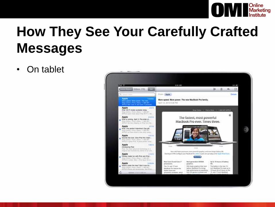
How They See Your Carefully Crafted
Messages
• On tablet
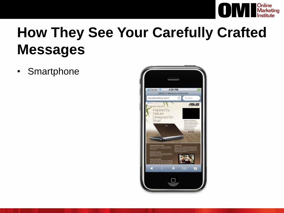
How They See Your Carefully Crafted
Messages
• Smartphone
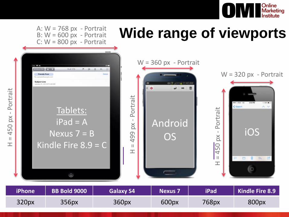
Wide range of viewports
iPhone BB Bold 9000 Galaxy S4 Nexus 7 iPad Kindle Fire 8.9
320px 356px 360px 600px 768px 800px
Tablets:iPad = A
Nexus 7 = BKindle Fire 8.9 = C
iOSAndroid
OS
W = 320 px - Portrait
H =
45
0 p
x -
Port
rait
W = 360 px - Portrait
H =
49
9 p
x -
Port
rait
H =
45
0 p
x -
Port
rait
C: W = 800 px - PortraitB: W = 600 px - PortraitA: W = 768 px - Portrait
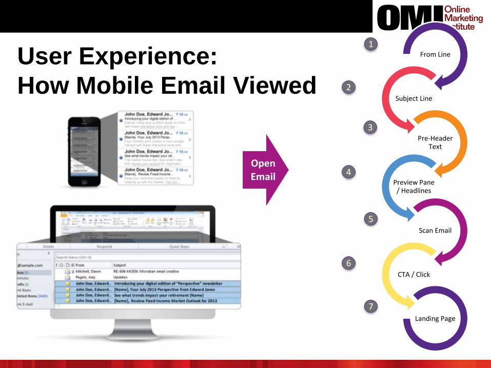
User Experience:
How Mobile Email Viewed
From Line
Subject Line
Pre-Header Text
Preview Pane / Headlines
Scan Email
CTA / Click
Landing Page
OpenEmail
1
2
3
4
5
6
7
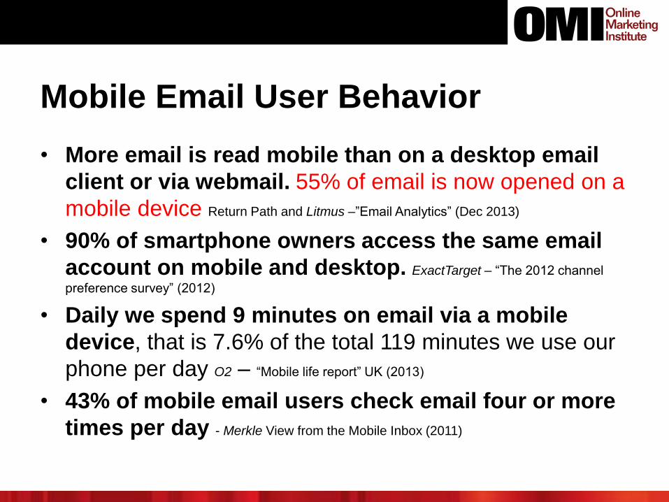
Mobile Email User Behavior
• More email is read mobile than on a desktop email
client or via webmail. 55% of email is now opened on a
mobile device Return Path and Litmus –”Email Analytics” (Dec 2013)
• 90% of smartphone owners access the same email
account on mobile and desktop. ExactTarget – “The 2012 channel
preference survey” (2012)
• Daily we spend 9 minutes on email via a mobile
device, that is 7.6% of the total 119 minutes we use our
phone per day O2 – “Mobile life report” UK (2013)
• 43% of mobile email users check email four or more
times per day - Merkle View from the Mobile Inbox (2011)
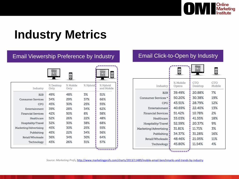
Industry Metrics
Source: Marketing Profs, http://www.marketingprofs.com/charts/2013/11489/mobile-email-benchmarks-and-trends-by-industry
Email Viewership Preference by Industry Email Click-to-Open by Industry
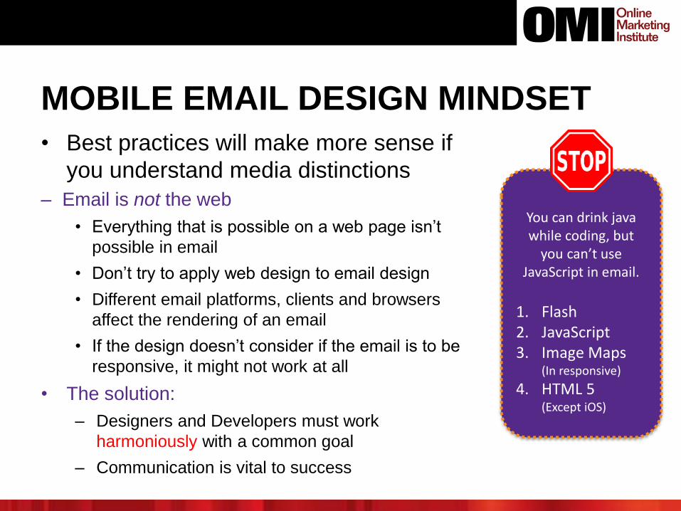
MOBILE EMAIL DESIGN MINDSET
• Best practices will make more sense if
you understand media distinctions
– Email is not the web
• Everything that is possible on a web page isn’t
possible in email
• Don’t try to apply web design to email design
• Different email platforms, clients and browsers
affect the rendering of an email
• If the design doesn’t consider if the email is to be
responsive, it might not work at all
• The solution:
– Designers and Developers must work
harmoniously with a common goal
– Communication is vital to success
You can drink java while coding, but
you can’t use JavaScript in email.
1. Flash2. JavaScript3. Image Maps
(In responsive)
4. HTML 5 (Except iOS)
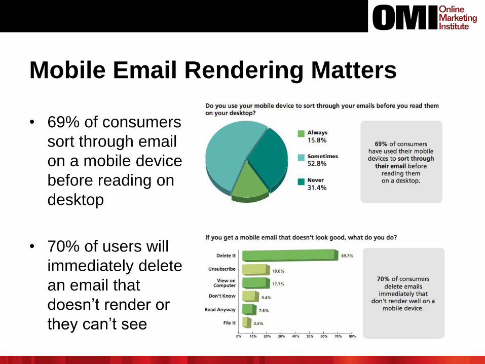
Mobile Email Rendering Matters
• 69% of consumers
sort through email
on a mobile device
before reading on
desktop
• 70% of users will
immediately delete
an email that
doesn’t render or
they can’t see
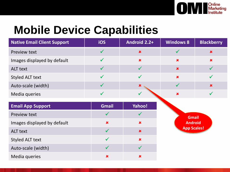
Mobile Device CapabilitiesNative Email Client Support iOS Android 2.2+ Windows 8 Blackberry
Preview text
Images displayed by default
ALT text
Styled ALT text
Auto-scale (width)
Media queries
Email App Support Gmail Yahoo!
Preview text
Images displayed by default
ALT text
Styled ALT text
Auto-scale (width)
Media queries
Gmail Android
App Scales!
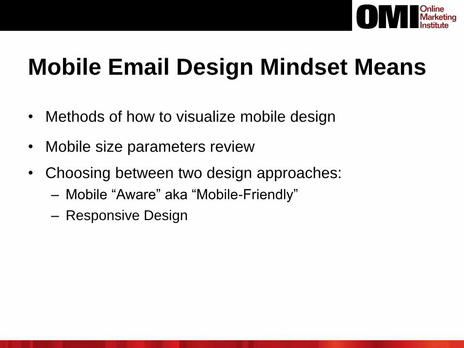
Mobile Email Design Mindset Means
• Methods of how to visualize mobile design
• Mobile size parameters review
• Choosing between two design approaches:
– Mobile “Aware” aka “Mobile-Friendly”
– Responsive Design
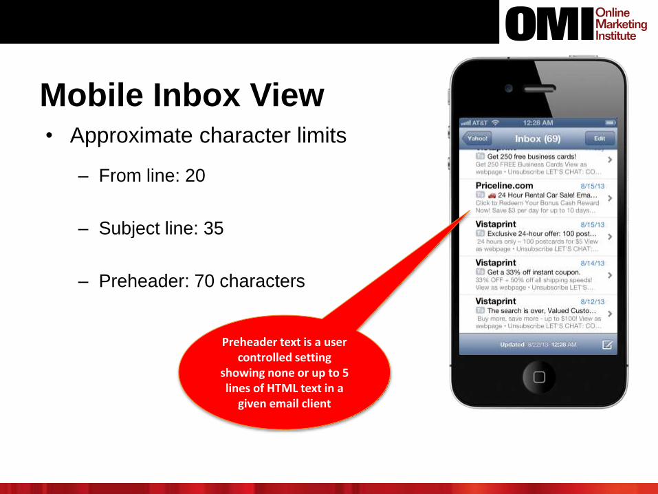
Mobile Inbox View• Approximate character limits
– From line: 20
– Subject line: 35
– Preheader: 70 characters
Preheader text is a user controlled setting
showing none or up to 5 lines of HTML text in a
given email client
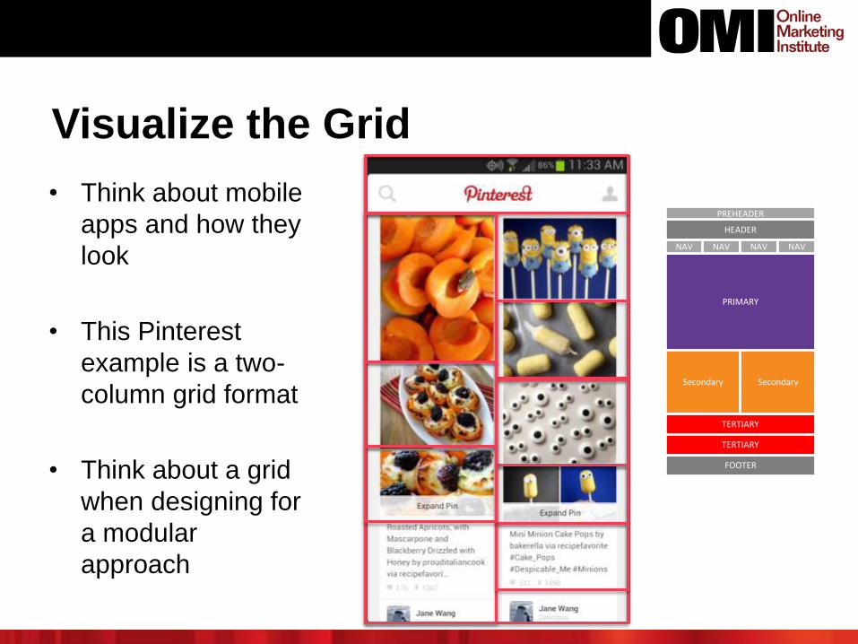
Visualize the Grid
• Think about mobile
apps and how they
look
• This Pinterest
example is a two-
column grid format
• Think about a grid
when designing for
a modular
approach
PRIMARY
Secondary
TERTIARY
PREHEADER
FOOTER
TERTIARY
HEADER
Secondary
NAV NAV NAV NAV
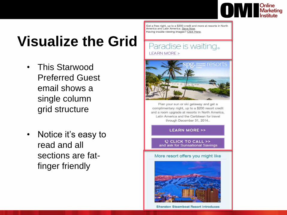
Visualize the Grid
• This Starwood
Preferred Guest
email shows a
single column
grid structure
• Notice it’s easy to
read and all
sections are fat-
finger friendly
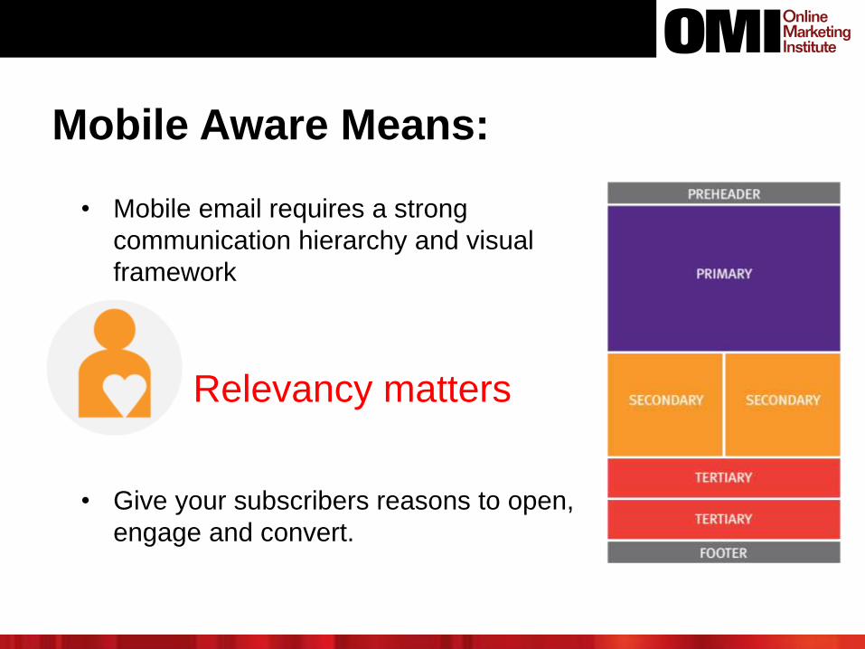
Relevancy matters
Mobile Aware Means:
• Mobile email requires a strong
communication hierarchy and visual
framework
• Give your subscribers reasons to open,
engage and convert.
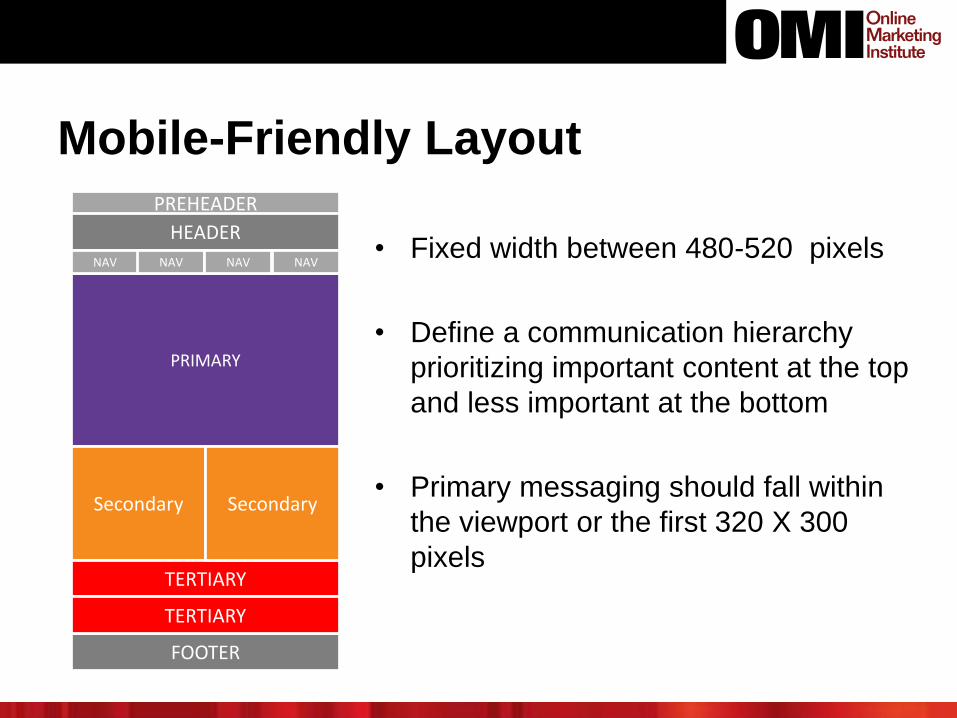
Mobile-Friendly Layout
• Fixed width between 480-520 pixels
• Define a communication hierarchy
prioritizing important content at the top
and less important at the bottom
• Primary messaging should fall within
the viewport or the first 320 X 300
pixels
PRIMARY
Secondary
TERTIARY
PREHEADER
FOOTER
TERTIARY
HEADER
Secondary
NAV NAV NAV NAV
Responsive Design
• An email design approach (as an outgrowth of web
design) that relies on media queries to sense the type
of device on which email is being used and optimize
display for that device
• Use of media queries requires using CSS3 (Cascading Style
Sheets 3) in HTML
• The most resource-intensive approach to making email
mobile-adaptive
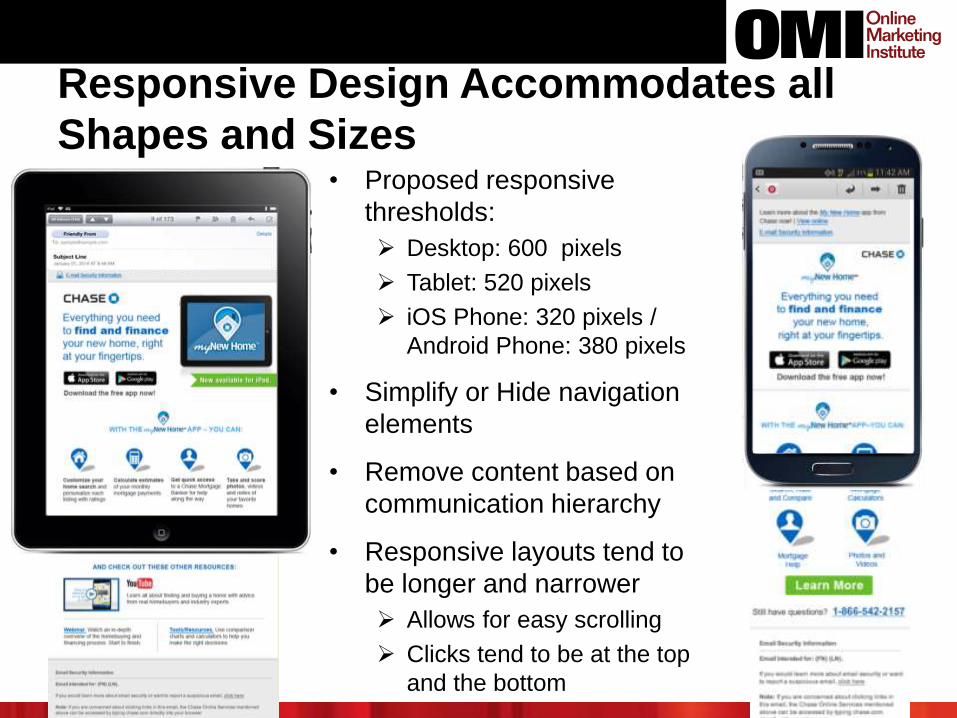
Responsive Design Accommodates all
Shapes and Sizes• Proposed responsive
thresholds:
Desktop: 600 pixels
Tablet: 520 pixels
iOS Phone: 320 pixels /
Android Phone: 380 pixels
• Simplify or Hide navigation
elements
• Remove content based on
communication hierarchy
• Responsive layouts tend to
be longer and narrower
Allows for easy scrolling
Clicks tend to be at the top
and the bottom
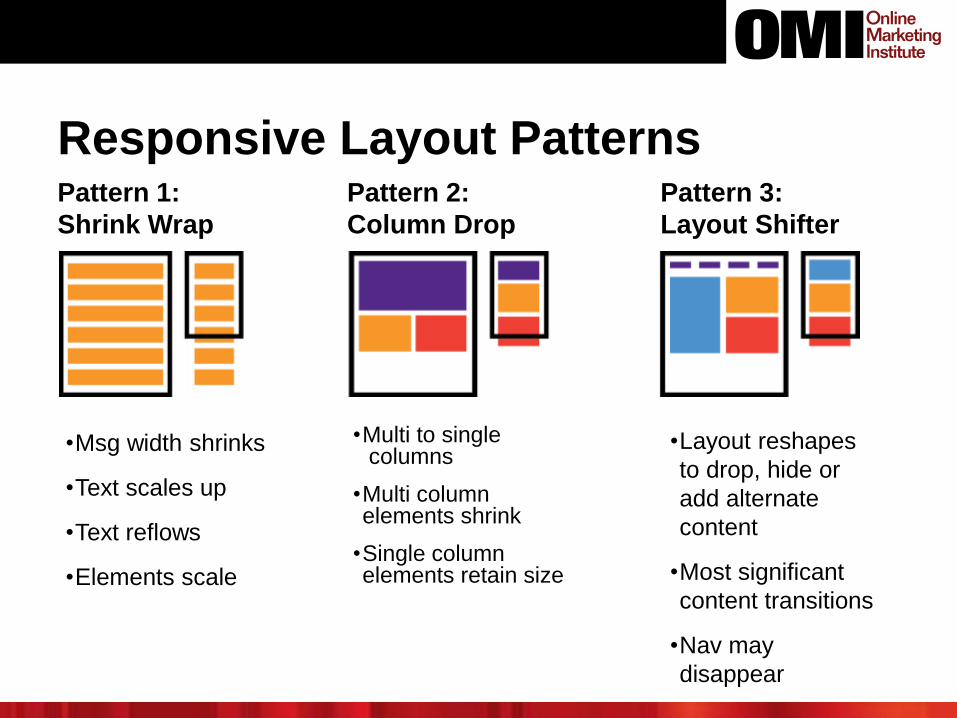
Responsive Layout PatternsPattern 1:
Shrink Wrap
•Msg width shrinks
•Text scales up
•Text reflows
•Elements scale
Pattern 3:
Layout Shifter
Pattern 2:
Column Drop
•Multi to singlecolumns
•Multi column elements shrink
•Single column elements retain size
•Layout reshapes
to drop, hide or
add alternate
content
•Most significant
content transitions
•Nav may
disappear
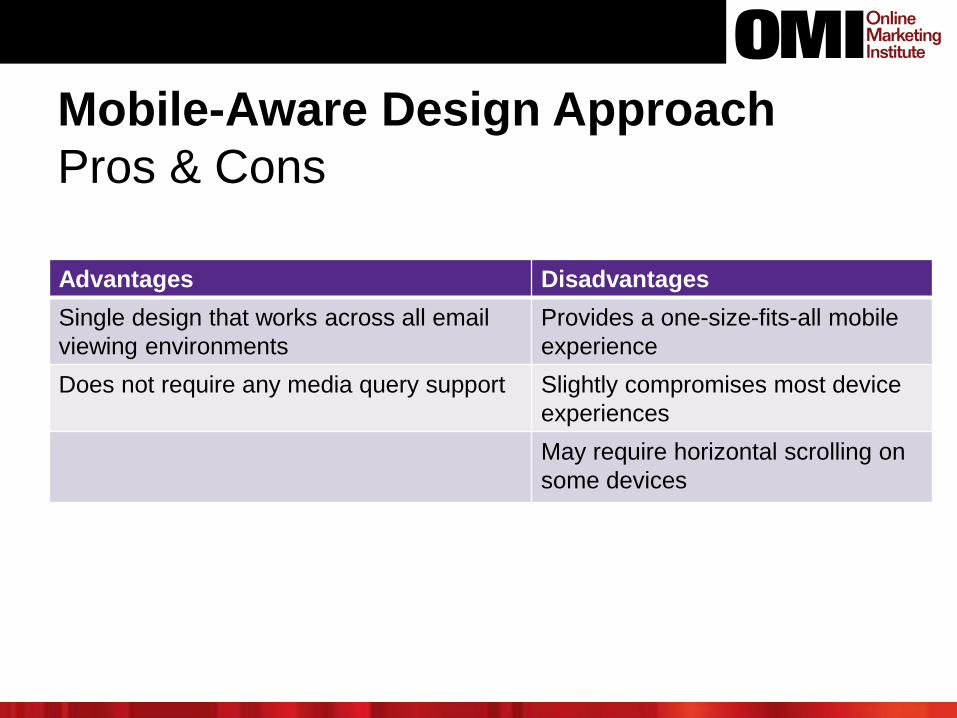
Advantages Disadvantages
Single design that works across all email
viewing environments
Provides a one-size-fits-all mobile
experience
Does not require any media query support Slightly compromises most device
experiences
May require horizontal scrolling on
some devices
Mobile-Aware Design Approach
Pros & Cons
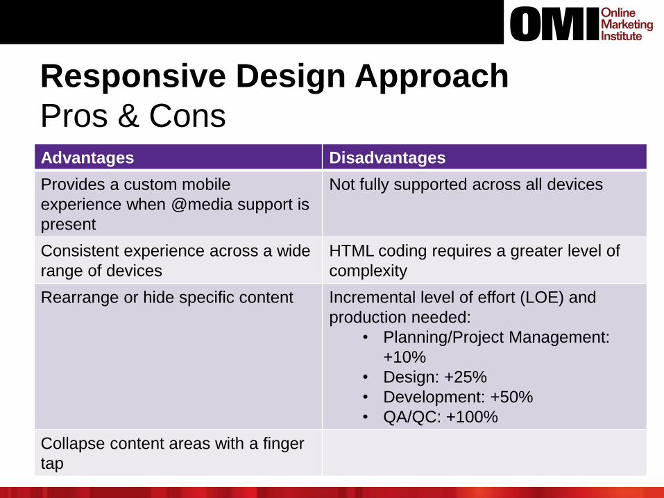
Advantages Disadvantages
Provides a custom mobile
experience when @media support is
present
Not fully supported across all devices
Consistent experience across a wide
range of devices
HTML coding requires a greater level of
complexity
Rearrange or hide specific content Incremental level of effort (LOE) and
production needed:
• Planning/Project Management:
+10%
• Design: +25%
• Development: +50%
• QA/QC: +100%
Collapse content areas with a finger
tap
Responsive Design Approach
Pros & Cons
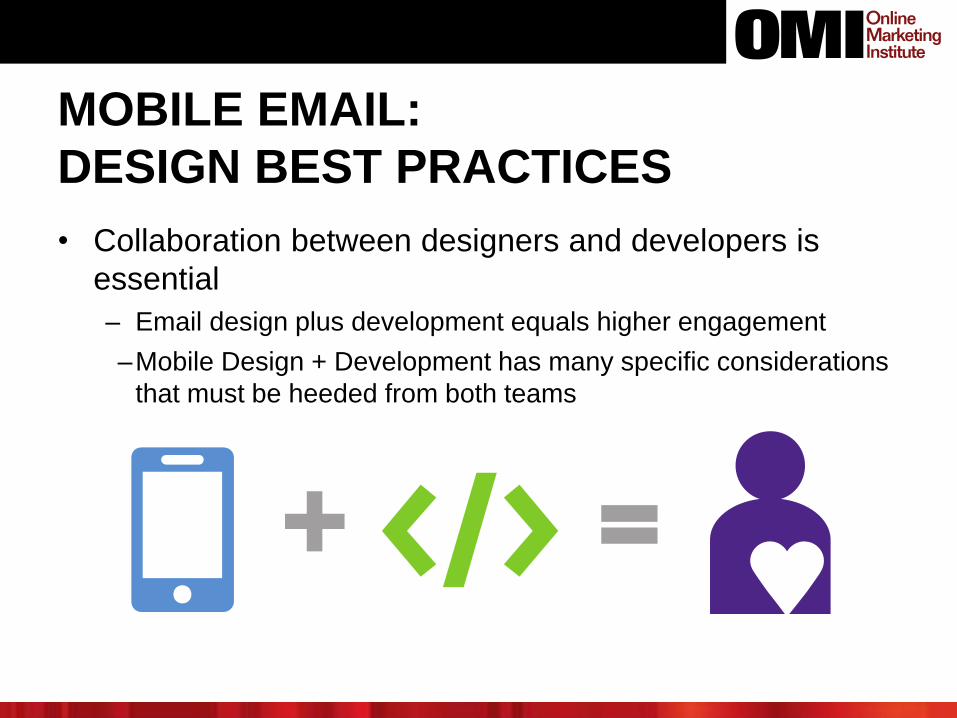
MOBILE EMAIL:
DESIGN BEST PRACTICES
• Collaboration between designers and developers is
essential
– Email design plus development equals higher engagement
–Mobile Design + Development has many specific considerations
that must be heeded from both teams
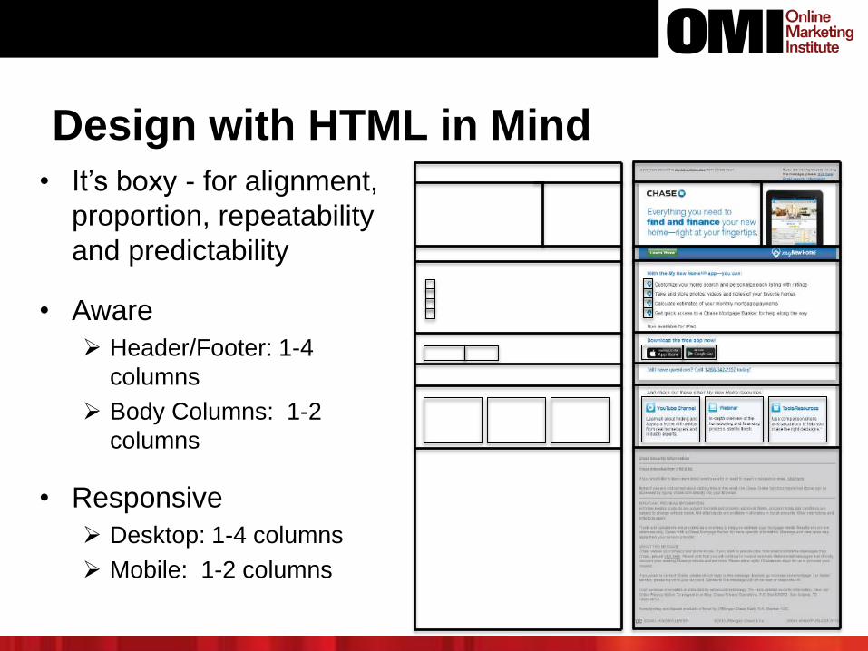
Design with HTML in Mind• It’s boxy - for alignment,
proportion, repeatability
and predictability
• Aware
Header/Footer: 1-4
columns
Body Columns: 1-2
columns
• Responsive
Desktop: 1-4 columns
Mobile: 1-2 columns
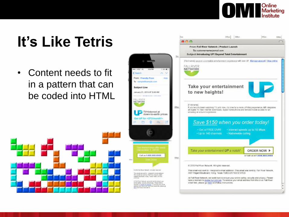
It’s Like Tetris
• Content needs to fit
in a pattern that can
be coded into HTML
• As the number of
columns decrease and
rows increase, content
must become simpler
Without simplicity,
content is muddled
and impossible to
read
Emphasize content
that is truly vital
Need vs “Nice to
have”
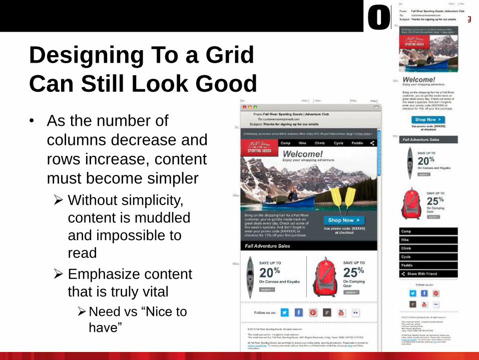
Designing To a Grid
Can Still Look Good
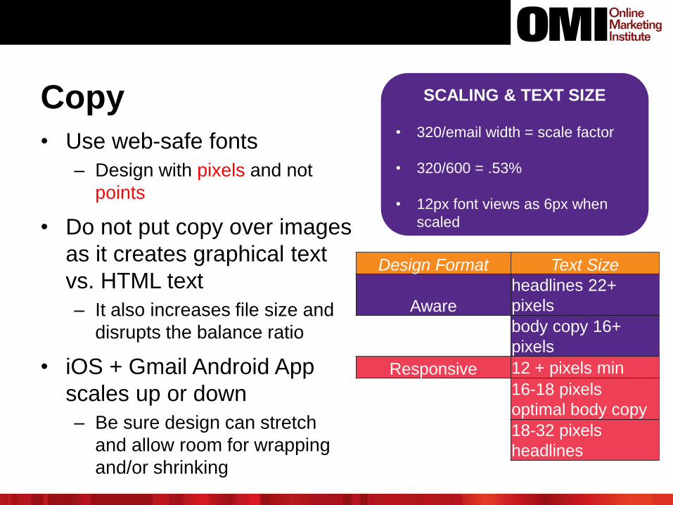
Copy
• Use web-safe fonts
– Design with pixels and not
points
• Do not put copy over images
as it creates graphical text
vs. HTML text
– It also increases file size and
disrupts the balance ratio
• iOS + Gmail Android App
scales up or down
– Be sure design can stretch
and allow room for wrapping
and/or shrinking
SCALING & TEXT SIZE
• 320/email width = scale factor
• 320/600 = .53%
• 12px font views as 6px when
scaled
Design Format Text Size
Aware
headlines 22+
pixels
body copy 16+
pixels
Responsive 12 + pixels min
16-18 pixels
optimal body copy
18-32 pixels
headlines
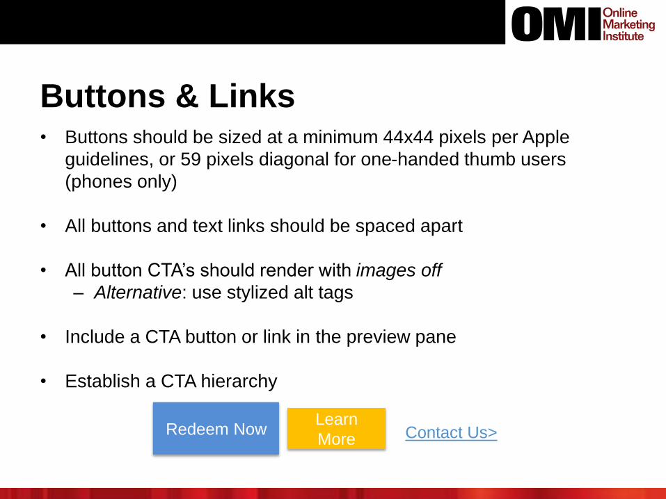
Buttons & Links• Buttons should be sized at a minimum 44x44 pixels per Apple
guidelines, or 59 pixels diagonal for one-handed thumb users
(phones only)
• All buttons and text links should be spaced apart
• All button CTA’s should render with images off
– Alternative: use stylized alt tags
• Include a CTA button or link in the preview pane
• Establish a CTA hierarchy
Redeem NowLearn
More Contact Us>
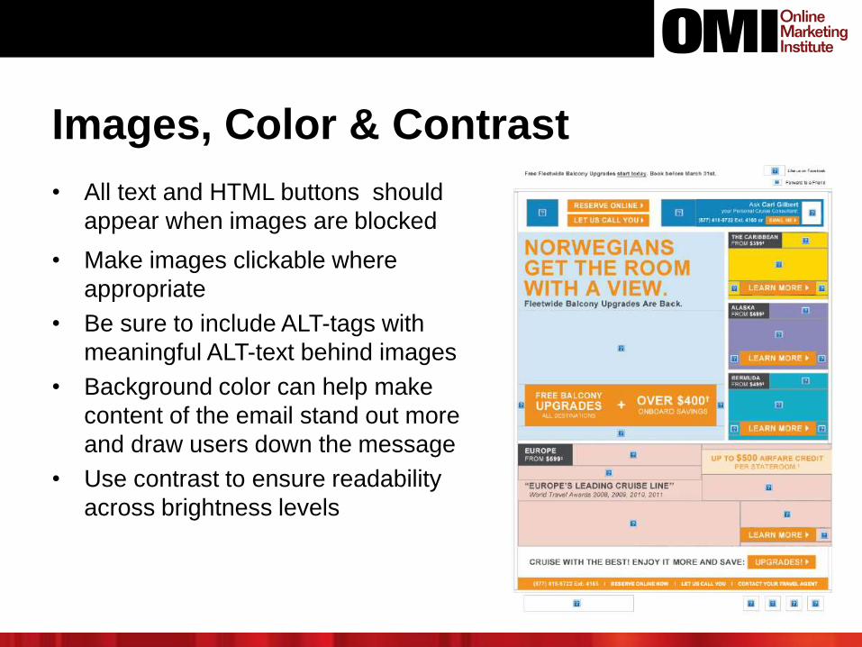
Images, Color & Contrast
• All text and HTML buttons should
appear when images are blocked
• Make images clickable where
appropriate
• Be sure to include ALT-tags with
meaningful ALT-text behind images
• Background color can help make
content of the email stand out more
and draw users down the message
• Use contrast to ensure readability
across brightness levels
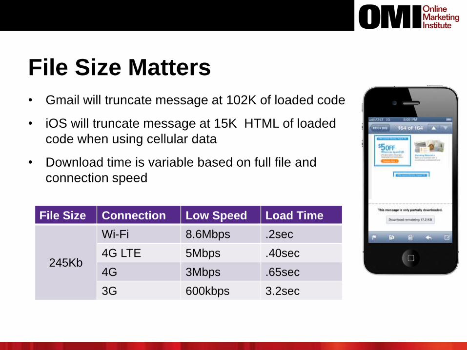
File Size Matters
• Gmail will truncate message at 102K of loaded code
• iOS will truncate message at 15K HTML of loaded
code when using cellular data
• Download time is variable based on full file and
connection speed
File Size Connection Low Speed Load Time
245Kb
Wi-Fi 8.6Mbps .2sec
4G LTE 5Mbps .40sec
4G 3Mbps .65sec
3G 600kbps 3.2sec
THE PATH TO MOBILE CONVERSION
• Where do you really want them to go from within your
mobile email?
– Browser? (Not if your site is mobile-unfriendly)
– App?
– Phone?
– In-store (location specific email)?
• Any are valid choices. More and more, email conversion
path links to mobile app
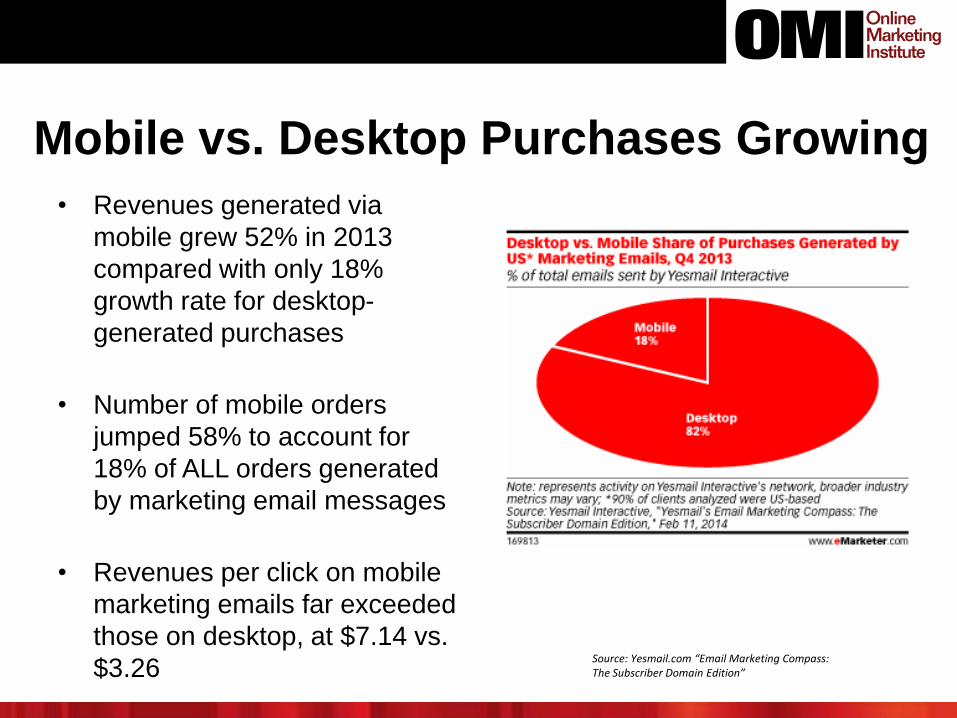
Mobile vs. Desktop Purchases Growing
• Revenues generated via
mobile grew 52% in 2013
compared with only 18%
growth rate for desktop-
generated purchases
• Number of mobile orders
jumped 58% to account for
18% of ALL orders generated
by marketing email messages
• Revenues per click on mobile
marketing emails far exceeded
those on desktop, at $7.14 vs.
$3.26Source: Yesmail.com “Email Marketing Compass: The Subscriber Domain Edition”
Move The Needle
Review Your Commercial Emails for
Mobile-Readiness
• Test sending your recurring or continuity email programs
(like newsletters) as well as your promotional email to
addresses viewable across a variety of different devices
– How do your messages look on different screen sizes?
– How mobile-aware is your current design approach?
– What needs to be fixed for true mobile-friendliness?
– How can you modify CTAs for better mobile response?
Key Takeaways
1. More marketing email is now opened and read on mobile
than stationary devices, and growing
2. Mobile-aware, if not fully mobile-optimized, email design
is essential to subscriber engagement and conversion
3. Device screen size, usability and ergonomics all influence
and change subscriber mobile vs. desktop-device email
and purchase behavior
4. Mobile-friendly design requires a new mindset and
proactive choices
5. There ARE design best practices you should follow to
ensure mobile-visible, and mobile-aware email


