MODELING THE SPREAD OF COVID-19 OVER VARIED CONTACT NETWORKS A Thesis presented to the Faculty of California Polytechnic State University, San Luis Obispo In Partial Fulfillment of the Requirements for the Degree Master of Science in Computer Science by Ryan Lee Sol´orzano June 2021
Transcript
MODELING THE SPREAD OF COVID-19 OVER VARIED CONTACT
NETWORKS
A Thesis
presented to
the Faculty of California Polytechnic State University,
4.1 A description of each contact network used for this research [4]. . . 13
4.2 Properties of each contact network. Values are averaged over all thedays of the study [4]. . . . . . . . . . . . . . . . . . . . . . . . . . . 14
6.1 The False Negative rates of RT-PCR based testing, where Day isdays since exposure, and FNR is the False Negative Rate, or percentchance someone will get a false negative result . . . . . . . . . . . . 20
7.1 A summary of the score for each strategy across each contact networkwhen considering the maximum number infected . . . . . . . . . . . 35
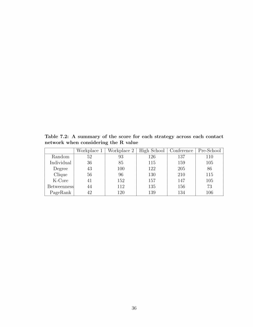
7.2 A summary of the score for each strategy across each contact networkwhen considering the R value . . . . . . . . . . . . . . . . . . . . . 36
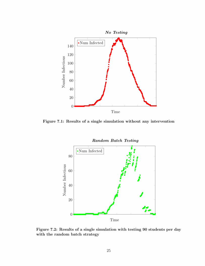
7.1 Results of a single simulation without any intervention . . . . . . . 25
7.2 Results of a single simulation with testing 90 students per day withthe random batch strategy . . . . . . . . . . . . . . . . . . . . . . . 25
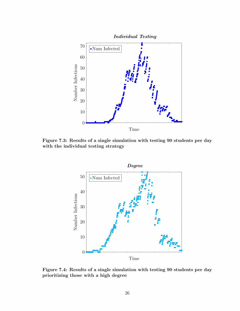
7.3 Results of a single simulation with testing 90 students per day withthe individual testing strategy . . . . . . . . . . . . . . . . . . . . . 26
7.4 Results of a single simulation with testing 90 students per day pri-oritizing those with a high degree . . . . . . . . . . . . . . . . . . . 26
7.5 Results of a single simulation with testing 90 students per day pri-oritizing those with high clique numbers . . . . . . . . . . . . . . . 27
7.6 Results of a single simulation with testing 90 students per day pri-oritizing those with high k-core numbers . . . . . . . . . . . . . . . 27
7.7 Results of a single simulation with testing 90 students per day witha high betweenness centrality . . . . . . . . . . . . . . . . . . . . . 28
7.8 Results of a single simulation with testing 90 students per day witha high PageRank . . . . . . . . . . . . . . . . . . . . . . . . . . . . 28
7.9 Averaged results of the maximum number infected for each strategyon the Workplace 1 contact network . . . . . . . . . . . . . . . . . 30
7.10 Averaged results of the maximum number infected for each strategyon the Workplace 2 contact network . . . . . . . . . . . . . . . . . 31
7.11 Averaged results of the maximum number infected for each strategyon the High School contact network . . . . . . . . . . . . . . . . . . 32
x
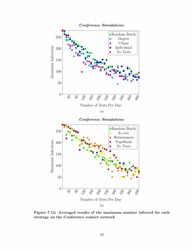
7.12 Averaged results of the maximum number infected for each strategyon the Conference contact network . . . . . . . . . . . . . . . . . . 33
7.13 Averaged results of the maximum number infected for each strategyon the Pre-School contact network . . . . . . . . . . . . . . . . . . 34
7.14 Averaged results of the R-value for each strategy on the Workplace1 contact network . . . . . . . . . . . . . . . . . . . . . . . . . . . . 37
7.15 Averaged results of the R-value for each strategy on the Workplace2 contact network . . . . . . . . . . . . . . . . . . . . . . . . . . . . 38
7.16 Averaged results of the R-value for each strategy on the High Schoolcontact network . . . . . . . . . . . . . . . . . . . . . . . . . . . . . 39
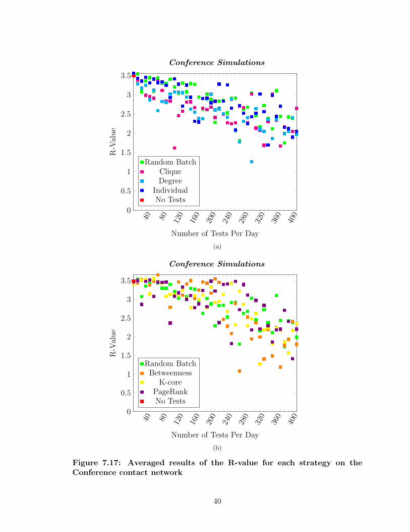
7.17 Averaged results of the R-value for each strategy on the Conferencecontact network . . . . . . . . . . . . . . . . . . . . . . . . . . . . . 40
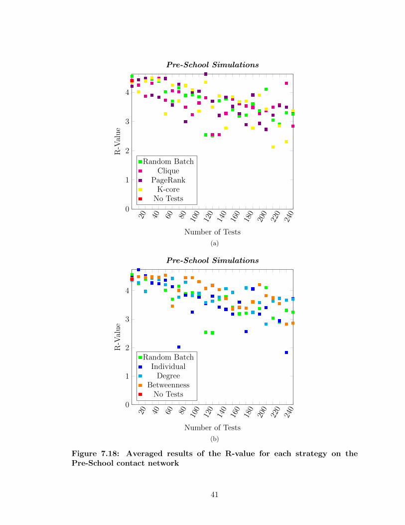
7.18 Averaged results of the R-value for each strategy on the Pre-Schoolcontact network . . . . . . . . . . . . . . . . . . . . . . . . . . . . . 41
xi
Chapter 1
INTRODUCTION
Mankind was not prepared for the SARS-Cov-2 pandemic, and unless we learn from it,
we will not be ready for the next pandemic. There are many behavior changes we can
implement as a society which have been proven to slow the spread of a disease, such
as wearing masks and social distancing. Yet, while these behavioral changes lower
how likely it is to transmit the disease, they do not involve the isolation of individuals
we think are sick. Furthermore, the testing/ quarantining plan in the United States
as a whole is mostly voluntary and relies on anecdotal information of being able to
list the people one was in contact with before being confirmed to have COVID-19.
Duke University has showcased the effectiveness of a well implemented testing plan
among a community, with their population showing much smaller numbers relative to
their surrounding community [3]. The efficacy of their response was credited in large
part due to their “aggressive testing” strategy, when combined with their pushes for
social distancing, mask mandates, hand washing, and more.
So we may, hypothetically, take advantage of the robust network of smartphones
and record the interactions between two individuals via their Bluetooth interactions.
This thesis aims to leverage five such contact networks and make a testing intervention
strategy using random testing, uniform testing, and graph theory metrics from the
contact networks of individuals. The research done in this paper aims to answer
several questions:
• RQ1: What percentage of the population would need to be randomly tested
every day to minimize the spread of a disease?
1
• RQ2: Is testing random batches of a population more or less effective than
every individual randomly testing twice a week (Similar to Cal Poly’s testing
strategy)?
• RQ3: Can we decrease the number of tests required to effectively minimize the
spread of a disease by using a testing strategy that uses graph theory?
For this thesis, we make several educated hypothesis for these research questions.
However, the hypotheses one may create depends largely on what is defined as “ef-
fectively minimizing the spread of a disease.” In the case of the following hypotheses,
we will consider “effectively minimizing” as minimizing the peak number of infectious
individuals. This is influenced by the idea of “flattening the curve” in order to min-
imize the number of hospitalizations of a population. The question of evaluation is
explored further in Chapter 8. The hypotheses are as follows:
• HP1: In order to minimize the spread of an infectious disease, at least half of a
population will have to be tested each day.
• HP2: With a low number of available tests, having each individual regularly test
will likely be more effective. However, as the quantity of tests becomes large,
the random batches will likely be more effective (albeit a bit impractical).
• HP3: Assuming equal amounts of tests, a testing strategy with graph theory
will perform better given a small quantity of tests. However, random testing
will eventually dominate as the quantity of tests increases.
There have been several methods developed for testing if an individual has COVID-
19. This thesis focuses on the Reverse Transcriptase Polymerase Chain Reaction
(RT-PCR) based testing due to availability of research [10]. With these tests, you
2
have the potential to correctly or incorrectly test positive, or correctly or incorrectly
test negative for COVID-19. When someone is falsely identified to have COVID-19,
it is called a false positive, and when someone falsely tests negative it is called a false
negative. Tests have what is called a false positive rate and false negative rate. In
the simulation used by this thesis, we either declare a person ’positive’ or ’negative’
based on the false positive and negative rates, and appropriately quarantine. The
values for these rates is discussed further in Chapter 5.
3
Chapter 2
BACKGROUND
2.1 Graphs
Graph theory is a broad topic which has applications from topology to computer
networks, yet has humble beginnings. In 1735, Swiss mathematician Leonhard Euler
wondered if it was possible to cross every bridge of Konigsberg, without crossing
every bridge twice [1]. Euler proved that it was not possible, and furthermore is
only possible if the city had at most 2 landmasses with an odd number of bridges
attached to them. By solving this problem, Euler proved the first theorem of modern
graph theory. The Konigsberg bridge problem can be abstracted to a graph, where
the landmasses are referred to as nodes and the bridges are edges. For this thesis,
we will focus on simple graphs where an edge goes in both directions (an undirected
graph), two nodes can only be connected by at most one edge, and a node cannot be
connected to itself.
2.1.1 Graph Metrics and Graph Algorithms
There are several graph metrics and algorithms which this thesis will utilize, which
include the degree of vertices, clique subgraphs, k-Cores, betweenness centrality, and
page rank. This section will define each metric or algorithm and the motivation behind
using it in a contact network.
The degree of a node is defined as the number of edges connected to it. In the context
of a contact network, a high degree corresponds to an individual who is in contact
4
with a lot of people. Therefore, the likelihood that they would contract a disease is
higher than an individual with a low degree.
A graph is considered a clique if every node is connected to the other. So, any typical
graph has subgraphs that are a cliques, but the size of the largest clique depends on
how well connected the graph is. Within epidemiological networks, viruses are known
to spread rapidly within cliques, so if an individual is in a large clique they may have
a high risk of contracting a disease.
Similar to clique, a k-core subgraph is defined as every node having degree k or more.
The motivation behind this is similar to individuals with a high degree and clique; if
someone is within a high k-core they not only have a high likelihood to contract or
spread a disease, but also they are within a well connected core that may speed up
the spread.
Betweenness centrality is a measure of the “centrality” of a node, meaning how many
of the shortest paths go through it. For example, if buildings are nodes and roads
are edges, the buildings downtown would have a high betweenness centrality, since
there are a lot of paths which go through them to get to another part of town. The
motivation behind using this metric is to catch those individuals who are “in between”
certain social groups so that if they get infected, the disease has a hard time spreading
to another part of the graph.
Page rank is a very popular algorithm developed primarily by Larry Page from Google
to rank the likelihood of an individual of someone visiting a webpage. It does this
by starting each webpage with the same number of “people” and evenly send each
“person” to their neighbors until an equilibrium is reached. In the case of this algo-
rithm, an equilibrium is reached when the values do not change between iterations.
In the context of epidemiological networks, rather than of visualizing the algorithm as
5
people visiting webpages we will be interpreting it as the diseases traveling to people.
Therefore, the numbers can be interpreted as the likelihood of a disease reaching a
person. Admittedly, this will not be as important in the early stages of a disease, but
will hopefully become relevant as a disease becomes more well mixed. Research has
suggested that nodes with high PageRank values are more likely to be super-spreaders
of a disease compared to those with lower PageRank values [15], although this was in
the context of cattle herds spreading a disease.
2.1.2 Contact Networks
Graphs can be modeled on much more than just land and bridges. For this the-
sis, nodes will represent people and edges represent an interaction, or contact, be-
tween two people that allows for transmission of COVID-19. Thus, we may define
a contact network graph as G = (V,E), where G = the contact network, V =
the vertices, or the people in the contact network, and E = the edges, or the con-
tacts between two people. The definition of a contact varies by who collected the
contact network data, however it generally is defined as two people coming a cer-
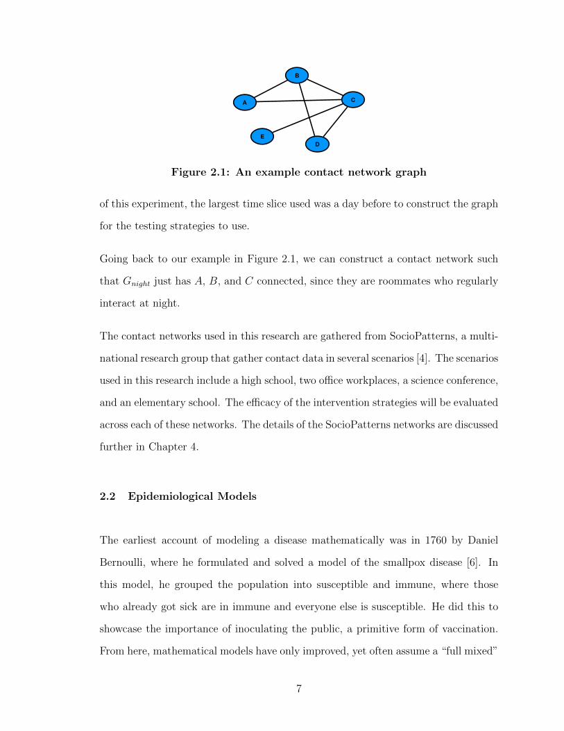
tain distance from each other for greater than a set amount of time. Figure 2.1
shows an example contact network. In this example, V = {A,B,C,D,E} and
E = {(A,B), (B,C), (A,C), (B,D), (C,D), (E,C)}. Since we are interpreting this
as a contact network, we can imagine a scenario where A, B, and C are roommates,
B, C, and D are in a club sport together, and E and C have a class together.
We must also introduce the idea of time, since different time slices of a day are
different graphs, since two people may only interact at certain times of a day. Thus,
graphs will now be denoted as Gτ = (Vτ , Eτ ), where τ is an hour time-slice of the
contact network at hour τ . Additionally, if a larger time-slice is needed, the graph
will simply be denoted as Gτ1−τ2 , where Gτ1−τ2 = (Vτ1 ∪ Vτ2 , Eτ1 ∪ Eτ2). In the scope
6
A
B
C
DE
Figure 2.1: An example contact network graph
of this experiment, the largest time slice used was a day before to construct the graph
for the testing strategies to use.
Going back to our example in Figure 2.1, we can construct a contact network such
that Gnight just has A, B, and C connected, since they are roommates who regularly
interact at night.
The contact networks used in this research are gathered from SocioPatterns, a multi-
national research group that gather contact data in several scenarios [4]. The scenarios
used in this research include a high school, two office workplaces, a science conference,
and an elementary school. The efficacy of the intervention strategies will be evaluated
across each of these networks. The details of the SocioPatterns networks are discussed
further in Chapter 4.
2.2 Epidemiological Models
The earliest account of modeling a disease mathematically was in 1760 by Daniel
Bernoulli, where he formulated and solved a model of the smallpox disease [6]. In
this model, he grouped the population into susceptible and immune, where those
who already got sick are in immune and everyone else is susceptible. He did this to
showcase the importance of inoculating the public, a primitive form of vaccination.
From here, mathematical models have only improved, yet often assume a “full mixed”
7
Figure 2.2: Histogram showcasing the power law nature of the number ofinteractions per person in the Conference contact network
model where every person has equal chance of being in contact with another. While
this is somewhat of an accurate model, it is very limited as people generally do not
have an equal probability of interacting with every other person in a community. In
fact, the degrees of real-world contact networks often follow a power law, meaning
more people have a relatively small degree of contacts. This property is showcased
in our own networks and displayed in Figure 2.2. This is why contact networks
are so important in modeling the spread of a disease; they provide a more powerful
framework by which to model the outcome of a disease [12].
2.2.1 General Terminology
There are several terms which are used in epidemiology which need to be defined in
the scope of this research, which include R0, epidemic, endemic, herd immunity, false
negatives and positives, and test sensitivity and specificity [13, 14].
8
R0 is sometimes referred to as the basic reproduction number, or how many people
we can expect an infectious individual to infect. When R0 = 1, each person only
infects one person while they are sick and a disease is referred to as an endemic. If
R0 > 1, the disease is now an epidemic, and the spread of the disease becomes very
rapid. There is no term for when R0 < 1, but if this is the basic reproduction number
of a disease then the number of people infected will be rapidly decreasing. The R0
value differs across diseases, and refers to the spread of a disease initially [7]. As a
disease spreads, this number changes and may be simply referred to as the R value
of a disease.
Herd immunity is the percentage of the population that must be immune to the
disease in order for it to not persist. In terms of R0, if a population is at the herd
immunity threshold, R0 < 1 [13].
A false negative result means that an individual with a disease incorrectly receives
a negative test result for a disease. Conversely, a false positive result means that an
individual without a disease receives a positive result for the disease.
In the study of medical diagnosis, there are two statistical features of a medical test
that are important to look at: the sensitivity and the specificity of the test. Sensitivity
is defined as the proportion of people with the disease who correctly test positive using
the test, and specificity is defined as the percentage of people without the disease who
have a negative test result. Some more commonly known statistics for testing is
the false negative rate and the false positive rate. The false negative rate equals 1 -
sensitivity, and the false positive rate equals 1 - specificity. The false negative rate
and false positive rate give us values that tell us exactly how often the tests are wrong
for any given individual (sick or healthy), so these values are what are actually used
in the simulation.
9
2.2.2 Compartmental Models
Models now have built on Bernoulli’s “susceptible” and “immune” model to a Sus-
ceptible, Infectious, and Recovered model, or SIR model. These types of models are
generally referred to compartmental models where the entire population is partitioned
into one of the compartments listed. Variations of these models include SEIR model,
which includes individuals exposed to the disease, and SEQIR, where a percentage
of the population is quarantined because they are showing symptoms [5]. Much like
Bernoulli, there can be a mathematical formula from one compartment to another.
However, this thesis focuses on the movement of individuals between compartments
based on the contact networks that have been gathered. The compartmental model
used in this paper can be seen in the experimental design section.
2.3 RT-PCR Based Tests
When determining if an individual has contracted a disease, a medical test must be
conducted. A widely available test used for detecting SARS-CoV-2 is the reverse
transcriptase polymerase chain reaction test, or RT-PCR [10]. This test is often
administered as a swab in the nasal region, although other methods of extracting
samples may include saliva, throat samples, or other bodily fluids [16]. For medical
tests such as this one, it is important to consider the sensitivity and specificity as
discussed in subsection 2.2.1. What values are used is discussed further in Chapter 6,
however it is important to note that this test has a relatively high sensitivity, and a
high specificity, meaning those with the disease are likely to test positive, and those
without the disease are not.
10
Chapter 3
RELATED WORKS
A work by St-Onge et al. first tried to model a more realistic spread of a hypothetical
disease using an improved SIR model [18]. Given the timing of the experiment, it
may be assumed that this model was loosely based on COVID-19. The authors then
showcased the importance of intervention strategies in mitigating the spread of disease
in networks with higher-order structure (i.e. a large community). The evaluation of
the intervention strategies is of particular interest in this research since this paper
also explores intervention strategies to mitigate the spread of a disease.
Imai et al. was one of the first studies to show that the transmission of SARS-CoV-
2 was self-sustaining, or that it’s R value is greater than 1 [7]. Additionally, they
calculated the R0 value of COVID-19 to be 2.6. This study was conducted in Wuhan,
China at the beginning of the COVID-19 pandemic, January 2020 and observed all
the estimated amount of cases prior to the publication of the paper. This paper is of
particular interest because it gives us the realistic values of the spread of COVID-19 in
the absence of disease intervention strategies such as mask wearing which to compare
the results of the simulations of this research to.
Kucharski et al. explored the effect of several intervention strategies on the effective
R0 value of COVID-19 [9]. This work found that a combined testing and tracing
strategy was the most effective at lowering the R value of a disease. Similar to Imai
et al., the evaluation of these intervention strategies is important with this research
as this study explores similar intervention strategies to this thesis.
11
Siu et al. attempt to mitigate the spread of a disease by creating vaccine inter-
vention strategies using graph theory [17]. Additionally, rather than simulating the
epidemic using a mathematical model, they also use a contact network gathered from
Copenhagen [19]. This work also implements vaccination strategies using underlying
reasoning which is similar to a testing/ quarantining strategy.
G’enois et al. explore if using co-location information can be down sampled to accu-
rately model a real life contact network [4]. Here, co-location data is defined as two
individuals being in the same general area such as a room. This paper used the So-
cioPatterns datasets and was able to show that there was no down-sampling technique
which is able to accurately model real world interactions across any scenarios. This
is helpful in the realm of this thesis, because there are many more contact networks
that look more like a co-location interaction rather than a face to face interaction, so
this paper shows that using these networks is not as accurate.
Estrada et al. have a very in-depth paper on how to mathematically model SARS-
CoV-2 using a modified SIR model [2]. While I’m more focused on modeling us-
ing contact networks rather than mathematical models, this paper is still extremely
helpful in creating my modified compartmental model, and for parameters for my
simulation such as probability of infection.
Shah et al. explore the correlation between the super spreaders of a disease and the
PageRank of those spreaders [15]. One of the results of this study found that the
nodes with a high PageRank value contain a higher proportion of super spreaders
than the nodes with lower PageRank values. It should be noted that this study was
done in the context of the spread of disease among herds of livestock, however the
results should still apply in a human contact network.
12
Chapter 4
NETWORK DESCRIPTIONS
The experiments done in this research use contact networks gathered by SocioPat-
terns. SocioPatterns is a collaboration between researchers and developers across the
world to collect various contact network data for networks ranging from Baboons’
interactions to interactions among people within a hospital [4]. All of the data is col-
lected using the same system where each participant wears an RFID tag and reader
which records if two individuals come into contact. In the case of this network, a con-
tact is defined as the readers of both individuals register the RFID tag of the other
for a 20s time window. This collaboration states that two individuals must be within
a 1.5 meters of each other to record a contact, or about 5 feet. However, intensity
is not specified meaning we must therefore assume that all contacts are equal and is
sufficient duration and distance to transmit COVID-19 from an infectious individual
to a susceptible one. Table 4.1 summarizes each contact network used in this research
and Table 4.2 summaries the properties of each network.
Table 4.1: A description of each contact network used for this research [4].
Network Year Participants DurationWorkplace 1 2013 92 2 weeksWorkplace 2 2015 232 2 weeksHigh School 2013 326 1 weekConference 2009 403 2 daysPre-School 2009 242 2 days
Looking at Table 4.2, we can see that these networks have very different structures.
Most noteably, the Workplace networks have a much smaller average degree and
network density than the rest of the networks, and the Pre-School network has a
significantly higher average degree and density than the rest. Intuitively, this makes
13
Table 4.2: Properties of each contact network. Values are averaged overall the days of the study [4].
Network Average Degree Network Density Clique NumberWorkplace 1 2.9 0.030 4.4Workplace 2 6.4 0.028 7.6High School 13.5 0.041 9.4Conference 28.8 0.072 11.0Pre-School 47.3 0.196 22.5
sense because an office workplace will likely have a hierarchy where in a typical day,
each individual only comes into contact with the people in their group; i.e. people
who work in Human Resources will typically only interact with people in the same
department. In a school on the other hand, the nature of the students’ schedules
causes them to switch around classrooms frequently and have a very high mixture of
contacts between their peers and teachers. Additionally, by design, in the Conference
dataset we can expect a very well mixed network, which results in its higher average
degree and density. The clique numbers are also interesting to note, as the schools
and conference networks have a higher clique number than the office workplaces.
These aspects of the contact networks will be interesting in evaluation as, by design,
some individuals will be frequently tested whereas others will be able to evade testing.
Due to the wide variation in average degrees and network density, we can expect those
with smaller average degrees to produce a smaller R0 value, and have a much lower
peak infection numbers than the more well mixed networks. Additionally, any testing
strategy that calculates clique number may be expected to perform better in the
Pre-school network as its clique numbers are much higher.
14
Chapter 5
SYSTEM DESIGN
5.1 Bucket Model
When creating the simulation for a COVID-19 epidemic, the first consideration was
the bucket model used. The bucket model for this research is shown in Figure 5.1,
and will be discussed in this section. The model starts with the entire network in the
Susceptible bucket, except one randomly chosen person is moved to the Exposed
bucket. Which person is chosen can have a large impact on the initial stage of the
infection simulation. For example, if the person has a small number of contacts, there
are less chances to infect others which means that there may not even be an outbreak.
As a result, each simulation uses a different seed value to ensure an adequate range
of scenarios for this research. Then, the simulation runs by moving the individuals
along the arrows defined by their interactions, testing strategies, and time.
From the Susceptible bucket, the nodes have two ways to move out: either they
come into contact with someone in the Infectious bucket and are moved to the
Susceptible Exposed Infectious
Quarantined
Removed
Figure 5.1: Proposed SEQIR Model
15
Exposed bucket, or they receive a false positive test and are quarantined. An indi-
vidual has probability 0 < α < 1 of being moved to the Exposed bucket upon contact
with an infectious person, which is based on research of SARS-CoV-2. This research
used an α value of 0.03, which was taken from the range of infectious rates used by
Kucharski et al. [9]. It should be noted that Kucharski differentiated between house-
hold contacts and close secondary contact infectious rates, and this research used
the middle value of the secondary contact infectious rate. This is in hopes to mimic
real life contacts, where the shorter duration contacts have a low chance to transmit
the disease, whereas the repeated contacts have a high likelihood to transmit. This
infectious rate resulted in an average R0 value of 2.69 in the High School network
without any interventions, which is similar to that found by Imai et al [7].
Then, from the Exposed bucket, individuals can either become infectious after a set
amount of time and move to the Infectious bucket, or they can receive a positive test
and be moved to the Quarantined bucket (although based on the testing statistics,
an individual is very unlikely to test positive while in the Exposed bucket). Then,
from the Infectious bucket, a person can either be moved to Removed, or they
can test positive and be moved to the Quarantined bucket. The name from the
Removed bucket comes from the idea that the individuals are effectively removed
from the simulation; they either recover and will not become infectious again, or they
are killed from the infection. From the Quarantined bucket, a person is moved
out after two weeks they are put into it, and that person can either move to the
Susceptible bucket if they falsely tested positive, or to the Removed bucket if
the infection has run its course. Finally, for the purposes of this experiment, once a
person is in the Removed bucket, they can never be moved out. It should be noted
that there has been reports of multiple COVID-19 infections in a single patient [8],
however this simulation assumes one infection is sufficient due to the rare nature of
a second reinfection in the time span of the simulations.
16
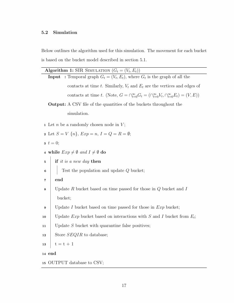
5.2 Simulation
Below outlines the algorithm used for this simulation. The movement for each bucket
is based on the bucket model described in section 5.1.
Algorithm 1: SIR Simulation (Gt = (Vt, Et))
Input : Temporal graph Gt = (Vt, Et), where Gt is the graph of all the
contacts at time t. Similarly, Vt and Et are the vertices and edges of
contacts at time t. (Note, G = ∩∞t=0Gt = (∩∞t=0Vt,∩∞t=0Et) = (V,E))
Output: A CSV file of the quantities of the buckets throughout the
simulation.
1 Let n be a randomly chosen node in V ;
2 Let S = V {n}, Exp = n, I = Q = R = ∅;
3 t = 0;
4 while Exp 6= ∅ and I 6= ∅ do
5 if it is a new day then
6 Test the population and update Q bucket;
7 end
8 Update R bucket based on time passed for those in Q bucket and I
bucket;
9 Update I bucket based on time passed for those in Exp bucket;
10 Update Exp bucket based on interactions with S and I bucket from Et;
11 Update S bucket with quarantine false positives;
12 Store SEQIR to database;
13 t = t + 1
14 end
15 OUTPUT database to CSV;
17
Readers may notice the order of the bucket movements; assuming no tests, the re-
moved bucket is updated first, then the infectious buckets, and so on. This is because
in the case that a person has run the course of their infection, we want to make sure
that they are moved to the proper removed bucket so that they do not infect any
additional individuals. A similar line of reasoning goes for the rest of the buckets.
18
Chapter 6
INTERVENTION STRATEGIES
This research explores seven different testing strategies with a varying amount of
available tests. This chapter outlines each strategy, the motivation behind creat-
ing this strategy, and potential benefits and pitfalls. In the simulation, the testing
strategy is implemented once a day in the morning. Additionally, only the eligible
population is tested, meaning only the population in the Susceptible, Exposed,
and Infectious bucket.
An important part of these strategies is the method which the tests are conducted.
This research attempts to simulate the testing that we have seen for COVID-19 as
closely as possible. Because of this, we use the statistical information discussed in
subsection 2.2.1 from the Reverse Transcriptase Polymerase Chain Reaction (RT-
PCR) based test, which is both widely used and has research conducted regarding
the false negative rate [10]. Unfortunately, getting exact values for the false positive
and false negative rate is extremely difficult in practice, and these values vary based
on the day of infection. So, this thesis attempts to approximate the false negative
rates found by Kucirka et al. by starting at 100% at day 1 of infection, then each day
having each value change according to the results found by the researchers. It should
be noted that they found a considerable uncertainty in their numbers, however for the
sake of this experiment we will assume the numbers found are correct. Then within
the simulation, testing works by checking how long it has been since exposure, and
based on the false negative or positive rate for that day, have the person be marked
as “positive” or “negative” using random number generation. It should be noted that
Kucirka et al. did not try to determine the false positive rate of the tests, however Dr.
19
Shmerling of Harvard Medical Health says that we may expect this value to be at or
near zero, as any false positives are likely due to lab equipment error [16]. So, for this
simulation the false positive rate will be a constant 2%. Finally, for these simulations
we assume immediate feedback from the test results, which more closely resembles
antigen tests rather than RT-PCR [16]. However, this assumption is made because
the simulations were designed to showcase the effectiveness of the testing strategies
rather than the tests themselves. Table 6.1 summarizes the false negative rates used
in this simulation.
Table 6.1: The False Negative rates of RT-PCR based testing, where Dayis days since exposure, and FNR is the False Negative Rate, or percentchance someone will get a false negative result