55
PROFESSIONAL PRACTICE MODULE FILE
| Date post: | 14-Mar-2016 |
| Category: |
Documents |
| Upload: | rachael-woollard |
| View: | 222 times |
| Download: | 0 times |
PROFESSIONALPRACTICE
MODULE FILE
PRESENTATION

HAND LETTERED TYPE

FORMS
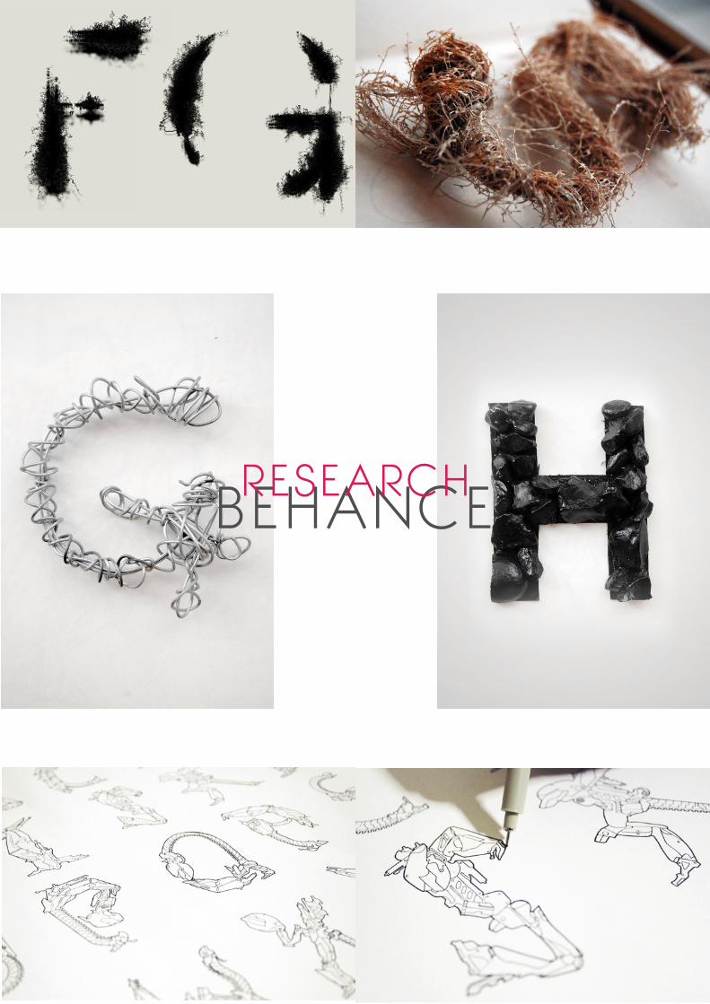
Pencil drawn Ink Pen Chalk Play-dough
Stamps Wire Straw Wax Charcoal
Wood Plastic Fabric Paper Metal

HAND WRITTEN TYPE
Indie films Organic products Album covers
Illustrative advertising and branding Indpendent
cosmetic products Food advertising Retail logo
WHERE IS IT USED

RESEARCHLIBRARY BOOKS
We began our research in the library, taking out any available books that looked at hand written
or hand rendered type.
The books we found
Michael Perry’s, ‘Hand Job; A catalog of type’
Steven Heller & Mirko Ilie’s, ‘Handwitten; Expressive lettering in the digital age.’
Gestalten’s ‘Playful type 2; New ephemeral lettering and illustrative fonts.’
GINGER MONKEYTOM LANE
EMAILS
What is your thought process when designing typography?
Question – throughly read the brief. Ask my own questions/ brainstorm
Research – look into stuff from my questioning
Moodbaord – Build inspiration and reference
Relax – try and forget about it for a bit
Play/sketch – explore ideas in my sketchbook
Relax – try and forget about it again for a bit
Evaluate – look at what I have and make some decisions
Get down to business – make stuff
Rest – try and forget about it for a little while again
Share – show someone I trust
Send – get it over to the client if all is cool for school
Why do you choose to use hand rendered or hand illustrated
typography, in your own work, rather than existing typography?
I simply much prefer to offer my clients something unique and
a true reflection of their needs and wants. You can’t usually find
a font that ticks all the boxes. Often you’d have to compromise
somewhere. I started drawing my own so that I could get it how I
wanted for them. Plus it’s fun! Now it’s more that they come to me
‘because’ I hand-letter.

USEFUL INFORMATIONTOM LANE
The email that we received from tom lane was one of the most useful and influential respons-
es and really stood out amongst the other emails. We found him to be an interesting character
and very honest when responding to our questions. Tom lane’s thought process when design-
ing was a good way of responding to a brief so we thought it was essential to include this in
our presentation as it would help us young designers with our own thought process.
When we started this project we found that one of the biggest issues that we came across
was defining the title of our presentation ‘ hand lettered type’ this response from Tom Lane
was very helpful.
In your opinion, how would you define hand rendered typography and illustrated
typography and the difference between the two?
I think the clue is in the title ;) I define it as letterforms drawn from scratch, by hand. Not
necessary with analogue tools. You can create hand rendered type using a wacom tablet or
a mouse. For me though, they have to be your own letterforms. Not sure of any difference
between the two. I call it Hand-lettering.
JON CONTINONEW YORK NATIVE
EMAILS
When is it considered illustration and not typography ?
I think the levels actually go like this: Typography > Lettering > Illustration. Typography is
utilitarian, it has a strong purpose and acts more as a building block than a decoration.
Lettering usually has a focus on uniqueness and decoration. Illustration is pretty much just
imagery that accompanies something else or is just nice to look at.
Why have you chosen to create your own type instead of using existing type ?
I’ve always felt that it was easier to express my feelings about subjects if I draw it with my own
hand rather than setting up words up in a font that everyone has seen a million times before. I
feel like fonts can’t properly communicate my voice.
Do you think Hand rendered type should be used more for brands and advertising ?
I think hand-rendered type should be used when the subject calls for it. There’s nothing worse
than when someone uses a particular medium incorrectly. As long as the context calls for it,
then you can use it anywhere you want!

JON CONTINONEW YORK NATIVE
Hey jon,
Just to say thankyou so much for answering my questions, they have really helped my
research. If you have some free time would you possibly be able to answer one more
question-
In terms of typography within the industry do you think hand rendered type is the way forward
?
Thankyou
Kind Regards
Rachael
Hi Rachael,
No I think there's room for both hand-rendered and computer-rendered. Both serve an
important role in design and it's up to designers to realize when each one is appropriate for
the situation at hand.
Glad I could help!
Jon

As a New York native, Jon Contino’s work is highly inspired by street art, he has a unique ap-
proach to design utilizing hand-drawn lettering and typographic illustration, with a well estab-
lished clothing line, magazines and advertising.
Co-Founder and Creative Director of menswear brand CXXVI Clothing Company.
After researching Jon Contino’s work and finding that the majority of his work included hand
drawn type, it was essential that we got in contact with him and asked him some vital ques-
tions that would contribute to our presentation. By adding him on twitter and emailing him
directly I felt that i could construct an email that wasnt too formal, I made sure that I was polite
but in order to get a detailed and genuine response I felt that I had to be myself and write the
email as if I was talking to him in an interview.

KYLE STEEDILLUSTRATOR
Hi. My name is Kyle. I don’t like writing about myself in the 3rd person.
Instead, here’s a recipe on how to make the perfect piece of bacon:
1.Place bacon on baking sheet
2.Put bacon in a cold oven
3.Bake at 375 for 15-17 minutes
4.Enjoy hot crispy bacon

When researching Kyle Steed, i found that he had a huge interest in web design and his
design work was mainly for company websites. Along side this he started out doing graffiti
art mainly for skateboards which evendently led him to create his hand drawn typefaces
and hand drawn icons ( steedicons). We decided as a group we would email him some
of our questions related to hand drawn type, highlighting his icon apps and typefaces,
however we recieved a response stating that he was on holiday so unfortunatly we didn’t
recieve answers for our questions. On the plus side Kyle steed’s website is full of usefull
information and previous interviews so his work would still contribute to our research.


KYLE STEEDINTERVIEW
What are your best methods for finding/attracting clients?
First and foremost; Consistent, personal branding is of utmost importance when you are
looking for new clients.
Even though I’m not a full-time freelancer I still think local meet up groups and other social
functions (such as Refresh) are great ways to meet potential clients. But don’t worry, if you
don’t have any social functions available in your neck of the woods or transportation is an
issue, you don’t have to look very far from your front door. I’ve found just simply meeting your
neighbours is a great way to make connections. Perfect example, this past summer while
hanging out at our community pool, soaking up the sun and drinking some beer, I got to know
one of my neighbours pretty well. My wife and I were even invited to have dinner with him and
his wife. And now I am going to be heading up his companies new website.
How did you get started in your field? Did you study something in particular or are
you self-taught?
Working in the field of web design was more of an accident than a choice. I always thought of
myself becoming an architect or an artist. But after a friend of mine started to nudge me in the
direction of the web I picked up a few books and started to learn. The first website I ever made
used inline styles and didn’t even declare a doc type. Thankfully I ran across a teacher who
valued the importance of CSS, and thus my life was changed. She introduced me to people
like Eric Meyer and Jeffrey Zeldman, whose books and website are a great resource for any
web designer. Now after a years work behind me doing web design and development full-time
I feel like there’s nothing I can’t learn but so much I have yet to learn at the same time.
As a group we found this information usefull to further our research in our own
professional practice even though it was not specifically related hand lettering
research.
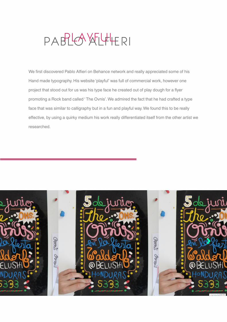
PABLO ALFIERIPLAYFUL
We first discovered Pablo Alfieri on Behance network and really appreciated some of his
Hand made typography. His website ‘playful’ was full of commercial work, however one
project that stood out for us was his type face he created out of play dough for a flyer
promoting a Rock band called ‘ The Ovnis’. We admired the fact that he had crafted a type
face that was similar to calligraphy but in a fun and playful way. We found this to be really
effective, by using a quirky medium his work really differentiated itself from the other artist we
researched.

Pablo Alfieri’s work on Behance
Victionary selected my works to published in your new book called Stereographics.
Victionary are a great Editorial design from Hong Kong that seel amazing books like Logol-
ogy, Graphics Alive and Type Addicted. To more information about the book and the editorial
please visit: www.victionary.com
Stereographics reveals how graphics makes its mark on the 3D realm through 4 inspiring
case studies explaining each step with insights into problem-solving, plus a diverse collec-
tion of works from over 60 design units worldwide.

STEVE SIMPSONCHILDREN’S BOOKS
From his website-
Steve takes an organic approach to his projects, blending the disciplines of design and
illustration. He spends a great deal of time on construction, shape and problem solving at the
pencil stage. Continuously re-drawing until a balance of aesthetics, key brief considerations
and client satisfaction have been realized. Approved pencils are then worked up in Photo-
shop using a limited palette of carefully chosen colours. Steve considers vintage illustration
and packaging to be a huge influence on his work particularly the works of Jim Flora, Mary
Blair and Ed Emberly.
He particularly enjoys combing design for print with illustration and looks forward to further
exploration of the world of packaging design
Steve Simpson’s reply to my email was one of the best responses we recieved from the list of
artists I wanted to contact. He was really detailed with his answers and as a group we really
benefited from his content. At this point we were still struggling with defining the differecne
between hand rendered and hand illustrative type, Steve gave us a simple definition in his
eyes which meant we could move on from that question and progress in our research.

EMAILS
Hello Steve,
I am currently studying BA(Hons) Graphic Design Course at the University of The West
of England. I am working on a group research project, which my classmates and I have
collectively decided to focus on the subject of hand rendered typography.
We have noticed that lettering and illustrated typography is used within your work and was
wondering if you could take the time to answer a couple of questions?
1. Why do you choose to use hand rendered or hand illustrated typography, in your
own work, rather than existing typography?
I actually find it quicker to do hand lettering, when we are talking small amounts of text, than
searching through endless font libraries. It’s also much more fun!
2. Why do you think clients like you choose to use hand rendered type?
It’s always original and organic and blends well with my illustration
3. In your opinion, how would you define hand rendered typography and illustrated
typography and the difference between the two?
There’s definitely a difference between the two. Some of my work would involve using the
original pencil line, more so when it’s a naive feel required. For anything more technical I’d
always tinker with it in photoshop using vectors. Think it probably comes down to the type
matching the content of the rest of the image. Both have their place.
4. What is your thought process when designing typography?
I want to use a style that suits my illustrations. They need to blend. It’s also about how much
emphasis the lettering needs and how prominent it needs to be. There’s also the tone. Are we
shouting or playful. It’s about getting the message right. Some times the type is really just a
pattern, other times it’s a message. Figuring out exactly what the problem is that you are being
asked to solve is always the first step.
We would be really grateful if you could get back to us as soon as it’s convenient for you.

LINZIE HUNTERLETTERING
linzie Hunters’ freelance illustration work is created digitally but when away from the comput-
er she enjoys traditional print-making and book-binding.
Linzie hunter’s work was in our digital category; we researched her work and found that all
her type was digitally rendered. Her style however is noticeably related to hand rendered
type, it appeared free flowing as we became more aware of the projects she was asked to
do we saw her hand lettered type suited her illustrative book designs. This research was
helpful to us as we found that even a hand rendered looking type can look as defined as
existing typefaces but still have that playful appearance.
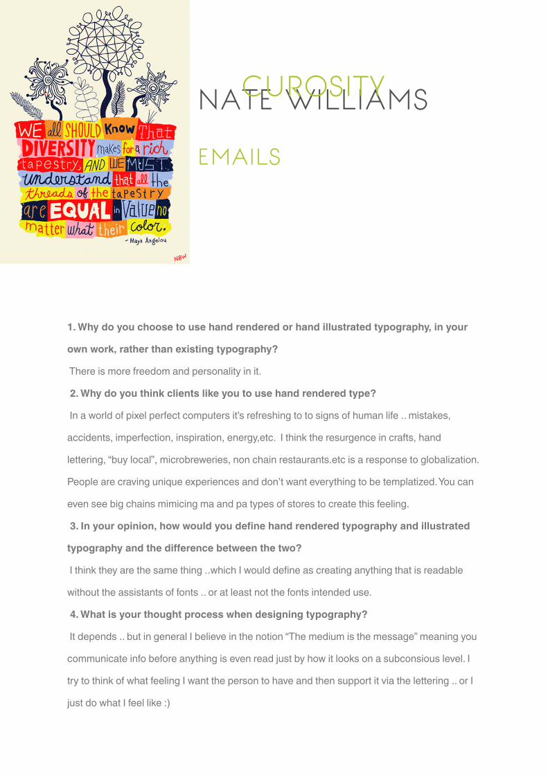
NATE WILLIAMSCUROSITY
EMAILS
1. Why do you choose to use hand rendered or hand illustrated typography, in your
own work, rather than existing typography?
There is more freedom and personality in it.
2. Why do you think clients like you to use hand rendered type?
In a world of pixel perfect computers it’s refreshing to to signs of human life .. mistakes,
accidents, imperfection, inspiration, energy,etc. I think the resurgence in crafts, hand
lettering, “buy local”, microbreweries, non chain restaurants.etc is a response to globalization.
People are craving unique experiences and don’t want everything to be templatized. You can
even see big chains mimicing ma and pa types of stores to create this feeling.
3. In your opinion, how would you define hand rendered typography and illustrated
typography and the difference between the two?
I think they are the same thing ..which I would define as creating anything that is readable
without the assistants of fonts .. or at least not the fonts intended use.
4. What is your thought process when designing typography?
It depends .. but in general I believe in the notion “The medium is the message” meaning you
communicate info before anything is even read just by how it looks on a subconsious level. I
try to think of what feeling I want the person to have and then support it via the lettering .. or I
just do what I feel like :)
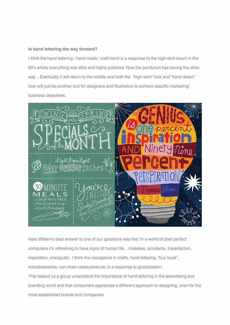
Is hand lettering the way forward?
I think the hand lettering / hand made / craft trend is a response to the high-tech boom in the
90’s where everything was slick and highly polished. Now the pendulum has swung the other
way .. Eventually it will return to the middle and both the ”high-tech” look and “hand drawn”
look will just be another tool for designers and illustrators to achieve specific marketing/
business objectives.
Nate William’s best answer to one of our questions was that ‘In a world of pixel perfect
computers it’s refreshing to have signs of human life .. mistakes, accidents, imperfection,
inspiration, energy,etc. I think the resurgence in crafts, hand lettering, “buy local”,
microbreweries, non chain restaurants.etc is a response to globalization’.
This helped us a group understand the importance of hand lettering in the advertising and
branding world and that consumers appreciate a different approach to designing, even for the
most established brands and companies.
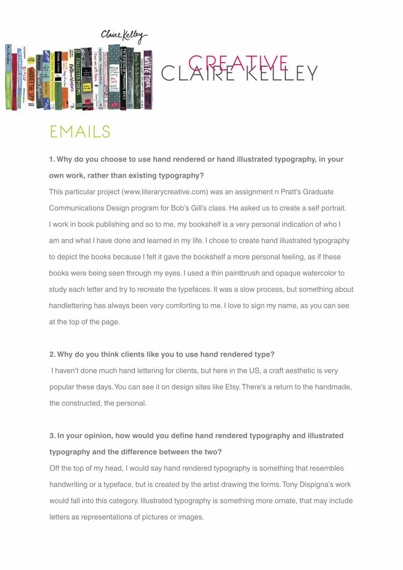
CLAIRE KELLEYCREATIVE
EMAILS1. Why do you choose to use hand rendered or hand illustrated typography, in your
own work, rather than existing typography?
This particular project (www.literarycreative.com) was an assignment n Pratt’s Graduate
Communications Design program for Bob’s Gill’s class. He asked us to create a self portrait.
I work in book publishing and so to me, my bookshelf is a very personal indication of who I
am and what I have done and learned in my life. I chose to create hand illustrated typography
to depict the books because I felt it gave the bookshelf a more personal feeling, as if these
books were being seen through my eyes. I used a thin paintbrush and opaque watercolor to
study each letter and try to recreate the typefaces. It was a slow process, but something about
handlettering has always been very comforting to me. I love to sign my name, as you can see
at the top of the page.
2. Why do you think clients like you to use hand rendered type?
I haven’t done much hand lettering for clients, but here in the US, a craft aesthetic is very
popular these days. You can see it on design sites like Etsy. There’s a return to the handmade,
the constructed, the personal.
3. In your opinion, how would you define hand rendered typography and illustrated
typography and the difference between the two?
Off the top of my head, I would say hand rendered typography is something that resembles
handwriting or a typeface, but is created by the artist drawing the forms. Tony Dispigna’s work
would fall into this category. Illustrated typography is something more ornate, that may include
letters as representations of pictures or images.
BEHANCERESEARCH
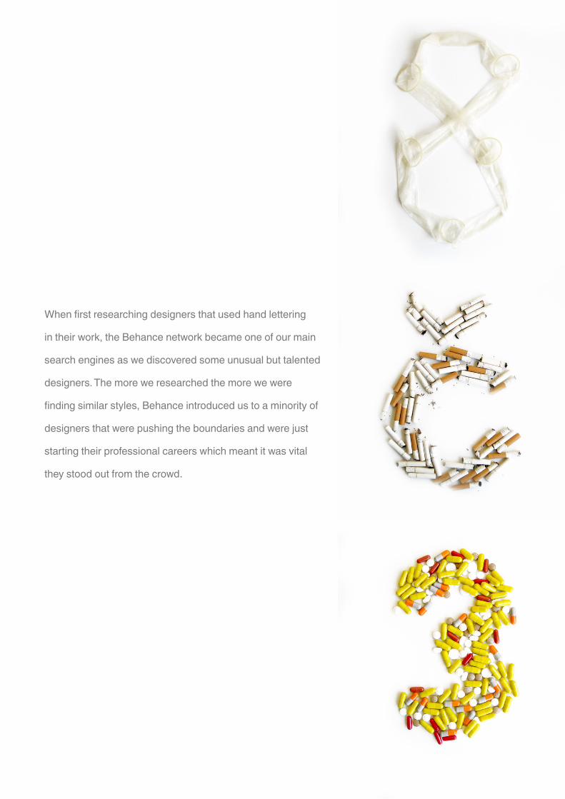
When first researching designers that used hand lettering
in their work, the Behance network became one of our main
search engines as we discovered some unusual but talented
designers. The more we researched the more we were
finding similar styles, Behance introduced us to a minority of
designers that were pushing the boundaries and were just
starting their professional careers which meant it was vital
they stood out from the crowd.
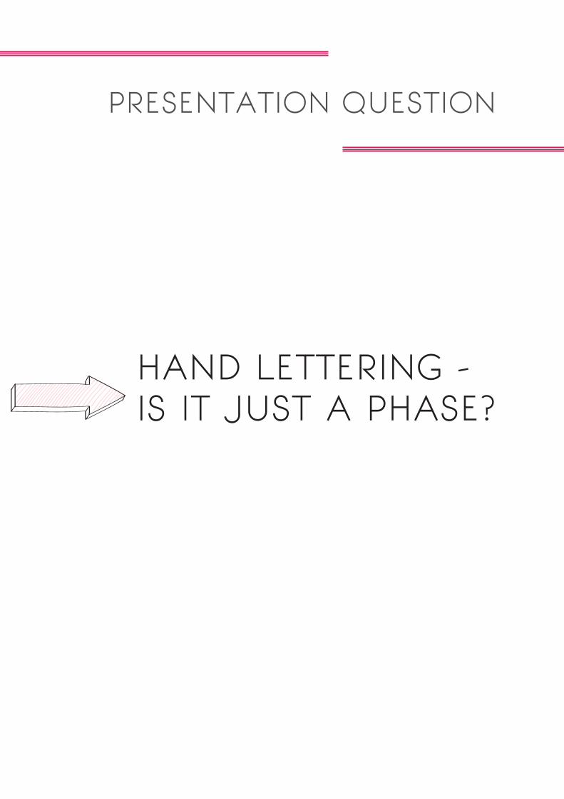
PRESENTATION QUESTION
HAND LETTERING - IS IT JUST A PHASE?

Once we had decided on our question for the presentation we started to delegate sections of
the presentation to each member of the group. We had to ensure that the presentation would
flow with interesting information that would hopefully educate the viewers on our chosen
subject, but also inform them of some design strategies that we were lucky to find out from the
designers we emailed.
First section- Different forms of hand lettered type
When researching this chosen subject it was interesting to find out how many designers would
break the boundaries and leave a standard pencil in the past. We thought it was important to
inform the viewers how many different forms could create hand lettered type, and define the
word ‘hand lettered’ so there would be no confusion.
Second section-Where is it used
This section was then split into three main areas in which we discovered hand lettering,
packaging, advertising and film titles. As much as we enjoyed exploring different designers
using their hand lettered type in their own projects, we wanted to find out where it was being
used for all consumers to appreciate, what area it was most used in and was it appropriate.
Third section-The designers
We included designers that we individually valued as a newly discovered designer and
then included their response to the question, why do you think clients like you to use hand
rendered type? It was really lucky that each of our favourite designers replied to the emails
we sent. We decided as a group that this was one of the more beneficial answers that we
could share with the viewers as it would help people understand the reason behind their hand
lettered type and why only certain clients can use it for specific things.
Fourth section-Favourite quotes
This section included some of how favourite answers from the emails, some useful information
to young developing designers and topped off with an example of their work.
ARROW CREATIONS

HERE
IT IS !SHCHLOEL.TUMBLR.COM
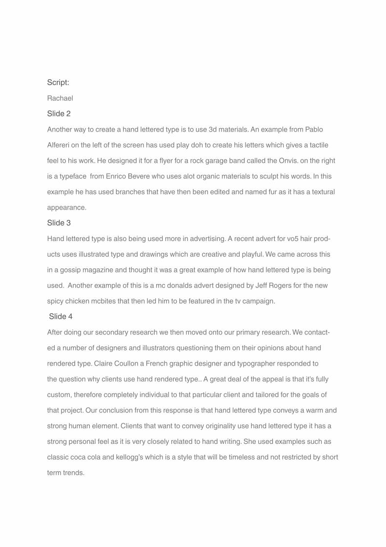
Script:
Rachael
Slide 2
Another way to create a hand lettered type is to use 3d materials. An example from Pablo
Alfereri on the left of the screen has used play doh to create his letters which gives a tactile
feel to his work. He designed it for a flyer for a rock garage band called the Onvis. on the right
is a typeface from Enrico Bevere who uses alot organic materials to sculpt his words. In this
example he has used branches that have then been edited and named fur as it has a textural
appearance.
Slide 3
Hand lettered type is also being used more in advertising. A recent advert for vo5 hair prod-
ucts uses illustrated type and drawings which are creative and playful. We came across this
in a gossip magazine and thought it was a great example of how hand lettered type is being
used. Another example of this is a mc donalds advert designed by Jeff Rogers for the new
spicy chicken mcbites that then led him to be featured in the tv campaign.
Slide 4
After doing our secondary research we then moved onto our primary research. We contact-
ed a number of designers and illustrators questioning them on their opinions about hand
rendered type. Claire Coullon a French graphic designer and typographer responded to
the question why clients use hand rendered type.. A great deal of the appeal is that it’s fully
custom, therefore completely individual to that particular client and tailored for the goals of
that project. Our conclusion from this response is that hand lettered type conveys a warm and
strong human element. Clients that want to convey originality use hand lettered type it has a
strong personal feel as it is very closely related to hand writing. She used examples such as
classic coca cola and kellogg’s which is a style that will be timeless and not restricted by short
term trends.

Slide 5
We then asked the question is hand lettering just a phase in the industry, after reflecting on
our previous replies we decided it would benefit us to ask this question. We received a re-
sponse from Jon Contino a typographic illustrator from New York, who is also co founder and
creative director for the menswear brand CXXVI. We were very pleased when we received a
response as we are all big fan of his work. Even though it was not as detailed as some of the
other responses we received it was still a positive response from a high demanding designer.
He replied : There’s room for both hand-rendered and computer-rendered type. Both serve an
important role in design and it’s up to designers to realize when each one is appropriate for
the situation at hand.
Last slide
We decided to make a tumblr account of all our research and findings, we made a little card
with the link on it so you can have a little look in your own time. It includes designers we looked
at and our responses that include inspiring advice, possible job directions and designers that
could help in your other projects.
BIBLIOGRAPHY
Alfieri, Pablo. Website www.pabloalfieri.com/
Bevere, Enrico. Website www.behance.net/gallery/EXPERIMENTAL-TYPOGRAPHY-FUR/2491459
Clarke, Georgina. Website www.georginaclarke.com/9878/home
Conti, Hannah J www.speckyboy.com/2010/11/29/the-beauty-of-the-hand-drawn-typography-trend
in- design/
Contino, Jon Website www.joncontino.com/ Coullon, Claire Website www.coullon.com
Design your way. Website
www.designyourway.net/blog/inspiration/impressive-hand-drawn-typography-in- spiration/
Dongcharoaen, Chaithawat Behance www.behance.net/gallery/Experiment-Sketch/4618495
Duncan, Angela Behance website www.behance.net/duncangela
Duncan, Angela Website www.theangeladuncan.com/Logo
Duncan, Angela Wesbite www.theangeladuncan.com/fun-Album-Artwork
Duncan, Angela Website www.theangeladuncan.com/ Duran, Todd Article www.designmylife.org
Handrawn Search engine www.pinterest.com/cameraluv/hand-drawn-type
Hayes, Adam Website www.mrahayes.co.uk
Hayes, Adam Reblogged Post www.whiteandnerdy1.tumblr.com/post/33144297634
King, Sarah Reblogged Post www.nosoyhombre-soyanimal.tumblr.com/post/31477615232
System of a Down Album Cover Art Reblogged Post www.urthereasonwhy.tumblr.com
post/31189529138
Rogers, Jeff Reblogged Post www.evhuwa.tumblr.com/post/18016573179/jeff-rogers-jeff-rogers-
just- put-out-a-new-site-a
Williams, Nate Tumblr Website www.n8w.tumblr.com/post/23166791661/upcoming-licensing
shows-sur- tex-booth-341-343
Sagmeister, Stefan Reblogged Post www.waardesign.tumblr.com/post/28429462947
Pretty Colours Tumblr Website www.prettycolors.tumblr.com
Heller, Steven & Illic, Mirko, Handwritten: Expressive Lettering in the Digital Age, Thames and
Hudson Ltd Hellige, Hellen & Klanten, Robert & Middendorp, Jan, Playful Type: v. 2: Ephemeral

Hunter, Linzie Website www.linzihunter.co.uk/
Jimenez, Nicolás García, Website www.behance.net/gallery/HOMEMADE-TYPOGRAPHY/3739809
Kelley, Claire. Website www.literarycreative.com/ King Sarah. A Website www.sarahaking.com
Sagmeister and Walsh Design Firm Website www.sagmeister.com LaFayette, Josh Tumblr Website
www.joshlafayette.tumblr.com/ Lettercult Article www.lettercult.com/custom-letters-in-movie-titles
Ioannou, Sophia Tumblr Website www.sampersandi.tumblr.com/post/12326859774/the-brief-
design-a-contemporary-range-of Anderson, Gail Article www.imprint.printmag.com/illustration/
mister-mcrogers%E2%80%99s-neighbor- hood/
Lyons, Kevin Website www.naturalborn.com/work/index.php
Lyons, Kevin Reblogged Post www.journeytotheeclectic.tumblr.com/post/18822682310/kevin-lyons
Magazine www.kingbrownmag.com
Marsden, Rachel Article www.rachelmarsdenwords.wordpress.com/2011/11/03/from-typography-
to-pa- per-back-in-practice/
Mcdevitt, Mary-Kate. Website www.marykatemcdevitt.com
McNulty, Pat Editor Advert Cosmopolitan magazine
Merle, Website Post www.indulgy.com/post/974gNsiJU1/hand-drawn-type-for-food-packaging
That Belongs In A Museum, Wordpress Blog www.thatbelongsinamuseum.wordpress.
com/2008/09/30/exhibit-c-hand-lettered-indie-movie-titles/
Miller, Yael & Reuben Share some candy. Website www.sharesomecandy.com
Nuttal, Natasha Behance www.graphiquefantastique.com/tag/hand-drawn-typography
Perry, Michael, Hand Job: A Catalog of Type, Princeton Architectural Press
Rogers, Jeff Website www.howdyjeff.com
ShanSan Art&Design Article www.typographyserved.com/Gallery/emotional-bookae/340432
Koncar, Vladamir Behance Website www.behance.net/konch/frame/133391
Gagin, Sebastian Article www.typographyserved.com/Gallery/Mech-type/369697
Piascik, Chris Tumblr Website www.chrispiascik.tumblr.com/ Simpson,Steve Website
www.stevesimpson.com
Steed, Kyle. Website www.kylesteed.com/
Williams, Nate Website www.n8w.com/gallery/tags/images Williams, Nate Website
www.n8w.com/gallery/tags/everything Williams, Nate Behance Website www.behance.net/n8wn8w
Hodge, Sean Article www.psd.tutsplus.com/articles/inspiration/alphabetic-inspiration-a-z-experi-
ments-with-letters-hand-crafted-type-and-more/
Chloe Johnston, Rachael Woollard and Shelley Wills
PROFESSIONALPRACTICE
FIRST IMPRESSIONS COUNT

10 Jacobs Wellls Road, Bristol, BS81EA
Rachaelwoollard.com
+44(0)7817709617
EducationCurently studying a BA(Hons) Graphic Design at
University of West of England
September 2011–2014
BTEC Level 3 Foundation Diploma in Art and Design
Interests
Editorial spreads and colour schemes featured in magazines such
as Elle and Dazed and Confused
Cosmetic products promotion and fashion retail marketing
Interior design
SkillsSoftware
Expert Adobe Photoshop, Indesign and Bridge
Competent Adobe Illustrator, Premier Pro, After effects and
Dreamweaver
Creative skills
Digital and Analogue Photography
Sculpture
3D objects
References available on request
Employment
Bar tender at Rileys Sports bar
2009–2011
Bar supervisor and promoter
Bar tender at Oceana Club
Experience
Photographer for Vogue inspired shoot for London College of Fashion
2011
Fashion publication for summer season line for UCA Epsom
2012
Fontstruct work featured in the Bower Ashton first year
Process exhibition
Rachael Woollard

FIRST DRAFT OF CVSUMMER WORK
My first initial approach to designing my cv was to keep it quite simple, fit the criteria and
include at least two bright and complimentary colours. I chose to create lines to section off
the different part of my CV, however when presenting this to my peers and tutors there first
thought was to fold on these lines created. The way it would have been folded would not
have been practical and created an uncertainty of what to do with it at first glance.
I kept my content quite simple as I was unsure to start off with what was appropriate in
a design CV as it would be very different to a CV that I would create for a part time job.
I included previous employment which was mostly in bar environments; this showed
commitment to late hours, a variety of different people and important responsibilities. I am
aware that I lack experience in design orientated work placements, however creating these
self promoting packages has made me realise that gaining some experience in these areas
will be very beneficial to my design career. I hope to get a couple of placements this year at
magazine companies, if these are not available I think that any company that involves design
work will be worth the applying for.
IMPROVEMENTS
Remove address
Remove ‘currently studying’
Include where I studied my foundation degree
More information for employment, skills required and responsibilities
More interests, creating a personality
Remember not to be too specific with interests which could limit me to jobs

rachaelwoollard.com
+44(0)7817709617
BA(Hons) Degree Graphic Design
University of West of England
BTEC Level 3 Foundation Diploma in Art and Design
Suffolk New College
Editorial spreads and colour schemes featured in magazines such as Elle and
Dazed and Confused
Cosmetic products promotion and fashion retail marketing
Interior design
Product design
Adobe Photoshop, Indesign
Adobe Illustrator, Premier Pro, After effects and Dreamweaver
Digital and analogue photography
Letterpress
Screen printing
References available on request
Oceana Club Bristol
Promoted and served customers, responsible for taking stock, cleaning and
teamwork.
Rileys Sports and Snooker Club Ipswich
Organized and contributed to designing promotional items for bar and sport
events.
Collaborated with a fashion student at The University of Creative Arts designed
a look book for her summer season line.
Collaborated with a fashion direction student at London College of Fashion,
photographed a vogue inspired editorial spread.
Fontruct Typeface poster featured in the Bower Ashton exhibition ‘Process’
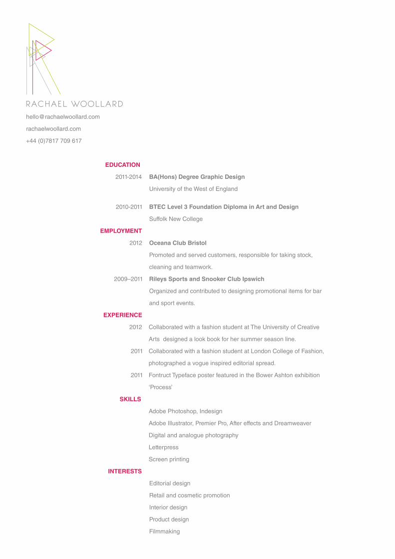
RACHAEL WOOLLARD
EDUCATION
EMPLOYMENT
EXPERIENCE
SKILLS
INTERESTS
2011-2014
2010-2011
2012
2009–2011
2012
2011
2011
Change logoLooks like motion graphics.Make triangle an equilateral triangle
University of the west of England
Make brighter
Do not specify
rachaelwoollard.com
+44 (0)7817 709 617
RACHAEL WOOLLARD
BA(Hons) Degree Graphic Design
University of the West of England
BTEC Level 3 Foundation Diploma in Art and Design
Suffolk New College
Oceana Club Bristol
Promoted and served customers, responsible for taking stock,
cleaning and teamwork.
Rileys Sports and Snooker Club Ipswich
Organized and contributed to designing promotional items for bar
and sport events.
EDUCATION
EMPLOYMENT
2011-2014
2010-2011
2012
2009–2011
Adobe Photoshop, Indesign
Adobe Illustrator, Premier Pro, After effects and Dreamweaver
Digital and analogue photography
Letterpress
Screen printing
References available on request
Collaborated with a fashion student at The University of Creative
Arts designed a look book for her summer season line.
Collaborated with a fashion student at London College of Fashion,
photographed a vogue inspired editorial spread.
Fontruct Typeface poster featured in the Bower Ashton exhibition
‘Process’
EXPERIENCE
SKILLS
Editorial design
Retail and cosmetic promotion
Interior design
Product design
Filmmaking
INTERESTS
2012
2011
2011
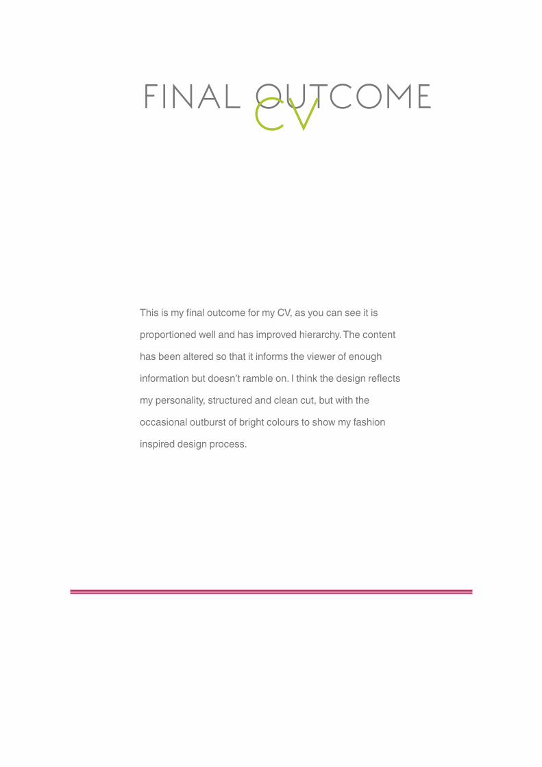
FINAL OUTCOMECV
This is my final outcome for my CV, as you can see it is
proportioned well and has improved hierarchy. The content
has been altered so that it informs the viewer of enough
information but doesn’t ramble on. I think the design reflects
my personality, structured and clean cut, but with the
occasional outburst of bright colours to show my fashion
inspired design process.

PAPER TESTS
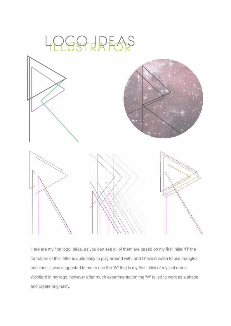
LOGO IDEASILLUSTRATOR
Here are my first logo ideas, as you can see all of them are based on my first initial ‘R’ the
formation of this letter is quite easy to play around with, and I have chosen to use triangles
and lines. It was suggested to me to use the ‘W’ that is my first initial of my last name
Woollard in my logo, however after much experimentation the ‘W’ failed to work as a shape
and create originality.

BUSINESS CARDSINDESIGN
RACHAEL WOOLLARDRachaelwoollard.com
Rachaelwoollard.com
+44(0)7817709617
RACHAEL WOOLLARD
MY FIRST BUSINESS CARDS
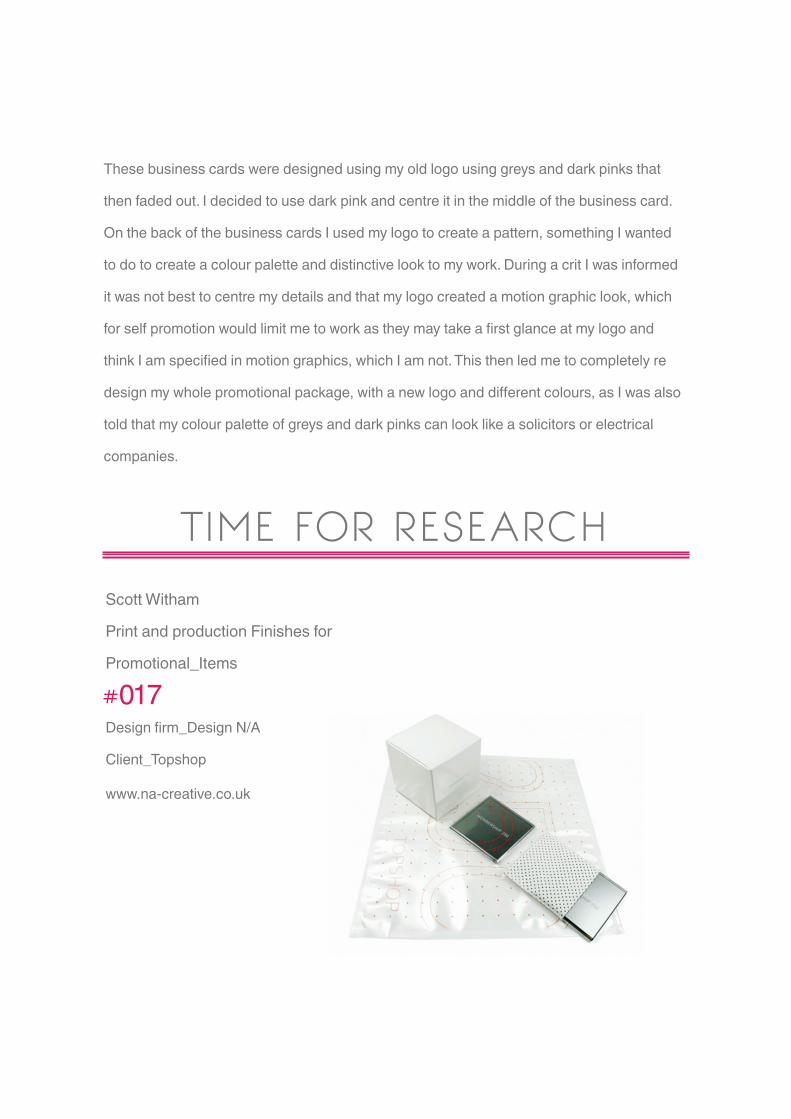
These business cards were designed using my old logo using greys and dark pinks that
then faded out. I decided to use dark pink and centre it in the middle of the business card.
On the back of the business cards I used my logo to create a pattern, something I wanted
to do to create a colour palette and distinctive look to my work. During a crit I was informed
it was not best to centre my details and that my logo created a motion graphic look, which
for self promotion would limit me to work as they may take a first glance at my logo and
think I am specified in motion graphics, which I am not. This then led me to completely re
design my whole promotional package, with a new logo and different colours, as I was also
told that my colour palette of greys and dark pinks can look like a solicitors or electrical
companies.
TIME FOR RESEARCHScott Witham
Print and production Finishes for
Promotional_Items
#017Design firm_Design N/A
Client_Topshop
www.na-creative.co.uk

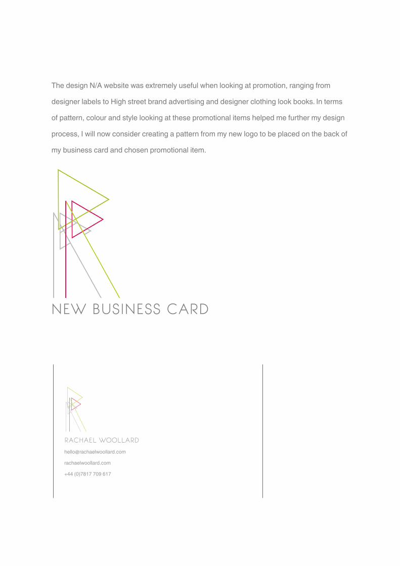
The design N/A website was extremely useful when looking at promotion, ranging from
designer labels to High street brand advertising and designer clothing look books. In terms
of pattern, colour and style looking at these promotional items helped me further my design
process, I will now consider creating a pattern from my new logo to be placed on the back of
my business card and chosen promotional item.
RACHAEL WOOLLARD
rachaelwoollard.com
+44 (0)7817 709 617
NEW BUSINESS CARD

MAKING PATTERNSINDESIGN
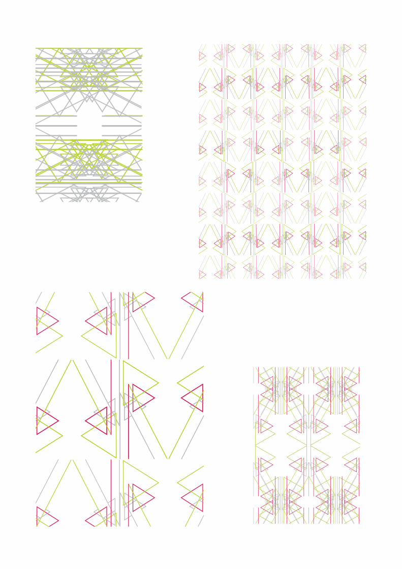

My selection of patterns were all made using my logo, they were distorted, repeated, colour
change and arranged in several different ways. In total I made 25 different patterns, in all
three different colours, dark pink, lime green and grey.
INSPIRATION
#041Design firm_Iwantdesign
www.iwantdesign.co.uk

FINAL PROMOTIONAL ITEMS
POSTCARDS

RACHAEL WOOLLARDrachaelwoollard.com
I designed six postcards with my chosen patterns on, I wanted to produce a promotional
item that could be sent anywhere and I think postcards is a great way to introduce your work
to consumers. I found that alot of fine artists do this for their work and was informed that it
will beneficial to my professional practice to do this. I created a light grey layout of a typical
postcard on the back with my details in the bottom left corner, so I can promote the rest of my
design work that is located on my website.

AS A COLLECTION
10 Jacobs wells Road BS8 [email protected]+44 (0)7817 709 617
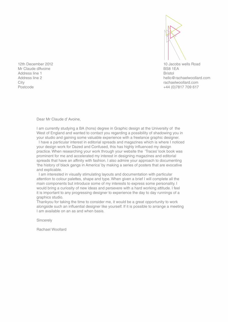
Dear Mr Claude d’ Avoine,
I am currently studying a BA (hons) degree in Graphic design at the University of the West of England and wanted to contact you regarding a possibility of shadowing you in your studio and gaining some valuable experience with a freelance graphic designer. I have a particular interest in editorial spreads and magazines which is where I noticed your design work for Dazed and Confused, this has highly influenced my design practice. When researching your work through your website the ‘Traces’ look book was prominent for me and accelerated my interest in designing magazines and editorial spreads that have an affinity with fashion. I also admire your approach to documenting ‘the history of black gangs in America’ by making a series of posters that are evocative and explicable. I am interested in visually stimulating layouts and documentation with particular attention to colour palettes, shape and type. When given a brief I will complete all the main components but introduce some of my interests to express some personality. I would bring a curiosity of new ideas and persevere with a hard working attitude. I feel it is important to any progressing designer to experience the day to day runnings of a graphics studio. Thankyou for taking the time to consider me, it would be a great opportunity to work alongside such an influential designer like yourself. If it is possible to arrange a meeting I am available on an as and when basis.
Sincerely
Rachael Woollard
12th December 2012Mr Claude d’Avoine Address line 1Address line 2CityPostcode

10 Jacobs wells Road BS8 [email protected]+44 (0)7817 709 617
12th December 2012Mr John GilsenanCreative DirectorIWANT Design LtdThe Corner House2 Grove ParkLondon E11 2DL
Dear Mr John Gilsenan,
I am currently studying a BA (hons) degree in Graphic design at the University of West of England and wanted to contact you regarding a possibility of interning at your design agency and gaining some valuable experience within such a well established and inspiring environment. I have a particular interest in editorial spreads and magazines which is where I noticed your publications section on your website and has highly influenced my design practice. When researching your work through your website the series of re-issues for ‘Everything But The Girl’ stood out for me. The design element of this is stunning but what attracted me was that they were presented as case bound books and that there was a strong and elegant theme throughout. I also admire your approach to designing the Identity sleeve for the folk super group Kan, the artwork for it is beautiful, however it was the pattern design and choice of colour that caught my eye. Working with colour alot myself I would be most interested in learning more about colour and the choices made in your design agency, also that you have such a wide range of skills in your agency my initial career path could be broadened. I am interested in visually stimulating layouts and documentation with particular attention to colour palettes, shape and type. When given a brief I will complete all the main components but introduce some of my interests to express some personality. I would bring a curiosity of new ideas and persevere with a hard working attitude. I feel it is important to any progressing designer to experience the day to day runnings of a graphics studio. Thankyou for taking the time to consider me, it would be a great opportunity to work for your design agency, something that will influence my career and excell my design process. If it is possible to arrange a meeting I am available on an as and when basis.
Sincerely
Rachael Woollard
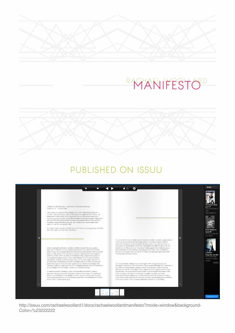
RACHAEL WOOLLARDMANIFESTO
PUBLISHED ON ISSUU
http://issuu.com/rachaelwoollard1/docs/rachaelwoollardmanifesto?mode=window&background-Color=%23222222


