Basic Skills for Statistical Database Creation & Management Using SPSS - Module IV From the Department of: Inter-Professional Research, Knowledge Translation, and Academic Development Wilson Suen, Research Assistant Vytas P. Velyvis, Director, Research
Transcript
Basic Skills for Statistical Database Creation &
Management Using SPSS - Module IV
From the Department of:
Inter-Professional Research, Knowledge Translation, and Academic Development
Wilson Suen, Research Assistant
Vytas P. Velyvis, Director, Research
What’s next? – Create Database
You carried out data collection using the suitable scale and now have a collection of data.
……………………….What’s next?
You need to input and analyze the data using statistical analytical software PASW (SPSS)
Quote re: purpose of analysis
The habit of analysis, the ability to get under the surface of things and at the vital essentials, gives a man a tremendous advantage.
-Anon., from The Handbook of Industrial Oil Engineering By John Rome Battle (1916)
You can think of PASW as a data processing centre.
What is PASW (SPSS)?
PASW is a computer software that enables researchers to input and analyze data.
It is available here at Ontario Shores on a network license.
Need to call IT to install the program for you.
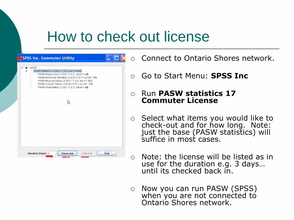
How to check out license
Connect to Ontario Shores network.
Go to Start Menu: SPSS Inc
Run PASW statistics 17 Commuter License
Select what items you would like to check-out and for how long. Note: just the base (PASW statistics) will suffice in most cases.
Note: the license will be listed as in use for the duration e.g. 3 days… until its checked back in.
Now you can run PASW (SPSS) when you are not connected to Ontario Shores network.
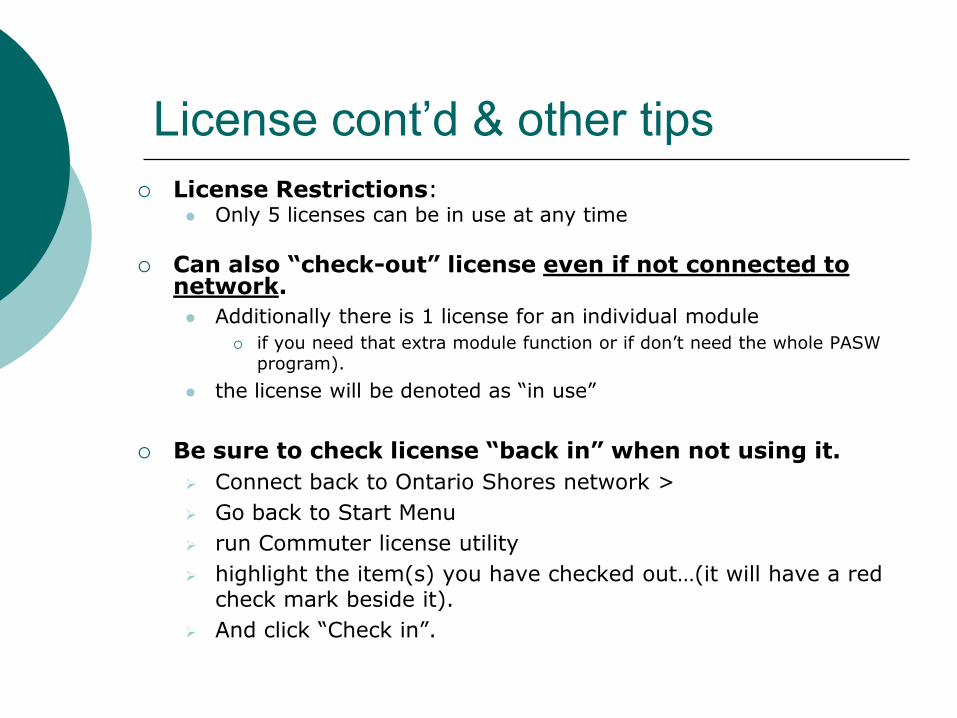
License cont’d & other tips
License Restrictions: Only 5 licenses can be in use at any time
Can also “check-out” license even if not connected to network.
Additionally there is 1 license for an individual module
if you need that extra module function or if don’t need the whole PASW program).
the license will be denoted as “in use”
Be sure to check license “back in” when not using it.
Connect back to Ontario Shores network >
Go back to Start Menu
run Commuter license utility
highlight the item(s) you have checked out…(it will have a red check mark beside it).
And click “Check in”.
Inputting data
Before inputting data, you need to define the variables in PASW.
Open the application, go to variable view, and insert a name for the variable. (i.e. age)
Inputting data cont’d
Need to also define the type (PASW automatically defaults to numeric)
Click on cell under “Type” and click on the button with the “…”
This screen will appear
Inputting Data
Width ….set to 8 characters –is adjustable.
Decimals column…set to 2
Label column, provides a description of the variable.
Value Labels
Use when are inputting a number or letter to denote a categorical variable value
e.g., . Gender/Sex = 1 or 2
Can also use a “string” value label e.g., Gender/Sex = F or M
Drop down box
Now can see the results of the value labels using a Drop Down function for the variable in DATA VIEW
Missing Values
Often in a survey, participants refuse to answer questions or don’t know the answer. Can make a
discrete missing value:
Click on the cell under “missing” and click on the button with “…”
This screen will pop up
Missing Values
In values column, can add any number (i.e. 999) to value and no response as label.
Defining Variables
In “measure” column, you can define the variable: scale, ordinal, or nominal.
Scale = numerical scale in which differences can be measured (e.g. age)
Ordinal = order of the items can be determined but cannot be measured. (e.g., likert scales)
Nominal = for variables that cannot be ranked or measured
Rule of Thumb:if it is not Categorical/nominal data (e.g., M/F)Then just stick with Scale.
So now what? Make Sure Data is
Clean!! (error free)
For starters let’s conduct a simple frequency analysis.
Why frequency analysis?
Useful for “cleaning” the database
checking for errors.
How to run a frequency analysis
From the menus choose: Analyze Descriptive Statistics Frequencies
Next, choose the variables you want to run frequencies on.
Click “ok” to run analysis.
PASW can also display frequencies graphically click frequencies button click charts button select desired chart Can create bar
charts/histograms.
Check data integrity using means
Click analyse
Click descriptives > options
Ask yourself: Do the means and standard deviations conform to what you expected as being reasonable? compare to other reported norms
what you expect your group to answer
what is mathematically possible
How to select specific cases
What if you only wanted to analyze part of the data (i.e. in the case of gender, only male or female)
Go to Data on the menu bar
Click on select cases
Select the if condition
How to select specific cases
Click on the if button Double click on the
marital status variable on the left side
Then type “=“ beside it, and enter F or M. Remember that F is female and M is male.
If F was chosen, only the data for females will be analyzed. If you look on the left side, you can see that rows containing female subjects’ data are crossed out. Vice versa if you select M instead of F.
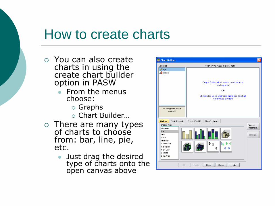
How to create charts
You can also create charts in using the create chart builder option in PASW From the menus
choose: Graphs Chart Builder…
There are many types of charts to choose from: bar, line, pie, etc. Just drag the desired
type of charts onto the open canvas above
How to create charts
Can drag variables in variables list to x-axis (independent variable) and y-axis (dependent variable).
X-axis of graph must be an ordinal measurement, not scale measurement, can change this temporarily while in chart mode.
Y-axis defaults to a count statistic, can change it to other statistics on the right side menu (i.e. mode, mean, median, etc)
Can also add titles and footnotes to the chart by selecting it from the options.
Click “ok” and the chart will be created in the output viewer.
Can double click on the chart and change the properties of it.
Example: Use sample data set in SPSS to create chart.
When to use different types of charts
SPSS allows for the creation of different types of charts.
When to use… Bar graphs: used to compare things between
different groups or to track changes over time.
Pie charts: best to use when you are trying to compare parts (X%) of a whole (100%). They do not show changes over time.
Line graphs: used to track changes over short and long periods of time. When smaller changes exist, line graphs are better to use than bar graphs. Line graphs can also be used to compare changes over the same period of time for more than one group.
How to setup so that Output viewer
records all changes to the database
Click on the output viewer Click on “Edit” on the
Menu Bar Click on “Options” Click on “Viewer” tab Make sure that the
Display commands in the log is checked.
This is useful for if you want to go back and see what analysis you ran previously.
Saving the database and output
For the database Click on the database Go to “File” in the menu heading Select “save as” and save to the desired folder.
Remember that the data base is saved as a .sav file.
For the output file Click on the output viewer Go to “File” in the menu heading Select “save as” and save to the desired folder.
Remember that the data base is saved as a .spv file.
That’s it!
Please look forward to our upcoming education modules where we will go more in-depth in data analysis using PASW (SPSS).