Page 1
Chapter 25
Page varieties
If you think of a Xamarin.Forms application as a building, then you construct this building from bricks
that take the form of views and elements. You arrange them into walls using layout classes, and then
form them into rooms with ContentPage, with passages from room to room made possible with navi-
gational functions structured around NavigationPage.
This visual architecture can be enhanced a bit more with other instantiable classes that derive from
Page. Here's the complete hierarchy:
Page
TemplatedPage
ContentPage
NavigationPage
MasterDetailPage
MultiPage<T>
TabbedPage
CarouselPage
This chapter is devoted to these additional Page derivatives, which are similar in that they serve as
parents to manage the visual presentation of two or more other pages:
MasterDetailPage manages two pages: The master is generally a collection of data or a list of
items, and the detail generally displays a particular item from the collection.
TabbedPage consists of multiple child pages identified by tabs. You can populate TabbedPage
with a collection of discrete pages or automatically generate tabs and pages based on a collec-
tion of data in much the same way that a ListView generates items based on a data collection.
With this second option, each tab is associated with a member of the collection, formatted with
a template, but this option is not suitable for iOS platforms.
The CarouselPage is slated for deprecation in favor of a forthcoming CarouselView, so it will not be
discussed in this chapter. MultiPage<T> is abstract and cannot be instantiated itself, but it defines
most of the properties and events for TabbedPage.
Master and Detail
The MasterDetailPage defines two properties, named Master and Detail of type Page. Generally,
you'll set these two properties to objects of type ContentPage, but currently, to get MasterDetail-
Page to work on the Universal Windows Platform, the detail page must be a NavigationPage.
Page 2
Chapter 25 Page varieties 1021
How the MasterDetailPage displays and switches between these two pages depends on several
factors: the underlying operating system, whether you're running the program on a phone or tablet,
the portrait or landscape orientation of the device, and the setting of a property of MasterDetail-
Page named MasterBehavior. Several behaviors are possible:
split: The master and detail pages are displayed side by side, the master on the left and the de-
tail on the right.
popover: The detail page is animated to cover, or partially cover, the master page. There are
three possibilities:
o slide: The detail and master page slide back and forth.
o overlap: The detail page partially covers the master page.
o swap: The detail page entirely obscures the master page.
In theory, the MasterBehavior property of MasterDetailPage allows you to choose between the
split and popover behaviors. You set this property to one of the five members of the MasterBehavior
enumeration:
Default
Split
SplitOnLandscape
SplitOnPortrait
Popover
As you’ll see, however, the setting of the MasterBehavior property has no effect for applications run-
ning on phones. It only affects applications running on a tablet or the desktop. Phones always exhibit a
popover behavior. Whether this behavior results in a slide, overlap, or swap depends on the platform.
Exploring the behaviors Let's explore these behaviors with a program named MasterDetailBehaviors. The program defines
three pages, named DemoPage (which derives from MasterDetailPage), and two ContentPage de-
rivatives that are children of the MasterDetailPage. These are named MasterPage and Detail-
Page.
MasterPage and DetailPage are very similar. Here’s MasterPage:
<ContentPage xmlns="http://xamarin.com/schemas/2014/forms"
xmlns:x="http://schemas.microsoft.com/winfx/2009/xaml"
x:Class="MasterDetailBehaviors.MasterPage"
Title="Master Page"
Padding="10"
x:Name="masterPage">
Page 3
Chapter 25 Page varieties 1022
<ContentPage.Padding>
<OnPlatform x:TypeArguments="Thickness"
iOS="0, 20, 0, 0" />
</ContentPage.Padding>
<Frame OutlineColor="Accent">
<StackLayout Orientation="Horizontal"
Spacing="0"
HorizontalOptions="Center"
VerticalOptions="Center">
<Label Text="{Binding Source={x:Reference masterPage},
Path=Width,
StringFormat='Master: {0:F0}'}"
FontSize="Large" />
<Label Text="{Binding Source={x:Reference masterPage},
Path=Height,
StringFormat=' × {0:F0}'}"
FontSize="Large" />
</StackLayout>
</Frame>
</ContentPage>
It contains a Frame with a pair of Label elements to display the width and height of the page. Notice
that a Title property is set and the page contains the standard Padding to avoid overlapping the
status bar on the iPhone.
The DetailPage does not contain that Padding. You’ll see that it’s unnecessary. But like Master-
Page, this page also sets the Title property and contains a Frame with a pair of Label elements to
display the width and height:
<ContentPage xmlns="http://xamarin.com/schemas/2014/forms"
xmlns:x="http://schemas.microsoft.com/winfx/2009/xaml"
x:Class="MasterDetailBehaviors.DetailPage"
Title="Detail Page"
Padding="10"
x:Name="detailPage">
<Frame OutlineColor="Accent">
<StackLayout Orientation="Horizontal"
Spacing="0"
VerticalOptions="CenterAndExpand"
HorizontalOptions="Center">
<Label Text="{Binding Source={x:Reference detailPage},
Path=Width,
StringFormat='Detail: {0:F0}'}"
FontSize="Large"/>
<Label Text="{Binding Source={x:Reference detailPage},
Path=Height,
StringFormat=' × {0:F0}'}"
FontSize="Large" />
Page 4
Chapter 25 Page varieties 1023
</StackLayout>
</Frame>
</ContentPage>
You’ll also need a page that derives from MasterDetailPage. To add such a page in Visual Studio,
add a new item to the project by using the Forms Xaml Page template; in Xamarin Studio, add a new
file to the project by using the Forms ContentPage Xaml template. This creates a page that derives
from ContentPage, but you can then simply change ContentPage to MasterDetailPage in both
the XAML file and C# code-behind file.
Here’s the XAML file for DemoPage with MasterDetailPage as the root element:
<MasterDetailPage xmlns="http://xamarin.com/schemas/2014/forms"
xmlns:x="http://schemas.microsoft.com/winfx/2009/xaml"
xmlns:local="clr-namespace:MasterDetailBehaviors"
x:Class="MasterDetailBehaviors.DemoPage"
Title="Demo Page"
MasterBehavior="Default">
<MasterDetailPage.Master>
<local:MasterPage />
</MasterDetailPage.Master>
<MasterDetailPage.Detail>
<NavigationPage>
<x:Arguments>
<local:DetailPage />
</x:Arguments>
</NavigationPage>
</MasterDetailPage.Detail>
</MasterDetailPage>
The MasterDetailPage.Master and MasterDetailPage.Detail property elements are set to in-
stances of MasterPage and DetailPage, respectively, but with a little difference: The Detail prop-
erty is set to a NavigationPage, and the x:Arguments tags specify the DetailPage as the construc-
tor argument. This is necessary to enable the user interface that lets the user switch between the mas-
ter and detail pages on the Universal Windows Platform.
Also notice that the MasterBehavior property is set to Default in the root tag. You can experi-
ment with different settings.
The App constructor sets the MainPage property to DemoPage. A Xamarin.Forms program should
not navigate to a MasterDetailPage:
namespace MasterDetailBehaviors
{
public class App : Application
{
public App()
{
MainPage = new DemoPage();
}
Page 5
Chapter 25 Page varieties 1024
…
}
}
When you first run the program, by default the detail page is initially displayed:
On all three platforms, the heading identifies this as the detail page by displaying the Title property
of DetailPage. The iPhone also displays the Title of the MasterPage.
The operation to switch from the detail page to the master is different on the three platforms:
On iOS, swipe the detail page to the right, or tap the Master Page text in the heading.
On Android, swipe right from the left edge of the phone, or tap the arrow in the upper-left
corner.
On Windows 10 Mobile, tap the menu icon in the upper-left corner.
Here’s the result after the switch:
Page 6
Chapter 25 Page varieties 1025
The master page is now visible. In terms of the MasterBehavior enumeration, the master page be-
comes visible with a Popover behavior, but the three screenshots illustrate differences between the
platforms:
The behavior on iOS is a slide. The detail page slides to the right as the master page slides in
from the left; you can still see the left part of the detail page.
The Android is an overlay. It’s hard to tell because the detail page is faded out, but look closely,
and you can see the Frame in the DetailPage at the far right of the screen.
Windows 10 Mobile is also a slide. You can see the detail page behind the master page.
On both iOS and Android, the width of the master page is somewhat less than the width of the screen.
To return to the detail page on iOS, swipe to the left. On Android, swipe the master page to the left,
tap the visible part of the detail page at the far right of the screen, or tap the Back triangle at the bot-
tom of the screen. On Windows Phone, tap the menu icon again or the Back arrow.
You’ll see similar behavior for these three platforms in landscape mode, except that master page has
a similar width as the master page in portrait mode, which results in much more of the detail page be-
ing visible:
Page 7
Chapter 25 Page varieties 1026
If you experiment with different settings of the MasterBehavior property of MasterDetailPage,
you’ll discover that this property has no effect on phones. Phones always have a popover behavior.
Only on the iPad and on Windows tablets and the desktop will you see a split behavior.
On the iPad in landscape mode, the MasterBehavior.Default setting results in a split behavior:
However, you can control the behavior. If you set the MasterBehavior property to Popover, you’ll
get a master page that overlays the detail page much like on the iPhone.
Page 8
Chapter 25 Page varieties 1027
For an iPad in portrait mode, the default setting is the same as Popover, and you’ll need to select
Split or SplitOnPortrait to get a split screen in portrait mode.
The SplitOnLandscape and SplitOnPortrait options allow you to have a different behavior for
portrait and landscape modes. The SplitOnLandscape setting makes the most sense, and that is why
it’s the same as Default for tablets and the desktop: The master and detail views share the screen in
landscape mode, but when the tablet is turned to portrait mode, the detail view occupies the full
screen and the master page overlays it.
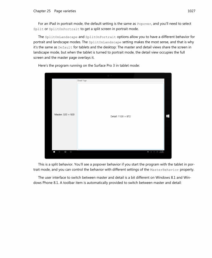
Here’s the program running on the Surface Pro 3 in tablet mode:
This is a split behavior. You’ll see a popover behavior if you start the program with the tablet in por-
trait mode, and you can control the behavior with different settings of the MasterBehavior property.
The user interface to switch between master and detail is a bit different on Windows 8.1 and Win-
dows Phone 8.1. A toolbar item is automatically provided to switch between master and detail:
Page 9
Chapter 25 Page varieties 1028
The Windows 8.1 screen shows the split behavior, but if you set it for popover, you’ll need to right-
click the screen to display the toolbar. The Windows Phone 8.1 screen displays the toolbar normally.
You are responsible for setting the toolbar button image and the associated text. The image and text
are the same regardless of whether the master or detail view is visible. The text is set from the Title
property of the master page., which in this case is “Master Page”.
The bitmap for the button is set from the Icon property of the master page. (This Icon property is
actually defined by Page and inherited by all the other page derivatives.) The Windows 8.1 and Win-
dows Phone 8.1 projects were both given a folder named Images. The content of this folder is a PNG
file. The constructor in the code-behind file for MasterPage sets that bitmap to the Icon property:
public partial class MasterPage : ContentPage
{
public MasterPage()
{
InitializeComponent();
if (Device.OS == TargetPlatform.WinPhone ||
Device.OS == TargetPlatform.Windows)
{
Icon = new FileImageSource
{
File = "Images/ApplicationBar.Select.png"
};
}
}
}
If you do not set that Icon property—either in the code-behind file or in the XAML file—the toolbar
Page 10
Chapter 25 Page varieties 1029
button will be displayed on the Windows 8.1 and Windows Phone 8.1 platforms without an image.
Tapping that toolbar icon switches between detail and master:
Back to school So far in this book you’ve seen a couple of programs that use a ListView to display the students of
the School of Fine Art. These programs all have different approaches for displaying a detailed look at
one of the students. The SelectedStudentDetail program in Chapter 19, “Collection views,” displayed
the ListView in the top half of the screen and the detail in the bottom half. The SchoolAndStudents
program in Chapter 24, “Page navigation,” used page navigation to display the student from the
ListView. Now let’s use a MasterDetailPage for this job and call it SchoolAndDetail.
One major difference between the SchoolAndDetail program and MasterDetailBehaviors in-
volves how the program is constructed. Rather than having separate classes for the master and detail
page, everything is consolidated in one class that derives from MasterDetailPage.
This single class (shown below) is named SchoolAndDetailPage. The layout of the master and de-
tail pages are defined within the MasterDetailPage.Master and MasterDetailPage.Detail
property-element tags.
The root tag sets a property of MasterDetailPage named IsPresented. This property allows a
program to switch between master and detail views programmatically or declaratively in XAML. The
default value is false, which means to display the detail page, but the root element of this XAML file
sets it to True to display the master page at startup:
<MasterDetailPage xmlns="http://xamarin.com/schemas/2014/forms"
Page 11
Chapter 25 Page varieties 1030
xmlns:x="http://schemas.microsoft.com/winfx/2009/xaml"
xmlns:school="clr-namespace:SchoolOfFineArt;assembly=SchoolOfFineArt"
x:Class="SchoolAndDetail.SchoolAndDetailPage"
IsPresented="True">
<MasterDetailPage.Master>
<ContentPage Title="School">
<ContentPage.Padding>
<OnPlatform x:TypeArguments="Thickness"
iOS="0, 20, 0, 0" />
</ContentPage.Padding>
<ContentPage.Icon>
<OnPlatform x:TypeArguments="FileImageSource"
WinPhone="Images/refresh.png" />
</ContentPage.Icon>
<ContentPage.BindingContext>
<school:SchoolViewModel />
</ContentPage.BindingContext>
<StackLayout BindingContext="{Binding StudentBody}">
<Label Text="{Binding School}"
FontSize="Large"
FontAttributes="Bold"
HorizontalTextAlignment="Center" />
<ListView x:Name="listView"
ItemsSource="{Binding Students}"
ItemTapped="OnListViewItemTapped">
<ListView.ItemTemplate>
<DataTemplate>
<ImageCell ImageSource="{Binding PhotoFilename}"
Text="{Binding FullName}"
Detail="{Binding GradePointAverage,
StringFormat='G.P.A. = {0:F2}'}" />
</DataTemplate>
</ListView.ItemTemplate>
</ListView>
</StackLayout>
</ContentPage>
</MasterDetailPage.Master>
<!-- Detail Page -->
<MasterDetailPage.Detail>
<NavigationPage>
<x:Arguments>
<ContentPage Title="{Binding FirstName}"
BindingContext="{Binding Source={x:Reference listView},
Path=SelectedItem}">
<StackLayout>
<!-- Name -->
<StackLayout Orientation="Horizontal"
HorizontalOptions="Center"
Page 12
Chapter 25 Page varieties 1031
Spacing="0">
<StackLayout.Resources>
<ResourceDictionary>
<Style TargetType="Label">
<Setter Property="FontSize" Value="Large" />
<Setter Property="FontAttributes" Value="Bold" />
</Style>
</ResourceDictionary>
</StackLayout.Resources>
<Label Text="{Binding LastName}" />
<Label Text="{Binding FirstName, StringFormat=', {0}'}" />
<Label Text="{Binding MiddleName, StringFormat=' {0}'}" />
</StackLayout>
<!-- Photo -->
<Image Source="{Binding PhotoFilename}"
VerticalOptions="FillAndExpand" />
<!-- Sex -->
<Label Text="{Binding Sex, StringFormat='Sex = {0}'}"
HorizontalOptions="Center" />
<!-- GPA -->
<Label Text="{Binding GradePointAverage, StringFormat='G.P.A. =
{0:F2}'}"
HorizontalOptions="Center" />
</StackLayout>
</ContentPage>
</x:Arguments>
</NavigationPage>
</MasterDetailPage.Detail>
</MasterDetailPage>
Notice also that the Title and Icon properties are set on the master page. The Windows 8.1 and
Windows Phone 8.1 projects contain an Images directory with a Refresh icon that might also suggest
a toggle operation. The master page also instantiates SchoolViewModel as an object in the Master-
PageBase.BindingContext property-element tags.
One advantage of putting everything within a single XAML file is that you can establish a data bind-
ing between the master and detail pages. The BindingContext of the ContentPage that serves as
the detail page is bound to the SelectedItem property of the ListView.
Other than those differences, the page definitions themselves are quite similar to the SchoolAnd-
Students program in the previous chapter.
The program starts up displaying the master page, which includes the ListView with the students:
Page 13
Chapter 25 Page varieties 1032
This program has another way to switch from the master page to the detail page. The code-behind
file contains a simple handler for the ItemTapped event of the ListView:
public partial class SchoolAndDetailPage : MasterDetailPage
{
public SchoolAndDetailPage()
{
InitializeComponent();
}
void OnListViewItemTapped(object sender, ItemTappedEventArgs args)
{
// Show the detail page.
IsPresented = false;
}
}
The difference between ItemTapped and ItemSelected is that ItemTapped works even if the
item is already selected. The ItemTapped handler doesn’t deselect the item. This maintains a con-
sistency between the selected item in the ListView and the contents of the detail page.
Here’s the detail page that you’ll see after a tap:
Page 14
Chapter 25 Page varieties 1033
To return to the master page on iOS, swipe right. On Android, swipe right from the left edge or tap
the arrow at the top. On Windows 10 Mobile, tap the menu icon in the upper-left corner.
On both Android and Windows Phone, tapping the Back arrow at the bottom of the screen will exit
the program. That Back arrow will switch from master to detail, but not from detail to master.
Here’s the program running on the iPad Air 2 simulator showing the side-by-side display of the
master and detail:
Page 15
Chapter 25 Page varieties 1034
Your own user interface If you’d like to supply your own user interface for switching between the master and detail views, you’ll
probably also want to disable the interface automatically provided by the MasterDetailPage. You
can do this in two ways:
Set the IsGestureEnabled property to false to disable the swipe gesture support on iOS
and Android.
Override the protected ShouldShowToolbarButton method and return false to hide the
toolbar buttons on Windows 8.1 and Windows Phone 8.1.
However, you won’t be able to disable the interface entirely. Setting the IsGestureEnabled prop-
erty to false means you can no longer use swipes to switch between master and detail on iOS and
Android. The property does not affect taps, however. For both iOS and Android, when the display has a
popover behavior and the master page is overlaying the detail page, you can dismiss the master page
with a tap on the detail page at the right. IsGestureEnabled does not disable those taps.
If you set the IsGestureEnabled property to false, you’ll need to supply your own user interface
for displaying the master view from the detail page on iOS and Android.
The toolbar button that accompanies the MasterDetailPage on Windows 8.1 and Windows
Phone 8.1 platforms is attached to the underlying native page. It cannot be accessed from the
ToolbarItems collections of the MasterDetailPage or of the two pages set to the Master and De-
tail properties. Overriding the ShouldShowToolbarButton and returning false suppresses that
toolbar button. Again, if you do that, you must supply you own user interface for switching between
master and detail views.
Another problem is that you don’t need an interface at all to switch between the views when the
MasterDetailPage is using a split mode. You know that you only get a split mode on iPad and Win-
dows Runtime tablets, but if you specify a MasterBehavior as Default or SplitOnLandscape, how
can you tell when the screen is in a split mode or overlay mode?
On the Windows Runtime tablets, a call to the base implementation of ShouldShowToolbar-
Button will tell you. This method returns true for phones and for tablets in an overlay mode, but it
returns false for tablets in a split mode. However, this method is only implemented on Windows 8.1
and Windows Phone 8.1.
For iOS, you can determine whether the iPad is in an overlay or split mode by checking the dimen-
sions of the page. If the page is in portrait mode, it’s overlay; for landscape mode, it’s split.
Let’s put all this knowledge to use. The ColorsDetails program displays all the colors in the
NamedColor collection in a ListView in the master page and provides detailed information about the
selected color in its detail page. Here’s the master page definition first:
<MasterDetailPage xmlns="http://xamarin.com/schemas/2014/forms"
xmlns:x="http://schemas.microsoft.com/winfx/2009/xaml"
Page 16
Chapter 25 Page varieties 1035
xmlns:toolkit=
"clr-namespace:Xamarin.FormsBook.Toolkit;assembly=Xamarin.FormsBook.Toolkit"
x:Class="ColorsDetails.ColorDetailsPage"
IsPresented="True"
x:Name="page">
<MasterDetailPage.Master>
<ContentPage Title="Colors">
<ContentPage.Padding>
<OnPlatform x:TypeArguments="Thickness"
iOS="0, 20, 0, 0" />
</ContentPage.Padding>
<ListView x:Name="listView"
SeparatorVisibility="None"
ItemsSource="{x:Static toolkit:NamedColor.All}"
ItemTapped="OnListViewItemTapped">
<ListView.RowHeight>
<OnPlatform x:TypeArguments="x:Int32"
iOS="80"
Android="80"
WinPhone="90" />
</ListView.RowHeight>
<ListView.ItemTemplate>
<DataTemplate>
<ViewCell>
<ContentView Padding="5">
<Frame OutlineColor="Accent"
Padding="10">
<StackLayout Orientation="Horizontal">
<BoxView x:Name="boxView"
Color="{Binding Color}"
WidthRequest="50"
HeightRequest="50" />
<StackLayout>
<Label Text="{Binding Name}"
FontSize="Medium"
VerticalOptions="StartAndExpand" />
<Label Text="{Binding RgbDisplay,
StringFormat='RGB = {0}'}"
FontSize="Small"
VerticalOptions="CenterAndExpand" />
</StackLayout>
</StackLayout>
</Frame>
</ContentView>
</ViewCell>
</DataTemplate>
</ListView.ItemTemplate>
</ListView>
</ContentPage>
</MasterDetailPage.Master>
…
Page 17
Chapter 25 Page varieties 1036
</MasterDetailPage>
The markup for this ListView is quite similar to that in the CustomNamedColorList program in
Chapter 19. In this new version, however, the ItemTapped event of the ListView is handled in the
code-behind file. (You’ll see that code shortly.)
Here’s the list of colors on the three platforms:
The ContentPage that serves as the detail view has its BindingContext set to the SelectedItem
property of the ListView. Most of the contents—which include a BoxView of the color; the red,
green, and blue values; and the hue, saturation, and luminosity values—are in a ScrollView. This is
for the benefit of phones in landscape mode. The only elements not in this ScrollView are a Label
with the color name at the top of the page and a Button on the bottom:
<MasterDetailPage … >
…
<MasterDetailPage.Detail>
<NavigationPage>
<x:Arguments>
<ContentPage Title="Color"
BindingContext="{Binding Source={x:Reference listView},
Path=SelectedItem}">
<ContentPage.Padding>
<OnPlatform x:TypeArguments="Thickness"
iOS="0, 20, 0, 0" />
</ContentPage.Padding>
<StackLayout>
<Label Text="{Binding FriendlyName}"
Style="{DynamicResource TitleStyle}"
Page 18
Chapter 25 Page varieties 1037
HorizontalTextAlignment="Center" />
<ScrollView VerticalOptions="FillAndExpand">
<StackLayout>
<BoxView Color="{Binding Color}"
WidthRequest="144"
HeightRequest="144"
VerticalOptions="CenterAndExpand"
HorizontalOptions="Center" />
<StackLayout VerticalOptions="CenterAndExpand"
HorizontalOptions="Center">
<StackLayout.Resources>
<ResourceDictionary>
<Style TargetType="Label">
<Setter Property="HorizontalTextAlignment"
Value="End" />
</Style>
</ResourceDictionary>
</StackLayout.Resources>
<Label Text="{Binding Color.R,
StringFormat='Red = {0:F2}'}" />
<Label Text="{Binding Color.G,
StringFormat='Green = {0:F2}'}" />
<Label Text="{Binding Color.B,
StringFormat='Blue = {0:F2}'}" />
<Label Text="{Binding Color.A,
StringFormat='Alpha = {0:F2}'}" />
<Label Text=" " />
<Label Text="{Binding Color.Hue,
StringFormat='Hue = {0:F2}'}" />
<Label Text="{Binding Color.Saturation,
StringFormat='Saturation = {0:F2}'}" />
<Label Text="{Binding Color.Luminosity,
StringFormat='Luminosity = {0:F2}'}" />
</StackLayout>
</StackLayout>
</ScrollView>
<Button x:Name="returnButton"
Text="Return to list"
HorizontalOptions="Center"
Clicked="OnReturnButtonClicked">
<Button.IsEnabled>
<Binding Source="{x:Reference page}"
Path="IsPresented">
<Binding.Converter>
<toolkit:BooleanNegationConverter />
</Binding.Converter>
</Binding>
</Button.IsEnabled>
</Button>
</StackLayout>
Page 19
Chapter 25 Page varieties 1038
</ContentPage>
</x:Arguments>
</NavigationPage>
</MasterDetailPage.Detail>
</MasterDetailPage>
The Button on the bottom has a Clicked event handler in the code-behind file, of course, but also
notice the data binding to its IsEnabled property. The source of the data binding is the IsPre-
sented property of the MasterDetailPage. If IsPresented is true—which means that master view
is displayed—then the Button is disabled. (If you’d like to do something similar in code, MasterDe-
tailPage defines an IsPresentedChanged event.)
You can see the Button at the bottom of the detail view for returning to the master view:
The code-behind file handles the event handlers for the ListView and Button (toward the bottom
of the file). These merely set the IsPresented property to false and true, respectively, and have no
effect when the MasterDetailPage is in split mode:
public partial class ColorDetailsPage : MasterDetailPage
{
public ColorDetailsPage()
{
InitializeComponent();
IsGestureEnabled = false;
// Special processing for iPads.
if (Device.OS == TargetPlatform.iOS &&
Device.Idiom == TargetIdiom.Tablet)
{
Page 20
Chapter 25 Page varieties 1039
SizeChanged += (sender, args) =>
{
// Enable button for portrait mode.
returnButton.IsVisible = Height > Width;
};
}
}
public override bool ShouldShowToolbarButton()
{
// Only works for Windows and Windows Phone platforms.
returnButton.IsVisible = base.ShouldShowToolbarButton();
return false;
}
void OnListViewItemTapped(object sender, ItemTappedEventArgs args)
{
IsPresented = false;
}
void OnReturnButtonClicked(object sender, EventArgs args)
{
IsPresented = true;
}
}
The more interesting parts of the code-behind file are in the constructor and the override of the
ShouldShowToolbarButton. These sections of code attempt two jobs:
First, they disable the existing user interface for switching between master and detail views by set-
ting IsGestureEnabled to false and returning false from ShouldShowToolbarButton. This
means that no toolbar item is displayed on the Windows 8.1 and Windows Phone 8.1 platforms. The
MasterDetailPage still requires that a Title be set on the ContentPage that serves as the master
view, but that Title is not used anywhere on these platforms.
The second job is to hide that Button entirely when the MasterDetailPage is in split view. The
SizeChanged handler for the page is set in the constructor when the program is running on an iPad,
and it sets the IsVisible property to true only if the page dimensions indicate portrait mode. The
ShouldShowToolbarButton override handles Windows tablets by showing the Button if the base
implementation of ShouldShowToolbarButton returns true.
That’s one way to implement your own user interface for switching between master and detail
views. The MasterDetailTaps program shows another approach. This program is similar to the Mas-
terDetailBehavior program that began this chapter, but with the definitions of the master and detail
views consolidated in one XAML file. This new program disables the existing UI for transitioning be-
tween master and detail views and replaces it with simple taps.
MasterDetailTapsPage derives from MasterDetailPage and includes similar Frame and Label
elements as the earlier program:
Page 21
Chapter 25 Page varieties 1040
<MasterDetailPage xmlns="http://xamarin.com/schemas/2014/forms"
xmlns:x="http://schemas.microsoft.com/winfx/2009/xaml"
x:Class="MasterDetailTaps.MasterDetailTapsPage"
Title="Demo Page">
<MasterDetailPage.Master>
<ContentPage Title="Master"
Padding="10"
x:Name="masterPage">
<Frame OutlineColor="Accent"
BackgroundColor="Transparent">
<Frame.GestureRecognizers>
<TapGestureRecognizer Tapped="OnMasterTapped" />
</Frame.GestureRecognizers>
<StackLayout Orientation="Horizontal"
Spacing="0"
HorizontalOptions="Center"
VerticalOptions="Center">
<Label Text="{Binding Source={x:Reference masterPage},
Path=Width,
StringFormat='Master: {0:F0}'}"
FontSize="Large" />
<Label Text="{Binding Source={x:Reference masterPage},
Path=Height,
StringFormat=' × {0:F0}'}"
FontSize="Large" />
</StackLayout>
</Frame>
</ContentPage>
</MasterDetailPage.Master>
<MasterDetailPage.Detail>
<NavigationPage>
<x:Arguments>
<ContentPage Title="Detail"
Padding="10"
x:Name="detailPage">
<ContentPage.Padding>
<OnPlatform x:TypeArguments="Thickness"
iOS="0, 20, 0, 0" />
</ContentPage.Padding>
<Frame OutlineColor="Accent"
BackgroundColor="Transparent">
<Frame.GestureRecognizers>
<TapGestureRecognizer Tapped="OnDetailTapped" />
</Frame.GestureRecognizers>
<StackLayout Orientation="Horizontal"
Spacing="0"
Page 22
Chapter 25 Page varieties 1041
VerticalOptions="CenterAndExpand"
HorizontalOptions="Center">
<Label Text="{Binding Source={x:Reference detailPage},
Path=Width,
StringFormat='Detail: {0:F0}'}"
FontSize="Large"/>
<Label Text="{Binding Source={x:Reference detailPage},
Path=Height,
StringFormat=' × {0:F0}'}"
FontSize="Large" />
</StackLayout>
</Frame>
</ContentPage>
</x:Arguments>
</NavigationPage>
</MasterDetailPage.Detail>
</MasterDetailPage>
Notice the TapGestureRecognizer attached to the Frame element on both the master and detail
pages.
Notice also that the BackgroundColor of each Frame is set to Transparent. This is for the benefit
of the Windows platforms. The default background of a Frame in these platforms is null, which lets
taps fall through to the underlying element. Setting the background to Transparent doesn’t change
the appearance but captures the taps.
The Tapped handlers simply set IsPresented:
public partial class MasterDetailTapsPage : MasterDetailPage
{
public MasterDetailTapsPage()
{
InitializeComponent();
// Disable swipe interface.
IsGestureEnabled = false;
}
public override bool ShouldShowToolbarButton()
{
// Hide toolbar button on Windows platforms.
return false;
}
void OnMasterTapped(object sender, EventArgs args)
{
// Catch exceptions when setting IsPresented in split mode.
try
{
IsPresented = false;
}
catch
Page 23
Chapter 25 Page varieties 1042
{
}
}
void OnDetailTapped(object sender, EventArgs args)
{
IsPresented = true;
}
}
The normal user interface is disabled as in the previous program but no logic is required to hide the
new user interface in split mode.
The try and catch block in the OnMasterTapped method is used to avoid an InvalidOpera-
tionException that occurs on both Windows and iPads in split mode. The error message that accom-
panies the exception states “Can't change IsPresented when setting Split.”
TabbedPage
TabbedPage derives from the abstract class MultiPage<Page>. It maintains a collection of children of
type Page, only one of which is fully visible at a time. TabbedPage identifies each child by a series of
tabs across the top or bottom of the page. An iOS application that uses a TabbedPage must include an
icon for each tab; otherwise, Apple will not accept the program for the App Store. This icon is set via
each page’s Icon property.
MultiPage<T> defines all the important properties and events for TabbedPage, the most im-
portant of which is:
Children property of type IList<T>.
Normally, you fill this Children collection with page objects.
However, you can use TabbedPage in a somewhat different way by observing that MultiPage<T>
is quite similar to ItemsView<T>, the base class of ListView, in that it defines:
the ItemsSource property of type IEnumerable, and
the ItemTemplate property of type DataTemplate.
If you supply an IEnumerable collection of objects with public properties suitable for data bindings,
and a template with a page type as the root element, then the children are generated dynamically. The
BindingContext of each generated page is set equal to the particular object from ItemsSource.
MultiPage<T> defines two properties that can help your application keep track of which page in
the Children collection the user is currently viewing:
CurrentPage of type T (Page for TabbedPage).
Page 24
Chapter 25 Page varieties 1043
SelectedItem of type object, referring to an object in the ItemsSource collection.
Both properties are gettable and settable.
MultiPage<T> also defines two events:
PagesChanged is fired when the ItemsSource collection changes
CurrentPageChanged is fired when the viewed page changes.
Most commonly, you’ll add ContentPage derivatives directly to the Children collection. If you
want to use TabbedPage for displaying a collection of similar pages based on a collection of data, you
can alternatively set the ItemsSource property to that collection and define a page by using
ItemTemplate, but this approach should be avoided on iOS.
Discrete tab pages The most common use of TabbedPage is to navigate between different functions within an app, which
typically means each tab presents a different type of page. It is common for these pages to be related
in some way—perhaps multiple pages for application settings—even if they don’t look the same.
The DiscreteTabbedColors program has three tabs: the first displaying a list of the built-in Xama-
rin.Forms colors, the second displaying a list of colors from the NamedColor class in the Xama-
rin.FormsBook.Toolkit (introduced in earlier chapters), and the third containing a color-tester (with
which you can select arbitrary RGB values to preview).
The DiscreteTabbedColors program begins with three ContentPage derivatives. The first is code-
only and consists of a simple list of the standard Xamarin.Forms colors.
class BuiltInColorsPage : ContentPage
{
public BuiltInColorsPage()
{
Title = "Built-in";
Icon = Device.OnPlatform("ic_action_computer.png", null, null);
Padding = new Thickness(5, Device.OnPlatform(20, 5, 5), 5, 5);
double fontSize = Device.GetNamedSize(NamedSize.Large, typeof(Label));
Content = new ScrollView
{
Content = new StackLayout
{
Spacing = 0,
Children =
{
new Label
{
Text = "White",
TextColor = Color.White,
FontSize = fontSize
},
Page 25
Chapter 25 Page varieties 1044
…
new Label
{
Text = "Purple",
TextColor = Color.Purple,
FontSize = fontSize
}
}
}
};
}
}
Notice that the Title property is set. This is essential for the tab text on all the platforms. The code
also sets the Icon property for iOS. The particular icon is part of the Android set of icons described in
Chapter 13, “Bitmaps,” and is 32-pixels square.
The NamedColorsPage consists of a ListView of all the NamedColor objects. Notice again the
Title property and Icon property for iOS:
<ContentPage xmlns="http://xamarin.com/schemas/2014/forms"
xmlns:x="http://schemas.microsoft.com/winfx/2009/xaml"
xmlns:toolkit=
"clr-namespace:Xamarin.FormsBook.Toolkit;assembly=Xamarin.FormsBook.Toolkit"
x:Class="DiscreteTabbedColors.NamedColorsPage"
Title="Toolkit">
<ContentPage.Icon>
<OnPlatform x:TypeArguments="FileImageSource"
iOS="ic_action_storage.png" />
</ContentPage.Icon>
<ListView ItemsSource="{x:Static toolkit:NamedColor.All}">
<ListView.RowHeight>
<OnPlatform x:TypeArguments="x:Int32"
iOS="80"
Android="80"
WinPhone="90" />
</ListView.RowHeight>
<ListView.ItemTemplate>
<DataTemplate>
<ViewCell>
<ContentView Padding="5">
<StackLayout Orientation="Horizontal">
<BoxView x:Name="boxView"
Color="{Binding Color}"
WidthRequest="50"
HeightRequest="50" />
<StackLayout>
<Label Text="{Binding Name}"
FontSize="Medium"
VerticalOptions="StartAndExpand" />
<Label Text="{Binding RgbDisplay, StringFormat='RGB = {0}'}"
Page 26
Chapter 25 Page varieties 1045
FontSize="Small"
VerticalOptions="CenterAndExpand" />
</StackLayout>
</StackLayout>
</ContentView>
</ViewCell>
</DataTemplate>
</ListView.ItemTemplate>
</ListView>
</ContentPage>
The third page contains a trio of Slider elements to select a color, such as you’ve seen before:
<ContentPage xmlns="http://xamarin.com/schemas/2014/forms"
xmlns:x="http://schemas.microsoft.com/winfx/2009/xaml"
xmlns:toolkit=
"clr-namespace:Xamarin.FormsBook.Toolkit;assembly=Xamarin.FormsBook.Toolkit"
x:Class="DiscreteTabbedColors.ColorTestPage"
Title="Test">
<ContentPage.Icon>
<OnPlatform x:TypeArguments="FileImageSource"
iOS="ic_action_gamepad.png" />
</ContentPage.Icon>
<StackLayout Padding="20, 40">
<StackLayout.BindingContext>
<toolkit:ColorViewModel Color="Gray" />
</StackLayout.BindingContext>
<Label Text="{Binding Red, StringFormat='Red = {0:F2}'}"
HorizontalOptions="Center" />
<Slider Value="{Binding Red}" />
<Label Text="{Binding Green, StringFormat='Green = {0:F2}'}"
HorizontalOptions="Center" />
<Slider Value="{Binding Green}" />
<Label Text="{Binding Blue, StringFormat='Blue = {0:F2}'}"
HorizontalOptions="Center" />
<Slider Value="{Binding Blue}" />
<BoxView Color="{Binding Color}"
VerticalOptions="FillAndExpand" />
</StackLayout>
</ContentPage>
Here’s the DiscreteTabbedColorsPage. Notice the root element of TabbedPage. This XAML file
simply adds instances of these three page types to the Children collection of the TabbedPage:
<TabbedPage xmlns="http://xamarin.com/schemas/2014/forms"
xmlns:x="http://schemas.microsoft.com/winfx/2009/xaml"
xmlns:local="clr-namespace:DiscreteTabbedColors"
Page 27
Chapter 25 Page varieties 1046
x:Class="DiscreteTabbedColors.DiscreteTabbedColorsPage">
<local:BuiltInColorsPage />
<local:NamedColorsPage />
<local:ColorTestPage />
</TabbedPage>
Here are the three tabs on the three platforms:
On iOS, the tabs are at the bottom, identified with text and icons, and the selected tab is high-
lighted. Both Android and Windows 10 Mobile display the tabs at the top of the screen but highlight
the selected tab in different ways.
The StudentNotes program has a home page that lists all the students in a ListView, but select-
ing a student from this list causes the program to navigate to a TabbedPage. The page has three tabs:
the first displays textual information about the student, the second displays the photograph of the stu-
dent, and the third displays an Editor that allows a teacher or other school administrator to enter
some notes about the student. (This feature makes use of the Notes property in the Student class in
the SchoolOfFineArt library.)
The App class in the StudentNotes program passes the Properties dictionary defined by Appli-
cation to the SchoolViewModel constructor, and also passes the Properties dictionary to the
SaveNotes method of the ViewModel when the program goes to sleep, possibly in preparation for
being terminated:
public class App : Application
{
public App()
Page 28
Chapter 25 Page varieties 1047
{
ViewModel = new SchoolViewModel(Properties);
MainPage = new NavigationPage(new StudentNotesHomePage());
}
public SchoolViewModel ViewModel
{
private set; get;
}
protected override void OnStart()
{
// Handle when your app starts
}
protected override void OnSleep()
{
ViewModel.SaveNotes(Properties);
}
protected override void OnResume()
{
// Handle when your app resumes
}
}
The home page should look familiar by now. It simply displays all the students in a ListView:
<ContentPage xmlns="http://xamarin.com/schemas/2014/forms"
xmlns:x="http://schemas.microsoft.com/winfx/2009/xaml"
xmlns:local="clr-namespace:StudentNotes;assembly=StudentNotes"
x:Class="StudentNotes.StudentNotesHomePage"
Title="Students"
BindingContext="{Binding Source={x:Static Application.Current},
Path=ViewModel}">
<StackLayout BindingContext="{Binding StudentBody}">
<Label Text="{Binding School}"
FontSize="Large"
FontAttributes="Bold"
HorizontalTextAlignment="Center" />
<ListView x:Name="listView"
ItemsSource="{Binding Students}"
ItemSelected="OnListViewItemSelected">
<ListView.ItemTemplate>
<DataTemplate>
<ImageCell ImageSource="{Binding PhotoFilename}"
Text="{Binding FullName}"
Detail="{Binding GradePointAverage,
StringFormat='G.P.A. = {0:F2}'}" />
</DataTemplate>
</ListView.ItemTemplate>
</ListView>
Page 29
Chapter 25 Page varieties 1048
</StackLayout>
</ContentPage>
The code-behind file contains the ItemSelected handler for the ListView to navigate to Stu-
dentNotesDataPage, setting the page’s BindingContext to the selected Student object:
public partial class StudentNotesHomePage : ContentPage
{
public StudentNotesHomePage()
{
InitializeComponent();
}
async void OnListViewItemSelected(object sender, SelectedItemChangedEventArgs args)
{
if (args.SelectedItem != null)
{
listView.SelectedItem = null;
await Navigation.PushAsync(new StudentNotesDataPage
{
BindingContext = args.SelectedItem
});
}
}
}
The StudentNotesDataPage derives from TabbedPage. Within the start and end tags of the
TabbedPage, three ContentPage definitions are added to the Children property of TabbedPage.
Each has its Title property set to the text to use in the tab, and Icon definitions are included for iOS:
<TabbedPage xmlns="http://xamarin.com/schemas/2014/forms"
xmlns:x="http://schemas.microsoft.com/winfx/2009/xaml"
x:Class="StudentNotes.StudentNotesDataPage"
Title="Student Data">
<ContentPage Title="Info">
<ContentPage.Icon>
<OnPlatform x:TypeArguments="FileImageSource"
iOS="ic_action_about.png" />
</ContentPage.Icon>
<StackLayout>
<Label Text="{Binding FullName}"
FontSize="Large"
HorizontalOptions="Center" />
<StackLayout Spacing="12"
VerticalOptions="CenterAndExpand"
HorizontalOptions="Center">
<StackLayout.Resources>
<ResourceDictionary>
<Style TargetType="Label">
<Setter Property="FontSize" Value="Large" />
Page 30
Chapter 25 Page varieties 1049
</Style>
</ResourceDictionary>
</StackLayout.Resources>
<Label Text="{Binding LastName,
StringFormat='Last name: {0}'}" />
<Label Text="{Binding FirstName,
StringFormat='First name: {0}'}" />
<Label Text="{Binding MiddleName,
StringFormat='Middle name: {0}'}" />
<Label Text="{Binding Sex,
StringFormat='Sex: {0}'}" />
<Label Text="{Binding GradePointAverage,
StringFormat='G.P.A. = {0:F2}'}" />
</StackLayout>
</StackLayout>
</ContentPage>
<ContentPage Title="Photo">
<ContentPage.Icon>
<OnPlatform x:TypeArguments="FileImageSource"
iOS="ic_action_person.png" />
</ContentPage.Icon>
<StackLayout>
<Label Text="{Binding FullName}"
FontSize="Large"
HorizontalOptions="Center" />
<Image Source="{Binding PhotoFilename}"
VerticalOptions="FillAndExpand" />
</StackLayout>
</ContentPage>
<ContentPage Title="Notes">
<ContentPage.Icon>
<OnPlatform x:TypeArguments="FileImageSource"
iOS="ic_action_edit.png" />
</ContentPage.Icon>
<StackLayout>
<Label Text="{Binding FullName}"
FontSize="Large"
HorizontalOptions="Center" />
<Editor Text="{Binding Notes}"
Keyboard="Text"
VerticalOptions="FillAndExpand" />
</StackLayout>
</ContentPage>
Page 31
Chapter 25 Page varieties 1050
</TabbedPage>
This is perhaps not enough information to spread over three pages, but you can easily imagine situa-
tions where this approach would be ideal.
Here’s how the three tabs look on the three platforms:
You can navigate back to the list of students in the normal way: By tapping the left arrow at the top
of the screen on iOS and Android, or by pressing the Back arrow at the bottom of the screen on
Android and Windows 10 Mobile.
Using an ItemTemplate The TabbedPage can also be used to present a small data set, each item of which is a separate page
identified by a tab. You do this by setting the ItemsSource property of TabbedPage and specifying
an ItemTemplate for rendering each page.
The MultiTabbedColors project contains a single page class that was added to the project as a
ContentPage, but which was then modified to be a TabbedPage. The project also has a reference to
the Xamarin.FormsBook.Toolkit library.
Notice that the root element of the XAML file sets the ItemsSource property of TabbedPage to
the collection available from the NamedColor.All static property. The remainder of the file defines
the ItemTemplate property. The TabbedPage.ItemTemplate property-element tags enclose a pair
of DataTemplate tags, in which a page definition appears, beginning with ContentPage. The data
bindings reference properties of the objects in the ItemsSource collection, in this case properties of
NamedColor:
Page 32
Chapter 25 Page varieties 1051
<TabbedPage xmlns="http://xamarin.com/schemas/2014/forms"
xmlns:x="http://schemas.microsoft.com/winfx/2009/xaml"
xmlns:toolkit=
"clr-namespace:Xamarin.FormsBook.Toolkit;assembly=Xamarin.FormsBook.Toolkit"
x:Class="MultiTabbedColors.MultiTabbedColorsPage"
ItemsSource="{x:Static toolkit:NamedColor.All}">
<TabbedPage.ItemTemplate>
<DataTemplate>
<ContentPage Title="{Binding Name}">
<ContentPage.Padding>
<OnPlatform x:TypeArguments="Thickness"
iOS="0, 20, 0, 0" />
</ContentPage.Padding>
<StackLayout>
<Label Text="{Binding FriendlyName}"
Style="{DynamicResource TitleStyle}"
HorizontalTextAlignment="Center" />
<ScrollView VerticalOptions="FillAndExpand">
<StackLayout>
<BoxView Color="{Binding Color}"
WidthRequest="144"
HeightRequest="144"
VerticalOptions="CenterAndExpand"
HorizontalOptions="Center" />
<StackLayout VerticalOptions="CenterAndExpand"
HorizontalOptions="Center">
<StackLayout.Resources>
<ResourceDictionary>
<Style TargetType="Label">
<Setter Property="HorizontalTextAlignment"
Value="End" />
</Style>
</ResourceDictionary>
</StackLayout.Resources>
<Label Text="{Binding Color.R,
StringFormat='Red = {0:F2}'}" />
<Label Text="{Binding Color.G,
StringFormat='Green = {0:F2}'}" />
<Label Text="{Binding Color.B,
StringFormat='Blue = {0:F2}'}" />
<Label Text="{Binding Color.A,
StringFormat='Alpha = {0:F2}'}" />
<Label Text=" " />
<Label Text="{Binding Color.Hue,
StringFormat='Hue = {0:F2}'}" />
<Label Text="{Binding Color.Saturation,
StringFormat='Saturation = {0:F2}'}" />
<Label Text="{Binding Color.Luminosity,
StringFormat='Luminosity = {0:F2}'}" />
Page 33
Chapter 25 Page varieties 1052
</StackLayout>
</StackLayout>
</ScrollView>
</StackLayout>
</ContentPage>
</DataTemplate>
</TabbedPage.ItemTemplate>
</TabbedPage>
To avoid overwriting the status bar at the top of the iOS screen, set Padding on the ContentPage
template rather than on the TabbedPage itself.
Set the Title property of this ContentPage template to the text you want to appear in the tabs to
identify each page. Notice that the Title is bound to the Name property of NamedColor, but the con-
tents of the page also include a Label with a TitleStyle to display the FriendlyName property,
which is similar to the Name property but includes spaces if the color name consists of multiple words.
Here is TabbedColors running on the three standard platforms:
The tabs function like a menu that allow you to select a particular page.
The good news is that this works great on Android and Windows 10 Mobile. You can scroll quickly
through the headers on the top of the Android screen, and swipe the actual pages on Windows 10
Mobile.
On iOS, however, only four items are displayed, and the more button and the ellipsis do not work.
Moreover, there are no icons, and you need icons on a TabbedPage for Apple to approve the app for
the App Store. While this facility of TabbedPage appears to be quite an interesting way to generate
pages, it’s not suitable for a cross-platform application. More suitable would be the CarouselView,
Page 34
Chapter 25 Page varieties 1053
which unfortunately was not quite ready by the time this book went to print.