7
MUSIC MAGAZINE RESEARCH
| Date post: | 09-Aug-2015 |
| Category: |
Documents |
| Upload: | samchittock |
| View: | 38 times |
| Download: | 0 times |
MUSIC MAGAZINE RESEARCH
Cover Page (1)
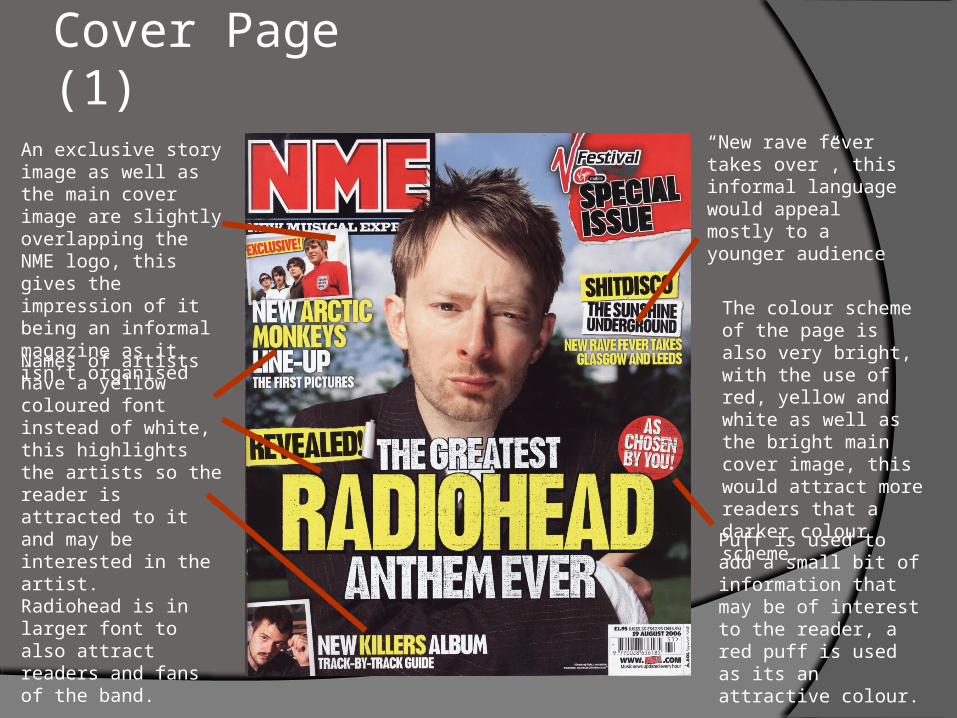
An exclusive story image as well as the main cover image are slightly overlapping the NME logo, this gives the impression of it being an informal magazine as it isn’t organised
Names of artists have a yellow coloured font instead of white, this highlights the artists so the reader is attracted to it and may be interested in the artist.Radiohead is in larger font to also attract readers and fans of the band.
Puff is used to add a small bit of information that may be of interest to the reader, a red puff is used as its an attractive colour.
“New rave fever takes over”, this informal language would appeal mostly to a younger audience
The colour scheme of the page is also very bright, with the use of red, yellow and white as well as the bright main cover image, this would attract more readers that a darker colour scheme.
Cover Page (2)
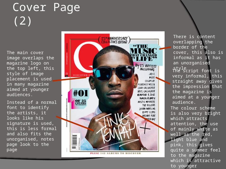
The script font is very informal, this straight away gives the impression that the magazine is aimed at a younger audience.
The main cover image overlaps the magazine logo on the top left, this style of image placement is used in many magazine aimed at younger audiences.
The colour scheme is also very bright which attracts attention, the use of mainly white as well as the red, light blue and pink, this gives quite a summer feel to the magazine which is attractive to younger audiences.
There is content overlapping the border of the cover, this also is informal as it has an unorganised style
Instead of a normal font to identify the artists, it looks like his signature is used, this is less formal and also fits the unorganised, notes page look to the page
Cover Page (3)
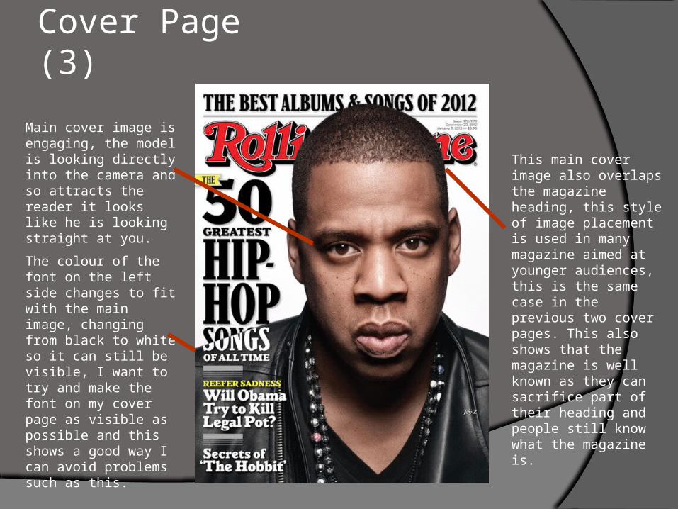
This main cover image also overlaps the magazine heading, this style of image placement is used in many magazine aimed at younger audiences, this is the same case in the previous two cover pages. This also shows that the magazine is well known as they can sacrifice part of their heading and people still know what the magazine is.
The colour of the font on the left side changes to fit with the main image, changing from black to white so it can still be visible, I want to try and make the font on my cover page as visible as possible and this shows a good way I can avoid problems such as this.
Main cover image is engaging, the model is looking directly into the camera and so attracts the reader it looks like he is looking straight at you.
Contents Page (1)
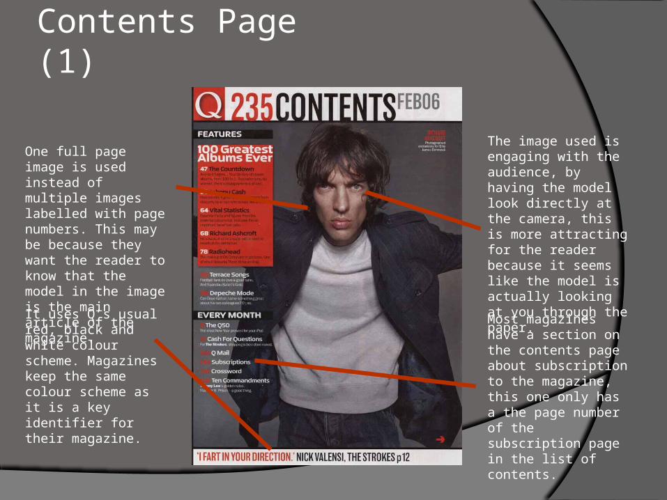
One full page image is used instead of multiple images labelled with page numbers. This may be because they want the reader to know that the model in the image is the main article of the magazine.
It uses Q’s usual red, black and white colour scheme. Magazines keep the same colour scheme as it is a key identifier for their magazine.
Most magazines have a section on the contents page about subscription to the magazine, this one only has a the page number of the subscription page in the list of contents.
The image used is engaging with the audience, by having the model look directly at the camera, this is more attracting for the reader because it seems like the model is actually looking at you through the paper.
Contents Page (2)
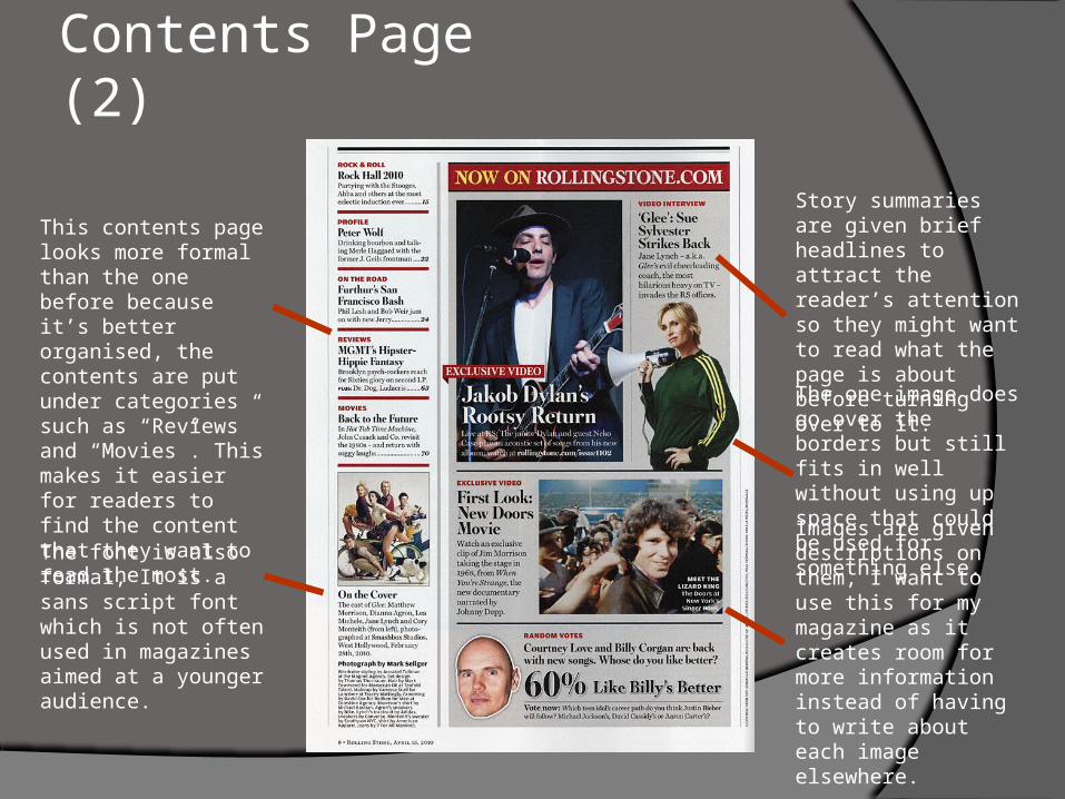
This contents page looks more formal than the one before because it’s better organised, the contents are put under categories such as “Reviews” and “Movies”. This makes it easier for readers to find the content that they want to read the most.
The font is also formal, It is a sans script font which is not often used in magazines aimed at a younger audience.
The one image does go over the borders but still fits in well without using up space that could be used for something else.
Images are given descriptions on them, I want to use this for my magazine as it creates room for more information instead of having to write about each image elsewhere.
Story summaries are given brief headlines to attract the reader’s attention so they might want to read what the page is about before turning over to it.
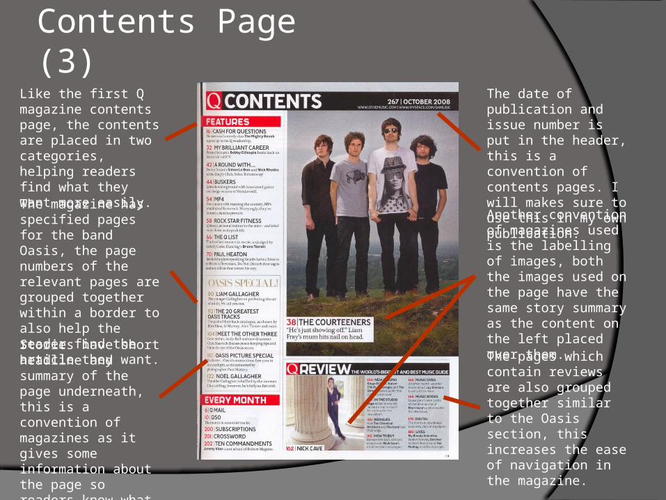
Contents Page (3)Like the first Q magazine contents page, the contents are placed in two categories, helping readers find what they want more easily.
The magazine has specified pages for the band Oasis, the page numbers of the relevant pages are grouped together within a border to also help the reader find the article they want.
Stories have short headline and summary of the page underneath, this is a convention of magazines as it gives some information about the page so readers know what they will be reading.
The date of publication and issue number is put in the header, this is a convention of contents pages. I will makes sure to use this in my own publication.
Another convention of magazines used is the labelling of images, both the images used on the page have the same story summary as the content on the left placed over them.
The pages which contain reviews are also grouped together similar to the Oasis section, this increases the ease of navigation in the magazine.


