33
No Unsupervised Thinking: How to increase conversions by guiding your audience Tuesday February 23, 2010 8pm-9:30pm Twitter: @stevediebold www.stevendiebold.com
| Date post: | 12-Aug-2015 |
| Category: |
Marketing |
| Upload: | steven-diebold |
| View: | 93 times |
| Download: | 0 times |

No Unsupervised Thinking: How to increase conversions by guiding your audience
Tuesday February 23, 2010 8pm-9:30pm
Twitter: @stevediebold www.stevendiebold.com

You invest significant resources to drive prospects to your site. • Advertising, PPC, Affiliates, SEO ,etc.
• If theyʼre exposed to your site and donʼt find it compelling, will they ever return?
• Do you guide them to conversion as well as your guide them to your site?

Five tested and proven strategies to guide your customers to conversion.
• Research results that show how reducing unsupervised thinking can lead to massive improvements.
• Common site design pitfalls and how to address them.
• Live optimization of audience-submitted sites with tips and tactics you can use today.
• Q&A session with E-rewards & Owner of Pro-profs quiz School

Eye-tracking studies: more than meets the eye
Imagine that you need a refresher on how to tie a tie. So, you decide to type [how to tie a tie] into the Google search box. Which of these results would you choose?


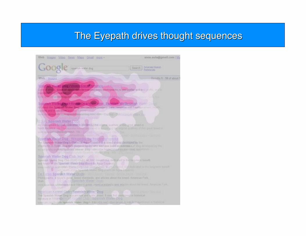


Key Point: Every element of our web pages must be guiding the customerʼs sequence of thoughts. We are not just optimizing web pages; we are optimizing thought sequences.
Sample objectives: filling out a form,purchasing product,trying out product, etc

Research notes:
Background: An established financial institution offering online savings accounts
Goal: To increase the amount of online account registrations
Primary research question: Which page would produce the most account sign-ups?
Approach: A/B/C split test focused on reducing the amount of friction

Two treatments were developed in which the amount of competing information was reduced gradually. Below is a visual representation of how the information was originally organized and gradually reduced in the two treatments.

The control contained 5 main blocks of information separated by defined lines and gradients.
• This page also offered three major calls to action
• Overall this page appears to have many objectives all competing in an unorganized way.

Without drastically changing the copy, Treatment 1 organized the page into two columns with one major call to action.
• Main copy has been bolded to direct the eyepath through the text.
• The second column now offers a customer testimonial.

Treatment 2 reduces the page even further, offering a single column containing main information and a single clear call to action.
• The copy has not been drastically altered in this treatment as well.

What you need to understand: By simplifying the page layout and reducing the amount of competing objectives the optimized pages were able to increase clickthrough by 266% and conversion by 27%.

This test illustrates a direct relationship between a websiteʼs clarity of direction and its conversion rates.
A website that immediately answers the following questions will achieve its objectives more often:
Where am I?
• What can I do here?
• Why should I stay and do it?

80% of large B2B sites use this offer layout for their homepage.
• 53% of smaller organizations do as well
• B2C and ecommerce also use variations on the theme.

Organized in a mainly single-column format with the option to add supporting information either in the left-hand or right-hand column.
• The main column should contain all the information that is stating the key points of the value of the offer.
• Content supporting the value (testimonials,credibility indicators, etc.) can potentially be used in supporting columns.

Key Point: Every element of our web pages must be guiding the customerʼs sequence of thoughts. We are not just optimizing web pages; we are optimizing thought sequences.
Start a conversation and guide them to action.

There are five ways in which you can adjust elements on your web pages to guide your visitor:
1. Size 2. Shapes 3. Color 4. Position 5. Motion

The larger an element is in relation to other elements of a web page will determine itʼs draw of the visitors attention.
• Example: Text size, images, banners, buttons
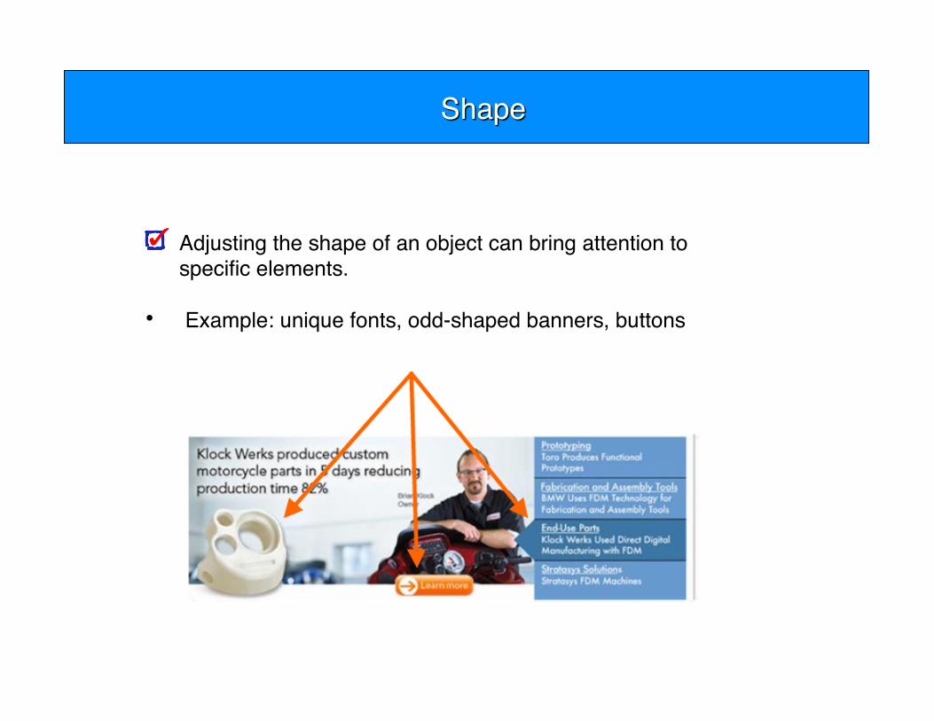
Adjusting the shape of an object can bring attention to specific elements.
• Example: unique fonts, odd-shaped banners, buttons

Adjusting the shape of an object can bring attention to specific elements.
• Example: unique fonts, odd-shaped banners, buttons

The proper use of colors can increase attention brought to the elements on a web page. However, too much color can become desensitizing to visitors.
• Example: banners, buttons, images, text

Adding motion to a graphic will immediately grab your userʼs attention. However, test this method with caution due to possible negative reactions.
• Examples: animated images, Flash videos

Now letʼs apply what weʼve learned about directing the visitorʼs eyepath to your web pages...

The site is effectively uses color, size to bring attention to ultimate goal of opening an IRA.
Positioning and layout is confusing and might cause someone to miss important info.
• Remove all unnecessary information.
• Reduce page to single column format where all important info is in eyepath.
• Consider using feature matrix.
Whatʼs working
What to watch
Other recommendations

This page uses shape and size to bring attention to calls to action and some of the value proposition.
However, overuse of colors and the lack of contrast between some elements mitigates the use of size and shape making it all the same.
• Avoid to many equally weighted objectives.
• Reduce the number of graphical elements
Whatʼs working
What to watch
Other recommendations

This site effectively uses color, size and shape to bring attention to the lead generation form.
Most everything else along with copy is lost in the white-on-blue color scheme. Consider a test with blue on white instead.
• Depends too much on video. Use key graphic instead.
• Using video as testimonials is better and supports value proposition.
• Not sure what they are selling.
Whatʼs working
What to watch
Other recommendations

This site effectively uses color, size and shape to bring attention to call to action.
Positioning and layout of the elements could better direct the sequence of thoughts.
• De-emphasize key graphic even if its a branding play to connect from tv ads. Put priority info in the eyepath unless the character holds enormous credibility and breeds familiarity.
• Add testimonials, move button, test vertical flow.
Whatʼs working
What to watch
Other recommendations
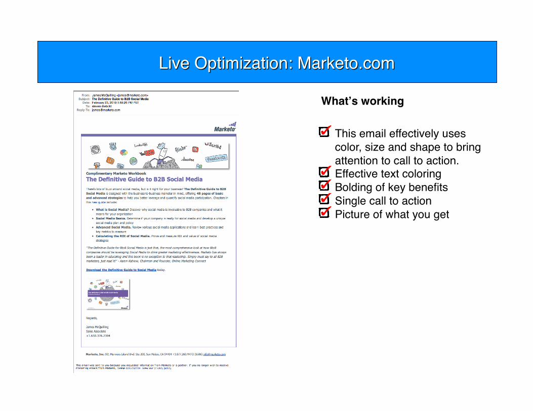
This email effectively uses color, size and shape to bring attention to call to action.
Effective text coloring Bolding of key benefits Single call to action Picture of what you get
Whatʼs working

This site effectively uses color, size and shape to bring attention to call to action.
Effective text coloring Bolding of key benefits Single call to action Picture of what you get De-emphasized nav on left to
focus user on objective of pages.
Key graphic with pic of what youʼre downloading.
Clear value prop Testimonials
Whatʼs working

www.stevendiebold.com
We value your feedback- please complete the survey before you leave.
Learn more about how we can help you with your current challenges
Clients we have worked with on many different projects


