3.11. The commutative effect of improper typography
4. Several Environmental
Conditions Influencing Reading
4.1. Glare
4.2. Slope and angular alignment for reading
4.3. The quality of paper and print
4.4. The effect of pilot's age on reading
5. Final Note
6. List of Design Recommendations
7. Acknowledgments
8. References
PRE't'TE[TING P.,'_ BLAI_K NOT FILM,ED
iii
Summary
Many types of paper documentation are employed on the flight-deck. They
range from a simple checklist card to a bulky Aircraft Flight Manual (AFM).
Some of these documentation have typographical and graphical deficiencies;
yet, many cockpit tasks such as conducting checklists, way-point entry,
limitations and performance calculations, and many more, require the use of
these documents. Moreover, during emergency and abnormal situations, the
flight crews' effectiveness in combating the situation is highly dependent on
such documentation; accessing and reading procedures has a significant
impact on flight safety. Although flight-deck documentation are an important
(and sometimes critical) form of display in the modern cockpit, there is a
dearth of information on how to effectively design these displays.
The object of this report is to provide a summary of the available literature
regarding the design and typographical aspects of printed matter. The report
attempts "to bridge" the gap between basic research about typography, and
the kind of information needed by designers of flight-deck documentation.
The report focuses on typographical factors such as typefaces, character
height, use of lower- and upper-case characters, line length, and spacing.
Some graphical aspects such as layout, color coding, fonts and character
contrast are also discussed. In addition, several aspects of cockpit reading
conditions such as glare, angular alignment, and paper quality are addressed.
Finally, a list of recommendations for the graphical design of flight-deck
documentation is provided.
1. Background
On May 26, 1987, at 16:45 Central Daylight Time, an Air New Orleans BAe-
3101, departed from runway 19 at New Orleans International Airport on a
scheduled commuter flight to Eglin Air Force Base, Florida. Flight 962 never
reached Eglin AFB that day, nor any altitude above 200 feet. The flight crew
felt a severe yawing motion and engine torque fluctuations. The captain
proceeded to make an emergency landing on the overrun of runway 19. The
aircraft rolled off the overrun, crossed an adjoining highway, struck several
vehicles, and came to rest on the far side of the highway. The National
Transportation Safety Board (NTSB) concluded that "the engine RPM levers
were either advanced to a position less than full forward or they were not
advanced at all before takeoff, indicating a lack of checklist discipline on the
_art of the aircrew" (NTSB, 1988, p. 24). The report also stated that,
The typeface on the Air New Orleans' checklist is 57 percent smaller thanthat recommended by human engineering criteria. This smaller typefacereduces the legibility of print even under optimum conditions. Althoughthere was no evidence that checklist legibility was a factor in this accident,
the Safety Board believes that under other operational circumstances, thisdeficiency could compromise the intended purpose of this device. There-fore, the Safety Board believes the FAA should take action to verify thataircraft checklists are designed to comply with accepted human engineering
criteria (p. 22).
The NTSB made a recommendation to the FAA to "issue an Advisory Circular
to commercial operators recommending the use of a procedural checklist that
incorporates human engineering design criteria for size and style of print"
(NTSB A-88-72). Figure 1 is a copy of the checklist used by the flight crews of
Air New Orleans Flight 962 (note that the poor quality of the checklist in figure
1 is due to several reproductions of the origonal checklist used by the crew of
Flight 962).
On August 19, 1980, a Saudi Arabian Lockheed L-1011 was returning to
Riyadh Airport (Saudi Arabia), after warnings in the cockpit indicated smoke in
the aft cargo compartment. The crew was searching for the appropriate
emergency procedure in their flight documentation. The accident report
stated that,
About 3 minutes were spent by the crew looking for the aft cargo smoke
warning procedure. Evidence indicated this difficulty was due to a split ofthe Emergency and Abnormal procedures into Emergencies, Abnormal, andAdditional [sections]. The crew apparently believed that the procedure wasin the Abnormal section when it was actually in the Emergency section ....
(Flight Safety Focus, 1985)
This, and several other factors ted to a horrific accident in which 287 passen-
gers and 14 crew members died of fire and toxic smoke inhalation.
AIR NEW ORLEANS BAe 3101
FLIGHT CREW CHECKLIST
(7TH REVISION)
I_-_1 m_ pmzmm mm_
MFI[ STMTDI (* - first fliPt It tlu dill')t. h_ surf uza_h,,i _m/Imla .I, lws - n I./II. Cle_ult 11_8tm5 *3. Imw Nmdle - MMI4. bttr/Imsr - M IBIIlam_INI.M CIMCaO
"6. tm_/ml_t Jklrt I_mis -7. Fms/FrmA/etd _ - BiT
,i_. ..u.,,i.m_,kl._t_ --_-_T---_I"" _m =mTr/m - SET {S)
-11. _ levers - IrlD;TIIqOlSZ. Pwsrlmm Levers - _ STPJTtTMI/flU. il13. l_ssurlzatlm/TImps hall - SET
Figure 1. Air New Orleans, BAe 3101 checklist (adopted from NTSB, 1988).ORIGIN_AL PAGE IS
OF POOR QUALITY
Documents, manuals, checklists and many other paper forms are used in the
cockpit. Ruffell Smith (1979), reported that excluding aircraft flight manuals,
the amount of paperwork needed for a flight from.Washington D.C. via New
York to London, had a single side area of 200 square feet (Figure 2). One
recent report submitted to NASA's Aviation Safety Reporting System (ASRS)
speaks to this issue:
Both the copilot and I wrote our flight clearance, which included the
KIRN 2D departure, as we received it from clearance delivery .... Ibriefed the crew on the departure, including emergency items, andread aloud the KIRN 2E departure procedure. During our departure,radar [ATC] asked why we had turned early .... Radar reminded us
that we were to fly the KIRN 2D departure of this flight .... I and otherpilots I know are concerned about the amount of information pre-sented to us for the operation of our flights. For the flight prompting
this report we had over 30 feet [italic added] of computer printout ofinformation for this flight including 30 navigation waypoints, later tobe revised enroute. Together, the two airports at Paris (Orly and
Charles De Gaulle) have procedures and info that make up a smallvolume of 89 pages. The 25 pound flight bag I carry contains 5 vol-umes of information in a constant state of revision. Too much infor-
mation could cause important items to be overlooked--lost in themaze of print. Important items of information and procedures shouldbe concise and printed as to be easy to read--especially at night.(ASRS Report No. 157620)
Although flight-deck documentation and written procedures are an inherent
part of flight operation, there is a drought of research regarding this aspect of
cockpit activity. The topic of procedural design and its associated display has
long been neglected by the human factors profession; partly because human
factors research has traditionally focused on the hardware interfaces in the
cockpit (controls, displays, etc.). Nevertheless, flight-deck documentation are
an integral part of the interfaces in the cockpit--specifying and dictating the
actions by which the pilot is expected to interact with the machine.
In a recent study, Degani and Wiener (1990) studied the human factors aspect
of checklist procedures. While conducting that study, the authors encoun-
tered many flight-deck documentation, such as flight plans, fuel sheets,
manifests, dispatch material, that were poorly presented (graphically and
typographically). Those documentation were not only difficult to follow, but
also difficult to read and comprehend. Those findings prompted this work.
4
Figure 2. Paperwork needed for a flight from Washington, D. C., to London (adopted from Ruffell Smith, 1979).
oRlrt iNA_ _" _
BLACK AND WHITE PHOTOG_:.APH
2. Objectives and Scope
The intent of this report is to provide a literature review of the basic research
on typography and suggest compatible approaches for designing flight-deck
documentation. The report focuses on several typographical and environmen-tal factors that affect the ability of the pilot to use, read, and comprehend
flight-deck documentation and written procedures. The efficiency and
manifests, etc., depends in part on typographical and graphical factors.
Moreover, during emergency or abnormal conditions, the flight crew efficiency
in accessing, reading, comprehending, and executing procedures has a
significant impact on flight safety (de Ree, 1991 ; Degani and Wiener, 1991).
There is very little experimental data in the literature regarding reading and
using printed text in the airline cockpit. Therefore, the data reported in this
study is based on laboratory studies. These experiments were not conducted in a
cockpit; the majority were conducted while the subjects (usually college
students), were seated by a desk and the printed matter was lighted with
normal room lighting.
This report attempts to "bridge" this gap between empirical research and "the
real world" by providing a summary of the basic research findings to the
documentation designer. Hence, the information presented here only serves
to provide a baseline. The designer should make an initial assumption fromthe data and the author's recommendations, then validate the design in an
appropriate flight simulator using his/her own company documentation and a
representative sample of the pilot population. For an example of this process,
conducted for a major international airline, see de Ree (1991 ).
Although it is beyond the scope of this report to discuss concepts of human
perception, the author would like to raise one"warning flag" regarding thedata in this report. I believe that information from data books and graphs
regarding human sensing of physical energies may be insufficient. While it istrue that the data reported in the literature are well established, it is also very
important to realize that the data cannot be used as a simple look-up table to
AnexampleoftheabovecombinationinhumanperceptionistheDeltaAirLinesFlight1141accident.Theaircraft,aB-727,crashedshortlyafterliftingofffromrunway18Lat Dallas-FortWorthInternationalAirport,followingano-flap/no-slattakeoff.TheNTSBconcludedthat"theflightcrewdidnotextendtheairplane'sflapsorslatsfortakeoff"(NTSB,1989,p.92). However,thecockpitvoicerecorderindicatedthatin responsetothesecondofficerprompt"flaps,"thefirstofficerresponded"fifteen,fifteen, green light." Presumably,
the first officer's response is based on a visual check of the needle position on
the inboard and outboard flap/slat position indicators ("fifteen, fifteen") and
illumination of the leading edge flaps and slats indicator light ("green light").
However, all these indicators displayed something very different from what thefirst officer responded (the flap/slat gauges indicated zero). In this case, as in
many other reported incidents (ASRS, 1987, 1989), the active strategies ofinformation processing of the first officer played a dominant role in determin-
ing what he actually perceived. Hence, the mere existence of the display and
its information is not predictive of what the observer will perceive.
Effective appearance of flight-deck documentation is effected by the correctgraphical presentation and the environmental conditions that influence
reading in the cockpit. These two factors should agree with the uniquephysical condition of the cockpit, the capabilities and limitations of the human
operator, and the method of using the documentation as dictated in the
standard operating procedures (Degani and Wiener, 1991, in progress). Some
of these considerations will be discussed in the following sections.
o Typography
3.1 Principles of Typography
Typography is defined by the Webster's dictionary as "the arrangement, style,
or general appearance of matter printed from type." In order to select and
use the appropriate typography, there are two factors that the document
designer should consider.
Legibifity of Print (Discriminability). This characteristic of an alphanumeric
enables the observer to quickly and positively identify it from all other letters
and characters. Legibility depends on stroke width, form of characters,
illumination on the page, and the contrast between the characters and the
background.
Readability. This quality of the word or text allows for rapid recognition of a
single word, word-groups, abbreviations, and symbols. Readability depends
on the spacing of individual characters, spacing of words, spacing of lines, and
the ratio between characters area to background area (Heglin, 1973; Sanders
and McCormick, 1987). These criteria are important for all printed matter;
however, they are crucial for the typographical design of flight-deck documen-
tation. Reading conditions in the airline cockpit is characterized by some of
the following:
1. Non-optimal viewing conditions (during night operations, dim
lighting, and direct sunlight);
2. Fast and frequent changes of accommodation between far- and near-
vision (looking for other traffic and then reading an approach plate);
3. Interruptions and distractions while following procedural sequencesfrom manuals and checklists (ATC communications, flight attendants,
company calls, etc.);
4. Several age groups with different viewing abilities within the pilot
population.
The following sections will detail some of the basic research findings regarding
aspects of typography and graphical design. Some of these aspects will be
illustrated here using a checklist of a wide-body airliner. Nevertheless, thereader is cautioned that these basic research findings are not specific for flight-
deck documentation. Therefore, the author's recommendations provided at
the end of each sub-section, cannot be used as specifications; each recom-
mendation must be to be evaluated by the designer for his/her unique
application.
BASELINE
ROMAN UPPERCASE AND LOWERCASE LETTERFORMS
ASCENDERSSERIF
COUNTERS
$X-HEIGHT, OR BODY
--DESCENDER
LOWER CASELETTERS
Figure 3. Letterforms (adopted from Craig, 1980).
3.2. Typeface (Fonts)
Typefaces or fonts refer to the style of the alphanumeric used in printing.
There are over 2300 typefaces available today. Two major groups of fonts are
applicable for use on the flight deck: roman and sans-serif. Roman is well
known since it is used daily in newspapers, journals, and books. Sans-serif is a
contemporary font that does not include the little strokes (serifs) that project
horizontally from the top or bottom of a main stroke (Figure 3).
Several researchers have reported that when other typographical factors are
controlled, sans-serif fonts are more legible than roman. The premise behind
this statement is that absence of serifs presents a more simple and clean
typeface, and therefore improves the legibility of the print (Cheetham and
Grimbly, 1964; Heglin, 1973; Poulton, 1965). Serifs disrupt character
discrimination and may add uneven appearance to the shape of strokes
and characters. However, it is also evident that they somewhat aid the
horizontal movement of the eye along the printed line--the serifs at the
top and bottom of a character create a "railroad track" for the eye to
follow along the line of. print. Therefore, when using a typeface withoutserifs, adequate spacing between the lines of print should be used in ord_.toprevent the eye'from bridging (slipping) to the adjoining line (Craig, l _t_u).The designer should safeguard against this factor as it may lead to skipping aline while reading a long]ist.
Gill Medium
ABCDEFGHIJKLMNOPQRSTUVWXYZ
abcdefghijklmnopqrstuvwxyz
HELVETICA
Many types of paper documentation are employed on the
flight deck. They range from a simple checklist card to a
TIMES
Many types of paper documentation are employed on the flight
deck. They range from a simple checklist card to a
PALATINO
Many types of paper documentation are employed on the
flight deck. They range from a simple checklist card to a
FUTURA
Many _Peks of paper documentation are employed on lhe flightThey range from a simple checklist card to a
MELIOR
Many types of paper documentation are employed on the
flight deck. They range from a simple checklist card to a
OPTIMA
Many types of paper documentation are employed on theflight deck. They range from a simple checklist card to a
OARAMOND
Many types of paper documentation are employed on the
flight deck. They range from a simple checklist card to a
Figure 4. Comparison of several fonts (adopted from Poulton, 1965).
Among the sans-serif group there are many different fonts from which to
select. Pulton (1965) compared the level of reading comprehension among
five different fonts (three different sans-serifs and two fonts with serifs). He
found a significantly higher level of comprehension while subjects were usinga sans-serif font called Gill-Medium. This font was also ranked first in its level
of character discrimination. A careful examination of Figure 4 will indicate thatin contrast to the Gill-Medium font, the letters of the other sans-serif fonts are
characterized by several "family resemblances." This results in similar appear-
ance and may reduce legibility (compare the "O" and "C"). Likewise, most ofthe modern san-serif fonts such as Futura, Avant Garde, and Helvetica also
include characters that are too similar to one another, and therefore difficult to
distinguish. The sources of similarity between the characters of modern sans-serif fonts are:
1. The standardized or modular appearance of the letters ("P," "R").
2. The effect of mirror images between the upper and lower part of the
character CE," "B," "D").
3. The use of equal radius for different letters CG," "O," "C")
(Craig, 1980; Cheetham and Grimbly, 1964).
10
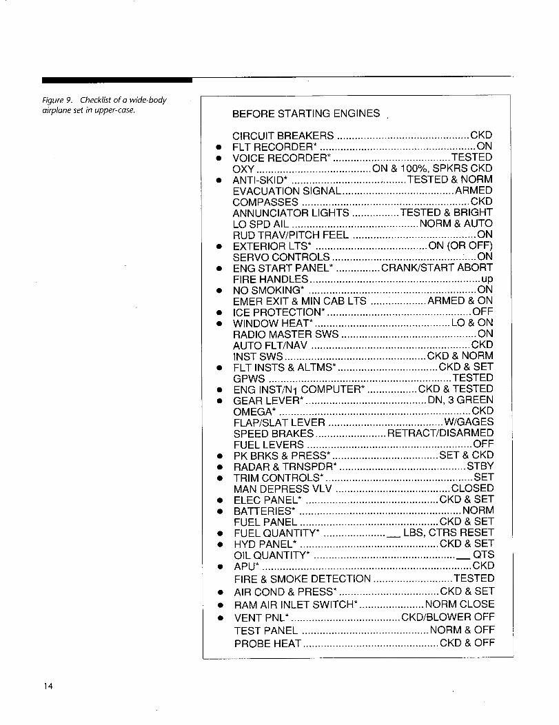
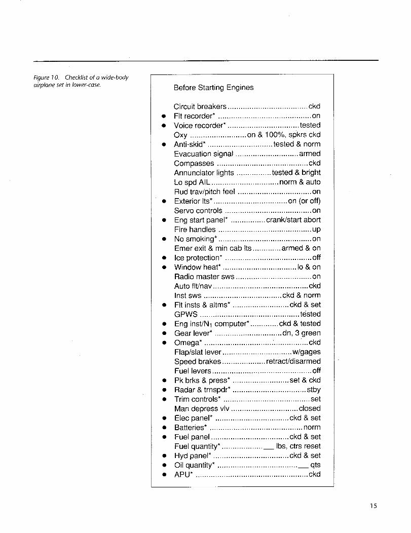
It is interesting to note here that most human factors design handbooksadvocate the use of sans-serif fonts--emphasizing the characteristics of modernsans-serif fonts as clean and simple fonts. Neglecting, however, the sub-optimal effect of their over-modularity on the legibility and readability.Figure 5 compares sans-serif and serif fonts for a checklist of a wide-bodyaircraft.
Another font related problem is the use of dot matrix printers. Several airlinesemploy, such printers for documents that are produced by dispatch agents(e.g., flight plan, fuel sheet, and cargo/passenger manifest). This font is verymodular, especially in upper case letters. In addition, it is difficult to discrimi-nate between characters because of the dot construction that make up acharacter and the uneven spacing between dots (see Figure 6). There are alsoinstances in which the print is almost unreadable because of an old ribbon inthe printer.
• Sans-serif fonts areusually more legible thanfonts with serifs.
• Avoid using a font thathas characters that aretoo similar to oneanother, as this will reducethe legibility of the print.
• Avoid using dot matrixprint for critical flight-deck documentation.
Flap/slat lever ................................ w/gagesSpeed brakes .................... retract/disarmedFuel levers .............................................. off
• Pk brks & press*. ......................... set & ckd
• Radar & trnspdr* .................................. stby• Trim controls*. ....................................... set
Man depress vlv ............................... closed
• Anti-skid*. ............................Evacuation signal ................Annunciator lights ...... testedLo spd AlL ....... norm & auto
9 Point Helvetica
(x height = .0_1 ;1 point = 1/100 of an inch)
3.4 Font Height (Typesize)
Measurement. When specifying the height of a font and spacing (both
vertically and horizontally), the designer should be aware that there are severalscales and methods of measurement. The traditional printer's "point" used for
typesize-height equals 1/100 of an inch; however, when it is used to measuredistance between lines, words, etc., a point is approximately equal to 1/72 of
an inch. This can be confusing. Another area of confusion is the method ofmeasurement. Lower-case letters can be measured in two different methods.
One is the overall size of the character, measured from the bottom of the
descender (p) to the top of the ascender (d). The other is the actual height ofa character that lacks ascenders or descenders ("o," "r," "x'); this measure-
ment is called the "x height" of a font. The designer should also note that
while a "point" on a Macintosh computer is exactly 1/72 of an inch, a "point"
on a professional typesetter is slightly less than 1/72 of an inch (L. E. Gifford,
personal communication, February, 1992).
Font height vs. viewing condition. Most of the information in the literature
regarding font height is presented in graphs. These graphs usually indicate
the relationship between character height, viewing distance, illumination level,stroke width, and visual acuity (Woodson, 1981; Howett, 1983). The graph in
Figure 11 depicts the recommended relationship between character height
and viewing distance for different illumination levels and alphanumeric status
(static, dynamic). Although this graph was designed for labels on instrument
panels, it also can be used as a guide for character size (Woodson andConover, 1964). When using this graph to determine the height of a lower-
case character, the distinction between the overall typesize and "x" heightshould be considered.
16
e-
._m"1-
Stroke width (in.)
\500- 100
50 - 10 -
5 - 1 -
.5 - .1 -
.05 - .01.1
Viewing distance (m)
.3 3 30 30O
I I
Visual acuity(Snellen index)
Y.,4
,¢1" ,es, ,S I
1 10
I
2.5
I .25
lOO lO00
Viewing distance (ft.)
2500
250EE
J_
2
Figure 13. Height vs. viewing distance and visual acuity (adopted from Woodson, 1981).
This recommendation, however, must be assessed with the following in mind:
1. The recommendation regarding checklists is coupled with labels and decals,
which are used differently on the flight deck (labels are fixed to the
panel).
2. This recommendation assumes the use of upper-case characters.
3. There is no mention of color or contrast level.
4. The recommendation is based on a height vs. viewing distance graph and
not on an empirical experiment (W. F. Grether, personal communications, 1988).
While evaluating typesize for optimum reading, Tinker (1963) experimented
with typesizes that ranged from 0.08 to 0.14 inches, all set in lower-case roman.
He reported that a 0.11 inch typesize was read significantly faster than 0.10 inch.
The majority of the readers judged the 0.11 inch typesize as the most legible.
To summarize, it appears from the above graphs and tables that a font sizebetween 0.14 and 0.20 inches is suitable for checklists and other critical
documentation used on the flight deck. However, for practical reasons of
limited space on a single page (in case of a checklist) and simply because of
increased volume (in case of manuals), this range (0.14-0.20) may not be
efficient (Turner and Huntley, 1991). Again, one must not forget that any
determination of suitable font height must be combined with accompanying
typographical factors such as horizontal spacing, line width, vibration levels,
color, etc., before any final judgement concerning the legibility of any types_/e
can be extracted. How far can the designer go in reducing the font size of
important flight documentation? The answer is based on the specifics of each
case. What is clear, from reviewing checklists, manuals, and these data, is that a
font size below O10 inch for any important flight-deck document is notre( om mended
• When specifying font
height or accessing graphsto determine the size of a
lower-case character, thedistinction between "x"
height and overall sizeshould be made.
• As a generalrecommendation, the "x"
height of a font used for
important flight-deckdocumentation shouldnot be below 0.10 inch.
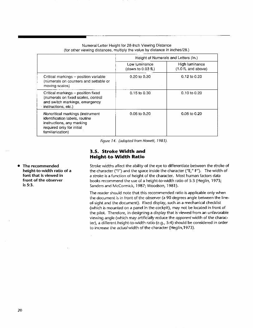
Stroke widths affect the ability of the eye to differentiate between the stroke of
the character ("1") and the space inside the character ("E," F'). The width of
a stroke is a function of height of the character. Most human factors databooks recommend the use of a height-to-width ratio of 5:3 (Heglin, 1973;
Sanders and McCormick, 1987; Woodson, 1981 ).
The reader should note that this recommended ratio is applicable only when
the document is in front of the observer (a 90 degrees angle between the line-
of-sight and the document). Fixed display, such as a mechanical checklist
(which is mounted on a panel in the cockpit), may not be located in front of
the pilot. Therefore, in designing a display that is viewed from an unfavorable
viewing angle (which may artificially reduce the apparent width of the charac-
ter), a different height-to-width ratio (e.g., 5:4) should be considered in order
to increase the actual width of the character (Heglin,1973).
2O
.8
°7
_.6
"_.5_.4
.3
2.1
Letter Height vs. Viewing Distanceand Illumination Level
(Minimum space between characters, 1 stroke width;between words, 6 stroke widths)
I I I I I I I I I I I I20 40 60 80 100 120 140 160 180 200 220 240
Viewing distance (in.)
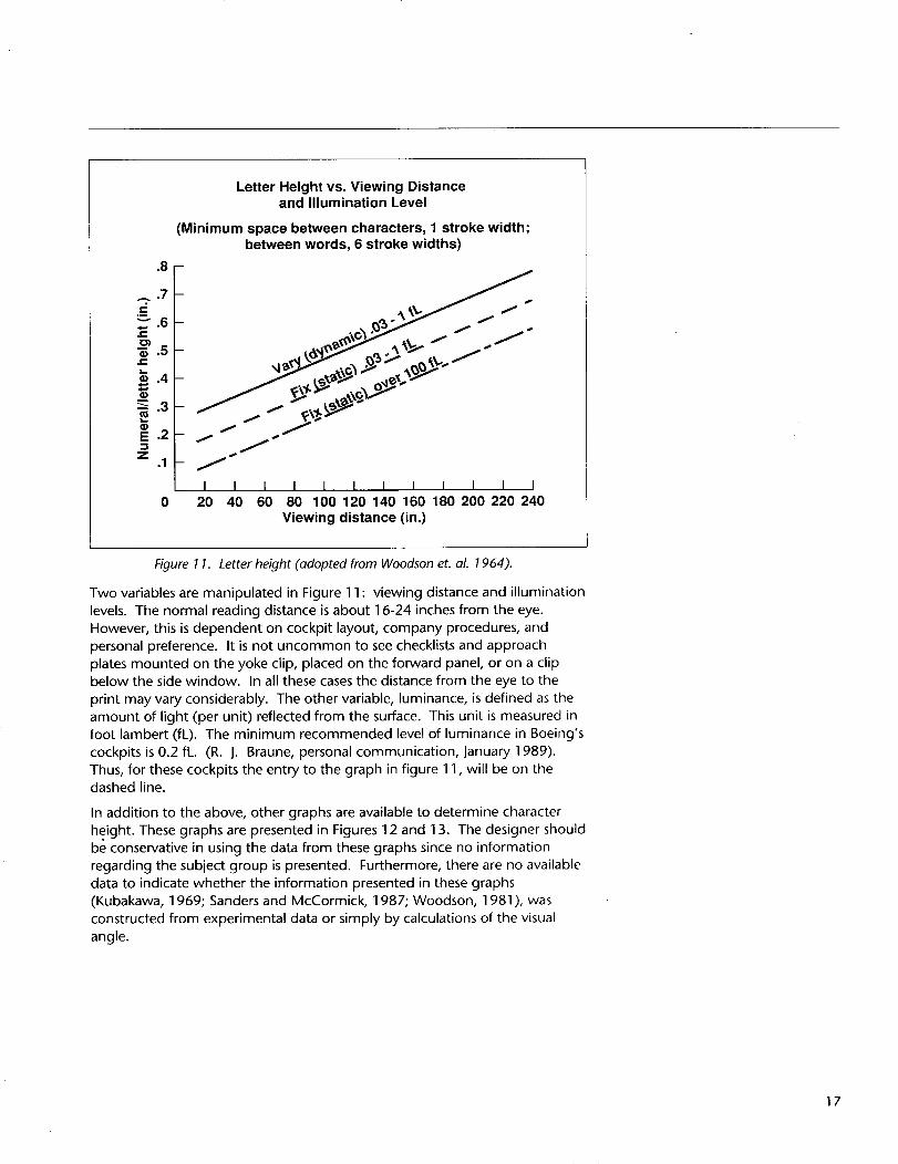
Figure 11. Letter height (adopted from Woodson et. aL 1964).
Two variables are manipulated in Figure 11 : viewing distance and illumination
levels. The normal reading distance is about 16-24 inches from the eye.
However, this is dependent on cockpit layout, company procedures, and
personal preference. It is not uncommon to see checklists and approach
plates mounted on the yoke clip, placed on the forward panel, or on a clipbelow the side window. In all these cases the distance from the eye to the
print may vary considerably. The other variable, luminance, is defined as the
amount of light (per unit) reflected from the surface. This unit is measured infoot lambert (fL). The minimum recommended level of luminance in Boeing's
cockpits is 0.2 fL. (R. J. Braune, personal communication, January 1989).
Thus, for these cockpits the entry to the graph in figure 11, will be on thedashed line.
In addition to the above, other graphs are available to determine character
height. These graphs are presented in Figures 12 and 13. The designer shouldbe conservative in using the data from these graphs since no information
regarding the subject group is presented. Furthermore, there are no available
data to indicate whether the information presented in these graphs
(Kubakawa, 1969; Sanders and McCormick, 1987; Woodson, 1981 ), was
constructed from experimental data or simply by calculations of the visual
angle.
17
.13 -
.12
.11
.10
_..09
.08.07
2 .06N .o5
.04
.03
.02
.01
JBlack on white *,_,-J 4.
_ / 7S
/ 7--_ s
7-_"
I I I I I I I I I I I I0 20 40 60 80 100 120140 160 180200220240
Viewing distance (in.)
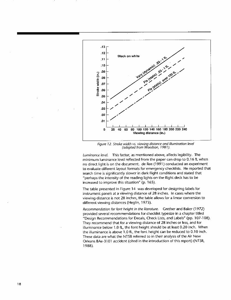
Figure 12. Stroke width vs. viewing distance and illumination level(adopted from Woodson, 1981).
Luminance level. This factor, as mentioned above, affects legibility. The
minimum luminance level reflected from the paper can drop to 0.16 fL when
no direct light is on the document, de Ree (1991) conducted an experiment
to evaluate different layout formats for emergency checklists. He reported that
search time is significantly slower in dark flight conditions and stated that
"perhaps the intensity of the reading lights on the flight deck has to be
increased to improve this situation" (p. 165).
The table presented in Figure 14 was developed for designing labels for
instrument panels at a viewing distance of 28 inches. In cases where the
viewing distance is not 28 inches, the table allows for a linear conversion to
different viewing distances (Heglin, 1973).
Recommendation for font height in the literature. Grether and Baker (1972)
provided several recommendations for checklist typesize in a chapter titled
"Design Recommendations for Decals, Check Lists, and Labels" (pp. 107-108).
They recommend that for a viewing distance of 28 inches or less, and for
illuminance below 1.0 fL, the font height should be at least 0.20 inch. When
the illuminance is above 1.0 fL, the font height can be reduced to 0.10 inch.
These data are what the NTSB referred to in their analysis of the Air New
Orleans BAe-3101 accident (cited in the introduction of this report) (NTSB,
1988).
]8
3.6. Horizontal and Vertical Spacing
The vertical and horizontal spacing between characters affects the legibility
and readability of the text especially when the font height is small. Increasing
the vertical spacing between lines reduces the probability of adverse visual
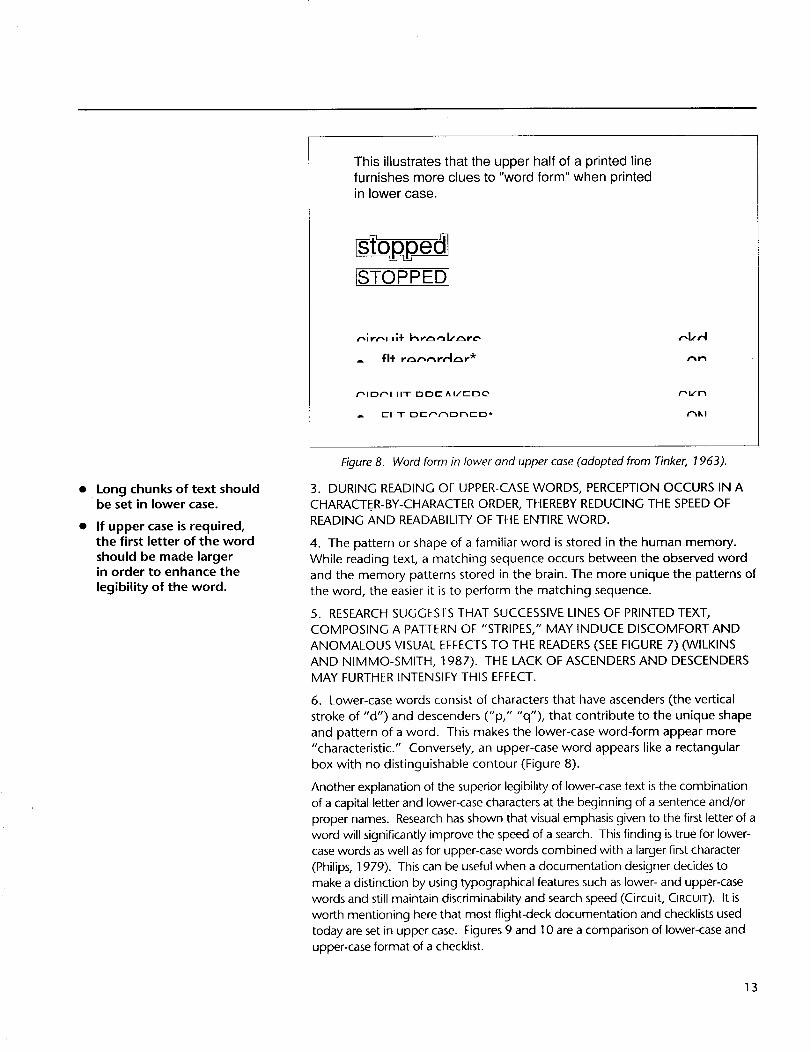
effect from the "pattern of stripes" (Figure 8). Wilkins and Nimmo-Smith
research (1987) suggests that "judgements of the clarity of text.., are critically
dependent on the spacing of the lines, more so than the overall density of
lettering on the page. As a result, the clarity of text can potentially be in-
creased at no extra cost by increasing the separation between the lines slightly
and decreasing slightly the mean horizontal spacing between the centers of
letters, within the limits of conventional typography" (p. 1 718). In addition,
the "opening" of an appropriate vertical space between lines reduces the
chance of optical bridging between adjacent lines--a critical factor for the
design of any list-type documentation. The recommended vertical space
between lines is 25-33 percent of the overall size of the font (Tinker, 1963;
Woodson, 1981). The horizontal space between characters should not be less
than one stroke width. As for word spacing, the gap between characters
should be large enough to allow grouping of words. This is achieved when
the word space is 25 percent of the overall height, and, again, not less than
one stroke width (Hartley, 1985; Woodson, 1981 ). Figures 15 and 16 are
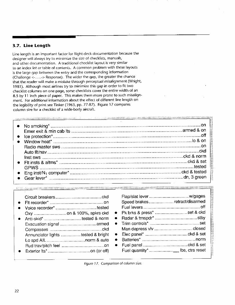
Line length is an important factor for flight-deck documentation because the
designer will always try to minimize the size of checklists, manuals,
and other documentation. A traditional checklist layout is very similar
to an index list or table of contents. A common problem with these layouts
is the large gap between the entry and the corresponding information
(Challenge <-. ..... -> Response). The wider the gap, the greater the chance
that the reader will make a mistake through perceptual misalignment (Wright,
1981). Although most airlines try to minimize this gap in order to fit two
checklist columns on one page, some checklists cover the entire width of an
8.5 by 11 inch piece of paper. This makes them more prone to such misalign-ment. For additional information about the effect of different line length on
the legibility of print see Tinker (1963, pp. 77-87). Figure 17 compares
column size for a checklist of a wide-body aircraft.
..................... ......
• No smoking* .................................................................................................................... onEmer exit & min cab Its ...................................................................................... armed & on
Lo spd AlL ............................... norm & auto
Rud trav/pitch feel .................................. on• Exterior Its*. ................................. on (or off)
Flap/slat lever ................................ w/gagesSpeed brakes .................... retract/disarmedFuel levers .............................................. off
• Pk brks & press*. ......................... set & ckd
• Radar & trnspdr*. ................................. stby• Trim controls*. ....................................... set
Man depress vlv ............................... closed
Flap/sEat lever ....................... w/gagesSpeed brakes .......... retract/disarmed
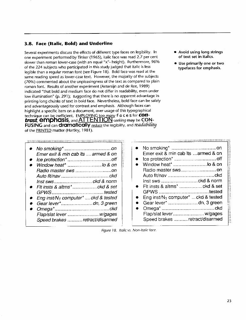
Figure 18. Italic vs. Non-Italic face.
23
Use black characters over a
white background for mostcockpit documentation.
3.9. Contrast
Woodson (1981) recommends the use of dark characters over a light back-
ground for normal illumination conditions. However, when the observer must
maintain a dark adaption condition, Woodson recommends a light character
over a dark background. To evaluate this condition, Tinker (1965) manipu-
lated and measured the following variables in a laboratory experiment: speed
of reading, subject's preference, eye movement measurements, recognizability
in the peripheral vision, and discriminability ata distance (when looking
straight ahead). For all the above dependent measures, the definite advantage
of black print on a white background was proven. Black over white is also
recognized at a larger angle from the line-of-sight. This is important in the
cockpit environment as documents cannot always be held in optimal viewing
angles. Nevertheless, white over black may provide a good method to
emphasize a title (such as a name of an emergency checklist).
• Avoid using white charactersover a black background in
normal line operations.However, if this is desired:
1. Use minimum amount oftext.
2. Use relatively large
typesize.
3. Use sans-serif to
minimize the loss of
legibility.3.10. Color Coding
A character and its background may differ in the amount of light they reflect
and color. Howett (1983) reported that when the character and its back-
ground are viewed from a short distance, more visual difference can be
reinforced by using large luminance differences than by employing large
chromatic (color) differences. In other words, the contrast is more important
than color differences in determining visibility of the characters. For example,
red and blue have considerable color contrast, yet very small luminancecontrast.
Some airlines use color coding to distinguish between different checklists in
the flight manual. Black print over white background is used for the normal
checklists and performance graphs, black over yellow for the abnormal
checklists, and black over light red for the emergency checklists. If one wishes
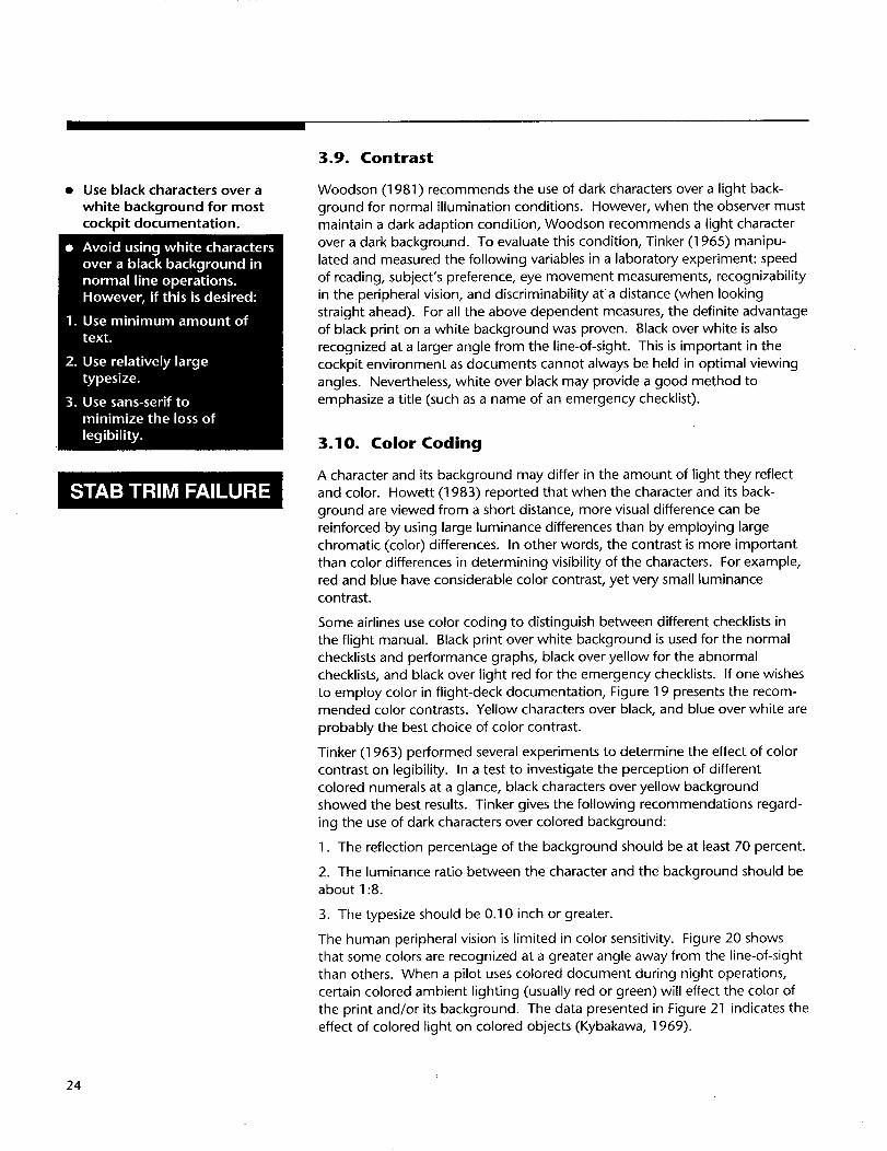
to employ color in flight-deck documentation, Figure 19 presents the recom-mended color contrasts. Yellow characters over black, and blue over white are
probably the best choice of color contrast.
Tinker (1963) performed several experiments to determine the effect of color
contrast on legibility. In a test to investigate the perception of different
colored numerals at a glance, black characters over yellow backgroundshowed the best results. Tinker gives the following recommendations regard-
ing the use of dark characters over colored background:
1. The reflection percentage of the background should be at least 70 percent.
2. The luminance ratio between the character and the background should beabout 1:8.
3. The typesize should be 0.10 inch or greater.
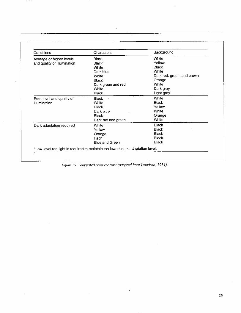
The human peripheral vision is limited in color sensitivity. Figure 20 shows
that some colors are recognized at a greater angle away from the line-of-sight
than others. When a pilot uses colored document during night operations,
certain colored ambient lighting (usually red or green) will effect the color of
the print and/or its background. The data presented in Figure 21 indicates the
effect of colored light on colored objects (Kybakawa, 1969).
Fit recorder*. ................................... on
Voice recorder*. ........................ tested
Oxy ................... on & 100%, spkrs ckd
Anti-skid*. ...................... tested & norm
Evacuation signal ...................... armed
Compasses ................................... ckd
Annunciator lights ......... tested & bright
Figure 22. The combined effect of several sub-optimal typographical conditions.
27
4. Several Environmental Conditions Influencing Reading
• Use anti-glare plastic tolaminate documents.
m
4.1. Glare
Several quick reference handbooks (QRH) and checklists used by several
airlines and some military units are laminated to protect them from wear and
tear. Others are inserted into a plastic casing and are pulled out only when a
new revision is issued. In choosing a plastic cover or lamination, an anti-glare
plastic that diffuses the light is recommended; otherwise, some rays from the
light source will be reflected to the pilot's eyes. This is commonly observed in
a dim cockpit when the pilot-light is directed to a document covered with
glossy plastic. Tinker (1963) conducted several experiments to find the effect
of surface glare on reading. He tested with three types of surface reflection
(22.9%, 85.8% and 95.1%). The results showed a significant reduction in
reading speed of the high glossy material (95.1% reflection). Furthermore,
75% of the subjects (sample size was 224), preferred the non-glossy paper.
Other types of glare are common during night operation. When the printed
matter is lit by a direct light (such as a flashlight or pilot-light) and the pilot's
eyes shift between the document and the dark window or panels, the eyesmust constantly readapt to different levels of luminance. Severe differences in
luminance between the document in-front of the observer (the critical vision)
and the surroundings (peripheral vision), can lead to a reduction in visual
discrimination, reading speed, and comfort. Furthermore, any strong lightsource (direct-sunlight, radar scope) that is not shielded from the field of
vision, will cause disability glare. As the light source gets closer to the line-of-
sight an increased reduction in visual efficiency will be experienced (Sanders
and McCormick, 1987).
4.2. Slope and Angular
Alignment for Reading
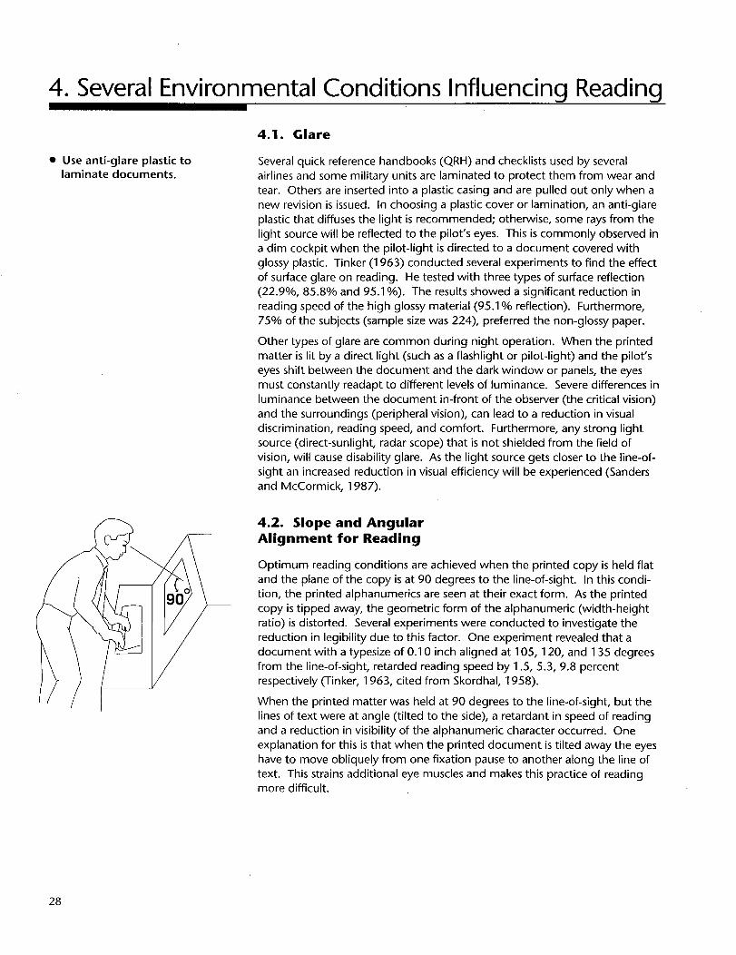
Optimum reading conditions are achieved when the printed copy is held flat
and the plane of the copy is at 90 degrees to the line-of-sight. In this condi-
tion, the printed alphanumerics are seen at their exact form. As the printed
copy is tipped away, the geometric form of the alphanumeric (width-height
ratio) is distorted. Several experiments were conducted to investigate the
reduction in legibility due to this factor. One experiment revealed that a
document with a typesize of 0.10 inch aligned at 105, 120, and 135 degrees
from the line-of-sight, retarded reading speed by 1.5, 5.3, 9.8 percent
respectively (Tinker, 1963, cited from Skordhal, 1958).
When the printed matter was held at 90 degrees to the line-of-sight, but the
lines of text were at angle (tilted to the side), a retardant in speed of reading
and a reduction in visibility of the alphanumeric character occurred. One
explanation for this is that when the printed document is tilted away the eyes
have to move obliquely from one fixation pause to another along the line of
text. This strains additional eye muscles and makes this practice of readingmore difficult.
28
Ensure that the quality of
the print and the paper iswell above normal
standards--poor quality of
print and paper will effectlegibility and readability.
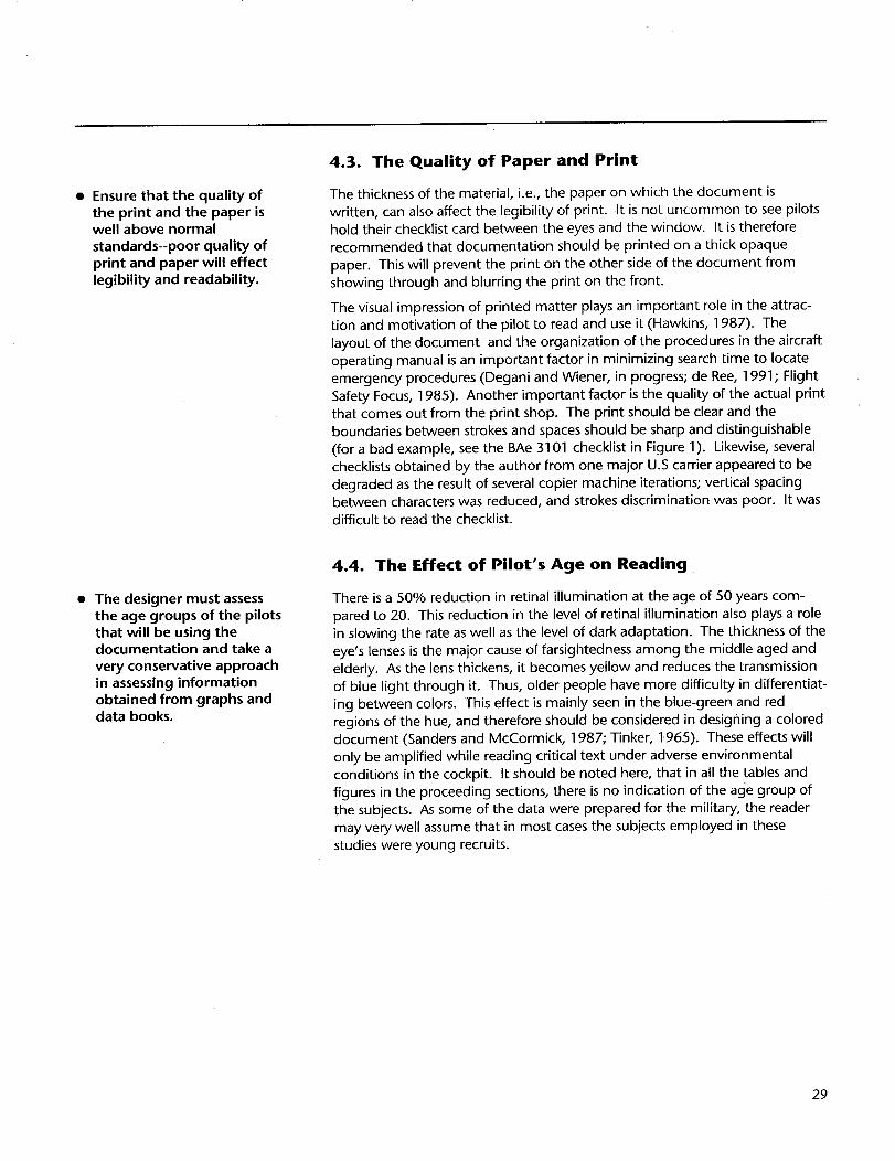
4.3. The Quality of Paper and Print
The thickness of the material, i.e., the paper on which the document is
written, can also affect the legibility of print. It is not uncommon to see pilots
hold their checklist card between the eyes and the window. It is therefore
recommended that documentation should be printed on a thick opaque
paper. This will prevent the print on the other side of the document from
showing through and blurring the print on the front.
The visual impression of printed matter plays an important role in the attrac-tion and motivation of the pilot to read and use it (Hawkins, 1987). The
layout of the document and the organization of the procedures in the aircraft
operating manual is an important factor in minimizing search time to locate
emergency procedures (Degani and Wiener, in progress; de Ree, 1991; Flight
Safety Focus, 1985). Another important factor is the quality of the actual print
that comes out from the print shop. The print should be clear and the
boundaries between strokes and spaces should be sharp and distinguishable
(for a bad example, see the BAe 3101 checklist in Figure 1). Likewise, several
checklists obtained by the author from one major U.S carrier appeared to be
degraded as the result of several copier machine iterations; vertical spacingbetween characters was reduced, and strokes discrimination was poor. It was
difficult to read the checklist.
• The designer must assessthe age groups of the pilotsthat will be using thedocumentation and take a
very conservative approachin assessing informationobtained from graphs anddata books.
4.4. The Effect of Pilot's Age on Reading
There is a 50% reduction in retinal illumination at the age of 50 years com-
pared to 20. This reduction in the level of retinal illumination also plays a role
in slowing the rate as well as the level of dark adaptation. The thickness of the
eye's lenses is the major cause of farsightedness among the middle aged and
elderly. As the lens thickens, it becomes yellow and reduces the transmission
of blue light through it. Thus, older people have more difficulty in differentiat-
ing between colors. This effect is mainly seen in the blue-green and red
regions of the hue, and therefore should be considered in designing a coloreddocument (Sanders and McCormick, 1987.; Tinker, 1.965). These effects will
only be amplified while reading critical text under adverse environmental
conditions in the cockpit. It should be noted here, that in all the tables and
figures in the proceeding sections, there is no indication of the age group of
the subjects. As some of the data were prepared for the military, the reader
may very well assume that in most cases the subjects employed in these
studies were young recruits.
29
5. Final Note
It will probably take a decade or two until most commercial airplanes in the
U.S. will fall into the category of "paper-less cockpits." These future cockpits
will have electronic checklists and electronic libraries containing most of the
information that is now in print (O'Lone, 1990, November 5; Riley, 1990).
Meanwhile, paper (manuals, checklists, dispatch papers) will dominate as a
form of presentation for this type of information on the flight deck. Neverthe-
less, there is almost no applied research on how to present flight-deck docu-mentation in the most efficent manner. The author believes that this is a clear
gauge to the lack of attention given to these devices by most high risk
industries (nuclear power, process control, military, maritime, and more). It is
puzzling to note this deficiency in flight-deck documentation of several majorU.S. airlines.
This report was intended to fill an existing "vacuum" of information concern-
ing typographical and graphical aspects of flight-deck documentation. The
author hopes that NTSB recommendation A-88-72, will lead human factors
specialists to investigate these issues and provide specific guidelines and
answers concerning optimal methods of presenting critical documentation.
Similar issues pertaining to computer generated displays such as electonic
checklist and electronic library systems should also be investigated. If proper
typographical and graphical display design will not be implemented, then it is
possible that the same problem of hard-to-read displays may perpetuate into
these new systems.
30
6. List of Design Recommendations
This section lists together all the design recommendations from the previoussub-sections. These recommendations are not specifications. They only form abaseline, which is based exclusively on the author's subjective interpretation ofthe data. Each recommendation should be carefully evaluated by the designerbased on the type of documentation, usage, criticality, and the target popula-tion. The recommendations are listed according to the order of sections in thisreport (sub-section numbers are given in parenthesis):
1. Sans-serif fonts are usually more legible than fonts with serifs.(3.2)
2. Avoid using a font that has characters that are too similar to oneanother, as this will reduce the legibility of the print. (3.2)
3. Avoid using dot matrix print for critical flight-deckdocumentation. (3.2)
4. Long chunks of text should be set in lower case. (3.3)
5. If upper case is required, the first letter of the word should bemade larger in order to enhance the legibility of the word. (3.3)
o When specifying font height, or accessing graphs to determinethe size of a lower-case character, the distinction between "x"
height and overall size should be made. (3.4)
. As a general recommendation, the "x" height of a font used forimportant flight-deck documentation should not be below 0.10inch. (3.4)
8. The recommended height-to-width ratio of a font that is viewedin front of the observer is 5:3. (3.5)
9. The vertical spacing between lines should not be smaller than 25-33% of the overall size of the font. (3.6)
10. The horizontal spacing between characters should be 25% of theoverall size and not less than one stroke width. (3.6)
11. Avoid using long strings of text set in italics. (3.8)
31
12. Useprimarilyoneor two typefacesfor emphasis.(3.8)
18. Ensurethat the qualityof the print and the paperiswell abovenormalstandards.Poorqualityof the print will effectlegibilityand readability.(4.3)
19. Thedesignermustassessthe agegroupsof the pilotsthat will be usingthe documentation,and takea veryconservativeapproachin assessinginformationobtainedfrom graphsand databooks.(4.4)
32
7. Acknowledgments
This work was supported by NASA research grant No. NCC2-327 from theAmes Research Center to the San Jose State University and grant No. NCC2-
377 to the University of Miami. The technical monitor was Everett A. Palmer.
The author wishes to thank Sheryl L. Chappell, Loren E. Gifford, Everett A.
Palmer, Leon Segal, and Barbara T. Sweet, of NASA Ames Research Center;Roweena Morrison of the Battelle/ASRS office; and Earl L. Wiener of the
University of Miami for reviewing this report and providing helpful comments.
Graphics provided by Kristen G. Bauersfeld, Tom J. Esposito, Loren E. Gifford,
Tom E. Nast, and Marie Westfall.
Note: This report was typeset in ITC Stone Sans 9 1/2 point type, x height -- 8
point, 12 point linespacing (leading), and output on a 1200 dot per inch laser
printer.
33
8. References
Antersijn, P., and de Ree, H. (1989). Readability improvement of emergencychecklists. Proceedings of the Fifth International Symposium on Aviation
Psychology (pp. 288-295). Columbus, OH: The Ohio State University.
O'Lone, R. G. (1990, November 5). Boeing picks subcontractors for 777's
structural and cockpit components. Aviation Week & Space
Technology, p. 34.
Philips, R. J. (1979). Why is lower-case better? Applied Ergonomics,
10(4),211-214.
Poulton, E. C. (1965). Letter differentiation and rate of comprehension in
reading. Journal of Applied Psychology, 49(5), 358-362.
35
Poulton,E.C.(1967).Searchingfornewspaperheadlinesprintedincapitalsoflower-caseletter.Journal of Applied Psychology, 51(5), 41 7-425.
Riley, J. (1990). The electronic library system (ELS): safety through efficient data
management. Honeywell, Inc: Author.
Ruffell Smith, H. P. (1979). A simulator study of the interaction of pilot workload
with errors, vigilance, and decisions (NASA technical memo 78482).
Moffett Field, CA: NASA Ames Research Center.
Sanders, M. S., and McCormick, F. J. (1987). Human factors in engineering and
design. (6th ed.). New York: McGraw-Hill.
Smith, F., Lott, D., and Cronnell, B. (1969). The effect of type size and case
alteration on word identification. American Journal of Psychology, 82,248-253.
Tinker, M. A. (1963). Legibility of print. Ames: Iowa State University Press.
Tinker, M. A. (1965). Bases for effective reading. Minneapolis: Univ. of
Minnesota press.
Turner, J. W., and H.untley M. S. (1991 ). The use and design of flight crewchecklists and manuals (DOT/FAA/AM-91/7). Cambridge, MA: National
Transportation System Center.
Wilkins, A. J., and Nimmo-Smith, M. I. (1987). The clarity and comfort of
printed text. Ergonomics, 30, (12), 1 705-1 720.
Woodson, W. E. (1981 ). Human factors design handbook. New York:McGraw-Hill.
Woodson, W. E., and Conover, D. W. (1964). Human engineering guide for
equipment designers (2 ed.). Los Angeles: University of California press.
Wright, P. R. (1981). Five skills technical writers need. IEEETransaction of
professional communication, PC-24(1), 10-16.
36
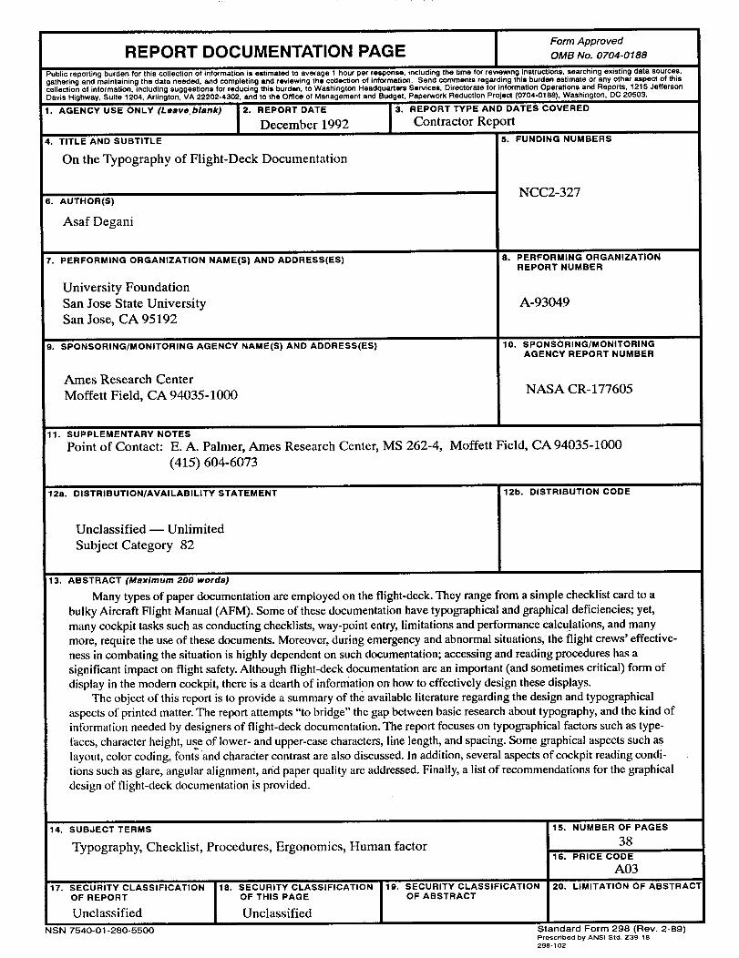
Form Approved
REPORT DOCUMENTATION PAGE OMBNo.0704-0188Public reporting burden for this collection of information is estimated to average t hour per response, including the time for reviewing instructions, searching existing data sources,gathering and maintaining the data needed, and completing and reviewing the collection of information. Send comments regarding this burden estimate or any other aspect of thiscollection of information, including suggestions for reducing this burden, to Washington Headquarters Services, Directorate for information Operations and Reports, 1215 JeffersonDavis Highway, Suite 1204, Arlington, VA 22202-4302, and to the Office of Management and Budget, Paperwork Reduction Project (0704-0188), Washington, DC 20503.
1. AGENCY USE ONLY (Leave, blank) I 2. REPORT DATE
I December 1992
4. TITLE AND SUBTITLE
On the Typography of Flight-Deck Documentation
6. AUTHOR(S)
Asaf Degani
7. PERFORMING ORGANIZATION NAME(S) AND ADDRESS(ES)
University Foundation
San Jose State University
San Jose, CA 95192
9. SPONSORING/MONITORING AGENCY NAME(S) AND ADDRESS(ES)
Ames Research Center
Moffett Field, CA 94035-1000
3. REPORT TYPE AND DATES COVERED
Contractor Report
5. FUNDING NUMBERS
NCC2-327
8. PERFORMING ORGANIZATIONREPORT NUMBER
A-93049
10. SPONSORING/MONITORINGAGENCY REPORT NUMBER
NASA CR- 177605
11. SUPPLEMENTARY NOTES
Point of Contact: E.A. Palmer, Ames Research Center, MS 262-4, Moffett Field, CA 94035-1000
(415) 604-6073
12a. DISTRIBUTION/AVAILABILITY STATEMENT
Unclassified -- Unlimited
Subject Category 82
12b. DISTRIBUTION CODE
13. ABSTRACT (Maximum 200 words)
Many types of paper documentation are employed on the flight-deck. They range from a simple checklist card to a
bulky Aircraft Flight Manual (AFM). Some of these documentation have typographical and graphical deficiencies; yet,
many cockpit tasks such as conducting checklists, way-point entry, limitations and performance calculations, and many
more, require the use of these documents. Moreover, during emergency and abnormal situations, the flight crews' effective-
ness in combating the situation is highly dependent on such documentation; accessing and reading procedures has a
significant impact on flight safety. Although flight-deck documentation are an important (and sometimes critical) form of
display in the modern cockpit, there is a dearth of information on how to effectively design these displays.
The object of this report is to provide a summary of the available literature regarding the design and typographical
aspects of printed matter. The report attempts "to bridge" the gap between basic research about typography, and the kind of
information needed by designers of flight-deck documentation. The report focuses on typographical factors such as type-
faces, character height, use of lower- and upper-case characters, line length, and spacing. Some graphical aspects such aslayout, color coding, fonts and character contrast are also discussed. In addition, several aspeCtS of cockpit reading condi-
tions such as glare, angular alignment, and paper quality are addressed. Finally, a list of recommendations for the graphical
design of flight-deck documentation is provided.
14. SUBJECT TERMS
Typography, Checklist, Procedures, Ergonomics, Human factor
17. SECURITY CLASSIFICATIONOF REPORT
Unclassified
NSN 7540-01-280-5500
i18. SECURITY CLASSIFICATION
OF THIS PAGE
Unclassified
19. SECURITY CLASSIFICATIONOF ABSTRACT
15. NUMBER OF PAGES
38
16. PRICE CODE
A03
20. LIMITATION OF ABSTRACl
Standard Form 298 (Rev. 2-89)Prescribed by ANSI Std. Z39-18