40
NASA CONTRACTOR REPORT # 177605 ON THE TYPOGRAPHY OF FLIGHT-DECK DOCUMENTATION ASAF DEGANI CONTRACT NCC2-327 December, 1992 National Aeronautics and Space Administration
38
NASA CONTRACTOR REPORT # 177605
ON THE TYPOGRAPHY OFFLIGHT-DECK DOCUMENTATIONASAF DEGANI
CONTRACT NCC2-327December, 1992
National Aeronautics andSpace Administration

39
NASA CONTRACTOR REPORT # 177605
ON THE TYPOGRAPHY OFFLIGHT-DECK DOCUMENTATIONASAF DEGANI
SAN JOSE STATEUNIVERSITY FOUNDATIONSAN JOSE, CALIFORNIA
Prepared forAmes Research CenterCONTRACT NCC2-327December, 1992
National Aeronautics andSpace Administration
Ames Research CenterMoffett Field, California 94035-1000
40
Contents
Summary
1. Background
2. Objectives and Scope
3. Typography
3.1. Principles of typography
3.2. Typeface (Fonts)
3.3. Lower-case vs. UPPER-CASE Characters
3.4. Font height (typesize)
3.5. Stroke width and height-to-width ratio
3.6. Horizontal and vertical spacing
3.7. Line length
3.8. Face (italic, bold) and underline
3.9. Contrast
3.10. Color coding
3.11. The commutative effect of improper typography
4. Several EnvironmentalConditions Influencing Reading
4.1. Glare
4.2. Slope and angular alignment for reading
4.3. The quality of paper and print
4.4. The effect of pilot’s age on reading
5. Final Note
6. List of Design Recommendations
7. Acknowledgments
8. References
iii
1
Summary
Many types of paper documentation are employed on the flight-deck. Theyrange from a simple checklist card to a bulky Aircraft Flight Manual (AFM).Some of these documentation have typographical and graphical deficien-cies; yet, many cockpit tasks such as conducting checklists, way-point entry,limitations and performance calculations, and many more, require the use ofthese documents. Moreover, during emergency and abnormal situations,the flight crews’ effectiveness in combating the situation is highly depen-dent on such documentation; accessing and reading procedures has asignificant impact on flight safety. Although flight-deck documentation arean important (and sometimes critical) form of display in the moderncockpit, there is a dearth of information on how to effectively design thesedisplays.
The object of this report is to provide a summary of the available literatureregarding the design and typographical aspects of printed matter. Thereport attempts “to bridge” the gap between basic research about typogra-phy, and the kind of information needed by designers of flight-deck docu-mentation. The report focuses on typographical factors such as typefaces,character height, use of lower- and upper-case characters, line length, andspacing. Some graphical aspects such as layout, color coding, fonts andcharacter contrast are also discussed. In addition, several aspects of cockpitreading conditions such as glare, angular alignment, and paper quality areaddressed. Finally, a list of recommendations for the graphical design offlight-deck documentation is provided.

2
On May 26, 1987, at 16:45 Central Daylight Time, an Air New Orleans BAe-3101, departed from runway 19 at New Orleans International Airport on ascheduled commuter flight to Eglin Air Force Base, Florida. Flight 962 neverreached Eglin AFB that day, nor any altitude above 200 feet. The flight crewfelt a severe yawing motion and engine torque fluctuations. The captainproceeded to make an emergency landing on the overrun of runway 19.The aircraft rolled off the overrun, crossed an adjoining highway, struckseveral vehicles, and came to rest on the far side of the highway. TheNational Transportation Safety Board (NTSB) concluded that “the engineRPM levers were either advanced to a position less than full forward or theywere not advanced at all before takeoff, indicating a lack of checklistdiscipline on the part of the aircrew” (NTSB, 1988, p. 24). The report alsostated that,
The typeface on the Air New Orleans’ checklist is 57 percent smaller thanthat recommended by human engineering criteria. This smaller typefacereduces the legibility of print even under optimum conditions. Althoughthere was no evidence that checklist legibility was a factor in this accident,the Safety Board believes that under other operational circumstances, thisdeficiency could compromise the intended purpose of this device.Therefore, the Safety Board believes the FAA should take action to verifythat aircraft checklists are designed to comply with accepted humanengineering criteria (p. 22).
The NTSB made a recommendation to the FAA to “issue an Advisory Circularto commercial operators recommending the use of a procedural checklistthat incorporates human engineering design criteria for size and style ofprint” (NTSB A-88-72). Figure 1 is a copy of the checklist used by the flightcrews of Air New Orleans Flight 962 (note that the poor quality of thechecklist in figure 1 is due to several reproductions of the original checklistused by the crew of Flight 962).
On August 19, 1980, a Saudi Arabian Lockheed L-1011 was returning toRiyadh Airport (Saudi Arabia), after warnings in the cockpit indicated smokein the aft cargo compartment. The crew was searching for the appropriateemergency procedure in their flight documentation. The accident reportstated that,
About 3 minutes were spent by the crew looking for the aft cargo smokewarning procedure. Evidence indicated this difficulty was due to a split ofthe Emergency and Abnormal procedures into Emergencies, Abnormal,and Additional [sections]. The crew apparently believed that the proce-dure was in the Abnormal section when it was actually in the Emergencysection.... (Flight Safety Focus, 1985)
This, and several other factors led to a horrific accident in which 287passengers and 14 crew members died of fire and toxic smoke inhalation.
1. Background

3
Figure 1. Air New Orleans, BAe 3101 checklist (adopted from NTSB, 1988).
4
Documents, manuals, checklists and many other paper forms are used in thecockpit. Ruffell Smith (1979), reported that excluding aircraft flight manu-als, the amount of paperwork needed for a flight from Washington D.C. viaNew York to London, had a single side area of 200 square feet (Figure 2).One recent report submitted to NASA’s Aviation Safety Reporting System(ASRS) speaks to this issue:
Both the copilot and I wrote our flight clearance, which includedthe KIRN 2D departure, as we received it from clearance delivery....I briefed the crew on the departure, including emergency items,and read aloud the KIRN 2E departure procedure. During our de-parture, radar [ATC] asked why we had turned early.... Radar re-minded us that we were to fly the KIRN 2D departure of thisflight.... I and other pilots I know are concerned about the amountof information presented to us for the operation of our flights. Forthe flight prompting this report we had over 30 feet [italic added] ofcomputer printout of information for this flight including 30 naviga-tion waypoints, later to be revised enroute. Together, the two air-ports at Paris (Orly and Charles De Gaulle) have procedures andinfo that make up a small volume of 89 pages. The 25 pound flightbag I carry contains 5 volumes of information in a constant state ofrevision. Too much information could cause important items to beoverlooked--lost in the maze of print. Important items of informa-tion and procedures should be concise and printed as to be easy toread--especially at night. (ASRS Report No. 157620)
Although flight-deck documentation and written procedures are an inherentpart of flight operation, there is a drought of research regarding this aspectof cockpit activity. The topic of procedural design and its associated displayhas long been neglected by the human factors profession; partly becausehuman factors research has traditionally focused on the hardware interfacesin the cockpit (controls, displays, etc.). Nevertheless, flight-deck documen-tation are an integral part of the interfaces in the cockpit—specifying anddictating the actions by which the pilot is expected to interact with themachine.
In a recent study, Degani and Wiener (1990) studied the human factorsaspect of checklist procedures. While conducting that study, the authorsencountered many flight-deck documentation, such as flight plans, fuelsheets, manifests, dispatch material, that were poorly presented (graphicallyand typographically). Those documentation were not only difficult tofollow, but also difficult to read and comprehend. Those findings promptedthis work.

5
Figure 2. Paperwork needed for a flight from Washington, D. C., to London (adopted from Ruffell Smith, 1979).

6
The intent of this report is to provide a literature review of the basic researchon typography and suggest compatible approaches for designing flight-deckdocumentation. The report focuses on several typographical and environ-mental factors that affect the ability of the pilot to use, read, and compre-hend flight-deck documentation and written procedures. The efficiency andaccuracy of reading checklists, maps, airport charts, flight plans, fuel slips,manifests, etc., depends in part on typographical and graphical factors.Moreover, during emergency or abnormal conditions, the flight crewefficiency in accessing, reading, comprehending, and executing procedureshas a significant impact on flight safety (de Ree, 1991; Degani and Wiener,1991).
There is very little experimental data in the literature regarding reading andusing printed text in the airline cockpit. Therefore, the data reported in thisstudy is based on laboratory studies. These experiments were not conducted ina cockpit; the majority were conducted while the subjects (usually collegestudents), were seated by a desk and the printed matter was lighted withnormal room lighting.
This report attempts to “bridge” this gap between empirical research and“the real world” by providing a summary of the basic research findings tothe documentation designer. Hence, the information presented here onlyserves to provide a baseline. The designer should make an initial assump-tion from the data and the author’s recommendations, then validate thedesign in an appropriate flight simulator using his/her own companydocumentation and a representative sample of the pilot population. For anexample of this process, conducted for a major international airline, see deRee (1991).
Although it is beyond the scope of this report to discuss concepts of humanperception, the author would like to raise one “warning flag” regarding thedata in this report. I believe that information from data books and graphsregarding human sensing of physical energies may be insufficient. While it istrue that the data reported in the literature are well established, it is alsovery important to realize that the data cannot be used as a simple look-up
2. Objectives and Scope

7
table to predict what will happen when an observer is confronted by aparticular display (in this case a printed matter). The specification of aprinted document in terms of physics can ensure that the information isavailable. However, whether that information is perceived accurately by theobserver also depends on how she/he processes that information. What isperceived by the observer is a combination of [1] what the data books detailabout human sensory detection and [2] the observer’s strategies of informa-tion processing (Foley and Moray, 1987).
An example of the above combination in human perception is the Delta AirLines Flight 1141 accident. The aircraft, a B-727, crashed shortly after liftingoff from runway 18L at Dallas-Fort Worth International Airport, following ano-flap/no-slat takeoff. The NTSB concluded that “the flight crew did notextend the airplane’s flaps or slats for takeoff” (NTSB, 1989, p. 92). How-ever, the cockpit voice recorder indicated that in response to the secondofficer prompt “flaps,” the first officer responded “fifteen, fifteen, greenlight.” Presumably, the first officer’s response is based on a visual check ofthe needle position on the inboard and outboard flap/slat position indica-tors (“fifteen, fifteen”) and illumination of the leading edge flaps and slatsindicator light (“green light”). However, all these indicators displayedsomething very different from what the first officer responded (the flap/slatgauges indicated zero). In this case, as in many other reported incidents(ASRS, 1987, 1989), the active strategies of information processing of thefirst officer played a dominant role in determining what he actually per-ceived. Hence, the mere existence of the display and its information is notpredictive of what the observer will perceive.
Effective appearance of flight-deck documentation is affected by the correctgraphical presentation and the environmental conditions that influencereading in the cockpit. These two factors should agree with the uniquephysical condition of the cockpit, the capabilities and limitations of thehuman operator, and the method of using the documentation as dictated inthe standard operating procedures (Degani and Wiener, 1991; 1994).Some of these considerations will be discussed in the following sections.
8
3. Typography
3.1 Principles of Typography
Typography is defined by the Webster’s dictionary as “the arrangement,style, or general appearance of matter printed from type.” In order to selectand use the appropriate typography, there are two factors that the docu-ment designer should consider.
Legibility of Print (Discriminability). This characteristic of an alphanumericenables the observer to quickly and positively identify it from all other lettersand characters. Legibility depends on stroke width, form of characters,illumination on the page, and the contrast between the characters and thebackground.
Readability. This quality of the word or text allows for rapid recognition ofa single word, word-groups, abbreviations, and symbols. Readabilitydepends on the spacing of individual characters, spacing of words, spacingof lines, and the ratio between characters area to background area (Heglin,1973; Sanders and McCormick, 1987). These criteria are important for allprinted matter; however, they are crucial for the typographical design offlight-deck documentation. Reading conditions in the airline cockpit ischaracterized by some of the following:
1. Non-optimal viewing conditions (during night operations, dimlighting, and direct sunlight);
2. Fast and frequent changes of accommodation between far- andnear-vision (looking for other traffic and then reading an approachplate);
3. Interruptions and distractions while following procedural sequencesfrom manuals and checklists (ATC communications, flight attendants,company calls, etc.);
4. Several age groups with different viewing abilities within the pilotpopulation.
The following sections will detail some of the basic research findingsregarding aspects of typography and graphical design. Some of theseaspects will be illustrated here using a checklist of a wide-body airliner.Nevertheless, the reader is cautioned that these basic research findings arenot specific for flight-deck documentation. Therefore, the author’s recom-mendations provided at the end of each sub-section, cannot be used asspecifications; each recommendation must be evaluated by the designer forhis/her unique application.

9
DESCENDER
SERIFASCENDERS
COUNTERS
LOWER CASE LETTERS
BASELINE
X-HEIGHT, OR BODY
Figure 3. Letterforms (adopted from Craig, 1980).
UPPERCASELETTER
ROMAN UPPERCASE AND LOWERCASE LETTERFORMS
3.2. Typeface (Fonts)
Typefaces or fonts refer to the style of the alphanumeric used in printing.There are over 2300 typefaces available today. Two major groups of fontsare applicable for use on the flight deck: roman and sans-serif. Roman iswell known since it is used daily in newspapers, journals, and books. Sans-serif is a contemporary font that does not include the little strokes (serifs)that project horizontally from the top or bottom of a main stroke (Figure 3).
Several researchers have reported that when other typographical factors arecontrolled, sans-serif fonts are more legible than roman. The premisebehind this statement is that absence of serifs presents a more simple andclean typeface, and therefore improves the legibility of the print (Cheethamand Grimbly, 1964; Heglin, 1973; Poulton, 1965). Serifs disrupt characterdiscrimination and may add uneven appearance to the shape of strokesand characters. However, it is also evident that they somewhat aid thehorizontal movement of the eye along the printed line—the serifs at thetop and bottom of a character create a “railroad track” for the eye tofollow along the line of print. Therefore, when using a typeface withoutserifs, adequate spacing between the lines of print should be used in orderto prevent the eye from bridging (slipping) to the adjoining line (Craig,1980). The designer should safeguard against this factor as it may lead toskipping a line while reading a long list.
Alphabet
10
HELVETICAMany types of paper documentation are employed on theflight deck. They range from a simple checklist card to a
TIMESMany types of paper documentation are employed on the flight
deck. They range from a simple checklist card to a
PALATINOMany types of paper documentation are employed on theflight deck. They range from a simple checklist card to a
FUTURAMany types of paper documentation are employed on the flight
deck. They range from a simple checklist card to a MELIOR
Many types of paper documentation are employed on theflight deck. They range from a simple checklist card to a
OPTIMAMany types of paper documentation are employed on theflight deck. They range from a simple checklist card to a
GARAMONDMany types of paper documentation are employed on theflight deck. They range from a simple checklist card to a
Among the sans-serif group there are many different fonts from which toselect. Pulton (1965) compared the level of reading comprehension amongfive different fonts (three different sans-serifs and two fonts with serifs). Hefound a significantly higher level of comprehension while subjects wereusing a sans-serif font called Gill-Medium. This font was also ranked first inits level of character discrimination. A careful examination of Figure 4 willindicate that in contrast to the Gill-Medium font, the letters of the othersans-serif fonts are characterized by several “family resemblances.” Thisresults in similar appearance and may reduce legibility (compare the “O”and “C”). Likewise, most of the modern sans-serif fonts such as Futura,Avant Garde, and Helvetica also include characters that are too similar toone another, and therefore difficult to distinguish. The sources of similaritybetween the characters of modern sans-serif fonts are:
1. The standardized or modular appearance of the letters (“P,” “R”).
2. The effect of mirror images between the upper and lower part of thecharacter (“E,” “B,” “D”).
3. The use of equal radius for different letters (“G,” “O,” “C”)(Craig, 1980; Cheetham and Grimbly, 1964).
Figure 4. Comparison of several fonts (adopted from Poulton, 1965).
Gill Medium
ABCDEFGHIJKLMNOPQRSTUVWXYZ
abcdefghijklmnopqrstuvwxyz

11
Sans-serif fonts areusually more legible thanfonts with serifs.
Avoid using a font thathas characters that aretoo similar to oneanother, as this will reducethe legibility of the print.
Avoid using dot matrixprint for critical flight-deck documentation.
•
•
•
Figure 5. Serifs vs. sans-serif fonts.
Circuit breakers ....................................ckd
• Flt recorder* .......................................... on
• Voice recorder* ............................... testedOxy................................ on & 100%, spkrs
• Anti-skid* ............................. tested & normEvacuation signal ............................ armedCompasses ..........................................ckdLo spd AIL ............................. norm & autoRud trav/pitch feel ................................. on
• Exterior lts* ............................... on (or off)Servo controls ....................................... on
Circuit breakers ...................................... ckd
• Flt recorder* ............................................. on
• Voice recorder* ................................... testedOxy .................................. on & 100%, spkrs
• Anti-skid* .............................. tested & normEvacuation signal ............................... armedCompasses .............................................. ckdLo spd AIL .............................. norm & autoRud trav/pitch feel .................................... on
• Exterior lts* ................................. on (or off)Servo controls ........................................... on
Figure 6. Dot-matrix vs. laserwriter printing.
• Eng start panel* .............. crank/start abortFire handles .......................................... up
• No smoking* ......................................... onEmer exit & min cab lts .......... armed & on
• Ice protection* ....................................... off
• Window heat* ................................. lo & onRadio master sws ................................. onAuto flt/nav ...........................................ckdInst sws ................................... ckd & norm
• Flt insts & altms* ........................ ckd & setGPWS ............................................. tested
It is interesting to note here that most human factors design handbooksadvocate the use of sans-serif fonts—emphasizing the characteristics ofmodern sans-serif fonts as clean and simple fonts. Neglecting, however, thesub-optimal effect of their over-modularity on the legibility and readability.Figure 5 compares sans-serif and serif fonts for a checklist of a wide-bodyaircraft.
Another font related problem is the use of dot matrix printers. Severalairlines employ such printers for documents that are produced by dispatchagents (e.g., flight plan, fuel sheet, and cargo/passenger manifest). Thisfont is very modular, especially in upper case letters. In addition, it isdifficult to discriminate between characters because of the dot constructionthat make up a character and the uneven spacing between dots (see Figure6). There are also instances in which the print is almost unreadable becauseof an old ribbon in the printer.

12
Figure 7. Pattern of stripes (adopted from Wilkens and Nimmo-Smith, 1987).
3.3. Lower-case vs. UPPER-CASE Characters
There is almost a consensus among researchers that, when other factors arecontrolled, lower-case characters are more legible than upper-case (Hartley,1981; Philips, 1979; Tinker, 1963). Poulton (1967) performed an experi-ment to determine the difference in readers’ attention between upper andlower-case in newspaper headings. He reports that lower case headingswere located faster than upper case heading. Tinker (1963) tested lower-case and upper-case fonts for legibility and pleasingness. He reported thatlower case was read faster and ranked higher in pleasingness.
There are several factors that contribute to the reduced legibility of upper-case words compared with lower-case:
1. Most printed material that we read and use in everyday life is set in lowercase.
2. Readability of lower case words is superior; words set in lower-case areperceived at a greater distance, suggesting that the “total word form” andlegibility of the elements is important while perceiving words set in lower-case(Tinker, 1963; Smith, Lott, and Cronnell, 1969). Note, however, that whenresearchers compared the legibility of individual characters, upper-case charac-ters were perceivable at a greater distance.
13
•CIRCUIT BREAKERS .............................................. CKD
FLT RECORDER* ............................................... ON
circuit breakers ..................................ckdflt recorder* .................................... on
Long chunks of text shouldbe set in lower case.
If upper case is required,the first letter of the wordshould be made largerin order to enhance thelegibility of the word.
3. DURING READING OF UPPER-CASE WORDS, PERCEPTION OCCURS IN ACHARACTER-BY-CHARACTER ORDER, THEREBY REDUCING THE SPEED OFREADING AND READABILITY OF THE ENTIRE WORD.
4. The pattern or shape of a familiar word is stored in the human memory.While reading text, a matching sequence occurs between the observed wordand the memory patterns stored in the brain. The more unique the patternsof the word, the easier it is to perform the matching sequence.
5. RESEARCH SUGGESTS THAT SUCCESSIVE LINES OF PRINTED TEXT,COMPOSING A PATTERN OF “STRIPES,” MAY INDUCE DISCOMFORT ANDANOMALOUS VISUAL EFFECTS TO THE READERS (SEE FIGURE 7) (WILKINSAND NIMMO-SMITH, 1987). THE LACK OF ASCENDERS AND DESCENDERSMAY FURTHER INTENSIFY THIS EFFECT.
6. Lower-case words consist of characters that have ascenders (the verticalstroke of “d”) and descenders (“p,” “q”), that contribute to the uniqueshape and pattern of a word. This makes the lower-case word-form appearmore “characteristic.” Conversely, an upper-case word appears like arectangular box with no distinguishable contour (Figure 8).
Another explanation of the superior legibility of lower-case text is the combina-tion of a capital letter and lower-case characters at the beginning of a sentenceand/or proper names. Research has shown that visual emphasis given to thefirst letter of a word will significantly improve the speed of a search. This findingis true for lower-case words as well as for upper-case words combined with alarger first character (Philips, 1979). This can be useful when a documentationdesigner decides to make a distinction by using typographical features such aslower- and upper-case words and still maintain discriminability and searchspeed (Circuit, CIRCUIT). It is worth mentioning here that most flight-deckdocumentation and checklists used today are set in upper case. Figures 9 and10 are a comparison of lower-case and upper-case format of a checklist.
••
•
Figure 8. Word form in lower and upper case (adopted from Tinker, 1963).
This illustrates that the upper half of a printed linefurnishes more clues to “word form” when printedin lower case.
stoppedSTOPPED
14
BEFORE STARTING ENGINES
CIRCUIT BREAKERS ............................................ CKD• FLT RECORDER* .................................................... ON• VOICE RECORDER* ...................................... TESTED
OXY ..................................... ON & 100%, SPKRS CKD• ANTI-SKID* ...................................... TESTED & NORM
EVACUATION SIGNAL.................................... ARMEDCOMPASSES ........................................................ CKDANNUNCIATOR LIGHTS .............. TESTED & BRIGHTLO SPD AIL.......................................... NORM & AUTORUD TRAV/PITCH FEEL ......................................... ON
• EXTERIOR LTS* ..................................... ON (OR OFF)SERVO CONTROLS................................................ ON
• ENG START PANEL* ............ CRANK/START ABORTFIRE HANDLES ........................................................ up
• NO SMOKING* ........................................................ ONEMER EXIT & MIN CAB LTS ..................ARMED & ON
• ICE PROTECTION* ............................................... OFF• WINDOW HEAT* ............................................ LO & ON
RADIO MASTER SWS............................................. ONAUTO FLT/NAV ..................................................... CKDINST SWS .............................................. CKD & NORM
• FLT INSTS & ALTMS* ............................... CKD & SETGPWS ............................................................. TESTED
• ENG INST/N1 COMPUTER* .............. CKD & TESTED• GEAR LEVER* ....................................... DN, 3 GREEN
OMEGA* ................................................................ CKDFLAP/SLAT LEVER ..................................... W/GAGESSPEED BRAKES ..................... RETRACT/DISARMEDFUEL LEVERS ....................................................... OFF
• PK BRKS & PRESS*.................................. SET & CKD• RADAR & TRNSPDR* ......................................... STBY• TRIM CONTROLS* ................................................ SET
MAN DEPRESS VLV ......................................CLOSED• ELEC PANEL*............................................ CKD & SET• BATTERIES* ...................................................... NORM
FUEL PANEL ............................................. CKD & SET• FUEL QUANTITY* ................... LBS, CTRS RESET• HYD PANEL* ............................................. CKD & SET
OIL QUANTITY* ............................................... QTS• APU* ...................................................................... CKD
FIRE & SMOKE DETECTION......................... TESTED
• AIR COND & PRESS*................................ CKD & SET
• RAM AIR INLET SWITCH* ................... NORM CLOSE
• VENT PNL* ................................... CKD/BLOWER OFFTEST PANEL .......................................... NORM & OFFPROBE HEAT ............................................ CKD & OFF
Figure 9. Checklist of a wide-bodyairplane set in upper-case.

15
Before Starting Engines
Circuit breakers ................................... ckd
• Flt recorder* .......................................... on
• Voice recorder* ............................... testedOxy ......................... on & 100%, spkrs ckd
• Anti-skid* ............................ tested & normEvacuation signal ............................armedCompasses ......................................... ckdAnnunciator lights.............. tested & brightLo spd AIL ............................. norm & autoRud trav/pitch feel ................................. on
• Exterior lts* ................................ on (or off)Servo controls ....................................... on
• Eng start panel*............... crank/start abortFire handles .......................................... up
• No smoking* .......................................... onEmer exit & min cab lts .......... armed & on
• Ice protection* ....................................... off
• Window heat* ................................. lo & onRadio master sws.................................. onAuto flt/nav .......................................... ckdInst sws ...................................ckd & norm
• Flt insts & altms* ........................ ckd & setGPWS ............................................. tested
• Eng inst/N1 computer* .......... ckd & tested
• Gear lever* ............................. dn, 3 green
• Omega* ............................................... ckdFlap/slat lever .............................. w/gagesSpeed brakes .................. retract/disarmedFuel levers ............................................. off
• Pk brks & press*......................... set & ckd
• Radar & trnspdr* ................................ stby
• Trim controls* ....................................... setMan depress vlv ............................. closed
• Elec panel* ................................. ckd & set
• Batteries* ...........................................norm
• Fuel panel .................................. ckd & setFuel quantity* ................ lbs, ctrs reset
• Hyd panel* .................................. ckd & set
• Oil quantity* .................................... qts
• APU* ................................................... ckd
Figure 10. Checklist of a wide-bodyairplane set in lower-case.

16
3.4 Font Height (Typesize)
Measurement. When specifying the height of a font and spacing (bothvertically and horizontally), the designer should be aware that there areseveral scales and methods of measurement. The traditional printer’s“point” used for typesize-height equals 1/100 of an inch; however, when itis used to measure distance between lines, words, etc., a point is approxi-mately equal to 1/72 of an inch. This can be confusing. Another area ofconfusion is the method of measurement. Lower-case letters can be mea-sured in two different methods. One is the overall size of the character,measured from the bottom of the descender (p) to the top of the ascender(d). The other is the actual height of a character that lacks ascenders ordescenders (“o,” “r,” “x”); this measurement is called the “x height” of afont. The designer should also note that while a “point” on a Macintoshcomputer is exactly 1/72 of an inch, a “point” on a professional typesetter isslightly less than 1/72 of an inch (L. E. Gifford, personal communication,February, 1992).
Font height vs. viewing condition. Most of the information in the literatureregarding font height is presented in graphs. These graphs usually indicatethe relationship between character height, viewing distance, illuminationlevel, stroke width, and visual acuity (Woodson, 1981; Howett, 1983). Thegraph in Figure 11 depicts the recommended relationship between charac-ter height and viewing distance for different illumination levels and alpha-numeric status (static, dynamic). Although this graph was designed forlabels on instrument panels, it also can be used as a guide for character size(Woodson and Conover, 1964). When using this graph to determine theheight of a lower-case character, the distinction between the overall typesizeand “x” height should be considered.
CIRCUIT BREAKERS CKD• Flt recorder* ............ on• Voice recorder* ...........
Oxy ..............................• Anti-skid* .....................
Evacuation signal ..........
CIRCUIT BREAKERS ....• Flt recorder* .......... on• Voice recorder* .........
Oxy ...........................• Anti-skid* ...................
Evacuation signal .......
12 Point Helvetica(x height = .125 ;1 point = 1/100 of an inch)
CIRCUIT BREAKERS .... CKD• Flt recorder* ................. on• Voice recorder* ................
Oxy ..................................• Anti-skid* .........................
Evacuation signal .............Annunciator lights . tested
11 Point Helvetica(x height = .110 ;1 point = 1/100 of an inch)
10 Point Helvetica(x height = .094 ;1 point = 1/100 of an inch)
CIRCUIT BREAKERS ....... CKD• Flt recorder* ................... on• Voice recorder* ..................
Oxy ....................................• Anti-skid* ...........................
Evacuation signal ..............Annunciator lights .... testedLo spd AIL ..... norm & auto
9 Point Helvetica(x height = .081 ;1 point = 1/100 of an inch)

17
Two variables are manipulated in Figure 11: viewing distance and illumina-tion levels. The normal reading distance is about 16-24 inches from the eye.However, this is dependent on cockpit layout, company procedures, andpersonal preference. It is not uncommon to see checklists and approachplates mounted on the yoke clip, placed on the forward panel, or on a clipbelow the side window. In all these cases the distance from the eye to theprint may vary considerably. The other variable, luminance, is defined asthe amount of light (per unit) reflected from the surface. This unit ismeasured in foot lambert (fL). The minimum recommended level ofluminance in Boeing’s cockpits is 0.2 fL. (R. J. Braune, personal communi-cation, January 1989). Thus, for these cockpits the entry to the graph infigure 11, will be on the dashed line.
In addition to the above, other graphs are available to determine characterheight. These graphs are presented in Figures 12 and 13. The designershould be conservative in using the data from these graphs since no infor-mation regarding the subject group is presented. Furthermore, there are noavailable data to indicate whether the information presented in thesegraphs (Kubakawa, 1969; Sanders and McCormick, 1987; Woodson, 1981),was constructed from experimental data or simply by calculations of thevisual angle.
Figure 11. Letter height (adopted from Woodson et. al. 1964).
.8
.7
.6
.5
.4
.3
.2
.1
0 20 40 60 80 100 120 140 160 180 200 220 240Viewing distance (in.)
Nu
mer
al/le
tter
hei
gh
t (i
n.)
Letter Height vs. Viewing Distance and Illumination Level
(Minimum space between characters, 1 stroke width;between words, 6 stroke widths)
Vary (dynamic) .03 - 1 fL
Fix (static) .03 - 1 fL
Fix (static) over 100 fL
18
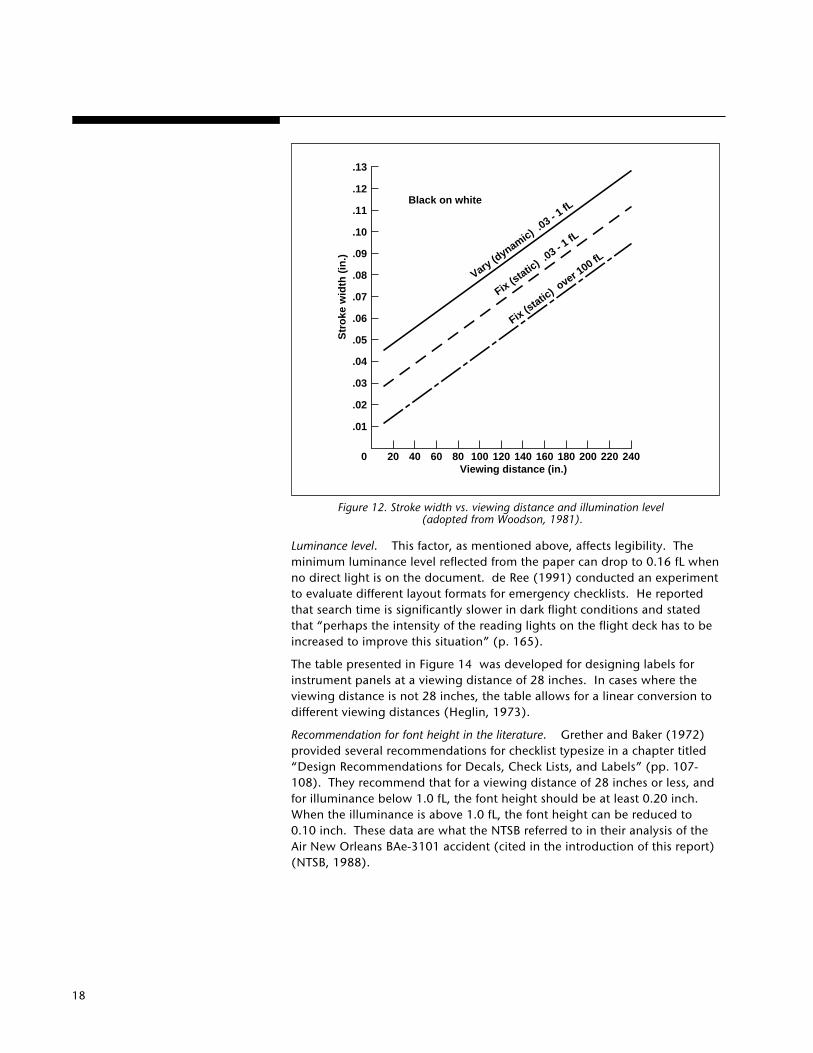
Figure 12. Stroke width vs. viewing distance and illumination level (adopted from Woodson, 1981).
Luminance level. This factor, as mentioned above, affects legibility. Theminimum luminance level reflected from the paper can drop to 0.16 fL whenno direct light is on the document. de Ree (1991) conducted an experimentto evaluate different layout formats for emergency checklists. He reportedthat search time is significantly slower in dark flight conditions and statedthat “perhaps the intensity of the reading lights on the flight deck has to beincreased to improve this situation” (p. 165).
The table presented in Figure 14 was developed for designing labels forinstrument panels at a viewing distance of 28 inches. In cases where theviewing distance is not 28 inches, the table allows for a linear conversion todifferent viewing distances (Heglin, 1973).
Recommendation for font height in the literature. Grether and Baker (1972)provided several recommendations for checklist typesize in a chapter titled“Design Recommendations for Decals, Check Lists, and Labels” (pp. 107-108). They recommend that for a viewing distance of 28 inches or less, andfor illuminance below 1.0 fL, the font height should be at least 0.20 inch.When the illuminance is above 1.0 fL, the font height can be reduced to0.10 inch. These data are what the NTSB referred to in their analysis of theAir New Orleans BAe-3101 accident (cited in the introduction of this report)(NTSB, 1988).
240220200180160140120100806040200
.01
.02
.03
.04
.05
.06
.07
.08
.09
.10
.11
.12
.13
Str
oke
wid
th (
in.)
Black on white
Vary (dynamic) .
03 - 1 fL
Fix (static
) .03 - 1
fL
Fix (static
) over 1
00 fL
Viewing distance (in.)

19
When specifying fontheight or accessing graphsto determine the size of alower-case character, thedistinction between “x”height and overall sizeshould be made.
As a generalrecommendation, the “x”height of a font used forimportant flight-deckdocumentation shouldnot be below 0.10 inch.
•
•
Viewing distance (m)
Visual acuity(Snellen index)
(Poor)
20/200
(Good)
20/2020/100
20/40
100500 2500
Str
oke
wid
th (
mm
)
3.3 30 300
250
25
2.5
.25101 100 1000.1
Viewing distance (ft.)
10
1
.1
.01
50
5
.5
.05
Hei
gh
t (i
n.)
Stroke width (in.)
This recommendation, however, must be assessed with the following in mind:
1. The recommendation regarding checklists is coupled with labels anddecals, which are used differently on the flight deck (labels are fixed to thepanel).
2. This recommendation assumes the use of upper-case characters.
3. There is no mention of color or contrast level.
4. The recommendation is based on a height vs. viewing distance graph andnot on an empirical experiment (W. F. Grether, personal communications, 1988).
While evaluating typesize for optimum reading, Tinker (1963) experimentedwith typesizes that ranged from 0.08 to 0.14 inches, all set in lower-caseroman. He reported that a 0.11 inch typesize was read significantly fasterthan 0.10 inch. The majority of the readers judged the 0.11 inch typesize as themost legible.
To summarize, it appears from the above graphs and tables that a font sizebetween 0.14 and 0.20 inches is suitable for checklists and other criticaldocumentation used on the flight deck. However, for practical reasons oflimited space on a single page (in case of a checklist) and simply because ofincreased volume (in case of manuals), this range (0.14-0.20) may not beefficient (Turner and Huntley, 1991). Again, one must not forget that anydetermination of suitable font height must be combined with accompanyingtypographical factors such as horizontal spacing, line width, vibration levels,color, etc., before any final judgement concerning the legibility of anytypesize can be extracted. How far can the designer go in reducing the fontsize of important flight documentation? The answer is based on the specificsof each case. What is clear, from reviewing checklists, manuals, and thesedata, is that a font size below 0.10 inch for any important flight-deck docu-ment is not recommended.
Figure 13. Height vs. viewing distance and visual acuity (adopted from Woodson, 1981).

20
The recommendedheight-to-width ratio of afont that is viewed infront of the observeris 5:3.
3.5. Stroke Width andHeight-to-Width Ratio
Stroke widths affect the ability of the eye to differentiate between the strokeof the character (“I”) and the space inside the character (“E,” F”). Thewidth of a stroke is a function of height of the character. Most humanfactors data books recommend the use of a height-to-width ratio of 5:3(Heglin, 1973; Sanders and McCormick, 1987; Woodson, 1981).
The reader should note that this recommended ratio is applicable only whenthe document is in front of the observer (a 90 degrees angle between theline-of-sight and the document). Fixed display, such as a mechanicalchecklist (which is mounted on a panel in the cockpit), may not be locatedin front of the pilot. Therefore, in designing a display that is viewed from anunfavorable viewing angle (which may artificially reduce the apparent widthof the character), a different height-to-width ratio (e.g., 5:4) should beconsidered in order to increase the actual width of the character(Heglin,1973).
•
Figure 14. (adopted from Howett, 1983).
NUMERAL/LETTER HEIGHT FOR 28-INCH VIEWING DISTANCEFor other viewing distances, multiply the value by [distance (in inches)/28].
HEIGHT OF NUMERALS AND LETTERS (IN.)
Low luminance(down to 0.03 fL)
High luminance(1.0 fL and above)
Critical markings – position variable(numerals on counters and settable ormoving scales)
Critical markings – position fixed(numerals on fixed scales, control and switch markings, emergencyinstructions, etc.)
Noncritical markings (instrument identification labels, routineinstructions, any marking required only for initial familiarization)
0.20 to 0.30 0.12 to 0.20
0.10 to 0.200.15 to 0.30
0.05 to 0.20 0.05 to 0.20
21
The vertical spacingbetween lines shouldnot be smaller than25-33% of the overallsize of the font.
The horizontal spacingbetween charactersshould be 25% of theoverall size and not lessthan one stroke width.
Figure 15. Variations—Vertical Spacing.
•
Circuit breakers .......................... ckd• Flt recorder* ................................. on• Voice recorder* ...................... tested
Oxy ................ on & 100%, spkrs ckd• Anti-skid* ................... tested & norm
Evacuation signal ................... armedCompasses ................................ ckdAnnunciator lights...... tested & bright
Lo spd AIL .................... norm & autoRud trav/pitch feel ........................ on
• Exterior lts* ....................... on (or off)Servo controls .............................. on
• Eng start panel*...... crank/start abortFire handles ................................. up
• No smoking* ................................. onEmer exit & min cab lts . armed & on
• Ice protection* .............................. off• Window heat* ........................ lo & on
Radio master sws......................... on
Auto flt/nav ................................. ckd
Inst sws .......................... ckd & norm
• Flt insts & altms* ............... ckd & set
GPWS .................................... tested
Circuit breakers ............................. ckd• Flt recorder* ................................... on• Voice recorder* .......................... tested
Oxy ................... on & 100%, spkrs ckd• Anti-skid* ...................... tested & norm
Evacuation signal ...................... armedCompasses................................... ckdAnnunciator lights .......... tested & brightLo spd AIL ....................... norm & auto
Rud trav/pitch feel ........................ on• Exterior lts* ....................... on (or off)
Servo controls .............................. on• Eng start panel*...... crank/start abort
Fire handles ................................. up• No smoking* ................................. on
Emer exit & min cab lts . armed & on• Ice protection* .............................. off
• Window heat* ..................... lo & onRadio master sws ...................... onAuto flt/nav ............................... ckdInst sws ....................... ckd & norm
• Flt insts & altms*............ ckd & setGPWS ................................... tested
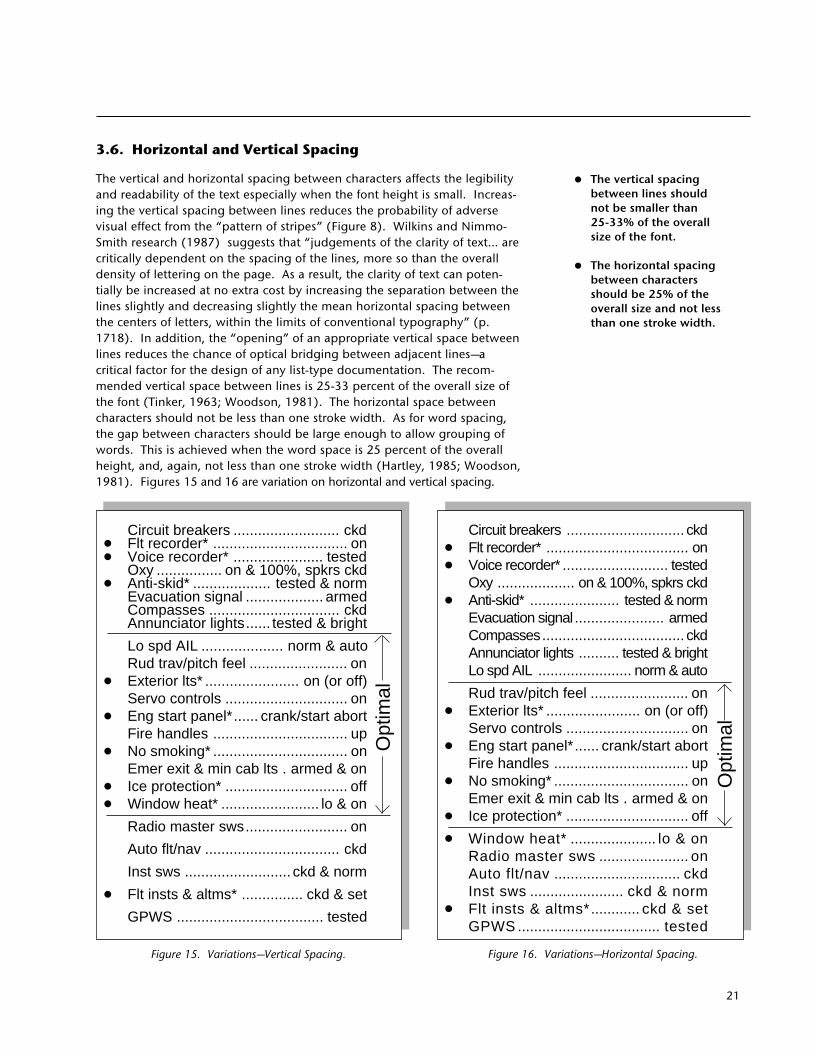
3.6. Horizontal and Vertical Spacing
The vertical and horizontal spacing between characters affects the legibilityand readability of the text especially when the font height is small. Increas-ing the vertical spacing between lines reduces the probability of adversevisual effect from the “pattern of stripes” (Figure 8). Wilkins and Nimmo-Smith research (1987) suggests that “judgements of the clarity of text... arecritically dependent on the spacing of the lines, more so than the overalldensity of lettering on the page. As a result, the clarity of text can poten-tially be increased at no extra cost by increasing the separation between thelines slightly and decreasing slightly the mean horizontal spacing betweenthe centers of letters, within the limits of conventional typography” (p.1718). In addition, the “opening” of an appropriate vertical space betweenlines reduces the chance of optical bridging between adjacent lines—acritical factor for the design of any list-type documentation. The recom-mended vertical space between lines is 25-33 percent of the overall size ofthe font (Tinker, 1963; Woodson, 1981). The horizontal space betweencharacters should not be less than one stroke width. As for word spacing,the gap between characters should be large enough to allow grouping ofwords. This is achieved when the word space is 25 percent of the overallheight, and, again, not less than one stroke width (Hartley, 1985; Woodson,1981). Figures 15 and 16 are variation on horizontal and vertical spacing.
Opt
imal
Opt
imal
•
Figure 16. Variations—Horizontal Spacing.
22
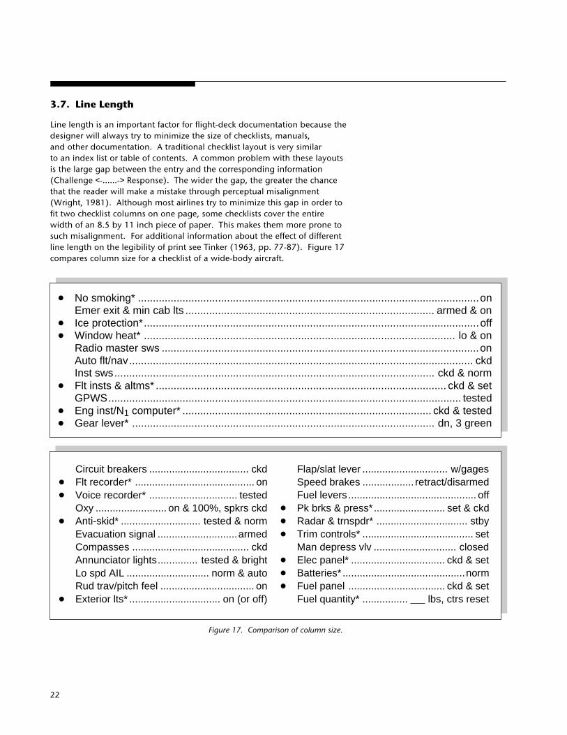
3.7. Line Length
Line length is an important factor for flight-deck documentation because thedesigner will always try to minimize the size of checklists, manuals,and other documentation. A traditional checklist layout is very similarto an index list or table of contents. A common problem with these layoutsis the large gap between the entry and the corresponding information(Challenge <-......-> Response). The wider the gap, the greater the chancethat the reader will make a mistake through perceptual misalignment(Wright, 1981). Although most airlines try to minimize this gap in order tofit two checklist columns on one page, some checklists cover the entirewidth of an 8.5 by 11 inch piece of paper. This makes them more prone tosuch misalignment. For additional information about the effect of differentline length on the legibility of print see Tinker (1963, pp. 77-87). Figure 17compares column size for a checklist of a wide-body aircraft.
Circuit breakers ................................... ckd
• Flt recorder* .......................................... on
• Voice recorder* ............................... testedOxy ......................... on & 100%, spkrs ckd
• Anti-skid* ............................ tested & normEvacuation signal ............................armedCompasses ......................................... ckdAnnunciator lights.............. tested & brightLo spd AIL ............................. norm & autoRud trav/pitch feel ................................. on
• Exterior lts* ................................ on (or off)
Flap/slat lever .............................. w/gagesSpeed brakes .................. retract/disarmedFuel levers ............................................. off
• Pk brks & press*......................... set & ckd
• Radar & trnspdr* ................................ stby
• Trim controls* ....................................... setMan depress vlv ............................. closed
• Elec panel* ................................. ckd & set
• Batteries* ...........................................norm
• Fuel panel .................................. ckd & setFuel quantity* ................ lbs, ctrs reset
Figure 17. Comparison of column size.
• No smoking* ...................................................................................................................onEmer exit & min cab lts .................................................................................... armed & on
• Ice protection*.................................................................................................................off• Window heat* ......................................................................................................... lo & on
Radio master sws ...........................................................................................................onAuto flt/nav.................................................................................................................... ckdInst sws............................................................................................................ ckd & norm
• Flt insts & altms* .................................................................................................. ckd & setGPWS....................................................................................................................... tested
• Eng inst/N1 computer* .................................................................................... ckd & tested• Gear lever* ...................................................................................................... dn, 3 green
23
Avoid using long stringsof text set in italics.
Use primarily one or two typefaces for emphasis.
• No smoking* ................................. onEmer exit & min cab lts .. armed & on
• Ice protection*............................... off• Window heat* ........................ lo & on
Radio master sws ......................... onAuto flt/nav.................................. ckdInst sws........................... ckd & norm
• Flt insts & altms* ................ ckd & setGPWS..................................... tested
• Eng inst/N1 computer* .. ckd & tested• Gear lever* ..................... dn, 3 green• Omega* ...................................... ckd
Flap/slat lever ......................w/gagesSpeed brakes ......... retract/disarmed
•
Figure 18. Italic vs. Non-Italic face.
• No smoking* ................................ onEmer exit & min cab lts ..armed & on
• Ice protection*.............................. off• Window heat* ....................... lo & on
Radio master sws ........................ onAuto flt/nav.................................. ckdInst sws.......................... ckd & norm
• Flt insts & altms* ............... ckd & setGPWS.................................... tested
• Eng inst/N1 computer* . ckd & tested• Gear lever* .................... dn, 3 green• Omega* ...................................... ckd
Flap/slat lever ..................... w/gagesSpeed brakes ........ retract/disarmed
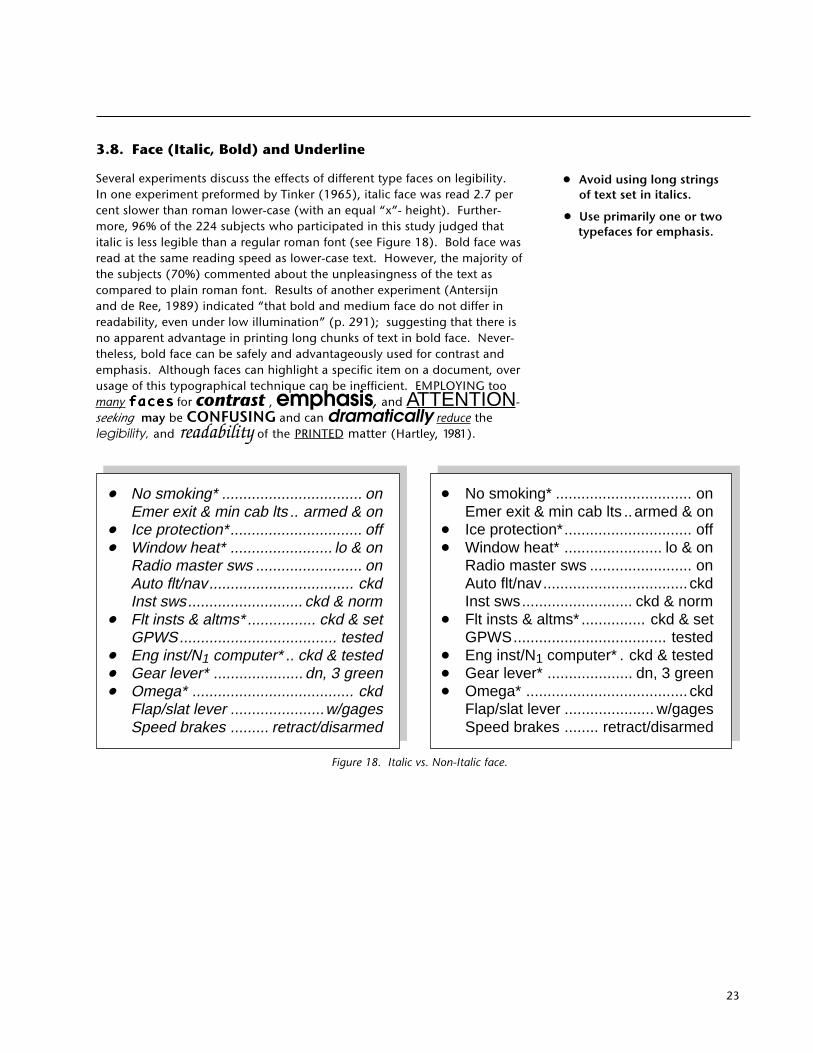
3.8. Face (Italic, Bold) and Underline
Several experiments discuss the effects of different type faces on legibility.In one experiment preformed by Tinker (1965), italic face was read 2.7 percent slower than roman lower-case (with an equal “x”- height). Further-more, 96% of the 224 subjects who participated in this study judged thatitalic is less legible than a regular roman font (see Figure 18). Bold face wasread at the same reading speed as lower-case text. However, the majority ofthe subjects (70%) commented about the unpleasingness of the text ascompared to plain roman font. Results of another experiment (Antersijnand de Ree, 1989) indicated “that bold and medium face do not differ inreadability, even under low illumination” (p. 291); suggesting that there isno apparent advantage in printing long chunks of text in bold face. Never-theless, bold face can be safely and advantageously used for contrast andemphasis. Although faces can highlight a specific item on a document, overusage of this typographical technique can be inefficient. EMPLOYING toomany facesfacesfacesfacesfaces for contrast , emphasis, and ATTENTION-seeking may be CONFUSING and can dramatically reduce thelegibility, and readability of the PRINTED matter (Hartley, 1981).
•
24
Use black characters over awhite background for mostcockpit documentation.
Avoid using white characters over a black background in normal line operations. However, if thisis desired:
1. Use minimum amount oftext.
2. Use relatively largetypesize.
3. Use sans-serif tominimize the loss oflegibility.
•
•
3.9. Contrast
Woodson (1981) recommends the use of dark characters over a light back-ground for normal illumination conditions. However, when the observermust maintain a dark adaption condition, Woodson recommends a lightcharacter over a dark background. To evaluate this condition, Tinker (1965)manipulated and measured the following variables in a laboratory experi-ment: speed of reading, subject’s preference, eye movement measurements,recognizability in the peripheral vision, and discriminability at a distance(when looking straight ahead). For all the above dependent measures, thedefinite advantage of black print on a white background was proven. Blackover white is also recognized at a larger angle from the line-of-sight. This isimportant in the cockpit environment as documents cannot always be held inoptimal viewing angles. Nevertheless, white over black may provide a goodmethod to emphasize a title (such as a name of an emergency checklist).
3.10. Color Coding
A character and its background may differ in the amount of light they reflectand color. Howett (1983) reported that when the character and its back-ground are viewed from a short distance, more visual difference can bereinforced by using large luminance differences than by employing largechromatic (color) differences. In other words, the contrast is more importantthan color differences in determining visibility of the characters. For ex-ample, red and blue have considerable color contrast, yet very small lumi-nance contrast.
Some airlines use color coding to distinguish between different checklists inthe flight manual. Black print over white background is used for the normalchecklists and performance graphs, black over yellow for the abnormalchecklists, and black over light red for the emergency checklists. If onewishes to employ color in flight-deck documentation, Figure 19 presents therecommended color contrasts. Yellow characters over black, and blue overwhite are probably the best choice of color contrast.
Tinker (1963) performed several experiments to determine the effect of colorcontrast on legibility. In a test to investigate the perception of differentcolored numerals at a glance, black characters over yellow backgroundshowed the best results. Tinker gives the following recommendationsregarding the use of dark characters over colored background:
1. The reflection percentage of the background should be at least 70percent.
2. The luminance ratio between the character and the background should beabout 1:8.
3. The typesize should be 0.10 inch or greater.
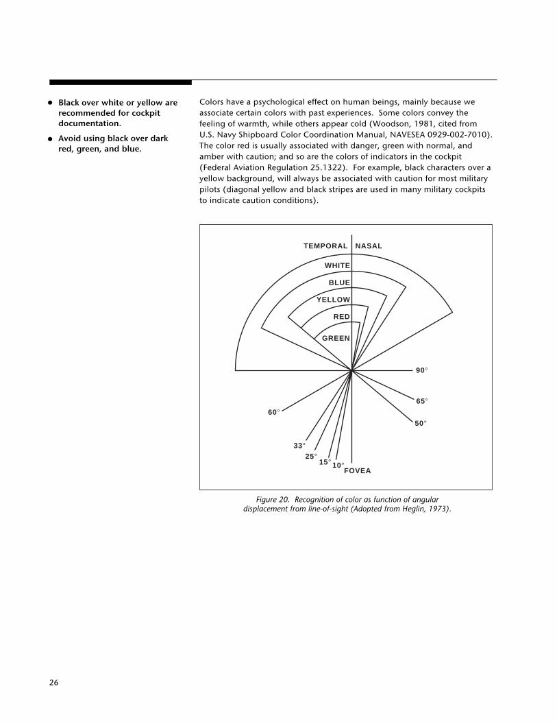
The human peripheral vision is limited in color sensitivity. Figure 20 showsthat some colors are recognized at a greater angle away from the line-of-sightthan others. When a pilot uses colored document during night operations,certain colored ambient lighting (usually red or green) will effect the color ofthe print and/or its background. The data presented in Figure 21 indicatesthe effect of colored light on colored objects (Kybakawa, 1969).
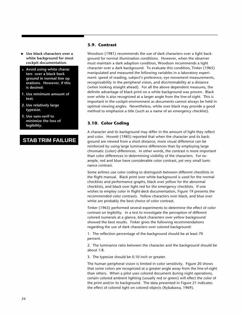
STAB TRIM FAILURE

25
Conditions Characters Background
Average or higher levels Black Whiteand quality of illumination Black Yellow
White BlackDark blue WhiteWhite Dark red, green, and brownBlack OrangeDark green and red WhiteWhite Dark grayBlack Light gray
Poor level and quality of Black Whiteillumination White Black
Black YellowDark blue WhiteBlack OrangeDark red and green White
Dark adaptation required White BlackYellow BlackOrange BlackRed* BlackBlue and Green Black
*Low-level red light is required to maintain the lowest dark adaptation level.
Figure 19. Suggested color contrast (adopted from Woodson, 1981).
26
TEMPORAL NASAL
WHITE
BLUE
YELLOW
RED
GREEN
FOVEA
60°
33°25°
15° 10°
50°
65°
90°
Colors have a psychological effect on human beings, mainly because weassociate certain colors with past experiences. Some colors convey thefeeling of warmth, while others appear cold (Woodson, 1981, cited fromU.S. Navy Shipboard Color Coordination Manual, NAVESEA 0929-002-7010).The color red is usually associated with danger, green with normal, andamber with caution; and so are the colors of indicators in the cockpit(Federal Aviation Regulation 25.1322). For example, black characters over ayellow background, will always be associated with caution for most militarypilots (diagonal yellow and black stripes are used in many military cockpitsto indicate caution conditions).
Black over white or yellow arerecommended for cockpitdocumentation.
Avoid using black over darkred, green, and blue.
Figure 20. Recognition of color as function of angulardisplacement from line-of-sight (Adopted from Heglin, 1973).
•
•

27
3.11. The Cumulative Effectof Improper Typography
For a given printed document, it is obvious that the combination of two ormore non-optimal or marginal conditions will have a greater effect onlegibility and/or readability. Therefore, when specifying the graphicalappearance of flight-deck documentation, the designer must be careful incombining several non-optimal conditions (white print over black back-ground, italic and bold faces, colors, small typesize, etc.). Such combinationswill tend to reduce the overall efficiency of using the document (see Figure22). Tinker (1963) conducted several experiments to determine to whatextent these combinations could be predicted. He found a progressive lossof legibility due to multiple non-optimal conditions such as decrease intypesize, increase in line length, changes in font type, etc. However, hisfindings indicate that the combined effect of non-optimal conditions cannotbe predicted by merely adding the effect of each sub-optimal condition.
EFFECT OF COLORED LIGHT ON COLORED OBJECTS
Object color
White
Black
Light Blue
Dark Blue
Green
Yellow
Red Light
LIght Pink
Reddish Black
Brilliant Red
Reddish Blue
Dark Reddish Purple
Olive Green
Red Orange
Blue Light
Very Light Blue
Blue Black
Dark Bluish Red
Bright Blue
Brilliant Blue
Green Blue
Light Reddish Brown
Green Light
Very Light Green
Greenish Black
Yellowish Red
Greenish Blue
Dark Greenish Blue
Brilliant Green
Light Greenish Yellow
Yellow light
Very Light Yellow
Orange Black
Bright Red
Light Reddish Blue
Light Reddish Purple
Yellow Green
Brilliant Light Orange
Red
Brown Red Bluish Brown Dark Olive Brown Brownish OrangeRed Orange
Figure 21. The effect of colored light on colored objects (adopted from Kubakawa, 1969).
• Flt recorder* .......................................................................................... on• Voice recorder* ............................................................................... testedOxy ......................................................................... on & 100%, spkrs ckd• Anti-skid* ........................................................................... tested & normEvacuation signal ........................................................................... armedCompasses ......................................................................................... ckdAnnunciator lights ............................................................. tested & brightLo spd AIL ............................................................................ norm & autoRud trav/pitch feel ................................................................................. on
Servo controls ...................................................................................... on• Eng start panel* .............................................................. crank/start abortFire handles .......................................................................................... up• No smoking* ......................................................................................... on
Figure 22. The combined effect of several sub-optimal typographical conditions.
• Flt recorder* .................................. on• Voice recorder* ........................ tested
Oxy ................. on & 100%, spkrs ckd• Anti-skid* ..................... tested & norm
Evacuation signal .................... armedCompasses .................................. ckdAnnunciator lights....... tested & bright

28
Use anti-glare plastic to laminate documents.
4.1. Glare
Several quick reference handbooks (QRH) and checklists used by severalairlines and some military units are laminated to protect them from wearand tear. Others are inserted into a plastic casing and are pulled out onlywhen a new revision is issued. In choosing a plastic cover or lamination, ananti-glare plastic that diffuses the light is recommended; otherwise, somerays from the light source will be reflected to the pilot’s eyes. This iscommonly observed in a dim cockpit when the pilot-light is directed to adocument covered with glossy plastic. Tinker (1963) conducted severalexperiments to find the effect of surface glare on reading. He tested withthree types of surface reflection (22.9%, 85.8% and 95.1%). The resultsshowed a significant reduction in reading speed of the high glossy material(95.1% reflection). Furthermore, 75% of the subjects (sample size was224), preferred the non-glossy paper.
Other types of glare are common during night operation. When the printedmatter is lit by a direct light (such as a flashlight or pilot-light) and thepilot’s eyes shift between the document and the dark window or panels, theeyes must constantly readapt to different levels of luminance. Severedifferences in luminance between the document in-front of the observer(the critical vision) and the surroundings (peripheral vision), can lead to areduction in visual discrimination, reading speed, and comfort. Further-more, any strong light source (direct-sunlight, radar scope) that is notshielded from the field of vision, will cause disability glare. As the lightsource gets closer to the line-of-sight an increased reduction in visualefficiency will be experienced (Sanders and McCormick, 1987).
4.2. Slope and AngularAlignment for Reading
Optimum reading conditions are achieved when the printed copy is held flatand the plane of the copy is at 90 degrees to the line-of-sight. In thiscondition, the printed alphanumerics are seen at their exact form. As theprinted copy is tipped away, the geometric form of the alphanumeric(width-height ratio) is distorted. Several experiments were conducted toinvestigate the reduction in legibility due to this factor. One experimentrevealed that a document with a typesize of 0.10 inch aligned at 105, 120,and 135 degrees from the line-of-sight, retarded reading speed by 1.5, 5.3,9.8 percent respectively (Tinker, 1963, cited from Skordhal, 1958).
When the printed matter was held at 90 degrees to the line-of-sight, but thelines of text were at angle (tilted to the side), a retardant in speed ofreading and a reduction in visibility of the alphanumeric character occurred.One explanation for this is that when the printed document is tilted awaythe eyes have to move obliquely from one fixation pause to another alongthe line of text. This strains additional eye muscles and makes this practiceof reading more difficult.
•
4. Several Environmental Conditions Influencing Reading
90
29
Ensure that the quality ofthe print and the paper iswell above normalstandards—poor quality ofprint and paper will effectlegibility and readability.
•
The designer must assessthe age groups of the pilotsthat will be using thedocumentation and take avery conservative approachin assessing informationobtained from graphs anddata books.
•
4.3. The Quality of Paper and Print
The thickness of the material, i.e., the paper on which the document iswritten, can also affect the legibility of print. It is not uncommon to seepilots hold their checklist card between the eyes and the window. It istherefore recommended that documentation should be printed on a thickopaque paper. This will prevent the print on the other side of the documentfrom showing through and blurring the print on the front.
The visual impression of printed matter plays an important role in theattraction and motivation of the pilot to read and use it (Hawkins, 1987).The layout of the document and the organization of the procedures in theaircraft operating manual is an important factor in minimizing search time tolocate emergency procedures (Degani and Wiener, in progress; de Ree,1991; Flight Safety Focus, 1985). Another important factor is the quality ofthe actual print that comes out from the print shop. The print should beclear and the boundaries between strokes and spaces should be sharp anddistinguishable (for a bad example, see the BAe 3101 checklist in Figure 1).Likewise, several checklists obtained by the author from one major U.S carrierappeared to be degraded as the result of several copier machine iterations;vertical spacing between characters was reduced, and strokes discriminationwas poor. It was difficult to read the checklist.
4.4. The Effect of Pilot’s Age on Reading
There is a 50% reduction in retinal illumination at the age of 50 yearscompared to 20. This reduction in the level of retinal illumination also playsa role in slowing the rate as well as the level of dark adaptation. Thethickness of the eye’s lenses is the major cause of farsightedness among themiddle aged and elderly. As the lens thickens, it becomes yellow andreduces the transmission of blue light through it. Thus, older people havemore difficulty in differentiating between colors. This effect is mainly seen inthe blue-green and red regions of the hue, and therefore should be consid-ered in designing a colored document (Sanders and McCormick, 1987;Tinker, 1965). These effects will only be amplified while reading critical textunder adverse environmental conditions in the cockpit. It should be notedhere, that in all the tables and figures in the proceeding sections, there is noindication of the age group of the subjects. As some of the data wereprepared for the military, the reader may very well assume that in most casesthe subjects employed in these studies were young recruits.
30
5. Final Note
It will probably take a decade or two until most commercial airplanes in theU.S. will fall into the category of “paper-less cockpits.” These future cockpitswill have electronic checklists and electronic libraries containing most of theinformation that is now in print (O’Lone, 1990, November 5; Riley, 1990).Meanwhile, paper (manuals, checklists, dispatch papers) will dominate as aform of presentation for this type of information on the flight deck. Never-theless, there is almost no applied research on how to present flight-deckdocumentation in the most efficent manner. The author believes that this isa clear gauge to the lack of attention given to these devices by most highrisk industries (nuclear power, process control, military, maritime, andmore). It is puzzling to note this deficiency in flight-deck documentation ofseveral major U.S. airlines.
This report was intended to fill an existing “vacuum” of information con-cerning typographical and graphical aspects of flight-deck documentation.The author hopes that NTSB recommendation A-88-72, will lead humanfactors specialists to investigate these issues and provide specific guidelinesand answers concerning optimal methods of presenting critical documenta-tion. Similar issues pertaining to computer generated displays such aselectonic checklist and electronic library systems should also be investigated.If proper typographical and graphical display design will not be imple-mented, then it is possible that the same problem of hard-to-read displaysmay perpetuate into these new systems.
31
6. List of Design Recommendations
This section lists together all the design recommendations from the previoussub-sections. These recommendations are not specifications. They only form abaseline, which is based exclusively on the author’s subjective interpretation ofthe data. Each recommendation should be carefully evaluated by the designerbased on the type of documentation, usage, criticality, and the target popula-tion. The recommendations are listed according to the order of sections in thisreport (sub-section numbers are given in parenthesis):
1. Sans-serif fonts are usually more legible than fonts with serifs.(3.2)
2. Avoid using a font that has characters that are too similar to oneanother, as this will reduce the legibility of the print. (3.2)
3. Avoid using dot matrix print for critical flight-deckdocumentation. (3.2)
4. Long chunks of text should be set in lower case. (3.3)
5. If upper case is required, the first letter of the word should bemade larger in order to enhance the legibility of the word. (3.3)
6. When specifying font height, or accessing graphs to determinethe size of a lower-case character, the distinction between “x”height and overall size should be made. (3.4)
7. As a general recommendation, the “x” height of a font used forimportant flight-deck documentation should not be below 0.10inch. (3.4)
8. The recommended height-to-width ratio of a font that is viewedin front of the observer is 5:3. (3.5)
9. The vertical spacing between lines should not be smaller than 25-33% of the overall size of the font. (3.6)
10. The horizontal spacing between characters should be 25% of theoverall size and not less than one stroke width. (3.6)
11. Avoid using long strings of text set in italics. (3.8)
32
12. Use primarily one or two typefaces for emphasis. (3.8)
13. Use black characters over a white background for most cockpitdocumentation. (3.9)
14. Avoid using white characters over a black background innormal line operations (3.9). However, if this is desired:
1. Use minimum amount of text.
2. Use relatively large typesize.
3. Use sans-serif to minimize the loss of legibility.
15. Black over white or yellow are recommended forcockpit documentation. (3.10)
16. Avoid using black over dark red, green, and blue. (3.10)
17. Use anti-glare plastic to laminate documents. (4.1)
18. Ensure that the quality of the print and the paper is well abovenormal standards. Poor quality of the print will effect legibilityand readability. (4.3)
19. The designer must assess the age groups of the pilots that will be using the documentation, and take a very conservative approach in assessing information obtained from graphs and data books. (4.4)

33
7. Acknowledgments
Note: This report was typeset in ITC Stone Sans 9 1/2 point type, x height =8 point, 12 point linespacing (leading), and output on a 600 dot per inchlaser printer.
This work was supported by NASA research grant No. NCC2-327 from theAmes Research Center to the San Jose State University and grant No. NCC2-377 to the University of Miami. The technical monitor was Everett A.Palmer. The author wishes to thank Sheryl L. Chappell, Loren E. Gifford,Everett A. Palmer, Leon Segal, and Barbara T. Sweet, of NASA Ames Re-search Center; Roweena Morrison of the Battelle/ASRS office; and Earl L.Wiener of the University of Miami for reviewing this report and providinghelpful comments. Graphics provided by Kristen G. Bauersfeld, Tom J.Esposito, Loren E. Gifford, Tom E. Nast, and Marie Westfall.
34
8. References
Antersijn, P., and de Ree, H. (1989). Readability improvement of emergencychecklists. Proceedings of the Fifth International Symposium on AviationPsychology (pp. 288-295). Columbus, OH: The Ohio State University.
ASRS. (1987). Erroneous flap setting; checklist use (Special request No. 1177/1182 [Database search]). ASRS office, Mountain View, California:Battelle.
ASRS. (1989). Erroneous flap setting; checklist use (Special request No. 1503[Database search]. Update of special request No. 1177/1182). ASRSoffice, Mountain View, California: Battelle.
Cheetham, D. and Grimbly, B. (1964). Design analysis: Typeface. Design,186, 61-71.
Craig, J. (1980). Designing with type. London: Pitman Publishing.
de Ree, H. (1991). The emergency checklist, testing various layouts. Proceed-ings of the Sixth International Symposium on Aviation Psychology (pp. 160-164). Columbus, OH: The Ohio State University.
Degani and Wiener, E. L. (1990). The human factors of flight-deck checklist: Thenormal checklist (NASA contract report 177549). Moffett Field, CA: NASAAmes Research Center.
Degani, A., and Wiener, E. L. (1991). Philosophy, policies, and procedures:The three P’s of flight-deck operations. Proceedings of the Sixth Interna-tional Symposium on Aviation Psychology (pp. 184-191). Columbus, OH:The Ohio State University.
Degani, A., and Wiener, E. L. (1994). On the design of flight-deck procedures(NASA Contractor Report 177642). Moffet Field, CA: NASA AmesResearch Center. <http://olias.arc.nasa.gov/publications/DOP/DOP.html>
Flight Safety Focus. (1985, May). In-flight fire: Report of the Saudi ArabianCivil Aviation Authority. Flight Safety Journal, p. 1-12.
Foley, P. and Moray, N. (1987). Sensation, perception, and system analysis.In G. Salvendy (Ed.), Handbook of human factors (pp. 45-71). New York:John Wiley & Sons.

35
Grether, W. F. and Baker, C. A. (1972). Visual presentation of information. InH. P. Van-Cott and R. G. Kinkade, (Ed.), Human engineering guide to equip-ment design (pp. 49-127). Washington, DC: American Institute for Re-search.
Hartley, J. (1981). Eighty ways of improving instructional text. IEEETransactions on professional communication, PC-24(1), 17-27.
Hartley, J. (1985). Designing instructional text. (2 ed.). London: Kogan Page.
Hawkins, F. H. (1987). Human factors in flight. Brookfield, VT: GowerPublishing Company.
Heglin, H. J. (1973). Navships display illumination design guide (NELC/TD-223).San Diego: Naval Electronics Laboratory Center.
Howett, G. L. (1983). Size of letters required for visibility as a function of viewingdistance and viewer acuity (Tech. note #1180). Washington, DC: NationalBureau of Standards.
Kubakawa, C. (1969). Databook for human factors engineers (NASA contractreport NAS2-5298). San Diego: Man Factors, Inc.
National Transportation Safty Board (1988). Air New Orleans. BAe-3101 N331CY.New Orleans International Airport, Kenner, Louisiana. May 26, 1987(Aircraft Accident Report, NTSB/AAR-88/06). Washington, DC: Author.
National Transportation Safty Board (1989). Delta Air Lines, Boeing 727-232,N473DA. Dallas-Fort Worth International Airport, Texas. August 31, 1988(Aircraft Accident Report, NTSB/AAR-89/04). Washington, DC: Author.
O’Lone, R. G. (1990, November 5). Boeing picks subcontractors for 777’sstructural and cockpit components. Aviation Week & SpaceTechnology, p. 34.
Philips, R. J. (1979). Why is lower-case better? Applied Ergonomics,10(4), 211-214.
Poulton, E. C. (1965). Letter differentiation and rate of comprehension inreading. Journal of Applied Psychology, 49(5), 358-362.
36
Poulton, E. C. (1967). Searching for newspaper headlines printed in capitalsof lower-case letter. Journal of Applied Psychology, 51(5), 417-425.
Riley, J. (1990). The electronic library system (ELS): safety through efficient datamanagement. Honeywell, Inc: Author.
Ruffell Smith, H. P. (1979). A simulator study of the interaction of pilotworkload with errors, vigilance, and decisions (NASA technical memo78482).Moffett Field, CA: NASA Ames Research Center.
Sanders, M. S., and McCormick, E. J. (1987). Human factors in engineeringand design. (6th ed.). New York: McGraw-Hill.
Smith, F., Lott, D., and Cronnell, B. (1969). The effect of type size and casealteration on word identification. American Journal of Psychology, 82,248-253.
Tinker, M. A. (1963). Legibility of print. Ames: Iowa State University Press.
Tinker, M. A. (1965). Bases for effective reading. Minneapolis: Univ. ofMinnesota press.
Turner, J. W., and Huntley M. S. (1991). The use and design of flight crewchecklists and manuals (DOT/FAA/AM-91/7). Cambridge, MA: NationalTransportation System Center.
Wilkins, A. J., and Nimmo-Smith, M. I. (1987). The clarity and comfort ofprinted text. Ergonomics, 30, (12), 1705-1720.
Woodson, W. E. (1981). Human factors design handbook. New York:McGraw-Hill.
Woodson, W. E., and Conover, D. W. (1964). Human engineering guide forequipment designers (2 ed.). Los Angeles: University of California press.
Wright, P. R. (1981). Five skills technical writers need. IEEE Transaction ofprofessional communication, PC-24(1), 10-16.
37


