Ooma & Ooma Telo Style Guide This document provides basic guidelines for the Ooma, Ooma Telo, and Ooma Office brands. 2-3 Ooma Signature 4 Ooma Telo Logotype 5 Ooma Office Logotype 6 Color Palette 7 Typography 8 Ooma Tag Line 9-10 Product Photography 11 Ooma Telo Supergraphic 12 Ooma Office Supergraphic
Transcript
Ooma & Ooma Telo Style Guide
This document provides basic guidelines for the Ooma, Ooma Telo, and Ooma Office brands.
2-3 Ooma Signature
4 Ooma Telo Logotype
5 Ooma Office Logotype
6 Color Palette
7 Typography
8 Ooma Tag Line
9-10 Product Photography
11 Ooma Telo Supergraphic
12 Ooma Office Supergraphic
Clear space
XXX
X
X
Clear space
X
XX
X X
Ooma Signature
The Ooma signature is composed of two elements: the Logotype and the Logo Symbol.
Preferred Signature
The preferred signature for Ooma locks the logotype and symbol side-by-side.
The minimum size for this signature in print is 1.25” wide, as rendered above.
Always maintain a level of clear space around the signature as detailed above.
Note the trademark symbol hangs outside the clear space guidelines.
X = height of Logo Symbol
X = width of Logo Symbol
Do not alter the lock-up of the logotype and symbol by moving them independently.
Do not scale the logotype and symbol independently of one another.
Do not use the logotype by itself. The Logo Symbol can be used separately, but only under specific conditions. See page 5.
The minimum size for this signature in print is 0.65”tall, as rendered above.
Always maintain a level of clear space around the signature as detailed above.
Note the trademark symbol hangs outside the clear space guidelines.
Alternate Signature
The alternate signature for Ooma locks the logotype and symbol vertically. Use this version in vertical designs, such as tall banners or brochures.
Ooma Signature
On light backgrounds
When placing the signature on a white or light background, use Ooma Blue (preferred) or Ooma Rich Black.
On dark backgrounds
When placing the signature on a black or dark background, use white.
Ooma Blue CMYK 100 35 0 50
Ooma Rich Black CMYK 60 40 40 100
If Rich Black poses printing issues – such as density or registration – simply use 100% K.
White K 0
Preferred Preferred
Do not use tints of Ooma Blue, Ooma Rich Black, or K.
Do not use Ooma Glow.
Do not use two different colors in a single application.
Ooma Telo Logotype
The Ooma Telo logotype should be the primary identity in designs for the Ooma Telo product.
Distinct
The logotype is composed of two elements: the Ooma logo and the product name. When used to brand a product, they must remain locked up as a single logotype. Separate the logotype from other elements through scale and ample clear space (detailed below).
The minimum size for this logotype in print is 1.35” wide. Generally though, this logo should appear much larger to stand as the primary identity.
On a dark background, use white only. Do not use the old Ooma Telo logotype. Do not resize the Logo Symbol. Maintain proportions.
Do not type in logo. Do not capitalize.
Color
On light backgrounds use the color version of the logotype only.
100% Pantone 302 Blue (Ooma logo)100% Process Cyan (Telo)
For dark backgrounds use white.
Clear space
X = height of letter “l”
X
2X
X
XX
Ooma Office Logotype
The Ooma Office logotype should be the primary identity in designs for the Ooma Office product.
Distinct
The logotype is composed of two elements: the Ooma logo and the product name. When used to brand a product, they must remain locked up as a single logotype. Separate the logotype from other elements through scale and ample clear space (detailed below).
The minimum size for this logotype in print is 1.5” wide. Generally though, this logo should appear much larger to stand as the primary identity.
Color
On light backgrounds use the color version of the logotype only.
On a dark background, use white only. Do not use the old Ooma Office logotype. Do not resize the Logo Symbol. Maintain proportions.
Do not type in logo. Do not capitalize.
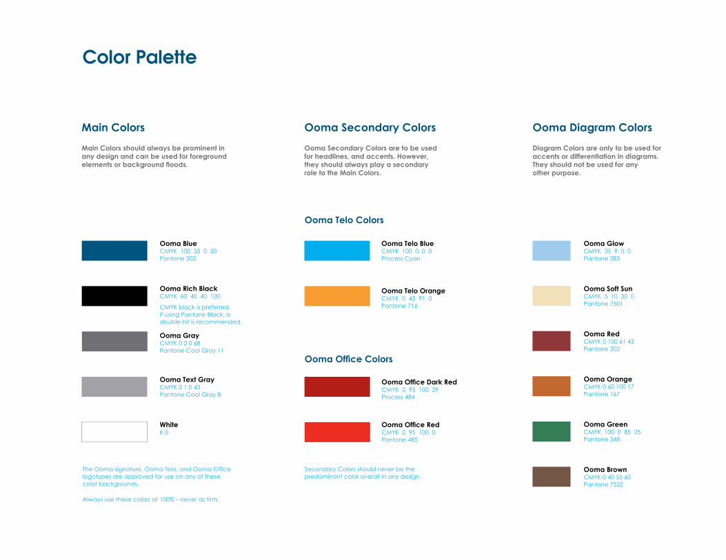
Color Palette
Main Colors
Main Colors should always be prominent in any design and can be used for foreground elements or background floods.
The Ooma signature, Ooma Telo, and Ooma Office logotypes are approved for use on any of these color backgrounds.
Always use these colors at 100% – never as tints.
Ooma BlueCMYK 100 35 0 50Pantone 302
Ooma Rich BlackCMYK 60 40 40 100
CMYK black is preferred. If using Pantone Black, a double-hit is recommended.
WhiteK 0
Ooma Telo BlueCMYK 100 0 0 0Process Cyan
Ooma Office Dark RedCMYK 0 95 100 29Process 484
Ooma Telo OrangeCMYK 0 45 91 0Pantone 716
Ooma Office RedCMYK 0 95 100 0Pantone 485
Ooma Text GrayCMYK 0 1 0 43Pantone Cool Gray 8
Ooma GlowCMYK 35 9 0 0 Pantone 283
Ooma RedCMYK 0 100 61 43 Pantone 202
Ooma OrangeCMYK 0 60 100 17 Pantone 167
Ooma GreenCMYK 100 0 85 25Pantone 348
Ooma BrownCMYK 0 40 55 60Pantone 7532
Ooma GrayCMYK 0 2 0 68 Pantone Cool Gray 11
Ooma Secondary Colors
Ooma Secondary Colors are to be used for headlines, and accents. However, they should always play a secondary role to the Main Colors.
Ooma Office Colors
Ooma Telo Colors
Ooma Diagram Colors
Diagram Colors are only to be used for accents or differentiation in diagrams. They should not be used for any other purpose.
Secondary Colors should never be the predominant color overall in any design.
Ooma Soft SunCMYK 5 10 30 0 Pantone 7501
Typography
Avant Garde is used for headlines, set in regular weight. All other text is set in Century Gothic, the official Ooma typeface, using both Regular and Bold to structure levels of copy.
Headlines
Headlines should be typeset at a prominent size in designs and should be set in regular (Roman) weight.
Color: On light backgrounds set headlines in Ooma primary or secondary colors. For dark backgrounds set headlines in white.
Headlines should be prominent. Use Ooma Telo colors for Telo only; Ooma Office colors for Ooma Office only.
Free Home Phone Service
Ooma gives you free U.S. calling. You pay only applicable taxes and fees.
Buy an Ooma Telo and get free, crystal-clear calling anywhere in the U.S. using your high-speed Internet and regular home phone. Maybe the first call you make should be to the phone company to give them the bad news?
Subheads
Subheads should be typeset in Century Gothic Bold, but unlike headlines, be modestly sized.
Color: On light backgrounds use Ooma Blue, black, or a secondary color. For dark backgrounds use white.
When used to title body copy, typeset subheads in the same point size, or just slightly larger.
Body Copy
Always set body copy in Century Gothic Regular. Use bold weight when there is need to call out or emphasize text within a lineof copy.
Color: On light backgrounds use black. On dark backgrounds use white.
The wide and round character of Century Gothic allows for typesetting in small point sizes while still maintaining readability.
Normal kerning is preferred for all applications (that includes headlines). When kerning is necessary for copy-fit, never kern too loose or tight.
Headline
Subhead
Body Copy
Tag Lines
Ooma has developed a tradmarked tag line for use with both our Telo and Office products. It is most often used in conjunction with the Ooma signature in our advertising and sales collateral.
Ooma Telo Tag Line
There is no set size or location the tag line should be used. However, its placement should always be secondary to other elements within the layout. The tag line can be in Roman (normal) or bold weights.
Because the tag line is trademarked, it must be used exactly as shown, with initial caps and the trademark symbol.
When paired with the Ooma signature, the Ooma Telo tag line can be either centered, or flush with the Logotype, extending to the right as far as is necessary. Its placement is dependent on the content in the layout.
However, the tag line should never intrude into the Ooma signature area.
When paired with the Ooma signature, the Ooma Office tag line can be either centered, or flush with the Logotype, extending to the right as far as is necessary. Its placement is dependent on the content in the layout.
However, the tag line should never intrude into the Ooma signature area.
Ooma Office Tag Line
There is no set size or location the tag line should be used. However, its placement should always be secondary to other elements within the layout. The tag line can be in Roman (normal) or bold weights.
Because the tag line is trademarked, it must be used exactly as shown, with initial caps and the trademark symbol.
The top of the tag line should sit half the height of the letter “m” in Ooma below the bottom of the Symbol.
The top of the tag line should sit half the height of the letter “m” in Ooma below the bottom of the Symbol.
When used flush left with the Ooma logotype, the top of the tag line can align with the bottom of the Symbol.
When used flush left with the Ooma logotype, the top of the tag line can align with the bottom of the Symbol.
The Smart Phone For Your Home.™
The Smart Phone For Your Home.™ The Smart Phone For Your Business.™
The Smart Phone For Your Home.™ The Smart Phone For Your Business.™
The Smart Phone For Your Business.™
Preferred Preferred
Preferred Preferred
Ooma Telo Photography
Ooma Telo is photographed in twocategories, Hero and Catalog.
Hero
The Hero photography showcases the product’s industrial design in graceful lighting on a sleek reflective surface.
Hero photos should be used in designs to introduce the product. For example, on the cover of a guide or front of a package.
A Hero photo should be central to any design. Because the device is photographed always facing left, place the photo in a layout somewhere between center and center-right to allow the face breathing room.
Size prominently and leave uncluttered space around the Hero. Always make use to the photos’ reflective shadow.
Catalog
The Catalog photos depict the product at various straightforward angles. These can be used throughout designs or for instructional/diagram purposes.
Do not overuse Hero photos by repeating them throughout designs or in diagrams. (That’s where Catalog photos come in.)
While cropping of the reflection is allowed, never crop the device itself.
Ooma Office Photography
Ooma Office Bast Station is represented in two categories, Hero and Catalog.
Hero
The Hero photography showcases the product’s industrial design in graceful lighting on a sleek reflective surface.
Hero photos should be used in designs to introduce the product. For example, on the cover of a guide or front of a package.
A Hero photo should be central to any design. The Ooma Office Base Station is always shown from the front view.
Size prominently and leave uncluttered space around the Hero. The Hero can be shown with or without a shadow, depending on the look and feel of the project layout.
Catalog
The Catalog photos depict the product at various straightforward angles. These can be used throughout designs or for instructional/diagram purposes.
Do not overuse Hero photos by repeating them throughout designs or in diagrams. (That’s where Catalog photos come in.)
Never crop the Ooma Office Base Station.
Rear view The Ooma Office Base Station may also be paired with the Ooma Linx device(s).
Supergraphics: Telo
One of the key elements for Ooma’s visual marketing is the use of the “flower” supergraphic.
It is the primary background and source of color to differentiate the Ooma Telo and Ooma Office product lines.
Uses
The supergraphic should be used as large as the content allows on all visual communications, except where specifically requested otherwise. It should not be used in its entirety, but rather be cropped, usually showing about one quarter of the “flower”. There is no specific rule about how much should be shown, but rather it should complement the space allowed by the other content in the layout.
Products should always be seated within the supergraphic, but “break out” into the whote space surrounding it whenever possible. This creates a sense of depth and separation to the relationship between the two images.
Colors
Only use the master artwork. Do not alter the colors in any way. The Ooma Telo supergraphic uses Pantone 302 for the “flower” element, and a gradation from 100% Cyan at the outside to 100% Pantone 302 at the center.
Type Within the Supergraphic
All text should be in white when used on top of the supergraphic.
Pay only applicable taxes and fees. See back for details.
FREE home phone service
The Smart Phone For Your Home™
Supergraphics: Ooma Office
One of the key elements for Ooma’s visual marketing is the use of the “flower” supergraphic.
It is the primary background and source of color to differentiate the Ooma Office and Ooma Telo product lines.
Uses
The supergraphic should be used as large as the content allows on all visual communications, except where specifically requested otherwise. It should not be used in its entirety, but rather be cropped, usually showing about one quarter of the “flower”. There is no specific rule about how much should be shown, but rather it should complement the space allowed by the other content in the layout.
Products should always be seated within the supergraphic, but “break out” into the whote space surrounding it whenever possible. This creates a sense of depth and separation to the relationship between the two images.
Colors
Only use the master artwork. Do not alter the colors in any way. The Ooma Office supergraphic uses Pantone 484 for the “flower” element, and a gradation from 100% Pantone 485 at the outside to 100% Pantone 484 at the center.
Type Within the Supergraphic
All text should be in white when used on top of the supergraphic.