186
Origin 8.5 Getting Started Booklet
Origin 8.5 Getting Started Booklet

Copyright © 2010 by OriginLab Corporation All rights reserved. No part of the contents of this book may be reproduced or transmitted in any form or by any means without the written permission of OriginLab Corporation. OriginLab, Origin, and LabTalk are either registered trademarks or trademarks of OriginLab Corporation. Other product and company names mentioned herein may be the trademarks of their respective owners. OriginLab Corporation One Roundhouse Plaza Northampton, MA 01060 USA (413) 586-2013 (800) 969-7720 Fax (413) 585-0126 www.OriginLab.com
iii
Table of Contents 1 Installation and Startup ....................................................................................... 1
1.1 Introduction .....................................................................................................................1
1.2 Installing Origin ...............................................................................................................1
1.3 Selecting a User Files Folder .........................................................................................3
1.4 Licensing Origin..............................................................................................................3
1.5 Registering Origin...........................................................................................................4
1.6 Setting the Origin Display Language..............................................................................4
1.7 System Transfers - Deactivating a License....................................................................5
1.8 Uninstalling Origin ..........................................................................................................5
2 Introduction to Origin .......................................................................................... 7
2.1 The Origin Project...........................................................................................................7
2.2 Hierarchy of Origin Objects ............................................................................................9
2.3 Operations and Recalculation ......................................................................................20
2.4 Themes and Templates................................................................................................22
2.5 Sharing Origin Files ......................................................................................................26
2.6 Analysis Templates and Batch Processing ..................................................................27
2.7 OriginPro.......................................................................................................................29
2.8 Programming in Origin..................................................................................................30
3 Origin Resources............................................................................................... 33
3.1 Help Files......................................................................................................................33
3.2 Tutorials ........................................................................................................................33
3.3 Multimedia Movies ........................................................................................................33
3.4 User Forum...................................................................................................................33
3.5 Case Studies ................................................................................................................34
3.6 Graph Gallery ...............................................................................................................34
3.7 Wiki Site........................................................................................................................34
3.8 Software Updates .........................................................................................................34
3.9 Technical Support.........................................................................................................34
3.10 Training and Consulting................................................................................................35
4 Notes for Upgrade Users................................................................................... 37
5 Tutorials ............................................................................................................. 39
5.1 Importing Data ..............................................................................................................40
5.2 Setting Column Values .................................................................................................48
5.3 Graphing Data From Multiple Sheets ...........................................................................59

Origin 8.5 Getting Started Booklet
iv
5.4 Plotting Overlapping Data and Setting Transparency ................................................. 73
5.5 Creating Intersecting Surface Plots from Worksheets................................................. 78
5.6 Customizing a Graph ................................................................................................... 90
5.7 Contour Plots and Color Mapping.............................................................................. 111
5.8 Merging and Arranging Graphs ................................................................................. 123
5.9 Working with Excel..................................................................................................... 133
5.10 Descriptive Statistics.................................................................................................. 148
5.11 Nonlinear Curve Fitting .............................................................................................. 155
5.12 Analysis Template and Batch Processing ................................................................. 163
6 Origin Toolbars.................................................................................................171
6.1 Standard .................................................................................................................... 171
6.2 Edit ............................................................................................................................. 172
6.3 Graph ......................................................................................................................... 172
6.4 2D Graph ................................................................................................................... 173
6.5 3D and Contour Graph .............................................................................................. 175
6.6 3D Rotation ................................................................................................................ 176
6.7 Worksheet Data ......................................................................................................... 176
6.8 Column....................................................................................................................... 177
6.9 Layout ........................................................................................................................ 177
6.10 Mask .......................................................................................................................... 178
6.11 Tools .......................................................................................................................... 178
6.12 Object Edit ................................................................................................................. 179
6.13 Arrow.......................................................................................................................... 180
6.14 Style ........................................................................................................................... 180
6.15 Format........................................................................................................................ 181
6.16 Auto Update ............................................................................................................... 181
6.17 Database.................................................................................................................... 182
6.18 Markers & Locks ........................................................................................................ 182

1
1 Installation and Startup
1.1 Introduction
Welcome and thank you for using Origin 8.5! In this guide, unless otherwise noted, "Origin" will be used to refer to both Origin and OriginPro.
Origin 8.5 is a Windows application. You can run Origin on an Intel-based Mac if you have installed virtualization software and set up a virtual computer with Windows installed on it. For more information, see the OriginLab website.
There are three steps that must be completed to prepare Origin for use: • Installation
• Selection of a User Files Folder
• License Management
An Administrator log in account is required to install Origin. However, for selection of a User Files Folder and for completing the license management, Administrator permissions are not needed.
1.2 Installing Origin
Both the Origin 8.5 Product and the Upgrade install into a new program folder - the Upgrade does not update a previous version. Thus, if installing an Origin Upgrade, you do not need to have your previous version of Origin installed, although you can have it installed.
The startup program that launches when you insert the Origin 8.5 DVD in the DVD drive includes an Origin 8.5 installation button. If this startup program does not run automatically, you can browse the DVD to launch the startup program, or browse the DVD to launch the Origin 8.5 installer.
In addition to the Origin 8.5 script-based installer that runs from the DVD startup program, an MSI installer is provided on the DVD. The MSI installer is ideal for use at Origin 8.5 multi-user sites, as you can use the MSI installer to build an Origin installation package for distribution. Sample MSI transforms are provided on the DVD.
For more information on multi-user site deployment, see the Support area of the OriginLab website.
1.2.1 Installation Settings
The following information is entered or selected during an Origin 8.5 installation: • User and organization name
• Origin serial number

1.2 Installing Origin
2 Installation and Startup
• Origin destination program folder
• Whether to install Origin Help documentation
• Whether to install pre-compiled Origin files
• Whether to install data import filters
• Whether to allow this Origin to be available for all Windows log-in users on the computer, or
just the current Windows log-in user
• Program folder for the Origin program icons
1.2.2 How to Proceed if you already have the Origin 8.5 Evaluation Installed
If you already have the Origin 8.5 Evaluation installed on your computer, you can convert the Evaluation into a Product or Upgrade. To do this, you must log into the computer with an Administrator account.
Run the Origin 8.5 Add or Remove Files program located in the Origin program icon folder. Alternatively, simply re-run the Origin 8.5 installer. In both cases, the Origin Setup program displays, providing options to Modify, Remove or Repair. Select the Modify option and click Next. Then select "Install Product (requires serial number)" and click Next. Proceed as prompted to complete the conversion process.
1.2.3 How to Make Corrections and Changes After you Complete an Installation
If you installed Origin with an incorrect serial number, or if you did not install the Help files or the pre-compiled Origin files and you later want them installed, you can make these changes by running the Origin 8.5 Add or Remove Files program located in your Origin program icon folder. In both cases, select the Modify option in the Origin Setup program and click Next.
• To correct a serial number, click Yes to change your serial number and proceed as prompted.
• To install the Help or pre-compiled Origin files, click No to change your serial number and
proceed as prompted.
If you selected "Current user only" in the All Users or Current User Setup page and you meant to select "All users", or the other way around, you can correct this by editing the InstInfo.INI file located in your Origin 8.5 program folder. This file contains an [OriginUsers] section with one line of text:
LogonUserName=value
You can set value to AllUsers or you can set it to the log-in user name you want to restrict access to. After you make this change and restart Origin, you may see a licensing dialog box again. In this case, repeat the licensing process as directed.
1.3 Selecting a User Files Folder
Installation and Startup 3
1.3 Selecting a User Files Folder
After installing Origin, each Windows log-in user that runs Origin must select a User Files Folder at their first Origin startup. The User Files Folder is the default location for saving and opening files for that log-in user.
Consider these points in selecting your User Files Folder: • If you have a mobile computer, it is best to select a User Files Folder location on your
computer rather than on your network.
• For non-mobile computers, you can select a User Files Folder location on the computer or the network, as long as you have stable access to the folder.
• Do not select the same User Files Folder as other Origin users, unless you want to share your
custom files. For more information, see OriginLab:Sharing Origin Files.
• If you upgraded from Origin 8.1 or 8.0, you must select an Origin 8.5 User Files Folder
different from your Origin 8.1/8.0 User Files Folder. To learn how to transfer files from your 8.1/8.0 folder to your 8.5 folder, see Notes for Upgrade Users.
At each Origin startup, Origin will check that your User Files Folder is accessible. If Origin cannot connect to the User Files Folder, you must select a new folder. Also, a Tools:Change User Files Folder menu command is provided to easily change the User Files Folder location.
If you are deploying Origin to multiple computers, or if there will be multiple log-in users running Origin on a computer, you may consider presetting the User Files Folder location. This can be done by editing the Path key in the [User Files] section of the Origin.INI file, located in the Origin program folder. Comments are provided in the Origin.INI file to assist you.
For more information on multi-user site deployment, see the Support area of the OriginLab website.
1.4 Licensing Origin
All Origin packages include license management. The type of license management provided with your package is determined at the time of your Origin purchase. License management models include, but are not limited to, the following:
• Node-locked license management - Each Origin computer requires a license file to run. The
number of licenses available is restricted to the purchased number.
• Concurrent network management - A FLEXnet license server is set up to provide the license
management. All Origins connect to the FLEXnet license server to check out a license. The license server counts and restricts the number of Origins that can run concurrently.
• Dongle - A dongle (USB hardware key) is provided with the Origin package and must be
present in the computer's USB port to run Origin.
For concurrent network and dongle management, the licensing process does not require a Windows log-in account with Administrator permissions. However, for node-locked packages, Administrator permissions are required. Once Origin is properly licensed, then it is licensed for all log-in users on that computer.
For all packages that except dongle management, a licensing dialog box will display when you first start Origin. This same licensing dialog box will display on future startups if Origin remains unlicensed. You must complete the licensing process to use Origin.

1.5 Registering Origin
4 Installation and Startup
• For a node-locked package, use the licensing dialog box to obtain a license for the computer
from the OriginLab website. If the computer does not have internet access, select that option in the dialog box to learn how to complete the process.
• In the concurrent network package, use the licensing dialog box to enter the location of the FLEXnet license server.
For information on setting up the concurrent network license management, see the guide provided in your Origin concurrent network package or see the Support area of the OriginLab website.
1.5 Registering Origin
Registering Origin is a prerequisite for Origin support from OriginLab and the team of Origin Distributors. Also, registration activates the Origin Help:Check for Updates menu command. Check for Updates allows you to check if a patch or updated Help files are available for your Origin, and to obtain those updates. Thus, although registration is optional, it is recommended.
If you have an Origin package with node-locked license management, your Origin is automatically registered after you successfully complete the licensing process. You can verify this by selecting Help:About Origin. The About Origin dialog box will display the Registration ID assigned to your Origin package.
For all other license management packages, a Registration dialog box displays when starting a licensed - but unregistered - Origin. Use the Registration dialog box to register your Origin on the OriginLab website. During this process, a Registration ID is issued. Enter or copy/paste this Registration ID into the Registration dialog box to complete the process. The Help:About Origin dialog box will now display your Registration ID.
1.6 Setting the Origin Display Language
Origin packages sold to organizations in a limited number of countries including Japan, Germany, Switzerland, Austria, and Liechtenstein may support running Origin with English display or with Japanese or German display. This language control is available by selecting Help:Change Language.
1.7 System Transfers - Deactivating a License
Installation and Startup 5
1.7 System Transfers - Deactivating a License
1.7.1 Node-locked Licenses (Computer ID-based)
A system transfer is required if you plan to replace your licensed Origin computer with a different computer.
• If Origin can still run on your computer:
Run Origin and select Help:Deactivate License. After successful deactivation, your Computer ID will be removed from Originlab's server so that you can install and activate on another computer.
• If your licensed Origin computer is no longer available:
You must contact your local Origin Distributor or OriginLab Technical Support to complete the system transfer process.
1.7.2 Concurrent Networks
A system transfer is only required if you need to replace the FLEXnet license server. It is not needed when replacing an Origin computer.
To obtain a replacement FLEXnet license server license file, contact your local Origin Distributor or OriginLab Technical Support.
1.7.3 Dongles
A system transfer is not needed when replacing a dongle-managed Origin computer.
1.8 Uninstalling Origin
To uninstall Origin, run the Origin 8.5 Add or Remove Files program located in the Origin program icon folder, or use the Windows "uninstall a program" tool. In both cases, the Origin Setup program displays providing options to Modify, Remove or Repair. Select the Remove option and complete the wizard as prompted.
The Remove program deletes all folders and files that were installed by the Origin 8.5 setup program. It also deletes folders and keys created by the installer in the Windows Registry.

7
2 Introduction to Origin
2.1 The Origin Project
The Origin Project file (.OPJ) combines data, notes, graphs, and analysis results in one flexibly structured document. All components of an Origin Project can be interactively accessed when the project file is opened in Origin. Origin Project files can also contain attachments of internally saved Microsoft Excel files or links to external Excel files, LabTalk script and Origin C code files, and third party files.
Combined with the ability to recalculate results on a change of input data or change of analysis parameter settings, the Origin Project can function as an Analysis Template for performing repeat analysis on multiple sets of similar data.
The dockable Project Explorer window in the Origin interface helps you organize and interact with various components of an Origin Project. Components such as workbooks, matrix books, graph pages, and notes windows can be organized in a user-defined folder structure with the flexibility of adding subfolders to any desired level. In a given Origin session, only one Origin Project file (or OPJ) can be opened in Origin, although you can append multiple files from a disk, or save a particular folder (and the subfolders there-in) to a separate OPJ file on the disk. Individual windows, such as workbooks and graphs, can also be saved to the disk and opened in order to be added to the currently open project.

2.1 The Origin Project
8 Introduction to Origin
Project Explorer is similar in form and function to Windows Explorer. The component windows can be sorted by name, date, size, or time, and options are provided to display additional properties such as window Long Names, or window order within a given subfolder. Context menus in Project Explorer provide various options including launching a slide show of all the graphs contained within a folder, or appending other Origin Project files from a disk.
Recognition and understanding of the organizational structure of the Origin Project, combined with a good understanding of the structure and features of the Origin Workbook and Matrix book, are important in order to make efficient use of these features to organize your data and associated graphs, notes, and analysis results in the optimal form based on your specific needs.
2.2 Hierarchy of Origin Objects
Introduction to Origin 9
2.2 Hierarchy of Origin Objects
The following sections provide basic information on the hierarchy of the Workbook, Matrix Book and Graph Window objects in Origin. Further details on the hierarchy of these and other objects can be found in the Origin Help file.
2.2.1 Workbooks
The Origin Workbook is organized as a collection of Worksheets. A workbook can contain multiple worksheets, also known as Layers, each of which is identified by a unique name and can be referenced by name or index, numbered left to right.
A worksheet contains a collection of Columns. Each column can be set to one of many data formats such as Text & Numeric, Numeric, Text, Date, and Time. Individual cells or groups of cells in a column can be formatted by customizing properties such as font, color, or number of decimal digits to display. However, a single column can contain only one type of data at a given time. Columns can be referenced by name or index, numbered left to right.
All columns have fixed properties (or metadata) situated in Label Rows at the top of each column, that include a Short Name, a Long Name, Units, and Comments. The values of these properties are used to address and represent the data columns within the Origin graphical interface, including various dialogs. Such properties are also utilized to annotate graphs when graphs are created from data stored in worksheet columns. You can also add custom label rows called User Parameters that can be assigned arbitrary names.
Numeric data stored in a column can be graphically displayed in the column header, in a special label row named Sparklines. A column's sparkline is a small inset plot of the data in that column, plotted as the dependent variable (Y) against the row number as the independent variable (X). Origin displays sparklines by default when data is imported into the columns. The display of sparklines can also be turned on or off by the user from the Column menu or from the context menu available when you right-click on the column header.
Worksheet columns also have a Plot Designation property that includes the designations X, Y, Z, Y Error and Label. This plot designation property allows graphs to be quickly created by selecting columns, and is also used by various dialogs in Origin to automatically recognize and assign input data for various operations such as curve fitting.
The Column Properties dialog allows you to customize various properties of the column including name, plot designation, format and subformat. This dialog is accessible by double-clicking on the column header and also from the right-click context menu.

2.2 Hierarchy of Origin Objects
10 Introduction to Origin
The Set Column Values entry in the Column menu opens a Set Values dialog which can be used to fill a column with values. The formula can refer to other columns in the same sheet, and can utilize various mathematical, statistical, and other functions available from the F(x) menu in the dialog. The Before Formula Script panel at the bottom of the dialog can be utilized to execute any LabTalk script prior to computation of the main column formula. The Variables menu provides a flexible interface in which to insert LabTalk script commands to access columns and other metadata contained in any sheet or book in the Origin Project.
Various properties of the workbook can be customized using the Worksheet Properties dialog
2.2 Hierarchy of Origin Objects
Introduction to Origin 11
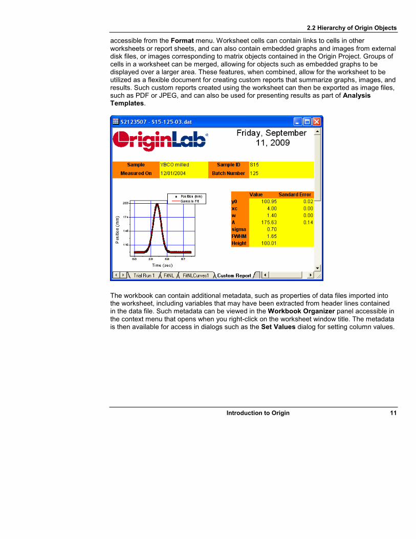
accessible from the Format menu. Worksheet cells can contain links to cells in other worksheets or report sheets, and can also contain embedded graphs and images from external disk files, or images corresponding to matrix objects contained in the Origin Project. Groups of cells in a worksheet can be merged, allowing for objects such as embedded graphs to be displayed over a larger area. These features, when combined, allow for the worksheet to be utilized as a flexible document for creating custom reports that summarize graphs, images, and results. Such custom reports created using the worksheet can then be exported as image files, such as PDF or JPEG, and can also be used for presenting results as part of Analysis Templates.
The workbook can contain additional metadata, such as properties of data files imported into the worksheet, including variables that may have been extracted from header lines contained in the data file. Such metadata can be viewed in the Workbook Organizer panel accessible in the context menu that opens when you right-click on the worksheet window title. The metadata is then available for access in dialogs such as the Set Values dialog for setting column values.

2.2 Hierarchy of Origin Objects
12 Introduction to Origin
2.2.2 Matrix Books
The Matrix Book in Origin is a collection of Matrix Sheets or Layers. Each matrix sheet can in turn contain multiple Matrix Objects. Each matrix object is a two-dimensional array of numbers. The data types supported include floating point, integer and complex.

2.2 Hierarchy of Origin Objects
Introduction to Origin 13
Matrix objects in a matrix sheet can also be viewed as image thumbnails. With the matrix sheet active, select View: Show Image Thumbnails from Origin's main menu, or from the right-click context menu of the matrix window title bar.
Each matrix object has associated X and Y coordinates. You can assign arbitrary begin and end values for X and Y coordinates, and those values will be used to create a linear map of coordinate values in X and Y. The coordinate values are used by Origin to set the axes when creating plots such as 3D Surface or Contour plots from the matrix data, and also by analysis operations such as surface fitting. The matrix dimensions, coordinates and X/Y/Z Labels, including Long Name, Units and Comments, can be customized using the Matrix Dimension and Labels dialog. The matrix data type, display, and Z Labels can be controlled using the Matrix Properties dialog. Both dialogs are accessible from the Matrix menu. All matrix objects contained in a given matrix sheet share the same dimensions property (number of cells in X and Y) and X/Y Labels, although each can have different settings for properties such as data type, display and Z Labels.

2.2 Hierarchy of Origin Objects
14 Introduction to Origin
The Set Values dialog also accessible from the Matrix menu, and allows you to specify a formula for generating the numbers in a matrix.
When a matrix contains numeric data, the top right corner of the window displays a D icon. A

2.2 Hierarchy of Origin Objects
Introduction to Origin 15
matrix object can also contain an image, such as an image imported from a disk file, instead of numeric data. When a matrix object contains an image, the top right corner displays an I icon. Basic image processing tools in Origin can operate on images stored in matrix objects. Images can be converted to numeric data and vice versa using menu items under the Image menu.
As mentioned earlier, all matrix objects in a matrix sheet can be viewed as thumbnail images. The bottom panel of the matrix window can display only one matrix object from one matrix sheet at a given time. Depending on whether the matrix object contains an image or numeric data, the display can be toggled between Data Mode and Image Mode, using the View menu. In Data Mode the display can also be toggled to either show the X and Y index or the actual X and Y coordinates, using the View menu.
2.2.3 Virtual Matrix
Data arranged in a group of worksheet cells can be treated as a virtual matrix, and such data can be used to create 3D plots, such as color mapped surfaces or contour plots. The X and Y coordinate values can be contained in data rows/columns or label rows of the worksheet. Nonlinear spacing of X and Y values is also supported.

2.2 Hierarchy of Origin Objects
16 Introduction to Origin
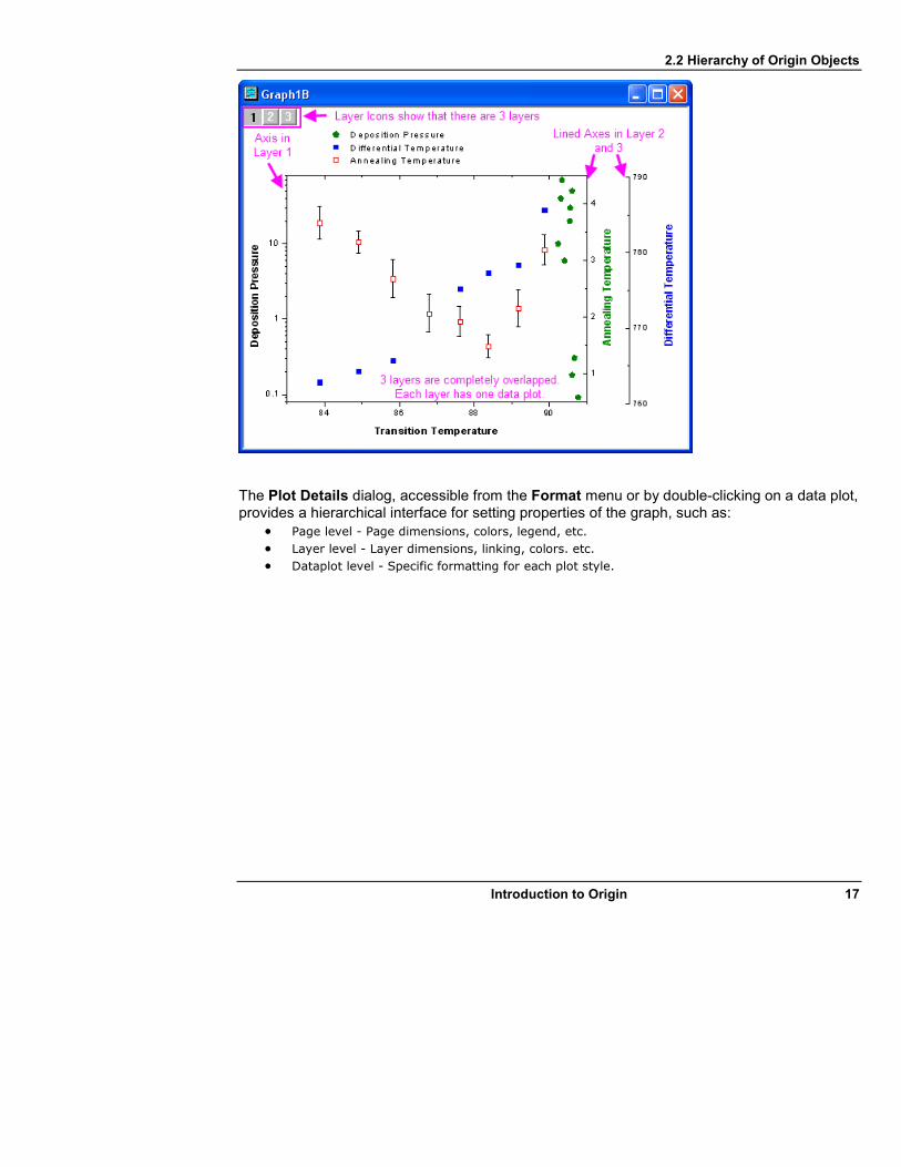
2.2.4 Graph
An Origin Graph Page can contain multiple Graph Layers, where each layer is comprised of a set of axes. Each graph layer can in turn contain multiple Data Plots. A Data Plot is simply a plot of one data set.
Graph layers can be separate from each other or can physically overlap in the graph page. The axes in one layer can also be linked to axes of other layers. This hierarchy provides a very flexible way to present multiple data plots in one graph in multiple layers, at the same time maintaining desired relationships between the data plots.
2.2 Hierarchy of Origin Objects
Introduction to Origin 17
The Plot Details dialog, accessible from the Format menu or by double-clicking on a data plot, provides a hierarchical interface for setting properties of the graph, such as:
• Page level - Page dimensions, colors, legend, etc.
• Layer level - Layer dimensions, linking, colors. etc.
• Dataplot level - Specific formatting for each plot style.

2.2 Hierarchy of Origin Objects
18 Introduction to Origin
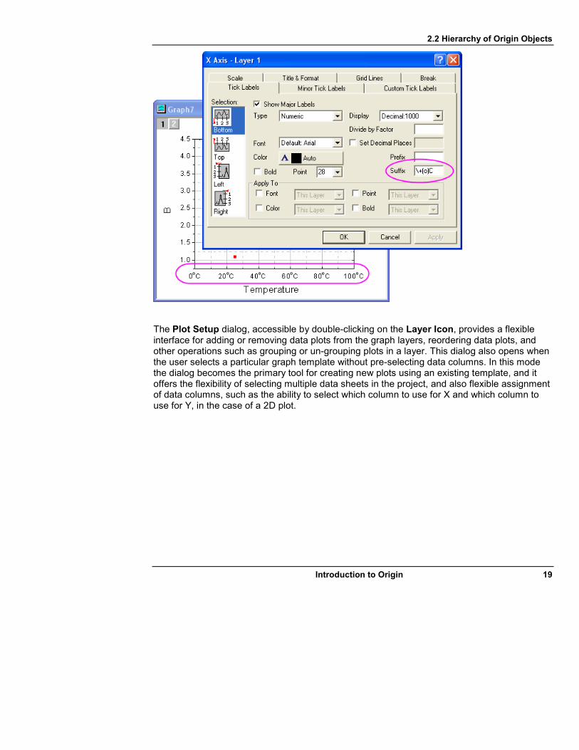
Double-clicking on any axis of a layer opens the Axis Dialog, which can be used to set properties of the axes such as tick directions, grid lines, and display format of tick labels.
2.2 Hierarchy of Origin Objects
Introduction to Origin 19
The Plot Setup dialog, accessible by double-clicking on the Layer Icon, provides a flexible interface for adding or removing data plots from the graph layers, reordering data plots, and other operations such as grouping or un-grouping plots in a layer. This dialog also opens when the user selects a particular graph template without pre-selecting data columns. In this mode the dialog becomes the primary tool for creating new plots using an existing template, and it offers the flexibility of selecting multiple data sheets in the project, and also flexible assignment of data columns, such as the ability to select which column to use for X and which column to use for Y, in the case of a 2D plot.

2.3 Operations and Recalculation
20 Introduction to Origin
2.3 Operations and Recalculation
Starting with version 8, results of various operations in Origin can be updated when source data is changed, such as when new data is imported to replace old data, or when a user decides to recall and change parameters of the operation. This feature is referred to as Recalculation. Dialogs for various operations, such as setting values of columns based on other columns, extracting worksheet data based on conditions of the data, or nonlinear curve fitting of data, provide a control for users to specify whether the Recalculate feature should be turned on, and whether the output should automatically update (Auto) or update when manually triggered (Manual).
If Recalculate is set to Auto or Manual, Origin saves all pertinent information related to the operation. For instance, if Recalculate is set in the Set Values dialog for setting column values, information about the source column(s), the formula itself, and any Before-Formula

2.3 Operations and Recalculation
Introduction to Origin 21
script are saved. If the operation is related to curve fitting, the details of the operation, including source data, what reports have been generated, and all settings relevant to the fitting, are saved.
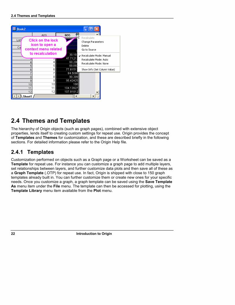
Operations that have Recalculate enabled are marked by displaying a lock on all output objects, such as worksheet columns and graph layers, related to the operation. The lock icons look like this:
Recalculate Auto Recalculate Manual Recalculate Manual—Needs Updating
A green lock means that output is based on the most current data. A yellow lock means that the output is based on previous data, and needs updating. Various options for managing the operation are available via the context menu displayed when clicking on the lock. For example, the user can click on the lock and select Change Parameters, which will then display the dialog associated with the operation, loaded with the exact settings used at the time the operation last executed. Users can change the settings and close the dialog to update the output with results from the changed settings.
The lock icon is object-specific— each worksheet column or graph layer for which recalculation is turned on will have its own lock, indicating whether the data has been updated or needs updating. There is also a project-level indicator for recalculation on the Standard Toolbar:
All Outputs Updated Outputs Need Updating
If one or more outputs in the current project need recalculation, this icon will become yellow. Clicking this button will update all operations for which input data has changed. This button is grayed out if recalculation is not active anywhere within the project.
2.4 Themes and Templates
22 Introduction to Origin
2.4 Themes and Templates
The hierarchy of Origin objects (such as graph pages), combined with extensive object properties, lends itself to creating custom settings for repeat use. Origin provides the concept of Templates and Themes for customization, and these are described briefly in the following sections. For detailed information please refer to the Origin Help file.
2.4.1 Templates
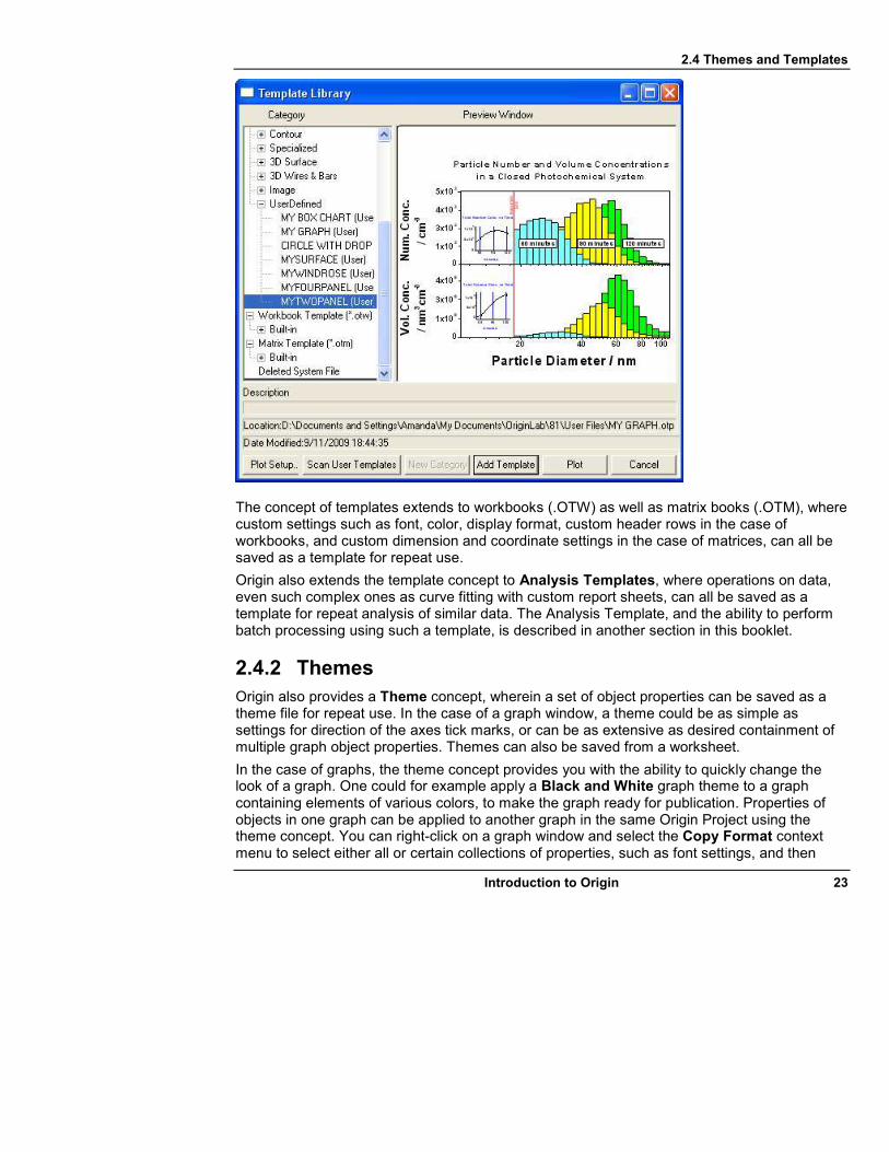
Customization performed on objects such as a Graph page or a Worksheet can be saved as a Template for repeat use. For instance you can customize a graph page to add multiple layers, set relationships between layers, and further customize data plots and then save all of these as a Graph Template (.OTP) for repeat use. In fact, Origin is shipped with close to 150 graph templates already built in. You can further customize them or create new ones for your specific needs. Once you customize a graph, a graph template can be saved using the Save Template As menu item under the File menu. The template can then be accessed for plotting, using the Template Library menu item available from the Plot menu.
2.4 Themes and Templates
Introduction to Origin 23
The concept of templates extends to workbooks (.OTW) as well as matrix books (.OTM), where custom settings such as font, color, display format, custom header rows in the case of workbooks, and custom dimension and coordinate settings in the case of matrices, can all be saved as a template for repeat use.
Origin also extends the template concept to Analysis Templates, where operations on data, even such complex ones as curve fitting with custom report sheets, can all be saved as a template for repeat analysis of similar data. The Analysis Template, and the ability to perform batch processing using such a template, is described in another section in this booklet.
2.4.2 Themes
Origin also provides a Theme concept, wherein a set of object properties can be saved as a theme file for repeat use. In the case of a graph window, a theme could be as simple as settings for direction of the axes tick marks, or can be as extensive as desired containment of multiple graph object properties. Themes can also be saved from a worksheet.
In the case of graphs, the theme concept provides you with the ability to quickly change the look of a graph. One could for example apply a Black and White graph theme to a graph containing elements of various colors, to make the graph ready for publication. Properties of objects in one graph can be applied to another graph in the same Origin Project using the theme concept. You can right-click on a graph window and select the Copy Format context menu to select either all or certain collections of properties, such as font settings, and then

2.4 Themes and Templates
24 Introduction to Origin
right-click on another graph and select Paste Format to apply the settings to that graph. Such a copy and paste format procedure can be applied to single elements, for example copying only the settings of a scatter plot from one graph to another.
The Theme Organizer dialog, accessible from the Tools menu, can be used to organize and apply themes to graphs and worksheets. This dialog can be used, for example, to apply a specific graph theme to all graphs contained in the Origin Project. Multiple graph themes can also be combined by first control-selecting desired themes and then accessing the Combine context menu item available in the right-click menu. This context menu also provides an option to edit a theme, allowing the user to add or delete properties to/from an existing theme.

2.4 Themes and Templates
Introduction to Origin 25
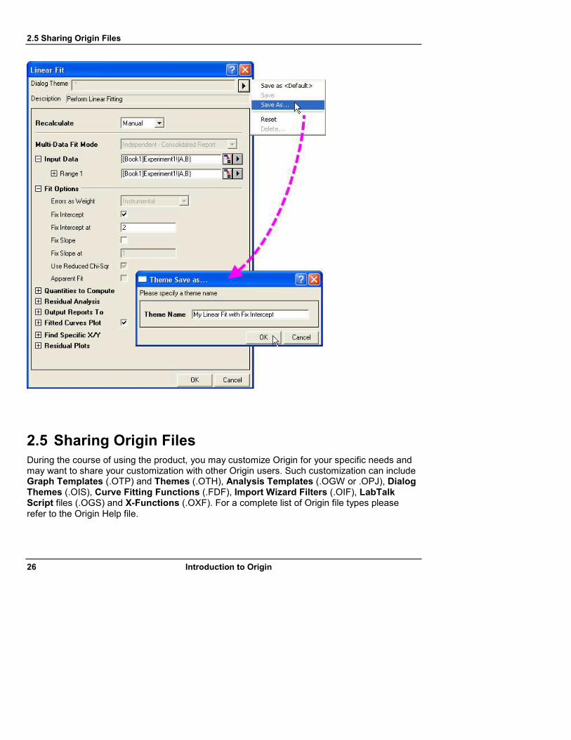
Origin also extends the concept of themes to dialog settings. You can thus customize settings of a dialog, such as the Smoothing dialog under the Analysis: Signal Processing menu, and then save your desired settings to the disk, as a named theme file. Multiple theme files can be saved for each dialog and then recalled from the dialog, allowing each dialog to be customized in different ways, i.e. for processing data from different experiments.
2.5 Sharing Origin Files
26 Introduction to Origin
2.5 Sharing Origin Files
During the course of using the product, you may customize Origin for your specific needs and may want to share your customization with other Origin users. Such customization can include Graph Templates (.OTP) and Themes (.OTH), Analysis Templates (.OGW or .OPJ), Dialog Themes (.OIS), Curve Fitting Functions (.FDF), Import Wizard Filters (.OIF), LabTalk Script files (.OGS) and X-Functions (.OXF). For a complete list of Origin file types please refer to the Origin Help file.

2.6 Analysis Templates and Batch Processing
Introduction to Origin 27
2.5.1 Drag and Drop Sharing
A quick and easy way to share a particular file with another user is to simply send them the file, such as via e-mail, and the file can be added to their Origin installation by dragging and dropping it onto Origin. Files such as an Origin Project (.OPJ) or Graph Template (.OTP) simply open when dropped onto Origin, and other files such as Fitting Functions are installed. For instance, if a new Fitting Function (.FDF) is dropped onto Origin, a dialog opens, asking for the name of the fitting function category to which the new function should be added. Drag-and-drop is supported for most Origin file types.
2.5.2 Sharing Files with Multiple Machines for Single Users
If you are a single user and have installed Origin on multiple machines and wish to share customization across those machines, you can set up the User Files Folder (UFF) to be on a shared location, such as a network drive, or even a USB flash drive, and use the same UFF path with each installation. Please refer to the Origin Help file for information on how to change the current UFF path.
2.5.3 Sharing Files with Other Users in a Network
If your Origin installation is part of a concurrent network, Origin provides a Group Folder mechanism to share files amongst multiple users. There can be multiple groups within a concurrent network, and each group can have a specific user acting as the group manager, who can utilize the Group Folder Manager tool to publish custom files for sharing with other members of the group. Please refer to the Origin Help file for more information.
2.5.4 Packaging Files
Origin provides a Package Manager tool to package multiple files into a single Origin Package (.OPX) file. This tool is accessible from the Tools menu, and provides a convenient way to distribute custom applications that may contain multiple Origin files, such as templates, X-Functions, and LabTalk script files. The .OPX file can be unpacked and installed by dragging and dropping it onto Origin. Options are provided for specifying where the files will be unpacked to, as well as executing LabTalk script before and after the installation. The Group Folder mechanism can also be used to distribute applications using .OPX files. For further details please refer to the Origin Help file.
2.6 Analysis Templates and Batch Processing
Once an Operation such as Set Values for columns, or Nonlinear Curve Fitting has been performed, and the user has set Recalculation to Auto or Manual, the workbook containing the operation, the source, and the output can be saved as an Analysis Template, from the File: Save Workbook as Analysis Template menu item. Origin clears all input and output data related to the operation and saves the workbook to the disk, as a file (.OGW).
2.6 Analysis Templates and Batch Processing
28 Introduction to Origin
Once an Analysis Template has been saved to the disk, it can be used at any time by opening a copy, using the File: Recent Books menu item. The user can then import new data into the appropriate source columns of the workbook, and the output columns and sheets will update automatically if the Recalculation status was set to Auto, or can be updated manually if the Recalculation status was set to Manual.
An Analysis Template workbook (OGW) can contain multiple operations, such as a series of operations that are related to one another. For example, the first operation could be extracting part of the data from the raw data sheet using specific conditions specified in the Extract Worksheet Data tool, and the next operation could be Nonlinear Fitting on the extracted data. When new data is brought into the raw data sheet of a book created from the template, the Extract Worksheet operation will trigger first, and then the updated output of this first operation will in turn trigger the second operation to perform the curve fitting. Analysis Templates thus provide an easy way for users to create custom analysis routines and then reuse them for repeat analysis of similar data.
The entire Origin Project (OPJ) containing multiple operations can also be saved as an Analysis Template, using the File: Save Project as Analysis Template menu item. Using the entire project in this manner may be useful or necessary in cases where the desired options involve more than one workbook, or involve multiple window types, such as workbooks and matrices, which cannot be combined into one workbook.
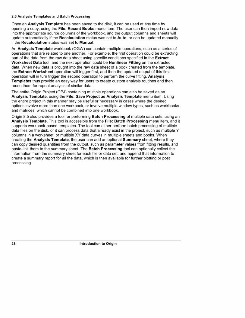
Origin 8.5 also provides a tool for performing Batch Processing of multiple data sets, using an Analysis Template. This tool is accessible from the File: Batch Processing menu item, and it supports workbook-based templates. The tool can either perform batch processing of multiple data files on the disk, or it can process data that already exist in the project, such as multiple Y columns in a worksheet, or multiple XY data curves in multiple sheets and books. When creating the Analysis Template, the user can add an optional Summary sheet, where they can copy desired quantities from the output, such as parameter values from fitting results, and paste-link them to the summary sheet. The Batch Processing tool can optionally collect the information from the summary sheet for each file or data set, and append that information to create a summary report for all the data, which is then available for further plotting or post processing.
2.7 OriginPro
Introduction to Origin 29
Tutorials are available in this booklet, and also from the Help: Tutorials menu item in the product, which demonstrate how to create and save an Analysis Template and then use such a template for performing Batch Processing of multiple data files or data sets.
2.7 OriginPro
The professional version of Origin, OriginPro, offers all of the features of Origin plus additional analysis tools and capabilities in the specific areas of Peak Analysis, Statistics, Signal Processing, Image Processing, and 3D Surface Fitting. Please refer to the Products area of the OriginLab website (www.OriginLab.com) for details regarding additional features available in OriginPro.

2.8 Programming in Origin
30 Introduction to Origin
If you have purchased the standard version of Origin, you can upgrade your version to OriginPro by contacting your Origin representative.
2.8 Programming in Origin
Origin provides two programming languages:
• LabTalk
• Origin C
LabTalk is a scripting language that provides access to most of the functionality of Origin. Using LabTalk, one can access and change properties of various Origin objects, such as worksheet columns, graph layers, and data plots. In addition to accessing objects in Origin, one can also access X-Functions from LabTalk, for performing various tasks such as importing data, analyzing data, exporting graphs and worksheets, and performing batch processing.
Origin C is a full-featured high-level programming language, closely based on the ANSI C programming language syntax. In addition, Origin C supports a number of C++ features and a few C# features. Origin C provides full access to all aspects of Origin, including data import, data handling, graphing, analysis, and export capabilities. Origin C functions can be accessed from user interface controls such as buttons, toolbars and menu items, or by creating X-Function-based dialogs.
Version 8.5 is shipped with a printed LabTalk Scripting Guide and an Origin C Programming Guide. These guides are also available as help files from the Origin Help menu. They provide an overview of scripting and Origin C programming, along with numerous examples for all key areas and operations in Origin. Detailed language reference help files for LabTalk and Origin C are accessible from the Help menu.
The OriginLab wiki site wiki.OriginLab.com has the most up-to-date documentation on LabTalk and Origin C, including extended examples for various Origin-specific areas.
The choice of which language to use for programming in Origin is mainly a question of complexity of the task. LabTalk scripting is well-suited for simple operations such as importing and manipulating data in worksheet columns, or performing analysis tasks such as smoothing, interpolation or curve fitting. In fact, when performing column transformations using the Set Column Values dialog, the formula as well as the Before Formula Script panel use LabTalk script.
LabTalk script can be easily executed from the Command and Script windows or from toolbar buttons and menu items, allowing for quick operations on data and Origin objects. Multiple lines of script can be saved to a disk file, optionally organized in sections, and called for execution from the interface. LabTalk script can include calls to X-Functions that perform advanced data processing and analysis. In short, if you are beginning to explore programming in Origin, it is good to start with LabTalk script.
As your Origin programming needs grow, or you find yourself in need of more advanced customization involving extensive coding, switching to the Origin C programming environment is recommended. Origin C provides access to all Origin objects and properties. Origin C code is organized as a set of functions with support for passing arguments, including various Origin

2.8 Programming in Origin
Introduction to Origin 31
objects. Origin C functions are compiled to object code and then loaded and executed inside of Origin. Origin C thus provides greater reliability and management capability, for developing and debugging code of greater scope and complexity.
Origin C is also the language used to create X-Functions, which are self-included XML files that can be loaded in Origin as a special type of global function. X-Functions provide users with a way to expand the functionality of Origin by adding custom data processing features. Custom tools can also be created using Origin's Developer Kit to build dialog resources, and then Origin C can be used to access such dialogs from within Origin.
In addition to the two programming languages, Origin can also be accessed as an Automation Server. Client applications such as National Instruments LabVIEW, Microsoft Excel or custom VB/VC/C# applications can use methods and properties exposed by Origin to exchange data back and forth with Origin, as well as send commands to be executed in Origin.

33
3 Origin Resources
The following sections summarize key Origin resources available to you. If you purchased Origin from a local distributor, your Origin distributor may provide additional resources. Please contact your distributor to learn more.
3.1 Help Files
Help files for various features in Origin, including programming, are accessible from the Origin Help menu. Help files are typically updated at every service release. You can check for availability of updated help files by selecting Help: Check for Updates.
The most up-to-date online versions of our help files can be accessed from the Support area of the OriginLab website (www.OriginLab.com) and from the OriginLab wiki site (wiki.OriginLab.com).
3.2 Tutorials
This booklet includes ten tutorials that cover some of the key features of Origin 8.5. Additional tutorials are available by selecting Help: Tutorials. The most up-to-date set of tutorials can be accessed from the OriginLab wiki site.
3.3 Multimedia Movies
A collection of multimedia movies are available from the home page of the OriginLab website as well as from the Support area of the website. The movies provide an easy way to learn key features and tips on using Origin. We frequently add to the collection of movies, so we recommend that you check back periodically to view new additions.
3.4 User Forum
The Origin User Forum is accessible from the home page of the OriginLab website. Our forum is very active with many posts from customers asking questions and providing answers, as well as sharing tips on using Origin. The forums are also monitored by our technical staff on a regular basis.
3.5 Case Studies
34 Origin Resources
3.5 Case Studies
The OriginLab website provides a collection of Case Studies, exploring how Origin users in various fields are using key features for their data analysis and graphing needs. We recommend that you view the case study collection to obtain ideas and suggestions about how to best utilize Origin for your field of work.
3.6 Graph Gallery
An extensive collection of user-created graphs are presented in our Graph Gallery, which is accessible from the home page of the OriginLab website. The graphs illustrate the wide variety of graph templates and advanced customization options available in Origin.
3.7 Wiki Site
The OriginLab wiki site (wiki.OriginLab.com) hosts the most up-to-date version of our documentation for Tutorials, Quick Help, LabTalk script programming, and Origin C programming. The wiki site also offers release notes with detailed information on features added in each version and service release, as well as information regarding other areas, such as installing and licensing the product, and notes for upgrade users.
3.8 Software Updates
OriginLab publishes periodic software updates, called Service Releases, for the current version of Origin. The Help: Check for Updates menu item in the product provides a fast and easy way to check whether a new service release is available. The Release Notes section on our wiki site provides pertinent information about what features and fixes are available in the current service release.
3.9 Technical Support
OriginLab and our team of international Origin Distributors are committed to providing timely and helpful Origin support. If you purchased Origin from a local Distributor, please contact your Distributor for support. Otherwise, contact OriginLab for support. Contact information for both OriginLab and the Origin Distributor team is available from the Support area of the OriginLab website. These web pages are accessible from Origin by selecting Help:Support:Contact OriginLab Support or Contact your Distributor.
All Origin 8.5 customers receive installation, licensing, and upgrade file-transfer support. However, support for using the Origin software is restricted to registered Origin users.

3.10 Training and Consulting
Origin Resources 35
Additional Origin Support restrictions may apply. Please review the OriginLab Technical Support policy statement provided in the Support area of the OriginLab website, or contact your Origin Distributor to learn about their support policy.
If you have a suggestion for adding or improving a feature in Origin, or if you have found a bug, we want to hear from you. Please select Help:Support:Submit a Feature Suggestion or Submit a Bug Report. You can also notify us from the Support area of the OriginLab website. Suggestions and bug reports are reviewed by our Support and Development teams.
3.10 Training and Consulting
OriginLab provides Training and Consulting services to customers to make optimal use of our products. To learn more about these services, see the Support area of the OriginLab website.

37
4 Notes for Upgrade Users
The Origin 8.5 Upgrade installs into a new program folder - the Upgrade does not update a previous version. It is therefore not necessary to have a previous version of Origin installed prior to upgrading.
Origin license management is version-specific. Thus, after installing the Origin 8.5 Upgrade, you must complete the license management process. A license dialog will be displayed when Origin 8.5 is launched for the first time, and this dialog will step you through the process.
Origin project files (OPJ files) created in earlier versions of Origin can be opened, updated, and saved in Origin 8.5. We do not recommend, however, opening and working with Origin 8.5 project files in earlier versions of Origin, as you may suffer some loss of information or data that is specific to the new version. For more information, please visit the Support area of the OriginLab website.
If you have custom Origin files from your previous version, such as graph templates, themes, fitting functions, LabTalk Script, or Origin C files, you can transfer them to your Origin 8.5 User Files Folder. Use the Tools:Transfer User Files menu item to view, select, and transfer files.
Key new features and improvements in Origin 8.5 are listed below. To learn more about these features, please view tutorials, help files, and web pages in the Products area of our website (www.OriginLab.com).
1. Transparency and Gradient Fill Control for Graph Objects 2. Zoom and Pan on Worksheets and Graphs 3. Embedding of MS-Word, Excel and Equation Objects in Origin Graphs 4. New Gadgets: Regional Stats, Differentiation, and Interpolation 5. Fitting Function Builder 6. 3D Graphing: Vectors, Error Bars, and Multiple Intersecting Surfaces 7. Matrix Improvements: Headers, Thumbnails, and Color Map 8. Contour and Surface Plot from a Virtual Matrix 9. Improved Image Profile Tool 10. Redesigned Data Information Window 11. 2D Plotting Enhancements: Label Customization and Flexible Ternary Scale 12. Non-linear Z-axis, and Color Map Support for Waterfall Plots


39
5 Tutorials
The following tutorials highlight some of the key features in Origin, including some of the new features introduced in version 8.5.
For a complete collection of Origin tutorials, please access the Help: Tutorials menu in Origin. Tutorials are maintained on our wiki site and are updated periodically. Please visit wiki.OriginLab.com for the most up-to-date tutorials.
Our main website www.OriginLab.com also offers Multimedia Movies about key Origin features.
• Tutorial 1 - Importing Data
• Tutorial 2 - Setting Column Values
• Tutorial 3 - Creating a Graph
• Tutorial 4 - Plotting Overlapping Data and Setting Transparency
• Tutorial 5 - Creating Intersecting Surface Plots from Worksheets
• Tutorial 6 - Customizing a Graph
• Tutorial 7 - Contour Plots and Color Mapping
• Tutorial 8 - Merging Graphs and Arranging Graph Layers
• Tutorial 9 - Working with Excel
• Tutorial 10 - Descriptive Statistics
• Tutorial 11 - Nonlinear Curve Fitting
• Tutorial 12 - Batch Processing using Analysis Template
5.1 Importing Data
40 Tutorials
5.1 Importing Data
5.1.1 Summary
Origin provides flexible ways of importing data, including simply dragging and dropping data files, using the ASCII import dialog to customize settings, and using the Import Wizard for advanced customization, extracting variables from header lines, and supporting custom file formats for many third-party files. This tutorial will highlight some of these features.
This tutorial will show you how to: • Import files by drag-and-drop
• Import multiple ASCII files by customizing settings
• Save settings for future use
• Use the Import Wizard and import filters
5.1.2 Drag-and-Drop Importing of ASCII Files
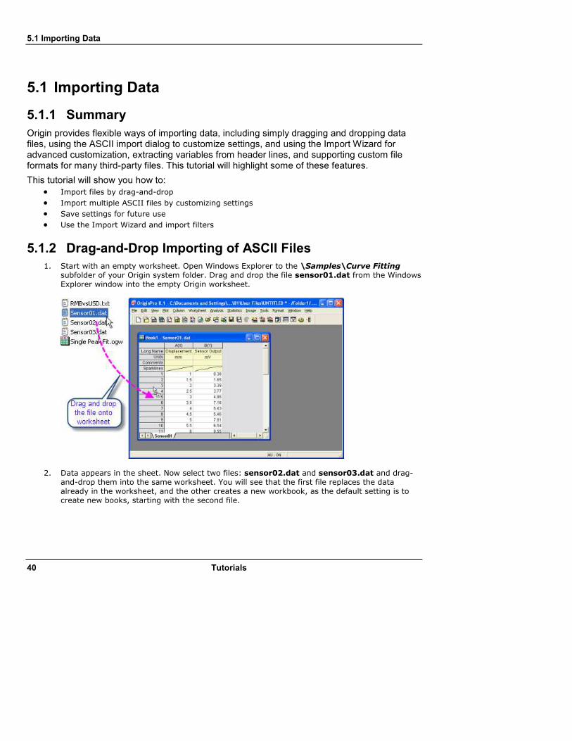
1. Start with an empty worksheet. Open Windows Explorer to the \Samples\Curve Fitting subfolder of your Origin system folder. Drag and drop the file sensor01.dat from the Windows Explorer window into the empty Origin worksheet.
2. Data appears in the sheet. Now select two files: sensor02.dat and sensor03.dat and drag-and-drop them into the same worksheet. You will see that the first file replaces the data already in the worksheet, and the other creates a new workbook, as the default setting is to create new books, starting with the second file.

5.1 Importing Data
Tutorials 41
The default setting when dragging and dropping is to replace existing data. If you have some other data already in the sheet, you can drop the file onto the gray area outside of any window, or into a graph window, and Origin will create a new book and import the data into it.
5.1.3 Customizing ASCII Import Dialog Settings and Saving a Theme
ASCII import and custom-file-format import both provide an options dialog, wherein a user can customize import settings and then save settings to use later on similar files.
1. Start with a new book and click the Import Multiple ASCII button on the standard
toolbar. 2. Select the files sensor01.dat, and sensor02.dat from \Samples\Curve Fitting and add
them to the lower panel of the file dialog. Click the file name column header in the lower panel to sort the files by name. Keep the Show Options Dialog box checked and click OK. This will open a dialog for import settings.
3. Change import mode to Start New Sheets. Expand the (Re)Naming Worksheet and Workbook node and change the settings so that only the sheet gets renamed.

5.1 Importing Data
42 Tutorials
4. Click on the right arrow button at the top of the dialog and select Save As, then give it a name like My Multifile Import and click OK. This saves your settings to a theme file on the disk.
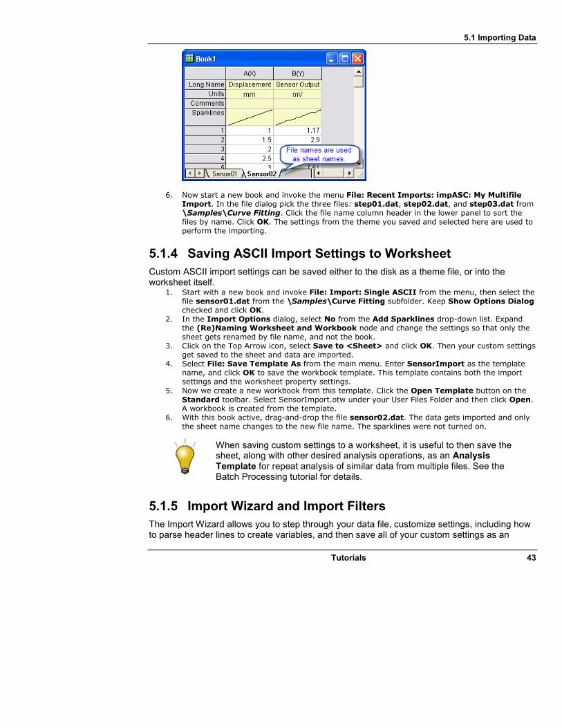
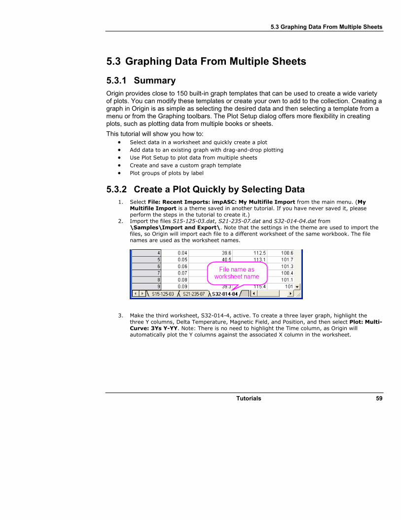
5. Click OK and the first file gets imported into the current sheet, and a new sheet is created for the second file. File names are used as sheet names.
5.1 Importing Data
Tutorials 43
6. Now start a new book and invoke the menu File: Recent Imports: impASC: My Multifile Import. In the file dialog pick the three files: step01.dat, step02.dat, and step03.dat from \Samples\Curve Fitting. Click the file name column header in the lower panel to sort the files by name. Click OK. The settings from the theme you saved and selected here are used to perform the importing.
5.1.4 Saving ASCII Import Settings to Worksheet
Custom ASCII import settings can be saved either to the disk as a theme file, or into the worksheet itself.
1. Start with a new book and invoke File: Import: Single ASCII from the menu, then select the file sensor01.dat from the \Samples\Curve Fitting subfolder. Keep Show Options Dialog checked and click OK.
2. In the Import Options dialog, select No from the Add Sparklines drop-down list. Expand the (Re)Naming Worksheet and Workbook node and change the settings so that only the sheet gets renamed by file name, and not the book.
3. Click on the Top Arrow icon, select Save to <Sheet> and click OK. Then your custom settings get saved to the sheet and data are imported.
4. Select File: Save Template As from the main menu. Enter SensorImport as the template name, and click OK to save the workbook template. This template contains both the import settings and the worksheet property settings.
5. Now we create a new workbook from this template. Click the Open Template button on the Standard toolbar. Select SensorImport.otw under your User Files Folder and then click Open. A workbook is created from the template.
6. With this book active, drag-and-drop the file sensor02.dat. The data gets imported and only the sheet name changes to the new file name. The sparklines were not turned on.
When saving custom settings to a worksheet, it is useful to then save the sheet, along with other desired analysis operations, as an Analysis Template for repeat analysis of similar data from multiple files. See the Batch Processing tutorial for details.
5.1.5 Import Wizard and Import Filters
The Import Wizard allows you to step through your data file, customize settings, including how to parse header lines to create variables, and then save all of your custom settings as an

5.1 Importing Data
44 Tutorials
import filter (.OIF) file for repeat use. The filter file can reside in the data folder, in the \Filters subfolder of your User Files Folder, or can even be saved to the worksheet itself for use with Analysis Templates. The Wizard is typically useful when the file has header lines that need to be parsed, or the file needs custom settings such as fixed width, or for executing LabTalk script at the end of the import for post processing.
1. Start with a new book. Click on the Import Wizard button in the standard toolbar to
launch the wizard. 2. Select the file \Samples\Import and Export\S15-125-03.dat. 3. Note that the Import Filter for Current Data Type drop-down changes to show Data
Folder: VarsFromFileNameAndHeader. This is a filter already created for this file and shipped with Origin, and it is automatically picked up from the same folder as the data file you chose. Next change Import Mode to Replace Existing Data.
4. Click Next and walk through the pages. Notice controls on the Header Lines pages that allow flexible definitions of where the header lines end, where sub header lines are located, and what gets assigned to long name, units, etc.
5. For this file the Variables Extraction and Variables Extraction by Delimiter pages define how to parse the header lines to extract values from them.
6. Click Next until you get to the Save Filters page. Check the Save filter box and change the radio button to In the Window. This will save the filter in the active worksheet.

5.1 Importing Data
Tutorials 45
7. Now check Specify advanced filter options. This brings you to the last page where script (to run at the end of the import) can be specified. In the edit box enter:
col(DegC)=col(2)-273.15; col(DegC)[u]$=(\+(0)C); col(DegC)[l]$=Delta Temperature;

5.1 Importing Data
46 Tutorials
8. Click Finish. The file gets imported and the import filter is now saved in your worksheet. The fifth column is a column added by the script. It is the Delta Temperature data in degrees Celsius.
9. With the worksheet active, click the Import Wizard button again and pick the file \S21-235-07.dat. Note that the Import Filter for Current Data Type drop-down shows <use filter in active window>, so Origin picks up the filter settings that were saved in the worksheet.
5.1 Importing Data
Tutorials 47
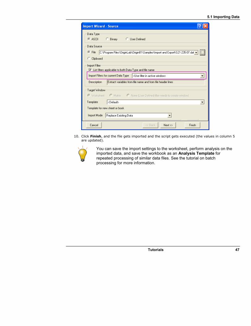
10. Click Finish, and the file gets imported and the script gets executed (the values in column 5 are updated).
You can save the import settings to the worksheet, perform analysis on the imported data, and save the workbook as an Analysis Template for repeated processing of similar data files. See the tutorial on batch processing for more information.

5.2 Setting Column Values
48 Tutorials
5.2 Setting Column Values
5.2.1 Summary
Origin provides several ways to fill a worksheet column with values. Use Auto Fill or script commands to fill a series of values. Use the Set Values dialog box to define a mathematical formula to generate or transform a data set. Refer to values in other columns from the same sheet or from other sheets and books. Select from a large collection of built-in functions to compute values. Create variables from metadata stored in worksheets or column headers, and use these variables in your column formula.
This tutorial will show you how to compute column values by: • Filling a Column with an Arithmetic Series
• Using Built-in Functions
• Using Other Columns
• Using Cell Values
• Using Variables from Workbook Metadata
5.2.2 Filling a Column with Arithmetic Series
Origin provides multiple methods to fill a column with arithmetic series.
5.2.2.1 Using Auto Fill
Enter a few starting values in cells.
5.2 Setting Column Values
Tutorials 49
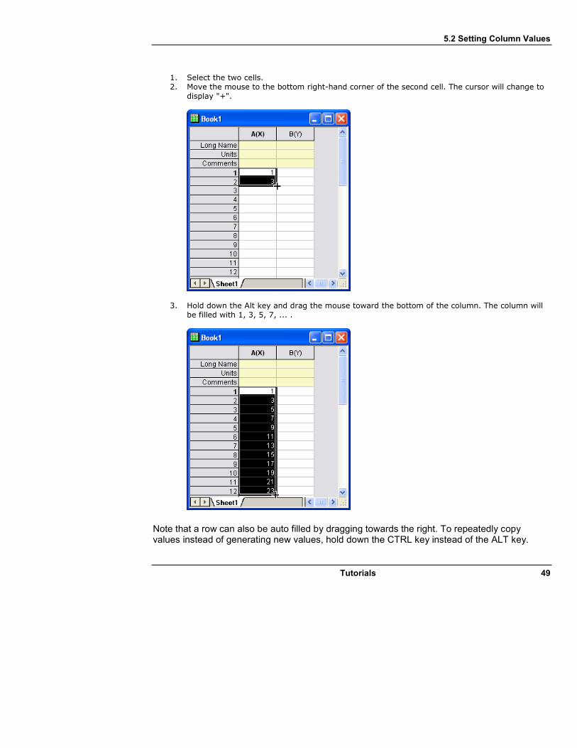
1. Select the two cells. 2. Move the mouse to the bottom right-hand corner of the second cell. The cursor will change to
display "+".
3. Hold down the Alt key and drag the mouse toward the bottom of the column. The column will be filled with 1, 3, 5, 7, ... .
Note that a row can also be auto filled by dragging towards the right. To repeatedly copy values instead of generating new values, hold down the CTRL key instead of the ALT key.

5.2 Setting Column Values
50 Tutorials
5.2.2.2 Using Data List
Type the following script in the Command window. col(B) = {1:2:23};
Column B will be filled with values: 1, 3, 5, 7, ...., 23
{v1:vstep:vn} produces the same result as the function data(v1,vn,vstep).
5.2.3 Using Built-in Functions
1. Create a new workbook. Import the US Metropolitan Area Population.dat file from the \Samples\Data Manipulation\ folder.
2. Click the Add New Columns button on the Standard toolbar to add a new column E. Highlight this column and right-click on it to select Set Column Values from the context menu. The Set Values dialog opens.
3. Select F(x): String: Right(str$,n)$ to add Right(,)$ into the Column Formula panel. 4. Click in the position between the left parenthesis and the comma, then insert the Trim
function by selecting F(x): String: Trim(str$[,n])$. The formula should look like: Right(Trim()$,)$.
5. Select wcol(1):wcol(4) to insert wcol(4) as the input of the Trim function. Then input 2 for the Right function and the expression should look like:

5.2 Setting Column Values
Tutorials 51
6. Click the OK button and the last column will get filled with States from column 4.
Note that some columns had two states at the end of the Metropolitan Area name, so to get both names change the formula to:
Right(Col(Metropolitan Area),Len(Col(Metropolitan Area))-Find(Col(Metropolitan Area),",")-1)$
When referring to another column in the same worksheet, you can use index, short name, or long name to identify the column.
5.2.4 Using Other Columns
1. We will continue with the steps from above to show you how to use other columns in the Set Values dialog. Add a new column to the worksheet (right-click to the right of the last column in the worksheet and select Add New Column from the context menu). Change the Long Name of the column to "Population/Sq. Mi."
2. Highlight this column and right-click on it. Select Set Column Values to bring up the dialog. Click the Col(A) menu and choose Col(A):Population and then enter the / character. Click the Col(A) menu again and choose Col(B):Sq. Mi.. The formula should look like: Col(Population)/Col(Sq. Mi.)
3. Click OK and the column will get computed using data from the other two columns.
5.2.5 Using Columns from Other Sheets
The Set Values dialog provides an Insert menu to easily insert range variables that point to columns in other books/sheets, which can then be used to compute column values for the current column.
1. Open the project Samples\Data Manipulation\Setting Column Values.OPJ and switch to the Columns from Other Sheets subfolder.
2. Right-click on the Sample sheet and select Duplicate Without Data. Rename(by double-clicking on the current name) the new sheet as: Corrected Sample.

5.2 Setting Column Values
52 Tutorials
3. Now you will fill these three columns with data based on formulas that reference columns in the other sheets. Highlight the first column and right-click on it to select Set Columns Values to open the dialog. Select Variables: Insert Range Variables to open the Range Browser dialog. You will use this dialog to add a range variable to the Before Formula Scripts panel, according to the instructions in the image below:
Click OK to close the dialog. range r1 = Sample!A will be automatically inserted into the Before Formula Scripts panel. Please rename it as:
range rTime = Sample!A;
4. Then enter rTime in the Column Formula and click the Apply button to generate data for
the first column.

5.2 Setting Column Values
Tutorials 53
5. Click the button to go to the next column. Then select Variables: Insert Range Variables to open the Range Browser dialog. You will use this dialog to insert two range variables to the Before Formula Script panel. Sort the data sets by long name (Click the LName heading to sort it). Insert two range variables that refer to Transducer1 columns in both the Reference worksheet and the Sample worksheet. Rename them as:
range rRef = Reference!B; range rSample = Sample!B;
6. Then input the following expression into the Column Formula:
rSample - (rSample[1] - rRef[1])
Click the Apply button to generate data for the second column of the Corrected Sample worksheet. Don't click the OK button yet.

5.2 Setting Column Values
54 Tutorials
You reference a particular cell value with square brackets, so [1] in the formula above means the first element.
Your formulas can be saved and reloaded into other columns to generate new data. 1. Now we will edit the range variables in the Before Formula Scripts panel and use another
expression to get the same results. Remove the column names B"Transducer 1" of the two range variables and select F(x): Variables and Constants: wcol(_ThisNumCol) in both lines so it looks as follows:
range rRef = Reference!WCol(_ThisColNum); range rSample = Sample!WCol(_ThisColNum);
2. Leave the expressions in the Column Formula panel unchanged and click Apply to generate
data. You will find that it gives you the same results, but the formula can now be applied to any column in the Corrected Sample worksheet, and the range variables will point to the same column, by index, in the Reference and Sample worksheets.
3. Select Formula: Save to open the Save dialog and name it "My Correction". Click the OK button to save it.
4. Click the button to go to the next column. Select Formula: Load: My Correction and click the Apply button to generate data for the third column.

5.2 Setting Column Values
Tutorials 55
5.2.6 Using Cell Values
Values contained in specific worksheet cells can be referenced and used to compute the formula for setting column values. This provides an easy way to use worksheet cells as control cells for updating values in a column.
1. Open the project \Samples\Data Manipulation\Setting Column Values.opj and switch to the Cells in a Worksheet subfolder in Project Explorer.
2. Right-click on column C and select the Set Column Values... context menu to bring up the Set Values dialog.
3. Use the Variables: Insert Range Variable... menu item to open the Range Browser. Then select the column with the long name (LName) Value. Press the Add button to insert a variable. Press the Close button to close the dialog.
4. In the Before Formula Scripts panel, change the name of the range variable to be rControl and add these additional lines so that the script looks like below
range rControl = G"Value"; int nOrder = rControl[2]; int nPoints = rControl[3]; differentiate -se iy:=(1,2) order:=1 smooth:=1 poly:=nOrder npts:=nPoints oy:=(1,3);
5. The script calls the differentiate X-Function and passes the cell values from column G as
arguments for polynomial order and number of points, which controls the Savitzky-Golay smoothing performed during the differentiation.
6. Set the Recalculate drop-down to Auto and press OK to close the dialog.

5.2 Setting Column Values
56 Tutorials
7. Now you can try to change the values in column G, to change the output.
Note: Allowed values of polynomial order are 1 to 9.
The graph shown in the worksheet was first created and then embedded into the worksheet by merging a group of cells.
5.2.7 Using Variables from Workbook Metadata
Metadata stored in the workbook, such as variables saved when importing data using the Import Wizard, can be referenced and used for computing column values.
1. Open or continue working with \Samples\Data Manipulation\Setting Column Values.OPJ, and switch to the Worksheet Metadata subfolder from the Project Explorer window.
2. Select column A and right-click to select the Insert menu option. A new column is inserted to the left of column A.
3. Select the first column (this newly inserted column) and right-click on it. Then select the Set Column Values menu item to open the Set Values dialog.
4. Select the Variables: Insert Info Variable menu item to open the Insert Variables dialog. Select Numeric int from the Variable Type drop-down list. Then select NumberOfPoints and press the Insert button to insert this variable into the Before Formula Scripts panel.

5.2 Setting Column Values
Tutorials 57
5. Next, set Variable Type to Numeric double. Hold the Shift key down to select both
StartFrequencyKHz and StepFrequencyKHz, and then press Insert to insert these two variables. Press the Close button to close the dialog.
6. In the upper Column Formula panel, input {d1:d2:d1+(n1-1)*d2} and then press the OK button to generate data and close the dialog. The column will be filled with frequency values.
7. Highlight the first and second columns, right-click on them and select Set As: XYY to change the plotting designations to X and Y. After you change the long name of the first column to Frequency, the worksheet should look like:

5.2 Setting Column Values
58 Tutorials
5.3 Graphing Data From Multiple Sheets
Tutorials 59
5.3 Graphing Data From Multiple Sheets
5.3.1 Summary
Origin provides close to 150 built-in graph templates that can be used to create a wide variety of plots. You can modify these templates or create your own to add to the collection. Creating a graph in Origin is as simple as selecting the desired data and then selecting a template from a menu or from the Graphing toolbars. The Plot Setup dialog offers more flexibility in creating plots, such as plotting data from multiple books or sheets.
This tutorial will show you how to:
• Select data in a worksheet and quickly create a plot
• Add data to an existing graph with drag-and-drop plotting
• Use Plot Setup to plot data from multiple sheets
• Create and save a custom graph template
• Plot groups of plots by label
5.3.2 Create a Plot Quickly by Selecting Data
1. Select File: Recent Imports: impASC: My Multifile Import from the main menu. (My Multifile Import is a theme saved in another tutorial. If you have never saved it, please perform the steps in the tutorial to create it.)
2. Import the files S15-125-03.dat, S21-235-07.dat and S32-014-04.dat from \Samples\Import and Export\. Note that the settings in the theme are used to import the files, so Origin will import each file to a different worksheet of the same workbook. The file names are used as the worksheet names.
3. Make the third worksheet, S32-014-4, active. To create a three layer graph, highlight the three Y columns, Delta Temperature, Magnetic Field, and Position, and then select Plot: Multi-Curve: 3Ys Y-YY. Note: There is no need to highlight the Time column, as Origin will automatically plot the Y columns against the associated X column in the worksheet.
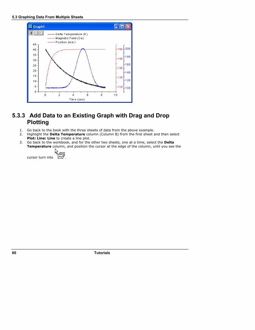
5.3 Graphing Data From Multiple Sheets
60 Tutorials
5.3.3 Add Data to an Existing Graph with Drag and Drop Plotting
1. Go back to the book with the three sheets of data from the above example. 2. Highlight the Delta Temperature column (Column B) from the first sheet and then select
Plot: Line: Line to create a line plot. 3. Go back to the workbook, and for the other two sheets, one at a time, select the Delta
Temperature column, and position the cursor at the edge of the column, until you see the
cursor turn into .
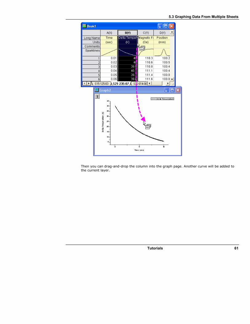
5.3 Graphing Data From Multiple Sheets
Tutorials 61
Then you can drag-and-drop the column into the graph page. Another curve will be added to the current layer.
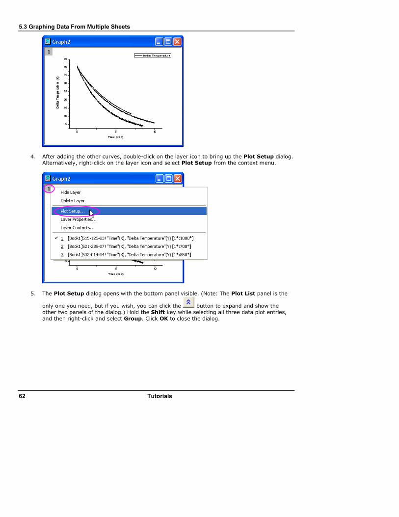
5.3 Graphing Data From Multiple Sheets
62 Tutorials
4. After adding the other curves, double-click on the layer icon to bring up the Plot Setup dialog. Alternatively, right-click on the layer icon and select Plot Setup from the context menu.
5. The Plot Setup dialog opens with the bottom panel visible. (Note: The Plot List panel is the
only one you need, but if you wish, you can click the button to expand and show the other two panels of the dialog.) Hold the Shift key while selecting all three data plot entries, and then right-click and select Group. Click OK to close the dialog.

5.3 Graphing Data From Multiple Sheets
Tutorials 63
Grouping the plots allows for quick creation of presentation-ready graphs, because each selection in the group is assigned a differentiating set of plot attributes (line color = black, red, green; symbol shape = square, circle, triangle; etc...).
6. Select Graph: Update Legend to open the legendupdate X-Function dialog. Set the Auto Legend Translation Mode to Custom. Enter @WS for Legend Custom Format. Click OK and the legend will now contain the worksheet name for each data plot.
5.3.4 Create a Plot using Plot Setup
The Plot Setup dialog box is useful for a variety of plotting tasks, including creating graphs, modifying the plot type, adding plots to or removing plots from the graph, grouping or ungrouping plots, and editing the plot range.
1. Using the same workbook as in the above examples, select no data. It doesn't matter what worksheet is active; what is important is that no columns are highlighted.
2. Select Plot: Multi-Curve: 4 Panel from the menu. Without any data selected, Origin will open
the Plot Setup dialog, allowing you to choose the data you wish to plot.
3. Expand the top panel by clicking the button. Hold down the Shift key to highlight the three worksheets. Alternatively, you can just click and drag your selection so that all three worksheets are highlighted.

5.3 Graphing Data From Multiple Sheets
64 Tutorials
4. In the middle panel, common columns in all three sheets are displayed. In this case, all three
sheets have similar data with matching column names. Click the double arrow button to
show the plot column list. This mode is easier because you don't have to check the X and Y designation check boxes.
5. Open the bottom panel of the dialog, the Plot List, if it is not already visible. Layer 1 is highlighted. Select Delta Temperature in the middle panel, and then click the Add button. Since you already selected the three worksheets in Step 3, this will add the Delta Temperature column from each of the three worksheets to layer 1.

5.3 Graphing Data From Multiple Sheets
Tutorials 65
6. Repeat these steps to add Magnetic Field and Position into layer 2 and layer 3, respectively.
Note that in each layer, the three data plots are automatically grouped.
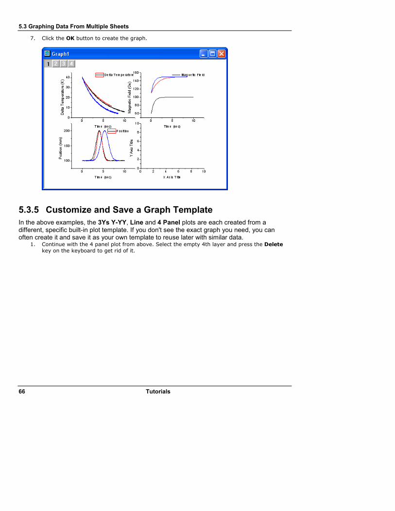
5.3 Graphing Data From Multiple Sheets
66 Tutorials
7. Click the OK button to create the graph.
5.3.5 Customize and Save a Graph Template
In the above examples, the 3Ys Y-YY, Line and 4 Panel plots are each created from a different, specific built-in plot template. If you don't see the exact graph you need, you can often create it and save it as your own template to reuse later with similar data.
1. Continue with the 4 panel plot from above. Select the empty 4th layer and press the Delete
key on the keyboard to get rid of it.
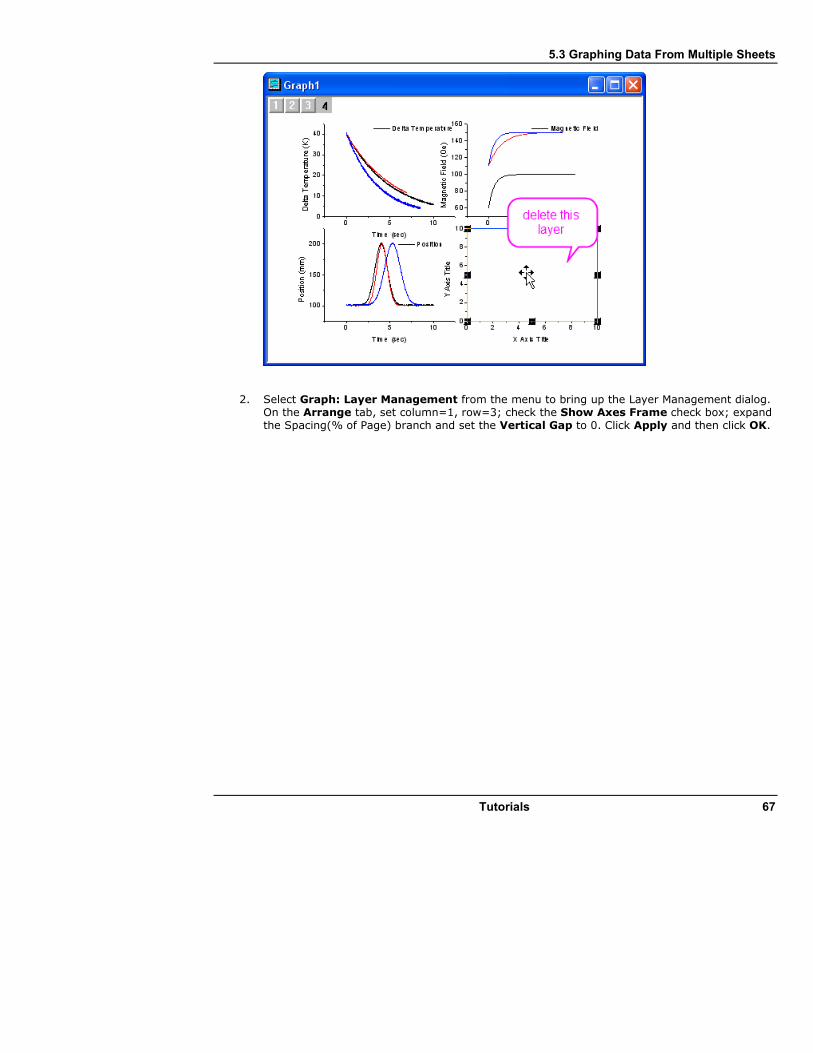
5.3 Graphing Data From Multiple Sheets
Tutorials 67
2. Select Graph: Layer Management from the menu to bring up the Layer Management dialog. On the Arrange tab, set column=1, row=3; check the Show Axes Frame check box; expand the Spacing(% of Page) branch and set the Vertical Gap to 0. Click Apply and then click OK.

5.3 Graphing Data From Multiple Sheets
68 Tutorials
3. Select File: Page Setup from the menu and change the Orientation to Portrait. 4. Select Graph: Update Legend: Open Dialog. Leave the destination as Whole Page to update
the legend in all layers on the graph page. Set the Auto Legend Translation Mode to Custom. Enter @WS for Legend Custom Format, and click OK. Your graph will look as follows:

5.3 Graphing Data From Multiple Sheets
Tutorials 69
To align the left Y-axis titles, you can hold down Shift and select them, and then use the Left Align button on the Object Edit toolbar.
5. Now that you have customized the graph, select File: Save Template As. In the dialog that opens, save as a new template with a new name such as PAN3 under the UserDefined category.
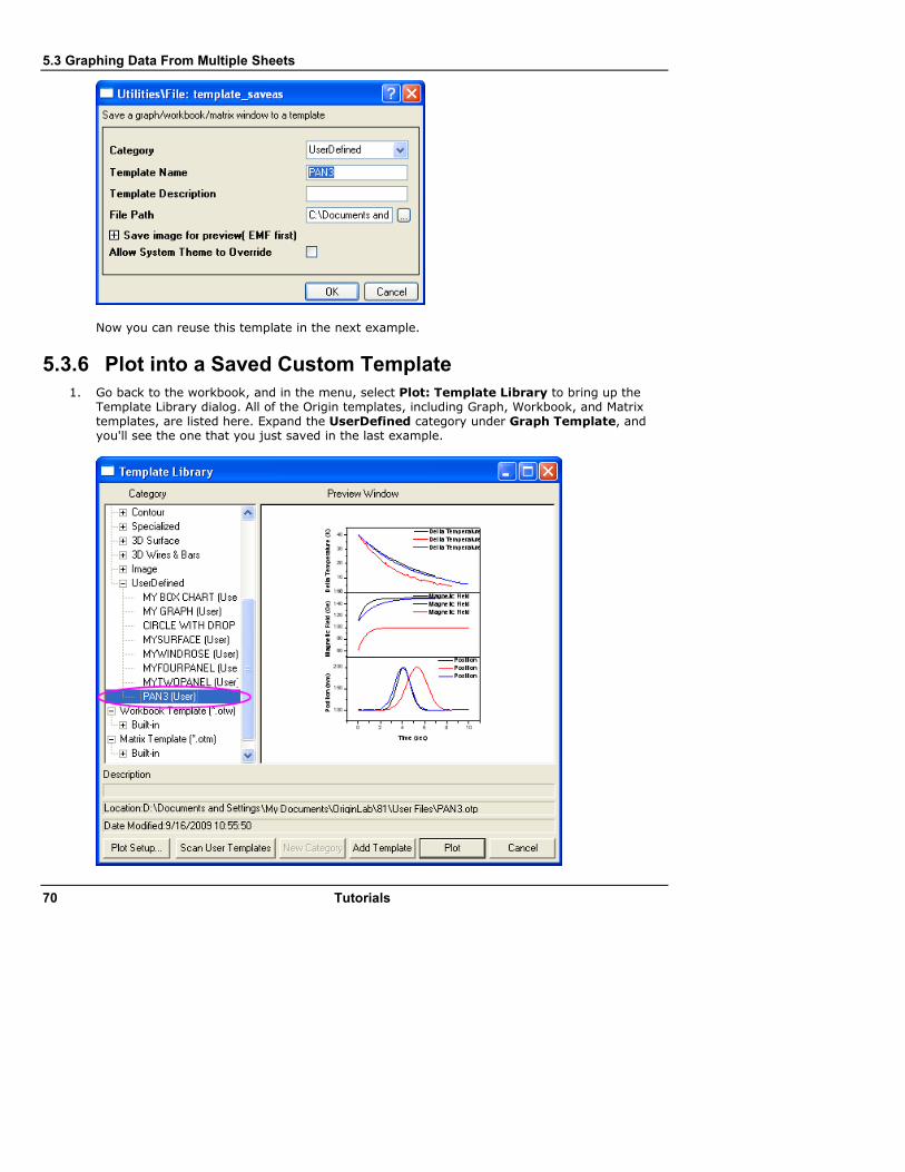
5.3 Graphing Data From Multiple Sheets
70 Tutorials
Now you can reuse this template in the next example.
5.3.6 Plot into a Saved Custom Template
1. Go back to the workbook, and in the menu, select Plot: Template Library to bring up the Template Library dialog. All of the Origin templates, including Graph, Workbook, and Matrix templates, are listed here. Expand the UserDefined category under Graph Template, and you'll see the one that you just saved in the last example.
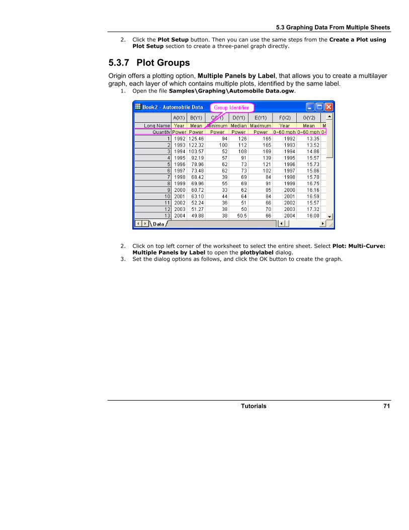
5.3 Graphing Data From Multiple Sheets
Tutorials 71
2. Click the Plot Setup button. Then you can use the same steps from the Create a Plot using Plot Setup section to create a three-panel graph directly.
5.3.7 Plot Groups
Origin offers a plotting option, Multiple Panels by Label, that allows you to create a multilayer graph, each layer of which contains multiple plots, identified by the same label.
1. Open the file Samples\Graphing\Automobile Data.ogw.
2. Click on top left corner of the worksheet to select the entire sheet. Select Plot: Multi-Curve: Multiple Panels by Label to open the plotbylabel dialog.
3. Set the dialog options as follows, and click the OK button to create the graph.

5.3 Graphing Data From Multiple Sheets
72 Tutorials
The graph should look like this:
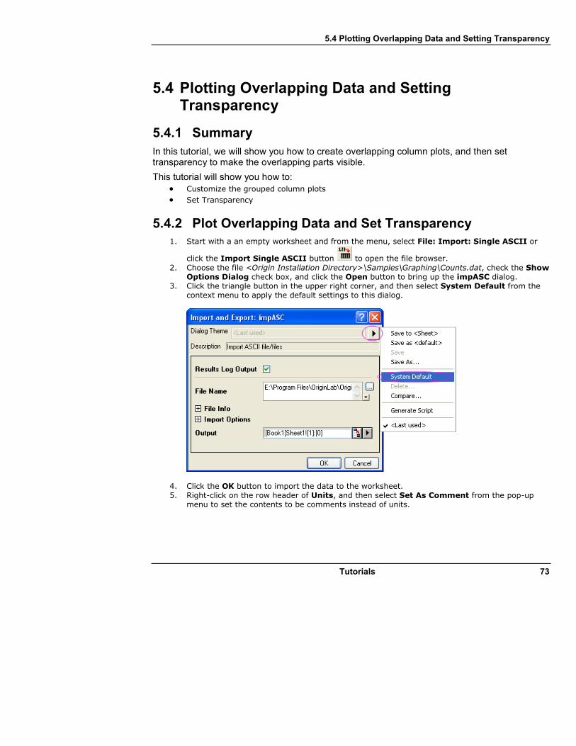
5.4 Plotting Overlapping Data and Setting Transparency
Tutorials 73
5.4 Plotting Overlapping Data and Setting Transparency
5.4.1 Summary
In this tutorial, we will show you how to create overlapping column plots, and then set transparency to make the overlapping parts visible.
This tutorial will show you how to: • Customize the grouped column plots
• Set Transparency
5.4.2 Plot Overlapping Data and Set Transparency
1. Start with a an empty worksheet and from the menu, select File: Import: Single ASCII or
click the Import Single ASCII button to open the file browser.
2. Choose the file <Origin Installation Directory>\Samples\Graphing\Counts.dat, check the Show Options Dialog check box, and click the Open button to bring up the impASC dialog.
3. Click the triangle button in the upper right corner, and then select System Default from the context menu to apply the default settings to this dialog.
4. Click the OK button to import the data to the worksheet. 5. Right-click on the row header of Units, and then select Set As Comment from the pop-up
menu to set the contents to be comments instead of units.
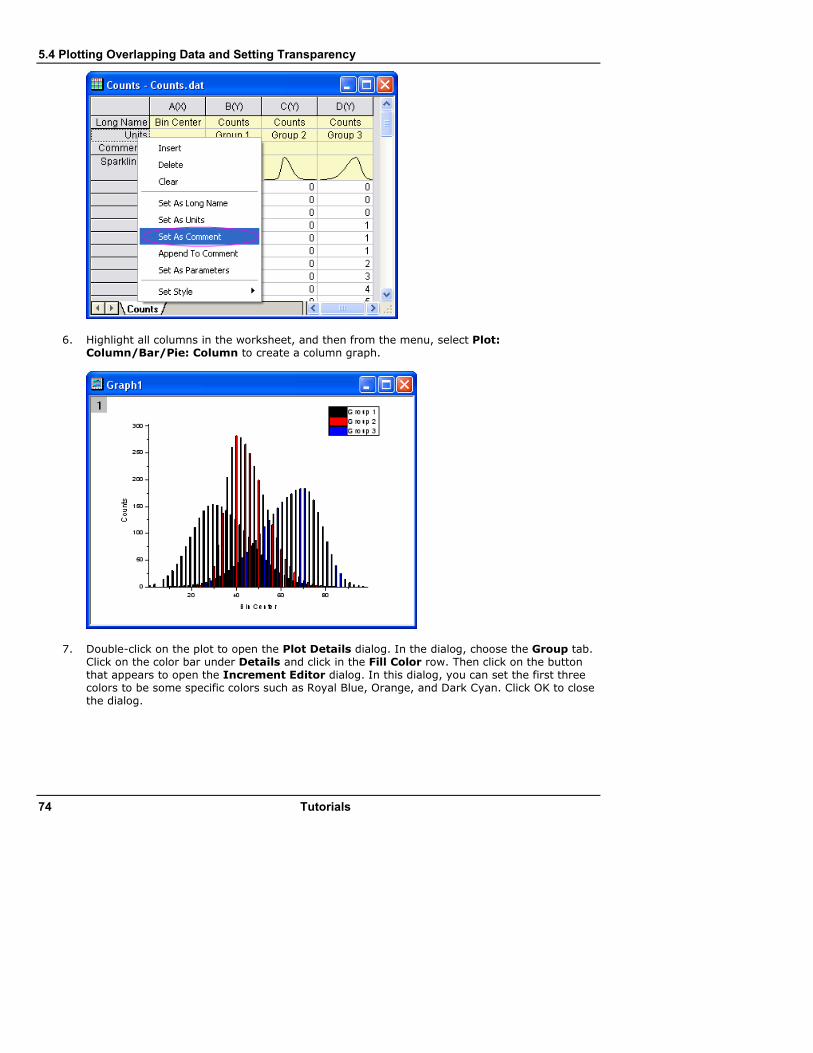
5.4 Plotting Overlapping Data and Setting Transparency
74 Tutorials
6. Highlight all columns in the worksheet, and then from the menu, select Plot: Column/Bar/Pie: Column to create a column graph.
7. Double-click on the plot to open the Plot Details dialog. In the dialog, choose the Group tab. Click on the color bar under Details and click in the Fill Color row. Then click on the button that appears to open the Increment Editor dialog. In this dialog, you can set the first three colors to be some specific colors such as Royal Blue, Orange, and Dark Cyan. Click OK to close the dialog.
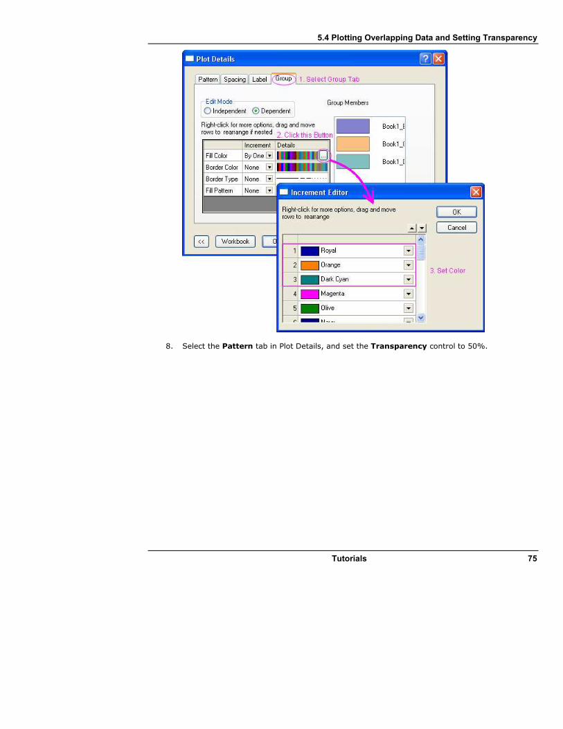
5.4 Plotting Overlapping Data and Setting Transparency
Tutorials 75
8. Select the Pattern tab in Plot Details, and set the Transparency control to 50%.
5.4 Plotting Overlapping Data and Setting Transparency
76 Tutorials
9. Select the Spacing tab, and set Gas Between Bars to zero and Overlap to 100.
10. Click the OK button to close the Plot Details dialog. The resulting graph should look like the image below:

5.4 Plotting Overlapping Data and Setting Transparency
Tutorials 77
5.5 Creating Intersecting Surface Plots from Worksheets
78 Tutorials
5.5 Creating Intersecting Surface Plots from Worksheets
5.5.1 Summary
Many plot types, such as 3D Surface, 3D Bars, and Contour, can be created from data contained in a matrix object or from data arranged in a block of cells in a worksheet. The latter arrangement is referred to as a Virtual Matrix. Whereas a typical matrix object only supports a linear mapping of X and Y coordinates, a virtual matrix supports nonlinear mapping as well. In this tutorial, we show you how to create intersecting color map surface plots from virtual matrix data.
This tutorial will show you how to:
• Create a Color Map Surface plot using virtual matrix data from a worksheet
• Add one surface graph to another to create intersecting surface plots
• Customize the Color Map of one surface plot and copy and paste the settings to another plot
• Set transparency
5.5.2 Create Surface Plots from Virtual Matrix Data
In this section, we will show you how to create surface plots from data in a worksheet.
1. Start a new project. Click the Import Multiple ASCII button on the Standard toolbar. In the dialog that opens, navigate to the \Samples\Graphing folder and select VSurface 1.dat and VSurface 2.dat. Select the Show Options Dialog check box.

5.5 Creating Intersecting Surface Plots from Worksheets
Tutorials 79
Press OK button.
2. In the impASC dialog, select Start New Sheets from the Import Mode drop-down list, to import data files to different worksheets of the same workbook. Expand the (Re)Naming Worksheet and Workbook branch of Import Options. Check Rename Sheet with (Partial) Filename and uncheck Rename Book with (Partial) Filename, to rename the worksheet with the file name.
5.5 Creating Intersecting Surface Plots from Worksheets
80 Tutorials
Click OK to import these two data files.
5.5 Creating Intersecting Surface Plots from Worksheets
Tutorials 81
The data has X coordinate values in the top row and Y coordinate values in the first column. Note that the X coordinates have nonlinear spacing.
3. With the "VSurface 1" sheet active, click on top left corner of the workbook to select the entire sheet. Then select the menu item Plot: 3D Surface: Color Map Surface. This will open the plot_vm dialog. This dialog opens any time a 3D or Contour plot menu item is invoked with a group of worksheet cells (a virtual matrix) selected. The dialog allows you to define where the X and the Y coordinate values are located. In the dialog, select X across columns from the Data Format drop-down list. Set the X Values in drop-down list to 1st row in selection and the Y Values in drop-down list to 1st column in selection:
Click OK to plot a Color Map Surface plot.
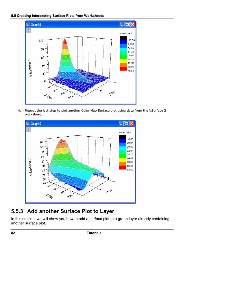
5.5 Creating Intersecting Surface Plots from Worksheets
82 Tutorials
4. Repeat the last step to plot another Color Map Surface plot using data from the VSurface 2 worksheet.
5.5.3 Add another Surface Plot to Layer
In this section, we will show you how to add a surface plot to a graph layer already containing another surface plot.

5.5 Creating Intersecting Surface Plots from Worksheets
Tutorials 83
1. Activate Graph1. Right-click on the Layer 1 icon on the top left corner of the graph and select Layer Contents from the context menu. In the Layer dialog that opens, select vsurface2 in the Available Data box and add it to the Layer Contents box.
Click OK to add the second surface.
Note that Origin displays the two surfaces with proper intersection.
2. Double-click on X axis to open the X Axis dialog. On the Scale tab, select Log10 from the
Type drop-down list.

5.5 Creating Intersecting Surface Plots from Worksheets
84 Tutorials
5.5.4 Customize Color Map and Copy-Paste to another Plot
In this section, we will customize the Color Map settings of one plot, and then copy and paste those settings to the other plot.
1. Double-click on the graph to open the Plot Details dialog. On the left panel, expand the Layer1 node and select VSurface 1. Then switch to the Color Map tab and set Level and Fill as below:

5.5 Creating Intersecting Surface Plots from Worksheets
Tutorials 85
2. Now press the Copy button under the Color Map Theme group on this tab to copy the level and color settings to the clipboard.
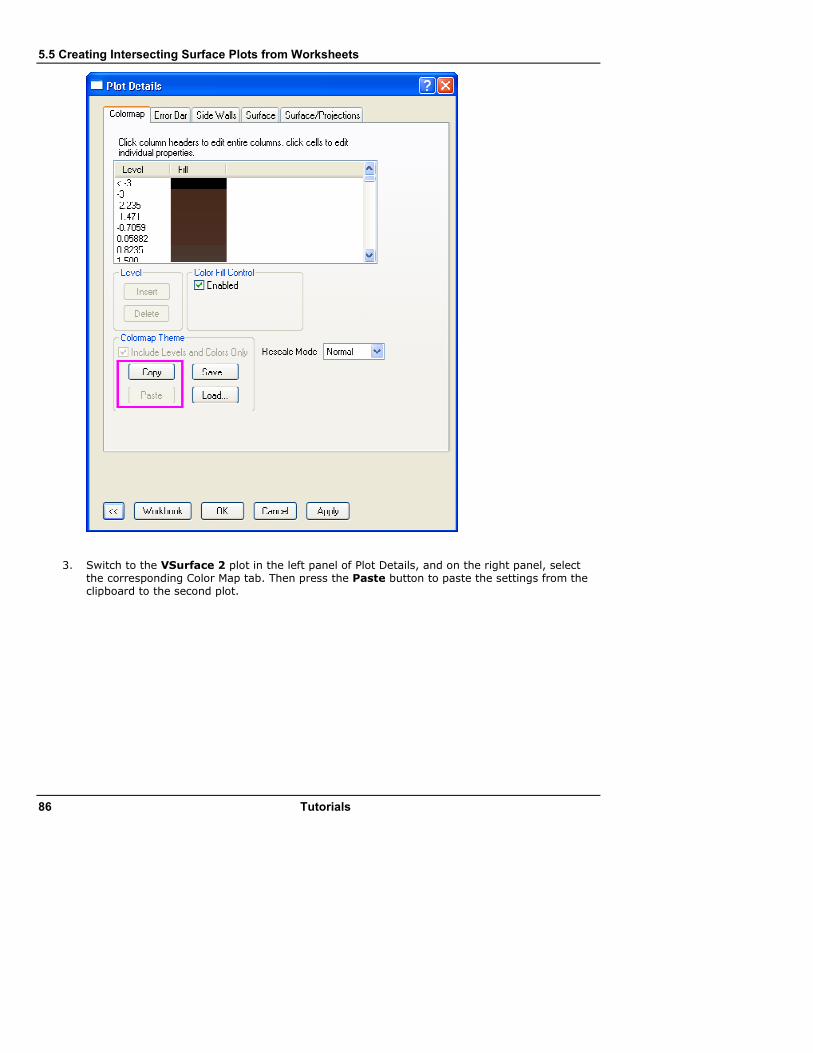
5.5 Creating Intersecting Surface Plots from Worksheets
86 Tutorials
3. Switch to the VSurface 2 plot in the left panel of Plot Details, and on the right panel, select the corresponding Color Map tab. Then press the Paste button to paste the settings from the clipboard to the second plot.

5.5 Creating Intersecting Surface Plots from Worksheets
Tutorials 87
5.5.5 Set Surface Transparency
We will now set the transparency of the second surface so that parts of the first surface are visible in this intersection plot.
1. Switch to the Surface tab and move the Transparency slider to 50%.

5.5 Creating Intersecting Surface Plots from Worksheets
88 Tutorials
The final graph should look like the following image.
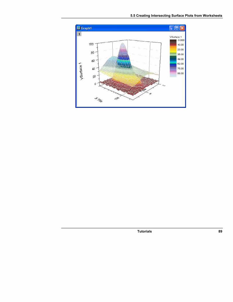
5.5 Creating Intersecting Surface Plots from Worksheets
Tutorials 89
5.6 Customizing a Graph
90 Tutorials
5.6 Customizing a Graph
5.6.1 Summary
Editing your Origin graph is very easy. Any graph element can be selected and with its associated dialog, the properties can be modified. In fact, you can customize your graph right down to a single data point.
This tutorial will show you how to: • Resize a Layer
• Add a Layer Title
• Customize and Save a Template
• Customize Axes
• Apply a Graph Theme
• Change Plotting Order in a Layer
• Customize a Point
• Customize a Grouped Plot
• Create a Color-mapped Waterfall Plot
5.6.2 Resize Layer
1. Open Customizing Graphs.OPJ from the \Samples\Graphing folder and select the Resize Graph and Customize Symbol folder from the Project Explorer window.
2. Make Graph2 active and right-click inside the layer, above the data points to select Add/Modify Layer Title from the context menu that opens. Add a title, as the following graph shows.
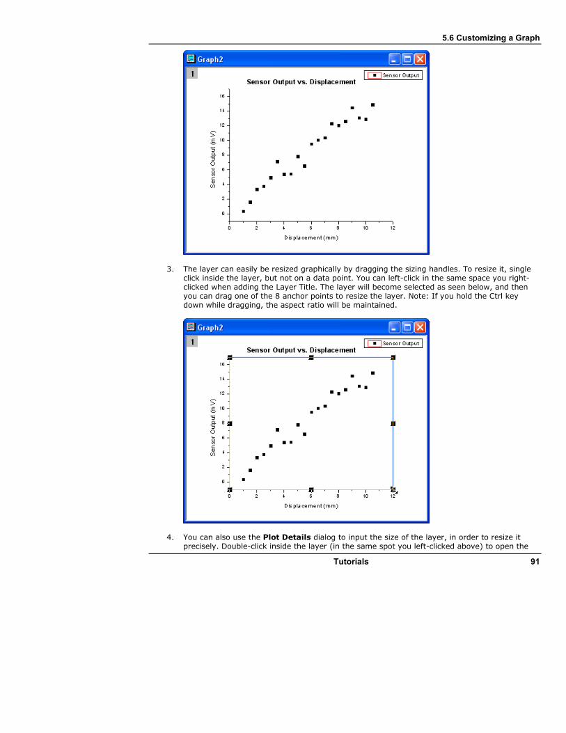
5.6 Customizing a Graph
Tutorials 91
3. The layer can easily be resized graphically by dragging the sizing handles. To resize it, single click inside the layer, but not on a data point. You can left-click in the same space you right-clicked when adding the Layer Title. The layer will become selected as seen below, and then you can drag one of the 8 anchor points to resize the layer. Note: If you hold the Ctrl key down while dragging, the aspect ratio will be maintained.
4. You can also use the Plot Details dialog to input the size of the layer, in order to resize it precisely. Double-click inside the layer (in the same spot you left-clicked above) to open the

5.6 Customizing a Graph
92 Tutorials
Plot Details dialog. Go to the Size/Speed tab, and set the layer area to the values shown in the image below:
5.6.3 Customize Data Plot and Axes
In this section, we will show you how to change the color of a data plot, and how to change the properties of the axes.
1. Click on one of the data points of Graph2 to select the entire data plot, and then change the
color of the data points to red by using the Line/Border Color button in the Style toolbar.
2. Next we will use the Axis dialog to customize the axes. Double-click on the X-axis to open the dialog and set the controls as follows:
o On the Scale tab, choose the # Major Ticks radio button and input 5 into it. Then select Vertical from the Selection list box. The name of the dialog changes to Y Axis when you do this. Input 0, 16 and 11 into the From,To and # Major Ticks edit boxes, respectively.
o On the Title&Format tab, select Top from the Selection list and check the Show
Axis&Ticks check box to add the top X-axis. Then select Right from the Selection list and again check the Show Axis&Ticks check box to add the right Y-axis. Now the graph should look like:

5.6 Customizing a Graph
Tutorials 93
5.6.4 Save and Reuse a Template
In this section, we will show you how to save the graph above as a template and reuse it. 1. In the menu, select File: Save Template As (alternatively, right-click on the graph window
title and choose Save Template As from the context menu) and rename the template as MyGraphTemplate. Then click the OK button to save it.
2. Create a new workbook and import the data file \Samples\Curve Fitting\Sensor2.dat, by using File: Import: Single ASCII. Highlight column B and select Plot: Template Library. Then select MyGraphTemplate and click the Plot button to create a graph.

5.6 Customizing a Graph
94 Tutorials
The graph should look like:
5.6.5 Changing Graph using Theme
Origin stores the properties of a graph in a theme file. In this section we will show you how to customize a graph by using a theme.
1. With Graph3 active, select Tools: Theme Organizer to open a dialog. Apply the themes Ticks All In and Times New Roman Font. Then click the Close button to close the dialog. The graph should look like:

5.6 Customizing a Graph
Tutorials 95
2. Then we will copy the formatting of the current graph and paste it to Graph2. Right-click to the right of the layer, anywhere on an empty white space, or even on the gray area, and select Copy Format: All Style Formats. Then activate Graph2, right-click in a similar spot and select Paste Format. Then Graph2 should look like the image below:
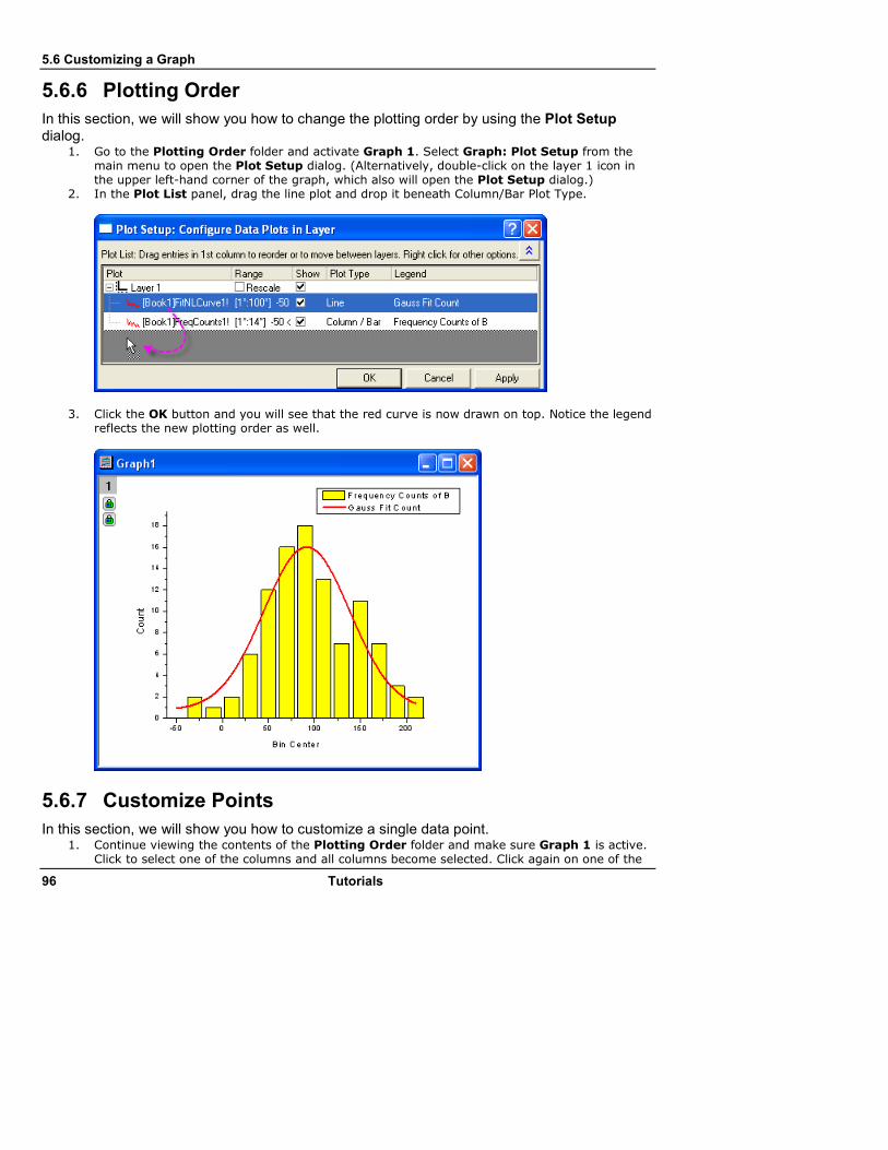
5.6 Customizing a Graph
96 Tutorials
5.6.6 Plotting Order
In this section, we will show you how to change the plotting order by using the Plot Setup dialog.
1. Go to the Plotting Order folder and activate Graph 1. Select Graph: Plot Setup from the main menu to open the Plot Setup dialog. (Alternatively, double-click on the layer 1 icon in the upper left-hand corner of the graph, which also will open the Plot Setup dialog.)
2. In the Plot List panel, drag the line plot and drop it beneath Column/Bar Plot Type.
3. Click the OK button and you will see that the red curve is now drawn on top. Notice the legend reflects the new plotting order as well.
5.6.7 Customize Points
In this section, we will show you how to customize a single data point. 1. Continue viewing the contents of the Plotting Order folder and make sure Graph 1 is active.
Click to select one of the columns and all columns become selected. Click again on one of the

5.6 Customizing a Graph
Tutorials 97
columns to select just that one column. Then change the color to green by using the Fill
Color button on the Style toolbar.
2. You can also use the Plot Details dialog to customize a single column. Hold down the Ctrl key while double-clicking on one of the columns to open the Plot Details dialog. You'll be editing the properties of just that single data point. Notice the index number for that point in the Plot Details dialog. Set the Gradient Fill group as follows to change the column color from yellow to red, gradually.
Then the graph should look like the following:

5.6 Customizing a Graph
98 Tutorials
3. You can customize a slice of a pie graph in the same way. Go to the Edit Single Data Point folder and activate the pie graph. Hold down the Ctrl key and double-click on one of the slices to open the Plot Details dialog. Under the Pattern tab, set the Fill Pattern to Dense, from the drop-down list, and set the Pattern Color to Red. (Alternatively, you could have clicked once and then clicked again on a slice to select just that one point, and then used the Style toolbar to customize that point.) The graph should look like:

5.6 Customizing a Graph
Tutorials 99
4. You can customize a single data point and add an annotation to it. Go back to the Resize Graph and Customize Symbol folder. Hold down the Ctrl key and double-click on one of the scatter points to open the Plot Details dialog. Under the Symbol tab, click the triangular Preview button to open the symbol gallery, and then select Sphere for the symbol. Increase the Size to 18, and click the Ok button to close the dialog.
5. Now you can use the annotation tool to add the X and Y values that correspond to your customized data point. Select the Annotation button from the Tools toolbar.
Then move the annotation cursor to your customized data point and double-click on it. Origin will automatically add a text object. Hit the ESC key or click on the Pointer button to stop annotating. You can customize the text label by double-clicking on it to enter Edit mode. You can also change its position by clicking and dragging - a line will automatically be drawn connecting the point and the label.
5.6.8 Group Plots
In this section, we will show you how to customize a grouped data plot. 1. Select the Grouped Data folder. Book3 will be active. Highlight the entire worksheet and
click the line button on the 2D Graphs toolbar to create a line graph.
2. Double-click on the X-axis to open the Axis dialog. Input 0.5 into the From edit box and 3.0 into the To edit box. Select Manual from the Rescale drop-down list (you will need to scroll up in the list). This prevents the From and To values from changing while rescaling. Click OK to apply these settings.

5.6 Customizing a Graph
100 Tutorials
3. Double-click somewhere inside the layer, on a blank place above the line plots, to open the Plot Details dialog. On the Stack tab, select Auto in the Offset group. Click OK to close the dialog.
4. Select Graph: Rescale to Show All. The Y scale of the graph automatically rescales, while the X scale doesn't change because the option was set to manual. Resize the layer and move the legend as you see fit.
5. Click on one of the data plots to select the entire group, and then use the Line/Border Color
button on the Style toolbar to change the colors. In Incr. List, you can select the
second-to-last increment list . The graph should look like:

5.6 Customizing a Graph
Tutorials 101
6. Though these data plots have been grouped, you can also customize each of them individually by clicking on the data plot twice. For example, you can click the yellow data plot twice (click
once, pause and click again) and then click the Line/Border Color button on the Style toolbar to change the color to another color, such as Olive.
7. You can also customize the graph by double-clicking on one of the data plots to open the Plot Details dialog. Under the Group tab, you can click the browser button
to open the Increment Editor dialog. In this dialog, customize the graph as shown in the following image. Please note that you can also drag the index of a row and move it to change the order of the color list.

5.6 Customizing a Graph
102 Tutorials
The graph should look like:
8. Right-click on the inner position of this dialog and select Save to save it as MyPalette for future use. Then you can right-click to get the context menu and select the Load option. You will find that MyPalette appears as the first entry in the fly-out menu, as the following image shows.
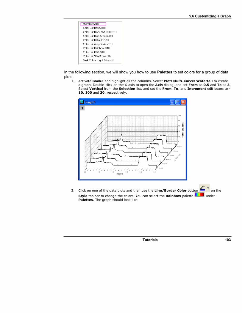
5.6 Customizing a Graph
Tutorials 103
In the following section, we will show you how to use Palettes to set colors for a group of data plots.
1. Activate Book3 and highlight all the columns. Select Plot: Multi-Curve: Waterfall to create a graph. Double-click on the X-axis to open the Axis dialog, and set From as 0.5 and To as 3. Select Vertical from the Selection list, and set the From, To, and Increment edit boxes to -10, 100 and 20, respectively.
2. Click on one of the data plots and then use the Line/Border Color button on the
Style toolbar to change the colors. You can select the Rainbow palette under
Palettes. The graph should look like:
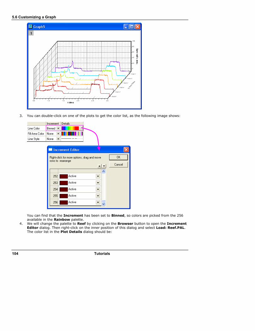
5.6 Customizing a Graph
104 Tutorials
3. You can double-click on one of the plots to get the color list, as the following image shows:
You can find that the Increment has been set to Binned, so colors are picked from the 256 available in the Rainbow palette.
4. We will change the palette to Reef by clicking on the Browser button to open the Increment Editor dialog. Then right-click on the inner position of this dialog and select Load: Reef.PAL. The color list in the Plot Details dialog should be:
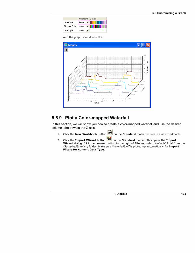
5.6 Customizing a Graph
Tutorials 105
And the graph should look like:
5.6.9 Plot a Color-mapped Waterfall
In this section, we will show you how to create a color-mapped waterfall and use the desired column label row as the Z-axis.
1. Click the New Workbook button on the Standard toolbar to create a new workbook.
2. Click the Import Wizard button on the Standard toolbar. This opens the Import
Wizard dialog. Click the browser button to the right of File and select Waterfall3.dat from the /Samples/Graphing folder. Make sure Waterfall3.oif is picked up automatically for Import Filters for current Data Type.

5.6 Customizing a Graph
106 Tutorials
Click Finish to import the Waterfall3.dat file.
3. To plot a waterfall color-mapped using each line's Y value, highlight the whole worksheet and select Waterfall Y: Color Mapping from the 2D Graphs toolbar (Alternatively, Select Plot: Multi-Curve: Waterfall Y:Color Mapping from the main menu).
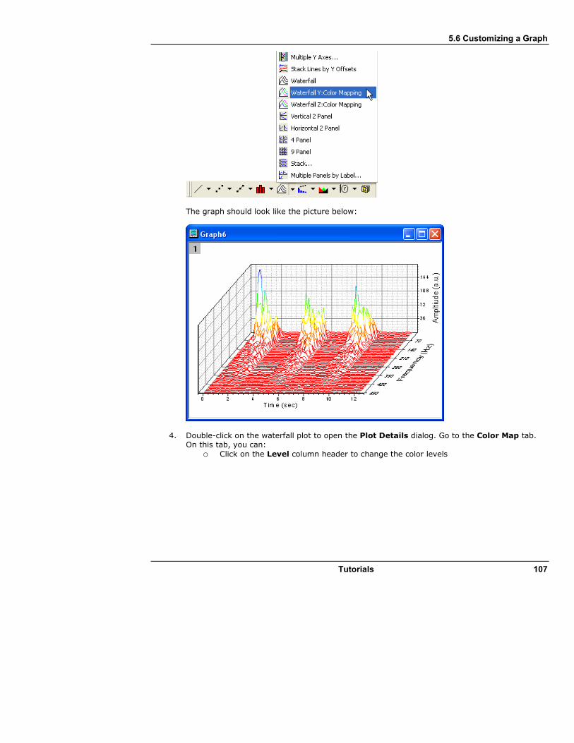
5.6 Customizing a Graph
Tutorials 107
The graph should look like the picture below:
4. Double-click on the waterfall plot to open the Plot Details dialog. Go to the Color Map tab. On this tab, you can:
o Click on the Level column header to change the color levels
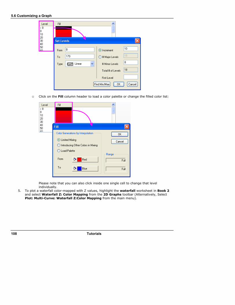
5.6 Customizing a Graph
108 Tutorials
o Click on the Fill column header to load a color palette or change the filled color list:
Please note that you can also click inside one single cell to change that level individually.
5. To plot a waterfall color-mapped with Z values, highlight the waterfall worksheet in Book 2 and select Waterfall Z: Color Mapping from the 2D Graphs toolbar (Alternatively, Select Plot: Multi-Curve: Waterfall Z:Color Mapping from the main menu).
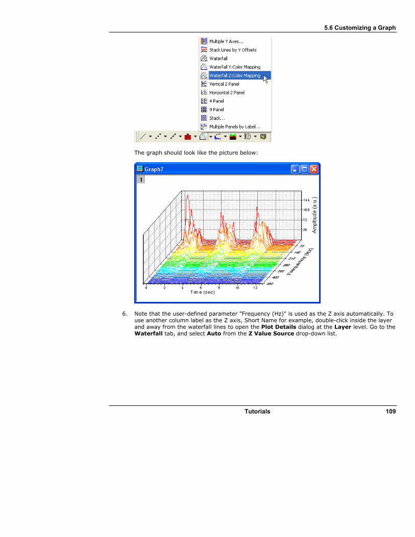
5.6 Customizing a Graph
Tutorials 109
The graph should look like the picture below:
6. Note that the user-defined parameter "Frequency (Hz)" is used as the Z axis automatically. To use another column label as the Z axis, Short Name for example, double-click inside the layer and away from the waterfall lines to open the Plot Details dialog at the Layer level. Go to the Waterfall tab, and select Auto from the Z Value Source drop-down list.

5.6 Customizing a Graph
110 Tutorials
7. To switch between Y and Z color mapping, select the first plot on the left panel of the Plot Details dialog and activate the Line tab. Select Y-value: Color Mapping from the Color drop-down list, to switch to Y color mapping. You can also select Z-Value: Indexing or Z-
Value: Direct RGB from this drop-down list.
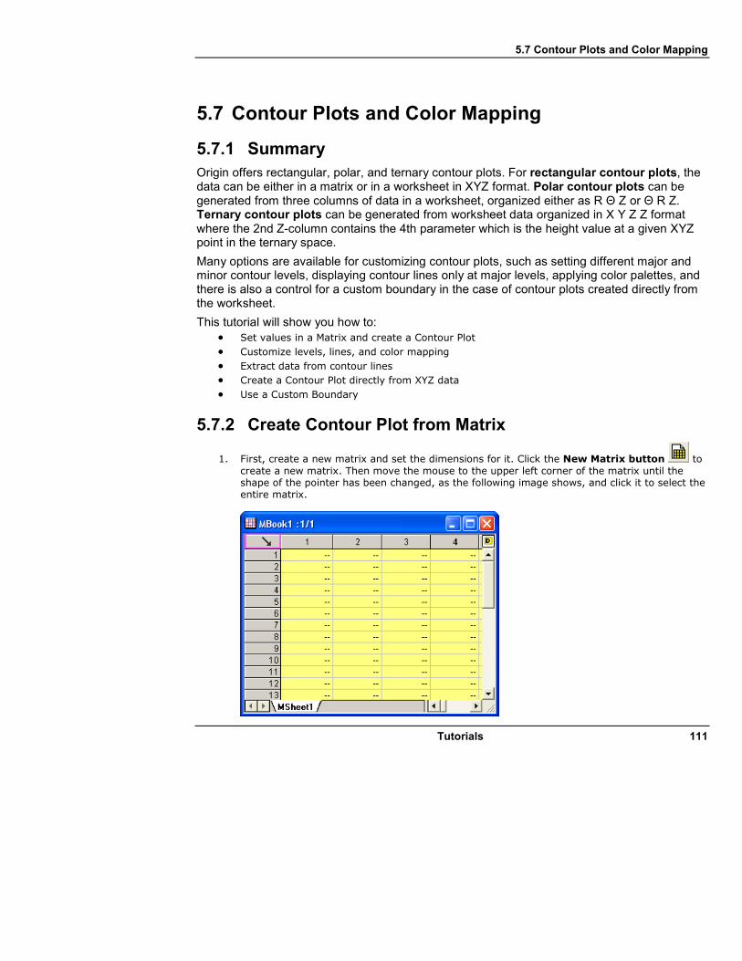
5.7 Contour Plots and Color Mapping
Tutorials 111
5.7 Contour Plots and Color Mapping
5.7.1 Summary
Origin offers rectangular, polar, and ternary contour plots. For rectangular contour plots, the data can be either in a matrix or in a worksheet in XYZ format. Polar contour plots can be generated from three columns of data in a worksheet, organized either as R Θ Z or Θ R Z. Ternary contour plots can be generated from worksheet data organized in X Y Z Z format where the 2nd Z-column contains the 4th parameter which is the height value at a given XYZ point in the ternary space.
Many options are available for customizing contour plots, such as setting different major and minor contour levels, displaying contour lines only at major levels, applying color palettes, and there is also a control for a custom boundary in the case of contour plots created directly from the worksheet.
This tutorial will show you how to: • Set values in a Matrix and create a Contour Plot
• Customize levels, lines, and color mapping
• Extract data from contour lines
• Create a Contour Plot directly from XYZ data
• Use a Custom Boundary
5.7.2 Create Contour Plot from Matrix
1. First, create a new matrix and set the dimensions for it. Click the New Matrix button to
create a new matrix. Then move the mouse to the upper left corner of the matrix until the shape of the pointer has been changed, as the following image shows, and click it to select the entire matrix.

5.7 Contour Plots and Color Mapping
112 Tutorials
Select Set Matrix Dimensions/Labels and set the dialog as shown in the following image:
2. Input data into the matrix by using the Set Values dialog. Highlight the matrix and right-click on it. Select Set Matrix Values to open the Set Values dialog. Input i*sin(x) - j*cos(y) in the Formula edit box and click OK to generate data. The matrix should look like this:
3. Each data point in the matrix corresponds to two different kinds of indices. One is the column and row indices. The other is the X and Y coordinates. You can select View: Show X/Y to see the X, Y coordinates.

5.7 Contour Plots and Color Mapping
Tutorials 113
4. Select View: Show Matrix Thumbnails to turn on thumbnails.
5. Now, create a contour plot. Activate the matrix and select Plot: Contour: Contour - Color Fill to create a contour. Right-click on the contour and select Display Caching: None. The graph should look like this:

5.7 Contour Plots and Color Mapping
114 Tutorials
5.7.3 Customize Levels, Lines and Color Map
Origin makes it easy to customize a contour plot, including changing the color scale and adding labels. The following steps show you how.
1. Double-click on the contour plot to open the Plot Details dialog. Click on the word Layer1 in the left panel (leave the check box checked, and click on the word itself), and then select the Size/Speed tab in the right panel, and disable Matrix data, maximum points per dimension to turn off Speed Mode.
2. Then select [MBook1]MSheet1!1(Z)(1:10201) to go to the matrix level. Click on the Level heading in the right panel to open the Set Levels dialog. Click Find Min/Max button and then set Major Levels to 8 and Minor Levels to 32, and then click OK to close it.
3. Now load a palette for the contour. Click on the Fill heading to open the Fill dialog, select the Load Palette radio box and then click the Select Palette button to select the Rainbow palette. Click Ok to close the dialog.

5.7 Contour Plots and Color Mapping
Tutorials 115
4. Click the Line heading to open the Contour Lines dialog. Then select Show on Major Levels only and click OK to close the dialog. Then click OK to close the Plot Details dialog.
5. Set the properties for the color scale. Right-click on the color scale and select Properties to open the Color Scales Control dialog. Select the Show on Major Levels check box and click OK to apply it to the color scale. Then the contour should look like
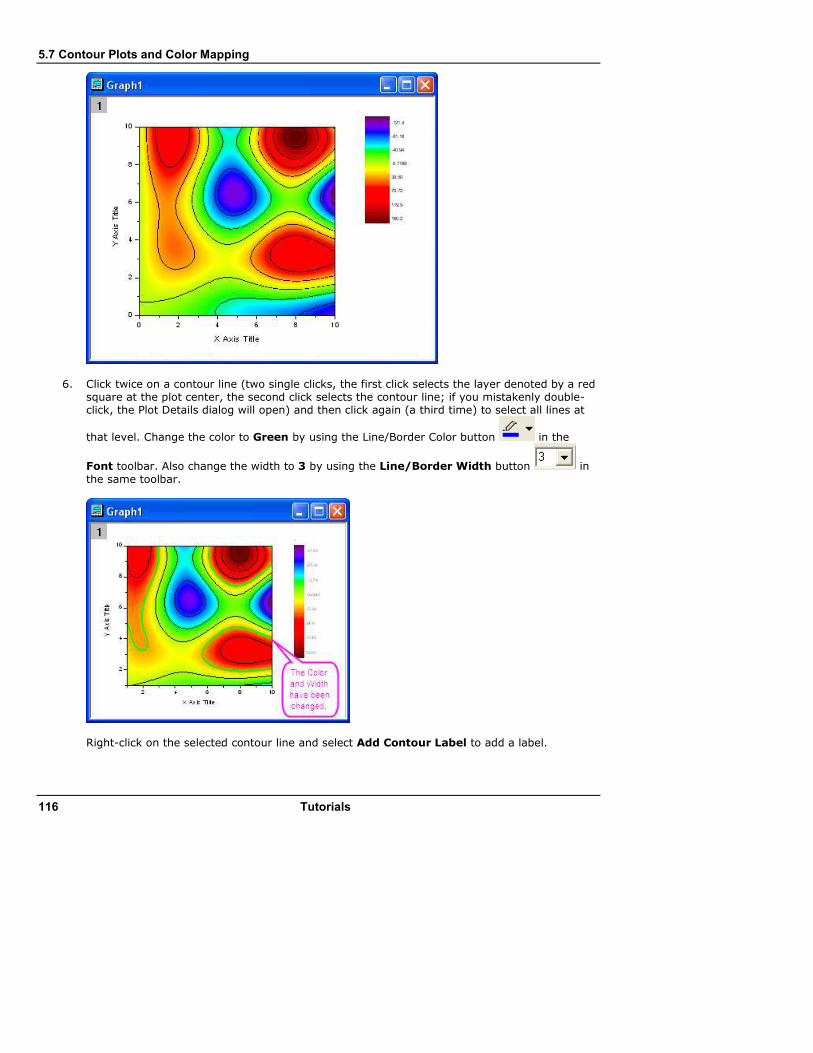
5.7 Contour Plots and Color Mapping
116 Tutorials
6. Click twice on a contour line (two single clicks, the first click selects the layer denoted by a red square at the plot center, the second click selects the contour line; if you mistakenly double-click, the Plot Details dialog will open) and then click again (a third time) to select all lines at
that level. Change the color to Green by using the Line/Border Color button in the
Font toolbar. Also change the width to 3 by using the Line/Border Width button in
the same toolbar.
Right-click on the selected contour line and select Add Contour Label to add a label.

5.7 Contour Plots and Color Mapping
Tutorials 117
7. Click twice on a contour line to select it, then right-click and select Extract Contour Lines. Origin will extract the data for that contour line to a worksheet. The following image shows part of the data in the worksheet.
5.7.4 Create a Contour Plot from XYZ Data
Origin can create contour plots directly from XYZ data in a worksheet without the need for an intermediate matrix. Delaunay Triangulation is used to compute and draw the contour lines.
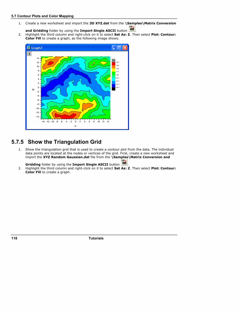
5.7 Contour Plots and Color Mapping
118 Tutorials
1. Create a new worksheet and import the 3D XYZ.dat from the \Samples\Matrix Conversion
and Gridding folder by using the Import Single ASCII button .
2. Highlight the third column and right-click on it to select Set As: Z. Then select Plot: Contour: Color Fill to create a graph, as the following image shows.
5.7.5 Show the Triangulation Grid
1. Show the triangulation grid that is used to create a contour plot from the data. The individual data points are located at the nodes or vertices of the grid. First, create a new worksheet and import the XYZ Random Gaussian.dat file from the \Samples\Matrix Conversion and
Gridding folder by using the Import Single ASCII button . 2. Highlight the third column and right-click on it to select Set As: Z. Then select Plot: Contour:
Color Fill to create a graph.
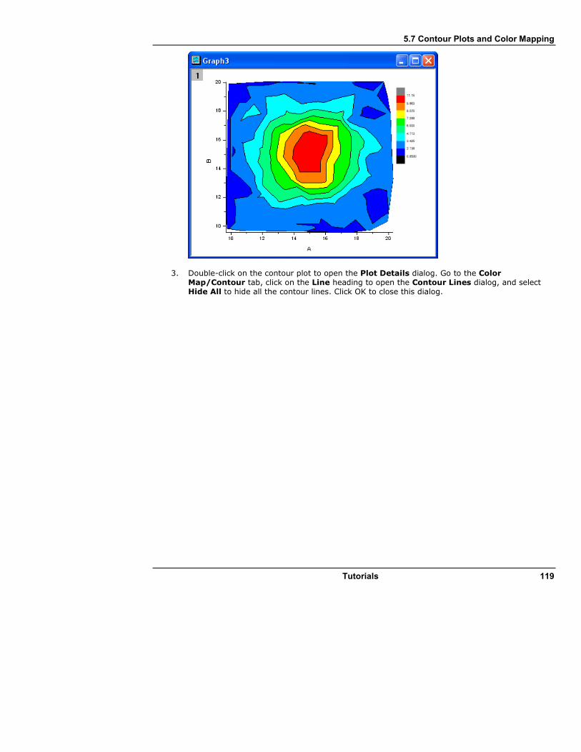
5.7 Contour Plots and Color Mapping
Tutorials 119
3. Double-click on the contour plot to open the Plot Details dialog. Go to the Color Map/Contour tab, click on the Line heading to open the Contour Lines dialog, and select Hide All to hide all the contour lines. Click OK to close this dialog.

5.7 Contour Plots and Color Mapping
120 Tutorials
4. Then select the Show Grid Lines and Show Data Points check boxes in the Color Map/Contours tab. Click OK to close the Plot Details dialog.
The contour plot with its superimposed grid should look like this:

5.7 Contour Plots and Color Mapping
Tutorials 121
5.7.6 Apply Custom Boundary
A custom boundary can be applied to contour plots created directly from XYZ data, where the user provides the data points for the boundary in additional columns on the same worksheet. This feature is useful when you have specific boundary data that defines the outline of an object, such as, say, the profile of an engine, and the contour shows engine temperature.
1. We will continue to use the worksheet and the contour plot created with XYZ Random Gaussian.dat in the previous example.
2. Go to the XYZRandomGaus workbook and click the Add New Columns button twice to add two columns. Highlight the two columns and right-click to select Set As: XY XY. Enter four rows of data, like you see below:
12 10
18 12
16 18
14 16
3. Double-click on the contour plot to open the Plot Details dialog. Select the Contour Info tab in the right panel, and set the dialog like the following image shows, to customize the boundary of the contour plot. Remember to uncheck the Show Grid Lines and Show Data Points check boxes in the Color Map/Contours tab. Click OK to close the Plot Details dialog.
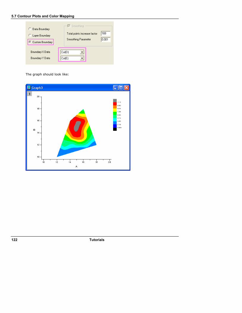
5.7 Contour Plots and Color Mapping
122 Tutorials
The graph should look like:
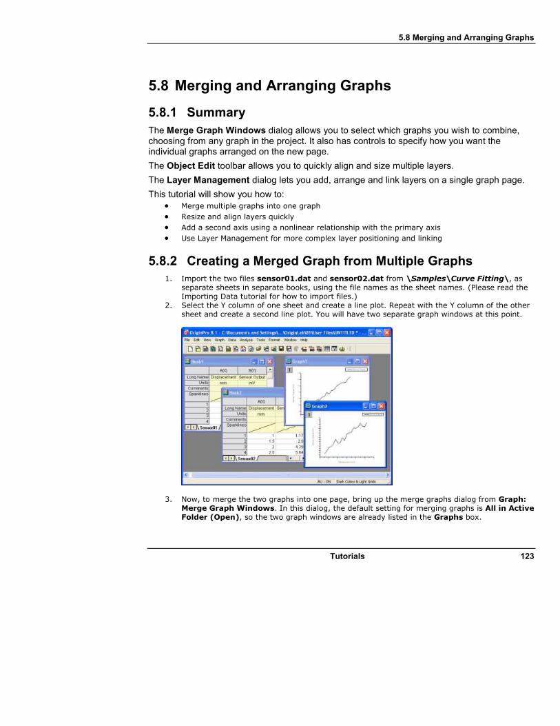
5.8 Merging and Arranging Graphs
Tutorials 123
5.8 Merging and Arranging Graphs
5.8.1 Summary
The Merge Graph Windows dialog allows you to select which graphs you wish to combine, choosing from any graph in the project. It also has controls to specify how you want the individual graphs arranged on the new page.
The Object Edit toolbar allows you to quickly align and size multiple layers.
The Layer Management dialog lets you add, arrange and link layers on a single graph page.
This tutorial will show you how to: • Merge multiple graphs into one graph
• Resize and align layers quickly
• Add a second axis using a nonlinear relationship with the primary axis
• Use Layer Management for more complex layer positioning and linking
5.8.2 Creating a Merged Graph from Multiple Graphs
1. Import the two files sensor01.dat and sensor02.dat from \Samples\Curve Fitting\, as separate sheets in separate books, using the file names as the sheet names. (Please read the Importing Data tutorial for how to import files.)
2. Select the Y column of one sheet and create a line plot. Repeat with the Y column of the other sheet and create a second line plot. You will have two separate graph windows at this point.
3. Now, to merge the two graphs into one page, bring up the merge graphs dialog from Graph: Merge Graph Windows. In this dialog, the default setting for merging graphs is All in Active Folder (Open), so the two graph windows are already listed in the Graphs box.

5.8 Merging and Arranging Graphs
124 Tutorials
4. Specify the following settings to merge the two graphs: 1), Uncheck Keep Source Graphs. This will remove source graphs after merging. 2) Arrange the layers as one column and two
rows. 3) Check Show Axes Frame. In this example, the two layers share the same X axis range, so we can hide the overlapped X axis. 4) Set the Vertical Gap to 0 for the two layers. 5) Change page orientation to Portrait. Then the source plots will be added as layers in the new graph page.
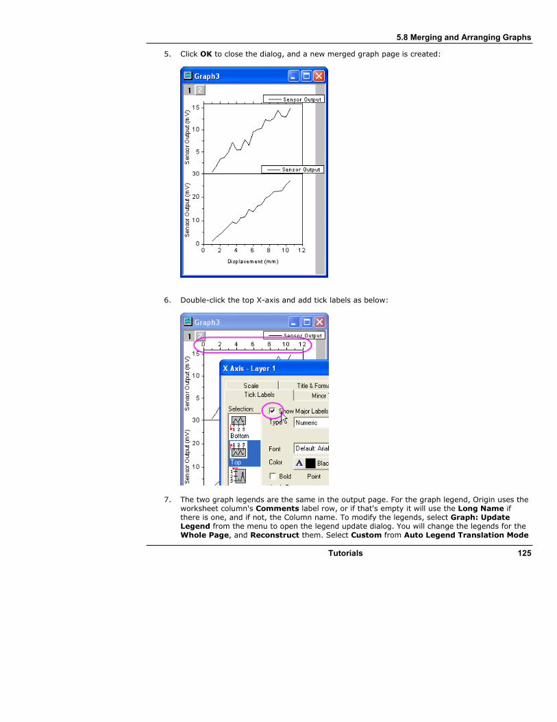
5.8 Merging and Arranging Graphs
Tutorials 125
5. Click OK to close the dialog, and a new merged graph page is created:
6. Double-click the top X-axis and add tick labels as below:
7. The two graph legends are the same in the output page. For the graph legend, Origin uses the worksheet column's Comments label row, or if that's empty it will use the Long Name if there is one, and if not, the Column name. To modify the legends, select Graph: Update Legend from the menu to open the legend update dialog. You will change the legends for the Whole Page, and Reconstruct them. Select Custom from Auto Legend Translation Mode
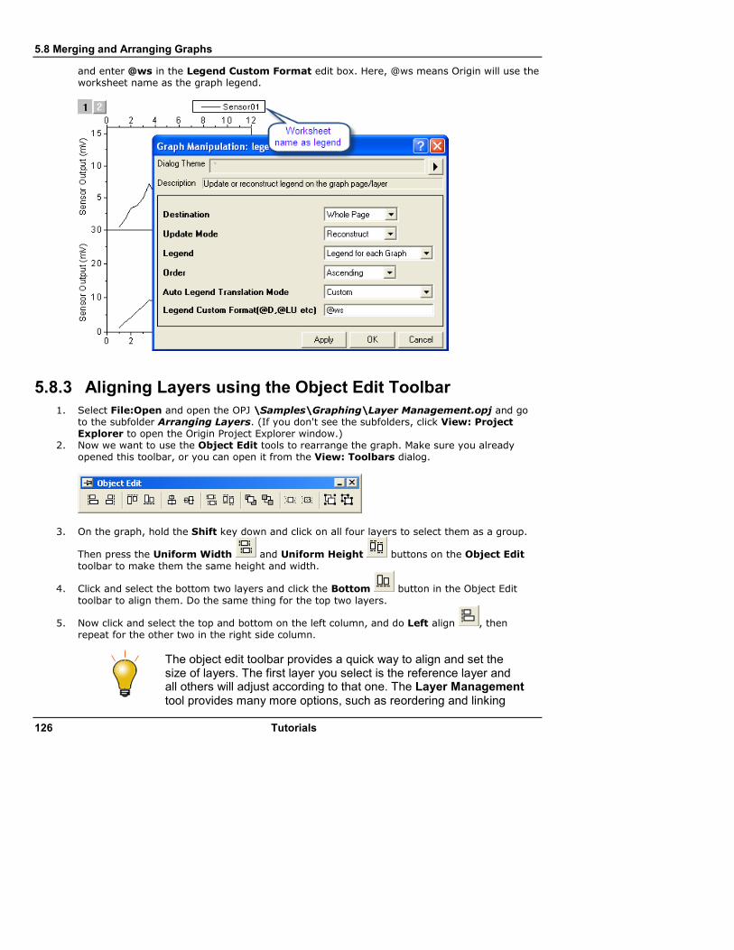
5.8 Merging and Arranging Graphs
126 Tutorials
and enter @ws in the Legend Custom Format edit box. Here, @ws means Origin will use the worksheet name as the graph legend.
5.8.3 Aligning Layers using the Object Edit Toolbar
1. Select File:Open and open the OPJ \Samples\Graphing\Layer Management.opj and go to the subfolder Arranging Layers. (If you don't see the subfolders, click View: Project Explorer to open the Origin Project Explorer window.)
2. Now we want to use the Object Edit tools to rearrange the graph. Make sure you already opened this toolbar, or you can open it from the View: Toolbars dialog.
3. On the graph, hold the Shift key down and click on all four layers to select them as a group.
Then press the Uniform Width and Uniform Height buttons on the Object Edit
toolbar to make them the same height and width.
4. Click and select the bottom two layers and click the Bottom button in the Object Edit
toolbar to align them. Do the same thing for the top two layers.
5. Now click and select the top and bottom on the left column, and do Left align , then repeat for the other two in the right side column.
The object edit toolbar provides a quick way to align and set the size of layers. The first layer you select is the reference layer and all others will adjust according to that one. The Layer Management tool provides many more options, such as reordering and linking

5.8 Merging and Arranging Graphs
Tutorials 127
layers, in addition to setting size and alignment.
6. Do not save changes to your project, as the same project is used later to demonstrate Layer Management.
5.8.4 Displaying Opposite Axes with a Nonlinear Formula
An Origin 2D graph layer is a set of X, Y axes, and opposite axes can be turned on for both X and Y. In addition, the opposite axes can also display labels using any user-specified nonlinear formula with respect to the primary axis.
1. Using the Project Explorer window, switch to the subfolder named Nonlinear Axis. 2. With the graph active, bring up the Layer Management tool by selecting Graph: Layer
Management. 3. Switch to the Axes tab and expand the Top branch and check the Axis, Title, and Tick Label
check boxes.
4. We want to display the labels on the top axis in units of Energy and the relationship between wavelength and energy is:
Energy (eV) = 1240/Wavelength (nm)
So in the Formula box, enter: 1240/x and click Apply, then click OK to close the dialog.
5. Double-click and edit the top X-axis title and change it to: Energy (eV) 6. Double-click the top axis labels or axis, to open the X-Axis dialog. Switch to the Custom Tick
Labels tab, and then click Hide radio for At Axis Begin, to hide the missing value label for energy that corresponds to zero wavelength.

5.8 Merging and Arranging Graphs
128 Tutorials
If you are setting up a nonlinear relationship for the right Y-axis, in the Formula you still need to use x instead of y.
5.8.5 Using Layer Management to Link and Position Layers
The Layer Management tool can be used to position, resize, swap, and link layers in order to establish the desired relationship between layers, as demonstrated in the following steps:
1. Reopen the project \Samples\Graphing\Layer Management.opj and then switch to the subfolder named Arranging Layers. You can reopen the project by selecting File: Recent Projects: Layer Management.opj. Do not save changes to the project.
2. Bring up the Layer Management tool from Graph: Layer Management. Then go to left panel and rename the layers so that they are, top to bottom: Peak 3, Peak 2, Peak 4, Peak 1. The layer names now correspond to the legend for each layer. Note: to rename a layer, double-click on the name, as the hint text in the dialog says.

5.8 Merging and Arranging Graphs
Tutorials 129
3. Now drag and arrange the list on the left so that they are ordered Peak 1, Peak 2, Peak 3, Peak 4. The layer number and names now match.
4. Now switch to the Arrange tab and do the following steps: 1) Uncheck the Link Layers check box. 2) Check Show Axes Frame. 3) Leave the Number of Columns and Number of Rows edit boxes as 2 by 2. 4) Set Horizontal Gap and Vertical Gap to 0.
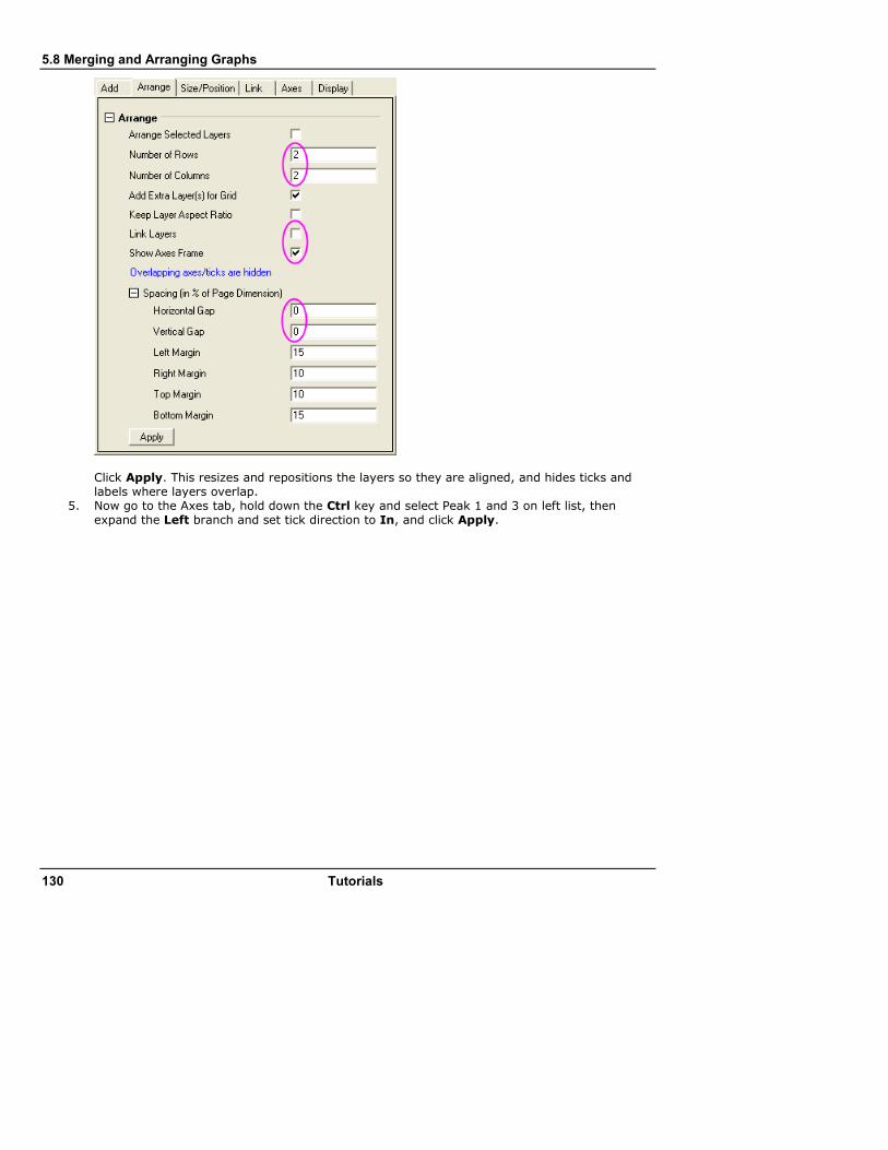
5.8 Merging and Arranging Graphs
130 Tutorials
Click Apply. This resizes and repositions the layers so they are aligned, and hides ticks and labels where layers overlap.
5. Now go to the Axes tab, hold down the Ctrl key and select Peak 1 and 3 on left list, then expand the Left branch and set tick direction to In, and click Apply.

5.8 Merging and Arranging Graphs
Tutorials 131
6. Now select Peaks 3 and 4, set the Bottom tick direction to In and click Apply. Then select Peaks 1 and 2, set the Top ticks to In and click Apply.
7. Now go to the Link tab and select Peaks 2, 3, and 4 in the left list and link them to layer 1, making sure you have the X-Axes linked Straight(1 to 1), and click Apply.
Then click OK to close the dialog.
8. Click and select the top left layer, layer 1, then drag and resize the layer and move the layer. Note that the other layers resize and move too, since they are linked by dimension to layer 1.

5.8 Merging and Arranging Graphs
132 Tutorials
9. Go to the top left layer (layer 1), and double-click the top X-axis. In the X-Axis dialog, change the X-Axis scale From 10 To 35, and click OK. You'll see that all the other layers now show the same new x range, as they are all linked in X.
When arranging linked layers, they are treated as one unit, so you should first unlink them if you need to rearrange and then you can link them again after arranging.
5.9 Working with Excel
Tutorials 133
5.9 Working with Excel
5.9.1 Summary
Origin provides flexible ways to interact with Excel. You can either import Excel data into an Origin workbook, or open an Excel book inside Origin. If you require full access to all of Origin's graphing and analysis features, you will probably want to import your Excel data files into Origin. If it is important to maintain a separate Excel workbook file—perhaps so that other colleagues who do not work with Origin have access to that file—you will probably want to open your Excel data files directly. We give a brief introduction to working with Excel in this tutorial.
This tutorial will show you how to: 1. Copy and paste data from Excel with full precision 2. Import an Excel file into an Origin workbook 3. Open an Excel file in Origin 4. Save an Excel file with path relative to the Origin Project file
5.9.2 Copying and Pasting Data from Excel
It may be desirable at times to simply copy and paste data from Excel to Origin instead of importing or opening Excel. These steps show that such a copy/paste operation can bring in data with full precision.
1. Launch Excel and Origin separately. 2. Open the file <Origin Installation Folder>\Samples\Graphing\ExcelData.XLS in Excel. 3. Select columns B through L, then right-click and bring up the Format Cells dialog, and set the
number of decimal places to 2. So now Excel shows fewer decimal places.

5.9 Working with Excel
134 Tutorials
4. Click on the top left cell in the Excel sheet to select the entire sheet and right-click and select Copy, or use the keyboard shortcut Ctrl+C to copy.
5. Go to a new book in Origin, place the cursor in row 1 of column 1 and do Ctrl+V or right-click and Paste.
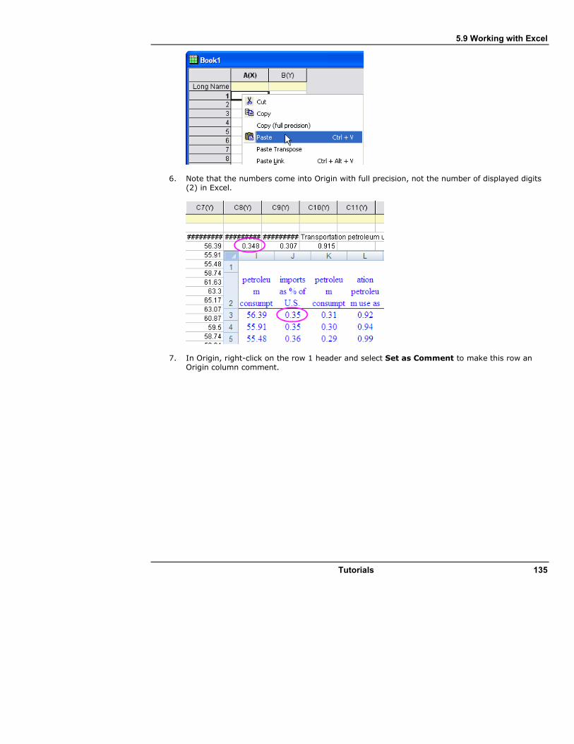
5.9 Working with Excel
Tutorials 135
6. Note that the numbers come into Origin with full precision, not the number of displayed digits (2) in Excel.
7. In Origin, right-click on the row 1 header and select Set as Comment to make this row an Origin column comment.

5.9 Working with Excel
136 Tutorials
8. Right-click on row 1 again and select Set as Long Name. Then rows 1 and 2 in Excel become the worksheet header in Origin:
9. You can now double-click column 1 and set it as Date and then plot the data.
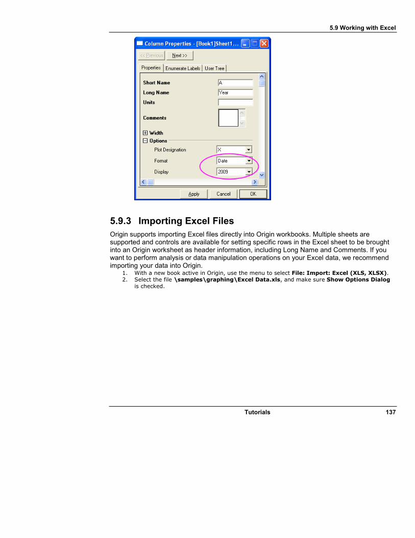
5.9 Working with Excel
Tutorials 137
5.9.3 Importing Excel Files
Origin supports importing Excel files directly into Origin workbooks. Multiple sheets are supported and controls are available for setting specific rows in the Excel sheet to be brought into an Origin worksheet as header information, including Long Name and Comments. If you want to perform analysis or data manipulation operations on your Excel data, we recommend importing your data into Origin.
1. With a new book active in Origin, use the menu to select File: Import: Excel (XLS, XLSX). 2. Select the file \samples\graphing\Excel Data.xls, and make sure Show Options Dialog
is checked.

5.9 Working with Excel
138 Tutorials
3. In the dialog that comes up, leave the Use Excel COM Component to Import check box checked.
4. Set the Index of Rows for Comments to 1. 5. Set the Index of Rows for Long Name drop-down to 2 and click OK to Import.

5.9 Working with Excel
Tutorials 139
6. Click and select the Comments cell under column 1, hold down the Ctrl key and drag the bottom right point of the selected cell to stretch across all columns with data, copying the same comments to all columns.
7. Press F4 to bring up the format dialog, switch to the Format tab, change the Apply To drop-down to Comments and set Dynamic Merge to Horizontal, then click OK.

5.9 Working with Excel
140 Tutorials
This sets the comments cells to be merged and to show in the center of all data columns.
5.9.4 Open Excel File in Origin
At times it may be desirable to keep the data in an external XLS file and simply open the file inside Origin as an Excel window, and then work with the data. When you open Excel (.XLS or .XLSX) files as Excel workbooks in Origin, an OLE instance of Microsoft Excel is launched. You can plot directly using Excel workbook data, but many analysis features, as well as 3D plotting, will be inaccessible.
1. Select File: Open Excel and select the file \Samples\Graphing\Excel Data.xls. 2. A new Excel window opens inside the Origin workspace. When this window is active, the Origin
main menu has different entries, some of which are specific to Excel, and the Excel toolbars are available.
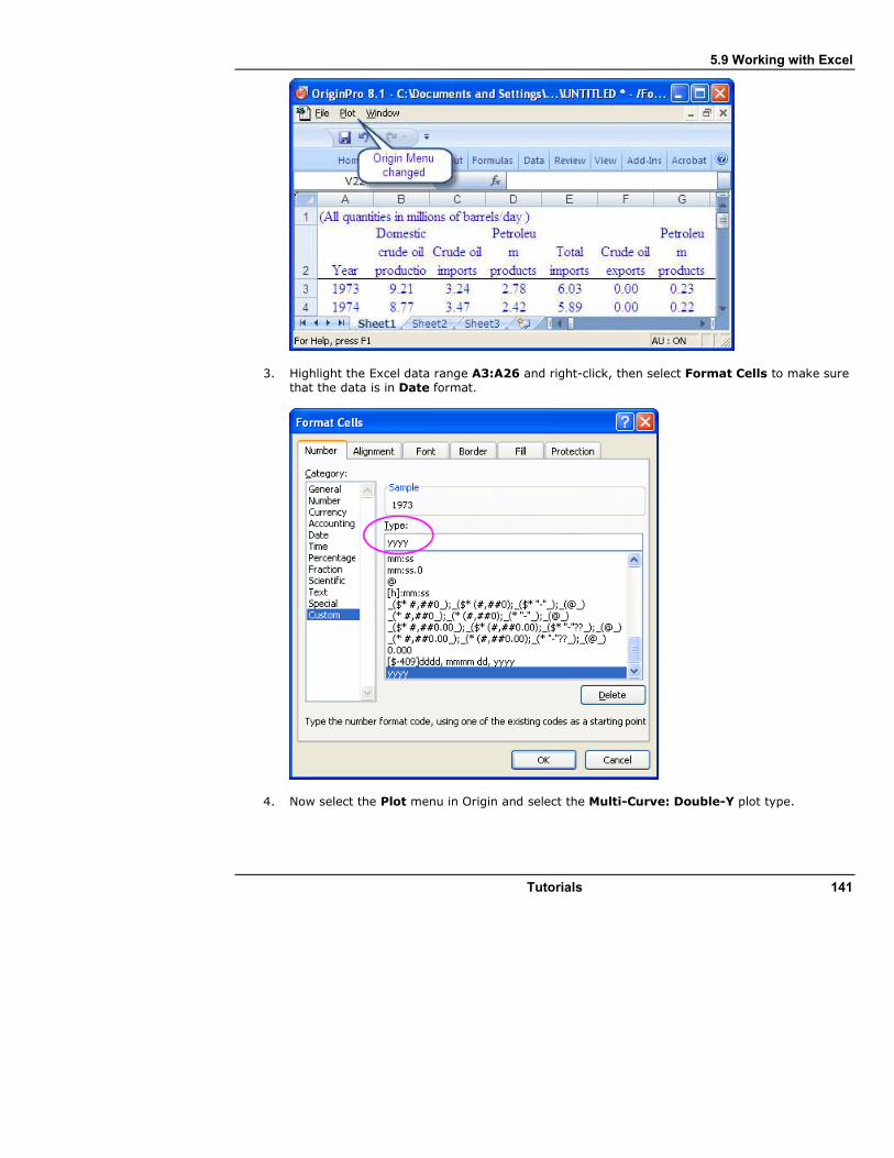
5.9 Working with Excel
Tutorials 141
3. Highlight the Excel data range A3:A26 and right-click, then select Format Cells to make sure that the data is in Date format.
4. Now select the Plot menu in Origin and select the Multi-Curve: Double-Y plot type.

5.9 Working with Excel
142 Tutorials
5. Select A3:A26 in the Excel sheet and click X in the Select Data for Plotting dialog to assign the X data.
6. Select B3:C26 in the Excel sheet and click Y in the Select Data for Plotting dialog to assign the Y data, and then change the Plot Into drop-down to be Multiple Layers.
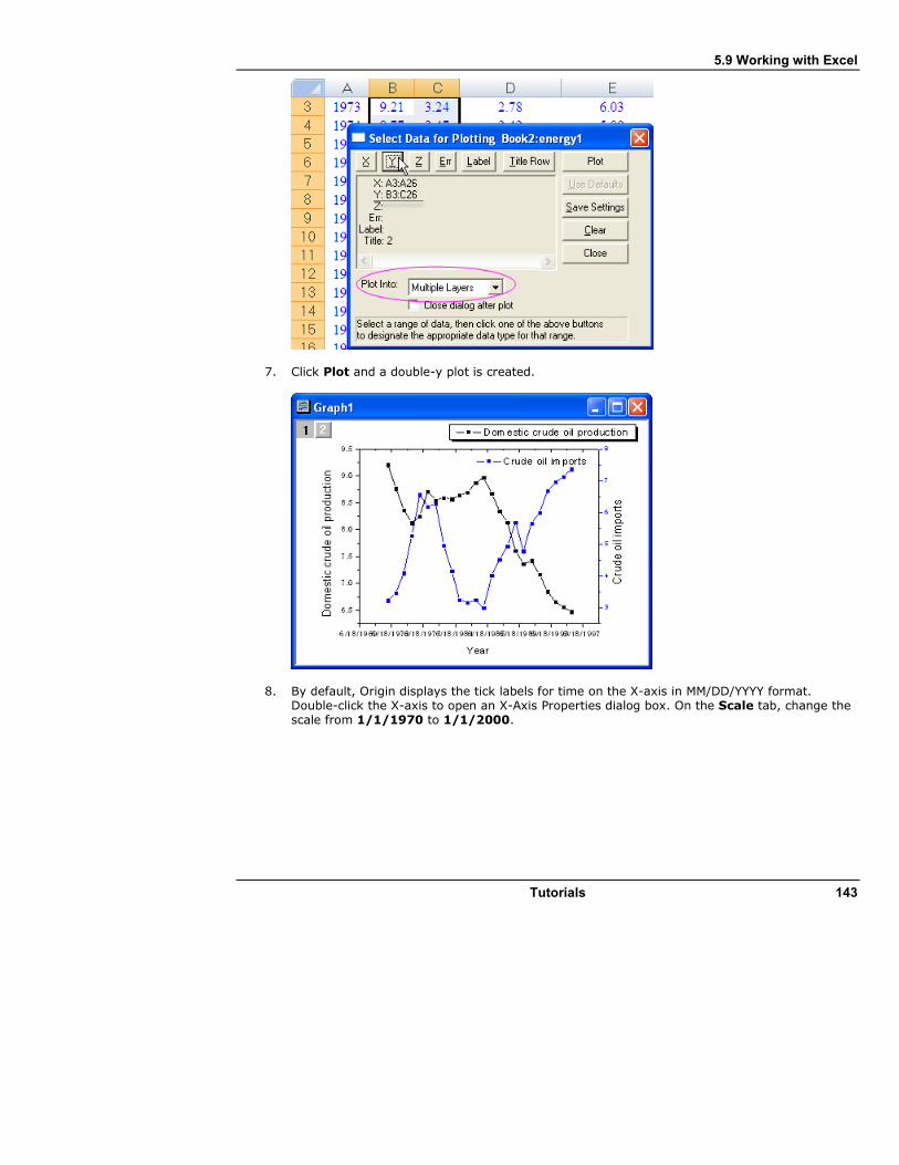
5.9 Working with Excel
Tutorials 143
7. Click Plot and a double-y plot is created.
8. By default, Origin displays the tick labels for time on the X-axis in MM/DD/YYYY format. Double-click the X-axis to open an X-Axis Properties dialog box. On the Scale tab, change the scale from 1/1/1970 to 1/1/2000.
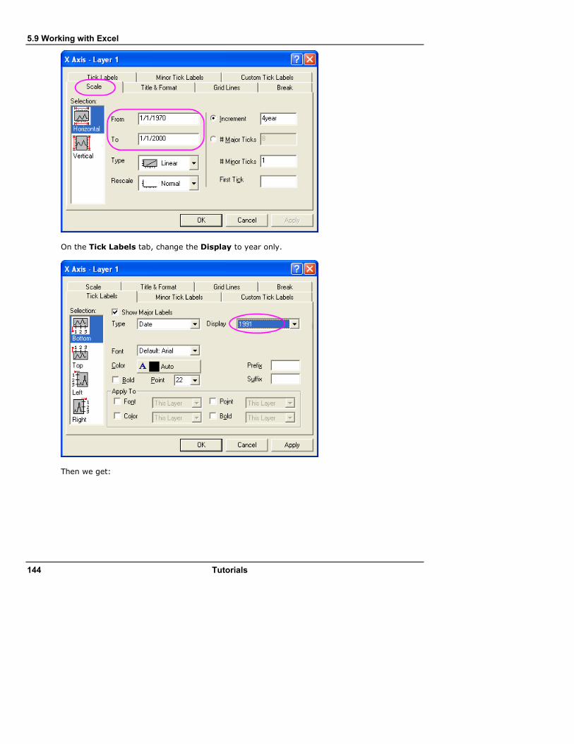
5.9 Working with Excel
144 Tutorials
On the Tick Labels tab, change the Display to year only.
Then we get:

5.9 Working with Excel
Tutorials 145
After opening Excel in Origin, if you switch to another Origin window, a toolbar spacer is visible where the Excel menu used to be. Right-click and you can select Hide Toolbar Spacer or Hide Toolbar Spacer Always.
5.9.5 Setting External Excel File Path Relative to OPJ Path
The Origin Project can contain an Excel window which is linked to an external Excel file. It may then be beneficial to save the Excel file in the same folder as the Origin project, or in a subfolder under the Origin project folder, which will then make the two files more portable, as seen in the following steps:
1. Close Excel if it is running. 2. Perform the steps under the Open Excel File in Origin section above, and (optionally) create
a plot. 3. First save the OPJ to some folder location such as "C:\My Files\My Project.opj". 4. Now right-click on the Excel window and select Save Workbook As and save it in a (new)
subfolder under the OPJ save location, such as "C:\My Files\Data\My Data.xls".
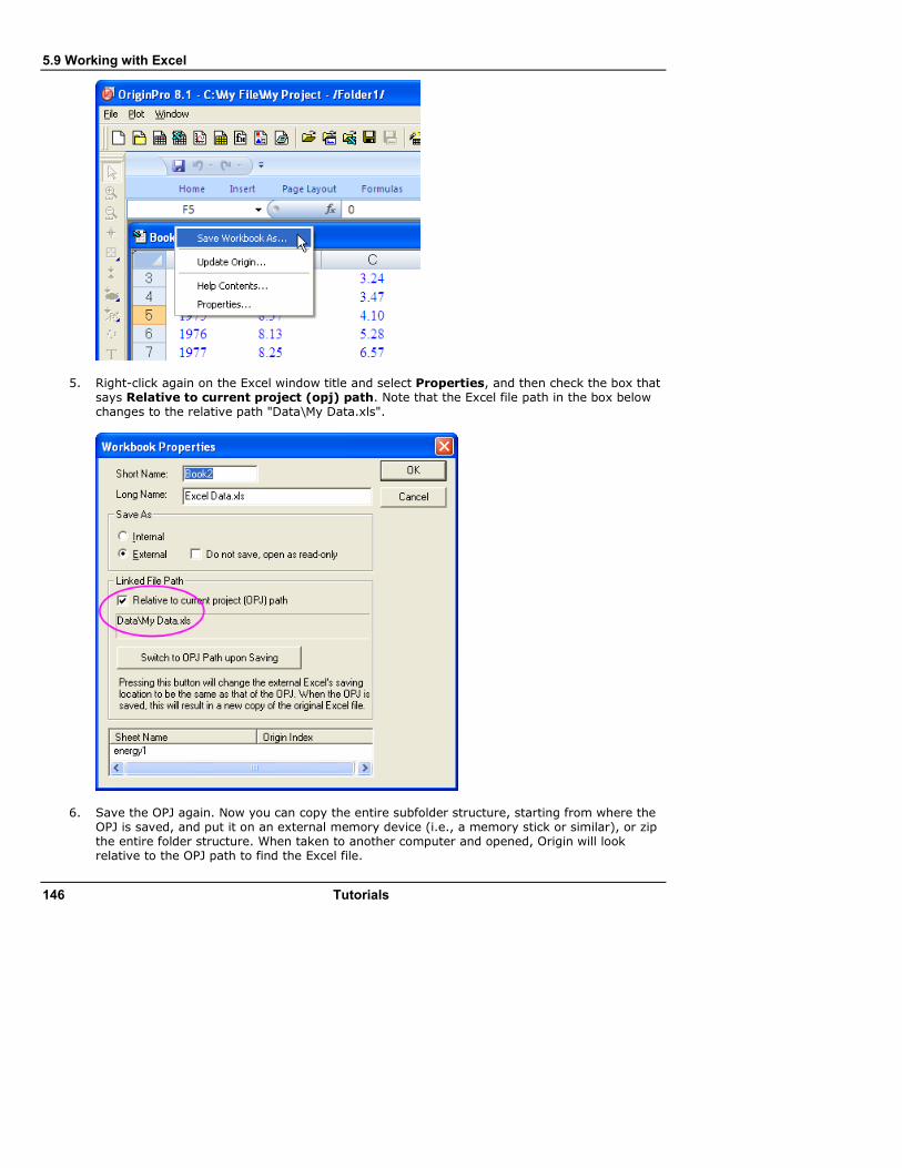
5.9 Working with Excel
146 Tutorials
5. Right-click again on the Excel window title and select Properties, and then check the box that says Relative to current project (opj) path. Note that the Excel file path in the box below changes to the relative path "Data\My Data.xls".
6. Save the OPJ again. Now you can copy the entire subfolder structure, starting from where the OPJ is saved, and put it on an external memory device (i.e., a memory stick or similar), or zip the entire folder structure. When taken to another computer and opened, Origin will look relative to the OPJ path to find the Excel file.
5.9 Working with Excel
Tutorials 147
If your Excel file is in a different location and you want to save it to the same path as the OPJ, you can open the Excel file in Origin, then right-click the title, select Properties and click the Switch to OPJ path upon Saving button. On saving the OPJ, the Excel file will be copied from its current location to the same path where the OPJ is saved.

5.10 Descriptive Statistics
148 Tutorials
5.10 Descriptive Statistics
5.10.1 Summary
Origin provides comprehensive Descriptive Statistics support including basic statistics (mean, median, variance, etc.), frequency counts, and correlation coefficients of data you select. In addition to strong plotting features, Origin's statistical tools help you summarize and analyze your data.
This tutorial will show you how to: • Use the Statistics on Column Dialog to calculate descriptive statistics for grouped data.
• Copy statistical results to a new worksheet for further processing.
• Unstack Columns to a graph.
• Analyze data sets with the Correlation Coefficient Tool.
5.10.2 Finding Frequency Information for Groups
Start with some data. We can use the Discrete Frequency Tool to quickly obtain frequency information for groups of data.
1. Start with a new project or a new workbook. Import the data file
\Samples\Statistics\automobile.dat by using Import Single ASCII . 2. Highlight the first two columns. Select Statistics: Descriptive Statistics: Discrete
Frequency to open a dialog. Column A and Column B are automatically picked as Input Data. Click OK
Results of discrete frequency are sorted in descending order of Count; the most frequently occurring data will appear first. You can rearrange the results by sorting worksheets even though there are locks on the columns.
5.10.3 Calculating Descriptive Statistics on Grouped Data
Using the Statistics on Columns tool, we can find basic statistics for each group of data. 1. Switch back to the first sheet. 2. Select Statistics: Descriptive Statistics: Statistics on Columns to open the Statistics on
Columns dialog.
3. Open the Range 1 branch and click the interactive button . The dialog will "roll up" and
you can set Data Range as Column C - Column G by selecting C(Y) and dragging to G(Y) in the Worksheet. Click the button in the rolled up dialog to restore the dialog. To set Group
Range to B(Y): Make, click the triangle button next to Grouping Range and select
B(Y) : Make.
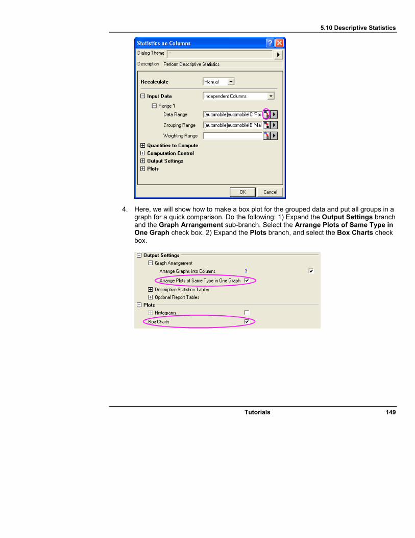
5.10 Descriptive Statistics
Tutorials 149
4. Here, we will show how to make a box plot for the grouped data and put all groups in a graph for a quick comparison. Do the following: 1) Expand the Output Settings branch and the Graph Arrangement sub-branch. Select the Arrange Plots of Same Type in One Graph check box. 2) Expand the Plots branch, and select the Box Charts check box.

5.10 Descriptive Statistics
150 Tutorials
5. Click the OK button to get the results in a report sheet.
You can double-click to open the graph containing the box plot and customize the graph. Click the Close button on the graph to restore the modified graph to the Report Worksheet.
5.10.4 Using Statistical Results for Further Operations
After using the Statistics on Columns dialog to produce a report tree, you may wish to do further analysis and plotting on the statistical results.
For example, to get average attribute values (i.e. horsepower, 0-60 mph time, weight, mileage) by vehicle Make from 1992 to 2004, perform the following:
1. In the report sheet, right-click on the title of the Descriptive Statistics table and select Create Copy as New Sheet from the short-cut menu.

5.10 Descriptive Statistics
Tutorials 151
2. When the new sheet is active, select Worksheet: Unstack Columns. 3. In the dialog that comes up, set columns D and E as Data to be Unstacked. Since the
triangle button fly-out menu supports only one selection, you need to use the interactive button.
4. Set column A as Group Variables. 5. Set Group Identifier to Short Name. 6. Select the Include Other Columns check box and set Other Columns to column B. Click the
OK button.
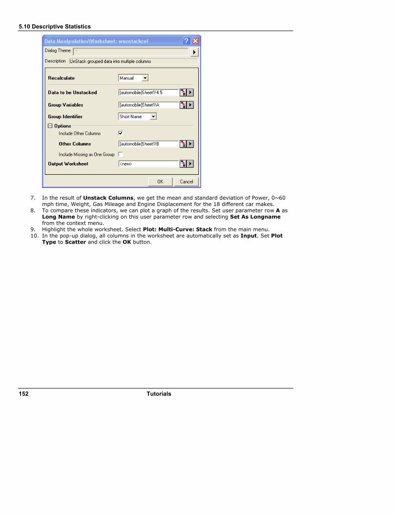
5.10 Descriptive Statistics
152 Tutorials
7. In the result of Unstack Columns, we get the mean and standard deviation of Power, 0~60 mph time, Weight, Gas Mileage and Engine Displacement for the 18 different car makes.
8. To compare these indicators, we can plot a graph of the results. Set user parameter row A as Long Name by right-clicking on this user parameter row and selecting Set As Longname from the context menu.
9. Highlight the whole worksheet. Select Plot: Multi-Curve: Stack from the main menu. 10. In the pop-up dialog, all columns in the worksheet are automatically set as Input. Set Plot
Type to Scatter and click the OK button.
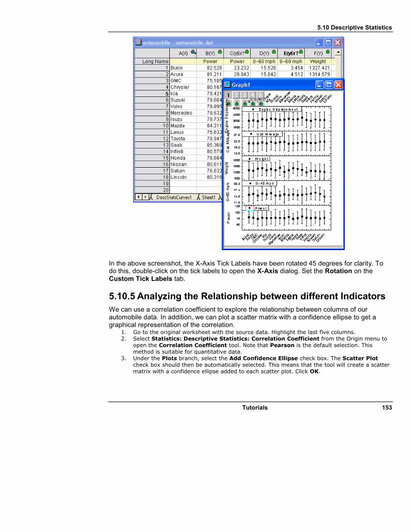
5.10 Descriptive Statistics
Tutorials 153
In the above screenshot, the X-Axis Tick Labels have been rotated 45 degrees for clarity. To do this, double-click on the tick labels to open the X-Axis dialog. Set the Rotation on the Custom Tick Labels tab.
5.10.5 Analyzing the Relationship between different Indicators
We can use a correlation coefficient to explore the relationship between columns of our automobile data. In addition, we can plot a scatter matrix with a confidence ellipse to get a graphical representation of the correlation.
1. Go to the original worksheet with the source data. Highlight the last five columns. 2. Select Statistics: Descriptive Statistics: Correlation Coefficient from the Origin menu to
open the Correlation Coefficient tool. Note that Pearson is the default selection. This method is suitable for quantitative data.
3. Under the Plots branch, select the Add Confidence Ellipse check box. The Scatter Plot check box should then be automatically selected. This means that the tool will create a scatter matrix with a confidence ellipse added to each scatter plot. Click OK.
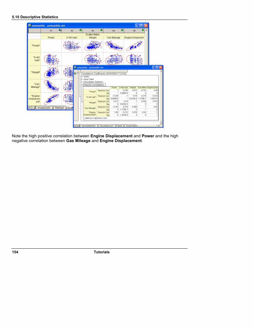
5.10 Descriptive Statistics
154 Tutorials
Note the high positive correlation between Engine Displacement and Power and the high negative correlation between Gas Mileage and Engine Displacement.

5.11 Nonlinear Curve Fitting
Tutorials 155
5.11 Nonlinear Curve Fitting
5.11.1 Summary
The Nonlinear Curve Fitter in Origin provides close to 200 built-in fitting functions, plus the ability to fit with user-defined functions. This tutorial will demonstrate how to use the fitter for a basic fitting task, including flexible selection of data.
This tutorial will show you how to: • Use the Regional Data Selector tool to select a specific range of a data plot to fit
• Use the Nonlinear Curve Fitter (NLFit) dialog to perform curve fitting
• Use Change Parameters to modify the data range to be fit
5.11.2 Graphically Selecting the Input Data Range to be Fitted
In this section, we will show you how to select a specific range of a dataset and perform curve fitting on it.
1. Start with a new project or create a new workbook and import the data file \samples\curve fitting\Two Peaks.dat, using File: Import: Single ASCII. Your workbook will look like this:
2. Highlight columns B and C and click the Scatter button, , from the 2D Graphs toolbar to
create a scatter graph. Note: Origin will automatically plot the two Y columns against the associated X column, column A, so there is no need to highlight column A.
3. The graph you just created includes multiple data plots, but only the first data plot, Signal 1, is active, meaning automatically picked up as input when an analysis dialog such as the
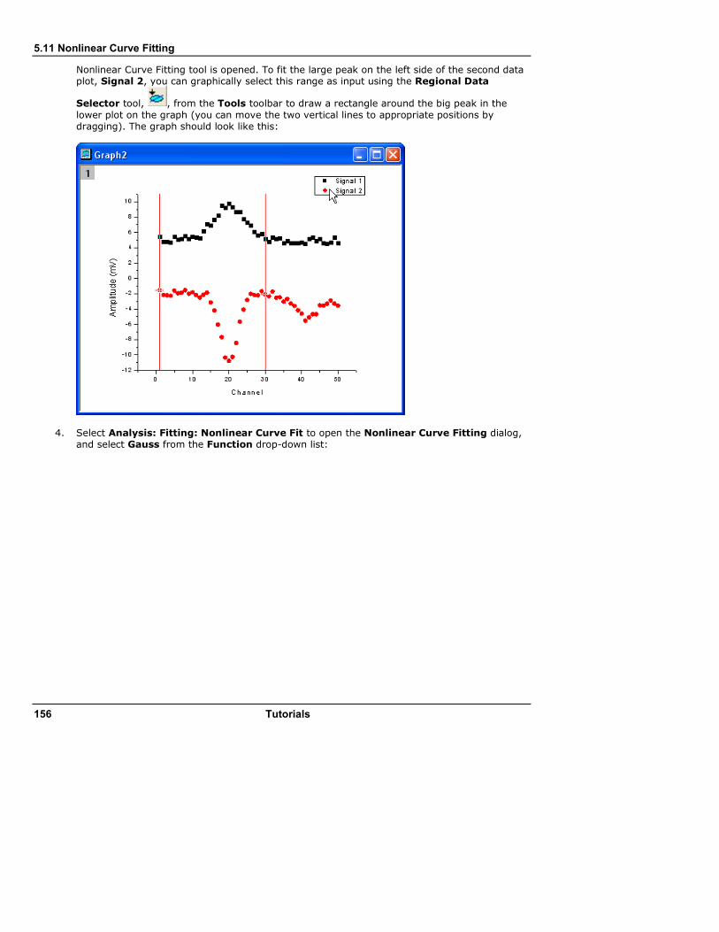
5.11 Nonlinear Curve Fitting
156 Tutorials
Nonlinear Curve Fitting tool is opened. To fit the large peak on the left side of the second data plot, Signal 2, you can graphically select this range as input using the Regional Data
Selector tool, , from the Tools toolbar to draw a rectangle around the big peak in the
lower plot on the graph (you can move the two vertical lines to appropriate positions by dragging). The graph should look like this:
4. Select Analysis: Fitting: Nonlinear Curve Fit to open the Nonlinear Curve Fitting dialog, and select Gauss from the Function drop-down list:
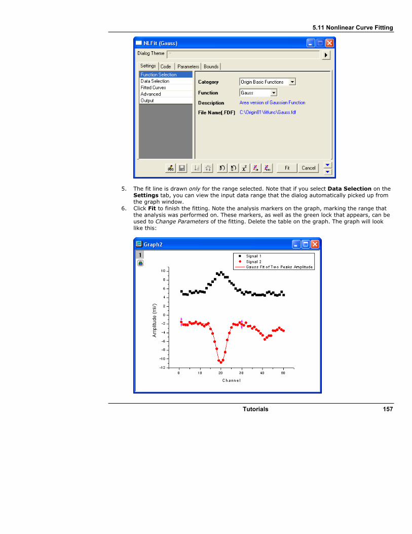
5.11 Nonlinear Curve Fitting
Tutorials 157
5. The fit line is drawn only for the range selected. Note that if you select Data Selection on the Settings tab, you can view the input data range that the dialog automatically picked up from the graph window.
6. Click Fit to finish the fitting. Note the analysis markers on the graph, marking the range that the analysis was performed on. These markers, as well as the green lock that appears, can be used to Change Parameters of the fitting. Delete the table on the graph. The graph will look like this:
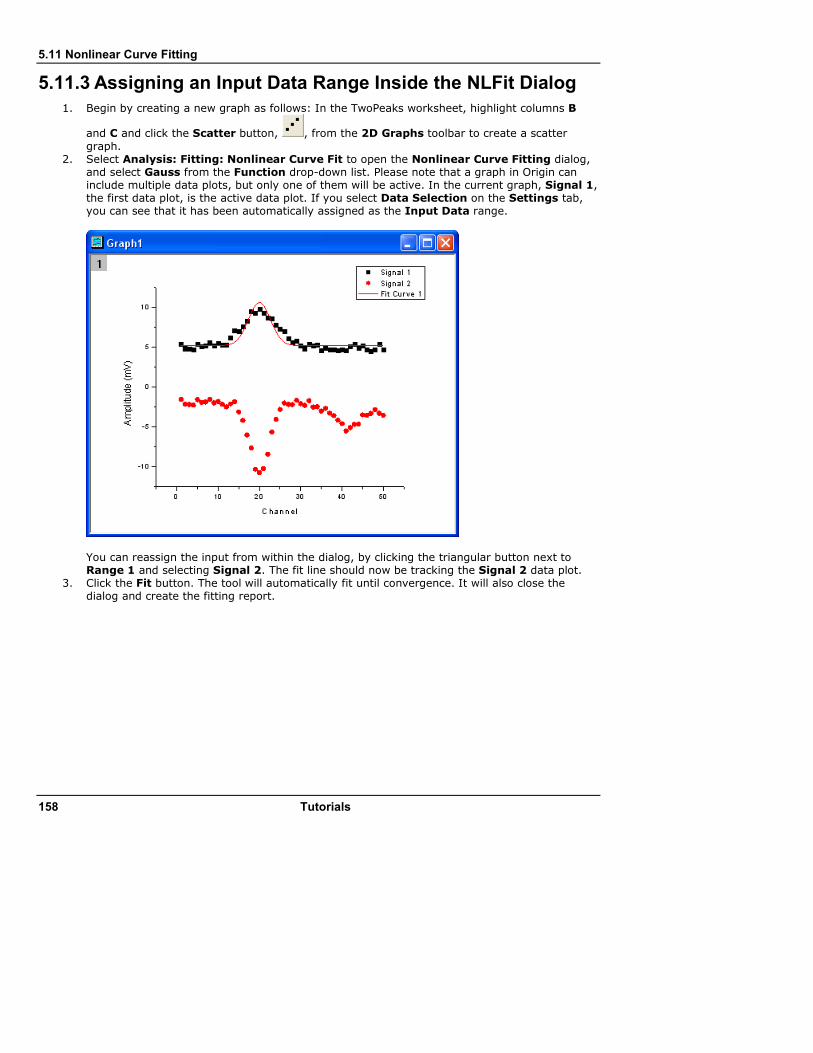
5.11 Nonlinear Curve Fitting
158 Tutorials
5.11.3 Assigning an Input Data Range Inside the NLFit Dialog
1. Begin by creating a new graph as follows: In the TwoPeaks worksheet, highlight columns B
and C and click the Scatter button, , from the 2D Graphs toolbar to create a scatter
graph. 2. Select Analysis: Fitting: Nonlinear Curve Fit to open the Nonlinear Curve Fitting dialog,
and select Gauss from the Function drop-down list. Please note that a graph in Origin can include multiple data plots, but only one of them will be active. In the current graph, Signal 1, the first data plot, is the active data plot. If you select Data Selection on the Settings tab, you can see that it has been automatically assigned as the Input Data range.
You can reassign the input from within the dialog, by clicking the triangular button next to Range 1 and selecting Signal 2. The fit line should now be tracking the Signal 2 data plot.
3. Click the Fit button. The tool will automatically fit until convergence. It will also close the dialog and create the fitting report.
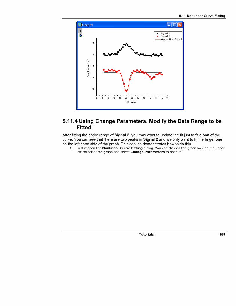
5.11 Nonlinear Curve Fitting
Tutorials 159
5.11.4 Using Change Parameters, Modify the Data Range to be Fitted
After fitting the entire range of Signal 2, you may want to update the fit just to fit a part of the curve. You can see that there are two peaks in Signal 2 and we only want to fit the larger one on the left hand side of the graph. This section demonstrates how to do this.
1. First reopen the Nonlinear Curve Fitting dialog. You can click on the green lock on the upper left corner of the graph and select Change Parameters to open it.

5.11 Nonlinear Curve Fitting
160 Tutorials
2. Change the fitting range by selecting Data Selection in the Settings tab, and then clicking the triangular button next to Range 1 to choose Select Range from Graph. The Nonlinear Curve Fitting dialog will automatically be minimized.
3. Drag the vertical line on the right side of the graph to leave out the small peak, as shown in the following image.

5.11 Nonlinear Curve Fitting
Tutorials 161
4. Maximize the Nonlinear Curve Fitting tool and click the Fit Until Converged button .
As in the image below, you will find that the new fit curve is now only over the selected range, and it fits the baseline better.
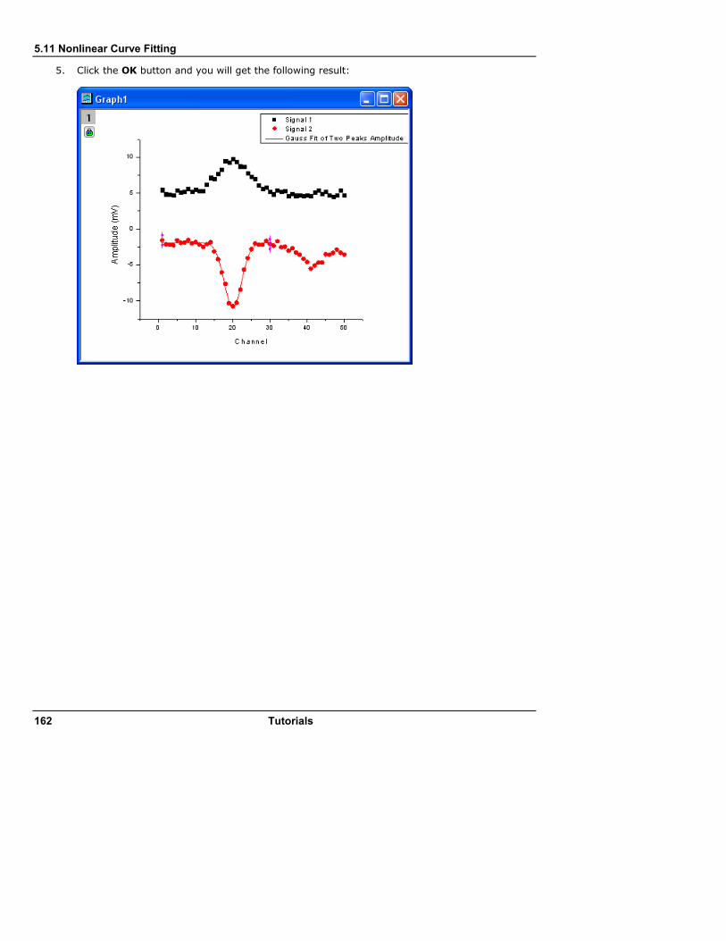
5.11 Nonlinear Curve Fitting
162 Tutorials
5. Click the OK button and you will get the following result:
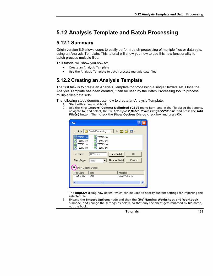
5.12 Analysis Template and Batch Processing
Tutorials 163
5.12 Analysis Template and Batch Processing
5.12.1 Summary
Origin version 8.5 allows users to easily perform batch processing of multiple files or data sets, using an Analysis Template. This tutorial will show you how to use this new functionality to batch process multiple files.
This tutorial will show you how to: • Create an Analysis Template
• Use the Analysis Template to batch process multiple data files
5.12.2 Creating an Analysis Template
The first task is to create an Analysis Template for processing a single file/data set. Once the Analysis Template has been created, it can be used by the Batch Processing tool to process multiple files/data sets.
The following steps demonstrate how to create an Analysis Template: 1. Start with a new workbook. 2. Use the File: Import: Comma Delimited (CSV) menu item, and in the file dialog that opens,
navigate to, and select, the file \Samples\Batch Processing\t275k.csv, and press the Add File(s) button. Then check the Show Options Dialog check box and press OK.
The impCSV dialog now opens, which can be used to specify custom settings for importing the selected file.
3. Expand the Import Options node and then the (Re)Naming Worksheet and Workbook subnode, and change the settings as below, so that only the sheet gets renamed by file name, not the book.

5.12 Analysis Template and Batch Processing
164 Tutorials
4. Our data file has two sub header lines suitable for Long Name and Units. Expand the Header Lines node and set Number of Subheader Lines to 2, and set Long Names as 1 and Units as 2.
5. Go to the Dialog Theme control in the top of the dialog, press the arrow button, and select Save to <Sheet> from the pop-up menu. This saves the custom settings right into the worksheet, so that the settings will become part of the Analysis Template and will be used for importing similar files when the template is used later by the Batch Processing tool.
6. Press OK and the file gets imported
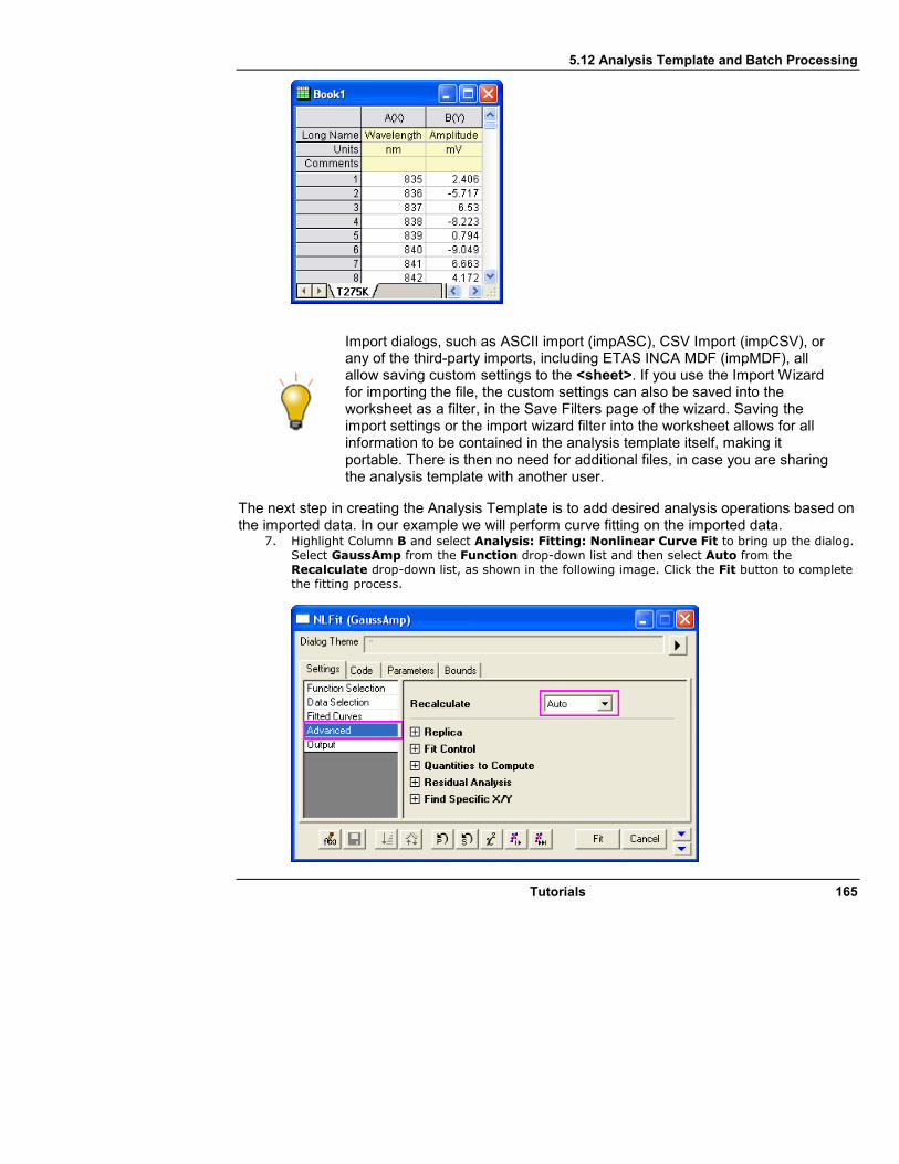
5.12 Analysis Template and Batch Processing
Tutorials 165
Import dialogs, such as ASCII import (impASC), CSV Import (impCSV), or any of the third-party imports, including ETAS INCA MDF (impMDF), all allow saving custom settings to the <sheet>. If you use the Import Wizard for importing the file, the custom settings can also be saved into the worksheet as a filter, in the Save Filters page of the wizard. Saving the import settings or the import wizard filter into the worksheet allows for all information to be contained in the analysis template itself, making it portable. There is then no need for additional files, in case you are sharing the analysis template with another user.
The next step in creating the Analysis Template is to add desired analysis operations based on the imported data. In our example we will perform curve fitting on the imported data.
7. Highlight Column B and select Analysis: Fitting: Nonlinear Curve Fit to bring up the dialog. Select GaussAmp from the Function drop-down list and then select Auto from the Recalculate drop-down list, as shown in the following image. Click the Fit button to complete the fitting process.
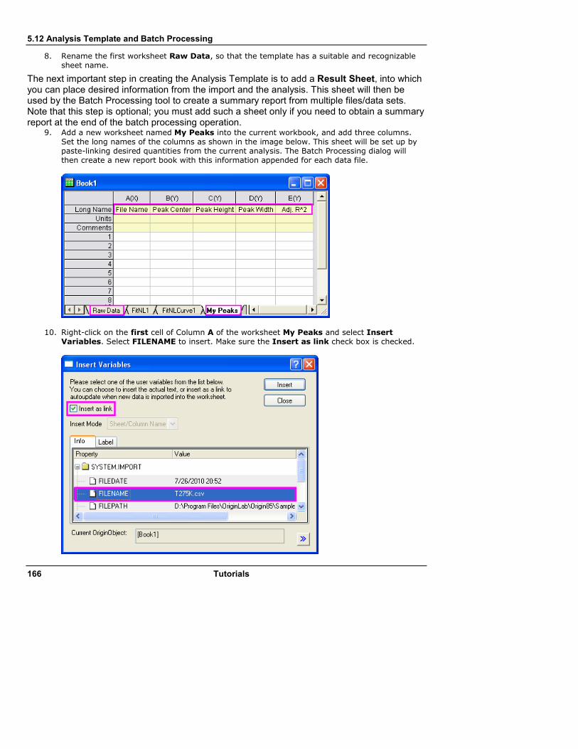
5.12 Analysis Template and Batch Processing
166 Tutorials
8. Rename the first worksheet Raw Data, so that the template has a suitable and recognizable sheet name.
The next important step in creating the Analysis Template is to add a Result Sheet, into which you can place desired information from the import and the analysis. This sheet will then be used by the Batch Processing tool to create a summary report from multiple files/data sets. Note that this step is optional; you must add such a sheet only if you need to obtain a summary report at the end of the batch processing operation.
9. Add a new worksheet named My Peaks into the current workbook, and add three columns. Set the long names of the columns as shown in the image below. This sheet will be set up by paste-linking desired quantities from the current analysis. The Batch Processing dialog will then create a new report book with this information appended for each data file.
10. Right-click on the first cell of Column A of the worksheet My Peaks and select Insert Variables. Select FILENAME to insert. Make sure the Insert as link check box is checked.

5.12 Analysis Template and Batch Processing
Tutorials 167
11. Go to the FitNL1 sheet to copy the values of parameter xc and then go to the My Peaks worksheet. Right-click on the first cell of Column B and select Paste Link. Then Copy relevant values from the Parameters table (parameters A and W) and from the Statistics table (Adj. R^2), to Paste Link them to Columns C, D and E.
12. Select File: Save Workbook as Analysis Template and name it My Peak Analysis. The raw data and related results will be cleared and the book will be saved to the disk as an OGW file with the specified name.
Analysis Templates can also include custom sheets other than a summary sheet. For instance, the user can create a custom sheet which combines multiple elements such as graphs and result tables in a format suitable for presentation and reporting. A graph can be inserted into a cell and then multiple cells in a sheet can be merged with this cell, to create a larger display of the graph image, for instance. Please view other tutorials available from the Help menu for information on how to create custom reports with merged cells.

5.12 Analysis Template and Batch Processing
168 Tutorials
5.12.3 Performing Batch Processing
We will now use the Analysis Template created in the steps above to perform batch processing of data from ten similar data files.
1. Create a new project and select File: Batch Processing from the main menu. Set the controls in the dialog as shown in the image below. Please note that the data files are under the Origin Installation Folder\Samples\Batch Processing folder, and all of them have the same prefix, T. Please remember to select All Files(*.*) from the Files of type drop-down list after you've opened the ASCII dialog by clicking the browser button, which is next to the File list.
2. Click OK to perform Batch Processing. The summary report should look like the image below. Sparklines were turned on for the data columns to visually compare the fit results from the different data files.
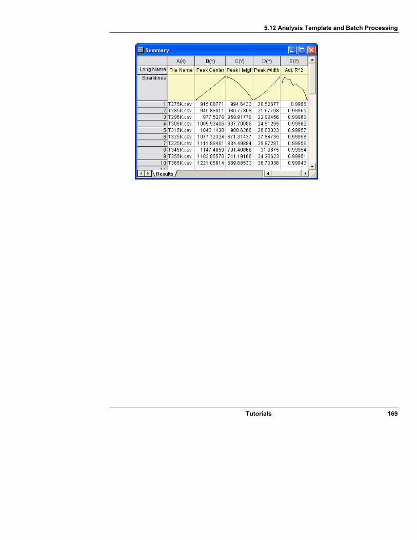
5.12 Analysis Template and Batch Processing
Tutorials 169


171
6 Origin Toolbars
Presented below is a list of all toolbars and buttons in Origin. Certain toolbar buttons (or entire toolbars) will be inactive (grayed out) if the object they act on is not present in the Origin Project. For instance, the 3D-Rotation Toolbar is only available when a 3D graph is active.
6.1 Standard
Button Description Button Description
New Project
New Folder
New Workbook
New Excel Workbook
New Graph
New Matrix
New Function
New Layout
New Notes
Open
Open Template
Open Excel
Save Project
Save Template
Import Wizard
Import Single ASCII
Import Multiple ASCII
Batch Processing
Recalculate Manual
Recalculate Auto
Zoom In and Out by Percentage
Slide Show of Graphs
Send Graphs to PowerPoint
Refresh
Duplicate

6.2 Edit
172 Origin Toolbars
Custom Routine
Project Explorer
Results Log
Command Window
Code Builder
Add New Columns
6.2 Edit
Button Description Button Description
Cut
Copy
Paste
6.3 Graph
Button Description Button Description
Zoom In
Zoom Out
Whole Page
Rescale
Extract to Layers
Extract to Graphs
Merge
Add Bottom-X Left-Y Layer
Add Top-X Layer
Add Right-Y Layer
Add Top-X Right-Y Layer
Add Inset Graph
Add Inset Graph With Data
Add Color Scale

6.4 2D Graph
Origin Toolbars 173
New Legend
Add XY Scale
Date & Time
New Link Table
6.4 2D Graph
Button Description Button Description
Line
Horizontal Step
Vertical Step
Spline Connected
Scatter
Scatter Center
Y Error
X Y Error
Vertical Drop Line
Bubble
Color Mapped
Bubble + Color Mapped
Line + Symbol
Line Series
2 Point Segment
3 Point Segment
Column
Column + Label
Bar
Stack Column
Stack Bar
Floating Column
Floating Bar
3D Color Pie Chart
B&W Pie Chart
Double Y Axis
3Ys Y-YY
3Ys Y-Y-Y
4Ys Y-YYY
4Ys YY-YY
Multiple Y Axes
Stack Lines By Y Offsets
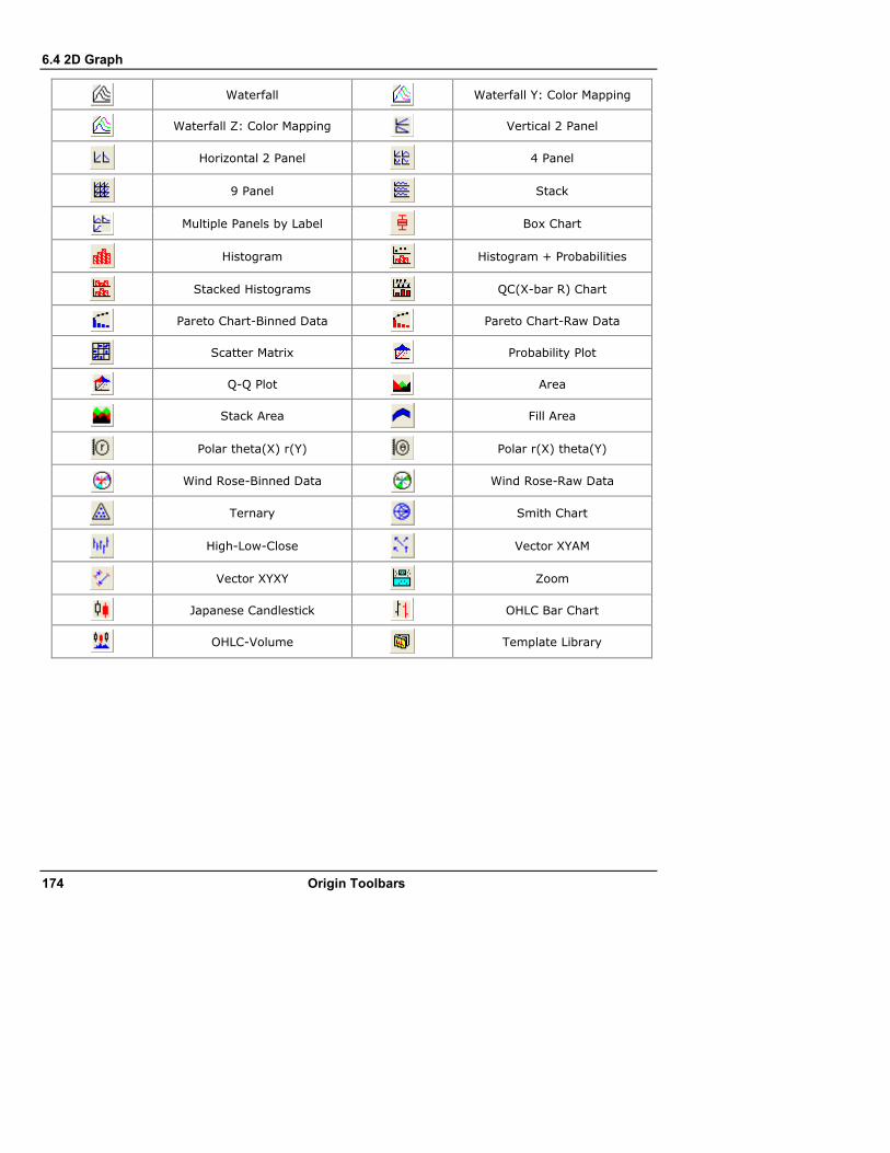
6.4 2D Graph
174 Origin Toolbars
Waterfall
Waterfall Y: Color Mapping
Waterfall Z: Color Mapping
Vertical 2 Panel
Horizontal 2 Panel
4 Panel
9 Panel
Stack
Multiple Panels by Label
Box Chart
Histogram
Histogram + Probabilities
Stacked Histograms
QC(X-bar R) Chart
Pareto Chart-Binned Data
Pareto Chart-Raw Data
Scatter Matrix
Probability Plot
Q-Q Plot
Area
Stack Area
Fill Area
Polar theta(X) r(Y)
Polar r(X) theta(Y)
Wind Rose-Binned Data
Wind Rose-Raw Data
Ternary
Smith Chart
High-Low-Close
Vector XYAM
Vector XYXY
Zoom
Japanese Candlestick
OHLC Bar Chart
OHLC-Volume
Template Library
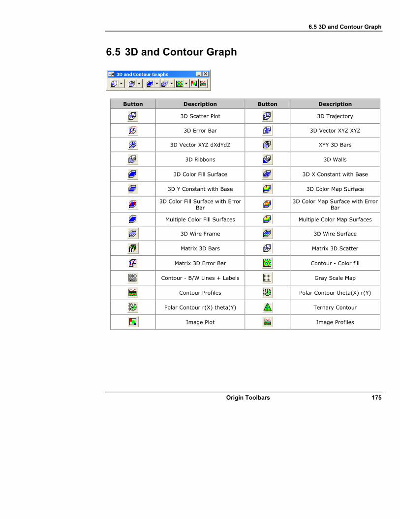
6.5 3D and Contour Graph
Origin Toolbars 175
6.5 3D and Contour Graph
Button Description Button Description
3D Scatter Plot
3D Trajectory
3D Error Bar
3D Vector XYZ XYZ
3D Vector XYZ dXdYdZ
XYY 3D Bars
3D Ribbons
3D Walls
3D Color Fill Surface
3D X Constant with Base
3D Y Constant with Base
3D Color Map Surface
3D Color Fill Surface with Error
Bar 3D Color Map Surface with Error
Bar
Multiple Color Fill Surfaces
Multiple Color Map Surfaces
3D Wire Frame
3D Wire Surface
Matrix 3D Bars
Matrix 3D Scatter
Matrix 3D Error Bar
Contour - Color fill
Contour - B/W Lines + Labels
Gray Scale Map
Contour Profiles
Polar Contour theta(X) r(Y)
Polar Contour r(X) theta(Y)
Ternary Contour
Image Plot
Image Profiles
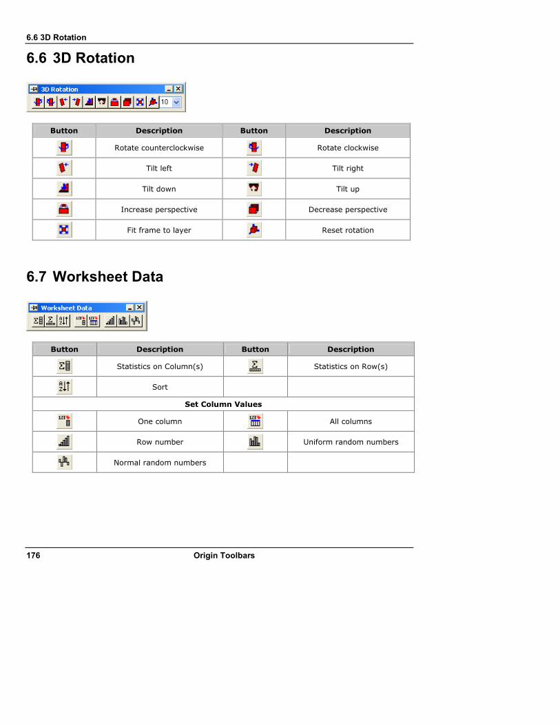
6.6 3D Rotation
176 Origin Toolbars
6.6 3D Rotation
Button Description Button Description
Rotate counterclockwise
Rotate clockwise
Tilt left
Tilt right
Tilt down
Tilt up
Increase perspective
Decrease perspective
Fit frame to layer
Reset rotation
6.7 Worksheet Data
Button Description Button Description
Statistics on Column(s)
Statistics on Row(s)
Sort
Set Column Values
One column
All columns
Row number
Uniform random numbers
Normal random numbers
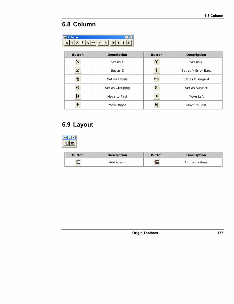
6.8 Column
Origin Toolbars 177
6.8 Column
Button Description Button Description
Set as X
Set as Y
Set as Z
Set as Y Error Bars
Set as Labels
Set as Disregard
Set as Grouping
Set as Subject
Move to First
Move Left
Move Right
Move to Last
6.9 Layout
Button Description Button Description
Add Graph
Add Worksheet

6.10 Mask
178 Origin Toolbars
6.10 Mask
Button Description Button Description
Mask Range
Unmask Range
Change mask color
Hide/Show masked points
Swap mask
Disable/Enables masking
6.11 Tools
Button Description Button Description
Pointer
Scale In
Scale Out
Screen Reader
Reader
Annotation
Cursor
Data Selector
Selection on Active Plot
Selection on All Plots
Mask Points on Active Plot
Mask Points on All Plots
Unmask Points on Active Plot
Unmask Points on All Plots
Draw Data
Text Tool
Arrow Tool
Curved Arrow Tool
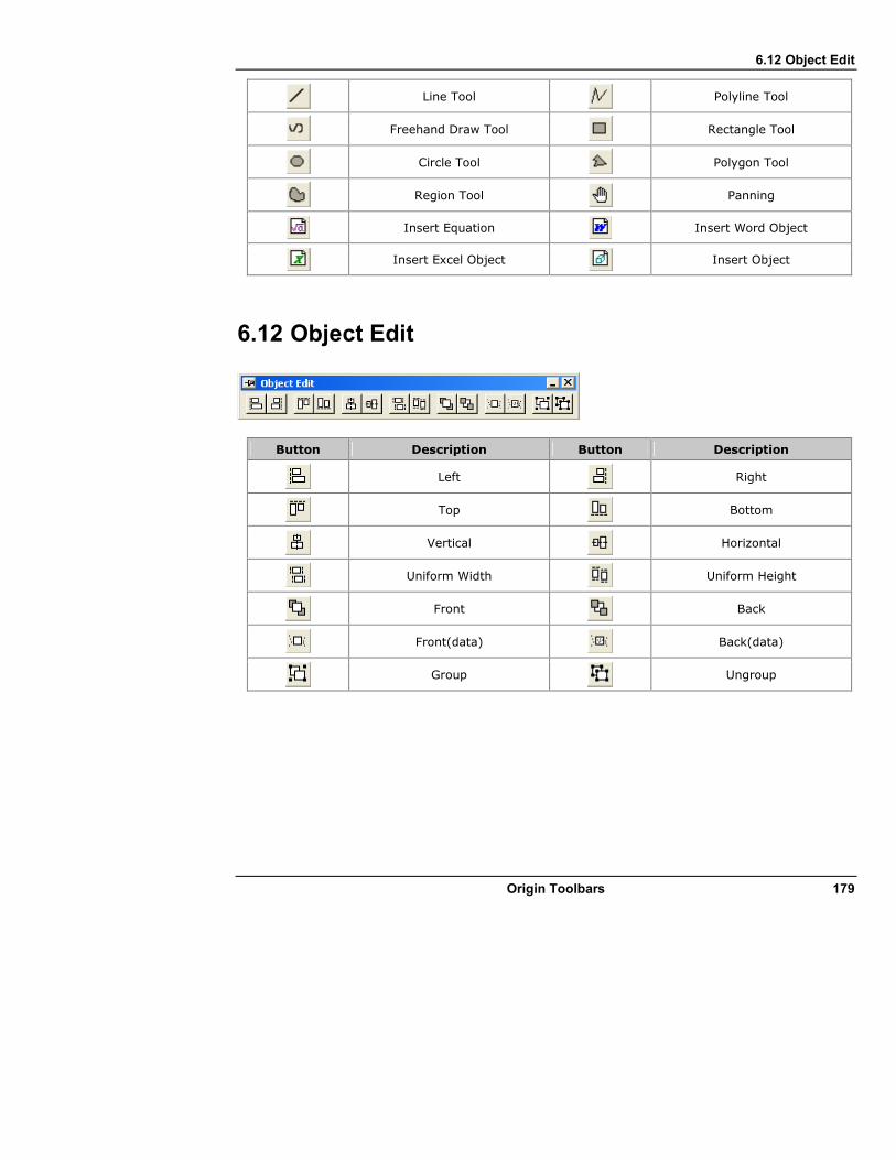
6.12 Object Edit
Origin Toolbars 179
Line Tool
Polyline Tool
Freehand Draw Tool
Rectangle Tool
Circle Tool
Polygon Tool
Region Tool
Panning
Insert Equation
Insert Word Object
Insert Excel Object
Insert Object
6.12 Object Edit
Button Description Button Description
Left
Right
Top
Bottom
Vertical
Horizontal
Uniform Width
Uniform Height
Front
Back
Front(data)
Back(data)
Group
Ungroup

6.13 Arrow
180 Origin Toolbars
6.13 Arrow
Button Description Button Description
Horizontal Alignment
Vertical Alignment
Widen Head
Narrow Head
Lengthen Head
Shorten Head
6.14 Style
Button Description Button Description
Fill Color
Line/Border Color
Pattern Color
Clear Borders
Left Border
Top Border
Right Border
Bottom Border
Frame Borders
Inside Horizontal Borders
Inside Vertical Border
Inside Horiz and Vert Borders
All Horizontal Borders
All Vertical Borders
All Borders
Merge cells
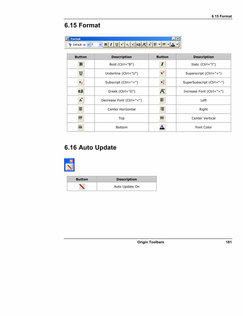
6.15 Format
Origin Toolbars 181
6.15 Format
Button Description Button Description
Bold (Ctrl+"B")
Italic (Ctrl+"I")
Underline (Ctrl+"U")
Superscript (Ctrl+"+")
Subscript (Ctrl+"=")
SuperSubscript (Ctrl+"-")
Greek (Ctrl+"G")
Increase Font (Ctrl+">")
Decrease Font (Ctrl+"<")
Left
Center Horizontal
Right
Top
Center Vertical
Bottom
Font Color
6.16 Auto Update
Button Description
Auto Update On
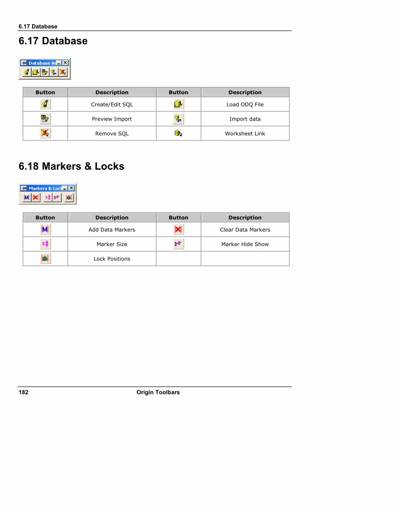
6.17 Database
182 Origin Toolbars
6.17 Database
Button Description Button Description
Create/Edit SQL
Load ODQ File
Preview Import
Import data
Remove SQL
Worksheet Link
6.18 Markers & Locks
Button Description Button Description
Add Data Markers
Clear Data Markers
Marker Size
Marker Hide Show
Lock Positions


