38
Palatino Palatino Palatino Palatino Palatino Palatino Linotype Linotype Linotype Linotype Linotype Linotype
| Date post: | 20-Feb-2019 |
| Category: |
Documents |
| Upload: | phungthuan |
| View: | 216 times |
| Download: | 0 times |

PalatinoPalatino
Palatino
Palatino
Palatino
Palatino
LinotypeLinotype
Linotype
Linotype
Linotype
Linotype
Copyright copy 2013
Arts 79 Typography 1Sources httpenwikipediaorgwikiPalatinohttpenwikipediaorgwikiTypography
PalatinoPalatino
Palatino
Palatino
Palatino
Palatino
LinotypeLinotype
Linotype
Linotype
Linotype
Linotype
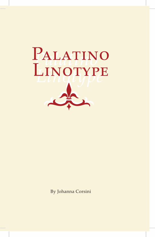
Johanna Corsini
LinotypePalatinoPalatinoLinotype
By Johanna Corsini
i
Li
no
typ
e
PP
P
a
aa
a
aa
l
ll
t
t
t
i
ii
n
n
n
o
o
o
Lino
t
yp
e
Table of Contents
6 History 8 Alphabet 10 Variations 11 Type Sizes 12 Ligatures 13 Numbers amp Symbols 14 Cyrillic Characters15 Greek Characters16 Calligraphic Quality17 Characteristics19 Colophon
6
PalatinoHistory
Regular 9 pt 48 pt
In 1984 Palatino was one of the typefaces originally included by Apple Computer in the Macintosh In the early days of desktop publishing it gained great popularity until it began to be replaced by Times Roman In 1999 Zapf revised Palatino for Linotype and Microsoft called Palatino Linotype The revised family incorporated extended Latin Greek and Cyrillic character sets Under the collaboration of Zapf and Akira Kobayashi the Palatino typeface family was expanded Linotype released the Palatino nova Palatino Sans and Palatino Sans Informal families expanding the Palatino typeface families to include humanist sans-serif typefaces Palatino nova was released in 2005 while the others were released in 2006 Named after 16th century Italian master of calligraphy Giambattista Palatino Palatino is based on the humanist fonts of the Italian Renaissance which mirror the letters formed by a broad nib pen this gives a calligraphic grace But where the Renaissance faces tend to use smaller letters with longer vertical lines (ascenders and descenders) with lighter strokes Palatino has larger proportions and is considered to be a much easier to read typeface
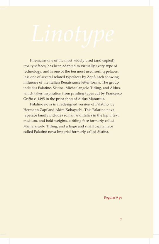
alatino is the name of a large typeface family that began as an old style serif typeface designed by Hermann Zapf initially released in 1948 by theP
Linotype foundry
7
Linotype
Regular 9 pt
It remains one of the most widely used (and copied) text typefaces has been adapted to virtually every type of technology and is one of the ten most used serif typefaces It is one of several related typefaces by Zapf each showing influence of the Italian Renaissance letter forms The group includes Palatine Sistina Michaelangelo Titling and Aldus which takes inspiration from printing types cut by Francesco Griffo c 1495 in the print shop of Aldus Manutius Palatino nova is a redesigned version of Palatino by Hermann Zapf and Akira Kobayashi This Palatino nova typeface family includes roman and italics in the light text medium and bold weights a titling face formerly called Michelangelo Titling and a large and small capital face called Palatino nova Imperial formerly called Sistina
8
PalatinoAlphabet
Aa Bb Cc Dd Ee Ff Gg Hh Ii Jj Kk Ll Mm Nn Oo Pp Qq Rr Ss Tt Uu Vv Ww Xx Yy Zz
Aa Bb Cc Dd Ee Ff Gg Hh Ii Jj Kk Ll Mm Nn Oo Pp Qq Rr Ss Tt Uu Vv Ww Xx Yy Zz
Regular Italic 18 pt
9
LinotypeAa Bb Cc Dd Ee Ff Gg Hh Ii Jj Kk Ll Mm Nn Oo Pp Qq Rr Ss Tt Uu Vv Ww Xx Yy Zz
Aa Bb Cc Dd Ee Ff Gg Hh Ii Jj Kk Ll Mm Nn Oo Pp Qq Rr Ss Tt Uu Vv Ww Xx Yy Zz
Bold Bold Italic 18 pt
10
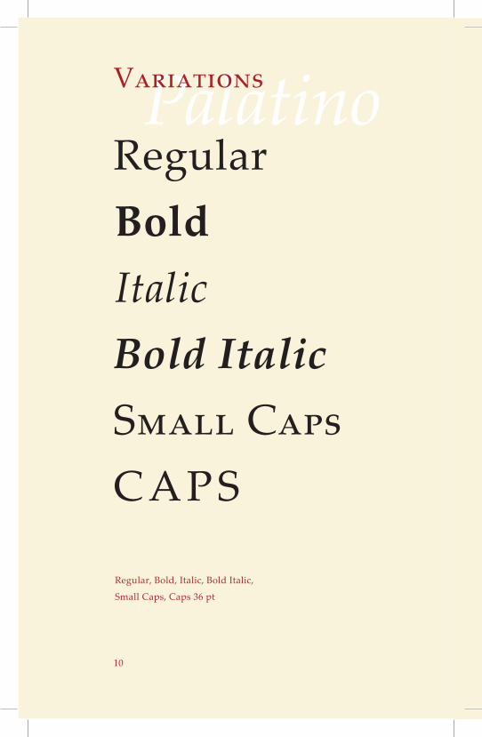
PalatinoVariations
BoldRegular
ItalicBold ItalicSmall CapsCAPS
Regular Bold Italic Bold Italic
Small Caps Caps 36 pt
11
LinotypeType Sizes
Typography is the art and technique of arranging type in order to make language visible
Typography is the art and technique of arranging type in order to make language visible
Typography is the art and technique of arranging type in order to make language visible
Typography is the art and technique of arranging type in order to make language visible
Regular 9 pt 12 pt 14 pt 18 pt
12
Palatino
ſſl
ffb
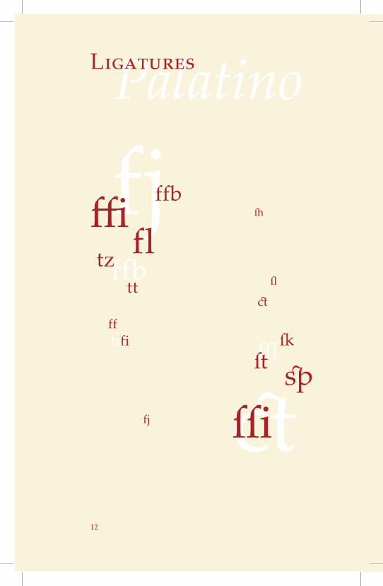
Ligatures
fjffi fl
ffb
tz tt
fitzff
fj ctſſispſt
ſk
ctſl
ſh
13
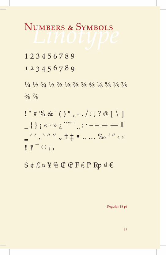
LinotypeNumbers amp Symbols
1 2 3 4 5 6 7 8 9 1 2 3 4 5 6 7 8 9
frac14 frac12 frac34 ⅓ ⅔ ⅕ ⅖ ⅗ ⅘ ⅙ ⅚ ⅛ ⅜ ⅝ ⅞
amp ( ) - [ ] _ iexcl laquo middot raquo iquest ‒ ndash mdash ― lsquo rsquo sbquo ‛ ldquo rdquo bdquo dagger Dagger bull hellip permil prime Prime lsaquo rsaquo oline ⁽ ⁾ ₍ ₎
$ cent pound curren yen ₠ ₡ ₢ ₣ ₤ ₧ ₨ ₫ euro
Regular 18 pt
sp
14
Palatinoк
ни го
печа
та
н
и
е
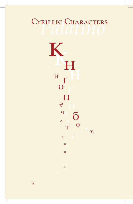
Cyrillic Characters
кн
и гоп
еча
та
н
и
е
бФ
ѪѪ
15
LinotypeGreek Characters
Ά Έ Ή Ί Ό Ύ Ώ ΐ Α Β Γ Δ Ε Ζ Η Θ Ι Κ
Λ Μ Ν Ξ Ο Π Ρ Σ Τ Υ Φ Χ Ψ Ω Ϊ Ϋ
ά έ ή ί ΰ α β γ δ ε ζ η θ ι κ λ ν ξ ο π ρ
ς σ τ υ φ χ ψ ω ϊ ϋ ό ώ ϐ ϑ ϕ ϖ Ϛ Ϝ Ϟ Ϡ
ϰ ἀ ἁ ἂ ἃ ἄ ἅ ἆ ἇ Ἀ Ἁ Ἂ Ἃ Ἄ Ἅ Ἆ Ἇ ἐ
ἑ ἒ ἓ ἔ ἕ Ἐ Ἑ Ἒ Ἓ Ἔ Ἕ ἠ ἡ ἢ ἣ ἤ ἥ ἦ ἧ
Ἠ Ἡ Ἢ Ἣ Ἤ Ἥ Ἦ Ἧ ἰ ἱ ἲ ἳ ἴ ἵ ἶ ἷ Ἰ Ἱ Ἲ
Ἳ Ἴ Ἵ Ἶ Ἷ
Regular 14 pt
16
PalatinoCalligraphic Quality
Y
HPAR
PYTtypOo
Ggrap
hy
17
LinotypeCharacteristics
Typography
Typography
Short descenders
Short ascenders
g Based on typefaces created with a broad nib pen
Palatino Linotype is easy to read unlike similar fonts because it has shorter ascenders and descenders
Regular 36 pt 10 pt 90 pt
PalatinoPalatino
Palatino
Palatino
Palatino
Palatino
LinotypeLinotype
Linotype
Linotype
Linotype
Linotype
18
19
LinotypeColophon
his book was very fun for me to create I enjoyed the entire process of designing each page and trying to represent this typeface in a way that T
encompasses its history as well as a more modern outlook on it This book was created by Johanna Corsini who is pursuing a degree in Graphic design This book uses the typeface Palatino Linotype throughout with no other typefaces used This book is perfect bound This has inspired me to want to create other books but unfortunately I would need InDesign for that and Irsquom not quite ready to start paying for access to the Adobe Cloud I am happy with the way it turned out and seeing it printed is very exciting This is my last big project here at University of the Pacific and I am glad to have done such a wonderful project before I go This will forever be a reminder of how muchI enjoyed creating designs and art in this department
Palatino
Linotype
Palatino
Linotype
Palatino
Linotype
Palatino
Linotype
Palatino
Linotype
Palatino
Linotype
Palatino
Linotype
Palatino
Linotype
Palatino
Linotype
PalatinoPalatino
Palatino
Palatino
Palatino
Palatino
LinotypeLinotype
Linotype
Linotype
Linotype
Linotype

Copyright copy 2013
Arts 79 Typography 1Sources httpenwikipediaorgwikiPalatinohttpenwikipediaorgwikiTypography
PalatinoPalatino
Palatino
Palatino
Palatino
Palatino
LinotypeLinotype
Linotype
Linotype
Linotype
Linotype
Johanna Corsini
LinotypePalatinoPalatinoLinotype
By Johanna Corsini
i
Li
no
typ
e
PP
P
a
aa
a
aa
l
ll
t
t
t
i
ii
n
n
n
o
o
o
Lino
t
yp
e
Table of Contents
6 History 8 Alphabet 10 Variations 11 Type Sizes 12 Ligatures 13 Numbers amp Symbols 14 Cyrillic Characters15 Greek Characters16 Calligraphic Quality17 Characteristics19 Colophon
6
PalatinoHistory
Regular 9 pt 48 pt
In 1984 Palatino was one of the typefaces originally included by Apple Computer in the Macintosh In the early days of desktop publishing it gained great popularity until it began to be replaced by Times Roman In 1999 Zapf revised Palatino for Linotype and Microsoft called Palatino Linotype The revised family incorporated extended Latin Greek and Cyrillic character sets Under the collaboration of Zapf and Akira Kobayashi the Palatino typeface family was expanded Linotype released the Palatino nova Palatino Sans and Palatino Sans Informal families expanding the Palatino typeface families to include humanist sans-serif typefaces Palatino nova was released in 2005 while the others were released in 2006 Named after 16th century Italian master of calligraphy Giambattista Palatino Palatino is based on the humanist fonts of the Italian Renaissance which mirror the letters formed by a broad nib pen this gives a calligraphic grace But where the Renaissance faces tend to use smaller letters with longer vertical lines (ascenders and descenders) with lighter strokes Palatino has larger proportions and is considered to be a much easier to read typeface
alatino is the name of a large typeface family that began as an old style serif typeface designed by Hermann Zapf initially released in 1948 by theP
Linotype foundry
7
Linotype
Regular 9 pt
It remains one of the most widely used (and copied) text typefaces has been adapted to virtually every type of technology and is one of the ten most used serif typefaces It is one of several related typefaces by Zapf each showing influence of the Italian Renaissance letter forms The group includes Palatine Sistina Michaelangelo Titling and Aldus which takes inspiration from printing types cut by Francesco Griffo c 1495 in the print shop of Aldus Manutius Palatino nova is a redesigned version of Palatino by Hermann Zapf and Akira Kobayashi This Palatino nova typeface family includes roman and italics in the light text medium and bold weights a titling face formerly called Michelangelo Titling and a large and small capital face called Palatino nova Imperial formerly called Sistina
8
PalatinoAlphabet
Aa Bb Cc Dd Ee Ff Gg Hh Ii Jj Kk Ll Mm Nn Oo Pp Qq Rr Ss Tt Uu Vv Ww Xx Yy Zz
Aa Bb Cc Dd Ee Ff Gg Hh Ii Jj Kk Ll Mm Nn Oo Pp Qq Rr Ss Tt Uu Vv Ww Xx Yy Zz
Regular Italic 18 pt
9
LinotypeAa Bb Cc Dd Ee Ff Gg Hh Ii Jj Kk Ll Mm Nn Oo Pp Qq Rr Ss Tt Uu Vv Ww Xx Yy Zz
Aa Bb Cc Dd Ee Ff Gg Hh Ii Jj Kk Ll Mm Nn Oo Pp Qq Rr Ss Tt Uu Vv Ww Xx Yy Zz
Bold Bold Italic 18 pt
10
PalatinoVariations
BoldRegular
ItalicBold ItalicSmall CapsCAPS
Regular Bold Italic Bold Italic
Small Caps Caps 36 pt
11
LinotypeType Sizes
Typography is the art and technique of arranging type in order to make language visible
Typography is the art and technique of arranging type in order to make language visible
Typography is the art and technique of arranging type in order to make language visible
Typography is the art and technique of arranging type in order to make language visible
Regular 9 pt 12 pt 14 pt 18 pt
12
Palatino
ſſl
ffb
Ligatures
fjffi fl
ffb
tz tt
fitzff
fj ctſſispſt
ſk
ctſl
ſh
13
LinotypeNumbers amp Symbols
1 2 3 4 5 6 7 8 9 1 2 3 4 5 6 7 8 9
frac14 frac12 frac34 ⅓ ⅔ ⅕ ⅖ ⅗ ⅘ ⅙ ⅚ ⅛ ⅜ ⅝ ⅞
amp ( ) - [ ] _ iexcl laquo middot raquo iquest ‒ ndash mdash ― lsquo rsquo sbquo ‛ ldquo rdquo bdquo dagger Dagger bull hellip permil prime Prime lsaquo rsaquo oline ⁽ ⁾ ₍ ₎
$ cent pound curren yen ₠ ₡ ₢ ₣ ₤ ₧ ₨ ₫ euro
Regular 18 pt
sp
14
Palatinoк
ни го
печа
та
н
и
е
Cyrillic Characters
кн
и гоп
еча
та
н
и
е
бФ
ѪѪ
15
LinotypeGreek Characters
Ά Έ Ή Ί Ό Ύ Ώ ΐ Α Β Γ Δ Ε Ζ Η Θ Ι Κ
Λ Μ Ν Ξ Ο Π Ρ Σ Τ Υ Φ Χ Ψ Ω Ϊ Ϋ
ά έ ή ί ΰ α β γ δ ε ζ η θ ι κ λ ν ξ ο π ρ
ς σ τ υ φ χ ψ ω ϊ ϋ ό ώ ϐ ϑ ϕ ϖ Ϛ Ϝ Ϟ Ϡ
ϰ ἀ ἁ ἂ ἃ ἄ ἅ ἆ ἇ Ἀ Ἁ Ἂ Ἃ Ἄ Ἅ Ἆ Ἇ ἐ
ἑ ἒ ἓ ἔ ἕ Ἐ Ἑ Ἒ Ἓ Ἔ Ἕ ἠ ἡ ἢ ἣ ἤ ἥ ἦ ἧ
Ἠ Ἡ Ἢ Ἣ Ἤ Ἥ Ἦ Ἧ ἰ ἱ ἲ ἳ ἴ ἵ ἶ ἷ Ἰ Ἱ Ἲ
Ἳ Ἴ Ἵ Ἶ Ἷ
Regular 14 pt
16
PalatinoCalligraphic Quality
Y
HPAR
PYTtypOo
Ggrap
hy
17
LinotypeCharacteristics
Typography
Typography
Short descenders
Short ascenders
g Based on typefaces created with a broad nib pen
Palatino Linotype is easy to read unlike similar fonts because it has shorter ascenders and descenders
Regular 36 pt 10 pt 90 pt
PalatinoPalatino
Palatino
Palatino
Palatino
Palatino
LinotypeLinotype
Linotype
Linotype
Linotype
Linotype
18
19
LinotypeColophon
his book was very fun for me to create I enjoyed the entire process of designing each page and trying to represent this typeface in a way that T
encompasses its history as well as a more modern outlook on it This book was created by Johanna Corsini who is pursuing a degree in Graphic design This book uses the typeface Palatino Linotype throughout with no other typefaces used This book is perfect bound This has inspired me to want to create other books but unfortunately I would need InDesign for that and Irsquom not quite ready to start paying for access to the Adobe Cloud I am happy with the way it turned out and seeing it printed is very exciting This is my last big project here at University of the Pacific and I am glad to have done such a wonderful project before I go This will forever be a reminder of how muchI enjoyed creating designs and art in this department
Palatino
Linotype
Palatino
Linotype
Palatino
Linotype
Palatino
Linotype
Palatino
Linotype
Palatino
Linotype
Palatino
Linotype
Palatino
Linotype
Palatino
Linotype
PalatinoPalatino
Palatino
Palatino
Palatino
Palatino
LinotypeLinotype
Linotype
Linotype
Linotype
Linotype

i
Li
no
typ
e
PP
P
a
aa
a
aa
l
ll
t
t
t
i
ii
n
n
n
o
o
o
Lino
t
yp
e
Table of Contents
6 History 8 Alphabet 10 Variations 11 Type Sizes 12 Ligatures 13 Numbers amp Symbols 14 Cyrillic Characters15 Greek Characters16 Calligraphic Quality17 Characteristics19 Colophon
6
PalatinoHistory
Regular 9 pt 48 pt
In 1984 Palatino was one of the typefaces originally included by Apple Computer in the Macintosh In the early days of desktop publishing it gained great popularity until it began to be replaced by Times Roman In 1999 Zapf revised Palatino for Linotype and Microsoft called Palatino Linotype The revised family incorporated extended Latin Greek and Cyrillic character sets Under the collaboration of Zapf and Akira Kobayashi the Palatino typeface family was expanded Linotype released the Palatino nova Palatino Sans and Palatino Sans Informal families expanding the Palatino typeface families to include humanist sans-serif typefaces Palatino nova was released in 2005 while the others were released in 2006 Named after 16th century Italian master of calligraphy Giambattista Palatino Palatino is based on the humanist fonts of the Italian Renaissance which mirror the letters formed by a broad nib pen this gives a calligraphic grace But where the Renaissance faces tend to use smaller letters with longer vertical lines (ascenders and descenders) with lighter strokes Palatino has larger proportions and is considered to be a much easier to read typeface
alatino is the name of a large typeface family that began as an old style serif typeface designed by Hermann Zapf initially released in 1948 by theP
Linotype foundry
7
Linotype
Regular 9 pt
It remains one of the most widely used (and copied) text typefaces has been adapted to virtually every type of technology and is one of the ten most used serif typefaces It is one of several related typefaces by Zapf each showing influence of the Italian Renaissance letter forms The group includes Palatine Sistina Michaelangelo Titling and Aldus which takes inspiration from printing types cut by Francesco Griffo c 1495 in the print shop of Aldus Manutius Palatino nova is a redesigned version of Palatino by Hermann Zapf and Akira Kobayashi This Palatino nova typeface family includes roman and italics in the light text medium and bold weights a titling face formerly called Michelangelo Titling and a large and small capital face called Palatino nova Imperial formerly called Sistina
8
PalatinoAlphabet
Aa Bb Cc Dd Ee Ff Gg Hh Ii Jj Kk Ll Mm Nn Oo Pp Qq Rr Ss Tt Uu Vv Ww Xx Yy Zz
Aa Bb Cc Dd Ee Ff Gg Hh Ii Jj Kk Ll Mm Nn Oo Pp Qq Rr Ss Tt Uu Vv Ww Xx Yy Zz
Regular Italic 18 pt
9
LinotypeAa Bb Cc Dd Ee Ff Gg Hh Ii Jj Kk Ll Mm Nn Oo Pp Qq Rr Ss Tt Uu Vv Ww Xx Yy Zz
Aa Bb Cc Dd Ee Ff Gg Hh Ii Jj Kk Ll Mm Nn Oo Pp Qq Rr Ss Tt Uu Vv Ww Xx Yy Zz
Bold Bold Italic 18 pt
10
PalatinoVariations
BoldRegular
ItalicBold ItalicSmall CapsCAPS
Regular Bold Italic Bold Italic
Small Caps Caps 36 pt
11
LinotypeType Sizes
Typography is the art and technique of arranging type in order to make language visible
Typography is the art and technique of arranging type in order to make language visible
Typography is the art and technique of arranging type in order to make language visible
Typography is the art and technique of arranging type in order to make language visible
Regular 9 pt 12 pt 14 pt 18 pt
12
Palatino
ſſl
ffb
Ligatures
fjffi fl
ffb
tz tt
fitzff
fj ctſſispſt
ſk
ctſl
ſh
13
LinotypeNumbers amp Symbols
1 2 3 4 5 6 7 8 9 1 2 3 4 5 6 7 8 9
frac14 frac12 frac34 ⅓ ⅔ ⅕ ⅖ ⅗ ⅘ ⅙ ⅚ ⅛ ⅜ ⅝ ⅞
amp ( ) - [ ] _ iexcl laquo middot raquo iquest ‒ ndash mdash ― lsquo rsquo sbquo ‛ ldquo rdquo bdquo dagger Dagger bull hellip permil prime Prime lsaquo rsaquo oline ⁽ ⁾ ₍ ₎
$ cent pound curren yen ₠ ₡ ₢ ₣ ₤ ₧ ₨ ₫ euro
Regular 18 pt
sp
14
Palatinoк
ни го
печа
та
н
и
е
Cyrillic Characters
кн
и гоп
еча
та
н
и
е
бФ
ѪѪ
15
LinotypeGreek Characters
Ά Έ Ή Ί Ό Ύ Ώ ΐ Α Β Γ Δ Ε Ζ Η Θ Ι Κ
Λ Μ Ν Ξ Ο Π Ρ Σ Τ Υ Φ Χ Ψ Ω Ϊ Ϋ
ά έ ή ί ΰ α β γ δ ε ζ η θ ι κ λ ν ξ ο π ρ
ς σ τ υ φ χ ψ ω ϊ ϋ ό ώ ϐ ϑ ϕ ϖ Ϛ Ϝ Ϟ Ϡ
ϰ ἀ ἁ ἂ ἃ ἄ ἅ ἆ ἇ Ἀ Ἁ Ἂ Ἃ Ἄ Ἅ Ἆ Ἇ ἐ
ἑ ἒ ἓ ἔ ἕ Ἐ Ἑ Ἒ Ἓ Ἔ Ἕ ἠ ἡ ἢ ἣ ἤ ἥ ἦ ἧ
Ἠ Ἡ Ἢ Ἣ Ἤ Ἥ Ἦ Ἧ ἰ ἱ ἲ ἳ ἴ ἵ ἶ ἷ Ἰ Ἱ Ἲ
Ἳ Ἴ Ἵ Ἶ Ἷ
Regular 14 pt
16
PalatinoCalligraphic Quality
Y
HPAR
PYTtypOo
Ggrap
hy
17
LinotypeCharacteristics
Typography
Typography
Short descenders
Short ascenders
g Based on typefaces created with a broad nib pen
Palatino Linotype is easy to read unlike similar fonts because it has shorter ascenders and descenders
Regular 36 pt 10 pt 90 pt
PalatinoPalatino
Palatino
Palatino
Palatino
Palatino
LinotypeLinotype
Linotype
Linotype
Linotype
Linotype
18
19
LinotypeColophon
his book was very fun for me to create I enjoyed the entire process of designing each page and trying to represent this typeface in a way that T
encompasses its history as well as a more modern outlook on it This book was created by Johanna Corsini who is pursuing a degree in Graphic design This book uses the typeface Palatino Linotype throughout with no other typefaces used This book is perfect bound This has inspired me to want to create other books but unfortunately I would need InDesign for that and Irsquom not quite ready to start paying for access to the Adobe Cloud I am happy with the way it turned out and seeing it printed is very exciting This is my last big project here at University of the Pacific and I am glad to have done such a wonderful project before I go This will forever be a reminder of how muchI enjoyed creating designs and art in this department
Palatino
Linotype
Palatino
Linotype
Palatino
Linotype
Palatino
Linotype
Palatino
Linotype
Palatino
Linotype
Palatino
Linotype
Palatino
Linotype
Palatino
Linotype
PalatinoPalatino
Palatino
Palatino
Palatino
Palatino
LinotypeLinotype
Linotype
Linotype
Linotype
Linotype

PalatinoPalatino
Palatino
Palatino
Palatino
Palatino
LinotypeLinotype
Linotype
Linotype
Linotype
Linotype
18
19
LinotypeColophon
his book was very fun for me to create I enjoyed the entire process of designing each page and trying to represent this typeface in a way that T
encompasses its history as well as a more modern outlook on it This book was created by Johanna Corsini who is pursuing a degree in Graphic design This book uses the typeface Palatino Linotype throughout with no other typefaces used This book is perfect bound This has inspired me to want to create other books but unfortunately I would need InDesign for that and Irsquom not quite ready to start paying for access to the Adobe Cloud I am happy with the way it turned out and seeing it printed is very exciting This is my last big project here at University of the Pacific and I am glad to have done such a wonderful project before I go This will forever be a reminder of how muchI enjoyed creating designs and art in this department
Palatino
Linotype
Palatino
Linotype
Palatino
Linotype
Palatino
Linotype
Palatino
Linotype
Palatino
Linotype
Palatino
Linotype
Palatino
Linotype
Palatino
Linotype
PalatinoPalatino
Palatino
Palatino
Palatino
Palatino
LinotypeLinotype
Linotype
Linotype
Linotype
Linotype

Palatino
Linotype
Palatino
Linotype
Palatino
Linotype
Palatino
Linotype
Palatino
Linotype
Palatino
Linotype
Palatino
Linotype
Palatino
Linotype
Palatino
Linotype
PalatinoPalatino
Palatino
Palatino
Palatino
Palatino
LinotypeLinotype
Linotype
Linotype
Linotype
Linotype

Linotype
Palatino
Linotype
Palatino
Linotype
Palatino
Linotype
Palatino
Linotype
Palatino
Linotype
Palatino
Linotype
Palatino
Linotype
Palatino
Linotype
PalatinoPalatino
Palatino
Palatino
Palatino
Palatino
LinotypeLinotype
Linotype
Linotype
Linotype
Linotype

Palatino
Linotype
Palatino
Linotype
Palatino
Linotype
Palatino
Linotype
Palatino
Linotype
Palatino
Linotype
Palatino
Linotype
Palatino
Linotype
PalatinoPalatino
Palatino
Palatino
Palatino
Palatino
LinotypeLinotype
Linotype
Linotype
Linotype
Linotype

Linotype
Palatino
Linotype
Palatino
Linotype
Palatino
Linotype
Palatino
Linotype
Palatino
Linotype
Palatino
Linotype
Palatino
Linotype
PalatinoPalatino
Palatino
Palatino
Palatino
Palatino
LinotypeLinotype
Linotype
Linotype
Linotype
Linotype

Palatino
Linotype
Palatino
Linotype
Palatino
Linotype
Palatino
Linotype
Palatino
Linotype
Palatino
Linotype
Palatino
Linotype
PalatinoPalatino
Palatino
Palatino
Palatino
Palatino
LinotypeLinotype
Linotype
Linotype
Linotype
Linotype

Linotype
Palatino
Linotype
Palatino
Linotype
Palatino
Linotype
Palatino
Linotype
Palatino
Linotype
Palatino
Linotype
PalatinoPalatino
Palatino
Palatino
Palatino
Palatino
LinotypeLinotype
Linotype
Linotype
Linotype
Linotype

Palatino
Linotype
Palatino
Linotype
Palatino
Linotype
Palatino
Linotype
Palatino
Linotype
Palatino
Linotype
PalatinoPalatino
Palatino
Palatino
Palatino
Palatino
LinotypeLinotype
Linotype
Linotype
Linotype
Linotype
Linotype
Palatino
Linotype
Palatino
Linotype
Palatino
Linotype
Palatino
Linotype
Palatino
Linotype
PalatinoPalatino
Palatino
Palatino
Palatino
Palatino
LinotypeLinotype
Linotype
Linotype
Linotype
Linotype
Palatino
Linotype
Palatino
Linotype
Palatino
Linotype
Palatino
Linotype
Palatino
Linotype
PalatinoPalatino
Palatino
Palatino
Palatino
Palatino
LinotypeLinotype
Linotype
Linotype
Linotype
Linotype

Linotype
Palatino
Linotype
Palatino
Linotype
Palatino
Linotype
Palatino
Linotype
PalatinoPalatino
Palatino
Palatino
Palatino
Palatino
LinotypeLinotype
Linotype
Linotype
Linotype
Linotype

Palatino
Linotype
Palatino
Linotype
Palatino
Linotype
Palatino
Linotype
PalatinoPalatino
Palatino
Palatino
Palatino
Palatino
LinotypeLinotype
Linotype
Linotype
Linotype
Linotype

Linotype
Palatino
Linotype
Palatino
Linotype
Palatino
Linotype
PalatinoPalatino
Palatino
Palatino
Palatino
Palatino
LinotypeLinotype
Linotype
Linotype
Linotype
Linotype

Palatino
Linotype
Palatino
Linotype
Palatino
Linotype
PalatinoPalatino
Palatino
Palatino
Palatino
Palatino
LinotypeLinotype
Linotype
Linotype
Linotype
Linotype

Linotype
Palatino
Linotype
Palatino
Linotype
PalatinoPalatino
Palatino
Palatino
Palatino
Palatino
LinotypeLinotype
Linotype
Linotype
Linotype
Linotype

Palatino
Linotype
Palatino
Linotype
PalatinoPalatino
Palatino
Palatino
Palatino
Palatino
LinotypeLinotype
Linotype
Linotype
Linotype
Linotype

Linotype
Palatino
Linotype
PalatinoPalatino
Palatino
Palatino
Palatino
Palatino
LinotypeLinotype
Linotype
Linotype
Linotype
Linotype

Palatino
Linotype
PalatinoPalatino
Palatino
Palatino
Palatino
Palatino
LinotypeLinotype
Linotype
Linotype
Linotype
Linotype

Linotype
PalatinoPalatino
Palatino
Palatino
Palatino
Palatino
LinotypeLinotype
Linotype
Linotype
Linotype
Linotype
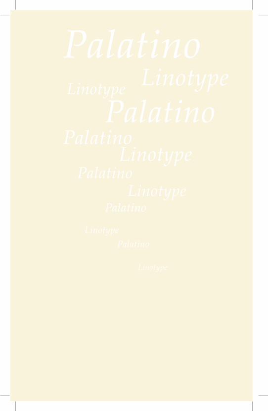
PalatinoPalatino
Palatino
Palatino
Palatino
Palatino
LinotypeLinotype
Linotype
Linotype
Linotype
Linotype


