1 Paper 096-2014 Up Your Game with Graph Template Language Layouts Sanjay Matange, SAS Institute Inc., Cary, NC ABSTRACT You have built the simple bar chart and mastered the art of layering multiple plot statements to create complex graphs like the survival plot using the SGPLOT procedure. You know all about how to use plot statements creatively to get what you need and how to customize the axes to achieve the look and feel you want. Now it’s time to up your game and step into the realm of the “Graphics Wizard.” Behold the magical powers of Graph Template Language layouts! Here you will learn the esoteric art of creating complex multi-cell graphs using LAYOUT LATTICE. This is the incantation that gives you the power to build complex, multi-cell graphs like the forest plot, stock plots with multiple indicators like MACD and Stochastic, Adverse Events by Relative Risk graphs, and more. If you ever wondered how the Diagnostics panel in the REG procedure was built, this paper is for you. Be warned, this is not the realm for the faint of heart! INTRODUCTION The Graph Template Language (GTL) provides a powerful syntax for the definition of graphs from the simplest scatter plot to highly complex panels. GTL uses the concept of layouts and plot layering to create a graph. Layouts and plot statements can be combined in a myriad of ways to create graphs. Let us review the GTL statements you can use in the following broad groups: plot statements layout statements ancillary statements Plot statements determine how the data is displayed. Different plot statements display the same data differently, as in a scatter plot versus a needle plot. Plot statements can be organized in the following groups based on their function: basic plots such as scatter, series where each observation is plotted in the graphfit plots such as regression or loess, where a fit line is displayed for the given data distribution plots such as histograms and box plots categorization plots such as bar charts and pie charts where summarized data is displayed three dimensional plots such as surface plot and bivariate histogram other plots such as parametric line, reference line, and drop line Layout statements determine where the plots are drawn and the relationship of one plot to another in the same layout container. Layouts also determine how the space available in the graph area can be subdivided. The layouts can be organized in the following groups based on their properties. overlay layouts for single-cell user-specified arrangement of multiple cells in a graph data-driven arrangement of multi-cell classification panels Ancillary statements such as titles, footnotes, entries, and legends can be used to provide the context and the keys needed to decode the information in the graph. Graphs are created by using one or more plot statements placed within one or more layout statements (containers). Every GTL template contains one BEGINGRAPH – ENDGRAPH block within which all the GTL statements have to be contained. This block can contain one and only one (possibly nested) layout block as the "root" layout container. All other layout statements must be nested inside this root layout container, and all plot statements must be inside some layout container. Single-cell and multi-cell graphs can be created using the process described below.
Transcript
1
Paper 096-2014
Up Your Game with Graph Template Language Layouts
Sanjay Matange, SAS Institute Inc., Cary, NC
ABSTRACT
You have built the simple bar chart and mastered the art of layering multiple plot statements to create complex graphs like the survival plot using the SGPLOT procedure. You know all about how to use plot statements creatively to get what you need and how to customize the axes to achieve the look and feel you want. Now it’s time to up your game and step into the realm of the “Graphics Wizard.” Behold the magical powers of Graph Template Language layouts! Here you will learn the esoteric art of creating complex multi-cell graphs using LAYOUT LATTICE. This is the incantation that gives you the power to build complex, multi-cell graphs like the forest plot, stock plots with multiple indicators like MACD and Stochastic, Adverse Events by Relative Risk graphs, and more. If you ever wondered how the Diagnostics panel in the REG procedure was built, this paper is for you. Be warned, this is not the realm for the faint of heart!
INTRODUCTION
The Graph Template Language (GTL) provides a powerful syntax for the definition of graphs from the simplest scatter plot to highly complex panels. GTL uses the concept of layouts and plot layering to create a graph. Layouts and plot statements can be combined in a myriad of ways to create graphs. Let us review the GTL statements you can use in the following broad groups:
plot statements
layout statements
ancillary statements
Plot statements determine how the data is displayed. Different plot statements display the same data differently, as in a scatter plot versus a needle plot. Plot statements can be organized in the following groups based on their function:
basic plots such as scatter, series where each observation is plotted in the graphfit plots such as regression or loess, where a fit line is displayed for the given data
distribution plots such as histograms and box plots
categorization plots such as bar charts and pie charts where summarized data is displayed
three dimensional plots such as surface plot and bivariate histogram
other plots such as parametric line, reference line, and drop line
Layout statements determine where the plots are drawn and the relationship of one plot to another in the same layout container. Layouts also determine how the space available in the graph area can be subdivided. The layouts can be organized in the following groups based on their properties.
overlay layouts for single-cell
user-specified arrangement of multiple cells in a graph
data-driven arrangement of multi-cell classification panels
Ancillary statements such as titles, footnotes, entries, and legends can be used to provide the context and the keys needed to decode the information in the graph.
Graphs are created by using one or more plot statements placed within one or more layout statements (containers). Every GTL template contains one BEGINGRAPH – ENDGRAPH block within which all the GTL statements have to be contained.
This block can contain one and only one (possibly nested) layout block as the "root" layout container. All other layout statements must be nested inside this root layout container, and all plot statements must be inside some layout container. Single-cell and multi-cell graphs can be created using the process described below.
2
REVIEW OF GTL PLOT AND LAYOUT STATEMENTS
Plot statements determine how the associated data is displayed. The same data is displayed in different ways by different plot statements such as scatter plot or a needle plot. This group contains all the plot statements that can be used to build single or layered graphs such as bar charts, histograms, or box plots. Plot statements must be placed in one of the GTL layout containers as explained below. Some examples of the usage of single and layered plots are shown below. All plot statements must be placed inside some layout containers.
Figure 1 – Bar Chart Figure 2 - Scatter Plot Figure 3 – Distribution Plot
Layout statements determine how the graph space is used and how the plot statements are displayed in relation to each other. Layout statements can also be thought of as containers. All plot statements must be placed inside one of these layout containers. The organization of multiple plot statements placed in one container is determined by the type of the container. The layouts available in GTL can be organized in the following groups:
overlay layouts for single-cell
user-specified layouts for custom arrangement of multiple cells in a graph
data-driven layouts for multi-cell classification panels
Single-cell layouts manage layering of multiple compatible plot statements in one common region called a cell. Each cell has up to 4 axes, and each plot in the cell can be associated with one pair of x and y axes (for two dimensional cases). GTL supports the following single-cell layouts.
Multi-cell layouts help you manage the graph layout by subdividing the space available in the graph into smaller cells. Each cell can contain nested layouts. GTL supports the following multi-cell layouts.
Figure 7 – Data Lattice Figure 8 - Data Panel Figure 9 - Lattice
3
Statistical Graphics (SG) procedures : Many commonly used graphs can be created using the SG procedures.
These procedures provide you with a familiar and easy syntax for creating many graphs, while generating the required GTL syntax behind-the-scenes to do the graph generation. These are the procedures you can use:
the SGPLOT procedure – for creating single-cell graphs
the SGPANEL procedure – for creating data-driven classification panel graphs
the SGSCATTER procedure – for creating comparative scatter plots and matrices
It is always a good idea to first use one of the SG procedures to create your graph. If you reach a point where you cannot get the graph you want from these procedures, then you will need to use GTL.
SINGLE-CELL LAYERED GRAPHS
Let us start with the single-cell graph. Such a graph contains only one rectangular region that includes the graphical representation of all the data. In addition to the single data area, this graph includes one or more titles at the top, footnotes at the bottom, and legends. Figure 11 shows a survival plot that was created using the SGPLOT procedure. The data for the graph shown in Figure 10 is obtained from the LIFETEST procedure.
This is a simple version of this popular graph and can be easily created using the SGPLOT procedure. This is a classic single-cell graph, with one rectangular region for graphical display of the data. Multiple compatible plot statements can be layered using the SGPLOT procedure syntax. Each plot statement renders one part of the graph
4
using the specified columns from the data set. The range of the data on the axes is the union of the ranges from all the plot statements. The following statements are used to create the graph:
a STEP plot statement to render Survival by Time by Stratum named ”s”.
a SCATTER plot statement to render Censored by Time named ”c”. This is included in the inner legend.
a SCATTER plot statement to render Censored by Time by Stratum, over plotting the previous markers.
a KEYLEGEND statement to display the legend in the upper right corner of the data area.
a KEYLEGEND statement to display the stratum values at the bottom of the graph.
CREATING A SINGLE-CELL GRAPH WITH GTL
The SGPLOT procedure uses GTL behind the scenes by creating a transient GTL template and submitting it to ODS to create the graph shown in Figure 11. Exactly the same graph can be created using the GTL code shown below. The resulting graph is shown in Figure 12.
As expected, the graph in Figure 12 is exactly the same as the graph shown in Figure 11. But with GTL, we can do more. Let us see what else we can add in this single-cell graph.
ADDING MORE DETAIL TO A SINGLE-CELL GRAPH WITH GTL
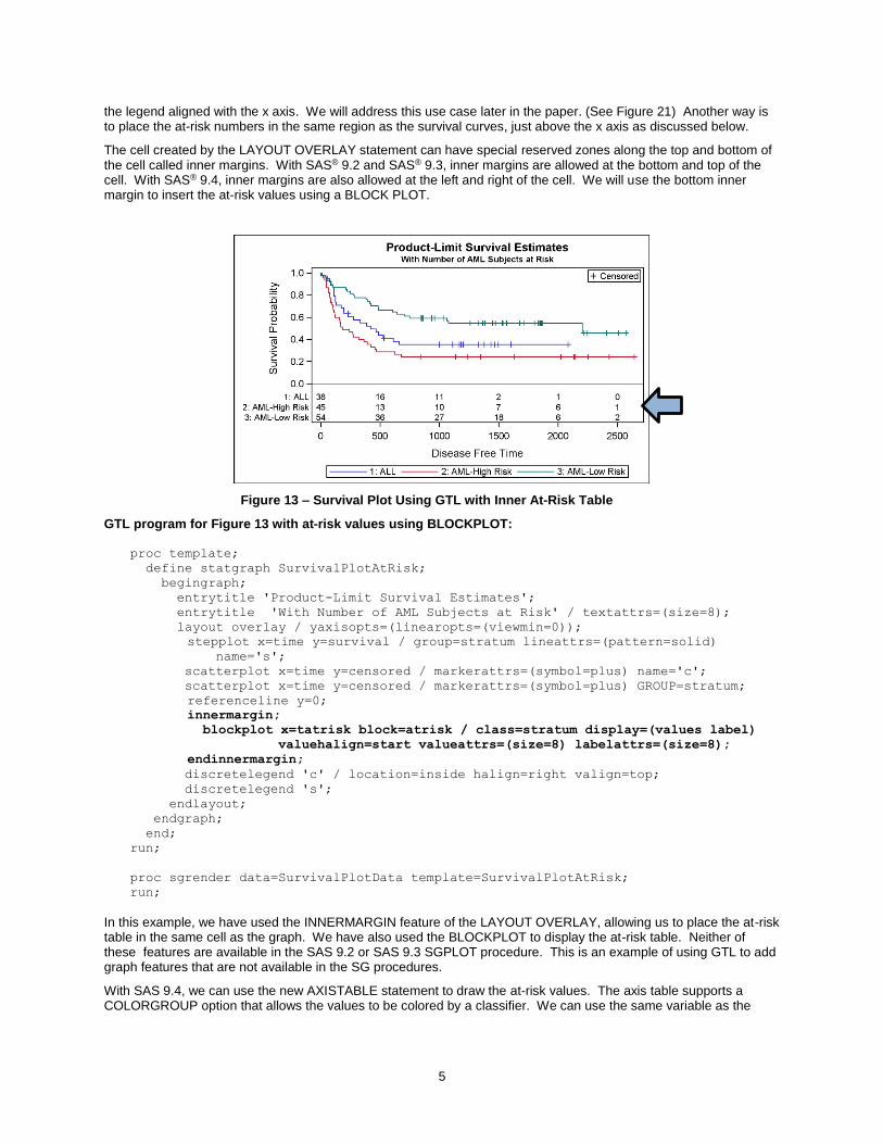
Often, in the survival plot graph, we want to display the number of subjects at risk at various points in the study. One configuration that is popular in the industry is to display the at-risk values by stratum at the bottom of the graph, below
5
the legend aligned with the x axis. We will address this use case later in the paper. (See Figure 21) Another way is to place the at-risk numbers in the same region as the survival curves, just above the x axis as discussed below.
The cell created by the LAYOUT OVERLAY statement can have special reserved zones along the top and bottom of the cell called inner margins. With SAS® 9.2 and SAS® 9.3, inner margins are allowed at the bottom and top of the cell. With SAS® 9.4, inner margins are also allowed at the left and right of the cell. We will use the bottom inner margin to insert the at-risk values using a BLOCK PLOT.
Figure 13 – Survival Plot Using GTL with Inner At-Risk Table
GTL program for Figure 13 with at-risk values using BLOCKPLOT:
proc template;
define statgraph SurvivalPlotAtRisk;
begingraph;
entrytitle 'Product-Limit Survival Estimates';
entrytitle 'With Number of AML Subjects at Risk' / textattrs=(size=8);
In this example, we have used the INNERMARGIN feature of the LAYOUT OVERLAY, allowing us to place the at-risk table in the same cell as the graph. We have also used the BLOCKPLOT to display the at-risk table. Neither of these features are available in the SAS 9.2 or SAS 9.3 SGPLOT procedure. This is an example of using GTL to add graph features that are not available in the SG procedures.
With SAS 9.4, we can use the new AXISTABLE statement to draw the at-risk values. The axis table supports a COLORGROUP option that allows the values to be colored by a classifier. We can use the same variable as the
6
class variable to use the same colors as the survival curves. This makes it easier to decode the graph. In this case, one could even remove the legend, as the axis table itself acts like a legend.
Figure 14 – Survival Plot Using GTL with Inner At-Risk Table
SAS 9.4 GTL program for Figure 14 with at-risk values using AXISTABLE:
proc template;
define statgraph SurvivalPlotInAxisTable;
begingraph;
entrytitle 'Product-Limit Survival Estimates';
entrytitle 'With Number of AML Subjects at Risk' / textattrs=(size=8);
All graphs have a default design width of 640 pixels and a default design height of 480 pixels. Some space in the graph is used for titles, footnotes, legends, and other graph elements. So, the actual size of the region in which the data is graphically represented can have an aspect ratio different from the graph size itself and clearly different from the aspect ratio of the data that is assigned on the x and y axis. The data range that is assigned to the x axis is mapped to fit the pixels available on the x axis. Similarly, the data range that is assigned to the y axis is mapped to fit the pixels available on the y axis. This is a common behavior of all graphs, as shown in Figure 15.
7
Figure 15 – Survival Plot Using GTL Figure 16 – Survival Plot Using GTL
Figure 15 shows a plot of city mileage by highway mileage for all vehicles. The range of the data on the x and y axes is close, but the pixel length of the x axis is double that of the y axis. So, the display of the data is skewed toward the horizontal. Note, each 10x10 data grid in Figure 15 is a wide rectangle and not square. The graph also displays a
line of slope = 1.0. This line is not displayed at a 45° angle.
Figure 16 shows the same graph using the LAYOUT OVERLAYEQUATED container. This container adjusts the data ranges on each axis such that each 10x10 grid of data is represented by a square rectangle on the screen. The line
with slope of 1.0 is displayed at a 45° angle on the screen. Equated containers come in the following four types:
FIT – This is the default type, and the range of the data is expanded on the appropriate axis.
SQUARE – Both x and y axes have the same data minimum and maximum.
SQUAREDATA – Both x and y axes have the same data range but not necessarily the same minimum and maximum.
EQUATE – Neither axis is extended, the aspect ratio of the data is retained, and the data area is adjusted.
GTL code using LAYOUT OVERLAYEQUATED for Figure 16:
An equated plot visually represents the true aspect ratio of the data. In addition to the example shown above, often the x and y axes represent some physical dimension of a real object or terrain like a lake. In these cases, it is important to represent the correct shape of the object in the graph.
SINGLE-CELL 3D LAYERED GRAPHS
GTL also supports a few 3D plot types like surface and a parametric bivariate histogram. Here are a couple of examples using the surface plot in an Overlay3D container. As the name suggests, multiple supported 3D plot statements can be combined.
Figure 17 – Surface Plot Figure 18 – Surface Plot with Color Response
GTL code using LAYOUT OVERLAYEQUATED for Figure 18:
proc template;
define statgraph SurfaceGradient;
begingraph;
entrytitle 'Spline Interpolation';
layout overlay3d / cube=false walldisplay=none;
surfaceplotparm x=x y=y z=z / surfacetype=fill
surfacecolorgradient=z name='s';
continuouslegend 's' / halign=right;
endlayout;
endgraph;
end;
run;
MULTI-CELL GRAPHS
The real strength of GTL lies in its ability to create complex and intricate graph layouts. The graph region can be subdivided into smaller rectangular regions as shown in Figures 7, 8, and 9 using one or more of the following layouts containers. These layout containers fall into two broad categories and can be nested to create almost any configuration of cells in one graph.
1. AD HOC LAYOUTS
a. LAYOUT LATTICE
b. LAYOUT GRIDDED
2. DATA-DRIVEN LAYOUTS
a. LAYOUT DATALATTICE
b. LAYOUT DATAPANEL
9
CREATING MULTI-CELL GRAPH WITH LAYOUTS LATTICE
You can use the LAYOUT LATTICE container to subdivide the graph region into a regular grid of cells. Each cell can contain a LAYOUT OVERLAY container. So, each cell can contain any of the single-cell graphs we have discussed so far. All the techniques you know about single-cell graphs apply equally to each cell.
Each cell of the lattice container can contain nested lattice or gridded containers to create complex layout configurations. One such configuration is shown in Figure 19. Braces are used to show the nesting of the layouts in the program.
Figure 19 – Ad Hoc Layout Using LAYOUT LATTICE
GTL code for Figure 19:
proc template;
define statgraph NestedLattice;
begingraph;
entrytitle 'Statistics for Vehicles Made in Asia';
The GTL program for this graph is shown below. I have removed some of the nonessential options and replaced them with <options> so that we can focus on the code needed to set up the configuration shown in Figure 19. Here is how we set up the arrangement of the cells in this graph.
1. A LAYOUT LATTICE with two rows and one column is used as the outermost container.
2. The upper row is populated with a LAYOUT OVERLAY having one bar chart.
3. The lower cell has a nested LAYOUT LATTICE with one row and two columns, creating two cells.
4. Each cell is populated with one layout overlay, the left cell having a scatter plot and the right cell having a histogram and a density plot.
Note that the baseline of the histogram in the bottom right cell in Figure 19 is floating up above the x axis. This happens even though we have set the YAXISOPTS=(OFFSETMIN=0) because, by default, the cells of a Lattice are made to have equal offsets. In this case, we would rather not have the Histogram baseline floating above the x axis. To break this association, we will wrap the LAYOUT OVERLAY in an extra LAYOUT GRIDDED as shown below.
Modified GTL code for the bottom right cell for Figure 20:
The LAYOUT LATTICE container goes one level deep to equalize the axis offsets of the cells in each row. So, for the program for Figure 19, the low and high offsets of the y axes for the scatter plot and the histograms were equalized. This caused the baseline of the histogram to float above the x axis. Wrapping the layout overlay of the right hand cell in another LAYOUT GRIDDED decoupled this equalization. Now the YAXISOPTS=(OFFSETMIN=0) is honored, and the histogram baseline is on the x axis as seen in Figure 20.
Figure 20 –Histogram Baseline on X Axis
11
SURVIVAL PLOT WITH EXTERNAL AT-RISK VALUES
Let us now revisit the survival plot graph we discussed in Figure 14. In that graph, we inserted the at-risk values in the inner margin at the bottom of the cell. However, often it is the standard practice to place the at-risk values at the bottom of the graph, below the axis and the legend, as shown in Figure 21 below.
We will use a two-row, one-column lattice to create this graph. The top cell contains the survival curves as shown in Figure 11, and the bottom cell contains the at-risk values. With SAS 9.4, a similar graph can also be made using the SGPLOT procedure. Here we have used the AXISTABLE to display at-risk values, but you can also use the BLOCKPLOT or a SCATTERPLOT with the MARKERCHARACTER option.
Figure 21 – Survival Plot Using GTL with Outer At-Risk Table
SAS 9.4 GTL program for Figure 21 with external at-risk values using AXISTABLE below the axis:
proc template;
define statgraph SurvivalPlotOutAxisTable;
begingraph;
entrytitle 'Product-Limit Survival Estimates';
entrytitle 'With Number of AML Subjects at Risk' / textattrs=(size=8);
Key features of the GTL template are listed below:
We have used a LAYOUT LATTICE to define a container of two rows and one column.
The upper cell is populated with the same LAYOUT OVERLAY block as for Figure 11.
The lower cell contains a LAYOUT OVERLAY with wall and axes display off.
The AXISTABLE is in an INNER MARGIN block. This allows the system to compute its size.
The LAYOUT LATTICE uses a ROWEWEIGHT=PREFERRED. This allows some cells to use a size that can be determined by the cell contents, such as AXISTABLE based on font size.
LAYOUT LATTICE FEATURES
The LAYOUT LATTICE container in GTL provides you with a rich set of features to organize your graph layout. Figure 22 shows the schematic diagram of the LAYOUT LATTICE where each cell has its own axes.
Figure 22 – Schematic Diagram of LAYOUT LATTICE with Independent Cell Axes
A LAYOUT LATTICE always creates a regular grid of M x N cells with M rows and N columns. Figure 22 shows a 2x2 regular grid of cells. Here are the main features of the container.
The container has a regular M x N grid of cells, with M rows and N columns.
In the diagram above, each cell has its own CELL HEADER and a set of independent AXES inside the cell.
Row and column gutter values can be specified to adjust the spacing of the cells.
SIDEBARS can be specified, one on each side of the grid of cells. The SIDEBAR – ENDSIDEBAR block is a container of its own and can contain nested layouts of legends or textual entries.
Outside the sidebars, each row can have a ROWHEADER on the left and a ROW2HEADER on the right.
Outside the sidebars, each column can have a COLUMNHEADER at the bottom and a COLUMN2HEADER
13
on the top.
Figure 21 is an example of the usage of a simple 2 x 1 layout with two rows and one column. Each cell has its own independent axes. The graph in Figure 20 is an example of using the LAYOUT LATTICE to create a custom layout using a nested LAYOUT LATTICE in the bottom cell.
The lattice layout also allows for uniform row and column axis ranges and also for common external axes. The schematic diagram for this is shown in Figure 23.
Figure 23 – Schematic Diagram of LAYOUT LATTICE with Common External Axes
The key difference between the diagram in Figure 23 and 22 is that the y axes of the cells are combined into a single external uniform ROWAXIS per row. Similarly, the x axes of the cells are combined into a single external uniform COLUMNAXIS axis per column. The ROW2AXIS or COLUMN2AXIS is displayed if appropriate.
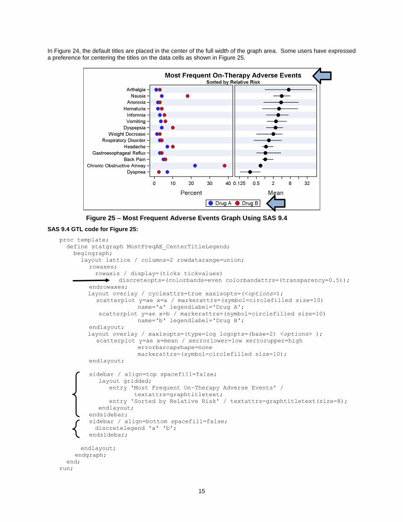
When there is only one column of data cells, the system will attempt to place the titles and legends centered on this single data area. This is often the preferred location for the tiles and legends. However, when there is more than one data column, the system is unable to do this, and the titles and legends are centered in the width of the entire graph. Note the position of the sidebars in arrangement shown in Figure 23. The sidebars span all the columns where the data is graphically displayed. Often, a user might desire to place the titles and legends centered over the columns, and we can use the sidebar to achieve that result as shown in Figure 25 below.
14
MOST FREQUENT ON-THERAPY ADVERSE EVENT GRAPH SORTED BY RELATIVE RISK
Another graph popular in the pharmaceutical domain is the Adverse Events by Relative Risk graph. This graph shows the most frequent on-therapy and treatment adverse events sorted by relative risks with associated 95% confidence intervals/standard error of mean. In this graph, we traditionally display the adverse events by treatment on the left side of the graph, and the mean and 95% confidence levels on the right. Here is the graph and the code.
Figure 24 – Most Frequent Adverse Events Graph Using SAS 9.3
In Figure 24, the default titles are placed in the center of the full width of the graph area. Some users have expressed a preference for centering the titles on the data cells as shown in Figure 25.
Figure 25 – Most Frequent Adverse Events Graph Using SAS 9.4
entry 'Sorted by Relative Risk' / textattrs=graphtitletext(size=8);
endlayout;
endsidebar;
sidebar / align=bottom spacefill=false;
discretelegend 'a' 'b';
endsidebar;
endlayout;
endgraph;
end;
run;
16
The titles can be centered on the data cells by placing ENTRY statements in the SIDEBAR, setting text attributes of the ENTRY to match the attributes of a title. To create a stack of the title and subtitle, we have to use a LAYOUT GRIDDED inside the SIDEBAR. The same plan is used to center the legend below both the cells. Now, you might not want to do this since this legend applies only to the left cell. But, if you do prefer this for aesthetic reasons, you can use a bottom SIDEBAR and place the legend in it as shown in Figure 25. Title and legend centering can also be done in the same way using SAS 9.3 code. I have used SAS 9.4 for this graph to demonstrate a couple of new convenience features available in SAS 9.4. These features are as follows:
Note the faint color bands in the graph. These help to guide the eye across a wide page. In Figure 24 created using SAS 9.3, we have to use a REFERENCELINE with thickness=15 to simulate these bands using the AEREF column. The value of thickness is a guess based on what works for this particular graph. SAS 9.4 provides a new option on the DISCRETEATTRS bundle called COLORBANDS. This option and related options create these alternating bands automatically.
A new option is available for the SCATTERPLOT to use lowercase on the error bars for a cleaner look.
FOREST PLOT
Finally, let us look at another popular graph, the FOREST PLOT. A forest plot is a graphical display designed to illustrate the relative strength of treatment effects in multiple quantitative scientific studies addressing the same question (Wikipedia). Here is one such a graph created using SAS 9.3 GTL program.
Figure 26 – Forest Plot Using SAS 9.3
The program for this graph is shown below. We have used the following criteria to create this graph:
We have used a LAYOUT LATTICE with three columns and one row.
The column weights are explicitly set to accommodate the columns of data and the graph.
In the left cell, we have used a SCATTERPLOT with MARKERCHARACTER option to display the study names, with Studylbl as the x variable. The plot is associated with the upper X2 axis.
The middle cell contains the odds ratio plot. This is created using a HIGHLOW plot to display the confidence limits. This is overlaid with another HIGHLOW plot of TYPE=BAR to display the mean. The box width is proportional to the weights.
17
The right cell contains four scatter plots with marker character options to display the values.
Wide alternate reference lines are used in each cell to draw the alternate bands.
SAS 9.3 GTL code for Figure 26:
proc template;
define statgraph ForestPlot_93;
begingraph;
entrytitle "Impact of Treatment on Mortality by Study";
entrytitle textattrs=(size=8) 'Odds Ratio and 95% CL';
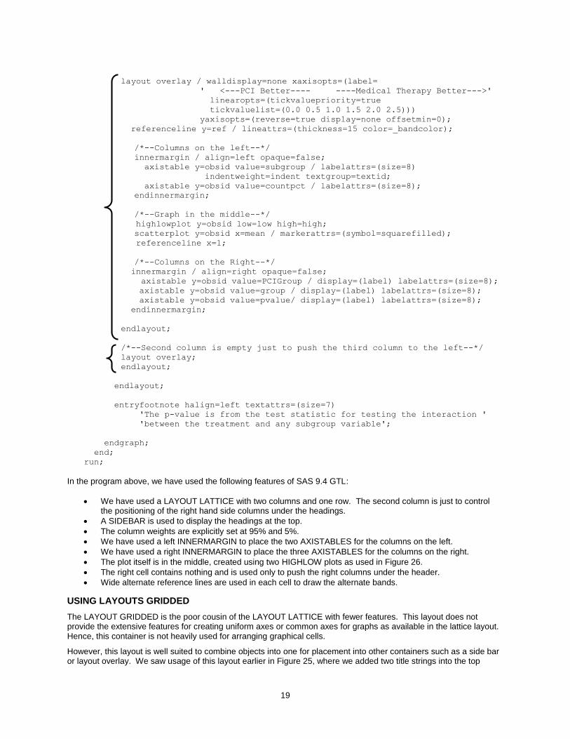
Another version of the forest plots is one with subgroups, preferred by the European agencies. Users want to display the data sub grouped by categories, using indented text and fonts attributes. This can also be created using SAS 9.3, but the graph shown in Figure 27 is created with SAS 9.4, using the new AXISTABLE plot statement. This plot statement is designed to ease the display of textual data in rows or columns with indention and text attributes.
18
The graph in Figure 27 can be done using a multi-column lattice like above, but is actually a single-cell graph with left and right inner margins. This is easier as it allows the columns in the inner margins to lay themselves out without us having to specify any column weights.
Figure 27 – Forest Plot with Subgroups Using SAS 9.4 AXISTABLE
/*--Second column is empty just to push the third column to the left--*/
layout overlay;
endlayout;
endlayout;
entryfootnote halign=left textattrs=(size=7)
'The p-value is from the test statistic for testing the interaction '
'between the treatment and any subgroup variable';
endgraph;
end;
run;
In the program above, we have used the following features of SAS 9.4 GTL:
We have used a LAYOUT LATTICE with two columns and one row. The second column is just to control the positioning of the right hand side columns under the headings.
A SIDEBAR is used to display the headings at the top.
The column weights are explicitly set at 95% and 5%.
We have used a left INNERMARGIN to place the two AXISTABLES for the columns on the left.
We have used a right INNERMARGIN to place the three AXISTABLES for the columns on the right.
The plot itself is in the middle, created using two HIGHLOW plots as used in Figure 26.
The right cell contains nothing and is used only to push the right columns under the header.
Wide alternate reference lines are used in each cell to draw the alternate bands.
USING LAYOUTS GRIDDED
The LAYOUT GRIDDED is the poor cousin of the LAYOUT LATTICE with fewer features. This layout does not provide the extensive features for creating uniform axes or common axes for graphs as available in the lattice layout. Hence, this container is not heavily used for arranging graphical cells.
However, this layout is well suited to combine objects into one for placement into other containers such as a side bar or layout overlay. We saw usage of this layout earlier in Figure 25, where we added two title strings into the top
20
sidebar. This is also very useful to create a small table of statistics for placement inside the graphs.
USING DATA-DRIVEN LAYOUTS
GTL also supports data-driven layouts as shown in Figures 7 and 8. These are the LAYOUT DATAPANEL and the LAYOUT DATALATTICE. These layouts create regular grids based on the class variables.
The DATAPANEL container supports multiple class variables and creates cells for all crossings of the class variable values. Cells are created only if they actually have data, so this layout is good for sparse data.
The DATALATTICE container supports a row and a column class variable and creates a regular grid of cells for all crossings of the class variables. Cells are created for all crossings, regardless of whether they contain data or not. Each row and each column has a header that displays the class variable value.
GTL classification panels do not support inclusion of computed plot types such as histograms, box plots, fit, and density plots. Hence, when creating a simple classification panel, it is often best to use the SGPANEL procedure to create graphs that contain a single panel.
CONCLUSION
The Graph Template Language provides a powerful syntax to create complex and intricate graphs. You can create single-cell and multi-cell graphs using LAYOUT OVERLAY and LAYOUT LATTICE. The lattice layout provides you the ability to subdivide your graph into regular row and column grids. Each cell of the grid can contain nested layouts. The examples included in this paper represent some of the most common graphs requested by users in the pharmaceutical domain and will provide you with the information you need to get started using these features.
REFERENCES
Matange, Sanjay. 2013. Getting Started with the Graph Template Language in SAS®: Examples, Tips, and Techniques for Creating Custom Graphs. Cary, NC: SAS Institute Inc.
Matange, Sanjay and Dan Heath. 2011. Statistical Graphics Procedures by Example: Effective Graphs Using SAS®. Cary, NC: SAS Institute Inc.
Matange, Sanjay. 2013. “Getting Started with SAS® Graph Template Language.” SAS Talks Webinar Series.
Available at http://www.sas.com/reg/web/corp/2260494.
Matange, Sanjay. Graphically Speaking. Available at http://blogs.sas.com/content/graphicallyspeaking.
RECOMMENDED READING
SAS Graph Template Language: Reference
SAS Graph Template Language: User’s Guide
Knowledge Base / Focus Areas on Graphics available at http://support.sas.com/rnd/datavisualization/index.htm
CONTACT INFORMATION
Your comments and questions are valued and encouraged. Contact the author:
Sanjay Matange SAS Institute, Inc. SAS Campus Drive Cary, NC 27513 (919) 531-6753 (919) 677-8000 [email protected] http://blogs.sas.com/content/graphicallyspeaking
SAS and all other SAS Institute Inc. product or service names are registered trademarks or trademarks of SAS Institute Inc. in the USA and other countries. ® indicates USA registration.
Other brand and product names are trademarks of their respective companies.