8
Paper Towns Title Analysis By Tyrone Iley

Paper Towns Title AnalysisBy Tyrone Iley
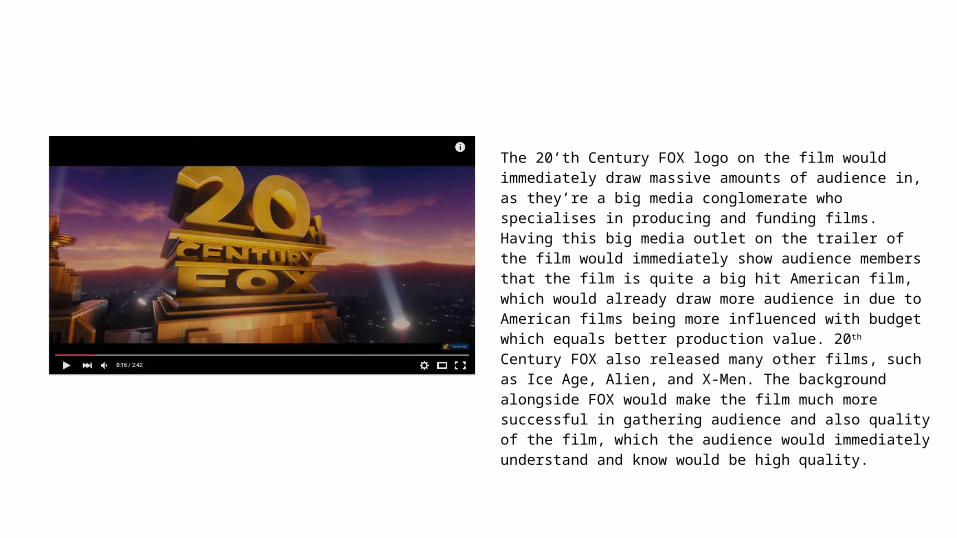
The 20’th Century FOX logo on the film would immediately draw massive amounts of audience in, as they’re a big media conglomerate who specialises in producing and funding films. Having this big media outlet on the trailer of the film would immediately show audience members that the film is quite a big hit American film, which would already draw more audience in due to American films being more influenced with budget which equals better production value. 20th Century FOX also released many other films, such as Ice Age, Alien, and X-Men. The background alongside FOX would make the film much more successful in gathering audience and also quality of the film, which the audience would immediately understand and know would be high quality.
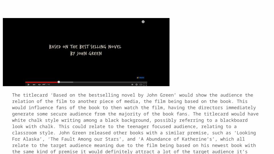
The titlecard ‘Based on the bestselling novel by John Green’ would show the audience the relation of the film to another piece of media, the film being based on the book. This would influence fans of the book to then watch the film, having the directors immediately generate some secure audience from the majority of the book fans. The titlecard would have white chalk style writing among a black background, possibly referring to a blackboard look with chalk. This could relate to the teenager focused audience, relating to a classroom style. John Green released other books with a similar premise, such as ‘Looking For Alaska’, ‘The Fault Among our Stars’, and ‘A Abundance of Katherine’s’, which all relate to the target audience meaning due to the film being based on his newest book with the same kind of premise it would definitely attract a lot of the target audience it’s aiming for immediately.

The titlecard stating the author of the book is the same author from ‘The Fault in our Stars’, which is another famous book with a movie adaptation. This would draw more audience members in due to the other film and book being the same genre with the same target audience. The movie adaptation was very popular too, meaning that people who just watched the movie would even go to watch this movie too if they enjoyed it enough.
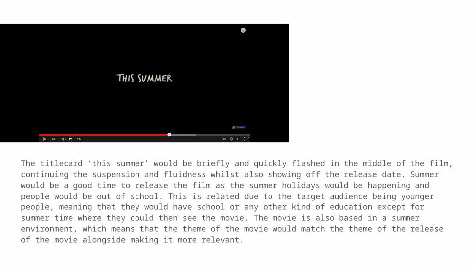
The titlecard ‘this summer’ would be briefly and quickly flashed in the middle of the film, continuing the suspension and fluidness whilst also showing off the release date. Summer would be a good time to release the film as the summer holidays would be happening and people would be out of school. This is related due to the target audience being younger people, meaning that they would have school or any other kind of education except for summer time where they could then see the movie. The movie is also based in a summer environment, which means that the theme of the movie would match the theme of the release of the movie alongside making it more relevant.
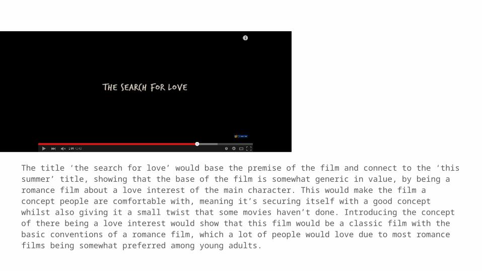
The title ‘the search for love’ would base the premise of the film and connect to the ‘this summer’ title, showing that the base of the film is somewhat generic in value, by being a romance film about a love interest of the main character. This would make the film a concept people are comfortable with, meaning it’s securing itself with a good concept whilst also giving it a small twist that some movies haven’t done. Introducing the concept of there being a love interest would show that this film would be a classic film with the basic conventions of a romance film, which a lot of people would love due to most romance films being somewhat preferred among young adults.

‘Will take you further’ would connect with the previous title, giving a chronological order with how the titles are presented. This would add suspension as the audience would be fed the titles progressively rather than immediately. The act of separating sentence structures in titles is a good way of adding suspension and also increasing the run time, not clustering text onto one titlecard whilst also making the audience have to wait for what the next titlecard would have on it. This is a very effective method to keep the audience glued. This is also true for the following titlecard ‘than you ever imagined’.

The ‘Paper Towns’ logo would be made a translucent font with the filling and with only outline, using the chalk font to again reinforce the ‘classroom’ relatability to the audience. The font would also be big so people notice it easily. This could even relate to the theme of paper due to the clark being reminiscent of a classroom.


