Four part white paper & webinar series profiling typography and dimensional typography in the 1 1 Typography, Placemaking and Signs A Four-Part SFI White Paper Series By Craig Berger Part I The History of Typography and Place
The Signage Foundation is a not-for-profitcommitted to expanding the knowledge base on the use and benefits of signage products through peer-reviewed research to facilitate the operation within the marketplace by manufacturers, suppliers and individuals in their efforts to design, build and sell innovative products. For more information, visitthesignagefoundation.org
Nova Polymers is the global leader in the development of materials and processing equipment for the fabrication of Accessible and ADA compliant signage. With a focus on education and the continued development of innovative materials that meet international accessibility guidelines, Nova continues to lead the sign industry and help people with visual disabilities navigate the built environment. novapolymers.com
Architectural signage solutions for ADA and Wayfinding signage helping people navigate their environment. Dixie Graphics is a solution source for designers and fabricators, offering material and sign choice. We also offer project completions from project management to installation accessorizing. Our goal is to streamline the manufacturing process for you.dixiegraphics.com
Swell Media Group is a branding and marketing solutions provider focused on lead generation and content creation. We build brands, websites and engaging marketing campaigns by working closely with you to understand your business and your clients. swellmediagroup.com
he history of typography is as long as the 5,000-year history of written languages and alphabets that combined letter forms into
words. Most of that history, however, was dedicated to the refi nement of written language on paper, which could be read by only a small minority of the most highly educated. Typography in the environment began at the dawn of the fi rst century A.D., bringing along with it the promotion of large-scale literacy and technological advancement in mobility and communication. In fact, there is a strong case to be made that environmental typography is a natural outgrowth of the desire for people to explore and comprehend the outside world.
Trajan and the First Environmental TypefaceThe Roman Empire had been in existence for more than 500 years before the fi rst experiments in environmental typography began. The complexity of managing a far-fl ung empire had grown easier with the use of one language, a common currency and written laws; but low literacy in the population made communication diffi cult on a mass scale.
The Romans resolved this with two inventions that pushed type from parchment into the urban environment. Metal stamps allowed for the development of watermarks and coin currency with numerical values that could be easily learned. In addition, stencils allowed for the consistent creation of type on posters, signs and carved landmarks. This fi rst Latin alphabet type style was termed Trajan, after the emperor in power when it fi rst appeared
on monuments, though it had evolved over the previous hundred years. The type style used simple serifs and all capital letters, but it created a communication revolution in the Roman Empire. Lettering was used to mark political and historical events such as major victories and landmarks. More important, it communicated the location of stores, marked roads and street numbers. This began to rationalize Roman cities and promote simple language skills.
The Printing Press and the Development of Legible TypeThe fl owering of typography during the Romans was short lived. The collapse of the empire reverted typography back to its key use in religious documents. Calligraphy became a core academic skill, but produced documents that were all but unintelligible. It was not until the 15th century, with the development of the printing press and moveable type, that typographical innovation resumed. Looking back to the clarity of the original typeface from the Romans, Nicholas Jenson developed one of the fi rst fonts designed for the printing press. The advent of a designed legible font soon became an industry with printers developing their own typefaces, many of which are still used today. Unfortunately, literacy in this era was very low and cities and towns were still too small to need the rationalization of letters and numbers. Advances is metalworking and woodcarving did see the rise of commercial signage utilizing a mix of pictograms and simple messages.
The Industrial RevolutionFonts were continually refi ned for the next 300 years, paralleling a continuous rise in new technologies for printing and a need for printed media in the environment. The trend started in 1757 with the development of the Baskerville font by John Baskerville. This typeface of varying thick and thin elements, high contrast and variable spacing allowed type to be seen from greater distances, increasing its utility for environmental communications.
At the same time the Industrial Revolution created many new tools that expanded printing, while making it more fl exible. The tracing pantograph and router made the creation of new and different fonts much easier, while expanding the ability to create unique signs. Color lithographic printing brought color to mass production printing by the mid-19th century, providing all the tools needed to create large-scale printed billboards and signs.
These technologies came at a perfect time when mass production brought about the need for product advertising and promotion. Cities began to fi ll up with posters, handbills, banners and print billboards, all featuring multiple fonts and styles. At the same time, cities exploded in size, with the addition of new building types. Offi ce buildings, train stations and municipal buildings now required signs for identity and wayfi nding. Typography was further simplifi ed to meet these new sign types, though typography was still following customized versions of classical fonts until the 20th century.
Bauhaus and the Modern Architectural EraThe messiness and clutter of the commercial city was disturbing to many designers and intellectuals in Europe. Design movements developed to integrate design disciplines to better refl ect the greater mechanization of society. This culminated in the Bauhaus movement of the 1920s, where designers like Walter Gropius, Mies Van Der Rohe and Josef Albers infl uenced architecture and design for the next 40 years. In 1927, Paul Renner developed Futura, a font stripped of all classical adornment that could seamlessly integrate with the modular and simple modern buildings being proposed by the Bauhaus.
In the United States, the Art Deco movement established sleek and streamlined typography to fi t with designs of airplanes, trains and cars. Thin Art Deco typography fi t perfectly with the advances in metal routing and cutting and the commercialization of neon lighting for signs. Commercial signage for stores and restaurants soon followed the sleek lines of skyscrapers and government buildings. By the 1950s, the sleekness of the Modern Movement met Art Deco to produce Moderne, a sign and building typography that still adorns hotels in Miami Beach.
Highway and Roadway EnvironmentsThe introduction of the automobile into everyday American life also infl uenced
the push for more legible environmental typography. In the 1920s the Manual and Specifi cations for the Manufacture, Display, and Erection of U. S. Standard Road Markers and Signs—a precursor to today’s Manual on Uniform Traffi c Control Devices–mandated specifi c typefaces for road signs. This type was usually modern San Serif characters that could be easily painted on signs and easily read at high speeds. After World War II the introduction of an interstate highway standard promoted Highway Gothic which was also adopted by a number of other countries with only minor changes. California developed a bolder version to utilize refl ective buttons.
The British went about things a little differently by employing a research study on type legibility. The result was the development of British Transport by Jock Kinneir, which had more rounded letters and was in upper and lower case, both attributes that tested well at high speeds. With the use of refl ective vinyl, American highway signs needed a new typeface that could minimize the blurring and hazing that came along with refl ectivity. The development of Clearview by Donald Meeker advanced many of the concepts found in Kinneir’s British Transport and after years of testing and advocacy, received approval from the Federal Highway Administration (FHWA) in 2004. The typeface is also used in a number of wayfi nding programs in airports and train stations where legibility is important. Today legibility testing is an integral part of typography design. New fonts like Wayfi nding Sans Pro have been developed directly from legibility testing of comparable font types.
Helvetica and the Typography of Brands
Modern typographical development went hand-in-hand with the modern design trends of the first half of the 20th century in art, architecture and publishing, but had yet to penetrate products and services. These categories still focused heavily on print advertising and packaging to convey brand identity. The post-war years saw the development of completely new classes of buildings to support rapidly growing multi-national companies. These companies needed type and identity approaches that could communicate to a wide variety of cultures as well as different print and environmental conditions. Corporate iconography and typography both became mediums to convey messaging.
In the 1950s, type foundries in Europe worked to develop fonts that could be applied to the varied needs of advertising and branding. Drawing inspiration from Akidenz-Grotesque, an early modern typeface developed in 1898, Adrian Frutiger designed Univers, which used numerical designations to identify different line weights, faces and position combinations. Helvetica, developed by Max Miedinger with Eduard Hoffmann was a font developed to be truly neutral and focused on legibility. Corporations such as American Airlines®, GM® and 3M® incorporated the Helvetica font family into their branding in the 1960s, followed soon after by retailers like Target®.
In the early 1960s, these new typefaces were released to the design community through the Linotype corporation with cast metal type and transfer stencils like Letraset. In signage, advances in vinyl, neon and f luorescent lighting led to a major move to both internally illuminated and cut vinyl signs. These signs were most effective with simple typography and high-color contrast. These advances promoted the beginning of a new type of designer–the environmental graphic designer–who works closely with architects to integrate modern brand tools into buildings. This development started in the 1950s with the work of Alvin Lustig and his wife Elaine Lustig Cohen on projects like the Northland Mall, the first enclosed mall in the country, and the Seagram Building, one of the first modern office towers.
Designers including Paul Rand, Chermayeff & Geismar and Unimark International continued to evolve typography from guidelines developed for advertising into fully developed programs for everything from business cards to buildings. This approach was also applied to the overall environment, including transit systems and government buildings.
Apple, CAD, ADA and the Type Accessible to the MassesIn a century of design advances, the
development of a number of interlocking software innovations in the 1970s and 1980s created the biggest leap yet in the development of environmental typography. A range of desktop publishing software solutions began with the development of the Apple Macintosh and complementary software for the manipulation of pictures, type and graphics. The rapid evolution of this software led to the creation of True Type Fonts in 1991, which could be scaled to multiple sizes without a loss of clarity. Combined with early drawings programs like Corel Draw and Freehand, even the smallest design firms could have access to tools for incorporating type into their work.
Along with tools for the designer, the introduction of commercially available Computer Aided Design (CAD) and manufacturing software brought specialized routing and cutting to thousands of small fabrication firms. When combined, Computer Aided Design and manufacturing improvements increased design flexibility so significantly that it is difficult to comprehend. Routed raised letters and Braille made accessible signage possible and created an entirely new industry and set of government codes. Computer controlled industrial tools brought high-powered methods to even the smallest sign shops, expanding custom and stylized typography to small communities around the globe. Finally advances in fabrication and lighting combined with a greater ability of designers to visualize the end product added immeasureable visual effects to signs.
The FutureWith the ability to create, adapt and apply type in a variety of ways, the future of type in the environment can move in any number of directions. But this may not yield greater design freedom. Increases in legibility research have created more effective typefaces but have also led to more restrictive design codes. Digital sign technology has dynamic type, yet in many transportation systems this has resulted in even greater efforts at standardization. The creation and use of type is the combination of technological innovation with systemic rationalization and that balance will always exist even in a future of limitless possibilities.
Learn more about the practices and research that defi ne the way we use type in the environment in Part 2 of Typography, Placemaking and Signs: Dimensional Typography Best Practices.
Great Books on Typography and SignageArchitectural Signing and Graphics, John FollisJohn Follis started one of the fi rst dedicated environmental graphic design fi rms and his book on the subject, released in 1978, established nearly all the early best practices for the development of wayfi nding and identity programs. A hard book to fi nd, but well worth it.
Graphic Design and Architecture: A 20th Century History, Richard Poulin
This book released in 2012 by perhaps the foremost combination of Environmental Graphic Designer and intellectual today, and covers many of the design themes discussed in a graphic, yet in-depth format.
Learning from Las Vegas, Robert VenturiYes the book is old. Yes it is hard to read. But very few books have had a greater infl uence in analyzing the role of symbol, type, identity and brand in the environment.
Signage and Wayfi nding Design, Chris Calori, and Signage Systems and Information Graphics, Andreas UbeleThe 21st Century version of signs and architecture, these books serve as a great basic text for the new generation of sign designers.
Wayshowing, Per MollerupIf you like design commentary this book provides wonderful riff s on design and wayfi nding in the environment in all its forms.
Helvetica and the New York City Subway System, Paul ShawA great story of how a single typeface can permeate our everyday life.
The Development of the Wayfi nding Typeface Wayfi nding Sans Pro, Ralf HermannThis article shows the development of a modern typeface used in signage and is a good guide to the varied legibility issues found in vehicular sign systems.
Thinking with Type, Ellen LuptonOne of the greatest design thinkers of the last twenty years brings an understanding of type to the masses with this book.
Four part white paper & webinar series profiling typography and dimensional typography in the sign making industry.
Wrtitten by Craig Berger
Environmental Typography Best Practices
Typography, Placemaking and SignsA Four-Part SFI White Paper SeriesWritten By Craig Berger
ypography is everywhere in our daily life. We read publications in diff erent formats, from paper to computer screens to mobile media.
We also see hundreds of signs each day: menu boards, directories, directionals and street signs. Unlike the material we read in print or on a computer screen – which we can focus on – signs must compete with many other distractions, all while we are moving. To successfully carry a message that resonates, typography must be successful on its own but also integrate into a complete and eff ective overall design.
Detection, Discrimination, Identity and OrientationCognitive research (the study of learning, reasoning, problem solving and decision making) explores how we use visual graphics to understand the world around us. This learning process is often divided into four areas that can relate to the design of all elements including type:
DETECTION: When you fi rst see a sign in the environment. DISCRIMINATION: When you fi rst diff erentiate the sign from other similar elements in the environment.IDENTITY (also called Comprehension and Recognition): When you fi rst understand the message on the sign.ORIENTATION: When you learn how the message and sign fi ts into a system of similar messages and signs.
These four cognitive approaches defi ne the study of environmental typography and each must be taken into account in the design process. Large type may be easier to spot, but more diffi cult to read than smaller typoge that is better located and designed. Type that easily can be understood as part of a larger system barely needs to be read at all before comprehension. This is good news for environmental graphic designers. They have a varied palette to improve legibility beyond typographic manipulation including sign scale, dimensionality, lighting, iconography and movement. It also means that best practices in typography must move beyond the design of type itself. It must incorporate the complete design of the sign and the system of which it is part.
Vehicular Wayfi nding, Typography and Best PracticesMost of the research on eff ective typography in the environment has been in the area of vehicular signs. Legibility in this setting is often a matter of life and death at 65 miles per hour. Phil Garvey of the Thomas D. Larson Pennsylvania Transportation Institute has worked on dozens of legibility research programs in the roadway environment. While focused mainly on typography, the research has shown that stylistic changes and adjustments are only a small element that aff ects overall legibility. Understanding which issues are most impactful to overall legibility can allow for much greater design fl exibility.
Large Legibility ImpactNegative Space: Of all the factors that impact legibility, far-and-away negative space (the space surrounding letters, words and messages) has the greatest impact on legibility. Greater negative space increases the chance of detection and discrimination, making comprehension much easier. Letter Height: For road signs, endless research has been enshrined in the Federal Highway Administration’s guidelines for letter heights. Reading height is measured in "time x speed" with roughly 2" of height for every 10 mph of speed on the roadway. This usually means that letter heights can get pretty big. Four inches minimum for a car going 25 miles per hour and 12 inches or more on the highway.
Open Counterforms: The introduction of reflective vinyl and lighting to signs has made letters so bright that the counterforms (space inside of letters) shrink, particularly for older drivers. Thinner stroke widths and more open counters mitigate this issue, which was first designed and tested with the Clearview typeface by Donald Meeker and James Montalbano. This typeface has has been replacing Highway Gothic on signs around the country, and similar thin stroke fonts are being used for a range of interior and exterior signs that need to be read both day and night.
Smaller Legibility ImpactPositive and Negative: Research has shown that dark letters on a light background are easier to read then light letters on a dark
background, often as much as 30%. The problem is that research also shows that sign panels on a light background are more difficult to find in the daytime. The verdict: It depends on the situation.
Upper-Case/Lower-Case: Research developed by the California Highway Commission and the British Transport Authority in the 1950s and 1960s showed that upper-case and lower-case type was about 10-15% more effective than just upper case. It took the Federal Highway Administration another 40 years to catch on to this fact. (Sign painters also were a little nervous about the extra complexity). Upper case is perfectly fine for a title or if slightly bigger type is used.
Serif versus San Serif: It has been known for decades that serif type is more legible than san serif type, but the difference is not always very large, particularly if the typeface is well designed. Organizations like the National Park Service have been using a simple serif font for years (NPS Rawlinson). On the other hand, cursive and idiosyncratic fonts (not just Comic Sans) should be avoided in most cases.
Typography, Brands and The Legible BuildingIn the 1950s and 1960s there was an explosion in typography used in branding. From McDonalds® to Macys® to A&P® to Mobil®, type dominated urban branding. (Though the golden arches set off a trend in iconography). Interestingly nearly all these script and ornate type approaches worked much better because of the buildings they were attached to: modern
Bauhaus style buildings with white glass and white walls. When streetscape clutter rose and building style became more ornate, typography became less effective. In the end, clean light-colored buildings (lit up like a Christmas tree at night) with dark type have the most resonance. As mentioned from the legibility research, background and contrast play the biggest role in legibility. Conquer that and type selection can be much more flexible.
Lighting and Typography
Externally lit signs cover a greater area which makes detection much easier, and there is a consistency across the background making the sign more readable than backlit or internally lit channel letters. Of course there are the downsides of extra energy costs and lighting pollution, as well as the clutter of hundreds of little buildings competing for attention.
Channel letters, neon letters and backlit signs are much less legible than externally lit signs, but they can be beautiful, compact and easy to control. Typography for channel letters generally should have much wider letter spacing and very simple fonts. In addition, the more dimensional, the simpler and wider spaced they need to be.
That leaves the much maligned (by town councils) internally lit sign box. This medium combines the best of both worlds. They are effi cient and cast a consistent glow. Since the low light evening environment is perfect for a light colored background, these signs showcase the much more eff ective dark letter/light background practice.
Tactility and TypographyWhen the Americans with Disabilities Act was introduced in 1993, it brought an entirely new set of issues and dilemmas to the design of typography: the often-contradictory needs of the blind and the visually impaired. The blind cannot see contrasting colors, require a narrow range of letter heights, can only read capital letters and need the information to appear in very specific locations. The visually impaired and pretty much every person who navigates visually, require high color contrast and large letter sizes.
There is very little in common between the type needs of people who read through touch and people who read through sight, though both benefit from simplicity. Those who rely on tactile fonts require them to be simple san serif and spaced adequately between letters and words. The same attributes benefit those with visual impairment. When used, these can serve both communities in most cases, reducing clutter in the environment and meeting universal design standards.
Typography and Wayfi ndingWe have discussed best practices in type for detection, discrimination and identification; but one area is perhaps the most important: orientation or how typography can be used as a tool for understanding our environment. Typography can be used for an endless variety of wayfinding tasks from addresses for streets,
transport lines and buildings to directional messaging. Type is the most flexible of tools for wayfinding, but it has one major drawback.
Humans are creatures of habit. The objects we see every day become ingrained in our memory and can become tools for understanding our environment. So the stop signs or restroom symbols we see every day become ingrained in our memory. We barely need to see them before we understand their function. For most wayfinding functions that use typography, however, we have fewer opportunities to learn things quickly. We are often viewing a navigation system for the first time.
Consistency is the all-encompassing attribute for good typographic design in wayfinding. That not only means using the same typeface, but also size, letter spacing, character spacing, position, location, luminescence and a dozen other factors. While consistency sounds simple on the surface, it is very difficult and requires constant review and diligence in practice. For example, try maintaining the same type height, width, letter spacing and position for thousands of street signs in a city. There is always an impulse to squeeze the type for a long name or change the position because of special circumstances, but even the smallest changes began to degrade our ability to understand the environment. We stop knowing where to look for the information and eventually stop looking.
Dynamic LegibilityThe last frontier of legibility is movement and it has proven to be among the most highly
effective. Studies by the retail research firm Envirosell have shown that changing menu boards increase detection as much as 30% with commensurate sales increases. Designing effective type and messaging for movement has been around for at least 60 years and many of those lessons are still used today. The top three approaches include:
Scrolling: Messages that move slowly and consistently are the most legible. The eye is attracted to the movement and can easily track the message. Scrolling billboards have been effectively employed in Times Square since World War II and are still the most ubiquitous form of dynamic messaging today.
Flipping and Fading: Why are old fashioned train station message boards still used? Because not only does the sound serve as a detection approach, the slow changing of letters both attracts attention and makes the type more familiar.
Flashing: With straightforward messages, just a simple flashing on and off attracts attention while maintaining a memory of the message even when it is not there.
The summaries and recommendations provided in this chapter give a fairly clear idea of good practices when using typography in different environmental conditions. In the end, though with all the research and case studies we have at our disposal, designers still have a multitude of options when developing effective information in the environment. The key is to use our accumulated knowledge as a guide, and not let it rule the design process.
Great Books and Research on Typography and Signage
City Signs and Lights, Stephen CarrThis book dates from 1973 but is still a great overview of legibility best practices in the environment.
Lighting for Driving: Roads, Vehicles, Signs and Signals, Peter R. BoyceA comprehensive overview of evening legibility on the roadway.
Media Facades, Mathias Hank HaeuslerTerminology, approaches and practices for media facades.
Pennsylvania Transportation Institute Legibility Research Thomas D. Larson, Pennsylvania State UniversityDozens of research reports on legibility available through the Institute and sponsoring institutions. (http://www.pti.psu.edu/index.php)
Research by Lighthouse for the Blind, Arlene R. Gordon Research InstituteThis research focuses on the development of visual cues for the blind and includes tactile signage and wayfi nding. (http://www.lighthouse.org/research)
Why We Buy and Call of the Mall, Paco UnderhillEnvirosell will not let you in on their high end legibility research, but they will provide some recommendations on legibility in the retail environment.
“Inevitably, but not always, what works best for people with disabilities works better for everybody.”Roger Whitehouse in Communication Arts Magazine
Four part white paper & webinar series profiling typography and dimensional typography in the sign making industry.
Wrtitten by Craig Berger
4518” MinimumCenter
Line
Corresponding “O” WidthAt least 55% but no more than 110% of the “I” height
Minimum:55% of “I” height
.125” .125” .125”
Typography and the Code – ADA and Egress Codes
Typography, Placemaking and SignsA Four-Part SFI White Paper SeriesWritten By Craig Berger
odes and guidelines govern a very large part of what is designed and implemented in the built environment. From federal guidelines
that mandate accessibility and design standards to local ordinances that govern the look and feel of our cities and towns, these rules are often unseen but play a signifi cant role in how buildings and public spaces perform. In addition to planning and architecture, codes apply to graphic information including symbols and type. Designers and fabricators who understand the intricacies and overlapping governance behind codes are usually the most eff ective at completing projects and achieving the most eff ective solutions.
Standards, Mandates and EnforcementThere often is a great deal of confusion about where design codes originate and which ones to follow. Instead of springing from local ordinances, codes usually come from three sources:
STANDARDS BODIES: These groups, like the International Standards Organization (ISO) or the National Fire Protection Association (NFPA) develop guidelines and standards based on research, best practices, and guidance from professional–and some not so professional– experts and special interest groups.
FEDERAL MANDATES: The United States has a system where states have the power to develop and enforce their own laws, based on federal guidance. Many of these mandates from organizations like the Justice Department, Environmental Protection Agency or Federal
Highway Administration must be integrated into state laws or face withdrawal of federal money and a lawsuit.
ENFORCEMENT ORGANIZATIONS: States and localities are responsible for developing and enforcing codes in their jurisdictions; they play a signifi cant role in interpreting these codes with federal guidance. Sometimes federal agencies also have an enforcement role, particularly involving government buildings.
ORIENTATION: When you learn how the message and sign fi ts into a system of similar messages and signs.
While design codes may seem purely localized, there is a range of research, precedent, best practices and advocacy that serve as a foundation. This knowledge comes in handy when interpreting the intent of local codes. When looking at state disability codes or local fire codes, knowledge of how they were developed by different organizations also can provide guidance in interpretation or resolving conflicts.
The Americans with Disabilities ActBefore 1991, states developed their own versions of the Americans with Disabilities Act based on guidelines established by the American National Standards Institute (ANSI) in conjunction with the International Code Council (ICC). When the federal government came along with their own Justice Department Guidelines, it based much of it on the guidelines already developed, without
a review of their eff ectiveness. In the 20 years since the ADA was passed, these groups worked to update the code based on a combination of advanced knowledge and ease of interpretation. States updated their codes multiple times based on these guidelines before the federal government was able to update its national code in 2011. This, of course, produced mass confusion with diff erent states and even localities having diff erent standards and enforcement approaches.
Today the national code is “Harmonized” with the International Building Code (IBC), but lingering confusion still exists. Eff ective accessibility designers are required to manage not only the moving target of the codes, but also their intent and interpretation. While most states must adhere to the national ADA, some places still maintain their own specifi c code language (California being the most well known); there is still no international consensus on disability codes.
How Typography Codes in the New ADA Were Developed and Enforced The new ADA was the result of a number of different organizations hashing out issues that were seen as inefficient or confusing in the first code. The leading controversial areas were:
San Serif Versus Simple Serif: The early ADA had a number of issues with unclear language that made for difficult enforcement. The most damaging was language calling for san serif or “simple” serif type. The word “simple” was meant to mean type with few
flourishes as opposed to Ye Olde English, but a lack of specificity of the language resulted in the rule being nearly unenforceable. Over the course of a decade, the ANSI committee refined the guidelines to only include san serif for tactile copy and eventually only a specific range of stroke widths, proportions and heights could be used.
Dual Signs: The ADA was originally developed as a one-size-fi ts-all code, with the needs of the blind and the visually impaired being covered by the same code. Since these two groups had such widely divergent needs, guidelines were developed to address both groups. Tactile letters would have restrictive code with very narrow standards for type selection, height, location and spacing. The visually impaired would have a wide range of serif and san serif typography to choose from as well as fl exible location, height and spacing.
This greater fl exibility has been a good thing. However many designers and code offi cials balk at the idea of “dual” signs that duplicate information to meet these standards. Most buildings today still follow the restrictive standards for the blind on all signs even though the new language has made it easier to diff erentiate between wayfi nding, directory and identifi cation signs.
“Domed. I can’t believe that one word can shut down my project.”
– A California designer
ROADWAYSIGNS
ADA
SIGNAGE
TRANSPORTATION
FrutigerHelvetica
Helvetica Futura
Garamond
Bodoni
Frutiger
Trajan
Myriad
Minion
COMMERCIAL SIGNS
Clearview
FUTURAHighway Gothic
Highway Sans
TransportNPS Rawlinson
Fru
tig
er 5
5 R
om
an
Hel
vetic
a R
egul
ar
Luci
da
Sans
Unic
ode
Myr
iad
Pro-
Regu
lar
ArialGenevaHelvetica
Verdana
DIG
ITA
L SI
GN
S
There are only a small number of typefaces that can be used on tactile signs based on tight restrictions
in character proportions, width and stroke width. These include early san serif type like Franklin Gothic
and modern type like Helvetica. While not specifi cally stated in the code, humanist type that varies stroke
thickness like Optima is discouraged and the tight restrictions make almost impossible to use.
Rounded or Domed/Edged or Curved: The simple serif controversy has shown how one small change in language can produce enormous unintended eff ects. Another issue which is still lingering with us today are standards that allows Braille to be subtly “rounded” at the top and raised letters to be “edged” or sanded at the corners. While both of these standards have a worthwhile goal of making tactile signs easier for blind people to use, they have produced confusion that still exists today.
Color: The ANSI committee that develops the guidelines for ADA has fought consistently over the last 20 years over the introduction of specific contrast criteria (70% or more contrast between foreground and background). In the most recent reiteration of the ADA, this guideline did not work its way into the final code, but since then ANSI has approved this restrictive contrast guideline. This means that states can slowly integrate the new guideline into their sign codes over the next few years, with activist states like California taking the lead. We do not know yet what impact this will have on enforcement, but if previous controversial issues are any guide, it will most likely result in confusion as code officials deal with issues like measurement procedures, and materials that are difficult to measure.
Safety and SecurityThe ADA is perhaps the best-known code standard for signs, but there are in fact a variety of guidelines and code standards governing safety information in the environment. From fire codes to specialized sign safety codes developed for building with specific hazards, they are becoming much more refined and sophisticated. Unlike wayfinding and commercial sign codes, building owners strive to comply with specific standards instead of focusing on creativity and originality. Organizations like the National Fire Protection Agency (NFPA) and the Occupational Health and Safety Administration (OSHA), have responded by focusing on the adoption of globally harmonized standards so that safety information could be consistent around the world. Ironically though, while there is a greater designer desire for consistent standards, there are fewer interpretive and enforcement groups focusing on the requirements. Localities can make their own codes and these can be at odds with international or national guidelines. Egress codes, in particular, have produced a confusing array of guidelines on both the national and state level. This has impacted type standards in numerous ways including:
Symbol or Type: Around the world there seems to be one universal standard for EXIT and that is a symbol: a person running through a door. Unfortunately, that standard is not being used in most of the United States which is still holding onto “EXIT” signs producing a great deal of standards confusion. Some innovative cities have compromised by combining the symbol with the word EXIT for a hybrid approach.
“Wouldn’t life be much easier if we could just use symbols?”
Address Systems: Any traveler to Europe is often confused by the elevators with the ground floor being called 0 and the floors above it starting with 1(Floors below start at -1). Even more confusing are city codes that require a letter and a number when below ground (B1, B2). This is one area where the design community seeks clarity over diversity.
The ADA and Egress: The ADA has very tight standards for signs, but these generally are not related to egress signs which follow their own standards. This has created even greater confusion by trying to determine where the ADA and egress standards meet particularly in regard to maps and stairwell signs.
Typography Harmonization: While there is a broad movement toward use of symbols in safety and egress information, there is still a great deal of information that needs to be
communicated through word messages. As of yet there is little harmonization of these standards, either through color, type selection, height or location. This will most likely be the next frontier of safety and egress standards.
Safety information relies heavily on symbols, but effective typography is equally important, though difficult to legislate. Leading safety companies like Clarion Safety Systems have responded by combining safety codes with internal best practices.
As the world becomes a more complex and cluttered place, there will continue to be efforts to rationalize signs and messages in the environment, without places becoming too similar and bland. The tension between these two ideals will most likely be the defining issue of 21st century environmental design, with the most creative responses balancing these two often-contradictory needs.
“Code offi cials have no understanding of the nuance of the dual sign code. One offi cial required that I have tactile copy on all signs, even overhead directionals! He backed down after I told him that blind people could not jump high enough to read the code under my signs.”
ADA International White Papers, Nova Polymers These white papers are available on the website and explore the nuances of accessibility codes between states and countries.(http://www.novapolymers.com/resources/white-papers)
Resources of the United States Access Board, USAB The United States Access Board is a government agency dedicated to education and outreach in accessibility. The organization's website has multiple tools and publications on accessibility interpretation and research. (http://www.access-board.gov)
Research by Lighthouse for the Blind, Arlene R. Gordon Research InstituteThis research focuses on the development of visual cues for the blind and includes tactile signage and wayfi nding. (http://www.lighthouse.org/research)
Resources of the National Fire Protection Agency, NFPAThis organization provides a variety of guidelines and educational resources for egress codes.(http://www.nfpa.org/codes-and-standards)
Safety Signs and Symbols, American National Standards Institute, ANSIA publication of guidelines for safety signs and graphics.(http://www.ansi.org)
SEGD ADA White Paper, SEGDThis white paper (now in its third version) provides an overview of leading accessibility issues including typography.(http://segd.org/2012-ada-white-paper-update)
Great Books and Resources on Typography and Sign Codes
Typography, Placemaking & SignsA Four-Part SFI White Paper SeriesBy Craig Berger
e use type to support brands, defi ne buildings and provide orientation; but how often do we recognize the craft of
manipulating type to be successful in the environment? The designers and fabricators who are successful in this environment must be adept at not only the manipulation of a complex design family, but also how it can be integrated into materials, architecture and technology.
The 10 short case studies below profile design projects that feature well studied, documented and comprehensive approaches to integrating type in environmental design. Some of these projects are famous and serve as an influence for the designers of today and some are just well-conceived projects from our contemporaries. Taken together, they show how effective use of type can both shape environments and the way we look at the places we interact with.
W
Bauhaus Projects, GermanyHerbert Bayer1920s and 1930s
Herbert Bayer is known today as one of the most famous type designers in history, having developed the typography used in signage for the Bauhaus campus as well as a purely lower case typeface(Universal) used in many of Bauhaus communications. A unique hybrid of graphic designer and architect, Bayer approached type design with an eye for its integration into architecture and building design with an eye towards color and type.
In a series of design studies for newsstands, factories and movie theaters, Bayer stretched his simple typographic language both two and three dimensionally to show how it could impact building surfaces and empty space. These studies had a great inf luence on modern architects by beginning a dialogue that would expand beyond basic architectural forms to include color, type, symbols and light.H
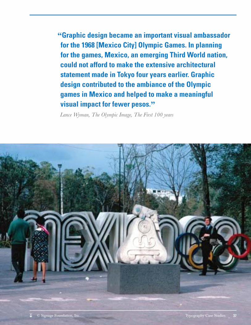
1968 Olympic Games, Mexico City, MexicoLance Wyman1968
Lance Wyman is still a practicing designer today more than 45 years after this trendsetting project, many people take for granted how ahead of its time this project was. Not only did Wyman develop special symbols that both ref lected the Olympic athletic spirit as well as the tradition native glyphic language, but Wyman also developed a typographic language that extended its tentacles into multiple environments from stamps to signs to public parks. This merger of type and an integrated visitor experience soon began to define the modern Olympic design tradition and was the inspiration behind famous Olympic designs developed for Los Angeles, Salt Lake City and London.
“Graphic design became an important visual ambassador for the 1968 [Mexico City] Olympic Games. In planning for the games, Mexico, an emerging Third World nation, could not afford to make the extensive architectural statement made in Tokyo four years earlier. Graphic design contributed to the ambiance of the Olympic games in Mexico and helped to make a meaningful visual impact for fewer pesos.”Lance Wyman, The Olympic Image, The First 100 years
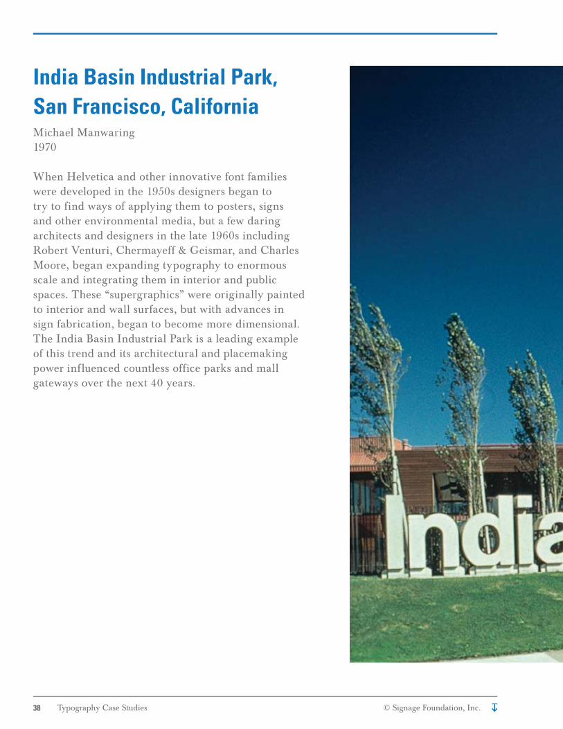
India Basin Industrial Park, San Francisco, CaliforniaMichael Manwaring1970
When Helvetica and other innovative font families were developed in the 1950s designers began to try to find ways of applying them to posters, signs and other environmental media, but a few daring architects and designers in the late 1960s including Robert Venturi, Chermayeff & Geismar, and Charles Moore, began expanding typography to enormous scale and integrating them in interior and public spaces. These “supergraphics” were originally painted to interior and wall surfaces, but with advances in sign fabrication, began to become more dimensional. The India Basin Industrial Park is a leading example of this trend and its architectural and placemaking power influenced countless office parks and mall gateways over the next 40 years.
Crate and Barrel and CB2Multiple design firms in addition to the in-house design team1962-Today
There are brands designed around icons and there are those designed around type. Crate and Barrel is firmly in the latter camp with enormous ramifications on the design philosophy and approach of the organization. In many companies, color or architecture drives design decisions but Crate and Barrel has made the clear leap into using type to drive all their guidelines from signs to architecture. It employed the same advertising firm led by Tom Shortlidge for 40 years to ensure design quality and consistency. The company also is committed to building a strong in-house design team, yet use outside design direction from firms like Calori & Vanden Eynden, creating a design spirit that infects the culture of the organization.
University of Phoenix Stadium, Phoenix, ArizonaPentagram (Michael Gericke, lead designer)Fabricated by Zumar Industries2008
Over the last 15 years architectural style has shifted to an aggressive modernism of sculptural forms and advanced materials. At the same time an equally powerful trend in brand environments has integrated typography into corporate and institutional architecture through materials and lighting. The collision of these two design ideologies can be seen at work in the University of Phoenix Stadium used by the Arizona Cardinals. The building, designed by Peter Eisenman, is a monument to clean and no apologies technological modernism, yet signage developed by Michael Gericke of Pentagram somehow both complements the monumental forms and supports an immersive experience that heightens the power of the building.
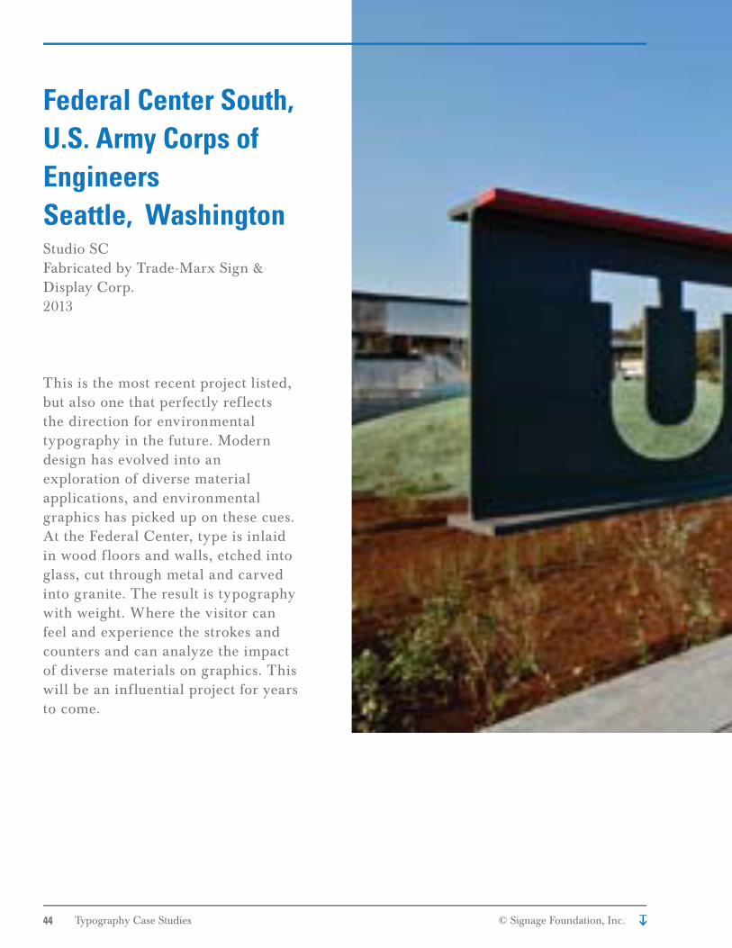
Federal Center South, U.S. Army Corps of EngineersSeattle, WashingtonStudio SCFabricated by Trade-Marx Sign & Display Corp.2013
This is the most recent project listed, but also one that perfectly ref lects the direction for environmental typography in the future. Modern design has evolved into an exploration of diverse material applications, and environmental graphics has picked up on these cues. At the Federal Center, type is inlaid in wood f loors and walls, etched into glass, cut through metal and carved into granite. The result is typography with weight. Where the visitor can feel and experience the strokes and counters and can analyze the impact of diverse materials on graphics. This will be an inf luential project for years to come.
Virtua Hospital, Marlton, New JerseyEx;it Fabricated by AGS2012
Wayfinding programs for facilities like large hospitals are mainly planning projects that where the signs and graphics serve a crucial but understated support role. In addition, these wayfinding programs must meet the specific requirements of the Americans with Disabilities Act, which requires that all signs meet strict typography standards. With restrictions like these it is inspiring to see messaging so refined with an understated yet effective hierarchy of scale, color contrast and material that guides the visitor unobtrusively.
NPR Headquarters, Washington D.C.Poulin + MorrisFabricated by Boyd Signs2013
To promote the image of a dynamic news organization, Poulin + Morris developed a dynamic approach to typography at every. From room numbers that “vibrate” with different color strokes to notification screens throughout the building, the type reflects the free flow of information befitting a national news outlet. In addition, type is both expanded and compressed to represent identification and directory information throughout the building.
Miami Beach, FloridaMERJE Fabricated by Gable Signs2001-2008
This program has had a great infl uence on the great number of urban wayfi nding programs that have come along since it was designed and installed. To ensure the selected Futura font was approved, the fi rm developed a research process with the Pennsylvania State University to show the effectiveness of type that deviated from the required Highway Gothic. In addition, the design process explored the linkage between typography, identity and legibility resulting in both a highly effective program, and one that defi nes the unique character of Miami Beach.
“You must really care about type if you are willing to spend tens of thousands of dollars to get the right one approved.”FDOT offi cial on approval of Futura for use in Miami Beach signs
It is not surprising that a travelling exhibition celebrating 100 years of typeface design and innovation would also meet such high standards for excellence. Type here is reduced to its simplest form: black on white, (or white on glass) and then through scale, pattern and dynamism creates a narrative that is carried through the entire space. An exhibition that is both beautiful and a wonderful teaching tool.
SEGD Design Awards, SEGDFar and away the greatest source of sign and environmental graphic design inspiration. The design awards served as inspiration for many of the projects seen in this paper. An incredible teaching tool for young designers
Bauhaus, Jeannine FiedlerHundreds of books have been written on the Bauhaus movement, but this recently released text covers the material from every point of view from the academic to the political.
Lance Wyman Interview for DesignBoomThis enlightening interview provides insights into one of the most perceptive environmental graphic designers of the last 50 years.(http://www.designboom.com/design/lance-wyman-interview/)
Resources
“Let us therefore create a new guild of craftsmen without the class-distinctions that raise an arrogant barrier between craftsmen and artists! Let us desire, conceive and create the new building of the future together. It will combine architecture, sculpture and painting in a single form, and will one day rise towards the heavens from the hands of a million workers as the crystalline symbol of a new and coming faith.” Walter Gropius, Founder of the Bauhaus