99
Doctoral Dissertation Shibaura Institute of Technology Perceptions of Colored Pictograms for Communication in Factory Emergencies March 2019 Suopor Hiranchiracheep

Doctoral Dissertation
Shibaura Institute of Technology
Perceptions of Colored Pictograms
for Communication in
Factory Emergencies
March 2019
Suopor Hiranchiracheep

Perceptions of Colored Pictograms for
Communication in
Factory Emergencies
BY
Suopor Hiranchiracheep
A DISSERTATION SUBMITTED IN PARTIAL FULFILLMENT
OF THE REQUIREMENTS FOR THE DEGREE OF
DOCTOR OF PHILOSOPHY
IN THE FUCTIONAL CONTROL SYSTEMS
GRADUATE SCHOOL OF ENGINEERING AND SCIENCE
SHIBAURA INSTITUTE OF TECHNOLOGY
MARCH 2019

i
Declaration of Authorship
I, Suopor HIRANCHIRACHEEP, declare that this thesis titled, “Perceptions of Colored
Pictograms for Communication in Factory Emergencies,” and the work presented in it are
my own. I confirm that:
This work was done wholly or mainly while in candidature for a research degree at
Shibaura Institute of Technology.
Where any part of this thesis has previously been submitted for a degree or any other
qualification at Shibaura Institute of Technology or any other institution, this has
been clearly stated.
Where I have consulted the published work of other, this is always clearly attributed.
Where I have quoted from the work of others, the source is always given. With the
exception of such quotations, this thesis is entirely my own work.
I have acknowledged all main sources of help.
Signed: ___________________________________
(Suopor HIRANCHIRACHEEP)
Date: ______________________________________

ii
Abstract
Pictograms are very useful for communication, not only with those who speak
different languages but also with an environment in different job ranks. In many
manufacturing settings, companies have implemented warning pictograms to ensure they
don’t get any accidents or/and to get much higher production efficiency. Therefore,
Comprehension of warning pictograms has become an important indicator of safety
measures.
This study examined the effects of cultural and educational background factors on
the comprehension of coloured pictograms for emergency situations in manufacturing
environments. Pictograms should promptly communicate particular conditions to people
who may not share a common language. The author designed coloured pictograms for such
manufacturing tasks as push, step, and turn and then present them to factory workers having
different cultural and educational backgrounds. A questionnaire survey was conducted to
identify the behaviour patterns of subjects viewing seven differently coloured pictograms:
white, black, red, yellow, green, blue, and pink. Questionnaire responses were obtained from
138 worker subjects, where the instructions were expressed in their native languages from
three different countries: Thailand, Myanmar, and Cambodia. Moreover, the questionnaire
was presented to 80 Japanese students and 178 Thai students in English instructions.
The author also analysed the data using one-way ANOVAs among seven colours for
each pictogram and T-tests among pairs of worker groups for each colour to determine the
culture and education differences. A statistical analysis of the results showed that educational
background was statistically significant for some colours but not for all colours.

iii
The author identified a statistically significant difference between educational and
cultural backgrounds. Thus, my results show that differences in the interpretation of the
meaning of coloured pictograms were more affected by educational backgrounds than by
cultural differences. The interpretations of the lowest-educated groups were different from
those of the high- educated ones. My results suggest that factory managers need to provide
comprehensive on-the-job training on signs posted in factories, in particular to low-educated
employees. Workers should be given explicit instructions about the links between safety
functions and pictogram colours.

iv
“Education is one of the country's most important jobs. Either prosperity or deterioration of
a country depend mainly upon the citizent's education. Hence, the strenghtened education
is indeed needed.”
His Majesty King Bhumibol Adulyadej
The Great king of Thailand
v
Acknowledgments
I realize that the fulfillment of Ph.D. task is a collective effort, which involves the guidance,
cooperation, support and. Dozens of people have helped and encouraged me immensely. I
would like to sincerely express my appreciation to all people who have made this dissertation
possible. I’ll never forget what they’ve done for me.
It is with immense gratitude that I acknowledge the support and help of my supervisors,
Prof. Atsuko K. Yamazaki, Ph.D. (Main-charge) who continually and convincingly conveyed
a spirit of adventure in regard to research and performance a professional lecturer. She,
especially, assisted me overcome many crisis situations and give me the opportunity to achieve
a better life. Definitely, this dissertation would not have been accomplished without her. She
still contributed and extended her valuable assistance to achieve in a memorandum of
understanding (MOU) between Shibaura Institute of Technology (SIT) and Nakhon
Ratchasima Rajabhat University (NRRU).
Moreover, my deepest thanks and appreciation to Prof. Hiroshi Hasegawa, Ph.D. (Sub-
charge) advise me how to succeed this research. I would like to extend my gratitude to the rest
of my dissertation committee: Prof. Masahiro Inoue, Prof. Kazunori Mano and Prof. Vichai
Saechout for their insightful comments. I am appreciatively indebted to them for their very
valuable comments even at during their difficult times.
I owe my deepest gratitude to committees and the president of NRRU who allow me
to get educational leave under the financial support by human resource development
scholarship of NRRU. In my experience as a Ph.D. Student, I’m certain that my ability can be
an asset to NRRU. I am honored as Ph.D. Student at Shibaura Institute of Technology (SIT)

vi
for spending four years. I had a chance to study with great and kind professors until I will get
certificate of sub-major. Moreover, I had work experiences with international friends in an
international environment and with people from all over the world. Their friendship and good
humor which had made my life much more enjoyable. In the future, I would bring my good
skill learnt by SIT system to my job at NRRU and become a great supervisor to my students.
I am grateful to Mr. Chitapong Wechtaisong, Ms. Sarunya Kanjanawattana and Ms.
Tipporn Laohakangvalvit for their kindly guidance, generousness, help and friendship that I
needed. In particular, I thank Diversity Communication Laboratory members and admirable
working atmosphere of this laboratory, Thai friends in SIT or Thailand. I would also like to
thank all the participants for their cooperation in my research. In addition, I still get positive
attitude to be a good person in order to create excellent stories from Mr. Palitchoke Ayanaputra
as role models.
Last but not least, I would like to thank my family for supporting me spiritually
throughout completing this dissertation. They did not only allow me to follow my dreams, but
also motivate me to control my destiny. I realize from my family that everyone has their own
struggles and own fights. Sometimes hurt is needed to make me grow.
vii
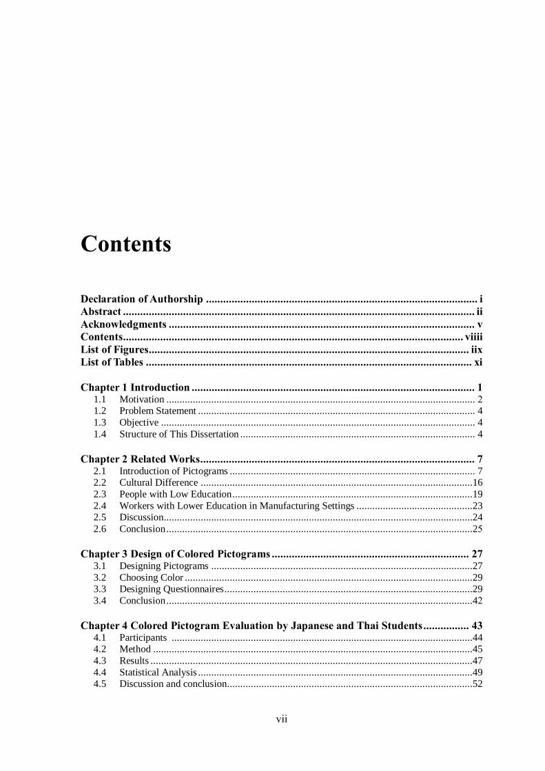
Contents
Declaration of Authorship ............................................................................................... i
Abstract ........................................................................................................................... ii
Acknowledgments ........................................................................................................... v
Contents ....................................................................................................................... viiii
List of Figures................................................................................................................ iix
List of Tables .................................................................................................................. xi
Chapter 1 Introduction ................................................................................................... 1 1.1 Motivation ..................................................................................................................... 2 1.2 Problem Statement ......................................................................................................... 4 1.3 Objective ....................................................................................................................... 4 1.4 Structure of This Dissertation ......................................................................................... 4
Chapter 2 Related Works................................................................................................ 7 2.1 Introduction of Pictograms ............................................................................................. 7 2.2 Cultural Difference .......................................................................................................16 2.3 People with Low Education ...........................................................................................19 2.4 Workers with Lower Education in Manufacturing Settings ............................................23 2.5 Discussion.....................................................................................................................24
2.6 Conclusion ....................................................................................................................25
Chapter 3 Design of Colored Pictograms ..................................................................... 27 3.1 Designing Pictograms ...................................................................................................27 3.2 Choosing Color .............................................................................................................29 3.3 Designing Questionnaires ..............................................................................................29 3.4 Conclusion ....................................................................................................................42
Chapter 4 Colored Pictogram Evaluation by Japanese and Thai Students ................ 43 4.1 Participants ..................................................................................................................44 4.2 Method .........................................................................................................................45
4.3 Results ..........................................................................................................................47
4.4 Statistical Analysis ........................................................................................................49 4.5 Discussion and conclusion.............................................................................................52

CONTENTS
_________________________________________________________________________
viii
Chapter 5 Colored Pictogram Evaluation by Factory Workers ................................. 54 5.1 Participants ..................................................................................................................54
5.2 Method .........................................................................................................................55 5.3 Results ..........................................................................................................................57
5.4 Statistical Analysis ........................................................................................................61
Chapter 6 Analysis and Discussion ............................................................................. 71 6.1 Overall Analysis and Discussion ...................................................................................71 6.2 Education Levels on the Interpretation...........................................................................72
6.3 Job Ranks of Workers and Career Directions .................................................................73
6.4 Colour Recognition as an Important Means ...................................................................73
6.5 Low-Educated Workers as a Multi-Layer Chain Subcontracting System ........................74 6.6 Training ........................................................................................................................75
Chapter 7 Conclusion and Future Work .................................................................... 76 7.1 Conclusion ....................................................................................................................76
7.2 Future Work ..................................................................................................................77
References ...................................................................................................................................78 Publication List ............................................................................................................................84

ix
List of Figures
Figure 1.1 Number of migrant workers from Myanmar and Cambodian in Thailand ......... 3
Figure 1.2 Structure of this thesis .................................................................................... 6
Figure 2.1 Pictograms for described actions in morning situations: in the morning, wake up,
wash a face, and brush teeth. ..................................................................................... 8
Figure 2.2 Safety pictograms of Public Information Symbols ......................................... 12
Figure 2.3 Thirty pictograms questioned for cultural differences [40] ............................ 17
Figure 2.4 Icons and pictograms representing seven referents or functions of the
videotelephone [34] ............................................................................................... 18
Figure 2.5 Medication pictograms developed by the RAD-AR Council [45] .................. 20
Figure 2.6 Good behavior and the safety characters of various designs for safety signs ... 24
Figure 3.1 Uncoloured pictograms for required actions in emergency situations: push a
button, step on a pedal, and turn a handle ................................................................ 28
Figure 3.2 Coloured pictograms for required actions of push a button ............................. 30
Figure 3.3 Introduction in the first section of the online questionnaire ............................ 34
Figure 3.4 Questions of personal information in the second section of the online
questionnaire ........................................................................................................... 34
Figure 3.5 Dropdown menu of questions of personal information in the second section of
the online questionnaire ........................................................................................... 37
Figure 3.6 Each coloured pictograms for actions in the third section of the online
questionnaire .......................................................................................................... 40

LIST OF FIGURES
x
Figure 3.7 Introduction in Thai of paper-based questionnaire ......................................... 41
Figure 4.1 Average importance values obtained of students for each pictogram colour from
two groups with different culture backgrounds ........................................................ 48
Figure 5.1 Average importance values obtained of workers for each pictogram colour from
three groups with different educational backgrounds .............................................. 60

xi
List of Tables
Table 2.1 Design principles of each type of International standards for safety signs: ISO
7010 [8]................................................................................................................... 10
Table 2.2 Examples of Safety sign, reference number and referent of International standards for
safety signs: ISO 7010 [9] ....................................................................................... 11
Table 2.3 (a) Similar pictograms have not been incorporated in sign standards on internet
[11] [12] [13] ......................................................................................................... 12
Table 2.3 (b) Similar pictograms have not been incorporated in sign standards on internet
[14] [15] [16] [17] .................................................................................................. 13
Table 2.4 Bottom for stopping Emergency on internet [18] [19] [20] [21] .................... 14
Table 2.5 Similar pictograms of International standards for safety signs: ISO 7010 [9] ... 15
Table 2.6 Pictograms for an action combined with an illustration of an object [48] ......... 24
Table 3.1 Option answer for question of “What is your type of industry or business?” and
“What is your job category?” .................................................................................. 32
Table 3.2 Option answer for question of “What is your final education?”, “What is your
nationality?”, “What's your current country of residence?”, and “What is your native
language?” ............................................................................................................. 33
Table 4.1 Personal background data of student subjects: gender, age range, nationality, and
educational level ....................................................................................................... 44
Table 4.2 One-way ANOVA results of students among three pictograms for each colour. 50
Table 4.3 T-test results between two pairs of Thai and Japanese students for each colour 52

LIST OF TABLES
xii
Table 5.1 Personal background data of factory worker subjects: gender, age range,
nationality, and educational level ............................................................................. 55
Table 5.2 One-way ANOVA results among three pictograms for each colour .................. 62
Table 5.3 One-way ANOVA results among seven colours for each pictogram ................. 66
Table 5.4 T-test results between two pairs of worker groups for each colour ................... 67

Chapter 1
Introduction
This chapter introduces stimulant that convince me to propose this doctoral dissertation
which entitled “Perceptions of Colored Pictograms for Communication in Factory
Emergencies”. This chapter also presents background of communication gaps at workplaces
Furthermore, I will show problem statements which will be investigated and determined that
this dissertation provides. Finally, summary of this chapter and an organization of this
dissertation will be described.

CHAPTER 1 INTRODUCTION 2
1.1 Motivation
Many companies have increased their global manufacturing production and moved such
facilities to countries with lower labour costs to achieve optimal total cost. Under such
circumstances, employees from various cultural and language backgrounds often work in
teams, especially in manufacturing settings in Southeast Asian countries. It is a sub region
of Asia, roughly be described as geographically situated east of the Indian subcontinent,
south of China and north of Australia, between west of the Indian Ocean and the east of
Pacific Ocean. Southeast Asian country is composed of eleven countries of impressive
diversity in religion, culture and history: Brunei, Burma (Myanmar), Cambodia, Timor-Leste,
Indonesia, Laos, Malaysia, the Philippines, Singapore, Thailand and Vietnam. Figure 1.1
illustrates the statistical data of immigration data in Thailand from 2014 to 2017. A blue line
in the line graph represents as the number of migrant workers from Myanmar. An orange
line represents the number of migrant workers from Cambodian. The total number of migrant
workers for Myanmar and Cambodian presents as a green line. Based on the statistical data,
the trend of foreign workers migration was up dramatically, especially in 2017. The number
of migrant workers from Myanmar was much higher than the number of migrant workers
from Cambodian since 2014.
Many problems have been reported, especially those associated with language
communication gaps at workplaces, such as an increase in the number of accidents, product
defects, and delivery delays. According to Eurostat, 3,515 fatal and 2,487,794 non-fatal
accidents involving the loss of at least four calendar days from work occurred in the
multilingual European Union in 2012 [1]. One major cause is communication problems
among co-workers from different language backgrounds or at varying job ranks. Factory
workers often have to cooperate with people from diverse cultural and language backgrounds
[2]. Therefore, high-quality communication is necessary to adhere to correct production
procedures toward meeting manufacturing objectives and achieving high levels of
productivity. This is also an important element in ensuring effective responses to emergency
situations in factories.

CHAPTER 1 INTRODUCTION 3
Figure 1.1 Number of migrant workers from Myanmar and Cambodian in Thailand

CHAPTER 1 INTRODUCTION 4
1.2 Problem statement
In actual workplaces, an organization’s entire staff must comprehend the identical meaning
of coloured signs to prevent injuries or to be clearly informed of possible danger. The
meaning of a coloured pictogram that shows a required action in a factory emergency must
be clearly understood by every single worker and manager, despite the workforce having
different linguistic, cultural, or educational backgrounds. Therefore, coloured pictograms
must be designed by taking into account a variety of culture- and education-based
perceptions of colours and actions. In this study, the author developed new pictograms in
different colours that clearly convey the meanings of operations required for emergency
situations in manufacturing settings. The author focused on the perception of importance for
actions expressed by coloured pictograms and investigated how different educational levels
as well as the cultural differences of staff members affected subjects’ actions based on their
perceptions of the depicted operations.
1.3 Objective
The purpose of this dissertation is to investigate the importance given by students and
workers to the actions (push, step, and turn) represented by the seven coloured pictograms
(white, black, red, yellow, green, blue, and pink) and to determine whether cultural
backgrounds or educational levels affect the perceptions of the coloured pictograms in
conveying procedures for emergency situations in manufacturing environments.
1.4 Structure of this dissertation
This dissertation consists of seven chapters including this chapter. The following are an
organization of dissertation which explains structure of each remaining chapters from
Chapter 2 to Chapter 7, which are organized as illustrated in Figure 1.2.

CHAPTER 1 INTRODUCTION 5
Chapter 2 presents literature reviews of existing researches in signs/pictograms, cultural
difference, people with low education, and workers with lower education in manufacturing
settings in safety field which are beneficial to contribute this dissertation. This survey is very
necessary to achieve the dissertation goals.
In Chapter 3, overall questionnaire of pictograms for required actions and surveying with
workers. It describes common actions to guide workers.
Chapter 4 presents results from respondents who were working at factory in Thailand and
studying in Japan or Thailand.
Chapter 5 presents the statistical analyses on the data obtained from the survey. To examine
whether the degree of importance given to each pictogram differed based on the three actions
represented by the pictograms. Then, we analysed the differences in the degree of importance
among the seven colours and finally tested each colour between the subject groups by t-tests
to determine the culture and education differences.
Chapter 6 presents the discussion of this dissertation which discusses what this dissertation
researched, evaluated, found, as well as solved. Furthermore, this chapter also discusses the
new finding from this dissertation.
Chapter 7 presents the conclusion of the dissertation which summarizes all of dissertation
processes from the first step until the last one including the motivation to purpose the
dissertation’s topic, the dissertation goals, the design, and statistical analyses. Finally, future
work are explained.

CHAPTER 1 INTRODUCTION 6
Figure 1.2 Structure of this thesis

Chapter 2
Related Works
2.1 Introduction of pictograms
Pictograms are believed to originate from prehistoric cave paintings and ancient
hieroglyphics. Pictograms are non-verbal communication symbols representing commonly
associated concepts. They are prevalently used as a visual communication tool to convey
information and messages instantaneously. Such non-verbal communication is very useful,
especially in emergency situations or when verbal communication is not possible [3] [4].
Icons and marks used in computers and electronic devices are also classified as pictograms.
They are sometimes referred to as “signs” or “symbols.” All of them are collectively referred
to as “graphical symbols” by the International Organization for Standardization (ISO) and
as “pictorial symbols” by the (JISC) [5]. In addition, symbols called “ideograms” are used

CHAPTER 2 RELATED WORKS 8
to represent a particular idea or concept. In many cases, however, all graphical and pictorial
representations that are used to convey information and messages are referred to as
“pictograms.”
Pictogram Ideogram Communication (PIC) is the most famous set of communication
icons. It was developed by Subhas Maharaj [6], a Canadian speech therapist, to support
communication for people with difficulties in oral and/or written communication. These PIC
symbols were also published in Japan in 1995 after they were adapted to communication in
Japanese. PIC symbols have been widely used and studied as a communication support tool
for children with disabilities. They have also been used in online chatting between children
speaking different languages [7]. Another example of pictograms developed for
communication support is a set of approximately 300 symbols created in accordance with
the Design Principles of Pictorial Symbols for Communication Support (JIS T0103),
established by Japanese Standards Association (JSA) 2005 . While most of the JIS T0103-
certified symbols represent objects and places, about 15 percent represent actions and
movements in Figure 2.1. Some of them even express emotions. They are among those
included in the JIS Design Principles of Pictorial Symbols for Communication Support.
Figure 2.1 Pictograms for described actions in morning situations: in the morning, wake up,
wash a face, and brush teeth.

CHAPTER 2 RELATED WORKS 9
The principles of using colour in safety signs and pictograms have been developed.
The principles of using colour in safety signs and pictograms have been developed by such
organizations as the International Organization for Standardization (ISO), the Japanese
Industrial Standards Committee (JISC), and the Industrial Accident Prevention Association.
ISO 7010 prescribes design principles incorporating shapes and colours for safety signs. In
these principles, red, yellow, blue, and green are respectively used for prohibitions or fire
equipment, warnings, mandatory directions and escape routes, and safety conditions, as
shown in Table 2.1 and Table 2.2 [8] [9].
According to the standards determined by JISC, red symbols denote “prohibited”
or “stop” messages [10] (Figure 2.2). Although these colour standards have been
incorporated in sign standards for creating pictograms at organizations and factories,
pictograms drawn in red, yellow, and green still convey different meanings, which have not
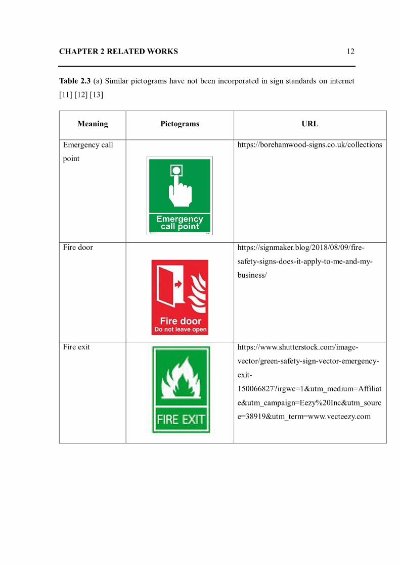
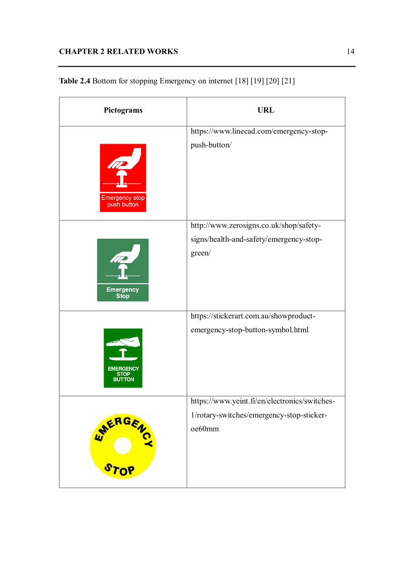
been united standards at many workplaces, are shown in Table 2.3 [11] [12] [13] [14] [15]
[16] [17] and Table 2.4. In addition, there are similar pictograms in emergency situation of
International standards for safety signs: ISO 7010 in Table 2.5 [9].
Figure 2.2 Safety pictograms of Public Information Symbols [10]

CHAPTER 2 RELATED WORKS 10
Table 2.1 Design principles of each type of International standards for safety signs: ISO
7010 [8]
Type of Sign Shape Design Pictogram
Prohibitive
Action/Equipment
which are prohibited
Circular
Black pictogram on
white background
with red border and
diagonal line
Warning
These signs give warning
of potential risks
Triangular
Black pictogram on
yellow background
with black border
Mandatory
A course of action which
must be taken
Circular
white pictogram on
blue background
Escape routes
And safety equipment
Rectangular
or Square
white pictogram on
green background
Fire Equipment
Location of fire fighting
equipment
Square
white pictogram on
red background

CHAPTER 2 RELATED WORKS 11
Table 2.2 Examples of Safety sign, reference number and referent of International standards
for safety signs: ISO 7010 [9]
Category
E F M P W
Evacuation route,
location of safety
equipment or
safety facility,
safety action
Fire equipment
signs
Mandatory
action signs
Prohibition
signs Warning signs
CHAPTER 2 RELATED WORKS 12
Table 2.3 (a) Similar pictograms have not been incorporated in sign standards on internet
[11] [12] [13]
Meaning Pictograms URL
Emergency call
point
https://borehamwood-signs.co.uk/collections
Fire door
https://signmaker.blog/2018/08/09/fire-
safety-signs-does-it-apply-to-me-and-my-
business/
Fire exit
https://www.shutterstock.com/image-
vector/green-safety-sign-vector-emergency-
exit-
150066827?irgwc=1&utm_medium=Affiliat
e&utm_campaign=Eezy%20Inc&utm_sourc
e=38919&utm_term=www.vecteezy.com

CHAPTER 2 RELATED WORKS 13
Table 2.3 (b) Similar pictograms have not been incorporated in sign standards on internet
[14] [15] [16] [17]
Meaning Pictograms URL
Fire extinguisher
https://www.riigiteataja.ee/en/eli/518112015
005/consolide
Emergency
telephone
https://www.riigiteataja.ee/en/eli/518112015
005/consolide
Emergency exit
https://pixabay.com/en/output-exit-
emergency-exit-note-476122/
Fire escape exit
sign
https://www.indiamart.com/proddetail/fire-
escape-exit-sign-9845496333.html
CHAPTER 2 RELATED WORKS 14
Table 2.4 Bottom for stopping Emergency on internet [18] [19] [20] [21]
Pictograms URL
https://www.linecad.com/emergency-stop-
push-button/
http://www.zerosigns.co.uk/shop/safety-
signs/health-and-safety/emergency-stop-
green/
https://stickerart.com.au/showproduct-
emergency-stop-button-symbol.html
https://www.yeint.fi/en/electronics/switches-
1/rotary-switches/emergency-stop-sticker-
oe60mm

CHAPTER 2 RELATED WORKS 15
Table 2.5 Similar pictograms of International standards for safety signs: ISO 7010 [9]
Meaning Pictograms
Emergency stop button
Emergency telephone
Fire alarm call point
Fire emergency telephone
Furthermore, pictograms are used to communicate medication instructions. These
are other examples of using pictograms when verbal communication is not effective [22]
[23], especially for improving comprehension of people with low literacy, the elderly and
children [24] [25] [26] [27] .The use of pictograms for communication and information
provision is prevalent. They are used not only as support tools for people with disabilities
and public information, but also to represent various hazards, such as on labels of agricultural
or other chemicals [28] [29] [30]. Although pictograms are seldom used to show procedures
in manufacturing setting, pictograms for manufacturing processes can convey meanings
effectively and comprehensibility without relying on language. Pictograms are often

CHAPTER 2 RELATED WORKS 16
regarded as effective means of communication at companies where many workers from
various countries and different cultural backgrounds work, since they can be used to improve
occupational risk prevention at manufacturing sites. Therefore, many health and safety
training or educational programs for employees at manufacturing companies include
learning about pictograms and signs. Yamazaki and Taki indicated that well-designed
pictograms for an action combined with the object conveyed meaning effectively, where
safety and productivity are significant [31]. Hiranchiracheep el al. examined the effects of
educational and cultural backgrounds on colored pictogram instructions in terms of
behavioral perception for actions in manufacturing. The results showed a significant
difference among groups with different educational backgrounds [32].
There have also been studies conducted on how to use pictograms to show the
parameters of special analytical instruments [33] [34] [35] [36]. As the use of pictograms is
spreading, an increasing number of studies are being conducted to review them, not only in
terms of their shapes but also in terms of their colors and presentation methods, so that they
can be used universally [37] [38] [39]. In a study by Waterson et al. they gathered evaluation
data from more than 200 young children to evaluate new safety pictograms [37]. Through
the summative assessment of the effectiveness of the new pictograms, particularly in an
example of formative evaluation, they outlined a useful set of guidelines for designing safety
signs for young children.
2.2 Cultural difference
According to some previous studies, cultural differences affect the interpretation of
pictograms. Cho examined [40] cross-cultural differences in pictogram interpretations by
people from United States and Japan. She suggested that cultural difference in pictogram
interpretations could be used as an agent construction basis based on human provided
interpretations. She proposed detecting method of cultural differences in cross-cultural
pictogram interpretations automatically. During calculation, bilingual dictionaries and
thesaurus were included to extract bilingual pairs of the two countries’ interpretation words.
There were bold lined pictograms as 18 of 30 pictograms are assessed to have some cultural
differences (Figure 2.3).

CHAPTER 2 RELATED WORKS 17
Figure 2.3 Thirty pictograms questioned for cultural differences [40]
Piamontea et al. [34] evaluated cultural differences in the interpretation of graphical
symbols. Their results obtained from American and Swedish subjects indicate that there were
differences in pattern ratings between two nationality groups and the differences may be
culturally linked. The test method used three sets of icons and pictograms representing seven
referents or functions of the videotelephone (Figure 2.4).

CHAPTER 2 RELATED WORKS 18
Figure 2.4 Icons and pictograms representing seven referents or functions of the
videotelephone [34]
However, the results in this study show that differences in the interpretation of the colored
pictogram meanings were more affected by educational backgrounds than cultural
differences. In actual workplaces, an organization’s entire staff must comprehend the
identical meaning of coloured signs to prevent injuries or to be clearly informed of possible
danger. The meaning of a coloured pictogram that shows a required action in a factory
emergency must be clearly understood by every single worker and manager, despite the
workforce having different linguistic, cultural, or educational backgrounds. Therefore,
coloured pictograms must be designed by taking into account a variety of culture- and
education-based perceptions of colours and actions.
CHAPTER 2 RELATED WORKS 19
2.3 People with low education
2.3.1 Adults with low education
The studies of medication pictograms have focused on elderly patients with low literacy
who display declining cognitive abilities and memory. Therefore, the comprehension of
pictograms can assist in the care of the elderly in order to establish methods to convey
medication instructions. Among the studies on the comprehension of medication
pictograms, those conducted by Mansoor and Dowse [22] and Dowse and Ehlers [41] are
particularly well known. Both studies assessed the effectiveness of pictograms in showing
how to take and store medicines in African countries with low literacy rates. The results
suggested that the US-designed pictograms that had been deemed effective were not
interpreted in the same way in South Africa and that medication pictograms would need to
be designed with consideration of cultural context. Knapp et al. [42] examined whether the
medication pictograms used in South Africa and the US could be understood by patients in
the UK. The results showed that for both the US and South African versions, only three of
the 10 pictograms were understood by more than 85 percent of the subjects. Meanwhile, Cho
[40] developed rather complicated pictograms by themselves and showed them to subjects,
some US nationals and some Japanese nationals, to analyze the differences in their
interpretations. The results indicated that different cultural backgrounds could cause
different interpretations of pictograms.
Meanwhile, Shimizu et al. [43] studied the use of pictograms to convey medication
instructions in Japan. Their study examined whether the pictograms of medication
instructions added on medicine bags could facilitate the understanding of the information,
and found that medicine bags with instructions both in text and pictograms increased
comprehension among more than 60 percent of the subjects. Patients aged 60 years and over
appreciated the pictograms more than younger ones. Based on these studies, the Risk/Benefit
Assessment of Drugs – Analysis and Response (RAD-AR) Council, a voluntary association
consisting of pharmaceutical companies in Japan, published medication pictograms in 2004.
They aimed to explain proper medication use in a way that everyone, including children and
elderly people, could understand. The medication pictograms developed by the RAD-AR
Council were intended to be displayed on medication instruction sheets provided along with

CHAPTER 2 RELATED WORKS 20
prescriptions. As of 2006, a total of 51 pictograms had been developed. Some pictograms
were combined to illustrate medication instructions.
Figure 2.5 Medication pictograms developed by the RAD-AR Council [44]
Kheir et al. [24] developed and evaluated comprehension of medicine label
instructions in a culturally diverse multiethnic population with low literacy skills.
Participants were randomized to one of three study groups: text plus verbal instructions,
pictogram-only label, and pictogram with verbal instructions. The results showed that the
pictogram with verbal instructions group achieved better comprehension. Van Beusekom
[27] examined 10 pharmaceutical pictograms and identified how the design could be
improved for understandability by low-literacy patients in the Netherlands. Thirty
adequately literate and 25 low-literate participants (assessed with the Dutch version of the

CHAPTER 2 RELATED WORKS 21
Rapid Estimate of Adult Literacy in Medicine: REALM-D) were asked to verbally explain
the meaning of each pictogram. The results of the study indicated that adequately literate
participants could more easily understand pictograms than people with low literacy. Five
pictograms of the adequately literate group and two pictograms of the low-literacy group
reached 67% understanding for the ISO cut-off. Designing pictogram characteristics should
focus on familiarity, simplicity, and showing the intake and effect of medicine.
The United States Pharmacopeia Convention (USP) developed 81 pharmaceutical
pictograms as ‘standardized graphic images that help convey medication instructions,
precautions and/or warnings to patients with a lower level reading ability and patients for
whom English is a second language. The USP pictograms have been tested for
comprehension by Ng et al. [26]. They examined comprehension of USP pictograms for older
Hong Kong residents (65 and above). The first group was presented with text labels and
another group with the text labels plus supplementary pharmaceutical pictograms. This study
showed that older people favored the addition of pharmaceutical pictograms to written text
for conveying medical information. Zargarzadeh and Ahamdi [45] investigated the
understandability of three pictograms selected as most applicable by participants and their
recall after educational mini-sessions. The groups with lower levels of literacy had more
difficulty interpreting them than those with a high level of literacy.
2.3.2 Children with low education
To develop pictograms as an effective communication tool, it is essential to examine
whether they are easy for the target group to understand. In particular, children’s curiosity
and a lack of experience and knowledge is critical to easily understand the pictograms in an
instant. Lin et al. [46] investigated four- to six-year-old preschool children and aimed to
identify how they understand warning pictograms (signs, frames, and colors). They used a
questionnaire to determine children’s understanding of warning pictograms and color; and
an interview was conducted with the subjects to verify the extent of their comprehension.
The results showed that children had stronger recognition of “Palm” among all warning
pictograms (Palm, Cross, Oblique Line, Skull, Exclamation Point), stronger recognition of
“Triangle Frame” among all warning frames (Triangle Frame, Circular Frame, Diamond

CHAPTER 2 RELATED WORKS 22
Frame, Octagonal Frame, Inverted Triangle Frame), and stronger recognition of the color
“Red” among all warning colors (Orange, Red, Green, Blue, Black). In addition, they
associated them with familiar objects. Waterson et al. [37] analyzed various designs for
safety signs and accident rate data on board trains for children (aged five-10). The result
showed that posters and labels were given a blue background and the colour yellow was used
for the background text in order to maximize the contrast between pictures and text as
requested by the children. Moreover, to reinforce good behavior and the safety characters,
the characters were always put on the “good” circle and never overlapped with pictograms
highlighting bad behavior.
Figure 2.6 Good behavior and the safety characters of various designs for safety
signs [37]

CHAPTER 2 RELATED WORKS 23
Korenevsky et al. [39] recruited adolescents (aged 12-18) from the volunteer
organization of the Children’s Hospital of Eastern Ontario (CHEO) in Ottawa, Ontario, as
well as from a youth organization at the hospital to identify the common graphic elements
for defined categories of pictograms and identify the key graphic elements common to all
pictograms. For all 21 pictogram categories, at least 80% of survey respondents agreed that
the storyboard conveyed the intended meaning. The result indicated that the context in which
pictograms are presented is important to their correct interpretation. Categories had few
preferred pictograms such as “take with an empty stomach”, “take one tablet”, or “do not
take if breastfeeding”.
2.4 Workers with lower education in manufacturing settings
Migrant workers in a factory often have to cooperate with colleagues who have
diverse culture and language backgrounds. Therefore, pictograms can be used to enhance
swift communication without conversing in the same language, where safety and
productivity are critical. Yamazaki and Taki [47] investigated the comprehension of
pictograms in manufacturing settings for actions such as ‘cut’, ‘push’ and ‘measure’. Their
comprehensibility was examined by Questionnaires A and B. Questionnaire A contained
pictograms with objects of intended actions, and Questionnaire B had pictograms without
objects. The results indicate that well-designed pictograms for an action combined with an
illustration of an object can be used effectively in manufacturing settings. In addition,
pictograms showing use of a tool for actions such as cutting and measuring tended to be
comprehended more correctly and spontaneously. Hiranchiracheep et al. [32] examined the
effects of educational and cultural backgrounds on colored pictogram instructions (push, step
and wheel) in terms of behavioral perception. Pictograms in seven different colors (White,
Black, Red, Yellow, Green, Blue and Pink) were used in the survey with three different
countries (Thailand, Myanmar and Cambodia). Results showed significant difference
among groups with different educational backgrounds. This suggests that educational
background may have more effect on the interpretation of colors used in pictograms than
cultural background.

CHAPTER 2 RELATED WORKS 24
Table 2.6 pictograms for an action combined with an illustration of an object [47]
2.5 Discussion
The first advantage of pictograms is that a graphical representation focused only on the
necessary information can be understood intuitively and instantly; however, there may also
be a disadvantage. Excessive filtering of information and oversimplified representations may
cause confusion [48]. Another advantage of pictogram communication is that information
can be easily understood by anyone, regardless of language, culture, or age. Neither prior
knowledge nor education is required to understand pictograms. This is why graphical
symbols are used for the public. However, pictorial symbols often vary across countries and
societies. This is because cultural context and individual cognitive performance affect the
interpretation of symbols and icons [22] [40] [41] [42]. Moreover, some pictograms can be
used only in certain cultural spheres (Mori 2006). For example, the International Federation
of Red Cross and Red Crescent Societies (IFRC) has two different emblems, one for
Christian societies and one for Muslim societies [48]. United States Pharmacopeial
Convention (USP) [49] pictograms are the most widely used and studied pictograms in the
healthcare domain, but eventually they turned out to be slightly different from those used in
other countries. These examples indicate that it is difficult to create a truly universal icon
that can be used regardless of cultural context [5].

CHAPTER 2 RELATED WORKS 25
The American National Standards Institute (ANSI) as the American standard and the
International Organization for Standardization (ISO) as the European standard have been
developed to mitigate this issue [50] [51]. They have laid a foundation for the JIS-certified
public information symbols. However, these ANSI, ISO and JIS standards cannot be applied
to many pictograms. The uniform design principles set for public information symbols by
the ISO Technical Committee on Graphical Symbols cannot eliminate regional differences
[5]. The study conducted by Kostelnick on the influence of cultural context on the
comprehension of pictograms and pictographs indicated that the proper selection of
information signs would depend on the familiarity of the symbols included in the signs to
people in that culture as well as the complexity of cultural backgrounds of the target group,
particularly when applying pictograms to children.
Tzeng et al. also assessed the recognition of pictograms from a psychological
perspective. The results suggested that the test subjects preferred pictogram designs similar
to those traditionally used in their home countries. Many other studies also showed that
people’s comprehension of pictograms could be greatly affected by their familiarity with the
symbols and symbolic elements included in the pictograms. Therefore, it is thought that each
pictogram should be carefully examined as to whether it will be easily understood by the
target group in the intended situation
2.6 Conclusion
The use of pictograms enhances illiterate populations’ comprehension, including people with
low health literacy, children and workers with lower education. Some of the reviewed studies
about the use of pictograms for health education point out that pictograms can be very
effective when they are used in combination with written or oral instructions. The author
found only a few articles on the use of pictograms in manufacturing settings, compared to
the existence of many studies on the use of pictograms to educate people for health and
medical purposes. This gap in the literature underlines the need for more research in this area
to provide a more comprehensive approach to pictograms in manufacturing settings, in
particular situations where swift and reliable information transfer is needed, such as in
dealing with an accident.

CHAPTER 2 RELATED WORKS 26
In this study, the author developed new pictograms in different colours that clearly
convey the meanings of operations required for emergency situations in manufacturing
settings. The author focused on the perception of importance for actions expressed by
coloured pictograms and investigated how different educational levels as well as the cultural
differences of staff members affected subjects’ actions based on their perceptions of the
depicted operations.

Chapter 3
Design of Colored Pictograms
3.1 Designing pictograms
In this study, the author focused on the common actions used in response to emergencies in
factories. The author chose three typical actions: push a button, step on a pedal, and turn a
handle. These actions are often taken to stop a machine, reduce a vehicle’s speed, or
loosen/tighten a valve. The author developed three pictograms for these common actions to
guide workers in performing these tasks. Yamazaki and Taki demonstrated that pictograms
for actions are comprehended better when they include an object along with a part that
represents an action (a ‘verb’ part), compared to those without an object. Therefore, the
author designed pictograms that consist of a verb part and an object part for the action.
Accordingly, the push pictogram has a hand, an arrow, and a button, while the step action is
represented by a foot, an arrow, and a pedal. Likewise, an arm & hand, an arrow, and a

CHAPTER 3 DESIGN OF COLORED PICTOGRAMS 28
handle denote the turn action. Pictograms for taking actions are usually represented by black
symbols or black lines, but the author used other colours for the parts of the pictograms that
represent the verb of the action in order to investigate the effects of colour on the subject’s
perception of the importance of the action. Figure 3.1 shows the basic, uncoloured
pictograms for actions in emergency situations at factories.
Figure 3.1 Uncoloured pictograms for required actions in emergency situations: push a
button, step on a pedal, and turn a handle
CHAPTER 3 DESIGN OF COLORED PICTOGRAMS 29
3.2 Choosing color
From the principles of using colour in safety signs and pictograms, the principles of using
colour in safety signs and pictograms have been developed by such organizations as the
International Organization for Standardization (ISO), the Japanese Industrial Standards
Committee (JISC), and the Industrial Accident Prevention Association. ISO 7010 prescribes
design principles incorporating shapes and colours for safety signs. In these principles, red,
yellow, blue, and green are respectively used for prohibitions or fire equipment, warnings,
mandatory directions and escape routes, and safety conditions [8] [9] . Moreover, pink signs
are appeared online as emergency sign [52] [53].
Therefore, the author chose seven colours for the action parts of each pictogram:
white, black, red, yellow, green, blue, and pink. Other parts of the pictograms were drawn in
black. Consequently, the author created a set of seven differently coloured pictograms for
each action. Figure 3.2 shows each coloured pictograms for push actions in emergency
situations at factories.
3.3 Designing questionnaires
To examine how effectively coloured pictograms can convey the importance of the action
represented by each pictogram, the author created a questionnaire that evaluated the degree
of urgency felt by subjects for the actions represented by differently coloured pictograms. A
part of the questionnaire is shown in Figure 3.2. The author conducted surveys to evaluate
how much importance is conveyed by each coloured pictogram and to verify how workers’
cultural backgrounds or educational levels affect the perceptions of pictograms in terms of
the importance of procedures during emergency situations.

CHAPTER 3 DESIGN OF COLORED PICTOGRAMS 30
Figure 3.2 Coloured pictograms for required actions of push a button (in white, black, red,
yellow, green, blue and pink)

CHAPTER 3 DESIGN OF COLORED PICTOGRAMS 31
3.3.1 Web-based questionnaires
The author created an online questionnaire to collect the data for analysis as follows.
1. Introduction in the first section, the author described this survey: objective and
how to (Figure 3.3).
2. Questions of personal information in the second section, subjects were asked as
follows (Figure 3.4).
gender and age
What is your type of industry or business?
What is your job category?
What is your final education?
What is your nationality?
What's your current country of residence?
What is your native language?
3. Each coloured pictograms for actions in the third section (Figure 3.5), subjects
were asked how effectively coloured pictograms can convey the importance of the action
represented by each pictogram as follows (Figure 3.4).
How much do you think it is important to push?
How much do you think it is important to step?
How much do you think it is important to wheel?
4. After finishing all section, participants submitted their questionnaires

CHAPTER 3 DESIGN OF COLORED PICTOGRAMS 32
Table 3.1 Option answer for question of “What is your type of industry or business?” and
“What is your job category?”
What is your type of industry or
business?
What is your job category?
Agriculture and forestry/Fishing
industry/Mining
Construction/Architecture/Civil
engineering
Machinery-related manufacturing
Materials and chemical-related
manufacturing
Electrical and electronics-related
manufacturing
Other manufacturing industries
Electricity supply
Gas and water supply
Information and communication
industry
Transportation industry
Wholesale/Retailing
Finance/Insurance
Real estate business
Restaurant/accommodation
Medical care/Welfare
Education/Learning support
Other services
Public service
Others (Please specify)
Account Manager
Administration
Building Operator
Business Development
Consultant/Contractor
Customer Service
E-Commerce
Engineering
Executive Management
Facilities Manager
Finance/Accounting
HR/Recruitment
Journalism
Legal
Logistics
MIS / IT
Application Developer
MIS / IT - Data Center
MIS / IT - Operations
MIS / IT - Security
MIS / IT - Storage
MIS/IT – Telecommunication
Manufacturing
Marketing Manager
Marketing, PR, Advertising
Network Management
Operations / Administration
Operations / Administration-
Security
Operations Manager
Property Owner
Purchasing / Procurement
Research / Development
Sales
Sales Manager
Technical Support
Training / Education
Real Estate Management
Others (Please specify)

CHAPTER 3 DESIGN OF COLORED PICTOGRAMS 33
Table 3.2 Option answer for question of “What is your final education?”, “What is your
nationality?”, “What's your current country of residence?”, and “What is your native
language?”
What is your final educational
level?
What is your
nationality? and
What's your current
country of residence?
What is your
native language?
1. Junior high school student
2. Junior high school graduate
3. High school student
4. High school graduate
5. University or College student
6. University or College graduate
7. Master's course student
8. Master's course graduate
9. Graduate doctoral student
10. Graduate School of doctoral
graduates
11. Others (Please specify)
Japan
Thailand
Malaysia
Philippines
Vietnam
Indonesia
Cambodia
Laos
Singapore
China
Brazil
Others (Please specify)
Thai
Malay
Filipino
Vietnamese
Indonesian
Cambodian
Lao
Tamil
Chinese
Brazilian
Portuguese
Others
(Please specify)

CHAPTER 3 DESIGN OF COLORED PICTOGRAMS 34
Figure 3.3 Introduction in the first section of the online questionnaire
Figure 3.4 Questions of personal information in the second section of the online
questionnaire

CHAPTER 3 DESIGN OF COLORED PICTOGRAMS 35
(a) Dropdown menu of industry type or business type
(b) Dropdown menu of job category: major

CHAPTER 3 DESIGN OF COLORED PICTOGRAMS 36
(c) Dropdown menu of education
(d) Dropdown menu of nationality

CHAPTER 3 DESIGN OF COLORED PICTOGRAMS 37
(e) Dropdown menu of native language
(f) Dropdown menu of current country of residence
Figure 3.5 Dropdown menu of questions of personal information in the second section of
the online questionnaire

CHAPTER 3 DESIGN OF COLORED PICTOGRAMS 38
(a) Each coloured pictograms of push button

CHAPTER 3 DESIGN OF COLORED PICTOGRAMS 39
(b) Eeach coloured pictograms of step pedal

CHAPTER 3 DESIGN OF COLORED PICTOGRAMS 40
(c) Each coloured pictograms of turn handle
Figure 3.6 Each coloured pictograms for actions in the third section of the online
questionnaire

CHAPTER 3 DESIGN OF COLORED PICTOGRAMS 41
3.3.2 Paper-based questionnaires
The author created a paper-based questionnaire to collect the data from Thai subjects with
secondary school or vocational diploma and Burmese and Cambodian subjects with primary
school educational level.
Figure 3.7 Introduction in Thai of paper-based questionnaire

CHAPTER 3 DESIGN OF COLORED PICTOGRAMS 42
3.4 Conclusion
This chapter presents designing common actions used in manufacturing procedures in
factories. The author chose three typical actions: ‘push’ a button, ‘step’ on a pedal and
‘wheel’ a handle. The author created a questionnaire not only web-based Questionnaires
but also Paper-Based questionnaires to ask how importance a subject feels for a step
represented by a differently colored pictogram; white, black, red, yellow, green, blue and
pink.

Chapter 4
Colored Pictogram Evaluation by
Japanese and Thai Students
To examine the importance given by students to the actions represented by the
coloured pictograms and to determine whether cultural backgrounds or educational levels
affect the perceptions of the pictograms in conveying procedures for emergency situations.
In experiment, we chose university students with Thai and Japanese nationalities as subjects
to see if their cultural differences affect their perception of pictograms in various colors since
many studies have noted that cultural differences are important factors for the perception of
signs and pictograms [25]. The perception of the meaning colors has been also recognized
as different across different cultures. In this survey, we choose the students with the same
educational backgrounds: undergraduate and graduate students at accredited universities in

CHAPTER 4 COLORED PICTOGRAM EVALUATION BY 44
JAPANESE AND THAI STUDENTS
Thailand and Japan. Therefore, a main factor to affect the perception of the colored
pictograms was assumed to be differences in their cultures.
4.1 Participants
The questionnaire was presented to two groups: one group of Japanese university
student subjects and another group of Thai student subjects. Eighty Japanese students (44
males and 36 females) responded to the questionnaire in which the instructions were
expressed in Japanese, and their ages ranged from 18 to 22 years. None of the Japanese
subject had worked at a factory by the time of this study.
Table 4.1 Personal background data of student subjects: gender, age range, nationality, and
educational level
Demographic
Category
Nationality
Thais Japanese
Gender
Male 78 44
Female 95 36
others 5 0
Age
12–17 0 0
18–27 175 80
28–37 3 0
Educational
level
Graduate/under-
graduate degree 178 80

CHAPTER 4 COLORED PICTOGRAM EVALUATION BY 45
JAPANESE AND THAI STUDENTS
As for the group of Thai student subjects who responded to the questionnaire, their
ages ranged from 18 to 37 years, and 178 subjects participated in this study (78 males, 95
females and 5 others), as shown in Table 4.1 They were given the same questionnaire with
the instructions in Thai language
4.2 Method
4.2.1 Method of Japanese university student subjects
The following are the questionnaire procedures:
1. The author had explained the introduction of my research in the first section of
the questionnaire and each parts of questionnaire.
2. All subjects were asked to answer questions for each subject’s personal
information in the second section of the questionnaire.
2.1. sex,
2.2. age,
2.3. major
2.4. the length of study at SIT
3. After that, they answer the questionnaires to indicate how important each
pictogram was by marking its percentage on the scale ranging from 0 to 100 in
the questionnaire as follows:
3.1. ‘push’ a button with each colors : white, black, red, yellow, green, blue
and pink
3.2. ‘step’ on a pedal with each colors : white, black, red, yellow, green, blue
and pink
3.3. ‘wheel’ a handle with each colors : white, black, red, yellow, green, blue
and pink
4. The last question is in case they didn’t understand the procedure well, they can
tell reasons (free description)

CHAPTER 4 COLORED PICTOGRAM EVALUATION BY 46
JAPANESE AND THAI STUDENTS
4.2.2 Method of Thai university student subjects
The following are the questionnaire procedures by online:
1. A lecturer had explained the introduction of my research and each part of
questionnaire on internet.
2. For the first page, all subjects found objective of the online questionnaires.
3. For the second page, they had filled out and selected personal information as
follows:
3.1. sex,
3.2. age,
3.3. type of industry or business
3.4. job category: major
3.5. education
3.6. nationality
3.7. native language
3.8. current country of residence
4. For the third page, they answer the question of each pictogram whose difference
seven colors as “how much do you think it is important to push?”
5. For the third page, they answer the question of each pictogram whose difference
seven colors as “how much do you think it is important to step?”
6. For the third page, they answer the question of each pictogram whose difference
seven colors as “how much do you think it is important to wheel?”
7. The last page is in case they didn’t understand the procedure well, they can tell
reasons (free description)

CHAPTER 4 COLORED PICTOGRAM EVALUATION BY 47
JAPANESE AND THAI STUDENTS
4.3 Results
After the author received responses from all subjects, the author averaged the scores
for each pictogram and also performed bar graphs to see there were tendency in the levels
of reception among the colored pictograms as well as the subject groups. The author
collected 258 responses from Japanese and Thai subjects. Figures 2 (a) and (b) presents the
average values obtained from the subjects. We divided the results into two graphs by
nationality; (a) Japanese and (b) Thai. Each graph shows seven categories of colours; white,
black, red, yellow, green, blue and pink.
(a) Japanese students Subjects

CHAPTER 4 COLORED PICTOGRAM EVALUATION BY 48
JAPANESE AND THAI STUDENTS
(b) Thai students Subjects
Figure 4.1 Average importance values obtained of students for each pictogram colour from
two groups with different culture backgrounds
For the Japanese subjects, the author found that red marked the highest value (over
80%) for all types of pictograms. White marked the lowest average value, which was less
than 35%. For the Thai subjects, the author found that green marked the highest value (over
55%) of the scale for every type of pictograms. In contrast, the white color showed the lowest
one, which was less than 40%. These graphs show that both Thai and Japanese groups
interpreted the all actions (push, turn, step) represented by the pictogram as having the same
importance even if they are in different colours. As seen in Figures 2 (a) and (b), Japanese

CHAPTER 4 COLORED PICTOGRAM EVALUATION BY 49
JAPANESE AND THAI STUDENTS
students interpreted the red pictograms as the most important for all actions represented by
the pictograms. On the other hand, the Thai students regarded the green ones as the most
important actions to take for emergency situations, and they rated the red pictograms as the
second-most important. However, the difference between the average scores given to the
green and red pictograms by the Thai subjects was small for all actions. The average scores
given by the Japanese students were very close to the ones given by the Thai students for the
black, yellow and pink pictograms. The pictograms in white were interpreted the least
important by both Thai and Japanese students.
4.4 Statistical analysis
The author performed the following statistical analyses on the data obtained from the
survey of Thai and Japanese students. To examine whether the degree of importance given
to each pictogram differed based on the three actions represented by the pictograms (push,
step, and turn), we computed a one-way analysis of variance (ANOVA) among the actions
for each nationality group. Then, the authors tested each colour between the subject groups
by t-tests to examine whether there is a difference between the two group in terms of their
perceptions of the colored pictograms
4.4.1 One-way ANOVA results among the actions
Table 4.2 (a) shows the result of a one-way ANOVA test preformed for the Japanese
subjects, and Table 4.2 (b) shows the result of a one-way ANOVA test preformed for the Thai
students. The ANOVA test results indicate that there was no significant difference among the
importance of pictograms in terms of actions for both the Thai and Japanese student groups.
Therefore, the results suggest that the differences in the perceptions of the pictograms for
both student groups were derived from the colours of the pictograms.

CHAPTER 4 COLORED PICTOGRAM EVALUATION BY 50
JAPANESE AND THAI STUDENTS
Table 4.2 One-way ANOVA results of students among three pictograms for each colour
(a) Japanese students
White Black Red Yellow Green Blue Pink
Meaning
of push
pictogram
29.13 59.31 85.19 56.44 36.63 37.69 41.06
MS
(within
groups)
23.75 58.31 81.25 58.56 38.81 40.88 40.38
MS
(within
groups)
33.81 59.25 80.44 57.13 42.19 41.94 39.50
F* 4.295 0.043 1.707 0.231 2.167 1.211 0.112
P** 0.015 0.958 0.184 0.794 0.117 0.300 0.894
MS
(among
groups)
2028.229 25.104 516.354 94.063 628.229 391.354 49.063
MS
(within
groups)
472.261 588.563 302.561 407.418 289.844 323.252 438.622
* df (between groups) = 2 * df (within groups) = 117 ** α = 0.05

CHAPTER 4 COLORED PICTOGRAM EVALUATION BY 51
JAPANESE AND THAI STUDENTS
(b) Thai students
White Black Red Yellow Green Blue Pink
Meaning
of push
pictogram
35.47 51.53 57.96 46.96 55.73 55.19 49.18
Meaning
of step
pictogram
30.36 53.70 52.80 46.42 58.63 53.87 45.66
Meaning
of turn
pictogram
37.42 53.63 53.66 45.67 56.31 52.06 43.62
F* 2.655 0.281 1.099 0.132 0.602 0.624 1.69
P** 0.071 0.755 0.334 0.877 0.548 0.536 0.186
MS
(among
groups)
2366.511 269.871 1360.097 74.904 418.946 440.934 1406.642
MS
(within
groups)
891.180 958.872 1237.505 568.831 695.613 706.522 832.373
* df (between groups) = 2 * df (within groups) = 531 ** α = 0.05

CHAPTER 4 COLORED PICTOGRAM EVALUATION BY 52
JAPANESE AND THAI STUDENTS
4.4.2 T-test results between two pairs for each colour
Based on the results of the ANOVA tests, a t-test was performed between the Thai
student group and the Japanese student group for each colour to see if there is a significant
difference between the two groups in terms of the perception of the pictogram of an act ion
according to a colour. Table 4.3 shows the result of a t-test preformed for each colour
between the Japanese and Thai subjects. The test results show that there was a significant
difference between the average scores of importance given by the Thai subject group and the
Japanese subject group for red, yellow, green and blue pictograms.
Table 4.3 T-test results between two pairs of Thai and Japanese students for each colour
White Black Red Yellow Green Blue Pink
T 1.887 -1.959 -9.974 -4.522 7.507 5.539 2.06
Df 194.063 189.762 253.942 160.097 218.146 211.236 196.789
P 0.061 0.052 < 0.001a < 0.001a < 0.001a < 0.001a 0.041
4.5 Discussion and conclusion
In this survey, three actions represented by pictograms in different colours were
shown to Thai and Japanese university students to determine whether cultural backgrounds
can affect the perceptions of the pictograms in conveying procedures for emergency
situations. The results of the survey showed that at the same kind of educational levels both
groups interpreted the importance of the actions represented in the coloured pictograms. The

CHAPTER 4 COLORED PICTOGRAM EVALUATION BY 53
JAPANESE AND THAI STUDENTS
results suggest that scores for the importance of each pictogram can be affected by its colour,
rather than the action indicated by the pictogram. The importance levels indicated by the
Thai group and the Japanese group showed a difference between the two groups for colours
often used for ISO and JIS signs (i.e, red, yellow, green and blue). In this survey, the author
could not identify whether the different perception of importance for the pictograms in these
colours was due to cultural differences between these two groups or different trainings that
the subjects have received. However, Japanese students tend to see ISO and JIS signs in
these colors in their daily live more than Thai students. For example, many Japanese high
schools have programs to teach students safety measures at school by showing them JIS
signs [54] [55] . On the other hand, the safety of students in Thailand is considered to be of
low priority compared with other issues, lacking not only an effective policy but also
practical training with regard to the health and safety of schoolchild. Moreover, Thai students
usually do not have the same kind of safety trainings before they enter a university [56].
Therefore, the differences of perception of the coloured pictograms between Thai and
Japanese students were probably derived from their differences in safety trainings. The result
also indicates that a colour can be an important factor to show the importance of an action
shown by a pictogram since both Thai and Japanese students rated the white pictograms as
the least important, but they rated the red and green ones much higher than the white
pictograms.

Chapter 5
Colored Pictogram Evaluation by
Factory Workers
5.1 Participants
The author conducted a survey using questionnaires with four subject groups: low-
educated Thai workers, high-educated Thai workers, low-educated Burmese workers, and
low-educated Cambodian workers. The questionnaire respondents were 40 Thai subjects (23
males and 17 females), 40 Burmese subjects (26 males and 14 females), and 40 Cambodian
subjects (19 males and 21 females). All subjects were working at a cosmetics factory.
CHAPTER 5 COLORED PICTOGRAM EVALUATION BY 55
FACTORY WORKERS
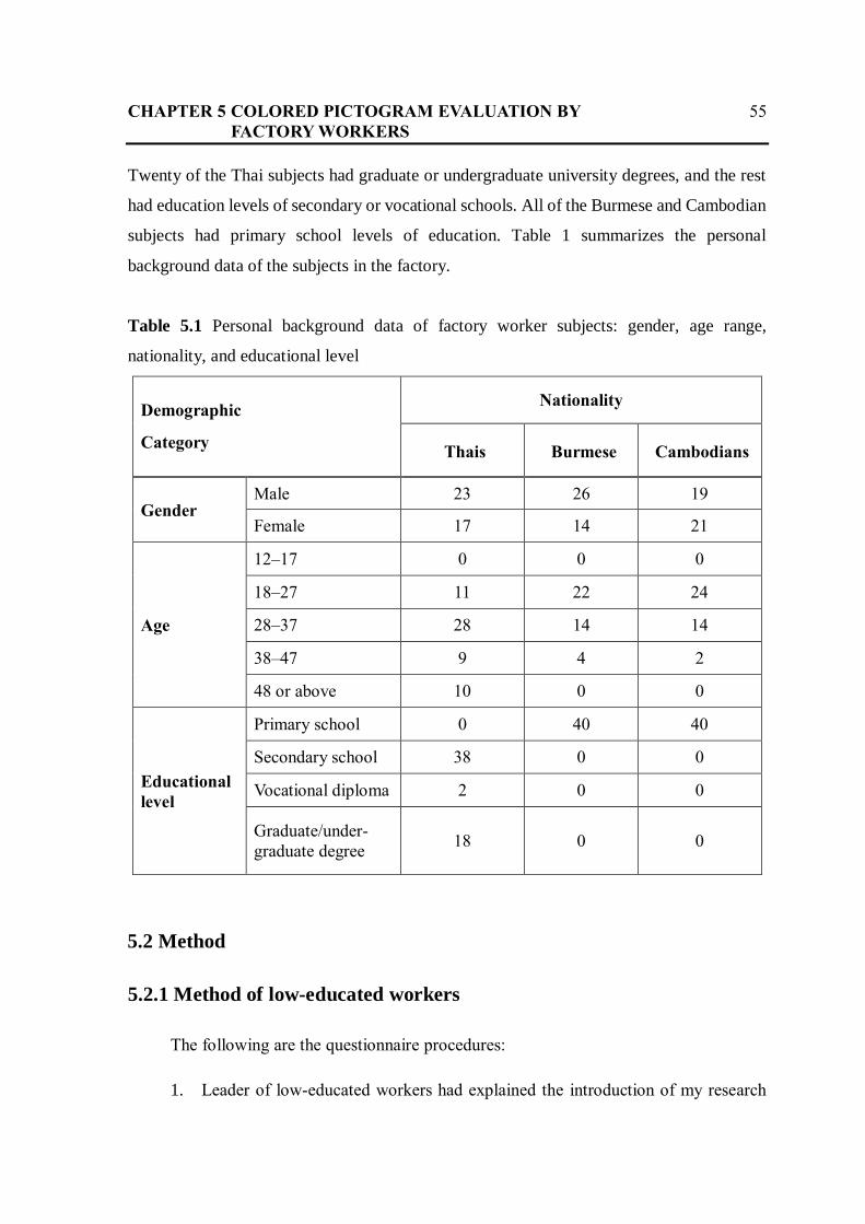
Twenty of the Thai subjects had graduate or undergraduate university degrees, and the rest
had education levels of secondary or vocational schools. All of the Burmese and Cambodian
subjects had primary school levels of education. Table 1 summarizes the personal
background data of the subjects in the factory.
Table 5.1 Personal background data of factory worker subjects: gender, age range,
nationality, and educational level
Demographic
Category
Nationality
Thais Burmese Cambodians
Gender Male 23 26 19
Female 17 14 21
Age
12–17 0 0 0
18–27 11 22 24
28–37 28 14 14
38–47 9 4 2
48 or above 10 0 0
Educational
level
Primary school 0 40 40
Secondary school 38 0 0
Vocational diploma 2 0 0
Graduate/under-
graduate degree 18 0 0
5.2 Method
5.2.1 Method of low-educated workers
The following are the questionnaire procedures:
1. Leader of low-educated workers had explained the introduction of my research

CHAPTER 5 COLORED PICTOGRAM EVALUATION BY 56
FACTORY WORKERS
and each part of questionnaire.
2. All subjects were asked to answer questions for each subject’s personal
information in the first section of the questionnaire.
2.1. sex,
2.2. age,
2.3. Nationality
2.4. Primary language
2.5. Education
2.6. Position
2.7. Province
3. After that, they answer the questionnaires to indicate how important each
pictogram was by marking its percentage on the scale ranging from 0 to 100 in
the questionnaire as follows:
3.1. ‘push’ a button with each colors : white, black, red, yellow, green, blue
and pink
3.2. ‘step’ on a pedal with each colors : white, black, red, yellow, green, blue
and pink
3.3. ‘wheel’ a handle with each colors : white, black, red, yellow, green, blue
and pink
4. The last question is in case they didn’t understand the procedure well, they can
tell reasons (free description)
5.2.2 Method of high-educated Thai workers
The following are the questionnaire procedures by online:
1. A responsible woman had explained my research to each subjects privately, then
sent the online questionnaire to them.
2. For the first page, all subjects found objective of the online questionnaires.

CHAPTER 5 COLORED PICTOGRAM EVALUATION BY 57
FACTORY WORKERS
3. For the second page, they had filled out and selected personal information as
follows:
3.1. sex,
3.2. age,
3.3. type of industry or business
3.4. job category : major
3.5. education
3.6. nationality
3.7. native language
3.8. current country of residence
4. For the third page, they answer the question of each pictogram whose difference
seven colors as “how much do you think it is important to push?”
5. For the third page, they answer the question of each pictogram whose difference
seven colors as “how much do you think it is important to step?”
6. For the third page, they answer the question of each pictogram whose difference
seven colors as “how much do you think it is important to wheel?”
7. The last page is in case they didn’t understand the procedure well, they can tell
reasons (free description)
5.3 Results
The author collected 138 responses from respondents who were working at factory in
Thailand. Figures 3 (a) through (c) present the average importance values obtained from
them. We divided the results into three graphs of respondents based on education: (a)
undergraduate or graduate degree, (b) secondary school education or a vocational diploma,
and (c) education through the primary school level. Each graph shows the average values for
the seven colour categories. For the subjects with undergraduate or graduate education, we
found that red marked the highest value (over 50%) for all types of pictograms. White
marked the lowest average value, which was less than 30% for the high-educated group. On

CHAPTER 5 COLORED PICTOGRAM EVALUATION BY 58
FACTORY WORKERS
the other hand, the results for the coloured pictograms from low-educated workers, including
Thais, Burmese, and Cambodians, showed very different tendencies from the results for the
high-educated subjects. The lowest average value for the low-educated subjects was 0% for
the red pictograms, which was obviously the lowest average value among the seven colours.
However, the green pictograms had the highest average value (exceeding 99%) for the low-
educated subjects. The results obtained from the two groups with different cultural
backgrounds and similar educational backgrounds showed similar characteristics. The
results of the average values for the low-educated respondents from Cambodians and
Burmese closely resembled those from Thai workers without undergraduate or graduate
degrees. On the other hand, the results from the high-educated Thai respondents were very
different from those obtained from the low-educated Thai workers, although both groups
share the same cultural background.

CHAPTER 5 COLORED PICTOGRAM EVALUATION BY 59
FACTORY WORKERS
(a) Thai subjects with undergraduate or graduate degrees
(b) Thai subjects with secondary school or vocational diploma

CHAPTER 5 COLORED PICTOGRAM EVALUATION BY 60
FACTORY WORKERS
(c) Burmese and Cambodian subjects with
primary school educational level
Figure 5.1 Average importance values obtained of workers for each pictogram colour from
three groups with different educational backgrounds

CHAPTER 5 COLORED PICTOGRAM EVALUATION BY 61
FACTORY WORKERS
5.4 Statistical analysis
The author performed the following statistical analyses on the data obtained from our
survey of factory workers. To examine whether the degree of importance given to each
pictogram differed based on the three actions represented by the pictograms (push, step, and
turn), we computed a one-way analysis of variance (ANOVA) among the actions. Then, the
author analysed the differences in the degree of importance among the seven colours by one-
way ANOVA and finally tested each colour between the subject groups by t-tests to
determine the culture and education differences.
5.4.1 One-way ANOVA results among the actions
The ANOVA results among the actions of the pictograms for each pictogram colour
showed no significant differences except for the green pictograms with the groups of low-
educated Thais (Tables 5.2(a) through (d)). We present the ANOVA results of the respondents
from four groups: (a) Burmese (b) Cambodians, (c) low-educated Thais, (d) and high-
educated Thai workers. These results suggest that the degree of importance given by the
subjects to each pictogram had been clearly instructed by the company in Thailand. Since
the only variation in each pictogram was the colour difference, the degree of importance
used in rating the pictograms can be regarded as the degree of importance given to each
colour.

CHAPTER 5 COLORED PICTOGRAM EVALUATION BY 62
FACTORY WORKERS
Table 5.2 One-way ANOVA results among three pictograms for each colour
(a) Burmese respondents
White Black Red Yellow Green Blue Pink
Meaning
of push
pictogram
50.50 48.75 0.00 19.75 100.00 69.50 0.25
Meaning
of step
pictogram
48.00 48.50 0.00 20.50 100.00 70.25 0.00
Meaning
of turn
pictogram
50.50 49.25 0.00 19.00 99.00 69.00 0.00
F* 0.773 0.062 *** 0.137 1.000 0.107 1.000
P** 0.464 0.94 *** 0.872 0.371 0.898 0.371
MS
(among
groups)
83.333 5.833 0 22.500 13.333 15.833 0.833
MS
(within
groups)
107.863 94.231 0 164.509 13.333 147.415 0.833
* df (between groups) = 2 * df (within groups) = 117 ** α = 0.05
*** No output of IBM SPSS Statistics 24 program because all data have identical values,
i.e. 0

CHAPTER 5 COLORED PICTOGRAM EVALUATION BY 63
FACTORY WORKERS
(b) Cambodian respondents
White Black Red Yellow Green Blue Pink
Meaning
of push
pictogram
69.25 42.00 0.00 5.75 98.75 65.75 0.00
Meaning
of step
pictogram
66.50 32.75 0.00 3.25 100.00 63.25 0.00
Meaning
of turn
pictogram
72.50 37.00 0.00 4.00 100.00 62.00 0.00
F* 0.459 1.066 *** 0.592 1.000 0.538 ***
P** 0.633 0.348 *** 0.555 0.371 0.585 ***
MS
(among
groups)
360.833 857.500 0 65.833 20.833 145.833 0
MS
(within
groups)
785.791 804.081 0 111.239 20.833 270.897 0
* df (between groups) = 2 * df (within groups) = 117 ** α = 0.05
*** No output of IBM SPSS Statistics 24 program because all data have identical values,
i.e. 0

CHAPTER 5 COLORED PICTOGRAM EVALUATION BY 64
FACTORY WORKERS
(c) Thai respondents, from low-educated workers
White Black Red Yellow Green Blue Pink
Meaning
of push
pictogram
44.88 47.00 0.25 20.50 100.00 62.00 8.00
Meaning
of step
pictogram
47.25 47.75 1.00 22.25 99.25 57.25 11.75
Meaning
of turn
pictogram
44.25 47.00 3.00 23.00 92.25 62.00 7.25
F* 0.7 0.049 1.087 0.177 5.787 0.608 1.123
P** 0.499 0.952 0.340 0.838 0.004 0.546 0.329
MS
(among
groups)
100.208 7.500 80.833 65.833 730.833 300.833 232.500
MS
(within
groups)
143.157 153.654 74.338 372.03 126.282 494.679 206.966
* df (between groups) = 2 * df (within groups) = 117 ** α = 0.05

CHAPTER 5 COLORED PICTOGRAM EVALUATION BY 65
FACTORY WORKERS
(d) Thai respondents, from high-educated workers
White Black Red Yellow Green Blue Pink
Meaning of
push
pictogram
20.78 42.89 49.67 42.11 44.50 43.39 40.67
Meaning of
step
pictogram
15.67 46.83 55.56 35.44 42.44 43.61 38.44
Meaning of
turn
pictogram
29.44 49.39 53.67 40.89 41.44 45.06 37.39
F* 1.201 0.13 0.085 0.292 0.041 0.017 0.06
P** 0.309 0.878 0.918 0.748 0.96 0.983 0.942
MS
(among
groups)
873.185 193.019 162.741 226.741 43.685 14.741 50.389
MS
(within
groups)
727.129 1483.344 1904.479 776.000 1062.772 864.265 837.426
* df (between groups) = 2 * df (within groups) = 51 ** α = 0.05

CHAPTER 5 COLORED PICTOGRAM EVALUATION BY 66
FACTORY WORKERS
5.4.2 One-way ANOVA results among seven colours
Table 5.3 One-way ANOVA results among seven colours for each pictogram
Low-educated
Burmese
Low-educated
Cambodians
Low-educated
Thais
High-educated
Thais
Meaning of
white pictogram 49.67 69.42 45.46 21.96
Meaning of
black pictogram 48.83 37.25 47.25 46.37
Meaning of red
pictogram 0.00 0.00 1.42 52.96
Meaning of
yellow
pictogram
19.75 4.33 21.92 39.48
Meaning of
green pictogram 99.67 99.58 97.17 42.80
Meaning of blue
pictogram 69.58 63.67 60.42 44.02
Meaning of pink
pictogram 0.08 0.00 9.00 38.83
F* 1072.702 396.728 278.865 1.735
P** < 0.001a < 0.001 a < 0.001 a 0.119
MS
(among groups) 54679.63 63003.84 43619.47 9965.764
a P-Value of IBM SPSS Statistics 24 program is 0.000.

CHAPTER 5 COLORED PICTOGRAM EVALUATION BY 67
FACTORY WORKERS
5.4.3 T-test results between two pairs for each colour
Table 5.4 T-test results between two pairs of worker groups for each colour
a P-Value of IBM SPSS Statistics 24 program is 0.000.
* Program cannot be computed because the standard deviation of both groups is 0.
White Black Red Yellow Green Blue Pink
a) Low-educated Thais vs. High-educated Thais
T 5.611 0.149 -7.971 -2.932 10.678 2.526 -5.709
Df 56 56 56 56 56 56 56
P < 0.001a 0.882 < 0.001a < 0.001a < 0.001a < 0.001a < 0.001a
b) Low-educated Thais vs. Low-educated non-Thais
T 4.446 -1.503 -2.143 -3.549 2.834 2.169 -6.602
Df 118 118 118 118 118 118 118
P < 0.001a 0.136 0.034 < 0.001a 0.005 0.032 < 0.001a
c) Low-educated Burmese vs. Low-educated Cambodians
T -5.401 3.312 * 7.248 0.156 2.358 1
Df 78 78 *
78 78 78 78
P < 0.001a < 0.001a *
0.004 0.749 0.718 0.043

CHAPTER 5 COLORED PICTOGRAM EVALUATION BY 68
FACTORY WORKERS
The key significance of our study is found in our result showing no statistical difference
among the three action pictograms of each colour for each nationality. For groups of low-
educated workers with different education levels (secondary school and vocational diploma)
on the same factory floor, we found no significance, mostly because colours are so critical,
explaining why we see such complicated ANOVA results. Thus, colour is the most important
factor. For the following groups of workers, low-educated Burmese, low-educated
Cambodians, and low-educated Thais, analysis among the coloured pictograms showed a
very significant difference of p < 0.001 (Table 5.3). The green pictogram obtained the
highest degree of importance from low-educated Burmese (mean importance value =
99.67 %), and the second-highest degree of importance was from low-educated Cambodians
(mean importance value = 99.58 %). On the other hand, the results for the coloured
pictograms from high-educated Thais showed no significant difference, where p = 0.119.
The red pictogram obtained the highest degree of importance, and the black pictogram had
the second-highest degree. In contrast, the white colour showed the lowest degree of
importance.
In addition, the author addressed whether a significant difference existed among subject
groups with varying cultural and educational backgrounds in terms of their degrees of
importance (Table 5.4). T-tests (α=0.05) were performed for each colour among three pairs
of subject groups: low-educated and high-educated Thais, low-educated Thais and low-
educated non-Thais, and low-educated Burmese and low-educated Cambodians. The t-test
results showed a very significant difference at the p<0.001 for each colour in all of the pairs.
The author found that among the groups of low-educated and high-educated Thai workers,
subjects who shared a culture but had different levels of education, the responses showed a
significant difference of colour pairs, such as white, red, green, yellow, and pink. On the
other hand, no significant difference was observed for the black pictograms in any pair.
Nevertheless, the results for all identically coloured pictograms for each pair with
different cultural backgrounds but similar educational backgrounds showed very significant
differences in both low-educated groups: low-educated Thais and low-educated non-Thais.
This tendency was especially significant with white, yellow, and pink pictograms.
Furthermore, the results obtained from two groups with different cultural and slightly
different educational backgrounds also showed that many pairs had highly significant

CHAPTER 5 COLORED PICTOGRAM EVALUATION BY 69
FACTORY WORKERS
differences. Thus, the results of this study show that different interpretations of the meaning
of coloured pictograms were more affected by educational background than cultural
differences. The low-educated group did mark almost 100% for the green pictograms and
0% for the red, perhaps because these two groups (Burmese and Cambodians) interpreted
the meaning of importance differently based on their surroundings, since their factory has
many pictograms, including emergency exits, fire equipment signs, fire hose reels, warnings,
and prohibitions. Thus, they are generally familiar with green and red pictograms.
However, the average results of the degree of importance for the coloured pictograms in
Table 5.3 show different P-Values among the seven colours for each pictogram. The low-
educated workers had P-Value < 0.001, while the high-educated Thais did not show a
significant difference. For the results in Table 5.4, we presented statistical results provided
by three different sets of paired subjects: low-educated and high-educated Thais, low-
educated Thais and low-educated non-Thais, and low-educated Burmese and low-educated
Cambodians. Note that the first paired subjects, i.e., low-educated and high-educated Thai
workers, had greatly different education levels but the same culture. The second paired
subjects, i.e., low-educated Thai and low-educated non-Thai workers, had only slightly
different education levels but different cultures. The third paired subjects, i.e., low-educated
Burmese and low-educated Cambodians, had different cultures but the same educational
level. We found that the first paired subjects presented five pairs showing strongly
significant differences (i.e., P-value less than 0.001) based on particular colours; for the
second paired subjects, we found three such pairs. Based on the findings from the first and
second paired subjects, education level positively affected the workers’ comprehension and
perception. For example, workers with a higher degree of education more accurately
interpreted the coloured pictograms than did the low-educated workers. Moreover, the third
paired subjects presented two pairs who showed weakly significant differences. The results
indicate that education level is a likely factor in one’s comprehension of coloured pictograms.
This was particularly pronounced in the cases of red pictograms, which had the same value
of 0 from every subject, and green pictograms, which were non-significant and thus
indicating no significant difference in performance between Burmese and Cambodians (p >
0.05). The difference in education level evidently affected worker interpretation of
pictograms more than did cultural differences.

CHAPTER 5 COLORED PICTOGRAM EVALUATION BY 70
FACTORY WORKERS
According to previous studies, cultural differences affect the interpretation of colours
and signs. Cho examined cross-cultural differences in pictogram interpretations by
Americans and Japanese and suggested that such cultural differences can be used as a basis
for agent construction. Piamontea et al. evaluated cultural differences in the interpretation
of graphical symbols, showing results for American and Swedish subjects. These subjects
showed differences in pattern ratings, and the authors concluded that the differences might
be culturally linked. However, the results in our study show that differences in the
interpretation of the meanings of coloured pictograms were more affected by educational
backgrounds than by cultural differences. The statistical T-test results of importance values
for the coloured pictograms in Table 5.4 show an unequal number of pairs with significant
differences between the highest- and lowest-educated groups.

Chapter 6
Analysis and Discussion
6.1 Overall analysis and discussion
The purpose of this study was to investigate the importance levels of pictograms
(push, step, and turn) among seven colours (white, black, red, yellow, green, blue, and pink)
and to examine the effects of cultural and educational background factors on the
comprehension of coloured pictograms for emergency situations in manufacturing
environments. The results of this study show that differences in the interpretation of the
meanings of coloured pictograms were more affected by educational background than by
cultural differences. In particular, highly educated workers interpreted the meanings of
pictograms better than low-educated workers. The main purposes of warnings and safety

CHAPTER 6 ANALYSIS AND DISCUSSION 72
signs are to make better decisions regarding safety issues, to make workers at factories aware
of hazards, and to prevent injuries [57]. Raskin noted that a lack of understanding or a
misinterpretation can lead to injury [58]. This study found that the degree of importance
given to coloured pictograms did not convey the intended information to low-educated
workers successfully, probably due to the lack of adequate training in symbolic
representation. The results of this study and a note by Wogalter and Laughery [57], as well
as a study by Raskin [58], suggest that an effective training program to promote the intended
messages of such signs be conducted. Factory facilitators who are responsible for
environmental health and safety training should provide appropriate educational programs
for workers to acquire a knowledge of industrial signs and the intended meanings of their
colors as a way to help prevent workplace accidents. Supervisor commitment to safety and
performing the safety.
6. 2 Education levels on the interpretation
Education levels had an impact on the interpretation of the pictograms in my study.
Several previous studies also reported that education levels can affect the comprehension of
pictograms. Participants with a low level of education performed relatively poorly on tasks
assessing their comprehension of the meanings of icons and pictograms, compared to those
with higher levels of education [59] [60]. Knapp et al. [61] provided survey results showing
that educational levels had a positive effect on the total scores of interpreting pharmaceutical
pictograms. Rajesh et al. [62] also showed that more literate participants could more
correctly interpret pictograms related to the antiretroviral therapy of Indian patients. In this
study, the author found a significant difference between the highest and lowest educated
groups. The highest educated workers comprehended the meaning of the pictograms much
better. An analysis of the results also indicates that the subjects in the two groups interpreted
the meanings of the coloured pictograms differently based on their previous experiences,
which typically involved differing job ranks. However, the highest educated workers did not
comprehend the information provided by the pictograms 100% correctly. These results
strongly suggest that activities and/or training related to safety signs should be regularly
provided to workers of all educational levels and at all job rankings because they must

CHAPTER 6 ANALYSIS AND DISCUSSION 73
always be conscious of safety sign messages and be able to react to emergency situations,
thus preventing accidents.
6. 3 A multi-layer chain subcontracting system
In manufacturing settings in Thailand, there is a multi-layer chain subcontracting
system. Therefore, workers who have different cultural and educational backgrounds may
work in the same company for a short time. The results of our study for low-educated
temporary workers from different cultures showed that they inaccurately interpreted the
coloured pictograms. This finding agreed with the results of Ma et al. [63], who noted that
the high mobility of workers usually produces the dangerous concept that they have no
responsibility for safety. Therefore, they might have a lower perception of risk than other
workers, implying that they should become familiar with the use of safety signs and be able
to easily interpret their correct meanings. The results here suggest the need to enhance
subcontract workers’ awareness for risk perception and to build a culture of workplace and
organizational safety through training. Lingard et al. suggested that safety culture was an
important factor in reducing industrial injury rates [64]. It would be beneficial if
environmental health and safety training facilitators could provide training and educational
activities continuously for new workers, particularly for workers with lower educational
levels. Even though subcontract workers are employed for a short time, such educational
programs would train them to act appropriately based on the intended meanings of workplace
pictograms.
6. 4 Colours provide an important means of recognition in many fields
Colour provides an important means of recognition in many fields. However, the author must
face the basic problem that different cultures use different colours for different purposes.
Even though there are many organizations for standardization, the colours of signs are not
the same in real situations. Chan et al. implied that the comprehensibility of messages could
be increased if signs were designed independent of culture [65]. The results of our research
showed that the interpretation of colored pictograms was less affected by cultural differences

CHAPTER 6 ANALYSIS AND DISCUSSION 74
than by educational differences. Therefore, using colors in pictograms was more effective
than using pictograms without colors, since a degree of culture independence could be
achieved at higher levels of formal and informal education. As seen in Table 3, over 50% of
the highest-educated group of Thai workers could correctly understand the meaning of the
red pictograms. On the other hand, none of the low-educated subjects could give the correct
meaning of red pictograms. For the highest educated group of Thai workers, red could be
interpreted as having various meanings ranging from prohibition to encouragement. In
contrast, the low-educated groups, including Thais, Burmese, and Cambodians, interpreted
the red pictograms as actions that must be avoided. They might have interpreted red and pink
pictograms simply as denoting prohibition. Therefore, it is important to understand that more
literate participants interpreted red pictograms more correctly and that low-educated groups
must become specifically aware of the use of colours in safety signs to prevent immediate
threats to property and safety.
6.5 Job ranks of workers and career directions
Regarding the job ranks of workers, in many factories in Thailand, workers usually learn the
meaning of coloured pictograms through their daily life experiences and career directions.
The results of our research in Table 5.3 show that the red pictograms held the highest
importance in the interpretation by high-educated workers, while the green pictograms were
interpreted by the low-educated workers as having the highest importance. It is likely that
such comprehension performance is related to their daily life experiences and career
directions. Yoon et al. noted that for safety issues, differences in awareness levels existed
between site general managers and occupational health and safety (OHS) managers [66].
That result was consistent with those of previous studies implying that workers in different
positions interpreted the meaning of pictograms differently. Of course, the best performance
was achieved by high-educated subjects whose life experiences were intricately linked with
their experiences on the factory floor. However, all workers must comprehend particularly
important signs, such as those instructing staff in the proper way to take action. Based on the
findings of this study, when workers with lower education can grasp the meaning of a

CHAPTER 6 ANALYSIS AND DISCUSSION 75
coloured pictogram, it is very likely that workers with a higher educational level can also
understand it. Activities and training aimed at such common understanding would not be so
expensive but could help avoid burdensome countermeasures required after mistaken actions.
6.6 Training
To interpret the use of pictograms correctly, industrial facilities should offer practical
training for employees. For example, participants must be able to identify an abnormal
simulation. Furthermore, they should know the appropriate solutions and be prepared to take
swift, immediately action by pushing an emergency button, which is often coloured in red.
In this sense, appropriate training on the principles of colour use in safety signs and
pictograms should be given to production workers, who may hold incorrect perceptions of
coloured pictograms. Knapp et al. also found that higher levels of activities and/or training
were positively correlated with correct comprehension [61]. It was also suggested that the
safety management office should use familiar symbols as much as possible [67]. Moreover,
safety management personnel should take responsibility for providing appropriate training
in signage to workers. Such training would help to ensure that workers were able to
comprehend sign meanings and would reinforce safety culture. For example, production
workers at lower-ranked positions often do not receive sufficient training on responding to
emergency situations that require stopping machines, since the decision to stop a machine is
usually made only by high-educated Thai workers in higher-ranking positions. Accordingly,
the lower-ranking Thais, Burmese and Cambodians, who do not receive sufficient training
on the use of red signs in handling emergencies, probably interpret the meaning of red in
pictograms simply as a prohibition.

Chapter 7
Conclusion and Future Work
7.1 Conclusion
The author examined whether the effects of educational background had more
significance for the interpretation of coloured pictograms than cultural background in a
factory setting. Using questionnaires, the author collected responses from 138 subjects:
Thais, Burmese, and Cambodians. In terms of behavioural perception required for swift
action in manufacturing settings, particularly in emergency situations, my results showed a

CHAPTER 7 CONCLUSION AND FUTURE WORK 77
significant difference among groups with different educational backgrounds. The author also
analysed the data using one-way ANOVAs among seven colours for each pictogram and T-
tests among pairs of worker groups for each colour. The author identified a statistically
significant difference between educational and cultural backgrounds. Thus, my results show
that differences in the interpretation of the meaning of coloured pictograms were more
affected by educational backgrounds than by cultural differences. The interpretations of the
lowest-educated groups were different from those of the high- educated ones. My results
suggest that factory managers need to provide comprehensive on-the-job training on signs
posted in factories, in particular to low-educated employees.
7.2 Future work
In my next study, the author plan to conduct an experiment to examine the perceptions of
coloured pictograms by workers at a factory from physiological and neurological points of
view. The author will conduct perception-reaction experiments with factory workers as
subjects for coloured pictograms to identify how their comprehension of the pictograms can
be affected by colours. Furthermore, the author will use an optical imaging technique to
measure brain functioning when subjects react to different coloured pictograms. In the
experiments, the author plan to present coloured pictograms to workers having different
cultural and educational backgrounds in a factory. In addition, questionnaires for managers
of the factory will be created to identify what factors cause exceptional differences among
factory workers. The author also plans to interview managers for this purpose and offer
possible guidance on developing training content for safety awareness.

References
[1] Eurostat: Accidents at work statistics. [online]. Available:
http://ec.europa.eu/eurostat/statistics-explained/index.php/Accidents_
at_work_statistics (Accessed 1 May 2016)
[2] Yamazaki, A.K. and Taki, H. (2010) ‘An evaluation of pictograms for communication
among Japanese-and Thai-speaking engineers working in manufacturing settings’ IPCC
2010: In Professional Communication Conference, IEEE International, pp. 357–364.
[3] Ota Y. (1995). ピクトグラムのおはなし[A story of a pictogram, Japan Standards
Association] (in Japanese), Japanese Standard Association
[4] Diaz,S., Martinez, G., Ota, Y., Marcus, A.(2015) Iconicity: Pictograms, Ideograms,
Signs for Utility, Usefulness and Pleasure, Promopress; Multilingual edition
[5] Ota Y. (2005). 国際安全標識のピクトグラムデザインの研究 [Research on pictogram
designs of international safety signs] (in Japanese). Progress Report of University Joint
Research. Japan: Tama Art University.
[6] Maharaji, S.C. (1980). Pictogram Ideogram Communication. The George Reed
Foundation for the Handicapped.
[7] Shimizu, H. (2003). 視覚シンボルの心理学[Psychology of Visual Symbols] (in
Japanese). Brain Publishing, Tokyo
[8] International Organization for Standardization: International standards for safety signs,
ISO 7010. [online]. available:http://www.shponline.co.uk/international-standards-
safety-signs-iso-7010/ [Accessed 1 October 2015]

REFERENCES 79
[9] International standards: Graphical symbols — Safety colours and safety signs —
Registered safety signs. [online]. available :
https://www.sis.se/api/document/preview/913377/. [Accessed 1 October 2015].
[10] The Foundation for Promoting Personal Mobility and Ecological Transportation: Public
Information Symbols. [online]. available : http://www.ecomo.or.jp/barrierfree/
pictogram/picto_top.html. [Accessed 1 May 2016].
[11] Eu signs: emergency call point sign. [Online]. Available: https://borehamwood-
signs.co.uk/collections. [Accessed 20 March 2017].
[12] Sign: Fire Safety. [Online]. Available: https://signmaker.blog/2018/08/09/fire-safety-
signs-does-it-apply-to-me-and-my-business/. [Accessed 20 March 2017].
[13] Shutterstock: Fire exit. [Online]. Available: https://www.shutterstock.com/image-
vector/green-safety-sign-vector-emergency-exit-150066827?irgwc=1&utm_medium
=Affiliate&utm_campaign=Eezy%20Inc&utm_source=38919&utm_term=
www.vecteezy.com. [Accessed 20 March 2017].
[14] Requirements Concerning the Provision of Safety Signs in the Workplace: Fire
Extinguisher. [Online]. Available: https://www.riigiteataja.ee/en/eli/518112015005/
consolide. [Accessed 20 March 2017].
[15] Requirements Concerning the Provision of Safety Signs in the Workplace: Emergency
Telephone. [Online]. Available: https://www.riigiteataja.ee/en/eli/518112015005/
consolide. [Accessed 20 March 2017].
[16] Pixabay: Emergency Exit. [Online]. Available: https://pixabay.com/en/output-exit-
emergency-exit-note-476122/. [Accessed 20 March 2017].
[17] Directional sign: Fire Escape Exit Sign. [Online]. Available: https://www.indiamart.
com/proddetail/fire-escape-exit-sign-9845496333.html. [Accessed 20 March 2017].
[18] Linecad: emergency stop push button. [Online]. Available: https://www.linecad.com/
emergency-stop-push-button/. [Accessed 20 March 2017].
[19] Zerosigns: Emergency Stop. [Online]. Available: http://www.zerosigns.co.uk/shop/
safety-signs/health-and-safety/emergency-stop-green// [Accessed 20 March 2017].
[20] Stickerart: Emergency Stop Button. [Online]. Available: https://stickerart.com.au/
showproduct-emergency-stop-button-symbol.html. [Accessed 20 March 2017].
[21] Rotary Switches: Emergency Stop Sticker. [Online]. Available: https://www.yeint.fi/
en/electronics/switches-1/rotary-switches/emergency-stop-sticker-oe60mm. [Accessed
20 March 2017].
[22] Mansoor, L. E., & Dowse, R. (2003). Effect of pictograms on readability of patient
information materials. Annals of Pharmacotherapy, 37(7-8), pp.1003-1009.
REFERENCES 80
[23] De Knegt, N. C., Schuengel, C., Lobbezoo, F., Visscher, C. M., Evenhuis, H. M., Boel,
J. A., & Scherder, E. J. (2016). Comprehension of pictograms for pain quality and pain
affect in adults with Down syndrome. Journal of Intellectual & Developmental Disability,
41(3), pp. 222-232.
[24] Kheir, N., Awaisu, A., Radoui, A., El Badawi, A., Jean, L., & Dowse, R. (2014).
Development and evaluation of pictograms on medication labels for patients with limited
literacy skills in a culturally diverse multiethnic population. Research in Social and
Administrative Pharmacy, 10(5), pp. 720-730.
[25] Mori Y., Takasaki, T., Ishida, T. (2006). Patterns in pictogram communication,
Proceedings of International Workshop on Intercultural Collaboration, California,
February 20-21, 2009pp. 227-280.
[26] Ng, A. W., Chan, A. H., & Ho, V. W. (2017). Comprehension by older people of
medication information with or without supplementary pharmaceutical pictograms.
Applied Ergonomics, 58, pp. 167-175.
[27] van Beusekom, M., Bos, M., Wolterbeek, R., Guchelaar, H. J., & van den Broek, J.
(2015). Patients’ preferences for visuals: Differences in the preferred level of detail, type
of background and type of frame of icons depicting organs between literate and low-
literate people. Patient Education and Counseling, 98(2), pp. 226-233.
[28] Chendrashekaran, P. (2017). A cross-sectional survey on the awareness of pesticide labels
and pesticide safety pictograms among paddy farming in south India. Journal of health
sciences and surveillance system, 4(4), pp. 158-166.
[29] Boelhouwer, E., Davis, J., Franco-Watkins, A., Dorris, N., & Lungu, C. (2013).
Comprehension of hazard communication: Effects of pictograms on safety data sheets
and labels. Journal of safety research, 46, pp. 145-155.
[30] Rother, H. A. (2008). South African farm workers’ interpretation of risk assessment data
expressed as pictograms on pesticide labels. Environmental Research, 108(3), pp. 419-
427.
[31] Yamazaki, A.K., Yabutani, J., Ebisawa, Y. and Hori, S. (2007) ‘A study of meaning
comprehensibility of pictograms for lathe procedural instructions’ In International
Conference on Knowledge-Based and Intelligent Information and Engineering Systems.
Springer, Berlin, Heidelberg, pp. 1058–1064.
[32] Hiranchiracheep, S., Yamazaki, A. K., & Foypikul, W. (2016). A preliminary surveying
of the meaning of colored pictogram instructions for emergency settings in
manufacturing. Procedia computer science, 96, pp. 1528-1534.
[33] Lueder, R., & Rice, V. J. B. (Eds.). (2007). Ergonomics for children: Designing products
and places for toddler to teens. CRC Press. New York.
[34] Piamonte, D. P. T., Abeysekera, J. D., & Ohlsson, K. (2001). Understanding small
graphical symbols: a cross-cultural study. International Journal of Industrial Ergonomics,
27(6), pp. 399-404.
REFERENCES 81
[35] Pratt, I. S. (2002). Global harmonisation of classification and labelling of hazardous
chemicals. Toxicology Letters, 128(1-3), pp.5-15.
[36] Waichman, A. V., Eve, E., & da Silva Nina, N. C. (2007). Do farmers understand the
information displayed on pesticide product labels? A key question to reduce pesticides
exposure and risk of poisoning in the Brazilian Amazon. Crop Protection, 26(4), pp. 576-
583.
[37] Waterson, P., Pilcher, C., Evans, S., & Moore, J. (2012). Developing safety signs for
children on board trains. Applied Ergonomics, 43(1), pp. 254-265.
[38] Yang, R., Miki, M., & Akihiro, H. (2002). A Study of Universal Design for Public Signs · A
Comparative Study of the Comprehension of Public Signs among Japanese and Chinese
Students. Bulletin of Japanese Society for Science of Design: Proceedings of the Annual
Conference of JSSD: Vol.49, pp. 260-261.
[39] Korenevsky, A., Vaillancourt, R., Pouliot, A., Revol, M., Steed, E., Besançon, L., ... &
Patel, J. R. (2013). How many words does a picture really tell? cross-sectional descriptive
study of pictogram evaluation by youth. The Canadian journal of hospital pharmacy,
66(4), pp. 219.
[40] Cho, H. (2009) ‘Analysis of Cultural Differences in Pictogram Interpretations’ Doctoral
thesis. Kyoto (Japan): Graduate School of Informatics, Kyoto University; 2009.
[41] Dowse, R., & Ehlers, M. (2005). Medicine labels incorporating pictograms: do they
influence understanding and adherence?. Patient education and counseling, 58(1), pp. 63-
70.
[42] Knapp, P., Raynor, D.K., Jebar, A.H. and Price, S.J. (2005) ‘Interpretation of medication
pictograms by adults in the UK’ Annals of Pharmacotherapy, Vol. 39, No. 7–8, pp. 1227–
1233.
[43] Shimizu, H., Seinoi T., Mita, T., Orii, T., Nakamura, K., Nakamura Y., Uchino, K.,
Omura, S., Sawada, Y., Iga Ai (1995). 患者への医薬品情報提供の適正化(1)-薬袋
に記載する服薬情報を絵文字化することの有用性 [Appropriateness of medicinal
information provision to patients (1) - Utility of pictographs of medication information
described on medicine bags] (in Japanese). Journal of the Nippon Hospital Pharmacists
Association, Vol. 21, No.2
[44] RAD-AR-Pictograms. [Online]. Available: https://www.core77.com/posts/4117/
Exciting-RAD-AR-pictograms. [Accessed 20 April 2017].
[45] Zargarzadeh, A. H., & Ahamdi, S. (2017). Comprehensibility of selected USP pictograms
by illiterate and literate Farsi speakers: The first experience in Iran-Part I. Journal of
Research in Medical Sciences: The Official Journal of Isfahan University of Medical
Sciences, 22, pp. 84-84.
[46] Lin, F. S., Chang, M. C., & Liu, X. F. (2015). Warning pictograms: can preschool children
recognize them?. Bulletin of Japanese Society for the Science of Design, 61(5), pp.5_87-

REFERENCES 82
5_96.
[47] Yamazaki, A.K. and Taki, H. (2009) ‘A comprehensibility study of pictogram elements
for manufacturing steps’ International Journal of Knowledge Engineering and Soft Data
Paradigms, Vol. 2, No. 1, pp. 70–81.
[48] The International Federation of Red Cross and Red Crescent Societies (IFRC). [Online].
Available: https://media.ifrc.org/ifrc/. [Accessed 20 April 2017].
[49] United States Pharmacopeial Convention (USP). [Online]. Available:
http://www.usp.org/. [Accessed 20 April 2017].
[50] The American National Standards Institute (ANSI). [Online]. Available:
https://www.ansi.org/. [Accessed 20 April 2017].
[51] The International Organization for Standardization (ISO). [Online]. Available:
https://www.iso.org/home.html. [Accessed 20 April 2017].
[52] Emergency Scene Ahead Roll-Up Signs. [Online]. Available: https://www.ricesigns.
com/roll-up-signs/emergency-management-roll-up-signs/ru40.htm. [Accessed 30 April
2017].
[53] Traffic sign. [Online]. Available: https://trafficsignstore.com/emergency.html. [Accessed
30 April 2017].
[54] Traffic Safety Education and Awareness Activities in Japan. [Online]. Available: https://
http://www.iatss.or.jp/common/pdf/en/iatss/composition/FY2014_Report_JP_En.pdf
[Accessed 30 April 2017].
[55] Proposal of “Safety Promotion School”. [Online]. Available: https:// http://evisapo.com/
en/sps/ [Accessed 30 April 2017].
[56] Srichai, P., Yodmongkol, P., Sureephong, P., & Meksamoot, K. (2013) ‘Managing school
safety in Thailand: Assessing the implications and potential of a lean thinking
framework’ Sage open, Vol.3, No.2, 2158244013489985.
[57] Wogalter, M.S. and Laughery, K.R. (2005) Handbook of Human Factors and
Ergonomics, 3rd ed., Lawrence Erlbaum Associates, Mahwah, NJ.
[58] Raskin, J. (2000) The humane interface: new directions for designing interactive systems.
Addison-Wesley Professional, New York, NY.
[59] Dowse, R. and Ehlers, M.S. (2003) ‘The influence of education on the interpretation of
pharmaceutical pictograms for communicating medicine instructions’ International
Journal of Pharmacy Practice, Vol. 11, No. 1, pp. 11–18.
[60] Chan, A.H. and Chan, K.W. (2013) ‘Effects of prospective-user factors and sign design
features on guessability of pharmaceutical pictograms’ Patient education and counseling,
Vol. 90, No. 2, pp. 268–275.

REFERENCES 83
[61] Knapp, P., Raynor, D.K., Jebar, A.H. and Price, S.J. (2005) ‘Interpretation of medication
pictograms by adults in the UK’ Annals of Pharmacotherapy, Vol. 39, No. 7–8, pp. 1227–
1233.
[62] Rajesh, R., Vidyasagar, S., Varma, D.M. and Sharma, S. (2012) ‘Design and evaluation
of pictograms for communicating information about adverse drug reactions to
antiretroviral therapy in Indian human immunodeficiency virus positive patients’ Journal
of Pharmaceutical and Biomedical Sciences (JPBMS), Vol. 16, No. 16.
[63] Ma, T.Y. and Chan, A.P. (1999) ‘The attitude of workers toward construction site safety—
A study of site safety in Hong Kong’ in A Singh, J Hinze, RJ Coble, eds. Implementation
of safety and health on construction sites: Proceedings of the second international
conference of CIB working commission W, Vol. 99, pp. 63–68.
[64] Lingard, H., Cooke, T. and Blismas, N. (2011) ‘Coworkers’ response to occupational
health and safety: An overlooked dimension of group-level safety climate in the
construction industry?’ Engineering, construction and architectural management, Vol. 18,
No. 2, pp. 159–175.
[65] Chan, A.H., Han, S.H., Ng, A.W. and Park, W. (2009) ‘Hong Kong Chinese and Korean
comprehension of American security safety symbols’ International Journal of Industrial
Ergonomics, Vol. 39, No. 5, pp. 835–850.
[66] Yoon, S.J., Lin, H.K., Chen, G., Yi, S., Choi, J. and Rui, Z. (2013) ‘Effect of occupational
health and safety management system on work-related accident rate and differences of
occupational health and safety management system awareness between managers in
South Korea’s construction industry’ Safety and health at work, Vol. 4, No. 4, pp. 201–
209.
[67] Rosson, M.B. and Carroll, J.M. (2002) Usability engineering: scenario-based
development of human-computer interaction, Morgan Kaufmann, San Francisco, CA.
Appendix A
List of Publications
A.1 Journal Paper
[J.1] S. Hiranchiracheep, A.K. Yamazaki, and A. Naowanondha, ” A development and
Comprehension of Pictograms for Educational Purposes”, Ratchaphruek Journal, Vol.16, No.3,
pp. 10-18 , Sep 2018.
A.2 International Conference Papers
[C.1] O. Lasunon and S. Hiranchiracheep,” Integrated learning towards a trend of the 21st
century classroom”, Proc. of the 10th Southeast Asian Technical University Consortium (SEATUC
2016), Feb 2016.
[C.2] S. Hiranchiracheep and A.K. Yamazaki,” A preliminary survey to investigate the effects
of colors in pictogram instructions for global manufacturing settings”, Proc. of the International
Society of Affective Science and Engineering (ISASE), Mar 2016.
[C.3] S. Hiranchiracheep, A.K. Yamazaki, and W. Foypikul,” A preliminary surveying of the
meaning of colored pictogram instructions for emergency settings in manufacturing”, Proc. of
the 20th International Conference on Knowledge Based and Intelligent Information and
Engineering Systems (KES), Sep 2016.

PUBLICATION LIST 85
[C.4] N. Takoolprom, S. Hiranchiracheep, C. Wechtaisong and S. Kamolchai, ” Impact of P2P
live-streaming application to internet service provider and private network: A case study on
sopcast application”, Proc. of the 8th International Graduate Research Conference (iGRC2017),
Dec 2017.
[C.5] K. Eto, H. Takase, H. Matsuda, A.K. Yamazaki, H. Yoshida, K. Ito, C. Ogiwara, I. Saeki,
A. Shimizu, S. Hiranchiracheep, ” Development of web-based learning materials to support
assisting-skill acquisition using 3DCG”, Proc. of the 22th International Conference on Knowledge
Based and Intelligent Information and Engineering Systems (KES), Sep 2018.
[C.6] C. Wechtaisong, S. Hiranchiracheep, P. Dhephasadin Na Ayudhaya, and A.K. Yamazaki”
Promoting and participating in the research exchange/laboratory internship project”, Proc. of
the 13th Southeast Asian Technical University Consortium (SEATUC 2019), Accepted.
A.3 Workshop
[W.1] S. Hiranchiracheep and A.K. Yamazaki, (2016, February). A preliminary surveying
of effect of colors in pictogram instruction with Japanese-speaking subjects. In SEATUC
2016 Intensive Workshop
[W.2] S. Hiranchiracheep and A.K. Yamazaki, (2018, July). Pictogram Communication
for Safety Measures at Manufacturing Sites, IEEE Professional Communication Society,
Japan Chapter, 1st Workshop & Technical Meeting 2018


