WORKING PAPER SERIES June 1986 MISRC-WP-86-11 Persuasion and the Role of Visual Presentation Support: The UM/3M Study (D. R. Vogel, G. W. Dickson, and J. A. Lehman) Prepared by Douglas R. Vogel Assistant Professor of MIS University of Arizona Gary W. Dickson Professor of MIS University of Minnesota John A. Lehman Assistant Professor of MIS University of Minnesota Management Information Systems Research Center School of Management University of Minnesota Minneapolis, Minnesota 55455
Transcript
WORKING PAPER SERIES
June 1986
MISRC-WP-86-11
Persuasion and the Role of Visual Presentation Support: The UM/3M Study
(D. R. Vogel, G. W. Dickson, and J. A. Lehman)
Prepared by Douglas R. Vogel
Assistant Professor of MIS University of Arizona
Gary W. Dickson Professor of MIS
University of Minnesota
John A. Lehman Assistant Professor of MIS
University of Minnesota
Management Information Systems Research Center School of Management University of Minnesota
Minneapolis, Minnesota 55455
ABSTRACT
This paper summarizes the findings of a study designed to systematically explore how computer
generated visual support affects the persuasiveness of a presentation. Perceptions of the
presenter as well as audience attention, comprehension, yielding, and retention culminating in
action were enhanced when presentation support was used compared to when it was not.
Further, the persuasive impact of a presentation was shown to depend on characteristics of the
support used. Characteristics examined were color vs. black and white, plain text vs. text plus
pictures and graphs, and 35mm slides vs. overhead transparencies. A model of the persuasion
process and guidelines for the effective use of presentation support were developed.
Presentation support effectiveness was also shown to vary as a function of presenter quality.
1.0 Introduction
Presentations using visual aids were found to be
43% MORE PERSUASIVE
than unaided presentations.
Researchers from the Management Information Systems Research Center at the
University of Minnesota and at 3M Corporation set out to explore how the use of visual support
by a presenter affects the persuasiveness of a presentation. Although there have been many
claims made regarding how presentations are improved by visual support, there is little empirical
evidence to back up the claims. The study conducted in 1981 at the Wharton School of the
University of Pennsylvania is the one empirical study that is often cited, but frequently the claims
exceed the study’s explanatory capabilities. To go beyond the Wharton Study, the combined
UM/3M team sought to lay the basis for a program of research which will fully explore the use
of visual aids in support of a presentation which has audience persuasion as its purpose.
To accomplish this goal we designed a baseline study which can support subsequent
work to further probe the subject of audience persuasion. It was our intention that the baseline
study be theory based and conducted in a rigorous manner in order that our results can be
replicated and defensible to both the research and practitioner communities. The baseline study,
which is reported upon here, involved an attempt to persuade people to commit their time and
money to attending seminars on time management. Presentations supported by a variety of
visual support (use of color vs. black and white; use of plain textual visuals vs. those enhanced
with “clip art” and graphs; and visuals on overhead transparencies vs. on 35mm slides) were
compared to a presentation with no visual support. Overall, the presentations using visual
support were 43% more persuasive.
2.0 The Nature of the Study
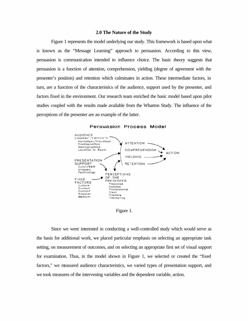
Figure 1 represents the model underlying our study. This framework is based upon what
is known as the “Message Learning” approach to persuasion. According to this view,
persuasion is communication intended to influence choice. The basic theory suggests that
persuasion is a function of attention, comprehension, yielding (degree of agreement with the
presenter’s position) and retention which culminates in action. These intermediate factors, in
turn, are a function of the characteristics of the audience, support used by the presenter, and
factors fixed in the environment. Our research team enriched the basic model based upon pilot
studies coupled with the results made available from the Wharton Study. The influence of the
perceptions of the presenter are an example of the latter.
Figure 1.
Since we were interested in conducting a well-controlled study which would serve as
the basis for additional work, we placed particular emphasis on selecting an appropriate task
setting, on measurement of outcomes, and on selecting an appropriate first set of visual support
for examination. Thus, in the model shown in Figure 1, we selected or created the “fixed
factors," we measured audience characteristics, we varied types of presentation support, and
we took measures of the intervening variables and the dependent variable, action.
In the study, we investigated the nature of visual presentation support on the outcomes
of the presentation at four levels. Level 1 investigation looked at the overall effect of
presentation support; level 2 examined the characteristics of support (e.g., use of color) at a
more detailed level; level 3 was an attempt to test an overall model of persuasion related to
presentation support; and level 4 sought to develop guidelines for the effective utilization of
presentation support.
In our study, the audience was composed of junior-level undergraduate business
students enrolled in an introductory course in management information systems. In the basic
study (more will be said later about a few treatments not described in the basic study) the
students, in groups of about 35 each, received a presentation which had as its purpose causing
each student to take action. Each group received the presentation in the same room and under
the same conditions. The other factors fixed in the study included the task setting and the
speaker. The task setting involved a presenter giving a ten minute presentation which was aimed
at influencing the students to sign up (commit time and money) for some number of seminars in
time management (ten seminars were available). In this study, we were careful to fix the speaker
as a variable by having the presentation on videotape. The speaker was selected on the basis of
auditions to be of average quality (more will be said on this dimension later).
The above factors were fixed for all nine treatment groups. One group saw the
presentation with no visual support and eight groups received one of the presentation support
treatments. The presentation support consisted of some form of high quality (prepared using 3M
facilities) visuals. The eight visual support treatments were color vs. black and white, plain text
vs. text enhanced with "clip art" and graphs, and 35mm slides vs. overhead transparencies).
3.0 Procedure
In the second week of the ten week course, a visit was made to the lecture classroom
where all students were together. An announcement was made by one of the research team to
the effect that the School of Management was considering developing a set of 10 time
management seminars for students. It was explained that students could take as many or few of
the ten seminars as they wished, but each one would cost $15.00 and would take two 3-hour
sessions in evenings to be arranged. It was stated that the seminars would be given by time
management professionals hired by the school to offer them. The students filled out a one page
questionnaire (the premeasure) which indicated their degree of interest in each of the ten
seminars and the amount of time and money they would likely be willing to commit to the
seminars. Nothing in detail was said about the nature of the seminars other than the ten titles
such as “Working Smarter,” or “Fighting Procrastination.”
In the fifth week of the course, all of the laboratory sections associated with the course
(13 sections of about 35 students each) met in a special room. The same member of the
research team who had appeared in the large lecture section of the class told the students that
they were going to see a followup presentation on the seminars that had been mentioned
previously. The lights in the room were dimmed and the ten minute videotape was shown to the
students. The member of the research team (for the eight visual treatment groups) manually
displayed the visual support for the presentation and synchronized their showing with the
presentation. It had been explained that these had been provided by the organization that would
offer the courses. Pilot tests indicated that, in the darkened room, the displays should be able to
be seen clearly by persons having normal vision.
At the conclusion of the videotape (ten minutes) a questionnaire was again completed
by each student. The same questions were asked before about the degree of interest in the
seminars. In addition, a number of additional questions were asked about perceptions of the
presenter, attention, and yielding. A short test of how well certain facts were comprehended by
the students was also administered. Finally, the students were asked about the perceived
legibility of the visuals used to support the presentation (in the eight visual support groups).
Ten days later, again in the large lecture class, the research team member gathered a
final bit of data. Students were again given the comprehension test. Administration of this
followup allowed retention to be measured.
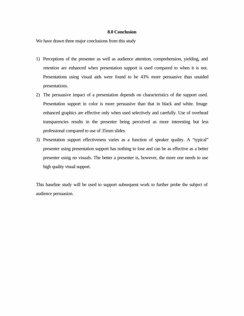
4.0 Results
We present the results of the study in four parts. First, we will present overall
conclusions. Next, we will examine the isolated impact of the various treatments. Third, we will
revisit the model of persuasion through “message learning” and revise Figure 1 according to our
findings. Finally, we will present some comments regarding the effectiveness of two of our visual
support treatments and add some findings from treatments not in the “basic study.”
4.1 Aggregate Findings
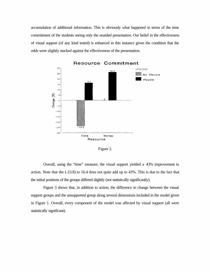
Figure 2 presents the difference in resource commitment between the premeasure and
the postmeasure for those receiving visual presentation support and the group receiving no
support. Action in terms of two measures, time and money, are displayed. The figure shows
how the group getting only a presentation without any visual support planned to spend less time
and the same amount of money on the seminars. Groups getting the visual support with the
presentation, on the other hand, planned to spend 16.4% more time and 26.4% more money on
the seminars.
A few comments are in order regarding these results. First, it is our opinion that the time
measure of action is a better one than money since all the subjects were full time students had
similar amounts of time available but may have varied substantially in their personal financial
positions. A second comment is that, to some degree at least, the experiment was biased against
the researchers in the sense that it would have been quite easy to decrease one's level of
commitment to action after seeing the presentation. This is because of the fact that, in the
premeasure, only the titles of the seminars were given and it was possible to project all sorts of
good qualities to the seminars. On the postmeasure the students had considerably more detail
about the contents of each seminar as well as having seen a videotape presentation of an
“average” presenter. Thus, it would have been quite easy to lose interest through the
accumulation of additional information. This is obviously what happened in terms of the time
commitment of the students seeing only the unaided presentation. Our belief in the effectiveness
of visual support (of any kind tested) is enhanced in this instance given the condition that the
odds were slightly stacked against the effectiveness of the presentation.
Figure 2.
Overall, using the “time” measure, the visual support yielded a 43% improvement in
action. Note that the (-23.8) to 16.4 does not quite add up to 43%. This is due to the fact that
the initial positions of the groups differed slightly (not statistically significantly).
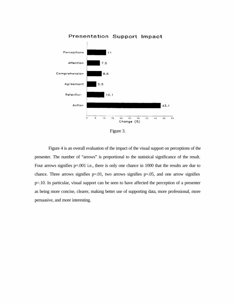
Figure 3 shows that, in addition to action, the difference in change between the visual
support groups and the unsupported group along several dimensions included in the model given
in Figure 1. Overall, every component of the model was affected by visual support (all were
statistically significant).
Figure 3.
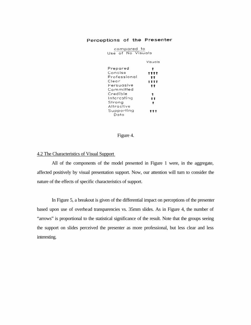
Figure 4 is an overall evaluation of the impact of the visual support on perceptions of the
presenter. The number of “arrows” is proportional to the statistical significance of the result.
Four arrows signifies p=.001 i.e., there is only one chance in 1000 that the results are due to
chance. Three arrows signifies p=.01, two arrows signifies p=.05, and one arrow signifies
p=.10. In particular, visual support can be seen to have affected the perception of a presenter
as being more concise, clearer, making better use of supporting data, more professional, more
persuasive, and more interesting.
Figure 4.
4.2 The Characteristics of Visual Support
All of the components of the model presented in Figure 1 were, in the aggregate,
affected positively by visual presentation support. Now, our attention will turn to consider the
nature of the effects of specific characteristics of support.
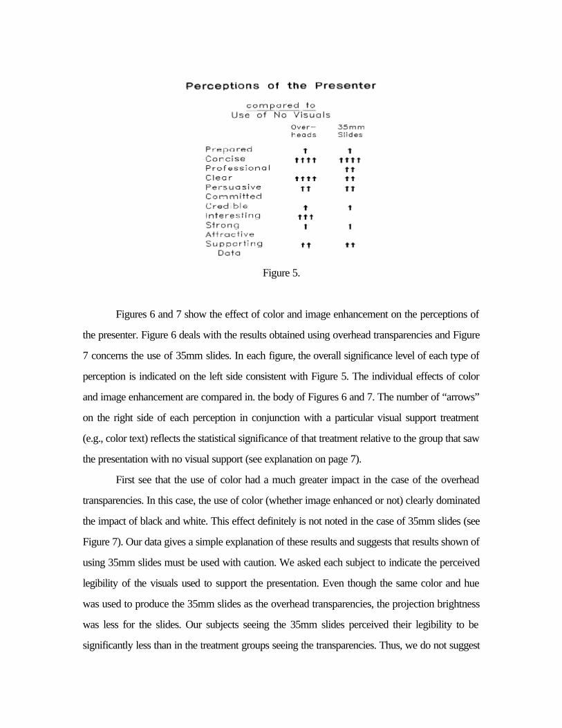
In Figure 5, a breakout is given of the differential impact on perceptions of the presenter
based upon use of overhead transparencies vs. 35mm slides. As in Figure 4, the number of
“arrows” is proportional to the statistical significance of the result. Note that the groups seeing
the support on slides perceived the presenter as more professional, but less clear and less
interesting.
Figure 5.
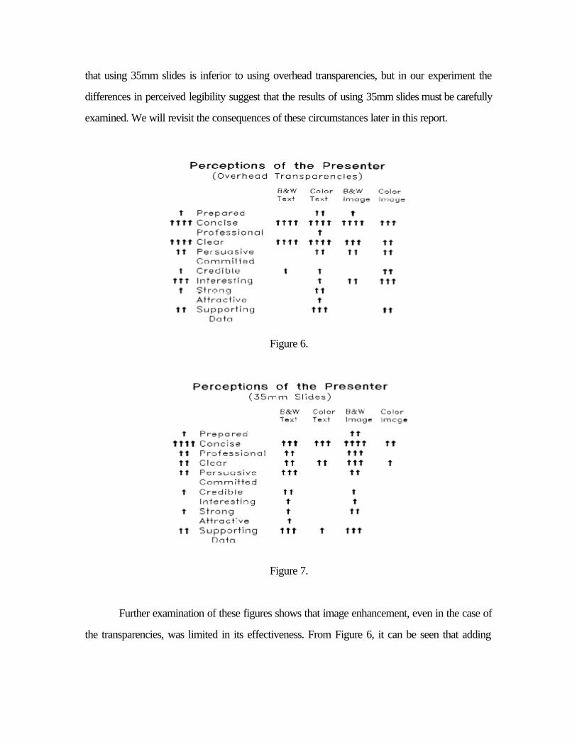
Figures 6 and 7 show the effect of color and image enhancement on the perceptions of
the presenter. Figure 6 deals with the results obtained using overhead transparencies and Figure
7 concerns the use of 35mm slides. In each figure, the overall significance level of each type of
perception is indicated on the left side consistent with Figure 5. The individual effects of color
and image enhancement are compared in. the body of Figures 6 and 7. The number of “arrows”
on the right side of each perception in conjunction with a particular visual support treatment
(e.g., color text) reflects the statistical significance of that treatment relative to the group that saw
the presentation with no visual support (see explanation on page 7).
First see that the use of color had a much greater impact in the case of the overhead
transparencies. In this case, the use of color (whether image enhanced or not) clearly dominated
the impact of black and white. This effect definitely is not noted in the case of 35mm slides (see
Figure 7). Our data gives a simple explanation of these results and suggests that results shown of
using 35mm slides must be used with caution. We asked each subject to indicate the perceived
legibility of the visuals used to support the presentation. Even though the same color and hue
was used to produce the 35mm slides as the overhead transparencies, the projection brightness
was less for the slides. Our subjects seeing the 35mm slides perceived their legibility to be
significantly less than in the treatment groups seeing the transparencies. Thus, we do not suggest
that using 35mm slides is inferior to using overhead transparencies, but in our experiment the
differences in perceived legibility suggest that the results of using 35mm slides must be carefully
examined. We will revisit the consequences of these circumstances later in this report.
Figure 6.
Figure 7.
Further examination of these figures shows that image enhancement, even in the case of
the transparencies, was limited in its effectiveness. From Figure 6, it can be seen that adding
image enhancement in addition to color made the presenter seem slightly more interesting, but at
the same time slightly less clear. Again, we will comment on these results later.
In regard to the “components of persuasion” of the model shown in Figure 1, our results
indicate:
?? Attention and Yielding are influenced by the perceptions of the presenter. ? ?? Comprehension and Retention are improved if color is used rather than black and
white, and may be increased by selective use of image enhancement. ? ?? In terms of “action,” color overhead transparencies had the greatest impact. ? ?? The two treatments that stand above all the others (given the problems of perceived
legibility of the 35mm slides) are those of color overhead transparencies (both plain text and image enhanced graphics).
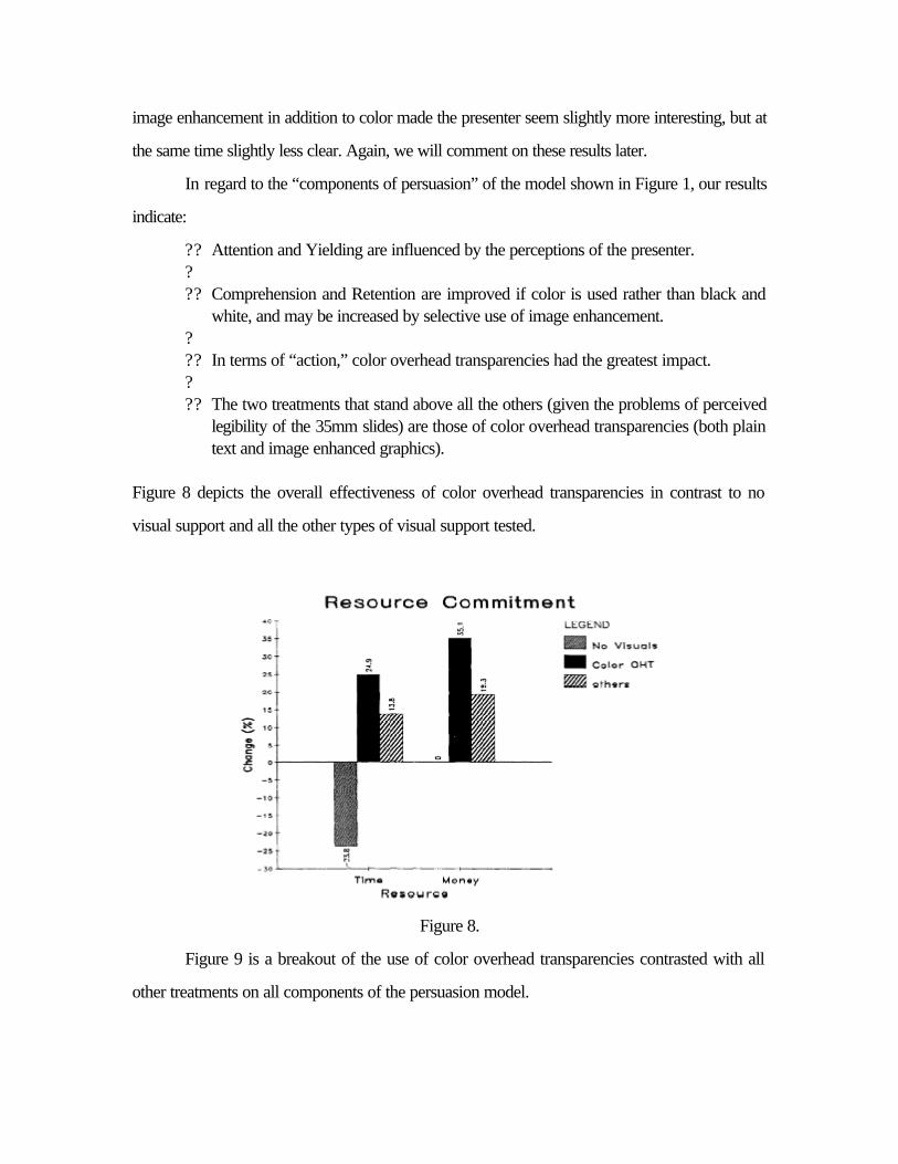
Figure 8 depicts the overall effectiveness of color overhead transparencies in contrast to no
visual support and all the other types of visual support tested.
Figure 8.
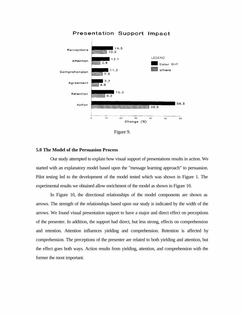
Figure 9 is a breakout of the use of color overhead transparencies contrasted with all
other treatments on all components of the persuasion model.
Figure 9.
5.0 The Model of the Persuasion Process
Our study attempted to explain how visual support of presentations results in action. We
started with an explanatory model based upon the "message learning approach” to persuasion.
Pilot testing led to the development of the model tested which was shown in Figure 1. The
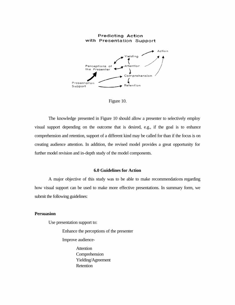
experimental results we obtained allow enrichment of the model as shown in Figure 10.
In Figure 10, the directional relationships of the model components are shown as
arrows. The strength of the relationships based upon our study is indicated by the width of the
arrows. We found visual presentation support to have a major and direct effect on perceptions
of the presenter. In addition, the support had direct, but less strong, effects on comprehension
and retention. Attention influences yielding and comprehension. Retention is affected by
comprehension. The perceptions of the presenter are related to both yielding and attention, but
the effect goes both ways. Action results from yielding, attention, and comprehension with the
former the most important.
Figure 10.
The knowledge presented in Figure 10 should allow a presenter to selectively employ
visual support depending on the outcome that is desired, e.g., if the goal is to enhance
comprehension and retention, support of a different kind may be called for than if the focus is on
creating audience attention. In addition, the revised model provides a great opportunity for
further model revision and in-depth study of the model components.
6.0 Guidelines for Action
A major objective of this study was to be able to make recommendations regarding
how visual support can be used to make more effective presentations. In summary form, we