147
| Date post: | 24-Jul-2016 |
| Category: |
Documents |
| Upload: | ivan-aillon |
| View: | 234 times |
| Download: | 0 times |

Photoshop Effects for PortraitPhotographers
Prelims-K80894.qxd 8/31/06 11:55 AM Page i
Prelims-K80894.qxd 8/31/06 11:55 AM Page ii
Photoshop Effectsfor Portrait
Photographers
Christopher Grey
AMSTERDAM ● BOSTON ● HEIDELBERG ● LONDON ● NEW YORK ● OXFORD
PARIS ● SAN DIEGO ● SAN FRANCISCO ● SINGAPORE ● SYDNEY ● TOKYO
Focal Press is an imprint of Elsevier
Prelims-K80894.qxd 8/31/06 11:55 AM Page iii
Acquisitions Editor: Diane HeppnerProject Manager: Paul GottehrerAssistant Editor: Stephanie BarrettMarketing Manager: Christine Degon VeroulisCover Design: Eric DeCicco
Focal Press is an imprint of Elsevier30 Corporate Drive, Suite 400, Burlington, MA 01803, USALinacre House, Jordan Hill, Oxford OX2 8DP, UK
Copyright © 2007, Elsevier Inc. All rights reserved.
No part of this publication may be reproduced, stored in a retrieval system, or transmitted in any form or by any means, electronic, mechanical, photocopying, recording, or otherwise, without the prior written permission of the publisher.
Permissions may be sought directly from Elsevier’s Science &Technology Rights Department in Oxford, UK: phone: (�44) 1865 843830, fax: (144) 1865 853333, E-mail: [email protected]. You may also complete your request on-linevia the Elsevier homepage (http://elsevier.com), by selecting “Support &Contact”then “Copyright and Permission” and then “Obtaining Permissions.”
� Recognizing the importance of preserving what has been written, Elsevier prints its books on acid-free paper whenever possible.
Library of Congress Cataloging-in-Publication DataApplication submitted
British Library Cataloguing-in-Publication DataA catalogue record for this book is available from the British Library.
ISBN 13: 978-0-240-80894-9ISBN 10: 0-240-80894-9
06 07 08 09 10 10 9 8 7 6 5 4 3 2 1
Printed in Canada
For information on all Focal Press publications visit our website at: www.books.elsevier.com
Prelims-K80894.qxd 8/31/06 11:55 AM Page iv
Contents
Foreword vii
Introduction ix
Acknowledgments xi
A Short Course in Layer Masks xiii
Section 1
Traditional Photographic Techniques 1
Creative Desaturation 2
Organic Vignettes 7
Converting Color to Grayscale 13
Short Focus 18
Short Focus (Light) 21
Black and White Infrared 23
Cross-Processing 27
High-Speed Film Grain 32
Oil Tint 35
Hand Coloring Black and White 41
Damage Free Dodge and Burn 45
Section 2
Image Enhancements 49
Surreal Backgrounds 50
HyperColor 53
Glowing Accents 55
Porcelain Skin 58
High Pass Sharpening 61
High Pass Soft Focus 63
Overexposure Rescue 65
Hollywood Eyes 67
Contents v
Prelims-K80894.qxd 8/31/06 11:55 AM Page v
Section 3
Artistic Effects 71
Perfect Litho 72
Linoleum Block 76
Scratchboard 79
Rough Pencil Sketch 84
Charcoal/Pen Sketch 86
Photocopy Sketch 89
Grain Sketch 92
Watercolor Painting 97
Wet Watercolor 102
Silkscreen Prints 106
Impressionism 112
The Classic PinUp 119
Oil Chalk 124
Index 127
vi Contents
Prelims-K80894.qxd 8/31/06 11:55 AM Page vi
Foreword
As a professional photographer, I consider myself lucky to be so totally immersed in thisevolutionary step of digital photography. I began working with Photoshop at version 2.5, and asthe program got better and computers got faster, Photoshop time overtook darkroom time. Mycomputer officially became my darkroom in 2001.
Still, there were aspects of the “old days” that I missed. For instance, I enjoyed vignettingportraits by hand, in the darkroom. I always felt my organic vignettes added a degree of charmto the images that they wouldn’t have otherwise had.
Kodak makes terrific black and white infrared film, but best results with it are obtained byhand processing in the darkroom, something I now have little time to do.
Some equipment, like view cameras, yield spectacular images when the swings and tilts areplaced where they shouldn’t be, but are slow and cumbersome, and not really suited to the styleof photography that I like.
It was the search for intelligent solutions to these and other questions that led me to this book.When I approached Photoshop analytically, instead of as a complex retouching tool, I began tolearn how to enhance images in new ways. Over time, I not only found elegant solutions for myanalog photography questions but for illustrative and painterly techniques as well.
The best thing to come from my research was something I hadn’t counted on; my clientswere as excited about seeing themselves interpreted by my tricks as I was when I did them.Even better, they were willing to pay more than normal price to own reprints.
All the techniques you’ll learn in this book are doable with just the basic controls and filtersthat come with the program. Whether you use them to have fun, for art, or to increase yourstudio’s bottom line, I know you’ll enjoy them.
Christopher Grey
Foreword vii
Prelims-K80894.qxd 8/31/06 11:55 AM Page vii

This page intentionally left blank
Introduction
Over the time I needed to write this book, it became obvious I had to make a few assumptionsabout my audience. My first (and most necessary) assumption is that you are at least familiarwith Photoshop on an intermediate level, that you understand the concept of Layers andBlending Modes and that you are willing to spend some time to learn a new way of thinking. Ifyou’re new to Photoshop, there’s no reason why you can’t use my tricks, but any introductoryinstruction you might need will have to be found elsewhere.
Even though these effects were built with Photoshop CS2, they will (almost) all work withany version of PS that supports Layers. Within the entire book, I believe I’ve used only two filtersthat are new to CS2, but those are largely optional steps, anyway.
It’s always annoyed me when authors tell you to “Click OK” at the end of each step, as ifyou’re too stupid to figure out that if you don’t, nothing will happen. I only wrote it once (okay,maybe twice), because it was necessary for the instruction.
There are many keyboard shortcuts within Photoshop which become second nature forsome users. I’ve deliberately not noted them, and have left it up to you and your level ofexpertise and preference as to whether or not you’ll use them. For each technique, I’ve tried tomake these sometimes complicated instructions as simple as possible.
Most of the images used as samples are studio portraiture, although I’ve placed a few non-portrait samples here and there. The techniques I’m presenting, while wonderful for portrait photographers, are equally valuable for stock photographers and photographic fineartists. All of the first-state images are available for you to download so you can precisely follow my directions and get the same results you see in this book. Just log on to http://www.ChristopherGrey.com/booksamples.
As my disclaimer states, “Your results may be different”. Not every image is perfect for everytechnique, but the techniques will work on any image. It’s up to you to determine which of yourexisting images will work the best, and for which technique. After some practice, you maydecide to actually shoot for a favorite look, adjusting camera exposure and lighting as necessary.
While the sequence of my instructions seems to work the best for the desired effect, theactual settings of the filters and adjustments should be played with, and I encourage you to dothat, just to see what happens. If you discover something fantastic, please let me know([email protected]).
Thanks for supporting my work, and for the desire to create your own.
Christopher Grey
Introduction ix
Prelims-K80894.qxd 8/31/06 11:55 AM Page ix

This page intentionally left blank
Acknowledgments
As always, writing a book is a tremendous undertaking; a commitment of time and energy thatalways takes more of each than was originally planned. Still, it was great fun to discover newapplications for the wonderful tools inside Photoshop.
I’d like to thank everyone who sat for my camera for their time and energy as well. Yourcontribution is much appreciated: Jordi Antrim, Dominic Castino, Kim Dalros, Michael Dane, BillFoster, Bill Fricke and Joette Poehler, Michelle Gonzalez, Molly Grace, Elizabeth Grey, SusanGrey, Jennifer Haldeman, Jennifer Hammers, Guy Jamal, Rachael Johnson, Ruth Koscielak,Katie Krall, Jessica Lee, Tammy Loheit, Tom McCarthy, Jim and Loy Mentzer, Steven Mentzer,Barbara Smith and Kaleigh Mentzer, Hannah Morcan, Isabella Ngo, Ali Perrier, LelaPhommasouvanh, Carrie Poehler, Danielle Polson, Lucia Radder, Hayley Riley, Jack Riley,Rebecca Riley, Kristen Rozanski, Kevin and Cassie Scheunemann, Megan Seefeld, EvangelineStacy, Bo Tarkenton, Kaelin Vermilyea, Jennifer Zumbach.
Some very talented makeup artists also contributed to this project: Susan Grey, JenniferHammers, and Jennifer Holiday Quinn.
Thanks to Caryn International and the Academy of Screen and Television for access to somevery talented individuals, and to Paul Hartley for the terrific author photo.
The Suzette Allen and Jonny Yoshinaga, thanks for the technical edit. Suzette is a Photoshopwizard whose input is always welcome; both are friends.
And, of course, thanks to my wife Sue and daughter Liz for putting up with yet anotherproject. I’m hoping you’ll have to deal with many more before all is said and done.
Christopher Grey
Acknowledgments xi
Prelims-K80894.qxd 8/31/06 11:55 AM Page xi

This page intentionally left blank
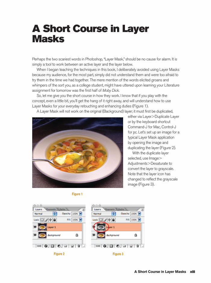
A Short Course in LayerMasks
Perhaps the two scariest words in Photoshop, “Layer Mask,” should be no cause for alarm. It issimply a tool to work between an active layer and the layer below.
When I began teaching the techniques in this book, I deliberately avoided using Layer Masksbecause my audience, for the most part, simply did not understand them and were too afraid totry them in the time we had together. The mere mention of the words elicited groans andwhimpers of the sort you, as a college student, might have uttered upon learning your Literatureassignment for tomorrow was the first half of Moby Dick.
So, let me give you the short course in how they work. I know that if you play with theconcept, even a little bit, you’ll get the hang of it right away, and will understand how to useLayer Masks for your everyday retouching and enhancing duties (Figure 1).
A Layer Mask will not work on the original (Background) layer; it must first be duplicated,either via Layer�Duplicate Layeror by the keyboard shortcutCommand-J for Mac, Control-Jfor pc. Let’s set up an image for atypical Layer Mask application by opening the image andduplicating the layer (Figure 2).
With the duplicate layerselected, use Image�
Adjustments�Desaturate toconvert the layer to grayscale.Note that the layer icon haschanged to reflect the grayscaleimage (Figure 3).
A Short Course in Layer Masks xiii
Figure 1
Figure 2 Figure 3
Prelims-K80894.qxd 8/31/06 11:55 AM Page xiii
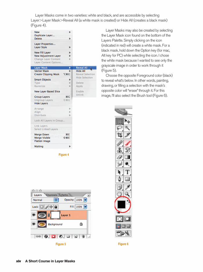
Layer Masks come in two varieties: white and black, and are accessible by selectingLayer�Layer Mask�Reveal All (a white mask is created) or Hide All (creates a black mask)(Figure 4).
Layer Masks may also be created by selectingthe Layer Mask icon found on the bottom of theLayers Palette. Simply clicking on the icon(indicated in red) will create a white mask. For ablack mask, hold down the Option key (for mac,Alt key for PC) while selecting the icon. I chosethe white mask because I wanted to see only thegrayscale image in order to work through it(Figure 5).
Choose the opposite Foreground color (black)to reveal what’s below. In other words, painting,drawing, or filling a selection with the mask’sopposite color will “erase” through it. For thisimage, I’ll also select the Brush tool (Figure 6).
xiv A Short Course in Layer Masks
Figure 4
Figure 5 Figure 6
Prelims-K80894.qxd 8/31/06 11:55 AM Page xiv
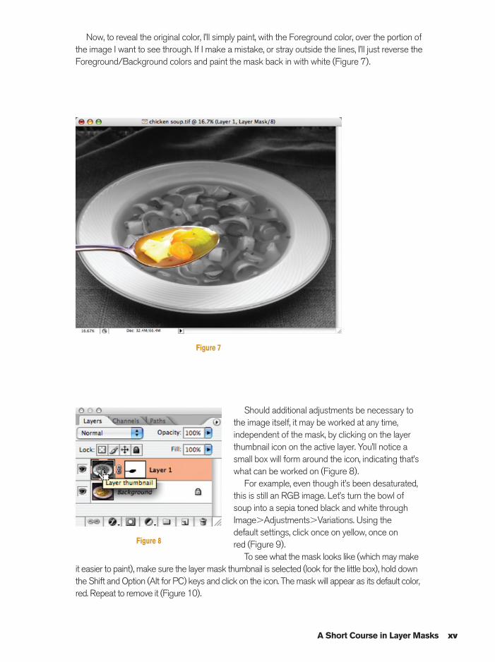
Now, to reveal the original color, I’ll simply paint, with the Foreground color, over the portion ofthe image I want to see through. If I make a mistake, or stray outside the lines, I’ll just reverse theForeground/Background colors and paint the mask back in with white (Figure 7).
A Short Course in Layer Masks xv
Figure 7
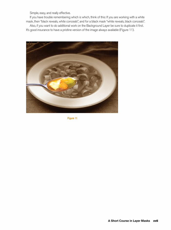
Should additional adjustments be necessary tothe image itself, it may be worked at any time,independent of the mask, by clicking on the layerthumbnail icon on the active layer. You’ll notice asmall box will form around the icon, indicating that’swhat can be worked on (Figure 8).
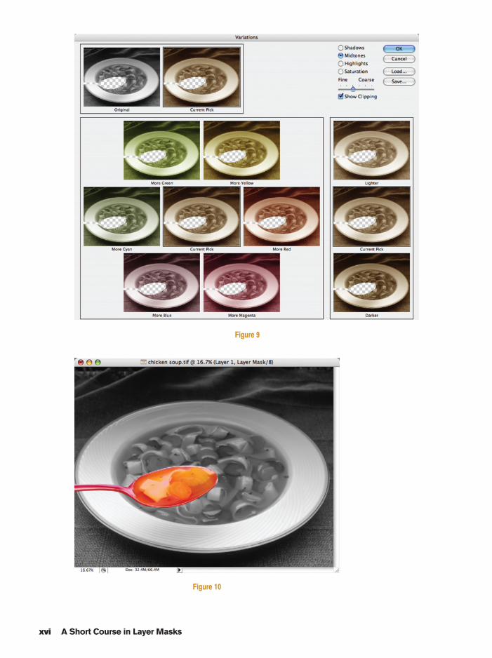
For example, even though it’s been desaturated,this is still an RGB image. Let’s turn the bowl ofsoup into a sepia toned black and white throughImage�Adjustments�Variations. Using the default settings, click once on yellow, once on red (Figure 9).
To see what the mask looks like (which may makeit easier to paint), make sure the layer mask thumbnail is selected (look for the little box), hold downthe Shift and Option (Alt for PC) keys and click on the icon. The mask will appear as its default color,red. Repeat to remove it (Figure 10).
Figure 8
Prelims-K80894.qxd 8/31/06 11:55 AM Page xv
xvi A Short Course in Layer Masks
Figure 9
Figure 10
Prelims-K80894.qxd 8/31/06 11:55 AM Page xvi
A Short Course in Layer Masks xvii
Simple, easy, and really effective.If you have trouble remembering which is which, think of this: If you are working with a white
mask, then “black reveals, white conceals”, and for a black mask “white reveals, black conceals”.Also, if you want to do additional work on the Background Layer be sure to duplicate it first.
It’s good insurance to have a pristine version of the image always available (Figure 11).
Figure 11
Prelims-K80894.qxd 8/31/06 11:56 AM Page xvii

This page intentionally left blank
Section 1Traditional PhotographicTechniques
Ch01-K80894.qxd 8/31/06 11:59 AM Page 1
2 Photoshop Effects for Portrait Photographers Christopher Grey
Creative Desaturation
While Photoshop is terrific for spicing up image color, it also offers a few tricks for spicing itdown. However, if you use just the Desaturate tool (Image�Adjustments�Desaturate), thebest you’ll get is a basic grayscale image, as there areno degrees of adjustment with that tool. Useful, but notterribly versatile.
Working the Saturation slider at Image�
Adjustments�Hue/Saturation to the left will graduallydesaturate the image until all that is left is the samebasic grayscale image.
You can also desaturate any selected color. This isespecially useful if you’d like or need to change thecolor balance of an image and want more control thanwith Variations and less trial and error than with ColorBalance.
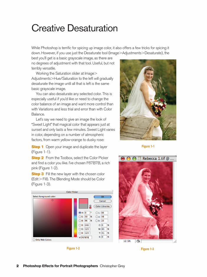
Let’s say we need to give an image the look of“Sweet Light” that magical color that appears just atsunset and only lasts a few minutes. Sweet Light variesin color, depending on a number of atmosphericfactors, from warm yellow-orange to dusky rose:
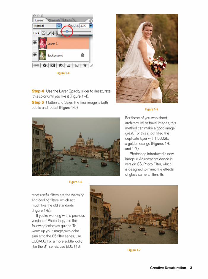
Step 1 Open your image and duplicate the layer(Figure 1-1).
Step 2 From the Toolbox, select the Color Pickerand find a color you like. I’ve chosen F67B7B, a richpink (Figure 1-2).
Step 3 Fill the new layer with the chosen color(Edit�Fill). The Blending Mode should be Color(Figure 1-3).
Figure 1-1
Figure 1-2 Figure 1-3
Ch01-K80894.qxd 8/31/06 11:59 AM Page 2
Creative Desaturation 3
Step 4 Use the Layer Opacity slider to desaturatethis color until you like it (Figure 1-4).
Step 5 Flatten and Save. The final image is bothsubtle and robust (Figure 1-5).
For those of you who shootarchitectural or travel images, thismethod can make a good imagegreat. For this shot I filled theduplicate layer with F5822E, a golden orange (Figures 1-6 and 1-7).
Photoshop introduced a newImage�Adjustments device inversion CS, Photo Filter, which is designed to mimic the effectsof glass camera filters. Its
most useful filters are the warmingand cooling filters, which act much like the old standards(Figure 1-8).
If you’re working with a previousversion of Photoshop, use thefollowing colors as guides. Towarm up your image, with colorsimilar to the 85 filter series, useEC8A00. For a more subtle look,like the 81 series, use EBB113.
Figure 1-5
Figure 1-4
Figure 1-6
Figure 1-7
Ch01-K80894.qxd 8/31/06 11:59 AM Page 3
4 Photoshop Effects for Portrait Photographers Christopher Grey
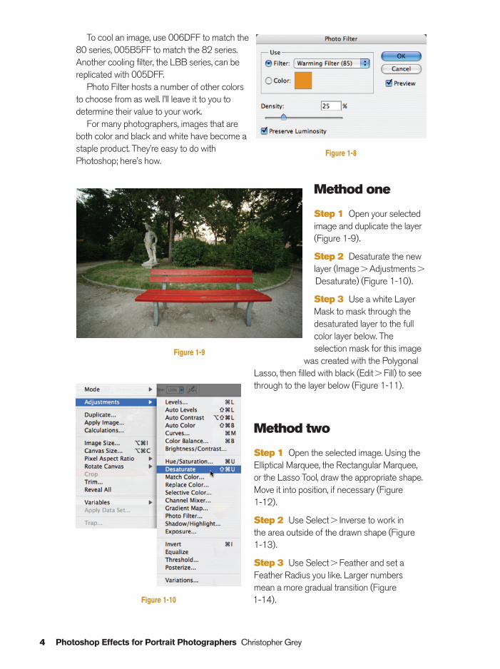
To cool an image, use 006DFF to match the80 series, 005B5FF to match the 82 series.Another cooling filter, the LBB series, can bereplicated with 005DFF.
Photo Filter hosts a number of other colors to choose from as well. I’ll leave it to you todetermine their value to your work.
For many photographers, images that areboth color and black and white have become astaple product. They’re easy to do withPhotoshop; here’s how.
Method one
Step 1 Open your selectedimage and duplicate the layer(Figure 1-9).
Step 2 Desaturate the newlayer (Image�Adjustments�
Desaturate) (Figure 1-10).
Step 3 Use a white LayerMask to mask through thedesaturated layer to the fullcolor layer below. Theselection mask for this image
was created with the PolygonalLasso, then filled with black (Edit�Fill) to seethrough to the layer below (Figure 1-11).
Method two
Step 1 Open the selected image. Using theElliptical Marquee, the Rectangular Marquee,or the Lasso Tool, draw the appropriate shape.Move it into position, if necessary (Figure 1-12).
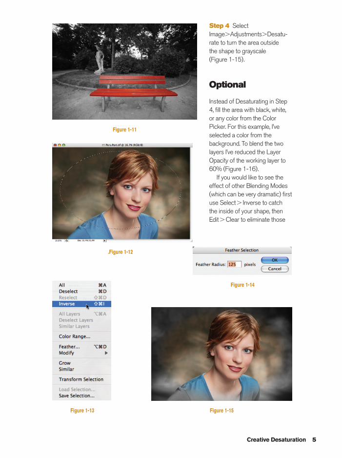
Step 2 Use Select� Inverse to work in the area outside of the drawn shape (Figure 1-13).
Step 3 Use Select�Feather and set aFeather Radius you like. Larger numbers mean a more gradual transition (Figure 1-14).
Figure 1-8
Figure 1-10
Figure 1-9
Ch01-K80894.qxd 8/31/06 11:59 AM Page 4
Creative Desaturation 5
Figure 1-11
.Figure 1-12
Figure 1-15
Figure 1-14
Figure 1-13
Step 4 SelectImage�Adjustments�Desatu-rate to turn the area outside the shape to grayscale (Figure 1-15).
Optional
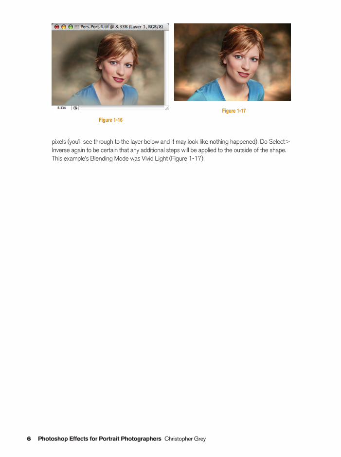
Instead of Desaturating in Step4, fill the area with black, white,or any color from the ColorPicker. For this example, I’veselected a color from thebackground. To blend the twolayers I’ve reduced the LayerOpacity of the working layer to60% (Figure 1-16).
If you would like to see theeffect of other Blending Modes(which can be very dramatic) firstuse Select� Inverse to catchthe inside of your shape, thenEdit�Clear to eliminate those
Ch01-K80894.qxd 8/31/06 11:59 AM Page 5
6 Photoshop Effects for Portrait Photographers Christopher Grey
Figure 1-17
pixels (you’ll see through to the layer below and it may look like nothing happened). Do Select�Inverse again to be certain that any additional steps will be applied to the outside of the shape.This example’s Blending Mode was Vivid Light (Figure 1-17).
Figure 1-16
Ch01-K80894.qxd 8/31/06 11:59 AM Page 6
Organic Vignettes 7
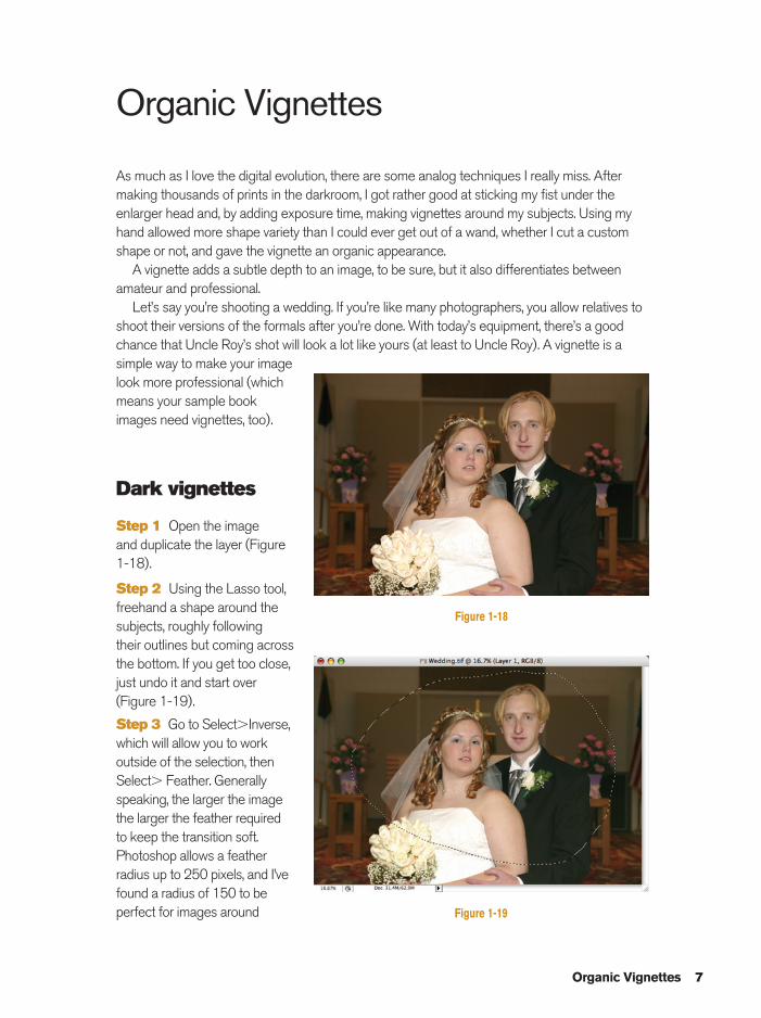
Organic Vignettes
As much as I love the digital evolution, there are some analog techniques I really miss. Aftermaking thousands of prints in the darkroom, I got rather good at sticking my fist under theenlarger head and, by adding exposure time, making vignettes around my subjects. Using myhand allowed more shape variety than I could ever get out of a wand, whether I cut a customshape or not, and gave the vignette an organic appearance.
A vignette adds a subtle depth to an image, to be sure, but it also differentiates betweenamateur and professional.
Let’s say you’re shooting a wedding. If you’re like many photographers, you allow relatives toshoot their versions of the formals after you’re done. With today’s equipment, there’s a goodchance that Uncle Roy’s shot will look a lot like yours (at least to Uncle Roy). A vignette is asimple way to make your imagelook more professional (whichmeans your sample bookimages need vignettes, too).
Dark vignettes
Step 1 Open the image and duplicate the layer (Figure1-18).
Step 2 Using the Lasso tool,freehand a shape around thesubjects, roughly following their outlines but coming acrossthe bottom. If you get too close,just undo it and start over(Figure 1-19).
Step 3 Go to Select�Inverse,which will allow you to workoutside of the selection, thenSelect� Feather. Generallyspeaking, the larger the imagethe larger the feather requiredto keep the transition soft.Photoshop allows a featherradius up to 250 pixels, and I’vefound a radius of 150 to beperfect for images around
Figure 1-18
Figure 1-19
Ch01-K80894.qxd 8/31/06 11:59 AM Page 7
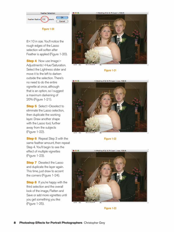
8�10 in size. You’ll notice therough edges of the Lassoselection will soften afterFeather is applied (Figure 1-20).
Step 4 Now use Image�
Adjustments�Hue/Saturation.Select the Lightness slider andmove it to the left to darken outside the selection. There’s no need to do the entirevignette at once, althoughthat is an option, so I suggesta maximum darkening of20% (Figure 1-21).
Step 5 Select�Deselect toeliminate the Lasso selection,then duplicate the working layer. Draw another shapewith the Lasso tool, furtheraway from the subjects(Figure 1-22).
Step 6 Repeat Step 3 with thesame feather amount, then repeatStep 4. You’ll begin to see theeffect of multiple vignettes(Figure 1-23).
Step 7 Deselect the Lassoand duplicate the layer again.This time, just draw to accentthe corners (Figure 1-24).
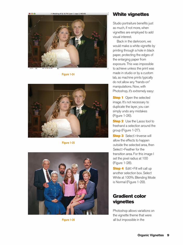
Step 8 If you’re happy with thethird selection and the overalllook of the image, Flatten andSave or add more vignettes untilyou get something you like(Figure 1-25).
8 Photoshop Effects for Portrait Photographers Christopher Grey
Figure 1-22
Figure 1-23
Figure 1-21
Figure 1-20
Ch01-K80894.qxd 8/31/06 11:59 AM Page 8
Organic Vignettes 9
White vignettes
Studio portraiture benefits justas much, if not more, whenvignettes are employed to addvisual interest.
Back in the darkroom, wewould make a white vignette byprinting through a hole in blackpaper, protecting the edges ofthe enlarging paper fromexposure. This was impossibleto achieve unless the print wasmade in studio or by a customlab, as machine prints typicallydo not allow any “hands-on”manipulations. Now, withPhotoshop, it’s extremely easy:
Step 1 Open the selectedimage. It’s not necessary toduplicate the layer, you cansimply undo any mistakes(Figure 1-26).
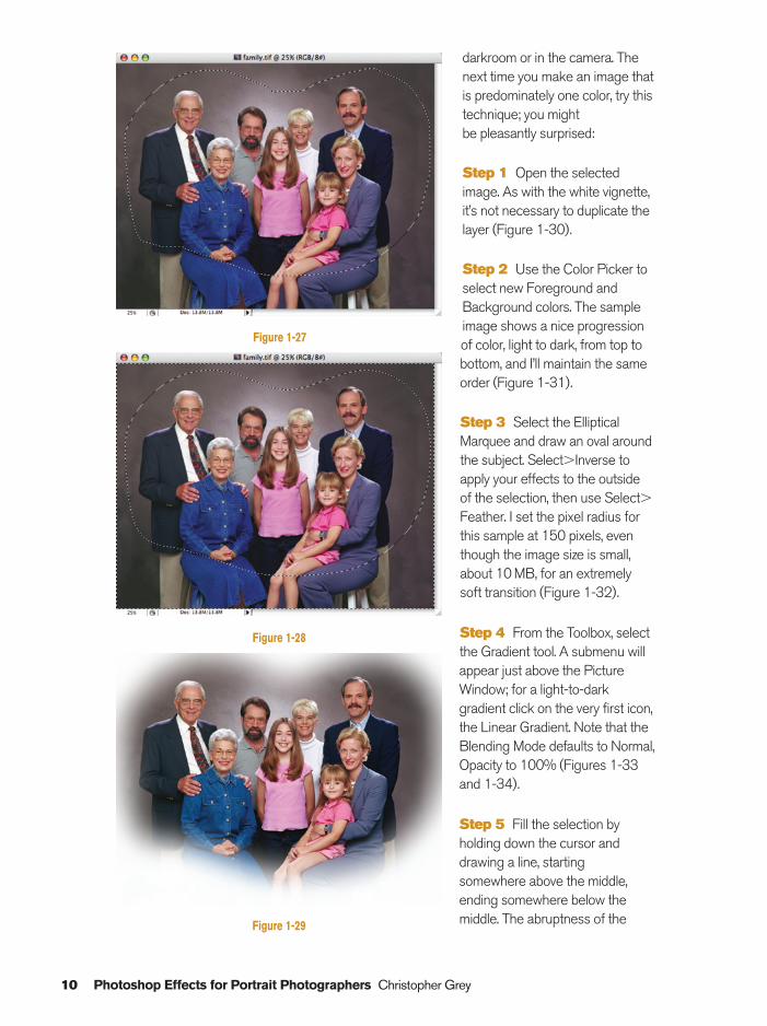
Step 2 Use the Lasso tool tofreehand a selection around thegroup (Figure 1-27).
Step 3 Select�Inverse willallow the effects to happenoutside the selected area, thenSelect�Feather for thetransition area. For this image Iset the pixel radius at 100(Figure 1-28).
Step 4 Edit�Fill will call upanother selection box. SelectWhite at 100%. Blending Modeis Normal (Figure 1-29).
Gradient colorvignettes
Photoshop allows variations onthe vignette theme that were all but impossible in the
Figure 1-24
Figure 1-25
Figure 1-26
Ch01-K80894.qxd 8/31/06 11:59 AM Page 9
10 Photoshop Effects for Portrait Photographers Christopher Grey
darkroom or in the camera. Thenext time you make an image thatis predominately one color, try thistechnique; you might be pleasantly surprised:
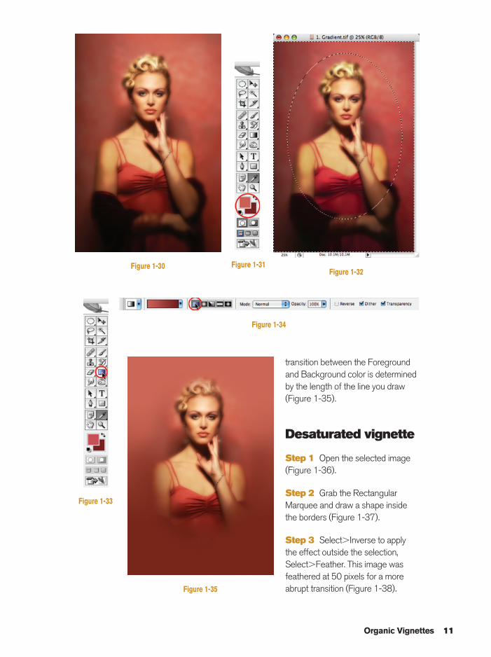
Step 1 Open the selectedimage. As with the white vignette,it’s not necessary to duplicate thelayer (Figure 1-30).
Step 2 Use the Color Picker toselect new Foreground andBackground colors. The sampleimage shows a nice progressionof color, light to dark, from top tobottom, and I’ll maintain the sameorder (Figure 1-31).
Step 3 Select the EllipticalMarquee and draw an oval aroundthe subject. Select�Inverse toapply your effects to the outsideof the selection, then use Select�Feather. I set the pixel radius forthis sample at 150 pixels, eventhough the image size is small,about 10 MB, for an extremelysoft transition (Figure 1-32).
Step 4 From the Toolbox, selectthe Gradient tool. A submenu willappear just above the PictureWindow; for a light-to-darkgradient click on the very first icon,the Linear Gradient. Note that theBlending Mode defaults to Normal,Opacity to 100% (Figures 1-33and 1-34).
Step 5 Fill the selection by holding down the cursor and drawing a line, startingsomewhere above the middle,ending somewhere below themiddle. The abruptness of the
Figure 1-27
Figure 1-28
Figure 1-29
Ch01-K80894.qxd 8/31/06 11:59 AM Page 10
Organic Vignettes 11
transition between the Foregroundand Background color is determined by the length of the line you draw(Figure 1-35).
Desaturated vignette
Step 1 Open the selected image(Figure 1-36).
Step 2 Grab the RectangularMarquee and draw a shape insidethe borders (Figure 1-37).
Step 3 Select�Inverse to applythe effect outside the selection,Select�Feather. This image wasfeathered at 50 pixels for a moreabrupt transition (Figure 1-38).
Figure 1-30
Figure 1-34
Figure 1-33
Figure 1-31Figure 1-32
Figure 1-35
Ch01-K80894.qxd 8/31/06 11:59 AM Page 11
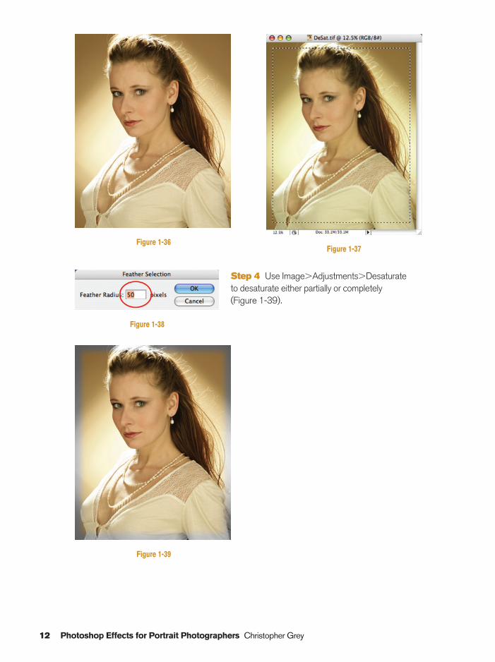
Step 4 Use Image�Adjustments�Desaturate to desaturate either partially or completely (Figure 1-39).
12 Photoshop Effects for Portrait Photographers Christopher Grey
Figure 1-36Figure 1-37
Figure 1-38
Figure 1-39
Ch01-K80894.qxd 8/31/06 11:59 AM Page 12
Converting Color to Grayscale 13
Converting Color to Grayscale
Method one: Grayscale
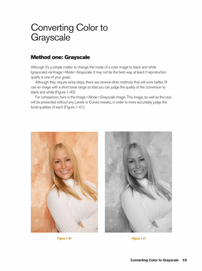
Although it’s a simple matter to change the mode of a color image to black and white(grayscale) via Image�Mode�Grayscale, it may not be the best way, at least if reproductionquality is one of your goals.
Although they require extra steps, there are several other methods that will work better. I’lluse an image with a short tonal range so that you can judge the quality of the conversion toblack and white (Figure 1-40).
For comparison, here is the Image�Mode�Grayscale image. This image, as well as the rest,will be presented without any Levels or Curves tweaks, in order to more accurately judge thetonal qualities of each (Figure 1-41).
Figure 1-40 Figure 1-41
Ch01-K80894.qxd 8/31/06 11:59 AM Page 13
Method two: Lab color
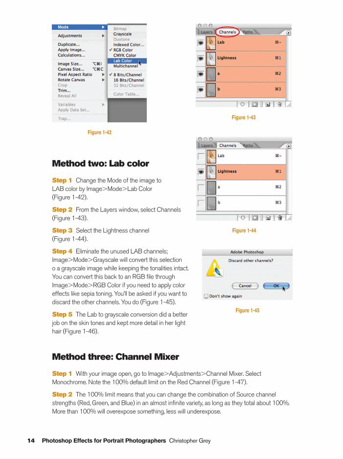
Step 1 Change the Mode of the image to LAB color by Image�Mode�Lab Color (Figure 1-42).
Step 2 From the Layers window, select Channels(Figure 1-43).
Step 3 Select the Lightness channel (Figure 1-44).
Step 4 Eliminate the unused LAB channels;Image�Mode�Grayscale will convert this selection o a grayscale image while keeping the tonalities intact.You can convert this back to an RGB file throughImage�Mode�RGB Color if you need to apply coloreffects like sepia toning. You’ll be asked if you want todiscard the other channels. You do (Figure 1-45).
Step 5 The Lab to grayscale conversion did a betterjob on the skin tones and kept more detail in her lighthair (Figure 1-46).
Method three: Channel Mixer
Step 1 With your image open, go to Image�Adjustments�Channel Mixer. SelectMonochrome. Note the 100% default limit on the Red Channel (Figure 1-47).
Step 2 The 100% limit means that you can change the combination of Source channelstrengths (Red, Green, and Blue) in an almost infinite variety, as long as they total about 100%.More than 100% will overexpose something, less will underexpose.
14 Photoshop Effects for Portrait Photographers Christopher Grey
Figure 1-42
Figure 1-43
Figure 1-44
Figure 1-45
Ch01-K80894.qxd 8/31/06 11:59 AM Page 14
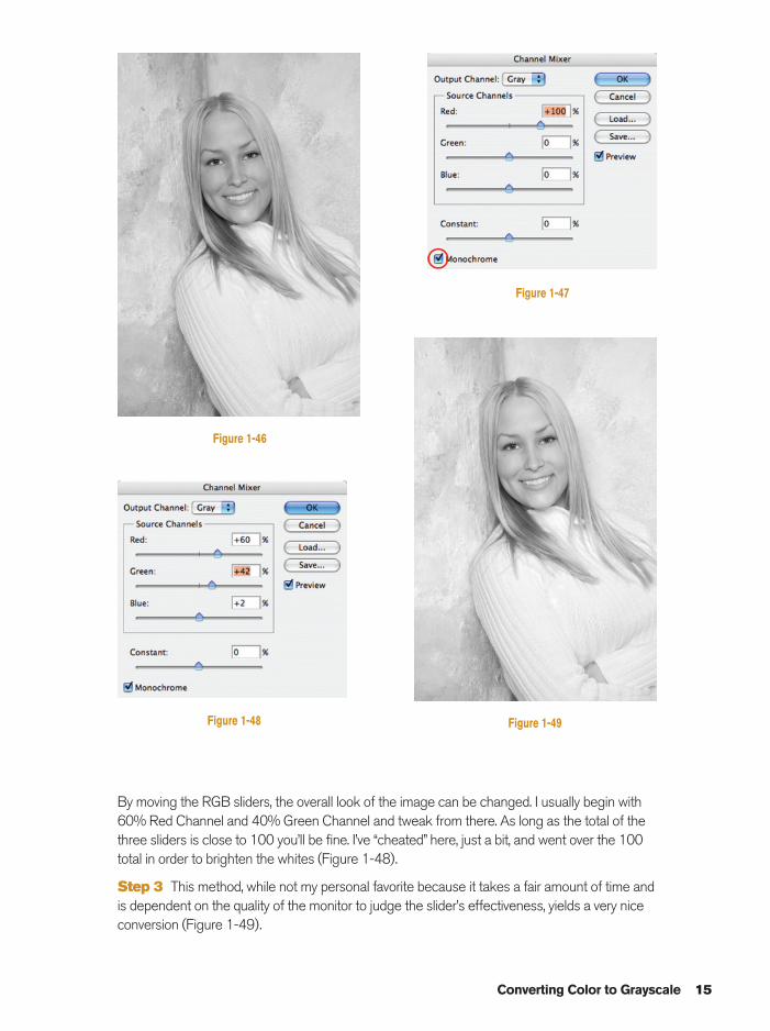
By moving the RGB sliders, the overall look of the image can be changed. I usually begin with60% Red Channel and 40% Green Channel and tweak from there. As long as the total of thethree sliders is close to 100 you’ll be fine. I’ve “cheated” here, just a bit, and went over the 100total in order to brighten the whites (Figure 1-48).
Step 3 This method, while not my personal favorite because it takes a fair amount of time andis dependent on the quality of the monitor to judge the slider’s effectiveness, yields a very niceconversion (Figure 1-49).
Converting Color to Grayscale 15
Figure 1-46
Figure 1-47
Figure 1-48 Figure 1-49
Ch01-K80894.qxd 8/31/06 11:59 AM Page 15
Method four:Hue/Saturation
In my opinion, this method offers themost variety and is very easy to master,although it’s not always the best choice.In the final step, the use of the sliderimmediately shows the effect of any ofthe classic black and white lens filters –yellow, green, red – and all shades inbetween, as if you had those filters onthe camera during the shoot:
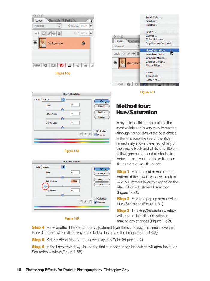
Step 1 From the submenu bar at thebottom of the Layers window, create anew Adjustment layer by clicking on theNew Fill or Adjustment Layer icon(Figure 1-50).
Step 2 From the pop up menu, selectHue/Saturation (Figure 1-51).
Step 3 The Hue/Saturation windowwill appear. Just click OK withoutmaking any changes (Figure 1-52).
Step 4 Make another Hue/Saturation Adjustment layer the same way. This time, move theHue/Saturation slider all the way to the left to desaturate the image (Figure 1-53).
Step 5 Set the Blend Mode of the newest layer to Color (Figure 1-54).
Step 6 In the Layers window, click on the first Hue/Saturation icon which will open the Hue/Saturation window (Figure 1-55).
16 Photoshop Effects for Portrait Photographers Christopher Grey
Figure 1-50
Figure 1-51
Figure 1-52
Figure 1-53
Ch01-K80894.qxd 8/31/06 12:00 PM Page 16
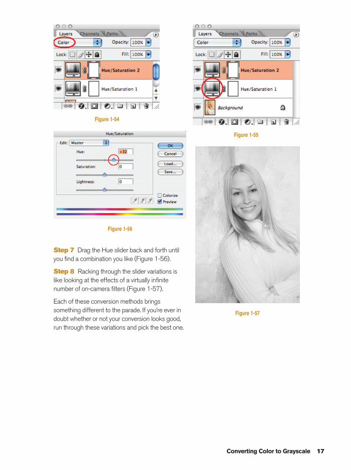
Step 7 Drag the Hue slider back and forth untilyou find a combination you like (Figure 1-56).
Step 8 Racking through the slider variations islike looking at the effects of a virtually infinitenumber of on-camera filters (Figure 1-57).
Each of these conversion methods bringssomething different to the parade. If you’re ever indoubt whether or not your conversion looks good,run through these variations and pick the best one.
Converting Color to Grayscale 17
Figure 1-54
Figure 1-56
Figure 1-55
Figure 1-57
Ch01-K80894.qxd 8/31/06 12:00 PM Page 17
Short Focus
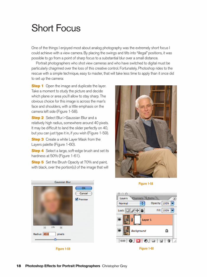
One of the things I enjoyed most about analog photography was the extremely short focus Icould achieve with a view camera. By placing the swings and tilts into “illegal” positions, it waspossible to go from a point of sharp focus to a substantial blur over a small distance.
Portrait photographers who shot view cameras and who have switched to digital must beparticularly chagrined over the loss of this creative control. Fortunately, Photoshop rides to therescue with a simple technique, easy to master, that will take less time to apply than it once didto set up the camera:
Step 1 Open the image and duplicate the layer.Take a moment to study the picture and decidewhich plane or area you’ll allow to stay sharp. Theobvious choice for this image is across the man’sface and shoulders, with a little emphasis on thecamera left side (Figure 1-58).
Step 2 Select Blur�Gaussian Blur and arelatively high radius, somewhere around 40 pixels.It may be difficult to land the slider perfectly on 40,but you can just type it in, if you wish (Figure 1-59).
Step 3 Create a white Layer Mask from theLayers palette (Figure 1-60).
Step 4 Select a large, soft-edge brush and set itshardness at 50% (Figure 1-61).
Step 5 Set the Brush Opacity at 70% and paint,with black, over the portion(s) of the image that will
18 Photoshop Effects for Portrait Photographers Christopher Grey
Figure 1-58
Figure 1-59 Figure 1-60
Ch01-K80894.qxd 8/31/06 12:00 PM Page 18
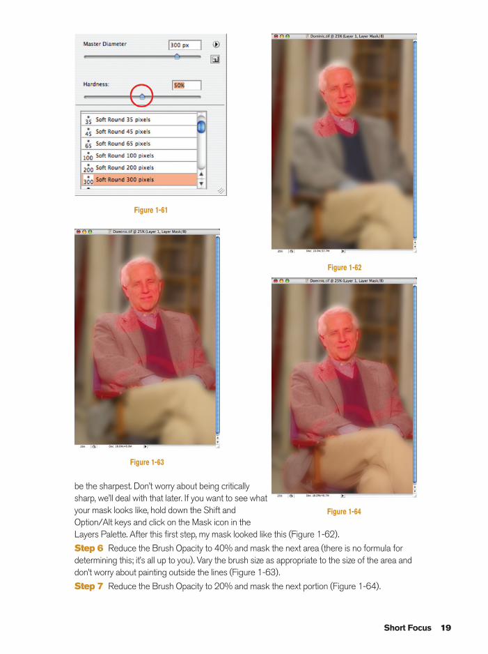
be the sharpest. Don’t worry about being criticallysharp, we’ll deal with that later. If you want to see whatyour mask looks like, hold down the Shift andOption/Alt keys and click on the Mask icon in theLayers Palette. After this first step, my mask looked like this (Figure 1-62).
Step 6 Reduce the Brush Opacity to 40% and mask the next area (there is no formula fordetermining this; it’s all up to you). Vary the brush size as appropriate to the size of the area anddon’t worry about painting outside the lines (Figure 1-63).
Step 7 Reduce the Brush Opacity to 20% and mask the next portion (Figure 1-64).
Short Focus 19
Figure 1-61
Figure 1-62
Figure 1-63
Figure 1-64
Ch01-K80894.qxd 8/31/06 12:00 PM Page 19
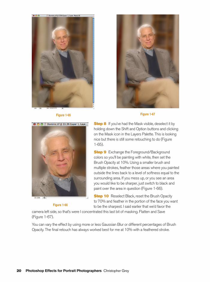
Step 8 If you’ve had the Mask visible, deselect it byholding down the Shift and Option buttons and clickingon the Mask icon in the Layers Palette. This is lookingnice but there is still some retouching to do (Figure 1-65).
Step 9 Exchange the Foreground/Backgroundcolors so you’ll be painting with white, then set theBrush Opacity at 10%. Using a smaller brush andmultiple strokes, feather those areas where you paintedoutside the lines back to a level of softness equal to thesurrounding area. If you mess up, or you see an areayou would like to be sharper, just switch to black andpaint over the area in question (Figure 1-66).
Step 10 Reselect Black, reset the Brush Opacity to 70% and feather in the portion of the face you wantto be the sharpest. I said earlier that we’d favor the
camera left side, so that’s were I concentrated this last bit of masking. Flatten and Save(Figure 1-67).
You can vary the effect by using more or less Gaussian Blur or different percentages of BrushOpacity. The final retouch has always worked best for me at 10% with a feathered stroke.
20 Photoshop Effects for Portrait Photographers Christopher Grey
Figure 1-65 Figure 1-67
Figure 1-66
Ch01-K80894.qxd 8/31/06 12:00 PM Page 20
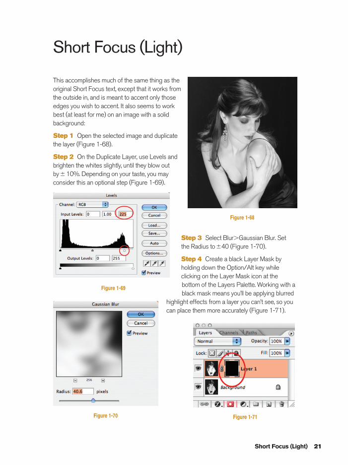
Short Focus (Light)
This accomplishes much of the same thing as theoriginal Short Focus text, except that it works fromthe outside in, and is meant to accent only thoseedges you wish to accent. It also seems to work best (at least for me) on an image with a solidbackground:
Step 1 Open the selected image and duplicate the layer (Figure 1-68).
Step 2 On the Duplicate Layer, use Levels andbrighten the whites slightly, until they blow outby�10%. Depending on your taste, you mayconsider this an optional step (Figure 1-69).
Step 3 Select Blur�Gaussian Blur. Set the Radius to�40 (Figure 1-70).
Step 4 Create a black Layer Mask byholding down the Option/Alt key whileclicking on the Layer Mask icon at thebottom of the Layers Palette. Working with ablack mask means you’ll be applying blurred
highlight effects from a layer you can’t see, so youcan place them more accurately (Figure 1-71).
Short Focus (Light) 21
Figure 1-68
Figure 1-69
Figure 1-70 Figure 1-71
Ch01-K80894.qxd 8/31/06 12:00 PM Page 21
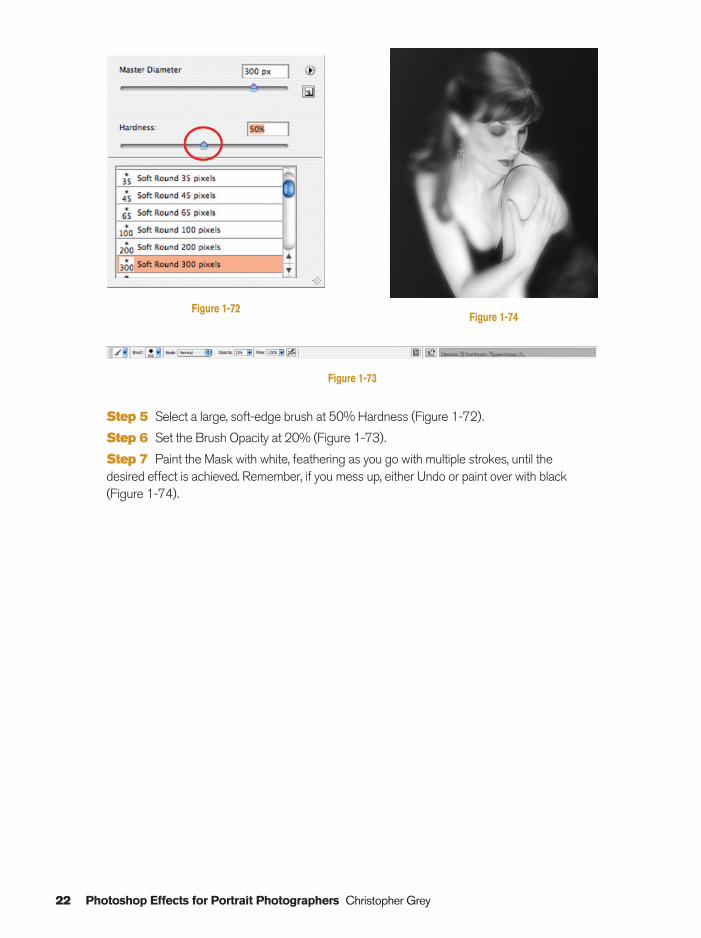
Step 5 Select a large, soft-edge brush at 50% Hardness (Figure 1-72).
Step 6 Set the Brush Opacity at 20% (Figure 1-73).
Step 7 Paint the Mask with white, feathering as you go with multiple strokes, until the desired effect is achieved. Remember, if you mess up, either Undo or paint over with black(Figure 1-74).
22 Photoshop Effects for Portrait Photographers Christopher Grey
Figure 1-72
Figure 1-73
Figure 1-74
Ch01-K80894.qxd 8/31/06 12:00 PM Page 22
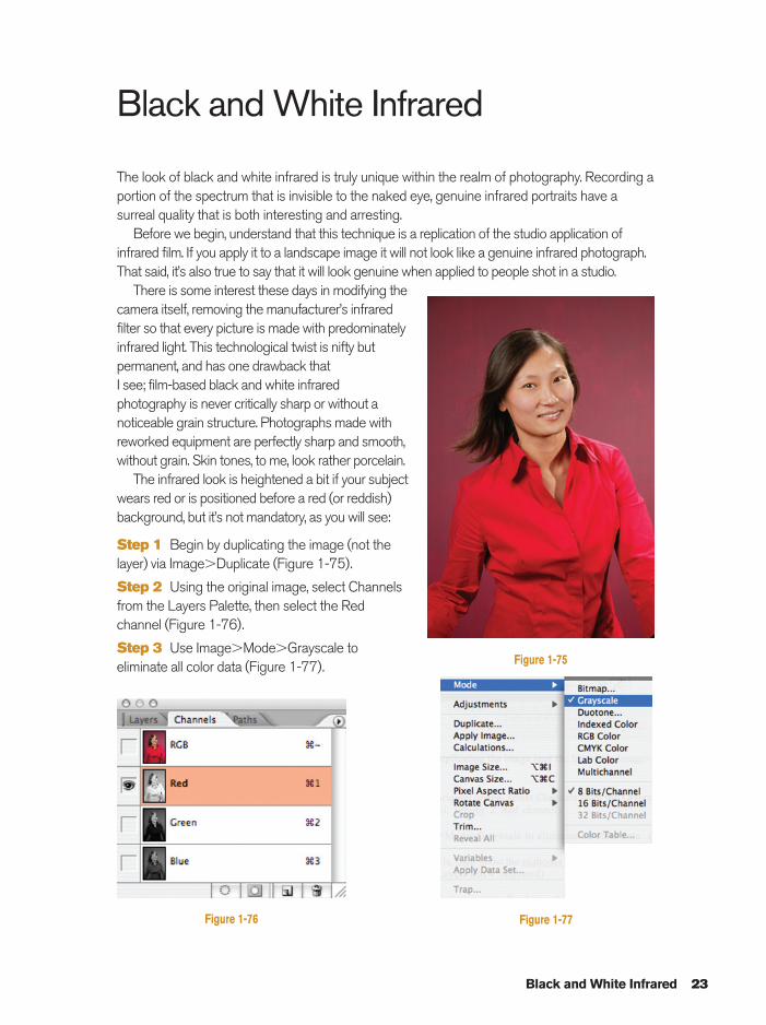
Black and White Infrared
The look of black and white infrared is truly unique within the realm of photography. Recording aportion of the spectrum that is invisible to the naked eye, genuine infrared portraits have asurreal quality that is both interesting and arresting.
Before we begin, understand that this technique is a replication of the studio application ofinfrared film. If you apply it to a landscape image it will not look like a genuine infrared photograph.That said, it’s also true to say that it will look genuine when applied to people shot in a studio.
There is some interest these days in modifying thecamera itself, removing the manufacturer’s infraredfilter so that every picture is made with predominatelyinfrared light. This technological twist is nifty butpermanent, and has one drawback that I see; film-based black and white infraredphotography is never critically sharp or without anoticeable grain structure. Photographs made withreworked equipment are perfectly sharp and smooth,without grain. Skin tones, to me, look rather porcelain.
The infrared look is heightened a bit if your subjectwears red or is positioned before a red (or reddish)background, but it’s not mandatory, as you will see:
Step 1 Begin by duplicating the image (not thelayer) via Image�Duplicate (Figure 1-75).
Step 2 Using the original image, select Channelsfrom the Layers Palette, then select the Redchannel (Figure 1-76).
Step 3 Use Image�Mode�Grayscale toeliminate all color data (Figure 1-77).
Black and White Infrared 23
Figure 1-75
Figure 1-76 Figure 1-77
Ch01-K80894.qxd 8/31/06 12:00 PM Page 23
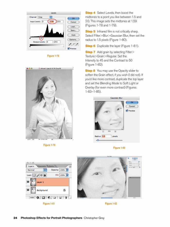
Step 4 Select Levels, then boost themidtones to a point you like between 1.5 and2.0. This image sets the midtones at 1.59(Figures 1-78 and 1-79).
Step 5 Infrared film is not critically sharp.Select Filter�Blur�Gaussian Blur, then set theradius to 1.5 pixels (Figure 1-80).
Step 6 Duplicate the layer (Figure 1-81).
Step 7 Add grain by selecting Filter�Texture�Grain�Regular. Set the Intensity to 45 and the Contrast to 50 (Figure 1-82).
Step 8 You may use the Opacity slider tosoften the Grain effect, if you wish (I did not). Ifyou’d like more contrast, duplicate the top layerand set the Blending Mode to Soft Light orOverlay (for even more contrast) (Figures 1-83–1-85).
24 Photoshop Effects for Portrait Photographers Christopher Grey
Figure 1-78
Figure 1-79
Figure 1-81
Figure 1-80
Figure 1-82
Ch01-K80894.qxd 8/31/06 12:00 PM Page 24
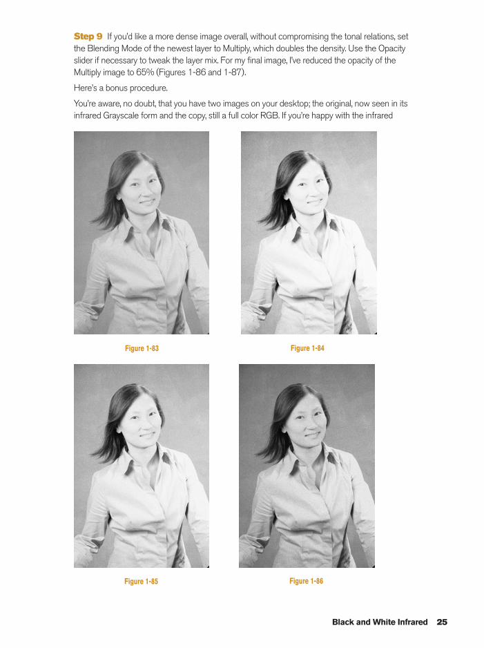
Step 9 If you’d like a more dense image overall, without compromising the tonal relations, setthe Blending Mode of the newest layer to Multiply, which doubles the density. Use the Opacityslider if necessary to tweak the layer mix. For my final image, I’ve reduced the opacity of theMultiply image to 65% (Figures 1-86 and 1-87).
Here’s a bonus procedure.
You’re aware, no doubt, that you have two images on your desktop; the original, now seen in itsinfrared Grayscale form and the copy, still a full color RGB. If you’re happy with the infrared
Black and White Infrared 25
Figure 1-84Figure 1-83
Figure 1-85 Figure 1-86
Ch01-K80894.qxd 8/31/06 12:00 PM Page 25
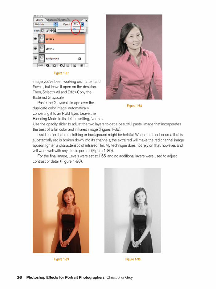
image you’ve been working on, Flatten andSave it, but leave it open on the desktop.Then, Select�All and Edit�Copy theflattened Grayscale.
Paste the Grayscale image over theduplicate color image, automaticallyconverting it to an RGB layer. Leave theBlending Mode to its default setting, Normal.Use the opacity slider to adjust the two layers to get a beautiful pastel image that incorporatesthe best of a full color and infrared image (Figure 1-88).
I said earlier that red clothing or background might be helpful. When an object or area that issubstantially red is broken down into its channels, the extra red will make the red channel imageappear lighter, a characteristic of infrared film. My technique does not rely on that, however, andwill work well with any studio portrait (Figure 1-89).
For the final image, Levels were set at 1.55, and no additional layers were used to adjustcontrast or detail (Figure 1-90).
26 Photoshop Effects for Portrait Photographers Christopher Grey
Figure 1-87
Figure 1-88
Figure 1-89 Figure 1-90
Ch01-K80894.qxd 8/31/06 12:00 PM Page 26
Cross-Processing 27
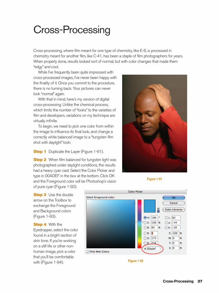
Cross-Processing
Cross-processing, where film meant for one type of chemistry, like E-6, is processed inchemistry meant for another film, like C-41, has been a staple of film photographers for years.When properly done, results looked sort of normal, but with color changes that made them“edgy” and cool.
While I’ve frequently been quite impressed withcross-processed images, I’ve never been happy withthe finality of it. Once you commit to the procedure,there is no turning back. Your pictures can neverlook “normal” again.
With that in mind, here’s my version of digitalcross-processing. Unlike the chemical process,which limits the number of “looks” to the varieties offilm and developers, variations on my technique arevirtually infinite.
To begin, we need to pick one color from withinthe image to influence its final look, and change acorrectly white balanced image to a “tungsten filmshot with daylight” look:
Step 1 Duplicate the Layer (Figure 1-91).
Step 2 When film balanced for tungsten light wasphotographed under daylight conditions, the resultshad a heavy cyan cast. Select the Color Picker andtype in 00ADEF in the box at the bottom. Click OKand the Foreground color will be Photoshop’s visionof pure cyan (Figure 1-92).
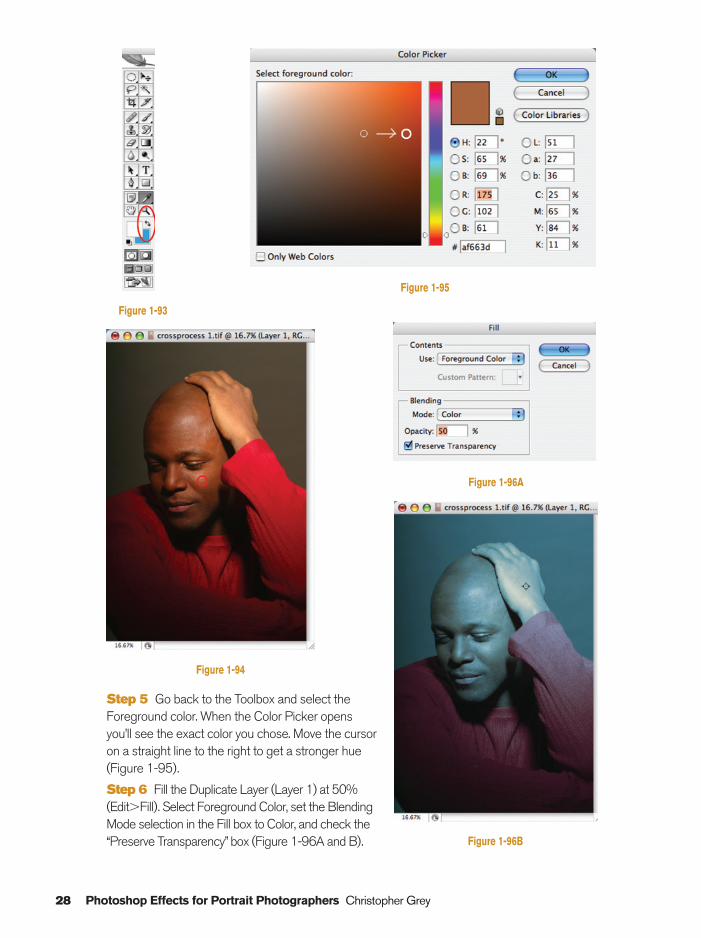
Step 3 Use the doublearrow on the Toolbox toexchange the Foregroundand Background colors(Figure 1-93).
Step 4 With theEyedropper, select the colorfound in a bright section ofskin tone. If you’re workingon a still life or other non-human image, pick a colorthat you’ll be comfortablewith (Figure 1-94).
Figure 1-91
Figure 1-92
Ch01-K80894.qxd 8/31/06 12:00 PM Page 27
28 Photoshop Effects for Portrait Photographers Christopher Grey
Step 5 Go back to the Toolbox and select theForeground color. When the Color Picker opensyou’ll see the exact color you chose. Move the cursoron a straight line to the right to get a stronger hue(Figure 1-95).
Step 6 Fill the Duplicate Layer (Layer 1) at 50%(Edit�Fill). Select Foreground Color, set the BlendingMode selection in the Fill box to Color, and check the“Preserve Transparency” box (Figure 1-96A and B).
Figure 1-94
Figure 1-93
Figure 1-96B
Figure 1-96A
Figure 1-95
Ch01-K80894.qxd 8/31/06 12:01 PM Page 28
Cross-Processing 29
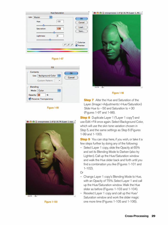
Figure 1-97
Step 7 Alter the Hue and Saturation of theLayer. (Image�Adjustments�Hue/Saturation)Slide Hue to�50 and Saturation to�30(Figures 1-97 and 1-98).
Step 8 Duplicate Layer 1 (“Layer 1 copy”) anduse Edit�Fill once again. Select Background Color,which will use the skin tone variation chosen inStep 5, and the same settings as Step 6 (Figures1-99 and 1-100).
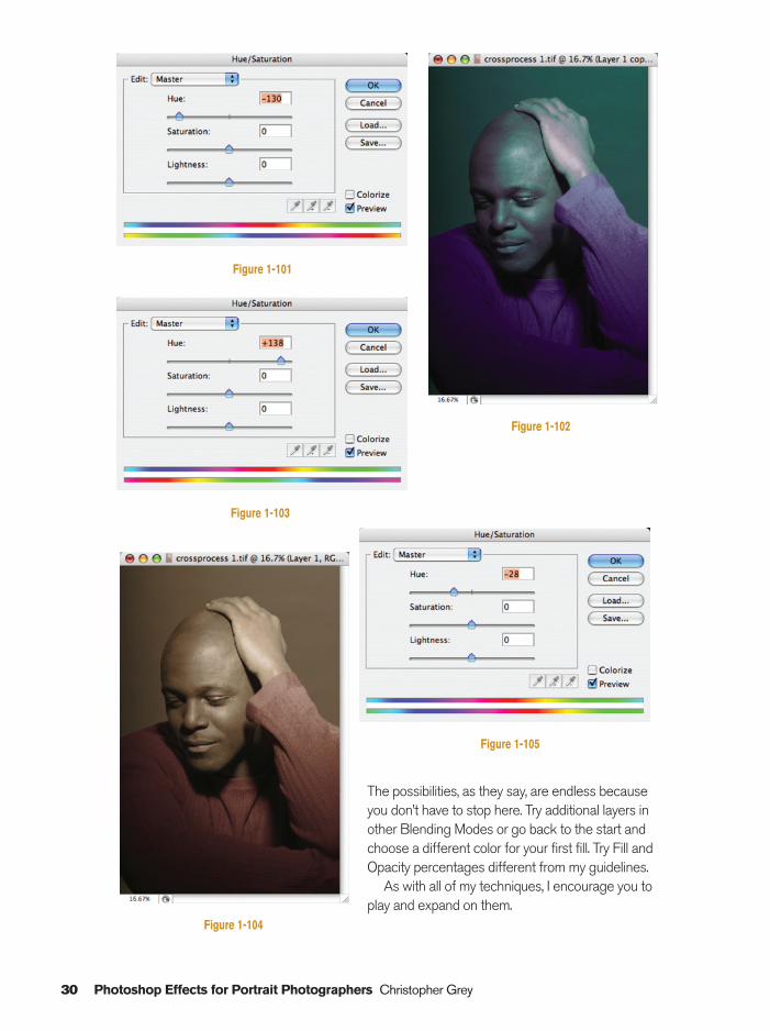
Step 9 You can stop here, if you wish, or take it afew steps further by doing any of the following:– Select Layer 1 copy, slide the Opacity at 65%
and set its Blending Mode to Darken (also tryLighten). Call up the Hue/Saturation windowand walk the Hue slider back and forth until youfind a combination you like (Figures 1-101 and1-102).
Or– Change Layer 1 copy’s Blending Mode to Hue,
with an Opacity of 75%. Select Layer 1 and callup the Hue/Saturation window. Walk the Hueslider as before (Figures 1-103 and 1-104).
– Reselect Layer 1 copy and call up the Hue/Saturation window and work the slider magicone more time (Figures 1-105 and 1-106).
Figure 1-98
Figure 1-99
Figure 1-100
Ch01-K80894.qxd 8/31/06 12:01 PM Page 29
30 Photoshop Effects for Portrait Photographers Christopher Grey
Figure 1-101
Figure 1-102
Figure 1-103
The possibilities, as they say, are endless becauseyou don’t have to stop here. Try additional layers inother Blending Modes or go back to the start andchoose a different color for your first fill. Try Fill andOpacity percentages different from my guidelines.
As with all of my techniques, I encourage you toplay and expand on them.
Figure 1-104
Figure 1-105
Ch01-K80894.qxd 8/31/06 12:01 PM Page 30
Cross-Processing 31
Figure 1-106
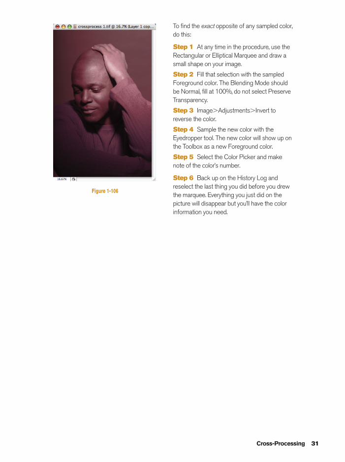
To find the exact opposite of any sampled color,do this:
Step 1 At any time in the procedure, use theRectangular or Elliptical Marquee and draw asmall shape on your image.
Step 2 Fill that selection with the sampledForeground color. The Blending Mode shouldbe Normal, fill at 100%, do not select PreserveTransparency.
Step 3 Image�Adjustments�Invert toreverse the color.
Step 4 Sample the new color with theEyedropper tool. The new color will show up onthe Toolbox as a new Foreground color.
Step 5 Select the Color Picker and makenote of the color’s number.
Step 6 Back up on the History Log andreselect the last thing you did before you drewthe marquee. Everything you just did on thepicture will disappear but you’ll have the colorinformation you need.
Ch01-K80894.qxd 8/31/06 12:01 PM Page 31
32 Photoshop Effects for Portrait Photographers Christopher Grey
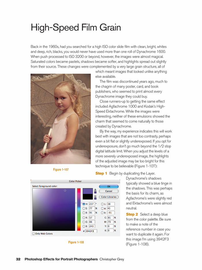
High-Speed Film Grain
Back in the 1960s, had you searched for a high ISO color slide film with clean, bright, whitesand deep, rich, blacks, you would never have used more than one roll of Dynachrome 1600.When push processed to ISO 3200 or beyond, however, the images were almost magical.Saturated colors became pastels, shadows became softer, and highlights spread out slightlyfrom their source. These changes were complemented by a very large grain structure, all of
which meant images that looked unlike anythingelse available.
The film was discontinued years ago, much tothe chagrin of many poster, card, and bookpublishers, who seemed to print almost everyDynachrome image they could buy.
Close runners-up to getting the same effectincluded Agfachrome 1000 and Kodak’s High-Speed Ektachrome. While the images wereinteresting, neither of these emulsions showed thecharm that seemed to come naturally to thosecreated by Dynachrome.
By the way, my experience indicates this will workbest with images that are not too contrasty, perhapseven a bit flat or slightly underexposed. If you opt forunderexposure, don’t go much beyond the 1/2 stopdigital latitude limit. When you adjust the levels of amore severely underexposed image, the highlightsof the adjusted image may be too bright for thistechnique to be believable (Figure 1-107):
Step 1 Begin by duplicating the Layer.Dynachrome’s shadowstypically showed a blue tinge inthe shadows. This was perhapsthe basis for its charm, asAgfachrome’s were slightly redand Ektachrome’s were almostneutral.
Step 2 Select a deep bluefrom the color palette. Be sureto make a note of thereference number in case youwant to duplicate it again. Forthis image I’m using 3942F3(Figure 1-108).
Figure 1-107
Figure 1-108
Ch01-K80894.qxd 8/31/06 12:01 PM Page 32
High-Speed Film Grain 33
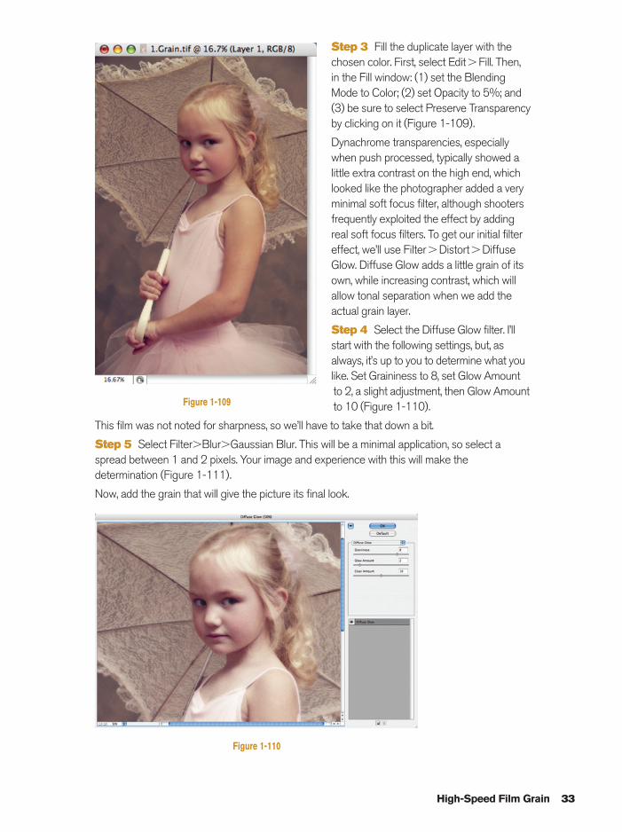
Step 3 Fill the duplicate layer with thechosen color. First, select Edit�Fill. Then,in the Fill window: (1) set the BlendingMode to Color; (2) set Opacity to 5%; and(3) be sure to select Preserve Transparencyby clicking on it (Figure 1-109).
Dynachrome transparencies, especiallywhen push processed, typically showed alittle extra contrast on the high end, whichlooked like the photographer added a veryminimal soft focus filter, although shootersfrequently exploited the effect by addingreal soft focus filters. To get our initial filtereffect, we’ll use Filter�Distort�DiffuseGlow. Diffuse Glow adds a little grain of itsown, while increasing contrast, which willallow tonal separation when we add theactual grain layer.
Step 4 Select the Diffuse Glow filter. I’llstart with the following settings, but, asalways, it’s up to you to determine what youlike. Set Graininess to 8, set Glow Amountto 2, a slight adjustment, then Glow Amountto 10 (Figure 1-110).
This film was not noted for sharpness, so we’ll have to take that down a bit.
Step 5 Select Filter�Blur�Gaussian Blur. This will be a minimal application, so select aspread between 1 and 2 pixels. Your image and experience with this will make thedetermination (Figure 1-111).
Now, add the grain that will give the picture its final look.
Figure 1-109
Figure 1-110
Ch01-K80894.qxd 8/31/06 12:01 PM Page 33
34 Photoshop Effects for Portrait Photographers Christopher Grey
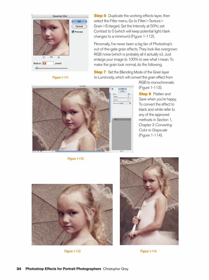
Step 6 Duplicate the working effects layer, thenselect the Filter menu. Go to Filter�Texture�
Grain�Enlarged. Set the Intensity at 50%; setContrast to 0 (which will keep potential light/darkchanges to a minimum) (Figure 1-112).
Personally, I’ve never been a big fan of Photoshop’sout-of-the-gate grain effects. They look like overgrownRGB noise (which is probably all it actually is). Justenlarge your image to 100% to see what I mean. Tomake the grain look normal, do the following.
Step 7 Set the Blending Mode of the Grain layer to Luminosity, which will convert the grain effect from
RGB to monochromatic(Figure 1-113).
Step 8 Flatten andSave when you’re happy.To convert the effect toblack and white refer toany of the approvedmethods in Section 1,Chapter 3 ConvertingColor to Grayscale(Figure 1-114).
Figure 1-111
Figure 1-112
Figure 1-113 Figure 1-114
Ch01-K80894.qxd 8/31/06 12:01 PM Page 34
Oil Tint 35
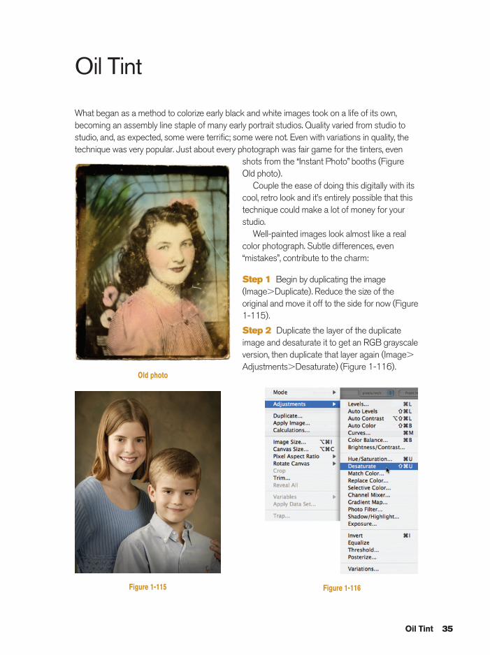
Oil Tint
What began as a method to colorize early black and white images took on a life of its own,becoming an assembly line staple of many early portrait studios. Quality varied from studio tostudio, and, as expected, some were terrific; some were not. Even with variations in quality, thetechnique was very popular. Just about every photograph was fair game for the tinters, even
shots from the “Instant Photo” booths (FigureOld photo).
Couple the ease of doing this digitally with itscool, retro look and it’s entirely possible that thistechnique could make a lot of money for yourstudio.
Well-painted images look almost like a realcolor photograph. Subtle differences, even“mistakes”, contribute to the charm:
Step 1 Begin by duplicating the image(Image�Duplicate). Reduce the size of theoriginal and move it off to the side for now (Figure1-115).
Step 2 Duplicate the layer of the duplicateimage and desaturate it to get an RGB grayscaleversion, then duplicate that layer again (Image�
Adjustments�Desaturate) (Figure 1-116).
Figure 1-115
Old photo
Figure 1-116
Ch01-K80894.qxd 8/31/06 12:01 PM Page 35
36 Photoshop Effects for Portrait Photographers Christopher Grey
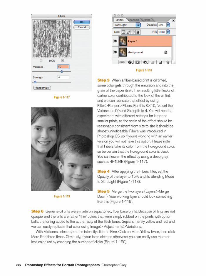
Step 3 When a fiber-based print is oil tinted,some color gets through the emulsion and into thegrain of the paper itself. The resulting little flecks ofdarker color contributed to the look of the oil tint,and we can replicate that effect by usingFilter�Render�Fibers. For this 8�10, I’ve set theVariance to 50 and Strength to 4. You will need toexperiment with different settings for larger orsmaller prints, as the scale of the effect should bereasonably consistent from size to size it should bealmost unnoticeable. Fibers was introduced inPhotoshop CS, so if you’re working with an earlierversion you will not have this option. Please notethat Fibers take its color from the Foreground color,so be certain that the Foreground color is black.You can lessen the effect by using a deep graysuch as 4F4D4E (Figure 1-117).
Step 4 After applying the Fibers filter, set theOpacity of the layer to 15% and its Blending Modeto Soft Light (Figure 1-118).
Step 5 Merge the two layers (Layers�MergeDown). Your working layer should look somethinglike this (Figure 1-119).
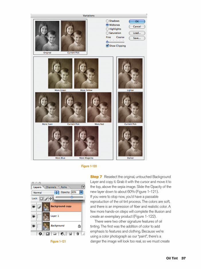
Step 6 Genuine oil tints were made on sepia toned, fiber base prints. Because oil tints are notopaque, and the tints are rather “thin” colors that were simply rubbed on the prints with cottonballs, the toning added to the authenticity of the flesh tones. Sepia is merely yellow and red, andwe can easily replicate that color using Image� Adjustments�Variations.
With Midtones selected, set the intensity slider to Fine. Click on More Yellow twice, then clickMore Red three times. Obviously, if your taste dictates otherwise, you can easily use more orless color just by changing the number of clicks (Figure 1-120).
Figure 1-119
Figure 1-118
Figure 1-117
Ch01-K80894.qxd 8/31/06 12:01 PM Page 36
Oil Tint 37
Step 7 Reselect the original, untouched BackgroundLayer and copy it. Grab it with the cursor and move it tothe top, above the sepia image. Slide the Opacity of thenew layer down to about 60% (Figure 1-121).If you were to stop now, you’d have a passablereproduction of the oil tint process. The colors are soft,and there is an impression of fiber and realistic color. Afew more hands-on steps will complete the illusion andcreate an exemplary product (Figure 1-122).
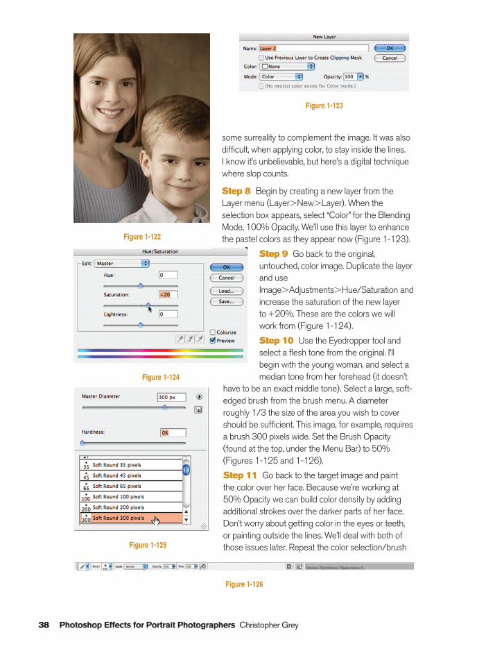
There were two other signature features of oiltinting. The first was the addition of color to addemphasis to features and clothing. Because we’reusing a color photograph as our “paint”, there’s adanger the image will look too real, so we must create
Figure 1-120
Figure 1-121
Ch01-K80894.qxd 8/31/06 12:01 PM Page 37
38 Photoshop Effects for Portrait Photographers Christopher Grey
some surreality to complement the image. It was alsodifficult, when applying color, to stay inside the lines. I know it’s unbelievable, but here’s a digital techniquewhere slop counts.
Step 8 Begin by creating a new layer from theLayer menu (Layer�New�Layer). When theselection box appears, select “Color” for the BlendingMode, 100% Opacity. We’ll use this layer to enhancethe pastel colors as they appear now (Figure 1-123).
Step 9 Go back to the original,untouched, color image. Duplicate the layerand useImage�Adjustments�Hue/Saturation andincrease the saturation of the new layerto�20%. These are the colors we willwork from (Figure 1-124).
Step 10 Use the Eyedropper tool andselect a flesh tone from the original. I’llbegin with the young woman, and select amedian tone from her forehead (it doesn’t
have to be an exact middle tone). Select a large, soft-edged brush from the brush menu. A diameterroughly 1/3 the size of the area you wish to covershould be sufficient. This image, for example, requiresa brush 300 pixels wide. Set the Brush Opacity(found at the top, under the Menu Bar) to 50%(Figures 1-125 and 1-126).
Step 11 Go back to the target image and paint the color over her face. Because we’re working at50% Opacity we can build color density by addingadditional strokes over the darker parts of her face.Don’t worry about getting color in the eyes or teeth, or painting outside the lines. We’ll deal with both ofthose issues later. Repeat the color selection/brush
Figure 1-122
Figure 1-123
Figure 1-124
Figure 1-125
Figure 1-126
Ch01-K80894.qxd 8/31/06 12:01 PM Page 38
Oil Tint 39
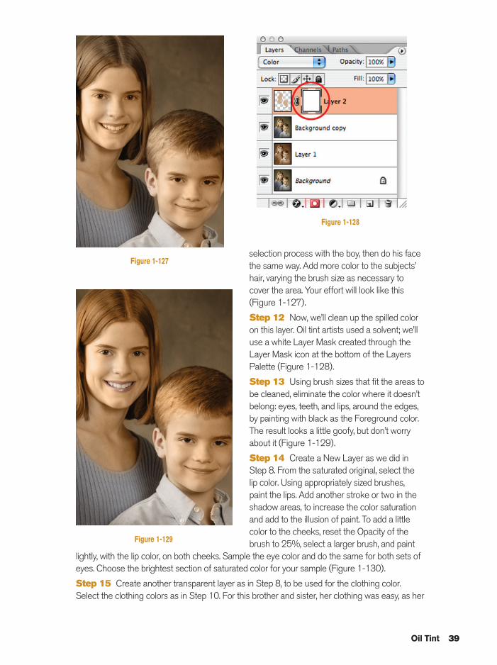
selection process with the boy, then do his facethe same way. Add more color to the subjects’hair, varying the brush size as necessary tocover the area. Your effort will look like this (Figure 1-127).
Step 12 Now, we’ll clean up the spilled coloron this layer. Oil tint artists used a solvent; we’lluse a white Layer Mask created through theLayer Mask icon at the bottom of the LayersPalette (Figure 1-128).
Step 13 Using brush sizes that fit the areas tobe cleaned, eliminate the color where it doesn’tbelong: eyes, teeth, and lips, around the edges,by painting with black as the Foreground color.The result looks a little goofy, but don’t worryabout it (Figure 1-129).
Step 14 Create a New Layer as we did inStep 8. From the saturated original, select thelip color. Using appropriately sized brushes,paint the lips. Add another stroke or two in theshadow areas, to increase the color saturationand add to the illusion of paint. To add a littlecolor to the cheeks, reset the Opacity of thebrush to 25%, select a larger brush, and paint
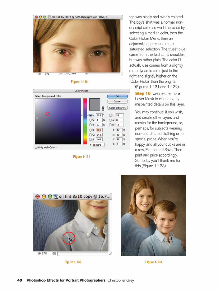
lightly, with the lip color, on both cheeks. Sample the eye color and do the same for both sets ofeyes. Choose the brightest section of saturated color for your sample (Figure 1-130).
Step 15 Create another transparent layer as in Step 8, to be used for the clothing color.Select the clothing colors as in Step 10. For this brother and sister, her clothing was easy, as her
Figure 1-127
Figure 1-128
Figure 1-129
Ch01-K80894.qxd 8/31/06 12:01 PM Page 39
40 Photoshop Effects for Portrait Photographers Christopher Grey
top was nicely and evenly colored.The boy’s shirt was a normal, non-descript color, so we’ll improvise byselecting a median color, then theColor Picker Menu, then anadjacent, brighter, and moresaturated selection. The truest bluecame from the fold at his shoulder,but was rather plain. The color I’llactually use comes from a slightlymore dynamic color, just to theright and slightly higher on theColor Picker than the original
(Figures 1-131 and 1-132).
Step 16 Create one moreLayer Mask to clean up anymispainted details on this layer.
You may continue, if you wish,and create other layers andmasks for the background, or,perhaps, for subjects wearingnon-coordinated clothing or forspecial props. When you’rehappy, and all your ducks are ina row, Flatten and Save. Thenprint and price accordingly.Someday you’ll thank me forthis (Figure 1-133).
Figure 1-133Figure 1-132
Figure 1-130
Figure 1-131
Ch01-K80894.qxd 8/31/06 12:02 PM Page 40
Hand Coloring Black and White
Hand coloring black and white photographs, even if you don’t have a color image for reference,is rather easy. In essence, we’ll be using a palette of set colors, just like hand colorists have usedfor decades. The only difference is that our palette is digital.
I remember, years ago, watching a colorist working on a copy print of an old family image. Allshe had to work with for reference was a few notes made by the client. Eye and hair color werepretty definite, but everything else, while noted, was simply presumed. It was up to her, as anartist, to fill in the blanks, which she did from a box of tints only 64 colors deep. It didn’t take hervery long to do a portrait, less than an hour as I recall, but, since hand coloring was her primaryjob and she really knew what she was doing, the dozens she did each week were accomplishedwith confidence and speed.
I guess that little digression means that you shouldn’t be too concerned if your first attemptsare less than stellar. Like every artistic technique, the secret to success is practice, practice,practice.
If you are beginning with a color image, you have the benefit of an actual color reference. Ifnot, we’ll reference Photoshop’s Swatches window, a mini-palette with more colors than handcolorists ever had in the past.
Make sure your black and white image is in the RGB Mode. If in doubt, just use Image�
Mode�RGB Color:
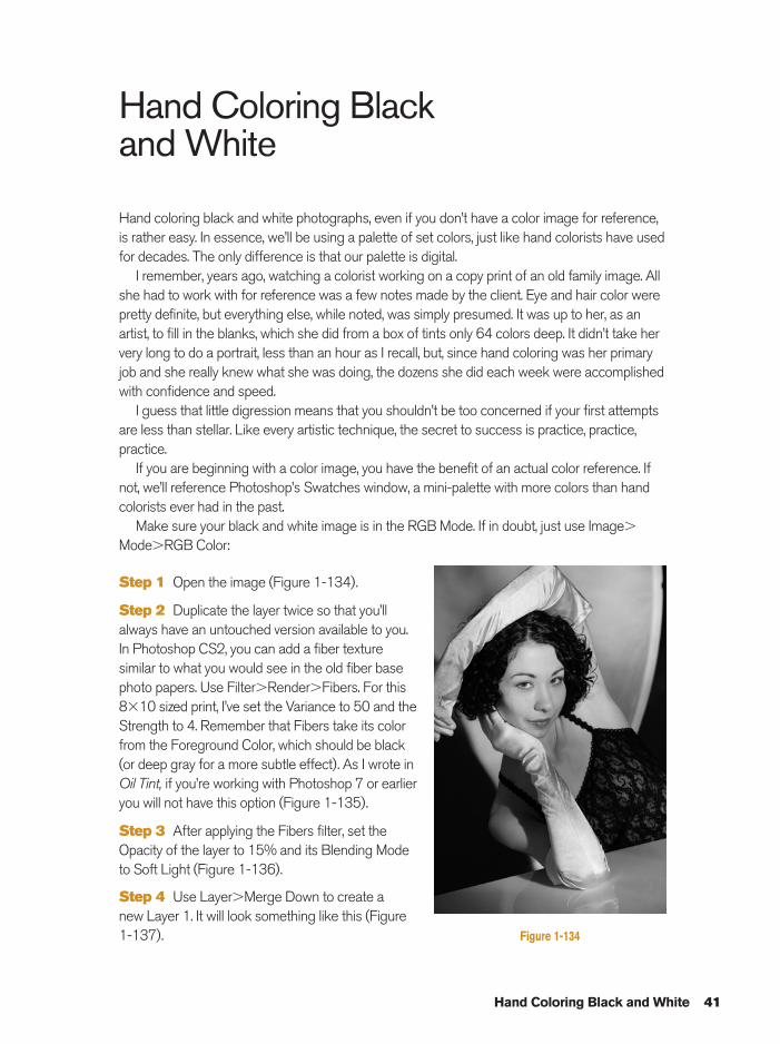
Step 1 Open the image (Figure 1-134).
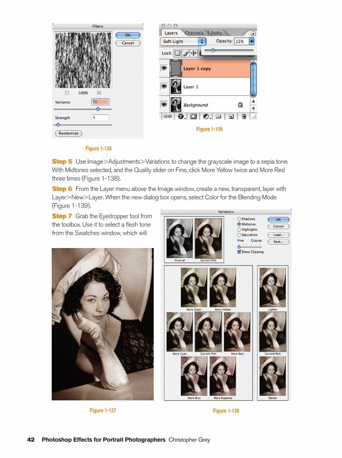
Step 2 Duplicate the layer twice so that you’llalways have an untouched version available to you.In Photoshop CS2, you can add a fiber texturesimilar to what you would see in the old fiber basephoto papers. Use Filter�Render�Fibers. For this8�10 sized print, I’ve set the Variance to 50 and theStrength to 4. Remember that Fibers take its colorfrom the Foreground Color, which should be black(or deep gray for a more subtle effect). As I wrote inOil Tint, if you’re working with Photoshop 7 or earlieryou will not have this option (Figure 1-135).
Step 3 After applying the Fibers filter, set theOpacity of the layer to 15% and its Blending Modeto Soft Light (Figure 1-136).
Step 4 Use Layer�Merge Down to create a new Layer 1. It will look something like this (Figure1-137).
Hand Coloring Black and White 41
Figure 1-134
Ch01-K80894.qxd 8/31/06 12:02 PM Page 41
42 Photoshop Effects for Portrait Photographers Christopher Grey
Step 5 Use Image�Adjustments�Variations to change the grayscale image to a sepia tone.With Midtones selected, and the Quality slider on Fine, click More Yellow twice and More Redthree times (Figure 1-138).
Step 6 From the Layer menu above the Image window, create a new, transparent, layer withLayer�New�Layer. When the new dialog box opens, select Color for the Blending Mode(Figure 1-139).
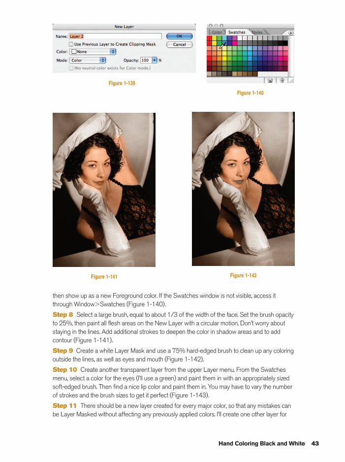
Step 7 Grab the Eyedropper tool fromthe toolbox. Use it to select a flesh tonefrom the Swatches window, which will
Figure 1-136
Figure 1-137 Figure 1-138
Figure 1-135
Ch01-K80894.qxd 8/31/06 12:02 PM Page 42
Hand Coloring Black and White 43
then show up as a new Foreground color. If the Swatches window is not visible, access itthrough Window�Swatches (Figure 1-140).
Step 8 Select a large brush, equal to about 1/3 of the width of the face. Set the brush opacityto 25%, then paint all flesh areas on the New Layer with a circular motion. Don’t worry aboutstaying in the lines. Add additional strokes to deepen the color in shadow areas and to addcontour (Figure 1-141).
Step 9 Create a white Layer Mask and use a 75% hard-edged brush to clean up any coloringoutside the lines, as well as eyes and mouth (Figure 1-142).
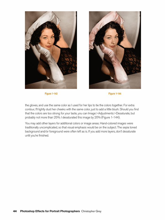
Step 10 Create another transparent layer from the upper Layer menu. From the Swatchesmenu, select a color for the eyes (I’ll use a green) and paint them in with an appropriately sizedsoft-edged brush. Then find a nice lip color and paint them in. You may have to vary the numberof strokes and the brush sizes to get it perfect (Figure 1-143).
Step 11 There should be a new layer created for every major color, so that any mistakes canbe Layer Masked without affecting any previously applied colors. I’ll create one other layer for
Figure 1-139
Figure 1-140
Figure 1-141 Figure 1-142
Ch01-K80894.qxd 8/31/06 12:02 PM Page 43
44 Photoshop Effects for Portrait Photographers Christopher Grey
the gloves, and use the same color as I used for her lips to tie the colors together. For extracontour, I’ll lightly dust her cheeks with the same color, just to add a little blush. Should you findthat the colors are too strong for your taste, you can Image�Adjustments�Desaturate, butprobably not more than 25%. I desaturated this image by 20% (Figure 1-144).
You may add other layers for additional colors or image areas. Hand-colored images weretraditionally uncomplicated, so that visual emphasis would be on the subject. The sepia tonedbackground and/or foreground were often left as is. If you add more layers, don’t desaturateuntil you’re finished.
Figure 1-143 Figure 1-144
Ch01-K80894.qxd 8/31/06 12:02 PM Page 44
Damage Free Dodge and Burn 45
Damage Free Dodge and Burn
Most Photoshop experts will tell you that it’sdestructive to use the Dodge and Burn toolsfound on the Toolbar because the toolsactually alter the pixels they’re used upon.Here’s a foolproof way to dodge and burn thatwill be completely visible, but will not affectanything until the layers are merged together.
This technique goes far beyond anydarkroom control you could ever have. You candodge or burn very small, controlled, areas,and, of course, immediately undo anymistakes. Even when you’re almost done, youcan still fix any dodge or burn mistake, just byapplying the opposite color to the area inquestion:
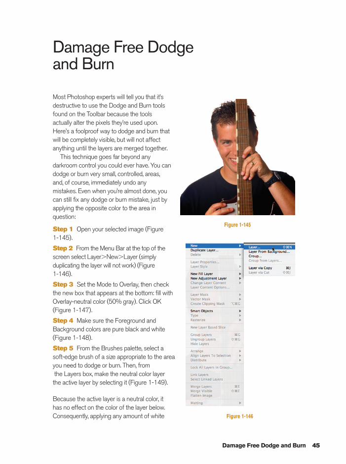
Step 1 Open your selected image (Figure 1-145).
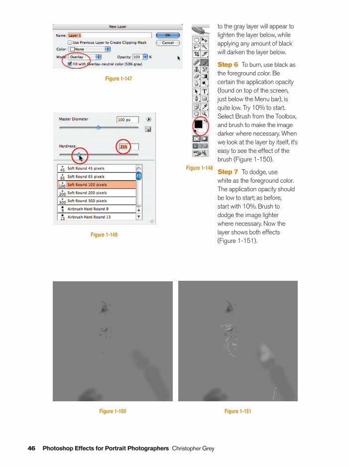
Step 2 From the Menu Bar at the top of thescreen select Layer�New�Layer (simplyduplicating the layer will not work) (Figure 1-146).
Step 3 Set the Mode to Overlay, then checkthe new box that appears at the bottom: fill withOverlay-neutral color (50% gray). Click OK(Figure 1-147).
Step 4 Make sure the Foreground andBackground colors are pure black and white(Figure 1-148).
Step 5 From the Brushes palette, select asoft-edge brush of a size appropriate to the areayou need to dodge or burn. Then, fromthe Layers box, make the neutral color layer the active layer by selecting it (Figure 1-149).
Because the active layer is a neutral color, it has no effect on the color of the layer below.Consequently, applying any amount of white
Figure 1-145
Figure 1-146
Ch01-K80894.qxd 8/31/06 12:02 PM Page 45
46 Photoshop Effects for Portrait Photographers Christopher Grey
to the gray layer will appear tolighten the layer below, whileapplying any amount of blackwill darken the layer below.
Step 6 To burn, use black asthe foreground color. Becertain the application opacity(found on top of the screen,just below the Menu bar), isquite low. Try 10% to start.Select Brush from the Toolbox,and brush to make the imagedarker where necessary. Whenwe look at the layer by itself, it’seasy to see the effect of thebrush (Figure 1-150).
Step 7 To dodge, use white as the foreground color.The application opacity shouldbe low to start; as before, start with 10%. Brush to dodge the image lighter where necessary. Now thelayer shows both effects(Figure 1-151).
Figure 1-147
Figure 1-149
Figure 1-148
Figure 1-150 Figure 1-151
Ch01-K80894.qxd 8/31/06 12:02 PM Page 46
Damage Free Dodge and Burn 47
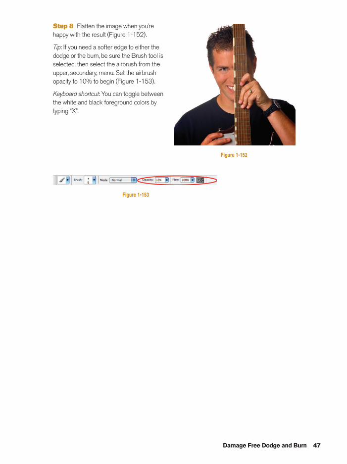
Step 8 Flatten the image when you’rehappy with the result (Figure 1-152).
Tip: If you need a softer edge to either thedodge or the burn, be sure the Brush tool isselected, then select the airbrush from theupper, secondary, menu. Set the airbrushopacity to 10% to begin (Figure 1-153).
Keyboard shortcut: You can toggle betweenthe white and black foreground colors bytyping “X”.
Figure 1-152
Figure 1-153
Ch01-K80894.qxd 8/31/06 12:02 PM Page 47

This page intentionally left blank
Section 2Image Enhancements
Ch02-K80894.qxd 8/31/06 12:03 PM Page 49
50 Photoshop Effects for Portrait Photographers Christopher Grey
Surreal Backgrounds
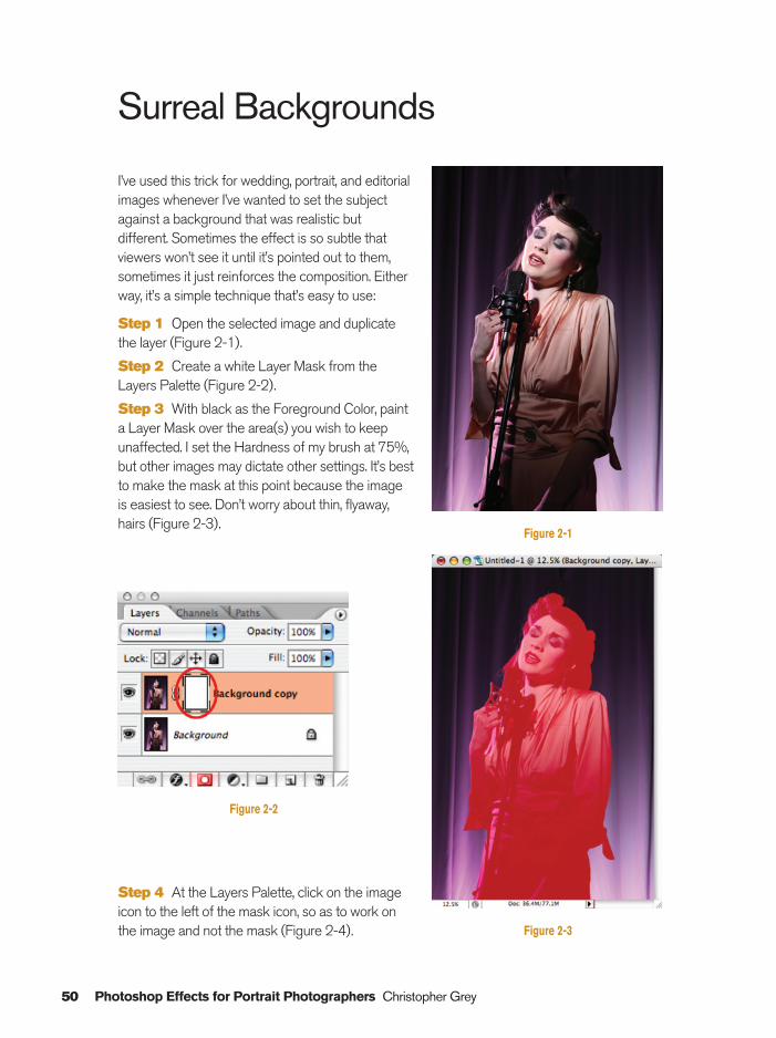
I’ve used this trick for wedding, portrait, and editorialimages whenever I’ve wanted to set the subjectagainst a background that was realistic butdifferent. Sometimes the effect is so subtle thatviewers won’t see it until it’s pointed out to them,sometimes it just reinforces the composition. Eitherway, it’s a simple technique that’s easy to use:
Step 1 Open the selected image and duplicatethe layer (Figure 2-1).
Step 2 Create a white Layer Mask from theLayers Palette (Figure 2-2).
Step 3 With black as the Foreground Color, painta Layer Mask over the area(s) you wish to keepunaffected. I set the Hardness of my brush at 75%,but other images may dictate other settings. It’s bestto make the mask at this point because the imageis easiest to see. Don’t worry about thin, flyaway,hairs (Figure 2-3).
Figure 2-1
Figure 2-3
Figure 2-2
Step 4 At the Layers Palette, click on the imageicon to the left of the mask icon, so as to work onthe image and not the mask (Figure 2-4).
Ch02-K80894.qxd 8/31/06 12:03 PM Page 50
Surreal Backgrounds 51
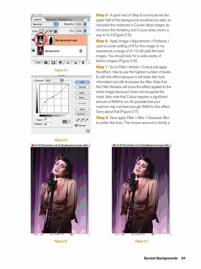
Step 5 A quick test of Step 6 convinced me theupper half of the background would be too dark, soI boosted the midtones in Curves. Most images donot show this tendency, but if yours does, here’s away to fix it (Figure 2-5).
Step 6 Apply Image�Adjustments�Posterize. Iused a Levels setting of 8 for this image. In myexperience, a range of 4–10 will yield the bestimages. You should look for a wide variety ofdistinct shapes (Figure 2-6).
Step 7 Go to Filter�Artistic�Cutout and applythe effect . I like to use the highest number of levels,8, with this effect because it will retain the mostinformation but still showcase the filter. Note thatthe Filter Window will show the effect applied to theentire image because it does not recognize themask. Also note that Cutout requires a significantamount of RAM to run. It’s possible that yourmachine may not have enough RAM for this effect.Sorry about that (Figure 2-7).
Step 8 Now apply Filter�Blur�Gaussian Blurto soften the lines. The chosen amount is strictly a
Figure 2-4
Figure 2-5
Figure 2-6 Figure 2-7
Ch02-K80894.qxd 8/31/06 12:03 PM Page 51
52 Photoshop Effects for Portrait Photographers Christopher Grey
Figure 2-8
Figure 2-9
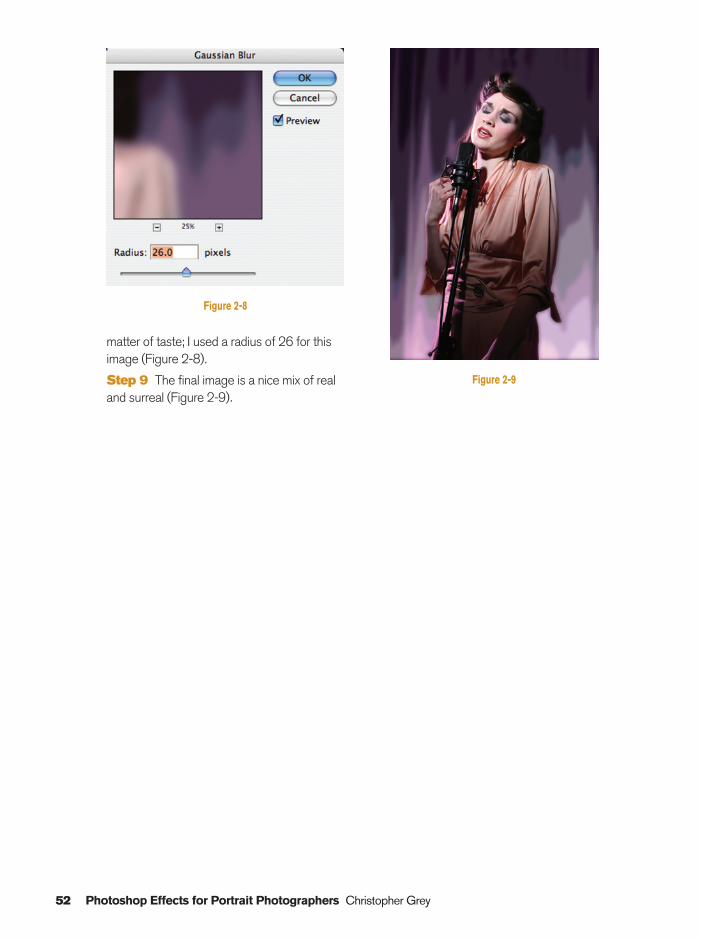
matter of taste; I used a radius of 26 for thisimage (Figure 2-8).
Step 9 The final image is a nice mix of realand surreal (Figure 2-9).
Ch02-K80894.qxd 8/31/06 12:03 PM Page 52
HyperColor
No matter how wonderful your images are, there are always some that would benefit from alittle extra zip. Portrait photographers will appreciate this technique because it’s easy to do andeasy to control.
The secret to this technique is the Posterize command found in the Image�Adjustmentssubmenu. If you’re old enough to remember the great rock and roll bands of the sixties, youprobably also remember the bright, color delineated (and hard to read), posters that announcedtheir concerts. A visual return to those heady days is just a mouse click away:
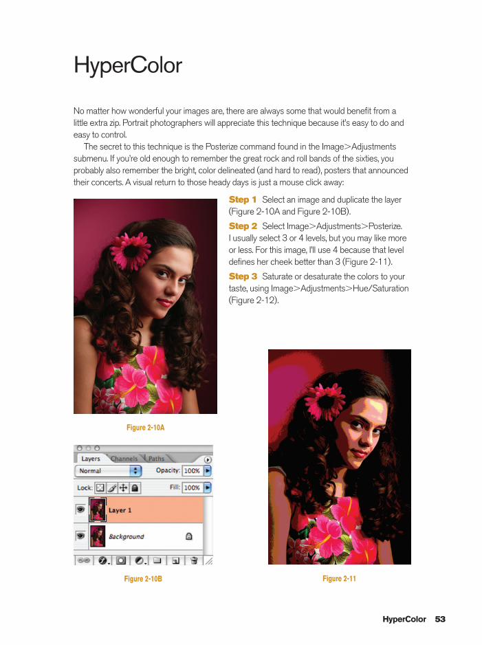
Step 1 Select an image and duplicate the layer(Figure 2-10A and Figure 2-10B).
Step 2 Select Image�Adjustments�Posterize. I usually select 3 or 4 levels, but you may like moreor less. For this image, I’ll use 4 because that leveldefines her cheek better than 3 (Figure 2-11).
Step 3 Saturate or desaturate the colors to yourtaste, using Image�Adjustments�Hue/Saturation(Figure 2-12).
HyperColor 53
Figure 2-10A
Figure 2-10B Figure 2-11
Ch02-K80894.qxd 8/31/06 12:04 PM Page 53
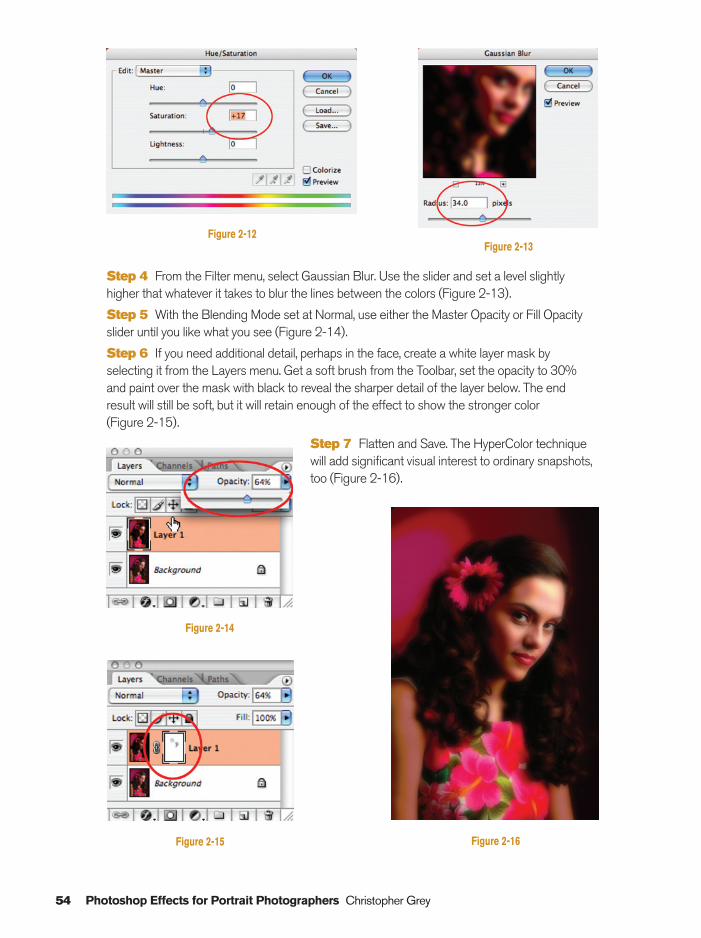
Step 4 From the Filter menu, select Gaussian Blur. Use the slider and set a level slightlyhigher that whatever it takes to blur the lines between the colors (Figure 2-13).
Step 5 With the Blending Mode set at Normal, use either the Master Opacity or Fill Opacityslider until you like what you see (Figure 2-14).
Step 6 If you need additional detail, perhaps in the face, create a white layer mask byselecting it from the Layers menu. Get a soft brush from the Toolbar, set the opacity to 30%and paint over the mask with black to reveal the sharper detail of the layer below. The end result will still be soft, but it will retain enough of the effect to show the stronger color (Figure 2-15).
Step 7 Flatten and Save. The HyperColor techniquewill add significant visual interest to ordinary snapshots,too (Figure 2-16).
54 Photoshop Effects for Portrait Photographers Christopher Grey
Figure 2-12
Figure 2-14
Figure 2-15
Figure 2-13
Figure 2-16
Ch02-K80894.qxd 8/31/06 12:04 PM Page 54
Glowing Accents 55
Glowing Accents
Simplicity in lighting is something every photographer should strive for, especially when workingwith people, as they tend to get bored when a session doesn’t move along smoothly. Time isoften a factor, as well. If you’ve hired a model, even though you may be working with clientmoney. You have a responsibility to get the job done as quickly as possible.
I will often structure a shoot with simplicity in mind, knowing the minor deficiencies that resultcan be remedied, even improved upon, with some creative Photoshop post-production. Bear inmind that any such fudging is within the confines of digital exposure latitude; although I maymess with the light:shadow ratio for any other accent, my key light (the light that all other lightsor image areas are metered against) is always properly metered and exposed.
This image was lit with only one light. My model was positioned close enough to thebackground that light from the 18-in. reflector would spill onto it as well as a white fill cardplaced at camera left. I could have put another light at camera left, to accent her face even more,but I felt the subtlety of a one light scenario would be more mysterious, especially after somePhotoshop work. Besides, my makeup artist provided a pretty nifty hat, and I wanted to makethe most of it.
I moved a large white foamcore board into camera left, to bounce some light onto her face.Even though the board was clean and new, the bounce was almost 11⁄2 stops darker than thekey, and looked a little flat because of the size of the bounce card:
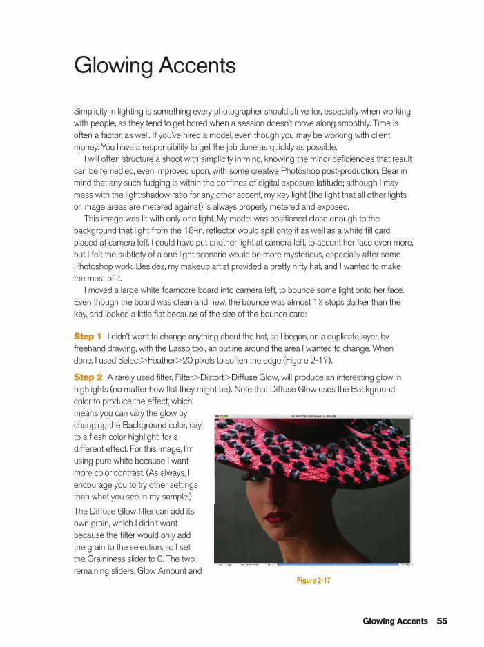
Step 1 I didn’t want to change anything about the hat, so I began, on a duplicate layer, byfreehand drawing, with the Lasso tool, an outline around the area I wanted to change. Whendone, I used Select�Feather�20 pixels to soften the edge (Figure 2-17).
Step 2 A rarely used filter, Filter�Distort�Diffuse Glow, will produce an interesting glow inhighlights (no matter how flat they might be). Note that Diffuse Glow uses the Backgroundcolor to produce the effect, whichmeans you can vary the glow bychanging the Background color, sayto a flesh color highlight, for adifferent effect. For this image, I’musing pure white because I wantmore color contrast. (As always, Iencourage you to try other settingsthan what you see in my sample.)
The Diffuse Glow filter can add itsown grain, which I didn’t wantbecause the filter would only addthe grain to the selection, so I setthe Graininess slider to 0. The tworemaining sliders, Glow Amount and
Figure 2-17
Ch02-K80894.qxd 8/31/06 12:04 PM Page 55
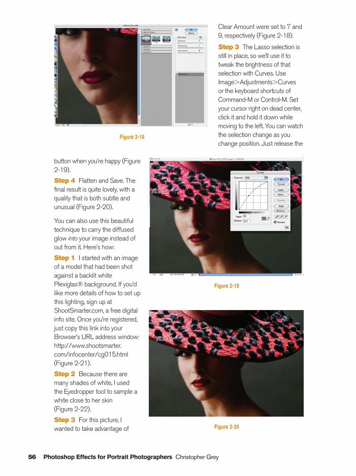
Clear Amount were set to 7 and9, respectively (Figure 2-18).
Step 3 The Lasso selection isstill in place, so we’ll use it totweak the brightness of thatselection with Curves. UseImage�Adjustments�Curves or the keyboard shortcuts ofCommand-M or Control-M. Setyour cursor right on dead center,click it and hold it down whilemoving to the left. You can watchthe selection change as youchange position. Just release the
button when you’re happy (Figure2-19).
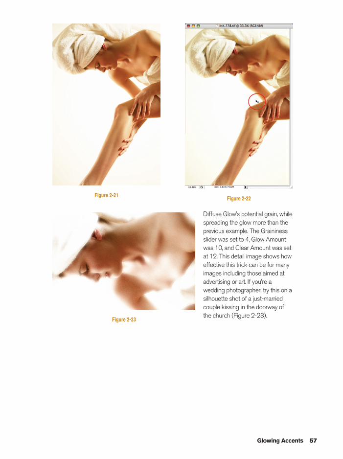
Step 4 Flatten and Save. Thefinal result is quite lovely, with aquality that is both subtle andunusual (Figure 2-20).
You can also use this beautifultechnique to carry the diffusedglow into your image instead ofout from it. Here’s how:
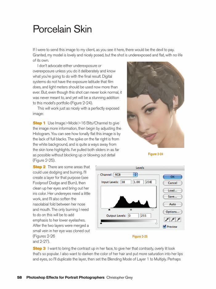
Step 1 I started with an imageof a model that had been shotagainst a backlit whitePlexiglas® background. If you’dlike more details of how to set upthis lighting, sign up atShootSmarter.com, a free digitalinfo site. Once you’re registered,just copy this link into yourBrowser’s URL address window:http://www.shootsmarter.com/infocenter/cg015.html(Figure 2-21).
Step 2 Because there aremany shades of white, I used the Eyedropper tool to sample awhite close to her skin (Figure 2-22).
Step 3 For this picture, Iwanted to take advantage of
56 Photoshop Effects for Portrait Photographers Christopher Grey
Figure 2-18
Figure 2-19
Figure 2-20
Ch02-K80894.qxd 8/31/06 12:04 PM Page 56
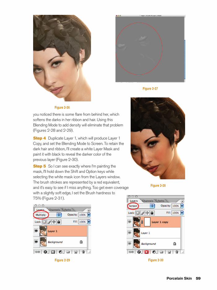
Diffuse Glow’s potential grain, whilespreading the glow more than theprevious example. The Graininessslider was set to 4, Glow Amountwas 10, and Clear Amount was setat 12. This detail image shows howeffective this trick can be for many images including those aimed atadvertising or art. If you’re awedding photographer, try this on asilhouette shot of a just-marriedcouple kissing in the doorway ofthe church (Figure 2-23).
Glowing Accents 57
Figure 2-21 Figure 2-22
Figure 2-23
Ch02-K80894.qxd 8/31/06 12:04 PM Page 57
Porcelain Skin
If I were to send this image to my client, as you see it here, there would be the devil to pay.Granted, my model is lovely and nicely posed, but the shot is underexposed and flat, with no lifeof its own.
I don’t advocate either underexposure oroverexposure unless you do it deliberately and knowwhat you’re going to do with the final result. Digitalsystems do not have the exposure latitude that filmdoes, and light meters should be used now more thanever. But, even though this shot can never look normal, itwas never meant to, and yet will be a stunning additionto this model’s portfolio (Figure 2-24).
This will work just as nicely with a perfectly exposedimage:
Step 1 Use Image�Mode�16 Bits/Channel to givethe image more information, then begin by adjusting theHistogram. You can see how tonally flat this image is bythe lack of full blacks. The spike on the far right is fromthe white background, and is quite a ways away fromthe skin tone highlights. I’ve pulled both sliders in as faras possible without blocking up or blowing out detail(Figure 2-25).
Step 2 There are some areas thatcould use dodging and burning. I’llcreate a layer for that purpose (seeFoolproof Dodge and Burn), thenclean up her eyes and bring out heriris color. Her undereyes need a littlework, and I’ll also soften thenasolabial fold between her noseand mouth. The only burning I needto do on this will be to addemphasis to her lower eyelashes.After the two layers were merged asmall vein in her eye was cloned out(Figures 2-26 and 2-27).
Step 3 I want to bring the contrast up in her face, to give her that contrasty, overly lit lookthat’s so popular. I also want to darken the color of her hair and put more saturation into her lipsand eyes, so I’ll duplicate the layer, then set the Blending Mode of Layer 1 to Multiply. Perhaps
58 Photoshop Effects for Portrait Photographers Christopher Grey
Figure 2-25
Figure 2-24
Ch02-K80894.qxd 8/31/06 12:04 PM Page 58
you noticed there is some flare from behind her, whichsoftens the darks in her ribbon and hair. Using thisBlending Mode to add density will eliminate that problem(Figures 2-28 and 2-29).
Step 4 Duplicate Layer 1, which will produce Layer 1Copy, and set the Blending Mode to Screen. To retain thedark hair and ribbon, I’ll create a white Layer Mask andpaint it with black to reveal the darker color of theprevious layer (Figure 2-30).
Step 5 So I can see exactly where I’m painting themask, I’ll hold down the Shift and Option keys whileselecting the white mask icon from the Layers window.The brush strokes are represented by a red equivalent,and it’s easy to see if I miss anything. Too get even coveragewith a slightly soft edge, I set the Brush hardness to75% (Figure 2-31).
Porcelain Skin 59
Figure 2-26
Figure 2-28
Figure 2-29
Figure 2-27
Figure 2-30
Ch02-K80894.qxd 8/31/06 12:04 PM Page 59
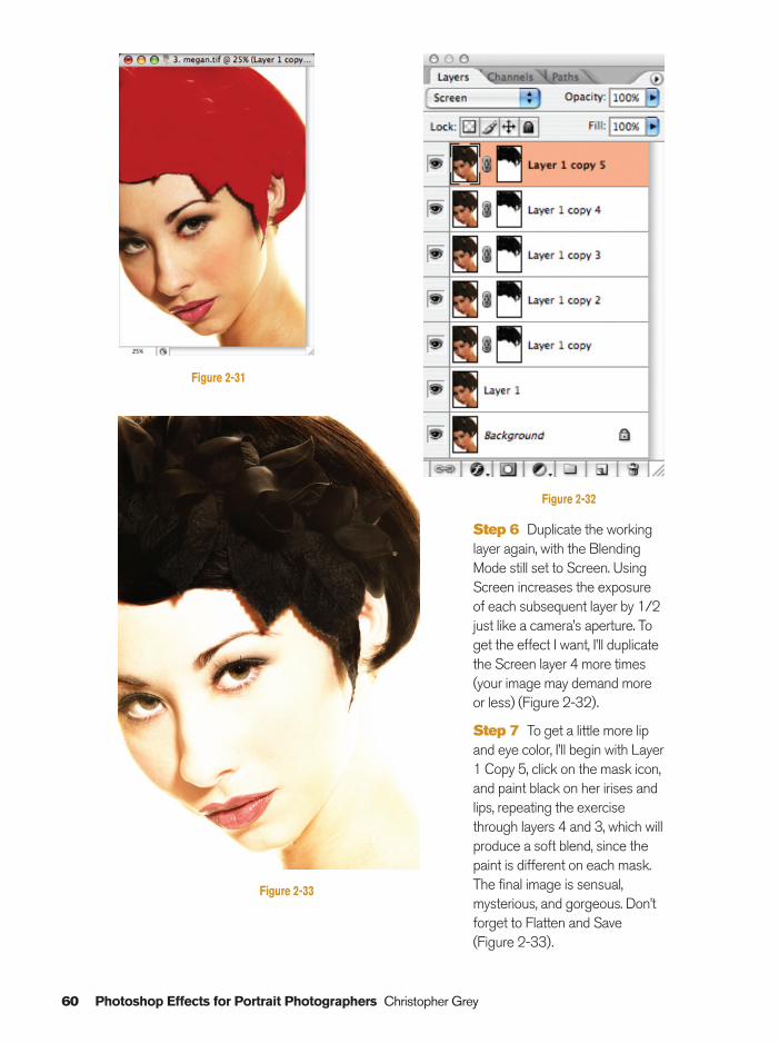
Step 6 Duplicate the workinglayer again, with the BlendingMode still set to Screen. UsingScreen increases the exposureof each subsequent layer by 1/2just like a camera’s aperture. Toget the effect I want, I’ll duplicatethe Screen layer 4 more times(your image may demand moreor less) (Figure 2-32).
Step 7 To get a little more lipand eye color, I’ll begin with Layer1 Copy 5, click on the mask icon,and paint black on her irises andlips, repeating the exercisethrough layers 4 and 3, which willproduce a soft blend, since thepaint is different on each mask.The final image is sensual,mysterious, and gorgeous. Don’tforget to Flatten and Save(Figure 2-33).
60 Photoshop Effects for Portrait Photographers Christopher Grey
Figure 2-32
Figure 2-33
Figure 2-31
Ch02-K80894.qxd 8/31/06 12:04 PM Page 60

High Pass Sharpening
This little trick is so good I wish I’d invented itmyself. I’ve seen it referenced many times inbooks and magazines, and it frequently turns upwhen someone asks for sharpening advice onInternet Photoshop discussion groups. Thebeauty of it is that you can vary the level ofsharpening by varying the opacity level of itslayer and it will not damage the pixels or createartifacts that affect the integrity of your image.See High Pass Soft Focus for a valuablevariation.
If you look carefully at my sample image,you’ll notice that I missed perfect focus slightly.Either she moved or I did (and it was probablyme), which put the point of focus on her templerather than her eyes:
Step 1 Open the selected image and make aduplicate layer (Figure 2-34).
Step 2 Select Filter�Other�High Pass. I’ve generally been pleased when starting at asetting of 10 pixels. Your new layer will look pretty funky (Figure 2-35).
Step 3 Change the new layer’s BlendingMode to Overlay (also try Soft Light) and changethe layer’s opacity until you’re happy with theresult. Many prefer an opacity of 30–40% butthat’s only a point of reference (Figure 2-36).
High Pass Sharpening 61
Figure 2-34
Figure 2-35 Figure 2-36
Ch02-K80894.qxd 8/31/06 12:05 PM Page 61
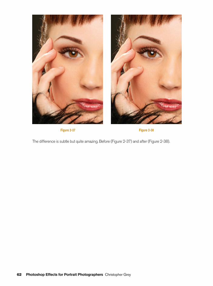
The difference is subtle but quite amazing. Before (Figure 2-37) and after (Figure 2-38).
62 Photoshop Effects for Portrait Photographers Christopher Grey
Figure 2-37 Figure 2-38
Ch02-K80894.qxd 8/31/06 12:05 PM Page 62
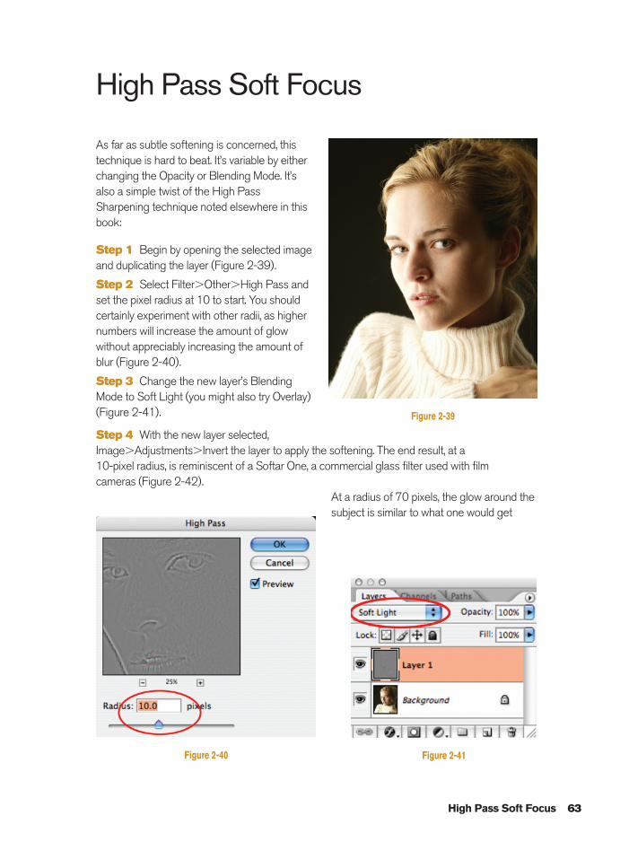
High Pass Soft Focus
As far as subtle softening is concerned, thistechnique is hard to beat. It’s variable by eitherchanging the Opacity or Blending Mode. It’salso a simple twist of the High PassSharpening technique noted elsewhere in thisbook:
Step 1 Begin by opening the selected imageand duplicating the layer (Figure 2-39).
Step 2 Select Filter�Other�High Pass andset the pixel radius at 10 to start. You shouldcertainly experiment with other radii, as highernumbers will increase the amount of glowwithout appreciably increasing the amount ofblur (Figure 2-40).
Step 3 Change the new layer’s Blending Mode to Soft Light (you might also try Overlay)(Figure 2-41).
Step 4 With the new layer selected,Image�Adjustments�Invert the layer to apply the softening. The end result, at a 10-pixel radius, is reminiscent of a Softar One, a commercial glass filter used with film cameras (Figure 2-42).
At a radius of 70 pixels, the glow around thesubject is similar to what one would get
High Pass Soft Focus 63
Figure 2-39
Figure 2-41Figure 2-40
Ch02-K80894.qxd 8/31/06 12:05 PM Page 63
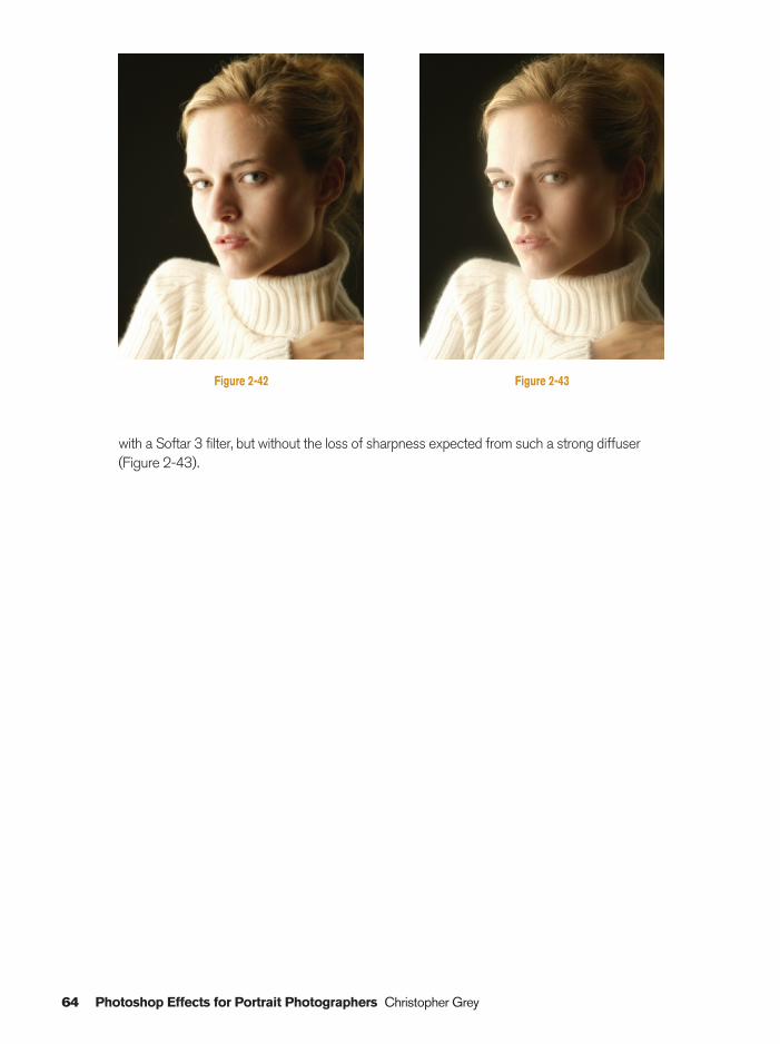
with a Softar 3 filter, but without the loss of sharpness expected from such a strong diffuser(Figure 2-43).
64 Photoshop Effects for Portrait Photographers Christopher Grey
Figure 2-42 Figure 2-43
Ch02-K80894.qxd 8/31/06 12:05 PM Page 64
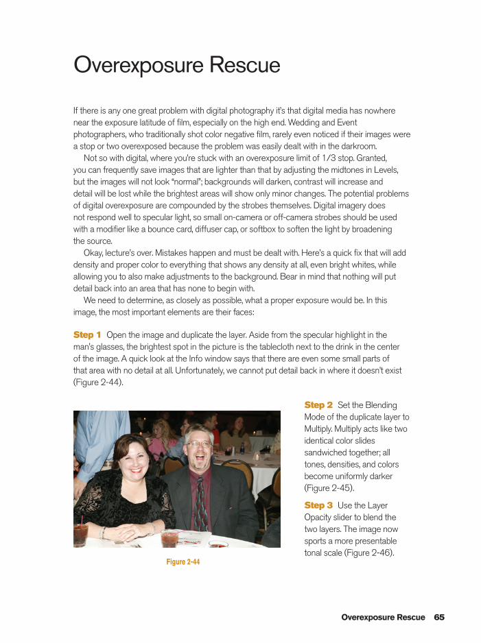
Overexposure Rescue
If there is any one great problem with digital photography it’s that digital media has nowherenear the exposure latitude of film, especially on the high end. Wedding and Eventphotographers, who traditionally shot color negative film, rarely even noticed if their images werea stop or two overexposed because the problem was easily dealt with in the darkroom.
Not so with digital, where you’re stuck with an overexposure limit of 1/3 stop. Granted, you can frequently save images that are lighter than that by adjusting the midtones in Levels,but the images will not look “normal”; backgrounds will darken, contrast will increase and detail will be lost while the brightest areas will show only minor changes. The potential problemsof digital overexposure are compounded by the strobes themselves. Digital imagery does not respond well to specular light, so small on-camera or off-camera strobes should be usedwith a modifier like a bounce card, diffuser cap, or softbox to soften the light by broadening the source.
Okay, lecture’s over. Mistakes happen and must be dealt with. Here’s a quick fix that will adddensity and proper color to everything that shows any density at all, even bright whites, whileallowing you to also make adjustments to the background. Bear in mind that nothing will putdetail back into an area that has none to begin with.
We need to determine, as closely as possible, what a proper exposure would be. In thisimage, the most important elements are their faces:
Step 1 Open the image and duplicate the layer. Aside from the specular highlight in the man’s glasses, the brightest spot in the picture is the tablecloth next to the drink in the center of the image. A quick look at the Info window says that there are even some small parts of that area with no detail at all. Unfortunately, we cannot put detail back in where it doesn’t exist(Figure 2-44).
Step 2 Set the BlendingMode of the duplicate layer toMultiply. Multiply acts like twoidentical color slidessandwiched together; alltones, densities, and colorsbecome uniformly darker(Figure 2-45).
Step 3 Use the LayerOpacity slider to blend thetwo layers. The image nowsports a more presentabletonal scale (Figure 2-46).
Overexposure Rescue 65
Figure 2-44
Ch02-K80894.qxd 8/31/06 12:05 PM Page 65
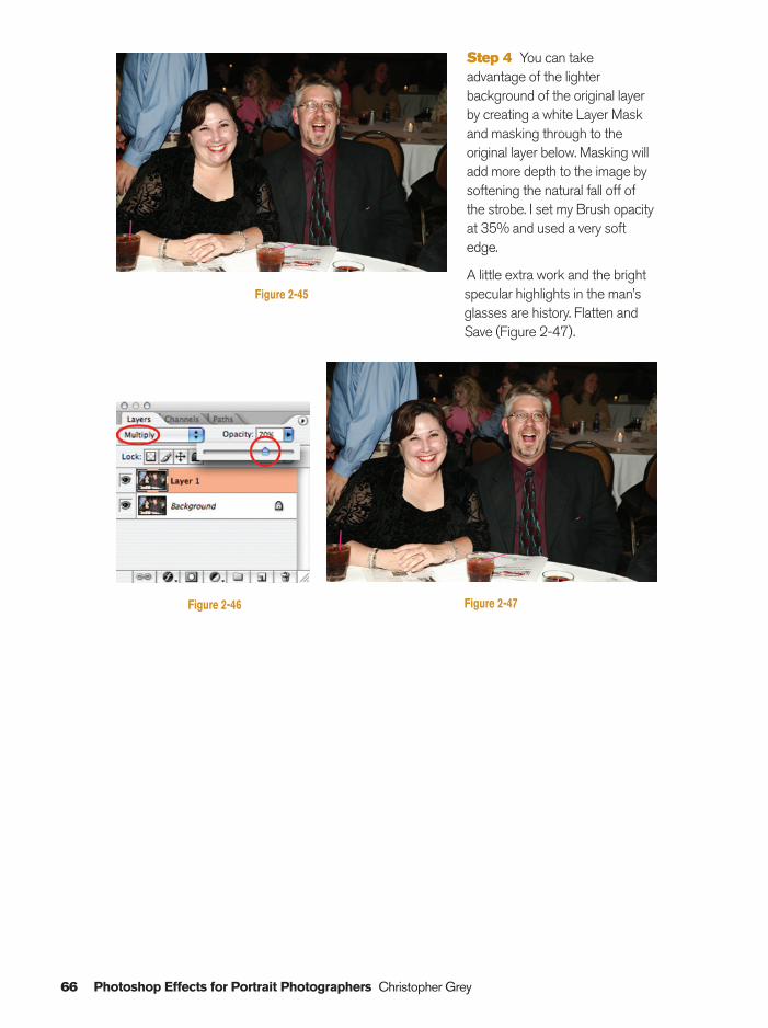
Step 4 You can takeadvantage of the lighterbackground of the original layerby creating a white Layer Maskand masking through to theoriginal layer below. Masking willadd more depth to the image bysoftening the natural fall off ofthe strobe. I set my Brush opacityat 35% and used a very softedge.
A little extra work and the brightspecular highlights in the man’sglasses are history. Flatten andSave (Figure 2-47).
66 Photoshop Effects for Portrait Photographers Christopher Grey
Figure 2-45
Figure 2-46 Figure 2-47
Ch02-K80894.qxd 8/31/06 12:05 PM Page 66
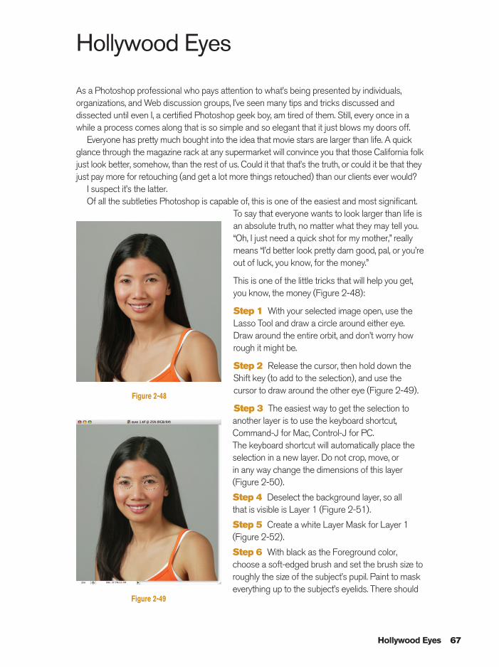
Hollywood Eyes
As a Photoshop professional who pays attention to what’s being presented by individuals,organizations, and Web discussion groups, I’ve seen many tips and tricks discussed anddissected until even I, a certified Photoshop geek boy, am tired of them. Still, every once in awhile a process comes along that is so simple and so elegant that it just blows my doors off.
Everyone has pretty much bought into the idea that movie stars are larger than life. A quickglance through the magazine rack at any supermarket will convince you that those California folkjust look better, somehow, than the rest of us. Could it that that’s the truth, or could it be that theyjust pay more for retouching (and get a lot more things retouched) than our clients ever would?
I suspect it’s the latter.Of all the subtleties Photoshop is capable of, this is one of the easiest and most significant.
To say that everyone wants to look larger than life isan absolute truth, no matter what they may tell you.“Oh, I just need a quick shot for my mother,” reallymeans “I’d better look pretty darn good, pal, or you’reout of luck, you know, for the money.”
This is one of the little tricks that will help you get,you know, the money (Figure 2-48):
Step 1 With your selected image open, use theLasso Tool and draw a circle around either eye.Draw around the entire orbit, and don’t worry howrough it might be.
Step 2 Release the cursor, then hold down theShift key (to add to the selection), and use thecursor to draw around the other eye (Figure 2-49).
Step 3 The easiest way to get the selection toanother layer is to use the keyboard shortcut,Command-J for Mac, Control-J for PC. The keyboard shortcut will automatically place theselection in a new layer. Do not crop, move, or in any way change the dimensions of this layer(Figure 2-50).
Step 4 Deselect the background layer, so all that is visible is Layer 1 (Figure 2-51).
Step 5 Create a white Layer Mask for Layer 1(Figure 2-52).
Step 6 With black as the Foreground color,choose a soft-edged brush and set the brush size toroughly the size of the subject’s pupil. Paint to maskeverything up to the subject’s eyelids. There should
Hollywood Eyes 67
Figure 2-48
Figure 2-49
Ch02-K80894.qxd 8/31/06 12:05 PM Page 67
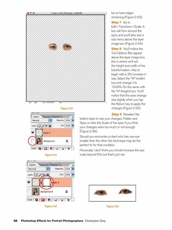
be no hard edgesremaining (Figure 2-53).
Step 7 Go toEdit�Transform�Scale. Abox will form around theeyes, and you’ll also see asub menu above the layerimage box (Figure 2-54).
Step 8 You’ll notice theTool Options Bar appearabove the layer image box;this is where we’ll set the height and width of thetransformation. I like tobegin with a 3% increase insize. Select the “W” (width)box and change it to103.0%. Do the same withthe “H” (height) box. You’llnotice that the eyes changesize slightly when you tapthe Return key to apply thechanges (Figure 2-55).
Step 9 Reselect thebottom layer to see your changes. Flatten and Save, or redo the Scale of the eyes if you think your changes were too much or not enough (Figure 2-56).
Should you encounter a client who has one eyesmaller than the other this technique may be theperfect fix for that condition.
Personally, I don’t think you should increase the eyescale beyond 5%, but that’s just me.
68 Photoshop Effects for Portrait Photographers Christopher Grey
Figure 2-50
Figure 2-52
Figure 2-51
Figure 2-53
Ch02-K80894.qxd 8/31/06 12:05 PM Page 68
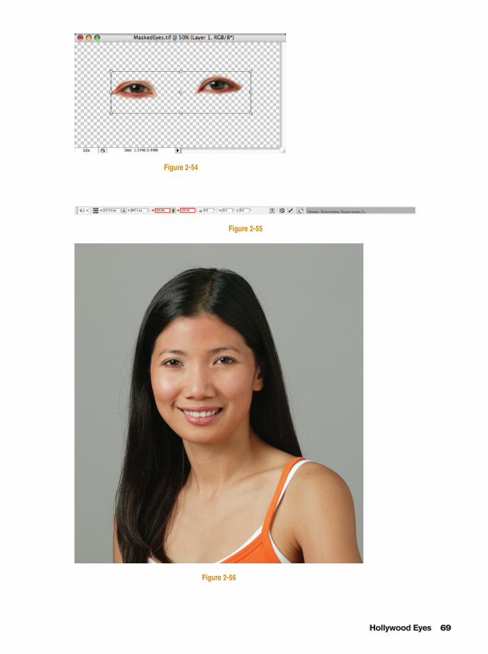
Hollywood Eyes 69
Figure 2-54
Figure 2-56
Figure 2-55
Ch02-K80894.qxd 8/31/06 12:05 PM Page 69

This page intentionally left blank
Section 3Artistic Effects
Ch03-K80894.qxd 8/31/06 12:08 PM Page 71
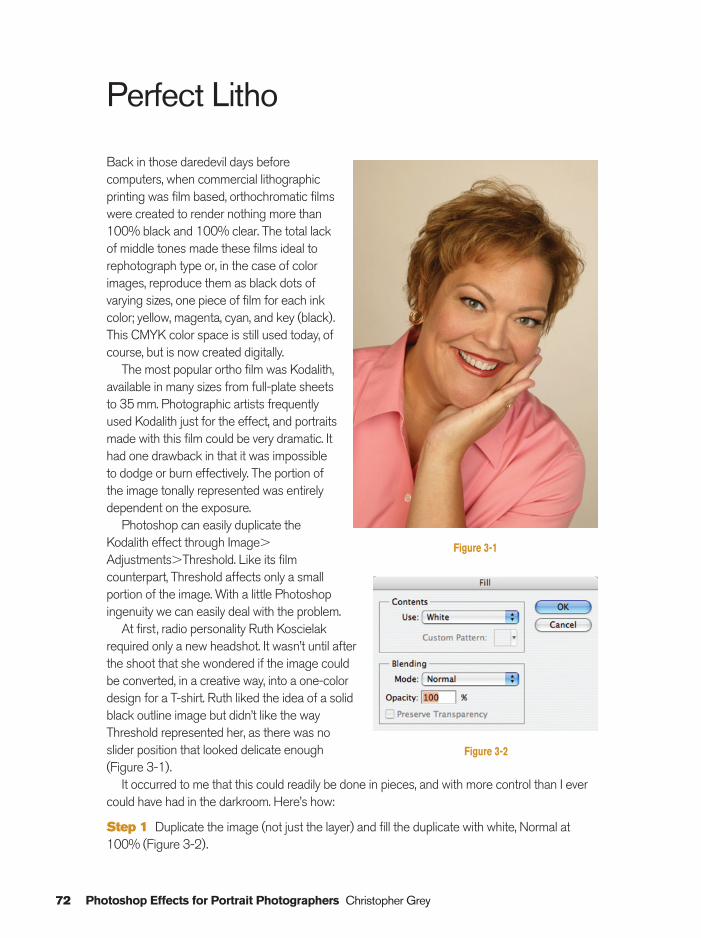
72 Photoshop Effects for Portrait Photographers Christopher Grey
Perfect Litho
Back in those daredevil days beforecomputers, when commercial lithographicprinting was film based, orthochromatic filmswere created to render nothing more than100% black and 100% clear. The total lackof middle tones made these films ideal torephotograph type or, in the case of colorimages, reproduce them as black dots ofvarying sizes, one piece of film for each inkcolor; yellow, magenta, cyan, and key (black).This CMYK color space is still used today, ofcourse, but is now created digitally.
The most popular ortho film was Kodalith,available in many sizes from full-plate sheetsto 35 mm. Photographic artists frequentlyused Kodalith just for the effect, and portraitsmade with this film could be very dramatic. Ithad one drawback in that it was impossibleto dodge or burn effectively. The portion ofthe image tonally represented was entirelydependent on the exposure.
Photoshop can easily duplicate theKodalith effect through Image�
Adjustments�Threshold. Like its filmcounterpart, Threshold affects only a smallportion of the image. With a little Photoshopingenuity we can easily deal with the problem.
At first, radio personality Ruth Koscielakrequired only a new headshot. It wasn’t until afterthe shoot that she wondered if the image couldbe converted, in a creative way, into a one-colordesign for a T-shirt. Ruth liked the idea of a solidblack outline image but didn’t like the wayThreshold represented her, as there was noslider position that looked delicate enough (Figure 3-1).
It occurred to me that this could readily be done in pieces, and with more control than I evercould have had in the darkroom. Here’s how:
Step 1 Duplicate the image (not just the layer) and fill the duplicate with white, Normal at100% (Figure 3-2).
Figure 3-2
Figure 3-1
Ch03-K80894.qxd 8/31/06 12:08 PM Page 72
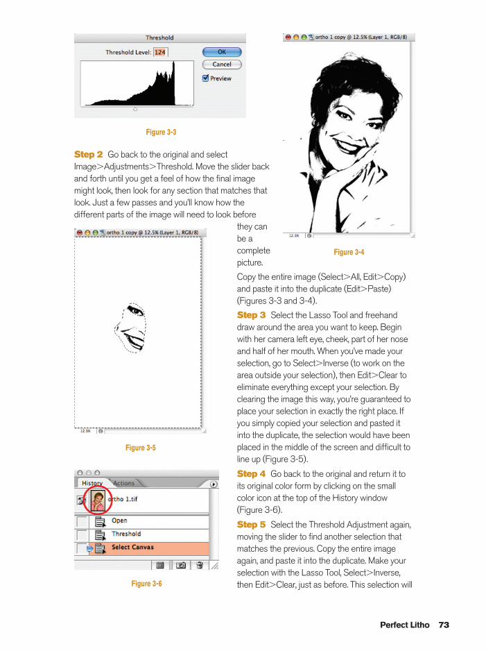
Step 2 Go back to the original and selectImage�Adjustments�Threshold. Move the slider backand forth until you get a feel of how the final imagemight look, then look for any section that matches thatlook. Just a few passes and you’ll know how thedifferent parts of the image will need to look before
they canbe acompletepicture.
Copy the entire image (Select�All, Edit�Copy)and paste it into the duplicate (Edit�Paste)(Figures 3-3 and 3-4).
Step 3 Select the Lasso Tool and freehanddraw around the area you want to keep. Beginwith her camera left eye, cheek, part of her noseand half of her mouth. When you’ve made yourselection, go to Select�Inverse (to work on thearea outside your selection), then Edit�Clear toeliminate everything except your selection. Byclearing the image this way, you’re guaranteed toplace your selection in exactly the right place. Ifyou simply copied your selection and pasted itinto the duplicate, the selection would have beenplaced in the middle of the screen and difficult toline up (Figure 3-5).
Step 4 Go back to the original and return it toits original color form by clicking on the smallcolor icon at the top of the History window(Figure 3-6).
Step 5 Select the Threshold Adjustment again,moving the slider to find another selection thatmatches the previous. Copy the entire imageagain, and paste it into the duplicate. Make yourselection with the Lasso Tool, Select�Inverse,then Edit�Clear, just as before. This selection will
Perfect Litho 73
Figure 3-4
Figure 3-5
Figure 3-6
Figure 3-3
Ch03-K80894.qxd 8/31/06 12:08 PM Page 73
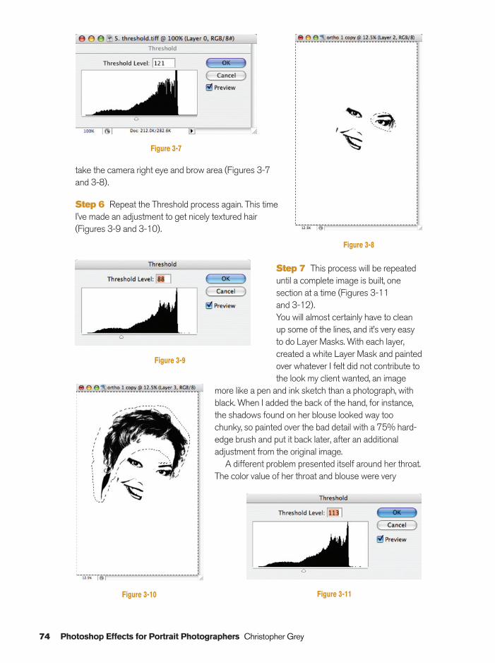
take the camera right eye and brow area (Figures 3-7and 3-8).
Step 6 Repeat the Threshold process again. This timeI’ve made an adjustment to get nicely textured hair(Figures 3-9 and 3-10).
Step 7 This process will be repeateduntil a complete image is built, onesection at a time (Figures 3-11 and 3-12).You will almost certainly have to cleanup some of the lines, and it’s very easyto do Layer Masks. With each layer,created a white Layer Mask and paintedover whatever I felt did not contribute tothe look my client wanted, an image
more like a pen and ink sketch than a photograph, withblack. When I added the back of the hand, for instance,the shadows found on her blouse looked way toochunky, so painted over the bad detail with a 75% hard-edge brush and put it back later, after an additionaladjustment from the original image.
A different problem presented itself around her throat.The color value of her throat and blouse were very
74 Photoshop Effects for Portrait Photographers Christopher Grey
Figure 3-8
Figure 3-10
Figure 3-9
Figure 3-11
Figure 3-7
Ch03-K80894.qxd 8/31/06 12:08 PM Page 74
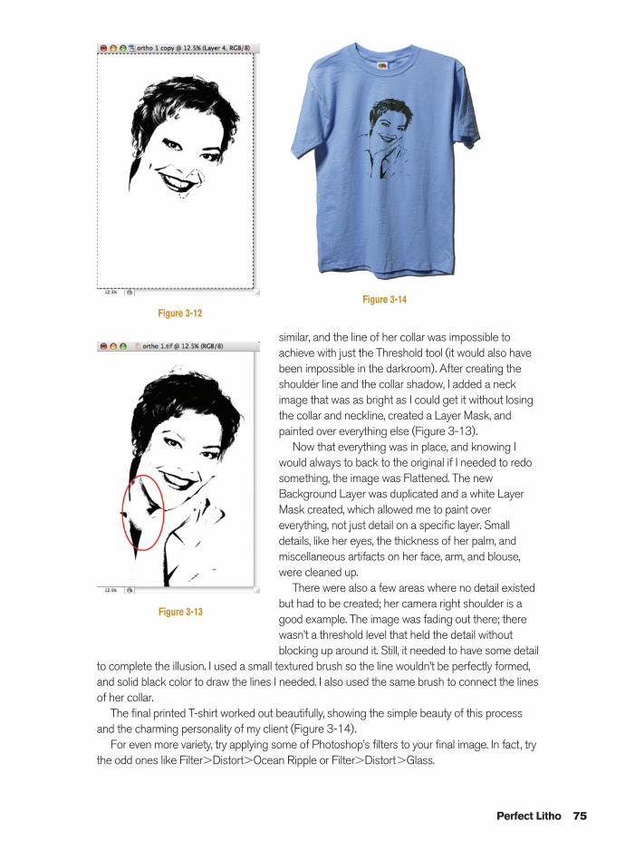
similar, and the line of her collar was impossible toachieve with just the Threshold tool (it would also havebeen impossible in the darkroom). After creating theshoulder line and the collar shadow, I added a neckimage that was as bright as I could get it without losingthe collar and neckline, created a Layer Mask, andpainted over everything else (Figure 3-13).
Now that everything was in place, and knowing Iwould always to back to the original if I needed to redosomething, the image was Flattened. The newBackground Layer was duplicated and a white LayerMask created, which allowed me to paint overeverything, not just detail on a specific layer. Smalldetails, like her eyes, the thickness of her palm, andmiscellaneous artifacts on her face, arm, and blouse,were cleaned up.
There were also a few areas where no detail existedbut had to be created; her camera right shoulder is agood example. The image was fading out there; therewasn’t a threshold level that held the detail withoutblocking up around it. Still, it needed to have some detail
to complete the illusion. I used a small textured brush so the line wouldn’t be perfectly formed,and solid black color to draw the lines I needed. I also used the same brush to connect the linesof her collar.
The final printed T-shirt worked out beautifully, showing the simple beauty of this processand the charming personality of my client (Figure 3-14).
For even more variety, try applying some of Photoshop’s filters to your final image. In fact, trythe odd ones like Filter�Distort�Ocean Ripple or Filter�Distort�Glass.
Perfect Litho 75
Figure 3-13
Figure 3-14Figure 3-12
Ch03-K80894.qxd 8/31/06 12:08 PM Page 75
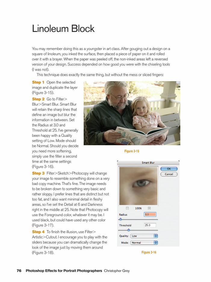
Linoleum Block
You may remember doing this as a youngster in art class. After gouging out a design on asquare of linoleum, you inked the surface, then placed a piece of paper on it and rolled over it with a brayer. When the paper was peeled off, the non-inked areas left a reversed version of your design. Success depended on how good you were with the chiseling tools (I was not).
This technique does exactly the same thing, but without the mess or sliced fingers:
Step 1 Open the selectedimage and duplicate the layer(Figure 3-15).
Step 2 Go to Filter�Blur�Smart Blur. Smart Blurwill retain the sharp lines thatdefine an image but blur theinformation in between. Setthe Radius at 3.0 andThreshold at 25. I’ve generallybeen happy with a Qualitysetting of Low. Mode shouldbe Normal. Should you decideyou need more softening,simply use the filter a secondtime at the same settings(Figure 3-16).
Step 3 Filter�Sketch�Photocopy will changeyour image to resemble something done on a verybad copy machine. That’s fine. The image needsto be broken down to something very basic andrather sloppy. I prefer lines that are distinct but nottoo fat, and I also want minimal detail in fleshyareas, so I’ve set the Detail at 6 and Darknessright in the middle at 25. Note that Photocopy willuse the Foreground color, whatever it may be. Iused black, but could have used any other color(Figure 3-17).
Step 4 To finish the illusion, use Filter�Artistic�Cutout. I encourage you to play with thesliders because you can dramatically change thelook of the image just by moving them around(Figure 3-18).
76 Photoshop Effects for Portrait Photographers Christopher Grey
Figure 3-15
Figure 3-16
Ch03-K80894.qxd 8/31/06 12:08 PM Page 76
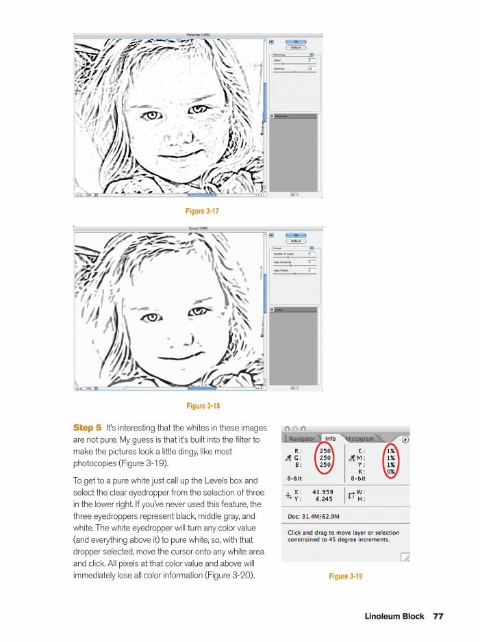
Step 5 It’s interesting that the whites in these imagesare not pure. My guess is that it’s built into the filter tomake the pictures look a little dingy, like mostphotocopies (Figure 3-19).
To get to a pure white just call up the Levels box andselect the clear eyedropper from the selection of threein the lower right. If you’ve never used this feature, thethree eyedroppers represent black, middle gray, andwhite. The white eyedropper will turn any color value(and everything above it) to pure white, so, with thatdropper selected, move the cursor onto any white areaand click. All pixels at that color value and above willimmediately lose all color information (Figure 3-20).
Linoleum Block 77
Figure 3-17
Figure 3-18
Figure 3-19
Ch03-K80894.qxd 8/31/06 12:08 PM Page 77
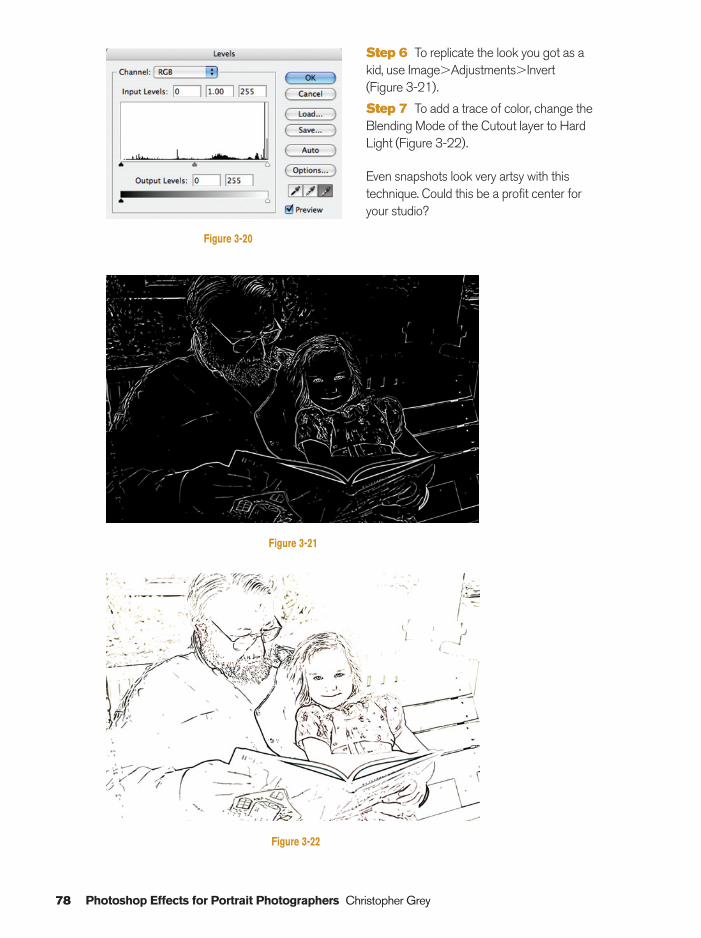
78 Photoshop Effects for Portrait Photographers Christopher Grey
Step 6 To replicate the look you got as akid, use Image�Adjustments�Invert (Figure 3-21).
Step 7 To add a trace of color, change theBlending Mode of the Cutout layer to HardLight (Figure 3-22).
Even snapshots look very artsy with thistechnique. Could this be a profit center foryour studio?
Figure 3-20
Figure 3-21
Figure 3-22
Ch03-K80894.qxd 8/31/06 12:08 PM Page 78
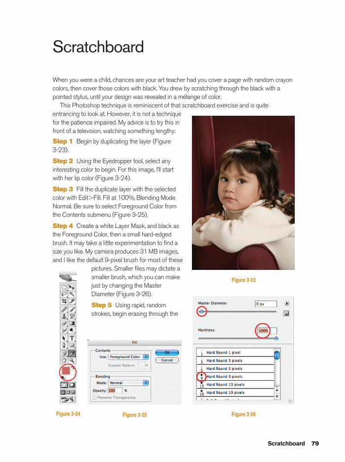
Scratchboard
When you were a child, chances are your art teacher had you cover a page with random crayoncolors, then cover those colors with black. You drew by scratching through the black with apointed stylus, until your design was revealed in a mélange of color.
This Photoshop technique is reminiscent of that scratchboard exercise and is quiteentrancing to look at. However, it is not a techniquefor the patience impaired. My advice is to try this infront of a television, watching something lengthy:
Step 1 Begin by duplicating the layer (Figure 3-23).
Step 2 Using the Eyedropper tool, select anyinteresting color to begin. For this image, I’ll startwith her lip color (Figure 3-24).
Step 3 Fill the duplicate layer with the selectedcolor with Edit�Fill. Fill at 100%, Blending ModeNormal. Be sure to select Foreground Color fromthe Contents submenu (Figure 3-25).
Step 4 Create a white Layer Mask, and black asthe Foreground Color, then a small hard-edgedbrush. It may take a little experimentation to find asize you like. My camera produces 31 MB images,and I like the default 9-pixel brush for most of these
pictures. Smaller files may dictate asmaller brush, which you can makejust by changing the MasterDiameter (Figure 3-26).
Step 5 Using rapid, randomstrokes, begin erasing through the
Scratchboard 79
Figure 3-23
Figure 3-24 Figure 3-25 Figure 3-26
Ch03-K80894.qxd 8/31/06 12:08 PM Page 79
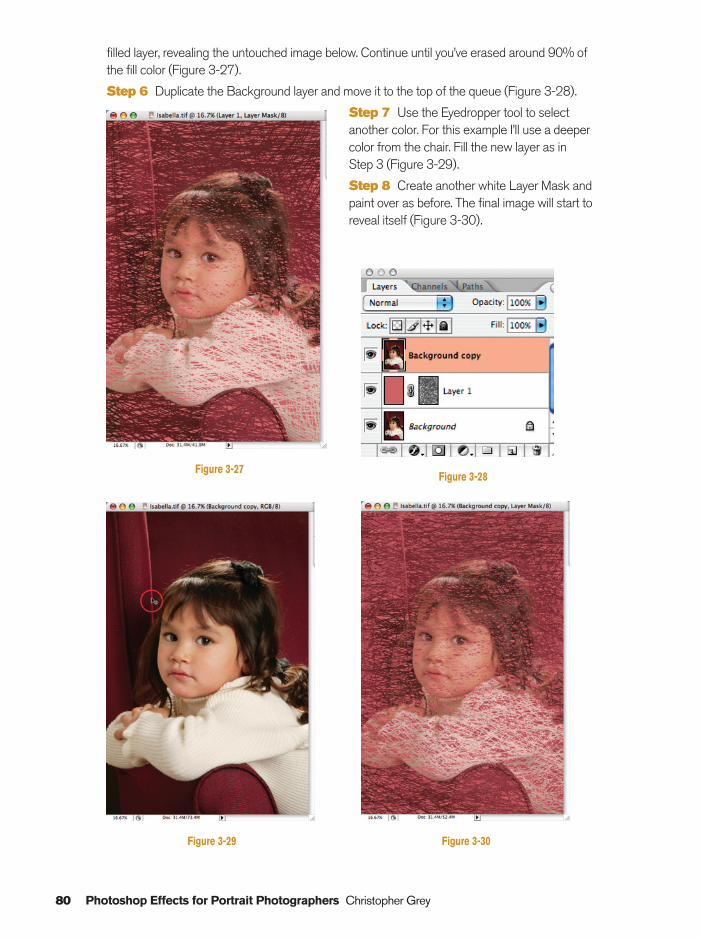
filled layer, revealing the untouched image below. Continue until you’ve erased around 90% ofthe fill color (Figure 3-27).
Step 6 Duplicate the Background layer and move it to the top of the queue (Figure 3-28).
Step 7 Use the Eyedropper tool to selectanother color. For this example I’ll use a deepercolor from the chair. Fill the new layer as in Step 3 (Figure 3-29).
Step 8 Create another white Layer Mask andpaint over as before. The final image will start toreveal itself (Figure 3-30).
80 Photoshop Effects for Portrait Photographers Christopher Grey
Figure 3-27Figure 3-28
Figure 3-29 Figure 3-30
Ch03-K80894.qxd 8/31/06 12:08 PM Page 80
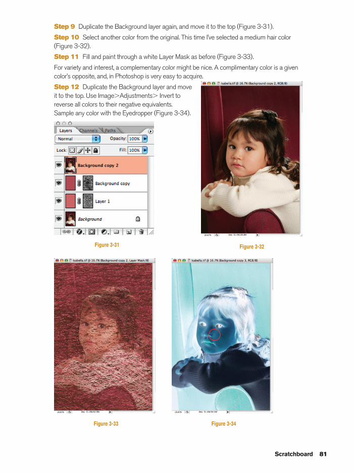
Step 9 Duplicate the Background layer again, and move it to the top (Figure 3-31).
Step 10 Select another color from the original. This time I’ve selected a medium hair color (Figure 3-32).
Step 11 Fill and paint through a white Layer Mask as before (Figure 3-33).
For variety and interest, a complementary color might be nice. A complimentary color is a givencolor’s opposite, and, in Photoshop is very easy to acquire.
Step 12 Duplicate the Background layer and moveit to the top. Use Image�Adjustments� Invert toreverse all colors to their negative equivalents.Sample any color with the Eyedropper (Figure 3-34).
Scratchboard 81
Figure 3-31 Figure 3-32
Figure 3-33 Figure 3-34
Ch03-K80894.qxd 8/31/06 12:08 PM Page 81
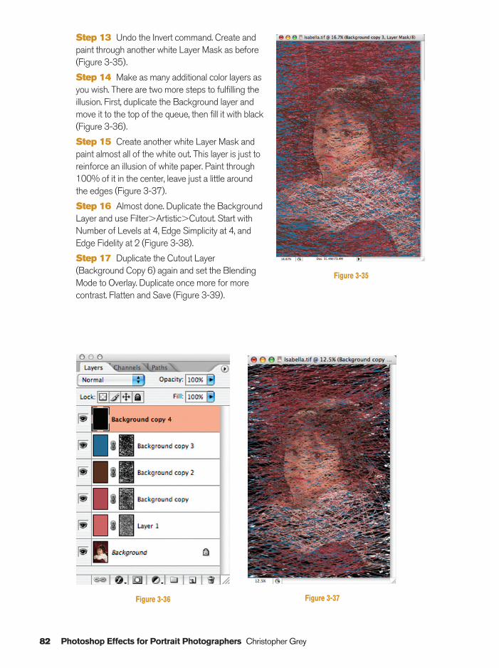
82 Photoshop Effects for Portrait Photographers Christopher Grey
Step 13 Undo the Invert command. Create andpaint through another white Layer Mask as before(Figure 3-35).
Step 14 Make as many additional color layers asyou wish. There are two more steps to fulfilling theillusion. First, duplicate the Background layer andmove it to the top of the queue, then fill it with black(Figure 3-36).
Step 15 Create another white Layer Mask andpaint almost all of the white out. This layer is just toreinforce an illusion of white paper. Paint through100% of it in the center, leave just a little aroundthe edges (Figure 3-37).
Step 16 Almost done. Duplicate the BackgroundLayer and use Filter�Artistic�Cutout. Start withNumber of Levels at 4, Edge Simplicity at 4, andEdge Fidelity at 2 (Figure 3-38).
Step 17 Duplicate the Cutout Layer(Background Copy 6) again and set the BlendingMode to Overlay. Duplicate once more for morecontrast. Flatten and Save (Figure 3-39).
Figure 3-35
Figure 3-36 Figure 3-37
Ch03-K80894.qxd 8/31/06 12:09 PM Page 82
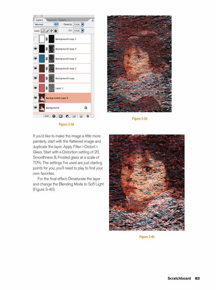
If you’d like to make the image a little morepainterly, start with the flattened image andduplicate the layer. Apply Filter�Distort�Glass. Start with a Distortion setting of 20,Smoothness 8, Frosted glass at a scale of70%. The settings I’ve used are just startingpoints for you; you’ll need to play to find yourown favorites.
For the final effect, Desaturate the layerand change the Blending Mode to Soft Light(Figure 3-40).
Scratchboard 83
Figure 3-38
Figure 3-39
Figure 3-40
Ch03-K80894.qxd 8/31/06 12:09 PM Page 83
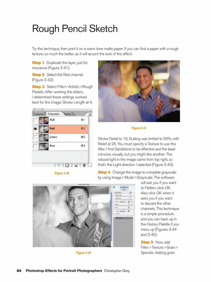
84 Photoshop Effects for Portrait Photographers Christopher Grey
Rough Pencil Sketch
Try this technique, then print it on a warm tone matte paper. If you can find a paper with a roughtexture, so much the better, as it will accent the look of the effect:
Step 1 Duplicate the layer, just forinsurance (Figure 3-41).
Step 2 Select the Red channel(Figure 3-42).
Step 3 Select Filter�Artistic�RoughPastels. After working the sliders, I determined these settings workedbest for this image: Stroke Length at 4,
Stroke Detail to 19, Scaling was limited to 50%, withRelief at 25. You must specify a Texture to use thisfilter; I find Sandstone to be effective and the leastintrusive, visually, but you might like another. Thenatural light in the image came from top right, sothat’s the Light direction I selected (Figure 3-43).
Step 4 Change the image to complete grayscaleby using Image�Mode�Grayscale. The software
will ask you if you wantto Flatten; click OK. Also click OK when itasks you if you want to discard the otherchannels. This techniqueis a simple procedureand you can back up inthe History Palette if youmess up (Figures 3-44and 3-45).
Step 5 Now, addFilter�Texture�Grain�
Speckle. Adding grain
Figure 3-41
Figure 3-43
Figure 3-42
Ch03-K80894.qxd 8/31/06 12:09 PM Page 84
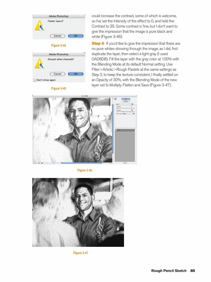
could increase the contrast, some of which is welcome,so I’ve set the Intensity of the effect to 0, and held theContrast to 35. Some contrast is fine, but I don’t want togive the impression that the image is pure black andwhite (Figure 3-46).
Step 6 If you’d like to give the impression that there areno pure whites showing through the image, as I did, firstduplicate the layer, then select a light gray (I usedDAD8D8). Fill the layer with the gray color at 100% withthe Blending Mode at its default Normal setting. UseFilter�Artistic�Rough Pastels at the same settings asStep 2, to keep the texture consistent. I finally settled onan Opacity of 30%, with the Blending Mode of the newlayer set to Multiply. Flatten and Save (Figure 3-47).
Rough Pencil Sketch 85
Figure 3-46
Figure 3-45
Figure 3-44
Figure 3-47
Ch03-K80894.qxd 8/31/06 12:09 PM Page 85
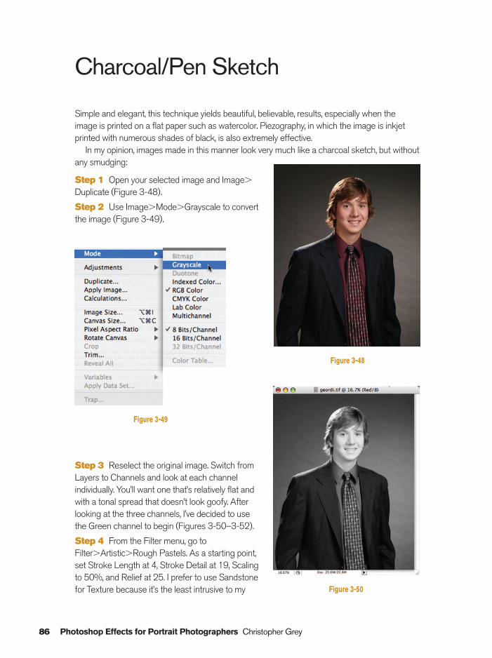
Step 3 Reselect the original image. Switch fromLayers to Channels and look at each channelindividually. You’ll want one that’s relatively flat andwith a tonal spread that doesn’t look goofy. Afterlooking at the three channels, I’ve decided to usethe Green channel to begin (Figures 3-50–3-52).
Step 4 From the Filter menu, go toFilter�Artistic�Rough Pastels. As a starting point,set Stroke Length at 4, Stroke Detail at 19, Scalingto 50%, and Relief at 25. I prefer to use Sandstonefor Texture because it’s the least intrusive to my
Charcoal/Pen Sketch
Simple and elegant, this technique yields beautiful, believable, results, especially when theimage is printed on a flat paper such as watercolor. Piezography, in which the image is inkjetprinted with numerous shades of black, is also extremely effective.
In my opinion, images made in this manner look very much like a charcoal sketch, but withoutany smudging:
Step 1 Open your selected image and Image�
Duplicate (Figure 3-48).
Step 2 Use Image�Mode�Grayscale to convertthe image (Figure 3-49).
86 Photoshop Effects for Portrait Photographers Christopher Grey
Figure 3-48
Figure 3-50
Figure 3-49
Ch03-K80894.qxd 8/31/06 12:09 PM Page 86
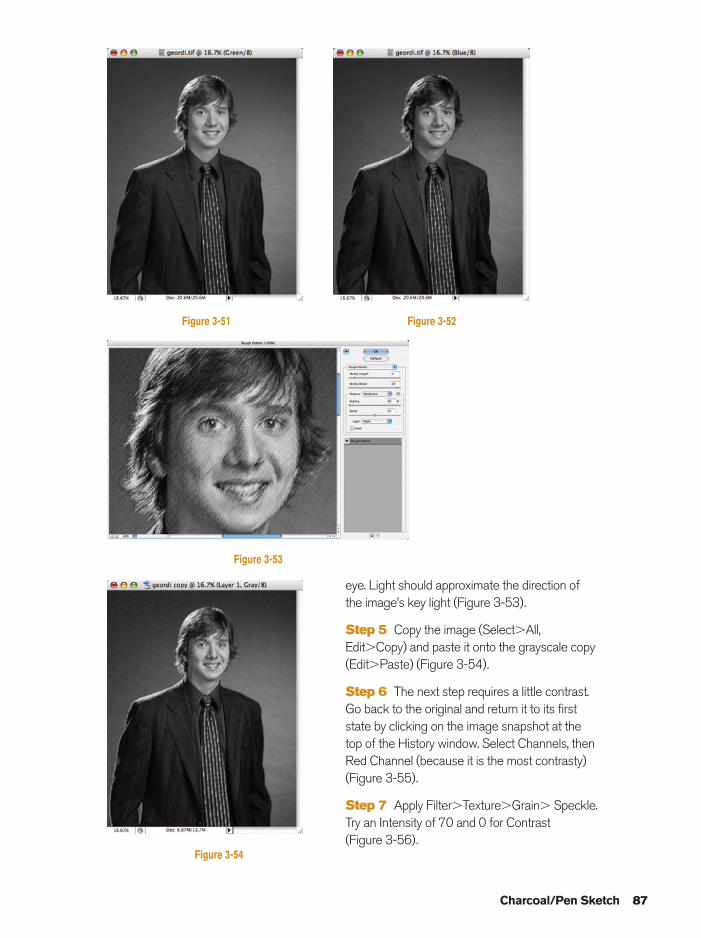
eye. Light should approximate the direction ofthe image’s key light (Figure 3-53).
Step 5 Copy the image (Select�All,Edit�Copy) and paste it onto the grayscale copy(Edit�Paste) (Figure 3-54).
Step 6 The next step requires a little contrast.Go back to the original and return it to its firststate by clicking on the image snapshot at thetop of the History window. Select Channels, thenRed Channel (because it is the most contrasty)(Figure 3-55).
Step 7 Apply Filter�Texture�Grain� Speckle.Try an Intensity of 70 and 0 for Contrast (Figure 3-56).
Charcoal/Pen Sketch 87
Figure 3-51 Figure 3-52
Figure 3-53
Figure 3-54
Ch03-K80894.qxd 8/31/06 12:09 PM Page 87
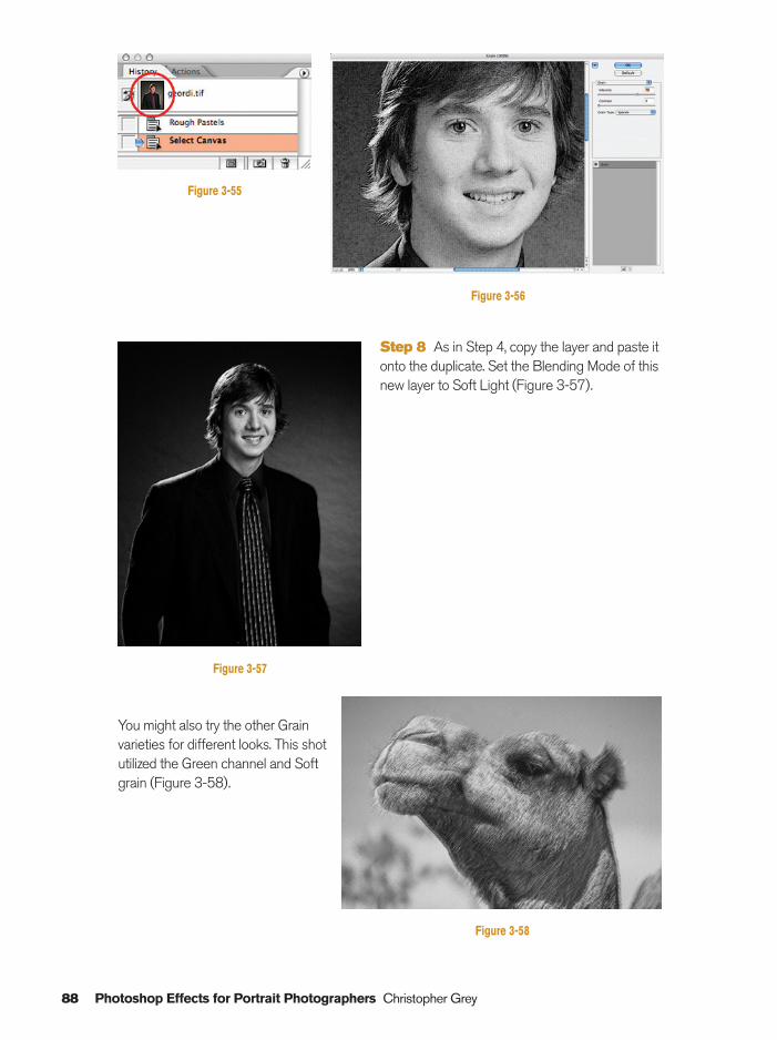
You might also try the other Grainvarieties for different looks. This shotutilized the Green channel and Softgrain (Figure 3-58).
Step 8 As in Step 4, copy the layer and paste itonto the duplicate. Set the Blending Mode of thisnew layer to Soft Light (Figure 3-57).
88 Photoshop Effects for Portrait Photographers Christopher Grey
Figure 3-56
Figure 3-55
Figure 3-57
Figure 3-58
Ch03-K80894.qxd 8/31/06 12:09 PM Page 88
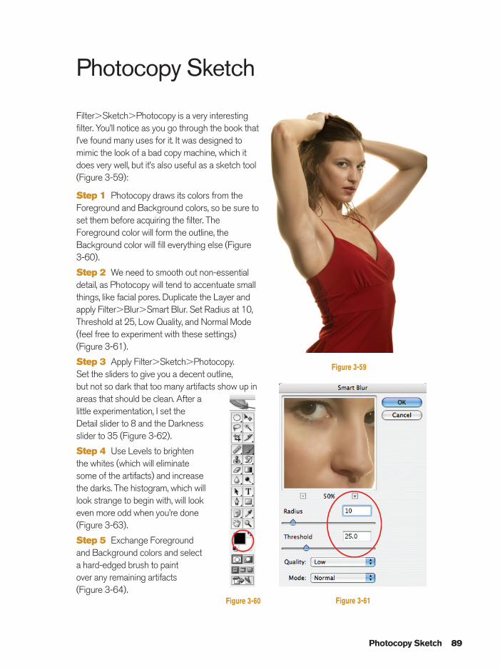
Photocopy Sketch
Filter�Sketch�Photocopy is a very interestingfilter. You’ll notice as you go through the book thatI’ve found many uses for it. It was designed tomimic the look of a bad copy machine, which itdoes very well, but it’s also useful as a sketch tool(Figure 3-59):
Step 1 Photocopy draws its colors from theForeground and Background colors, so be sure toset them before acquiring the filter. TheForeground color will form the outline, theBackground color will fill everything else (Figure3-60).
Step 2 We need to smooth out non-essentialdetail, as Photocopy will tend to accentuate smallthings, like facial pores. Duplicate the Layer andapply Filter�Blur�Smart Blur. Set Radius at 10,Threshold at 25, Low Quality, and Normal Mode(feel free to experiment with these settings) (Figure 3-61).
Step 3 Apply Filter�Sketch�Photocopy. Set the sliders to give you a decent outline, but not so dark that too many artifacts show up inareas that should be clean. After alittle experimentation, I set theDetail slider to 8 and the Darknessslider to 35 (Figure 3-62).
Step 4 Use Levels to brightenthe whites (which will eliminatesome of the artifacts) and increasethe darks. The histogram, which willlook strange to begin with, will lookeven more odd when you’re done(Figure 3-63).
Step 5 Exchange Foregroundand Background colors and selecta hard-edged brush to paint over any remaining artifacts (Figure 3-64).
Photocopy Sketch 89
Figure 3-59
Figure 3-60 Figure 3-61
Ch03-K80894.qxd 8/31/06 12:09 PM Page 89
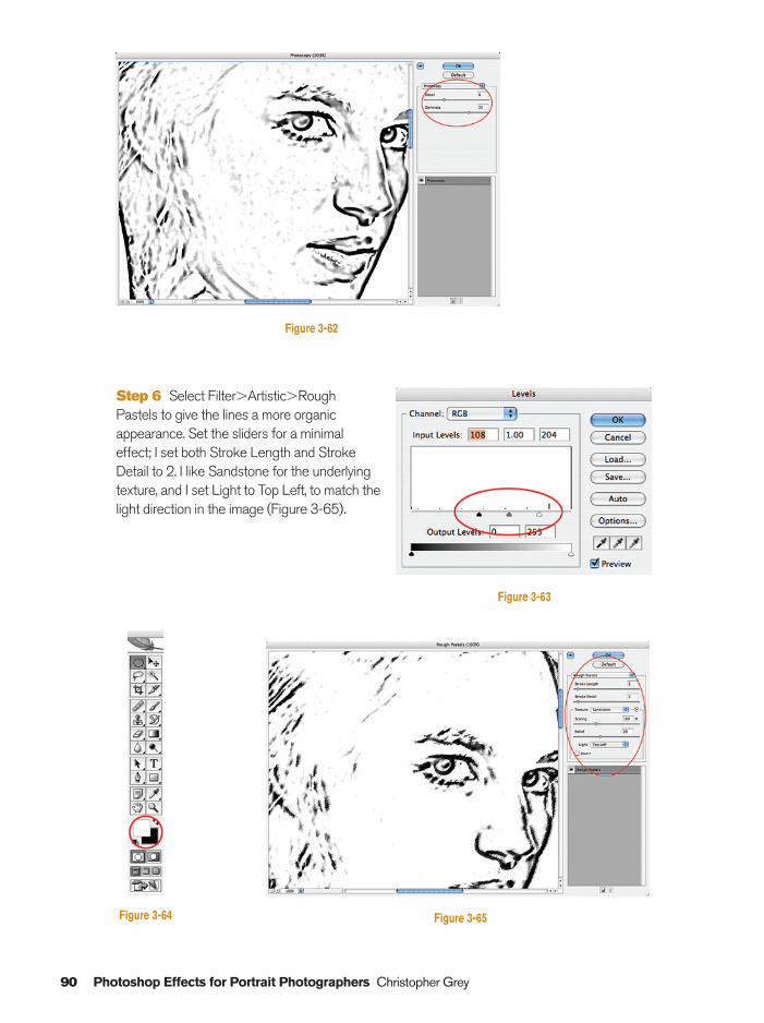
90 Photoshop Effects for Portrait Photographers Christopher Grey
Step 6 Select Filter�Artistic�Rough Pastels to give the lines a more organicappearance. Set the sliders for a minimal effect; I set both Stroke Length and Stroke Detail to 2. I like Sandstone for the underlyingtexture, and I set Light to Top Left, to match thelight direction in the image (Figure 3-65).
Figure 3-62
Figure 3-65
Figure 3-63
Figure 3-64
Ch03-K80894.qxd 8/31/06 12:09 PM Page 90
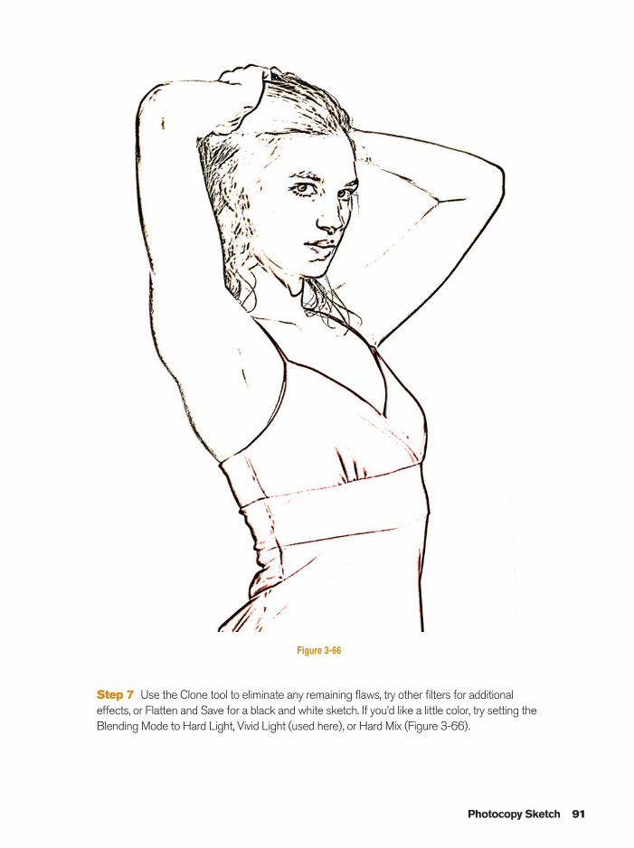
Photocopy Sketch 91
Figure 3-66
Step 7 Use the Clone tool to eliminate any remaining flaws, try other filters for additionaleffects, or Flatten and Save for a black and white sketch. If you’d like a little color, try setting theBlending Mode to Hard Light, Vivid Light (used here), or Hard Mix (Figure 3-66).
Ch03-K80894.qxd 8/31/06 12:09 PM Page 91
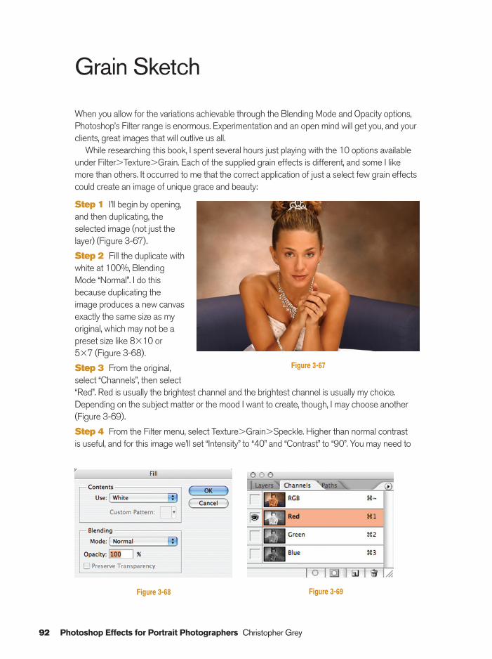
92 Photoshop Effects for Portrait Photographers Christopher Grey
Grain Sketch
When you allow for the variations achievable through the Blending Mode and Opacity options,Photoshop’s Filter range is enormous. Experimentation and an open mind will get you, and yourclients, great images that will outlive us all.
While researching this book, I spent several hours just playing with the 10 options availableunder Filter�Texture�Grain. Each of the supplied grain effects is different, and some I likemore than others. It occurred to me that the correct application of just a select few grain effectscould create an image of unique grace and beauty:
Step 1 I’ll begin by opening,and then duplicating, theselected image (not just thelayer) (Figure 3-67).
Step 2 Fill the duplicate withwhite at 100%, BlendingMode “Normal”. I do thisbecause duplicating theimage produces a new canvasexactly the same size as myoriginal, which may not be apreset size like 8�10 or 5�7 (Figure 3-68).
Step 3 From the original,select “Channels”, then select“Red”. Red is usually the brightest channel and the brightest channel is usually my choice.Depending on the subject matter or the mood I want to create, though, I may choose another(Figure 3-69).
Step 4 From the Filter menu, select Texture�Grain�Speckle. Higher than normal contrast is useful, and for this image we’ll set “Intensity” to “40” and “Contrast” to “90”. You may need to
Figure 3-67
Figure 3-68 Figure 3-69
Ch03-K80894.qxd 8/31/06 12:09 PM Page 92
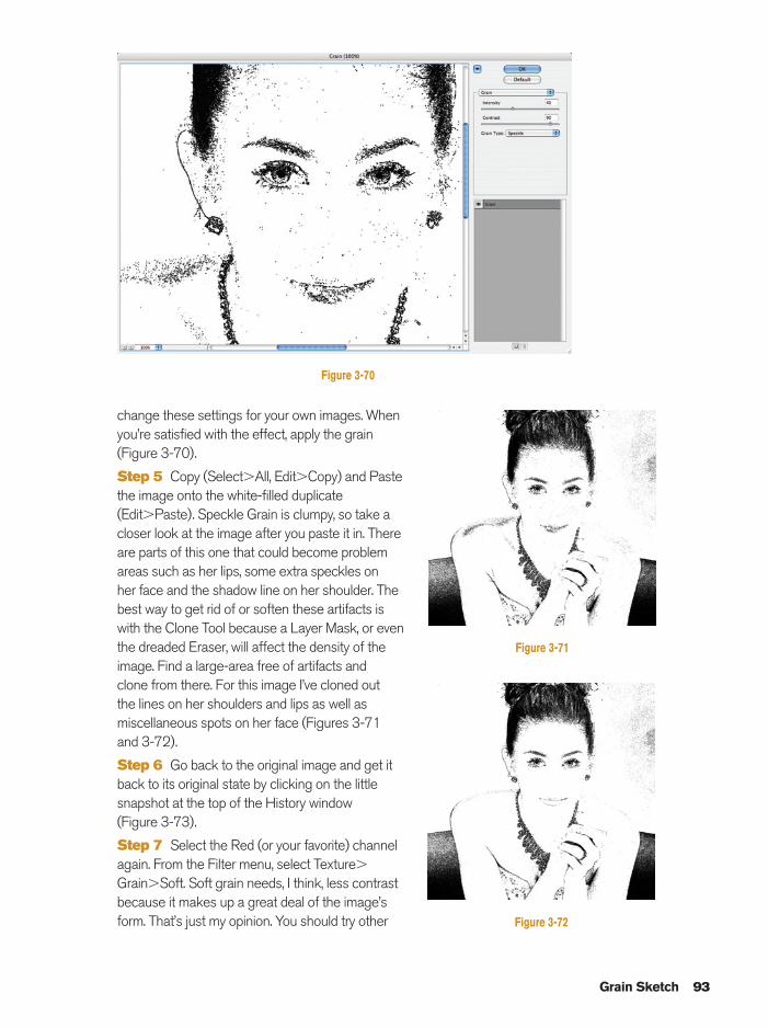
change these settings for your own images. Whenyou’re satisfied with the effect, apply the grain(Figure 3-70).
Step 5 Copy (Select�All, Edit�Copy) and Paste the image onto the white-filled duplicate(Edit�Paste). Speckle Grain is clumpy, so take acloser look at the image after you paste it in. Thereare parts of this one that could become problemareas such as her lips, some extra speckles on her face and the shadow line on her shoulder. Thebest way to get rid of or soften these artifacts iswith the Clone Tool because a Layer Mask, or eventhe dreaded Eraser, will affect the density of theimage. Find a large-area free of artifacts and clone from there. For this image I’ve cloned out the lines on her shoulders and lips as well asmiscellaneous spots on her face (Figures 3-71 and 3-72).
Step 6 Go back to the original image and get itback to its original state by clicking on the littlesnapshot at the top of the History window (Figure 3-73).
Step 7 Select the Red (or your favorite) channelagain. From the Filter menu, select Texture�
Grain�Soft. Soft grain needs, I think, less contrastbecause it makes up a great deal of the image’sform. That’s just my opinion. You should try other
Grain Sketch 93
Figure 3-70
Figure 3-71
Figure 3-72
Ch03-K80894.qxd 8/31/06 12:09 PM Page 93
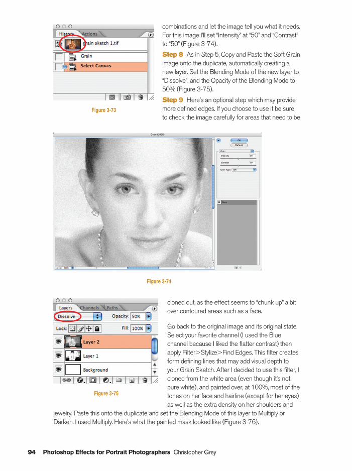
94 Photoshop Effects for Portrait Photographers Christopher Grey
combinations and let the image tell you what it needs.For this image I’ll set “Intensity” at “50” and “Contrast”to “50” (Figure 3-74).
Step 8 As in Step 5, Copy and Paste the Soft Grainimage onto the duplicate, automatically creating anew layer. Set the Blending Mode of the new layer to“Dissolve”, and the Opacity of the Blending Mode to50% (Figure 3-75).
Step 9 Here’s an optional step which may providemore defined edges. If you choose to use it be sureto check the image carefully for areas that need to be
Figure 3-73
Figure 3-74
cloned out, as the effect seems to “chunk up” a bitover contoured areas such as a face.
Go back to the original image and its original state.Select your favorite channel (I used the Bluechannel because I liked the flatter contrast) thenapply Filter�Stylize�Find Edges. This filter createsform defining lines that may add visual depth toyour Grain Sketch. After I decided to use this filter, Icloned from the white area (even though it’s notpure white), and painted over, at 100%, most of thetones on her face and hairline (except for her eyes)as well as the extra density on her shoulders and
jewelry. Paste this onto the duplicate and set the Blending Mode of this layer to Multiply orDarken. I used Multiply. Here’s what the painted mask looked like (Figure 3-76).
Figure 3-75
Ch03-K80894.qxd 8/31/06 12:10 PM Page 94
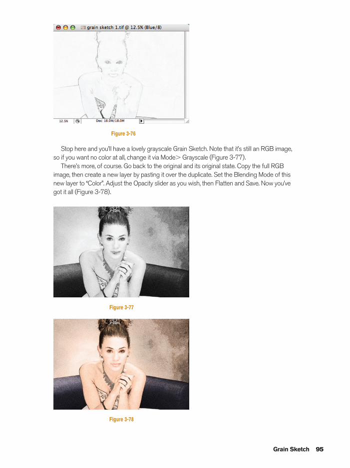
Stop here and you’ll have a lovely grayscale Grain Sketch. Note that it’s still an RGB image,so if you want no color at all, change it via Mode� Grayscale (Figure 3-77).
There’s more, of course. Go back to the original and its original state. Copy the full RGBimage, then create a new layer by pasting it over the duplicate. Set the Blending Mode of thisnew layer to “Color”. Adjust the Opacity slider as you wish, then Flatten and Save. Now you’vegot it all (Figure 3-78).
Grain Sketch 95
Figure 3-76
Figure 3-77
Figure 3-78
Ch03-K80894.qxd 8/31/06 12:10 PM Page 95
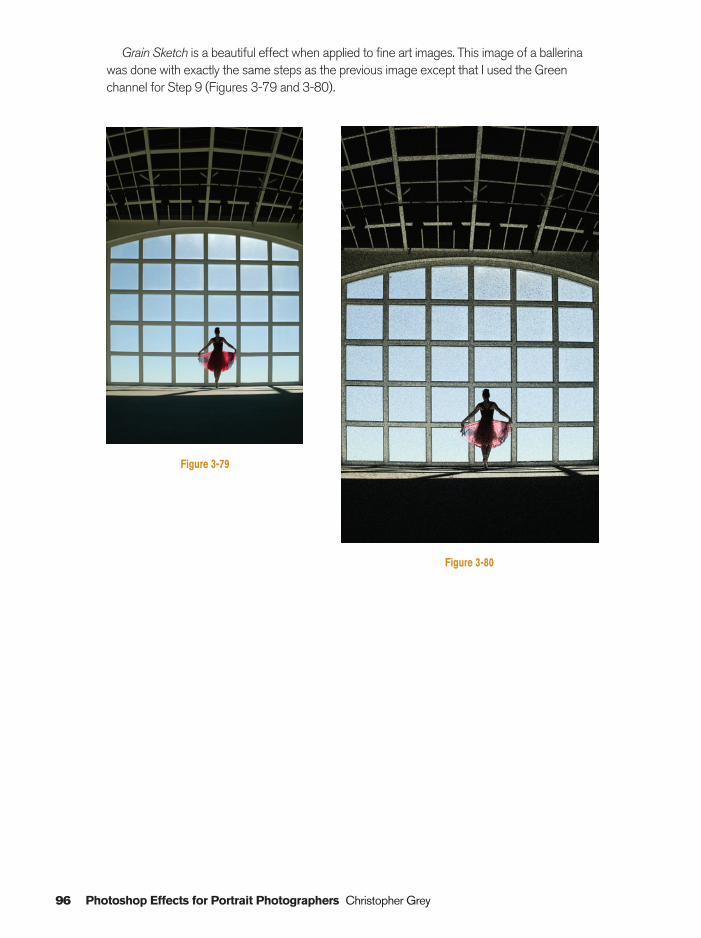
96 Photoshop Effects for Portrait Photographers Christopher Grey
Figure 3-79
Figure 3-80
Grain Sketch is a beautiful effect when applied to fine art images. This image of a ballerinawas done with exactly the same steps as the previous image except that I used the Greenchannel for Step 9 (Figures 3-79 and 3-80).
Ch03-K80894.qxd 8/31/06 12:10 PM Page 96
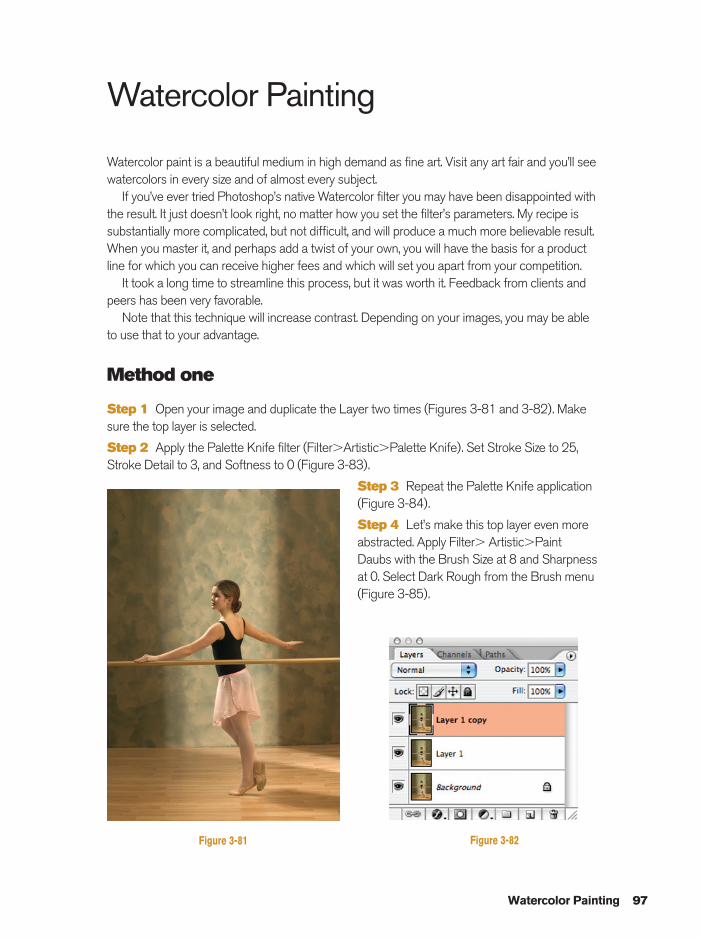
Watercolor Painting
Watercolor paint is a beautiful medium in high demand as fine art. Visit any art fair and you’ll seewatercolors in every size and of almost every subject.
If you’ve ever tried Photoshop’s native Watercolor filter you may have been disappointed withthe result. It just doesn’t look right, no matter how you set the filter’s parameters. My recipe issubstantially more complicated, but not difficult, and will produce a much more believable result.When you master it, and perhaps add a twist of your own, you will have the basis for a productline for which you can receive higher fees and which will set you apart from your competition.
It took a long time to streamline this process, but it was worth it. Feedback from clients andpeers has been very favorable.
Note that this technique will increase contrast. Depending on your images, you may be ableto use that to your advantage.
Method one
Step 1 Open your image and duplicate the Layer two times (Figures 3-81 and 3-82). Makesure the top layer is selected.
Step 2 Apply the Palette Knife filter (Filter�Artistic�Palette Knife). Set Stroke Size to 25,Stroke Detail to 3, and Softness to 0 (Figure 3-83).
Step 3 Repeat the Palette Knife application(Figure 3-84).
Step 4 Let’s make this top layer even moreabstracted. Apply Filter� Artistic�Paint Daubs with the Brush Size at 8 and Sharpnessat 0. Select Dark Rough from the Brush menu(Figure 3-85).
Watercolor Painting 97
Figure 3-81 Figure 3-82
Ch03-K80894.qxd 8/31/06 12:10 PM Page 97
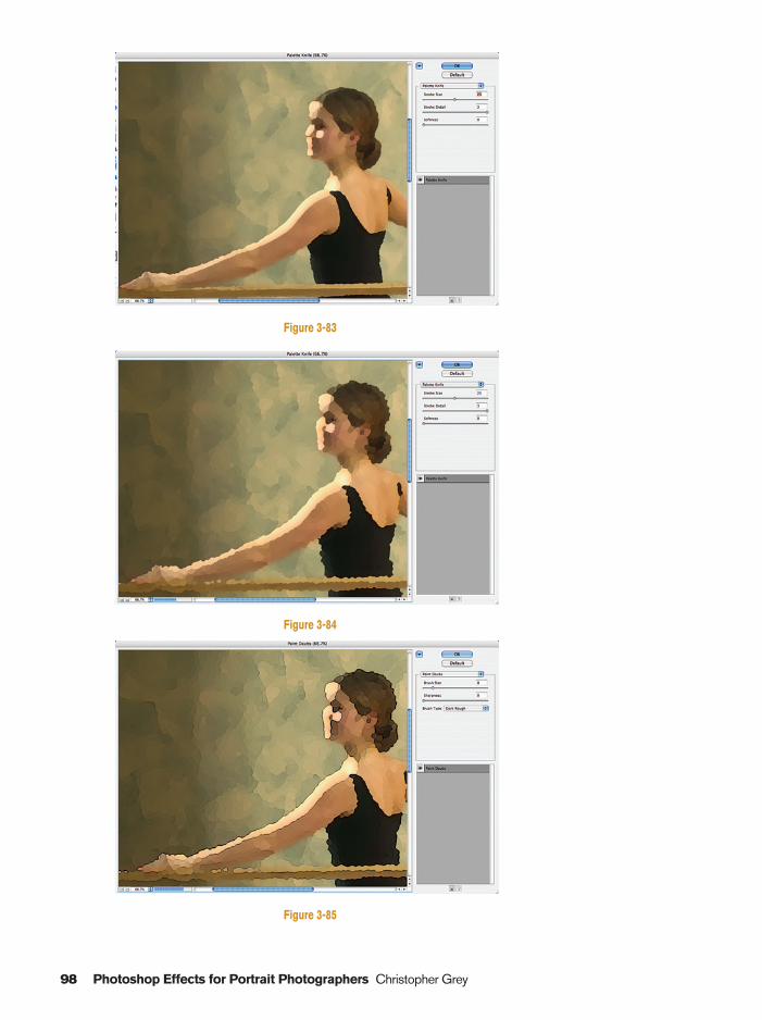
98 Photoshop Effects for Portrait Photographers Christopher Grey
Figure 3-83
Figure 3-84
Figure 3-85
Ch03-K80894.qxd 8/31/06 12:10 PM Page 98
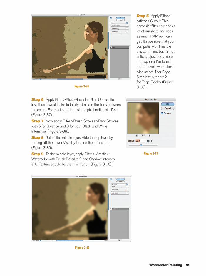
Step 5 Apply Filter�Artistic�Cutout. Thisparticular filter crunches alot of numbers and usesas much RAM as it canget. It’s possible that yourcomputer won’t handlethis command but it’s notcritical; it just adds moreatmosphere. I’ve foundthat 4 Levels works best.Also select 4 for EdgeSimplicity but only 2 for Edge Fidelity (Figure3-86).
Step 6 Apply Filter�Blur�Gaussian Blur. Use a little less than it would take to totally eliminate the lines betweenthe colors. For this image I’m using a pixel radius of 15.4(Figure 3-87).
Step 7 Now apply Filter�Brush Strokes�Dark Strokes with 5 for Balance and 0 for both Black and WhiteIntensities (Figure 3-88).
Step 8 Select the middle layer. Hide the top layer byturning off the Layer Visibility icon on the left column(Figure 3-89).
Step 9 To the middle layer, apply Filter� Artistic�
Watercolor with Brush Detail to 9 and Shadow Intensity at 0. Texture should be the minimum, 1 (Figure 3-90).
Watercolor Painting 99
Figure 3-86
Figure 3-87
Figure 3-88
Ch03-K80894.qxd 8/31/06 12:10 PM Page 99
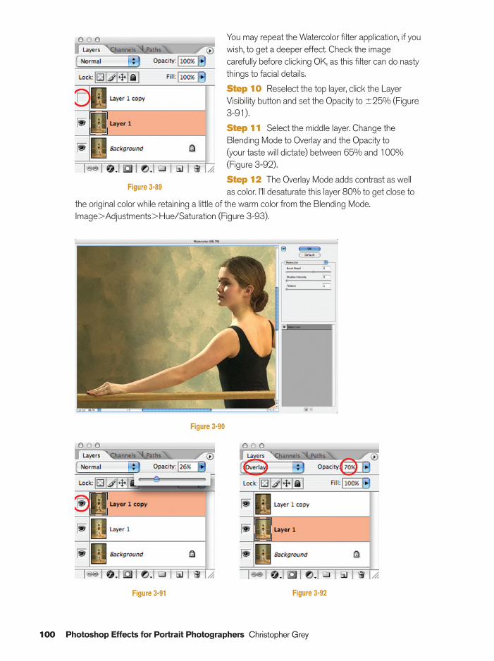
100 Photoshop Effects for Portrait Photographers Christopher Grey
You may repeat the Watercolor filter application, if youwish, to get a deeper effect. Check the imagecarefully before clicking OK, as this filter can do nastythings to facial details.
Step 10 Reselect the top layer, click the LayerVisibility button and set the Opacity to �25% (Figure3-91).
Step 11 Select the middle layer. Change theBlending Mode to Overlay and the Opacity to (your taste will dictate) between 65% and 100%(Figure 3-92).
Step 12 The Overlay Mode adds contrast as wellas color. I’ll desaturate this layer 80% to get close to
the original color while retaining a little of the warm color from the Blending Mode.Image�Adjustments�Hue/Saturation (Figure 3-93).
Figure 3-89
Figure 3-90
Figure 3-91 Figure 3-92
Ch03-K80894.qxd 8/31/06 12:10 PM Page 100
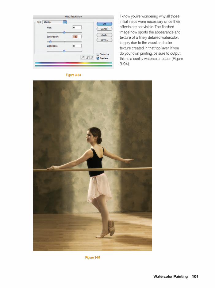
I know you’re wondering why all thoseinitial steps were necessary since theiraffects are not visible. The finishedimage now sports the appearance andtexture of a finely detailed watercolor,largely due to the visual and colortexture created in that top layer. If youdo your own printing, be sure to outputthis to a quality watercolor paper (Figure3-94).
Watercolor Painting 101
Figure 3-93
Figure 3-94
Ch03-K80894.qxd 8/31/06 12:10 PM Page 101
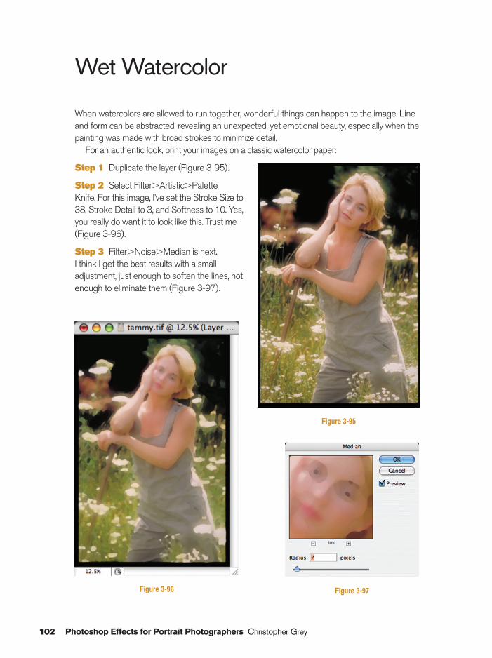
102 Photoshop Effects for Portrait Photographers Christopher Grey
Wet Watercolor
When watercolors are allowed to run together, wonderful things can happen to the image. Lineand form can be abstracted, revealing an unexpected, yet emotional beauty, especially when thepainting was made with broad strokes to minimize detail.
For an authentic look, print your images on a classic watercolor paper:
Step 1 Duplicate the layer (Figure 3-95).
Step 2 Select Filter�Artistic�Palette Knife. For this image, I’ve set the Stroke Size to38, Stroke Detail to 3, and Softness to 10. Yes,you really do want it to look like this. Trust me(Figure 3-96).
Step 3 Filter�Noise�Median is next. I think I get the best results with a smalladjustment, just enough to soften the lines, notenough to eliminate them (Figure 3-97).
Figure 3-96
Figure 3-95
Figure 3-97
Ch03-K80894.qxd 8/31/06 12:10 PM Page 102
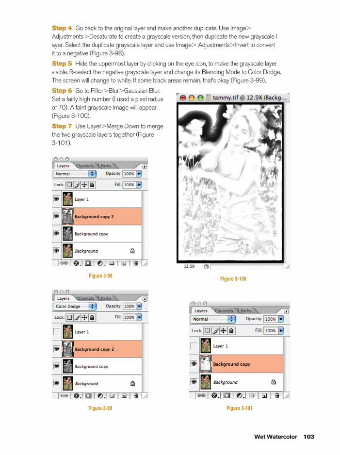
Step 4 Go back to the original layer and make another duplicate. Use Image�
Adjustments�Desaturate to create a grayscale version, then duplicate the new grayscale layer. Select the duplicate grayscale layer and use Image� Adjustments�Invert to convert it to a negative (Figure 3-98).
Step 5 Hide the uppermost layer by clicking on the eye icon, to make the grayscale layervisible. Reselect the negative grayscale layer and change its Blending Mode to Color Dodge.The screen will change to white. If some black areas remain, that’s okay (Figure 3-99).
Step 6 Go to Filter�Blur�Gaussian Blur.Set a fairly high number (I used a pixel radiusof 70). A faint grayscale image will appear(Figure 3-100).
Step 7 Use Layer�Merge Down to mergethe two grayscale layers together (Figure 3-101).
Wet Watercolor 103
Figure 3-98
Figure 3-99 Figure 3-101
Figure 3-100
Ch03-K80894.qxd 8/31/06 12:10 PM Page 103
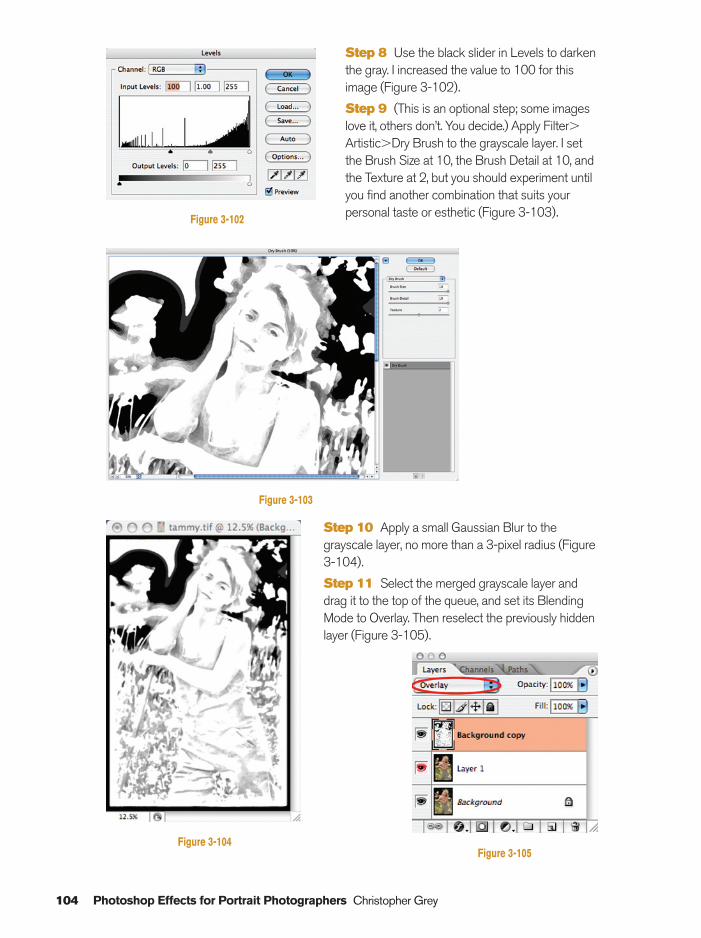
Step 8 Use the black slider in Levels to darkenthe gray. I increased the value to 100 for thisimage (Figure 3-102).
Step 9 (This is an optional step; some imageslove it, others don’t. You decide.) Apply Filter�Artistic�Dry Brush to the grayscale layer. I setthe Brush Size at 10, the Brush Detail at 10, andthe Texture at 2, but you should experiment untilyou find another combination that suits yourpersonal taste or esthetic (Figure 3-103).
Step 10 Apply a small Gaussian Blur to thegrayscale layer, no more than a 3-pixel radius (Figure3-104).
Step 11 Select the merged grayscale layer anddrag it to the top of the queue, and set its BlendingMode to Overlay. Then reselect the previously hiddenlayer (Figure 3-105).
104 Photoshop Effects for Portrait Photographers Christopher Grey
Figure 3-102
Figure 3-103
Figure 3-104Figure 3-105
Ch03-K80894.qxd 8/31/06 12:10 PM Page 104
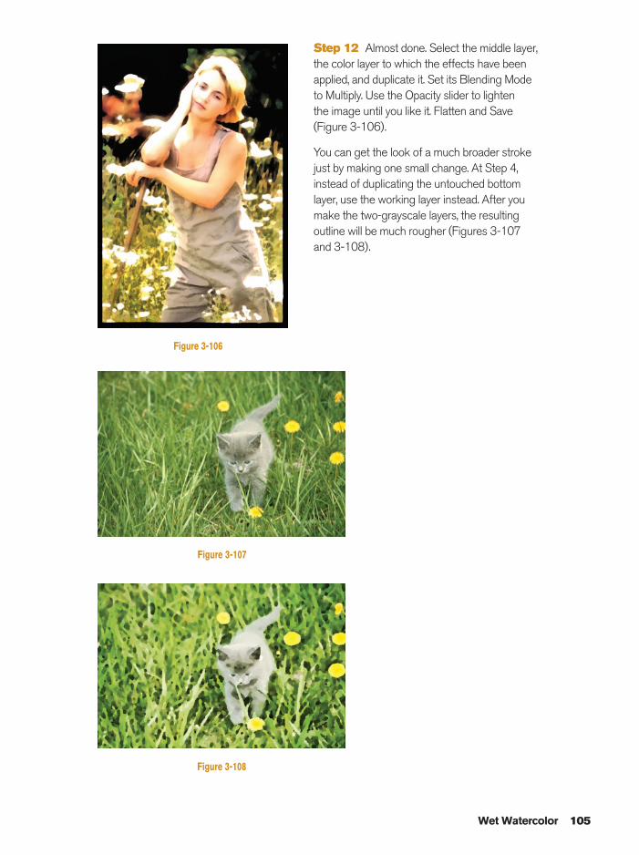
Step 12 Almost done. Select the middle layer,the color layer to which the effects have beenapplied, and duplicate it. Set its Blending Mode to Multiply. Use the Opacity slider to lighten the image until you like it. Flatten and Save(Figure 3-106).
You can get the look of a much broader strokejust by making one small change. At Step 4,instead of duplicating the untouched bottomlayer, use the working layer instead. After youmake the two-grayscale layers, the resultingoutline will be much rougher (Figures 3-107 and 3-108).
Wet Watercolor 105
Figure 3-106
Figure 3-107
Figure 3-108
Ch03-K80894.qxd 8/31/06 12:11 PM Page 105
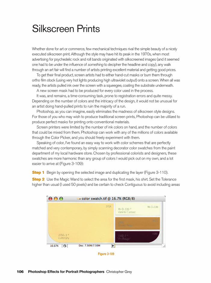
106 Photoshop Effects for Portrait Photographers Christopher Grey
Silkscreen Prints
Whether done for art or commerce, few mechanical techniques rival the simple beauty of a nicelyexecuted silkscreen print. Although the style may have hit its peak in the 1970s, when mostadvertising for psychedelic rock and roll bands originated with silkscreened images (and it seemedone had to be under the influence of something to decipher the headline and copy), any walkthrough an art fair will find a number of artists printing excellent material and getting good prices.
To get their final product, screen artists had to either hand-cut masks or burn them throughortho film stock (using very hot lights producing high ultraviolet output) onto a screen. When all wasready, the artists pulled ink over the screen with a squeegee, coating the substrate underneath.
A new screen mask had to be produced for every color used in the process.It was, and remains, a time-consuming task, prone to registration errors and quite messy.
Depending on the number of colors and the intricacy of the design, it would not be unusual foran artist doing hand-pulled prints to ruin the majority of a run.
Photoshop, as you can imagine, easily eliminates the madness of silkscreen style designs.For those of you who may wish to produce traditional screen prints, Photoshop can be utilized toproduce perfect masks for printing onto conventional materials.
Screen printers were limited by the number of ink colors on hand, and the number of colorsthat could be mixed from them. Photoshop can work with any of the millions of colors availablethrough the Color Picker, and you should freely experiment with them.
Speaking of color, I’ve found an easy way to work with color schemes that are perfectlymatched and very contemporary, by simply scanning decorator color swatches from the paintdepartment of my local hardware store. Chosen by professional colorists and designers, theseswatches are more harmonic than any group of colors I would pick out on my own, and a loteasier to arrive at (Figure 3-109):
Step 1 Begin by opening the selected image and duplicating the layer (Figure 3-110).
Step 2 Use the Magic Wand to select the area for the first mask, his shirt. Set the Tolerancehigher than usual (I used 50 pixels) and be certain to check Contiguous to avoid including areas
Figure 3-109
Ch03-K80894.qxd 8/31/06 12:11 PM Page 106
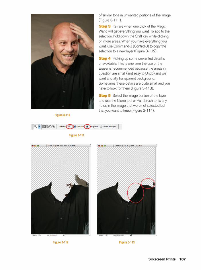
of similar tone in unwanted portions of the image(Figure 3-111).
Step 3 It’s rare when one click of the MagicWand will get everything you want. To add to theselection, hold down the Shift key while clickingon more areas. When you have everything youwant, use Command-J (Control-J) to copy theselection to a new layer (Figure 3-112).
Step 4 Picking up some unwanted detail isunavoidable. This is one time the use of theEraser is recommended because the areas inquestion are small (and easy to Undo) and wewant a totally transparent background.Sometimes these details are quite small and youhave to look for them (Figure 3-113).
Step 5 Select the Image portion of the layerand use the Clone tool or Paintbrush to fix anyholes in the image that were not selected butthat you want to keep (Figure 3-114).
Silkscreen Prints 107
Figure 3-111
Figure 3-112 Figure 3-113
Figure 3-110
Ch03-K80894.qxd 8/31/06 12:11 PM Page 107
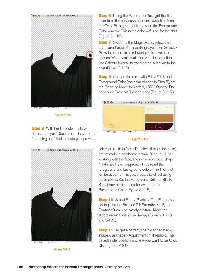
Step 9 With the first color in place,duplicate Layer 1 (be sure to check for the“marching ants” that indicate your previous
selection is still in force. Deselect, if that’s the case),before making another selection. Because I’ll beworking with the face, and not a more solid shape,I’ll take a different approach. First, reset theforeground and background colors. The filter thatwill be used, Torn Edges, creates its effect usingthose colors. Set the Foreground Color to Black.Select one of the decorator colors for theBackground Color (Figure 3-118).
Step 10 Select Filter�Sketch�Torn Edges. Mysettings, Image Balance 24, Smoothness 8, andContrast 9, are completely arbitrary. Move thesliders around until you’re happy (Figures 3-119and 3-120).
Step 11 To get a perfect, sharply edged blackimage, use Image�Adjustments�Threshold. Thedefault slider position is where you want to be. ClickOK (Figure 3-121).
108 Photoshop Effects for Portrait Photographers Christopher Grey
Step 6 Using the Eyedropper Tool, get the firstcolor from the previously scanned swatch or fromthe Color Picker, so that it shows in the ForegroundColor window. This is the color we’ll use for the shirt(Figure 3-115).
Step 7 Switch to the Magic Wand, select thetransparent area of the working layer, then Select�Grow to be certain all relevant pixels have beenchosen. When you’re satisfied with the selectionuse Select�Inverse to transfer the selection to theshirt (Figure 3-116).
Step 8 Change the color with Edit�Fill. SelectForeground Color (the color chosen in Step 6), setthe Blending Mode to Normal, 100% Opacity. Donot check Preserve Transparency (Figure 3-117).
Figure 3-115
Figure 3-116
Figure 3-114
Ch03-K80894.qxd 8/31/06 12:11 PM Page 108
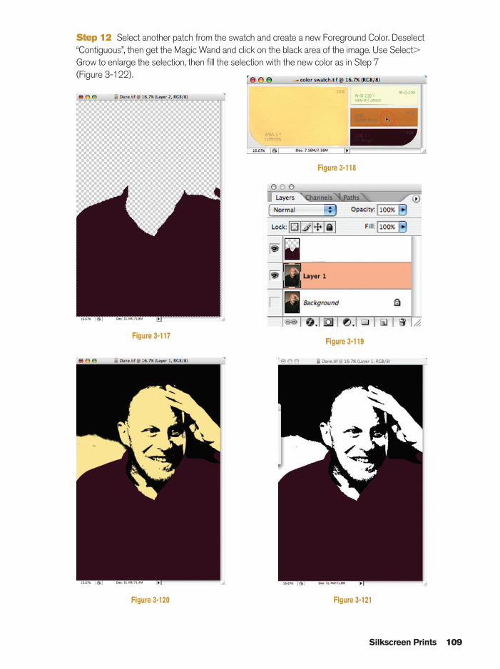
Step 12 Select another patch from the swatch and create a new Foreground Color. Deselect“Contiguous”, then get the Magic Wand and click on the black area of the image. Use Select�Grow to enlarge the selection, then fill the selection with the new color as in Step 7 (Figure 3-122).
Silkscreen Prints 109
Figure 3-119
Figure 3-121Figure 3-120
Figure 3-117
Figure 3-118
Ch03-K80894.qxd 8/31/06 12:11 PM Page 109
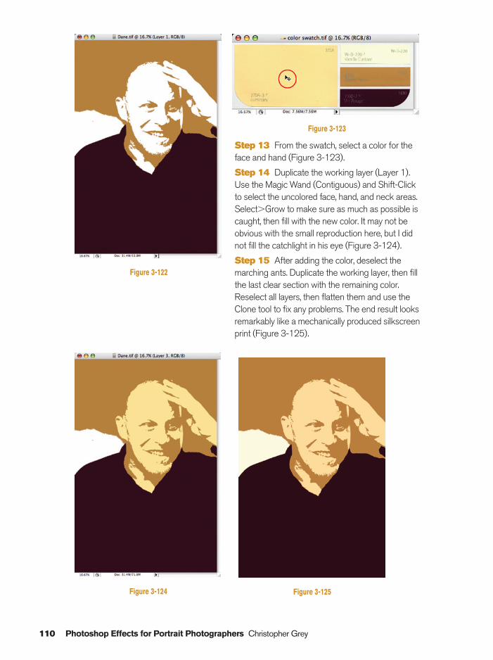
110 Photoshop Effects for Portrait Photographers Christopher Grey
Step 13 From the swatch, select a color for theface and hand (Figure 3-123).
Step 14 Duplicate the working layer (Layer 1).Use the Magic Wand (Contiguous) and Shift-Clickto select the uncolored face, hand, and neck areas.Select�Grow to make sure as much as possible iscaught, then fill with the new color. It may not beobvious with the small reproduction here, but I didnot fill the catchlight in his eye (Figure 3-124).
Step 15 After adding the color, deselect themarching ants. Duplicate the working layer, then fillthe last clear section with the remaining color.Reselect all layers, then flatten them and use theClone tool to fix any problems. The end result looksremarkably like a mechanically produced silkscreenprint (Figure 3-125).
Figure 3-122
Figure 3-124 Figure 3-125
Figure 3-123
Ch03-K80894.qxd 8/31/06 12:11 PM Page 110
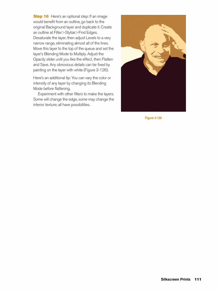
Step 16 Here’s an optional step: If an imagewould benefit from an outline, go back to theoriginal Background layer and duplicate it. Createan outline at Filter�Stylize�Find Edges.Desaturate the layer, then adjust Levels to a verynarrow range, eliminating almost all of the lines.Move this layer to the top of the queue and set thelayer’s Blending Mode to Multiply. Adjust theOpacity slider until you like the effect, then Flattenand Save. Any obnoxious details can be fixed bypainting on the layer with white (Figure 3-126).
Here’s an additional tip: You can vary the color orintensity of any layer by changing its BlendingMode before flattening.
Experiment with other filters to make the layers.Some will change the edge, some may change theinterior texture; all have possibilities.
Silkscreen Prints 111
Figure 3-126
Ch03-K80894.qxd 8/31/06 12:11 PM Page 111
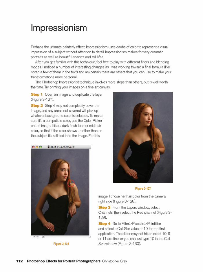
112 Photoshop Effects for Portrait Photographers Christopher Grey
image, I chose her hair color from the cameraright side (Figure 3-128).
Step 3 From the Layers window, selectChannels, then select the Red channel (Figure 3-129).
Step 4 Go to Filter�Pixelate�Pointillize and select a Cell Size value of 10 for the firstapplication. The slider may not hit an exact 10; 9or 11 are fine, or you can just type 10 in the CellSize window (Figure 3-130).
Impressionism
Perhaps the ultimate painterly effect, Impressionism uses daubs of color to represent a visualimpression of a subject without attention to detail. Impressionism makes for very dramaticportraits as well as beautiful scenics and still lifes.
After you get familiar with this technique, feel free to play with different filters and blendingmodes. I noticed a number of interesting changes as I was working toward a final formula (I’venoted a few of them in the text) and am certain there are others that you can use to make yourtransformations more personal.
The Photoshop Impressionist technique involves more steps than others, but is well worththe time. Try printing your images on a fine art canvas:
Step 1 Open an image and duplicate the layer(Figure 3-127).
Step 2 Step 4 may not completely cover theimage, and any areas not covered will pick upwhatever background color is selected. To makesure it’s a compatible color, use the Color Pickeron the image. I like a dark flesh tone or mid haircolor, so that if the color shows up other than onthe subject it’s still tied in to the image. For this
Figure 3-127
Figure 3-128
Ch03-K80894.qxd 8/31/06 12:11 PM Page 112
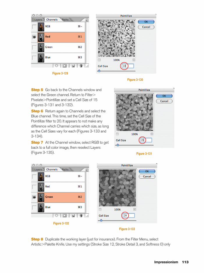
Step 5 Go back to the Channels window andselect the Green channel. Return to Filter�Pixelate�Pointillize and set a Cell Size of 15(Figures 3-131 and 3-132).
Step 6 Return again to Channels and select theBlue channel. This time, set the Cell Size of thePointillize filter to 20. It appears to not make anydifference which Channel carries which size, as longas the Cell Sizes vary for each (Figures 3-133 and3-134).
Step 7 At the Channel window, select RGB to getback to a full color image, then reselect Layers(Figure 3-135).
Step 8 Duplicate the working layer (just for insurance). From the Filter Menu, selectArtistic�Palette Knife. Use my settings (Stroke Size 12, Stroke Detail 3, and Softness 0) only
Impressionism 113
Figure 3-129
Figure 3-130
Figure 3-131
Figure 3-132
Figure 3-133
Ch03-K80894.qxd 8/31/06 12:11 PM Page 113
114 Photoshop Effects for Portrait Photographers Christopher Grey
as a point of departure. I’ve found every image will require some experimentation. You canachieve a lesser effect by using Dry Brush instead of Palette Knife (Figure 3-136).
Step 9 Filter�Distort�Glass can change the flat strokes of the Palette Knife and make them look more like something painted with a rough brush. My settings; Distortion: 6,Smoothness: 4, Texture: Frosted, and Scaling: 50% seem to work well with a variety of images(Figure 1.137).
At this point, you can adjust the Opacity against the layer below, or Merge Down, or Deselectthis layer and start over with the insurance layer. This example will be Merged, leaving me withjust two layers.
Step 10 Duplicate the new working layer twice, then select the topmost layer (Figure 3-138).
Figure 3-134 Figure 3-135
Figure 3-136
Ch03-K80894.qxd 8/31/06 12:11 PM Page 114
Step 12 Set the Blending Mode of the HighPass layer to Soft Light, then Merge Down (for aharder effect, set the Blending Mode to Overlay)(Figure 3-140).
Step 13 You may leave the image as is, and goon to the next step, or play with the BlendingModes to try some different effects. For instance,changing the Mode of the top layer to Overlay,Soft Light, Hard Light, or Vivid Light will increasethe color contrast by varying degree, after which
Step 11 A High Pass layer will increase thesharpness and contrast of the colors (see HighPass Sharpening elsewhere in the book for moredetails). Go to Filter�Other�High Pass and set aradius of �80 pixels. The higher the number, thehigher the contrast (Figure 3-139).
Impressionism 115
Figure 3-137
Figure 3-138
Figure 3-139
Ch03-K80894.qxd 8/31/06 12:11 PM Page 115
116 Photoshop Effects for Portrait Photographers Christopher Grey
you can blend those top two layers usingthe Opacity slider. I used Soft Light forthis image, at 74% Opacity (Figure 3-141).
Step 14 At the Toolbox, reselect Blackas the Foreground Color and White asthe Background Color by clicking on thesmall black/white icon below the colorboxes (Figure 3-142).
Step 15 At the Layer window,duplicate the original, unaffected layer,and drag it to the top of the queue(Figure 3-143).
Step 16 Use Filter�Sketch�
Photocopy to create an outline of thesubject. Be careful to set Detail tominimize artifacts in the skin (I set it at 2)and Darkness to get some thick lines (I settled on 40) (Figure 3-144).
Step 17 Set the Blending Mode of the Photocopy layer to Multiply. The “fat” Photocopy linesbring some reality back to the image (Figure 3-145).
Step 17 is normally the final step in the Impressionism process but I can never resist the urge toplay with Photoshop (neither should you) and frequently find new techniques to build on what I’ve done (Figure 3-146).
Figure 3-140
Figure 3-141
Figure 3-142Figure 3-143
Ch03-K80894.qxd 8/31/06 12:11 PM Page 116
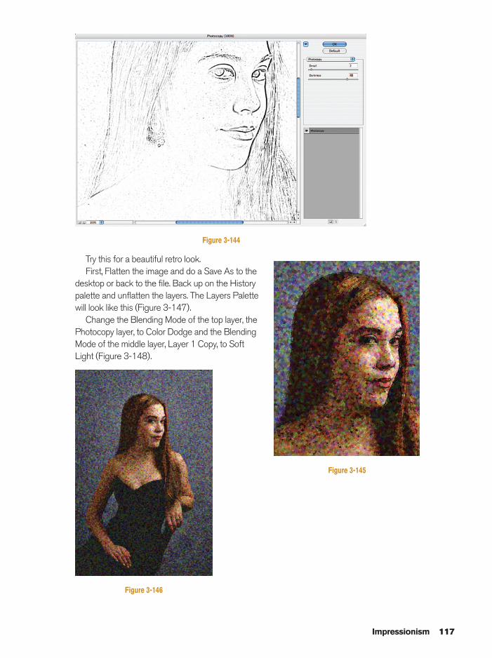
Try this for a beautiful retro look.First, Flatten the image and do a Save As to the
desktop or back to the file. Back up on the Historypalette and unflatten the layers. The Layers Palettewill look like this (Figure 3-147).
Change the Blending Mode of the top layer, thePhotocopy layer, to Color Dodge and the BlendingMode of the middle layer, Layer 1 Copy, to SoftLight (Figure 3-148).
Impressionism 117
Figure 3-144
Figure 3-145
Figure 3-146
Ch03-K80894.qxd 8/31/06 12:11 PM Page 117
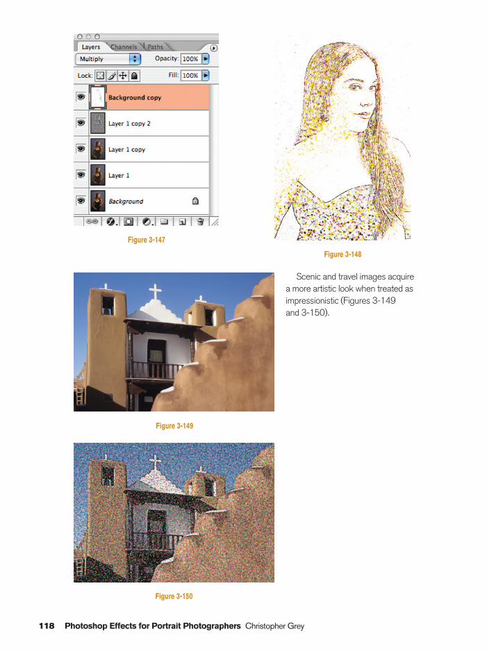
118 Photoshop Effects for Portrait Photographers Christopher Grey
Figure 3-148
Figure 3-149
Figure 3-150
Scenic and travel images acquirea more artistic look when treated asimpressionistic (Figures 3-149 and 3-150).
Figure 3-147
Ch03-K80894.qxd 8/31/06 12:12 PM Page 118
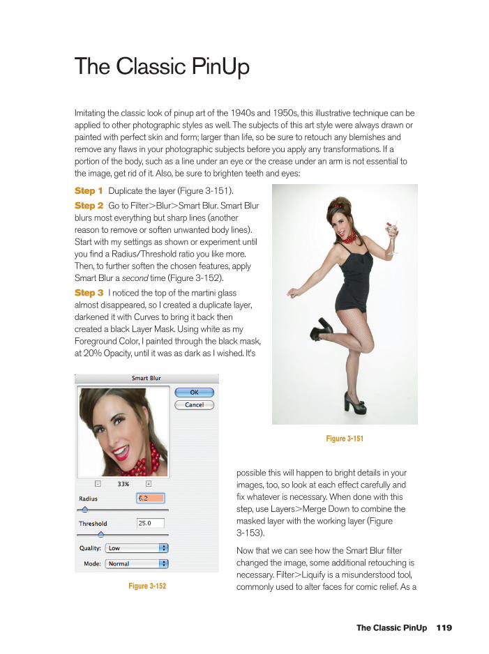
possible this will happen to bright details in yourimages, too, so look at each effect carefully and fix whatever is necessary. When done with thisstep, use Layers�Merge Down to combine themasked layer with the working layer (Figure 3-153).
Now that we can see how the Smart Blur filterchanged the image, some additional retouching isnecessary. Filter�Liquify is a misunderstood tool,commonly used to alter faces for comic relief. As a
The Classic PinUp
Imitating the classic look of pinup art of the 1940s and 1950s, this illustrative technique can beapplied to other photographic styles as well. The subjects of this art style were always drawn orpainted with perfect skin and form; larger than life, so be sure to retouch any blemishes andremove any flaws in your photographic subjects before you apply any transformations. If aportion of the body, such as a line under an eye or the crease under an arm is not essential tothe image, get rid of it. Also, be sure to brighten teeth and eyes:
Step 1 Duplicate the layer (Figure 3-151).
Step 2 Go to Filter�Blur�Smart Blur. Smart Blurblurs most everything but sharp lines (anotherreason to remove or soften unwanted body lines).Start with my settings as shown or experiment untilyou find a Radius/Threshold ratio you like more.Then, to further soften the chosen features, applySmart Blur a second time (Figure 3-152).
Step 3 I noticed the top of the martini glassalmost disappeared, so I created a duplicate layer,darkened it with Curves to bring it back thencreated a black Layer Mask. Using white as myForeground Color, I painted through the black mask,at 20% Opacity, until it was as dark as I wished. It’s
The Classic PinUp 119
Figure 3-151
Figure 3-152
Ch03-K80894.qxd 8/31/06 12:12 PM Page 119
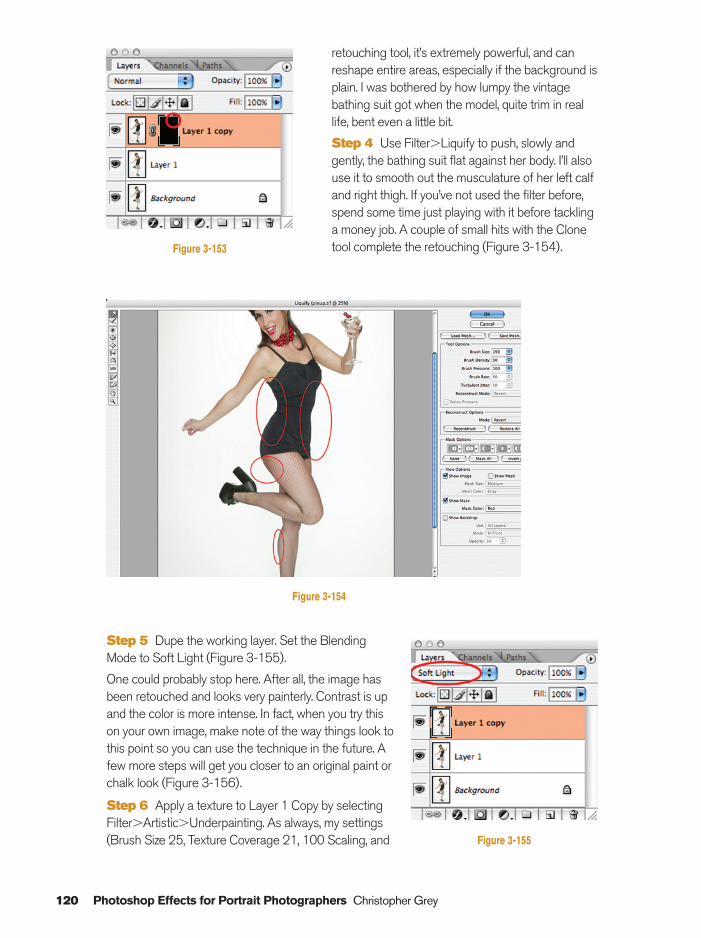
120 Photoshop Effects for Portrait Photographers Christopher Grey
retouching tool, it’s extremely powerful, and canreshape entire areas, especially if the background isplain. I was bothered by how lumpy the vintagebathing suit got when the model, quite trim in reallife, bent even a little bit.
Step 4 Use Filter�Liquify to push, slowly andgently, the bathing suit flat against her body. I’ll alsouse it to smooth out the musculature of her left calfand right thigh. If you’ve not used the filter before,spend some time just playing with it before tacklinga money job. A couple of small hits with the Clonetool complete the retouching (Figure 3-154).Figure 3-153
Figure 3-154
Step 5 Dupe the working layer. Set the BlendingMode to Soft Light (Figure 3-155).
One could probably stop here. After all, the image hasbeen retouched and looks very painterly. Contrast is upand the color is more intense. In fact, when you try thison your own image, make note of the way things look tothis point so you can use the technique in the future. Afew more steps will get you closer to an original paint orchalk look (Figure 3-156).
Step 6 Apply a texture to Layer 1 Copy by selectingFilter�Artistic�Underpainting. As always, my settings(Brush Size 25, Texture Coverage 21, 100 Scaling, and Figure 3-155
Ch03-K80894.qxd 8/31/06 12:12 PM Page 120
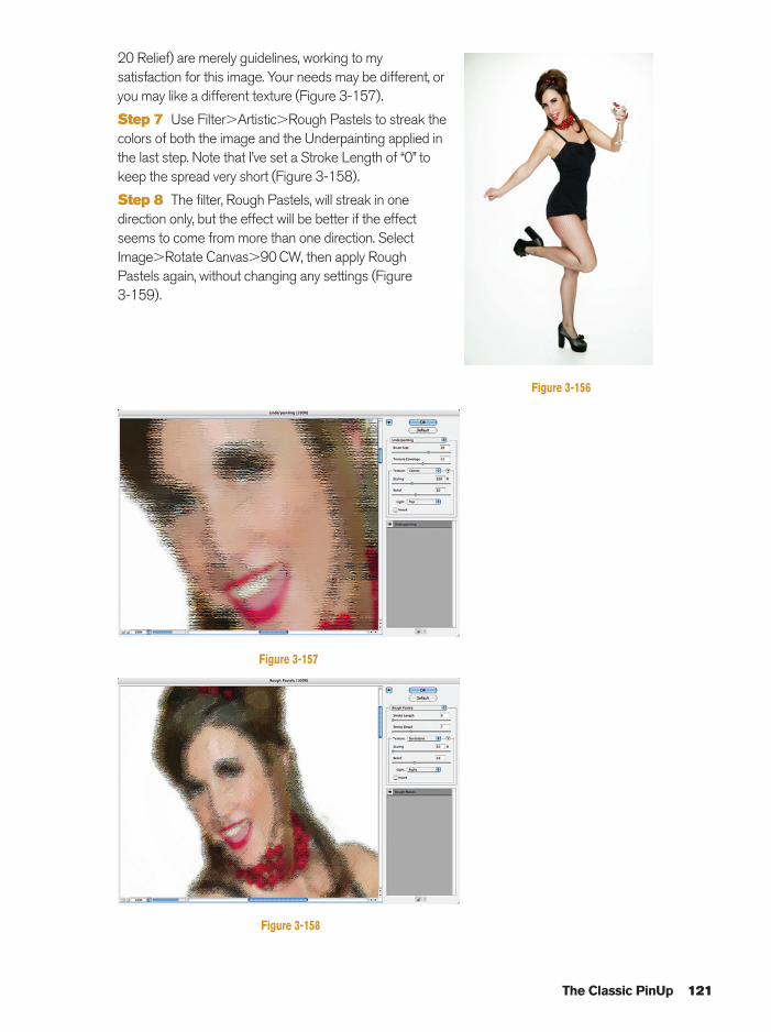
20 Relief) are merely guidelines, working to mysatisfaction for this image. Your needs may be different, oryou may like a different texture (Figure 3-157).
Step 7 Use Filter�Artistic�Rough Pastels to streak thecolors of both the image and the Underpainting applied inthe last step. Note that I’ve set a Stroke Length of “0” tokeep the spread very short (Figure 3-158).
Step 8 The filter, Rough Pastels, will streak in onedirection only, but the effect will be better if the effectseems to come from more than one direction. SelectImage�Rotate Canvas�90 CW, then apply RoughPastels again, without changing any settings (Figure 3-159).
The Classic PinUp 121
Figure 3-156
Figure 3-157
Figure 3-158
Ch03-K80894.qxd 8/31/06 12:12 PM Page 121
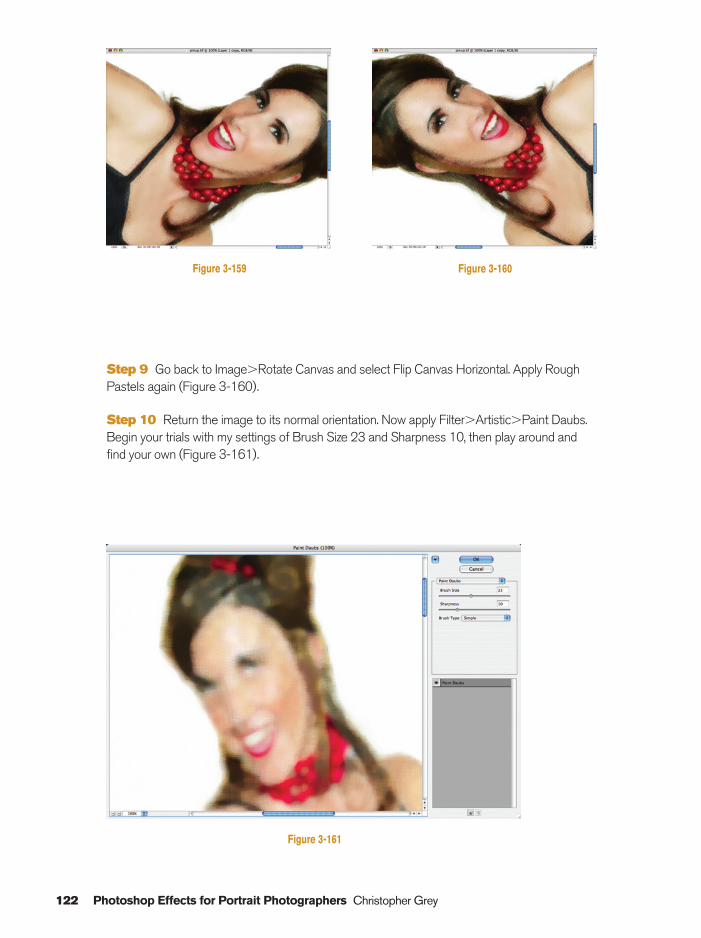
122 Photoshop Effects for Portrait Photographers Christopher Grey
Figure 3-161
Figure 3-159 Figure 3-160
Step 9 Go back to Image�Rotate Canvas and select Flip Canvas Horizontal. Apply RoughPastels again (Figure 3-160).
Step 10 Return the image to its normal orientation. Now apply Filter�Artistic�Paint Daubs.Begin your trials with my settings of Brush Size 23 and Sharpness 10, then play around andfind your own (Figure 3-161).
Ch03-K80894.qxd 8/31/06 12:12 PM Page 122
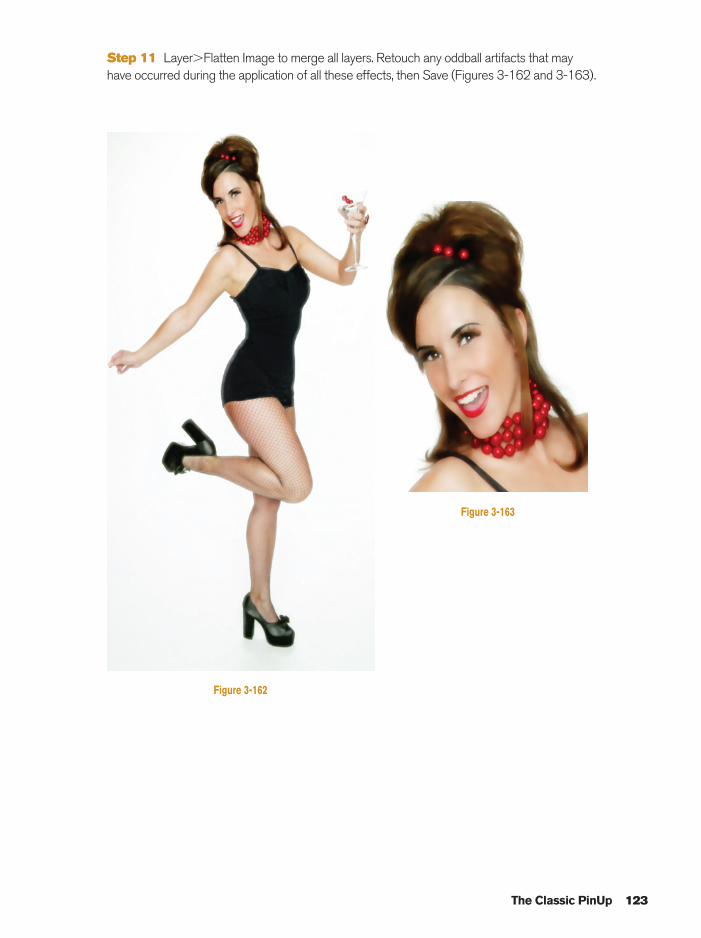
The Classic PinUp 123
Figure 3-162
Figure 3-163
Step 11 Layer�Flatten Image to merge all layers. Retouch any oddball artifacts that may have occurred during the application of all these effects, then Save (Figures 3-162 and 3-163).
Ch03-K80894.qxd 8/31/06 12:12 PM Page 123
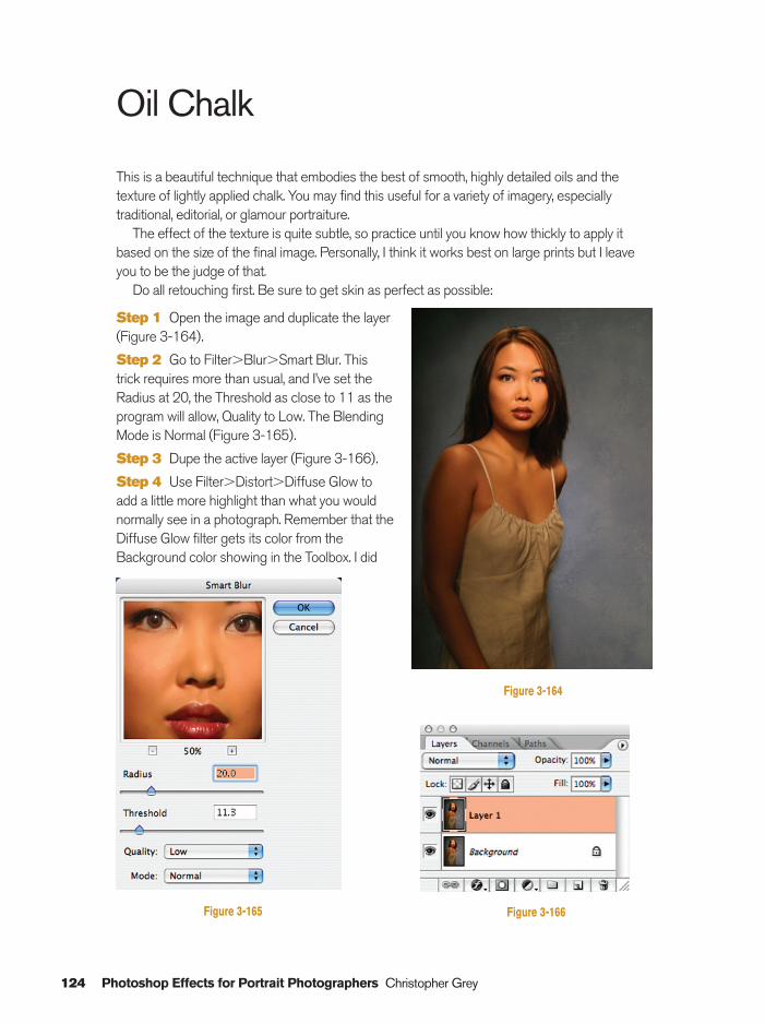
124 Photoshop Effects for Portrait Photographers Christopher Grey
Oil Chalk
This is a beautiful technique that embodies the best of smooth, highly detailed oils and thetexture of lightly applied chalk. You may find this useful for a variety of imagery, especiallytraditional, editorial, or glamour portraiture.
The effect of the texture is quite subtle, so practice until you know how thickly to apply itbased on the size of the final image. Personally, I think it works best on large prints but I leaveyou to be the judge of that.
Do all retouching first. Be sure to get skin as perfect as possible:
Step 1 Open the image and duplicate the layer(Figure 3-164).
Step 2 Go to Filter�Blur�Smart Blur. This trick requires more than usual, and I’ve set theRadius at 20, the Threshold as close to 11 as theprogram will allow, Quality to Low. The BlendingMode is Normal (Figure 3-165).
Step 3 Dupe the active layer (Figure 3-166).
Step 4 Use Filter�Distort�Diffuse Glow to add a little more highlight than what you wouldnormally see in a photograph. Remember that theDiffuse Glow filter gets its color from theBackground color showing in the Toolbox. I did
Figure 3-164
Figure 3-165 Figure 3-166
Ch03-K80894.qxd 8/31/06 12:12 PM Page 124
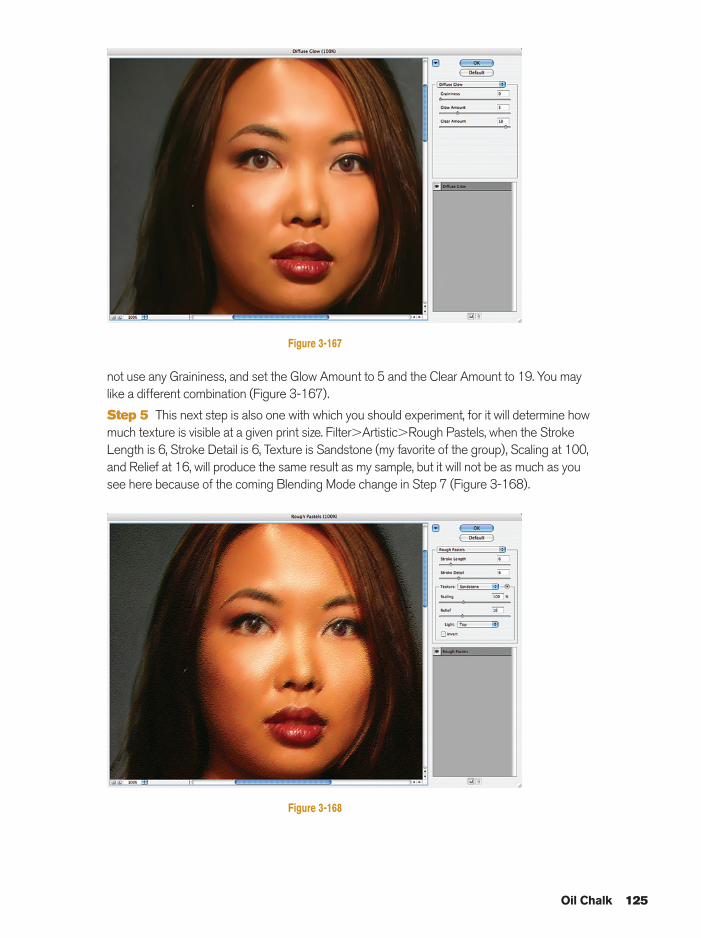
not use any Graininess, and set the Glow Amount to 5 and the Clear Amount to 19. You maylike a different combination (Figure 3-167).
Step 5 This next step is also one with which you should experiment, for it will determine howmuch texture is visible at a given print size. Filter�Artistic�Rough Pastels, when the StrokeLength is 6, Stroke Detail is 6, Texture is Sandstone (my favorite of the group), Scaling at 100,and Relief at 16, will produce the same result as my sample, but it will not be as much as yousee here because of the coming Blending Mode change in Step 7 (Figure 3-168).
Oil Chalk 125
Figure 3-167
Figure 3-168
Ch03-K80894.qxd 8/31/06 12:12 PM Page 125
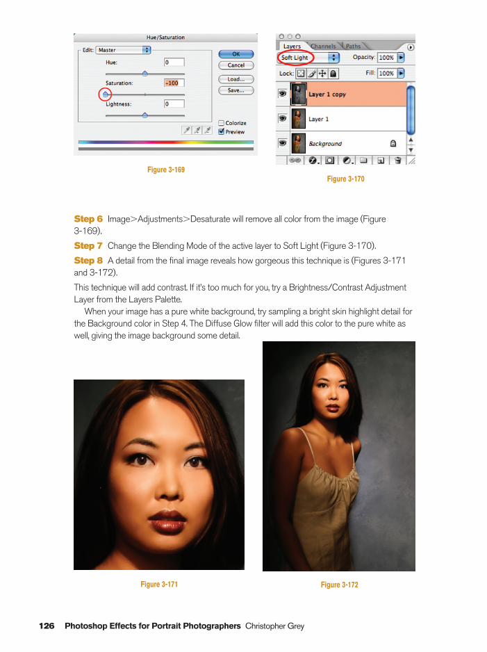
126 Photoshop Effects for Portrait Photographers Christopher Grey
Step 6 Image�Adjustments�Desaturate will remove all color from the image (Figure 3-169).
Step 7 Change the Blending Mode of the active layer to Soft Light (Figure 3-170).
Step 8 A detail from the final image reveals how gorgeous this technique is (Figures 3-171and 3-172).
This technique will add contrast. If it’s too much for you, try a Brightness/Contrast AdjustmentLayer from the Layers Palette.
When your image has a pure white background, try sampling a bright skin highlight detail forthe Background color in Step 4. The Diffuse Glow filter will add this color to the pure white aswell, giving the image background some detail.
Figure 3-171
Figure 3-169Figure 3-170
Figure 3-172
Ch03-K80894.qxd 8/31/06 12:12 PM Page 126
Index 127
Agfachrome 1000, 32analog photography, 18–20artistic effects
charcoal, 86–88classic pinup, 119–123grain sketch, 92–96impressionism, 112–118linoleum block, 76–78oil chalk, 124–126pen sketch, 86–88perfect litho, 72–75photocopy sketch, 89–91rough pencil sketch, 84–85scratchboard, 79–83silkscreen prints, 106–111watercolor painting, 97–101wet watercolor, 102–105
black and whitehand coloring, 41–44infrared photography, 23–26see also Grayscale
Brush tool, xiv, 47Burn tool, 45–47, 58
Channel Mixer, 14–15channels, 23, 26, 84, 86, 87, 88, 92, 93, 94,
112, 113charcoal sketch, 86–88classic pinup, 119–123Clone tool, 93CMYK color space, 72cross-processing, 27–31
dark vignettes, 7–8darkroom, 9, 45, 65Desaturate tool, 2desaturated vignettes, 11–12
desaturation, 2–6methods, 4–5optional, 5–6see also Grayscale
Diffuse Glow filter, 33, 55–56, 126Dodge tool, 45–47, 58Dynachrome 1600, 32, 33
Ektachrome, 32Eyedropper tool, 31, 38
glowing accents, 55–57gradient color vignettes, 9–11Gradient tool, 10grain sketch, 92–96grayscale, 2, 13, 26
see also Black and whitegrayscale conversion, from color, 13–17
Channel Mixer, 14–15Grayscale, 13Hue/Saturation, 16–17Lab Color, 14
hand coloring black and white photographs,41–44
High Pass Sharpening, 61–62High Pass Soft Focus, 63–64High-Speed Film Grain, 32–34Hollywood eyes, 67–69Hue/Saturation, 16–17HyperColor, 53–54
image enhancements, 49glowing accents, 55–57High Pass Sharpening, 61–62High Pass Soft Focus, 63–64Hollywood eyes, 67–69HyperColor, 53–54
Index
Index-K80894.qxd 8/31/06 11:57 AM Page 127
image enhancements (cont)overexposure rescue, 65–66porcelain skin, 58–60surreal backgrounds, 50–52
Impressionism, 112–118infrared photograph, 23–26
Kodalith effect, 72
Lab Color, 14Lasso tool, 4, 7, 55Layer Mask, xiii
creation, xivduplicate layer, xiiithumbnail, xv
Layer Opacity slider, 5, 65lighting, 55, 56linoleum block, 76–78Liquify tool, 119
oil chalk, 124–126oil tint, 35–40Opacity slider, 24–25, 26, 105, 111organic vignettes, 7–12
dark vignettes, 7–8desaturated vignette, 11–12gradient color vignettes, 9–11white vignettes, 9
overexposure rescue, 65–66
pen sketch, 86–88perfect litho, 72–76Photo Filter, 3, 4photocopy sketch, 89–91piezography, 86
porcelain skin, 58–60Posterize command, 53
red clothing/background, 23, 26rough pencil sketch, 84–85
Saturation slider, 2, 16–17scratchboard, 79–83short focus, 18–21
light, 21–22silkscreen prints, 106–112Soft Grain image, 93–94surreal backgrounds, 50–52Swatches window, 41, 42–43Sweet Light, 2–3
Threshold tool, 72, 74–75traditional photographic techniques
black and white infrared, 23–26Burn tool, 45–47creative desaturation, 2–6cross-processing, 27–31Dodge tool, 45–47grayscale conversion, from color, 13–17hand coloring black and white, 41–44high-speed film grain, 32–34oil tint, 35–40organic vignettes, 7–12short focus, 18–22
vignettes, 7–12Vivid Light, 6, 91
watercolor painting, 97method, 97–101
wet watercolor, 102–105white vignettes, 9
128 Index
Index-K80894.qxd 8/31/06 11:57 AM Page 128


