18
Photoshop Evaluation Kristy Ma 10E
| Date post: | 24-Dec-2015 |
| Category: |
Documents |
| Upload: | alicia-bell |
| View: | 214 times |
| Download: | 1 times |
Photoshop Evaluation
Kristy Ma10E
DEVELOPMENT
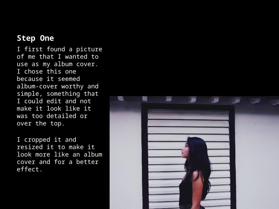
Step OneI first found a picture of me that I wanted to use as my album cover. I chose this one because it seemed album-cover worthy and simple, something that I could edit and not make it look like it was too detailed or over the top.
I cropped it and resized it to make it look more like an album cover and for a better effect.
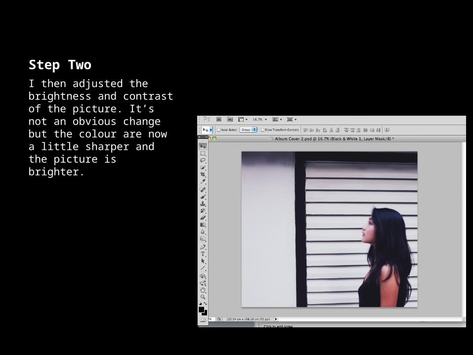
Step TwoI then adjusted the brightness and contrast of the picture. It’s not an obvious change but the colour are now a little sharper and the picture is brighter.
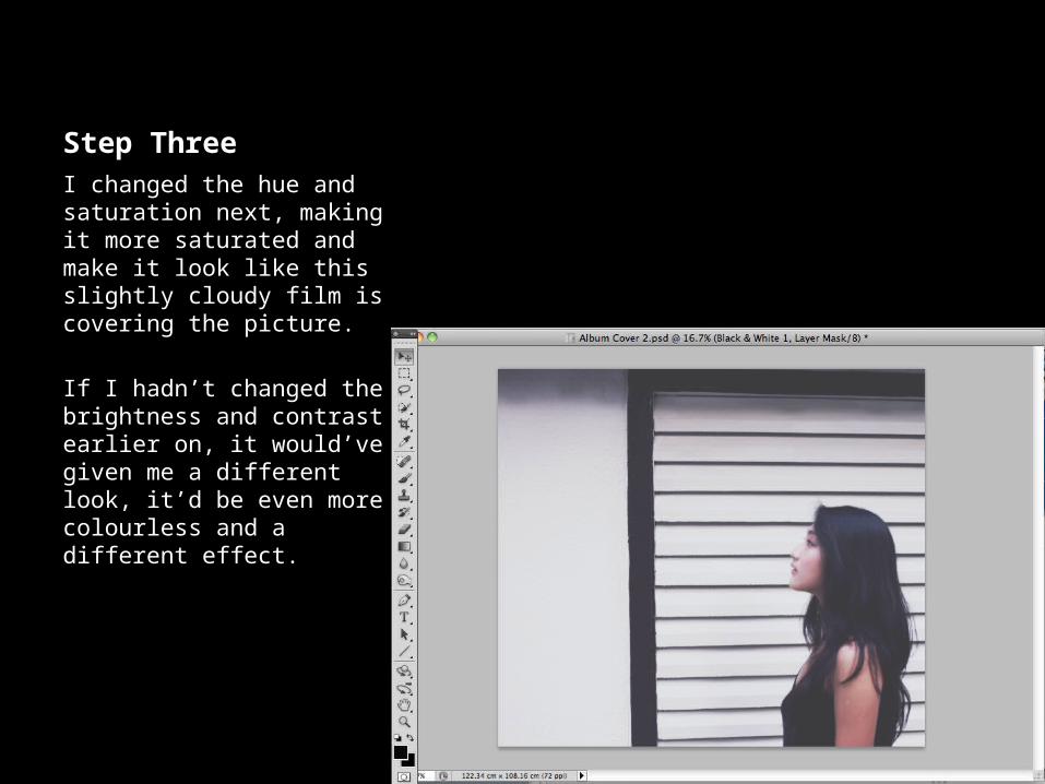
Step ThreeI changed the hue and saturation next, making it more saturated and make it look like this slightly cloudy film is covering the picture.
If I hadn’t changed the brightness and contrast earlier on, it would’ve given me a different look, it’d be even more colourless and a different effect.
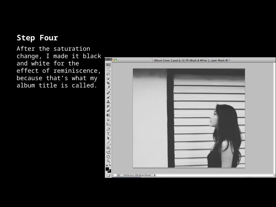
Step FourAfter the saturation change, I made it black and white for the effect of reminiscence, because that’s what my album title is called.
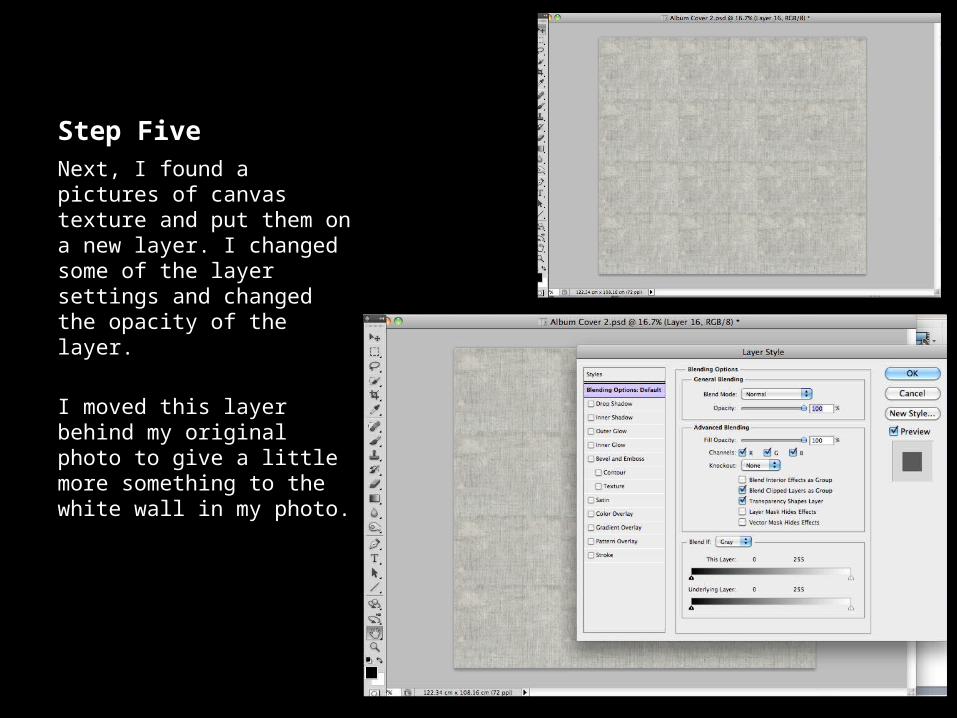
Step FiveNext, I found a pictures of canvas texture and put them on a new layer. I changed some of the layer settings and changed the opacity of the layer.
I moved this layer behind my original photo to give a little more something to the white wall in my photo.
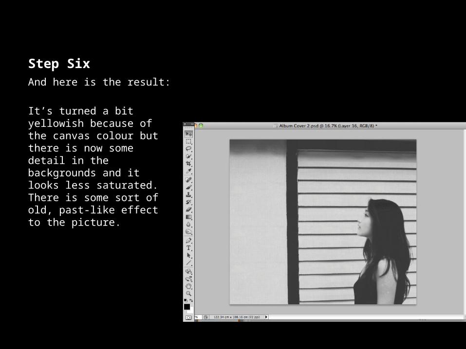
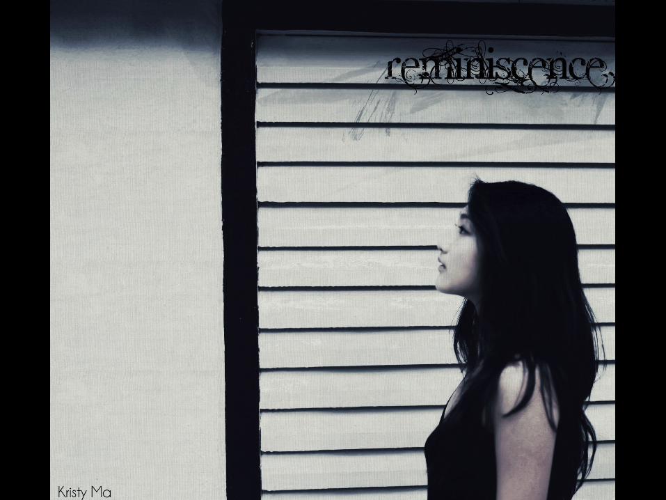
Step SixAnd here is the result:
It’s turned a bit yellowish because of the canvas colour but there is now some detail in the backgrounds and it looks less saturated. There is some sort of old, past-like effect to the picture.
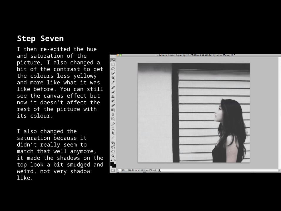
Step SevenI then re-edited the hue and saturation of the picture, I also changed a bit of the contrast to get the colours less yellowy and more like what it was like before. You can still see the canvas effect but now it doesn’t affect the rest of the picture with its colour.
I also changed the saturation because it didn’t really seem to match that well anymore, it made the shadows on the top look a bit smudged and weird, not very shadow like.
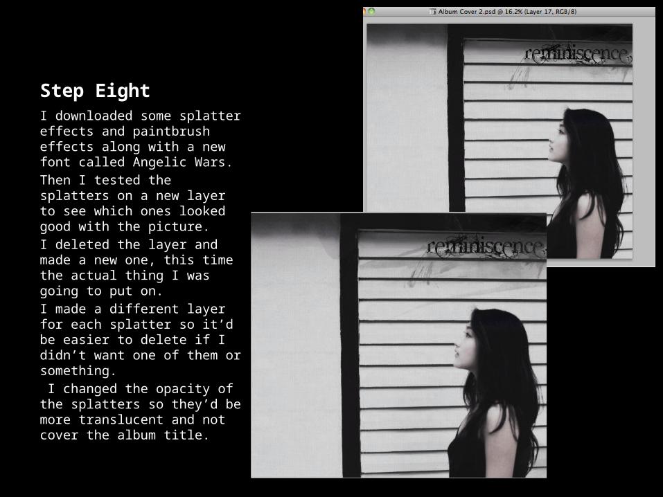
Step EightI downloaded some splatter effects and paintbrush effects along with a new font called Angelic Wars.Then I tested the splatters on a new layer to see which ones looked good with the picture.I deleted the layer and made a new one, this time the actual thing I was going to put on. I made a different layer for each splatter so it’d be easier to delete if I didn’t want one of them or something. I changed the opacity of the splatters so they’d be more translucent and not cover the album title.
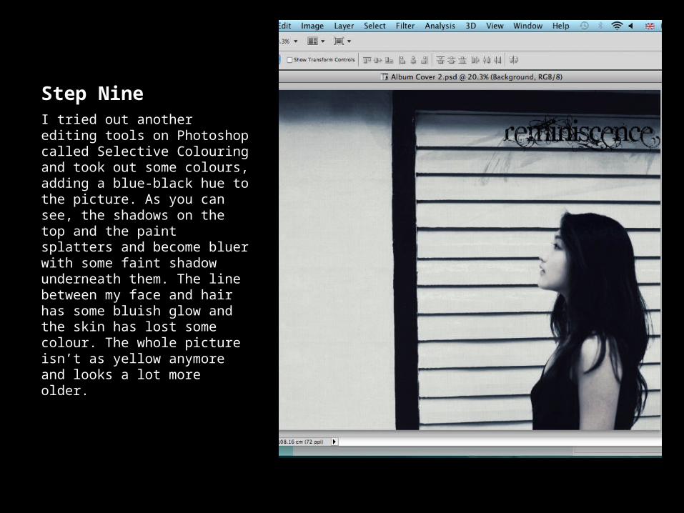
Step NineI tried out another editing tools on Photoshop called Selective Colouring and took out some colours, adding a blue-black hue to the picture. As you can see, the shadows on the top and the paint splatters and become bluer with some faint shadow underneath them. The line between my face and hair has some bluish glow and the skin has lost some colour. The whole picture isn’t as yellow anymore and looks a lot more older.
EVALUATION
Aims and Objectives
To appeal to certain customers of the genre chosen:• Must reflect genre• Album title and picture should relateTo show that I have used and understand Photoshop:• Screen shots • Steps showing what I did or used
Aims and Objectives
To appeal to certain customers of the genre chosen:My album cover does suit it’s genre and it’s colouring and mood both suggest so. The title and the picture relate and I hope this is something that would appeal to customers.To show that I have used and understand Photoshop:I had screen shots for every step and explained what I did for each one of them. I showed the tools used and explained in detail what I did to create each certain effect to get this product.
The Process
I couldn’t think of what to do at first and had to look at a lot of other examples and actual album covers before a had a good idea. Then, I watched a lot of tutorials showing different effects and the things I could do with Photoshop. I started testing them with my picture and tried to get it to look as good as possible, not all of them were successful and it took awhile but I managed to learn a lot of new effects and techniques now. At the end, I managed to mix some of the tutorial effects and tools to create my own idea, which I used in my album cover.
Achievements
I’ve never been really that good with Photoshop because I didn’t really understand what you could actually do with it. After watching a few tutorials on album covers and some effects, I started to understand just how much you can actually do with Photoshop. What I did isn’t exactly difficult but I’m pretty proud of what I managed to do for this unit. I learned a lot of new effects and uses for Photoshop like downloading and using paint splatters, colour selection and a few others. Also, another of my achievements is that I managed to do this with a good time management, because I usually find myself running out of time when I do these things.
Improvements
I think I could’ve done more to the picture or have done it in another genre so I could use more effects or other styles of editing, I could’ve shown more use of Photoshop if I’d chosen another genre of music for my album cover. I could’ve tested some more effects and tools with my picture and come up with something better and might even be able to produce it successfully.


