44
P CTOGRAMS AND S GNAGE Alexandre Bernardo 2008-344 Class A3 “Race Control Tower”
| Date post: | 19-Mar-2016 |
| Category: |
Documents |
| Upload: | alexandre-bernardo |
| View: | 214 times |
| Download: | 2 times |

P CTOGRAMSAND S GNAGE
Alexandre Bernardo2008-344 Class A3
“Race Control Tower”
“Race Control Tower”
P CTOGRAMSAND S GNAGE
Alexandre Bernardo2008-344 Class A3


Venue

1 Venue
The Estoril circuit was built in 1972 on a rocky plateau near the village of Alcabideche, 9 km from the city of Estoril, the beach resort lending its name to the circuit. The course has two hairpin turns, noticeable elevation changes, and a long start/finish straight. Its original perimeter was 4.350 km (2.703 mi).
Throughout the years, Estoril has had numerous problems with safety, failing safety inspections on more than one occasion. After the death of Ayrton Senna at the 1994 San Marino Grand Prix, a chicane was added which increased the circuit length to 4.360 km (2.709 mi). Estoril sometimes has high crosswinds, which remind many of its Spanish counterpart, the Circuit de Catalu-nya which also has a similar layout. Many teams were fond of using Estoril for winter testing.
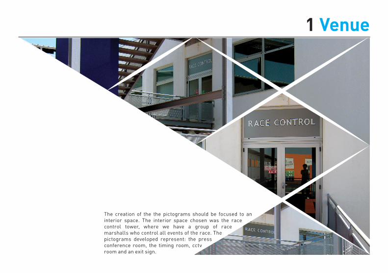
The intervention site is the race control tower, which hasn’t a signage system of any kind.
1 Venue
The creation of the the pictograms should be focused to an interior space. The interior space chosen was the race control tower, where we have a group of race marshalls who control all events of the race. The pictograms developed represent: the press conference room, the timing room, cctv room and an exit sign.

Inspiration

2 Inspiration
The main sources of inspiration for the development of the project were the pictograms used in 2000
Sydney’s Summer Olympics and the ones used in Beijing, 8 years later. The layout of the circuit
was also an inspiration, due to the shapes and curves of the design.

Sketches
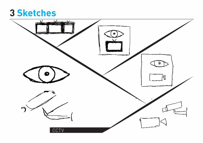
3 Sketches
CCTV

3 Sketches
Timing Room

3 Sketches
Press Conference room

3 Sketches
Exit sign


Pictograms
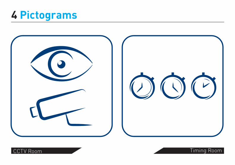
4 Pictograms
CCTV Room Timing Room
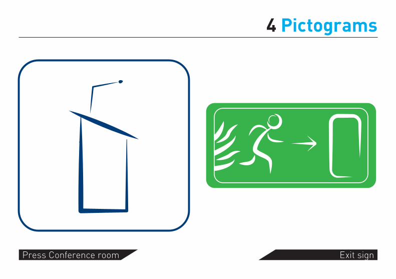
4 Pictograms
Press Conference room Exit sign

Typography
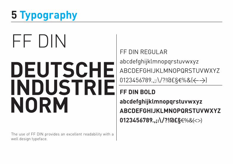
5 Typography
FF DIN
DEUTSCHEINDUSTRIENORM
FF DIN REGULARabcdefghijklmnopqrstuvwxyzABCDEFGHIJKLMNOPQRSTUVWXYZ0123456789.,;:\/?!@£§€%&(<>)
FF DIN BOLDabcdefghijklmnopqrstuvwxyzABCDEFGHIJKLMNOPQRSTUVWXYZ0123456789.,;:\/?!@£§€%&(<>)
The use of FF DIN provides an excellent readability with a well design typeface.

Colour

6 Colour
Pantone 654RGB: 0, 44, 95
CMYK: 100, 54, 0, 63
Pantone Cool GrayRGB: 230, 231, 232
CMYK: 0, 0, 0, 10
Used in typography, pictograms and arrows
The body should be in brushed metal.

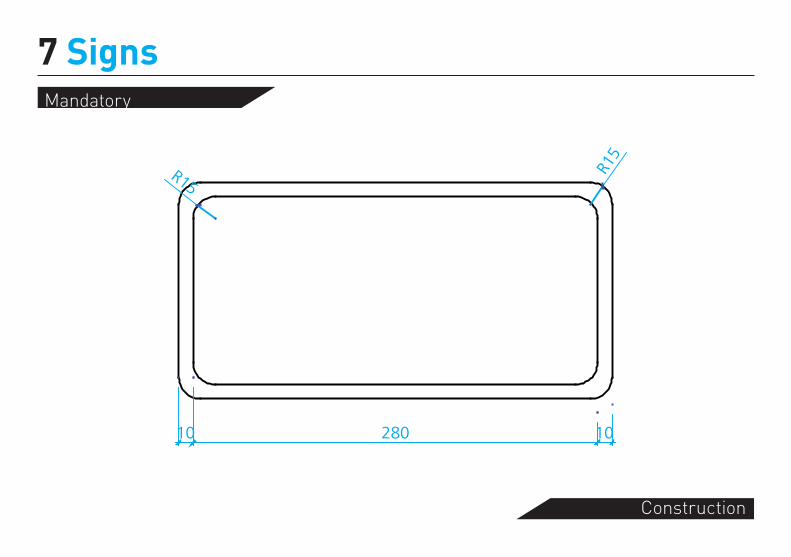
Signs

7 SignsDirectional
Construction
1015 105 1010 130 10 130 10
430
1010
2010
010
150
6422
64
R15
Text area

7 Signs
Left arrow sign
Right arrow sign

7 SignsIdentification
Construction
10 130 10 130 10
290
150
1054
2254
10

7 Signs
Identification in right
Identification in left

300
7 SignsInformation
Construction
20 410 1010
1021
,521
,543
,143
,143
,143
,143
,121
,510
600
R7,5
R7,5
10 110 30

7 SignsInformation sign
Você está aquiYou are here
CronometragemTiming
Casa de banhoRestroom
Circuito fechado de TVCCTV
SAÍDA de emergênciaEmergency EXIT
Conferência de imprensaPress conference
Mandatory
Construction
7 Signs
280 10
R15
R15
10

EXIT sign
7 Signs

Position
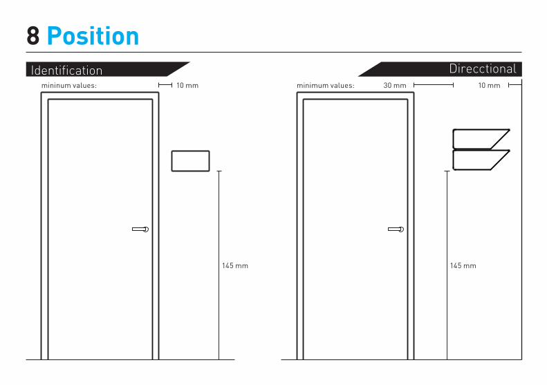
8 PositionIdentification Direcctional
145 mm
10 mm
145 mm
30 mm 10 mmminimum values:mininum values:

8 PositionEXIT sign
10 mm
mininum values:
Informationminimum values:
130 mm
60 mm


Materials

9 Materials
The blue part of the sign, which consists in the pictogram, arrow and type, should be 5mm inside of the body of the pictogram. This gives an extra touch to the sign, making it not entirely flat. The material sould be paint or plastic.
The grey part, the body of the sign, should be 20mm of thickness. The material should be brushed steel. This material choice gives the possibility of game lights and a more dynamic design.

Appli-cation
EXIT sign
Identification
Direction
Information
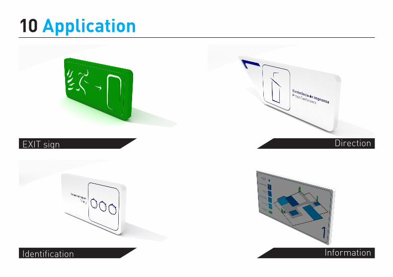
10 Application

EXIT sign
Identification
Direction
Information
10 Application