• Magazines are aimed at very niche audiences as there are many different genres of music in the world. This means that there are a lot of different magazines and it is hard to get noticed. Creating innovative concepts for front covers and content is a key way of creating a brilliant new magazine- and a new idea for a magazine is what I will be outlining in the next few slides. Music Magazine.
Transcript
• Magazines are aimed at very niche audiences as there are many different genres of music in the world. This means that there are a lot of different magazines and it is hard to get noticed. Creating innovative concepts for front covers and content is a key way of creating a brilliant new magazine- and a new idea for a magazine is what I will be outlining in the next few slides.
Pitch and Present…
Music Magazine.
Title?• The title of my magazine will be punchy and brief.• Most music magazines- but not all- are one word and are very short.• Bottleneck!• This title gives off the kind of image that I am hoping to create with
my magazine.• “Bottleneck” being a piece of equipment used with guitars gives off
the image that my magazine is all about the music- which it is. Which bands- which artists- which songs- merchandise- tour dates- etc. It’s all about the music.
• Also, bottleneck kind of brings images of bars to your mind rather than clubs. Bars are the most likely place to find new, fresh bands and therefore the opposite of pop artists, which is the opposite of what I want.
Release Frequency?• My magazine will be released weekly. As my survey
monkey results show that people are happiest with the magazine being released in week two and four the most; I am going to release a new magazine in weeks one, two and three and then have the best bits of each magazine in week four so that anybody who has missed any of the three weeks is able to catch up in a compact, concise end of the month issue.
Cover Price.• The price of this magazine will be around £2.49, this should cover costs of printing-
paper and ink- along with profit; it should also make it cheap enough for students to buy which is likely to be a lot of the audience as it is aimed at people from 16-20, with many of them being in their last year of school, college or at university. Being only £2.49 means that it is quite average for a weekly magazine- as hoped. Also, £4 was the most people were willing to pay for a magazine; however, that was based on the notion that the magazine would be printed weekly, so £2.49 a week is much cheaper than £16.
• The genre of my magazine will be tailored to the liking of my audience, it will be fixated around the vague title of “Rock” but will- depending on the month- have more elements of heavy metal, punk etc.
• Metal to punk to original, etc. means that the colours of the magazine are going to vary a little. Where it is a heavy metal month, the colours are going to be darker and there will be more blacks, topics will be surrounding more metal bands and so on. This would apply to other subgenres of rock.
Pitch and Present…
Genre.
Reader Profile.Steve, 18, from York, is a music fanatic, he listens to it 24/7,
He believes that rock is the godfather of music genres- and that is one of the main reasons why rock plays such a large part of his life.
Steve reads magazines to get information on celebrities, freebies and to read articles.
CONTINUED…
His fashion is therefore heavily impacted by the music he listens to- and his social gatherings are also effected as he loves to attend venues to listen to live music.
CONTINUED…
You Me At Six and Sum 41 are at the heart of Steve. Every gig he attends is centred around whether these guys are on tour,
not on tour or are supporting; however he is open to new bands.
CONTINUED…
He likes the simple things in life; partying, socialising and even studying. His favourite colours are black and red, and his favourite shirt is chequered with
the same colours.
CONTINUED…
Being a student, Steve is not swimming in money; however, when he does
have spare change, he makes sure to buy a music magazine to satisfy his
need for music information.
Finished.
Examples- Front Cover
Main image: The main image will consist of a close up of the main artist and a medium close up of the other two- this will show that the front guy is the largest subject(Most famous) in this issue.
A banner will be placed underneath the main image. This will be used to round off the main image, so that the image does not just stop randomly in the middle of the page, making it easier on the eyes.
Buzz words: buzz words will be placed in a small, simple banner below the attached to the main image; this will draw the attention of the reader to the puffs, plugs and sub-images along the bottom of the page.
Plugs will be used on my front cover to show subimages alongside freebies and competitions so that the readers attention is drawn to them and they can interact with the publishers.
Barcode&Date: these are common conventions within the magazine market, they alert the reader what date it was published, the price and it allows the magazine to be scanned and bought.
Freebies: this sections of the front cover will be reserved for freebies, it will show sections of the magazine and therefore alert the reader to aspects of the magazine without them having to open it up but it will also relate to freebies that are going to be included in the magazine too.
Subheading/image: this slot will feature a small picture of another artist going to be featured in the magazine. It will show the potential buyer of what kind of bands are going to be in store in this issue and therefore they can decide whether they want to buy it or not.
Puffs will be used at the top of the magazine so that the readers are able to- if they wish- go to certain sites (FACEBOOK etc)and follow the magazine, this would allow them to gain further information of certain articles and certain artists if anything in the magazine had caught their eye.
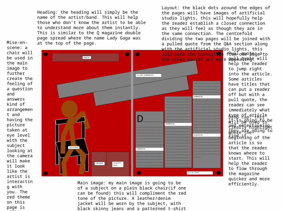
Layout: the black dots around the edges of the pages will have images of artificial studio lights, this will hopefully help the reader establish a closer connection as they will feel as though they are in the same connection. The centrefold dividing the two pages will be joined with a pulled quote from the Q&A section along with the artificial studio lights, this will make the transition from one page to the other easier and more appealing.
Heading: the heading will simply be the name of the artist/band. This will help those who don’t know the artist to be able to understand more about them instantly. This is similar to the Q magazine double page spread where the name Lady Gaga was at the top of the page.
Pull quote: a pull quote will help the reader to jump right into the article. Some articles have titles that can put a reader off but with a pull quote, the reader can see immediately what type of article it is going to be and entertaining they are going to find it.
Drop cap: this will be used to clearly highlight where the beginning of the article is so that the reader knows where to start. This will help the reader to flow through the magazine quicker and more efficiently.
Mise-en-scene: a chair will be used in the main image to further create the feeling of a question and answers kind of arrangement and having the picture taken at eye level with the subject looking at the camera will make it look like the artist is interacting with you. The red theme on this page is will be toned down a lot, a darker red will fit in with one of the three most common colours expected in a Rock magazine according to my survey.
Main image: my main image is going to be of a subject on a plain black chair(if one can be found) this will compliment the red tone of the picture. A leather/denim jacket will be worn by the subject, with black skinny jeans and a patterned t-shirt to complete the Rock kind of look.
A heading will be used to clearly indicate that this page is going to be the contents page, this is for the user to be able to locate certain aspects of the magazine and find out where they want to go.
A main image will be located in the centre of the page to show what type of music the magazine is going to include. This image will include a microphone and an amp to instil the idea in the readers that this is a rock magazine.
The little sub-images near the bottom of the music magazine are going to consist of puffs and plugs, this is to get the reader interacting with the magazine publishers to get them to feel involved.
A column of subheading will make it very clear to readers what topics are where. This will help to maintain efficiency, rendering a fulfilment of the need to read quickly for people at the recommended reading age as life tends to be moving quickly for them.
I am using this flatplan to show an outline/example of what the magazine will potentially end up looking like. However; as this is only an example, the final one would include more pages of each kind, except contents page, front cover and back cover, This example flatplan is just used to show how the layout would look as the main one would continue to follow such a pattern.
Front Cover:
Back Cover:
Article Pages:
Double page spreads:
Freebies:
Freebies:
Examples- Fonts. This first font is Marcelle by StereoType, the second one is Dalek by K-Type; these two fonts are Greek/Roman. These fonts are appealing to me as they both reek of sophistication and ancient Greece often has connotations of wisdom, power and obviously longevity.
This font- with its many curves and ovals/circles- portrays an image of smoothness that I hope to achieve with my magazine. Teenagers around 16-19 are often fashion conscious and therefor hope to look cool, smooth. Ergo, the use f this slick font would hopefully appeal to that side of them.
This font, of all of them, looks the most rock themed. Being that my magazine is a rock magazine, it would only make sense for the title to be rocky.