To preserve the anonymity of establishments, the Bureau of Labor Statistics withholds publication of data for any geographic industry level in which there are fewer than three firms or in which the employment of a single firm accounts for over 80 percent of the industry. - PowerPoint PPT Presentation
Figure 2.Population density (num berofpersons peracre)in the 10 county region,w ith breaks betw een colors atstandard deviations.The darkerthe red,the higherthe density;the darkerthe blue,the low erthe density.D ensities are calculated by taking allpersons w ithin a three m ile radius ofeach pointon the m ap, using censusblock centroidsfrom the 2000 CensusofPopulation.
Transcript
Figure 2. Population density (number of persons per acre) in the 10 county region, with breaks between colors at standard deviations. The darker the red, the higher the density; the darker the blue, the lower the density. Densities are calculated by taking all persons within a three mile radius of each point on the map, using census block centroids from the 2000 Census of Population.
Figure 3. Road density (linear feet of road per acre) in the 10 county region, in the same standard deviation format used in Figure 2: the darker the red, the higher the density; the darker the blue, the lower the density. Densities are calculated using Tiger 2000 street line centroids from the Bureau of the Census. This map, too, represents knowledge we already have: the urbanized area around Nashville could be delineated either by looking at the density of the road network or the density of population. Road density and population density produce markedly similar images.
To preserve the anonymity of establishments, the Bureau of Labor Statistics withholds publication of data for any geographic industry level in which there are
a) fewer than three firms
or
b) in which the employment of a single firm accounts for over 80 percent of the industry.
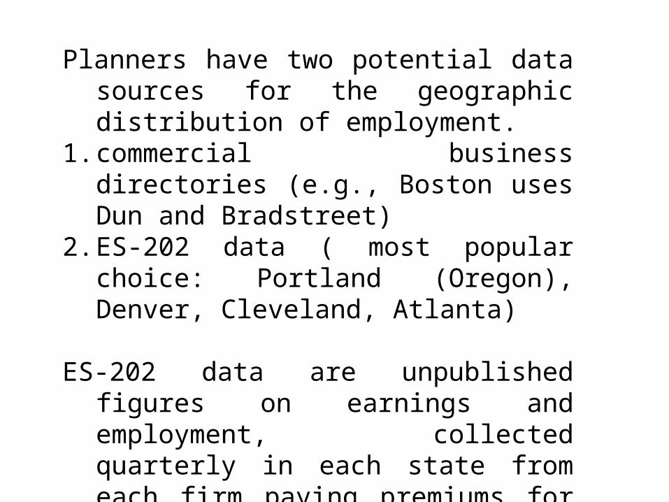
Planners have two potential data sources for the geographic distribution of employment.
1. commercial business directories (e.g., Boston uses Dun and Bradstreet)
2. ES-202 data ( most popular choice: Portland (Oregon), Denver, Cleveland, Atlanta)
ES-202 data are unpublished figures on earnings and employment, collected quarterly in each state from each firm paying premiums for unemployment insurance. In Tennessee, the data are collected by the Department of Labor and Workforce Development.
Problems with ES-202 data:
1. Unpublished and protected by law; special permission and tight controls required.
2. Many workers excluded: the self-employed without employees, unpaid workers in a family business, railroad employees, about half of those in agriculture, some state and local government employees, and most employees of religious institutions.
3. Physical address not always complete or correct.
Table 1: ES-202 Employment Compared with REIS Employment in 10 County Area Data Source Employment 1998 ES-202 as % ES-202 Total number employees 702,697 100% REIS Total part-time and full-time employment (including proprietors) 939,863 75% REIS Wage and Salary employment 771,496 91%
REIS: Regional Economic Information System (U.S. Department of Commerce 2001).
Table 2: Geocoding Accuracy of ES-202 Data Category Number of
Employees Percent of Employees
Number of Records in ES-202 file
Percent of Records in ES-202 file
Description
sw01 570,155 39.7 34,863 56.3 Geocoded to street number, street, zip, and county sw02 55,241 3.9 3,369 5.4 Geocoded to street number, street and zip sw03 51,421 3.6 2,057 3.3 Geocoded to street number, street and county sw04 4,054 0.3 323 0.5 Geocoded to street, zip, and county sw05 82,337 5.7 3,972 6.4 Geocoded to street and county sw06 4,411 0.3 333 0.5 Geocoded to street (without street suffix) and county sw07 174,894 12.2 9,314 15.0 Geocoded to zip and county sw08 253,381 17.6 236 0.4 Geocoded manually School 54,638 3.8 570 0.9 Public K-12 school systems geocoded to individual
schools Missing 185,617 12.9 6,919 11.2 Geocoded to county
Notes: ES-202 data geocoded for two quarters—1998 quarter 2 and 2001 quarter 1—so that the number of records is twice the actual number of establishments.
Table 3: Geocoding Accuracy by Date, Business Activity Type, and County. Good Mixed Missing Total Number of Records
Notes: ‘Good’: records geocoded in categories sw01, sw03, or sw08. ‘Missing’: records in the category ‘Missing.’ ‘Mixed’: records in the categories sw02, sw04, sw05, sw06, sw07, and ‘School.’
Types of “Products” from Geocoded data:
Constraint: must not disclose information on individual firms.
1. TAZ and Census Tract employment data (ArcView shapefiles)
2. Measures of concentration and dispersion of sectors.
3. Large-scale maps of employment concentration by sector.
Figure 2. Population density (number of persons per acre) in the 10 county region, with breaks between colors at standard deviations. The darker the red, the higher the density; the darker the blue, the lower the density. Densities are calculated by taking all persons within a three mile radius of each point on the map, using census block centroids from the 2000 Census of Population.
Figure 4. Employment density (jobs per acre) in the 10 county region, in the same standard deviation format used in Figure 2: the darker the red, the higher the density; the darker the blue, the lower the density. Densities are calculated using the geocoded ES-202 data, omitting only the least accurate category: ‘Missing.’ The three-mile-radius smoothing performed in the calculation of the densities, as well as the presentation of the results in standard deviation format rather than actual numbers, serves to conceal the employment figures of any particular firm.
Figure 5. Distribution sector employment density (employees per acre), in the same standard deviation format used in Figure 2: the darker the red, the higher the density; the darker the blue, the lower the density. Here we define distribution as two-digit SIC codes 42, 43, 44, 45, 46, 47, 50, and 51—these sectors represent wholesale trade and transportation (excluding passenger transport). Railroads are omitted only because they are not included in the ES-202 data.
Figure 6. Manufacturing sector employment density (employees per acre), in the same standard deviation format used in Figure 2: the darker the red, the higher the density; the darker the blue, the lower the density. Manufacturing is less concentrated than Distribution, though central Davidson County and the LaVergne area of Rutherford County appear to have high concentrations of both activities. Auto manufacturing apparently accounts for some of the more dispersed manufacturing sites.
Figure 7. Auto-Related Manufacturing employment density (employees per acre), in the same standard deviation format used in Figure 2: the darker the red, the higher the density; the darker the blue, the lower the density. Auto-related sectors were identified by using an input-output table to find those sectors most intimately linked to transportation equipment manufacturing. Auto-related Manufacturing is more dispersed than Manufacturing as a whole.
Figure 8. Non-Auto-Related Manufacturing employment density (employees per acre), in the same standard deviation format used in Figure 2: the darker the red, the higher the density; the darker the blue, the lower the density. Figures 7 and 8 show that auto-related manufacturing is primarily based outside of Davidson County, and it also shows that the manufacturing of northern Rutherford County is diversified well beyond the auto-related sectors.
Figure 9. Health services employment density (employees per acre), in the same standard deviation format used in Figure 2: the darker the red, the higher the density; the darker the blue, the lower the density. Health service establishments are those with a two-digit SIC code of 80. Health services are highly concentrated in west-central Davidson County, though each of the surrounding counties have significant centers of health services.
Figure 10. Entertainment services employment density (employees per acre), in the same standard deviation format used in Figure 2: the darker the red, the higher the density; the darker the blue, the lower the density. Entertainment services are defined here as SIC codes 58 (eating and drinking establishments), 79 (Amusements and Recreation services), 84 (Museums and Botanical and Zoological Gardens), and 7832 (Motion Picture Theatres). For all of these, customers must visit the site and spend some time there; the act of consumption is completed on the site. Entertainment services appear to be distributed much like overall employment.
Figure 11. Retail Trade employment density (employees per acre), in the same standard deviation format used in Figure 2: the darker the red, the higher the density; the darker the blue, the lower the density. Compared to overall employment, retail trade is somewhat dispersed.
Figure 12. Change in Retail trade employment density between the second quarter of 1998 and the first quarter of 2001. The map is in the same standard deviation format used in Figure 2: the darker the red, the higher the change in density; the darker the blue, the lower the change in density. Figure 12 is shown at a gross scale, with smoothing, to avoid disclosing any information about particular establishments; but even this gross-grained view shows some interesting changes—particularly strong employment growth in the Cool Springs area and weaker growth in the Green Hills area.