7
Planning And Research
| Date post: | 06-Aug-2015 |
| Category: |
Documents |
| Upload: | sid-rawson |
| View: | 64 times |
| Download: | 0 times |

Planning And Research
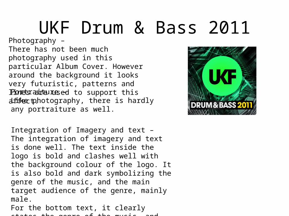
UKF Drum & Bass 2011Photography – There has not been much photography used in this particular Album Cover. However around the background it looks very futuristic, patterns and lines are used to support this affect.
Portraiture – Like photography, there is hardly any portraiture as well.
Integration of Imagery and text – The integration of imagery and text is done well. The text inside the logo is bold and clashes well with the background colour of the logo. It is also bold and dark symbolizing the genre of the music, and the main target audience of the genre, mainly male. For the bottom text, it clearly states the genre of the music, and the colours also go well with the background.
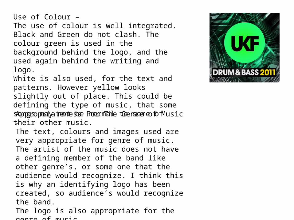
Use of Colour – The use of colour is well integrated. Black and Green do not clash. The colour green is used in the background behind the logo, and the used again behind the writing and logo. White is also used, for the text and patterns. However yellow looks slightly out of place. This could be defining the type of music, that some songs may not be normal to some of their other music.
Appropriateness For The Genre of Music –The text, colours and images used are very appropriate for genre of music. The artist of the music does not have a defining member of the band like other genre’s, or some one that the audience would recognize. I think this is why an identifying logo has been created, so audience’s would recognize the band. The logo is also appropriate for the genre of music.

Jay Z The Black AlbumPhotography – Photography has been used on this album cover. The artist of the album ‘Jay Z’ is the main image. People will be able to identify with this image, and identify who the artist is immediately as he is a well known artist.
Portraiture – For portraiture, the outline of Jay Z has been made to look like he is glowing. This could be so he stands out from the background of the album cover.
Integration of Imagery and Text - The imagery and text integrate well. The text is white, because the cover is dark, it stands out, and white and black go well together as colours, they do not clash with the image.

Use Of Colour – The use of colour is very blain, just black and white, however these colours go well together. The album is very dark, the writing is white so you can tell the name of the artist and name of album. The main image of the artist is made to look like its glowing so he stands out. Colours do not clash, and there is mainly only one colour used which is black.
Appropriate For The Genre of Music –The image is appropriate for the genre of the music. The tracks on the album are mainly about being in a life of crime, which is reflected on the main image of the album cover, Jay Z looks to be covering his face, maybe hiding his identity from some one, like the genre of his music.

Arctic Monkey What Ever People Say, That What I’m Not
Photography – Photography used is maybe of one of the band members. It’s a close up shot of the band member. He also has a direct mode of address, so that an audience can identify with him. He is also smoking, which could show a slight rebellious side of the band member.
Portraiture – There has not been much portraiture used, maybe the image has been airbrushed for a good, clean effect.
Integration of Imagery and Text – The text looks to be curly, and some letters shaded in. It is on a white background which makes it stand out. The text does integrate well with the main image, does not clash at all.

Use Of Colour – There is not a wide variety of colours used on this album cover, mainly blue’s, white and greys. The colour of the text is a light grey, and goes well with the blue background. This is the same as the white shirt one of the band members is wearing. Colours are quite soft, not bright and bold.
Appropriateness For The Genre of Music – The main image for the cover is appropriate for the genre of music. They are an Indi Band, so by one of the members wearing a shirt, he looks formal and smart, however this over looked by the fact he is smoking, something that is not seen as formal or smart, also reflected by the genre of their music. The album cover is appropriate, the colours used are appropriate for the genre, not bright or dark, they are very soft and do not clash.


