50
pocsimplotcu.com User Experience Review The Good, the Okay, and the Ugly Get more members and borrowers

pocsimplotcu.com
User Experience ReviewThe Good, the Okay, and the Ugly
Get more members and borrowers

The day you start talking to your audience and it’s about them, that’s the day that business really happens.
SCOTT STRATTEN
User Experience Review

What’s on the menu?
1. ASHLEY IS INTERESTED IN MEMBERSHIP
2. JOHN, A MEMBER, NEEDS AN AUTO LOAN
User Experience Review

1. Ashley is interested in membership
Ashley is a 30-year-old mother with two kids. She’s married and makes most of the financial decisions. Ashley heard
about your CU from a friend and she’s interested in becoming a member even though she’s been adequately
happy banking with Wells Fargo.
User Experience Review


Ashley: Let’s see if I want to become a
member of this CU.

I like the history and “heritage.”

I like the history and “heritage.”
I also like the idea of being a member-owner:
that’s one of the main things that has me
interested in joining a CU; that’s different from banking at Wells Fargo.

Overall, the site feels out-of-date.

Overall, the site feels out-of-date.
It lacks the engaging, clean feeling I expect from
a forward-thinking organization.

Overall, the site feels out-of-date.
It lacks the engaging, clean feeling I expect from
a forward-thinking organization.
Editor’s note: Let me point out a few things that make the website
say, “I’m out-of-date and not very engaging.”

The homepage is mostly text :(
!People love and connect
with imagery.
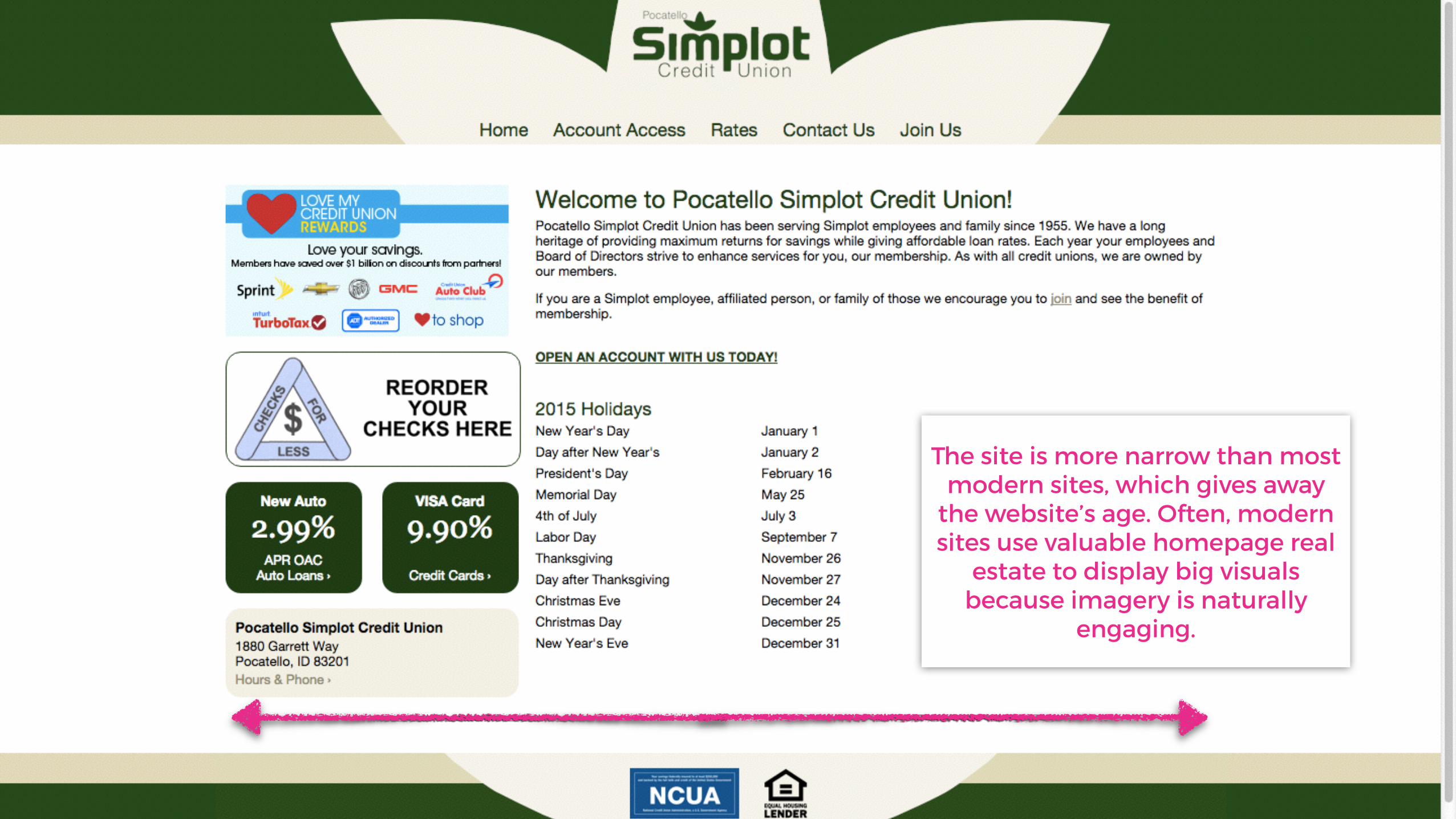
The site is more narrow than most modern sites, which gives away
the website’s age. Often, modern sites use valuable homepage real
estate to display big visuals because imagery is naturally
engaging.

To borrow a favorite phrase, there doesn’t
seem to be any “method to the
madness,” i.e., any purpose for the organization or
structure.

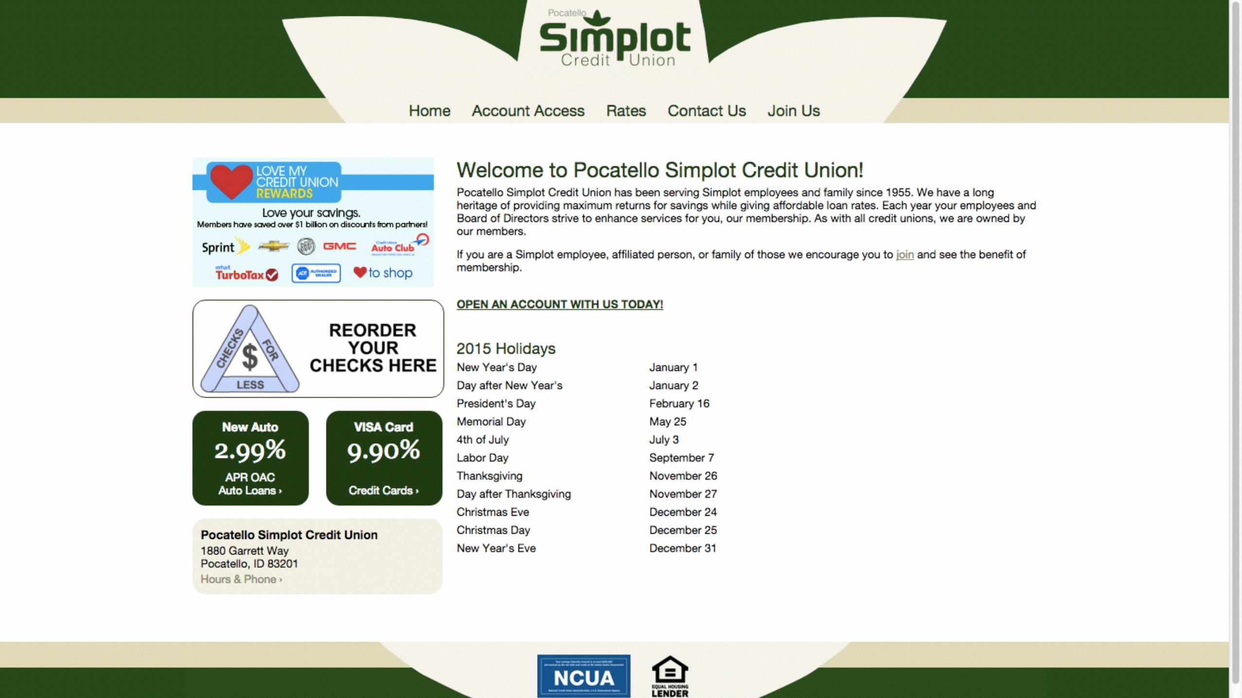
Let’s get back to Ashley’s journey.

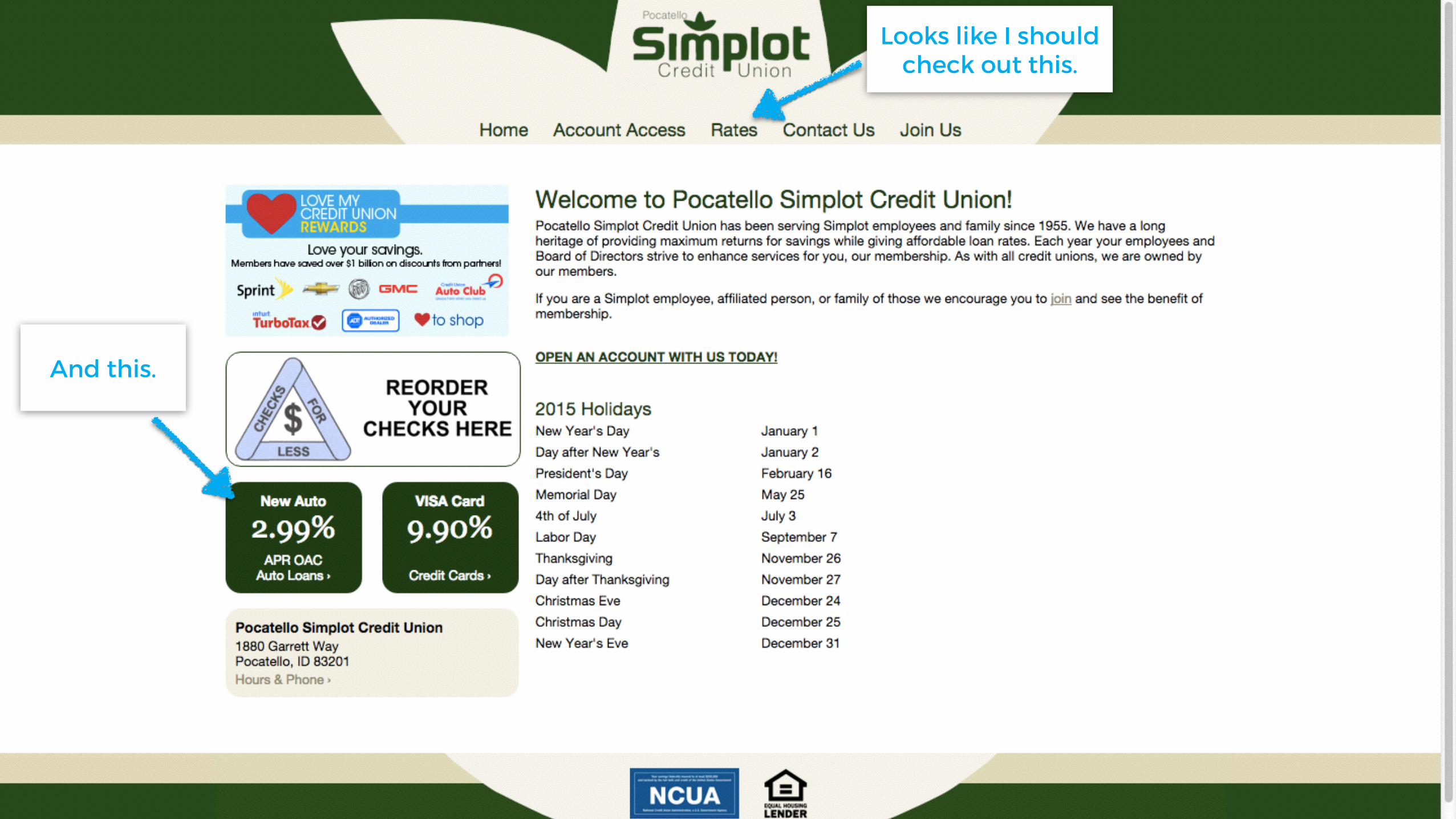
Ashley: Looks like I should check out
this.

Ashley: Looks like I should check out
this.
And this.

Ashley: Looks like I should check out
this.
And this.
And this.

Ashley: Looks like I should check out
this.
And this.
And this.
I’d love to know the benefits of
membership.

I’m going here first.
I’d love to know the benefits of
membership.

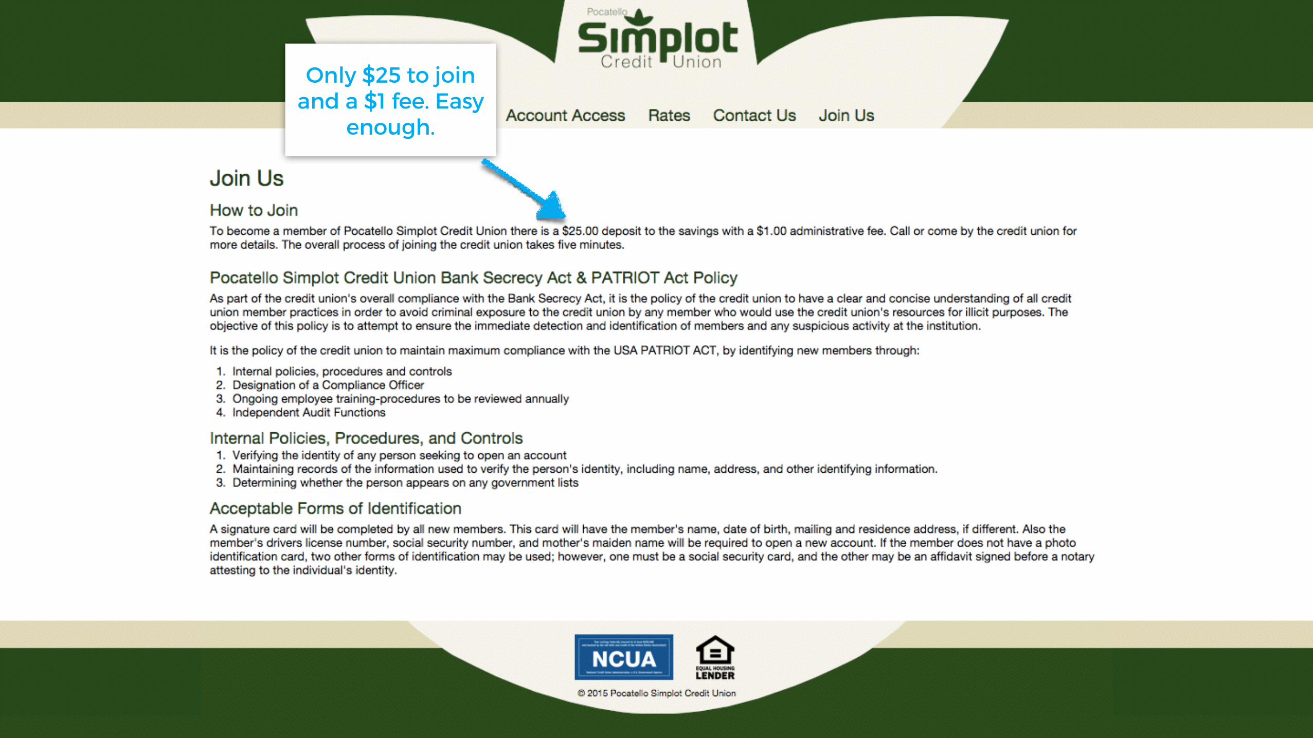
Only $25 to join and a $1 fee. Easy
enough.

Only $25 to join and a $1 fee. Easy
enough.
I have to call or go into a branch :(
I wish I could get started online. I’m not sure when I’ll
get a chance to call or stop by.

Only $25 to join and a $1 fee. Easy
enough.
I have to call or go into a branch :(
I wish I could get started online. I’m not sure when I’ll
get a chance to call or stop by.
It only takes 5 minutes? I like that!

Maybe some potential members care about all of these
administrative details, but not me. I just want to know why I should
join this credit union, and the info on this page hasn’t given me
enough reason to join.

Maybe some potential members care about all of these
administrative details, but not me. I just want to know why I should
join this credit union, and the info on this page hasn’t given me
enough reason to join.
I’m going back to the homepage.

Maybe I can find more reason to join
here.


Nope :( This is just an application.

Nope :( This is just an application.
And a pretty hefty application at
that.

Nope :( This is just an application.
I don’t have enough reason to spend time completing this application
right now.
And a pretty hefty application at
that.

Nope :( This is just an application.
And a pretty hefty application at
that.
I don’t have enough reason to spend time completing this application
right now.
And I’m hungry. So, I’m off to lunch.

Nope :( This is just an application.
And a pretty hefty application at
that.
I don’t have enough reason to spend time completing this application
right now.
And I’m hungry. So, I’m off to lunch.
Editor’s Note: The greatest failure of this whole process is that there are zero opportunities for Ashley to submit her name and contact
info online saying she’s interested in membership. Her only options are to call or go to a branch—most people will never call or stop by. I
can’t overemphasize the importance of online lead capture
if growth is truly one of the CU’s goals.

RECAP - Ashley wants to become a member
The Good
The OK
The Ugly
• There are a few good snippets of appealing text
• Easy to find the “Join Us” page
• There are a few calls to action on the homepage aimed at potential members (good), but none of them really stand out visually, i.e., they don’t catch the eye (bad)
• Ashley couldn’t find enough reason to become a member
• Overall, the site is outdated and not engaging
• The site is probably 99% text; almost no imagery
• No online lead capture

2. John needs an auto loan
John, a member of your CU, is 37 years old and has an established career. At this point in his life, he has money to
spend and he wants to buy a new car. He’s here to learn about getting an auto loan from your CU.
User Experience Review


John: Let’s see if I want to get an auto loan from my credit
union.

Looks like I should check out this.
Looks like I should check out this.
And this.

Here first.

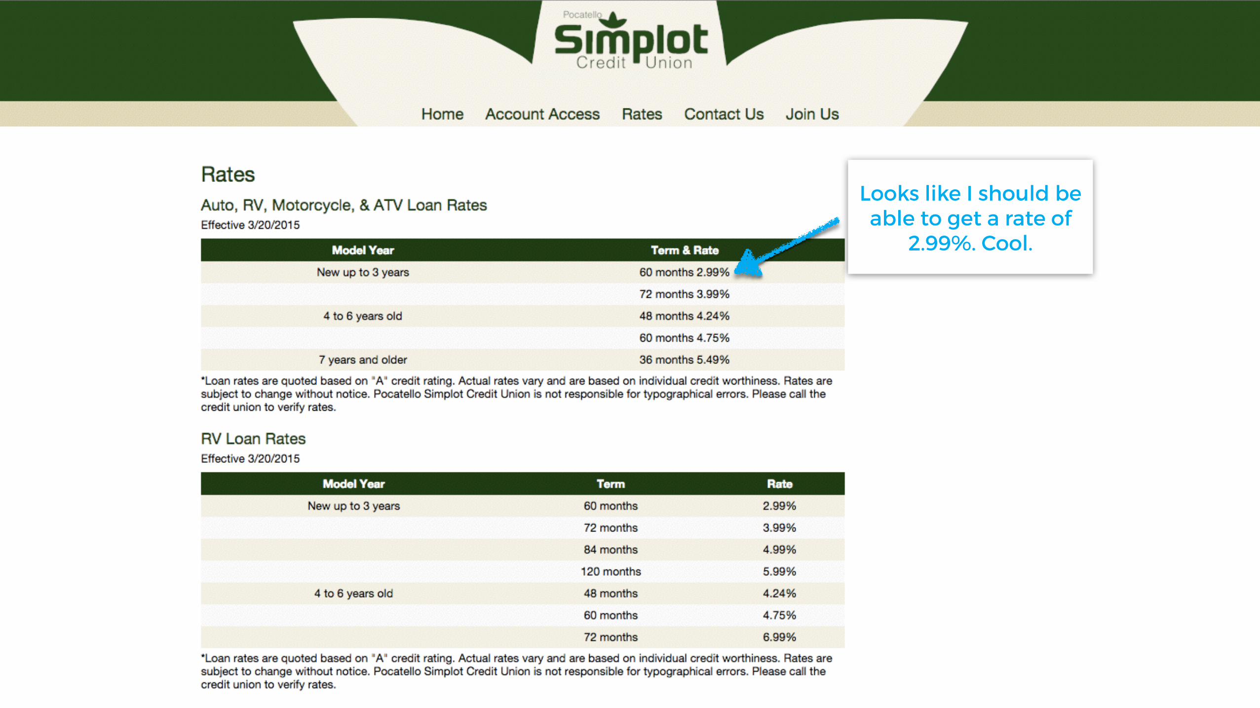
Looks like I should be able to get a rate of
2.99%. Cool.

Looks like I should be able to get a rate of
2.99%. Cool.
I guess I’ll go back to the homepage now.

Looks like I should be able to get a rate of
2.99%. Cool.
I guess I’ll go back to the homepage now.
Editor’s note: After showing John rates would be a perfect time for a call to action to lead John to the next step in the auto
loan process.

Now let’s have a look at this.


Hmmm. The same exact page as before. Well, I
don’t see anywhere else on this site to learn about
getting an auto loan.

Hmmm. The same exact page as before. Well, I
don’t see anywhere else on this site to learn about
getting an auto loan.
Unfortunately, all I really found was a
potential rate.

RECAP - John needs an auto Loan
The Good
The OK
The Ugly
• Easy to find loan rates
• I spotted the call to action on the left side of the homepage (good); it says “auto loans,” but just takes me to the rate page (bad)
• Very little information; all I could find was a list of potential auto loan rates; users need much more information to guide them through the buying process


