25


0 1G R A P H I C
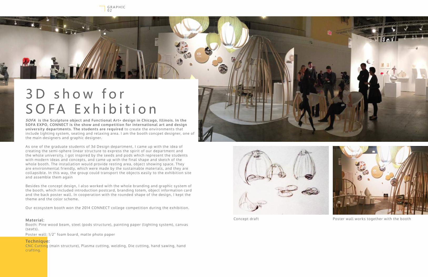
SOFA is the Sculpture object and Functional Art+ design in Chicago, Ill inois. In the SOFA EXPO, CONNECT is the show and competition for international art and design university departments. The students are required to create the environments that include l ighting system, seating and relaxing area. I am the booth concpet designer, one of the main designers and graphic designer.
As one of the graduate students of 3d Design department, I came up with the idea of creating the semi-sphere l inear structure to express the spirit of our department and the whole university. I got inspired by the seeds and pods which represent the students with modern ideas and concepts, and came up with the f inal shape and sketch of the whole booth . The instal lation would provide resting area, object showing space. They are environmental friendly, which were made by the sustainable materials, and they are col lapsible. In this way, the group could transport the objects easily to the exhibition site and assemble them again
Besides the concept design, I also worked with the whole branding and graphic system of the booth, which included introduction postcard, branding totem, object information card and the back poster wall . In cooperation with the rounded shape of the design, I kept the theme and the color scheme.
Our ecosystem booth won the 2014 CONNEC T college competition during the exhibition.
Material :Booth: Pine wood beam, steel (pods structure), painting paper (l ighting system), canvas (seats).Poster wall : 1/2” foam board, matte photo paper
Technique:CNC Cutting (main structure), Plasma cutting, welding, Die cut ting, hand sawing, hand craf ting.
3 D s h o w f o r S O FA E x h i b i t i o n
0 2G R A P H I C
Concept draf t Poster wall works together with the booth

0 3G R A P H I C
2015For SOFA EXPO 2015, my task was stil l graphic par t for the whole booth . This year, the 3D group collaborated with the Theatre Ar t Department from University of Iowa. The Theatre Ar t brought their professional l ighting system to ref lect our 3D Design idea of seasonal changing and sustainabil ity. As a consequence, the booth construction was more pure and clean than the booth in 2015, so the l ight would not f ight with students’ work.
The f irst thing about my design for the booth is our 3D logo. Based on the idea of professional education that 3D would provide, I came up with the slogan-”Unfold future”. And this became to be my inspiration of our new logo- a folded paper band tried to form the digital and let ter out, and within two dif ferent shades of yel low together, the 2d shape could express the “three dimensional” concept.
Besides the logo for 3D Department, I also designed the postcards and the wall decal . The postcards was the combination of Rhino and Il lustrator. First I used Rhino to create the wire frame that ref lect our wood frame ceil ing. Second I appl ied the color spectrum on the wire frame, so it would fol low the Theatre Ar t Department concept of season change. 1 . Colored logo
2. Logo with grid3. Postcard fromt and back view
4. Rendering5. Actual photo of 3D booth
5 4 3
1
2
0 4G R A P H I C
Render Preview of the Children Reading Area Mural
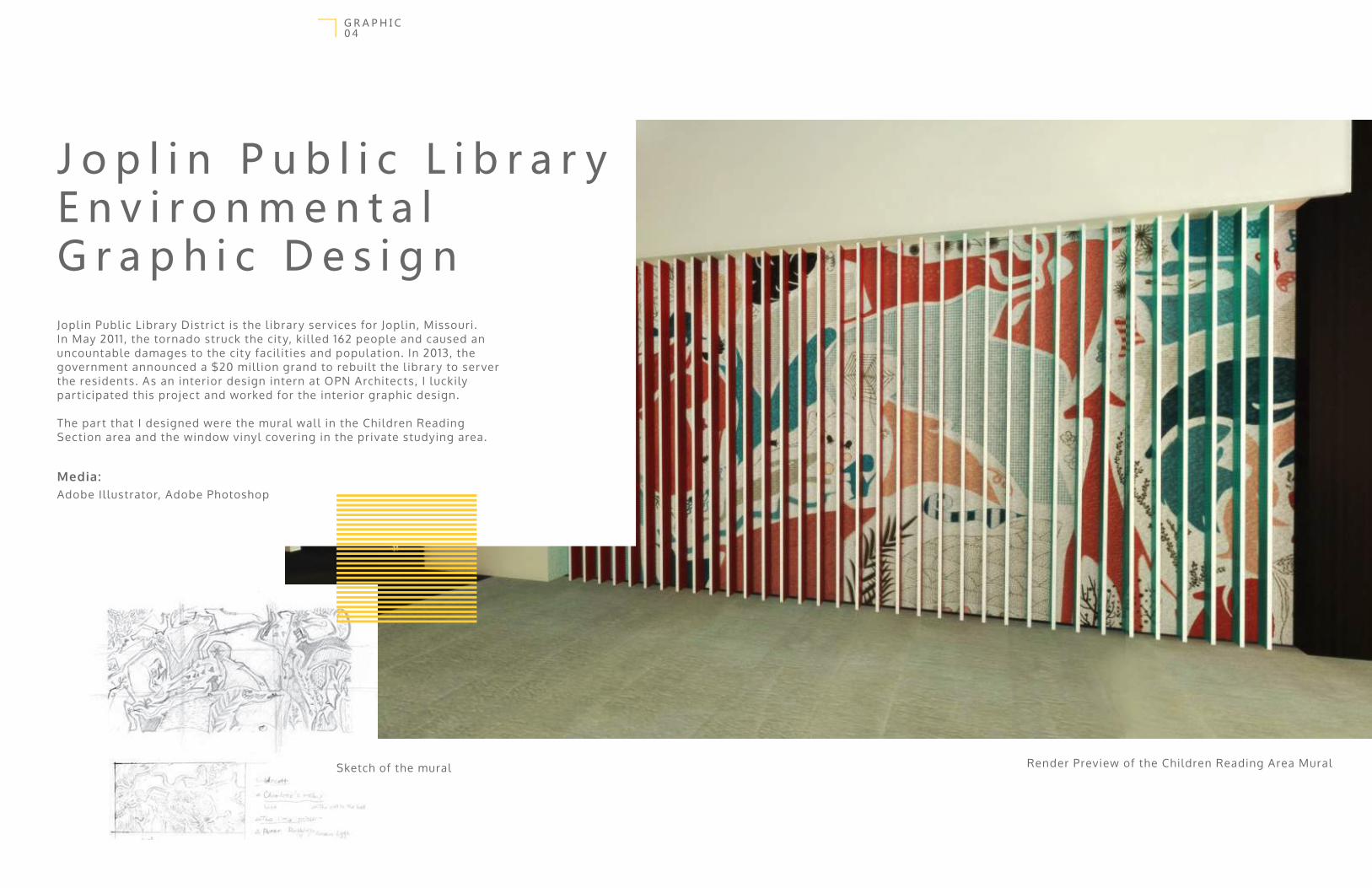
J o p l i n P u b l i c L i b r a r yE n v i r o n m e n t a l G r a p h i c D e s i g nJopl in Publ ic Library District is the l ibrary ser vices for Jopl in, Missouri. In May 2011 , the tornado struck the city, kil led 162 people and caused an uncountable damages to the city facil ities and population. In 2013, the government announced a $20 mil l ion grand to rebuilt the l ibrary to ser ver the residents. As an interior design intern at OPN Architects, I luckily par ticipated this project and worked for the interior graphic design.
The par t that I designed were the mural wall in the Children Reading Section area and the window vinyl covering in the private studying area.
Media:Adobe Il lustrator, Adobe Photoshop
Sketch of the mural

0 5G R A P H I C
1
2
1 . Mural Over view2. Location in the space3. Elevation view
My inspiration was coming from a story about butter f ly man. Some sur vivals said during the tornado, they saw some human with butter f ly wings f lying in the sky. Af ter the catastrophic, a group of local ar tists and children collaborated together created streets ar t and murals to inspire and encourage people, and these butter f ly became to be one of the element to represent freedom and rebir th .
Due to the environment of this mural (Children Reading Area), the butter f l ies and other animal would be great f igures to make the space more playful and organic. And the aim of these collage animals is to provide interaction between kids and famil ies to improve young generation cognitive competence. Moreover, the animals are the charactors from dif ferent children stories, l ike The Lit tle Prince, Rainbow Fish , The Cat in the Hat, charlot te’s web and so on, to simulate the crowd read more and enjoy the background story.
The mural is placed behind a ver tical screen which get one side painted with red and another side with aqua color, so to balance with the whole surrounding, I picked red and blue as the color scheme of the il lustration.
3
Public lobby
Entrance
Children
Reading area
Mural

0 6G R A P H I C
Besides the f inal animal col lage mural design, I also created other options for cl ients. Al l of them contain the idea of ‘reading, education, exploration and the love of nature’.
Besides the mural design in the entrance area of Children Reading Section, I also provided a design of the vinyl f ilm that is going to be at tached to the ful l height glaze in the Private Study Room. With the concept of Gestalt and Typography, the name Jopl in is spelled out with the negative space created by random let ters and hint words, l ike ‘grow’, ‘discover’, ‘play’, ‘respect ’ and so on, which are picked by the Jopl in Library stuf f, to express their expectations and blessing to the users of this l ibrary and the whole city ’s residents.
1
2
1 . Other Mural sketches and design2. Window vinyl f ilm design for private study room

After the 1999 renovation, the Prairie High School which located on the Southwest edge of Cedar Rapids, Iowa, decides to upgrade the facil ities and environment for the young generation again. As the environmental graphic design intern, I worked on the f looring design to bring visual stimulation to the users, and bring the spirit of Prairie to everyone that study and works there.
The area that I mainly worked on was the common area and the corridor to the cafe in the campus. The common area include two f loors which connects the main entrance area, the per formance theater, classrooms and cafe together, it is the f irst and the most important space that everyone wil l use and go through in the school .
P r a i r i e H i g h S c h o o lF l o o r G r a p h i c
0 7G R A P H I C

The f irst area that I star ted to work on was the common lobby in the campus. The area need to be covered by charcoal and beige color terrazzo to decrease the budget and future maintenance cost of the space.
The graphic was mainly focused on creating the pattern to express the enthusiastic and energy of the high school students. Beside that, the communication between people and the unity and teamwork of the group are the other design elements I want to show in the design. As an result , I came up with three dif ferent ideas which are al l have simple geometry to cut down the price of manufacturing. The f irst one is the pedestrain path which emphasis the movement of people; the second idea comes from the electrical board that can hint the teenagers’ active minds and the teamworks among the group; the third one is about the grouping and individual . The design group picked the pedestrain idea as the f inal plan.
0 8G R A P H I C
0 9G R A P H I C
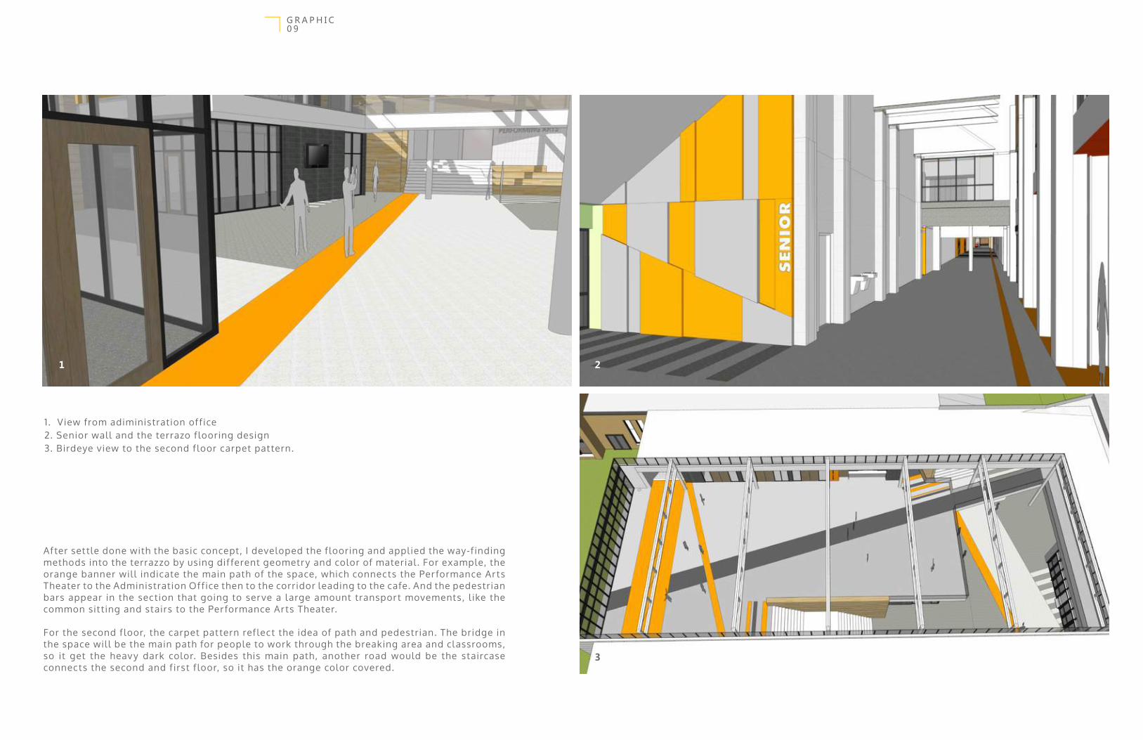
1 . View from adiministration of f ice2. Senior wall and the terrazo f looring design3. Birdeye view to the second f loor carpet pattern.
3
21
After set tle done with the basic concept, I developed the f looring and appl ied the way-f inding methods into the terrazzo by using dif ferent geometry and color of material . For example, the orange banner wil l indicate the main path of the space, which connects the Per formance Ar ts Theater to the Administration Off ice then to the corridor leading to the cafe. And the pedestrian bars appear in the section that going to ser ve a large amount transport movements, l ike the common sit ting and stairs to the Per formance Ar ts Theater.
For the second f loor, the carpet pattern ref lect the idea of path and pedestrian. The bridge in the space wil l be the main path for people to work through the breaking area and classrooms, so it get the heav y dark color. Besides this main path , another road would be the staircase connects the second and f irst f loor, so it has the orange color covered.
1 0G R A P H I C
LEF T. PosterRIGHT. Package
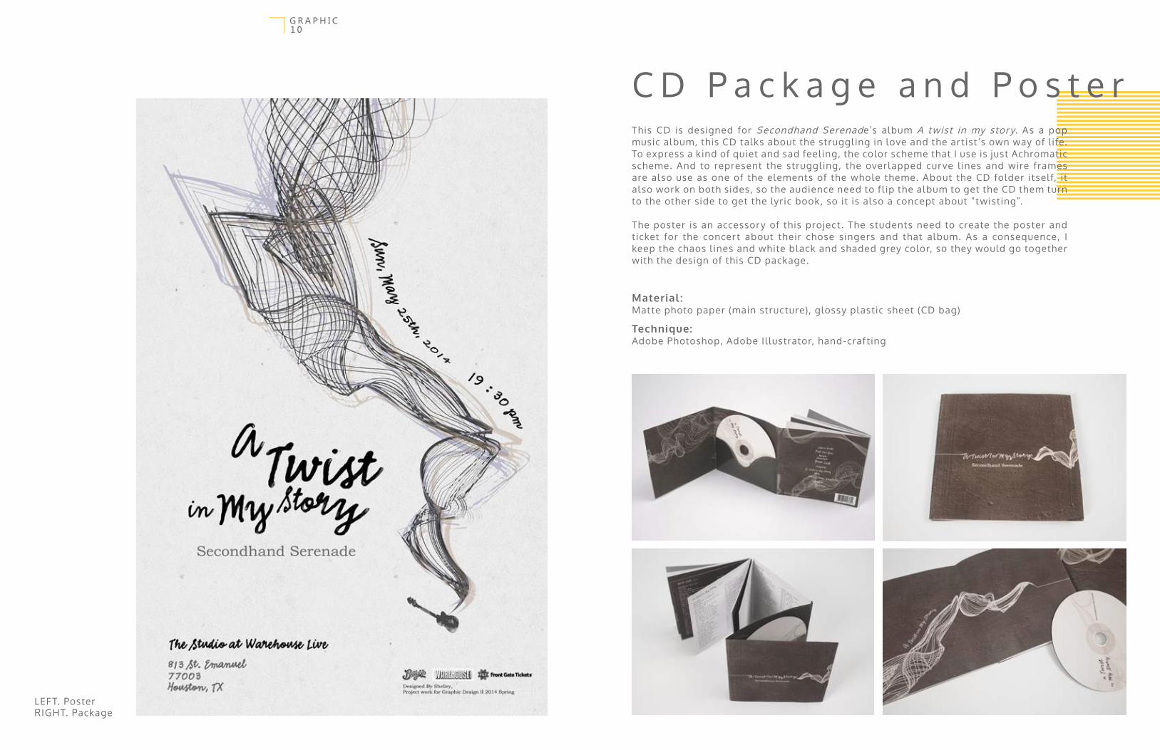
This CD is designed for Secondhand Serenade’s album A twist in my story. As a pop music album, this CD talks about the struggl ing in love and the ar tist ’s own way of l ife. To express a kind of quiet and sad feel ing, the color scheme that I use is just Achromatic scheme. And to represent the struggl ing, the overlapped cur ve l ines and wire frames are also use as one of the elements of the whole theme. About the CD folder itself, it also work on both sides, so the audience need to f l ip the album to get the CD them turn to the other side to get the lyric book, so it is also a concept about “twisting”.
The poster is an accessory of this project . The students need to create the poster and ticket for the concert about their chose singers and that album. As a consequence, I keep the chaos l ines and white black and shaded grey color, so they would go together with the design of this CD package.
Material :Matte photo paper (main structure), glossy plastic sheet (CD bag)
Technique:Adobe Photoshop, Adobe Il lustrator, hand-craf ting
C D P a c k a g e a n d P o s t e r

1 1G R A P H I C
An abecedarium is a sor t of acrostic verse form in which the l ines begin with the let ters of the alphabet. The French philosopher Gil les Deleuze gave the abecedarium new l ife when he, in 1988, gave a series of television inter views in which the main themes and concepts of his work were arranged alphabetical ly. This abecedarium is much more modest in scope, and only wants to arrange the concepts, projects, and initiatives referred to in the book, Een Nieuwe Bevlogenheid, and to supplement it here and there with examples.
In this project, we required to pick three let ters and create the il lustration for the let ters and the words that the let ter referred. I got F, for Futurezwei, Q for Quest and K for Ketikoti. The Futurzwei talks about the sustainabil ity, so I appl ied the inf inity sign to represent the recycle precess, and this wil l create a better future and save the energy. For the Quest, the idea is about breaking the boundary in people’s hear t, so I used the broken chain and the lock. And the last one is Keti Koti, which is a shared meal during which the abol ition of slavery is commemorated. The Last Dinner is the inspiration of this il lustration, which spl it into two time frame. The lef t one talks about the slaves’ struggl ing, and the lef t one is modern l ife.
Media:Adobe Photoshop, Adobe Il lustrator
I l l u s t r a t i o n f o r A b e c e d a r i u m o f t h e
N e w B e g i n n i n g
1. Futurwei 2. Quest 3. Keti Koti
12
3
1 2G R A P H I C
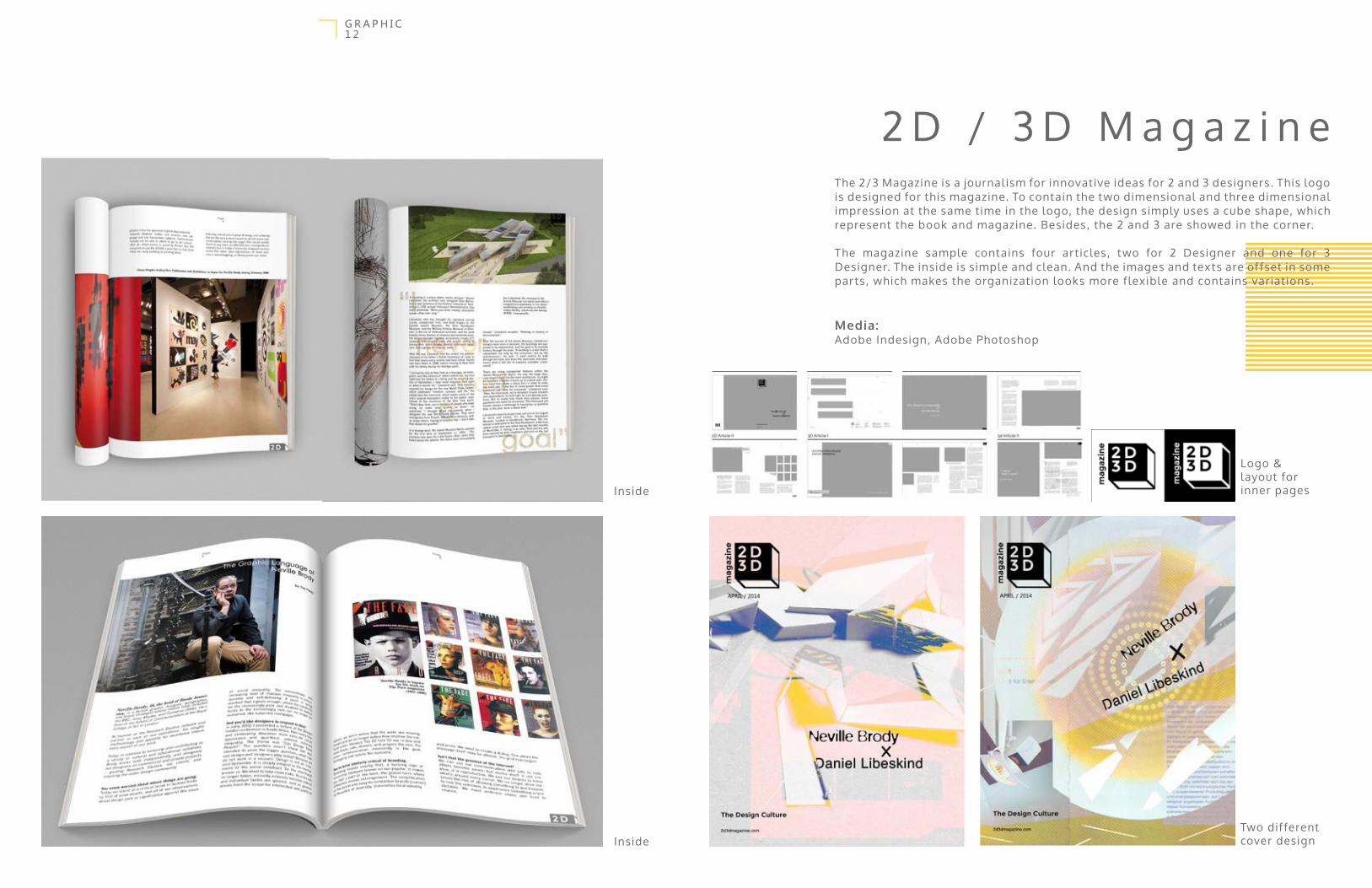
The 2/3 Magazine is a journal ism for innovative ideas for 2 and 3 designers. This logo is designed for this magazine. To contain the two dimensional and three dimensional impression at the same time in the logo, the design simply uses a cube shape, which represent the book and magazine. Besides, the 2 and 3 are showed in the corner.
The magazine sample contains four ar ticles, two for 2 Designer and one for 3 Designer. The inside is simple and clean. And the images and texts are of fset in some parts, which makes the organization looks more f lexible and contains variations.
Media:Adobe Indesign, Adobe Photoshop
2 D / 3 D M a g a z i n e
Inside
Inside
Two dif ferent cover design
Logo & layout for inner pages

The actual apperance of the website
1 3G R A P H I C
The Good Design Conference website design is aim to reveal the conference which is conducted in New York. The objectives of the design Conferences tend to be integrative across the various discipl ines, to reach the current state of the ar t , to cover the multidiscipl inary aspects of design and to assure high level review pol icy.
I designed the simplif ied logo and use dark color elegant layout to express the advanced concept about the conference.
Web link: http://myweb.uiowa.edu/yxie8/conference/web/index.html
Media:Adobe Photoshop (layout design), Adobe Dreamweaver (coding).
G o o d d e s i g n C o n f e r e n c e w e b d e s i g n
1. Home page2. Introduction page3. Schedule page4. Speaker page
1 2
3 4

1 4A R C H I T E C T U R E / I N T E R I O R

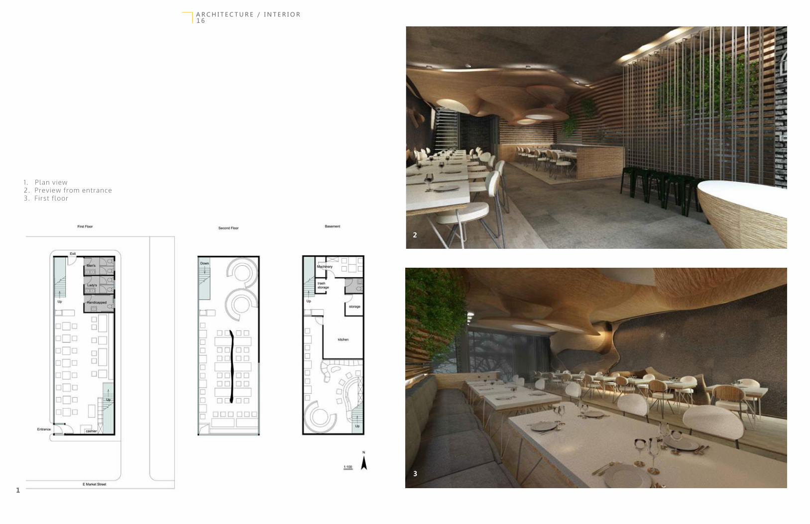
D A O R e s t a u r a n t“Dao” in Chinese means “island”, and this is also my inspir tation. In this restaurant design that specif ic made for Asian cusine, I try to bring the cur v y organic form from beach sand into this interior, to make the environment more welcoming and natual .
The interior uses birch wood veneer to laminate together to create the form, and this color would remind customers about the white sand beach.The glass-made umbrella shaped colume would bring natural sunl ight into the interior space, and it represents the water and ocean. Besides the mixture of dif ferent materials, the restaurant also includes a large amount of plants,e.g. , the entrance(f irst) f loor has plant ’s wall , they would ref lect the green forest near beach.
Media:Autodesk 3D Max, Autodesk CAD, Adobe Photoshop
1 5A R C H I T E C T U R E / I N T E R I O R
1 6A R C H I T E C T U R E / I N T E R I O R
1 . Plan view2. Preview from entrance3. First f loor
2
1
3
1 7A R C H I T E C T U R E / I N T E R I O R
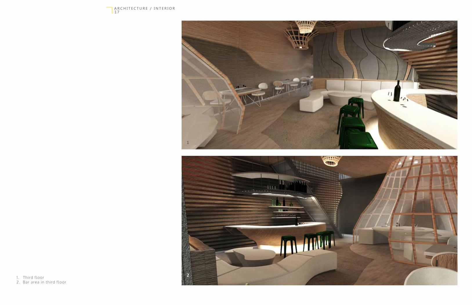
1 . Third floor2. Bar area in third floor
1
2

Because of my culture background, I notice that Asian people usually l ive in a real ly l imited space, sometimes the house gets real ly crowded because of furnitures and facil ities inside. With the consideration of better space usage, I designed this conceptual apartment residential house for small size family, l ike couple and some famil ies with only one child.
To maintain the function of the house, there are a plenty of open space that people can customize. Besides, the room contains some movable par ts, l ike the frame for the television which can be moved around or rotate on the frame structure in front of the kitchen counter, so the audiences in l iving room and kitchen can both watch the T V. Within al l these functions, the house would ser ve the users better.
For this project, I appl ied the rough industrial- looking ornament to make the design looks more contemporary. The l ight is an important thing to think about for the space. A large amount of warm color l ights are inser ted into the space, and there’s some hidden-resources l ight which can create the sof t ef fect for the space.
The materials that are appl ied in the house is concrete, brick, marble and some warm color fabric.
I took out the l iving area to create the model ing and did the renders.
Media:Autodesk 3D Studio Max, Autodesk CAD, default render system of 3D Max, Adobe Photoshop
R e s i d e n t i a l H o u s e
1 8A R C H I T E C T U R E / I N T E R I O R
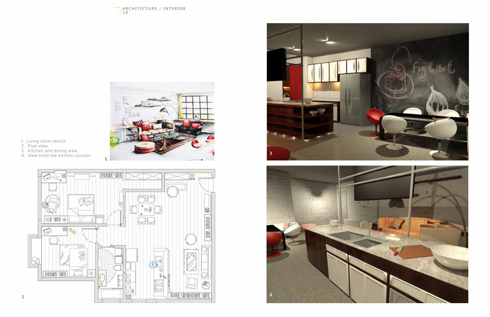
1 . L iving room sketch 2. Plan view3. Kitchen and dining area4. View from the kitchen counter
2
13
4
A R C H I T E C T U R E / I N T E R I O R1 9

Va g a r y A i r H o t e l
The Vagary Air Hotel is one of the big group project that I worked together with other two students. In this project I was required to design the hotel lobby.
With the inspiration of Chinese landscape painting, we tried to ref lect the dif ferent mountain height in our dif ferent f loor levels and wood panels, the scenery nature as our central green garden and the water fal l entrance, and also the translucent drapes hint the poetic humanities in those drawings.
Media:Google Sketchup, Ar tlantis Studio ( render), Autodesk CAD, Adobe Photoshop
Collaborate with Rouxin Liu, Wenhan Li
2 0A R C H I T E C T U R E / I N T E R I O R

1 . F irst f loor plan2. Second floor plan3. The lobby with daylight system4. The night view of the hotel lobby
1 2
N
3
4
2 1A R C H I T E C T U R E / I N T E R I O R
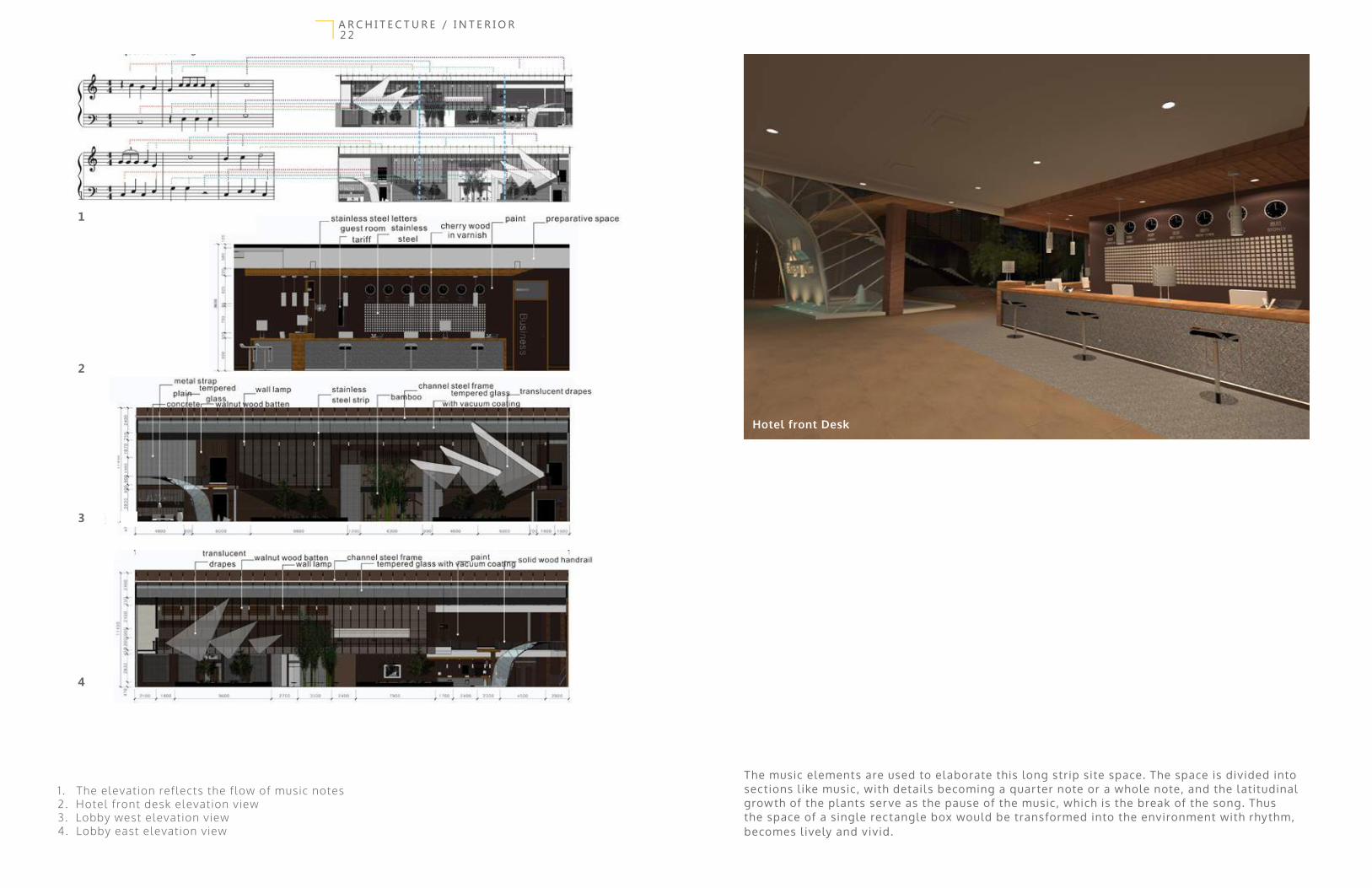
1 . The elevation reflects the flow of music notes2. Hotel front desk elevation view3. Lobby west elevation view4. Lobby east elevation view
1
2
3
4
Hotel front Desk
The music elements are used to elaborate this long strip site space. The space is divided into sections l ike music, with details becoming a quarter note or a whole note, and the latitudinal growth of the plants ser ve as the pause of the music, which is the break of the song. Thus the space of a single rectangle box would be transformed into the environment with rhythm, becomes l ively and vivid.
2 2A R C H I T E C T U R E / I N T E R I O R
1

S k e t c h / D r a f t
Media:Pen, color pencil , water color, markers, digital illustration.
2 3G R A P H I C

Thanks for your interest !


